2000AD Covers Uncovered – Mars Attacks!
6th July 2016
Set your Thrill receptors on full as Prog 1988 sees the triumphant return of super artist D’Israeli to the Galaxy’s Greatest, as Scarlet Traces makes it’s debut in Prog 1988. Scarlet Traces: Cold War is the third book of Ian Edginton and D’Israeli’s Scarlet Traces series, a story set after the alien invasion of The War of the Worlds by H.G Wells (hey, nice name!)
Cold War is set in 1968, seventy four years after the invasion of Earth by alien forces. Earth has fully grasped and developed the alien technology but this has been at great cost to Britain, which resulted in the destruction of much of the South of England at the end of the ‘The Great Game.’
I asked comics legend D’Iraeli to fill us in on the creation of his startling cover the series. Over to him…
“So, as as usual, Tharg-in-Residence Matt Smith sent me a detailed brief for the cover of Prog 1988. In this case it was an expanded version of a panel from the first episode of Scarlet Traces – Cold War:
“Would you be up for doing a cover for the first episode? I was thinking of the three fighter ships flying in formation towards us, Union Jacks on the wings, Earth in the background…?”
“I always produce three different cover roughs, one based exactly on the brief, one slight variant, and one wild card. Since I’d built 3D models of the Interceptor spaceships for the episode, I spent a bit of time arranging the models in different compositions, rather than sketching out layouts.”
“CGI is a bit of a double-edged sword – it can save time and effort when drawing complex objects (assuming said object appears enough times in a strip for the time saved drawing it to offset the time spent building and arranging the model(s.)) If you’re not careful, it can end up producing a dull, mechanical-looking end result. For myself, I always ink over 3D model renders by hand to integrate them completely with my own drawing. In the case of a composition like this, it’s important to introduce dynamic compositions and strong perspective to help offset the “deadening” effect of the mechanically-correct CGI underpinnings.
The model renders are shown here with the roughs I made from them using Clip Studio Paint (née Manga Studo):
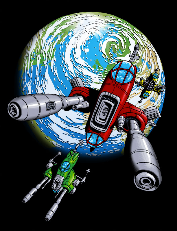
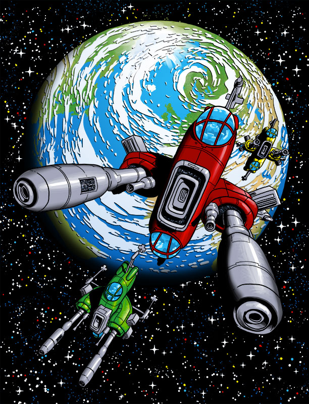
“Below is the wild card cover. This is the “kitchen sink” composition – it has everything, the interceptors converging on an alien cylinder with both the Earth and the Moon in the background, and an interceptor pilot clearly visible. My tribute to 1970’s sci-fi paperback covers.”
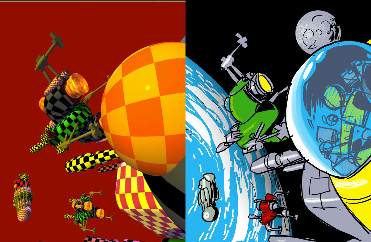
Erm… some beach balls and candy rocks in space? What is the artist trying to tell us here?
“Closer to Matt’s brief, but with the exploding alien cylinder in the background for added “oomph.”
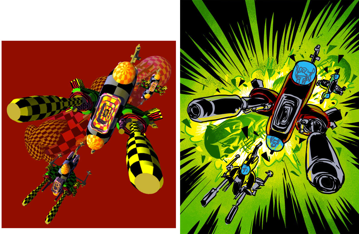
A futuristic reimagining of the Hindenburg Disaster.
“And the final sketch, Interceptors and the Earth, precisely as per the brief. As you can see here, I didn’t do a new render from the models for this one; I just positioned a render of the Earth over the first reference image to give me the background I needed.”
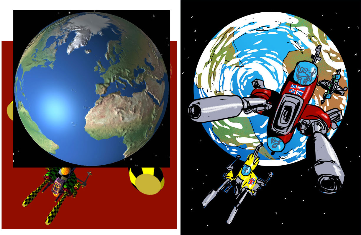
Will the last person to leave Earth please turn off the lights.
“Once Tharg had approved rough number 3, it was time to begin the finished drawing. Since most of the image was based on 3D model renders, there was relatively little drawing to be done. This image shows the minimal amount of pencilling I had to do…”
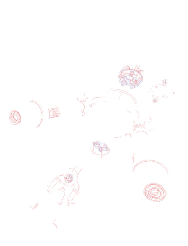
White Space…
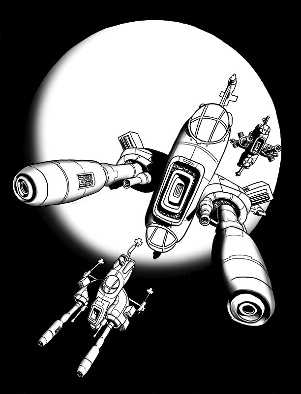
“Here I’m inking the spaceships. I do the inks on their own layer so I’ll be able to play around with the backgrounds later on.”

Spaceships by Bertie Bassett.
“Adding the black of space (which also defines the disc of the Earth…)”
And on the first day, D’Israeli said “Let there be dark!”
“Softening. There are two things I don’t usually do; shade with black or use the airbrush tool for shading. I usually avoid that particular look because it’s a kind the basic go-to solution for anyone teaching themselves digital art, and it’s hard to differentiate your work if you just do what everyone else does. In this case, though, airbrushed tones were just what I needed to lend volume to the curves of the planet and the spaceships in the harsh light of interplanetary space. Never say “never!””
Turned out cloudy then…
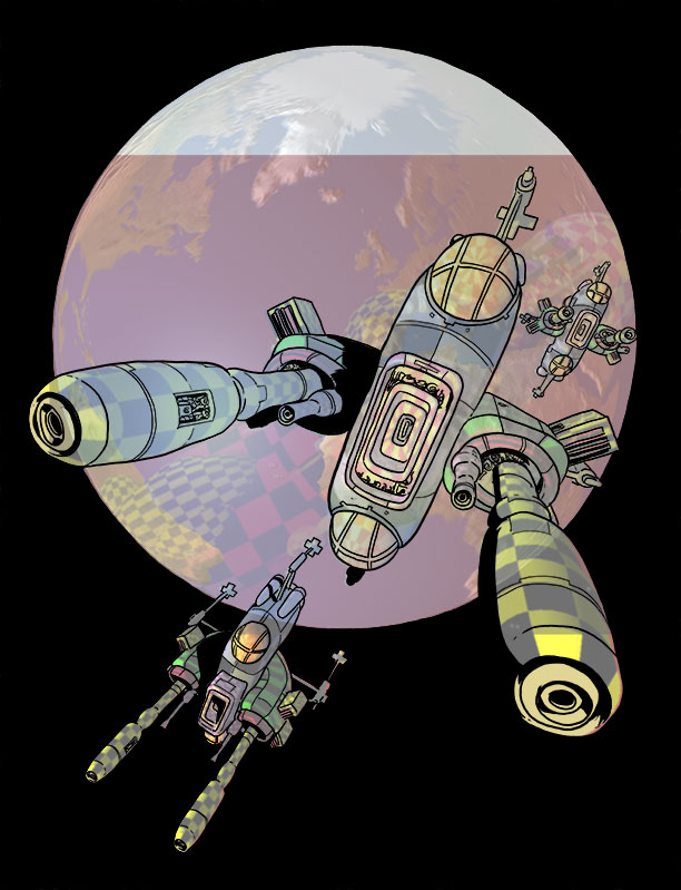
“Flat colours; here I’m adding in the basic flat colours to the objects (using the Paint Bucket tool) and tracing off the shapes of the continents as blocks of colour (using the excellent Lasso Fill tool in Clip Studio Paint née Manga Studio – just draw a shape and let go and it automatically fills with colour, just like using the old Pencil tool in Illustrator.) The colours on the planet are on two different layers, under the colours of the spaceships, so I can fiddle with them without affecting the ships.
I’ve made one change here from the roughs – swapping the colours of the yellow and green spaceships, since the green was getting lost against the colour of the continents behind.”

After the 50th series of Celebrity Big Brother, the people of Earth had had enough…
“Clouds. Mostly drawn in using the Lasso Fill tool, with the Pen tool used for the smaller blobs. I try to set up a realistic-looking whorl pattern that will draw the eye to the lead spaceship. I do this on a new layer between the colours for the spaceships and the colour for the planet, so I don’t have to worry about masking them out or anything – I can just draw freely and they appear “behind” the spaceships.”

Cloud Atlas
“Cloud shadows. By selecting the clouds with the Lasso tool, nudging the selection a few pixels over with the keyboard arrow keys, filling with black on a new layer, repeating the selection of the clouds, and using it to delete parts of the black fill, I create fine black shadows for the clouds over the Earth in about thirty seconds flat!”
“Past the Sea of Swirly Twirley Gumdrops.”
“Highlights. On a new layer, I add a few shiny highlights to the spacecraft to help them “pop.” I also add a bright blue circular gradient to the Earth’s oceans to help give form to the globe. Finally, I lock transparency on the layer containing the continents. This means I can only draw on the continents themselves. I then add texture with Clip Studio’s Chalk brushes, using a mix of beiges, browns and khaki-greens to give variation to the Earth’s surface.”

Given a bit of a polish by one of those windscreen washer folks. There’s no escaping them!
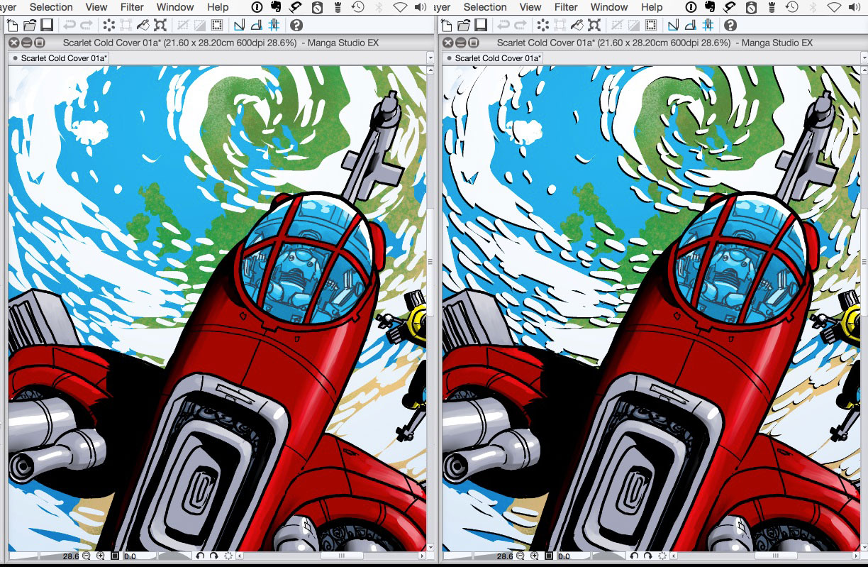
“I wonder if the space background would look better with stars added. Save a copy, add stars – no, it doesn’t. Back to the previous version. Another reason to work digitally – with real media that experiment would have set me up for at least an hour of repair work.”
“My God! It’s full of stars!”
“Done!”

Earth Forces are Go!
“I export the file from Clip Studio Paint in Photoshop format, and process it to a flat CMYK TIFF in Photoshop for upload to the 2000AD FTP server.”
Wow!!! Thank you so much to D’Israeli for sendng the images and excellent breakdown, a true pro! Be sure to visit his site at here and also Eamonn Clake’s brilliant Scarlet Traces annotations page!