2000 AD Covers Uncovered – Getting some dino-action with Dexter and Tazio Bettin
26th November 2021
Every week, 2000 AD brings you the galaxy’s greatest artwork and 2000 AD Covers Uncovered takes you behind-the-scenes with the headline artists responsible for our top cover art – join bloggers Richard Bruton and Pete Wells as they uncover the greatest covers from 2000 AD!
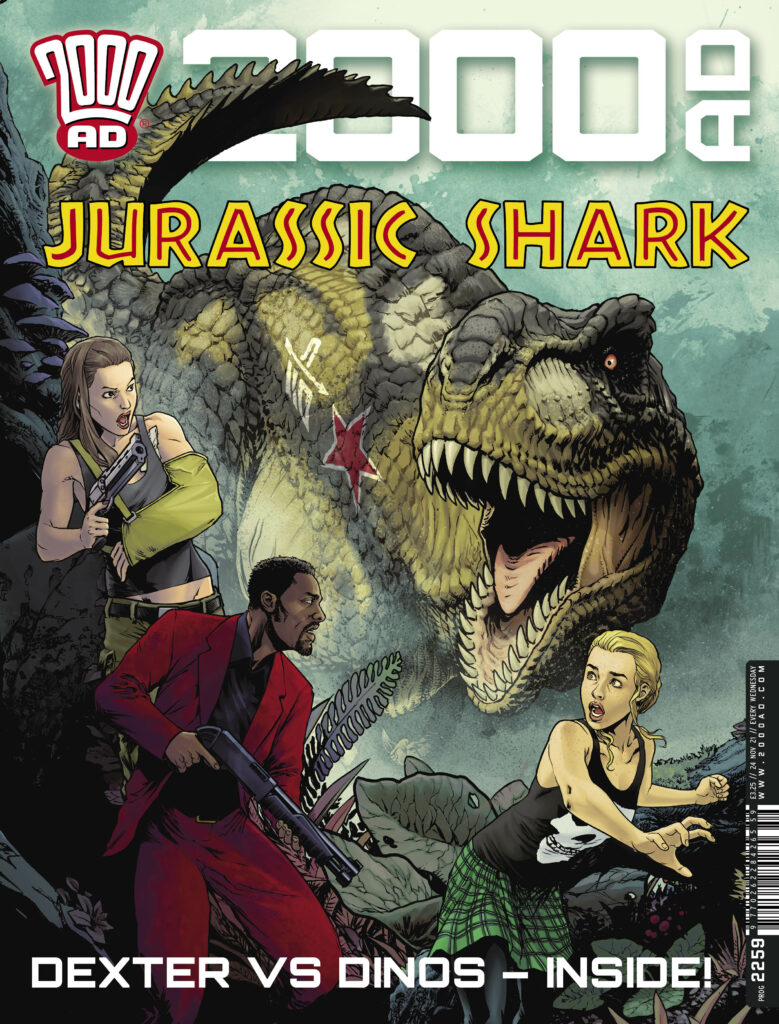
It’s time to check in again with Sinister Dexter… or at least Dexter, in 2000 AD Prog 2259, out on 24 November – as Dan Abnett and Tazio Bettin bring us Dexter in Lordy Jordy: King of Everything. And it’s also a warm welcome for his debut cover to Tazio Bettin!

.
Now, over to Tazio for the making of the cover…
TAZIO BETTIN: Your first cover for 2000 AD is no small deal. When my editor, Matt, gave me green light to create one, I knew it had to be one of my best. I was determined to impress both him and Dan Abnett, who got me into working with him on his Sinister Dexter.
I had carte blanche on the cover, so I started thinking what elements would need to be present to successfully convey what the chapter’s story is about. The current chapter of the comic is set in an underground sewer jungle island that hides an abandoned soviet complex, and there are dinosaurs, as a result of me nagging Dan to have them because… I mean, dinosaurs, right? Dan went one step further and made these creatures unique and badass by giving them Russian military tank insignia. The gentleman always knows how to blow my mind.
Dexter, Carrie and Billi are the focus characters, so they obviously needed to be there. Previously, they had encountered some pretty cool characters, which I had immense fun in designing, such as Kalinka the robot and especially Vegvisir. She was initially meant to be just some lieutenant of the queenpin Bates, capturing our heroes at the beginning of the previous chapter, but when I drew this character as a tough, muscular woman with a cold attitude, Dan decided to give her a name and make her central to the story, which filled me with joy.
.
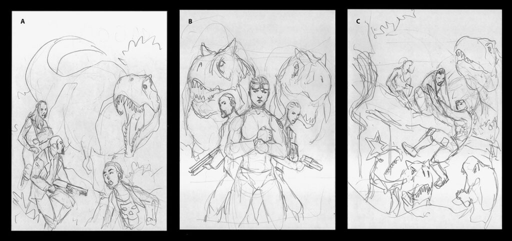
So on I went and prepared some layouts for the cover, two of which included Vegvisir, and the last focusing on the main characters only. I didn’t want the composition to be excessively busy: I think I prefer essential, simple, and iconic compositions over crowded covers with dozens of characters striking an action pose, the likes of which you constantly saw – especially during the nineties when I grew up – and didn’t especially like. I decided that this composition had to have no more than three characters and, of course, dinosaurs.
As you can see from the initial sketches, this stage is little more than a composition study where I plan elements and their placement. In the end, the first option was chosen, one focusing on the main characters – Dexter, Carrie, and Billi. So, knowing where I was going, I got busy with pencils...
.
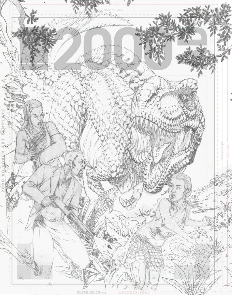
In drawing dinosaurs for this chapter of Sinister Dexter I actually tried to go with the best scientific knowledge we have of these awesome animals, which ones were likely (or proven) to have feathers and which ones apparently didn’t. To the best of my current knowledge, it seems likely that among Theropods, Tyrannosauridae didn’t have feathers, so my inspiration came from crocodiles. I know it’s a completely different clade, but I took some artistic license inspired by Peter Jackson’s King Kong dinosaurs. Unlike your naked-skin Jurassic park T-Rex, I decided that my Tyrannosauri have scales on their backs and heads and a slightly crocodile-like tail. Oh and let us remember that Tyrannosauridae first appeared in the Late Cretaceous. What’s with this Jurassic nonsense anyways?
Since I wanted to take advantage of the cover space in the best possible way I could, I decided to draw all the elements separately and to assemble them later…
.
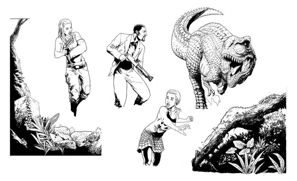
After approval of the pencils, I went ahead using some good thick paper I could safely scratch ink textures on, and my faithful collection of nibs, fineline markers, and brushes. I believe that where pencils are the foundation and skeleton of a drawing, what gives it life is the inks, and that inkers are often the unsung heroes of comics. A good inking is what marks the difference between a good piece of comic art and a mediocre one, no matter how good the pencils are. The versatility of inking instruments and techniques allows for a number of great solutions that can make a drawing really pop out.
My favourite part of inking is the texturisation of uneven surfaces and volumes, such as the vegetation here. I often like to flick my nib on the rim of an old plastic card to create a controlled splatter effect here and there, as well as using my fingerprints to create a very fine, texturised midtone where needed. The final effect I usually go for is a juxtaposition of clean, regular lines and texturising smudges that break down the shapes and give a realistic, worn feeling to objects.
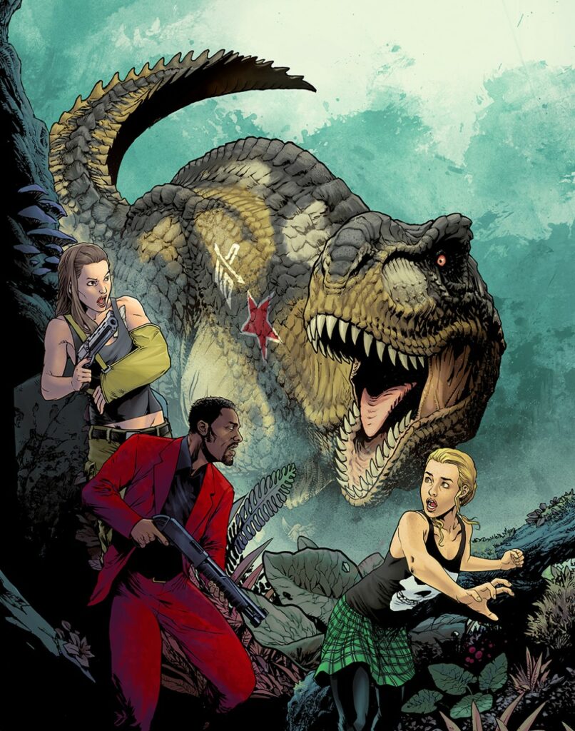
Finally, when it comes to colouring, I’m reminded of the legendary Gennady Tartakovsky’s rule that made his Samurai Jack so visually memorable: ‘no green grass and no blue skies.’ Colours are always at least slightly askew in the expected colour palette, and that’s indubitably a big part of that cartoon’s magic.
After having decided what the colour dominance will be in an illustration, I start from the background and work my way up to the foreground. Every element remains separate at this stage, and therefore movable just in case I feel like that would benefit the overall composition. Just like in inking, I like a juxtaposition of clean colouring and natural looking, irregular textures.
.
For the background, I’ve used some abstract textures I previously created by smudging watercoloured ink on paper, so as to create an illusion of foliage. The Tyrannosaurus’ skin is also painted with textured brushes, whereas the foreground elements, and especially the characters, have clean, regular gradients to them, which makes them stand out in the composition. The wood, rock and foliage were already textured at the inking stage, so I kept clean, untexturised colouring to not overdo the effect, with the result of only making the image difficult to read.
As it is when working on interior pages, the readability of a composition is the main concern, and that remains true during every stage of the process. The value of the chosen colours is probably the key at this point. A good idea is to turn your illustration to black and white, and see if it’s still readable. If the values are too uniform, it will just look like a grey mess. If you can look at a cover at thumbnail size and in black and white, and still read the elements, then you’ve done your first job right.
And hopefully this is just the beginning of a series of covers for 2000 AD, I hope you all like my work!
Oh – we do Tazio, we do!
Thanks so much to Tazio for sending along his cover work – always great to see an art droid get their first ever 2000 AD cover! And you can find Tazio’s cover adorning the front of 2000 AD Prog 2259 – out on sale wherever you get your Thrill-power from, including the 2000 AD web shop, on 24 November