2000 AD Covers Uncovered: Megazine #452 – Twice the Law with Laurence Campbell!
18th January 2023
Every week, 2000 AD brings you the galaxy’s greatest artwork and 2000 AD Covers Uncovered takes you behind-the-scenes with the headline artists responsible for our top cover art – join bloggers Richard Bruton and Pete Wells as they uncover the greatest covers from 2000 AD!
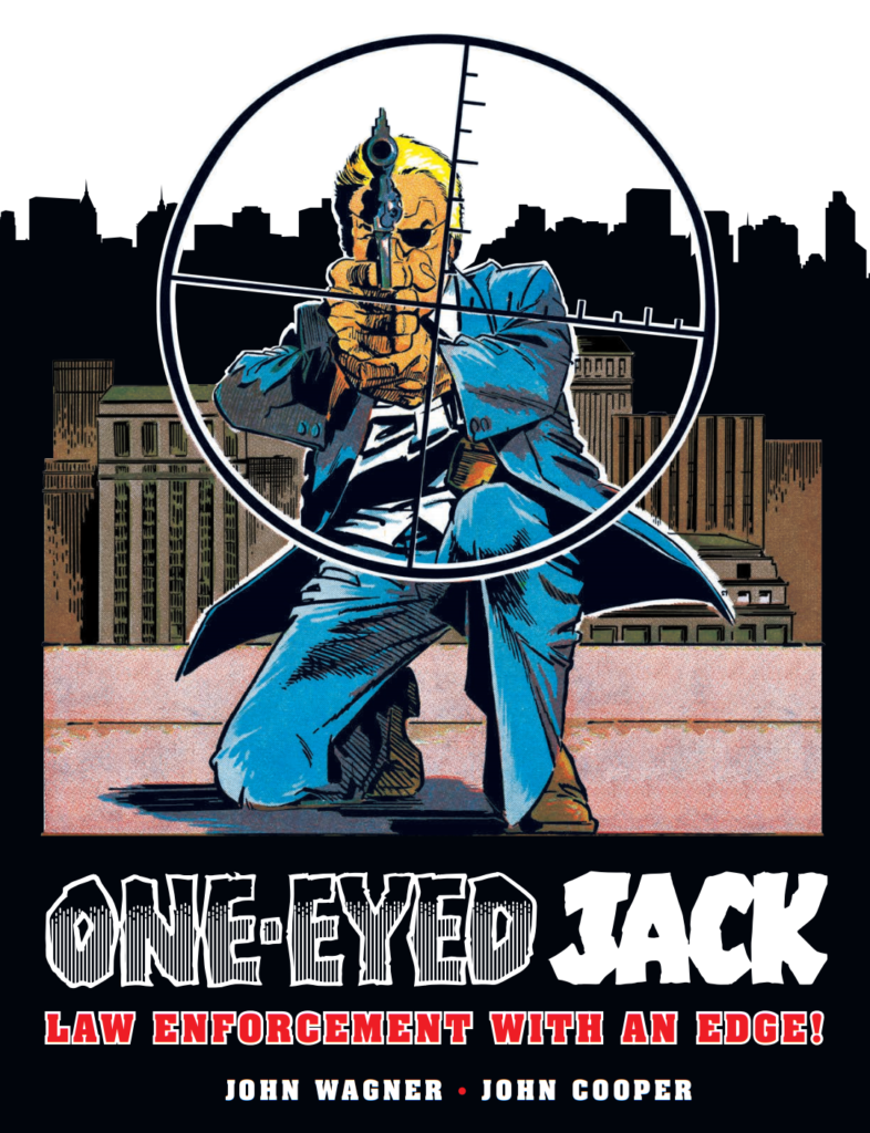
This week, it’s time for a new Judge Dredd Megazine with the surprise return of a classic character from the pages of 1970s Valiant… One-Eyed Jack.
But how on Earth have writer Kenneth Niemand and artist Ian Richardson managed to bring together Jack McBane, scourge of villains in 70s New York, with the toughest Judge of Mega-City One? Well, we’re not saying – you’ll need to read the new Judge Dredd series, One-Eyed Jacks in this months Megazine!
And it’s all underneath a fabulous cover from artist Laurence Campbell…
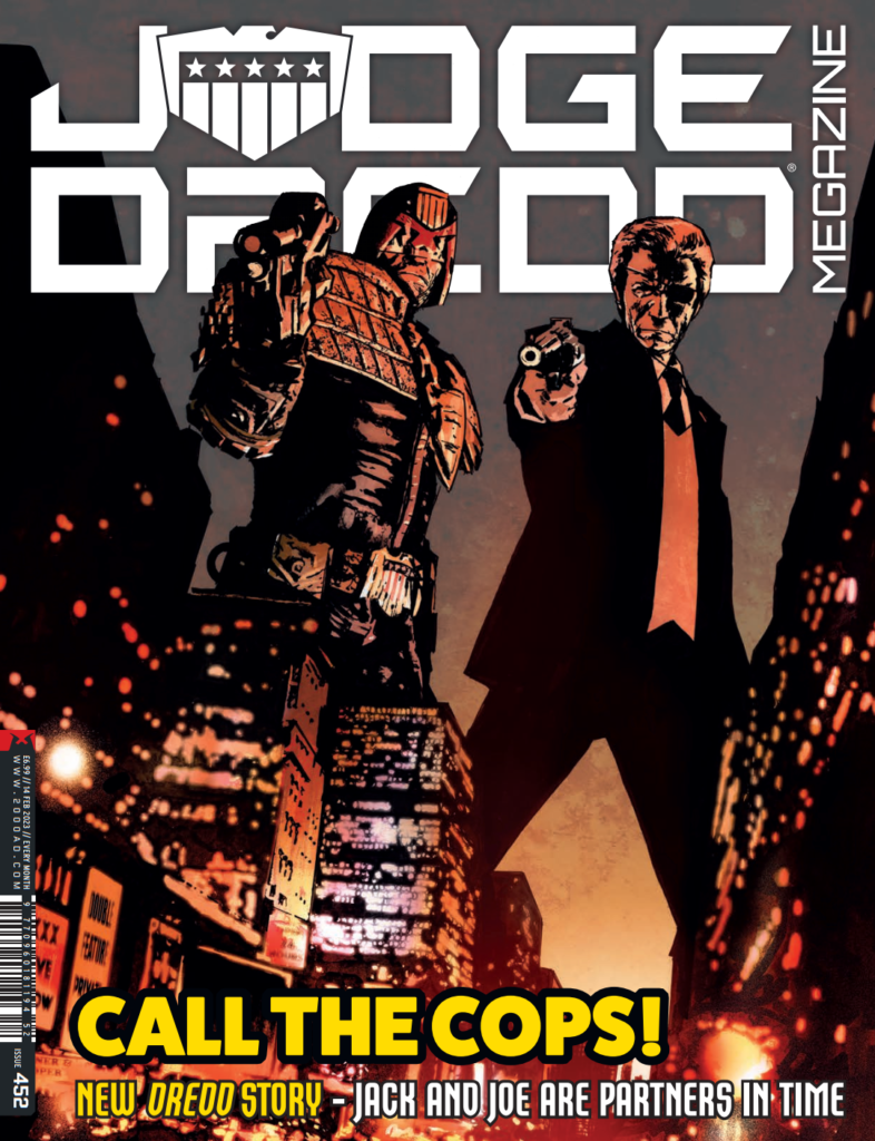
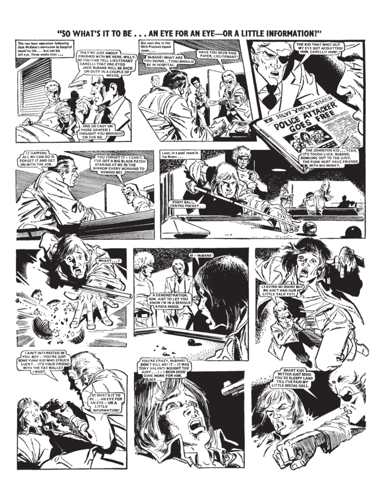
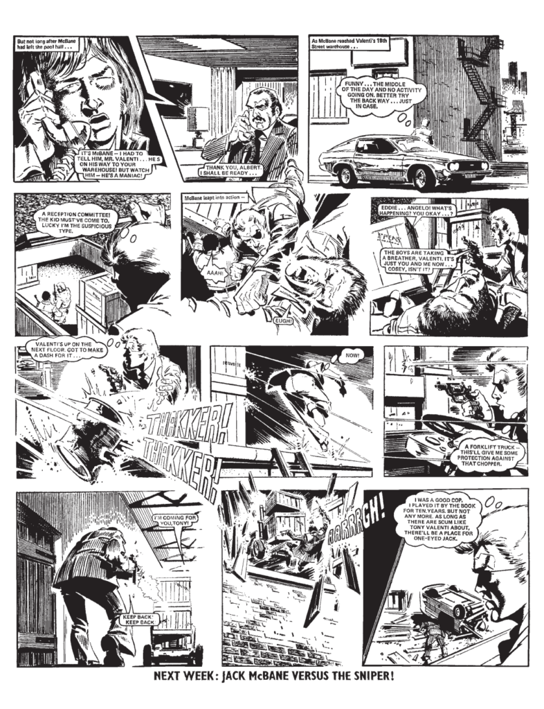
This first Megazine of 2023 is also the first regular sized squarebound format for the Meg after last months super-sized festive blowout, meaning you get all the usual five thrill-packed Megazine strips (Storm Warning, Dark Judges, Devlin Waugh, and Surfer, in addition to the One-Eyed Jacks Judge Dredd tale) plus reprints of Judge Dredd: Year One and Mega-City Two, alongside a Treasury Classic, reprinting an extract from the 1975 debut of One-Eyed Jack from Valiant, as written by John Wagner and drawn by John Cooper.
But back to Covers Uncovered and the return of Laurence Campbell to the cover of the new Megazine… and he’s here to tell us all about it right now…
LAURENCE CAMPBELL: If I remember correctly Matt got in touch asking if I was free to draw a cover for Judge Dredd Megazine. I replied yes as I love working for 2000 AD when I can.
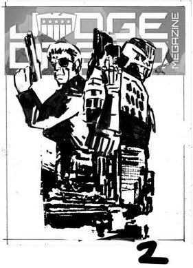
He then sent over the cover concept of Judge Dredd and One-Eyed Jack together with 1970’s/early 80’s New York in the background.
How could I not resist this? My 11 year old self would have gone nuts for this. I remember One-Eyed Jack from the odd issue of Valiant I picked up or from reprints in 2000 AD Annuals or it might have been Summer Specials, Either way I knew the character.
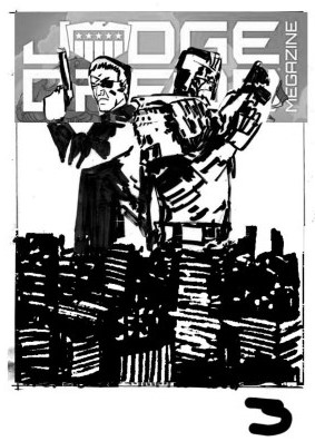
My starting point was very rough sketches in a sketchbook, this is something I’ve always done since art college. Anything and everything gets put down as it’s brain storming at this point. Matt’s original suggestion was Jack and Joe standing back to back with old New York skyline in the background.
Once initial very loose marks are put down in the sketchbook I then draw up ideas, these are thumbnails and normally drawn four to an A4 page, sometimes one to an A4 page. The idea here is for the ideas to take some sort of form.
These would also have been sent to Matt when ready. Shapes, points of focus and clarity are what I’m looking for here, it’s a good point to solve problems you might have.
I’ve put my thumbnails in order of the development of my idea. Matt’s initial idea was the starting point. This to me was your Hollywood film poster, buddy cop/romcom look – that’s in examples 1-4 of my thumbnails...
This would have worked fine with me but I felt there was something more which could be done.
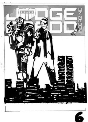
I was worried that your eyes were attracted direct to the centre of the image and that was it – I felt there was something more dynamic to be done… which brings me to 5 and 6…
The upward looking shot of 5 and putting the city in the foreground had something interesting for me. At this point I then moved away from the back to back and played with other ideas. I liked the connection to two full figures standing within the city and the connection with the twin towers. The twin towers obviously sadly dating the city.
Ideas 5- 6 then got me to my final idea of number 9. I like the shape of the buildings in number 9 and how it pulls in into the picture and to the bottom right of the cover. Ready to get the viewer to turn the page.
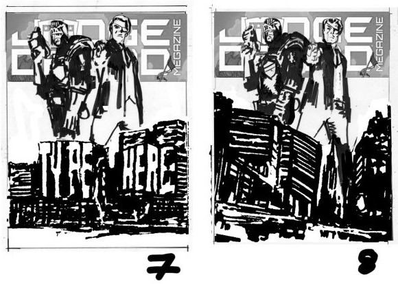
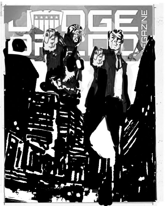
I then sent all the thumbnails off to Matt with my suggestion of number 9 working for me. Matt agreed which was cool.
The next step is to enlarge the thumbnail in Photoshop, get references ready, and then start inking…

Inked on A3 paper with a selection of brush pens, fine line pens, markers, inks and correction fluid.
Once happy I then scan, clean up and add Photoshop touches here and there. The image is then sent to Matt.
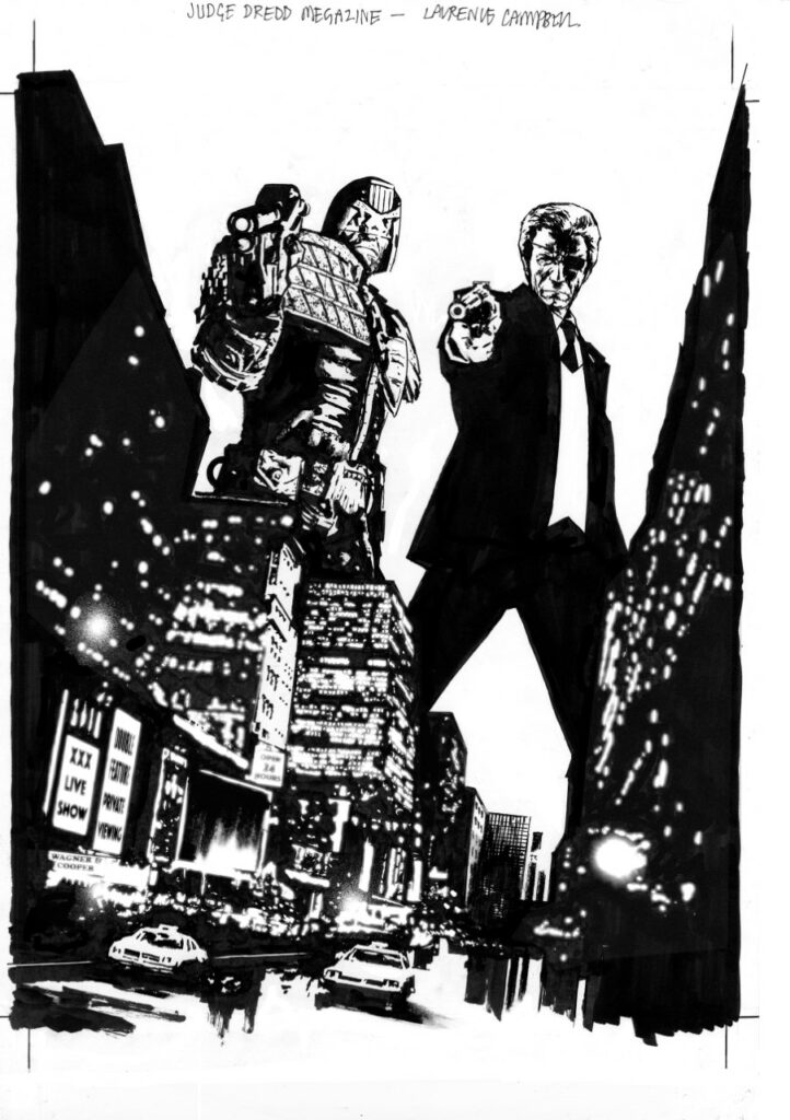
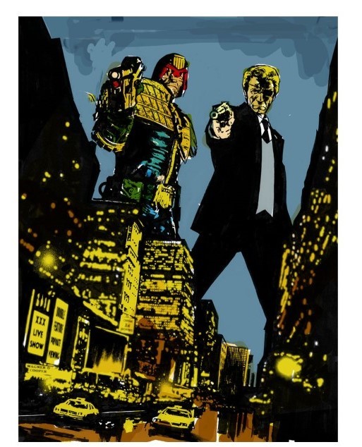
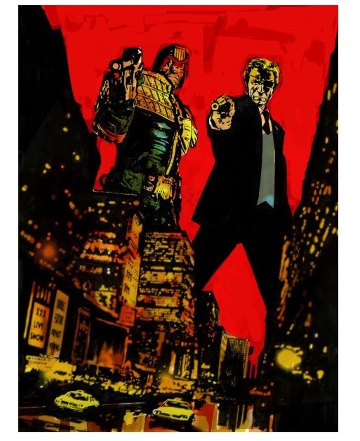
Matt told me Quinton Winter was colouring the cover, so I worked up some very quick colours ideas just to give Quinton an idea of what I was thinking.
I’d worked with Quinton on Sword of Hyperborea, a Hellboy and BPRD spin off book along with writer Rob Williams a 2000 AD regular who I’ve worked with a number of times.
I’m very happy with what Quinton has done with the colours on the final cover.
The whole process was fun and enjoyable, would be cool to draw more Dredd in the future some point.

So there you go, thanks so much for Laurence for sending that one along – and we can ALL agree that it would be more than cool to see Laurence’s artwork on Dredd in the future!
You can find the Dredd/One‑Eyed Jack cover, and the start of the series, on Judge Dredd Megazine issue 452, out wherever you get hold of your Thrill Power from 18 January, including the 2000 AD web shop!
And just as a little bonus, here’s the first few pages of the One-Eyed Jack strip that’s reprinted in this issue of the Megazine – you can get hold of the full reprint from the 2000 AD web shop!
