“Nu Earth is like the inside of a lava lamp” – Si Coleby and Len O’Grady talk colour on Jaegir
21st April 2018
As she moves from the relative safety from behind her own lines to the sickly, contaminated world of Nu Earth, Nortland war crimes investigator Atalia Jaegir faces a new and dangerous challenge in her current story, In The Realm Of Pyrrhus…
But it’s much less of a challenge for the creative team behind the art – artist Simon Coleby and colourist Len O’Grady. With experience of working together previously, the pair have collaborated to conjure up something special for readers with their vision of an environment saturated with pathogens and ablaze with gunfire!
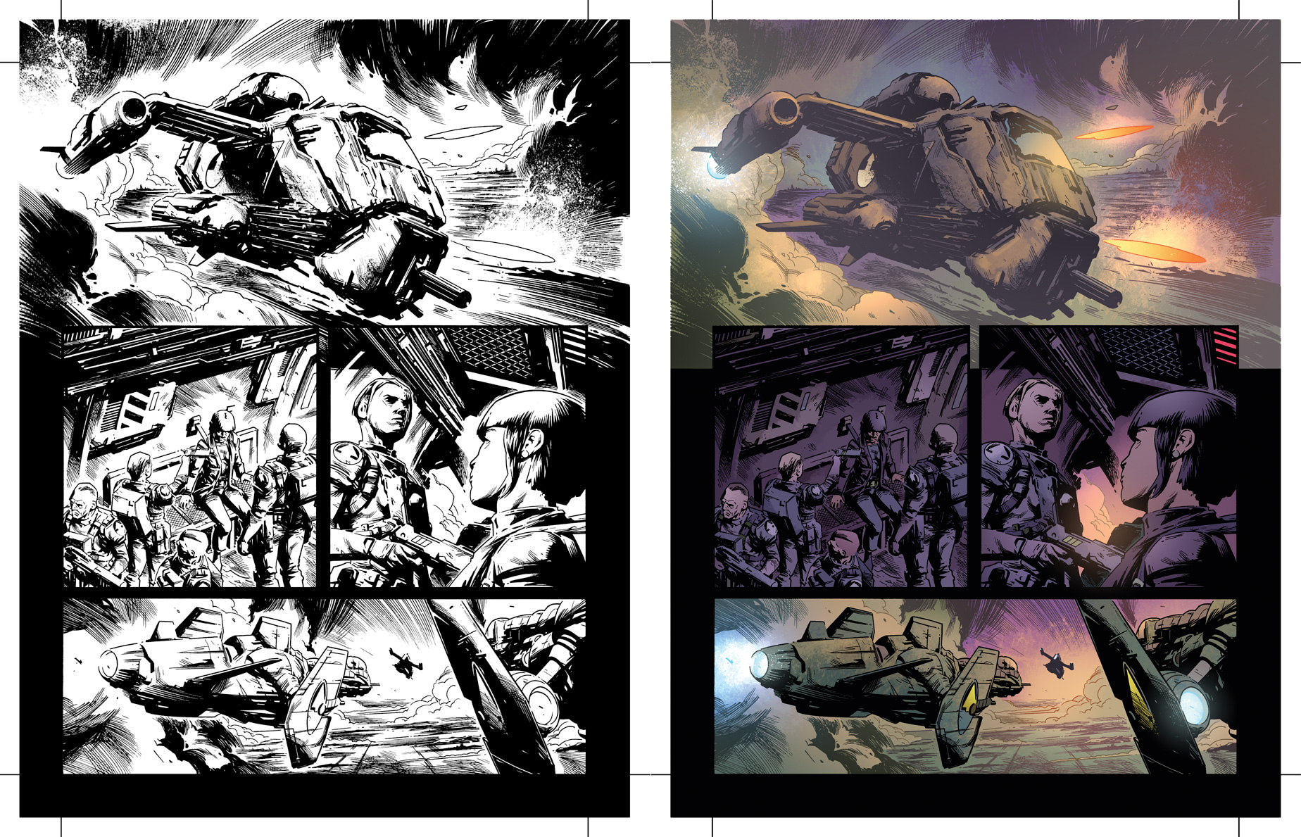
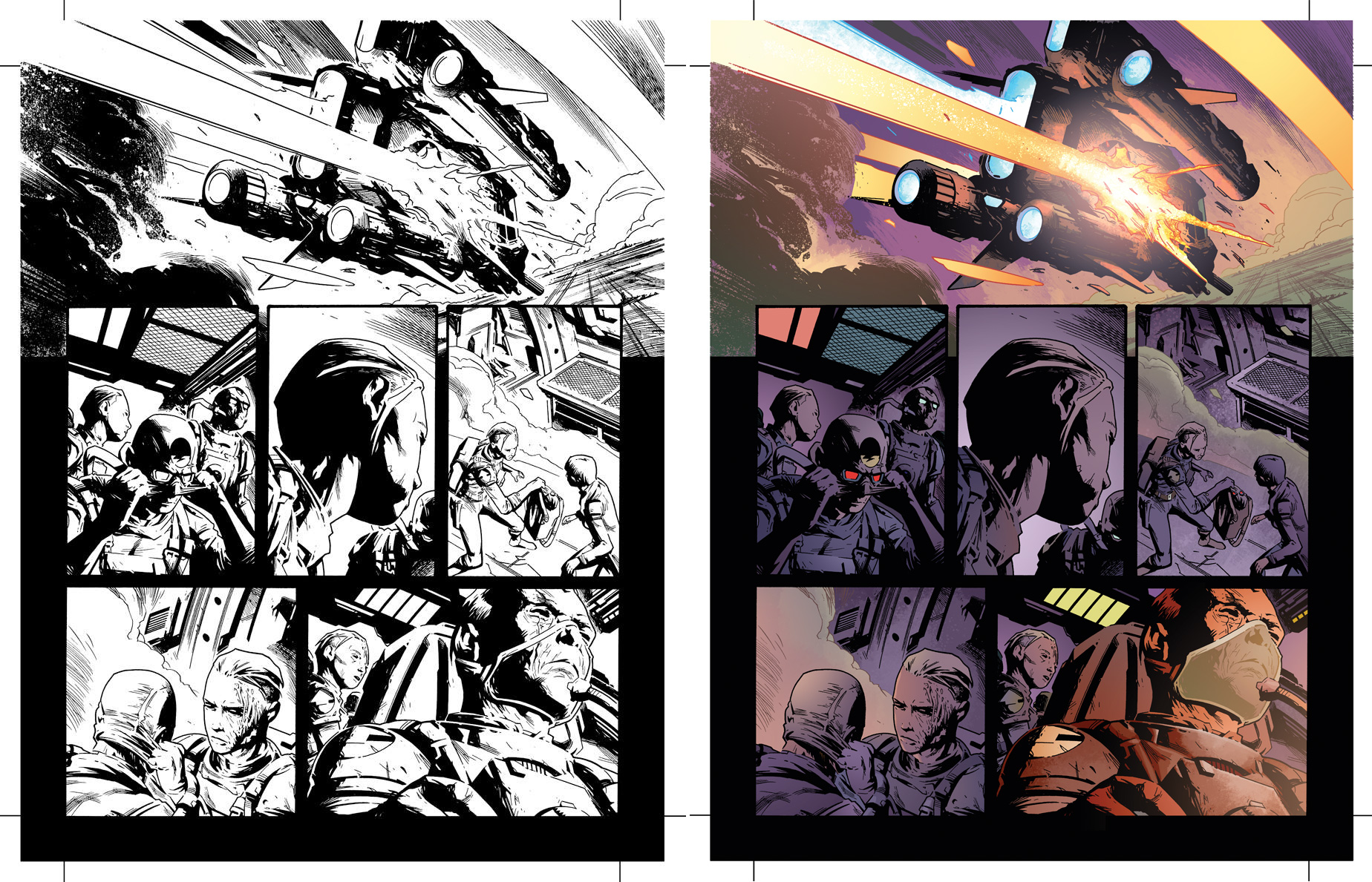
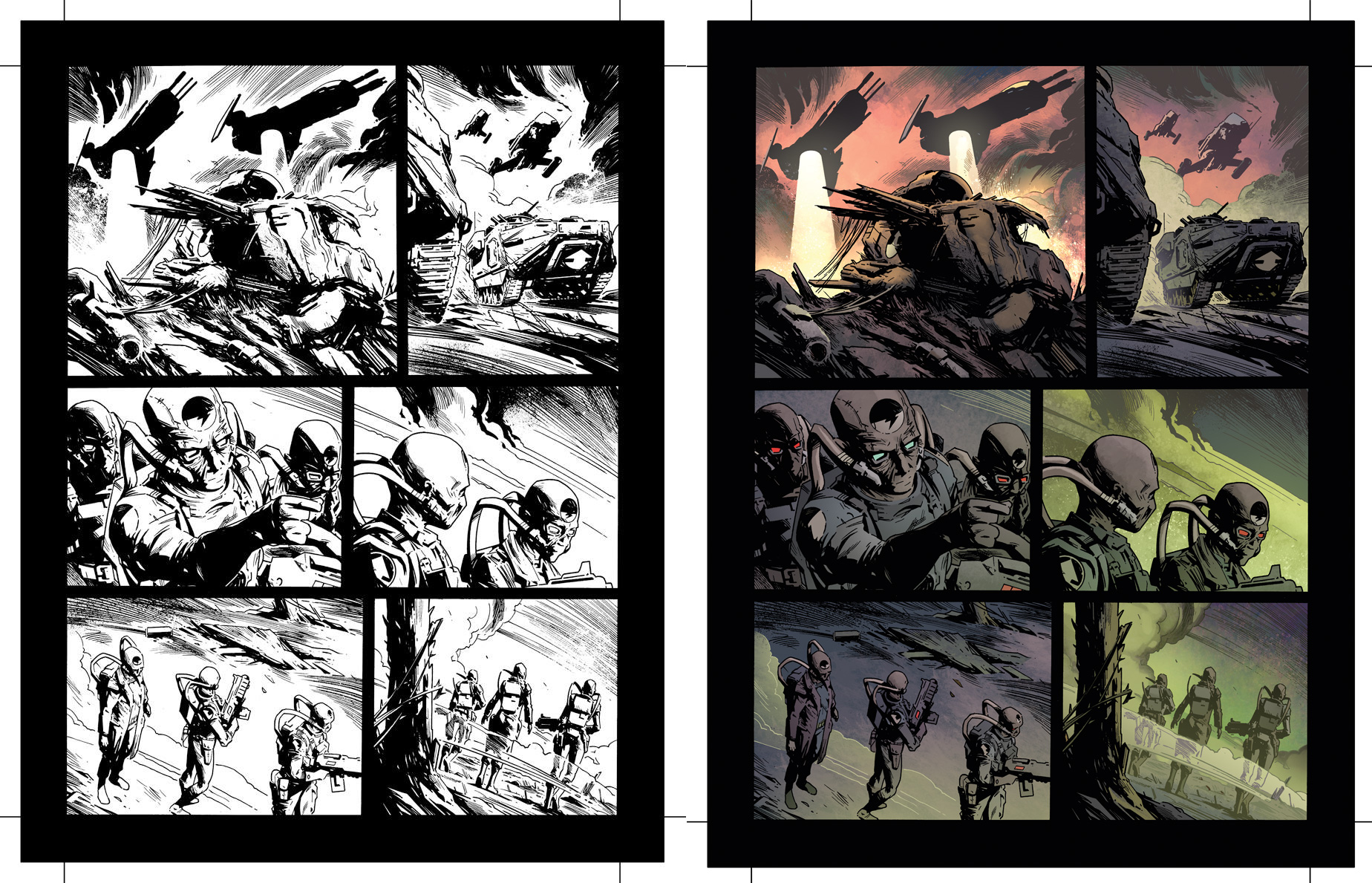
Simon and Len talked to the 2000 AD blog about the colour work on the latest episode of Jaegir: In The Realm Of Pyrrhus for Prog 2077 as we place their work publicly side-by-side for the first time…

Would you both describe your working relationship on Jaegir, as there’s been a few series now. How closely do you work? How has that relationship changed over time?
Simon: From the outset with Jaegir, I was delighted to be working with Len, and felt confident that we could produce a strong and interesting body of work between us. Len and I had collaborated previously, notably on the IDW series Judge Dredd – Year One, written by Matt Smith. Having produced that series, I knew that Len would combine a muted palette where appropriate, with bolder colours to emphasise story points where it would serve the plot. I think that IDW project was something of a foundation for how our working partnership has developed with Jaegir.
Len: We’ve always gotten on like a house on fire; screaming, smoke and flames everywhere. Or working relationship has actually really been one of the smoothest I’ve had in twenty-odd years of comics. We just seem to have a good simpatico.

Len, could you describe your choice of palette for this episode and how you decided on the palette for the whole series? Are you looking to create a thread or theme throughout, or is it an episode-by-episode basis?
Len: I’ve gone on about this in other venues, but I feel that, on the whole, the original Rogue Trooper has never had a particularly memorable palette; It’s a toxic, hellish soup of layered toxins, roiling about. When I was a kid, I came across a National Geographic where they did a feature on the most toxic of waste and how it was “disposed of”. What stayed with me was just how lurid the stuff looked. Added to that the grime and corrosive filth that adheres to everything, I wanted the combatants to have little to tell them apart, apart from the configurations of their suits, almost as if they are just another pollutant scudding across the surface of Nu-Earth. Considering just how deadly it is to every character (apart from Rogue), it seemed silly to not push out the boat and make the environment a star; that’s why I’m always finding tweaks for the locations and time to make it feel like more then just a poison planet, it still has environments and climate, albeit that of the inside of a lava lamp.
Simon: I know that Len is extremely adept at adding depth to panels, which had combined very well with the aspects of the Jaegir I’ve enjoyed very much — we’re creating a world for our characters, and I’ve particularly had fun drawing their environments. In a story such as ‘Brothers in Arms’, for example, we got to show a variety of locations, which I enjoyed illustrating enormously. I have huge confidence in Len’s ability to choose colours which describe everything from the vast countryside of the Jaegir estate to the claustrophobic confines of the bunkers and seedy streets in which Atalia so often finds herself. Another example would be our recent cover for Prog 2075. I was happy to leave room for Len to add those brutal, psychedelic colours to the chem clouds in the background — once again; emphasising the scale and the environment, and really making the piece striking. Len and I do chat quite often, but rarely about anything very specific to whichever story we’re working on. I can only think of a handful of times where I’ve suggested particular colours, and that’s usually been for something technical, rather than anything aesthetic. I trust Len’s professional judgement, and I’m always excited to see how much he’s added to my linework.

The chiaroscuro contrast in this top panel where the figures are descending from the blazing hoppa is really striking…
Simon: I could see a couple of ways to approach it — a down-shot was one option, but I felt that might be a little bit weak. Instead, I went for a shot looking up at our characters. I felt they’d been established clearly enough in the preceding pages, that the storytelling wouldn’t be confused by a striking chiaroscuro approach, and so I had an image in-mind along the lines of Eduardo Risso or Mike Mignola. Again, I was confident that leaving some space for Len to add his creativity to the sky textures could only serve the panel well.
Len, with a page like that, where Si has used figures that are virtually silhouettes, what’s your creative process in colouring it? I noted you went for a very bold background and further contrast with the hoppa.
Len: That aesthetic predates Jaegir, truth be told, I think it settled into something during Judge Dredd: Year One; in many ways Simon is the anti-Mignola — lots of strong blacking, but eager to turn those blocks or planes into something with more depth. It’s alway a lot of fun, like a half finished jigsaw with the borders finished. The color choices there were informed by the story, really- just expounding on what went before. I don’t think we ever colored a twilight on Nu-Earth before, and I wanted a transition into an inky, dirty night punctuated by battle glares and chemical phosphorescence.

It’s interesting how you play with the contrast/tone of Si’s inks, particularly in the first panel of page one, and on the backgrounds of page two – is this something you do only for Jaegir? Does it take trust between an artist and a colourist for the latter to know where and when to use effects like this?
Len: As someone who has been known to draw the occasional comic myself, I totally appreciate the anxiety of an artist handing their art off and hoping for the best. As a result, I’ll usually try to take the time to ask the artist what they had in mind- you’d be surprised how many don’t consider it at all, and moreso how few artists get that consideration. I find a little goodwill goes a long way. The real pros like Simon and a few others I won’t namedrop here know what you’re about and trust that your experience will help push the story along, which is why we all showed up anyway.
Jaegir: In The Realm of Pyrrhus is currently running in 2000 AD…
