2000 AD Covers Uncovered: 17th & Oak Take Mega-City One to Dizzying New Heights in Regened Prog 2356
1st November 2023
Every week, 2000 AD brings you the galaxy’s greatest artwork and 2000 AD Covers Uncovered takes you behind-the-scenes with the headline artists responsible for our top cover art – join bloggers Richard Bruton and Pete Wells as they uncover the greatest covers from 2000 AD!
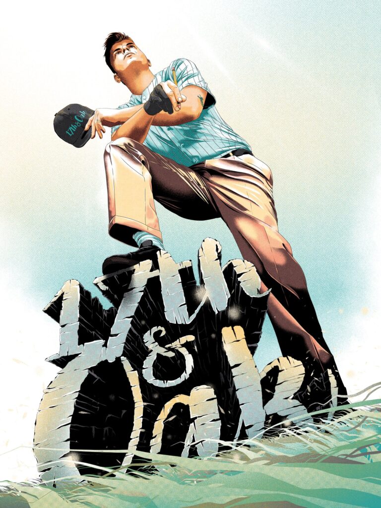
This week, a debutante art droid in 2000 AD Towers – 17th & Oak for the spectacular cover of 2000 AD Regened Prog 2356 – it’s all about Dredd and the Mega-City…
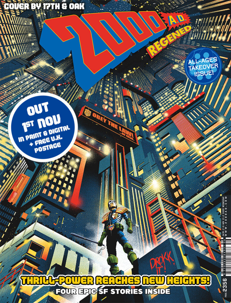
Now that’s a majorly good Dredd & the City cover right there – a zarjaz debut indeed!
So, over to 17th & Oak for the story of who they are and how this great cover came together…
17th & Oak: I’m a Freelance Illustrator based in the south of the UK. My main avenue of work is partnering with movie studios to illustrate alternative versions of film posters used in the marketing campaigns of upcoming releases.
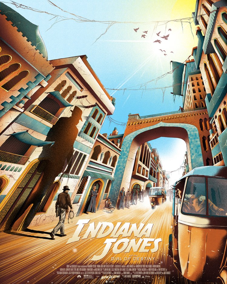
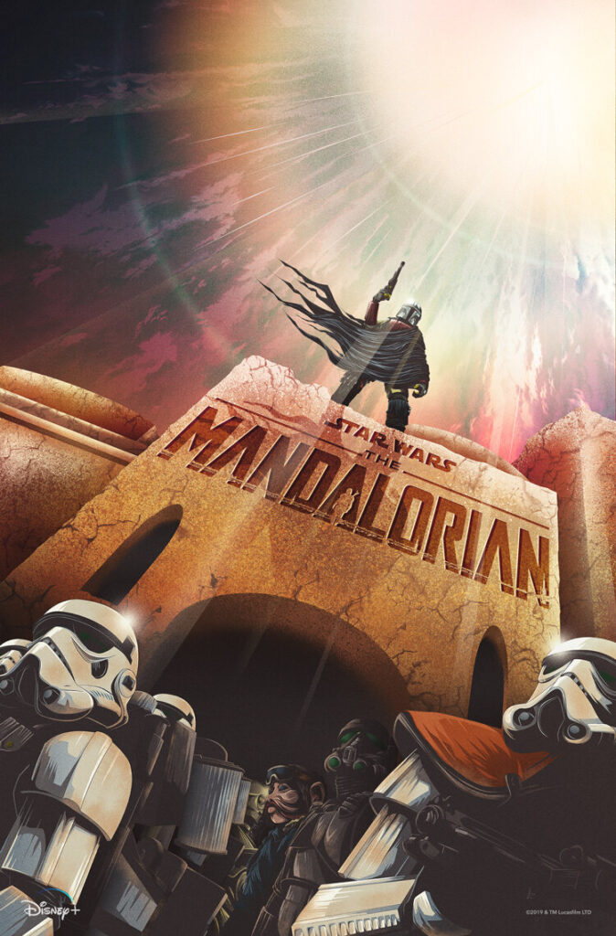
Titles I’ve worked on include Indiana Jones and the Dial of Destiny, Renfield, Bullet Train, and The Mandalorian to name a select few. I’ve also created art for book covers, blu-ray covers, steelbooks, merchandise, editorial, and even trading cards.
But this is my first professional venture into comic covers and wow… what a start, 2000 AD!
2000 AD has been a solid part of my life since my childhood in the late ‘80s/early ‘90s. It was my uncle who got me into comics. He loved the British comic scene and was an avid collector of 2000 AD.
I remember him having boxes full of Progs in the cupboard under the stairs. After telling me one day about 2000 AD he said that I could borrow his collection. As you can imagine my excitement was like a kid in a sweet/toy/comic shop at Christmas with an endless amount of cash! The only thing was that I could only take one box at a time. For the next year or so I was always seen carrying around a big brown box of 2000 AD Progs. It was a funny sight seeing a small kid lugging round a big box of comics like it was my pet. Whenever I was in the car I’d be sat in the passenger seat with my current 2000 AD box in the footwell and my head buried in the comic.
It was the comic equivalent of binge-watching. Once I’d finished an issue, I’d put it to the side and grab the next one of the top and once I’d finished a box it was back to the source for a fresh new pile of escapism.
As you can tell, 2000 AD holds such fond memories for me so getting to work on a cover is a dream come true and an absolute honour.
The piece I’ve created has been received so well and I’ve been made to feel very welcome in the comic world by the fans. So let me talk about it and my process.
Firstly, there’s two things that most of my art pieces share – perspective and a restricted colour palette. Extreme perspectives are what I’m known for and this piece is no different.
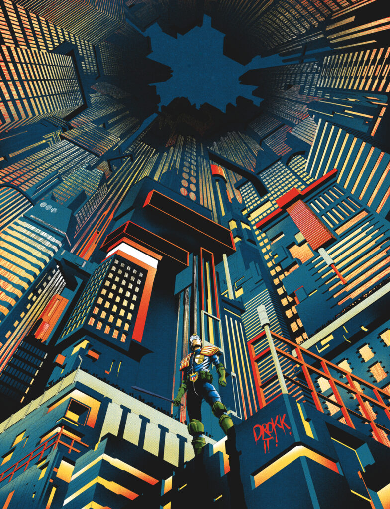
I was asked to draw Cadet Dread standing in front of Mega City One. Simple right?
A main goal of all of my work is to tell a story by capturing a moment in time. With this cover, I wanted to give the sense that Cadet Dredd had just accomplished something, an arrest of a perp for example off camera and he’s standing in a way that is warning everyone else not to mess with him.
To fully communicate this I knew the POV had to be from below which automatically makes Dredd look strong, mean and proud. This would also show the dizzying heights of Mega-City One.
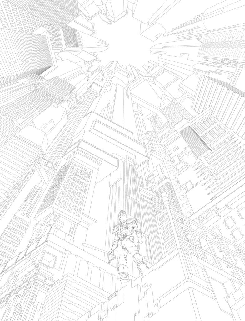
Usually, I tend to have the perspective leading into the corners so the whole piece would have been at an angle but for this one, I decided to keep it straight. Mainly because I liked the idea of the city leading up to the title which would be placed right over the vanishing point creating a dynamic connection between the title and Dredd which your eye naturally follows. Because the brief was simple I wanted to keep the composition and the story simple.
Once the perspective grid has been established, I’m ready to get started. I haven’t drawn Dredd since I was a teenager which was so long ago that I feel like I’ve never drawn him so this was an exciting challenge.
After loads of research to understand how the armour sits on his body, I whipped up a quick sketch. It took a bit of trial and error but I eventually got it to the point that I was happy with his pose and angle…
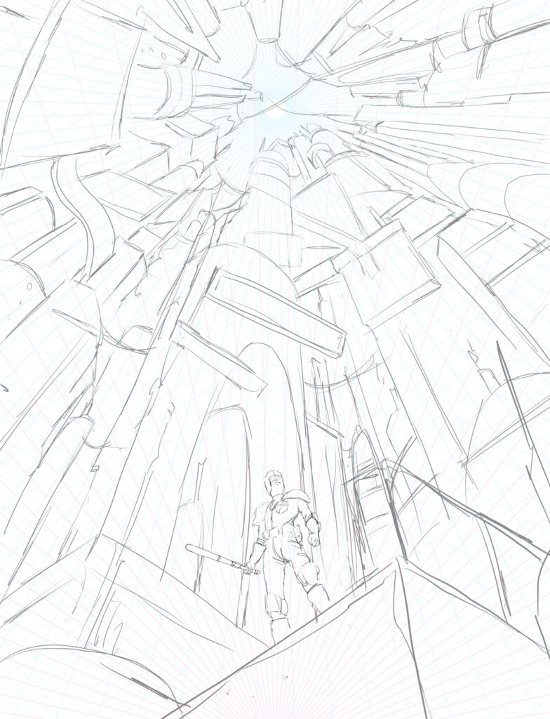
It was then time to move on to the city. Originally I was going to do him holding his gun but decided to have him holding his baton. For some reason, I find the baton way more intimidating than the gun.
Usually for cities, I use reference material but, for this one, I decided not to and drew it straight out of my head making it up as I went along. A strangely therapeutic approach to cities as I can just draw anything that spills out of my head and I’m not bound to a certain look. Having fantasy/sci-fi as subject matter allows me to do this as it doesn’t need to be based on anything in the real world. I find I tend to create unique-looking cities when I do it this way.
For an idea of what I was going for, I was keeping films like Blade Runner and Akira in my head but I wanted a certain style of brightness to it, a little like Vegas, which gives off the feeling that it’s not a dangerous city at all – but of course, we know different.
I’ve been told that my sketches have a tendency to be a little too advanced (well, for my corner of the Illustration industry, maybe not for comics) but I need to take it to a level that I’m happy with so I believe I’ve communicated exactly what I’m going for. Also, I need to know that what I’ve sketched out can be accomplished.
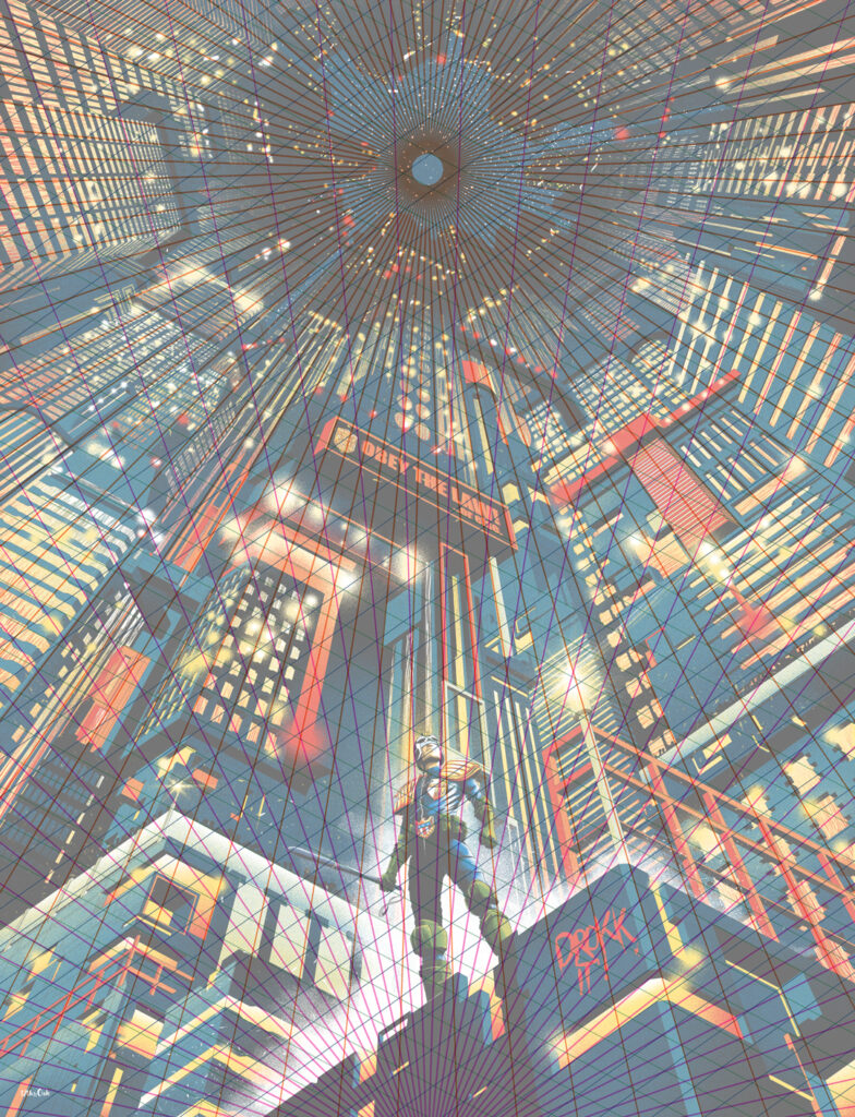
Using perspective in such an extreme way can be quite tricky. If one vanishing point is wrong it can throw off the whole piece and potentially make the look of the piece completely different so I need to know for certain that that won’t happen.
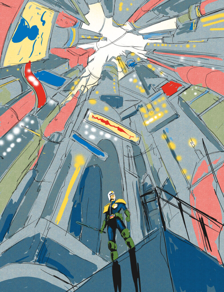
Colour plays a big part as well in communicating the feel of what I created that’s why I always add basic colour to my sketches from the start.
My sketch got approved instantly! Whoop!
Sometimes I’ll have clients asking to change, add, or remove certain parts but not on this occasion.
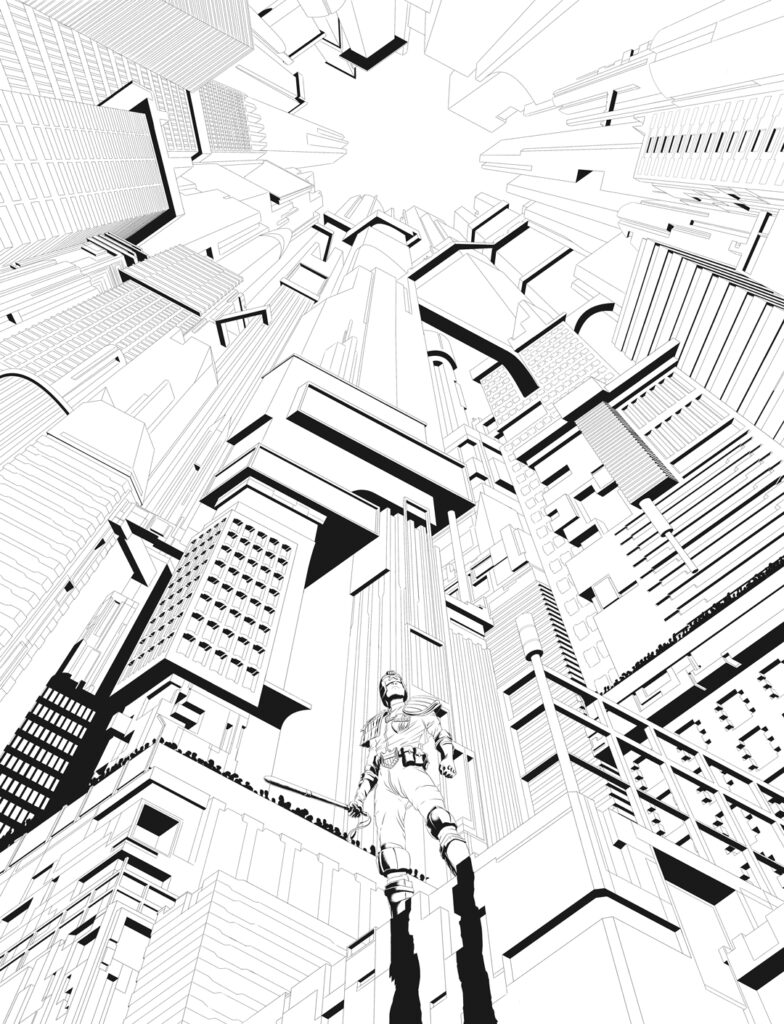
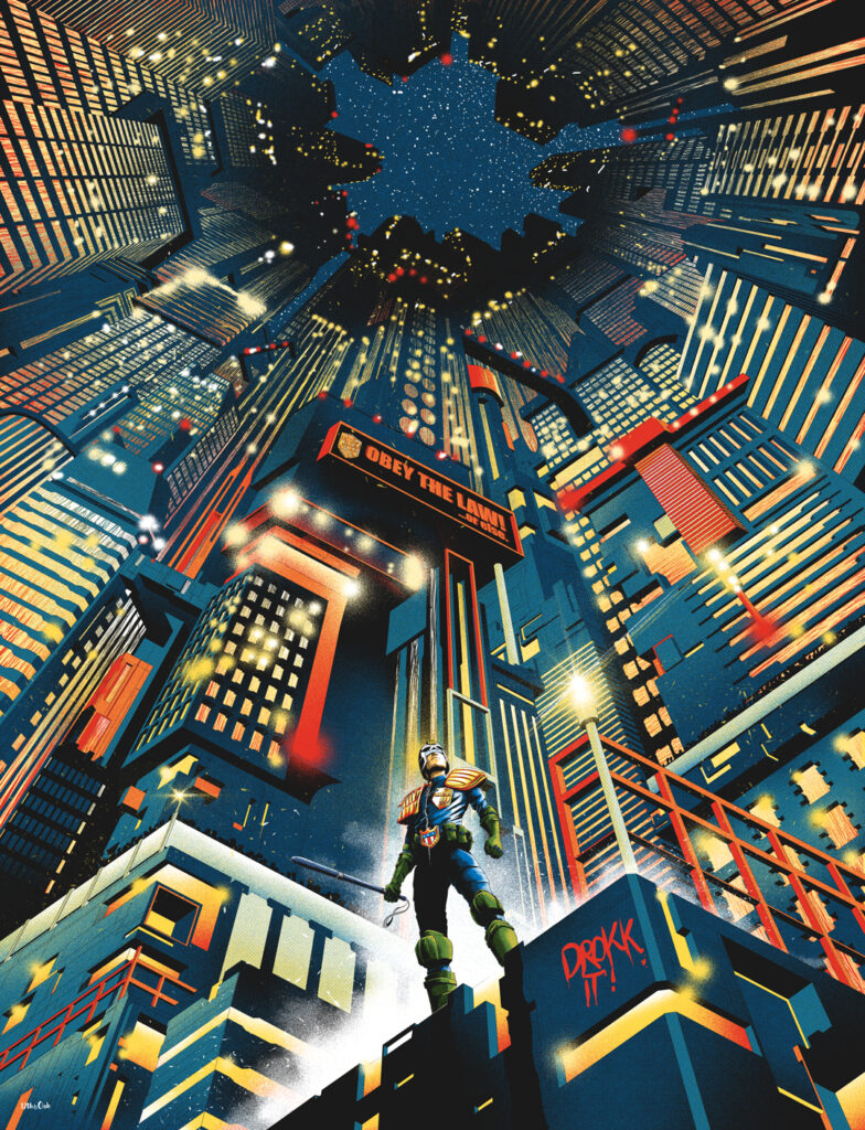
Now this is where the hard graft begins. How I create my art has always been very much rooted in comics; pencils, inks, colours. Even though I mainly work digitally, I still take the comic book approach. I’ll take my sketch and draw a tighter more detailed one. Once I’m happy with that I’ll start inking and adding in even more detail. I love giving people lots to look at so I’ll add in as much as humanly possible to each piece I do.
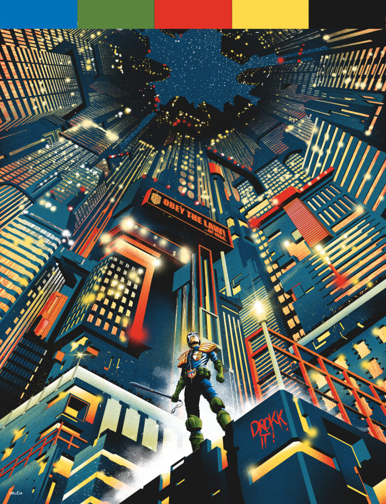
As I mentioned before, I use a restricted colour palette. I find that the small amount of colours really brings the piece together and gives it a comforting sense of unity. I know that it looks like I’ve used a whole bunch of colours but I actually only used five.
I take a screen printing approach to colouring using block colours and a clever use of halftone patterns to create highlight, shade, and in some cases completely new colours. Layering certain colours on top of each other with halftones tricks the eye into seeing different colours. I’m a huge fan of traditional printmaking methods so I incorporate this into my work as often as possible. Often I scour the Internet in search of colour palette ideas but what’s great about this piece is that the colour palette was already decided for me because of Dredd’s outfit – Green, Blue, Red, Yellow, and Black for the inks makes my colour palette.

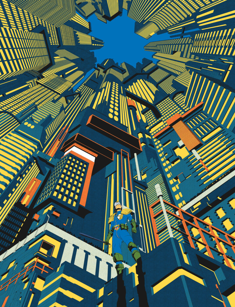
Once the inks are done and the colour palette established it’s a case of seeing which colours work best where and then building it up into the finished piece.
The last thing I do is add a few little details like the glimmering and glare of the lights, steam/smoke, graffiti etc...
As you can tell, I’ve developed quite a few rules for myself when it comes to my art. Perspective, colours and even the process (pencils then inks then colours). I believe this is because of my background in Graphic Design which is an artform with boundaries and I’ve taken the same self-restricted approach with my illustration, it just doesn’t look like it.
Working with 2000 AD marks the start of my comic book cover journey so keep an out for the perspective-led, detailed, and colourful artwork of 17th & Oak!
Oh yes – if this is how good his debut cover is, we reckon there’s definitely going to be more Prog covers from 17th & Oak in the future!
Now, a couple of extras from 17th & Oak, just to give us more glimpses behind the magic – the finished cover with the original perspective grid that started it all off and a reminder of just how that simple five-colour palette makes the entire cover work…
And that’s how the cover all came together – a really impressive debut! Thanks to the mysterious new art droid only known as 17th & Oak for sending all the details along. (Well, mysterious until you head to the ‘About Me’ section of his website anyway!)
You can find this latest incredible cover for 2000 AD Regened Prog 2356 wherever you pick up your weekly dose of the Galaxy’s Greatest, including the 2000 AD web shop.
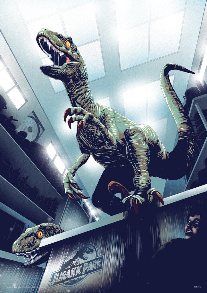
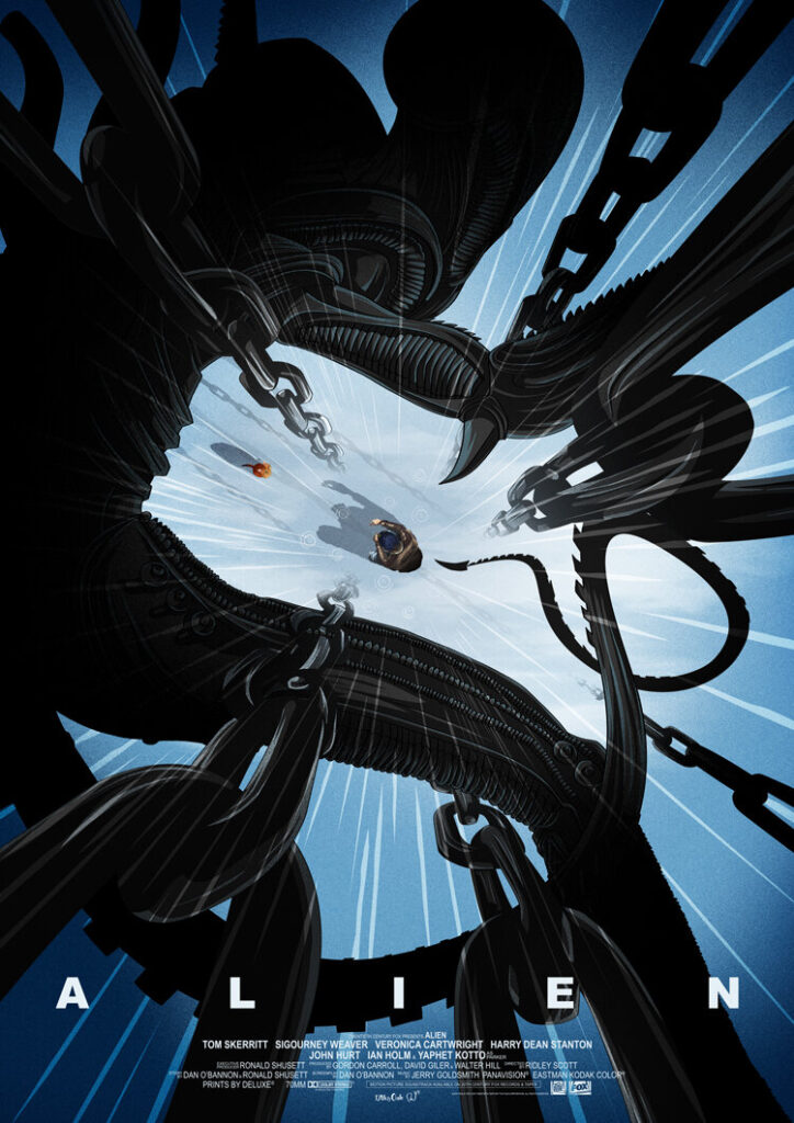
For more from 17th & Oak, head to www.17thandoak.com. And to give you a little idea of his previous work, here’s just a few from his web gallery. He really does like a good bit of perspective!