2000 AD Covers Uncovered: David Millgate – ‘If Looks Could Kill!’
4th February 2022
Every week, 2000 AD brings you the galaxy’s greatest artwork and 2000 AD Covers Uncovered takes you behind-the-scenes with the headline artists responsible for our top cover art – join bloggers Richard Bruton and Pete Wells as they uncover the greatest covers from 2000 AD!
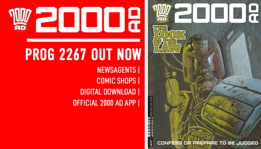
This week, the return of one of the legends of modern 2000 AD, co-creator of Sinister Dexter with Dan Abnett… it’s David Millgate! David’s been working here at the Galaxy’s Greatest since 1995 and he’s back for a classic Judge Dredd here on the cover of Prog 2267… which looks rather like this…
.
DAVID MILLGATE: The first thing to mention is that I did this artwork in late December 2020, so it’s been over a year since I last looked at it. Sometimes I’ll look back at a particular drawing or painting and I don’t remember much about doing it, or what was going through my head at the time. However, luckily this is one piece for which I have total recall!
I wasn’t officially commissioned to do a Dredd cover, but sometimes I’ll set myself a ‘phoney’ brief by inventing a tagline for a potential cover. I like to come up with an initial concept or some vague semblance of a beat that could be from a story. To be honest, anything’s better than looking at a blank sheet of paper, which is often the instant death of any inspiration for me. It just helps get all those creative juices flowing! I’ve done this a few times in the past and the art has ended up on the cover of 2000 AD and luckily that was the case with this one too.
My tagline for this one was ‘If Looks Could Kill’, but in hindsight that was maybe too murderous, even for Dredd. As a character, he’s always hard-as-nails, but he’s still basically a guy who’s upholding The Law. I think the one that the editor Matt Smith came up with, ‘The Look of The Law’, works much better.
.
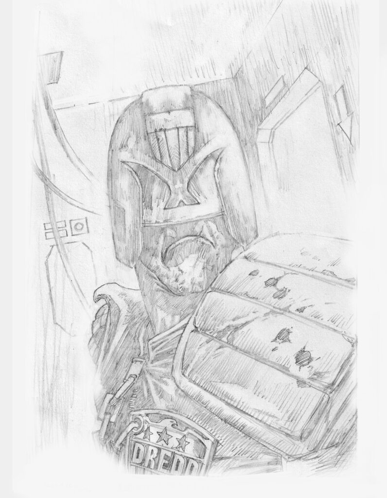
I’ve always thought that Dredd is such a strong visual character, even when he’s not necessarily in an action pose. Some of the most iconic images of him through the many decades have been when he’s been sitting or just standing there with that chin protruding out from beneath his helmet-visor. I wanted the viewer to feel like a perp would when Dredd turns to stare down at them. They know the chase is over…the game’s up…and they’ll be doing a long stretch in an Iso-Cube!
With my potential Dredd cover approach firmly in my mind, this makes doing the actual artwork that much easier, as the image is already 70% rendered in my head, before I’ve even picked up a pencil.
.
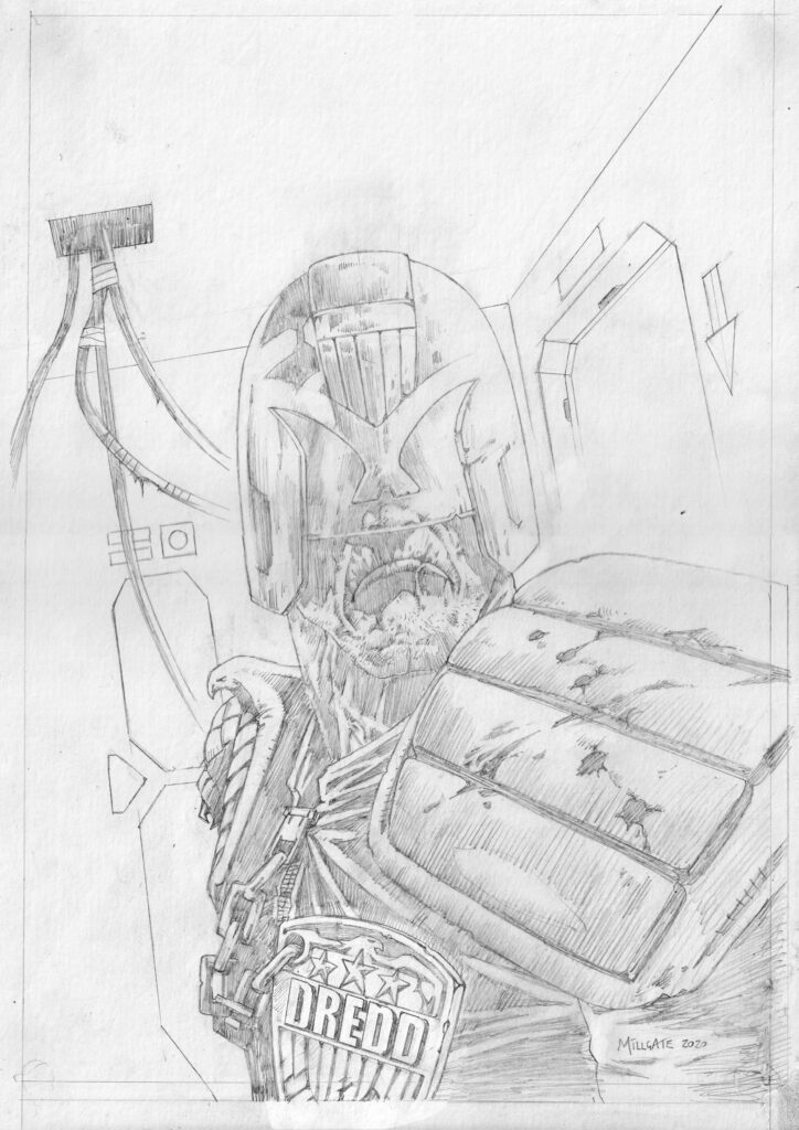
As a result I didn’t bother with thumbnails, but started by doing a quick rough sketch that was pretty much 80% there already and getting near to the image in my mind. However, I wasn’t all that happy with Dredd’s face or the visor section of his helmet. In the past I’ve gotten away with not even drawing his nose. If you’re careful this can sometimes work great with Dredd, but you have to be very careful, as it usually only works from certain angles (*budding artists please take note as the margins between this technique working and looking totally wrong are very small).
The fact that we never get to see or have to worry about what his face looks like is such a cool and mysterious aspect to Dredd’s persona and character (Err…Sly Stallone removing his helmet anybody???)
.
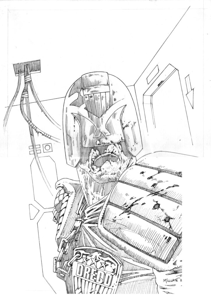
Anyway, I didn’t think completely leaving out his nose was really working here, as it made him look badly drawn at best or at worst oddly deformed. I decided that for this idea to really work I was going to need the visor to look see-through. In so doing this would reveal the end of his nose and make the face/stare less comic-booky and hopefully much more believable.
I also changed the angle of the light-flashes on Dredd’s visor too. I don’t know what anyone else thinks, but it always seemed to me that those lightning-bolt type flashes on his visor were just the classic 2000 AD era line artists way of suggesting light reflecting off of his visor, but in a rather simplified and stylised way. It’s a bit harder to render reflections convincingly with just black and white line art.
Over the years they became ubiquitous and even in the fully painted era – when achieving realistic light effects became more do-able – you’d still often see them rendered as simple, zig-zag flashes. Did all of us ‘lazy’ artist’s not really think it through in a logical way? I felt that this piece required the light-flashes to look much more like interior light being cast into the room, which is then reflected back off a shiny, translucent/transparent surface. At the same time, we can also see Dredd’s nose and a hint of his face through the visor. It sounds like such an obvious thing, but once I’d changed those few details it made a really big difference to the impact of the face and the whole feel of his stare, which as a result really made the cover art come alive!
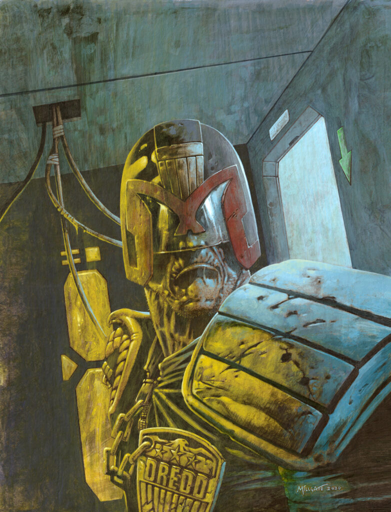
Oh yes, it’s a cover that really comes alive – another classic cover to adorn the stands. Thanks to David for letting us into his creative process!
2000 AD Prog 2267 is out now – get it from anywhere Thrill-Power is sold, including the 2000 AD web shop.
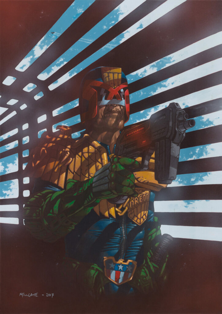
Now, as a little bonus… David’s cover to 2000 AD Prog 2051 (you can read his Covers Uncovered on that one here)…
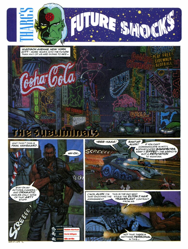
And to end, here’s a little really early David Millgate for you. First, his very first art in 2000 AD, from 1995’s Prog 927 – Future Shocks: The Subliminals.
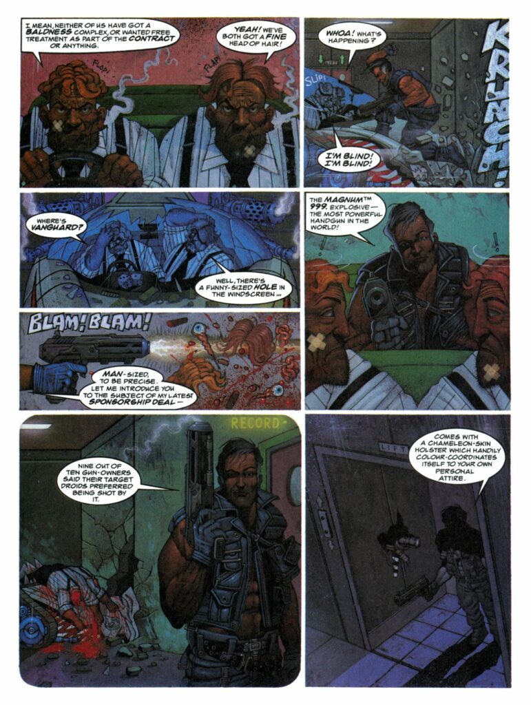
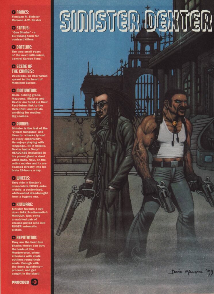
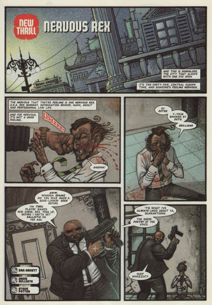
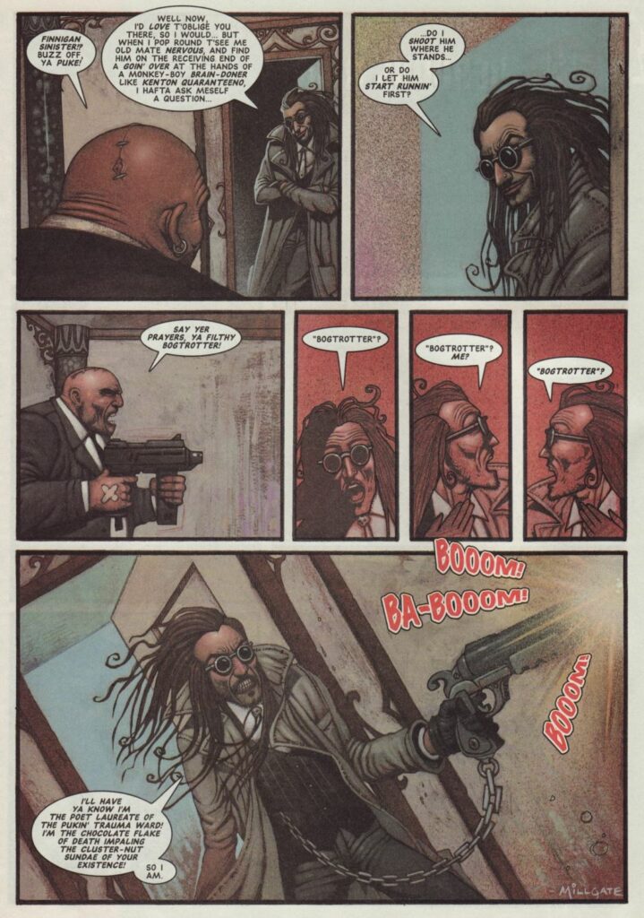
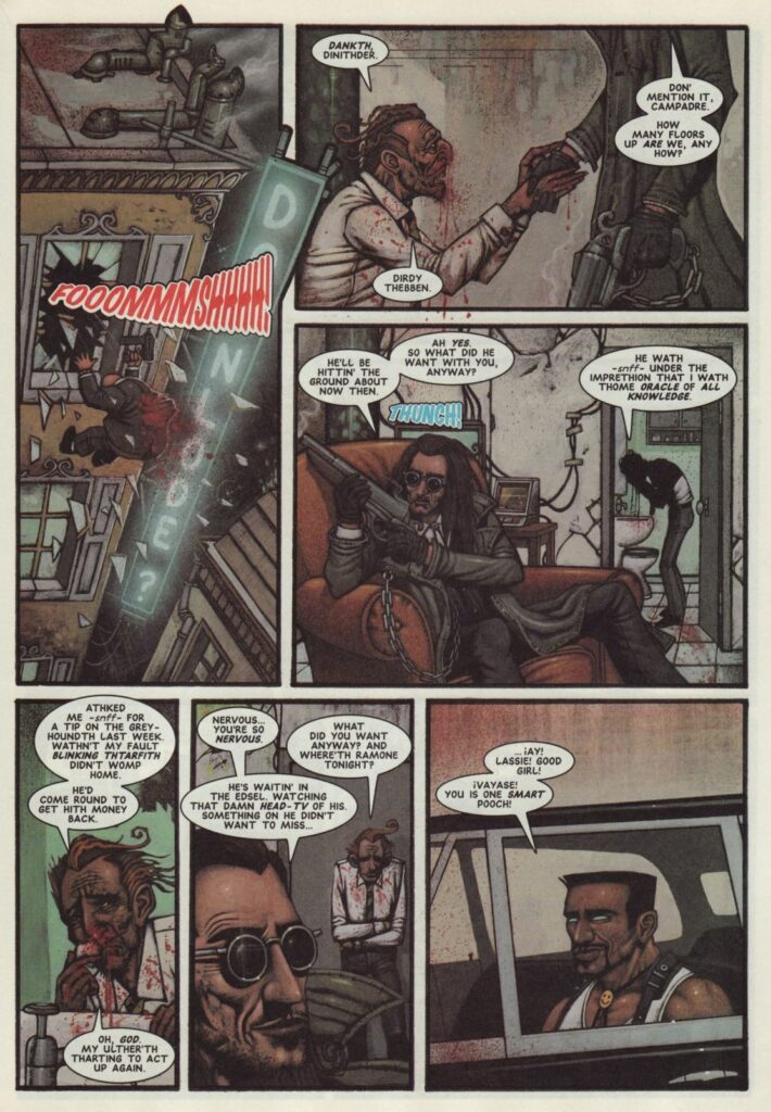
And now, one of those very first Sinister Dexter‘s, co-created by Millgate, from 2000 AD Prog 981.
