2000 AD Covers Uncovered: Jimmy Broxton Talks Skip Tracer
5th March 2020
Every week, 2000 AD brings you the galaxy’s greatest artwork and 2000 AD Covers Uncovered takes you behind-the-scenes with the headline artists responsible for our top cover art – join bloggers Richard Bruton and Pete Wells as they uncover the greatest covers from 2000 AD!
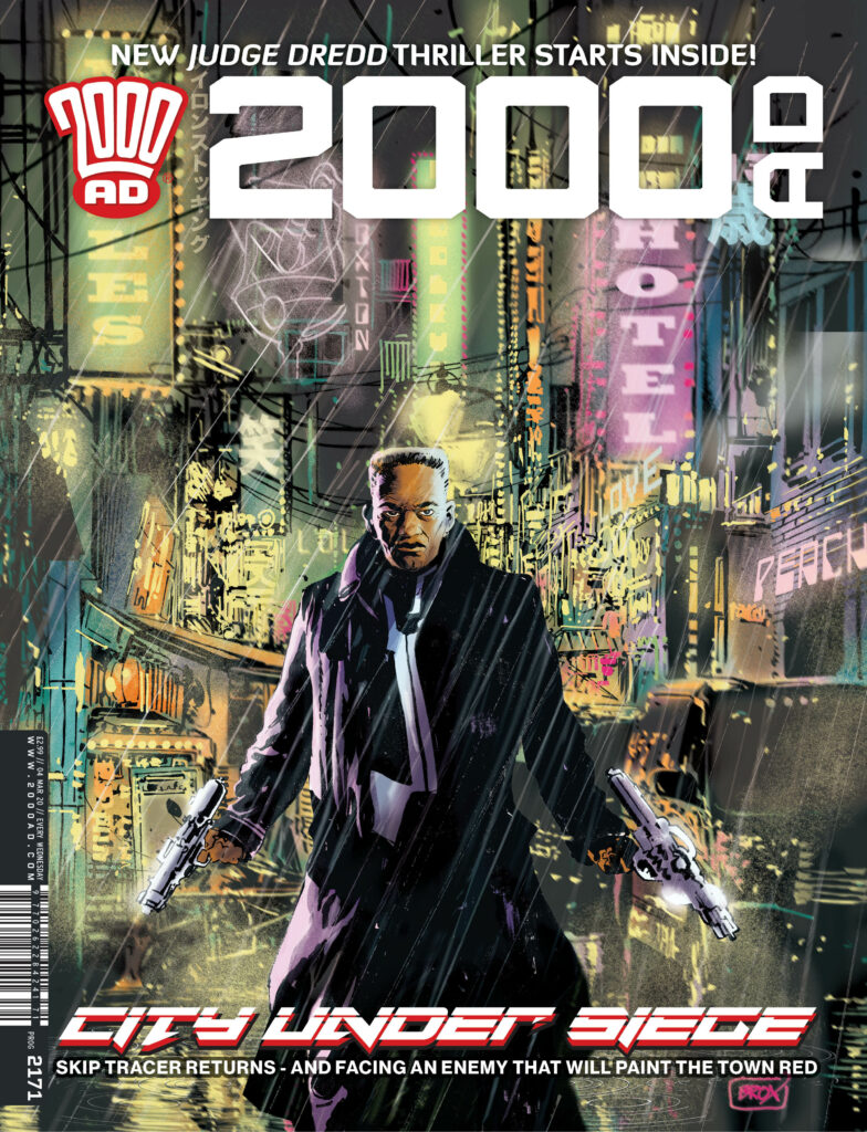
This week, it’s time to look at the fabulous cover for 2000 AD Prog 2171, out right now, and featuring the return of Skip Tracer. And we’ve got cover artist Jimmy Broxton giving us a wonderfully in-depth tale of putting the cover together…
So, without any further ado, over to Jimmy Broxton…
I rarely do covers, and I approach them slightly differently to my interior storytelling pages. I’ll experiment with different styles and media, I sometimes have a prose book cover, or movie poster aesthetic in mind, not just a pin-up style piece of comic art with a logo slapped on it (not that there’s anything wrong with those sorts of covers, they can work a treat). This piece was no exception, fortunately, 2000 AD likes to do things differently as well, so when Matt asked me to do a cover for the prog featuring Skip Tracer, I jumped at the chance.
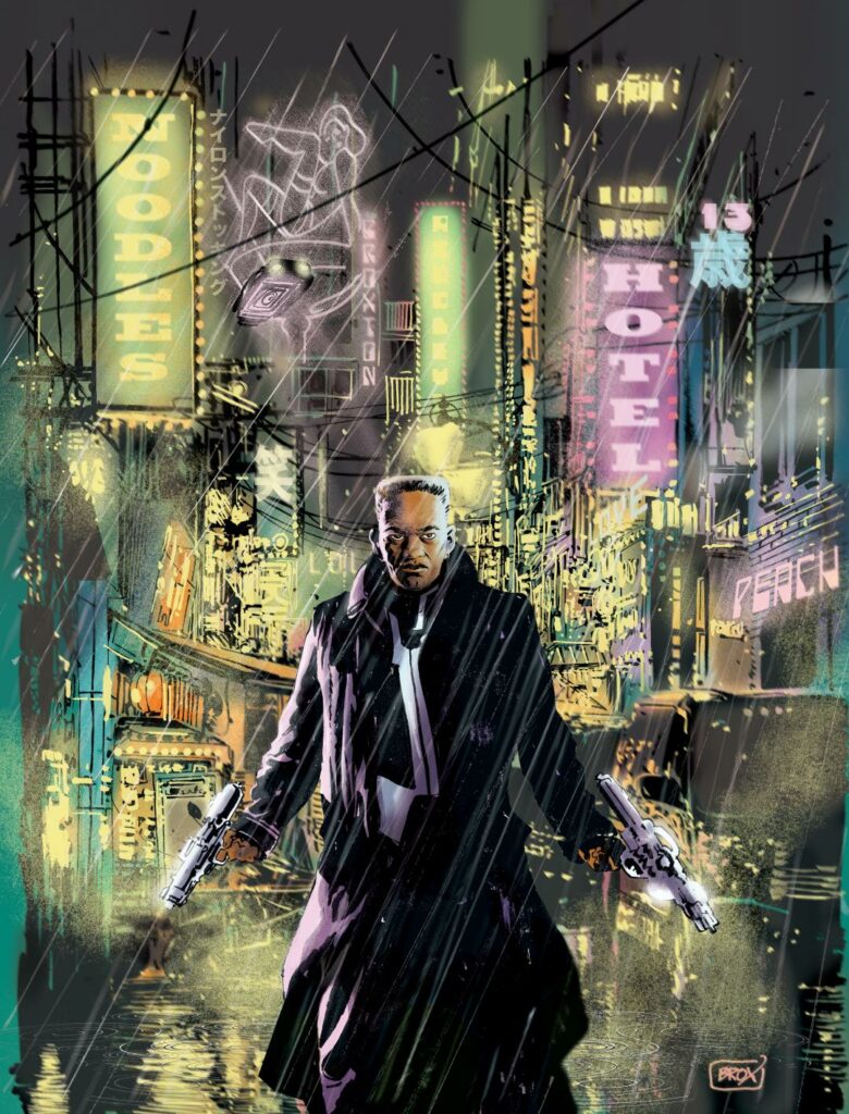
Matt’s brief was simple, ‘I thought maybe you could do the cover as a pulp neo-noir pastiche. Bit Blade Runner in tone.’
SOLD! Say no more, that was all I needed to hear, I’m already there, as that is so far up my neon-lit, rain-drenched alley that I can taste the raindrops, and the cover now exists fully formed in my mind, all that’s required is that I do justice to the vision in my head (almost never happens, but hey, we have to keep trying). And more importantly, the request from Matt, doing a cover is a big deal for me, so I want to get it right.
My typical working relationship with the mighty Tharg is an unusual one I think. Basically I’m sent a script, and I send back finished art, I rarely do roughs or layouts for myself, preferring instead to go straight to final art. So, no prelims, roughs, pencils or layouts usually exist, unless I’m running close to deadline, in which case I’ll provide (if requested) very basic roughs in order to allow the lettering to be done. This straight to art process usually works fine, with only very occasional requests for alterations or changes, it’s never to do with the interpretation of the script, more likely a question of content, and going a little ‘too far’, even for 2000 AD! More on that later.
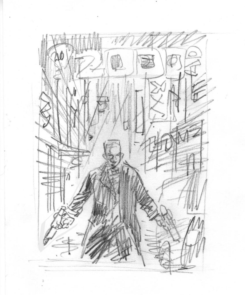
(Initial pencil sketch)
Covers are different and need to be planned and balanced with other Progs, so I go through the proper approval process for a change! I produced a small pencil sketch (for my eyes only, well, until now), not much more than a stick figure doodle, but that was enough to satisfy me that it would work compositionally.
It wouldn’t, however, be enough to satisfy Tharg, he would need to see something a little more polished, something befitting a mighty editor’s inbox, rather than the inside of a school desk, where my woeful scribble belongs.
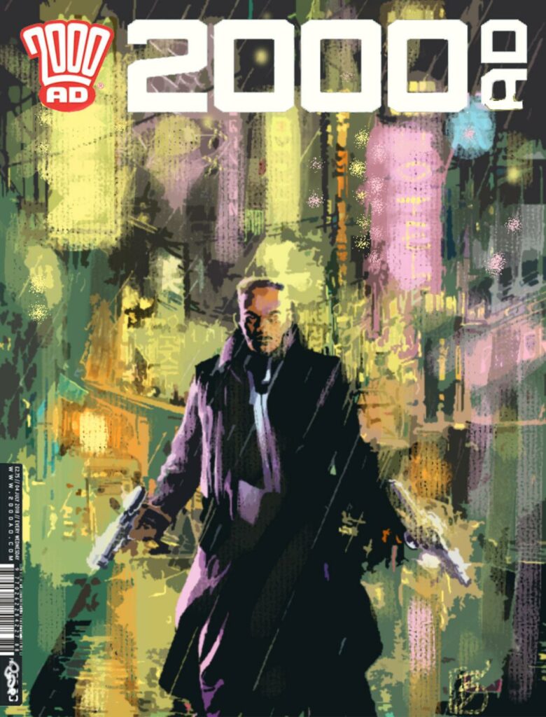
To that end, I digitally painted a rough of the cover, and dropped it into a cover template, with logo and publishing/pricing info. Very crude, but hopefully enough to sell the idea, it was more to suggest the colour values and the atmosphere I was trying to achieve, with no specific details on display. I brazenly submitted only one such rough, and Tharg the benevolent (it would seem) as well as mighty, approved it.
Now I had to draw it properly!
It’s worth noting at this point that, although that colour rough was created 100% digitally, I do in fact create all of my art the old fashioned way, with pens, pencils, brushes etc, on actual paper! Some digital compositing takes place, and the colours and special effects are done on screen, but the line art is real. I’ve yet to find a digital application that effectively replaces or improves upon actual wet ink on paper, with all of the multitude of variances and organic/analogue ‘accidents” that can contribute to a finished piece. Just call me ‘partially old fashioned.’
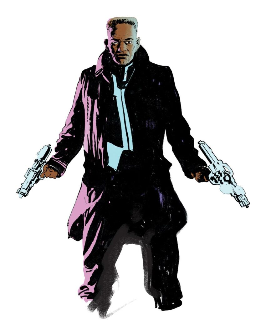
With a single point perspective composition like this, and with the figure front and centre, that figure, and especially the face and expression is key, so I drew the head separately, much larger than the body…
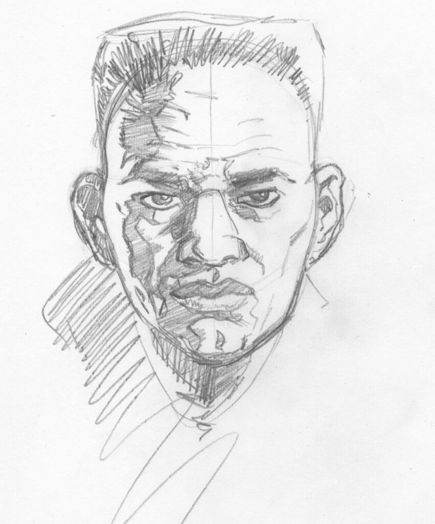
This allowed me to focus on his expression and work out the lighting patterns – as I was planning multiple light sources the shadow work had to be very solid.
Once confident the sketch was working, I proceeded to final inks for the head…

The body was then created as a second stand-alone piece of artwork, all to be ‘comped’ together later on screen.
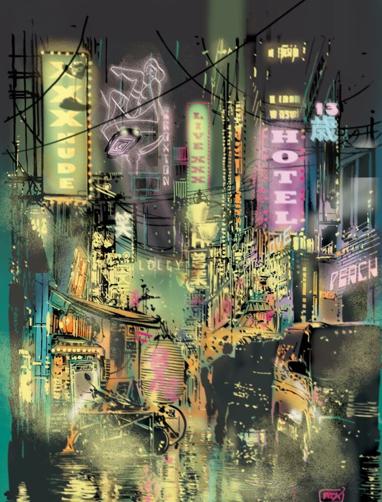
With the figure complete, I could then tackle the background without worrying about figure placement too much. I created the entire street scene, with no hole or gap for Skip Tracer, I could add him anywhere at my digital leisure later (friendly advice, watch out for digital leisure, spend too much time with that and you’ll get no work done!)
I drew the scene, in ‘positive’ mode, which is to say, all the black and ‘shadowy’ bits.
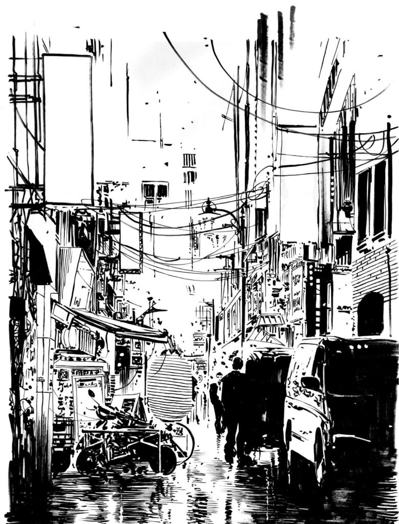
I also produced a second drawing, where I inked all of the negative or ‘shining’ bits (technical term), lights, reflections, signs etc, this way I could create those effects with an analogue organic /vibe, to hopefully achieve a hand-painted, ‘none CGI’ final result…
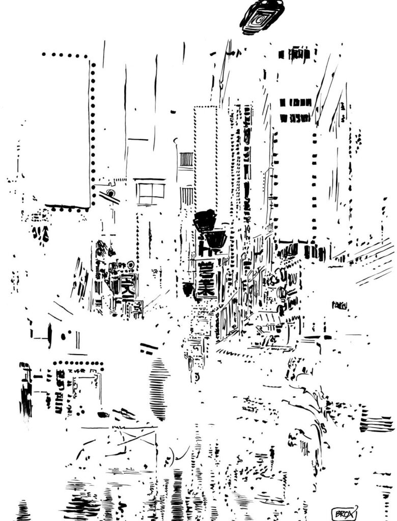
something perfectly near-abstract looking at it this way)
With all the linework done, everything was scanned at hi-res (600dpi, thanks for asking), I then ‘comped’ the figure together by combining the head and body, and added the basic colours. At this stage, the scanned line art of the ‘negative’ elements were kept aside.
Referring to my original colour rough, I very roughly digitally ‘hand-painted’ the background in various layers over the black and white line art…
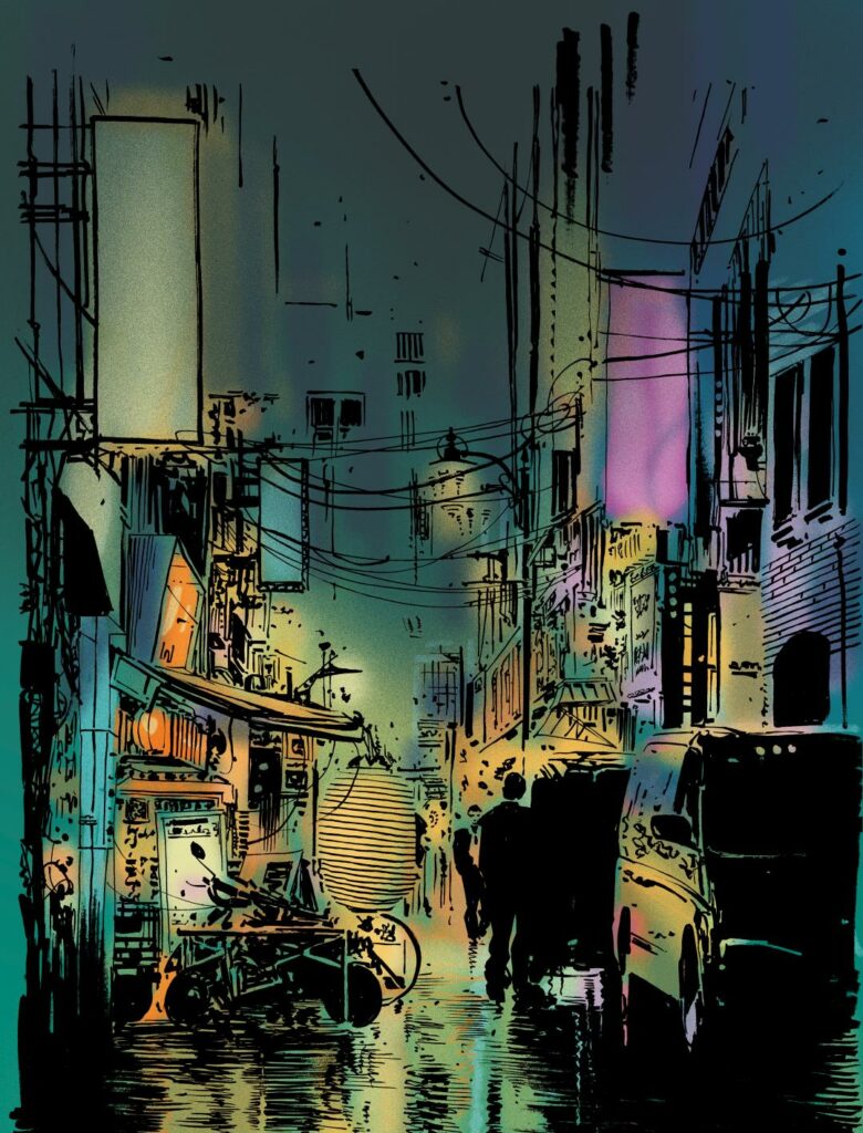
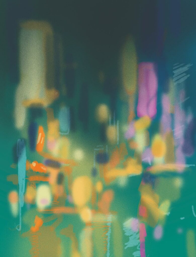
The colour render, minus inks, shows just how free-flowing and impressionistic the colours are…
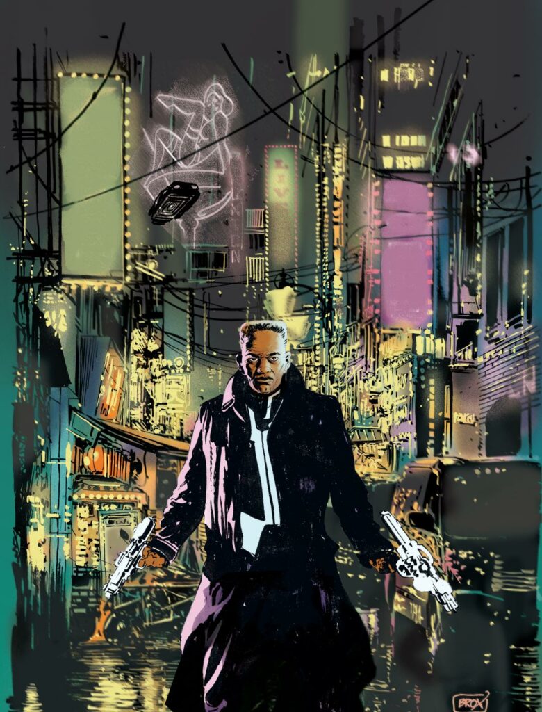
The pre-coloured figure was pasted into position to complete the scene. I also added a flying car, as nothing screams ‘this is the bloody future’ like a flying car. The final image, will hopefully be greater than the sum of its parts, no single element stands alone, and the composition does not really succeed until all the separate elements are pasted into position, not unlike traditional 2D animation cells from years ago (hey, I said I was old fashioned.)
Finishing touches were then added, glowing lights, smoke, steam, extra lighting effects (including my inked ‘negative’ elements, now layered as highlights), typographic elements and signs (more on those presently) and finally a few extra layers of weather, rain, puddles and reflections.
At this stage, just for the fun of it, I created a ‘back cover’ version, the same image, just completed minus the figure…
The completed, flattened and print prepped file was set to Tharg for approval. Job done, well almost…
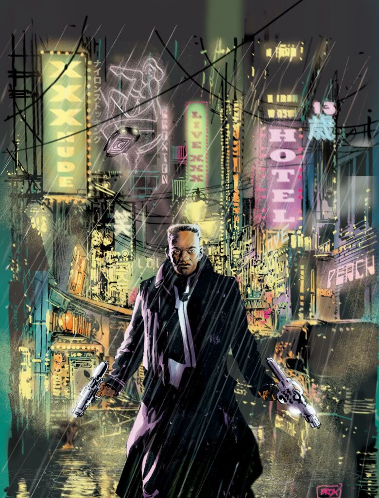
In my eagerness to give the image an authentic neo-noir, neon-drenched feel, I had strayed perhaps too far into the red light district of Skip Tracer’s world. ‘Live XXX’ and ‘XXX Nude’, in bold signage, might give the wrong impression of the contents of a magazine to be displayed prominently on a WH Smith shelf. Something ‘less saucy’ was requested and I thought it best not to suggest we simply go with it as is and poly-bag the Prog as a give-away with ‘Big and Bouncy’ magazine. I very wisely complied with Tharg’s request to tone down the sleaze (well, there had to be a first time!) The signs were changed, the ‘XXX ALL NUDE’ delights previously offered replaced by noodles (hey, even a pervert’s got to eat!) and that version is the final approved cover of the prog that will hit the stands any day now.
A huge thank you to Jimmy Broxton for an incredible breakdown of just what goes into making a cover. And what a cover it is. Go look for 2000 AD Prog 2171 on the racks of your local newsagent or comic shop right now!