2000 AD Covers Uncovered – Justice delivered with a bullet!
17th February 2020
Every week, 2000 AD brings you the galaxy’s greatest artwork and 2000 AD Covers Uncovered takes you behind-the-scenes with the headline artists responsible for our top cover art – join bloggers Richard Bruton and Pete Wells as they uncover the greatest covers from 2000 AD!
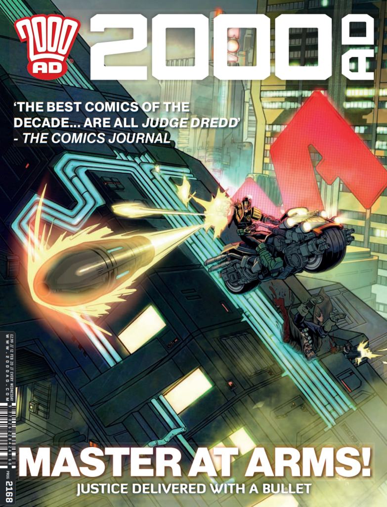
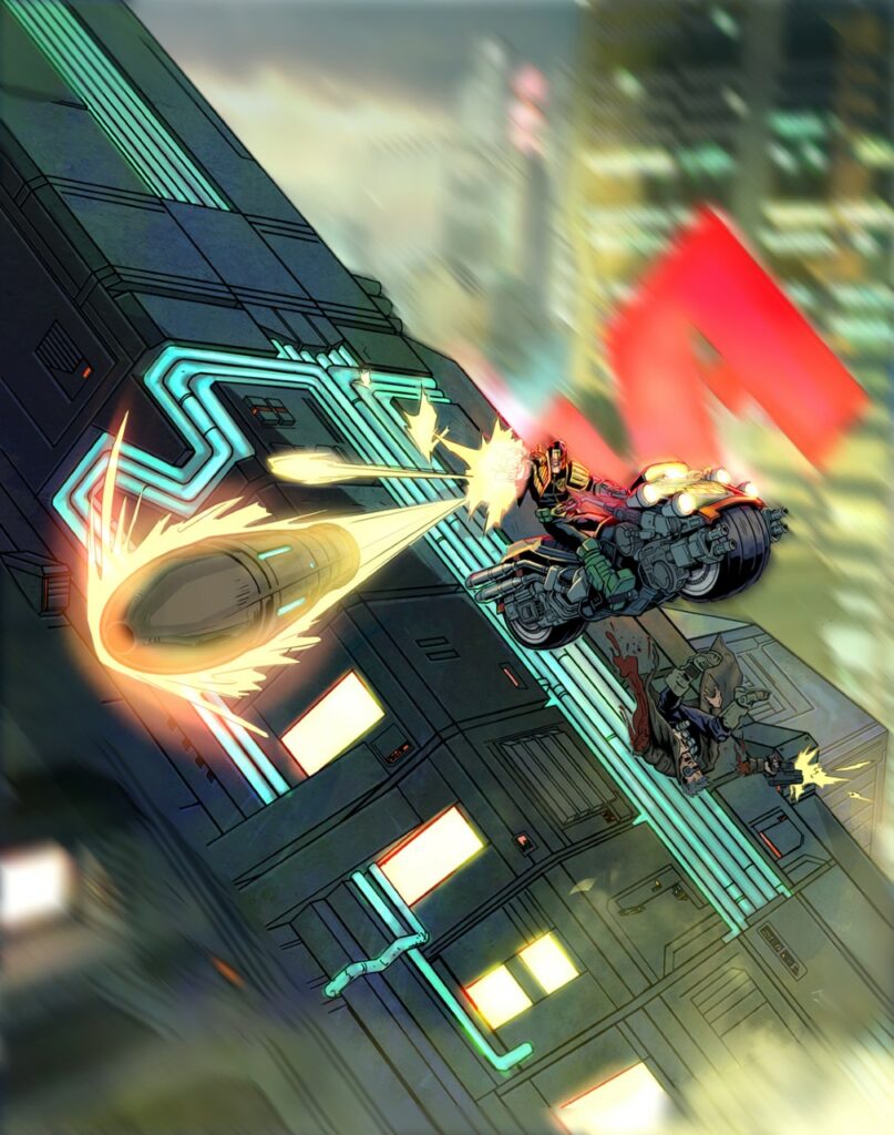
2000 AD Prog 2168 is out now featuring Joel Carpenter’s neon-drenched beauty of a cover – we talked to Joel about his crafting of this strato-scraping shot!
Over to Joel for the details of putting this beauty together…
Before starting this cover, I’d been itching to do some comic art. After a few years concept designing, which is immensely enjoyable, I still missed comics, in particular 2000 AD and I really, really wanted to do something Dredd.
So I approached Tharg the Mighty (trembling) about doing a cover. This was my first cover and I had no idea if he’d be open to it. But fortunately, Matt said yes and gave me the opportunity to pitch some ideas (YES!). He suggested coming up with a non-story related cover concept for Dredd.
Whoa! I could take this anywhere.
Matt’s direction is often succinct, I think he really likes to give his artists freedom and takes a hands-off approach to guiding the artistic process which is always great. I asked if he meant an iconic cover without narrative or just unrelated to current stories. This may seem obvious, but with fairly open briefs it’s always worth asking many questions, even if they seem silly.
I started by imagining a few themes/ scenarios, then doing thumbnail sketches of my initial ideas. Drawing several thumbnails scenarios helps develop an idea almost subconsciously.
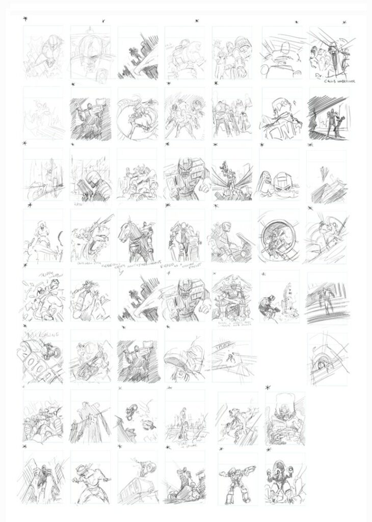
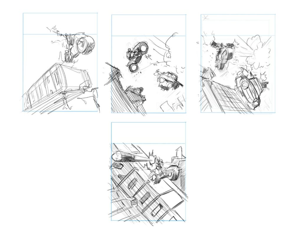
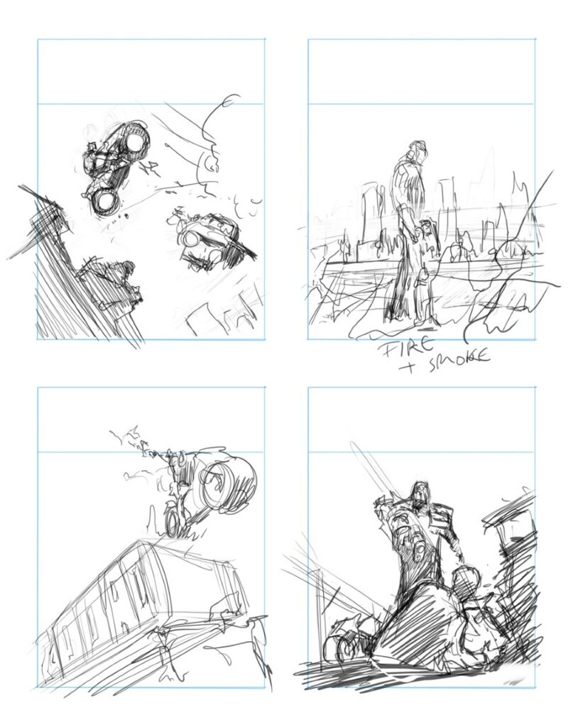
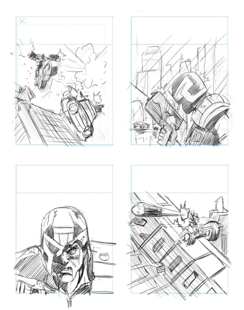
Matt wanted an action based cover and went for the bullet in your face sketch.
These ideas are about Dredd taking any risk to uphold the law. An unstoppable force, who’s already effortlessly dispatched the perp in shot, whilst riding down the side of a skyscraper and picking off the other unseen perps. It also seemed cool to have Dredd zip over a solid 2000 AD in the image.
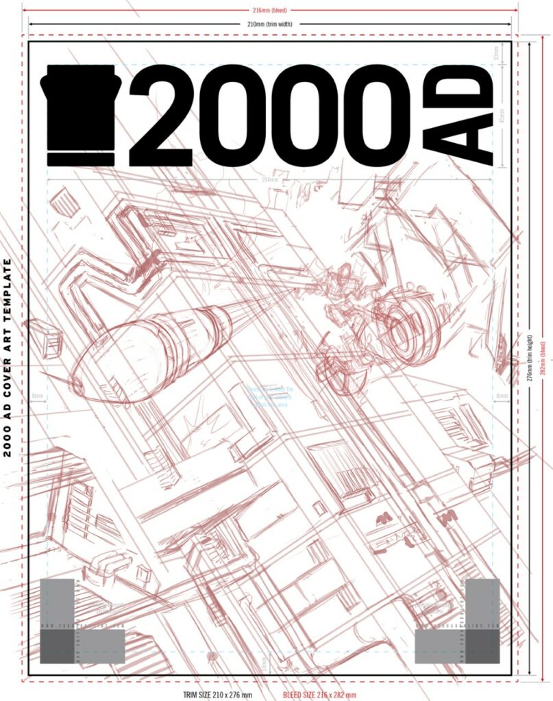
Before getting into detail, I put the sketch into a cover template and spent a while finalising the composition.
Originally the 2000 AD in the building was going to be more obvious, but I decided the composition fit better this way and it was fine if 2000AD wasn’t noticed….
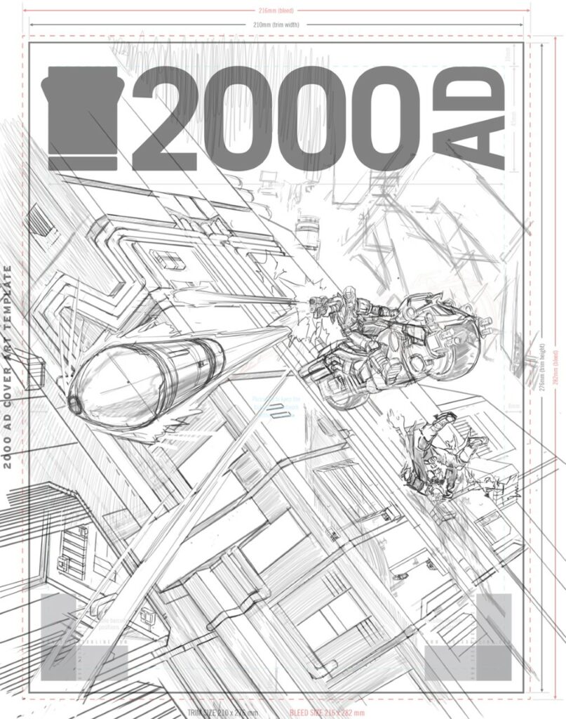
So, time for pencils…
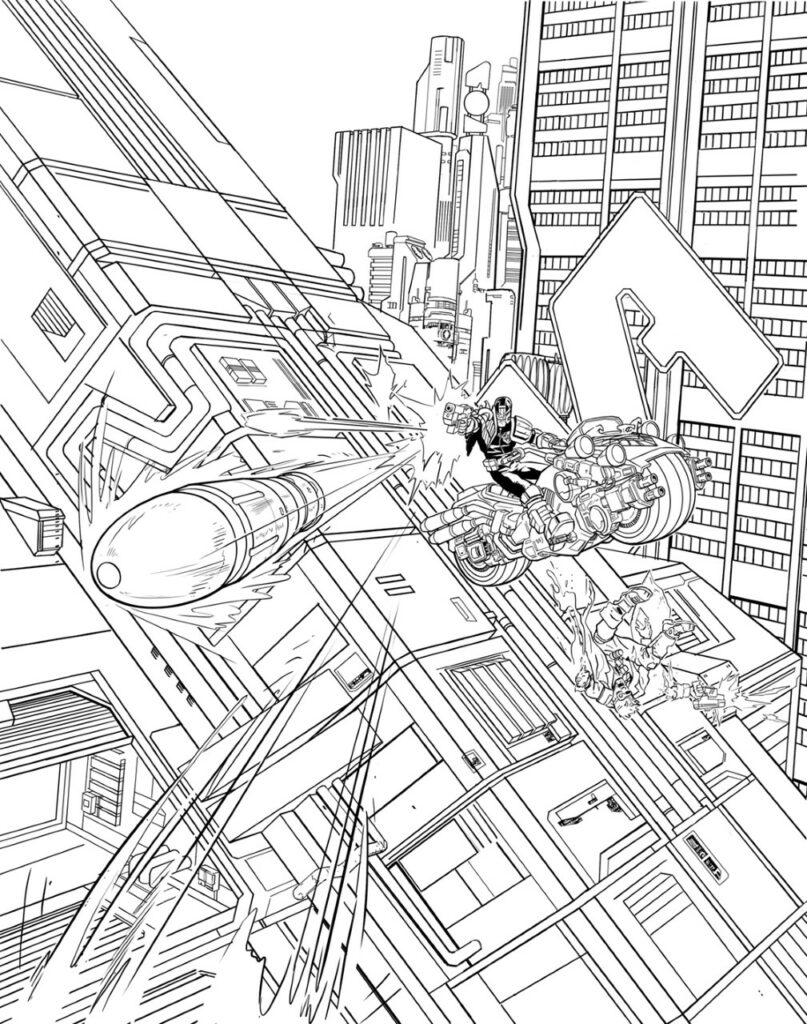
And inks…
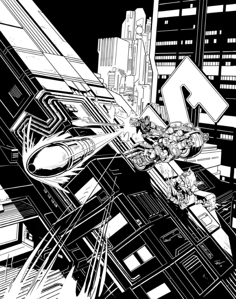
And then the nervous moment when it’s time to approach the Might Tharg again with the inked cover!
Thankfully, Matt/Tharg was happy and asked if I wanted to colour it. I jumped at the opportunity, as I had strong ideas of how I wanted to city to feel.
Which means it was time to do a few colour tests…
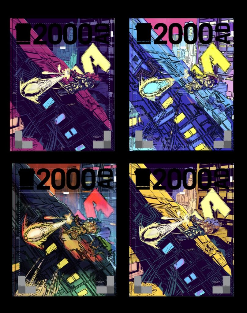
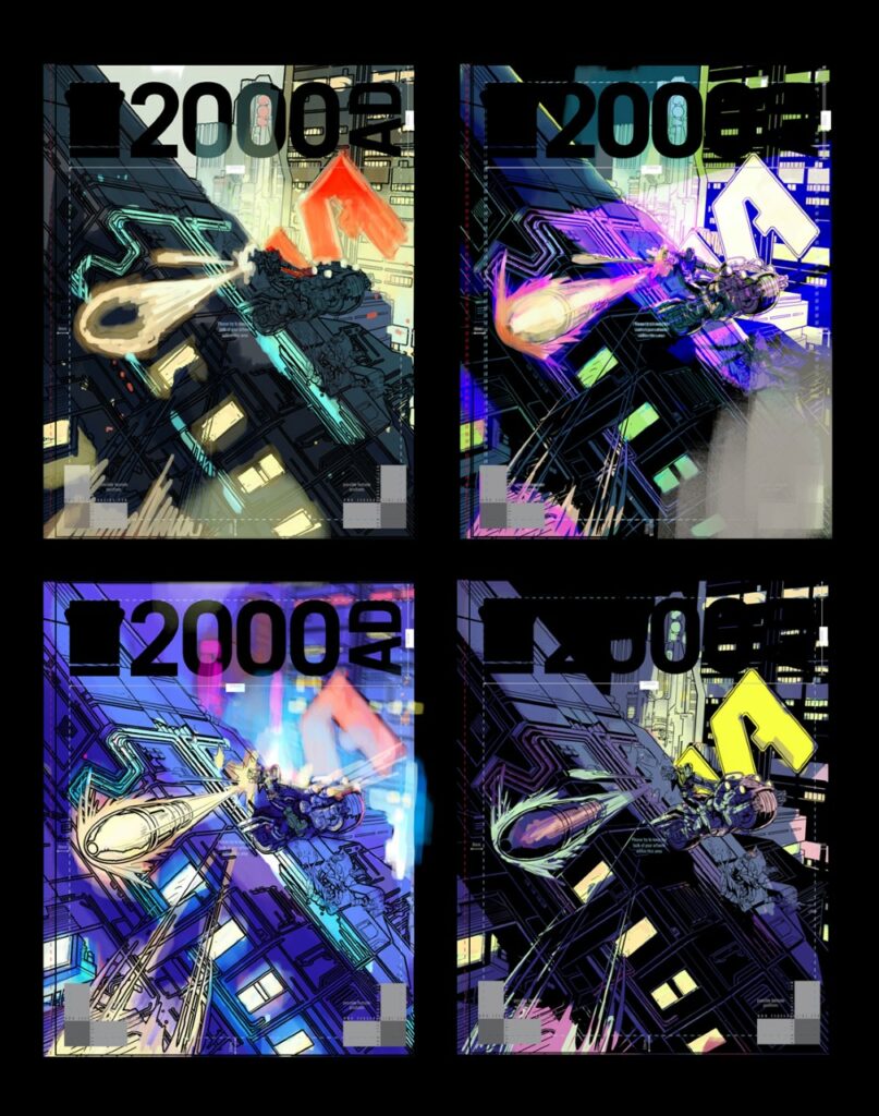
These tests helped decide how much could be done in shadow with colour vs black and what palette best matched the mood I was going for.
As alternatives, I quite like the retro/Moebius colour of the top right second page and the similar night purple version on the bottom left, first page.
In the final image, I took most black out and swapped night sky- for dark but brighter day showing the viewer more of the city. Partly, I wanted to highlight it’s depth and the height of buildings, a crowded polluted city but also the danger of the stunt Dredd is pulling off!
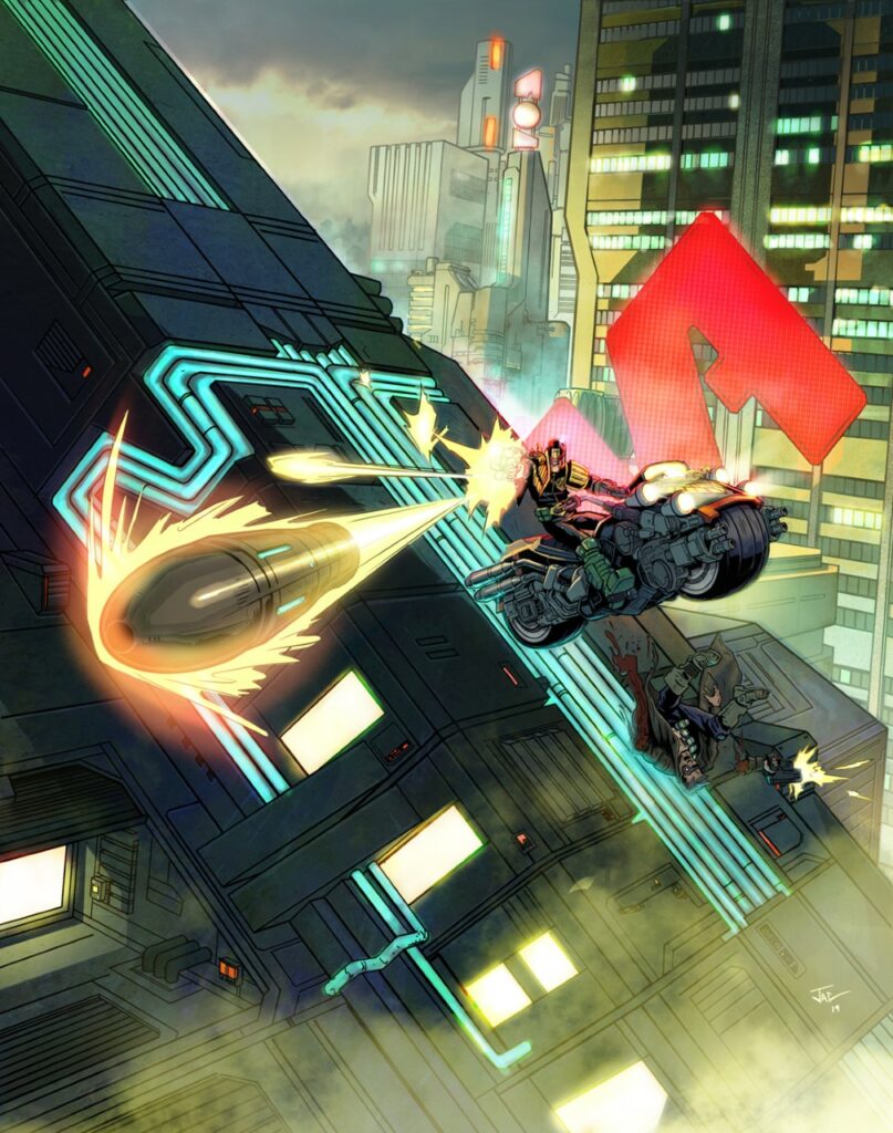
I considered blurring the background to add dynamism but wanted to keep the city visible. I had in mind the look of dystopian future sci fi movies where it’s so polluted you can’t tell day from night. I’ve always loved Blade Runner and the amazing concept art of Syd Mead, who sadly passed away recently, RIP. So I went for a realistic feel to the background, foggy, with the heavy looking industrial architecture style of Alien/Blade runner.
In retrospect, there are things I might change, I always see something haha! Overall though, I’m really pleased with the result and look forward to possibly doing more covers in the future… when Tharg commands!
Thank you so much to Joel Carpenter for sharing all that great art – and you can see the finished thing on the cover of 2000 AD Prog 2168, which is out right now!
