2000 AD Covers Uncovered – Mark Harrison takes us OUT…or bust!
30th September 2021
Every week, 2000 AD brings you the galaxy’s greatest artwork and 2000 AD Covers Uncovered takes you behind-the-scenes with the headline artists responsible for our top cover art – join bloggers Richard Bruton and Pete Wells as they uncover the greatest covers from 2000 AD!
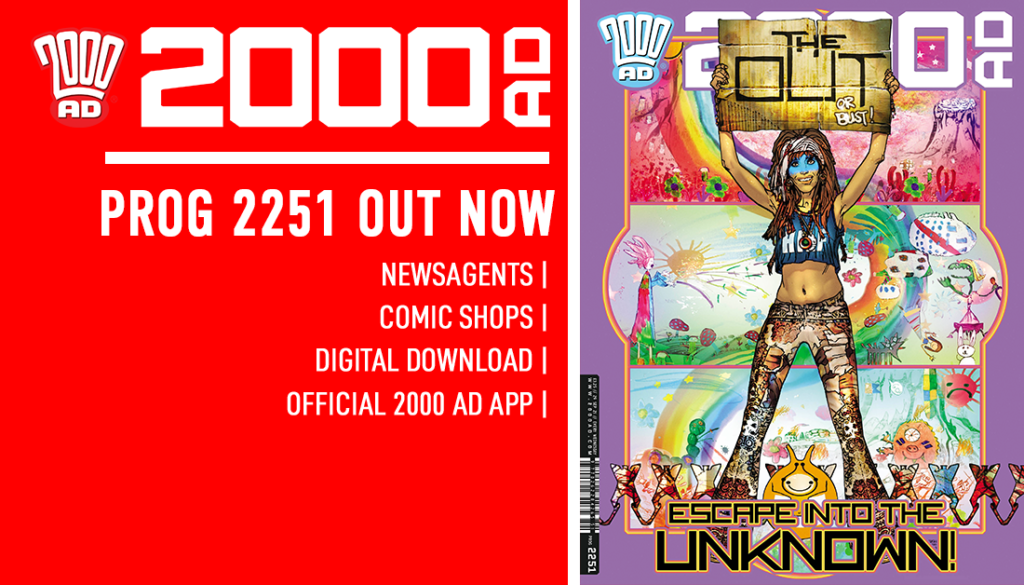
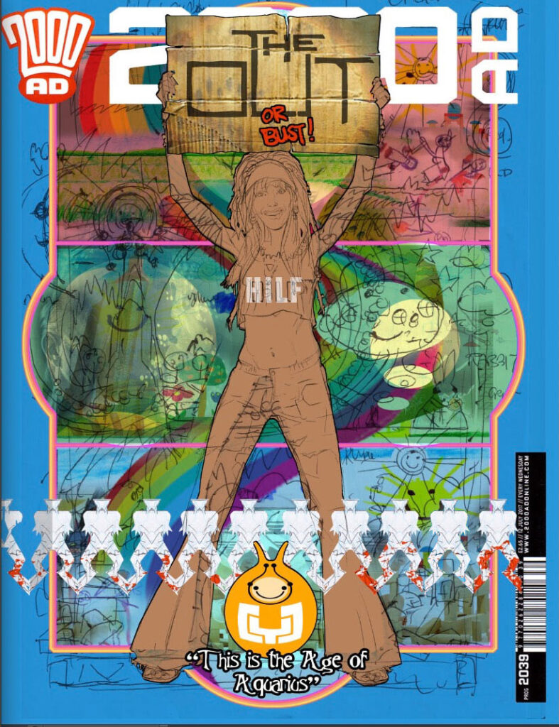
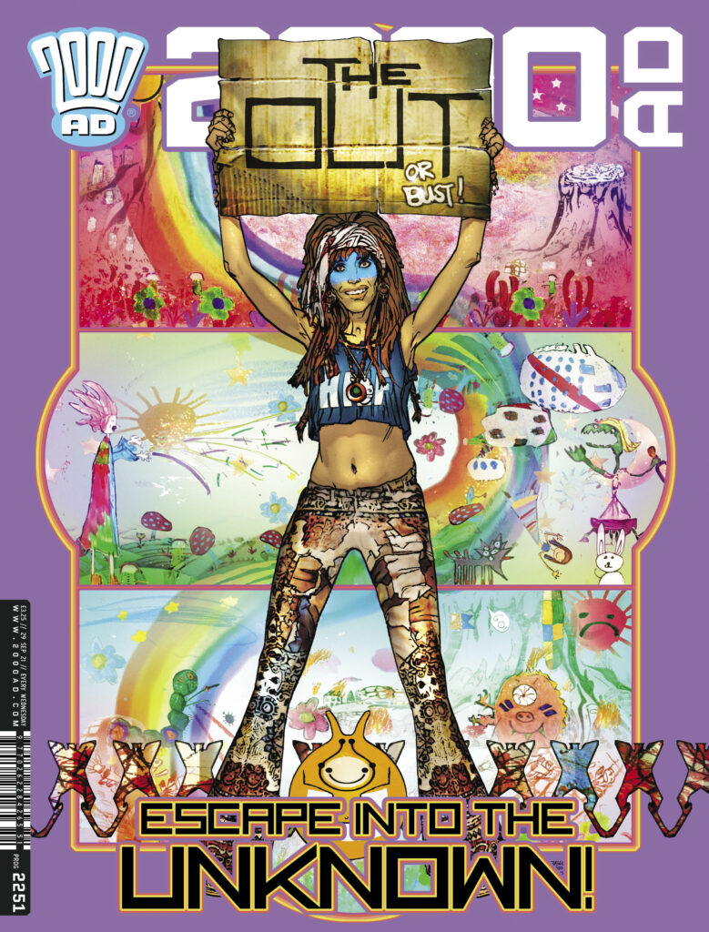
The new 2000 AD, Prog 2251 is out on 29 September and it’s got a doozy of a thrill-powered cover by Mark Harrison, artist on The OUT, the stunning series taking us far, far across space, out to the furthest edge of the universe, and far into the future, where photo-journalist Cyd Finlea has been cataloguing the alien societies she’s been encountering for a long 10 years now. She’s lost track of how far she is from home, but she’s keeping going, just her and her sentient flatspace bag, seeking out other ex-pat humans.
.
Now… over to Mark Harrison – this one’s a great one!
MARK HARRISON: So…. I was expecting this but not so soon! I thought this was seeing light in October- November so it’s a bit of a shock to me it’s being published now. I’d better get my skates on for the last few episodes!
And weirdly this particular cover has relevance to those last episodes. Let me make explain why.
Or NOT as you will see.
I have to be deliberately opaque with this cover and temper my disclosure.
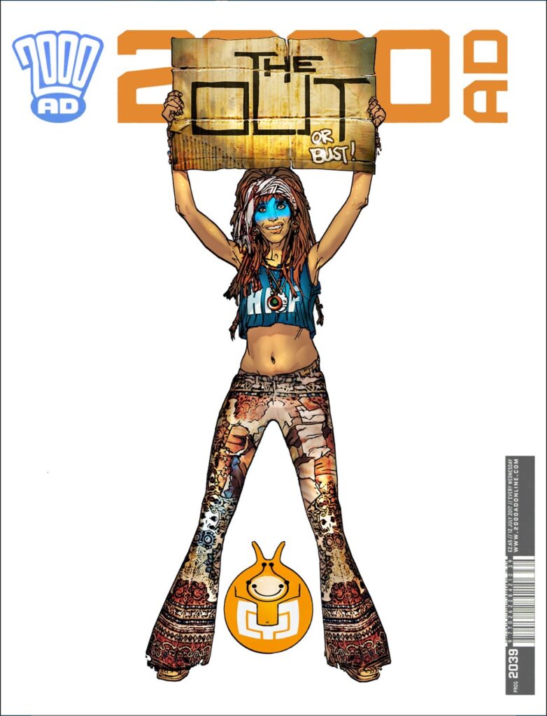
“THE OUT…or Bust!” ( A reference to the “Klondike or bust” Gold rush prospectors seeking fortune in a far off land. Everything or nothing. Risk it all. And for Cyd Finlea this is risking herself to find her long-lost daughter.
The first cover heralding the new book of The OUT turned a simple idea into a very complex one that required long-term careful planning and calculated vagueness that even now, nearly a year after doing it, I have to maintain.
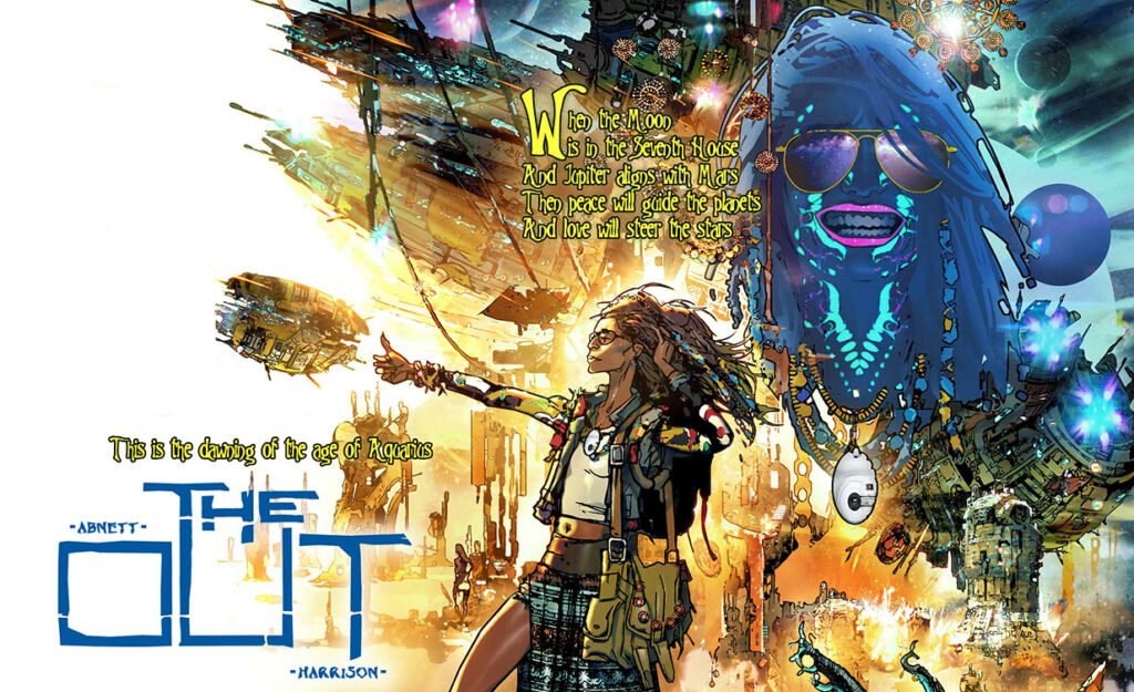
Before I even considered doing a new cover I had contemplated resubmitting the pitch artwork that was used to first generate interest in The OUT.
That would be this one – although, as Mark will tell us, this is just some of that pitch artwork…
.
MARK HARRISON: This was unpaid work done by myself about three years ago in consultation with Dan Abnett as a possible original story after concluding our run on Grey Area.
It was just ideas I had, a wandering space hippie traveling the stars and had elements of a storyline within the art, some of which was a little too revelatory and relevant to the current storyline (so the pitch art included here is cropped).
So, as the pitch art (in full) was too on the nose I went about designing a new original cover.
Originally I was going to have a simple bleached out image of a bored Cyd sitting with Bag by a dusty roadside at an Alien bus stop waiting for a galactic bus, a personal recollection of myself and my brother waiting for a rural bus in the Summer sun that would seemingly take hours to arrive.
And that was the cover. Very stark, so much white. But ultimately I wimped out and didn’t present that version. Plus it was reminiscent in feel to a Grey Area cover I had done of alien immigrants escaping through a border wall.
.
MARK HARRISON: I still wanted Cyd holding up a cardboard sign she carried with her as she thumbed a lift to somewhere other than here, but I was stumped for a background.
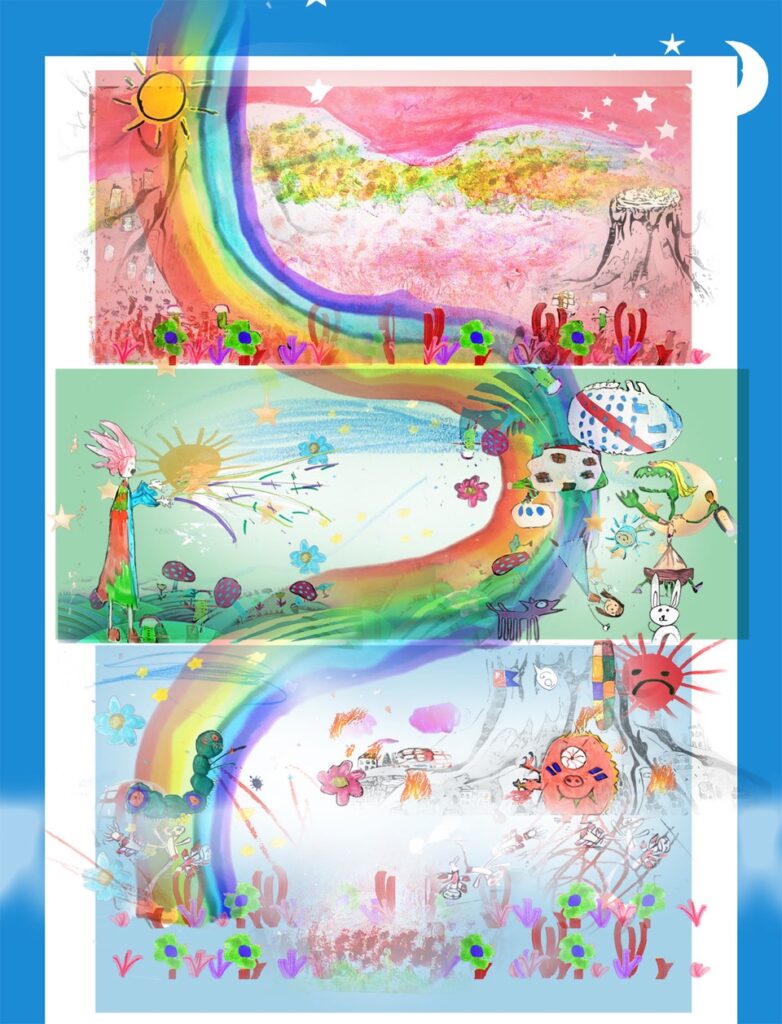
Then I thought why not show the whole adventure yet to come as a sort of sequence of scenes, three in total, a Triptych? In a sort of traffic light of three colours representing… something.
And within these three panels would be the entire story. The twist was it would be realised by children or represented by the things a child could identify with. Why children? Ahhhh…
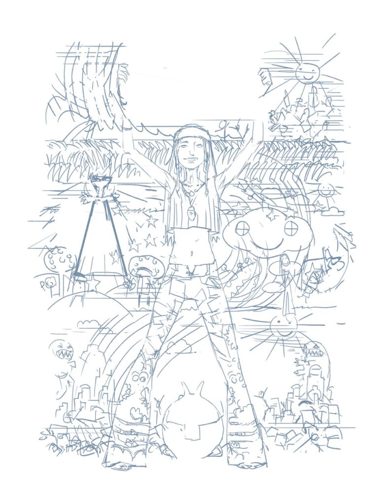
In an early sketch I had ideas for wooden building blocks, dolls, teddy bears, monsters etc. Glow in the dark 5 pointed stars and suns and moons that might make up a hanging mobile above a cot. Stick figures made of pipe cleaners.
And a daisy chain of aliens.
.
MARK HARRISON: There was one slight problem. The story only existed as a synopsis and none of this had been scripted, fully discussed and certainly not designed! Now I was being asked to guess what things might look like or even if they would be relevant months from now.
Kind of putting the cart before the horse but that’s how Dan and I like to roll!
Also, the imagery in the background had to be vague but enough to suggest a scope and diversity. This is also about making the strip/comic attractive and intriguing to the reader/comic buyer.
.
MARK HARRISON: After the first initial sketch, I discounted using the playthings of children to represent scenes as it was too specific and would require a lot of work trying to get it to feel right.
(Although the paper daisy chain remained as a graphic overlay, with a design change to make it look less like a chorus line!)
Then I hit on the idea of a single specific child telling the story through their drawings.
Be it in crayon, pen or chalk. Simplistic and yet also poignant.
The book as seen through the imagination and emotions of a child. So there is comedic imagery, safe and happy for fun moments… then more uncontrolled scribbling, to suggest anger, frustration, upset for the darker times.
It was all a little delicate and needing clear, simple ideas and style, unencumbered by a lifetime of influence and the obvious clichés that an artist can subliminally fall back on.
What better artist to turn to than a child! Two, in fact, the daughters of a friend who provided the bulk of background drawings with the briefest of direction from me as to what was required. I wanted their imaginations unfettered...
>
These would be photographed and PhotoShop manipulated to something approximating what I had already sketched out (and not shown the girls).
Sometimes I was challenged by their choices, but then I thought why not? Go there. Figure out how to make it work later!
It was an interesting and exciting approach that came up with ideas and designs my rational adult mind wouldn’t have contemplated. Like the dueling monsters, already formidable with tooth and claw, but still feeling the need to also arm themselves with medieval weapons!
I was tickled by the idea that somewhere there was a place giant monsters could source oversized swords and mace! I loved their inventiveness that was unshackled from the self-conscious constraints of logic and “realism”, something that can hamper us in later life as we second guess our decisions.
Fantasy for the pure sake of it.
After all, this was The OUT. We can do what we like!
Of course, such invaluable artistic assistance should not go uncredited. Thank you, Anya and Susha. You’re stars!
(But not paid ones, remember???)
The cover underwent a process of moving things around, adding additional art, keeping it deceptively simple and seemingly random.
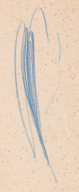
Finally, as an aside, the cover also incorporates a special personal touch, namely the earliest existing “drawing” of mine appropriately on the inside cover of a book of fairy tales, fables, and abridged stories (hence it surviving all these years)
I happened across it purely by chance and thought why not include it. From crayon scribble to digital cover… and a whole lifetime in between.
Funnily enough, my favourite colour turned out to be blue. (Still a child at heart!)
.
And that’s it – a strangely and unexpectedly personal cover whose publication has been eagerly awaited by two young girls – despite their critical comments on how I changed their art! (Artists! )
Now THAT was a particularly stunning Covers Uncovered! Thank you so much to Mark Harrison for sending it through to us. You can find his stunning The OUT cover on the front of 2000 AD Prog 2251 – in comic shops, newsagents, and from the 2000 AD web shop from 29 September!