2000 AD Covers Uncovered – Mark Harrison takes us OUT with Prog 2187
24th June 2020
Every week, 2000 AD brings you the galaxy’s greatest artwork and 2000 AD Covers Uncovered takes you behind-the-scenes with the headline artists responsible for our top cover art – join bloggers Richard Bruton and Pete Wells as they uncover the greatest covers from 2000 AD!
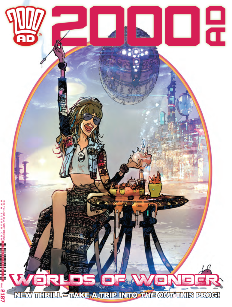
This week, it’s the turn of Mark Harrison and 2000 AD Prog 2187, cover-featuring the fabulous looking new series he’s drawing, The Out, written by Dan Abnett. Obviously, these two gents have got form, having collaborated for a long time on the rather spectacularly good Grey Area.
The Out begins in Prog 2187, out now from comic shops, newsagents, and the 2000 AD web shop.
Abnett describes The Out thus…
The Out is a cosmic odyssey, really. The story of human beings (well, one in particular) wandering out in the far-flung reaches of space, encountering a galactic milieu of alien species. SF is chock full of stories about mankind reaching the stars and becoming an important, or THE important, species, but what if we’re just a minor footnote no one’s ever heard of? Little more than tourists on the greatest Grand Tour/gap year ever? The character, Cyd, has gone so far into “The Out” that she’s forgotten where Earth is and hasn’t seen another human for years. It’s a story about what happens when the ‘wonder’ of the endless holiday starts to pale. What does it mean (to her) to be human? Has humanity made any impact at all? It’s a bit quirky, character-driven, and very alien.
And thematically, he and Mark refer to it as… ‘A love letter to the SF book-jacket art we grew up with’.
To give you an idea just what they mean… here’s the first page of The Out for you all to marvel over…
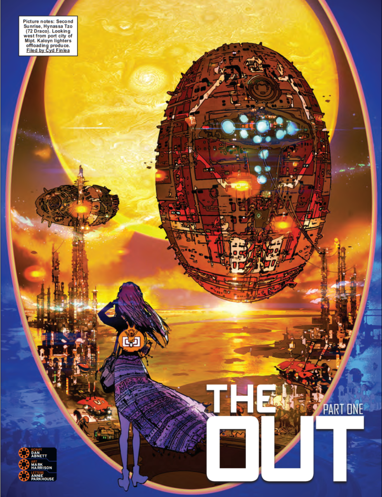
So, with that imagery burning it’s way into your minds, over to the great Mark Harrison to talk us through the making of the cover…
After pitching Tharg a promotional image for The Out, a first cover to introduce the strip was asked for.
Dan and I felt the promo image was a bit too on the money and revelatory for a cover so something more like the slow burn story unfolding and low key would be more appropriate.
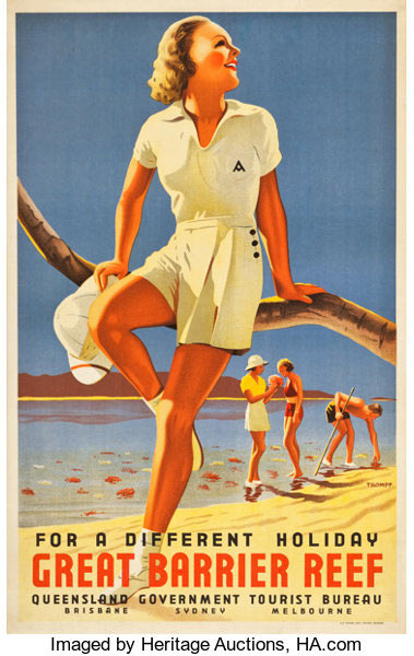
The main character Cyd is a sort of Intergalactic Geographic/space tourism photojournalist, documenting new worlds opened up to the human race. Something akin to the emerging tourism industry of the 1950’s when exotic destinations became accessible to the general public. Whilst part of The Out’s image brief was to be inspired by the science fiction book covers of the 1970’s I thought this image should also work as an advert, subliminally influenced by the travel posters of the 1930s onwards. This sort of thing…
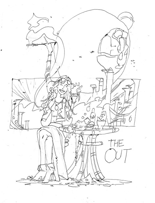
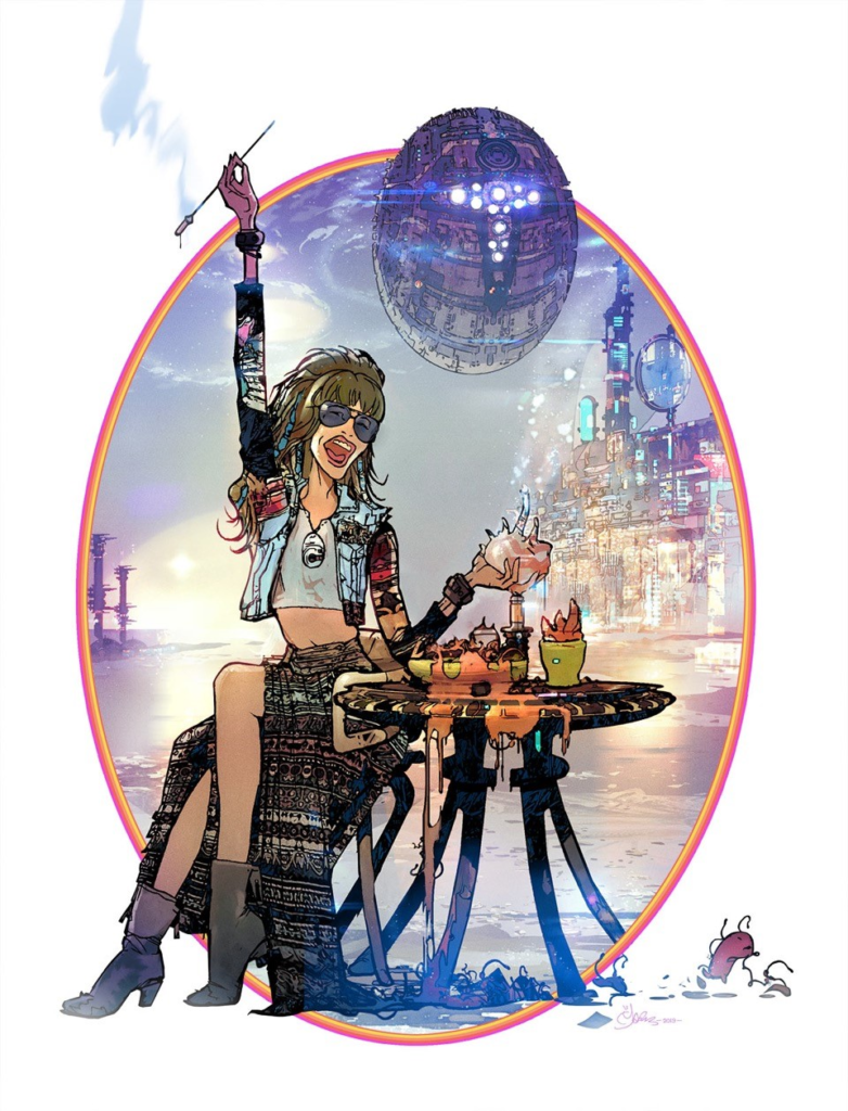
An image of our bon viveur heroine Cyd calling out to join her at her table outside an alien café enjoying a local (and escaping) delicacy. The scene should be bright, breezy, pastel-coloured, with simplified background elements, a beach scene, a building/night club and form of transport (in this case a Chris Foss inspired starship).
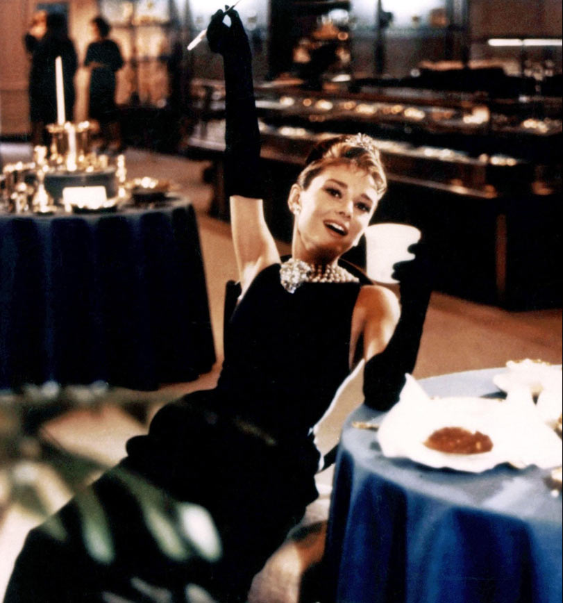
Quite a bit of time and effort was put into moving these elements around to get a pleasing composition. Cyd’s pose also pays homage to Audrey Hepburn as Holly Golightly in Breakfast at Tiffany’s.
As for putting it all together… here’s Mark with the details…
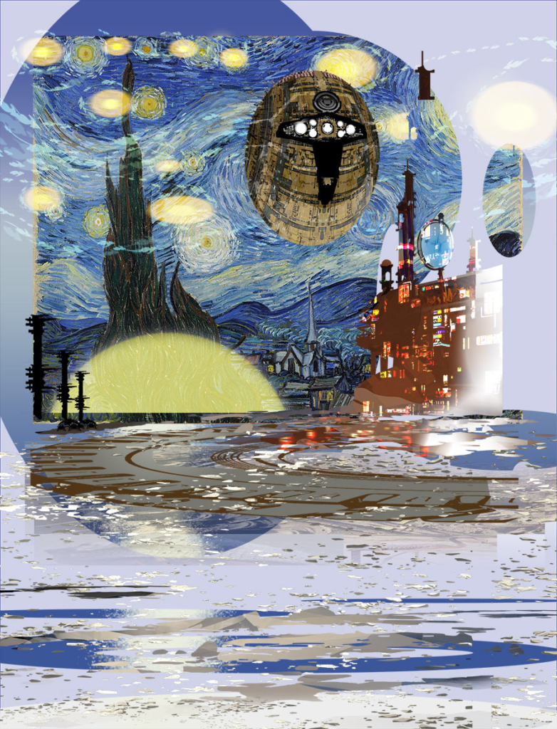
I pretty much steamed ahead with this. I threw together some elements, silhouettes and moved them around until I got something pleasing for the background.
I’ve been recently experimenting with custom shapes in PhotoShop, a technique used by some concept artists. A shape could be any defined image; in this instance a tyre image used to create a circular sci-fi jetty.
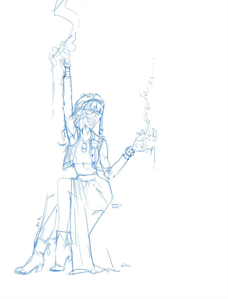
The seated foreground figure was redrawn a few times at the digital pencilling stage; the positioning of the legs was a problem.
I decided to swap the character around and have the legs facing away from rather than under the table, the figure placement used to balance what would have been a centre-weighted composition.
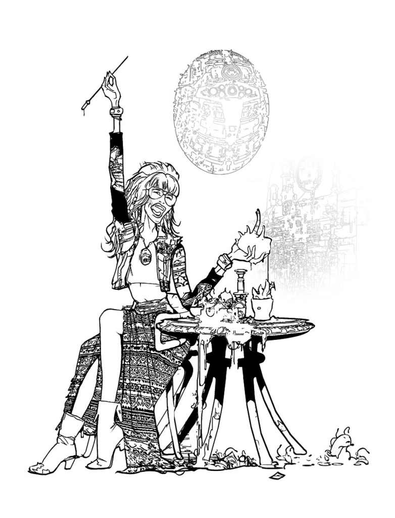
The inks
included existing art of a spaceship that was also used to balance the
image.
Flat colouring was added and edge lighting and a layer of lights derived from
other files to add detail. which also informed the image such as
reflections.

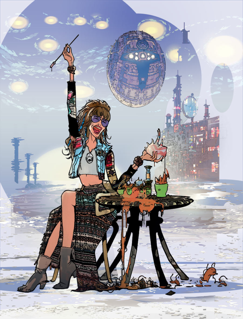
Finally a pass of tone and tweaking the image, brightening the scene behind the character to add focus.
A late addition was to add an oval frame to the scene to mirror the starship and have the art break the frame for extra emphasis. It also adds to the poster feel and graphical conventions.
And that’s it!
Of course, when Harrison says ‘And that’s it!’, what I and all other non-artists say is, bloody hell, that’s a fabulous amount of work going into this cover. Thank you so much to Mark for getting that to us and sharing it with you all.
The Out begins in Prog 2187, out now from comic shops, newsagents, and the 2000 AD web shop. It’s looking like it’s going to be a great series.