2000 AD Covers Uncovered – “Now THERE’S Something you don’t see every day…much!”
7th August 2020
Every week, 2000 AD brings you the galaxy’s greatest artwork and 2000 AD Covers Uncovered takes you behind-the-scenes with the headline artists responsible for our top cover art – join bloggers Richard Bruton and Pete Wells as they uncover the greatest covers from 2000 AD!
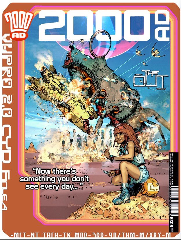
This week, it’s the return of Mark Harrison with his next cover for The Out, his strip with Dan Abnett. It’s 2000 AD Prog 2193 and it’s pretty darn wonderful.
In The Out, Abnett and Harrison bring us the tale of Cyd Finlea, photo-journalist for the Global Neographic organisation in the furthest edge of the universe, far into the future. She travels, she photographs things, she sends them in, she gets paid, she moves on and repeats it all over again. And then things start getting really interesting. Over the course of this first series, we’ve seen Abnett and Harrison set up a truly fantastic universe with incredible visuals of absolute alienness and grand scale.
So, we sat Harrison down and got him to share the making of this one with us. The fun starts straight away, as Harrison entitles the thing…
_______
“Now THERE’S Something you don’t see every day…much!”
(or – A Little Love Letter to the classic generation of Science Fiction and Fantasy book cover art)
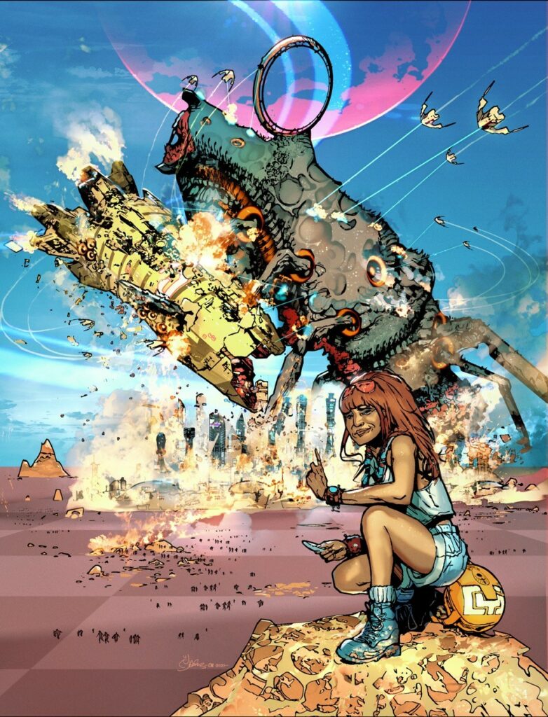
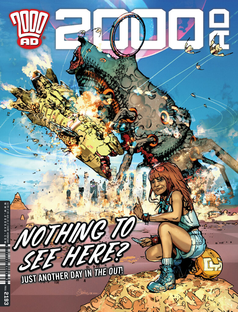
The OUT cover #2 – ‘Giant Star Beast fights Space Cruiser whilst being attacked by fighter squadron over a city on a distant planet’ was one of those covers that just came together very easily.
It was a type of cover that harkened back to the days of nostalgically deceptive comic covers that promised great thrills inside only to leave the young wide-eyed reader gloriously disappointed, in that the cover had NOTHING to do with the strip inside! Or more like a cover from ye olden days of 2000 AD, bright primary colours, hyperbole…Hyper thrills!‘
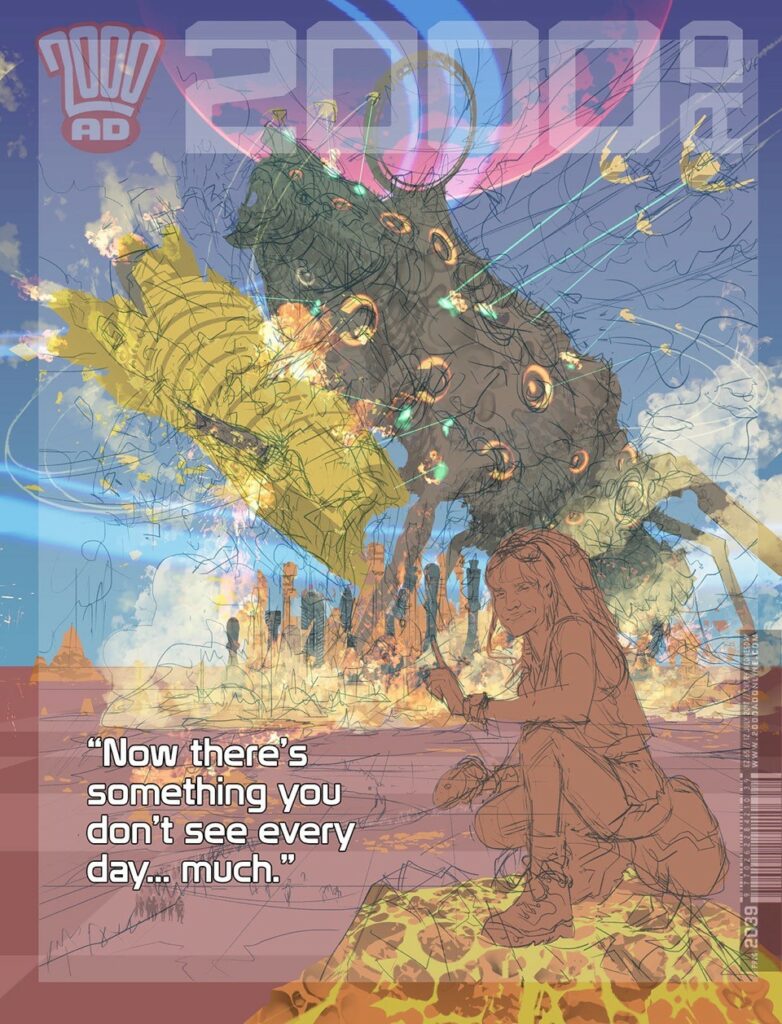
The idea I’ve had in my head for a while, based on an old cartoon I saw of two men fishing on a lake (loch) and seeing a serpentine monster rise up from the depths (Nessie) to attack a flying saucer that is, in turn, firing on the monster. One of the nonplussed men turns to the other to say: “Well there’s a sight you don’t see very often.”
It was the juxtaposition of the mundane against the amazing (and calamitous) and their understated reaction that made it funny.
It was something I would discover would be hard to replicate on the cover because although Cyd is an average 40 something-year-old 21st Century woman travelling the stars with a line in sardonic understatement herself, pretty much everything she is surrounded by is always amazing, different and otherworldy. So the joke loses a bit of that contrast as there is not enough recognisable “other”.
Still, I proceeded and was so confident in the idea I kinduv went straight to rough digital pencils and colour silhouettes before thinking “Hmmm…. Maybe I should run this past Tharg first”. Fortunately Tharg was okay with it.
In terms of art process, I’ve recently started ‘drawing’ in silhouettes of colour or tone. I say “drawing”. After an initial sketch it’s a case of using the lasso tool in PhotoShop to outline a silhouette and fill with colour (as you see in the submitted rough draft).
This silhouette is built up first in Quick Mask before committing to a layer.
Those initial colours can be reselected and line work added to them with an action or two to give an outline or change the colour, add a texture or more art.
That is repeated for every colour to build up outlines that are then properly drawn into. For most of the time I’m selecting and filling until getting to the details.
It’s something I’ve been refining over the course of the strip and hopefully, it’s going to define how The Out looks in future episodes.
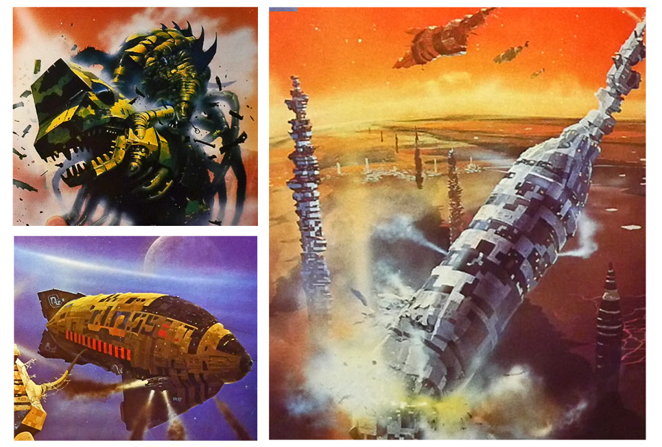
The ship came together nicely, straight out of the Chris Foss shipyards, engines belching out voluminous smoke. A clever scale visual Foss and John Harris used to give their ships mass. We can all equate to smokestacks or cooling towers on the horizon and how massive those are. Real-world reference to sell the scale.
People scattering from the city through the checkerboard fields for an additional scale assist. The ‘Chess Piece’ city sky line was suggested by a friend and that went with the checkerboard crops.
Distant flat almost featureless horizons were a favourite thing amongst sci-fi artists. It provided focus on the foreground but also suggested an uncomfortable vast emptiness beyond the safety of man’s little foothold in space. The unimaginable expanse of the unknown.
Talking of unknowns, the creature was trickier, as sort of squid/insect combination. There’s more and the following gives it away and I hope works subliminally … but the combat is not all it seems...
I designed the ship and creatures ‘maws’ to look deliberately the same as a visual clue to the reader.
You see the creature isn’t attacking the starship.
It’s mating with it. (‘Oh the humanity!’)
I envisioned a case of mistaken identity. Beast on the prowl in mating season ‘sees’ (via electrical signals- it has no eyes as such) a similarly looking ‘mate’ parked above a city – the military space cruiser. And, like a misdirected whale, advances intent on making the earth move for everyone unfortunately involved. Fighters launch from the cruiser to attack ineffectually like annoying gnats. The creatures ovipositor spears the ship, scattering its eggs.
It was why Cyd was wagging her finger in the shot. ‘So much for ‘La petite mort’ was another idea for a cover tag line I had in mind. This cover is going to get printed, right?
(Or if that’s too much information… It’s a giant monster attacking a space ship!)
It’s the sort of visual humour, sci-fi film and TV references, along with modern art that I like to layer throughout the strip, more for my own enjoyment and for those who might get the references. If you think you see something familiar, you’re probably right and that’s great!
This cover and the story of Cyd’s adventures in The Out are inspired by the sci-fi book cover illustrations of legendary artists Dan and I grew up with in the 1970’s.
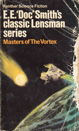
I can recall as a 10-year-old boy a Chris Foss book cover in my uncles bookcase that I would just stare at for ages. It didn’t look painted. I had no knowledge of airbrushes at the time so the art looked almost magically photographic. (The book in question is Masters of the Vortex; part of the E.E. “Doc” Smith’s classic Lensman series… I must read it someday!)
To younger readers seeming unimpressed by this, you have to understand that book covers promised visions of science fiction and fantasy that TV and film at the time could only dream of or copy in a limited way. Shows like Star Trek and the just airing Space:1999 was about as good as it got!
This was like the best CGI and effects ever. In fact, it’s only very recently with the likes of Guardians of the Galaxy have we gone into that colourful space ship universe. (James Gunn presented a ‘Proof of Concept’ for GOTG to Marvel Studios including Chris Foss artwork.) I would dearly love to see a film that had these amazing images in them!
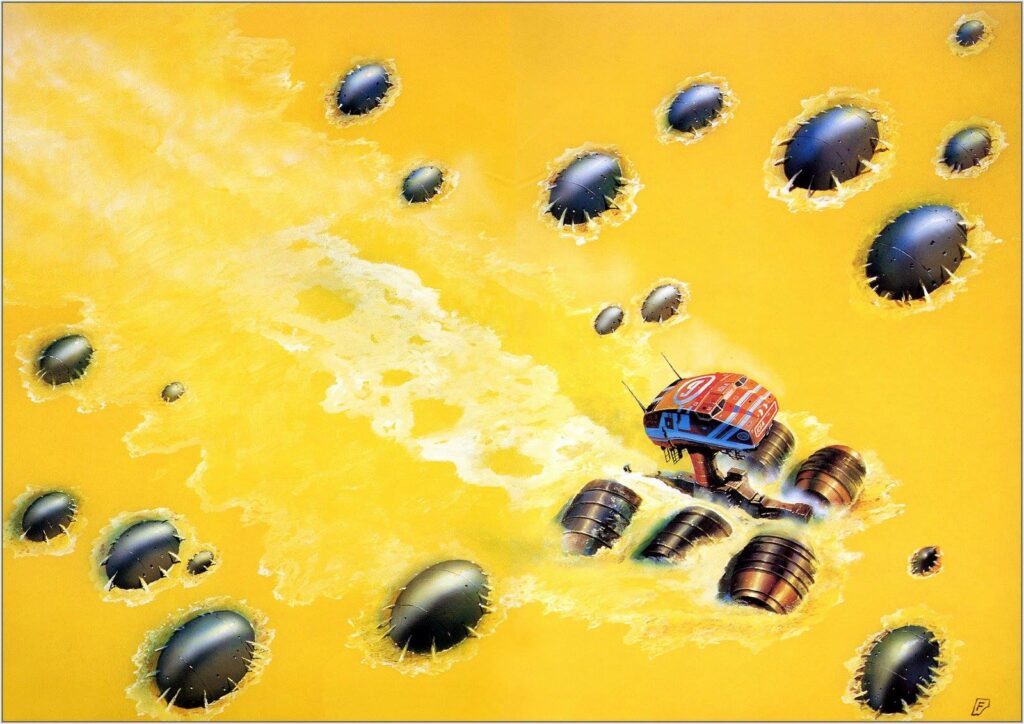
From a teenager to present day, I would fill my bookcases with many of the collected covers from artists such as Jim Burns, Peter Elson, Peter Jones, Bruce Pennington, Bob Eggleton, John Harris, John Berkley, Chris Achilleos and Chris Foss. (Achilleos and Foss have also contributed covers to the Galaxy’s Greatest Comic!)
And whilst I might not have read all the books they illustrated, their covers inspired stories of the imagination, possibly entirely different, and that was the genesis of The Out.
Their work, along with American and European comic artists and their reprints in Heavy Metal Magazine were brainfood to me.
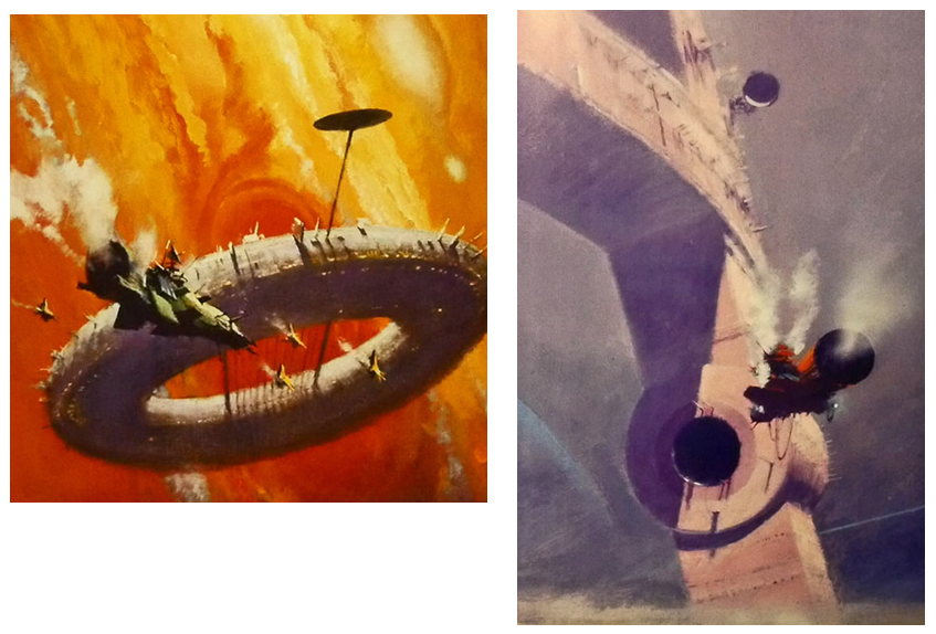
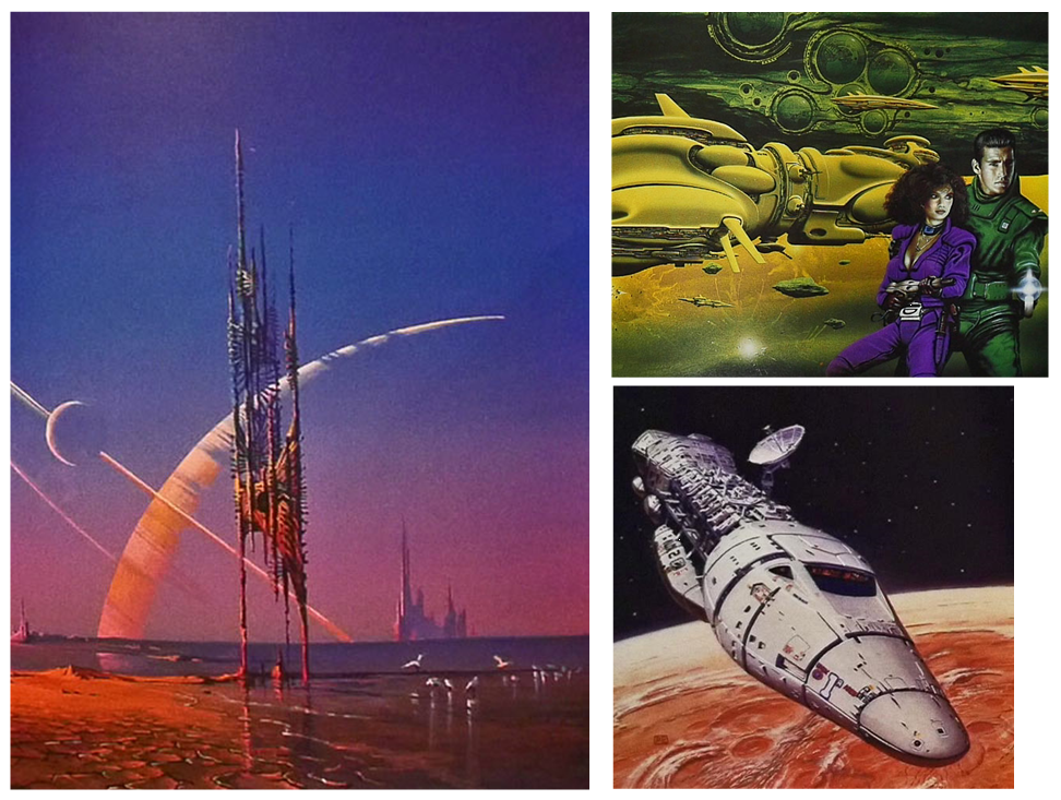
All these great visionaries have influenced the look of The Out and the strip is a love letter to their work and the pleasure it gave a growing artist and writer.
In many ways it’s a strip I’ve been waiting to do all my life to do. It’s tapping into a lot of personal history and influences. It’s a journey I’ve been on many times… in my imagination!
And now you can join us as we go further and wilder… Out There!
You definitely need to join Mark ‘Out there’ – The Out is one of those strips that’s got all the makings of instant classic 2000 AD about it. Thank you so much to Mark for giving us another glimpse into what it takes to get a cover to the Galaxy’s Greatest onto the shelves.
The Out began in Prog 2187 and you can find this current Prog 2193 out now from comic shops, newsagents, and the 2000 AD web shop. It’s a great cover for a truly great strip!
And for more Covers Uncovered from Mark, do check out the post on the first Out cover – Prog 2187.