2000 AD Covers Uncovered: of Bullitt & Big Guns – McBane & Dredd on Kieran McKeown’s cover for Megazine 457
27th June 2023
Every week, 2000 AD brings you the galaxy’s greatest artwork and 2000 AD Covers Uncovered takes you behind-the-scenes with the headline artists responsible for our top cover art – join bloggers Richard Bruton and Pete Wells as they uncover the greatest covers from 2000 AD!
We’re looking at the front cover of Judge Dredd Megazine 457 now – which is out now – with Kieran McKeown giving us the double trouble pairing of Dredd and Jack McBane for the finale of the excellent One-Eyed Jacks storyline.
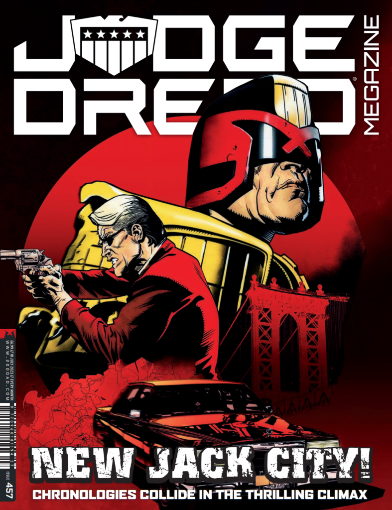
It’s been a time-travel caper with a difference, as we’ve tracked villainous goings-on in 1970s New York City and 2145 Mega-City One in a thriller of a tale, one which has also shed light onto the Fargo bloodline.
Ken Niemand and Kieran McKeown, with Ian Richardson on art for episode 1, have blown us all away with this one and it’s fitting that Kieran gets the cover for the finale showing that final ‘meeting’ of two of the toughest cops of any time!
KIERAN MCKEOWN: I had initially wanted to do an homage to late 60s/early 70s cop movies for the cover. ‘Homage’ is a fancy art word for ‘steal’.
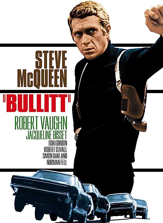
The one I liked was ‘Bullitt,’ probably my favourite cop movie from that era. The car chase sequence is just a masterclass in visual storytelling. I probably learned more about visual storytelling from that one sequence alone than any other resource in my library of art books.
.
KM: Sadly, Matt said that IDW had already done a Dredd Bullitt homage.
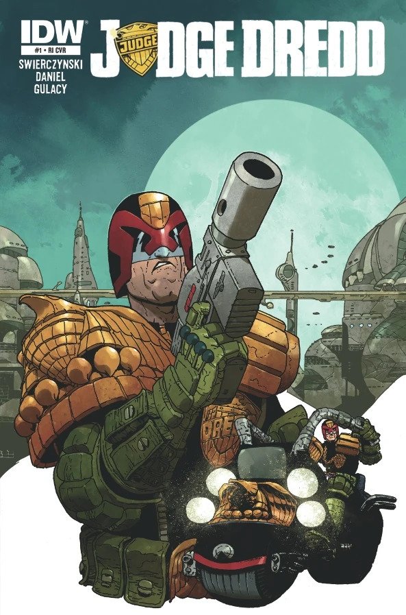
Oh yes they had – and initially I had it in my head that it was the variant cover that the late, great, much missed Carlos Ezquerra did as a variant cover for Judge Dredd #1 from IDW, published November 2012.
Sure, thought I, It’s not quite an exact Bullitt homage, but it’s got the elements of it. So I figured it was most likely this one. Which of course gives me the perfect opportunity to share something by King Carlos with you…
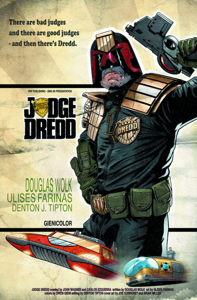
At which point, a missive from TMO himself, most gracious and majestic and generous Tharg, came through... Idiot web-droid, it’s not the Carlos cover that’s the Bullitt homage but the subscription variant cover by Joe Coroney for 2014’s Judge Dredd Mega-City Two #1. Ooops. Bad me.
Tharg sees all, Tharg hears all, Tharg even knows what we’re typing. Meanwhile, I shall be enjoying quarter oil rations all month. So, THIS is the cover Tharg’s human representative was telling Kieran about…
Okay, back to Kieran, licking his wounds over losing out on the Bullitt image – but at least he’s not in a tiny cubicle smarting from a talking to from TMO!
KM: So I had to think of something else. Reflecting on it, I felt it important that the cover featured both Dredd and McBane. The novelty of the Dredd/McBane crossover was that you had these two guys from two very different worlds coming into contact. So I really wanted to juxtapose Dredd with all this 60s & 70s era imagery. So I decided to go with this…
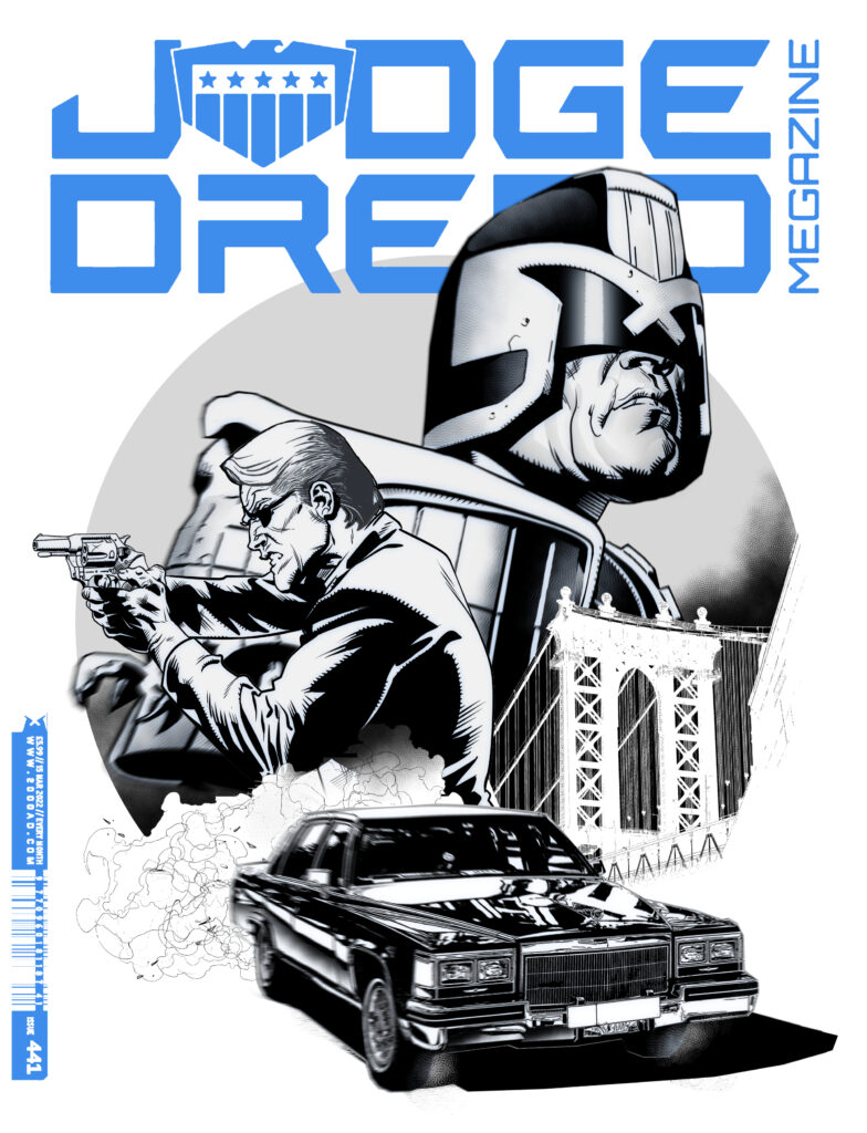
My process is not all that different to any other artists. I get my reference, do my layouts and then finish.
So with the space allowed, I figured the readers might be more interested in some of the finishing touches I employ.
These finishing touches probably don’t make a whole pile of visual difference in the final coloured version. But from experience, they do give a nice layer of polish to your work that editors respond positively to – which is important if you’re trying to get a job. People that look at your work on Instagram also seem to respond more positively to this type of look in your artwork. I know that can seem trivial but Instagram is very important for building an artist’s profile.
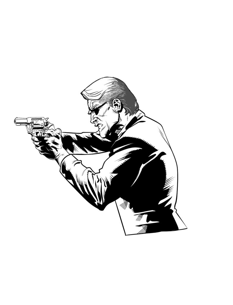
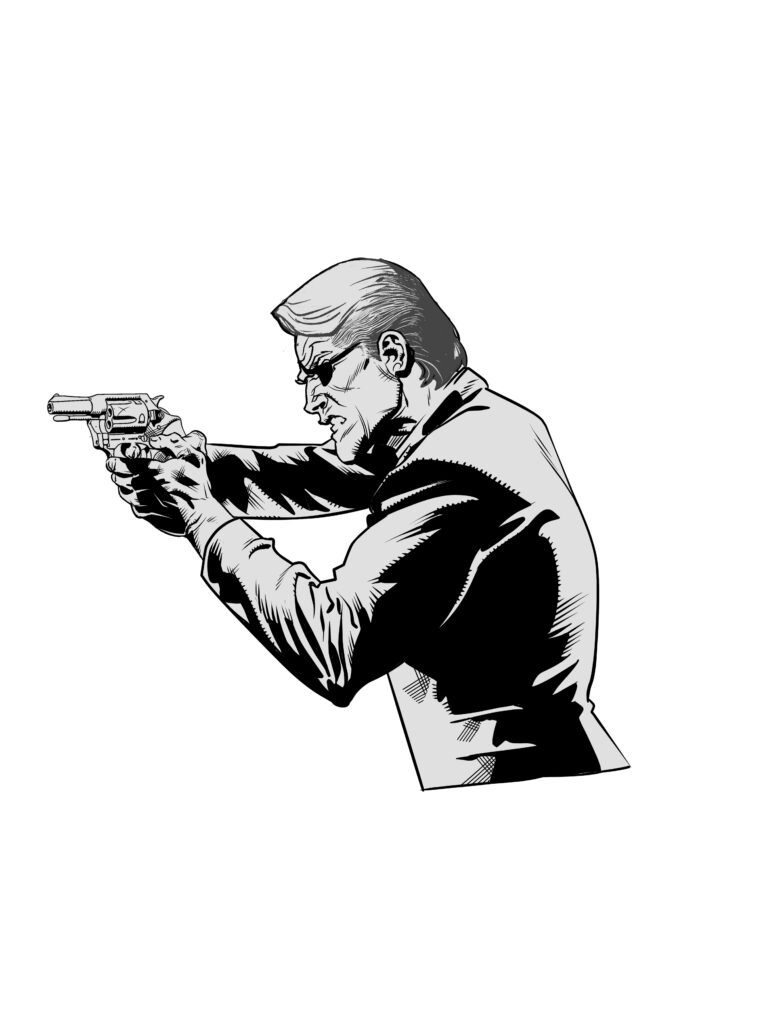
So, when I finish inking a figure digitally, the first thing I do is pop a grey layer underneath…
.
This just helps the figure pop out more from the white of the page. If you’re managing multiple different objects and figures on a page, strategic use of a grey layer is also helpful in emphasising particular elements for which you might want to draw the viewer’s eye.
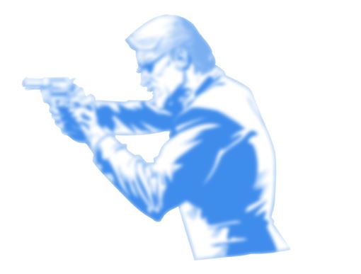
Now you can easily stop at the grey layer stage. But I like to take it one step further. So next, I make a duplicate of the black and white layer and place it between the B&W layer and the grey layer. I turn the layer blue. You could use some other colour if you prefer. There’s nothing special about blue. It just reminds me of those non-photocopy blue pencils I used to use in my old analog drawing days.
-just the next stage of Kieran’s process)
Next, Clip Studio and Photoshop have a function that allows you to blur an image. I use the “Gaussian Blur” on Clip Studio for this. I turn the blur up real high. What you’re left with is a very blurred blue image of the B&W layer – as seen below.
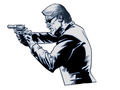
I then turn the opacity of the blue layer right down so you get something like the above when the original B&W layer is overlaid. I learned this trick from Marc Brunet’s YouTube channel. I don’t really know what this step accomplished other than, in my opinion, the image looks cooler. I think it’s intended to be a really quick way of doing “AO” (ambient-occlusion) type shading. That is, softening the transitions between the shadow and light sides of your drawing as well as the midtones within the light side. As I said, they also remind me a bit of the old blue pencil construction lines, comic artist’s often used when drawing analog.
Personally, I just love seeing the artist’s construction peep through underneath a finished drawing.
Anyway, I hope you found this somewhat interesting!
Nope, not interesting Kieran – fascinating. Sure, I had to look up ambient-occlusion, but that’s what’s always so good about hearing artists go into the nitty-gritty of putting their art together!

So there you go, thanks so much for Kieran to sending that one along – You can find Judge Dredd Megazine 457, released on 21 July, wherever you pick up your monthly Meg, including the 2000 AD web shop.
And if you’re after more McBane, the original John Wagner and John Cooper One-Eyed Jack strip from Valiant comic in 1975 is now available as a collection from the 2000 AD web shop.
But before you go, make sure you go and read Kieran’s interview all about One-Eyed Jacks here! And finally, you can find Kieran online at his Instagram.
