2000 AD Covers Uncovered – SK Moore on the 2000 AD Encyclopedia
8th May 2022
Every week, 2000 AD brings you the galaxy’s greatest artwork and 2000 AD Covers Uncovered takes you behind-the-scenes with the headline artists responsible for our top cover art – join bloggers Richard Bruton and Pete Wells as they uncover the greatest covers from 2000 AD!
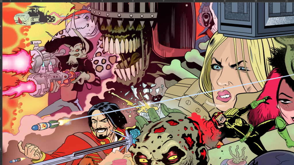
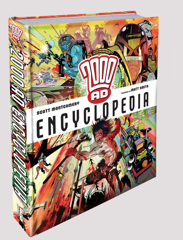
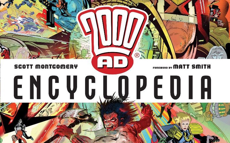
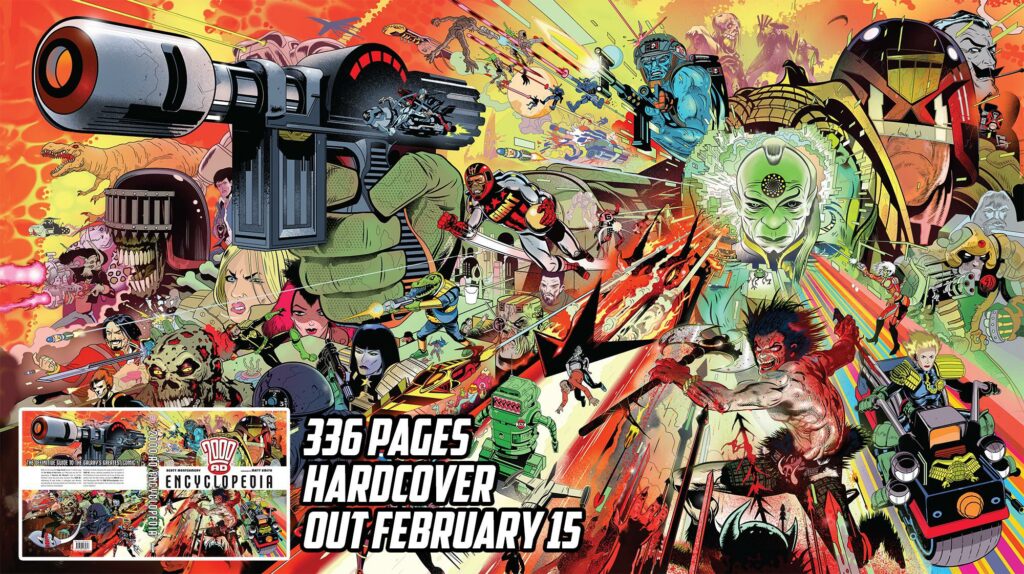
The 2000 AD Encyclopedia by Scott Montgomery is a comprehensive, detailed collection giving you a look at the entire creative history of 2000 AD. Full of incredible artwork, this one’s a perfect gift for comic book fans, whether they’re Squaxx Dek Thargo of long-standing or 2000 AD neophytes.
Timed to concide with 2000 AD‘s landmark 45th anniversary, this 336-page hardcover was released on 16 February 2022 (buy it at the 2000 AD web shop), complete with an absolute masterpiece of a cover from artist Stewart K Moore.
Now, if you’ve been following Covers Uncovered a while, you’ll know that getting SK Moore to tell us about his covers is a great, great thing. And this one’s no different. Heck, this time he’s even gone to video to better capture the creative process!
.
[And my apologies to Stewart about this – he got the files over to me early, it was all set up – and I forgot to take it out of drafts! Sorry Stewart – bad me… I’m going to be in such trouble with Tharg!]
SK MOORE: Editors at Rebellion reached out to me with regard to doing a cover painting of some of the principal 2000 AD characters for the cover of the encyclopedia.
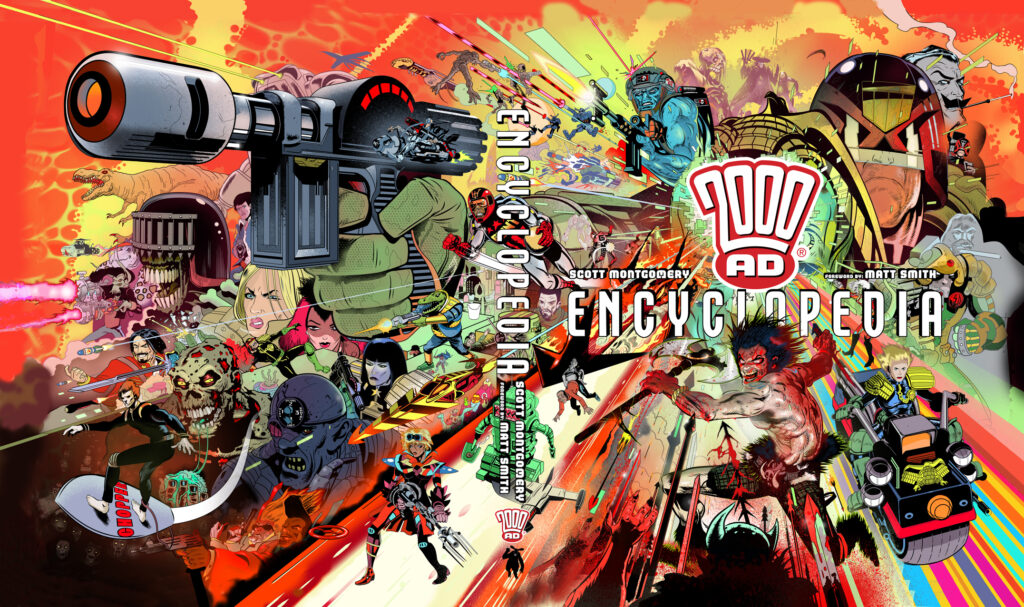
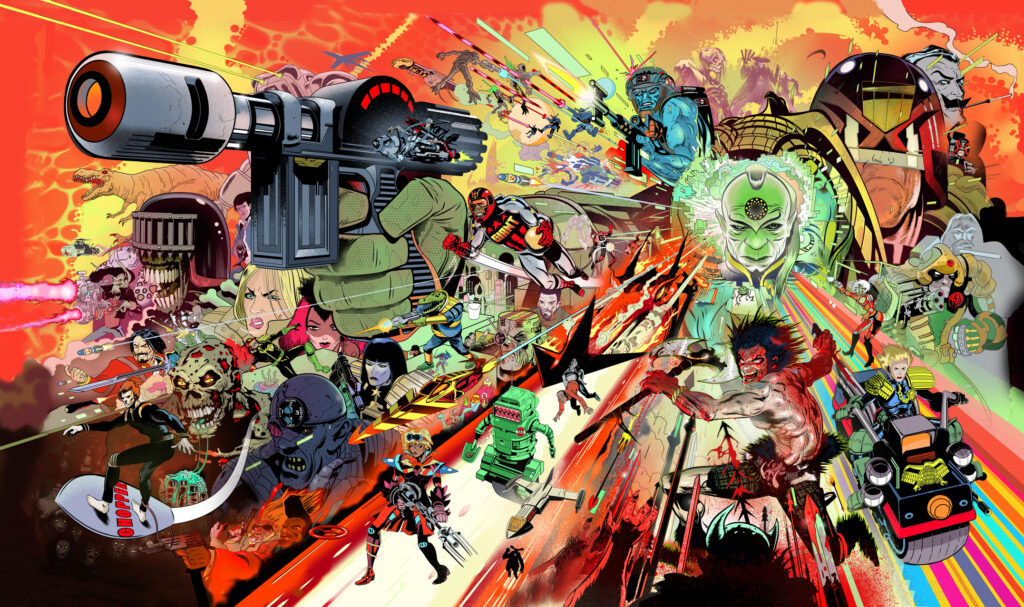
The plan was that the paper cover would have titles etc but when you pull off the paper cover you see the whole image without text or titles – as far as I know, the titles and graphic furniture are not printed on the actual book. So you can take the cover off and see the whole art unsullied by info of any kind…or so goes the plan!
.
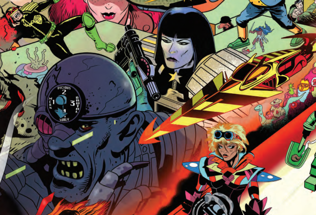
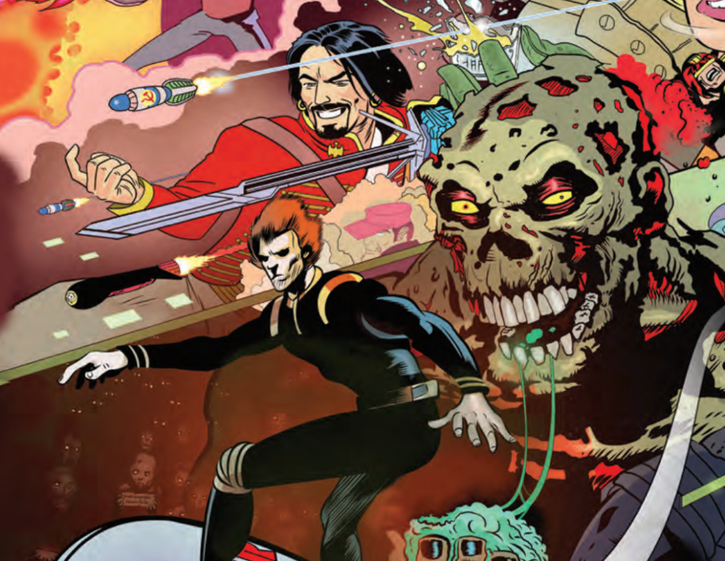
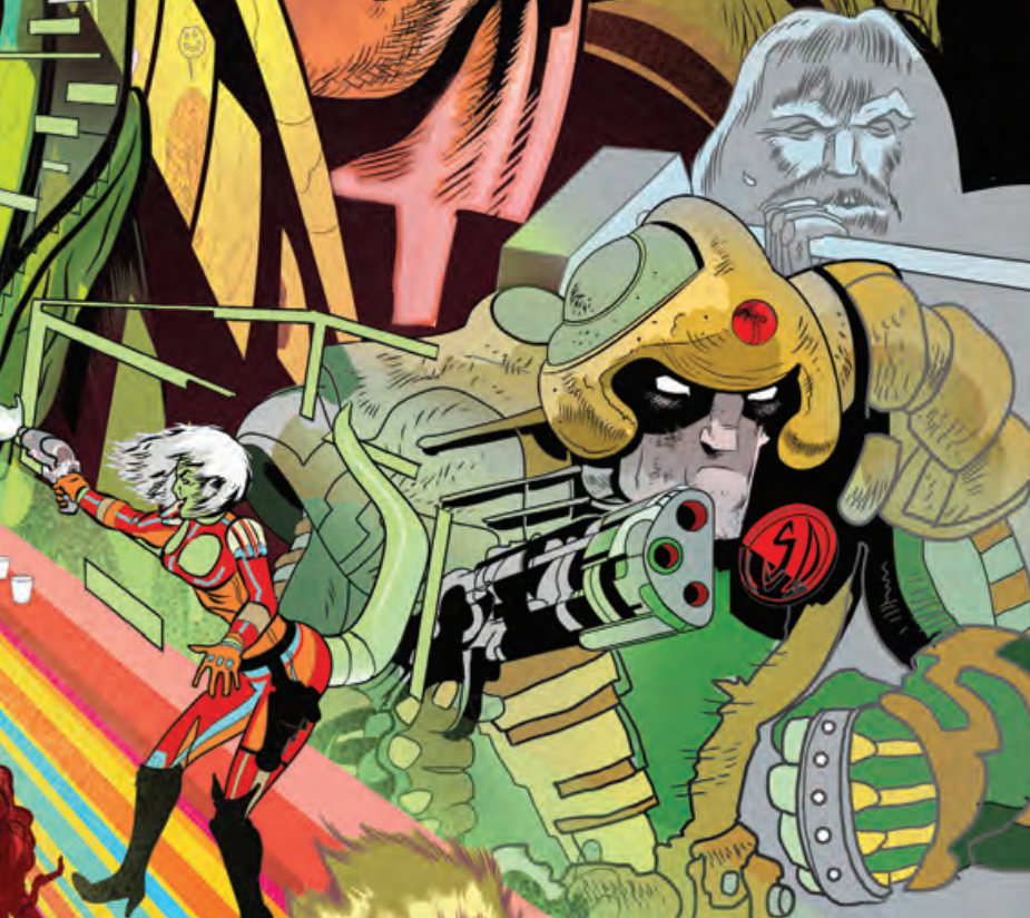
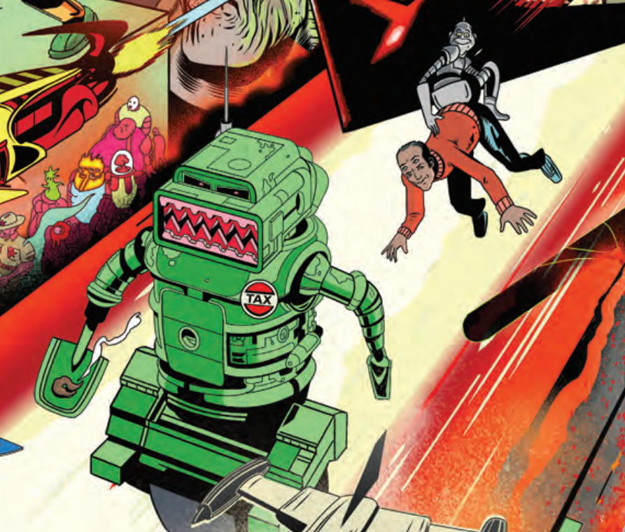
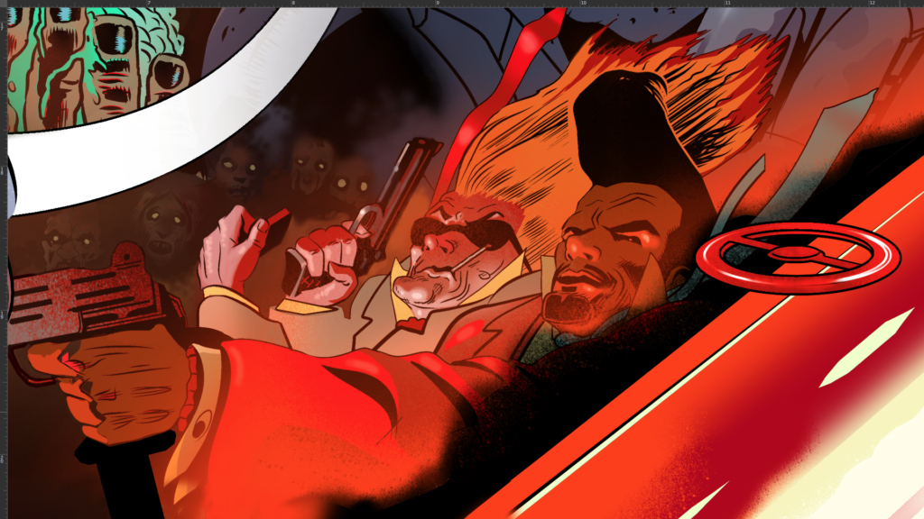
I was sent 2 lists, one listed principles like Dredd, Slaine, Nemesis, Halo Jones, Ro-Jaws (I think) – well, a total of six characters, I think. The second listed characters to include if possible.
I had a very tight timeframe in which to get this done and it’s almost always the case that you are busy when the new job comes in. So if a client needs something in two weeks, chances are, your next week or month is already booked. I also had a trip to Scotland* looming, that would eat another week.
And then there’s what I think of as ‘the snow globe’. I’m a firm believer in getting on with it, I don’t wait for inspiration. But every now and again I simply can’t get into it and sometimes I think that’s because events outside of work have shook up my thoughts, travel for example, and especially these days with all the extra paperwork and Covid testing, things that frazzle you, y’know? It can be creatively debilitating and that eats into deadline time. So I was concerned the trip itself would leave me all shook up…as ‘The King’ might say.
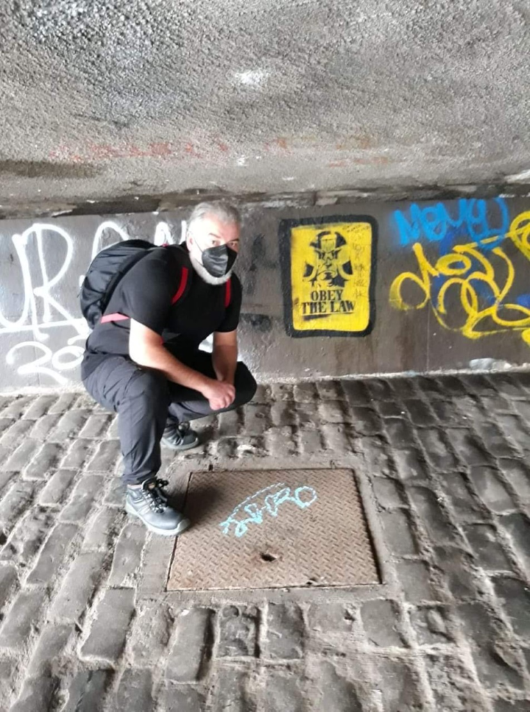
*Incidentally Scotland was no escape, some Banksy-a-like has sprayed Dredd on a wall under The King George the V bridge in Glasgow, I stumbled on his grim visage as we walked along the Clyde after breakfast….not an aid to digestion.
In this case, I had no time to do anything ambitious or difficult…so, difficult is exactly what I did.
My editors gave me an extra week to cover for the trip, it couldn’t be helped. We were long overdue a trip back after Covid lockdown… thanks again Ed’s!
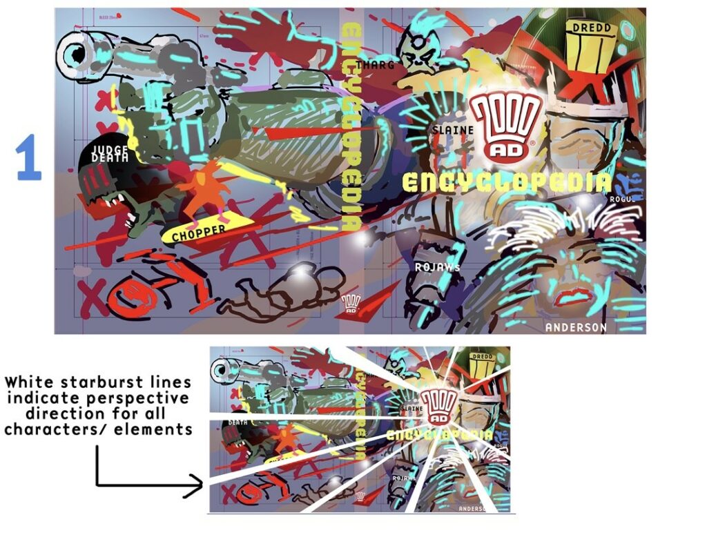
The template had letters set across the middle. Perhaps the team expected a white background. Text would go over my image in a banner maybe. I did a quick rough, got some notes back, a character swirl. I was asked for a few shifts of character and scale, but the idea of a swirl of characters got the green light!
.
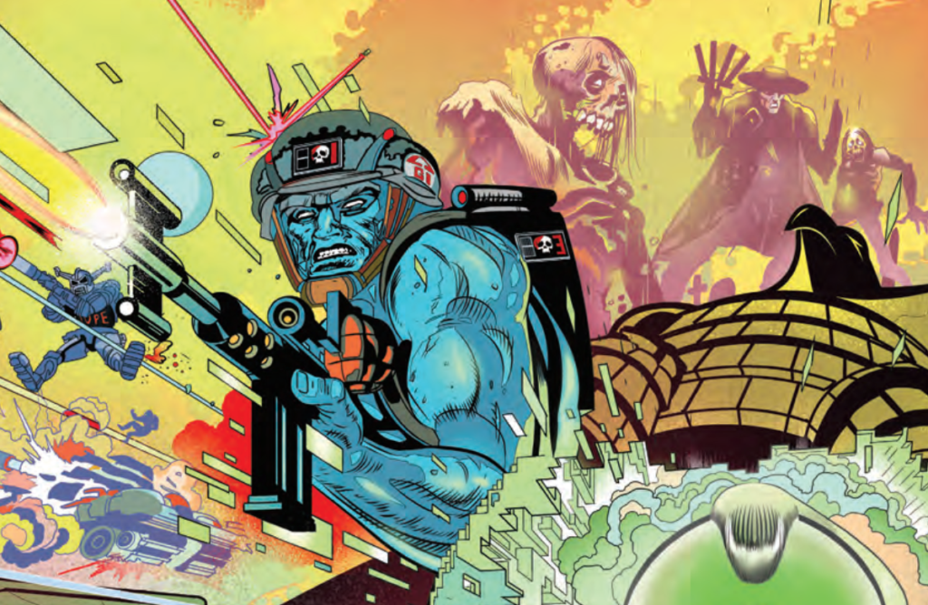
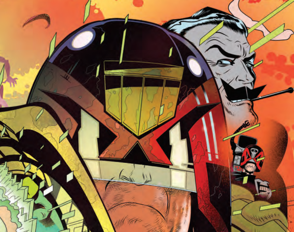
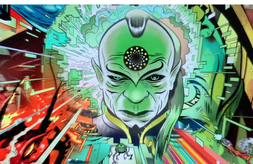
I decided to fill the scene in a way that looked like everything was coming from Tharg, I moved Tharg to improve the effect. I placed him under the 2000 AD logo so he’d surprise readers when the jacket came off.
I then realised he could be explosively shedding his skin, that way I could have a shell Tharg outside of the logo that we could glimpse.
.
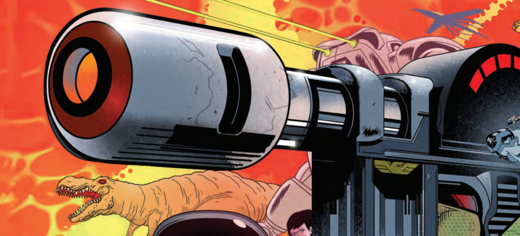
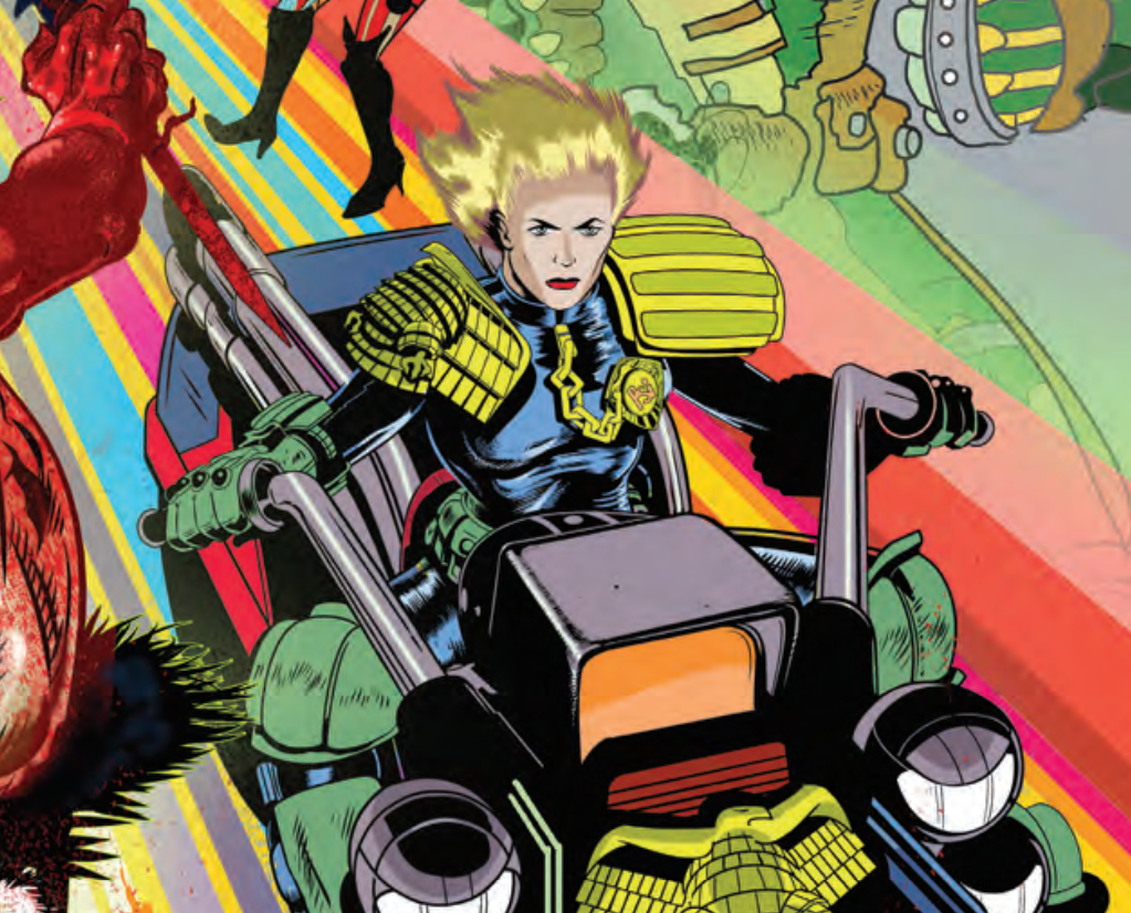
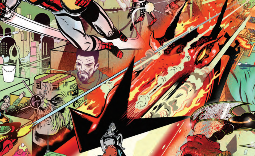
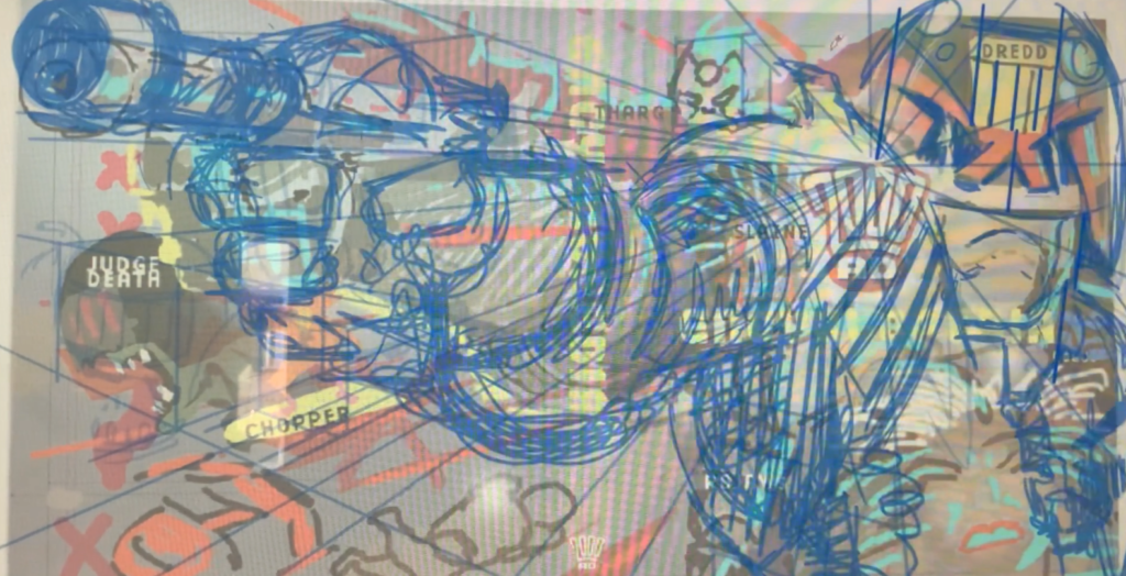
I set up my perspectives and got on with drawing the various characters. I concentrated on the front cover so I could be sure I’d at least have that if I ran out of time.
.
For the life of me I can’t understand Clip Studio 3 point perspective rulers. I can draw 3D conventionally on paper but not in this software…am I alone? Is it me? So I set up 3 layers with 2 point perspective…nuts, right? …but it works for me.
At first it didn’t go my way, then it did, then it didn’t, then it really did…sometimes you have to keep going. Nerve-racking if time is short …and it was.
The template suggested a white banner, I’m guessing that would have nested better if I had left a lot of white space. In fact having more white may have been the expectation.
(Anderson video)
Composition and Workflow.
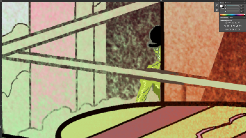
All the characters were created in completely separate files. This was a work-around I established because my system is old and memory strained with hundreds of pages of my Project MKUltra graphic novel. I was suffering SEVERE pinwheel issues before I made that decision.
(Judge Death video)
I realised the explosion might present problems for any landing text, I decided to think of ways to work with it. Although it was not requested I created a type layout and worked the letters up to look like they too were in 3D space.
It was an option I thought I should submit. The whole point of the painting was ‘acceleration’ and this allowed a greater rush of images since the letters would sit between elements that were rushing at us where as a banner might appear like a barrier holding back the rush.
I created a Slaine layer that would put his hair in front of ‘Encyclopedia’. As if he jumped in front of it.
There was some concern along the way from management about Slaine’s hair interfering with text, if they are publishing a book they want to know the titles reads. A move was requested earlier on too. The banner and logo were moved after I submitted final art.
(Slaine video)
2000 AD covers put characters in front of logos all the time, it looks great, it accelerates action and although it obscures the title, I think, it enhances the title because obscured tease the brain. They make you think a bit.
In psychology they call it ‘Amodal Completion’. It is the ability of the human brain to recognise partially obscured things. I’ve talked about it before. In this case it didn’t come down to that, though, the word was hardly obscured at all.
.
And with that, Stewart left us, no doubt to have a little lie down after all that. However, he did send over plenty more videos, which we’ll add below. But there was one thing that caught my eye when I was watching the videos, possibly the most essential advice any artist can give…
.
Thank you, as always, to Stewart for sending all of that along. You can get hold of your copies of the 2000 AD Encyclopedia, either the book itself or the book + the A2 poster version of Stewart’s incredible artwork at the 2000 AD web shop.
.
If you want to see more and read more from Stewart, you can go be amazed at the Covers Uncovered for 2000 AD Prog 2179 and the sort-of Covers Uncovered for the special poster in the 2000 AD Sci-Fi Special 2020, and the wonderfully long version for 2000 AD Prog 2239.
You can (and should) follow him on Twitter, go look at his website, and his incredible Graphic Novel, PROJECT MK UlTRA: Sex, Drugs, and the CIA Volume 1 is available right now.
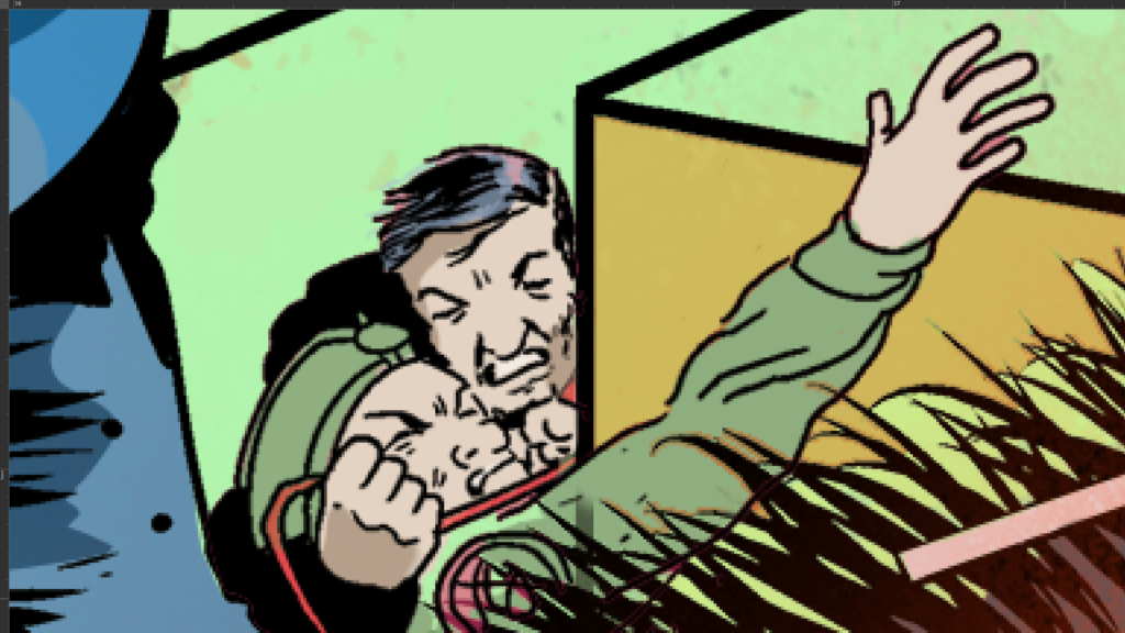
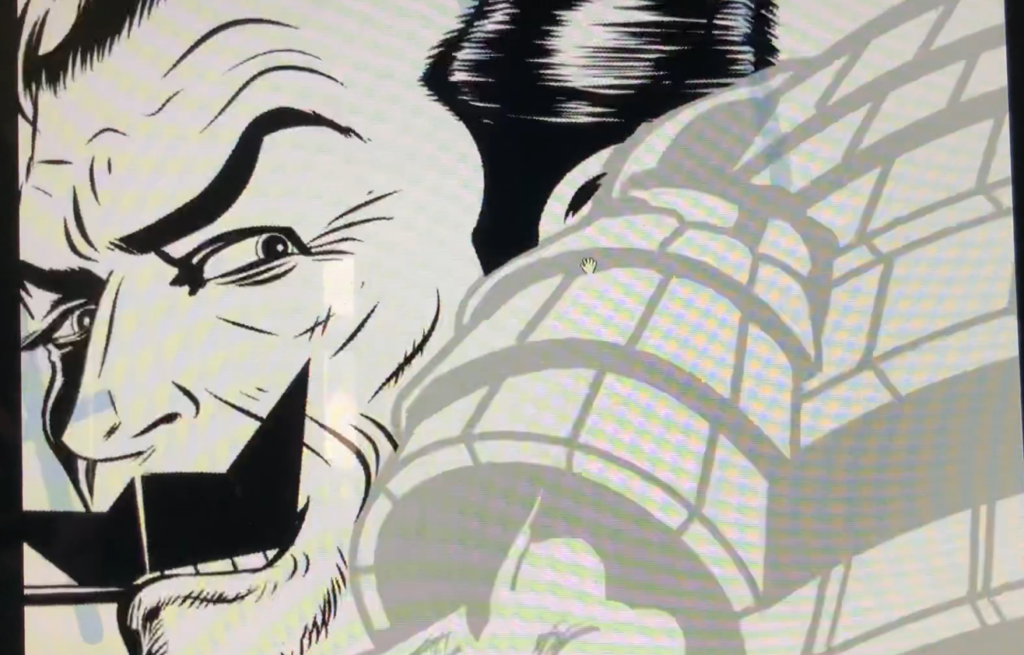
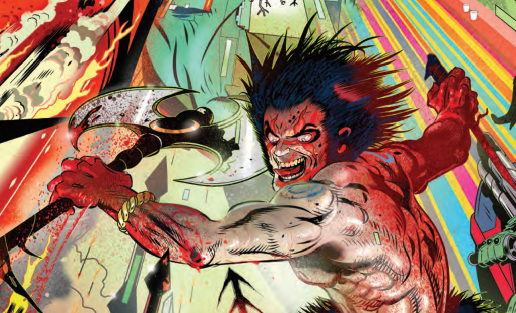
Now, just because you’ve been so nice and because Stewart kindly sent them along – a few close-ups of the cover and extra videos!