2000 AD Covers Uncovered – SK Moore’s MC-1 under the gaze of Dredd
27th April 2020
Every week, 2000 AD brings you the galaxy’s greatest artwork and 2000 AD Covers Uncovered takes you behind-the-scenes with the headline artists responsible for our top cover art – join bloggers Richard Bruton and Pete Wells as they uncover the greatest covers from 2000 AD!
Heading to the 2000 AD webstore and whatever stores are still open, you’re not going to be able to miss 2000 AD Prog 2179 with a stunning cover by SK Moore…
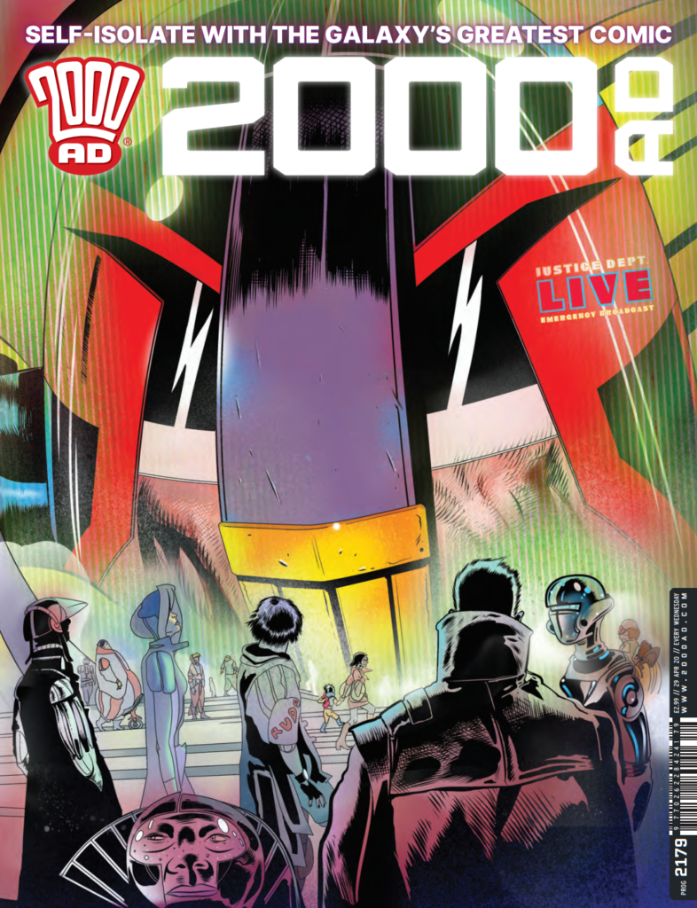
Stewart Kenneth Moore first entered the pages of the Galaxy’s Greatest when he took over the art duties on the last series of Pat Mills’ Defoe: Divisor that began in 2000 AD Prog 2150. His style is full of detail and style and you can find an interview with him talking about his artwork on Defoe: Divisor here. Currently working on his graphic novel, MK-Ultra: Sex, Drugs and the CIA, he took some time to give us this week’s wraparound Dredd cover.
Stewart joins us now to break-down just how the cover was put together, a tale of respirators, masks and a city under a watchful authoritarian glare…
How to Have Ideas Without Getting Any Ideas.
I didn’t have one. I wasn’t looking for one either. But despite a huge effort on the part of my frontal lobes to keep my mind trained on the psychedelic world of 1970’s San Francisco (the setting of my current project) images of Hazmat-suited soldiers emerging from disinfectant clouds repeatedly turned my thoughts to the stories of Judge Dredd. 2020 Wuhan China seemed very Mega-City One.
Respirators and masks were on my mind long before they became mandatory in Prague, where I live. Passing the occasional nightmarish figure in 17th century ‘Plague Doctor’ uniform or glimpsing hooded figures in state-of-the-art military gas helmets in the metro system here was an increasingly common sight. Gallows humour. Everyone’s a social satirist these days.
Within a few days, we were all in lockdown here and running errands without a mask was illegal. But there was no problem, no panic-buying, the citizens just got on with it like they’d seen it all before. They hadn’t, of course, no they’d seen far worse. Compared to Soviet and Nazi invasions this was nothing.
The image of Dredd with his respirator down while addressing a population that had seen ‘far worse’ flashed through my mind, probably while I did something awful like clean the cat litter tray, who knows, but I laughed. It might have been partially triggered by something a 2000 AD fan said to me on Twitter (How’s that for reverb!). I don’t really know why I laughed but it occurred to me the idea might amuse others too and that it could be a very good thing right now. I realised it might cheer people up, especially fans, to see that in Mega-City 1 it’s business as usual. Beyond that, it reinforces the lockdown message. Hmmm…
Ideas don’t always appear fully formed and when they do I get a bit suspicious of them and doubtful of how I came to have them, ‘where did that come from?’ I wonder. I tend to think I’ve seen it somewhere. So I quickly searched the back issues on the 2000AD website, I found nothing that looked anything like what I imagined. I couldn’t be sure but decided to risk embarrassment by pitching anyway. Pitch and be damned!
The Pitch
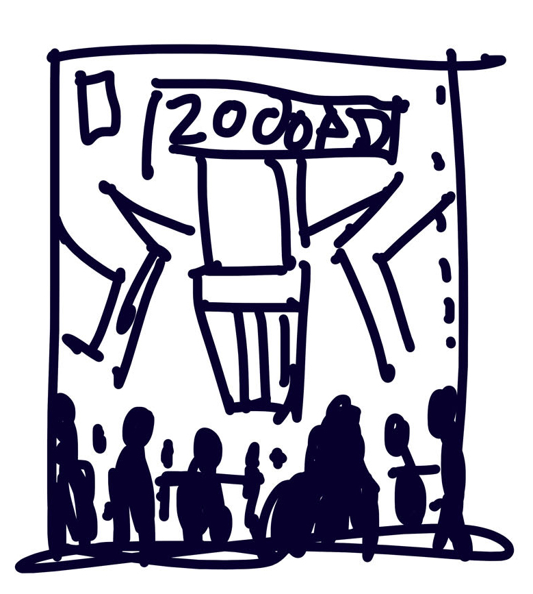
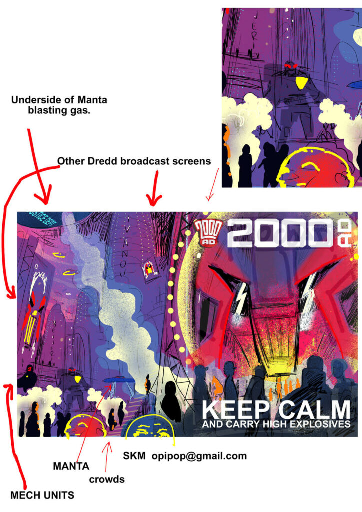
I emailed the idea to Tharg accompanied by a simple rudimentary scribble (see simple rudimentary scribble provided) that I offered to ‘work up’ into a doodle.
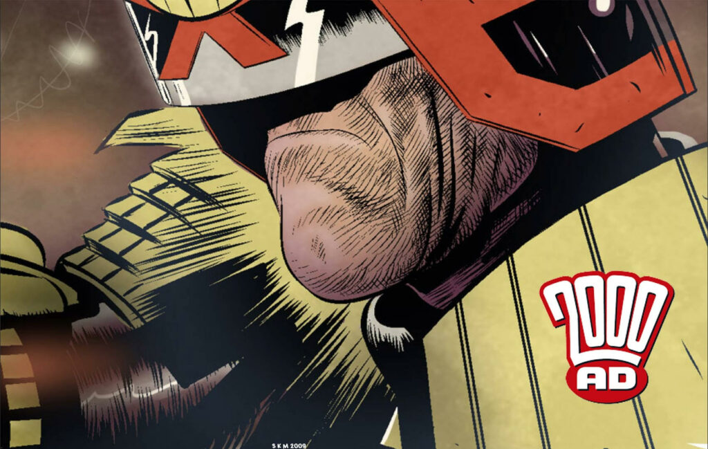
I included a drawing of Dredd that I made for the ill-fated 2nd Judge Dredd Gamebook. The scribble was very simplistic so I felt I should show the level of finish I would be aiming for. Tharg’s very own emissary on Earth, Matt Smith, told me to doodle on and, so, doodle on I did.
The Doodle
I knocked out this doodle with the poor-taste text ‘KEEP CALM AND CARRY HIGH-EXPLOSIVE’ . These words being, of course, a cruel update of the famous WW2 era British motivational posters. I thought it was very funny. So funny in fact that I fell out of my chair and on to the floor. I lay there for some time, doubled over laughing.
At some point, I regained my composure and climbed up into my chair to ‘carry on’. This was of course just place holder text, the words that will actually go on the cover have nothing to do with me. That’s decided in The Nerve Centre. But I do need to show where I would hope any text would be placed. It so happens the art was published without any text and that was the best choice of all.
I submitted the doodle and that evening I noted a mysterious green glow at my window. At the time I thought it a kind of sign from The Mighty One’s ‘Rosette of Sirius’ or something. Come to think of it, this part of what I’m telling you may be rubbish, so take it with a pinch of salt. No one drives these days. The traffic lights outside my window are permanently green, maybe that was it. Hell knows. The point is I thought I had the green-light, that’s what I’m saying. I thought I could take this doodle and go ‘NEXT LEVEL’. It’s the thought that counts, right?
The Design
Now cheering you up is an objective, sure, but I need to grab you to do that. Anyone who has stood back and looked at the shelves of WH Smith knows what a piranha-like feeding frenzy that is. Prog 2179 has to crack Woman’s Own right in the staples, head-butt its way through an army of Clarksons, turf Good Housekeeping backwards out an open window and boot Country Living right square in the GQ’s! But how?
If you can see Dredd’s visor at 200 feet, well, chances are Ideal Home will bottle it, Vanity Fair will fold, Heritage Railway will step up or step off. Aye, thought so Heritage Railway. Everybody knows that visor and what it represents, back off!
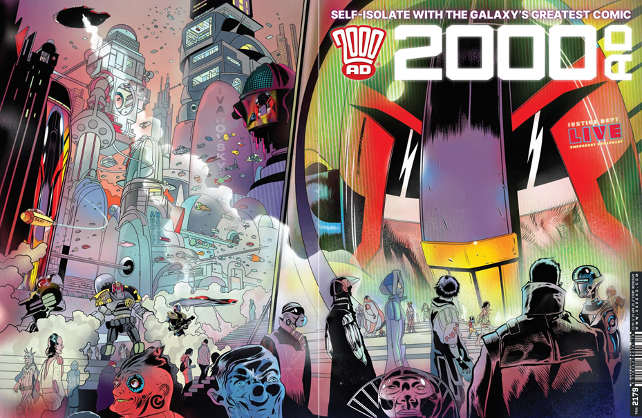
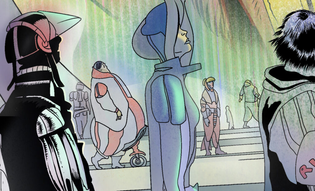
Now, if I succeeded and you grabbed 2000AD, that’s good, but my job isn’t done yet, it needs to grab you! With it in your mitts I want you to feel you are at the back of the crowd watching the screen. I want Dredd looking in at you, not the other way around! Yes, It is ‘objectively true’ to say that you are holding the prog, but at some subconscious level you have now also entered Mega-City One and are standing at the very back of the crowd. And just about when your eye begins to study the distant fatty with his wee belly-wheel, I think, it’s fair to say, you’ll have been grabbed!
Now, you might open the issue, or turn it over. If you do the latter, I’m taking your eye deeper and deeper into a vast Mega-City in a desperate effort to hold it there long enough to prompt the store clerk to break the spell and ask ‘You gonna buy that comic ur whit?’ (Translation: ‘Are you considering purchasing this particular publication?’).
The combination of confusion followed by a flush of embarrassment should render you psychologically weakened enough to be highly suggestible to the word ‘buy’ at this point and my work is done here. You don’t work this long on the subject of MKUltra without picking up a few mind-control tricks!
Shut Up and Tell Us How You Did It.
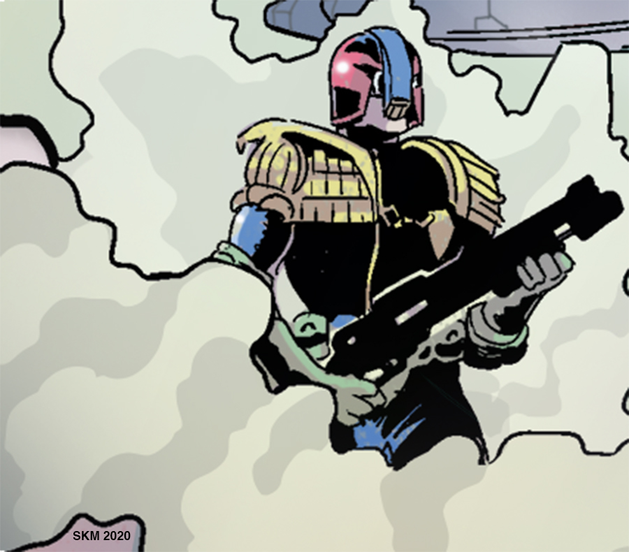
I took the 2000AD cover template and over-laid my doodle. I then lightened those layers and started to rough out the particulars on a new top layer. That means making a strong Dredd first! I only have his visor to go on, no chin, so nailing the visor ‘intent’ was very important. Although Dredd is depicted on a massive screen the dramatic trick here is to treat it like a goldfish bowl and we are the goldfish and he is looking in and down at us like a giant. Later I had to push Dredd back because the dominance of the black in the helmet threatened to make him appear to be an actual giant and that could be confusing. Am I…repeating myself? Age, jings.
With Dredd inked I got on with the citizens. I wanted to build everyone around the wee belly-wheeled ‘Fatty’. Making a large man very small was another way to maximise Dredd. That may have been a lesson learned from Jim Baikie.
Long ago I asked Jim about a tiny dog in one of his Dredd pages. ‘It’s that minimalist thing’ he said. I believe he meant that emphasising something so small can serve to maximise other things, in this case, Dredd. One way or another it amuses the eye.
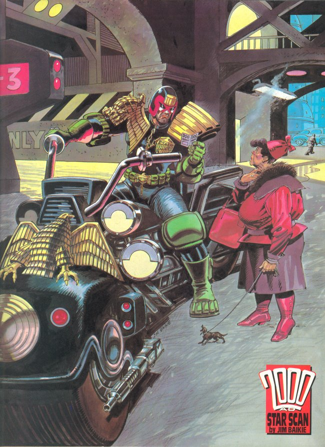
‘This is the picture I refer to by Jim Baikie. Thanks to Wullie Russell for sourcing it.’
During the day I work on my graphic novel. I start early, around 6am most days. But some days I start at 5am. I worked on this cover in the evenings. I had a long lead time on it so I could potter around at night and take my time. I started work on the city on the back of the cover at the same time as I worked on another cityscape during the day for my book.
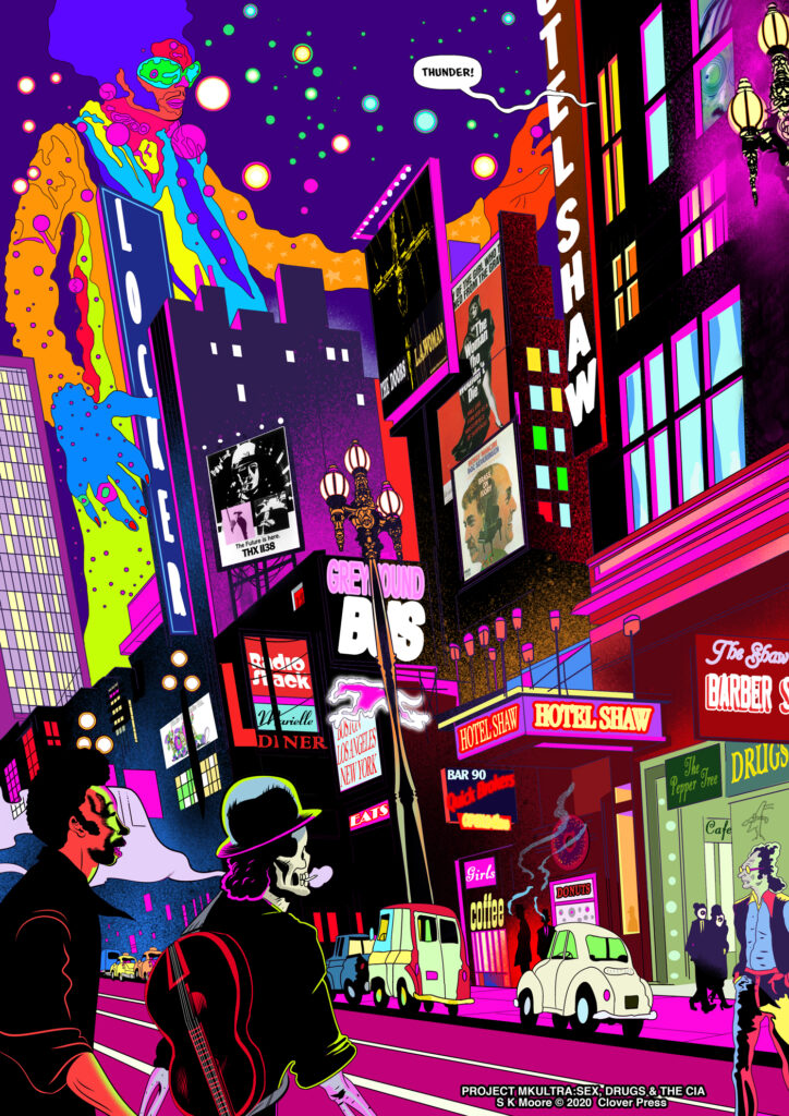
San Francisco 1971 and the futuristic MC1 are quite different, but they affected one and other. I think my GN page was improved by this back and forth method, as though one image was a testing ground for the other.
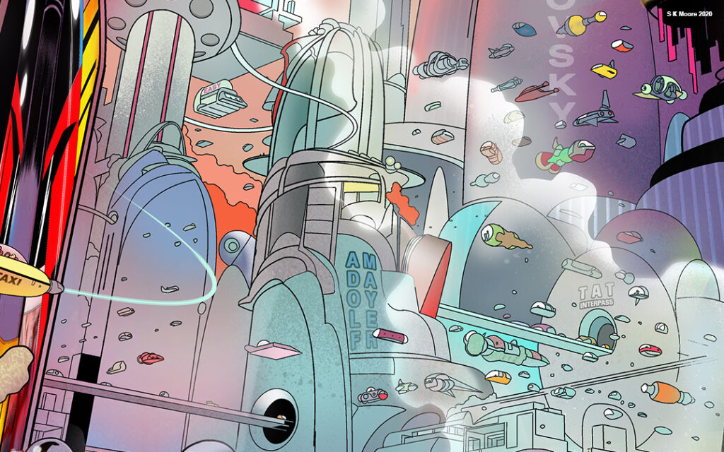
I then scoped out the cavernous interiors of the mega-blocks to heighten the sense of vastness. Finally, I created a final inked drawing of the entire wrap-around scene. My goal with this design is to jump off the shop-shelf at you…oh, I did you say that already…ha ha, you whipper-snappers!
But for those with digital subscriptions, I take it even further. My hope is that digital resolution will be good enough to allow readers to pinch and expand the scene to reveal many more areas. You have to remember that your comic may be A3 on paper but in the digital medium, it is a vast wall-sized fresco, potentially anyway. I have been trying to exploit this side of digital comics for the benefit of readers for years now in Aces Weekly. But I must admit, it is exhausting and I’m not feeling the love. This is an area to be explored, but it may be beyond me to continue in this way much longer…..where was I?
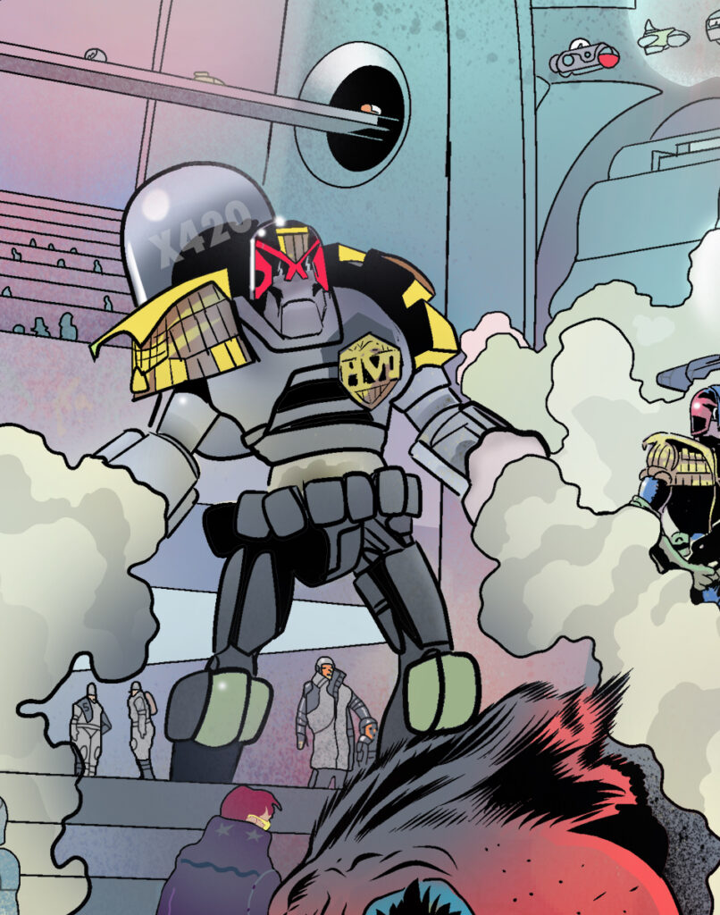
Oh right, now I set up my rulers. I draw with a tablet and work in Manga Studio (now inexplicably known as ‘Clip, Studio Something’…well, not in my day!). The digital rulers allow you to work faster than you might on paper. But they are a pain in the neck. As much as I love the speed I find them to be maddening and would rather use actual rulers on Bristol board. I like technical drawing. Digital is vital for speed, though, and not having to worry about how or where to buy art materials with all the shops shut nowadays (due to the pandemic) is yet one more unseen advantage of digital art. In the Covid age I never run out of ink!
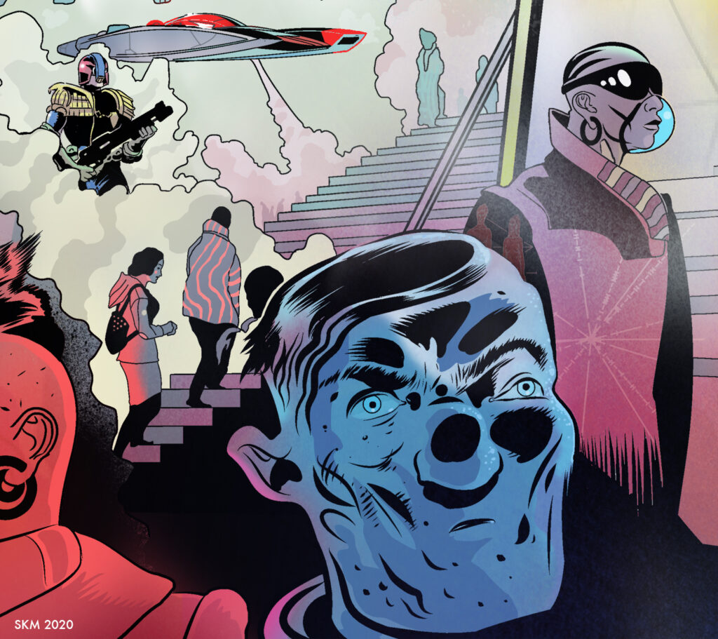
The doodle perspective was all by eye. I always find it a bit uncanny when I over-lay the rulers and they all work right away. Doing perspective by eye, without rulers has it’s stylistic advantages. Some artists never use rulers and the organic quality, it seems, keeps the image alive in a way that rulers can kill a picture. The straight line can stiffen art to death.
‘The straight line leads to the downfall of humanity’ – Friedensreich Hundertwasser.
Well, I wouldn’t go that far. So I draw everything…refine, delete, clean up. It’s a balancing act and I try and keep the image a ‘comic’ image and not too ‘real’. This leads to areas looking real and some more like comic characters, I like that mix right now, I think it keeps things alive somehow, unpredictable, amusing. Here and there I might use some photo references, but they also can stiffen the art and I’m often disappointed with the outcomes. So I tend not to. I have found that if I fog out my sketches, make them really really light, almost vanishing, my imagination suggests things in them that are not there and I follow that very often. Strange, I know, but true. Try it. Anyway, I export my inks and open them in Photoshop.
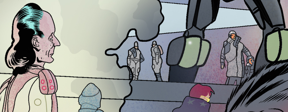
To quickly govern colour I pull in my doodle and ‘gaussian blur’ the doodle into a cloud of colours. That creates a ‘colour atmosphere’ that I then place under the inks and workover. The colours I choose are reactions to the colours beneath. I have always painted this way in oils with very colourful under-paintings. It’s a way of doing things. The psychedelic MK page definitely affected this part of my Mega-City.
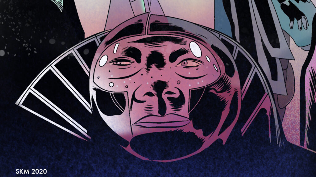
I paint the details and push and pull and fight and temper things for a long while. I like flat colour in comics but mix things up a bit with some shading and airbrushing here and there. Eventually, I look at the whole image and temper a few final things. In this case, pushing Dredd back a bit so he will sit better under the 2000AD logo. It’s always a good idea to keep checking against the logo that the whole image works to serve the title.
At the very end, I made some blunders, with so many details I accidentally lost a few things. There was some graffiti and a few other details that I painted over accidentally. There was more gas and darkness on the front cover art. Somehow I mixed things up and lost those layers in the final version and didn’t realise. It realised it didn’t really matter, not a big deal.
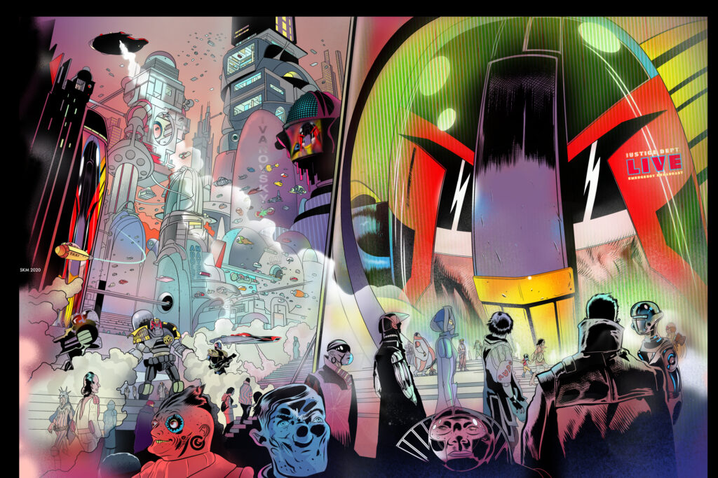
I use Dropbox (or other FTP system) to upload final art to Tharg. I then wait in fearful silence. You never know, the work might not pass muster and I might be demolished by Tharg’s Rigelian Hotshots. They move at near light speeds, I understand.
So if Tharg is in Oxford it should only be a matter of seconds for them to strike me down, so, once the moment passes and I’m still quite conscious (and not horribly burned) I feel it’s reasonable to assume the work has most likely been approved for publication. However, if Tharg is in lockdown at his second home on Betelgeuse it could take considerably longer for me to be rent asunder. I’m not sure how many light years away his star system is or how long it would take for Rigelian Hotshots to get to me.
But The Mighty One must be happy with my work because I am still here typing this missive with my faculties intact!
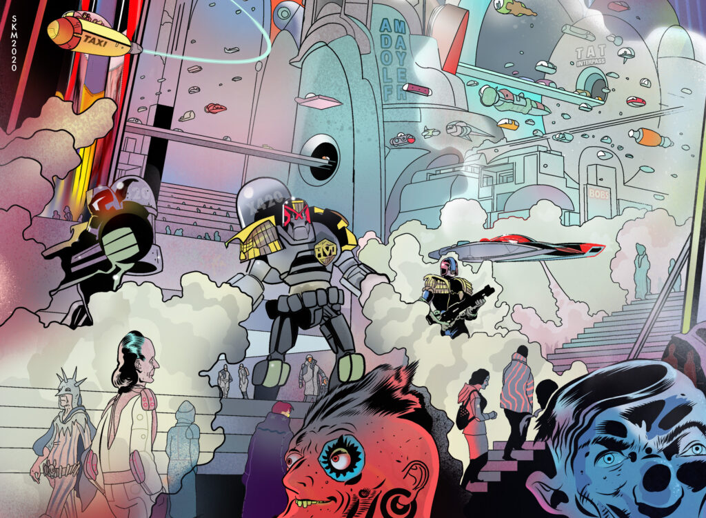
Now THAT was a Covers Uncovered! Thanks to Stewart for going deep onto something that will, no doubt, be up there in the top Prog covers of the year!
2000 AD Prog 2179 is out now – available from stores that are open and from the 2000 AD web store.
You can follow Stewart on Twitter and Instagram for more art, more updates, and more greatness!
