2000 AD Covers Uncovered: Smash!-ing It Again with Andy Clarke
29th November 2023
Every week, 2000 AD brings you the galaxy’s greatest artwork and 2000 AD Covers Uncovered takes you behind-the-scenes with the headline artists responsible for our top cover art – join bloggers Richard Bruton and Pete Wells as they uncover the greatest covers from 2000 AD and beyond!
This week, we’ve got another superheroic treat for you with another Smash!-ing Andy Clarke cover to the hit three-issue series that brings together classic Brit super-types from across the ages – SMASH!
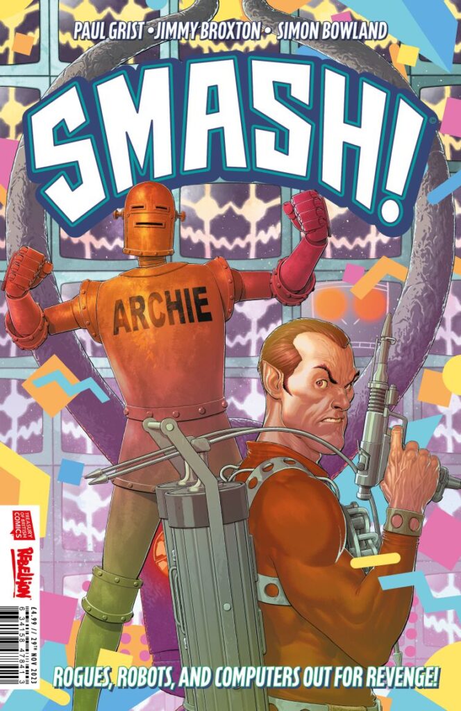
Issue 2 of Smash!, by Paul Grist and Jimmy Broxton, is out on 29 November with all-out action and adventuring as we join the thrills in the ‘80s with The Spider finding himself trapped in Maxwell Tower after his heist of the demonic idol created by Janus Stark goes badly wrong.
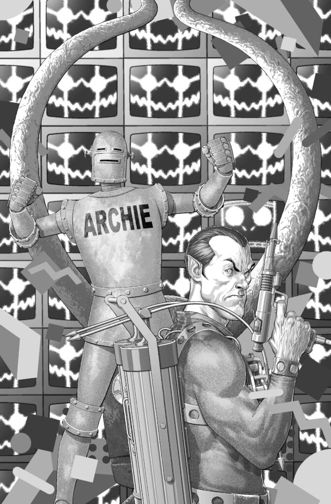
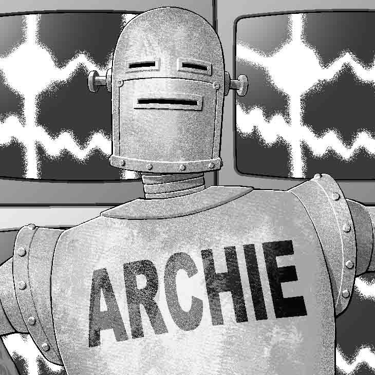
As Robot Archie closes in on capturing the arch-criminal, the King of Crooks is up against malevolent AI Max and the terrors of The Thirteenth Floor in a thrilling second part to this celebration of all the weird and wonderful of Brit comics!
Smash! #2 arrives in comic book stores and on the 2000 AD webshop and app on 29 November and we’ve got cover artist Andy Clarke here to tell you all about putting together the cover for this one…
Of course, alongside this Covers Uncovered for Smash! issue 2, you should head back a month and check out Andy’s art and process for issue 1.
As before, editor Oliver Pickles sent along the reference material for Andy to use – focusing on Max, Maxwell Tower and Robot Archie…
written by Alan Moore, Leah Moore, John Reppion, art by Shane Oakley, George Freeman.
Cover by Dave Gibbons, interior art by Oakley/Freeman.
>
The Thirteenth Floor: The Return of Max – art by John Stokes.
>
So, as we found out in the process to issue 1’s cover, Oliver also suggested a look at Sean Murphy’s recent Batman covers to give a film poster feel to this trio of covers.
After that, Andy roughed up sketches for all three covers – to keep a ‘look’ going through them all. But also giving each one its period theme, saying this when we talked about issue 1’s cover – ‘As the series is set in different decades, I wanted to add a 1960s (for issue 1) and a 1980s (for issue 2) background pattern or design as a nod to that.’
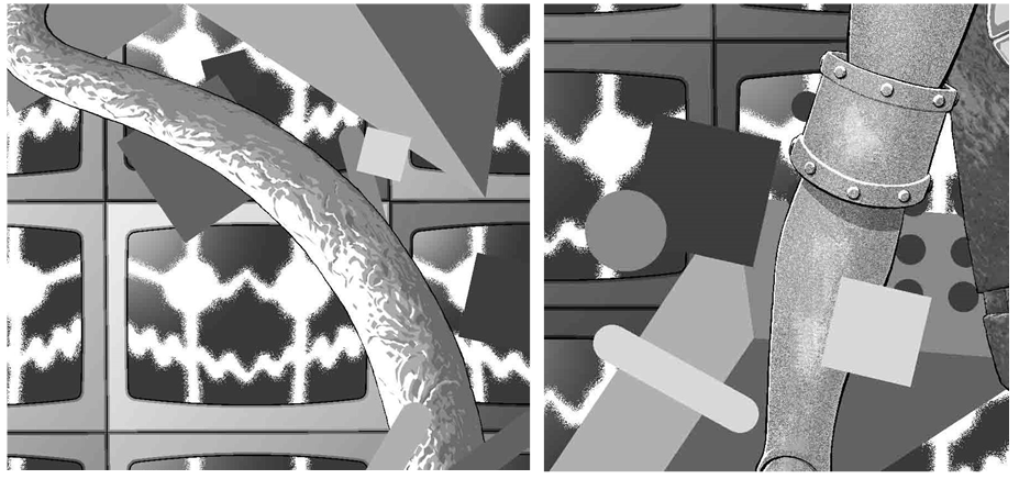
The idol quickly became the one real linking element for Andy across all three covers… ‘I roughed up some sketches for all three, just really to see if anything popped out that I could carry across them all so they had a connection of some kind. Pretty soon, the Idol looked like it would be the thing that could link the covers together – the Idol also did a lot of the heavy-lifting for each layout/composition in the end, it helped tie everything together.’
In fact, the idol was so integral that Andy used it as, according to him, a bit of a cheat. Here’s what he had to say about that for issue 1 – ‘Once it was agreed the Idol would be the one element repeated on all three covers, I thought that once I’d inked the outline, done all the grey-tone, the flats, the colour and rim-lights on it for issue 1, I could drop it into the other two covers without having to redo it from scratch each time. Then all I had to do was alter the colours and highlights on the Idol for #2 and 3 so it matched the colour-scheme around it. Bit of a cheat really, but it saved some time.
Okay then, now we go to Andy and his thinking about putting together this cover…
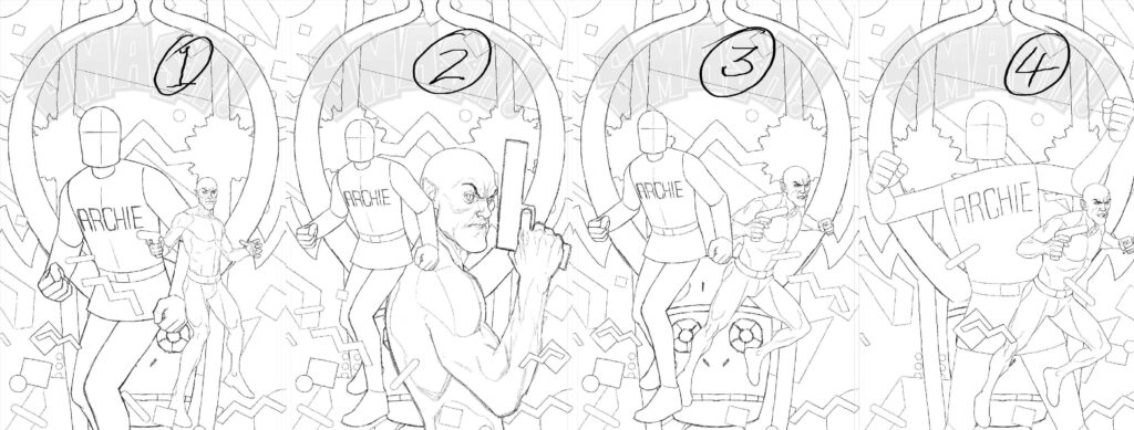
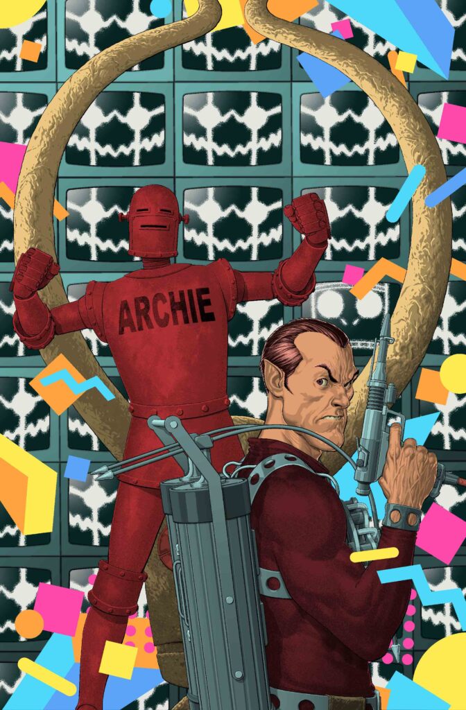
ANDY CLARKE: I did quite a few sketches for the second cover – examples of which are included here – it wasn’t coming together as easily as the first one, so I splurged a bit on different poses and positions for the two characters – changing the size of Robot Archie in relation to The Spider and vice versa.
ANDY CLARKE: I was set on using the ’80s pattern I’d found – I broke it up a bit so it looked like it was floating around the characters, but its essentially the same kind of design that was used in the title credits on Saved By The Bell.
He’s right you know… compare and contrast…
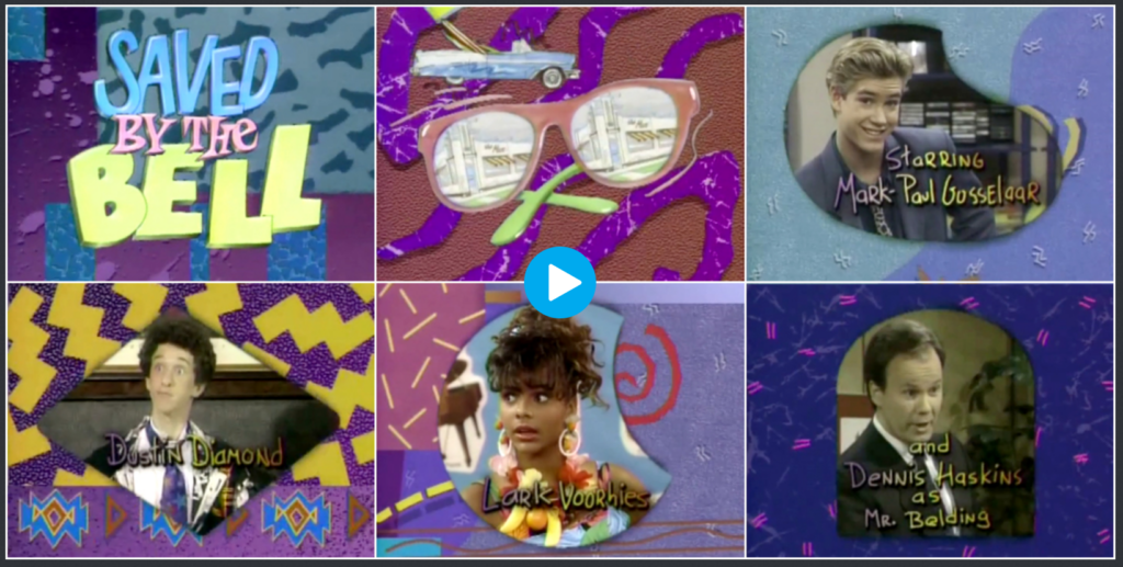
Yep, definitely Saved By The Bell vibes! Oh, the strange places these art droids get their inspiration from. And if you want to see the whole title sequence in all its garish ‘80s glory – head here where we got the image from.
Okay, back to Andy…
ANDY CLARKE: The thing that fixed #2 was all down to Oliver. I couldn’t put my finger on why it wasn’t working that well as a composition, I just knew that it wasn’t.
Oliver pointed out that the big, singular version of Max I’d drawn up was occupying the same plane in the picture as the Idol, so he suggested having Max as a wall of TV screens instead that could be pushed back and act as the background. This seemed to fix things for the better immediately – there might even have been an audible click.
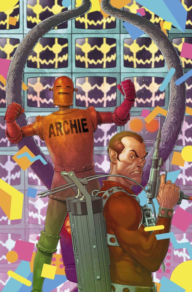
And here’s cover sketch #8 – with the Oliver-inspired fix absolutely nailing the design for the cover…
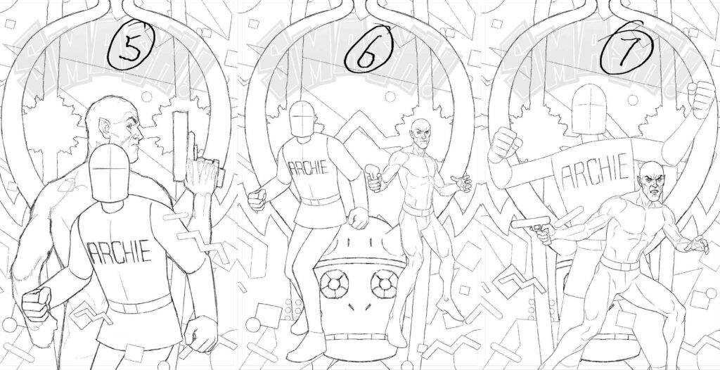
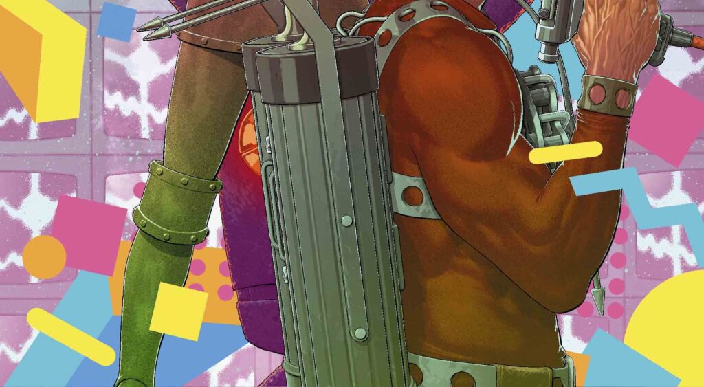
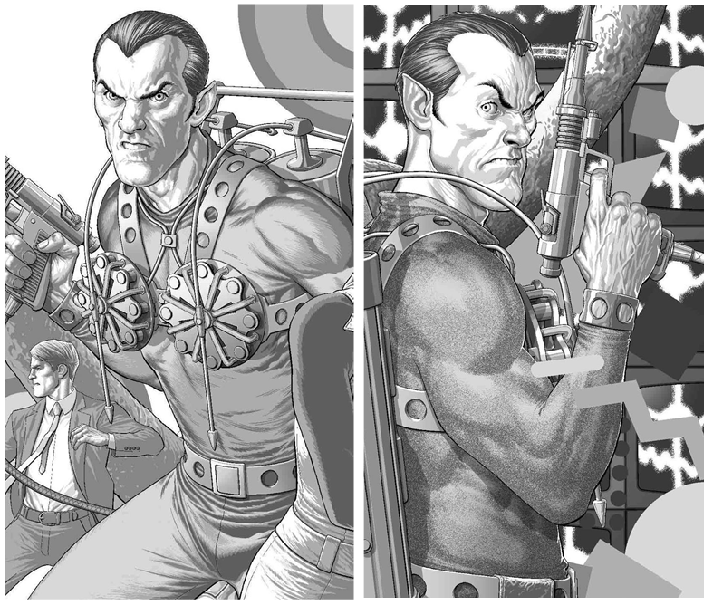
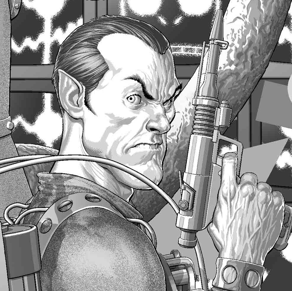
ANDY CLARKE: To fit with the setting for issue 2, I tried to make The Spider more “‘80s” – his shoulders and arms are a bit bigger and more rounded compared with #1.
I was going for a hint of that muscled-up excess a lot of superhero comics had in the late ’80s/early ’90s. I might have been a bit too subtle about it though, looking at it now.
Well, time for another compare and contrast for you! Here’s Andy’s Spider from issue 1 versus issue 2 – subtle but definitely got that ’80s bulk going…
All he needs is pouches everywhere and we’re right back there!
Now, time for the various stages of putting it all together now that Andy’s fixed all the design bits and got something to work off!
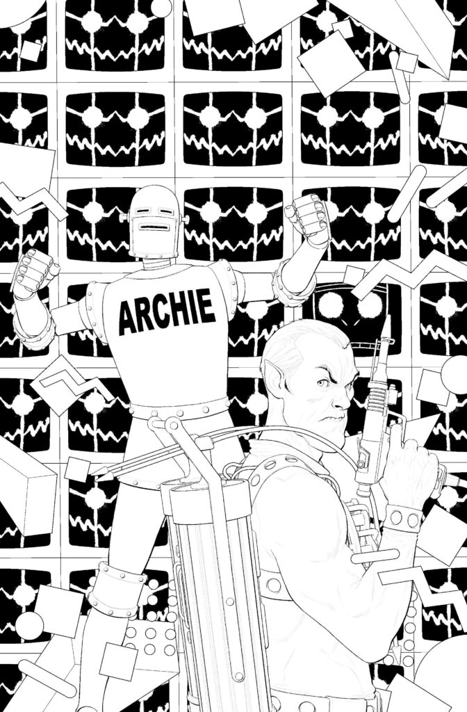
As he’s told us before, he pencils, then inks – but only inks the outlines, putting black only where it wouldn’t be better served with greys (and on this one that means a lot of Max in the background!) After that, the huge amount of detail comes in with the greytones that are added. Finally, with the colouring, it’s flats first and then final colours added to really make it all pop on the shelves.
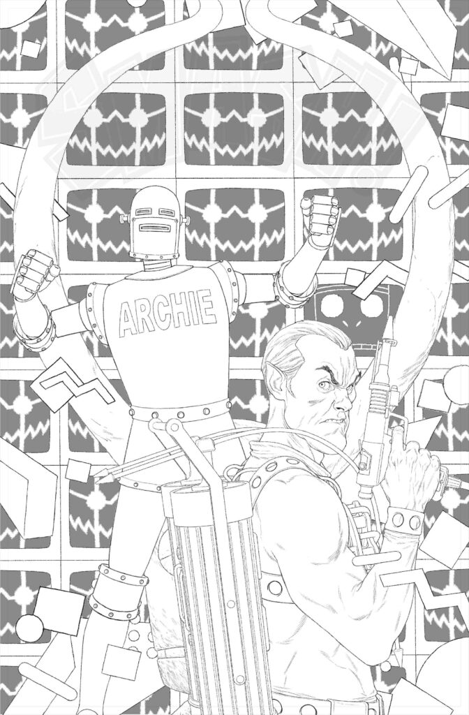
a muscular Spider, Robot Archie, multiple Maxs, and the idol that started it all off.
Oh, and all those Saved By The Bell ’80s visual bits!
in this case, a heck of a lot of Maxs!
And here’s just a little bit of that detail… it’s so incredibly impressive that we wanted to blow it all up a bit to show you…
Okay, back to the process and the final stages – colours!
Another SMASH!-ing cover there from Andy (no, we’re not going to stop using Smash!-ing, it’s way too perfect a fit!) Thanks so much to him for sending it along to us.
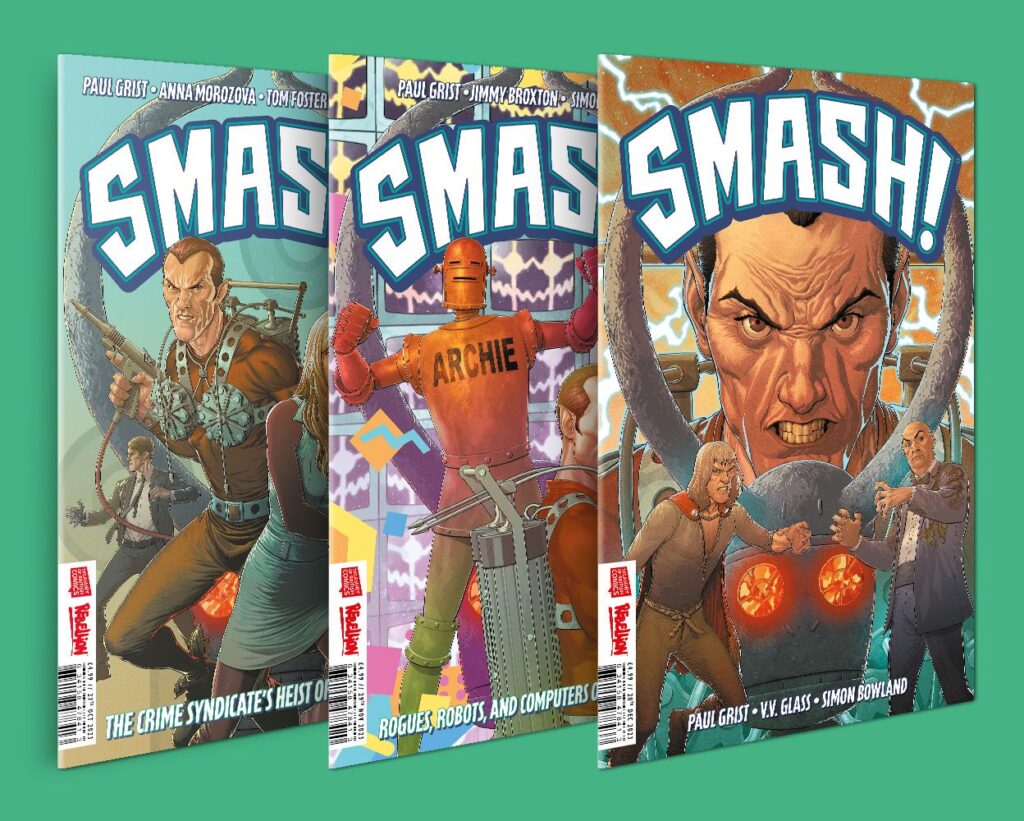
You can find Smash! issue 2 in comics shops and from the 2000 AD webshop and app on 27 November, and there’s also the chance to pick up all three SMASH! Issues in a bundle from the webshop right here.
Andy’s Covers Uncovered for Smash! Issue 1 is a must of course, but there’s also these to take a little look at – Prog 2287, Prog 2290, Prog 2312, Megazine 444, and not forgetting the Prog 2350 subscriber-exclusive cover!