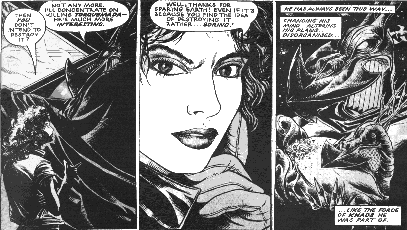
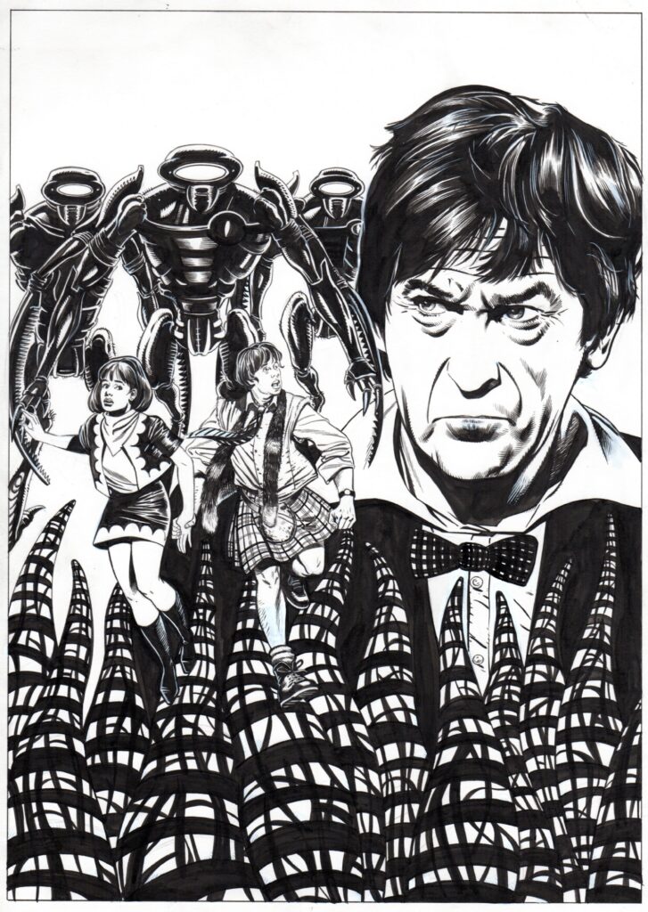
2000 AD Covers Uncovered – the luscious & lovely David Roach returns in Prog 2265
22nd January 2022
Every week, 2000 AD brings you the galaxy’s greatest artwork and 2000 AD Covers Uncovered takes you behind-the-scenes with the headline artists responsible for our top cover art – join bloggers Richard Bruton and Pete Wells as they uncover the greatest covers from 2000 AD!
This week, it’s 2000 AD Prog 2265 and the return of the opulence of turn-of-the-century Parisienne sci-fi fantasy thriller, Saphir from Kek-W and artist David Roach. First seen as a Tharg’s 3Riller back in Progs 2197-2199 for the first 3-part Saphir: Un Roman Fantastique, where we were introduced to the strange world of Inspector Alphonse Mucha of the Surete – expect lush looks and plenty of otherworldly weirdness in the new series, the 5-part Saphir: Liaisons Dangereuses!
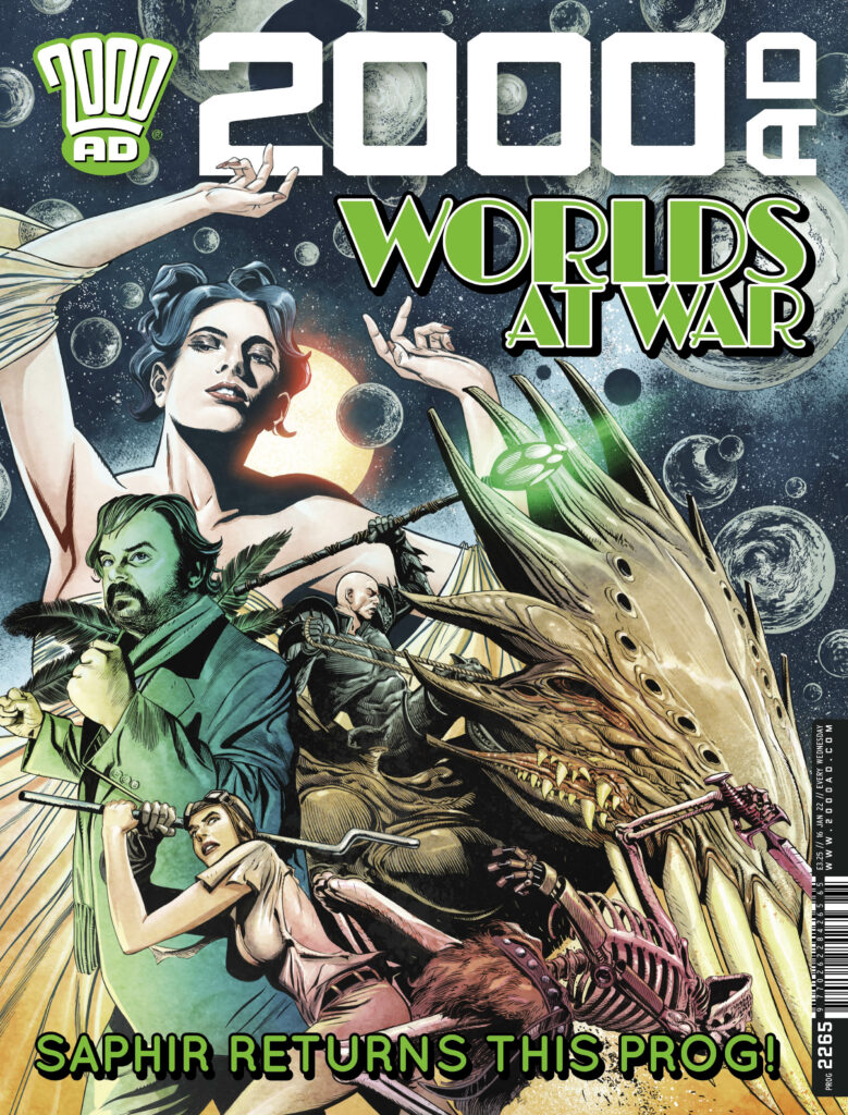
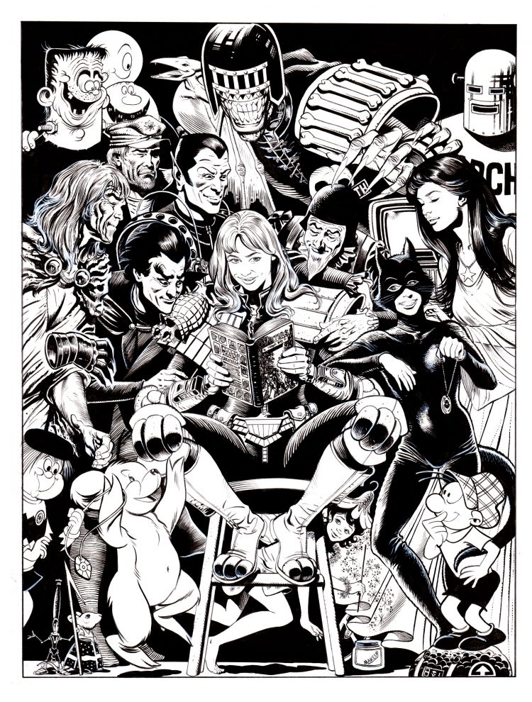
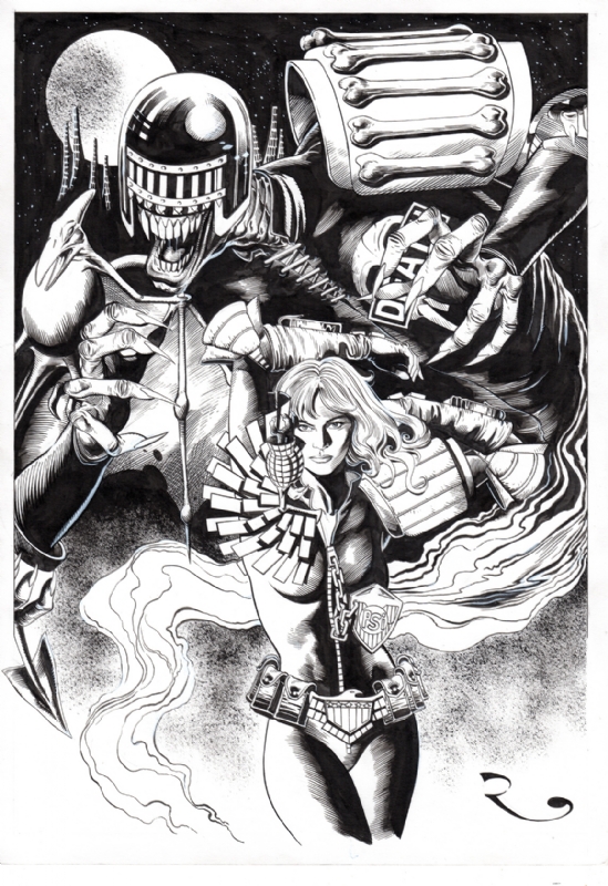
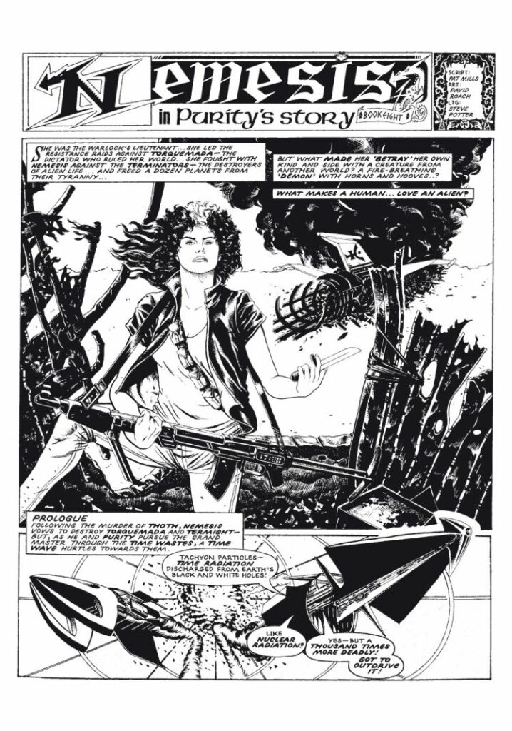
You’ve thrilled to his work in 2000 AD over the years on Nemesis, Judge Dredd and Judge Anderson over the years, you’ll have been amazed and entertained with the whole history of comics in his Masters Of British Comic Art and now you get to be blown away by his Saphir cover on the latest from the Galaxy’s Greatest – it’s time for Covers Uncovered and the lush lines of David Roach…
So, over to David…
DAVID ROACH: It is one of the vagaries of my comic art career that despite being the regular Dr Who cover artist for Panini, I’ve rarely been asked to draw covers for 2000AD. Admittedly that’s mostly been my own fault because I’ve always been so slow that asking me to draw a cover for my strips would only have made each Anderson , Dredd or Nemesis episode even later than it already was.
So perhaps that’s why each time I am asked (and this is only my fourth- including a pair for classic 2000AD) it feels like an immense honour.
In this case it’s doubly special because Saphir is a special project for Kek W. and myself and being given the cover feels like a big step in trying to establish the series at the Galaxy’s Greatest Comic. Saphir was something we cooked up together and then begged The Mighty One to commission, and amazingly he said yes. Twice!
As soon as I’d sent in the last episode of the current storyline Matt asked if I’d like to do a cover, the only stipulation being that it had to be a movie poster style- with various pictorial elements, rather than a particular scene from the first episode.
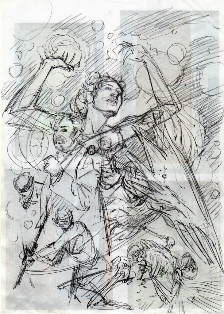
This suited me just fine since it was pretty much the same concept with all my Dr Who covers, and since there wasn’t long to do it, it meant I could shamelessly pick things that were fun to draw without taking a lifetime to finish. It’s odd but true, at least in my case, that putting even the roughest sketch down on paper can feel hard to deviate from, so whenever possible I like to compose each image in my head first, moving around the various parts to create a nicely balanced image. Of course, what constitutes a harmonious but exciting picture is almost impossible to define and much of the time it feels like I’m making it up as I go along and hoping for the best. For this cover I put together an extremely rough sketch (as you can see) and promised Matt it would all come together in the end. Thankfully he gave it the OK so off I went.
.
I like to work big and this image actually expanded as I drew it, as more and more of the art overlapped the logo I had to constantly expand the borders to fit everything in. The final picture almost fills an A2 piece of paper, which is the size British artists typically drew at up to the early ‘80s but is quite an anomaly these days. By contrast, Phil Winslade draws at what looks like A4, pretty much print size.
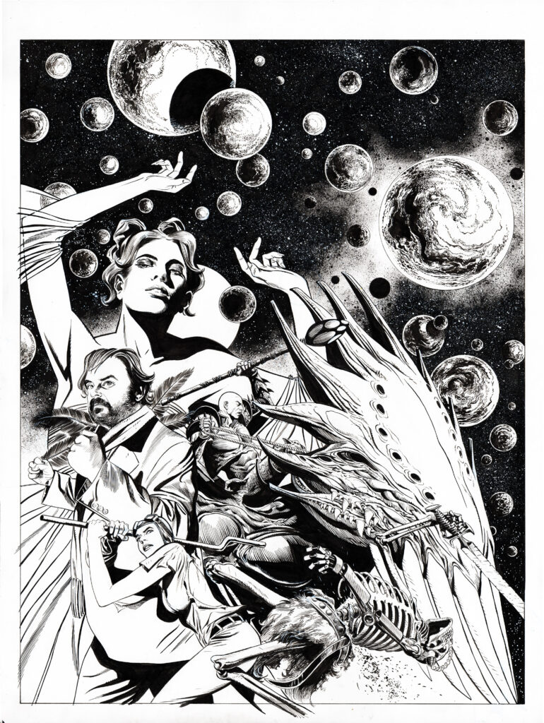
As the star of the strip, I wanted Inspector Mucha to be more or less the central image but he ended up getting squashed to one side a bit by our bald, coral-armoured baddie Viridian on his flying creature. Hey, these things happen. The Inspector himself is modelled on my musician friend Anthony Reynolds who is a life-long 2000AD fan so I felt it only fair to make him look suitably heroic, hence his determined stare and pugilistic posture. Viridian’s pose is largely taken from an interior panel from episode2, just because it turned out so well, and I tweaked some angles so as not to create any jarring vectors with bits of the creature.
It’s a constant frustration that the rough sketch has a lovely dynamism to it that can so easily be lost in the finished drawing, and I ended up redrawing this relatively small figure endlessly to try and get it right. The monster ended up having hands in the strip, but I was never fully happy with them so I obscured them on the cover!
Even in my earliest thoughts about the cover, I wanted to feature a large portrait of Lady Sofia but it took a little while to decide on the background. In episode 1 we have a sequence where Sofia conjures up a whole universe in her sitting room so that seemed like a striking image to include and featuring characters against a black background can really make them pop. Planets are great to draw as well- use a template, compass or small plate, draw around them and bingo- a planet. I just doodle away at them with a brush in the inking stage to create random patterns and depth, add sponge effects for milky ways and white paint for stars and there we are- a suitably cosmic background. That’s the plan anyway.
.
The foreground is a little bit of a cheat since it’s a scene that doesn’t actually happen in episode 1, but I really wanted the statuesque chauffeur/Alien Warrior Jorg to be in the picture. I felt she should be doing something dramatic so I brought forward her battle with the skeletons from episode 2 and hoped that nobody would complain. The poses came through pretty quickly in the sketch so I more or less carried them over to the finished cover with some minor tweaking. There were other characters in the episode who I was initially going to include but I ultimately decide that I wanted to Delay that surprise for inside the comic. Hopefully it’s going to be a real “What the..?” moment.
Putting an image together can be quite an organic process, at least the way I do it, and all through the process I try to be conscious of the tonal contrasts across the picture. That is; aiming to have light areas set against dark backgrounds, or vice versa, and playing different sorts of tones, lines, and textures against each other so the eye is never confused at what it’s looking at. Artists can create depth by putting a white halo around a figure, but that just feels like cheating. For those interested in the minutia of an artist’s tools; the whole thing was drawn with a B propelling pencil, inked with number 1 and 2 Pro-Arte Prolene brushes (Very cheap- in fact, Ian Gibson once told me off for my shoddy art materials!), Joseph Gillott dip pens, Winsor And Newton inks, ropey old bits of sponge and Pitt permanent markers on smooth, 220 g/m A2 Daler Rowney paper.
.
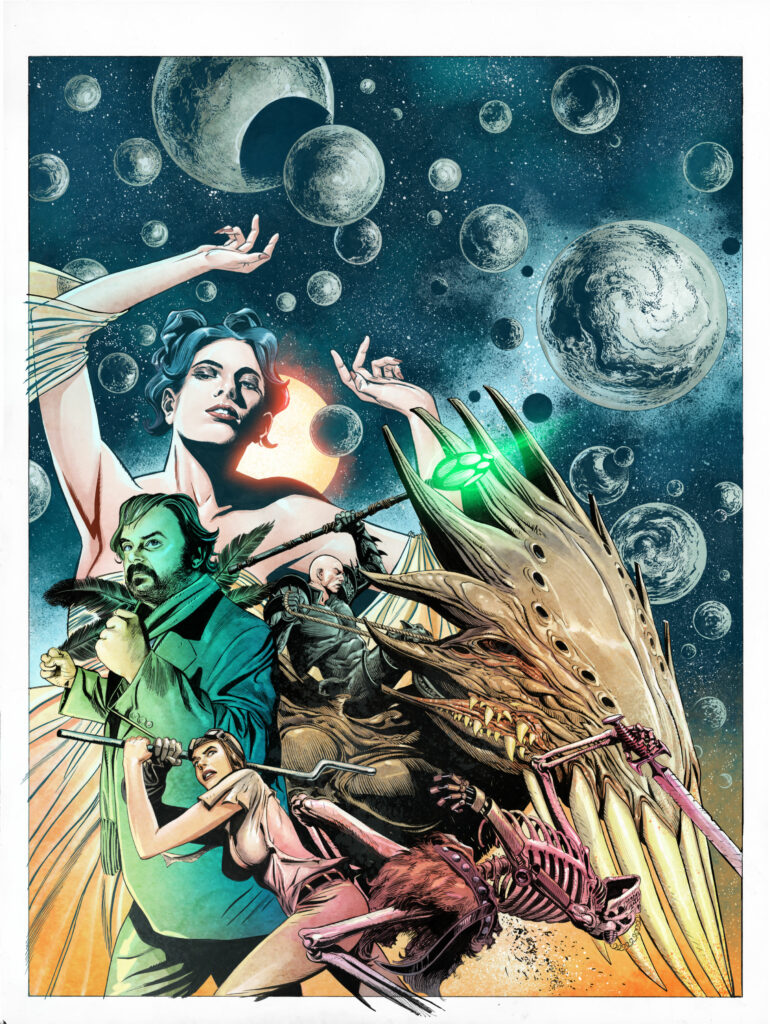
A few days after I sent the cover scan into the Nerve Centre I popped round to give my chum Dylan Teague a Christmas Card and he mentioned that he’d just finished colouring the cover, so you can see the turnaround was extremely fast. I didn’t know Dylan was going to colour it- but I’ll never pass up the chance to work with him, even if I didn’t have any say in it! I always compose in lights and darks and perhaps because I’m colourblind I rarely imagine what colours might work best, simply hoping the colourist knows what he or she is doing, because they’re bound to know more than I do. Dylan is one of the best so I knew I was in good hands
Drawing the 2 series of Saphir has been some of the most enjoyable experiences of my career and getting a cover feels like a real vote of confidence. Kek and I would love to do more but it’s entirely in the hands of the readers so it’s very much a time of crossing fingers and hoping for the best. At the very least I hope everyone enjoys the cover and picks up the latest Prog to see what’s inside….

.
And that’s it – all that work and crossed fingers from David’s side pays off as we all get to see something that looks just stunning on the shelves this week!
Thanks so much to David for sending the work along – you can find that cover as well as the first part of the fantastic and fantastical Saphir: Liaisons Dangereuses in 2000 AD Prog 2265!
Now, a little more of that gorgeous Roach line to make gooey eyes at…
