2000 AD Covers Uncovered: Vote Freely! – Megazine 442 cover by Phil Winslade
22nd March 2022
Every week, 2000 AD brings you the galaxy’s greatest artwork and 2000 AD Covers Uncovered takes you behind-the-scenes with the headline artists responsible for our top cover art – join bloggers Richard Bruton and Pete Wells as they uncover the greatest covers from 2000 AD!

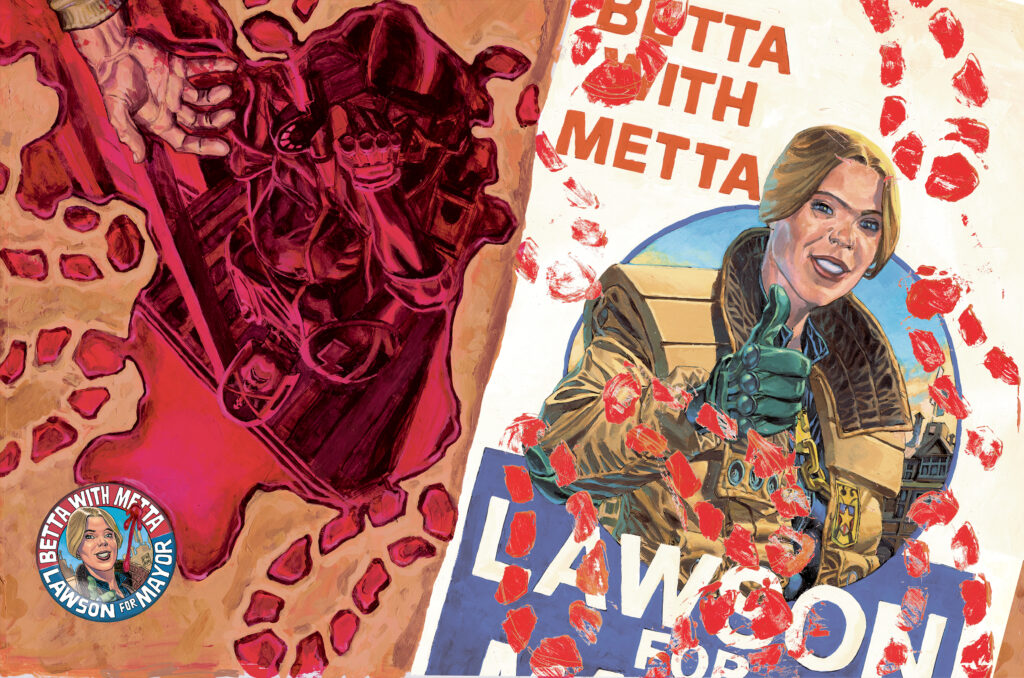
Wow! Check out that blood-soaked masterpiece of a cover for Judge Dredd Megazine 442 – out on the stands and from the 2000 AD web shop right now!
As we speed headlong into Badrock’s forthcoming election in Lawless: Ballots Over Badrock, artist Phil Winslade ramps up the tension with this deceptively optimistic, then devastatingly gory wraparound cover, just what does Phil and Dan have in store for us in Badrock’s first election?
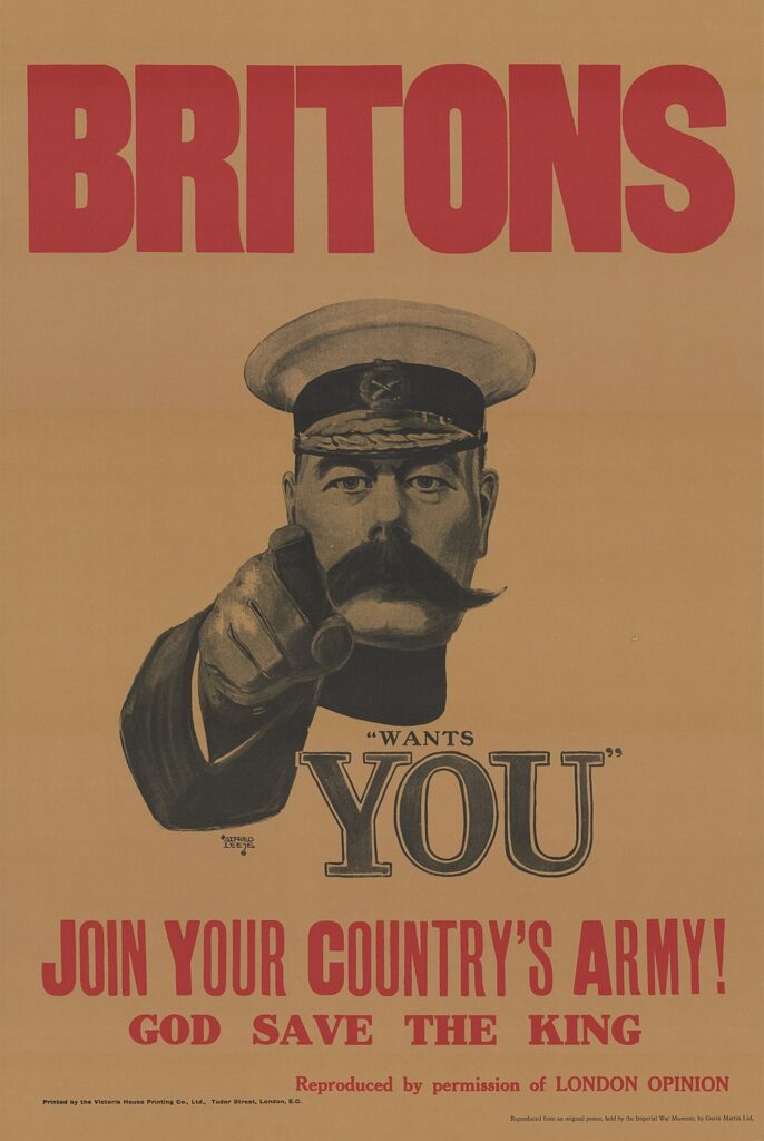
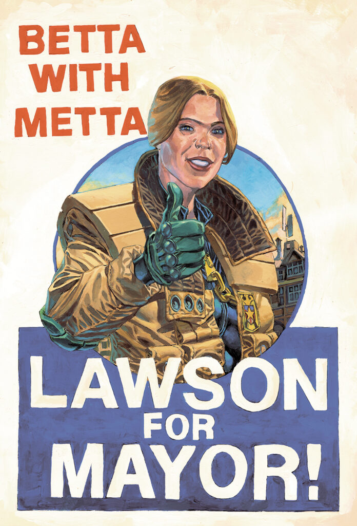
“So I wanted to do a cover with the election poster from the strip being the main focus.” Says artist Phil Winslade, “And I wanted to paint that poster, as I haven’t ever done a version of the Kitchener’s ‘Your Country Needs You!’”
Of course, Phil is the master of the wraparound, with seven of his nine Lawless covers offering us dangerously unsafe levels of extra thrillpower, which is highly irresponsible if you ask me!
Phil gives us an insight into his process and motivation for his double-page masterpieces, he said “I have been doing wraparounds since the third cover and enjoy how they look and the extra dimension they give. The back cover needs to be less important than the right-hand side, but gives you an extra dimension to the cover when seen as a whole. An extra bit of storytelling context to the main image, if you will. I wanted the poster in the image to look distressed by blood in some way to give it more tension and drama.”
Well, he’s certainly done that! My feeling of dread for the forthcoming election episodes is palpable!
Phil continues “I also wanted to introduce an idea of the chaos of the Badrock elections. This idea had been in my head for a while; either a wall of posters with blood spatters as in the first part of ‘Ballots…’ or a floor shot of the aftermath of some violent event. I chose the latter version because I could add a hand or foot in of a victim, which brings the idea across much better than spattering a load of overlapping posters. This version also gave me the nod to the iconic Dave Gibbons watchmen badge image. Tharg approved my thumbnail image and off I went!”
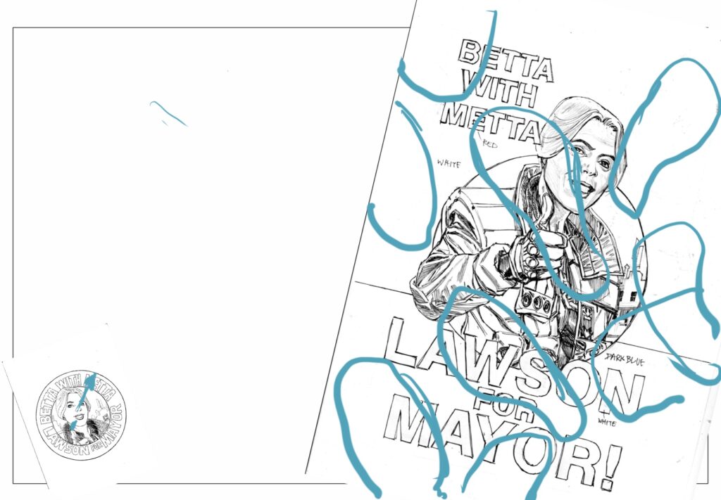
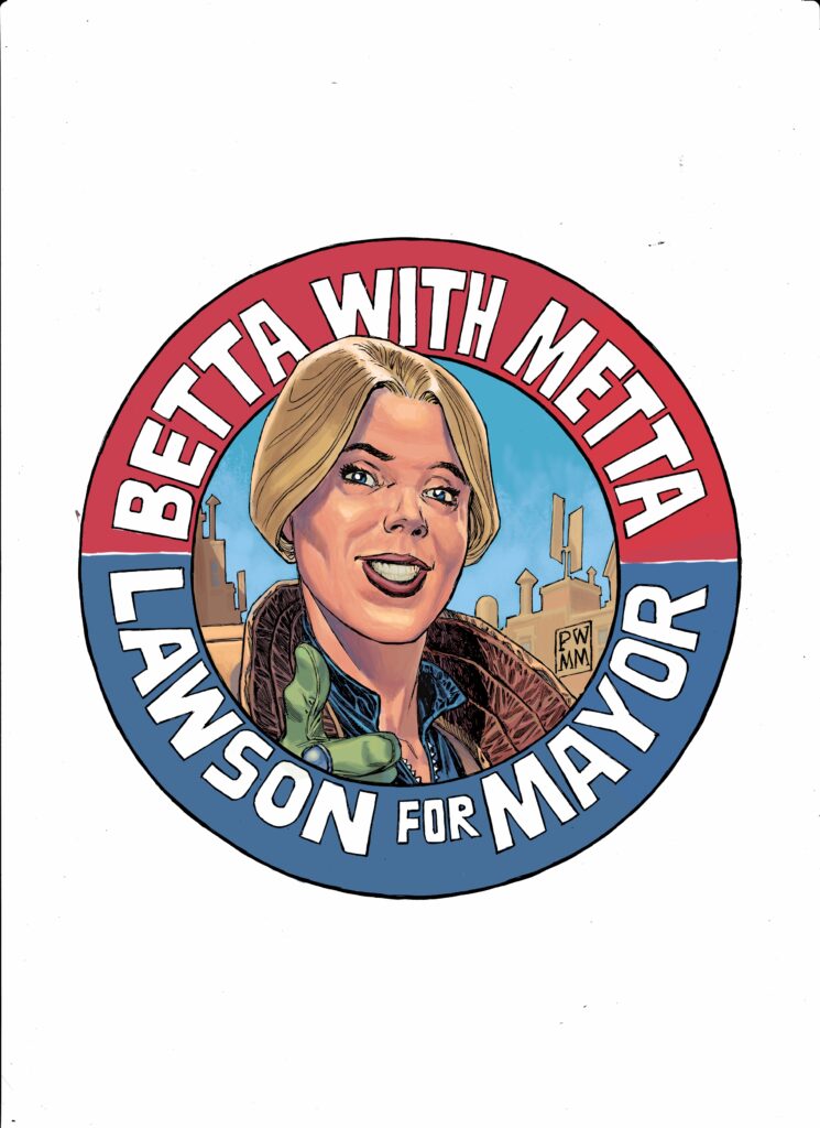
“I wanted the poster distressed by footprints to give that feeling of ‘yesterday’s news is today’s chip paper.’ The original drawings of both poster and badge were drawn as pencils for the first part of “Ballots…”
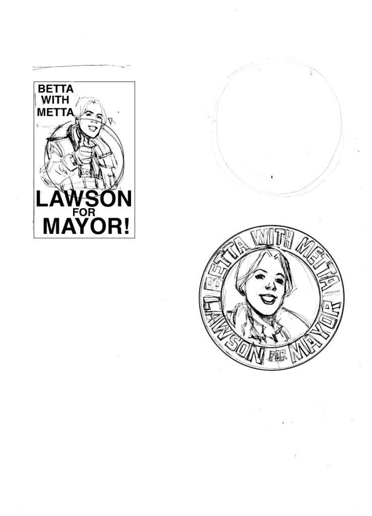
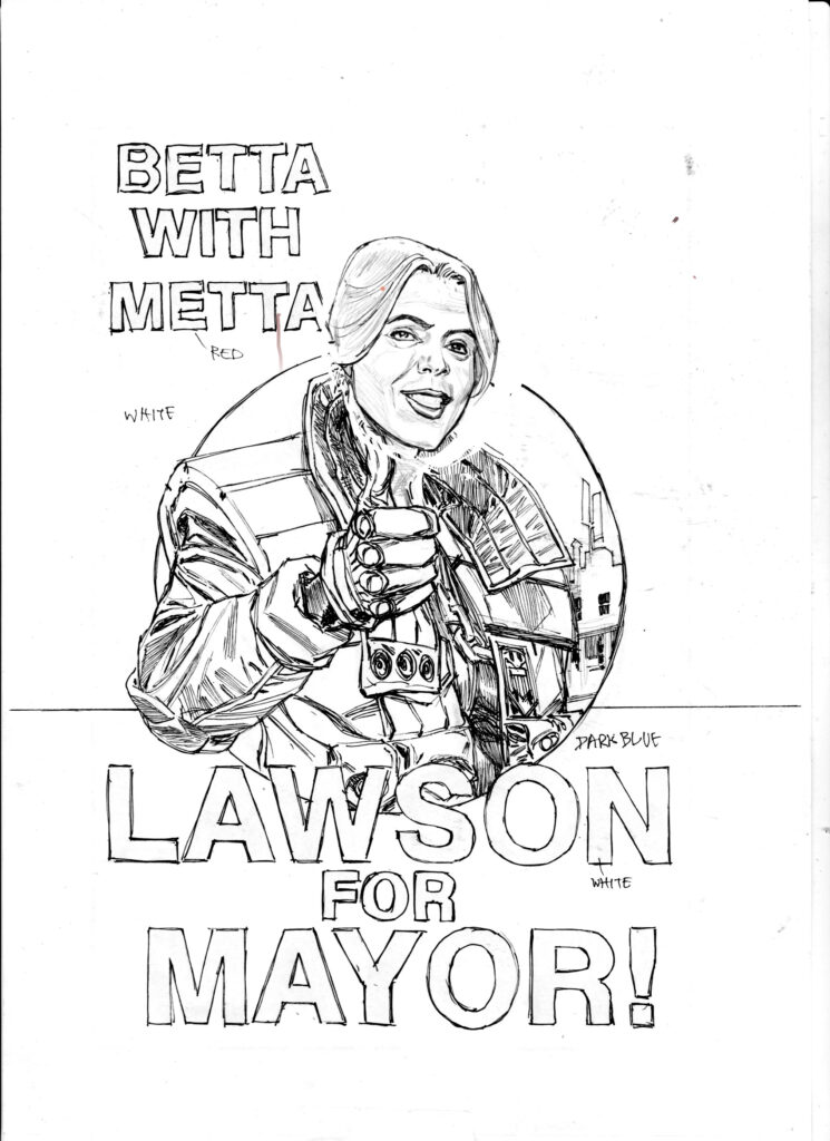
Giving us a real glimpse into how this incredibly intricate artist works, Phil continues “This meant that they could be pasted into my pencils numerous times and at different angles, but would give me a consistency for inking on a lightbox. I pencil either on paper or on an iPad, print them out to size and then use a lightbox to see the prints through the board when I ink. This means my inked pages don’t have pencil lines to rub out or blue lines to get rid of during digital editing – blue lines give me a false sense of line weight and ink can be undermined by rubbing out on it.” Truly fascinating.
He continues “The whole cover became a collage assembled on the computer from separate paintings because I wanted to have a clean version of the poster so it could be used as a pin-up or print to go with the sense of the campaign, along with the badges. A kind of created artifact for the readers – a bit of fun. :)”
A BIG tease from Phil next, as he alludes to future events which really don’t sound good at all… “As I was laying it down on the board, I struck on the idea of having SJS Judge McClure reflected in the blood pool, as much to give it a sense of liquidity. It started as a shadow, but I felt that would be a bit difficult to read and thought a silhouette of an SJS judge looming would be significant, especially in light of the events to follow in the story to come.” Ooooooh, scary!
“At some point I thought it would be cooler upside down, to create a kind of compositional vertical symmetry, but more because I thought it looked cool! This image is my first note drawn with touch pad of my laptop in Photoshop. I worked it up on the board…”
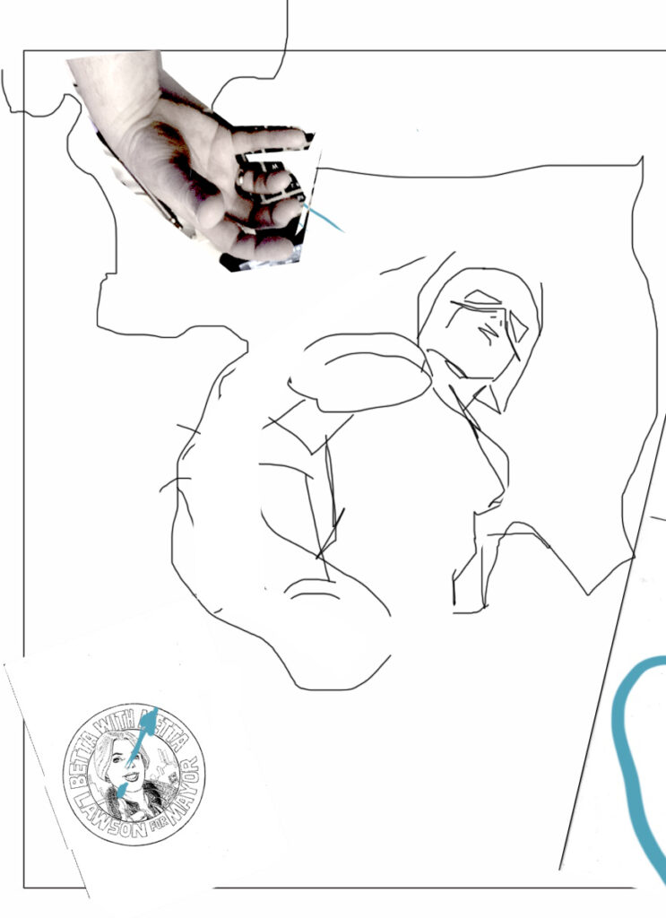
The first element to be completed on the cover was that sumptuous Kitchener-esque poster. Phil said “I did the poster first and slid that under the back cover layer later.”
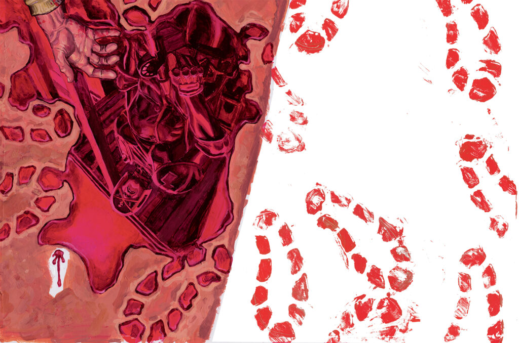
Next he used erm… extremely technical methods to create the footprints. He explains “The footsteps were created in a ‘Changing Rooms’ fashion by cutting out a stencil from a plastic folder and stippling and smearing the paint into the holes. Originally I wanted to use some shoes but they would have been way too big!”
Almost finished, just one more element to add “I pasted the badge on last.”
“I hope it’s a good representation of the current storyline and where it’s going. This is an important and game changing period for Metta and co and for Dan and me.
Oh, and if someone wants to make badges and posters, I expect to get one!”
Thank you so much to Phil for sending the images and brilliant text. With his excellent panel layouts and mindboggling level of detail on every page, it is amazing that he found time to share his process with us! What lucky squaxx we are!
Judge Dredd Megazine Issue 442 is out right now from anywhere Thrillpower is sold, including the 2000 AD web shop!
