2000 AD Covers Uncovered: ‘When creativity is effortless it becomes a form of magic’ – The return of Simon Harrison for Prog 2394
7th August 2024
Every week, 2000 AD brings you the galaxy’s greatest artwork and 2000 AD Covers Uncovered takes you behind-the-scenes with the headline artists responsible for our top cover art – join bloggers Richard Bruton and Pete Wells as they uncover the greatest covers from 2000 AD!
Something a little bit special this week, the return of one of Tharg’s droids who’s been absent from the Prog for just shy of 30 years! Yes, it’s the return of the unmistakable, and quite simply brilliant Simon Harrison for this weeks’ cover…
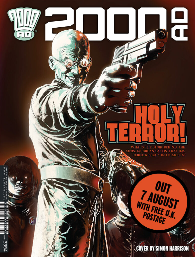
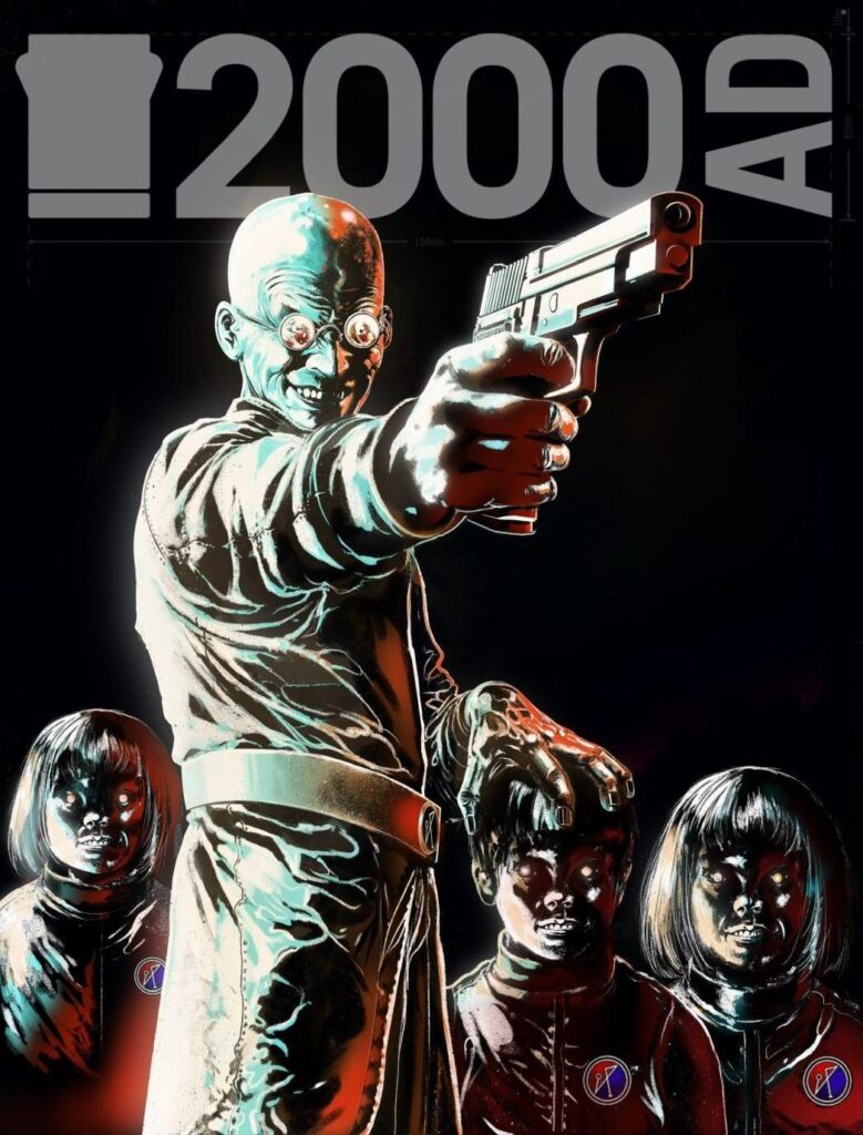
The cover features the bad guy from David Barnett and Lee Milmore’s Herne & Shuck, a delicious slice of folk horror, as one man and his (demonic) dog go traipsing through the magical realms of England.
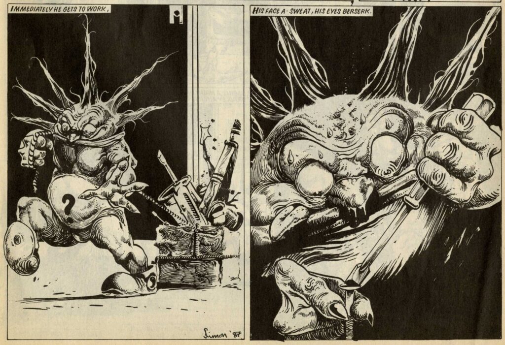
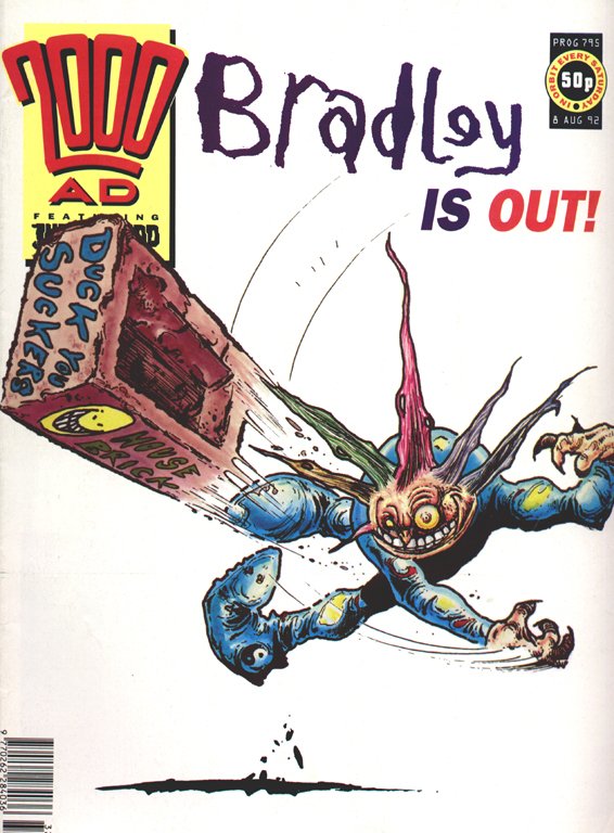
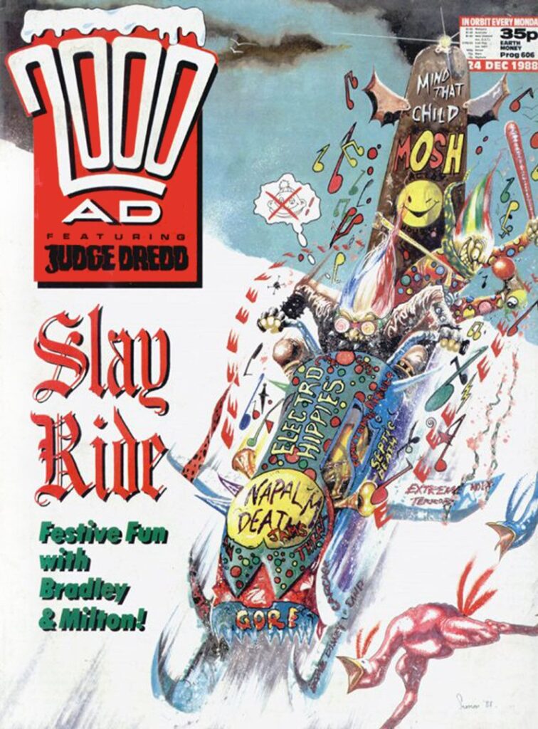
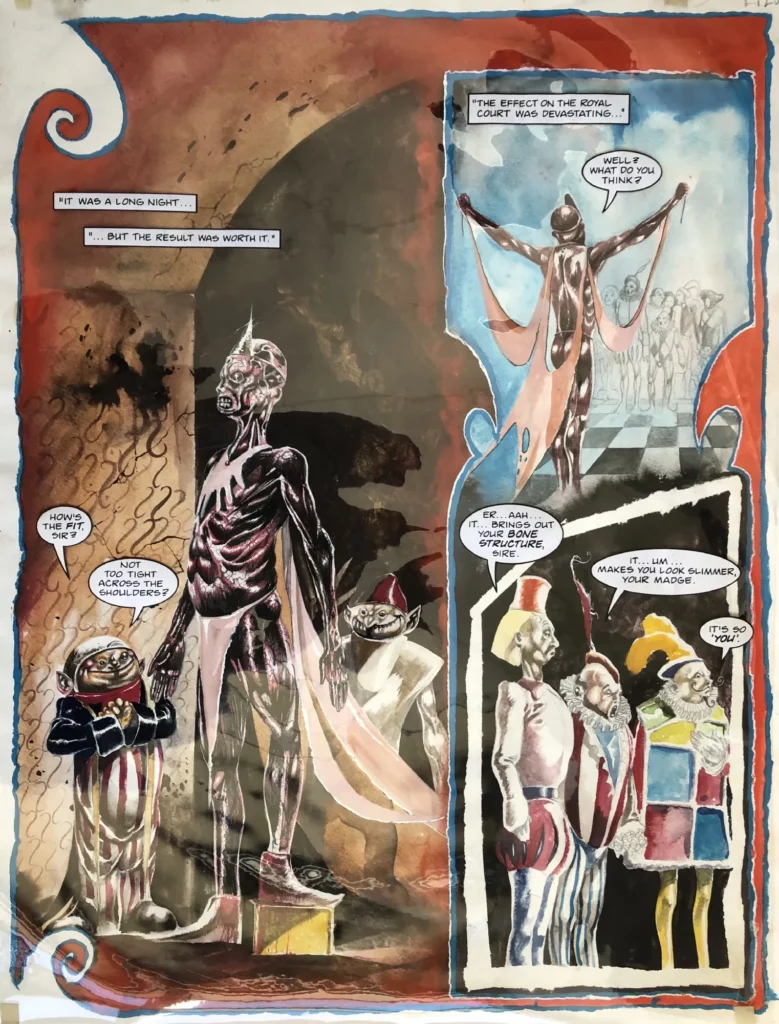
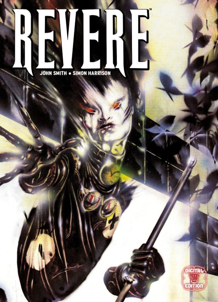
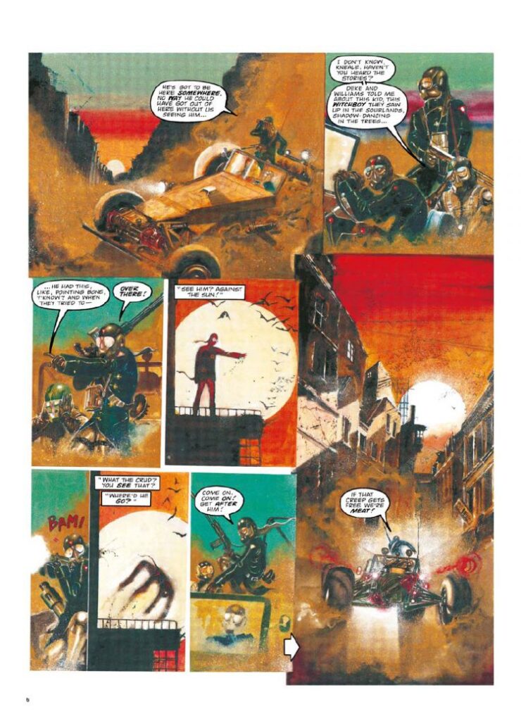
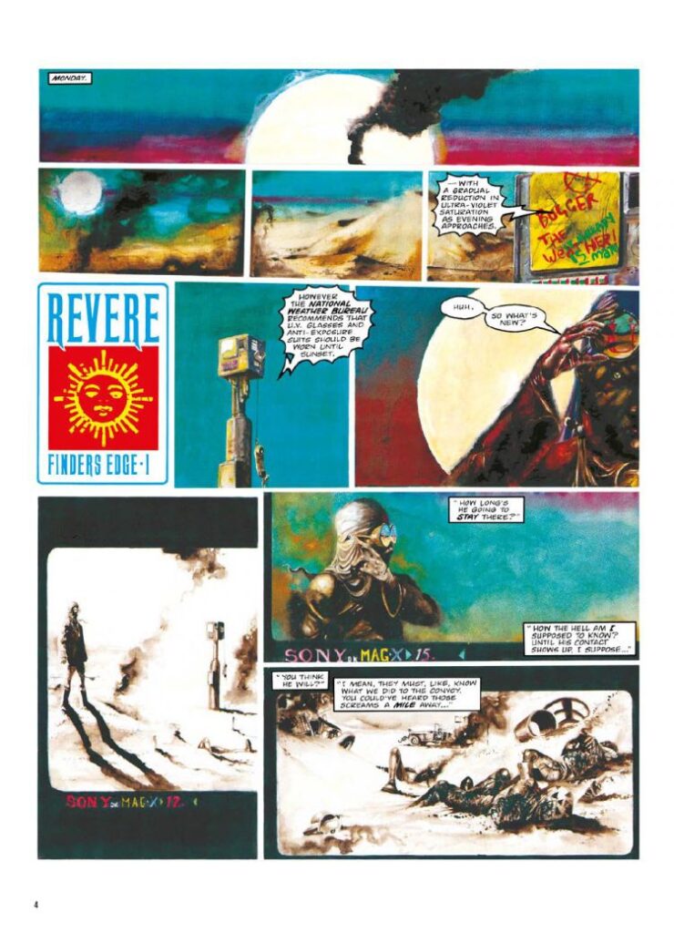
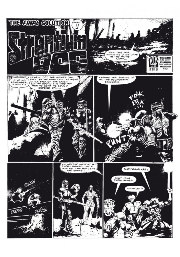
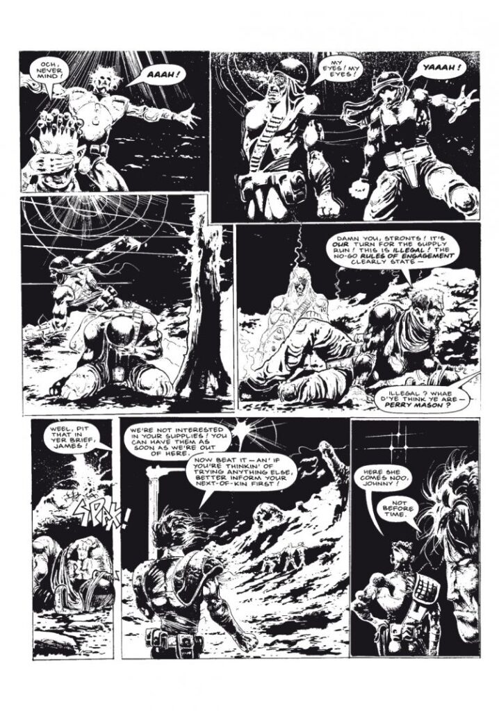
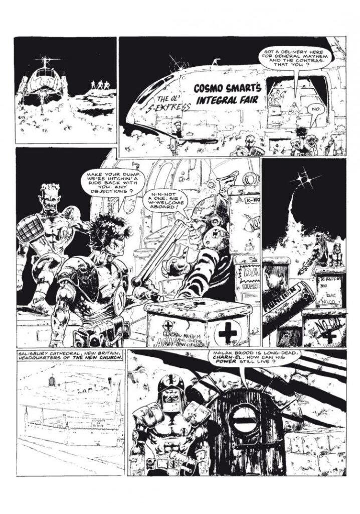
As for Simon, well, it’s an absolute pleasure to see him returning to the Prog. Like we say, it’s been very nearly three decades since we last saw his art in here. Fiercely distinctive, wonderfully individual, Simon was one of those art droids to hit the Galaxy’s Greatest in the late 80s, working on the madcap, anarchic teen Bradley, taking on one of Strontium Dog’s most memorable moments, not to mention the absolute psychedelic fever-dream that was Revere.
To say Simon’s had an interesting life in art and beyond is really underplaying things. After his stint at 2000 AD in the late 80s and early 90s, he went far, far away – travelling extensively in Ukraine, Northern Africa, Asia, South America, and the Indian subcontinent. He’s also a martial arts instructor and has spent time as a bodyguard in war zones in Crimea and Israel. So, no, not your average art droid at all! He currently works as a collaborative fine artist in BECKERHARRISON, exhibiting in Berlin, London, Washington, and New York.
He’s splitting his time between that and working on the production of a TV show, whilst also concentrating on personal projects exploring the function of human consciousness and more, including DOGON, a really fantastically strange visual Sci-Fi tale that ‘explores the atavistic racial memories all humans hold within their genetic code.’
Oh yes, you can, you should, you MUST, dive deeper into all that he’s done and is doing.
But first… let’s talk Covers Uncovered…
SIMON HARRISON: There isn’t much initial documentation on the first stages of the cover because I was moving house when Matt emailed me about it so I kind of did it on the fly. But here’s a breakdown of the process. This is some real nerdy shit so prepare yourselves viewers!
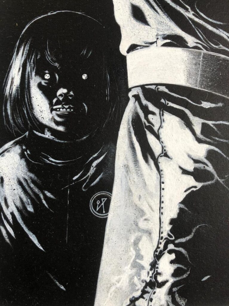
This is Lee Milmore’s reference Matt sent me from the story Herne and Shuck: Suffer The Children…
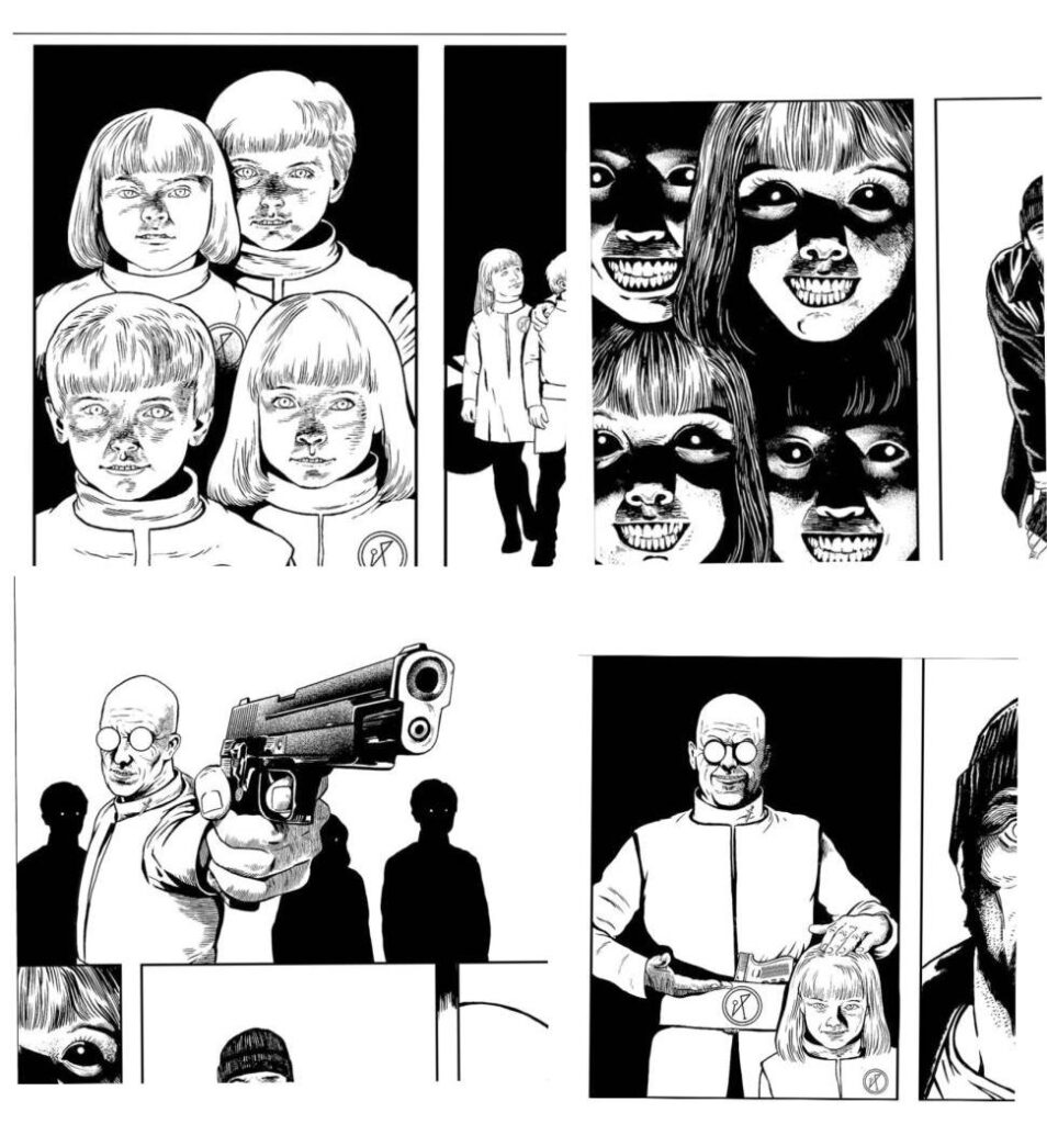
The brief was… ‘A shot of the bald guy in glasses, grinning evilly towards the reader, surrounded by the equally evilly grinning kids. Very unnerving/eerie. Does that sound OK? Best, M.’
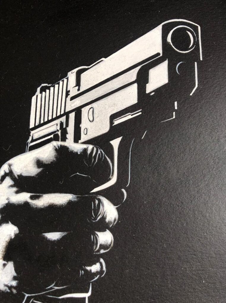
So, I thought I would create an image that conveyed the eeriness of the imagery and the blunt threat of the gun. Pretty straightforward really.
I liked the dramatic lighting on the top-right image and took the entire painting in that direction.
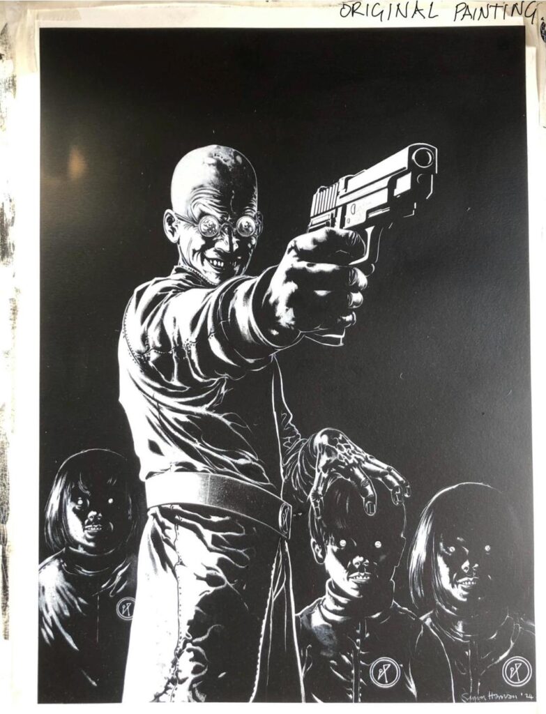
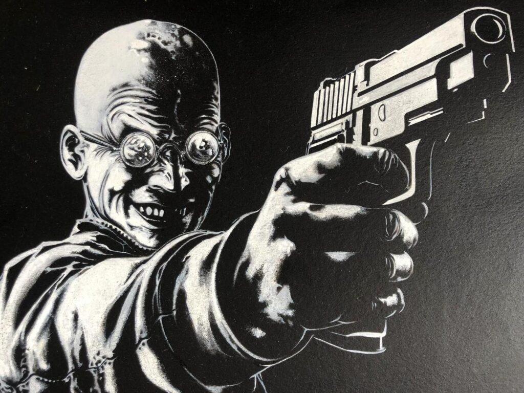
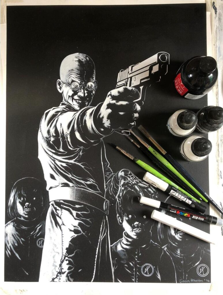
First, here’s the original foundation painting. As you can see it’s black and white as I intended to digitally colour it. As I said I was moving house!
It’s 300gsm rag fibre paper stuck on an IKEA shelf with masking tape. I start by painting the whole paper acrylic black. Then sketch the outline image on with white pencil.
I used acrylic liquitex ink, Posca acrylic paint pens and a mixture of paint brushes to complete the work. The acrylic pens have a really good density of pigment in the white so they suit this technique very well…
If you look closely at the details you can see where the different densities of white pigment create spontaneous shading. Especially around his face…
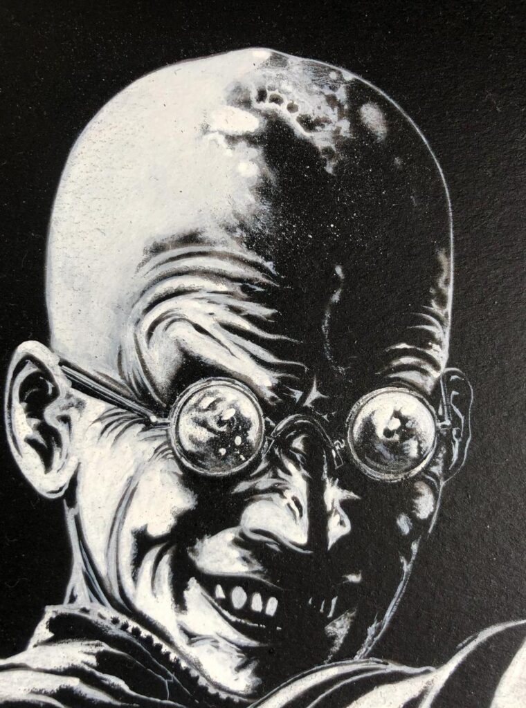
It’s an outcome of the absorption of ink into the paper. A drawback really, as it means if you want pure white you need to paint over it again but it gives a blueish tint when it absorbs. This is what prompted me to use a blue/green in the final colour scheme.
The gun was inked quite mechanically with pens only, to preserve the straight edges as much as possible...
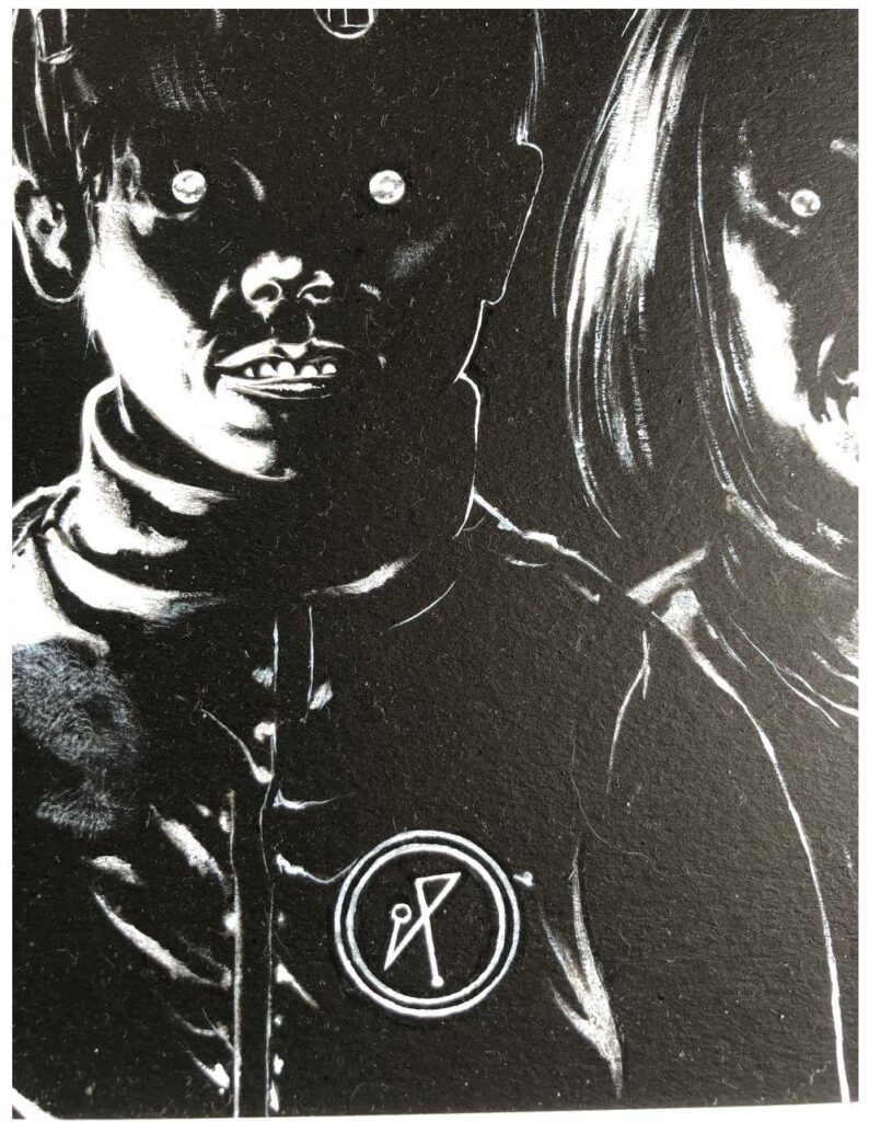
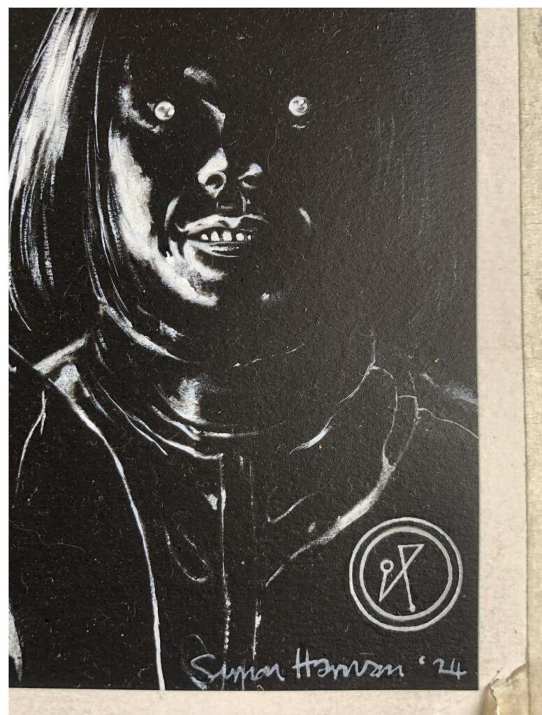
The textures on the bad guy’s tunic were created using a standard approach with the pens and brushes and then dry brushing over the areas with white or black to get the desired effect.
Dry brushing was also used to create a sense of shading on the edges of the creases on the garments and on his weapon hand. It breaks up the white quite nicely.
Very fine detail was added in with a number 2 sable brush. The type you nerds use to paint your board gaming figures. Finally, I used a tooth brush to flick white and black flecks where needed to finish it off. I don’t know why, but I feel this somehow adds a sense of dynamism to an image. I use it all the time.
Maybe it’s the sheer randomness of the splashes? Who can say?
Once I had the painting done I photographed it and created a digital file. This was then edited, still in black and white. This is mainly a clean up stage, straightening lines and perfectly circling circles. Real pedant stuff.
It’s also necessary because when digitally colouring an image it’s a lot easier to select areas from an image with clearly defined regions.
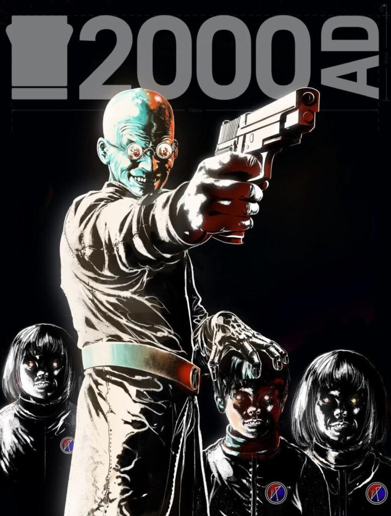
What I did next was drop the digital image into the 2000AD template. This was to check the positioning with the logo and barcodes. I let the main bad guy’s head clip the logo because I knew it would look cool and jump the image forward.
When it was ready, I sent it to Matt and waited with bated breath in case he didn’t like it. ( Not really… I knew it was good!!!)
By now it looked like this…
I liked it a lot. It had a very classic feel to it, which I thought was appropriate as it was the first cover I’d done for 2000 AD for 30 years.
It almost seemed a shame to have to colour it so I decided that when I did, I would preserve as much of this original feel as I could.
The first stage in colouring is a colour lighting check. I add a faint airbrush glow to the figures where lit and add some exploratory colour to find a direction for the different colours. This can obviously differ from the global lighting as is the case here where the light is from the left but the warm hues will be coming from the right. So I had my colours. Red, turquoise and orange…
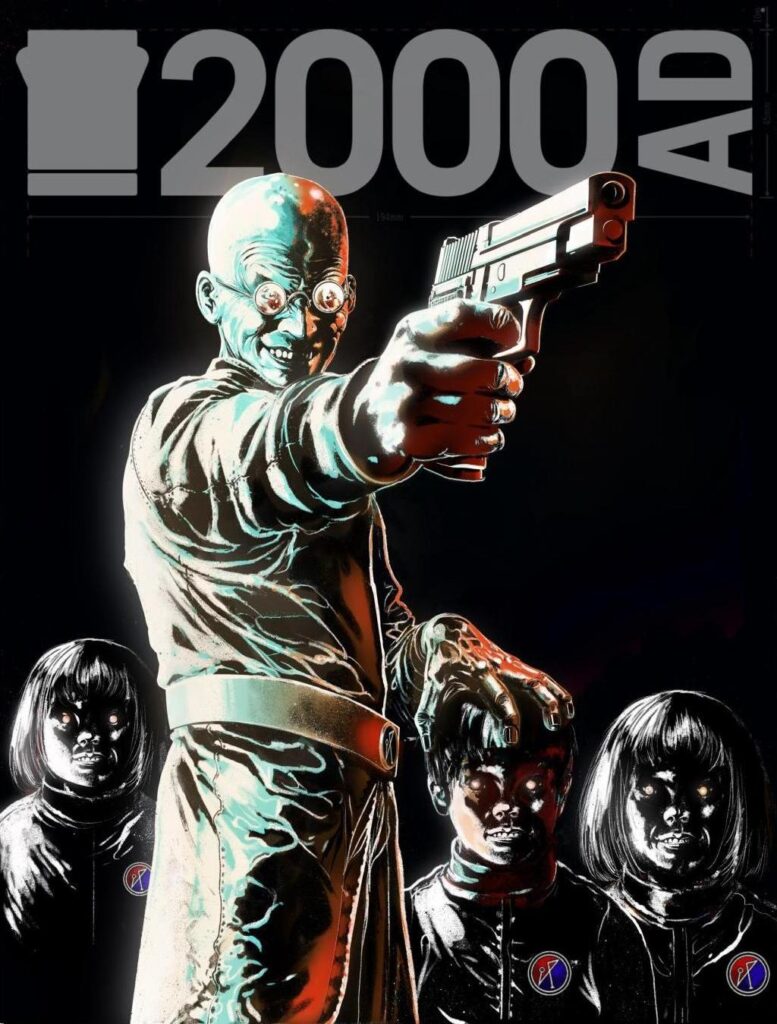
Normally, if I was painting the hard copy, I’d do the background first but as it’s a digital file now, I can cut the figures out, isolate them from the background and just go to town on them. So I started on the main bad guy first. I have a rule when using digital media. Never do anything that I can’t reproduce using ink and paint brushes. So I use only limited tools in procreate. The studio pen, the airbrush and the dry brush. I don’t follow any systematic order. I just paint the part that interests me at the time.
I gradually build up the colours. All the time I’m paying attention to the need to not obscure the initial drawing. I want to maintain its dark weight as much as possible.
As the colour creeps across I begin to feel the kids are too dominant in the image. Their hair is too bright. It’s causing a lack of depth. I want them to drop back a little and give the main guy some room.
So I use a darker layer to semi-obscure them. It’s a typical airbrush trick which originally didn’t translate well into the old 2000 AD printing standards. It would tend to look really muddy.
That seems to do the trick. I can still discern the fine detail in the hair but it’s not grabbing too much attention.
Time for the background colour. I wanted an eerie glow. Something that was somehow burning and diffuse.
I’ve always liked vignettes so I went for one. Mainly at the top of the image to mirror the light creeping into the figures.
At the last moment I decided the whole image could do with being muted a little. I guess I was looking for a more antiquated, sepia feel to convey Matt’s description of the story as folk horror.
That’s one benefit of digital work. It’s very versatile. Changes are easy to achieve. This would be a huge ball ache otherwise.
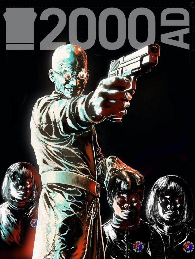
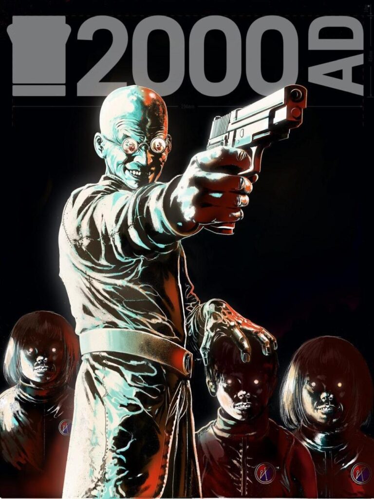
Finally, I reduced the size of my signature as it was too large. So this is the finished image, sans logo…
Here’s an example of materials and an idea of scale. The image is approximately A2 in size but obviously 2000 AD format…
Overall it was a very enjoyable experience. Matt was very pleased with the initial design and green-lit it without a hitch. The entire project was very smooth and free of any real technical difficulties.
People have asked me why I came back to 2000 AD. You can blame Molcher to a certain extent.
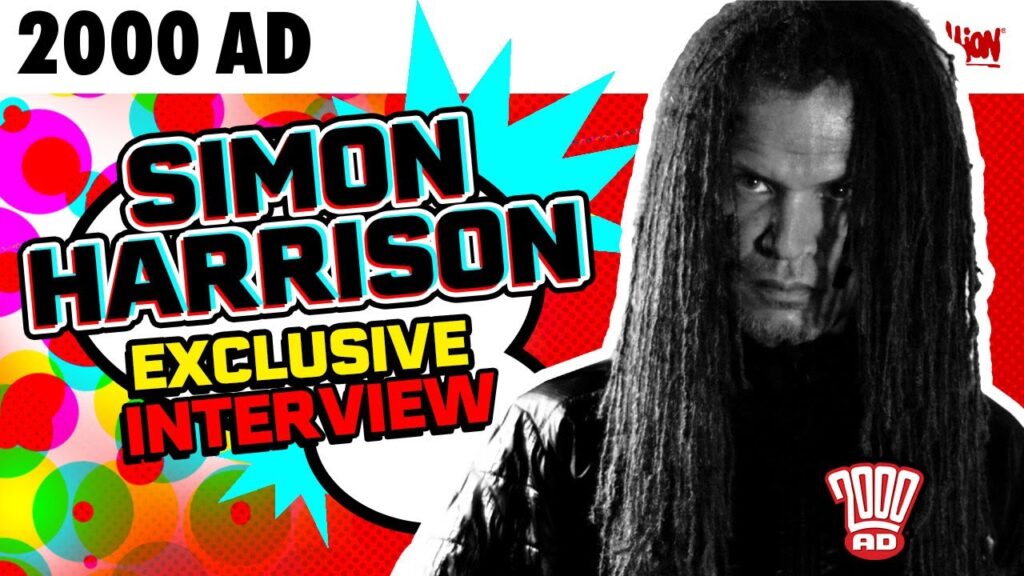
[Simon’s talking about his recent interview on the 2000 AD Thrill-Cast – it’s a great interview and one you HAVE to listen/watch!]
SIMON HARRISON: The interview prompted me to take action on an already present and growing inclination but mainly it was due to correspondence from fans who have stayed in touch over the years and plagued me with requests to contact the editorial staff again. Their response to my interview was so overwhelmingly good and warm-hearted that I just wrote Matt an email quite soon after.
He got back to me right away which I really appreciated. He said he would shoot me a script over when one came up. A few weeks later he emailed me out of the blue and asked me if I wanted to do a cover. I responded ‘Sure thing…’ and he said ‘Good stuff.’
You asked me if I was lured with cash. Ha! No… it didn’t even cross my mind. When I finished the cover I blatantly asked Matt how much I should invoice for as I had no idea so no, it certainly wasn’t the money!!!
I’ve been asked what got me into art or comics. I’ve been asked this many times, especially by people who’ve read DOGON as it seems to prompt a deeper introspection in viewers than my comic work. I’ll supply you with an answer from DOGON itself as an explanation as to why I have an interest in art and what its purpose is for me.
‘+++ This is a complicated question +++ DOGON will give you the best answer possible through this limited format +++ Art is not just a question of creating imagery +++ Obstacles need to be removed first +++ The first largest obstacle a creator faces is one of [Time] +++ Time is needed to investigate and analyse the creative process +++ Time is needed to create +++ Creativity must become an overriding priority +++ And obviously the amount of time one has at one’s disposal is directly linked to the choice of lifestyle +++ thus most artists are considered unconventional hermetic or non participatory +++ time is also needed to remove the obstacle of [physical competence] +++ Whatever the discipline whether sculpting painting drawing music or photography one must have competence and sincerity +++ so time is needed to practice +++ The technical ability need not be perfect but it must come easy and it must come from the heart +++ A painter like Edvard Munch does not have the same technical stance as Caravaggio but the merits of the two artists are unmistakable +++ Ability can be naive but still inspirational +++ One must finally remove the obstacle of [style] +++ If the style used to create the image is not thoroughly automatic there will be difficulties in conveying exactly what is witnessed by the creator to the viewer +++ Style is the physical technique used coupled with the particular psychological idiosyncrasies of the creator +++ So when physical technique meshes perfectly with thought the imagery is expressed almost perfectly +++ What was seen is what is conveyed +++ When this occurs the perception roams freely in the mindscape without hindrance or fear +++ The mind gains access to imagery and ability not normally available and the results are often extraordinary and revelatory +++ This is the essential point of art +++ Not only does it create a shield for the creator or the viewer between themselves and societies mediocrity but it also creates conditions where the internal information flows outward so freely that it appears as if from nowhere and is often as surprising to the creator as it is for the viewer +++ This is not some hypothetical grandiose explanation of the creative process +++ It can be done +++ When creativity is effortless it becomes a form of magic +++.’
Over the years people have wondered where I was or what I’ve been doing. The answer is I’ve been travelling the world as a bodyguard or training in a monastery.
When I wasn’t doing that I was working on DOGON. A very weird visual SCI-FI story (hand painted sequential airbrush art), that explores the atavistic racial memories all humans hold within their genetic code.
I’ve also been working on a mainly digital project called Tao. It’s a black and white graphic novel using collage and drawing. It’s about Kung Fu and the supernatural. A psychic detective’s investigation into a string of brutal gangland murders spirals out of control when she stumbles onto a hidden world of government corruption Karmic assassins and magic.
While travelling I worked as a fine artist with my friend Carolin as BECKERHARRISON creating conflict art. I’ve been in war zones and beautiful places.
If you want to know more just watch the interview with Mike Molcher here!
That’s all folks.
Seeya,
Simon Harrison
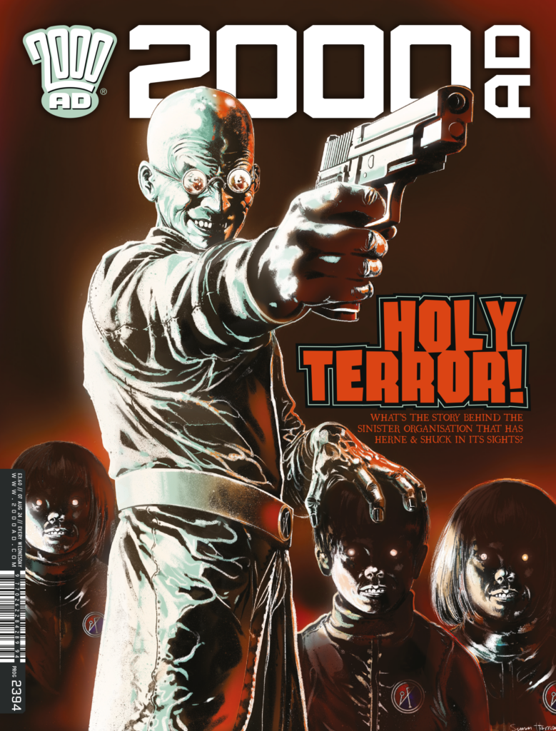
Well, now that was a GREAT Covers Uncovered, don’t you think? Simon’s process and his art laid bare for you – and it’s a cover that just dares you not to pick up the Prog!
Prog 2394 is out right now and available in all the usual places you find your Thrill-Power, including the 2000 AD web shop.
Thank you so much to Simon for letting us into his process there, absolutely enthralling stuff. You can find more from Simon across the Internet here – DOGON – Instagram: @dogon.a.i.135, and BECKERHARRISON – beckerharrison.com
And you absolutely must, MUST, give the 2000 AD Thrill-Cast where Molch-R chats to Simon a watch/listen. All the relevant links to that are here. In it, Simon talks about his life and career, getting work at 2000 AD, all the incredible places his art has taken him, and all with a view on the world and on art that’s simply a fascinating listen/watch.
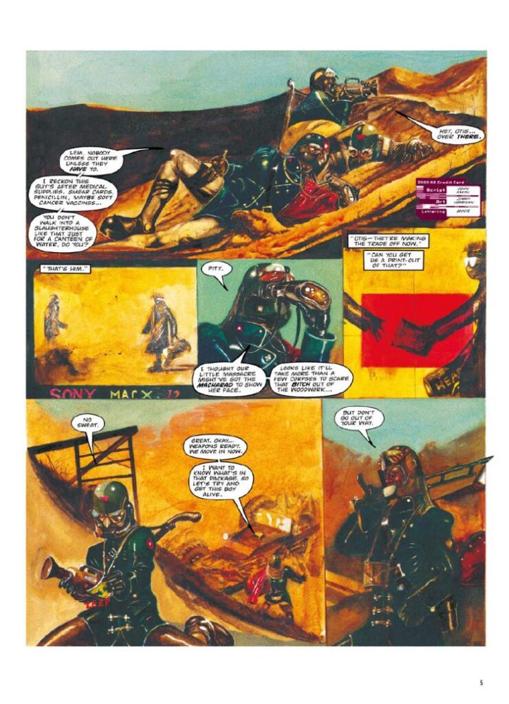
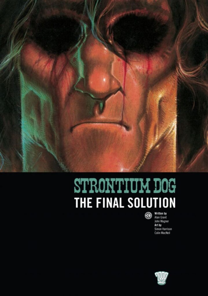
As for getting hold of Simon’s 2000 AD work – of which, hopefully, there’ll be more in the future! – you can still pick up the digital edition of the collected (and incredible) Revere, written by John Smith. For his Strontium Dog work, pick up The Final Solution, written by Alan Grant and John Wagner. And as for the strip he might well be best-known for, Bradley, well maybe it’s time to ask Tharg is we could possibly get hold of a collection any time soon? It’s well past due!
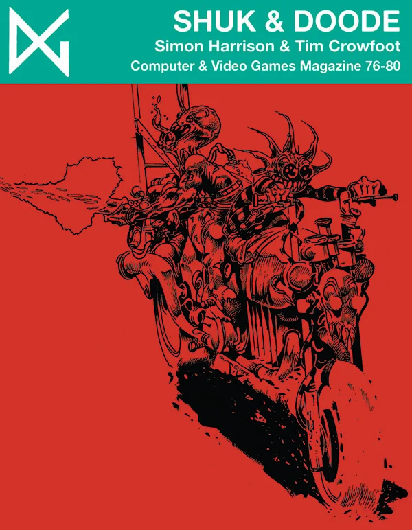
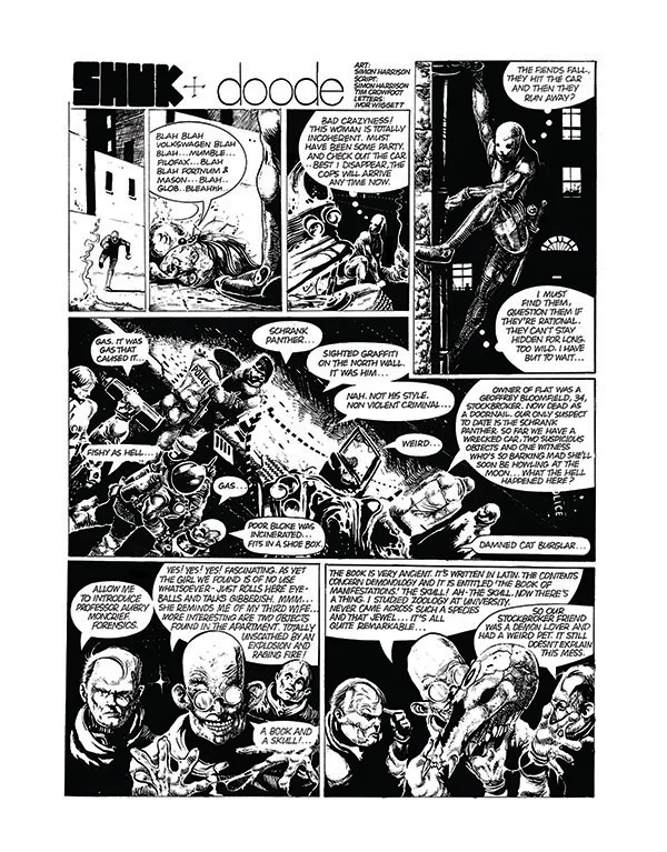
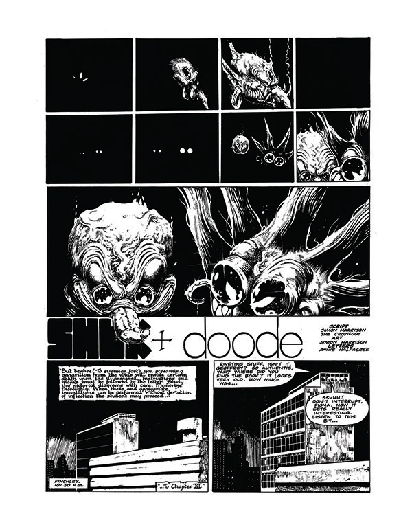
Oh, and there’s also some fascinating early work of Simon’s recently published by Dark & Golden – the demonic misadventures of Shuk & Doode, co-written by Tim Crowfoot.
And finally… a little Bradley… Tharg? Sir? How about that collection????