2000AD Covers Uncovered – Venus Fly Scrap!
22nd May 2017
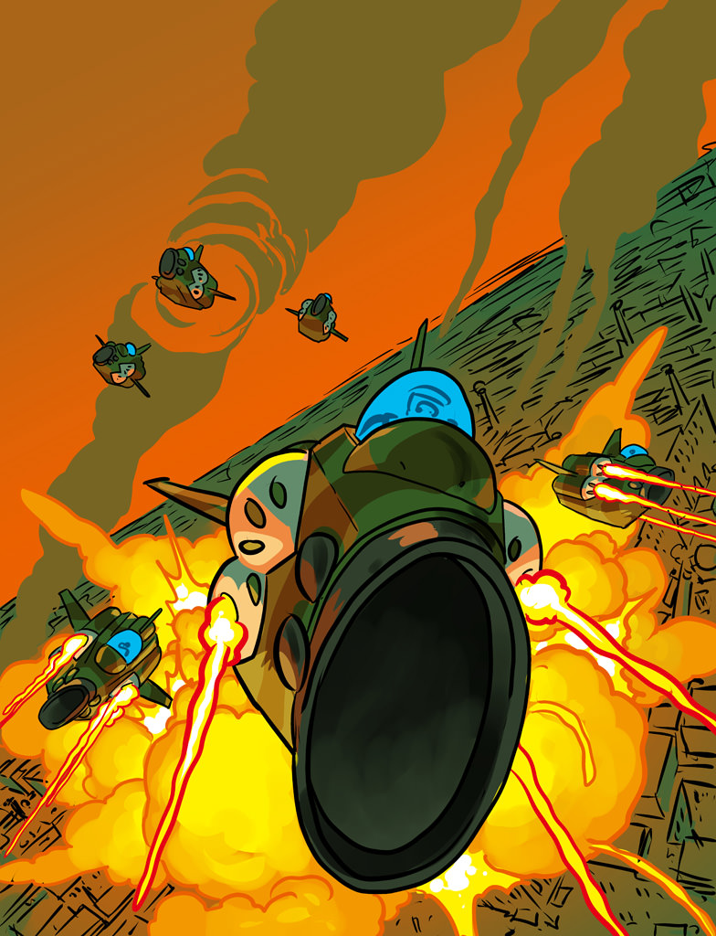
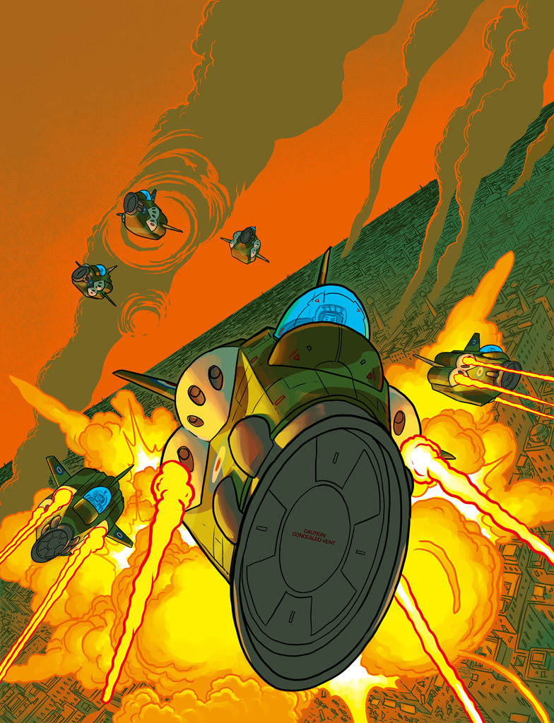
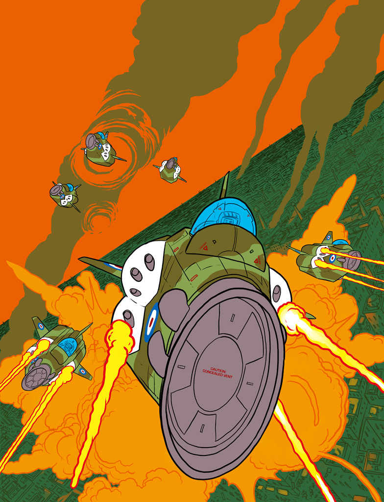
Earth strikes back! The forces of Earth, with the help of Ahron, Ikarus and Sohna, have stuck a major blow against the occupying Alien forces on Venus. Series artist D’Israeli brings us yet another stunning cover, beautifully highlighting the forces of Earth’s hit and hope ‘Scorched Venus’ policy.
As ever, D’Israeli was kind enough to send a wealth of images and information about the cover, he said “As usual we started with a brief from Tharg-In-Residence Matt Smith; the idea was to show a formation of Earth fighters firing missiles over a Venusian city as a hug explosion goes off in the background. Unless otherwise stated, all work was done in Manga Studio/Clip Studio Paint MX 5.”
“The previous episodes had contained quite a few shots similar to the brief, and I’d already built 3D models of the fighters so I could draw them consistently. They were loosely inspired by the “Sky One” fighter aircraft from the 1969 Gerry Anderson TV series UFO…”
Believe in Better
“Since I’d done a lot of work like this already, I took the unusual step of starting by playing about with 3D models – I had a pretty clear idea of the composition I wanted to achieve, and it was as easy to get it by moving models around as it was to draw roughs and then move models around.”
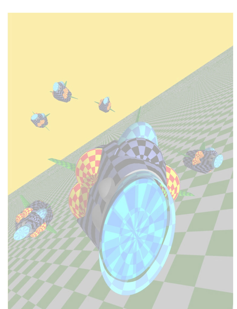
We can only hope that D’Israeli makes ‘Neeeeoooooowwwww! Pew! Pew! Pew!’ noises while he plays with these models…
“Below is the cover rough sent to Matt Smith. I often do two or three, but in this case the design was very clear and I was also in the middle of the last episode with the deadline roaring up on me like a Jurassic Park tyrannosaur seen through the wing mirror of an electric jeep. The colour scheme had been established in the story already, so I just went with that as it was nice and dramatic.”
Is it still called a Dutch Angle when it’s on Venus?
“Here are the pencils. Once the rough was approved, I stripped out the outlines from the roughs, faded them down a but and used them, superimposed over the same model rendering, as the “pencils’ for the finished piece.”
Apocalypse Now!
“On a new layer I inked the aircraft and on yet another the red flames from the rocket launches. It’s always best to keep everything separated out as much as possible to allow for corrections or changes, so I routinely end up with dozens of layers. The background explosions and city buildings were to be done as “colour holds” (coloured outlines), so I took a slightly different approach with them…”
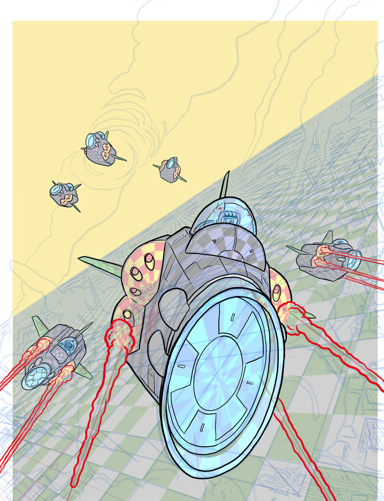
“Stay on target! Stay on target!”
“Flat colour next! By dropping in simple flat colour I could better judge what colours the background outlines needed to be. Using coloured outlines for the background helps to “pop” the planes forward and smart a sense of distance.”
“I inked the explosion in red first, filled it (on another layer – the Paint Bucket Tool in both Manga Studio and Photoshop can use outlines on one layer to constrain a fill on a different layer) with orange and then “greebled” in the details of the city buildings behind the explosion. Having the dark green to work against let me see more easily what colour to pick for the building outlines. I use the term “greebling” for noodling in fine detail like buildings or mechanisms as a nod to the use of the word “greeblies” by the special effects house ILM to describe fine detail pieces used to give a sense of scale to models. The greebling here was quite tough as the foreground greeblies were identifiable things like doors, windows, roofs and even tiny figures, but the stuff near the horizon was basically just scribble designed to hint at lots of buildings below the resolution of the eye. Deciding at what point to go from recognisable detail to texture is a bit tricky, and you’re always tempted to switch a bit too early when your hand starts getting tired!”
“In this cover, as with the matching scenes in the strip, you’ll notice I use columns of smoke to eat up as much landscape as I decently can to reduce the amount of greebling necessary.”
D’Israeli’s Greeble wobbles, but he doesn’t fall down!
“The flat colours on the background and explosion are either midtones or shadows, so I just needed to add highlights to make them look 3D. For some reason I find it easiest to start with a mid-tone and add highlights and shadows; as a result I’m more comfortable with acrylics or gouache than watercolour when I work with real media. I also added a shadow tone to the planes to make them really stand out from the background explosions.”

“Smoke me a kipper, I’ll be home for breakfast!”
“Finally I add highlights to the planes. They’re already standing out well from the background, so I add the minimum of highlights to keep them separated while also giving the impression they’re 3D objects lit by the blast from below and the flashes from the missiles.”
To experience the cover in its full glory, you must join in with the Dambusters March. All together now “Dah! Dah! Dah! Dah! Dada dah, daaaah! Dah! Dah! Dah! Dah! Dah! Dada da daaaah!”
And it’s finished! “At this point we’re done and I export the file from Manga Studio to Photoshop for file preparation and upload to the 2000AD FTP server. Manga Studio only works in the RGB colour space so I convert the file to a CMYK TIFF for printing. Photoshop has particularly good controls for this, and in fact it’s about the last thing I still use it for.”
Huge thanks as ever to the wonderful Mr Matt Brooker, AKA D’Israeli for once again sending such wonderful images and info. Greebling eh? I’d never heard of that before! I love this cover, it really does give off a Star Wars/Dambusters vibe and I love the way the fighters have penetrated the smoke trails, it really adds a kinetic energy and atmosphere to this already brilliant piece! All hail D’Israeli!


