2000AD Covers Uncovered – We’re Forked!
25th June 2017
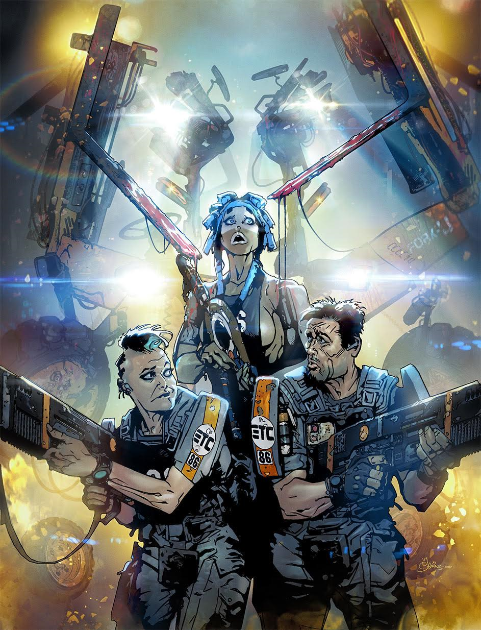
Uh oh! The intrepid agents of Exo Transfer Control are back and they’ve got trouble! Something is tearing apart cargo handlers in the Grey Area and it’s up to officers Feo, Resting Bitch Face and Bulliet to stop it. In a facility full of oddballs, how do you tell the spooks from the kooks!?!
Series artist Mark Harrison is back to pack the panels with all manner of cinematic effects and crazy background jokes. I urge you all to pour over each and every page as the Easter Egg count is off the scale!
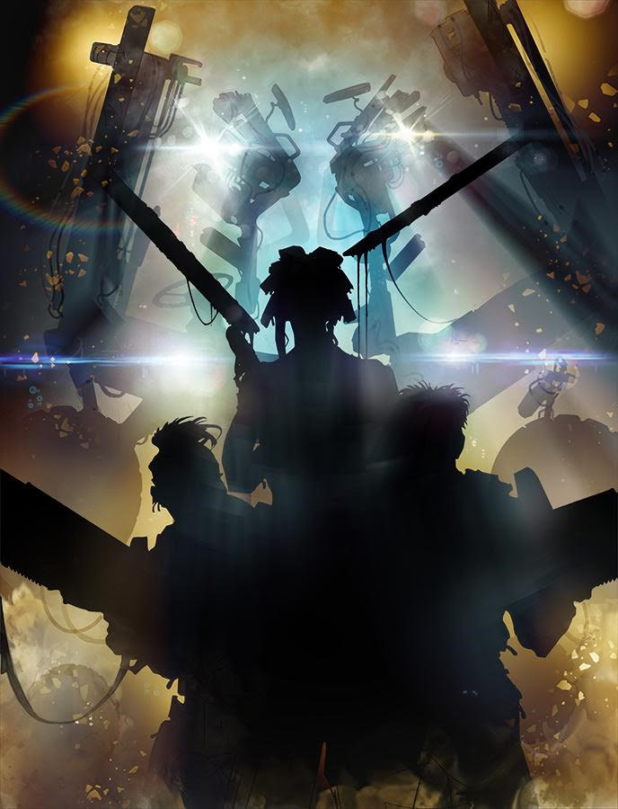
Over to Mark to tell us how the cover was created “After an initial suggestion from Tharg-who-must-be-obeyed of a “Transformers” type alien looming up behind our unwary heroes, I came up with this finished sketch in PhotoShop that also suggested some mood lighting, being lit by amber emergency lights.”

“It’s behind you!”
“I knew I wanted a sort of “Was that the wind?” cliché moment you get in a horror film, where the beast drips saliva onto the heroine or in this case blood (Having not seen the final cover I don’t know if this will be censored along with the “Fork U”- Tharg and his minions can move in mysterious ways!)” Rest assured, both details survived! – PWLS.
“The transformer alien was in the guise of a Fork lift truck so I grabbed some images off the internet, cut them up and created a sort of collage of machine parts as an indistinct “presence”.
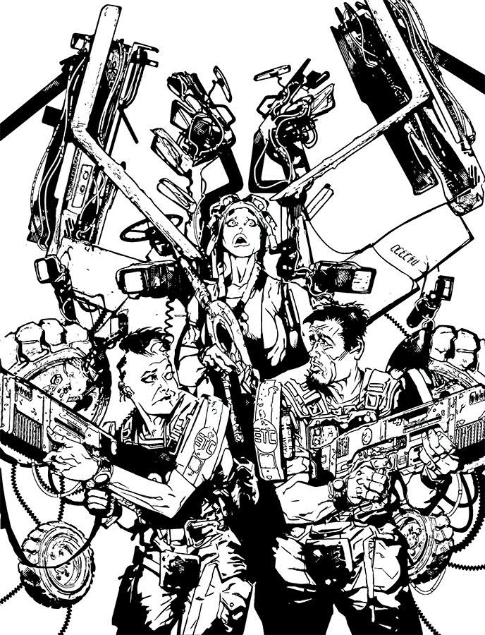
“The creature would be more silhouette and shadow and light than anything too complex. (Although you can see from the “inks” I did work into it quite a bit before dialing back the detail.)”
“The inks however tend to be towards the end of the process these days as my particular approach towards a cinematic styling paying attention to lighting and shadow no means I usually after initial sketching go straight to a silhouette of the foreground figures and around, on top of and behind that I place special effects.”
“Big Jobs!” Ooops, wrong strip!
Of course, Mark is well known for his cinematic approach to his artwork, with a range of atmospheric volumetric light effects, smoke, lens flares and sound effects. Mark gives us a little insight into his infatuation here: “I’d become quite obsessive with in-camera lighting effects and artefacts, loving the added colour and layering they create.”
“Ironically I’m not a fan of them excessively used in films, but sparingly, anamorphic, is there nothing that screams wonderful widescreen film more than the short life of a lens flare on screen? I love ’em! (When they are real!)”
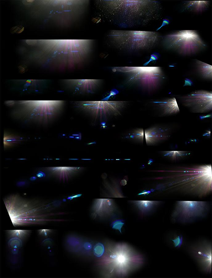
“I like the effect in comics so much I’ve created my own over the years. Even as pencil and paint pre-computers, and then created my own based on freeze frames from films (the helicopters approach in Close Encounters; Kane descends into the Egg silo in Alien.) However, recently I realised I could generate my own better than I could make them digitally using my camera and an anamorphic lens (that gives you that classic panavision look!)”
“I lay on my back in the garden on a sunny day and pointed my digital camera at the sun (not a good idea kids) with a black portfolio on my lap to catch the flaring effects. You can see the results in what I call “JJ Abrams Wet Dream”. :)”
“God knows what the neighbours must have thought!”
“Beyond honour, there is duty! Beyond duty, obsession! And beyond obsession, madness! Beyond that, is a man lying on his back in the garden, taking photos of the sun!”
Mark continues “Will I actually use them remains to be seen. I generate a lot of art files than sometimes don’t get used. Making comics into movie comics is pretty complex!)”
Below are the lens flares used on this particular cover…
Mark does the Rorschach Test.
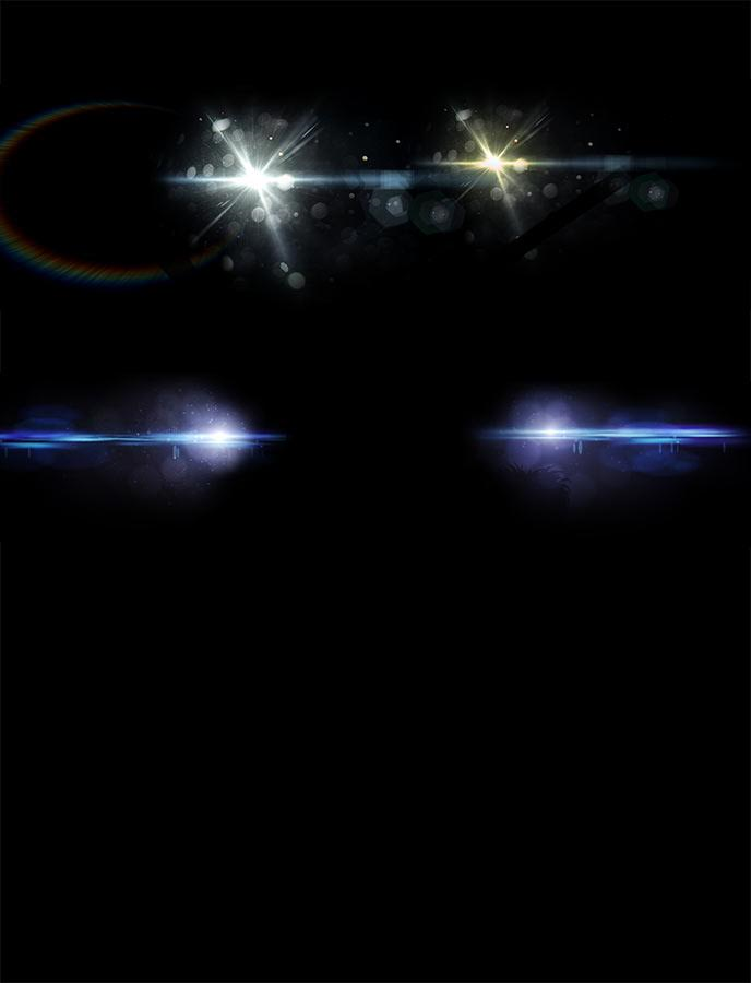
“I established the effects and atmosphere of the piece using silhouettes…”
“Who turned out the lights?”
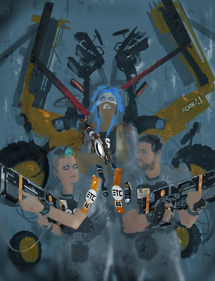
“Now its time to give the foreground some detail. I add additional art such as the guns and ETC logos a separate layer and block out large areas of black using the PhotoShop lasso tool and fill…”
“Then comes the heavier line brush work to define depth. Finally the finer line detail. Pretty much the classic inking approach.”
Not so resting, surprised face!
“I’m inspired by artists like artist Michael Golden. His work on Marvel’s “The ‘Nam” and his more caricature portrayal of heroes is something I’d definitely want to explore in future episodes of Grey Area.”
“It’s something I feel more comfortable with. A mix of realistic cinematic styling with almost a toon like content.”
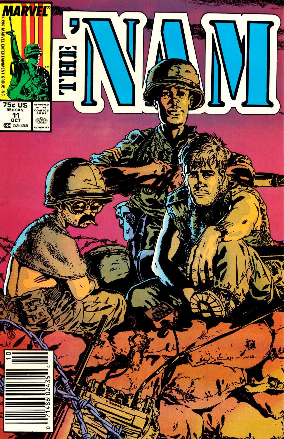
Hey what’s this!?! Nam Covers Uncovered?
The Golden Boys.
“Flat colours follow which are sampled colours from a reference sheet that I apply to the scene at a reduced opacity initially. This gives the scene a colour mix. Tone and rim lighting are defined once again by lasso took and brush.”
“The flattened image is then selectively dodged and burned and a few custom actions are run that enhance the over effects and colours.”
He slimed me!
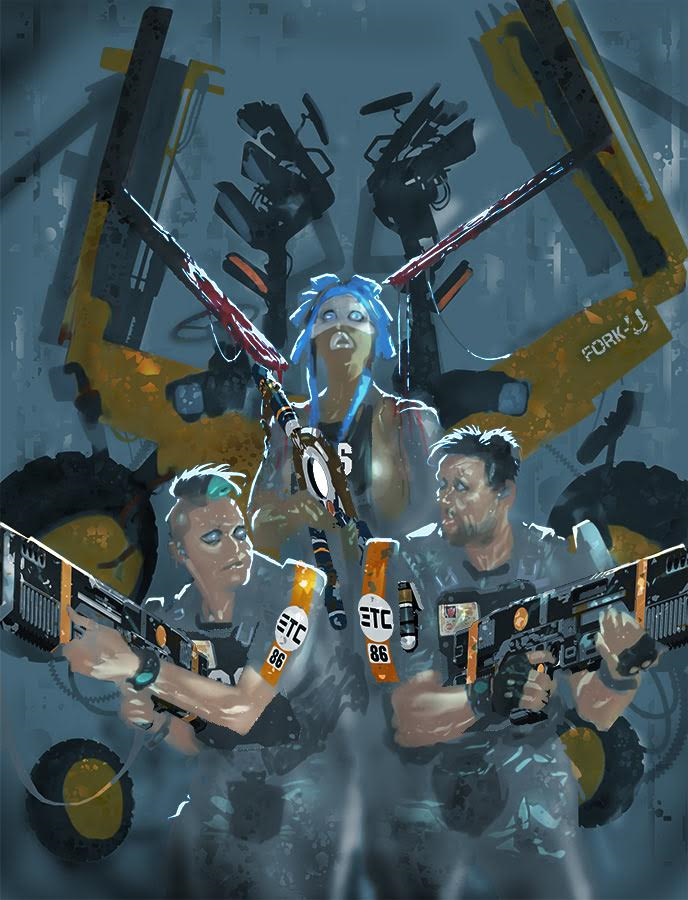
“Finally I tweak the overall contrast and gamma and lighten for final delivery and printing to compensate for the darkening that takes place in the printed comic (which doesn’t always work.)”

Resting Bitch Face had gone a little too far with her Ripley in Exosuit cosplay costume.
Huge thanks to Mark for sending us the images and fascinating process, I always enjoy his commentary when explaining his cover process, passion and innovation in equal measure!

