45 artists for 45 years, Part 2 – Visions from the first 200 Progs in the 2000 AD 45th Anniversary Art Book
24th May 2022
This week sees the release of the 45 Years of 2000 AD art book, celebrating 45 years of 2000 AD with 45 great artists giving their take on some of the Galaxy’s Greatest Comic’s legendary characters.
Out on 25 May, the book will be available in a standard hardcover or a special slipcase hardcover, exclusive to the 2000 AD webshop, this is a unique collection honouring four and a half decades of groundbreaking comics!
To celebrate, we’ve been talking to some of the artists involved in this gorgeous book. Check out the first part here.
Pre-order/order now from 2000AD.com:
HARDCOVER >>
EXCLUSIVE SLIPCASE EDITION >>
Pre-order/order from these stockists:
HIVE.CO.UK >>
BOOKSHOP.ORG (UK) >>
BARNES & NOBLE (US) >>
AMAZON.CO.UK >>
AMAZON.COM >>
FIND YOUR LOCAL COMIC BOOK STORE >>
In this post, we’ve got stunning artists depicting some of the Thrill-Powered characters from the first 200 Progs, Steve White on Flesh, Chun Lo on Dredd, VV Glass on Nemesis, Eduardo Ocana on Blackhawk, Andreas Butzbach on Meltdown Man, and Josh Hicks on Mean Arena. But, as befits his status, we’ll start with old stoney face…
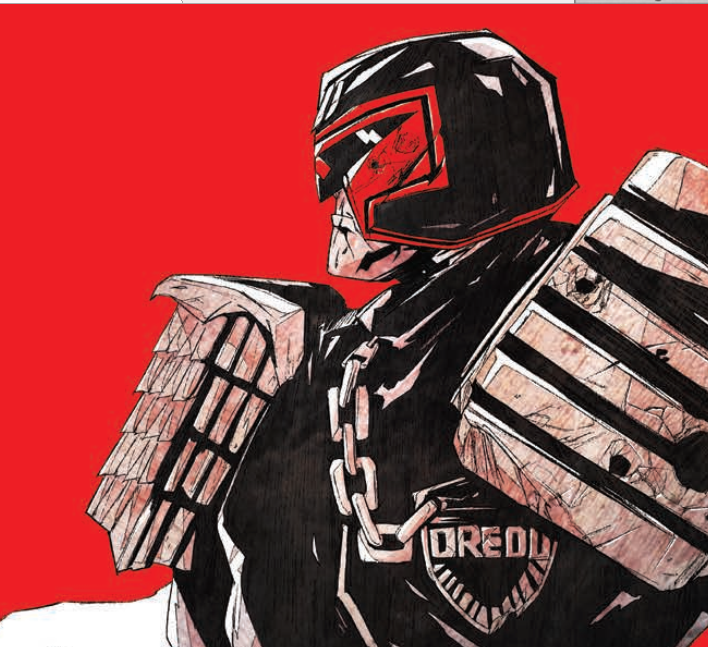
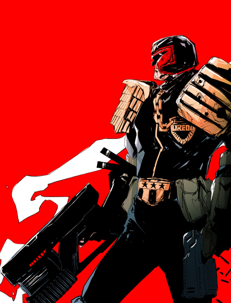
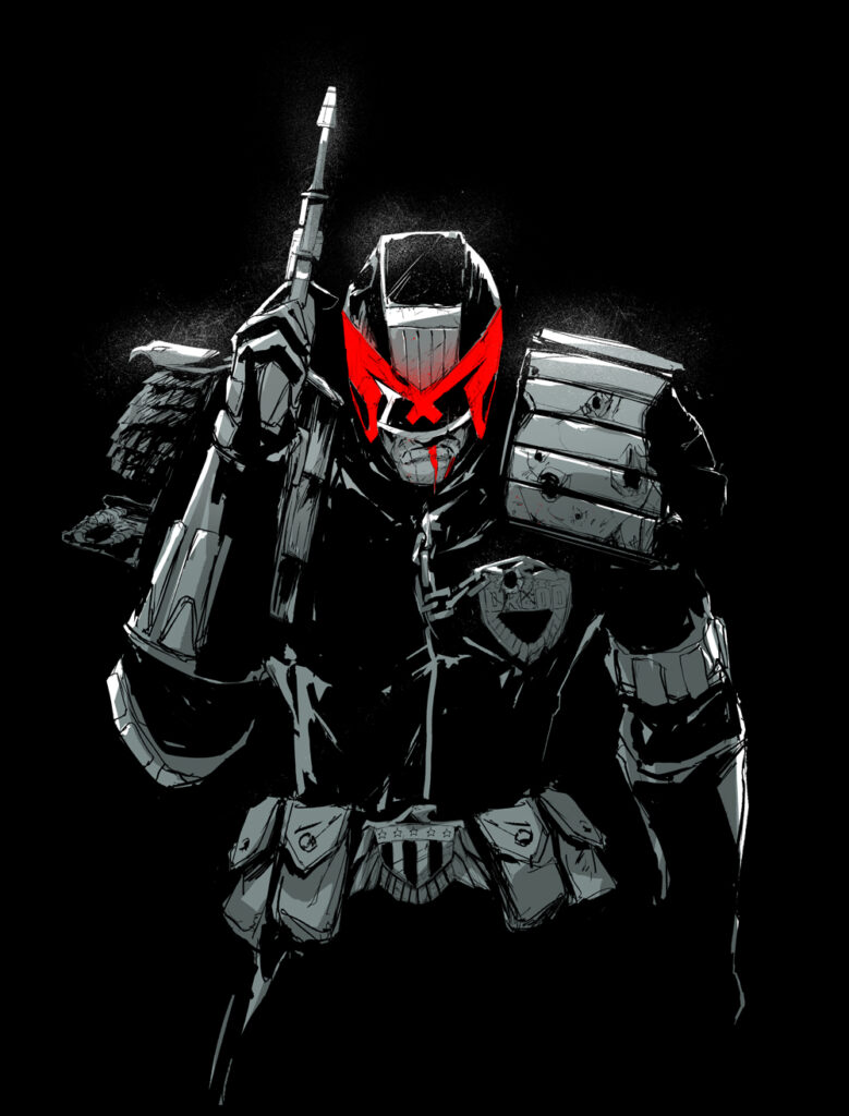
CHUN LO – JUDGE DREDD (2000 AD Prog 2)
I drew Judge Dredd for the book. Dredd has always been such an iconic character with an iconic look. Stern, vigilant, and regal. I wanted to translate that into my drawing. There have been numerous renditions of the character, all amazing. I really wanted mine to stick out. I chose to give him a very blocky visage, box-like if you will. Making him into a larger-than-life intimidating figure, blunt with rough edges. With that recognizable scowl and all.
I wanted to show something, for a lack of a better word, badass. Something that Dredd fans would hopefully like and true to the character.
2000 AD and Dredd have huge nostalgia for me. Nostalgia. I remember one of the first movies I’ve ever seen was actually the 1995 Judge Dredd. The costume designs in the movie were spectacular. In fact some of those design choices I also incorporated into my piece, as well as blending in some elements from the 2012 film Dredd.
This is my first foray into illustrating a 2000 AD character. With that said I would love to have more opportunities to illustrate 2000 AD characters, especially The Dark Judges. Judge Death is a personal favorite of mine.
.
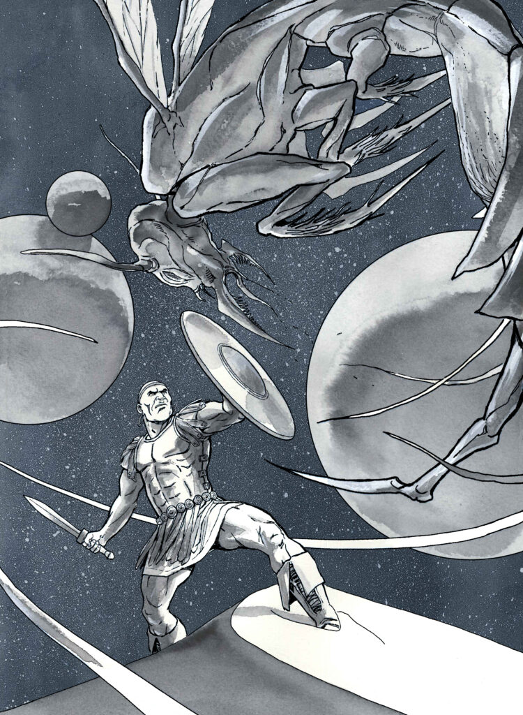
STEVE WHITE – FLESH (2000 AD Prog 1)
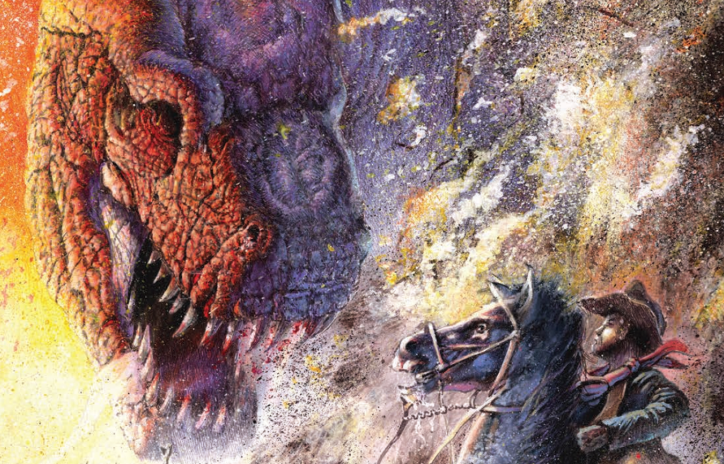
I’ve drawn Old-One Eye from the original series of Flesh. I was approached about doing this piece because, although my original credits on 2000 AD were as a writer, I am now better known as an artist, particularly in the field of palaeoart – the reconstruction and illustration of extinct animals, which is obviously very centred on dinosaurs. So, it seems to have been one of those nexus points where my comics history crossed the streams with my love of drawing dinosaurs.
I guess I wanted to try and encapsulate the wonderful mix of genres the original series of Flesh was constructed from, which at its simplest terms is cowboys vs dinosaurs. Even though Flesh is meant to be set in the future, it was the Wild West feel that, as a kid who loved both westerns and dinosaurs, really spoke to me – The Valley of Gwangi blew my mind as a boy! I just wanted to show those two genres crashing into each other, and there was one particular scene in the first series where the tyrannosaurs break into a domed town that feels more like Deadwood under plexiglass and run amok – it’s where Old One-Eye gets her name – and the whole place goes up in flames. I just wanted it to feel like a movie poster for the Flesh movie we so desperately need.
Flesh was, in a roundabout way, what brought me to 2000 AD after a school friend told me about a new comic that had dinosaurs in it. I loved the story and quickly grew to love everything about 2000 AD. It introduced me to amazing stories, writers, and artists who I continue to love 45 years on. I have muscle memories of reading for the first time the climax of Flesh as Old One-Eye stands atop the Fleshdozer as the Great Monster of All Time. I remember vividly reading the finale of Nemesis Book One and The Cursed Earth. It’s safe to say Flesh and 2000 AD are part of my DNA.
.
EDUARDO OCANA – BLACK HAWK (Tornado Issue 4 – 1979)
When Olivia Hicks asked me for create an illustration of Black Hawk in this 45th Anniversary of 2000 AD art book next to a lot of incredible 2000 AD artists, I felt honored to be part of a book like this. It has been nice to give my vision of a character that Azpiri, one of the best Spanish comic artist for me, drew in the 70s/80s.
When I was a kid, El Pais, the Spanish newspaper had a comic supplement on Sundays and one of the artists was Azpiri, drawing Mot, an all ages story of a monster and a kid- I loved reading that every Sunday.
Later, when I was a teenager, I loved his short watercolors noir sci-fi stories that I read in the pages of the Spanish magazines Zona 84 or Cimoc (similar to 2000 AD magazine but ended in Spain in the ‘90s.)
I didn´t know Azpiri did Black Hawk, I discovered it in the pdf Olivia sent me with all the adventures in the ‘70s – it was a beautiful surprise and I had no doubts that I wanted to do. Did I have in my style similitudes with the style of Azpiri? – I’d like to think that it’s possible. And even though my style is different from his, I see that I search for similar things; a realistic sci-fi style in backgrounds, strong dynamic characters and a fluid storytelling.
Anyway, for the illustration, I tried to find a vision near to what Azpiri did, so I’ve drawn him in a realistic way, a little far from Full Tilt Boogie style but nearest to Black Hawk’s original idea.
.
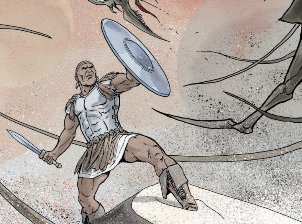
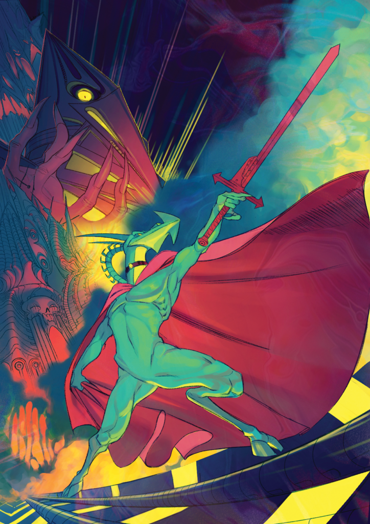
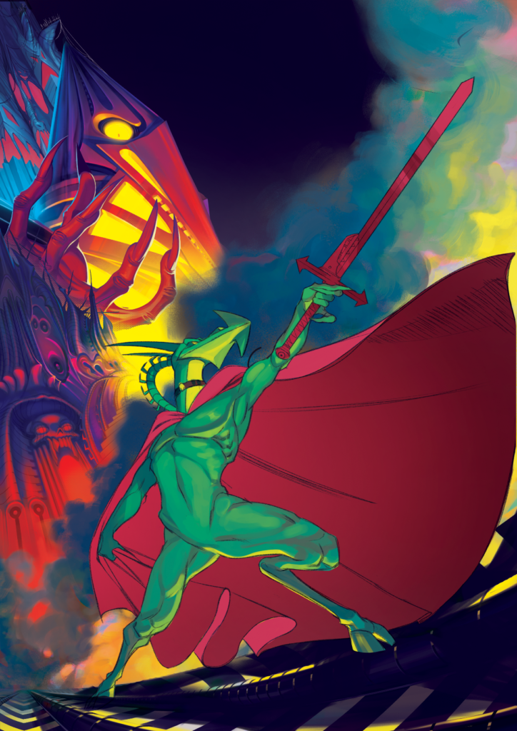
V V GLASS – NEMESIS (2000 AD Prog 167)
I’ve done Nemesis the Warlock from… well, Nemesis the Warlock. I’m a big fan of Kevin O’Neill, so this was an excuse to go through his back catalogue, not to mention getting to do violence on the reader with some really eye-harming colours!
Basically I tried to translate the Gaudian nightmare space of the Nemesis comics to a single image, and to give a sense of the setup there at a glance. There’s a lot going on in Nemesis, per page, so I had to boil everything down to the big points – the architecture, the meld of sci-fi and fantasy, antihero & villain and their respective vibes, the opera of the whole thing.
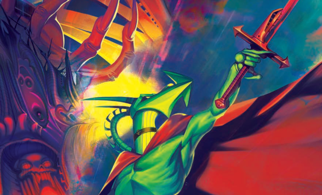
Detail from V V Glass’ Nemesis
I wanted to push the colour palette of the comics up to the extreme, as well. The colours on the 80s strips were hostile – it was, in a good way, the palette of a worm exploding. It was at the limit of analogue printing, so I wanted to transfer that approach to the edge of what digital colourgrading can do, what I’d imagine Nemesis could look like if it was being produced now. Then, because of that, I kept having to scale back smaller references for the sake of readability – I originally had Torquemada’s troops fighting Nemesis’ allies in the buildings at the left of the page, but it was impossible to see them because of the complicated colour buildup in that area, so they went. The hazard strip tubes Nemesis is standing on were also originally his ship, but that didn’t translate well to the extreme perspective of the picture, so the colours are there to gesture towards it instead.
The series name was a household meme when I was growing up, and then when I got the chance to actually read it, it turned out a lot more funny and a lot more politically prescient than I’d expected based on sometimes having the title said at me in a horror voice. The philosophy behind Nemesis is of a piece with the rest of 2000 AD in general (which makes sense given who wrote it). It has the same ‘turn it up to 11’ storytelling ethos, but there’s the same sense of anti-authoritarianism coming through spectacle and humour. I like the mode of embodying authoritarian puritanism and othered selfhood and having them engage in a struggle that makes the obvious 1980s equivalents literal. Conservative respectability goes hand in glove with fascist supremacism, so dramatic but also so grindingly doily-drapingly mundane – be pure, be vigilant! But also, you know, just behave.
It was new to draw a distinctly non-human character in a distinctly alien setting. Before this I’d mostly one one-shots for Rebellion anthologies set on modern-day normal Earth with normal people. But even in standard 2000 AD, the strips have some combination of sci-fi and urban settings. Nemesis has as much of your old sword & sorcery fantasy to it as sci-fi, and everyone in it looks like some kind of living polygon. Working with that aesthetic was very refreshing!
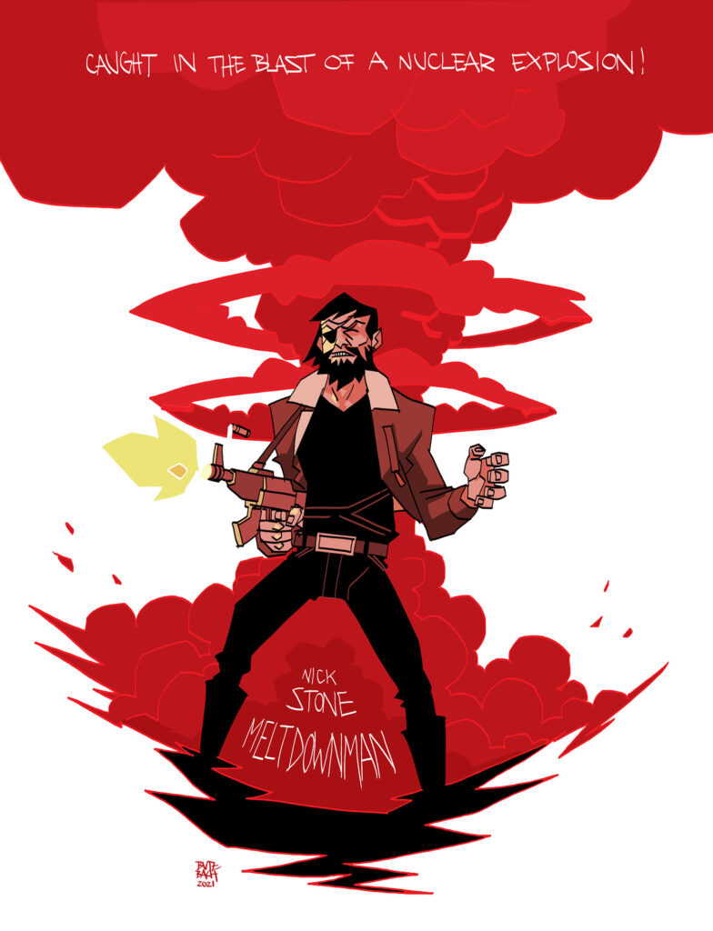
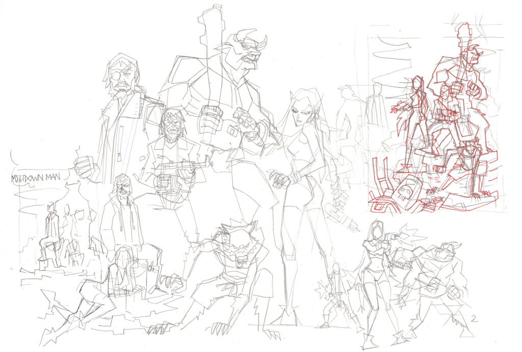
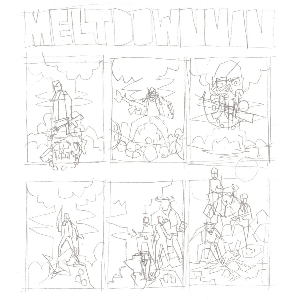
ANDREAS BUTZBACH – MELTDOWN MAN (2000 AD Prog 178)
For the 2000 AD 45th-anniversary art book, I had the opportunity to draw Nick Stone, Meltdown Man. A man who gets caught in the blast of a nuclear explosion and flung into the far future, straight into the middle of a caste war. Great stuff!
I was not familiar with the character, the strip predates me by a year and 2000 AD material was hard to get back in the day. Thankfully, this is no more a problem nowadays and as I started reading the collection, it quickly became clear that Alan Hebden had a special story to tell. The strip has a strong spirit and Belardinelli’s art is amazing as always. I love his work on Slaine and he did not disappoint in Meltdown Man either.
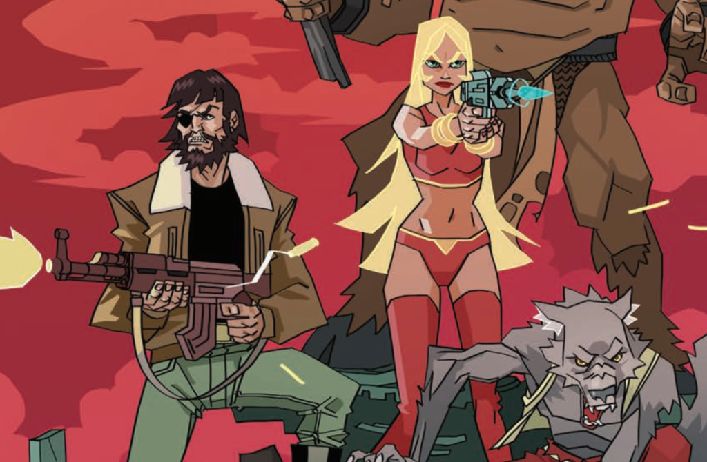
It’s always fun to draw cool old-school characters and I try to do my own thing whilst staying true to the original designs. For the Pin-Up, I was going for a hero shot inspired by the original Prog covers. Nick, Liana, Gruff and T-Bone, guns blazin’ in the heat of battle.As said, I’ve not been familiar with Meltdown Man before, but he certainly does mean a lot to me now. As my first published work with 2000 AD, this is a personal milestone. For me, it is an honor to be featured in such a book, among many great artist of which some were huge influences to me. This is childhood dream stuff coming true right here!
Being from Germany, I had only limited access to 2000 AD publications until the Internet changed everything. We had no Prog or regular 2000 AD releases but there were translations of various Judge Dredd stories and Feest published Slaine The Horned God in a huge format. I remember Rogue Trooper being my first 2000 AD series of which I had original English Issues.
2000 AD always stood out from the regularly available comics and shaped my perception of what a comic should be, pretty early. For me, 2000 AD always stood for wild, rebellious fun stuff and after 45 years, still does.
.
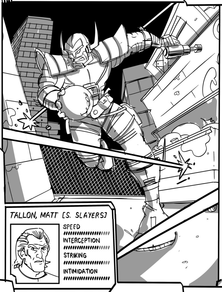
JOSH HICKS – MEAN ARENA (2000 AD Prog 178)
As a sedentary cartoonist I have a sort of biological aversion to sport, but as soon as there’s some kind of dramatic, fantastical element involved, I’m all in. That’s why I love pro-wrestling, and that’s also why I jumped at the chance to draw The Mean Arena’s Matt Tallon for the 45th anniversary art book. Rugby and football I can take or leave – but throw in cyborgs and laser blasts and whatnot and I’m there!
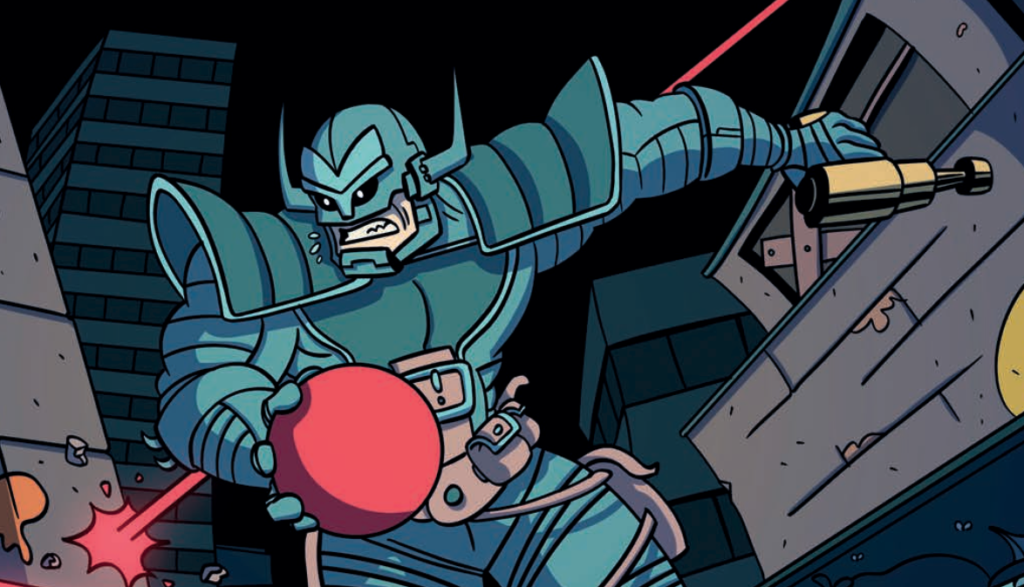
With my piece, I wanted to play pretend and do an honest version of what a Mean Arena comic drawn by me would probably look like. I kept classic design cues from the great John Richardson and Steve Dillon art from the strip’s early days and just tried to do them some semblance of justice.
I also liked the idea of designing the piece like a sports trading card or a video game display screen, so I threw in some Matt Tallon vital statistics for good measure. Playing with that stuff was fun, and also led me to fantasise about a Mean Arena strip from the point of view of the various shady promoters – a perfect mix of Arnie’s The Running Man and Sega’s Football Manager. The dream combo!
.
.