INTERVIEW: Barbara Nosenzo on colouring Halo Jones
20th March 2018
2018 sees a 2000 AD classic remastered and in colour for the very first time.
Alan Moore and Ian Gibson began The Ballad of Halo Jones in 1984 and it swiftly became a classic – a feminist soap opera full of nuanced storytelling, and monumental world-building. Over three books, Moore and Gibson followed Halo’s increasingly spectacular life, escaping the ghetto of The Hoop, taking to the stars as a space-liner stewardess aboard the Clara Pandy, and experiencing the horrors of war.
Beginning this May, audiences get to rediscover Halo Jones all over again…
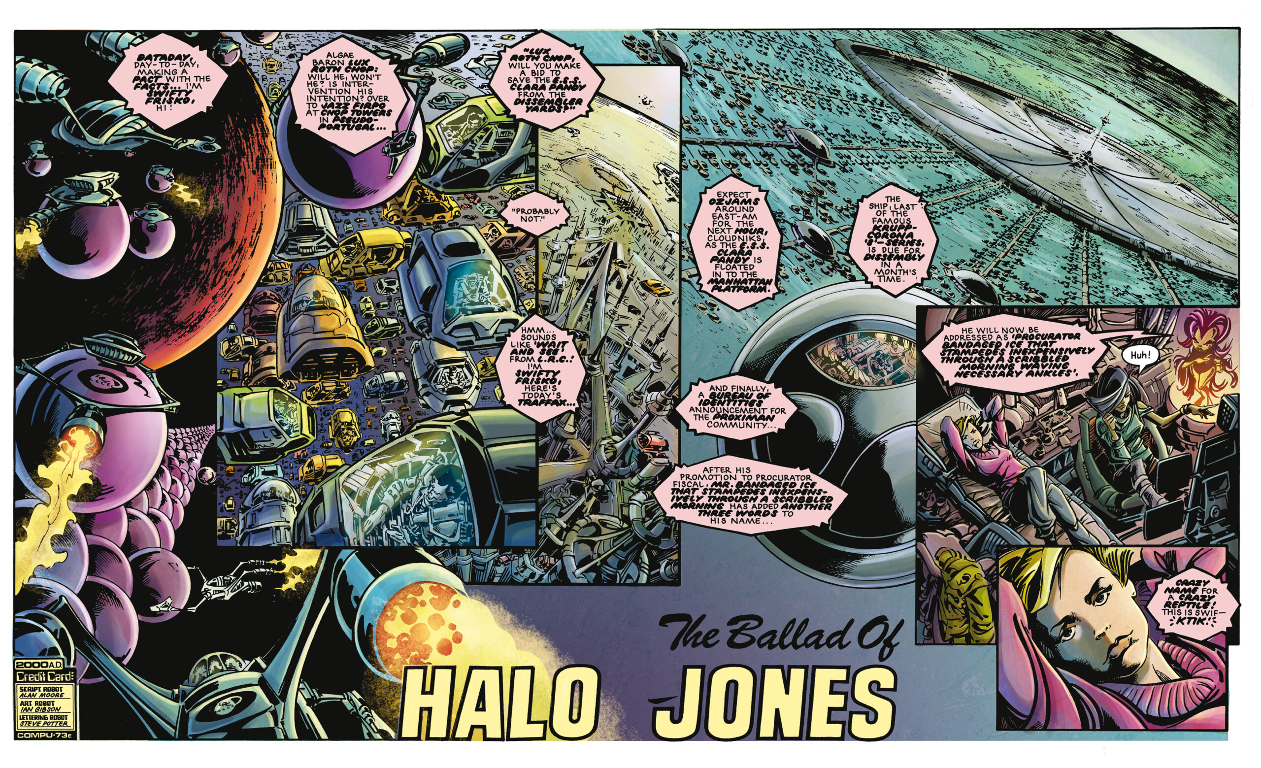
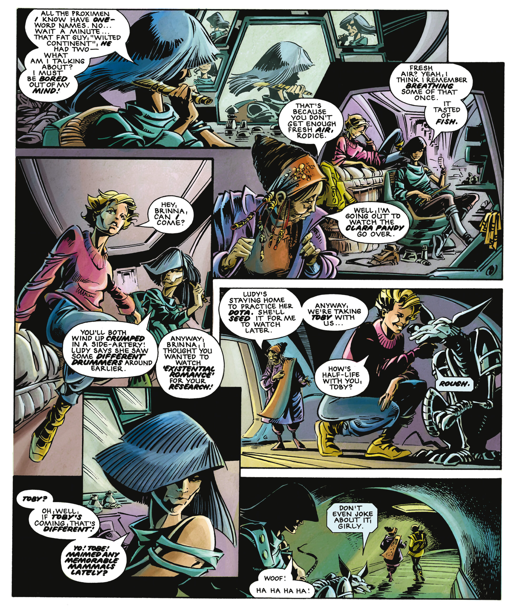
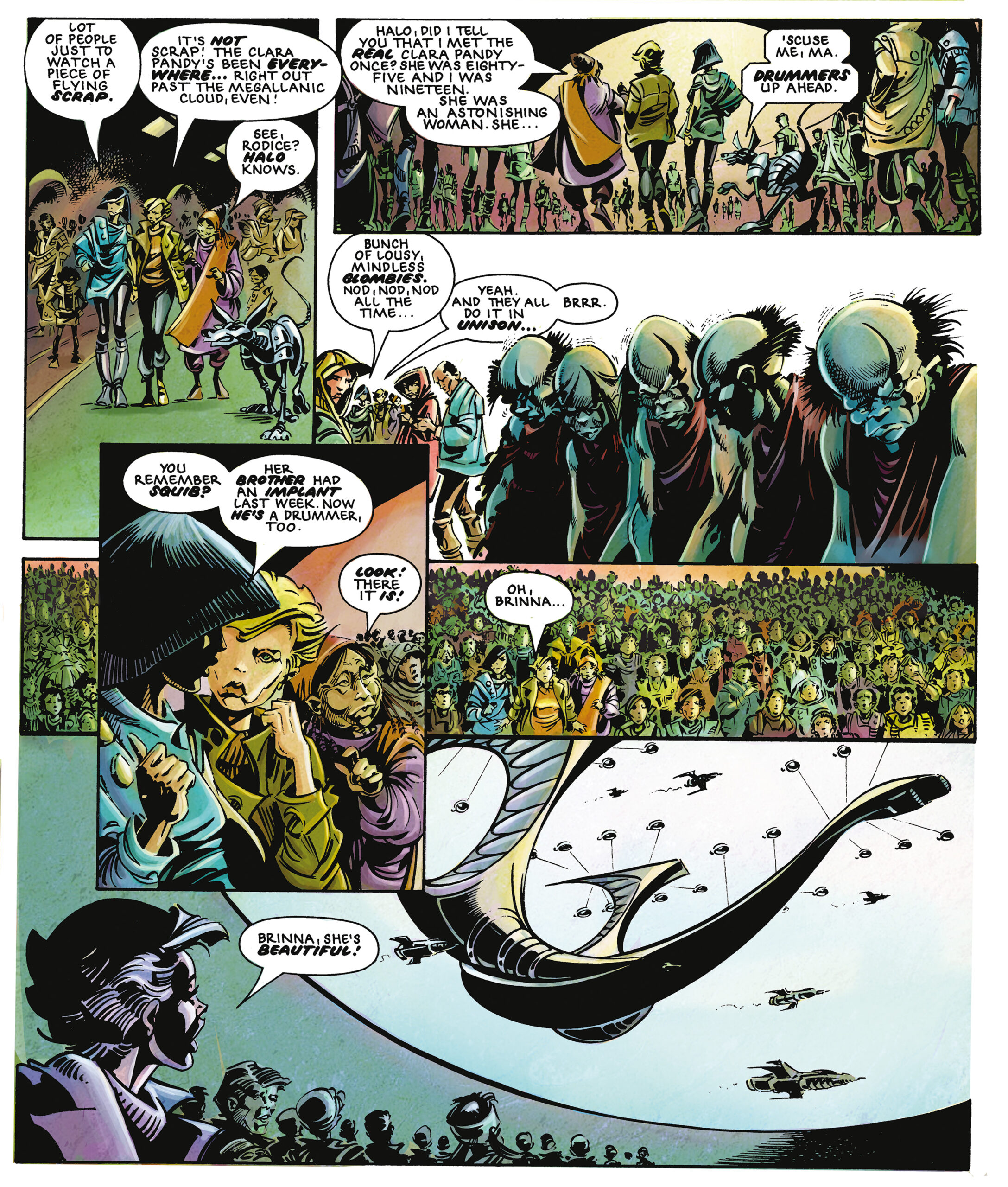
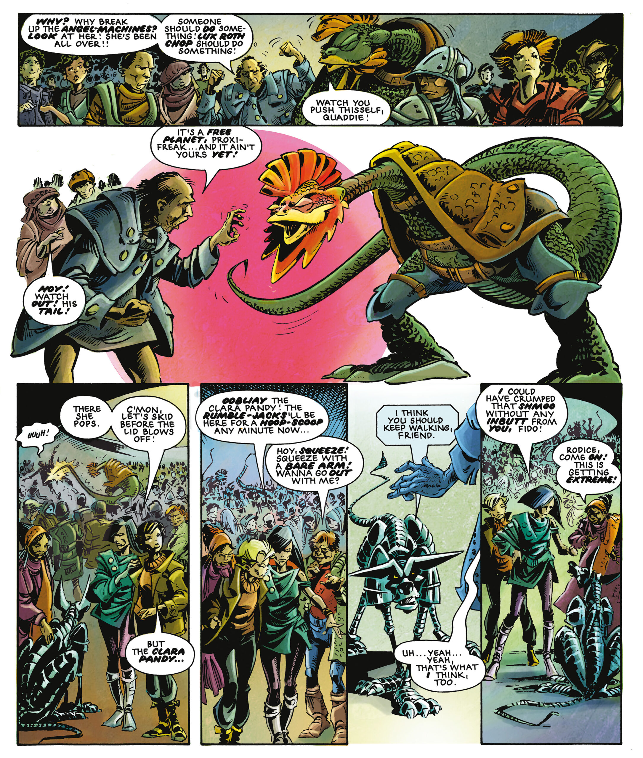
Originally published in black and white, the re-releases will feature extensively remastered artwork and, for the very first time, will be published in colour. Italian newcomer Barbara Nosenzo is responsible for bringing colour to the world of Halo Jones.
The 2000 AD blog’s Richard Bruton sat down with Barbara to talk about what it means to bring colour to a classic…
Richard Bruton: In May, we get to experience the magic of Alan Moore and Ian Gibson’s The Ballad of Halo Jones in a completely new light. Or rather, a completely new palette, as it will be the first time we’ve seen the work in colour. And of course, you’re the artist responsible for providing those all-new colours. How did this project come about?
Barbara Nosenzo: It’s always weird thinking about it, as it was as unexpected as it was wonderful! I was working on a cover for Rebellion (The Complete Journal of Luke Kirby) when I received THAT e-mail from Ben Smith asking me if I was interested on doing test pages for the Halo Jones project… of course I was!!! Who wouldn’t be???
What was your initial response to being asked to bring colour to the work?
BN: HUGE. Halo is a perfect example of black & white balance, and I constantly felt the responsibility of adding colours where there was no need for them!
Were you already aware of Halo Jones, and of Alan Moore and Ian Gibson?
BN: I hadn’t read Halo Jones before getting the job, but I’m a huge fan of Alan Moore, so thinking about ME working on a story written & drawn by such huge artists really made me crazy! From the beginning I put myself under a lot of pressure, because I knew that I was working on a masterpiece, and I wanted to do my very best work on it.
Obviously, The Ballad of Halo Jones was created to be in black and white by Ian Gibson. And although we’ve seen glimpses of what Gibson and Moore imagined her world would look like in colour with various extras, covers, and one off pieces, the addition of colour is something major. How did you approach bringing colour to this black and white world?
BN: While reading the books for the first time, I started imagining atmospheres and details, and tried to put those on paper. I used some covers as reference, and then I worked on my own palette to bring Halo’s world to life. I focused on creating colors for atmosphere, and I decided with my editor (Matt Smith) to choose different background tones for each book, to help define the three different stages of Halo’s life (the Hoop, the Clara Pandy and the War).
Book one has a green, dirty background color to give you a feeling of uselessness and deterioration, that perfectly matches life on Hoop. Book two has a pale yellow tone, because its Clara Pandy time, apparently an age of luxury surrounding Halo. And finally, red tones for book three because it’s all about the war. To obtain these effects, I used background layers, with a wrinkled paper texture turned in three different colours, each one for the specific book I was working on.
I think that colour is like soundtrack in a movie: it should enhance the feelings and underline particular moments. That’s how I tried to use my palette, often using weird colours to define feelings (blue for sadness, green or purple for fear.)
How closely did you work with the editorial team on the colouring work, and how did you deal with the unique problems adding colour to this classic produced?
BN: I’m particularly happy about it, because I had an active role in the creative process, from the beginning (when I suggested different colour styles to choose) through to the end, deciding with Matt atmospheres and palette for the books. Being respectful of Ian Gibson’s black and white artwork obviously created some challenges that I had to solve. Many times I had to create continuity solutions, such as when the floor in one panel becomes the ceiling in the panel next under with no edges to separate them. I solved this problem thinking a lot about the settings (like an interior designer!) so that the colour gradients I used to connect the panels would not look harsh or “out of place”. I had to decide where it was useful to colour on the black lines and where it was pointless, choosing colours not too bright but also not too dark, adding light effects on a total black line… many times I focused a lot on a little detail, such as a little blood stain, to get the best effect possible but also keeping Gibson’s style.
Going back to your beginnings, where, when, and how did you begin working in comics?
BN: I’ve always drawn and coloured since I was a child, but professionally speaking I started working in comics in 2004, with a small collective of authors named La Compagnia del Fumetto, basically a group of friends who decided to self-publish. We worked together over almost 10 years, and that gave me the opportunity to become more professional. While attending my self-publishing group, I realised that colouring was my true passion. In 2009, I had a portfolio review with Marvel’s talent scout CB Cebulski in Mantova, and he let me know that I could do this professionally. In 2013 I signed my first contract with an Italian publisher, Lo Scarabeo, for whom I produced a couple of Tarot sets, and worked as colourist for ManFont Comics, an Italian small publisher. Finally in 2017 I met the Rebellion guys and started working with them, culminating in Halo Jones.


