Interview: Dave Taylor On The All-New World Of Megatropolis
9th September 2020
It’s 30 years since the first issue of the Judge Dredd Megazine and, with issue #424, there’s a ghafflebette line-up of strips to celebrate those 30 years!
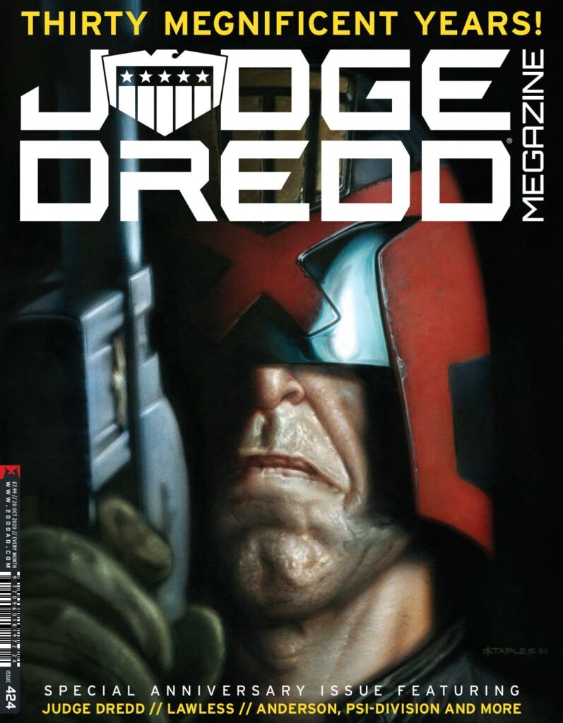
We get John Wagner, Colin MacNeil, and Dan Cornwell returning to the legacy of America Jara in Judge Dredd, we have a 20-page Lawless musical (yes, full-on musical!) from Dan Abnett and Phil Winslade, a one-off Anderson strip from Maura McHugh and Steven Austin, and the start of Dreadnaughts, a stunning new strip from the earliest days of the Justice Department from Michael Carroll and John Higgins.
But there’s also the Scrotnig surprise of Megatropolis by Kenneth Niemand and Dave Taylor, an alt-timeline Mega-City One, where the cops are all corrupt except a certain Detective Joe Rico.
We caught up with artist Dave Taylor to talk about Megatropolis and just what it’s like creating this new, familiarly unfamiliar world…
SUBSCRIBE TO THE JUDGE DREDD MEGAZINE >>
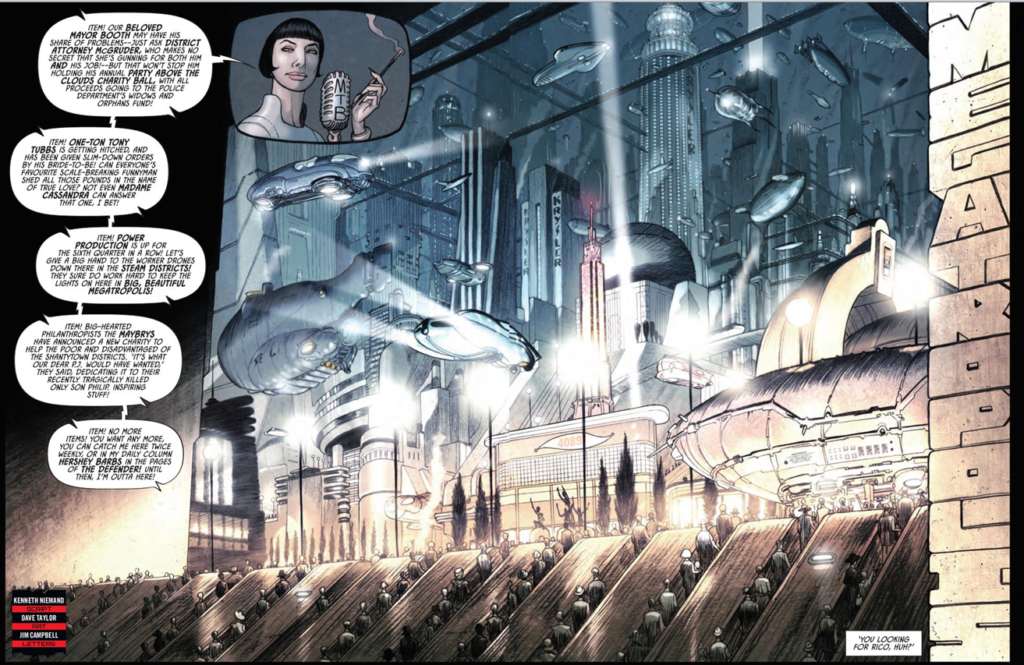
Megatropolis promises us an art deco retro-future variation of all we know about MC-1 and the first episode absolutely delivers all that, with Dave Taylor’s artwork giving us a sumptuous mix of all that art deco style and corrupt underworld of this all-new MC-1.
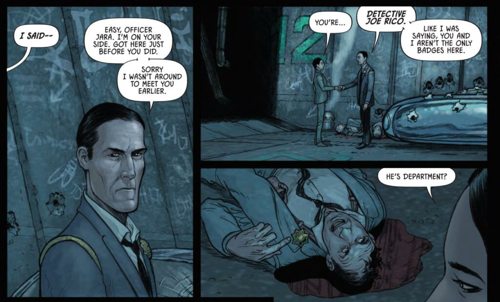
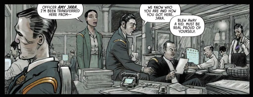
In this first episode, Joe Rico, ‘the choirboy’ according to his fellow cops, gets his new partner – Amy Jara. We have Mayor Booth and District Attorney McGruder facing off with each other, we have the tragic death, at Jara’s hands, of one young PJ Maybre, and the news announced by a certain Hershey Barbs. It’s definitely a very different, very striking version of the MC-1 we all know, and so much of that is down to the art of Taylor.
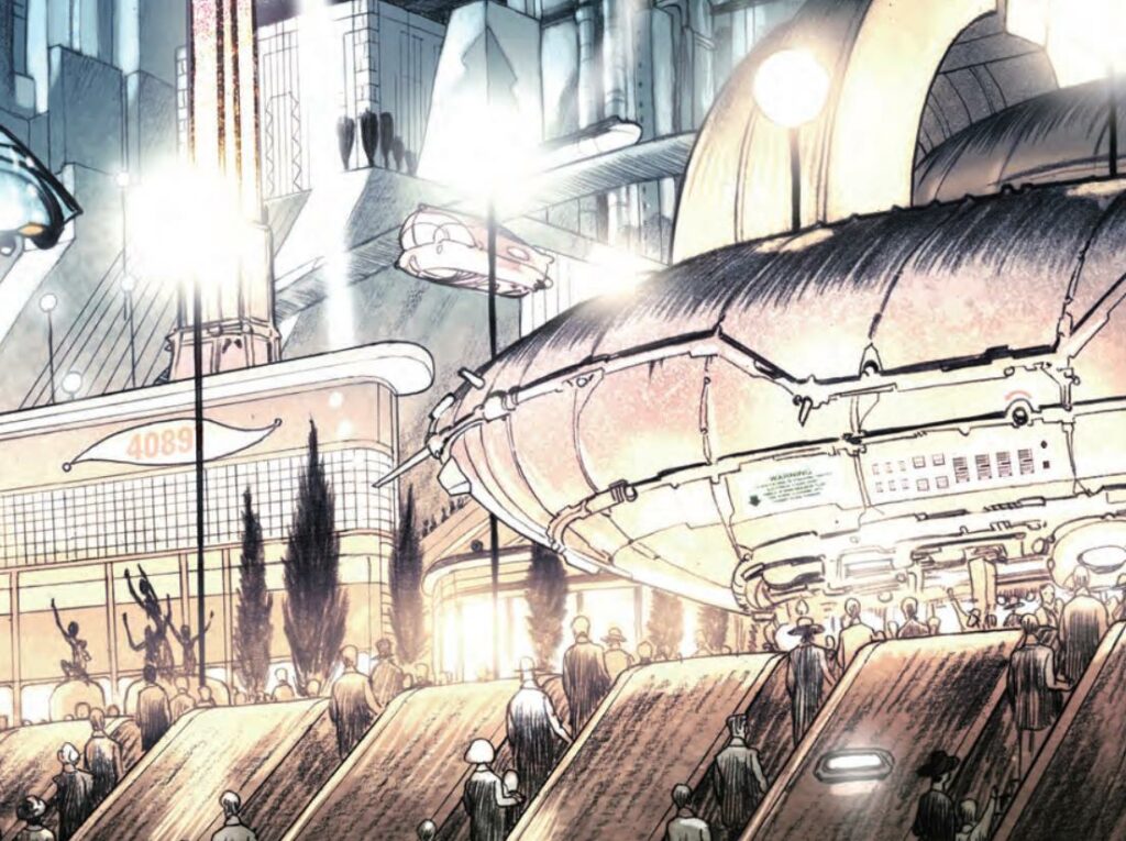
Okay then, hi Dave – your new strip, Megatropolis, kicks off in the 30th anniversary Megazine, issue 424, and it really looks stunning!
First things first, how did it all come about and how did you get involved with it?
Dave Taylor: As far as I can make out, the idea came as a gift from the stars. One of those moments of inspiration that forces you to wonder why someone hadn’t thought of it before, it being such a fantastic concept.
I certainly thought “Holy Shit!” when I got the message from Tharg. The thought behind offering the script to me I think was based on my Batman: Death by Design book in which I showed that I’m not scared of drawing cities! That book also gave me an education in the design aesthetics of the ’30s, something that was needed for Megatropolis.
How many parts will we see with Megatropolis this time round and will we be seeing further series from you and Kenneth in the future?
DT: It’s an 8-part story; a complete and self-contained story that could very easily become an ongoing series, if the folks like it, which they will because it’s bloody awesome! That’s just a fact and not in any way egotistical on my part.
And whilst we’re mentioning the infamously reclusive Mr Niemand, how did you find working together?
DT: Ken and I live on a Kibbutz, so we see each other on a regular basis. He showed me the best method of picking fruit and vegetables, which hand to favour, and all the special equipment he’s so masterly gifted with. I can barely keep up with him, he’s a whirlwind. Working with Ken is like working with a true genius. He’s an enigma.
Now, the meat of this – let’s talk about what it takes to design something so familiar and yet so completely different to MC-1.
DT: I think my understanding and love of the visual history of Mega-City One (a genuine fan since ’77) gave me the ability to place that setting into a different universe without losing the feel of the original.
I don’t think I ever thought I should turn down the 30’s feel for fear of losing that original essence, it came out naturally, in most part because of the script and the characters involved, who also hopefully feel both new and familiar to the reader. I did find myself occasionally wanting to add something very typically MC-1 in style, something to gently remind us where we are. That happened a few times. It’s more likely than not that I did that occasionally because I was missing drawing the real/original city a little, pining for the nut job crazy shit that I love to draw.
I’m assuming that there’s been a hell of a lot of worldbuilding going on with this one before it got anywhere near the finished page? What sort of things have gone into the creation of Megatropolis?
DT: A fair amount of the work had been done with the Batman Death by Design book, in that my memory banks were still full of 30’s New York and Chicago architecture and all the other design elements a convincing world needs. That was a huge advantage and a great stepping off point for me.
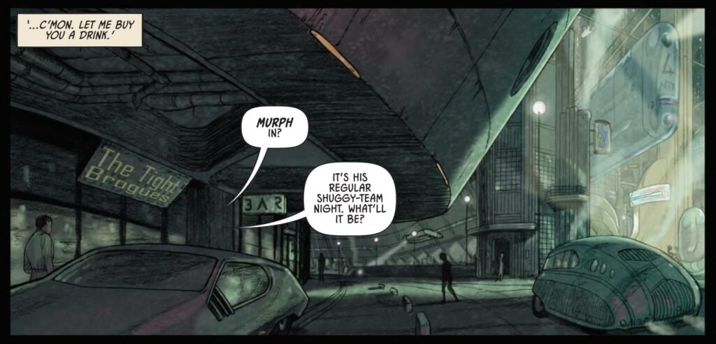
DT: I was very familiar with the Metropolis movie and other like-minded films of that period, something that Kenny stressed to me as an important reference for this book. What was new to me was designing air-cars that looked right for this. I can draw an MC-1 vehicle with my eyes closed, some would say I always do, but coming up with the right vehicles for this gig was a challenge.
You might ask why is there a late ’70s fastback Mustang in there? Well, firstly because it’s the most badass shit hot car money can buy, and our hero needed a badass shit hot air-car in place of a Lawmaster, and secondly because I’d argue (and probably will have to) that the look of those muscle cars was born in the ’30s.
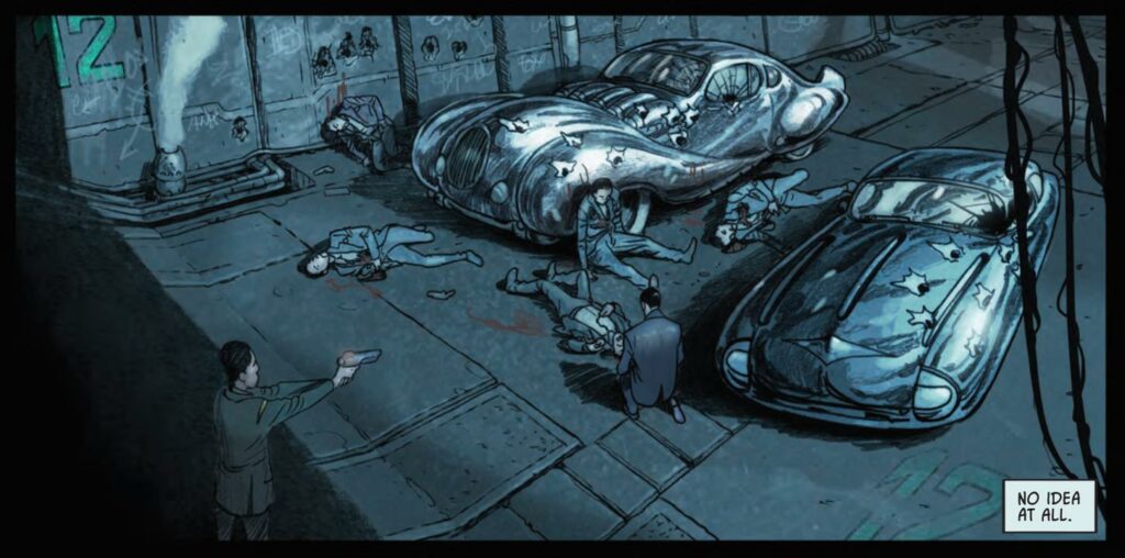
I’m seeing so many different elements in here – there’s the entire retro vibe of those delicious roadsters, the 30s/40s look of the plain-clothes cops, the organic stylings of the tech, there’s even something almost Geiger-esque in the shantytown pipework. And so much more I’m sure, feel free to go through so many of the aspects of it all!
DT: What we consider “contemporary design” today was conceived back in the late ’20s and into the ’30s. Those sleek silver shapes, those gentle gliding curves, those bold dramatic expressions in metal and concrete were all born 100 years ago. I’ve tried to capture all of that in this book, that design lost in time thing is fascinating.
I can’t think of one outside influence on this book, to be honest. I wanted to make this as original as I could, and having been so delighted with the idea of working in this “why hasn’t someone thought of it before” unique universe I wanted it to be completely me, or this version of me.
One thing that’s wonderful to see when we’re talking about process with artists, is to actually see a bit of process as well as talk about it. What’s your process for going from concept through to the finished page with Megatropolis?
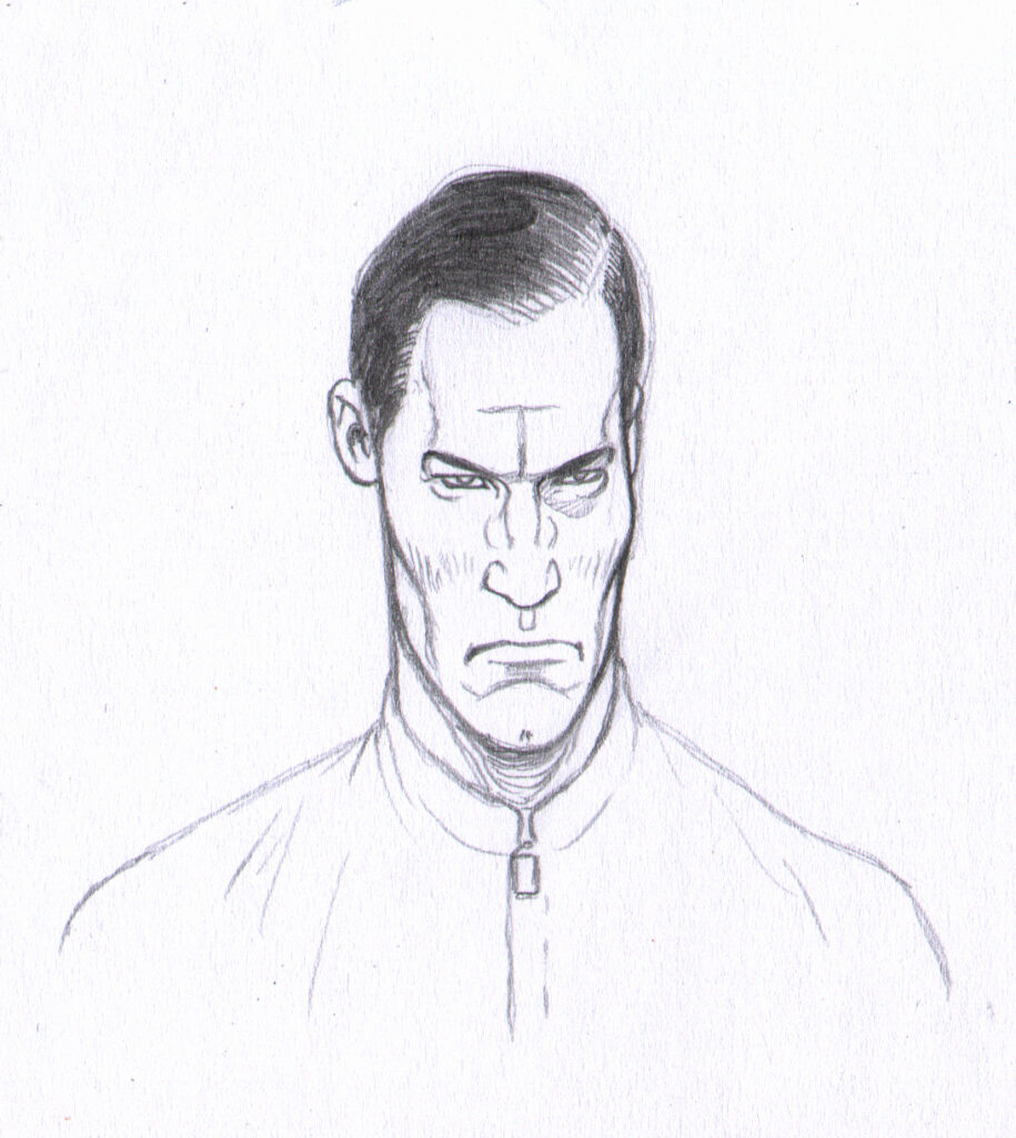
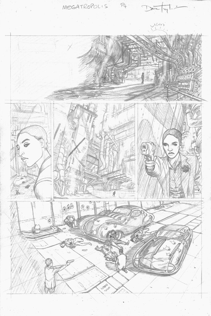
DT: My process on this is pretty much the same as I’ve been using for many years, with some adaptations. When comics publishing reached the point where artwork could be digitally scanned in place of being photographed, way back in the 90s, I jumped at the opportunity of producing something that retained the pencil line without being traditionally inked.
There’s something earthy and natural about the pencil that ink can not mimic.
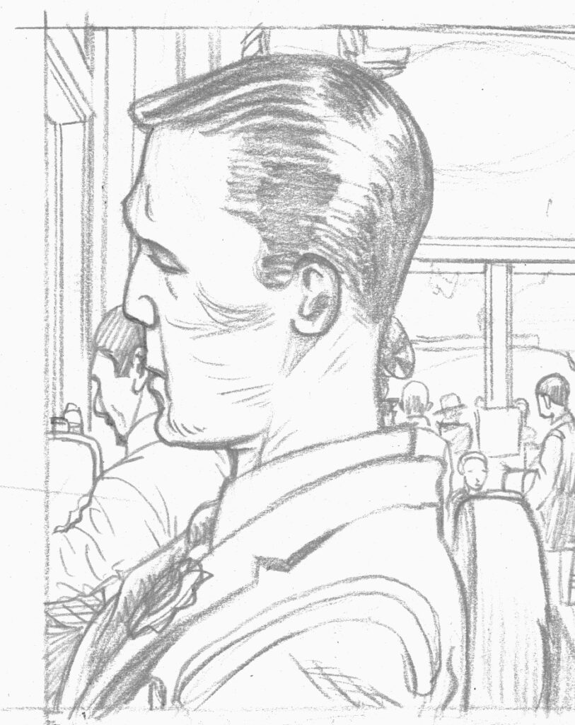
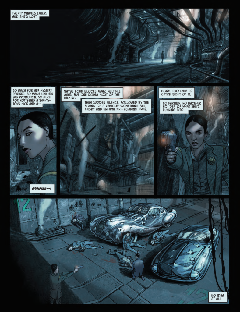
Megatropolis needed to be gritty, and there’s nothing more gritty than a 5B pencil. I draw little “thumbnail” impressions of each page, no more than 3×2 inches, then expand those rough ideas onto the full-size paper (17x11inch) using a blue pencil, then “ink” the page with both HB and 5B graphite pencils. Then I move into the 21st Century by using a “computer” to add the colour. I’ve used a muted natural pallet for this book to help make it feel more real, and to give room to more dynamic colour when the story requires it.
It’s not rocket science. Rocket science is now outdated thanks to “captured” flying saucers.
Thanks to Dave for chatting to me, always great to hear his ideas and see how they get to the page. And in the spirit of that, Dave sent over a full page of his pencils/inks for Megatropolis, letting us show you both that and the final page 4 printed in the Megazine.
You can get hold of Megazine Issue 424 from 16 September in the 2000 AD web shop!
