Posted on

2000 AD Covers Uncovered – INJ Culbard on Prog 2295’s Brink: Mercury Retrograde finale

Every week, 2000 AD brings you the galaxy’s greatest artwork and 2000 AD Covers Uncovered takes you behind-the-scenes with the headline artists responsible for our top cover art – join bloggers Richard Bruton and Pete Wells as they uncover the greatest covers from 2000 AD!

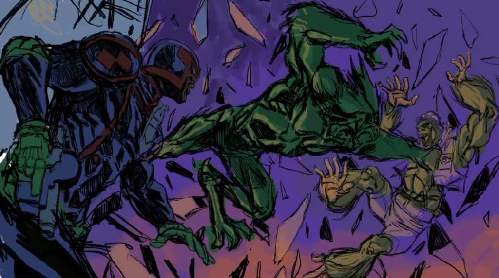
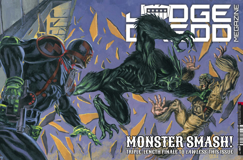
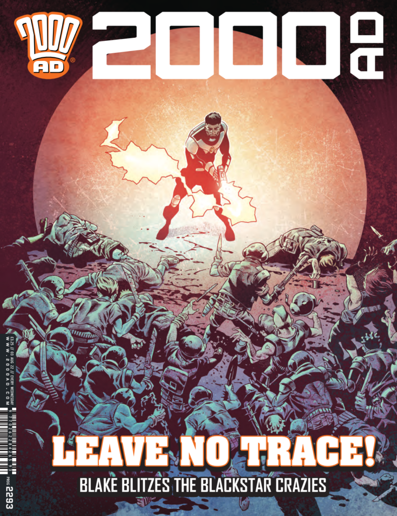
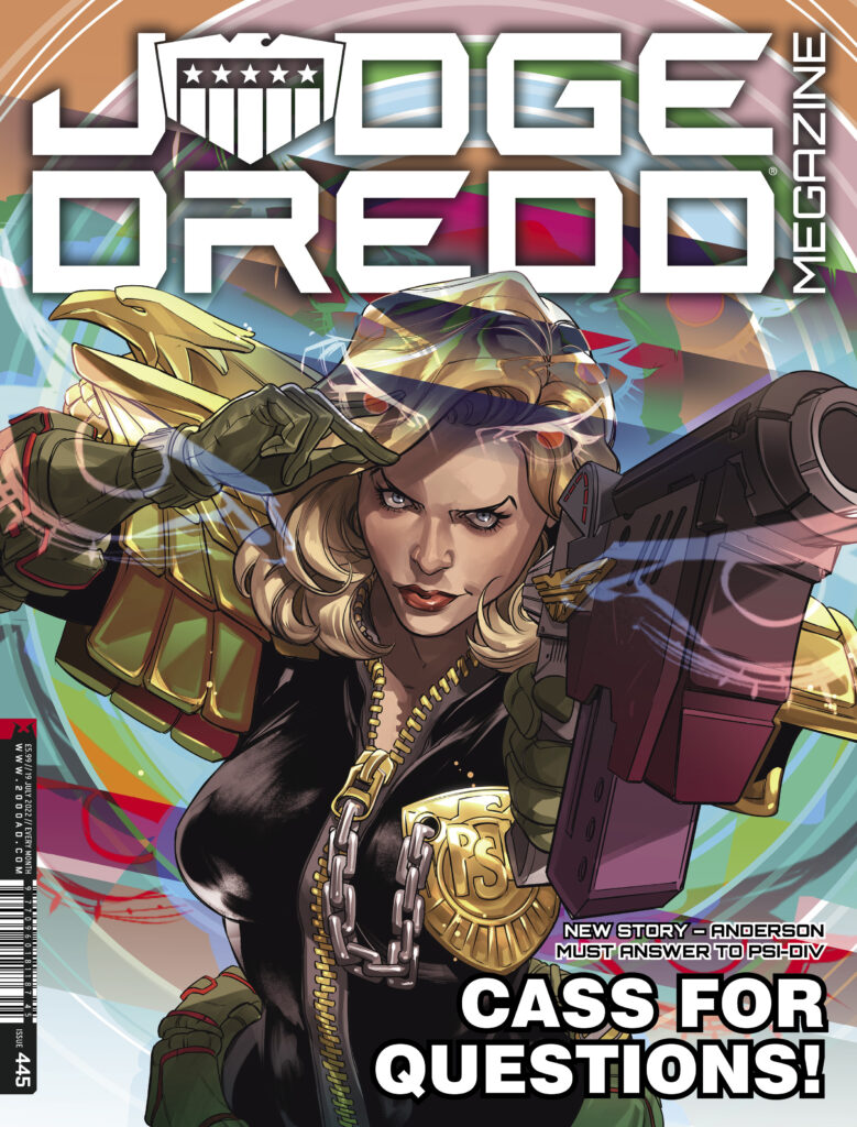
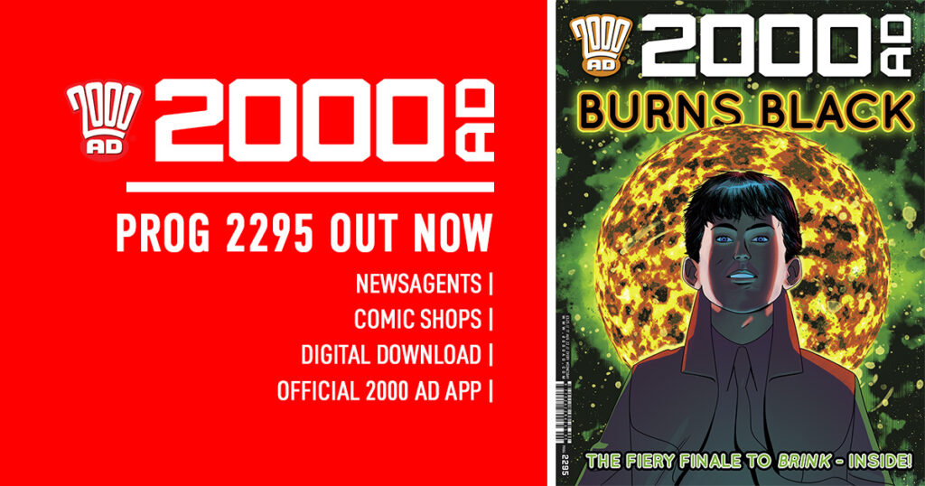
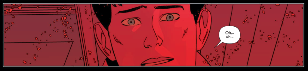
This week, for the thrilling double-sized finale to Brink Book Five: Mercury Retrograde, we welcome back INJ Culbard for the cover of 2000 AD Prog 2295 – out wherever the Galaxy’s Greatest is sold from 17 August.

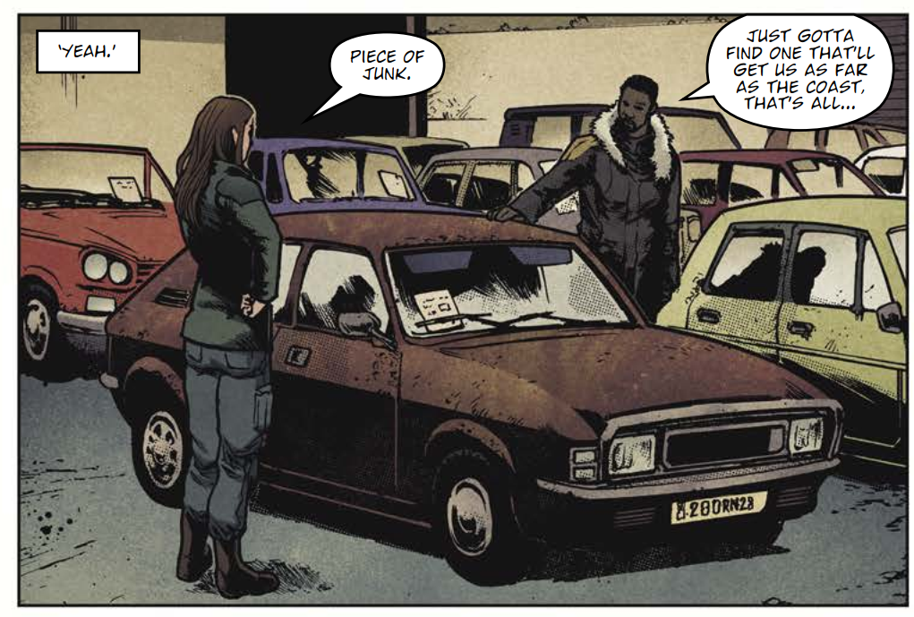
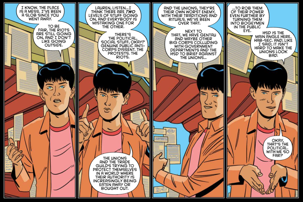
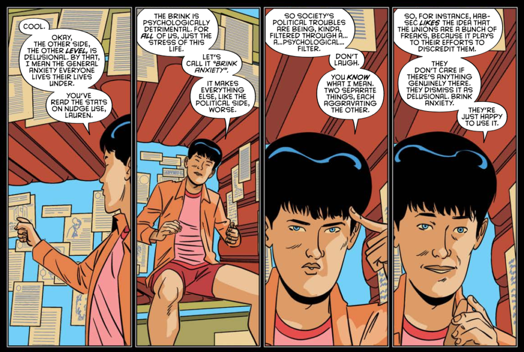
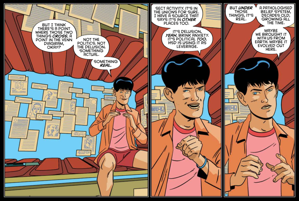
Throughout Brink Book Five: Mercury Retrograde, Dan Abnett and INJ Culbard have had us twisting and turning as we’ve followed investigative journalist Nolan Maslow as he goes deeper and deeper into his investigations of sect activity on the Habs in a story taking place parallel to events of Brink Book One, the death of Brinkman and Mercury going dark. It’s all adding extra layers to the story of Bridget Kurtis and her continuing fight to uncover the strange events and forces that haunt the remnants of humanity and driving them headlong into madness.

And now it all comes to an end with the double-length finale – brutal, inevitable, brilliant.

So, over to Ian now for the tale of putting together this final cover of Brink Book Five. Oh, and our apologies for the weird things going on in some of Ian’s answers here. We’ve tried to fix the glitching, but something strange is going on …

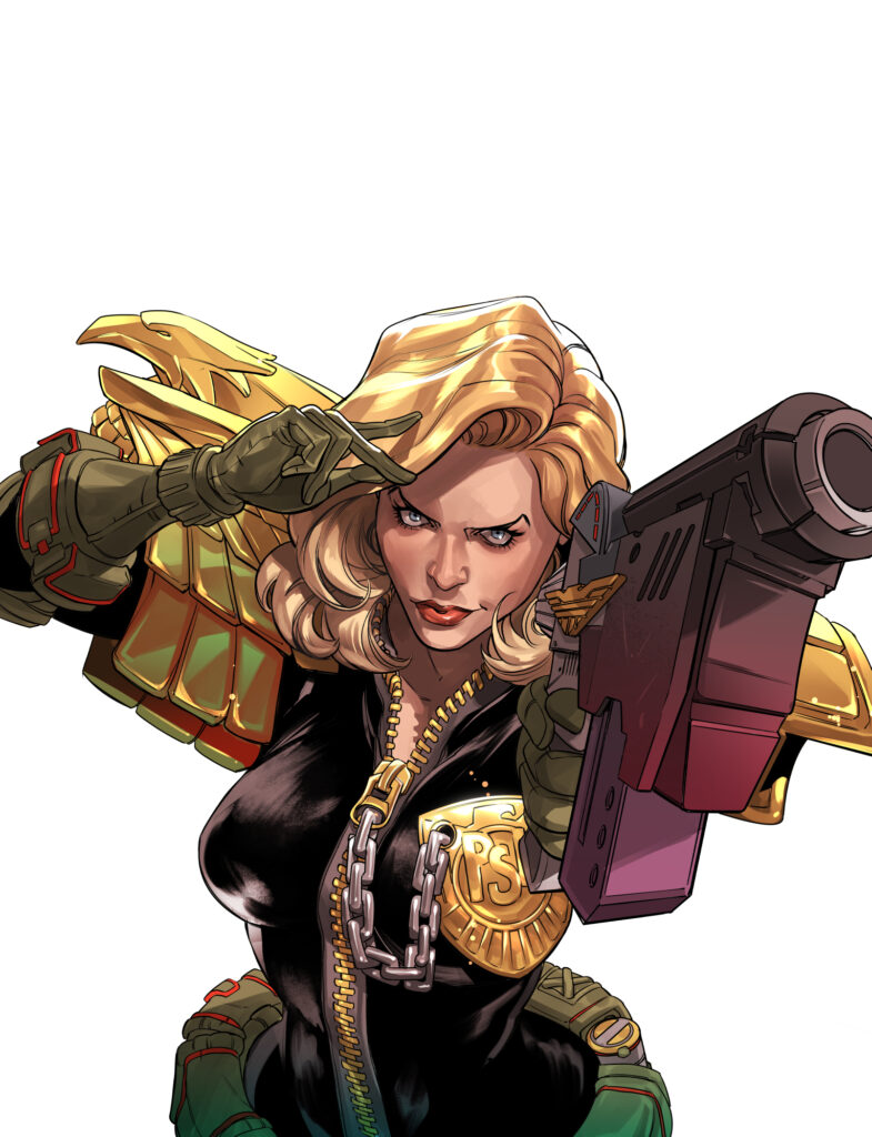
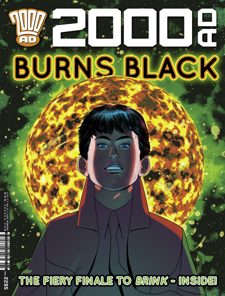
Ian, It’s the double-sized finale to Brink: Mercury Retrograde in Prog 2295, bringing the tale of Mas Nolan to an end and continuing the brilliance that you and Dan Abnett are creating with Brink. This fifth book has been both reinvention and revelation, seeing the events of the first book from a completely different angle and giving everything added depth (not that it was exactly short of depth in the first place).

When it came to putting the cover together for the finale, was it from a suggestion from Tharg or all your concept?

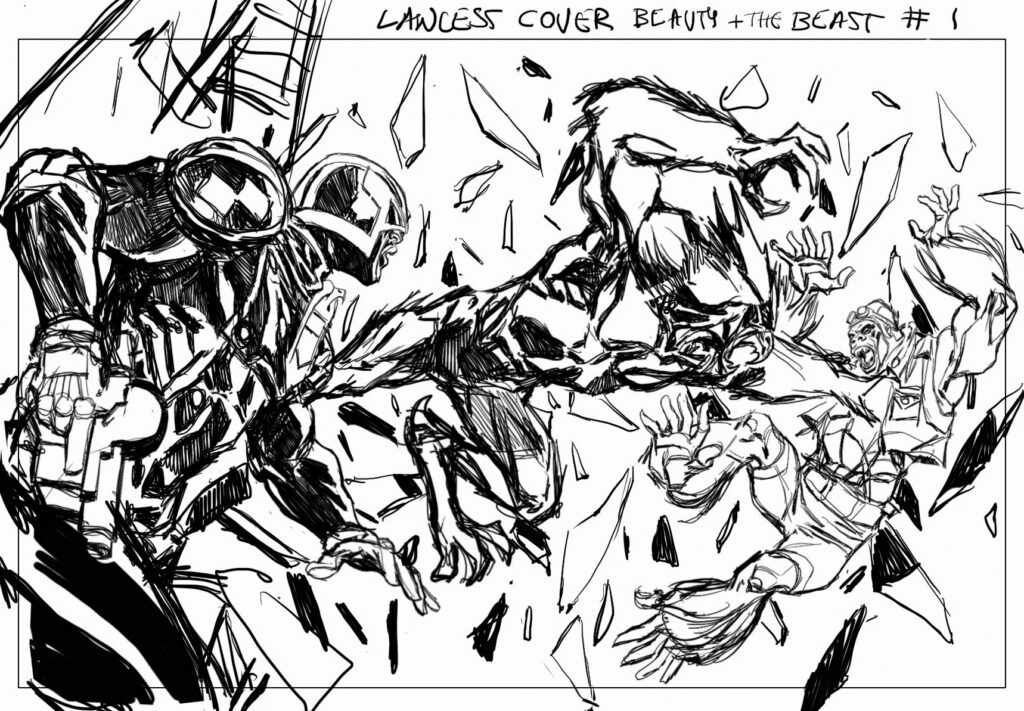
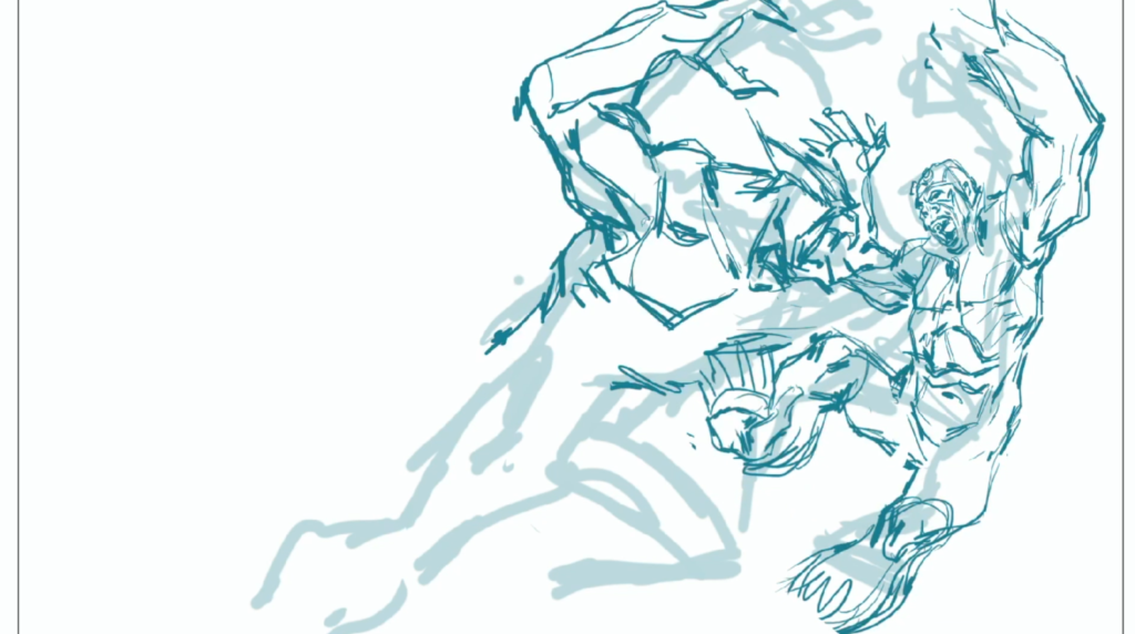
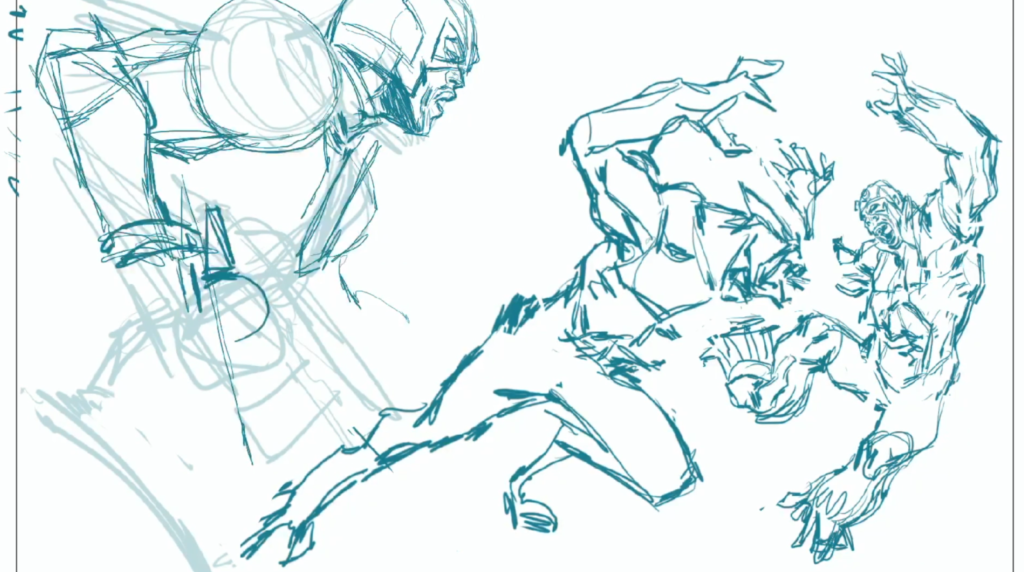
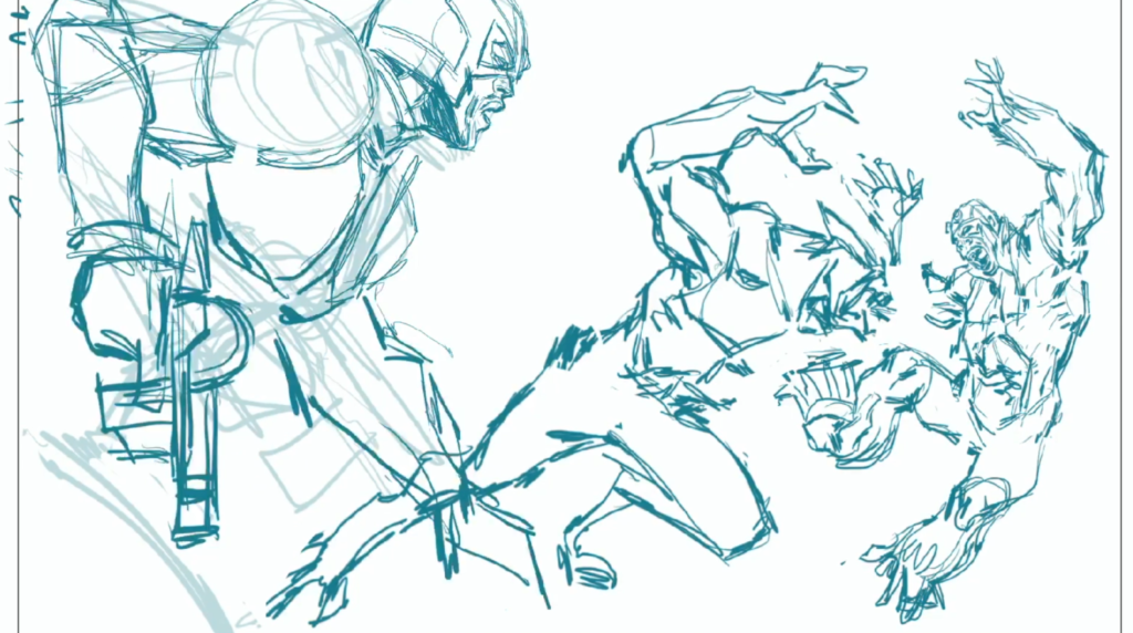
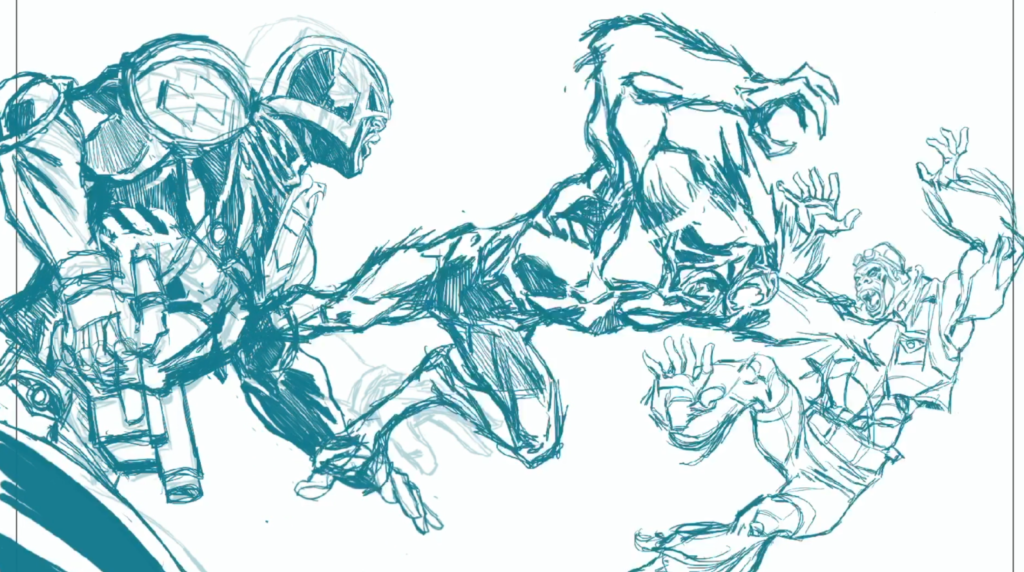
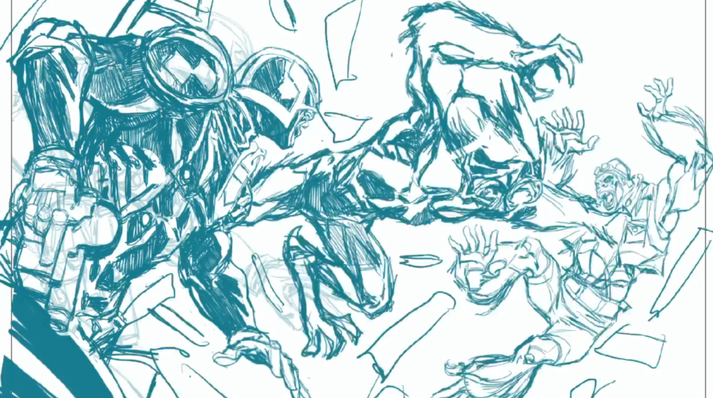
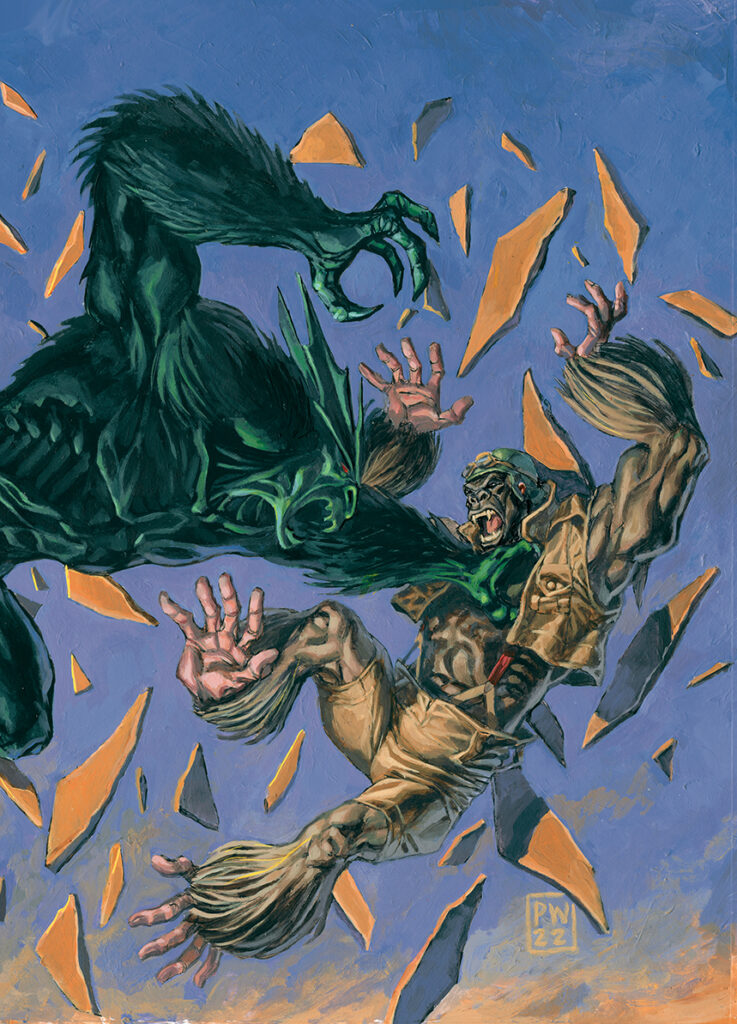
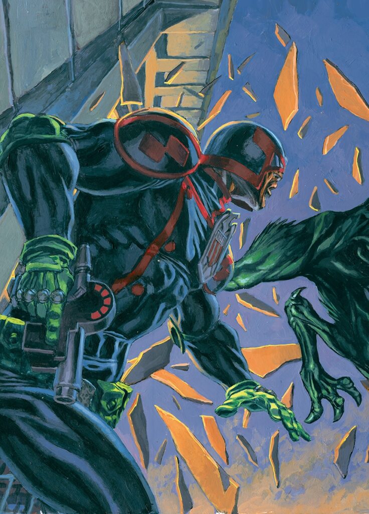
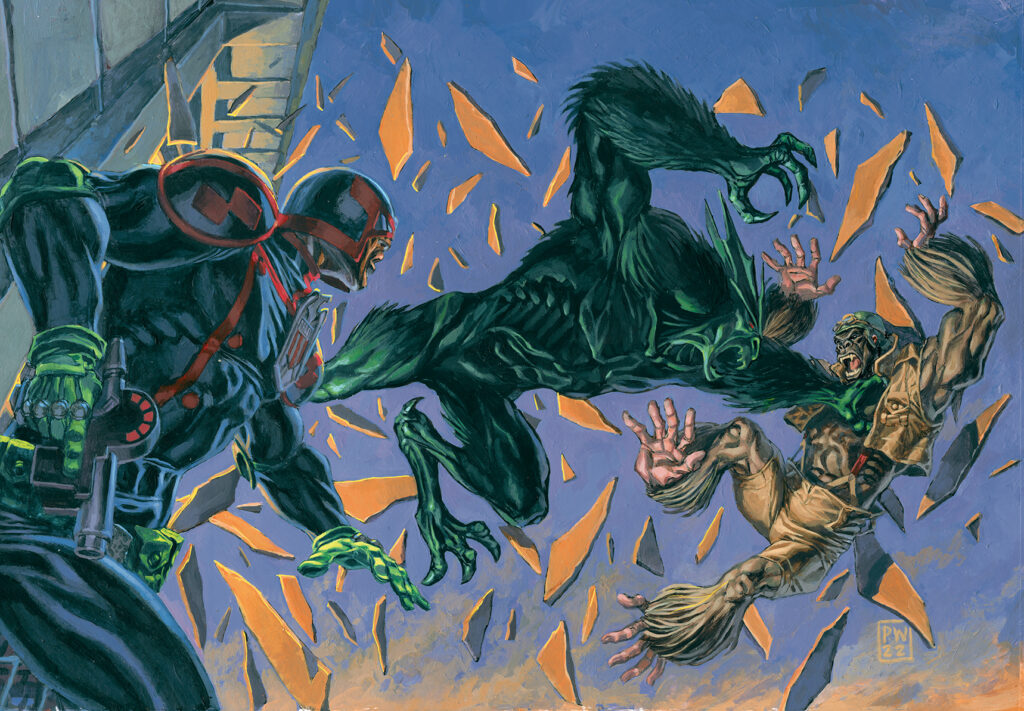
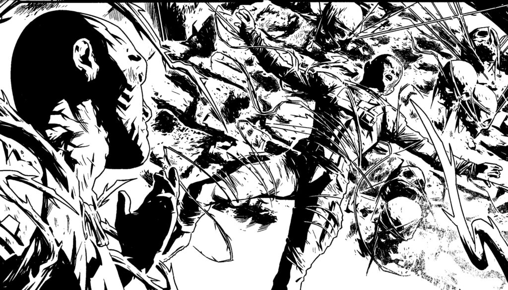
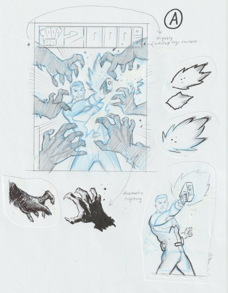
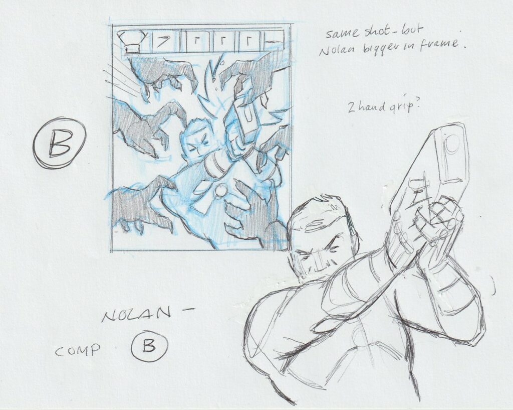
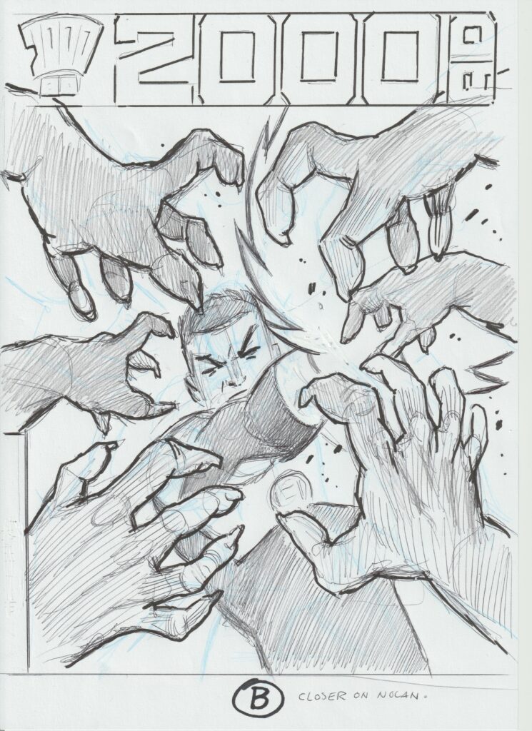
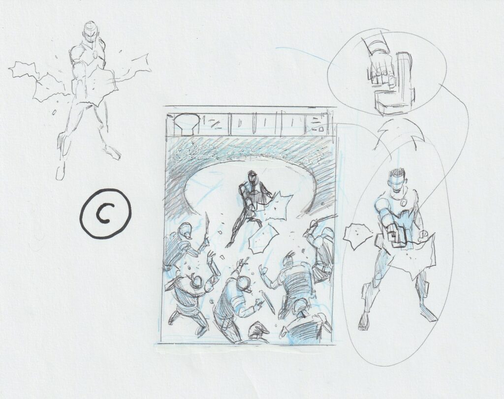
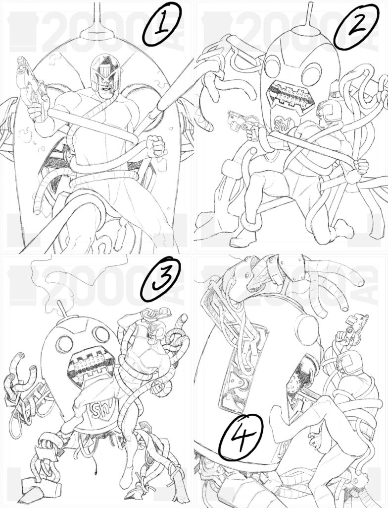
INJ CULBARD: I’m pretty sure this one was my suggestion. I wanted a portrait of Maslow (previous covers had been POV covers in a way, the rioters, the tunnels, the murder wall).

I just wrote something like “portrait of Maslow, against the backdrop of █████████

Hmmm, not sure what’s gone on here Ian, something appears to be redacting your words here. Let’s keep going, I’m sure it’s just a glitch.

Was it another cover that was pretty simple in your head, one that came together pretty quickly, or was it something that generated a few cover concepts?

INJC: On paper, really simple, but that usually means much harder in execution. And it was. 

Ian’s initial cover concept – not quite working

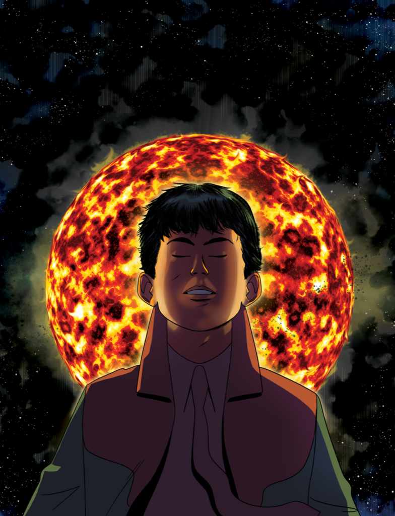
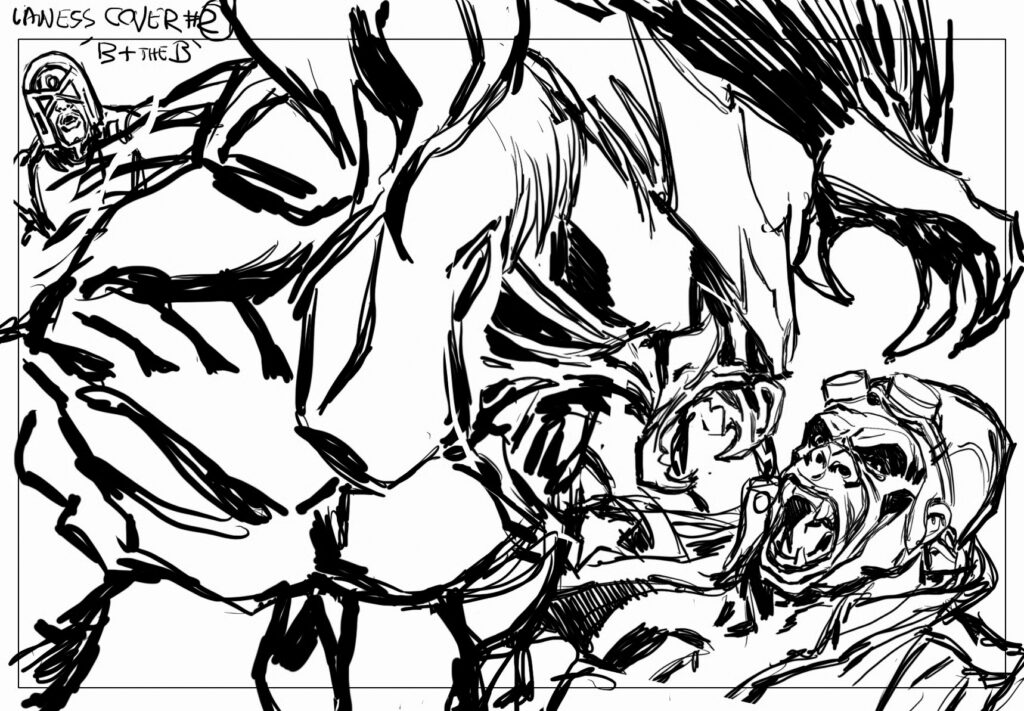
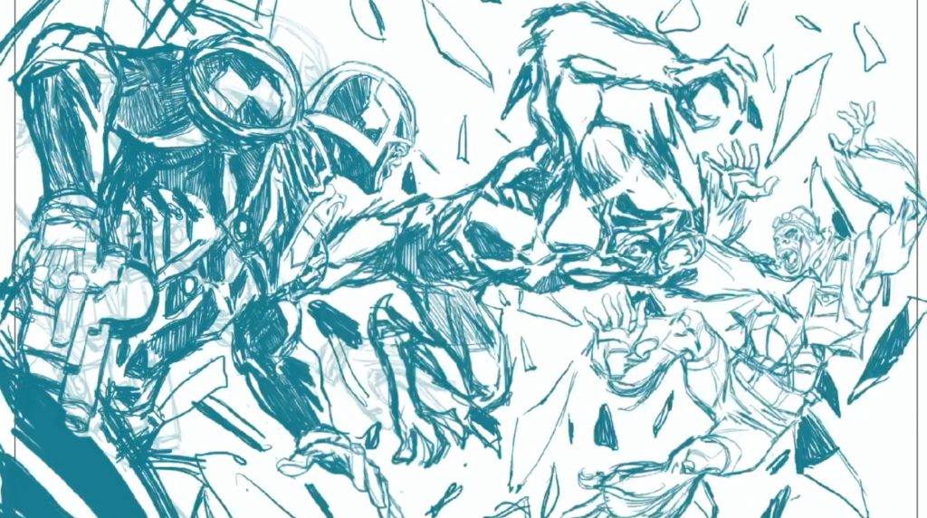
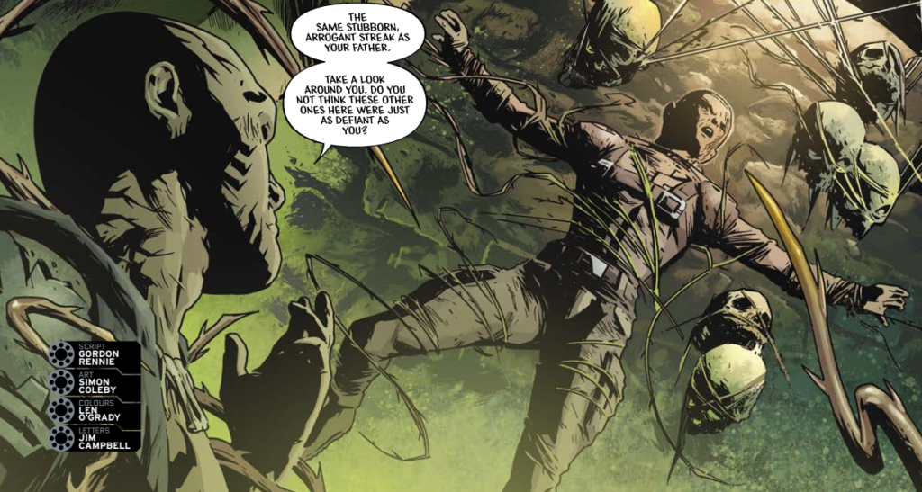
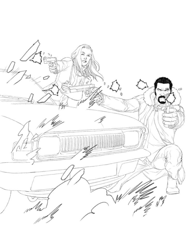
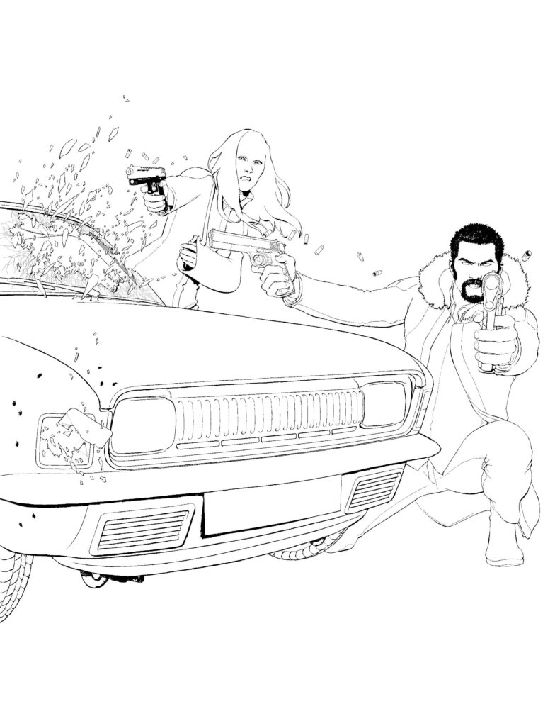
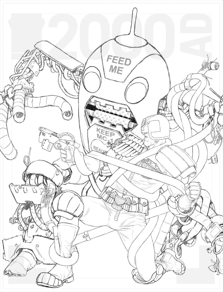
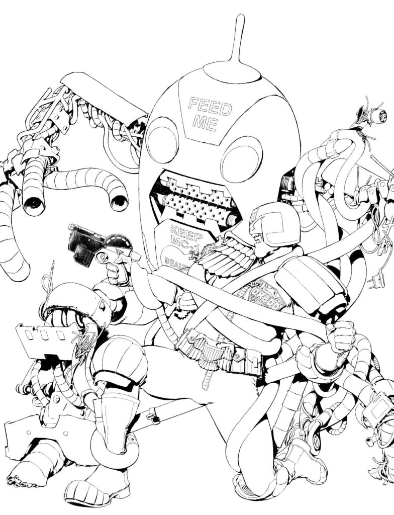
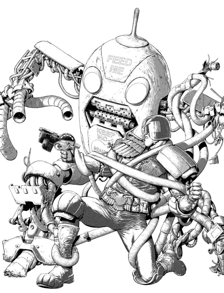
INJC: I got to this point and thought it wasn’t right. Something just wasn’t quite working – with that much light behind him he’d be a silhouette and I’d lose all that detail. I needed to rethink the lighting.

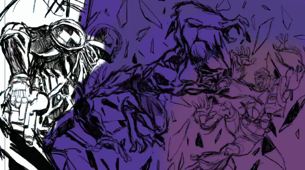
So at this point I’d been working in clip studio to get the drawing down, I’d exported to Photoshop the wrangle the color, but then I took the Photoshop file back into Clip Studio and did a final pass on the color. This knocks the color back into RGB values and it needs for print to be in CMYK values, and not only that but I have no black in my colors, and when converting from RGB to CMYK it keeps some black value in the color. So it’s a substitution processes at this point. 

(Ian’s colour flats for Mas on the cover)

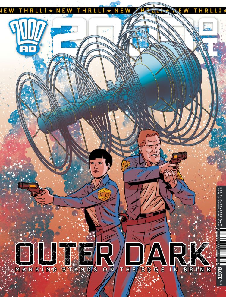
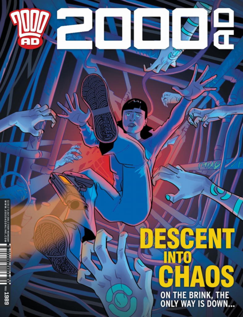
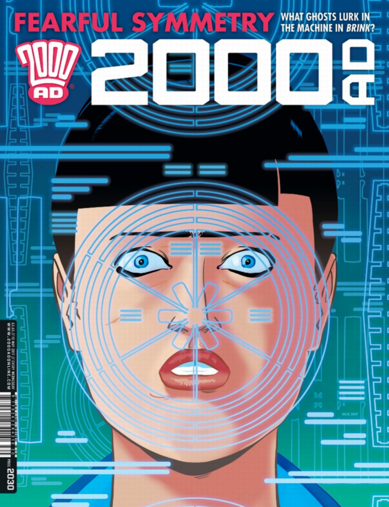
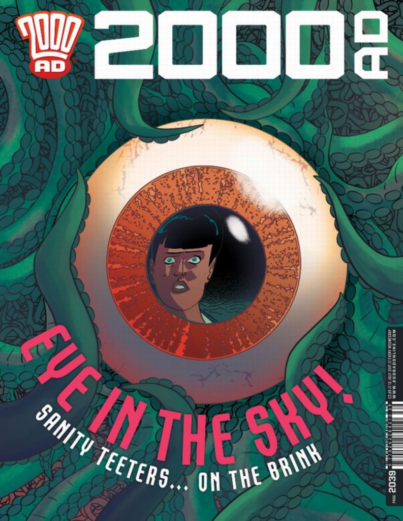
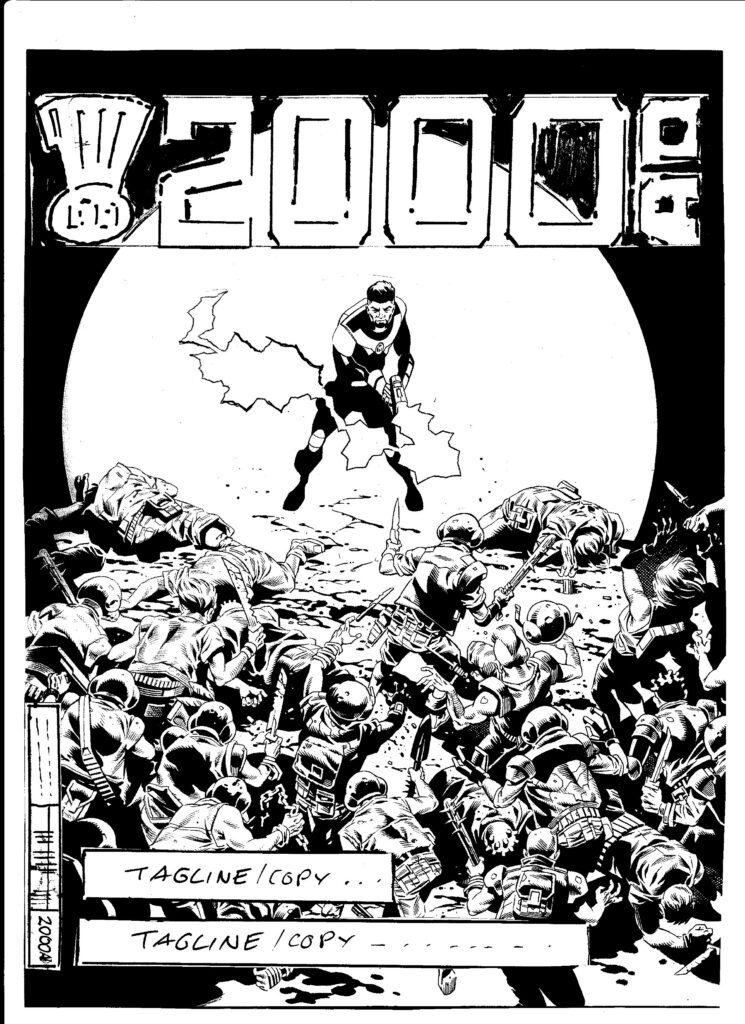
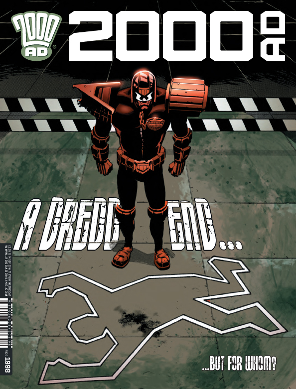
Again, as with all of the Brink covers thus far (aside from the very first one back on Prog 1978), we’re here with the circular motif once more. I asked you last time and you brushed me off with ‘The Eye of Vovek is everywhere.’

So… one more time… what’s the secret sybolism you’re using here, is it the whole Eye of Vovek again, infusing everything in the series, influencing and corrupting as it goes?  

INJC: It’s ██████████ 

There it is again. No idea what’s going on there Ian.

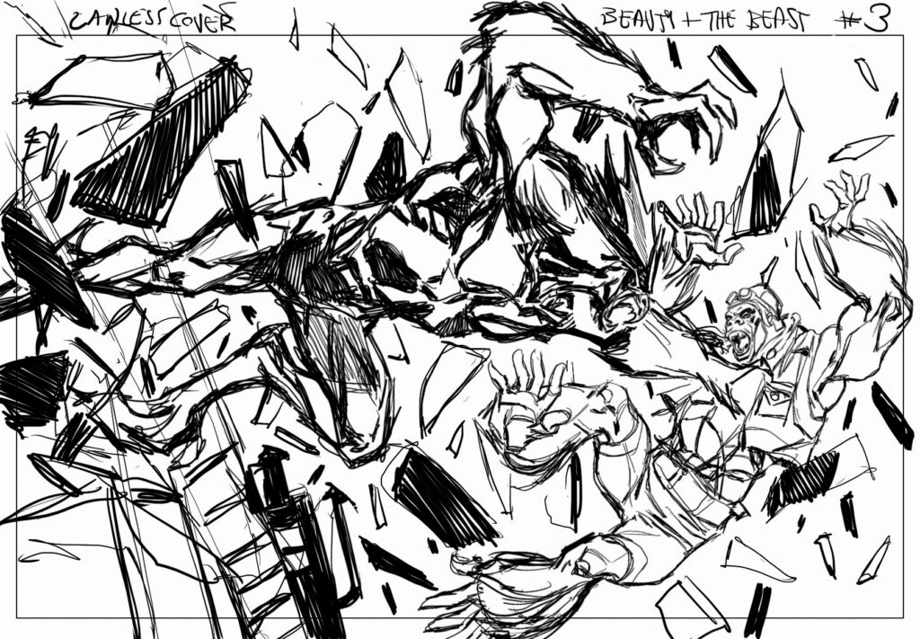
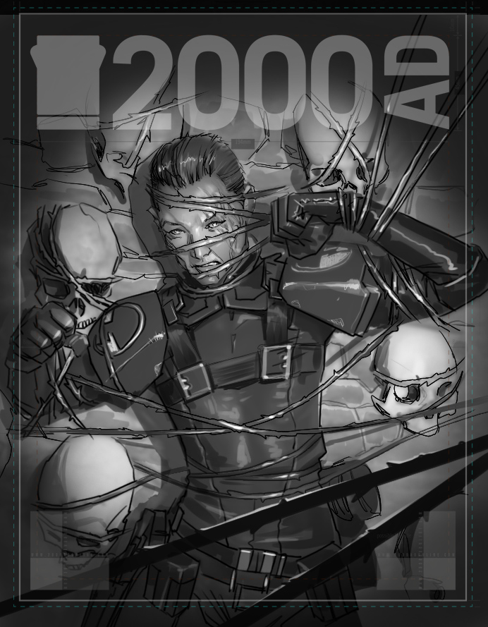
So, without really giving away too much of the ending here, what’s the symbolism you’re using with the blazing planet/sun thing on the cover burning its way towards Mas?

INJC: Well, it’s because ████████████ and so ███████████ seemed appropriate. 

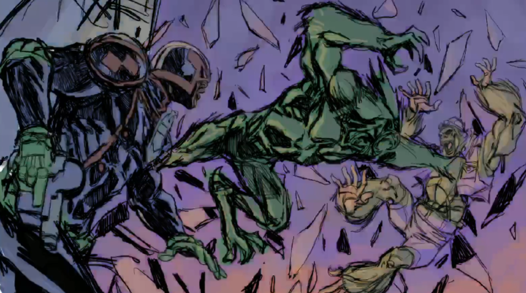
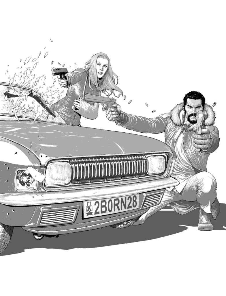
Okay, moving on… looking at the cover here, just with my untutored and artistically lacking eye, it’s more colourful than prior covers, the blazing depths of the thing in the background defining everything on the cover and the colours of that impacting the figure of Mas as well.

INJC: That’s as a result of what wasn’t working with my first pass. I decided to go for weird illuminations, so it created quite a different ambiance. 

(Lighting all sorted – the final cover to end Brink Book Five)

So, you’ve got that initial sketch all done and the concept nailed down – next it’s off to slave away over the computer again in Clip Studio?

INJC: Absolutely. I work at a desktop (on a Cintiq 16… I’d like a 22 or 32 Cintiq if Wacom are listening), and mostly handle the coloring there in Photoshop. I lay everything out and draw it on an iPad Pro because I love the way the Apple Pencil handles (but a new one would be great, Apple).Clip Studio is fantastic and I’ve been using it since the very beginning, from when it used to be called Manga Studio. Everything I’ve ever drawn for comics was drawn in it.  The iPad I’ve been using since about the second quarter of Book Four and it has changed a lot for me. I’m no longer shackled to a desk, I can sit anywhere and work on the book. I think it’s useful to actually move your headspace into a different space entirely. Change up your environment when working. So the iPad Pro really has been great for that (again… if you’re listening).

Finally, with the end of Brink Book Five: Mercury Retrograde, what have we to expect for you, Dan, the Habs, Bridge, and everything else in Brink for volume Six?

INJC: In Book Six ████████ is ████████ and we find out about ████████████ and meet a ██████████████ called █████████████████. It’s full of ███████████ and ███████████ and I’m looking forward to getting started on it. 

We have no idea why things broke down so badly there in the end. Let’s just chalk it up to the strangeness of Brink, eh?

Thanks so much to Ian for sending along those images and talking us through his latest cover.

You can find 2000 AD Prog 2295 wherever you pick up your weekly dose of Ghafflebette comics, including the 2000 AD web shop from 17 August.

Now, although Brink Book Five is done with now, you can (and should) catch up with the whole saga of Brink, written by Dan Abnett, art by INJ Culbard in the four books available. As one of the finest modern series to feature here in the Progs it’s something that rewards re-reading, especially in light of the revelations here in Mercury Retrograde.

Buy them here – Brink Book OneBrink Book TwoBrink Book ThreeBrink Book Four. Brink Book Five: Mercury Retrograde is available for pre-order right now from the 2000 AD web shop and will be released on 23 November 2022.

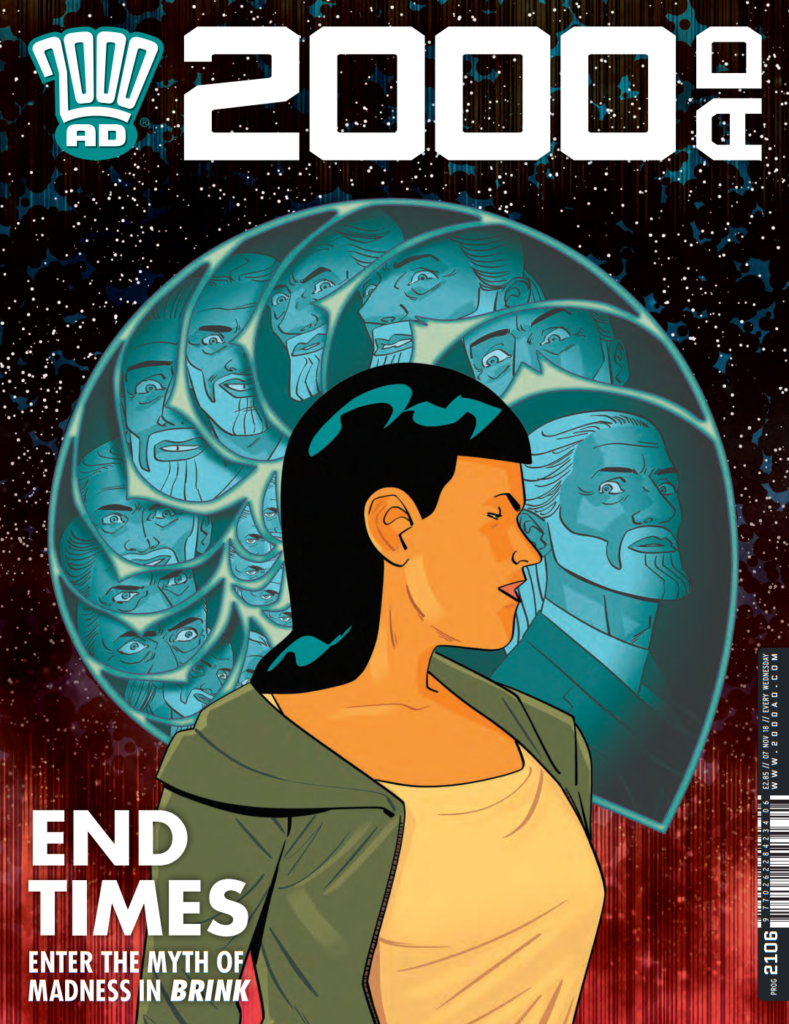
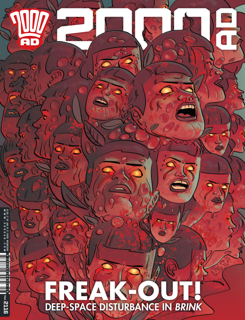
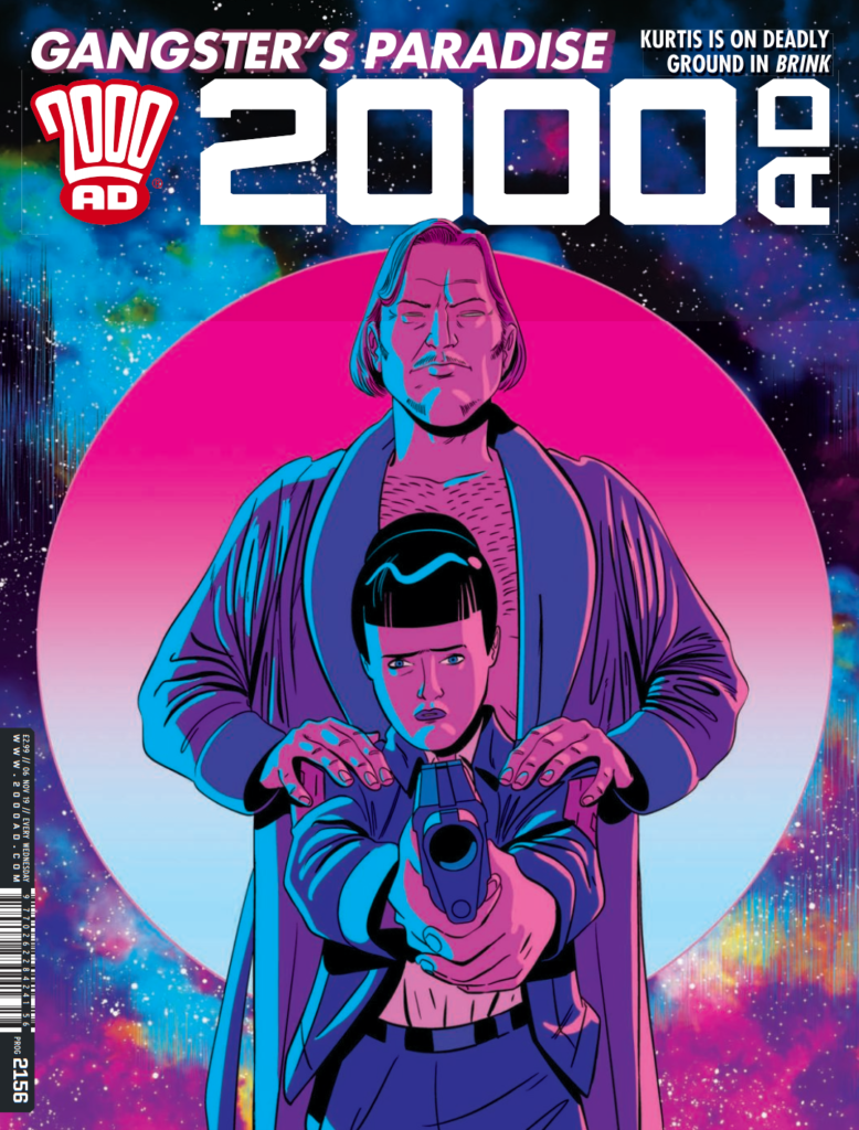
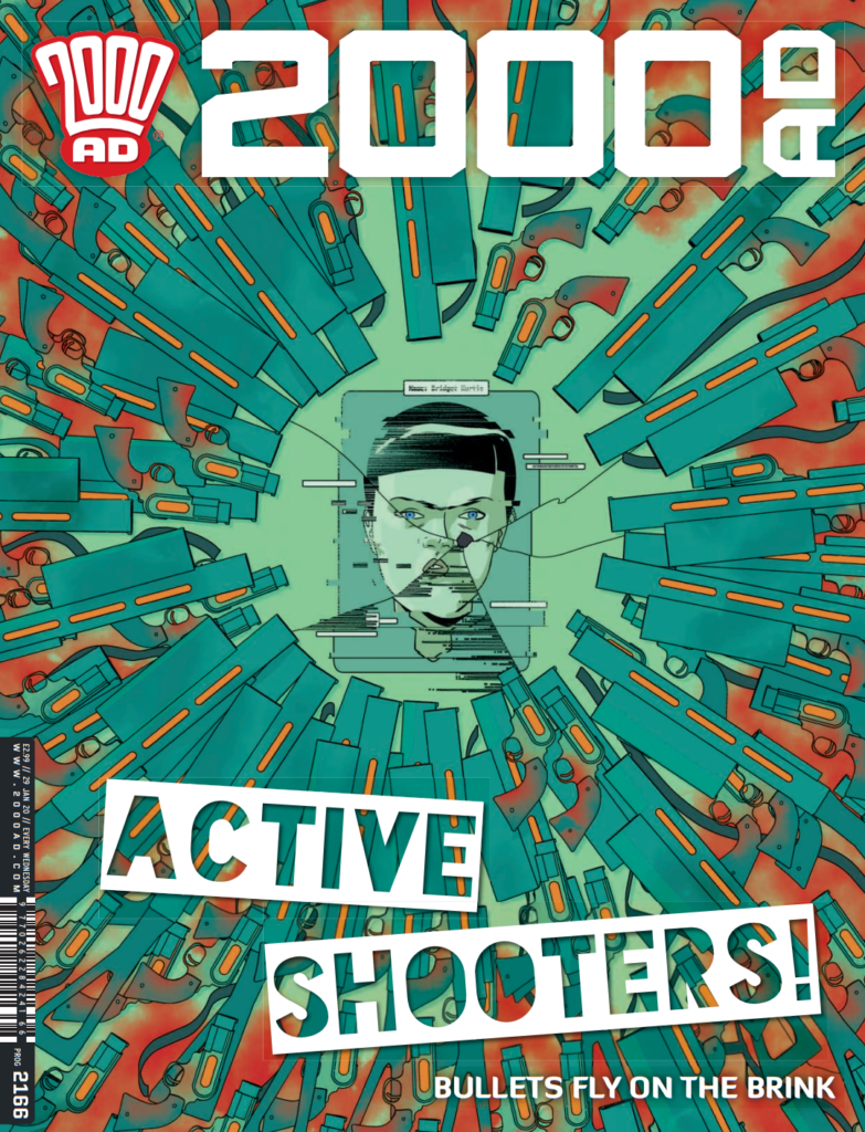
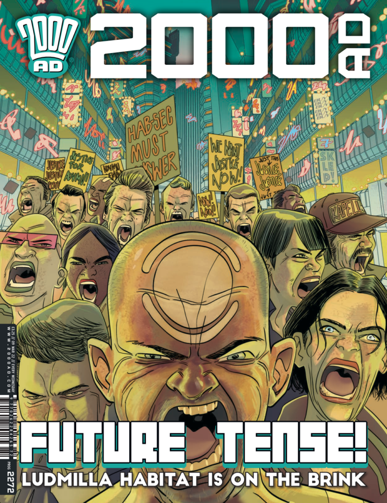
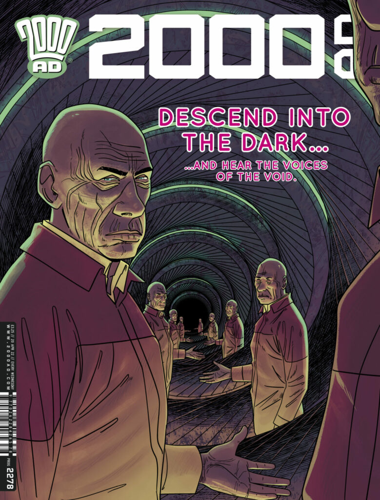
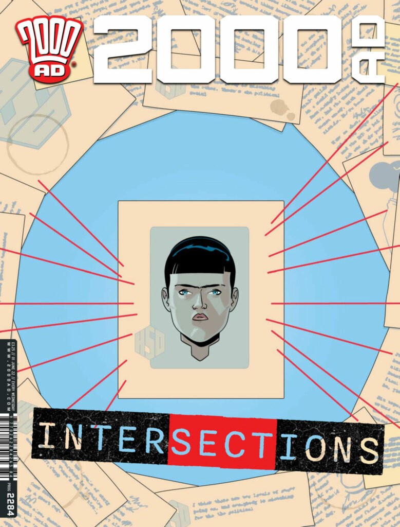
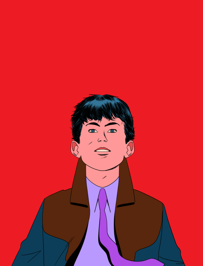
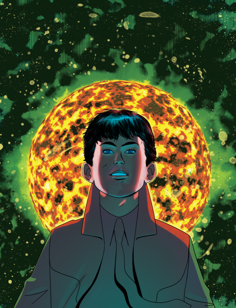
And to end, another look back at Ian’s Brink covers of the past… beautifully disturbing and fascinating imagery for an amazing saga. And be sure to check out all of Ian’s Covers Uncovered pieces for Brink – 2000 AD Prog 1978 & Prog 1989, 2000 AD Prog 2039, 2000 AD Prog 2272, 2000 AD Prog 2278, 2000 AD Prog 2284.

Posted on

2000 AD Covers Uncovered – ‘Jaroo and Mr Radtus having a barny’ – Phil Winslade on Megazine 447

Every week, 2000 AD brings you the galaxy’s greatest artwork and 2000 AD Covers Uncovered takes you behind-the-scenes with the headline artists responsible for our top cover art – join bloggers Richard Bruton and Pete Wells as they uncover the greatest covers from 2000 AD!

Today, it’s time to say hello again to the wonders of the Winslade, as art droid Phil Winslade returns for a ghafflebette wraparound cover to Judge Dredd Megazine 447, out on 17 August, that marks the very special finale to the latest series of Lawless, Ballots over Badrock.

Inside Megazine 447, it’s a triple-length finale to Lawless: Ballots Over Badrock, as Dan Abnett and Phil Winslade bring things to a thriller of a conclusion – Will Jaroo survive meeting the Radtus monster? Will Marshall the Outlaw Metta Lawson survive an SJS beatdown? And will Phil Winslade’s drawing hand survive a triple-length episode with all that gorgeous b&w detailing he puts into Lawless?

Well… we’re not going to answer any of those, but we are going to let Phil take you through his making of yet another incredible wraparound painted cover – something he’s calling ‘Beauty & The Beast’.

PHIL WINSLADE: I was considering a whole Mission: Impossible scenario where Tharg got in touch with a self-destructing tape machine that burnt down half my kitchen but realised that my cultural references were so woefully anachronistic that most readers wouldn’t understand it.

So Matt emailed and said he wanted a cover with Jaroo and Mr Radtus having a barny. “Fine” says I.

Well, apart from referring to The Mighty One as this Matt fella, all seems good so far – ‘Jaroo and Mr Radtus having a barny’ is one of those lines you know will be making it to the title of this Covers Uncovered.

PW: So I needed something with some energy featuring the two characters. I came up with something I thought would work with a strong horizontal movement with Jaroo in jeopardy. I decided that the couple bursting out of Audrey’s stables had potential for lots of action and dramatic lighting as the scene was at night/dusk.

.

PW: I also felt that a big double headshot would work and really emphasise the savagery of the battle. So I included that as an option.

.

PW: At this point, I’m mainly thinking about the front cover although obviously keeping my options open as to the back cover. I felt that Drury was an important part of the narrative so had him in mind for that bonus feature.

He also gives some extreme foreground dynamic leading you from left to right and hopefully emphasises the movement of the other two figures.

.

PW: Sketch one without Drury was more direct and had a more BLAM! quality so I wanted the option to be there for Matt.

(You know Phil, Tharg is going to be getting the droid recalibration chambers ready for you if you’re going to keep mentioning this Matt fella.)

PW: Matt (oh heck, you’ve really done it now,) chose option 3 which was probably the initial image I had in mind before I overthunked it.

I wanted to do a color sketch for my own guidance. I wanted to get that sense of light coming from the unseen hole in the wall. I also wanted the color palette to be different from the cover now adorning Lawless Volume 4. The blue/purple, green, and blues contrast nicely (I hope) with the warm pale oranges and browns. Well, I hope it works anyway.

And Phil was generous enough to share a video of the making of that colour sketch process with us in this short vid, which he describes as this…

PW: The video is all the procreate digital work – after the thumbnails and from initial drawing to color sketch to before any paint or ink was used.

So, keeping in mind this is all just for a colour ‘sketch’ for Phil’s own guidance… watch in awe Earthlets…

.

Now, to give you a feel of just what that colour ‘sketch’ entails (yes, sketch… incredible how some artists define sketch!) we’ve pulled a few screenshots from Phil’s video… this is all digital work from Phil, from initial marks through getting the figures in place and then adding colours.

PW: From that point everything was done analogue – tracing the cartoon, physically painting to the point of scanning and editing on PS (which doesn’t have a convenient time-lapse feature).

I traced the sketch onto the Bristol paper I use and taped that to the board and got out the acrylics. Colour is tricky when you paint. In bright sunlight colors look much brighter and less muddy than under artificial light so every evening you think “good grief this is awful” and in the morning light you think” hmm it’s not as bad as I thought…”.

Scanning can do strange things which you have to compensate and adjust – and what it comes out like in print on the different papers is unpredictable. The collections’ covers come out better than the Meg’s but it’s probably that I’m over-sensitive about it. It even changes when you use different apps to view it on your computer!

The painting part took 3 or 4 days after Matt approved the sketch he wanted. Painting always has a “without a net” quality for me. I don’t do it enough to ever feel particularly confident. I hope it has some sense of movement and drama and people enjoy all that Lawless inside.

And that folks, is Phil Winslade in peak artist’s worry mode. Which, of course, as you and I know and we can all plainly see, is absolute nonsense – these painted Lawless covers are always some of our absolute faves when we look back on the year’s best covers.

Despite the worries, he’s done it again with the stunning finished painted cover of Megazine 447, sending along these final painted images before the trade dress gets put on…

And that’s it! Thanks so much to Phil Winslade once more for sending that one along. You can see it in all its glory adorning Judge Dredd Megazine issue 447, out right now from everywhere the Galaxy’s Greatest is sold, including the 2000 AD web shop.

It’s packed full of Thrill Power, a one-off Judge Dredd, the conclusion of Psi-Judge Anderson: Dissolution, and of course, the triple-length finale to Lawless: Ballets Over Badrock by Dan Abnett and Phil Winslade – who we all hope is currently enjoying a little time off and icing his drawing hand and wrist – after all, that amount of incredible detail has to hurt!

And if you’re looking for more of that wonderful Winslade cover work… you can find it here – more Lawless for Megazine 418 and Megazine 422, and some older Dredd covers for Megazine 365 and 2000 AD 1879.  Well worth taking a look!

And finally, because we know you love to see these things in all their glorious detail, the full-sized versions of those screenshots we took from the video Phil sent along…

Posted on

2000 AD Covers Uncovered – Jaegir’s wired up wrong… Alex Ronald on Prog 2294

Every week, 2000 AD brings you the galaxy’s greatest artwork and 2000 AD Covers Uncovered takes you behind-the-scenes with the headline artists responsible for our top cover art – join bloggers Richard Bruton and Pete Wells as they uncover the greatest covers from 2000 AD!

This week, with a strung-up Jaegir, it’s the return of art droid Alex Ronald to the cover of 2000 AD Prog 2294 – out on 10 August in all the usual Thrill Powered places.

Since first appearing in the Prog back in the 90s, with a first appearance in Prog 984, Alex Ronald’s stylings were to be seen on Judge Dredd, Vector 13, Rogue Trooper, and Sinister Dexter before he moved on to other things in the CG industry where he worked as both an illustrator and 3D modeller.

But the lure of 2000 AD meant a return to working for The Mighty One, with his computer-rendering and painted style making him an accomplished cover artist marking him out and providing some of the most striking and stylish covers in recent years.

This week, Alex is headed out into the wasteland of Nu-Earth for a Jaegir cover. Inside the Prog, Gordon Rennie, Simon Coleby, and Len O’Grady are giving us a technicolour masterclass of a tale in Jaegir: Ferox that finds Kapitan Kapitan-Inspector Atalia Jaegir of the Nordland State Security Police in something of a bind at the hands (and thorny tentacles) of General Kurga, one of her own side who sees himself as Number-Earth’s saviour.

Now, over to Alex for the breakdown of the cover, which all started from Tharg giving his art droid the reference image The Mighty One wanted from an internal panel from Jaegir: Ferox.

The reference panel from Jaegir: Ferox, giving us a chance to see Simon Coleby’s starkly gorgeous lines…
… before Len O’Grady adds in his lush colour palette to give us the finished panel

.

ALEX RONALD: The reference image for the cover had Jaegir her being pulled up to a wall by the bio wire, arms out-stretched.

I ran into an issue trying to replicate this with the cover dimensions since she seemed far off and removed from the viewer when I had her fully in shot.

I felt the cover image would be stronger tighter in, focusing on her eyes and the rage at being captured. So instead I opted to have her straining against the wire which allowed me to go closer and have her full upper torso in frame.

As you can see from the rough, initially I had the wire across her face which reminded me of one of the Hellraiser characters. But for final art, I thought it best to remove that and allow her distinctive facial scars to be seen in their full gory glory.

As with most of what I do, it’s a rough 3D model which I sketch over, add detailing then paint on top of that after approval.

I hope you like it.

Oh, we do like it Alex, we do indeed! Thanks so much to Alex for sending that one along to join the growing library of Covers Uncovered entries here.

You can find 2000 AD Prog 2294 wherever you pick up your weekly dose of Ghafflebette comics, including the 2000 AD web shop from 10 August.

And for more Covers Uncovered goodness from Alex, be sure to click through and have a look at his work on Prog 2016, Prog 2047, Prog 2162, Prog 2191, Prog 2206, Prog 2255, and Judge Dredd Megazine 435.

Posted on

2000 AD Covers Uncovered – Paul Marshall blows us away with Prog 2293’s Skip Tracer cover

Every week, 2000 AD brings you the galaxy’s greatest artwork and 2000 AD Covers Uncovered takes you behind-the-scenes with the headline artists responsible for our top cover art – join bloggers Richard Bruton and Pete Wells as they uncover the greatest covers from 2000 AD!

This week, we welcome Paul Marshall once more to Covers Uncovered for his Zarjaz cover of 2000 AD Prog 2293, out everywhere that thrill power is sold, including the 2000 AD web shop, on 3 August.

Prog 2293 sees James Peaty and Paul’s Skip Tracer: Valhalla get to episode seven, with the former soldier turned psi-tracker returning to the Cube, now under the malignant influence of a nearby blackstar and full of a crazed zombie army all muttering ‘Valhalla‘.

And, as you can see, the cover has Marshall pulling out all the stops to show us just what trouble Nolan Blake’s got himself into this time!

PAUL MARSHALL: Tharg asked me if I could provide a cover for Skip Tracer: Valhalla showing Nolan Blake blasting away at a horde of approaching Zombie delinquents….Obviously I was only too happy to say yes.

I submitted a couple of ideas for basic comps, one looking through the zombies at Nolan, at eye level amid the action, the other a down-shot similar to the scene in the previous episode…

And this is what Paul’s referring to… from Prog 2292, with Abe attempting to buy Nolan some time…

>

PM: Tharg went for the Birdseye view, so I got to work!… it had to be a fairly quick turnaround so I think it took a few days to complete from start to finish.

I used a Blue pencil to draw and Brushpens and Fineliners to ink. I also provided plenty of ‘overdraw’ on the image and ‘dead space’ to allow room for cropping, plus leaving room for the logo, Taglines etc.

Now, as for the images Paul sent along… first we have those basic compositions, starting with the one Tharg rejected with versions A & B…

… and now the one deemed cover worthy by The Mighty One…

All it took then was the simple (hah!) process of pencilling and inking the thing to get it to a final inked version… pretty much like this one…

Finally, it’s sent to colourist extraordinaire, Mr Dylan Teague to work his technicolour magic on it… all of which leads us to the final published cover…

And that’s it! Thanks so much to Paul for sending that one along.

You can find 2000 AD Prog 2293 wherever you pick up your weekly dose of Ghafflebette comics, including the 2000 AD web shop from 3 August.

For more from Paul, be sure to look back over his previous Covers Uncovered – PJ Maybe on Prog 1753, Judge Dredd on Prog 1998, and Skip Tracer on Prog 2249.

Posted on

2000 AD Covers Uncovered – Andy Clarke, Sinister-less Dexter, and the world’s worst car… it’s Prog 2290

Every week, 2000 AD brings you the galaxy’s greatest artwork and 2000 AD Covers Uncovered takes you behind-the-scenes with the headline artists responsible for our top cover art – join bloggers Richard Bruton and Pete Wells as they uncover the greatest covers from 2000 AD!

This week, it’s the return of Andy Clarke with his third cover in the past few months for Tharg, this time with the cover of 2000 AD Prog 2289, out wherever you get your Thrill Power on 13 July.

The veteran art droid first of all wants to point out that getting three covers in a few months is absolutely all on merit and categorically denies that he owes The Mighty One many, many years’ worth of art in payment for all that droid-oil he’s been consuming to get him through the day.

Right, that over and done with – time to let Andy tell us all about putting together his latest 2000 AD cover, featuring one-half of the greatest gunshark team in Downlode, Raymone Dexter, currently starring in Malice in Plunderland by writer Dan Abnett and artist Tazio Bettin.

ANDY CLARKE: Sinister Dexter was my first comics work, so getting the opportunity to come up with a cover for the series again was fantastic. I always had a lot of time for these two – Dex in particular – and even though we’re missing one-half of the partnership as things currently stand, it was nice to have Carrie there on this one.

Dan Abnett was always really great, really generous with support and encouragement. Not being burdened by an abundance of confidence, when he seemed to like what I was doing on the SinDex stories I worked on, it was a real boost.

For this one, Tharg had a very clear brief, so it was fairly straightforward to come up with a sketch that got the point across.

The tricky part was reffing the car and getting the guns to look right – I don’t find them all that easy to draw, and they don’t seem to get any easier the more I do them. I could’ve gone with one of Dex’s guns doing that recoil thing too – where it pulls back and you briefly see the inner barrel (or whatever it’s called) as it’s fired – but it wouldn’t have really added anything . . . and I didn’t have the patience to sit like a lemon trying to get it to look right.

Andy Clarke’s sketches for the cover –
immediately bringing back memories of a car only good for shooting

Breaking in again for just a moment or two and seeing as Andy just mentioned the car – when I first saw the cover I just knew from bitter experience what it was, one of the worst possible cars that’s ever been made, the encapsulation of the crappiness of the British car industry in the 70s and 80s, the abysmal Austin Allegro. I checked on this with Andy, wondering why he had to pick that particular car but he came back with this… ‘Yep, that was all Tazio Bettin,’

Well, that was all too intriguing to leave, so it was off to ask Tazio about it…

TAZIO BETTIN: I’m not a car expert at all, so I asked my father, who definitely knows better. The panel where the Allegro first appears had, in the script, Dexter and Carrie looking at a car (they were in need of transportation), and Carrie commenting it’s a pile of junk.

The panel Tazio’s talking about – Carrie’s absolutely right – piece of junk.
From 2000 AD Prog 2289’s Dexter: Malice in Plunderland part 1 – art by Tazio Bettin

Tazio Bettin: This prompted me into checking what is a notoriously crappy car. My father suggested some models. The Allegro appears consistently even in Internet rankings of “worst cars of all time”. So in my mind it had to be it, for Carrie’s remark to ring comically indisputable to the reader.

The car does look cheap and ugly, but in a kind of (to me) adorable way. As if it was saying “I’m sorry I’m a terrible car, but at least you can say that I look a little vintage?”

No, sorry Tazio, I’ve driven one. It’s unforgivable awful not adorable. Like driving mud. Badly designed and built mud.

TAZIO BETTIN: Lastly, the number plate. I am disseminating Easter eggs throughout all the comic. I’m sure the readers will have spotted at least some or all of them, and this was a chance I couldn’t pass on. What could such a demure-looking car be saying through it’s plate? Just to up the conicity a little, I went with the philosophical “to be or not to be” spelled on alphanumeric.

Okay… so there you go. The wonders of the artistic process and the lengths they go to, eh?

Now, back to Andy…

ANDY CLARKE: Once the sketch was approved, I tightened it up and put in the car damage in the hope that it looked convincing: what does it really look like if bullets are smacking into a car? Haven’t a clue. Sure there’s reference out there somewhere, but sometimes too much ref makes me tentative. So, it may not be remotely accurate, but it kinda looks okay.

From there, I inked the outlines and only put black in the areas I was sure needed to be black and wouldn’t be better served in grey. With the greytones I try to do all the detailing, after that’s done, the flat colours are added.

Andy Clarke’s pencils – all looking good but not enough damage to the world’s worst car yet
Inks stage – still not enough carnage unleashed on the Allegro Andy!
Now for greytones
…and then flats

Round about here, I thought maybe the suggestion of a background might be a good idea. So I looked for a suitable parking structure to use as a base, did a rough, blocky sketch and placed it in – messing around with the layer options, adding some blur, so it was there, but not drawing too much attention. Keeping the background colour non-specific also helped knock it back. 

To finish off, I changed some of the greys to colour, added gradients and highlights – the bullet sparks and muzzle flashes needed a little more zing and some random dust and dirt spatter was added to beef it all up a bit. Some spray-diffused ink texture for the ground and that, I think, was it.

All of which leads us to this – the final cover and the Allegro getting a little of what it deserved

And that’s it! Thanks so much to both Andy Clarke for telling us all about the latest cover (and to Tazio Bettin for chipping in with a little extra info – even if he’s completely wrong about any redeeming features on the Allegro).

You can get hold of 2000 AD Prog 2290 on 13 July wherever the Galaxy’s Greatest is sold, including the 2000 AD web shop.

And for more Andy Clarke talking about his covers (and paying off that droid oil debt) have a look at the Covers Uncovered for 2000 AD Prog 2287 and Judge Dredd Megazine 444.

Posted on

2000 AD Covers Uncovered – Peter Yong talks law & claw (& ditching tentacles) for 2000 AD Regened Prog 2288!

Every week, 2000 AD brings you the galaxy’s greatest artwork and 2000 AD Covers Uncovered takes you behind-the-scenes with the headline artists responsible for our top cover art – join bloggers Richard Bruton and Pete Wells as they uncover the greatest covers from 2000 AD!

This week, it’s the return of 2000 AD Regened with all-ages Thrill Power designed to give young readers their first dose of the Galaxy’s Greatest comic!

On cover duties for 2000 AD Regened Prog 2288 (out on June 29th) we have Peter Yong, winner of the last 2000 AD Art Stars competition in 2021!

Peter’s a concept and storyboard artist from Australia who’s worked in the video games and animation industries whose Angel Gang piece for Art Stars won back in October 2021. After that, as he’ll tell you, he was delighted to get the call for this Regened cover! So now, over to Peter…

PETER YONG: It all started last year when I submitted the Angel Gang piece for the 2000 AD Art Stars competition – to my surprise I won!

Now there’s a sight you NEVER want to see – Peter Yong’s 2000 AD Art Stars Winner from October 2021

PY: Shortly after, I was contacted by the mighty Tharg to create the cover shown here. I have been a professional artist for over 15 years, working in animation and video games but this is my first comic cover!

I am a huge 2000 AD fan, so I was excited and a wee bit nervous. 2000AD was one of the reasons I pursued art in the first place!

The brief that I received for the cover was very broad: I was to draw Cadet Dredd and it didn’t have to tie into any story. So I got drawing and came up with 3 options:

.

PY: I wanted to keep the composition simple and striking. I find it really helps to zoom out and draw these quite small. I always like when a composition is clear and readable.

I was delighted when Tharg chose number three. However, I was asked to make the beasties more alien. A welcome change for me because looking at it again, it seems like Dredd has just entered an alligator enclosure and is manhandling a few of the occupants…ha ha!

I resubmitted with some alien-looking guys but wondered if they were too scary looking for an all-ages issue?

Dredd versus Tentacles… it’s always tentacles on a Wednesday for Dredd (preferably grilled)

PY: Tharg replied with some great suggestions so I made some tweaks. I liked the look of these guys and I was very happy to get rid of the tentacle arms from the previous version (…what was I thinking?…)

Tentacles off the menu and antennae are on again – but Dredd normally has antennae on a weekend as a treat

PY: I thought I had the skill and confidence to take this directly into ink….Unfortunately, none of this was the case, so I had to draw it roughly first to clarify the forms.

But hey, Cadet Dredd’s younger and not so set in his ways – antennae it is!

PY: Next was Inking. I used Clip Studio Paint as I really like the feel of the “GPen” in the program. When I Ink I try not to just trace the rough, but try to push and enhance the drawing more.I feel like this helps to keep the finished product lively and spontaneous. It’s also so much more fun when I think like this!

Especially when the antennae are so tastily-drawn!

PY: Next is colour. Put simply, my approach was to try and make the Alien’s colour contrast against Dredds. Referencing the other Cadet Dredd covers, I wanted it to be colourful and not so serious.

After all that tentacle and antennae talk, a hungry Cadet sets about beating the colour into the nasties

PY: And finally I added all the shadows, some rim light and some other little effects and it’s done!

In fact, he’s beaten so much colour into them that smoke’s started coming out of them
– add your own fart gag for the kids right here!

PY: I have to say, a huge thank you to Tharg (Matt Smith) and Mike Molcher. Having the opportunity to create a cover for 2000 AD is definitely a dream come true!

As a product of the Art Stars competition, I think it is an amazing platform to see up-and-coming artists and have their work published. 2000 AD has always been a place to showcase amazing stories and mind-blowing, interesting art and I am so thankful for the hard work Matt, Mike and everyone at 2000 AD do!

And that’s it! Thanks so much to Peter for sending that one along. And just like him, you can get involved with the 2000 AD Art Stars competitions and get your art in the Galaxy’s Greatest (and get paid for it too – Tharg really is a generous dictator benefactor!) when 2000 AD Art Stars returns later this year with an exciting new challenge!

You can find 2000 AD Prog 2288 wherever you pick up your weekly dose of Ghafflebette comics, including the 2000 AD web shop from 29 June 2022.

And you can find out more about Peter at his website – http://peteryongart.com/ and his Instagram – https://www.instagram.com/peteyongdraws/

Now… the full-sized versions of those initial three sketches sent over to Tharg for his approval…

Posted on

2000 AD Covers Uncovered: Andy Clarke talks trash (droid) For Prog 2287

Every week, 2000 AD brings you the galaxy’s greatest artwork and 2000 AD Covers Uncovered takes you behind-the-scenes with the headline artists responsible for our top cover art – join bloggers Richard Bruton and Pete Wells as they uncover the greatest covers from 2000 AD!

In one of those ‘typical, no covers from him for ages and then two come along in a couple of months’ moments, it’s the return of the brilliant Andy Clarke to the cover of 2000 AD Prog 2287.

We last saw Andy with his cover to the Judge Dredd Megazine issue 444 back in May – and you can read his Covers Uncovered on that one here. For Prog 2287, it’s another stunning Dredd with the Lawman of the Future attempting to take out the trash – and you can see just how that turns out inside with the one-off Judge Dredd: Grinder, written by Ken Niemand and drawn by Nick Dyer.

So now we’ll hand you over to Andy Clarke, a veteran droid complaining of having a few circuits on the fritz right now – although, these days, don’t we all? Mind you, we don’t all make the mistake Andy’s making of asking The Mighty One for an upgrade… foolish, foolish droid!

ANDY CLARKE: This one seemed like it was going to be really fun – a funky-looking automated rubbish bin/garbage grinder turned possessed rampaging robot, trying to get it’s bendy mitts on Dredd. Understandable. Who wouldn’t go a bit doolally if their days were spent eating ****. 

I sent off a couple more sketches to Ma*zzzxxtt*Tharg after not really fulfilling the spirit of the brief with the first one I sent through. My malfunction. I misread the brief. Words were there that later weren’t.

Obviously, some maintenance is required – can we book me in? I thought I’d be good for another fifteen or so, not crapping out in my mid-forties. *zzzxxtt*

Andy Clarke’s fist four sketches sent over for The Mighty One’s approval
(Every single morning the poor Justice Department Dress-O-Matic droid has to go through this fuss)
The final choice, pencilled and ready to go!
(And yes, we’re avoiding the tentacles gag… but feel free to add your own!)

ANDY CLARKE: Where was I? Sketches?! Oh, right – yeah, so *zzzxxtt* Tharg chose a sketch and I went about firming it up – defining Dredd’s uniform, making sure the grinder looked solid enough and I felt confident enough with all its bits and pieces.

It’s a great design and I had a good time with all the cables and made-up techy junk. But I wish I’d fixed the positioning a tad – some of the tentacles holding Dredd seem to pull him into the grinder (not literally) a little too much, it’s a bit tangent-y and I should’ve tried to separate Dredd and the grinder a bit more.

I inked it up, keeping it simple – only really concentrating on the outlines. I didn’t want to cover any detailing at this point as I was going to get to all that stuff with the greytones in the next step. 

And then the inks get added
(After all, what a grown Judge gets up to in his own home is completely up to him)
Greytones next
(But seriously, your minds are just in the gutter)
Flat colours added next

ANDY CLARKE: This time, once I’d filled in the flats, I decided to change some of the greys – colourising them to try to bring out a bit more variety in Dredd’s uniform and to knock back some of the darker grinder areas. I think I could have played more with the contrast too – it’s a little washed out – everything’s almost got the same level of light and dark. But, still learning and always will be, so hopefully I can improve on all this stuff as I go. 

All that was left was to add some grime and dirt to the grinder and try to accentuate the glow around the eyes. Not overly happy with the effects stuff, but I think I’ve found a better way to do it since, that might work a little better in future. 

And the final image – full fx and backgrounds all added

ANDY CLARKE: The background is just a mix of different brushes and colours that seemed to fit with the rest of the picture. I did a few different ones to give me some choices – and one or two flat colour options and a plain white background too. This one seemed to win out.

And that’s it. *zzzxxtt* Now, about that maintenance booking – does the warranty cover any upgrades?

And there you have it – our thanks to Andy for sending along the background to another great cover image for 2000 AD – you can find Prog 2287 in newsagents, comic shops, and everywhere you get your weekly Thrill Power, including the 2000 AD web shop from 22 June.

With all that done, the Clarke droid trundled off to Tharg’s repair shop to enquire about the maintenance and possible upgrade. Thankfully, we ducked out the side door before the explosion of Thargian proportions – think that scene from Oliver with the gruel but with more volume and flying droid bits everywhere. Hopefully we’ll see Andy’s work back on the cover in the future, once he’s put himself back together and served his punishment time that is!

Posted on

2000 AD Covers Uncovered – Steven Austin’s tale of two chins for Prog 2286

Every week, 2000 AD brings you the galaxy’s greatest artwork and 2000 AD Covers Uncovered takes you behind-the-scenes with the headline artists responsible for our top cover art – join bloggers Richard Bruton and Pete Wells as they uncover the greatest covers from 2000 AD!

This week, a fabulous new Judge Dredd cover from the mega-talented art droid Steven Austin adorning the front of the Galaxy’s Greatest for 2000 AD Prog 2286, out on 15 June!

Steven got his break in 2000 AD back in 2016 with Prog 1982 for a Time Twister tale, The Timeless Assassin, written by Rory McConville, after being spotted by Tharg in the 2000 AD fan-comic Zarjaz and then going through the much-dreaded cycle of submission and rejections from TMO. But despite the knock-backs, Austin kept submitting and eventually impressed Tharg with his style and great artwork, proof once more that you should never give up, Tharg may say no, but he’s always looking for new art and script droids! Because since then, Steven’s established himself both on the covers and inside everyone’s fave sci-fi weekly and the monthly Judge Dredd Megazine.

So, over to Steven with, as he puts it, his ‘waffle!!’

STEVEN AUSTIN: So this idea for the cover was a pitch, I’ve been toying with the idea of doing a Dredd cover with MC-1 kind of morphed into his portrait for a while, this came from a cover I saw years ago, I think it was a Daredevil cover but can’t for the life of me remember who drew it and haven’t been able to find it again, but the image stuck in my mind. 

I sent Tharg an A4 rough but, on completing it, I came up with a slightly different angle on the original rough and doodled it down in the bottom left…

Dredd IS Mega-City One – staring down Perps for the last 45 years!
Layouts stage – Tharg and Steven went for the small one here.

Both Tharg and I preferred this version so I worked up another A4 rough using this design…

Mega-City Dredd – the approved layouts

This was then blown up to A3 and lightboxed…

Final pencils for Mega-City Dredd – or are they?

I then inked this piece but somehow cocked up Dredd’s face, or at least his mouth and chin, it ended up looking weak and too soft…

Dredd’s chin… too soft?
Inks for Steven Austin’s cover

However I liked other elements of the image so threw a load of white ink at it, made some changes and then lightboxed the A3 inked version again… I don’t usually do this but in this case I thought it necessary.

Back to the drawing board and the lightbox to fix that chin – far moodier!

I then inked this piece leaving all of the buildings, both in his helmet and background clear… 

Inks added to the chinny/final version of another classic cover

I then thought it would be more effective with the background buildings in black with just those in the helmet clear so decided to send Tharg versions of both to see which he thought worked best, again he agreed and went for the darker background. 

Happy with this I sent it off to Tharg who had Jim Boswell colour the piece, I think Jim’s colour work on it is outstanding, it was nothing like I had imagined it to be on drawing the piece, but I do love it.

There you go, a tale of two chins! Thanks so much to Steven for sending that one along.

You can find 2000 AD 2286 wherever you pick up your weekly dose of Ghafflebette comics, including the 2000 AD web shop from 15 June. You can find Steven on Twitter here, and be sure to check out what he’s had to say about previous covers for Prog 2184 here and Prog 2211 here.   

Posted on

2000 AD Covers Uncovered: Rachael Stott gets psyched with Cassandra on Megazine #455!

Every week, 2000 AD brings you the galaxy’s greatest artwork and 2000 AD Covers Uncovered takes you behind-the-scenes with the headline artists responsible for our top cover art – join bloggers Richard Bruton and Pete Wells as they uncover the greatest covers from 2000 AD!

Time for the latest Judge Dredd Megazine – issue 455, which is out right now, featuring with a rather stunning Judge Anderson cover from superstar artist Rachael Stott.

Rachael’s work was most recently seen about these parts with her stunning rendition of Indigo Prime in the 45 Years of 2000 AD Art Book. She’s perhaps best known for her work for Marvel and DC, including Spider-Man and Supergirl, but she’s made incredible interior and cover artwork for IDW, Titan, Archie, Image, Boom!, and many more. Right now, she’s drawing the adventures of a certain Fantastic Four-some over at Marvel Comics.

Anderson gets the cover of the Megazine this month due to a brand-new series, Dissolution, starting this month in the Megazine, with writer Maura McHugh and artist Lee Carter picking up on the aftermath of the Be Psi-ing You one-off published in Prog 2250, and finds Cass and fellow psi Corann Ryan being held under guard at Psi-Division. To keep you up to speed, that story is reprinted in this month’s bagged supplement (the Carter droid taking the opportunity to remaster his artwork to stunning effect) alongside 2019’s The Dead Run series.

Right then, time to see and hear Rachael’s take on what is a stunning cover – and extra credit to her for getting ‘psyched’ in there with her very first sentence!

Psych… Rachael’s very earliest designs for the Megazine cover… spot the deliberate mistake?

RACHAEL STOTT: When Matt – sorry, who’s this Matt? – When Tharg approached me about doing a Judge Anderson cover, I was pretty psyched as I don’t think I’ve down any Judges professionally yet. That uniform is so iconic and we’ve seen so many interpretations that it’s always fun to approach a character and have a serious think about ‘Okay, how would *I* draw them?’ ‘What does the Rachael version of Judge Anderson look like?’

And I think we all have to just go back to that classic Carlos Ezquerra version of Dredd and determine what we all found so compelling about it. 

I always think about how Dredd, if envisioned as an American character, would’ve looked way more muscle-bound and thick. That classic Captain America Dorito-shaped torso. A superhero. Whereas instead, Dredd’s design is all about contrast – huge golden shoulder epaulets next to a solid black, unrendered jumpsuit. A zipper (when was the last time you saw a zipper on a superhero that wasn’t Catwoman?) Practical yet impractical. Realistic but cartoony. Narrow hips, thin thighs, but big chunky pouches (For spare change). Contrary to what you’d think, being so top-heavy in his design makes him look really solid. I think that’s why artists like Jock are so perfect for Dredd – huge slabs of black ink accentuating all these big chunky, contrasting shapes.

I’d seen many versions of Dredd and Anderson that went for a realistic-looking approach, but I really wanted to swing the other direction as far as I could. I wanted to accentuate anything that is already over the top about the uniform – I think that’s when the design really shines.

It’s all about the epaulets – Rachael Stott’s linework for her Anderson cover

RS: So that meant, for starters, the biggest epaulets I can get away with. (So much easier to ‘cheat’ on how they’re placed when you don’t have to worry about panel-to-panel continuity).

A narrow waist still, and more chunky pouches (for snacks), and weirdly the ridiculously chunky zipper became my favourite part? It’s funny when the stuff that should be boring to draw ends up fun.

Rachael Stott’s Anderson in initial colour stages, complete with ‘ridiculously chunky zipper’ and however many links to the chain she needs!
And more Anderson with colours, layers, and tones – psy-chedelic trippiness not shown

RS: Then for the colour and effects, I tried to come up with a way of showing telepathy that made the image a bit trippy, and to be honest I just messed around with layers a lot until I found colour combinations that I liked.

One of the original sketches for the cover had her psychic-ness messing with the logo – but that may have been too much of a logistical/branding nightmare for Tharg to allow. 

So the drawing part was methodical, but the colouring was throwing stuff at the wall and seeing what stuck.

I ended up really happy with the finished piece, I hope I get to draw more Judges in the future!

Well, we reckon Rachael’s not alone in wanting her to do more Judges in the future… Anderson, Joe, or anyone from Justice Department, that would be a great thing to see.

Thanks so much to Rachael Stott for another wonderful stream of consciousness Covers Uncovered and for letting us into the mind of yet another artist!

You can find the Judge Dredd Megazine issue 455 everywhere Thrill Power is sold, including the 2000 AD web shop.

Oh, and as an extra special treat for you… here’s Rachael’s wonderful Indigo Prime piece we mentioned for the 45 Years of 2000 AD Art Book – and you can get hold of the hardback version here at the 2000 AD web shop or here for the web-exclusive slipcase edition.

Posted on

2000 AD Covers Uncovered – INJ Culbard’s Inter-sect-ions for Prog 2284 – ‘The Eye of Vovek is everywhere.’

Every week, 2000 AD brings you the galaxy’s greatest artwork and 2000 AD Covers Uncovered takes you behind-the-scenes with the headline artists responsible for our top cover art – join bloggers Richard Bruton and Pete Wells as they uncover the greatest covers from 2000 AD!

This week we have INJ Culbard on the cover of 2000 AD Prog 2284 with another one of his striking Brink covers – out wherever you get your Thrill Power on 1 June.

But it’s a very different sort of Covers Uncovered this week, with Ian talking us through the whole process of making the cover but without the usual process images.

As you can see, it’s one of those fabulous covers that’s so deceptively simple, and that’s what makes it so very striking and one that you just can’t miss on the shelves this week – all thanks to Ian’s artwork and stylings.

As he’ll tell you in just a moment, the cover was a brief from Tharg riffing on the imagery in the latest episode of Brink: Mercury Retrograde – and that’s why there aren’t really any cover process images, all of the preliminary work had really already been done inside the episode and Ian just took inspiration from that.

As you’ll see through the panels we’ve included here, we’re at the stage in the brilliant Mercury Retrograde where investigative journalist Nolan Maslow breaks down what he’s uncovered so far, all about the Unions, the links to the Sects, HabSec, and the way that the Brink itself is psychologically damaging.

As you’d expect, it’s not exactly left Mas in a good place either…

Ian, you’re on the cover of Prog 2284 with a Brink cover that hints very much at bringing everything in Mercury Retrograde at least a little bit together.

In this latest installment, we have investigative journalist Nolan Maslow presenting his findings on what he’s uncovered so far, including what he’s calling ‘Brink Anxiety’. And of course, all of this ties right back into the very first Brink storyline as Mas’ investigations have been spurred on by the death of Brinkman and the Union/Sect connection that sent Bridget Kurtis off on her own path. So far, Kurtis and Maslow haven’t been in direct contact, but that may well change I suppose.

Now, as for the cover, it’s another one that has that circular symbolism, something that’s run through every Brink cover except the very first one. So, what’s the deal with the circular motif running through your Brink covers?

INJ CULBARD: Don’t you know? The Eye of Vovek is everywhere. 

Oh yes, the Eye gets everywhere… and it certainly implies that Kurtis is central to everything here, even though we haven’t seen practically anything of her yet.

As for the Inter’sect’ions cover tagline – was that yours or did Tharg have a hand in it?

INJC: That was Tharg. 

As far as putting the cover together, where does the initial idea come from – presumably Tharg gets in touch with the request for a cover and you give him some ideas riffing on a theme?

INJC: Again Tharg. It was a brief. I tend to stick exactly (or as close to) brief, so I don’t know that there was even that much of a rough stage for this given as it was drawing on imagery from the interior art, and it was so straightforward. 

Do you tend to fix the idea quickly for the cover and simply submit that to Tharg or, like PJ Holden and others, give Tharg multiple choices for the possible cover layout?

INJC: Occasionally. I did suggest the pages were on the floor surrounded by stuff like a shoe and Maz’s writepad and a coffee cup, I think I was doing this because I was a little nervous of the image being so simple. Classic avoidance.

I find that the simpler something appears the harder it is in execution because you’ve not got very little to work with — not as much to distract the reader with. So I did try to suggest it was on the floor so I could introduce all these other elements, but Tharg was keen to have that blue wall there. So I stuck to the brief.

The bottom line here is, I trust in Tharg.

So say we all Ian, so say we all.

You’re in the position now where you’ve established a pattern with these covers, so I’d imagine most of the time the covers get approved with little trouble?

INJC: Yes. I mean, sometimes there’s a little bit of back and forth with really crude sketches to suggest alternatives, I never work anything up beyond a thumbnail I couldn’t sketch in a matter of seconds in response to an email, it’s always very rapid-fire like that if it does come to that.  

I mean, believe it or not, the thing that took the longest in our discussions on this particular cover was how many red lines there should be and where they should be pointing, I did a couple of variations of that, but very quick, in document notations over the jpegs I’d sent. The decision-making is over in a matter of minutes. 

Okay then, after the initial sketch gets approval, where does the art go then? I seem to remember you saying that you’re working completely digitally now? What’s the process involved in putting it all together – if it is digital I’m assuming you don’t go the typical traditional route of pencils to inks to colour? And what software are you using to make the art now?

INJC: I’ve always worked digital ever since I started out. I work in Clip Studio and that’s a program specifically for comics. Something I hated doing before was marking up panels and gutters… this does all that calculation for you and very quickly, so that’s cool. No more smudging lines with a plastic ruler and then having to use correction paint on it. But otherwise it’s drawing as I would on paper, just on a screen instead. Same thing really.  Takes a little getting used to but you do get used to it.

I work on a desktop and on an iPad Pro (which is awesome because I can sit anywhere and work on that… I can get away from my desk) and I love drawing with the Apple Pencil so much (it’s perfect weight etc) that I draw all of the comic in Clips Studio for the iPad. You can calibrate how the pen reacts to pressure (if you’ve ever worked with dip pen nibs, it’s like adjusting those for flow and pressure sort of…). I tend to think it’s pretty crude the way I do it because I just draw. I’m sure there are lots of bells and whistles and fancy tricks it can do but my demands of it have always been quite simple. Draw. 

INJC: Whether it’s a graphics tablet stylus or a lead pencil or an inking brush, you still need the artist to push that thing around. Digital tools are just that. Tools. Like a pencil or a ruler. The art is the artist. The art is to the art what the violinist is to music… the violin is a tool of expression. When I’m done with black and white I produce flats, which is a layer under the art with color isolated areas. When that’s done I then export that to photoshop and I color there. That process involves trapping the line art – which is a technique that ensures that the color beneath the line art has enough room that if there’s a misprint (black line art printing over a color page) and it goes off register (they sometimes do by a pixel or so) it doesn’t show because the color art is buffered together as much as possible under the line art. And I work with a zero K palette (CMYK… no black in the color whatsoever) so it doesn’t muddy the art… and that’s pretty much it.

Then it goes off for approval and I’m done. Next batch of pages. 

Don’t you love it when the artists go technical? But no matter how much we have the veil lifted and they let us know how they do what they do, there’s still that sense of it all coming together as if by some arcane magic.

But thanks to Ian for sending over the details of all that he does. You can find 2000 AD Prog 2284 and the latest episode of Brink: Mercury Retrograde wherever you pick up your weekly dose of Thrill Power, including the 2000 AD web shop from 1 June.

The entire series of Brink to date, written by Dan Abnett and drawn by INJ Culbard, is available in four books so far – one of the most incredible pieces of sci-fi procedural work you’ll ever read. It’s never too late to discover just how excellent this series is – you can buy them here – Brink Book 1Brink Book 2Brink Book 3Brink Book 4.

For more of Ian’s covers, have a read of his previous Covers Uncovered, from Prog 1978, Prog 2039, Prog 2272, Prog 2278.