Every week, 2000 AD brings you the galaxy’s greatest artwork and 2000 AD Covers Uncovered takes you behind-the-scenes with the headline artists responsible for our top cover art – join bloggers Richard Bruton and Pete Wells as they uncover the greatest covers from 2000 AD!
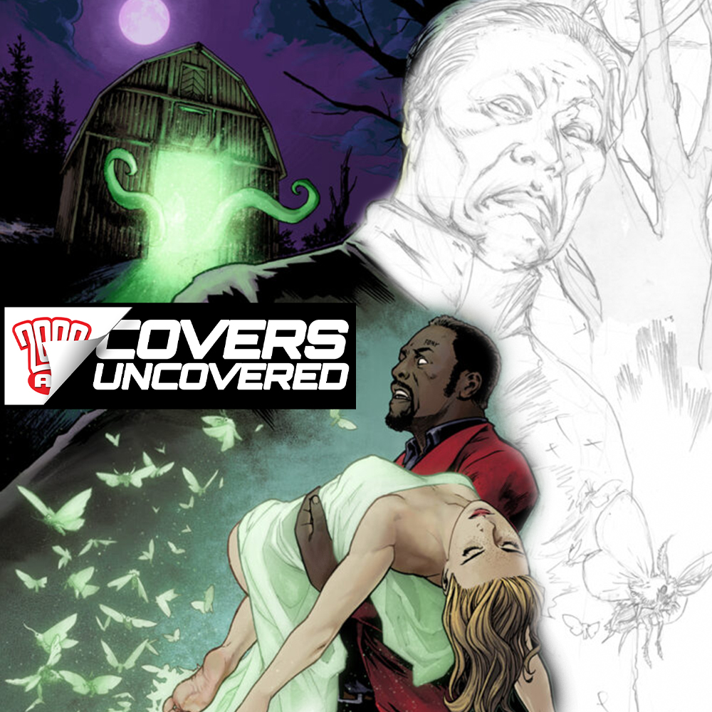
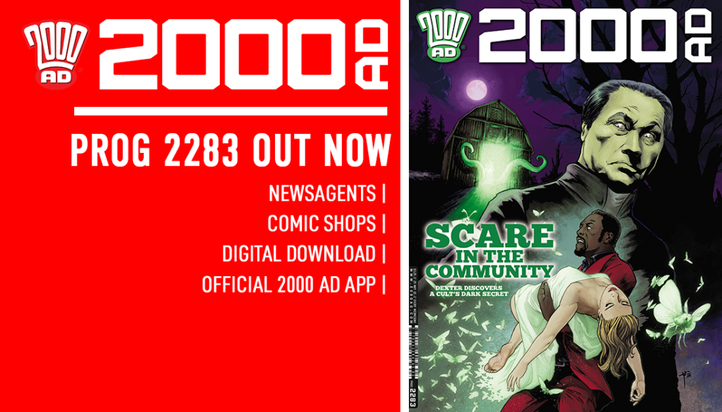
This week, we have a suitably spooky cover from Tazio Bettin, showing us the creepy goings-on in the latest Sinister Dexter strip, The Thing in The Thing. Well, actually it’s the latest Dexter strip, as Dan Abnett and Tazio have broken the partnership between the two greatest gunsharks in Downlode. Currently, Dexter and his gang have gone on the run from the rogue AI that’s taken over Downlode, with Dex’s ex-partner, back from the dead and reanimated by the AI, hot on their heels.
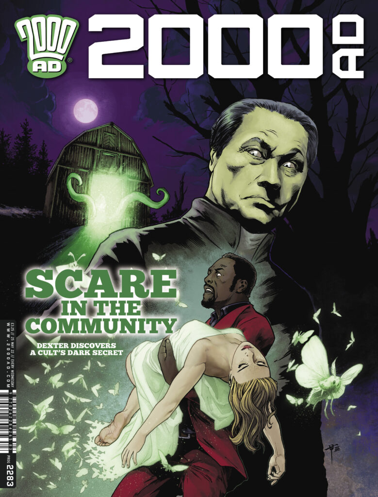
You can find this mean and moody Tazio Bettin piece on the cover of 2000 AD Prog 2283 – out wherever you get your Thrill Power on 25 May.
TAZIO BETTIN: The current chapter of Dexter brings us back to the atmospheres of weird fiction from the ’20s and ’30s. If you have never read any horror stories by Arthur Machen, Robert Bloch, Frank Belknap-Long, or Clark Ashton-Smith, that is your cue to rectify that.
Dan’s script plays beautifully with classic horror tropes, so I knew immediately that I needed to convey a similar mood through the cover, and that I wanted it to be a homage to classic horror covers and posters. My inspiration came from Hammer horror movie posters from the ’60s and ’70s, especially those featuring the legendary Peter Cushing and, of course, Christopher Lee as Dracula. Those artworks used to have such iconic atmospheres, with just the right amount of cheesiness.
Going back to the classics is a great exercise in analysing the compositions and palettes, see what made the posters so iconic, and possibly learn something new and valuable.
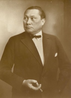
Paul Wegener Tazio’s inspiration for Rev. Wegener.
Let me backtrack one moment to mention that, when I read the first script, I was overjoyed to realize that one of the new characters in this story would be a perfect match for the semblance of german actor Paul Wegener, best known for his role as the eponymous monster from german Expressionist movie Der Golem from 1920 (yes, this is another clue if you haven’t seen it). I’d wanted to draw him as a character in a comic for a long time, but it couldn’t be just anyone. It had to be a memorable character, and there it was!
I suggested as much to Dan, who agreed and went as far as even naming the character Reverend Wegener. I’d be curious to know how many readers will get this somewhat obscure homage… His face is very striking and intense, and hopefully, I managed to do him justice.
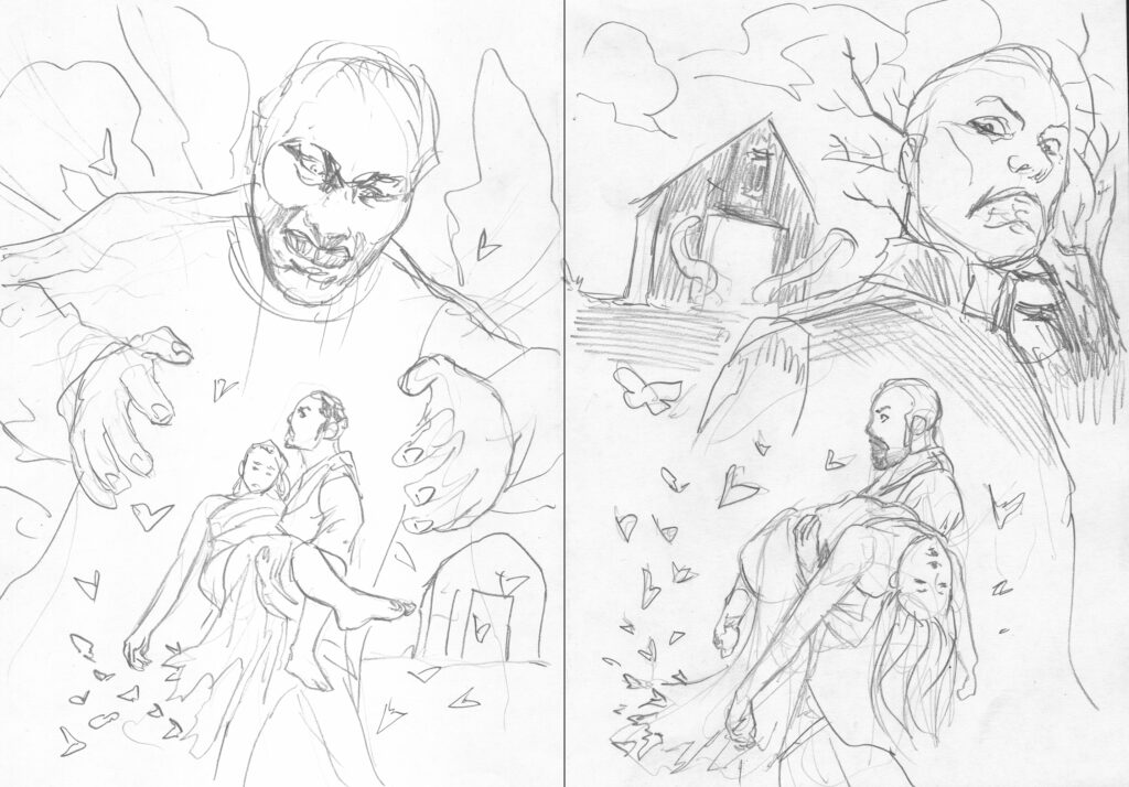
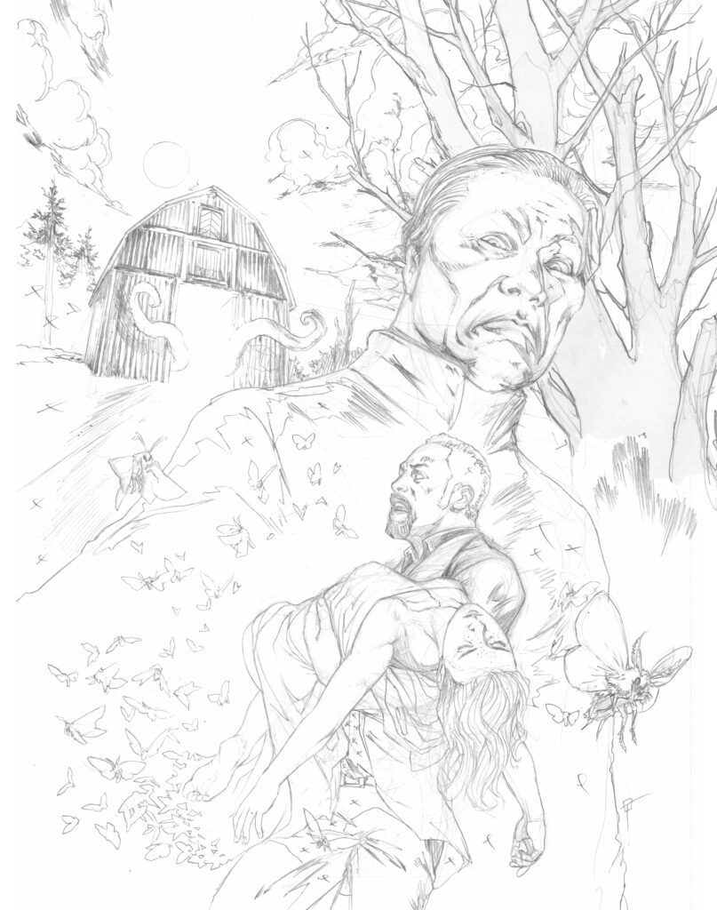
With that in mind, and back to the cover. I had the iconic villain, I had the inspiration. The rest of the pieces fell into place rather smoothly and naturally. I wanted the cover to be all about foreshadowing and make the reader wonder. What happened to Billi? What are those moths about? What’s that thing in the barn?
Compared to my previous cover, the process in this one was much less cerebral and much more like a natural flow of connecting the dots and let the pieces fall into place. So much so that it’s hard for me to analyze it and put it into words.
I sent some initial proposals to Matt and Dan, but it was an easy choice: everyone agreed that the one to the right here was the right one. Since the story is mainly centered on Dexter and Billi Octavo, I left the other characters out this time, favoring immediacy and expressiveness.
There was little changed from layout to pencils, except for minor adjustments in the placement of elements.
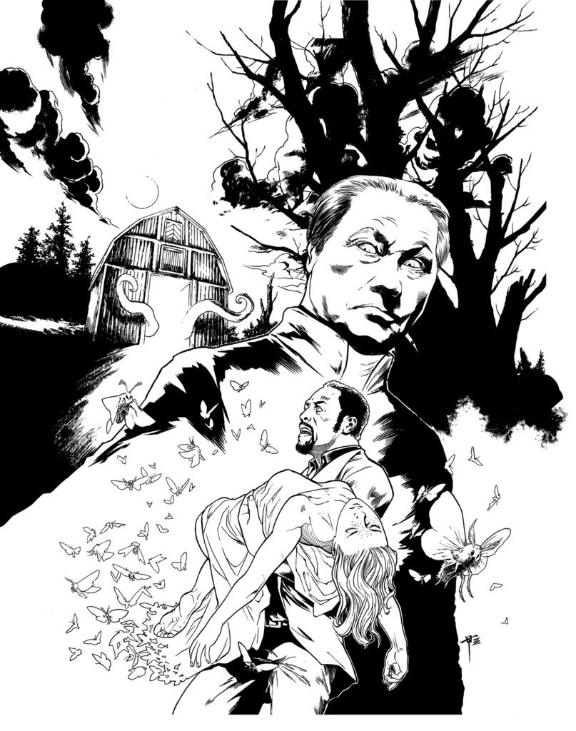
There is one element I changed in the transition from pencils to inks: Wegener’s face felt too much like a caricature, and I wasn’t satisfied. I didn’t want to go that far with the cheesiness, so I redrew it.
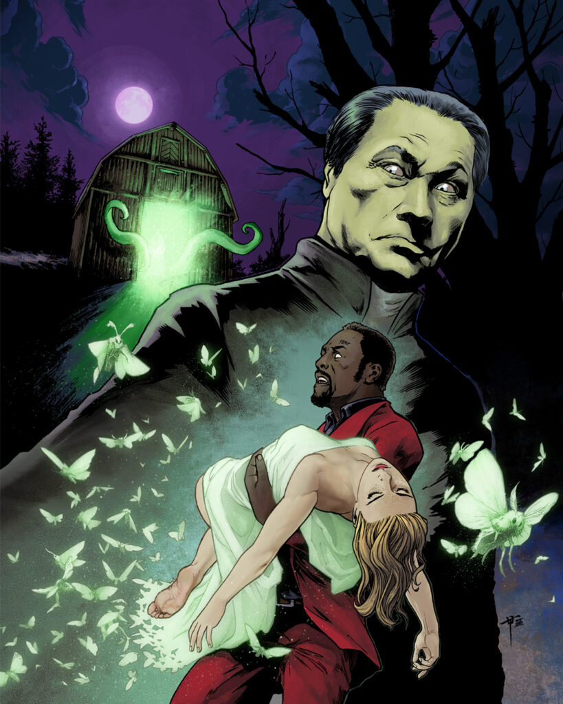
The last remaining part was choosing a colour theme for this drawing. Green is easily linked to the horror and supernatural genre due to the eerie quality it can have. I thought I’d use it to highlight the elements of danger: the barn, Reverend Wegener, the moths, and chose background colours that would work well in highlighting those elements, in this care a purple dominance. Hopefully that also adds some creepiness and surreal quality to the whole picture.
I am very honoured to have a chance to draw a cover for 2000AD magazine again, and I hope the readers will like it!
Tazio, we’re certain the readers are going to love it!
Thanks so much to Tazio for sending that one along. Love it when the artists go deep into the ideas behind the cover and Tazio certainly did that!
If you want to read more from Tazio, check out the making of 2000 AD Prog 2259 here.
You can find 2000 AD Prog 2283 wherever you pick up your weekly dose of Ghafflebette comics, including the 2000 AD web shop from 25 May.
Every week, 2000 AD brings you the galaxy’s greatest artwork and 2000 AD Covers Uncovered takes you behind-the-scenes with the headline artists responsible for our top cover art – join bloggers Richard Bruton and Pete Wells as they uncover the greatest covers from 2000 AD!
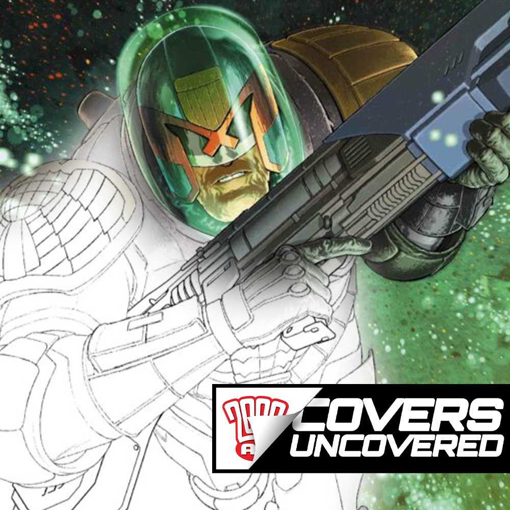
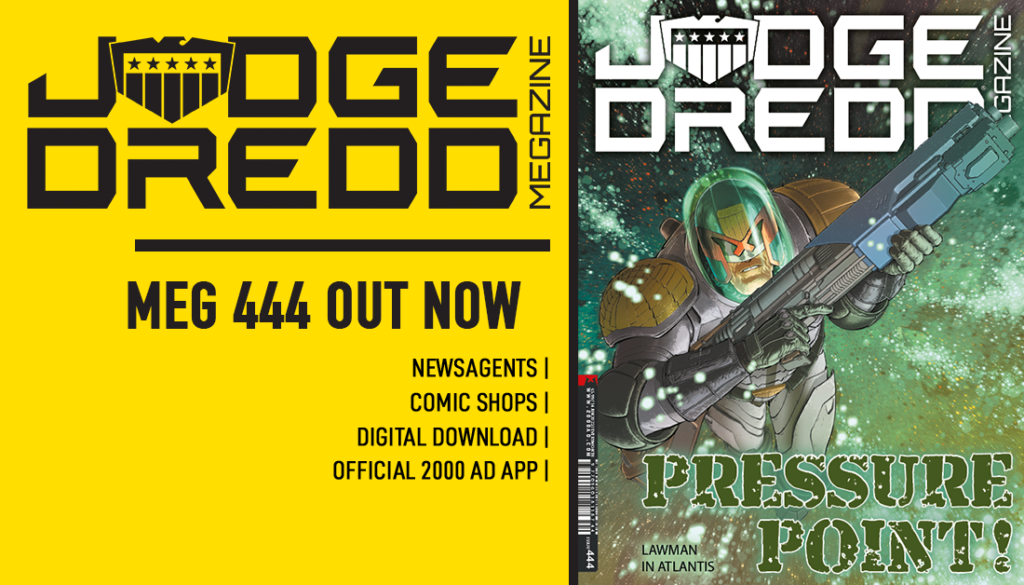
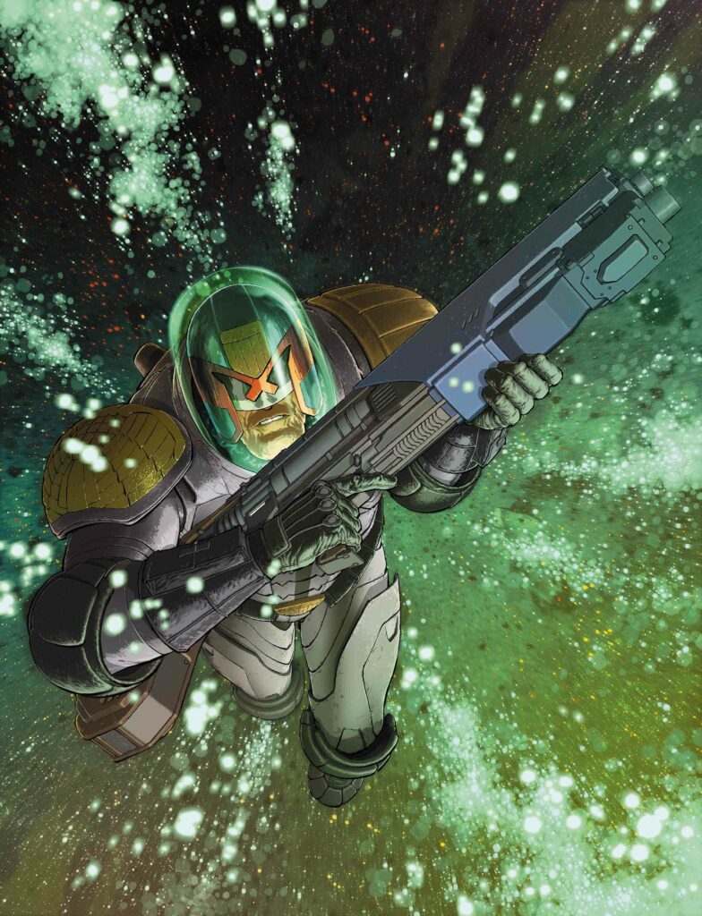
Judge Dredd Megazine issue 444 sees the triumphant return of veteran artdroid Andy Clarke! It’s on sale wherever Thrill Power is sold, including the 2000 AD web shop, from 18 May.
We were delighted to see Andy not only return to the comic, but also send some images and blurb for 2000 AD Covers Uncovered. Sadly, the Clarke droid currently has a minor software glitch that inexplicably causes him to refer to The Mighty Tharg as Matt. I can hear Mek-Quake ‘investigating’ the glitch over the sounds of Andy’s screams right now…
Andy begins “I sent an email to Matt earlier this year basically as a way of sending my congrats on the 45th and – although I don’t think I explicitly stated this (I really shoulda) – his amazing tenure as editor. I wasn’t sure he’d remember me at all, but with the anniversary and how it seems like yesterday that Matt started at 2000 AD, it just felt like a good thing to do. With the Battle Action cover and my becoming a little obsessed with the first 11 Dredd Case Files books, 2000 AD had been on my mind a lot the past year or so.”
“And I’ve enjoyed emailing back-and-forth with Wiggz over the years about this and that, so I’ve always kept in touch of a sort – like a distant relative who never calls or shows up to family get-togethers.”
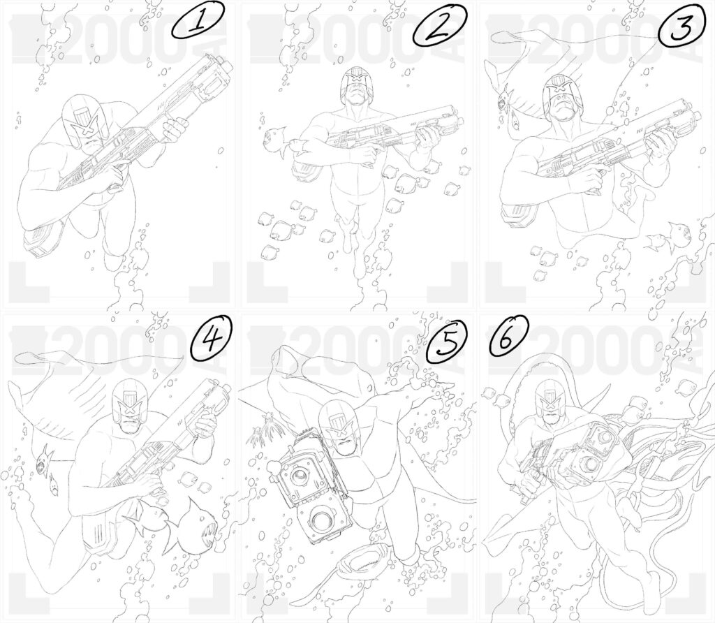
“Anyway, despite the abundance of artistic talent Matt can call on, he asked if I was up for a script or a cover. So I wiped away the tears of joy and got to scribbling some cover sketches – it felt like 2004 again, except hopefully I wasn’t quite the clueless dumbass now that I was back then… Yeah, right!”
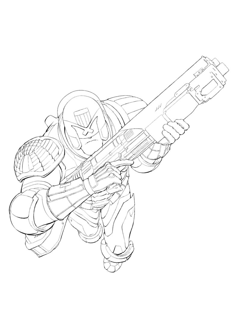
“So, once I’d taken a good look at the strip reference Matt sent over, I sent him a handful of sketches. No detail really, but the important things are there – the helmet, the gun – just enough to get a sense of ‘does this work or not?’.”
Dredd inexplicably recreating the Nirvana Nevermind album cover…
Andy continues “Matt picked #1 and I set it aside to come back to while I worked on some other stuff. For some reason, my brain farted and I decided I wanted to have a go at colours too, so I asked Matt if that would be okay, he said ‘Yes’ and then I felt the anxiety set in. ‘How are you going to do this? You don’t colour! You don’t colour because you’re always disappointed in the results when you do! No colour sense, no clue – dumbass!’”
I think we all know what is causing those bubbles. Dredd really needs to lay off the synthi-beans.
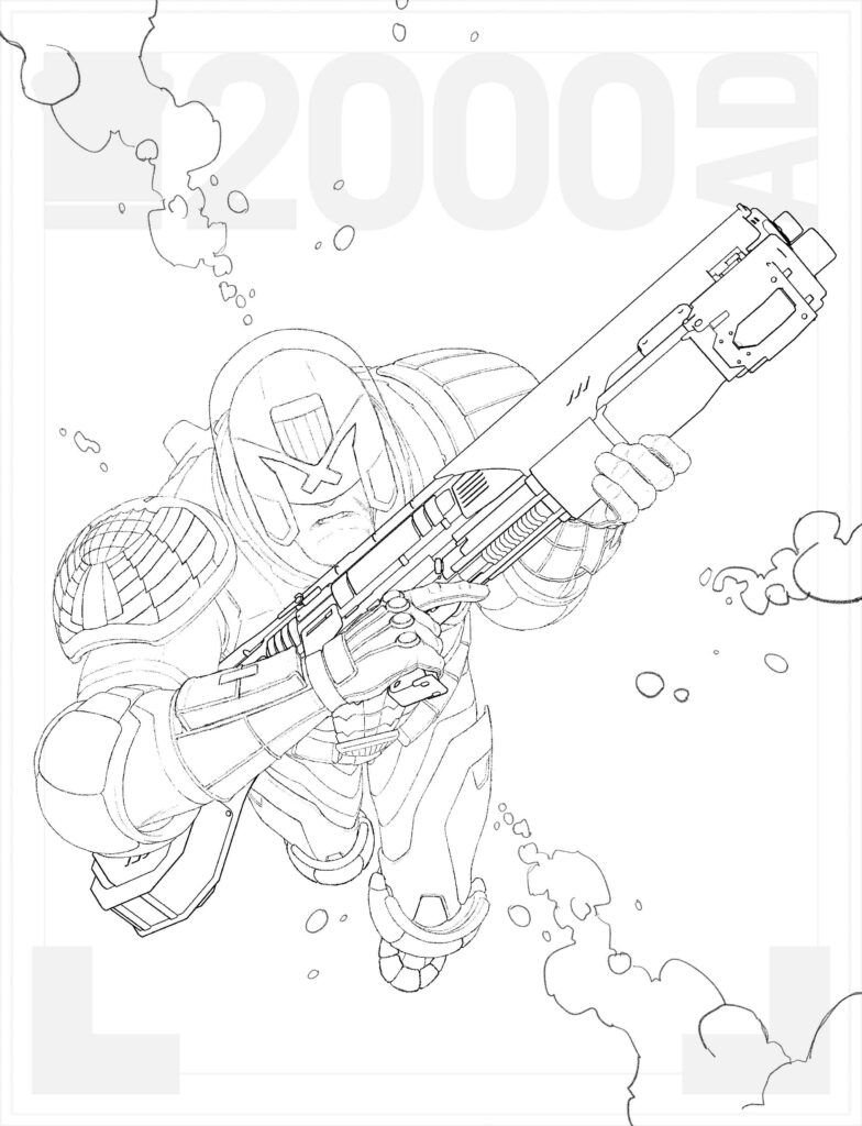
After a brief hiatus, Andy got to work on these wonderfully tight inks, showing just why he is one of the best in the business…
Stoopid small boots were always making Dredd trip over.
With the inks done, it was time for Andy to tackle the big Elmer in room… “So, for once I ignored my inner critic and had a good think. I’d only done 2 coloured covers before, and they weren’t even intended to be covers originally, so the pressure wasn’t there. This time it was. First thing I did once I’d done the drawing and the inks was come up with something for the background. I’d never depicted underwater before (that I can remember anyway), especially a toxic underwater, so despite not really knowing how to go about it, had a surprisingly good time doing it. It’s just a texture (probably some ink disaster from years back) that I poked, prodded and colourised until it looked alright.”
A huge advocate for Droid rights, Andy made this dirty protest to highlight the Mighty One’s draconian working conditions at the Nerve Centre.
Andy continues “To at least try to make it look more like an underwater scene, I added a few streams of green toxic-y air-bubbles.”
A rare handkerchief used by James Fenemore Snork himself!
Andy installed the Jackson Pollock plug-in to help create the final background.
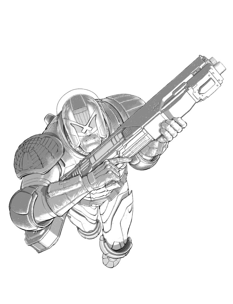
With the background ready, it was back to old Dredd himself; “Then it was onto adding grey-tone to Dredd. It’s really just another round of inks – but in grey, so I can work out stuff that would look too blunt or a total mess if inked up in black.”
It looks like Andy took the “Old Stony Face” moniker a little too literally.
“Then came the flat colours placed underneath the grey-tone. This is where I either think, ‘hmm, something’s not right,’ or ‘hmm, this might come out alright after all.’”
Thankfully, it came out better than alright – wow!
Once again, Dredd had totally overdressed for the justice department pool party.
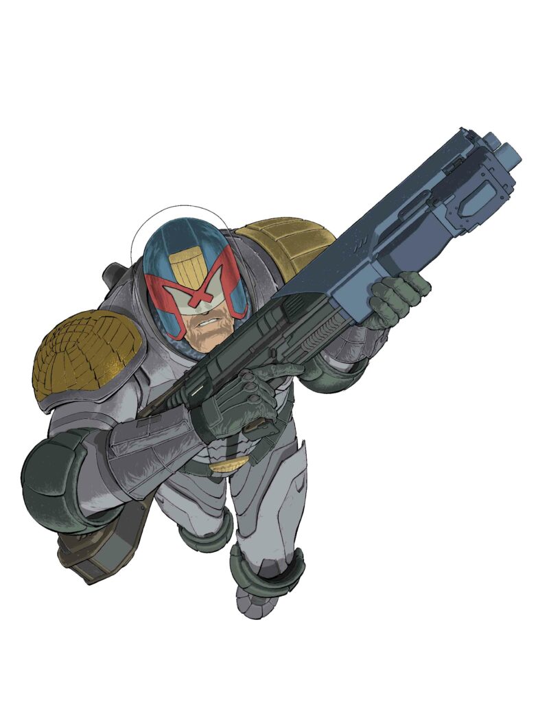
“Finally, I added highlights, gradients etc. to round off the whole thing. This is where I agonise and tie myself up in knots, tweaking things and fussing – retaining anal – before I realise enough is enough and put myself to bed.”
“Oh Joe! I’ll never let go! I promise!” Rose lets go, Celine Dion begins to warble “Neeeeer! Faaaaaar! Wherever you aaaaaaare!”
“The final step was sliding the background in behind Dredd and sending it off to Matt to see if it all looked okay . . .
Luckily it did.”
It certainly did! What a fantastic cover and what BRILLIANT colours! Any need not worry next time! Thank you so much to Andy for taking the time to do this, and it’s absolutely fantastic to see him back in the House of Tharg where he belongs!
And that’s it! Thanks so much to Andy for sending that one along. Like we say, look for that stunning cover blasting off the shelves and in the 2000 AD web shop from 18 May.
Every week, 2000 AD brings you the galaxy’s greatest artwork and 2000 AD Covers Uncovered takes you behind-the-scenes with the headline artists responsible for our top cover art – join bloggers Richard Bruton and Pete Wells as they uncover the greatest covers from 2000 AD!
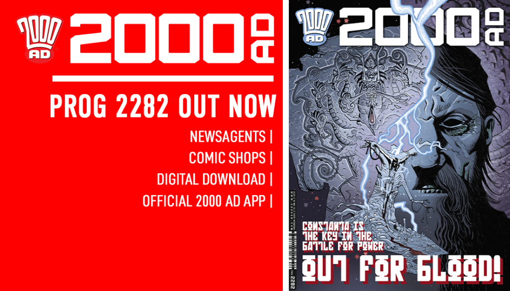
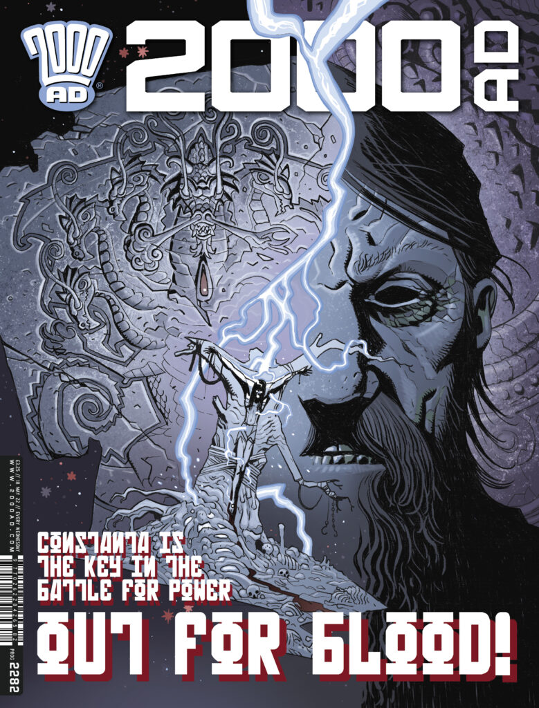
This week, on the front of 2000 AD Prog 2282, out 18 May, it’s the return of super artist Tiernan Trevallion for another incredible Fiends of the Eastern Front: 1963 Prog cover. In 1963, written by Ian Edginton, we’ve seen the vampire Constanta attacked in cold war Berlin and London, with the forces of Baba Yaga and Rasputin seeking him as the prize in a supernatural battle for power. But now, between the ancient Balaur and the First Sinner, he’s paying a heavy price for being the vamp in the middle!
Tiernan, as you’d expect from a droid of such brilliance, is in high demand and although he had chance to send us the images for this Covers Uncovered, his poor circuits just couldn’t cope with the workload and he’s had to schedule an emergency re-lube and repair session from Tharg’s droid workshop.
However, as his failing circuits spluttered and sparked their last as he was lowered into the oil vats, he did manage to press send on his words for this Covers Uncovered…
Here’s the components of the cover… as usual, not much to report beyond a rather glib and unhelpful explanation of the process…
And that’s all you get from the Trevallion droid this time round! I think you’ll agree with us when we say that none of the explanations are ever glib or unhelpful though.
Anyway, the art is the thing of course and with a cover like that, we really don’t need to say that much do we?
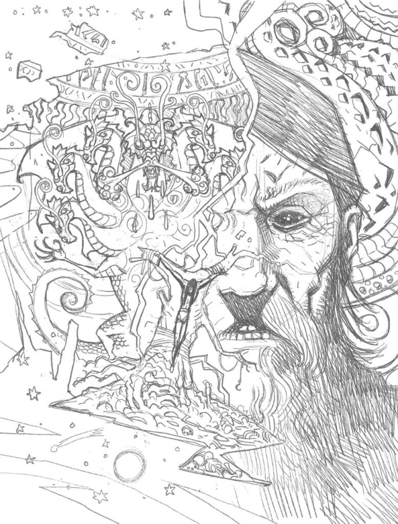
So, starting off with raw pencils to set the scene… Balaur to the left of him, Rasputin to the right, Constanta’s stuck in the middle, a sacrifice to the elder gods and demons fighting over him…
.
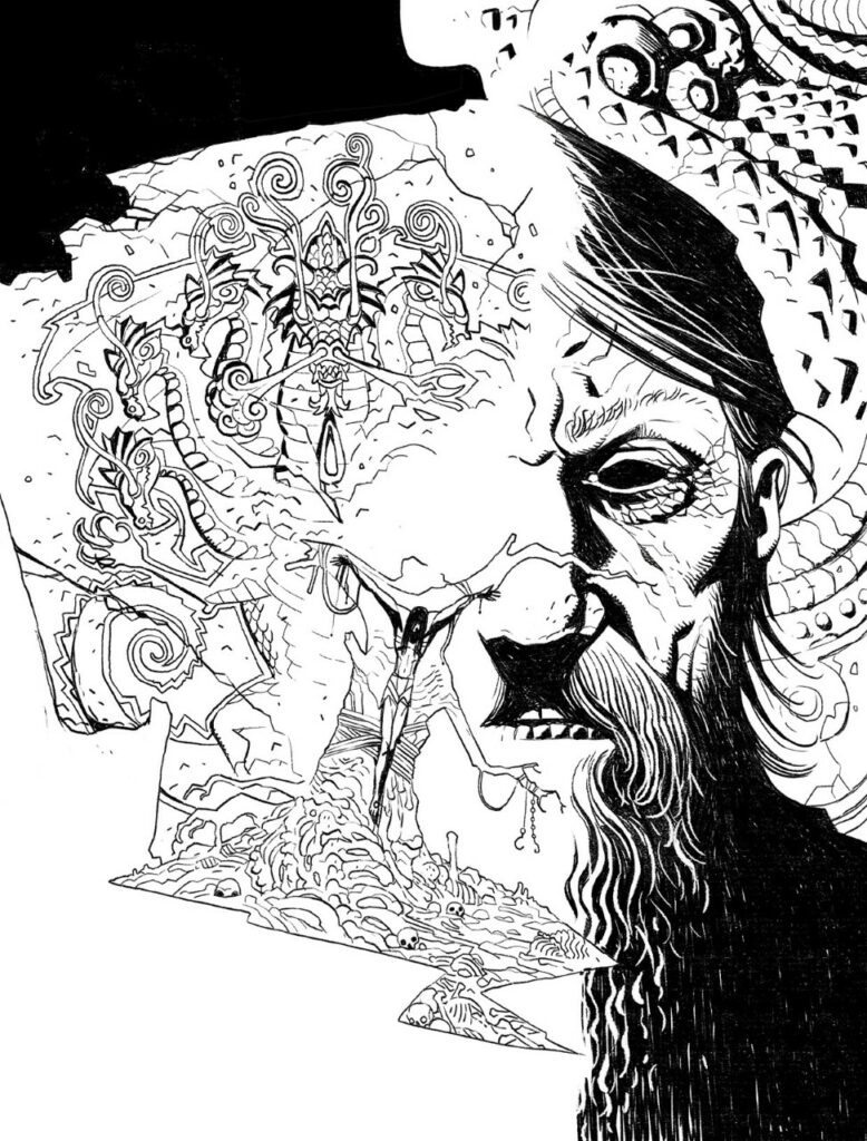
After that, straight to inking the cover image. And as you’d expect from Trevallion after seeing the wonderfully grotesque imagery week in and week out for the black and white Fiends: 1963 series, he does a stunning black and white inked version…
.
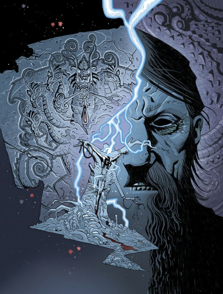
And finally… adding some subtle and sympathetic colours to the cover… including a disturbing trail of red… Constanta really isn’t having the best of days…
Thanks to Tiernan for sending along the process of what is a truly stunning cover there. You can find that cover and the very latest Fiends of the Eastern Front: 1963 on and in 2000 AD Prog 2282, out wherever Thrill Power is sold, including the 2000 AD web shop, from 18 May.
For more Covers Uncovered from Tiernan, see this beauty for Prog 2276, and check out the interview all about Fiends: 1963 with Ian Edginton here.
Every week, 2000 AD brings you the galaxy’s greatest artwork and 2000 AD Covers Uncovered takes you behind-the-scenes with the headline artists responsible for our top cover art – join bloggers Richard Bruton and Pete Wells as they uncover the greatest covers from 2000 AD!
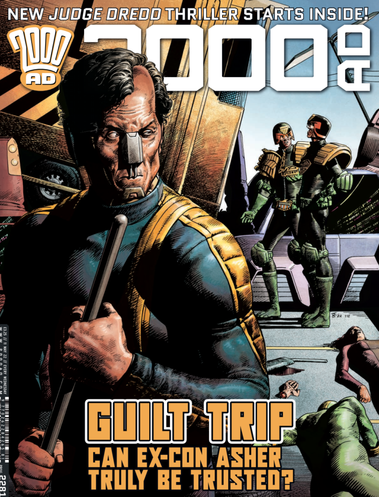
This week, 2000 AD Prog 2281 sees the return of 2000 AD’s funniest art droid (well, he used to be a stand-up comic!) – Tom Foster for both cover and art on the new Judge Dredd series An Honest Man.
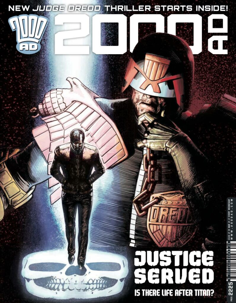
Tom’s back on the cover on Prog 2281 with the return of ex-Judge Kyle Asher. You first saw him in the Kenneth Niemand written and Foster drawn Judge Dredd: A Penitent Man (Progs 2225-2230), returning to the big Meg after 20 years on Titan for beating a citizen to death. He got through his first brush with Dredd and is now working as an Auxillary – but can he keep his Titan-treated nose to the grindstone or will he find the Judge’s instincts kick in again as he returns in An Honest Man? (Oh come on, what do you reckon?)
Anyway, it’s going to be another great series and it all kicks off with a great cover for the first part of An Honest Man on the front of Prog 2281. So, over to Tom Foster to tell us all about it…
TOM FOSTER: One of the advantages of having used 3D-models so extensively in the past is that I can sort of kit-bash a design together fairly quickly without putting pencil to paper. Don’t get me wrong – I like putting pencil to paper, but when it comes to selling a cover idea, it helps to have something that looks, in some sense, fully-realised.
3D-modelling – Tom Foster style! (And you can all add your own big stick gags for this one all the way through!)
In this instance, Tharg had something fairly specific in mind, with Asher in the foreground, looking over his shoulder at Dredd.
I wanted to try and keep the image tied into their encounter in this issue, so I set it against the huge traffic pile-up, with Judge Purcell in attendance.
The rough sketch Foster describes this one as ‘a bit undercooked’ – madness!
Once Tharg was happy, I went about doing a rough sketch of the cover, using the 3D model for a bit of reference on the composition. Generally, I would spend a few hours on this initial stage – getting the nuts and bolts of the anatomy and major forms locked in as early as possible, but this time, I think I only took around 45 minutes.
This was a bit of a double-edged sword, to be honest. It allowed me to get nearly all the penciling done in one day (which is unusual for me), but it meant that a lot of the elements were a bit undercooked and suffered as a result.
The final pencil stage – or maybe not! The Foster droid was just not happy with it
Once the initial sketch was finished, I blew it up from A4 to A3, added a few perspective grids for the background and started overlaying what I assumed would be the final pencils, using a lightboard.
I was still in the process of drawing a later chapter of the story at the time and didn’t want to lose too much time to the process, so resolved to work a little rougher than usual and trust that I could clean things up sufficiently at the inking stage.
However, in my foolish haste, I failed to devote the right amount of attention to the background figures, including Dredd himself (a cardinal sin).
The final, final pencil stage. Is Foster happy? Nope, not yet!
The Dredd figure was looking stiff and flat, and many of the other details were far too indistinct, so I scanned my pencils into photoshop, tinkered with some of the proportions a little and printed them out again. On another sheet of A3, I tightened up some of the problem areas and then scanned these revisions and composited then with the first draft pencils.
Even at this stage, I needed a few little tweaks to be happy enough to move onto inks, but eventually, I managed to get a version I was satisfied with.
The inked stage – and Foster’s happy… …for a little bit
I printed out a blueline version of the pencils and inked it with a sable brush and some Microns. Although most of it turned out okay, there were a few details left over from the poorly constructed initial drawing stages that made it to the final line art. The figures still lack a little dimension and I have some issues with how Dredd’s helmet is drawn – the angle of the visor doesn’t match the angle of the rest of it – and this gives things a bit more of a cartoony look than I’d prefer.
If I’d noticed it while I was working on it, I have fixed it, but I didn’t, so now you’re stuck with it.
The final cover, complete with the mistake he didn’t manage to fix! They really can be too hard on themselves these art droids, can’t they?
After getting a high-quality scan of the inks done, I started work on the colours – which, in this instance, were all done digitally. Here I was able to add a little more dimension and texture to the image and try to draw attention away from the problem areas.
Ultimately though, there are still a lot of issues. Most of them are peripheral and don’t really draw the eye, so I don’t mind them too much, but there are a few that still really bug me. In general, the figures of Dredd and Purcell, should really just have been started from scratch when it was clear that they weren’t very strong.
Overall though, I think the final piece just about works, and the lively palette keeps things visually appealing enough to forgive some of the drawing problems.
Meh, I dunno. Still in two minds about it. At least it’s got a background. I usually find a way to avoid that.
Tom Foster, one and all, way, way too hard on himself on yet another great cover!
Thanks to Tom for that – we think it’s as magnificent as all his other work and it’s a delight to see him both on the cover and in the Prog, with his amazing art on Judge Dredd: An Honest Man. It all happens in 2000 AD Prog 2281, out wherever Thrill Power is sold, including the 2000 AD web shop, from 11 May.
And then there’s his ‘From the Drawing Board’ video – the one where he was so entertaining and funny that it put way too much pressure on other art droids!
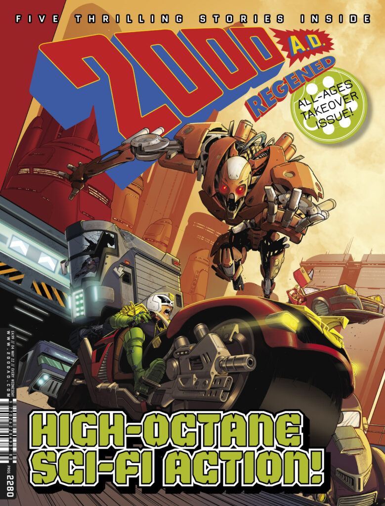
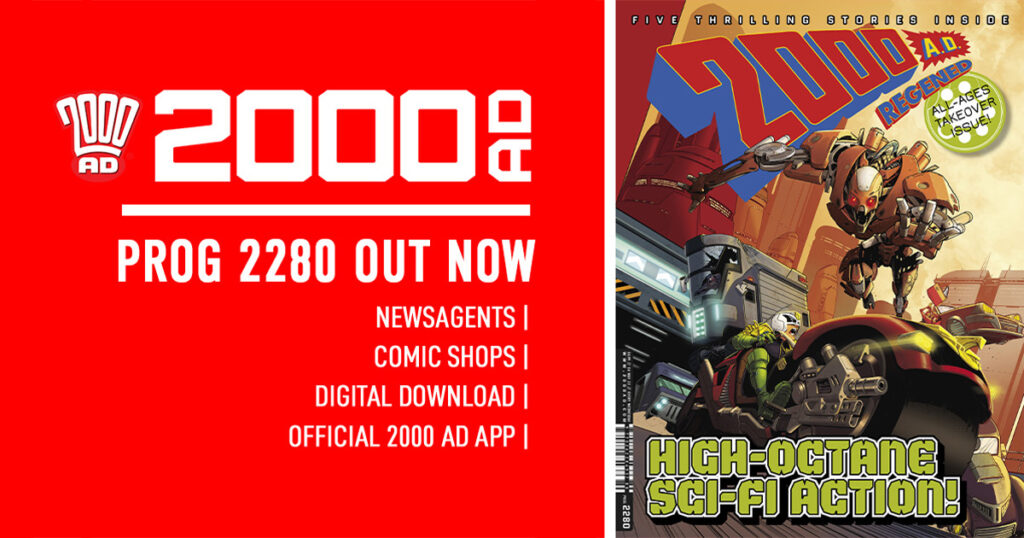
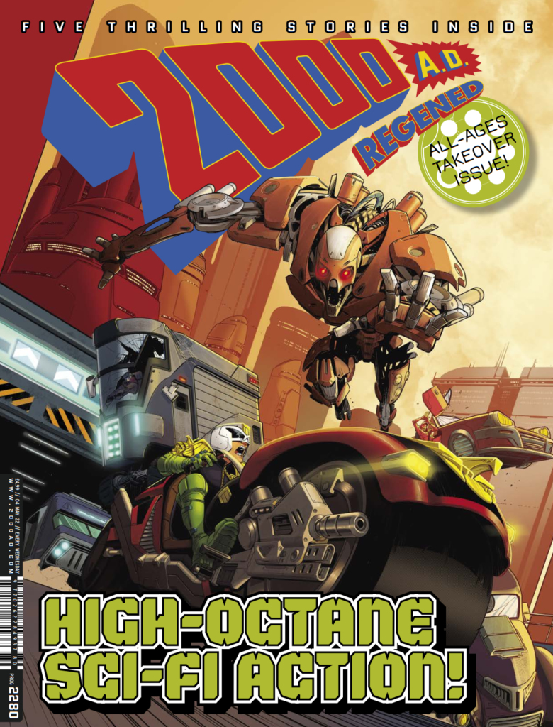
Out right now – the latest 2000 AD Regened – Prog 2280 – has hit the stands and is packed with all-ages action and thrills for you and your younger Earthlets!
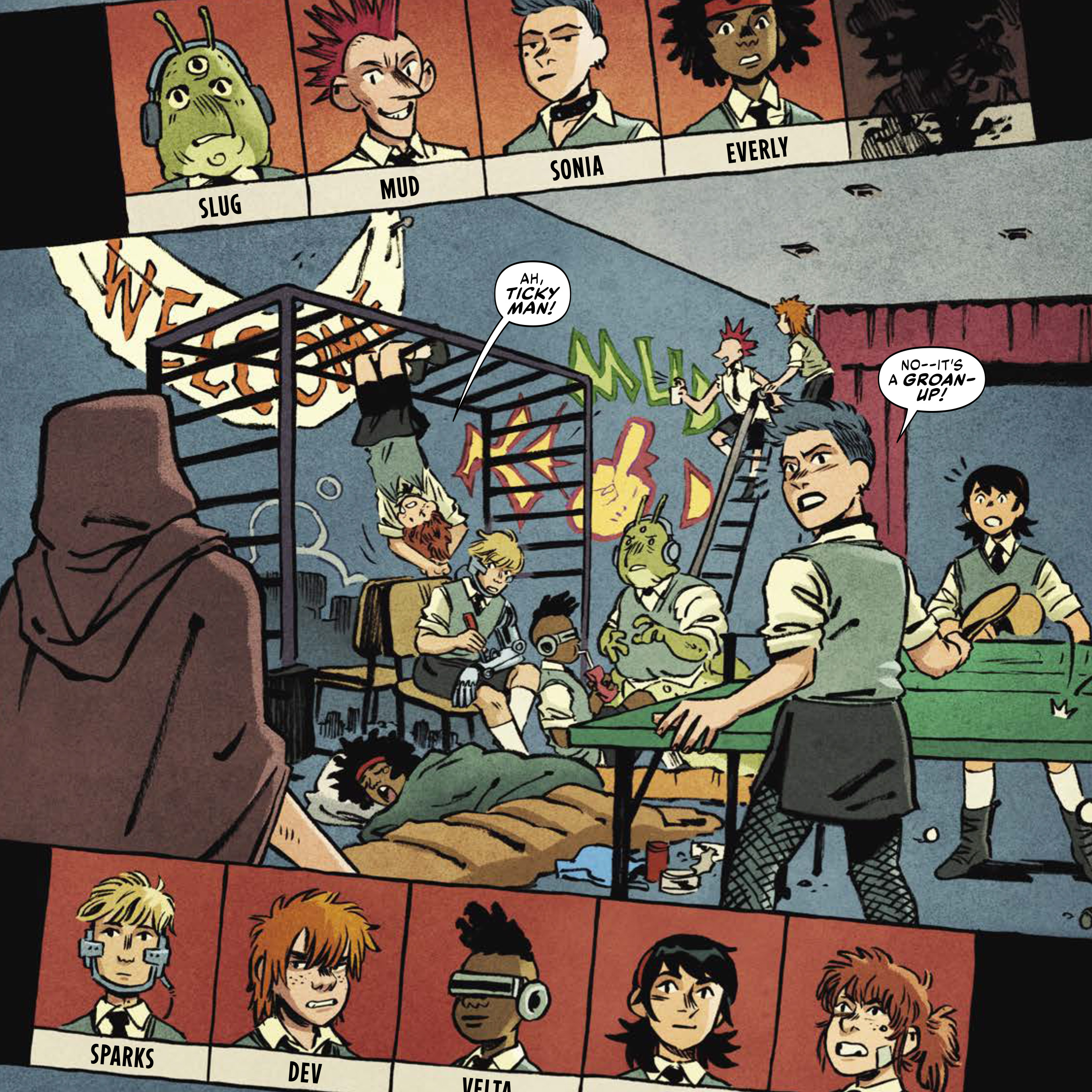
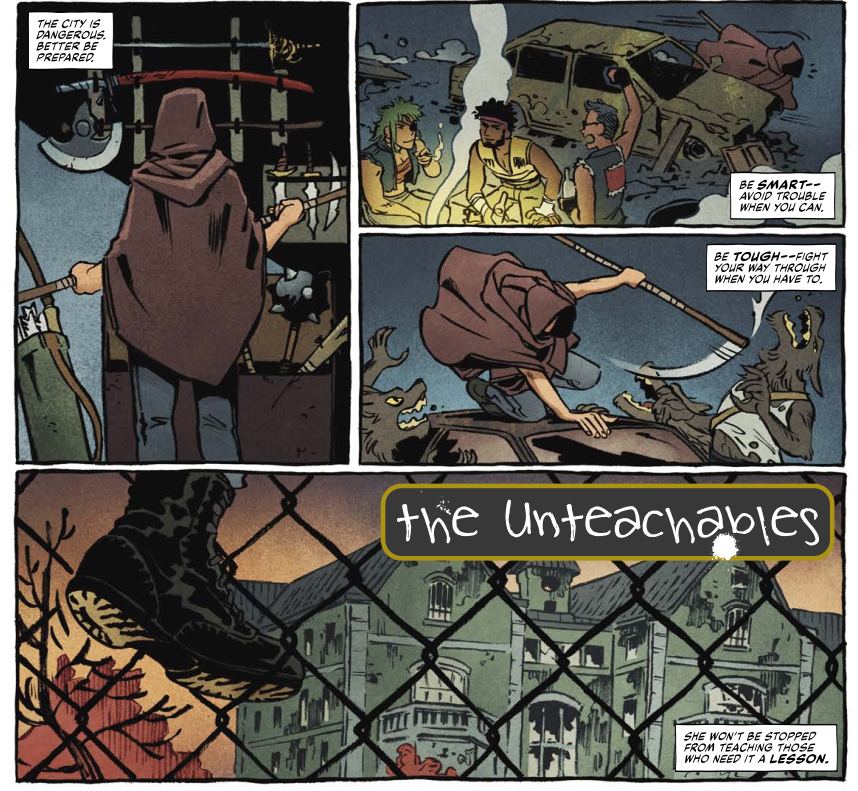
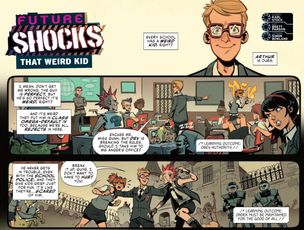
Inside, there’s five strips of wonderful things, including more of everyone’s favourite lawman of the future, Cadet Dredd, the adventures of a young Marlon Shakespeare in Chopper, an AI nightmare of a Future Shock, magical misadventures with the kids of Lowborn High, and post-apocalyptic classroom chaos when the kids of Class Omega-Default IV return in The Unteachables by Karl Stock and Xulia Vicente.
Introducing The Unteachables! Art by Xulia Vicente
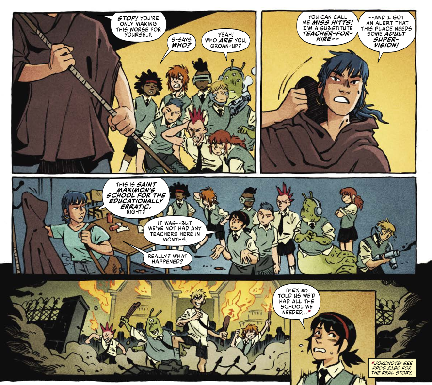
Hi Karl, Hi Xulia… The Unteachables is a new strip in name only, as the kids from Class Omega-Default IV have already appeared before in Regened, back in Prog 2130’s Future Shock: That Weird Kid.
The Weird Kid ended with the class triumphant and a group of anarchic, rebellious kids running the school.So, I suppose the first things to ask are… what made you decide to bring the class back in the Unteachables?
KARL STOCK: I’m not sure when it struck me, but I was toying around with ideas for what might work for 2000AD Regened in an all-ages context and remembering how much I loved the Bash Street Kids when I was young. They were briefly my favourites until 2000AD and Star Wars hit around age 7 or 8.
I absolutely see what you mean with the Bash Street Kids. And it’s something that was there with Carl Giles’ kids in his fabulous cartoons – kids, go ask Grandpa!
KS: At some point it just landed that I had already created – with artist Brett Parson, whose great character and world designs are a massive part of this story – a group who fitted that mould exactly, in my first Future Shock for 2000AD Regened back in 2019, That Weird Kid. But this realisation was a pretty meandering process; the Shock always existed as a done-in-one in my mind, and my efforts since have gone into more Future Shocks and various bits for specials. General ‘learning the comic writing trade’ stuff. I guess I rediscovered These Weird Kids when I felt ready to.
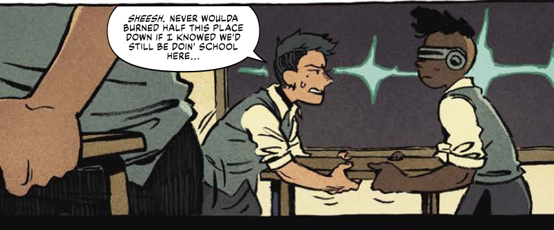
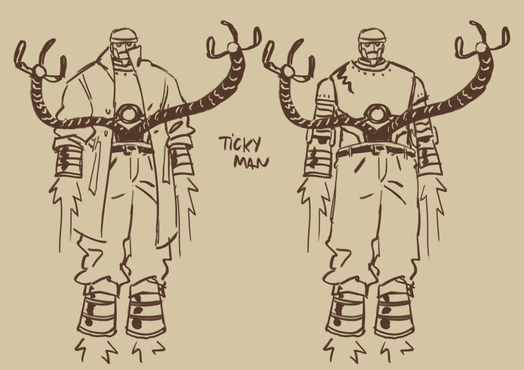
Miss Hitts is ready to teach! Unteachables art from Xulia Vicente
So you have the idea of the feral kids running riot a la Baxendale but then it’s taken a sci-fi step by shifting it to some post-apocalyptic future setting.One thing I really liked was how you’ve not gone to great lengths to really explain what the hell’s going on outside the classroom up to this point. A great example, of course, is Slug and how it’s never brought up about how alien he is – a simple visual proof that this really isn’t the Earth we know – if it even is Earth that is! And of course there’s the puzzle over Arthur and the technology involved there.
Now with this second Unteachables – we can retroactively go back and call That Weird Kid an Unteachables, right? – it’s still got all the Bash Street kids anarchy but there’s more of a Walking Dead vibe about the thing. You’ve expanded the series to look more to the outside world, hell-hole that it is, and what the other survivors are doing there.
KS: Put simply, the premise in my mind is, ‘what is school like in a dystopian sci-fi future?’ There are all sorts of avenues to explore in this world, which we’ve seen a little of in the first page or two here – perhaps we can explore more of them in future?
Absolutely! So then, what sort of things can we expect from this new episode?
KS: A story that hopefully takes them out of the thinly-sketched world of that one-off and gives their situation a bit more context and structure. I was aiming for one part Bash Street Kids, one part 2000AD Regened, and one part Kids Rule OK from Action – which is an ambitious blend, but I’ll try to keep honing it if we see them again.
And also this episode, we have a new artist on board, as Xulia replaces Brett Parson on art – how did this come about?
KS: As soon as the strip was commissioned I asked Tharg, aka editor Matt Smith, if Brett would be able to come back – but I’d missed the boat, he was already busy with the outstanding Pandora Perfect. Xulia was Matt’s choice, and she’s done a great job as a more than capable replacement.
I like to say hello to every artist who’s commissioned to draw one of my strips, and usually we exchange pleasantries and they get on with it. That was kind of the same here, but Xulia was keen to double-check references and things like that – I suspect she found it difficult recreating some of the characters from Brett’s original pages, where all we saw was maybe one side of their face once. I reckon that would be a tough job for any artist.
Meet The Weird Kid – the original Unteachables tale from Prog 2130 – art by Brett Parson
KS: By the way, it’s important here to pay tribute to Brett once more – only maybe two or three of the ensemble cast in the Unteachables were characters I’d described in the first script, who they’ve become in the new story was all extrapolated from the life he brought to them in the brief glimpses we saw in the Future Shock.
Xulia’s carried that on, her pages and characters are lively and real, and there’s something pleasingly Marvelesque about a lot of the action. I’m lucky to have had them both work in this world, and colourist Matt Soffe and letterer Simon Bowland of course.
Xulia, have you enjoyed coming in and stamping your own look on Class Omega-Default IV?
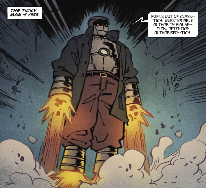
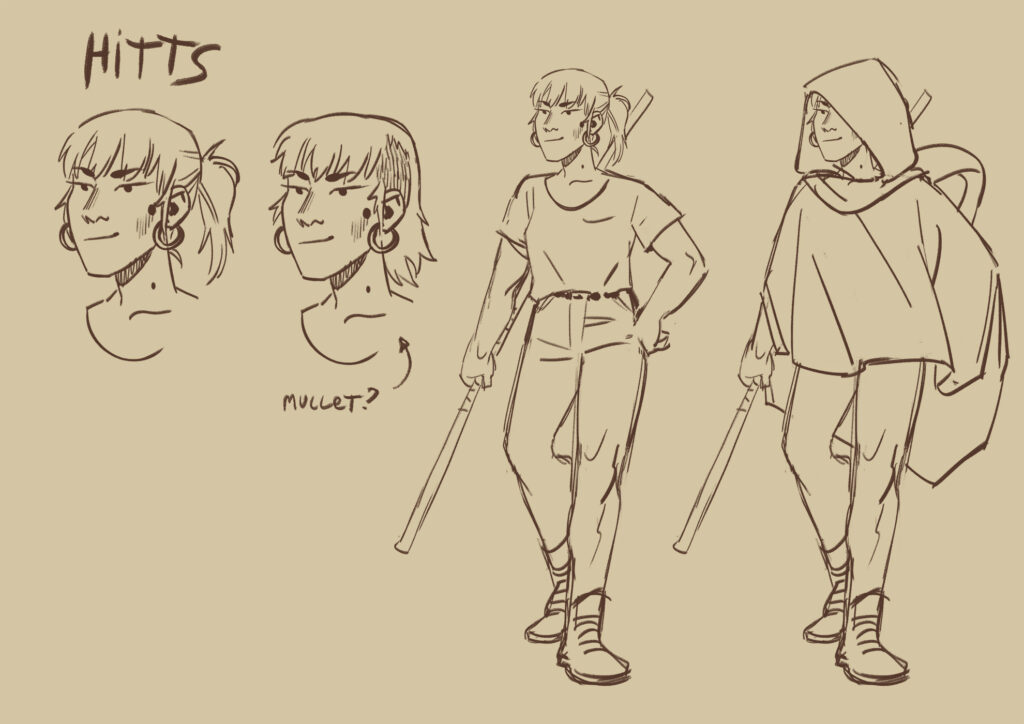
XULIA VICENTE: It sure was a fun pack of feral kids to work with! The source material was great and even if we don’t know much about each of the characters, their designs already have so much personality that it was easy for me to imagine them alive in my head. I also got to introduce a few new characters, so I can just hope they blend well with the cast!
One of Xulia Vicente’s new characters fro The Unteachables – The Ticky Man!
How did this new partnership come about and how did the relationship develop to get the strip finished?
XV: I had worked on a small strip for 2000AD previously [Oh yes, the Judge Death rocking out strip in the 2018 Sci-Fi Special- interview right here], so editor Matt contacted me again for this one. Then Karl reached out to me too to discuss any doubts I could have, and was so kind as to provide a few references I was missing and clarify some parts of the script. English is not my first language so I sometimes struggle to fully understand descriptions, so Karl was really helpful there.
Xulia, you’re coming on to The Unteachables after that initial episode by Brett Parson – I think it’s safe to say that you have very complementary artistic styles and the transition is near seamless – but did you have any thoughts of changing your art at all for The Unteachables?
XV: Well I’m flattered that you’d see a resemblance to Brett’s pages! I guess you could say our styles align well, sure, though I also think part of the merit is thanks to Matt Soffe’s colours and Simon Bowland’s letters, I feel they help the strips blend a lot.
So… even with Brett’s strip as reference, I didn’t really make significant changes to my art style for this. I tend to trust the editor’s choice when they hand me a job and just do my own thing. However, I do feel like adding more blacks and more of a baroque style when working for 2000 AD, mainly because it’s the vibe it brings and also because scripts have more panels per page and more information per panel than I normally do.
Yeah, don’t you hate it when that happens? – Unteachables art by Xulia Vicente
When it came to putting the art together for the Unteachables (and for your other work), how do you approach the story, what’s your process?
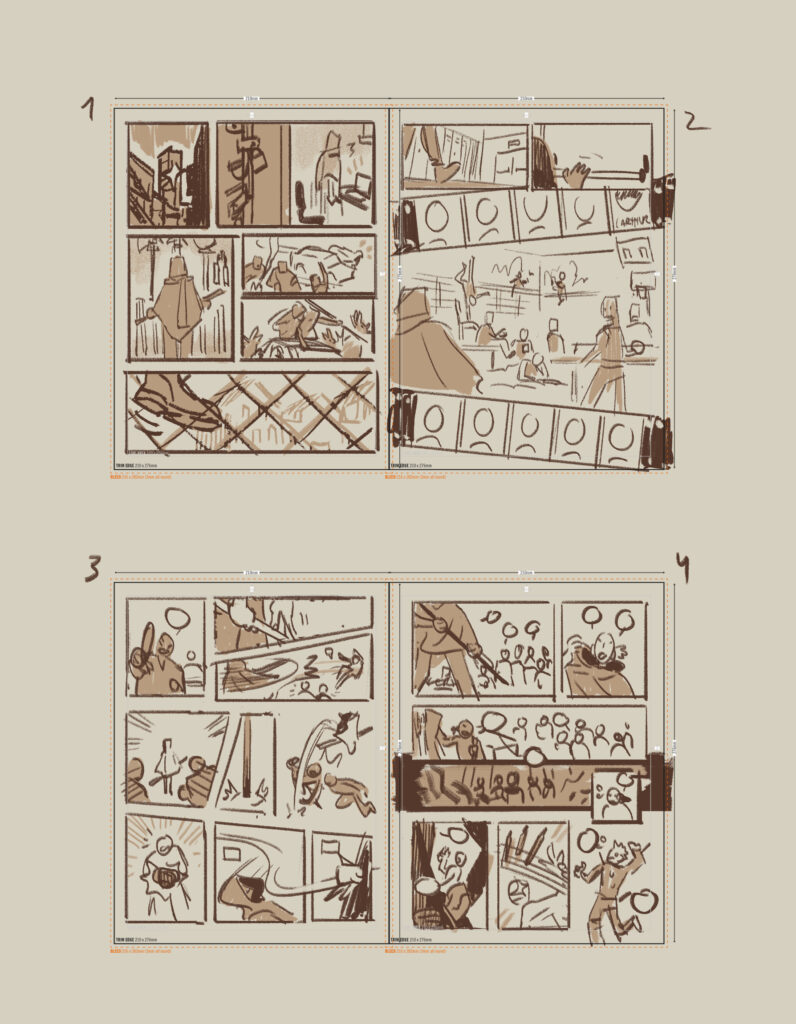
XV: When I work with someone else’s script, I like to read them through a few times, with some time in the middle (if I’m lucky with the schedules). It helps settle a mood and flow for the story in my head, and lay down any doubts I have for the writer. Then I draw a small storyboard (lately I’ve improved at actually making them somewhat readable for people other than myself) and hand it to whoever needs to see it (Karl in this case).
Storyboarding the Unteachables – Xulia Vicente’s layouts
XV: I designed two characters for this story from the description handed by Karl. Really nothing fancy: I look through references and sketch until something comes out. I also made sure to sketch and properly list all of the kids, since I only had Brett’s strip as reference for them.
Character designs for the Unteachables – to see them in all their glory we’ve added them full-size down below
.
XV: From then on, it’s easy: draw the pages. I work with red pencil, a brush and ink, on a Din A3 format. I should really stop stacking paper at home and switch to digital processes, but I just can’t bring myself to work on a screen 24/7…
And a final Unteachables page from Xulia before Matt Soffe and Simon Bowland work their magic!
It’s another example of strips that start as Future Shocks or one-offs and later develop into something more – in the same way as The Intestinauts sprung from the first Regened back in the 2018 Free Comic Book Day comic and is now firmly rooted in the pages of the Prog.
Any plans for the future of The Unteachables? Is it one of those strips that can be transferred to longer stories or do you think it’s something that works a lot better as individual stories? Have you got some sort of massive plan all mapped out across your walls with every detail of the world and what potentially could happen with all of the characters?
KS: It’s not worked out to the level of the corkboard on the wall with the bits of string linking up every character – but yes, I’ve got a few ideas for these characters and their world, and many more half-ideas waiting to be jigsawed together somehow, the possibilities are… not quite endless, but there are loads of them! As ever, it’s down to Tharg whether they see the light of day. This is the first thing I’ve co-created for the prog which might in any way be described as a series, so I’d love to take it further.
Now, as we promised you – the full-size character designs from Xulia –
Thank you so much to Karl and Xulia for chatting to us – you can find The Unteachables running riot in 2000 AD Regened Prog 2280 – out now from everywhere the Galaxy’s Greatest is sold, including the 2000 AD web shop.
Every week, 2000 AD brings you the galaxy’s greatest artwork and 2000 AD Covers Uncovered takes you behind-the-scenes with the headline artists responsible for our top cover art – join bloggers Richard Bruton and Pete Wells as they uncover the greatest covers from 2000 AD!
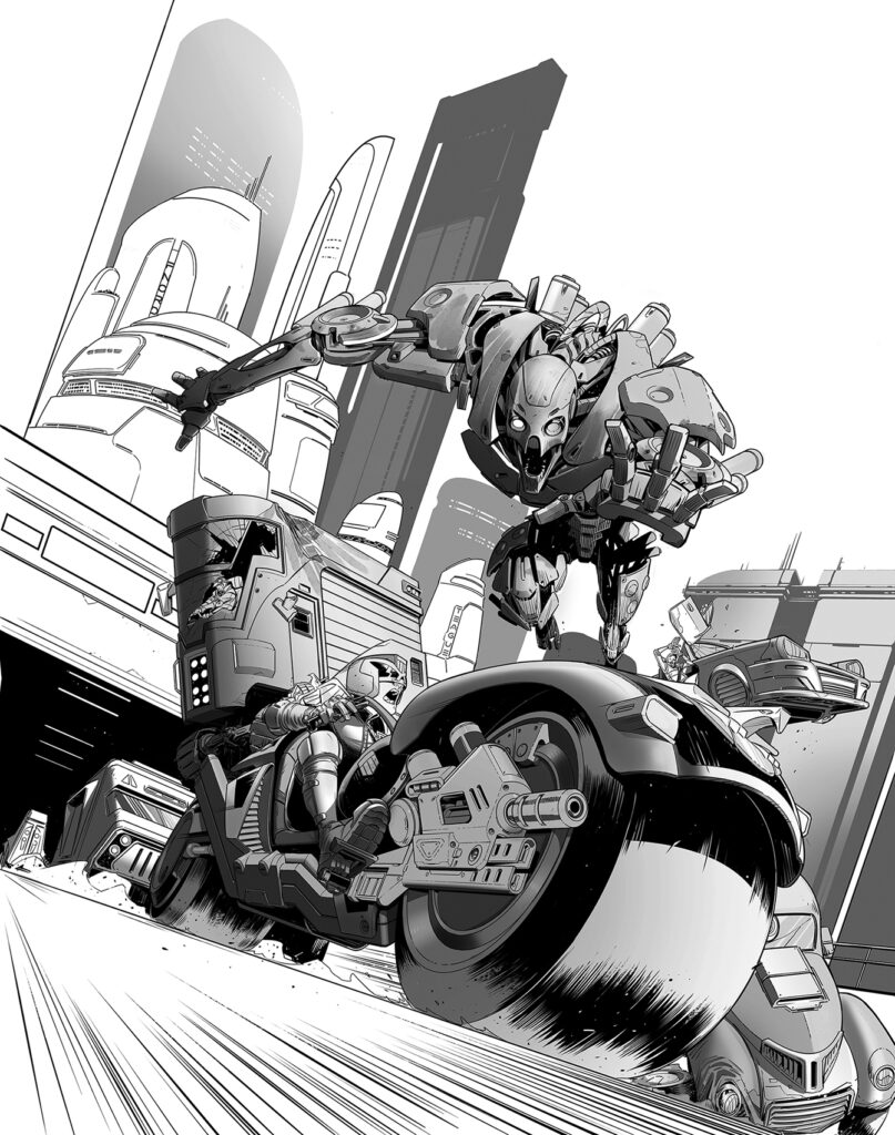
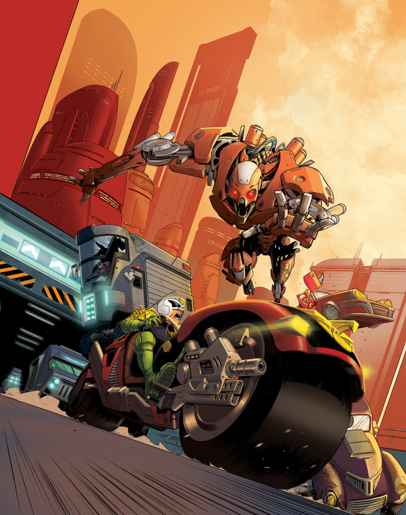
This week, it’s the return of the all-ages Regened Prog and the return of art droid Chris Wildgoose for 2000 AD Prog 2280 – all the thrill power you’d expect, just with that all-ages twist!
Inside the latest Regened you’ll find a great Cadet Dredd with Red Medicine by James Peaty and Luke Horsman, Hogwarts meets Grange Hill in Lowborn High by David Barnett and Anna Morokova, there’s AI gone oh so wrong in a Future Shock: Smart Home by Honor Vincent and VV Glass, we’re headed back to school with Class Omega-Default IV in The Unteachables by Karl Stock and Xulia Vincente, and the return of Marlon Shakespeare in Chopper: What Goes Up by David Barnett and Nick Roche.
But it’s all wrapped in that great Cadet Dredd cover by Chris Wildgoose… who’s about to tell us all about putting it together…
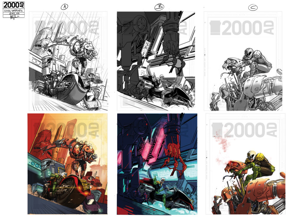
CHRIS WILDGOOSE: When Matt Smith got in touch to ask if I was interested in doing a Regened cover, he said I could have free reign. They were yet to lock down the main Cadet Dredd story but suggested he could have a showdown with an Alien or a Robot (while going light on the use of guns as this was aimed at younger readers).
Growing up with Dredd, I always felt his best tool—beside his helmet and his Law Giver—was the Law Master! So I was excited to have a go at that. I also grew up reading the ABC Warriors stories and I’m a genuine fan of the first Dredd film, so I picked the robot showdown with a slight Hammerstein look to it.
Before I started designing, I read over Matt Smith and Neil Googe’s previous Cadet Dredd story, Coming To America [the exclusive Cadet Dredd in Regened Volume 1] to get a feel for how it looked. Neil’s Law Master designs are just awesome, so I wanted to use some of the flavour he’d given the bike, with a bit of my own spin. I know readers can be very keen on Dredd’s continuity, but with this being the Regened issue, I felt I had space to play with the design a little while keeping it close to an existing design.
And so, I went in with these influences from the get-go.
I sent over these three designs. The first two would require a big bunch of time to work on it. Loads of detail and fun action. Whereas Option C was a design that could be completed quickly, in case time was short. Unable to let Dredd wield a gun, I had fun planning out what he could do to the robot that would still be quite violent!
Option A was inspired by Rob Williams and Dylan Teague’s short Dredd story, Meat,[Judge Dredd Megazine 298] which has a gnarly opening on a Mega-City One highway. My actual personal pick would have been option B, as I loved the colours and was in the mood for a dark, neon, muggy street-level piece.
To be fair, for me, these are on the more finished scale of ‘sketches’ So they are on the tighter side and often, when I know I’m colouring for myself I’ll put a fair bit of time into figuring out the colours in this stage too. It tends to save me a lot of brain ache later on down the line.
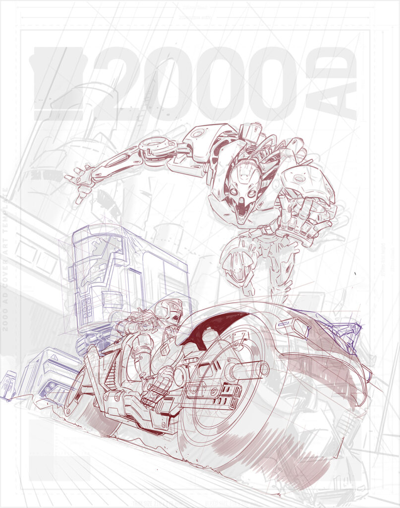
Matt chose option A as the final cover, so next I got stuck in with the pencils…
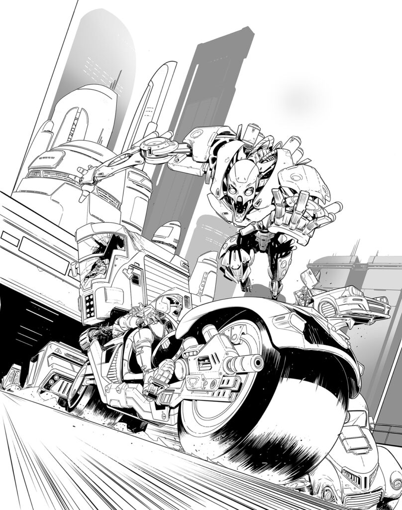
I kept the pencils pretty bare bones, as I was inking it myself and doing it all digitally. With my layouts being pretty tight already, most of the hard work came in the inking stage. Here I was mostly making sure Dredd and the bike were drawn correctly.
Often I’ll render my covers with some shadow layers. I knew I wanted the robot to have a bunch of grooves and dents, so I worked in some damage at this stage (and on that hover bus getting knocked out of the way).
And here’s the final piece! I kept very close to the colours I’d worked out in the planning stage, with just some tweaks to add motion blur to the road debris.
The final touch was to add a couple of little Easter eggs!
Keeping with the tradition of naming a block after a fellow 2000 AD art droid, I named a block ‘Teague’ after artist Dylan Teague, who has been one of my biggest influences while working in comics. There’s also a ‘Fnord’ block, which is for my eldest brother. (Don’t worry, my brother isn’t actually named Fnord, but I thought he’d prefer his constant internet handle over a ‘Tim’ block. I owe all of my 2000 AD love to Tim, who would let me steal and mistreat his Progs when I was far, far too young.
And that’s it! Thanks so much to Chris Wildgoose there for sending that one along. And thanks to Tim for letting Chris steal his Progs – always share nice, Earthlets, you’re building the essential next-generation of Squaxx dek Thargo!
You can find 2000 AD Prog 2280 wherever you pick up your weekly dose of Ghafflebette comics, including the 2000 AD web shop from 4 May.
Every week, 2000 AD brings you the galaxy’s greatest artwork and 2000 AD Covers Uncovered takes you behind-the-scenes with the headline artists responsible for our top cover art – join bloggers Richard Bruton and Pete Wells as they uncover the greatest covers from 2000 AD!
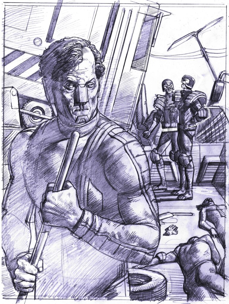
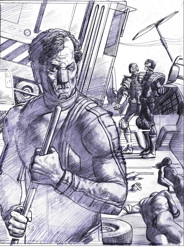
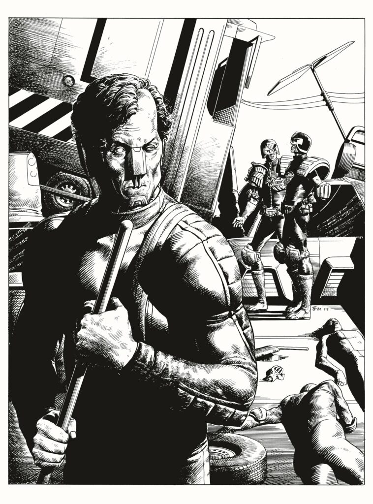
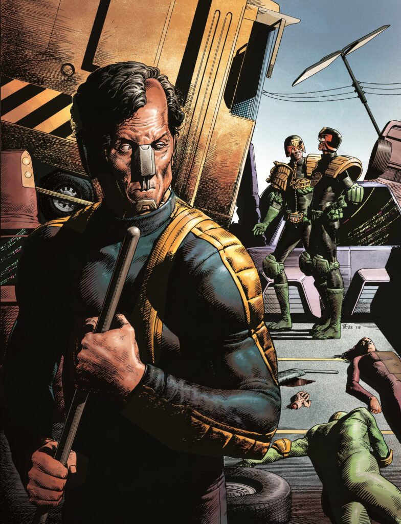
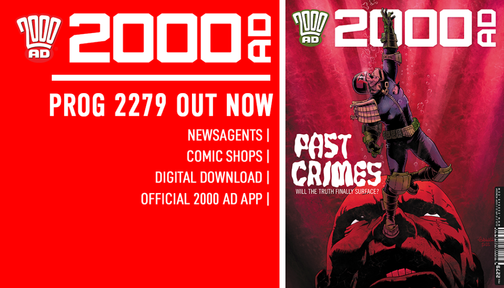
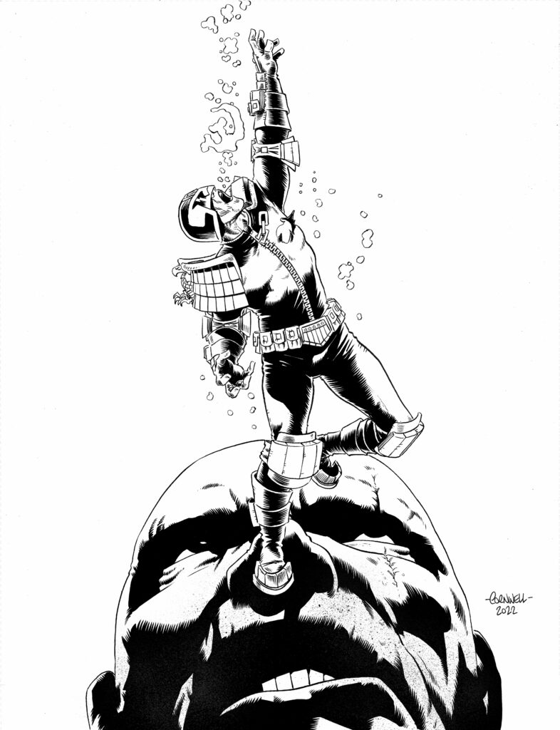
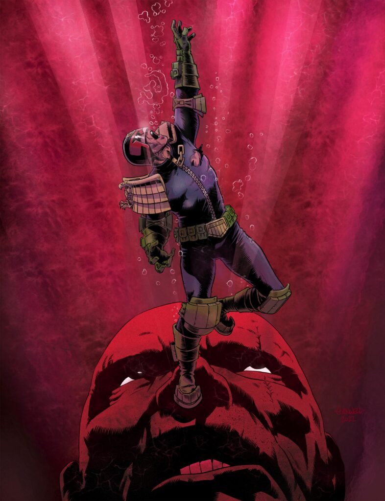
This week sees the Scrotig finale to what’s bound to be one of the major tales of the year – Judge Dredd: The Citadel by John Wagner and Dan Cornwell. After seeing Dredd vs Dredd on 2000 AD Prog 2277, Dan Cornwell returns for the cover of Prog 2279 with Dredd in deep water… but which Dredd is it? Well, Dan’s not telling and neither are we!
First of all, Dan sends his apologies to you all – he’s looked everywhere (and yes, he did check down the back of the sofa and under the fridge) but just can’t find the pencils and the flats for this one… so just fill in the blanks. But I’m sure you’ll agree with us that we love seeing whatever Dan can send to us!
DAN CORNWELL: When Matt approached me about providing the cover for Prog 2277 – Double Dredd, he also said the cover for the final episode of ‘The Citadel’ in Prog 2279 was available if I was interested? Of course I was!
I’m sure the squazz are sick of the sight of me, so give them more?
Nope, not a bit of it Dan, more, more, and more is always welcome!
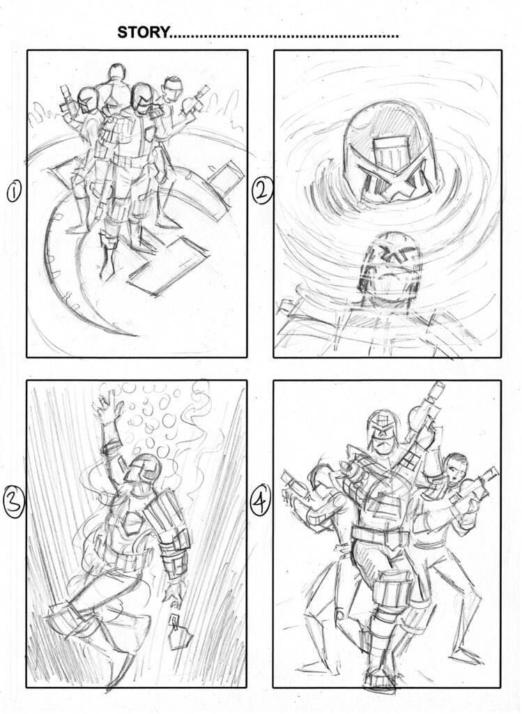
More Dredds than you can shake a daystick at! Dan Cornwell’s prelims for the cover
DC: I had a number of prelims ready from the web exclusive of Citadel and Prog 2277 and sketched a few more for Matt. He liked the simple, clean image of Dredd? sinking into the depths.
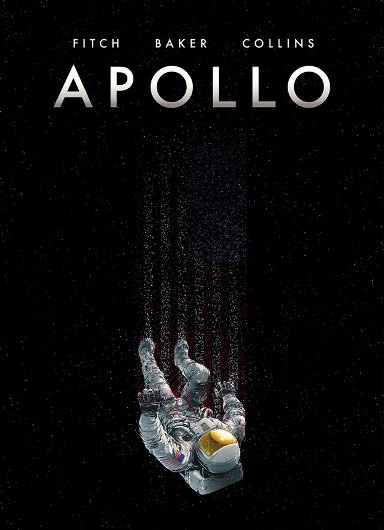
He suggested I could add an image of Winterton in the background,or something along those lines. He said he liked the image as it also reminded him of Mike Collins’s cover to his book ‘Apollo’.
That would be this one… a cracking graphic novel from SelfMadeHero…
DC:I started to pencil the image on my regular A3 bristol board then I started playing with adding Winterton in the background. After a few false starts, I ended up swaying to an image of Winterton looming in the depths.
Once it worked well as an image I then tightened the pencils and inked the image. I chose the red background to symbolise blood. Well that was the idea anyway.
Jaws 5 – Attack of the dome (and yes, this is exactly where Pete would make the gag about Dredd’s nethers being violated!)
Once the inks were finished I scanned the pic in photoshop, added the flats then transferred it to Procreate for finished colours. I added highlights, textures and filters.
The more the image came together the more it was looking like a James Bond cover or even Jaws. Not a bad thing I guess.
Up from the depths… 30 stories high… it’s Winter-Zilla! (but where’s Winter-zookie?)
And thanks so much to Dan for taking the time to send that along – even though he’s drowning in deadlines right now for future Thrill Powered Prog episodes!
You can find Dan’s cover to 2000 AD Prog 2279 out on the shelves and in the 2000 AD web shop from 27 April – and remember, inside you’ll find the Ghafflebette finale to The Citadel by John Wagner and Dan Cornwell – which Dredd is which? And who lives? Who dies? And why? There’s only one way to find out Earthlets… get out there and buy it now!
And remember, the Citadel collection is out on 20 July, complete with a web shop exclusive hardcover with a brand-new Dan Cornwell cover!
Every week, 2000 AD brings you the galaxy’s greatest artwork and 2000 AD Covers Uncovered takes you behind-the-scenes with the headline artists responsible for our top cover art – join bloggers Richard Bruton and Pete Wells as they uncover the greatest covers from 2000 AD!
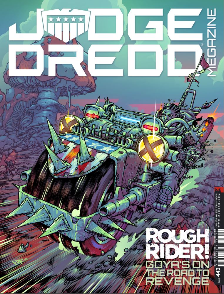
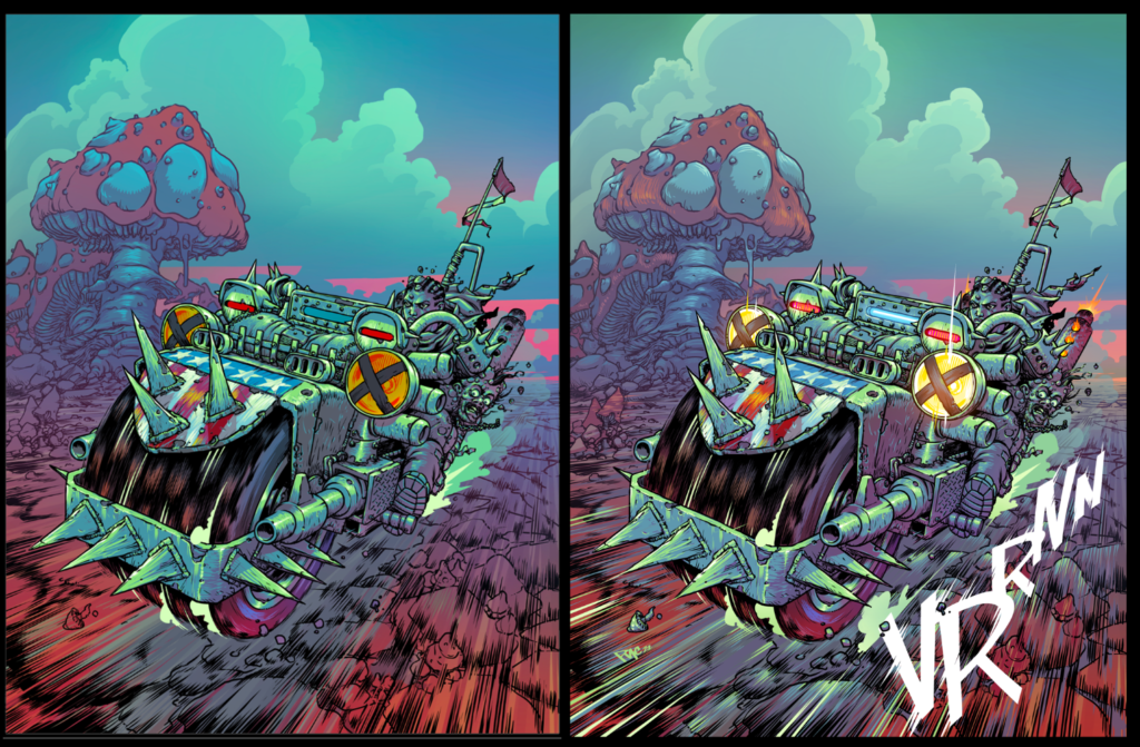
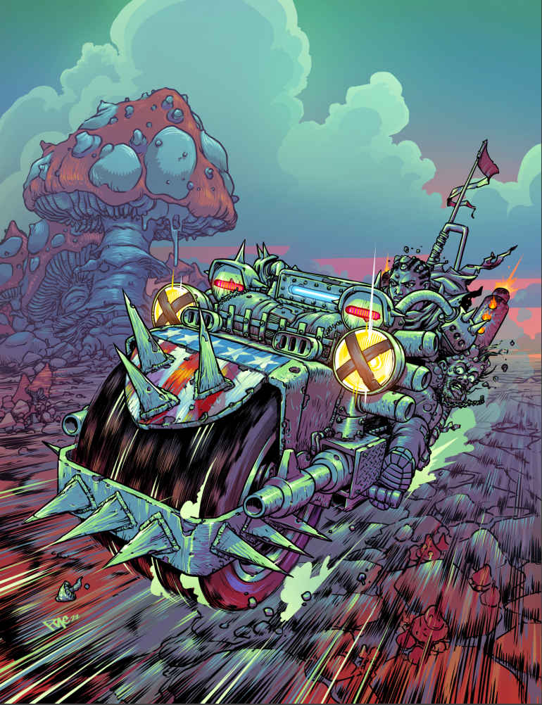
This month’s Judge Dredd Megazine has a fabulous looking Judge Goya cover as Intestinauts artist Pye Parr switches over from the Prog to the Meg to give us his take on Death Cap’s hero as she makes her way across the Cursed Earth in search of revenge, desperate to find those who killed everyone she loved before the fungus in her head takes over and kills her.
(Damn, now that’s a mean machine right there)
So, over to Pye for a breakdown on the cover… first up, the brief from Tharg…
PYE PARR: Everything started after Matt (Tharg) got in touch with a pretty simple brief: “In the story Death Cap that Boo is drawing, the main character gets this modded Mad Max-style Lawmaster. I was thinking of a kinetic shot of her speeding towards us on the bike. She’s been infected with the Grubb’s fungus…”
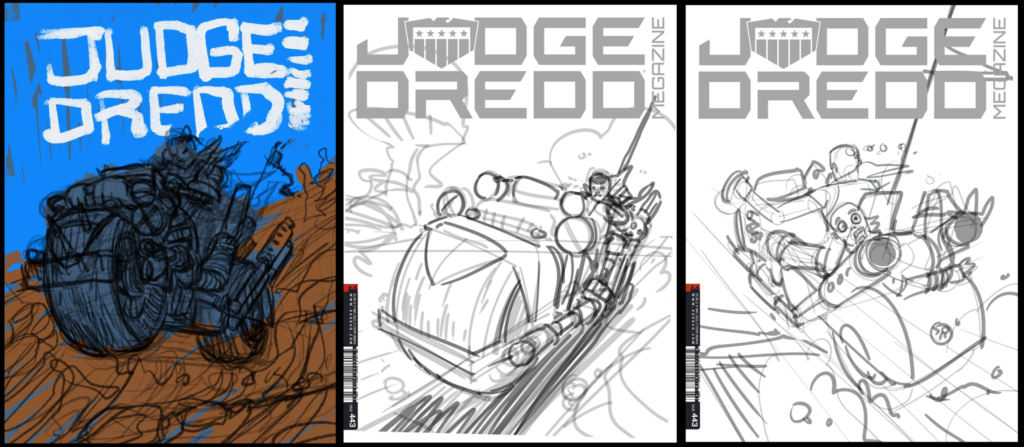
I did the first one on my iPad in front of the tv. It looked crap so I tried again a bit later on. I expanded on the grubs fungus thing and put mushrooms everywhere.
All of that trial and error means three different cover roughs…
(Damn that fungus, Goya’s just got no clue whether she’s coming or going.)
With the rough approved, it’s time to get moving, especially as print deadline day is coming up fast… back to Pye again…
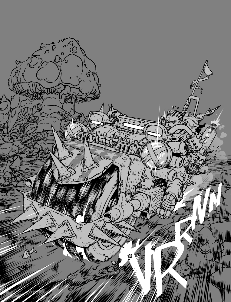
Pencils drawn, scanned then cleaned up, and final linework. I moved Goya’s head out from behind the handlebars so you could see her face better on the final version.
(Taking it from pencils to inks – Goya’s fungal nightmare develops)
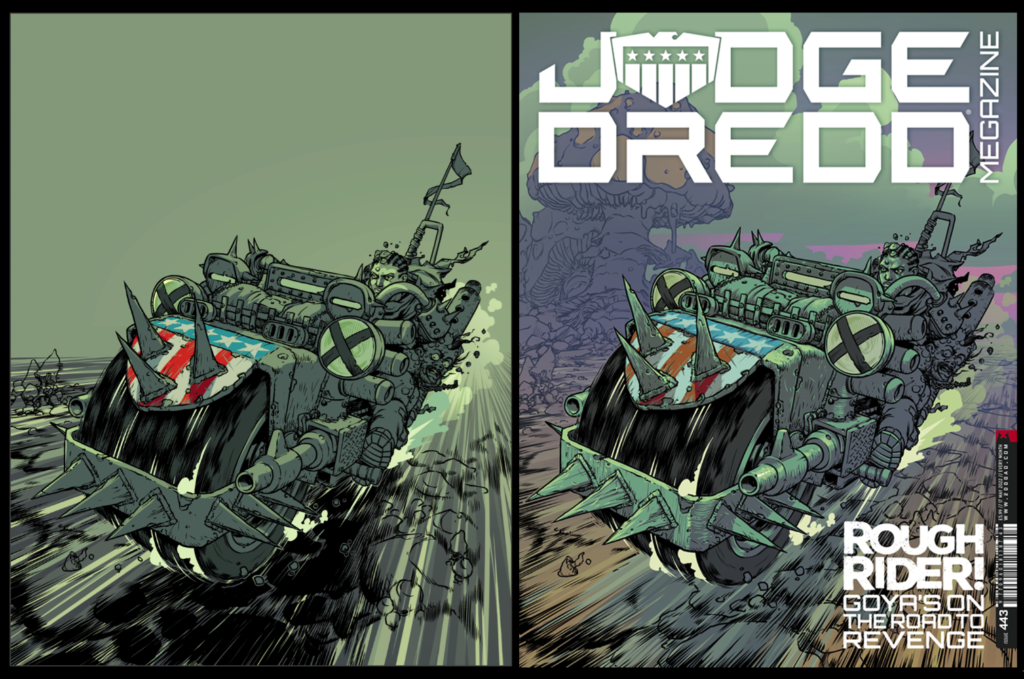
Then it’s time for the colouring progress. I started off pretty muted, but there was a couple of weeks gap between image 2 and 3 here, so when i came back to it I was like “fuck all that dull stuff, this needs some acid green and pink!”
(Acciiiiiidddd! Acccciiiiidddd! – See kids, this is what the special mushrooms can lead to!)
And all that gets us to the final artwork. It *might* have caused The Mighty One some heart palpitations here by messing up my timings and not supplying it till 6pm on print deadline day…
(She’s a rough-ridin’, ‘shroom-sproutin’, mad as hell fungicidal Judge and she’s comin to get ya!)
And that’s it, from basic idea from Matt all the way through to a stunning final cover for what’s turning out to be a stunning series. Of course, for putting Tharg through that last-minute worry, the Parr droid is getting his very sensitive circuits repeatedly driven over by Goya’s mean machine for the next few weeks.
Thanks so much to Pye Parr for sending over all that great artwork and sharing how he does the great things he does!
Death Cap, by TC Eglington and Boo Cook, continues its run in the Megazine issue 443 – all capped off with Pye’s cover and available from 20 April in all great shops and the 2000 AD web shop. And don’t forget that Pye’s art can be found in the Prog right now with the latest installment of the intestinal infiltrators as the Intestinauts meet the Bowel Impactors.
And finally, for more background on Eglington and Cook’s absolutely brilliant Death Cap, check out the interview with the pair of them here.
Every week, 2000 AD brings you the galaxy’s greatest artwork and 2000 AD Covers Uncovered takes you behind-the-scenes with the headline artists responsible for our top cover art – join bloggers Richard Bruton and Pete Wells as they uncover the greatest covers from 2000 AD!
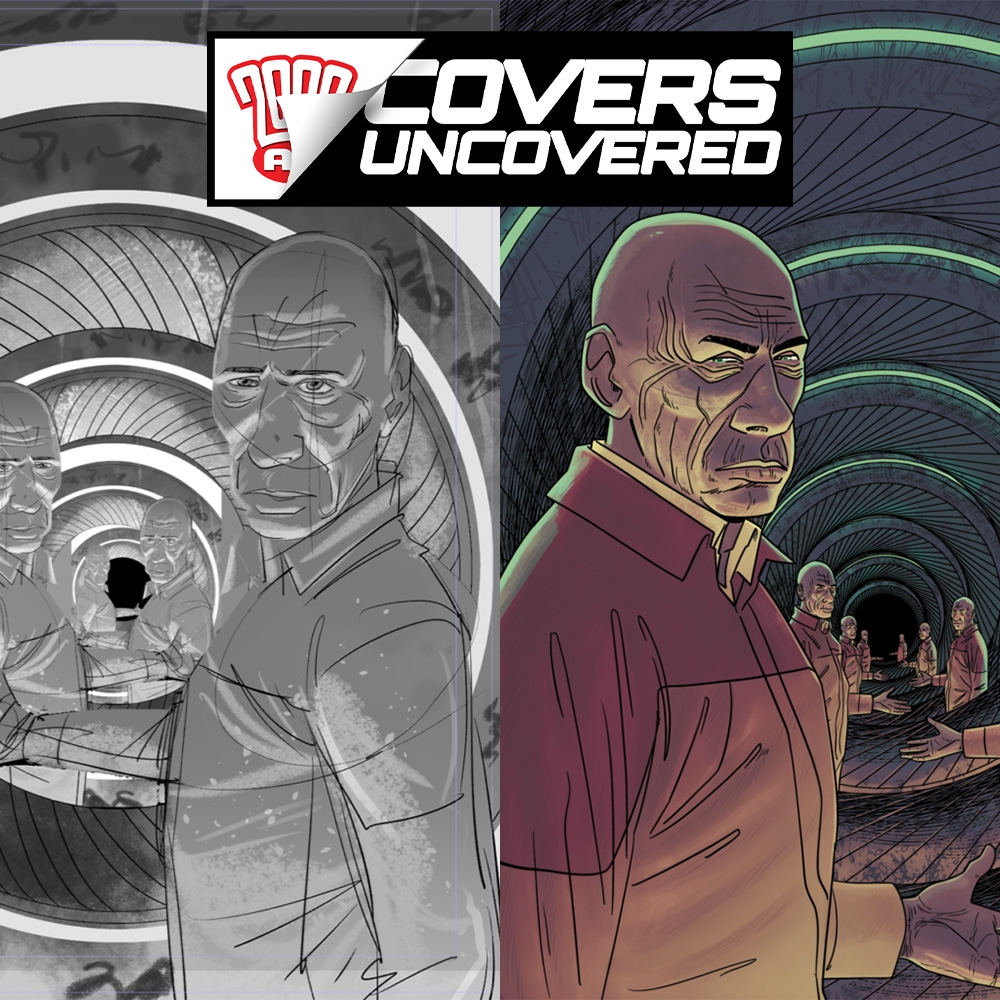
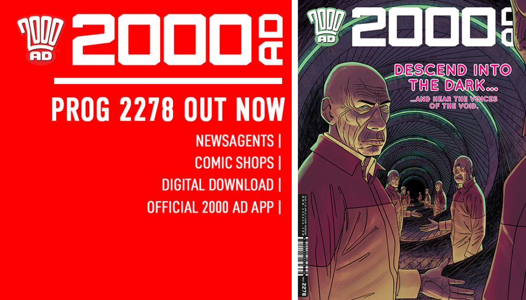
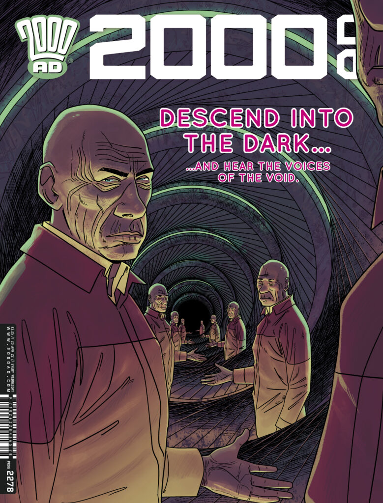
This week, the brilliant INJ Culbard takes the reins for the cover to 2000 AD Prog 2278, out on 21 April from everywhere and anywhere that delivers Thrill Power. It’s a mind-bending cover from Brink: Mercury Retrograde as poor old investigative journo Mas heads down, down, down into the underworks in the company of retired Union boss Eugene Bardot. And it’s suitably twisted and strange…
So, without further ado, the unsettling beauty of INJ Culbard’s Brink cover…
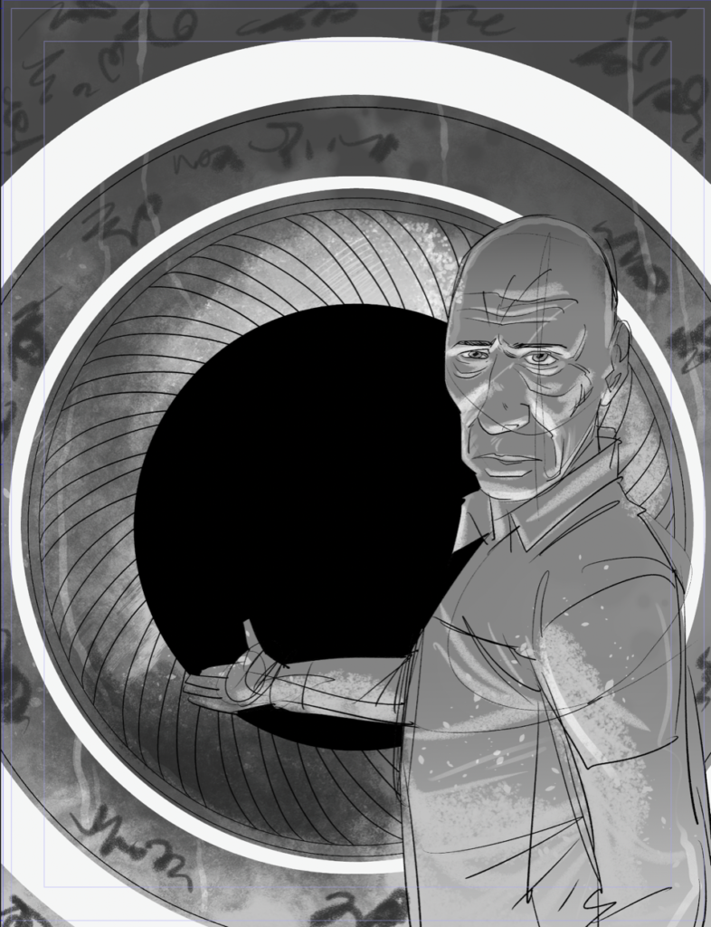
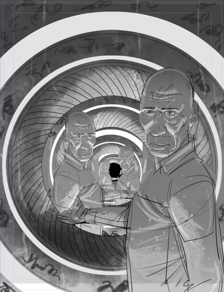
INJ CULBARD: For the brief of Prog 2278, it was Bardot inviting Maslow into the vents. Again, I stuck with the concentric eye theme. Now, the layout for this seemed pretty straightforward forward…
When a sinister looking man invites you in…not a bloody chance! INJ Culbard’s first layout for the Prog
But… well, something about it wasn’t weird enough, and I like weird. So… I did a quick copy and paste of Bardot to show him repeating off into the darkness. This got approval…
Oh yes, more of them… much creepier. Run. Run now!
And then I went on to color, and this took me a while. Compositionally something interesting happened, the irises seem to almost spiral as they go off into the darkness.
Thanks to Ian for taking the time (and the punishment) to get this to us. But it’s well worth it to see his process in play, as his work on Brink, along with Dan Abnett, is always a highlight of any Prog it’s in!
2000 AD Prog 2278 is out on shelves and digital on 21 April – get it from the 2000 AD web shop, comic shops, and wherever you find your Thrill Power!
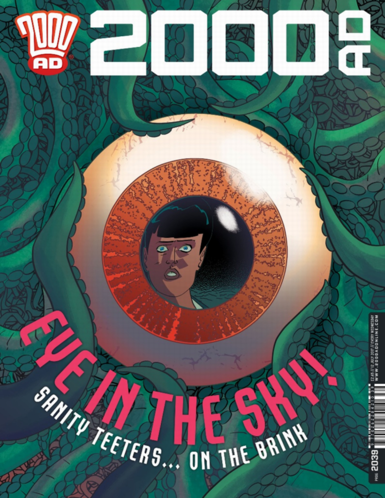
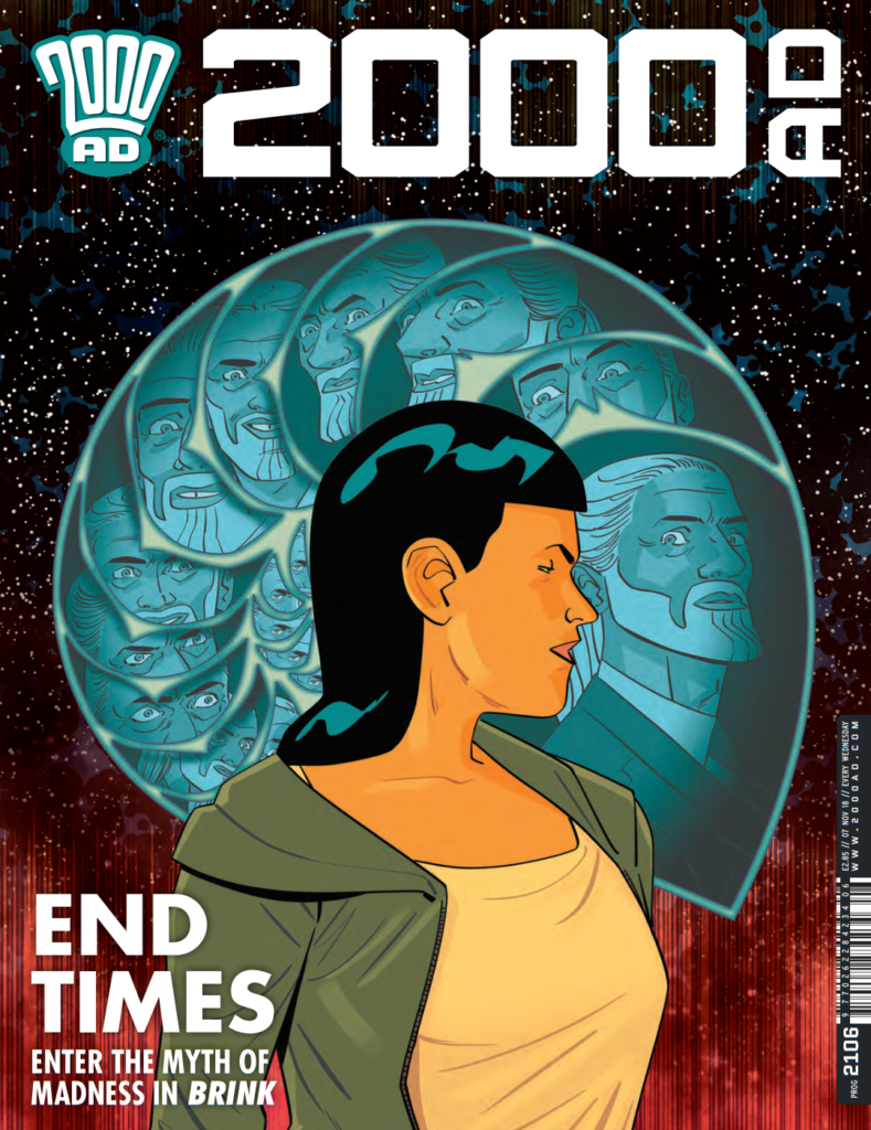
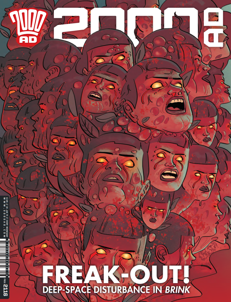
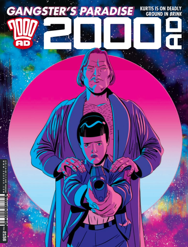
And to end, a look back over the Brink covers of the past… all of them featuring that idea of Culbard playing on circular imagery to create some of the best, most effective, and just plain disturbing images of the past several years…
Every week, 2000 AD brings you the galaxy’s greatest artwork and 2000 AD Covers Uncovered takes you behind-the-scenes with the headline artists responsible for our top cover art – join bloggers Richard Bruton and Pete Wells as they uncover the greatest covers from 2000 AD!
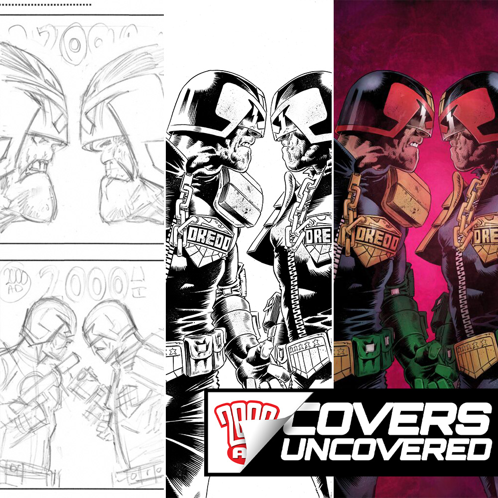
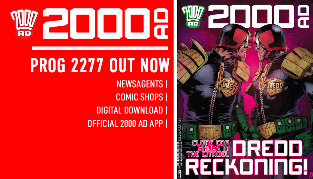
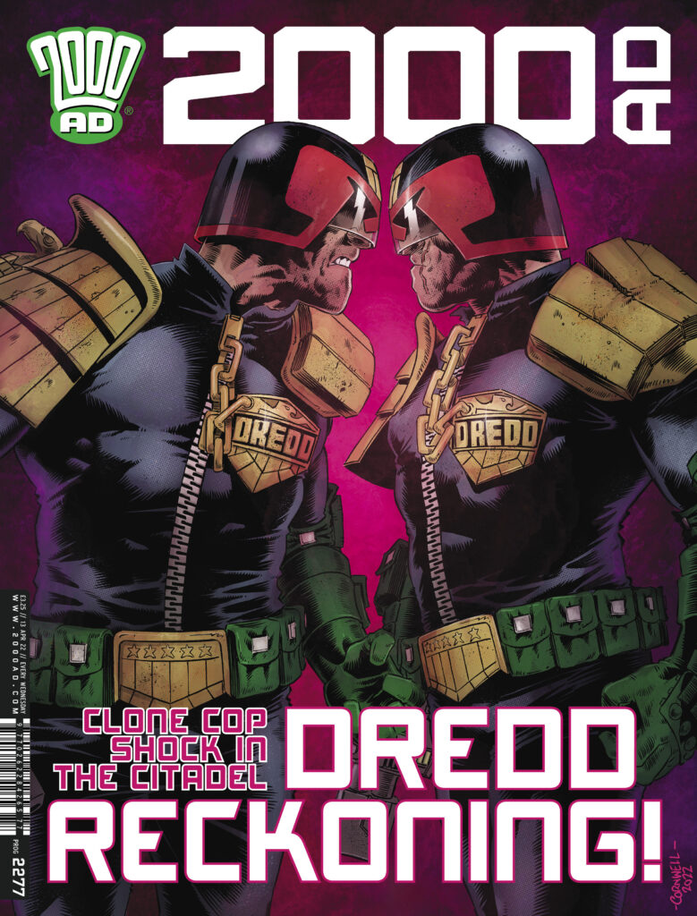
Borag Thungg Earthlets and welcome to another great installment of 2000 AD Covers Uncovered, where Tharg’s finest minons art droids give you the inside track on making the glorious covers to the Galaxy’s Greatest. This week, it’s Judge Dredd art droid Dan Cornwell with the double Dredd delights of 2000 AD Prog 2277, out on 13 April!
Since his very first Judge Dredd, Dan’s artwork has been blowing is all away and his work on this latest, absolutely shocking Judge Dredd: The Citadel is no exception. It’s John Wagner writing a storyline that’s promised to change everything and it’s in Prog 2277 that you find out the reason why!
Now, over to Dan to tell us all about putting together this stunning meeting of Dredd and Dredd in The Citadel!
DAN CORNWELL: When Matt asked if I’d be interested in providing a cover for Prog 2277 I was more than happy to do so. I had some ideas running through my head and was ready to sketch them out when Matt suggested that it should probably be
Dredd vs Dredd face-off. It clearly made sense, it’s THE moment from that issue, and possibly the series. And hell, who doesn’t like a face-off cover, especially TWO DREDDS!
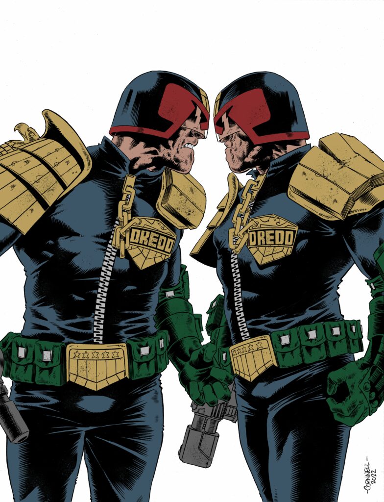
Way too many CHINS! Dan Cornwell’s roughs for the cover that got sent to Tharg
I penciled some rough ideas. The problem with a cover like this is you’re really quite restricted. It’s two people facing each other.
I played with the angle of the shot and it became apparent the angle of this piece wasn’t going to be too extreme, it just wouldn’t work. Having both Dredd badges showing was a must.
I sent Matt the cover prelims for him to choose. Once he chose the best option I then penciled the page using a 2h lead on A3 Bristol (again, I never scanned the pencils. I keep forgetting that step, too eager to get inking!)
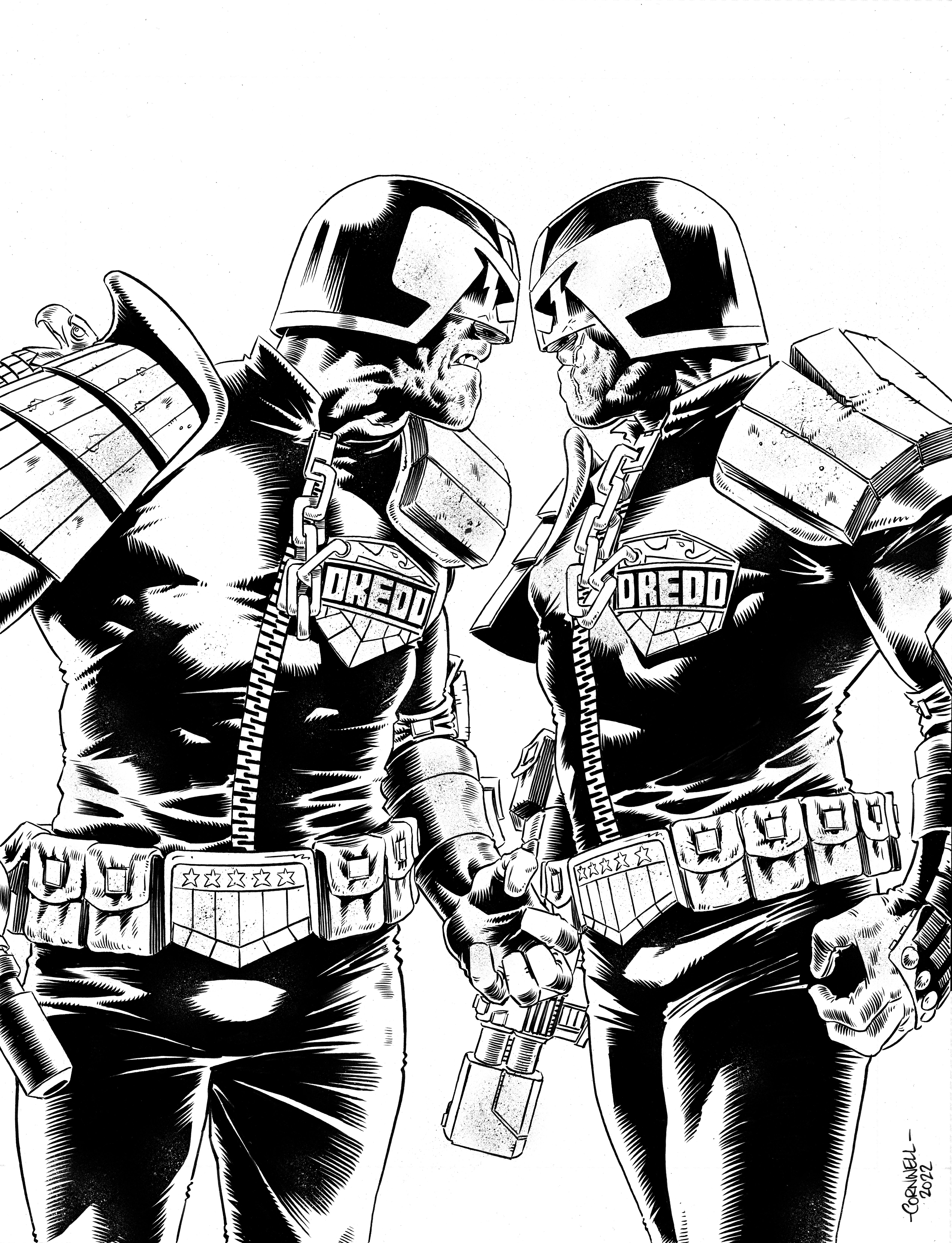
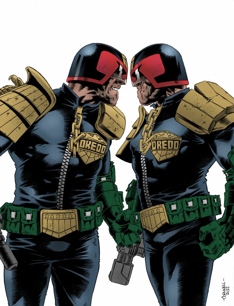
Next I inked the image and decided to have no background as that can be done as I progress. I scanned the image, adjustested the levels and cleaned it up where necessary in Photoshop.
Dan’s final inked version – print it out for a great of spot the difference!
Next I added the flat colours and at this point I thought I’d try colouring it in Procreate on the ipad. I don’t use this application much but I thought why not. It’s a much more user-friendly tool and there’s no harm in trying right?
Flat colours stage – chinny reckon you say?
Hey, another spot the difference – compare & contrast the flat colour stage with this flats plus tones stage!
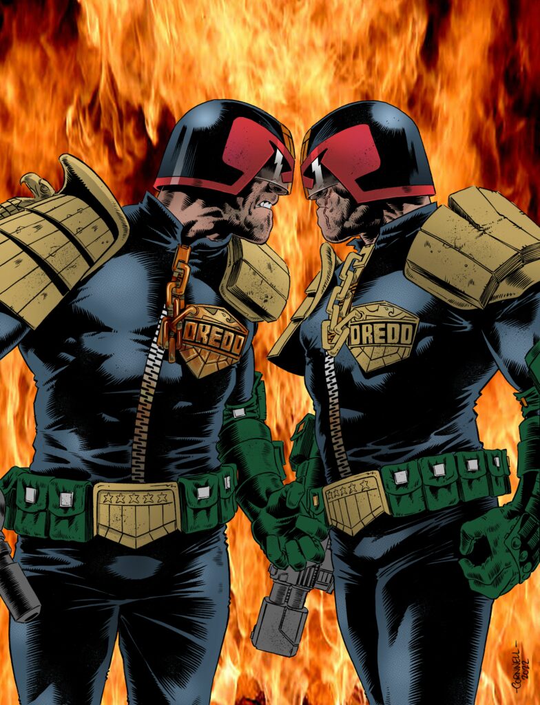
The background became a bit of an issue at this point. In my mind I thought I would do a background of fire. I found an image of fire and popped into the background to see how it would look (This was just a reference picture, it wasn’t going to be the image I would have used, I would have painted that myself.)
Lads, lads, stop with the chin-off – the bloody world’s on fire!
But as I progressed it became apparent that it was taking the focus away from the main point of the cover. It’s Dredd vs Dredd, that should be the focus.
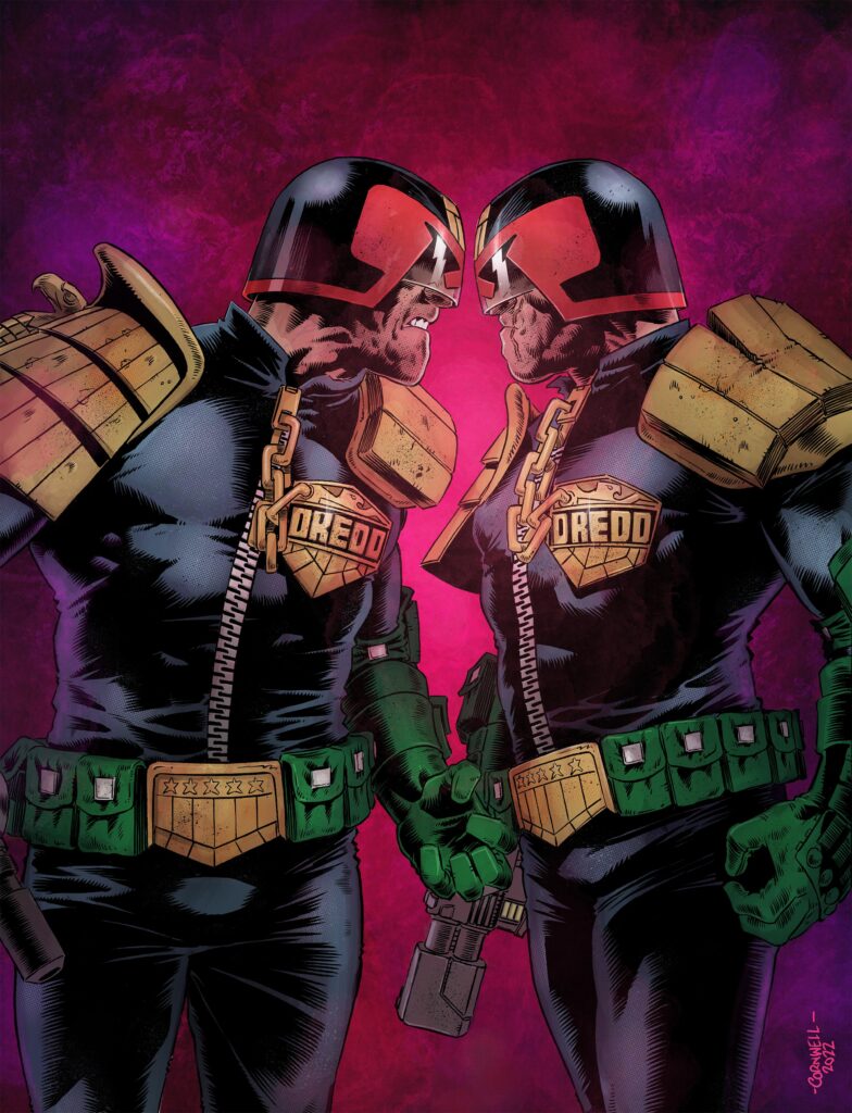
A cleaner, less busy background was needed with a few textures here and there and the main area of brightness emanating from the centre point, right in between the two Dredds forcing your focus right there. There’s not much between the two of them and it may take the eagle-eyed fan to notice which Dredd is which. But it’s there if you read the episode.
And here it is, the final version of the cover – Two Dredds facing off in the Citadel… and you’re gonna be talking about the story inside for the longest time!
I finished the cover with a few textures and sent it to Matt to see if it was worthy. Thankfully it was. Phew.
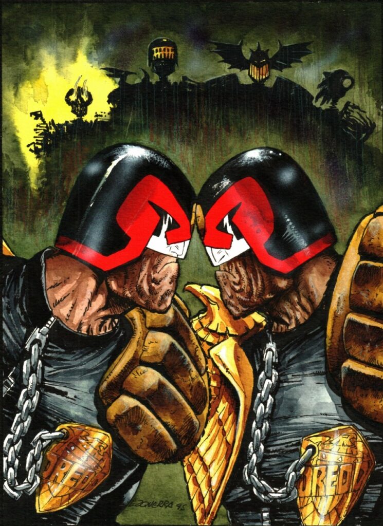
There’ve been a few iconic ‘Dredd vs Dredd’ images over the years – Carlos’s exquisite image of Dredd vs Kraken from Necropolis for example, so I knew whatever I drew I would create a stir. Good or bad? That’s the choice of the reader.
Well, we reckon Dan’s played an absolute blinder and given us one of the covers that will be up for cover of the year in a lot of readers’ minds – which is only right, seeing as The Citadel will be the most talked-about Dredd of the year!
Thanks so much to Dan for sending that fabulous art along – you can see it on the cover of 2000 AD Prog 2277, out wherever the Galaxy’s Greatest is sold, including the 2000 AD web shop, on 13 April. You NEED to see just what’s going on in The Citadel – why are there two different Dredds? What’s the story? And trust us on this, what happens next is going to blow your socks off!
And just to end… that Carlos Ezquerra double Dredd that Dan mentions… damn, what an image…