Every week, 2000 AD brings you the galaxy’s greatest artwork and 2000 AD Covers Uncovered takes you behind-the-scenes with the headline artists responsible for our top cover art – join bloggers Richard Bruton and Pete Wells as they uncover the greatest covers from 2000 AD!
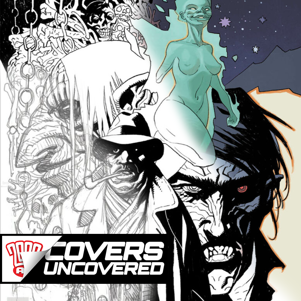
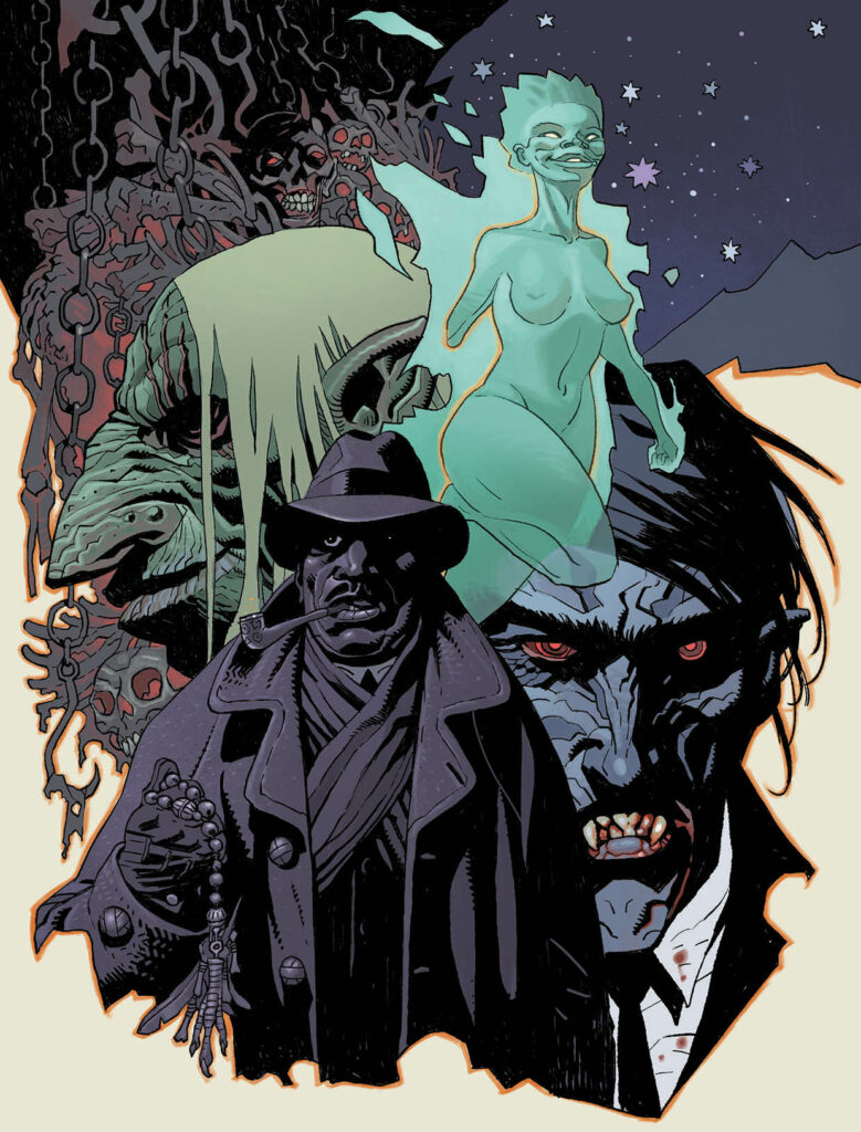
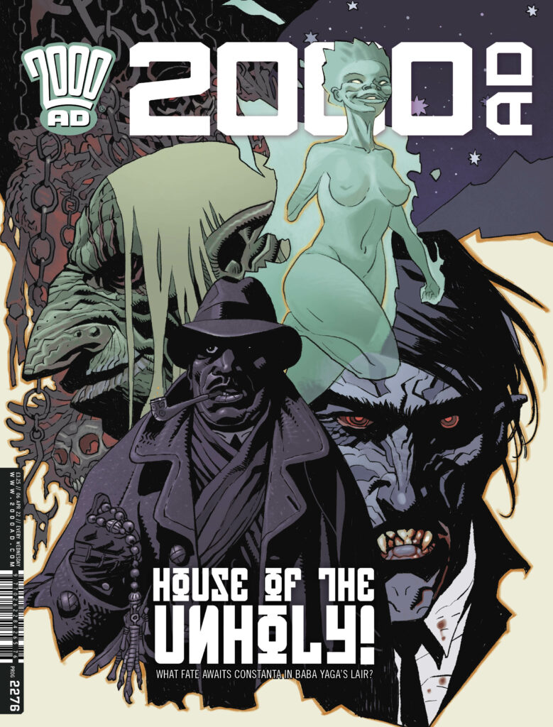
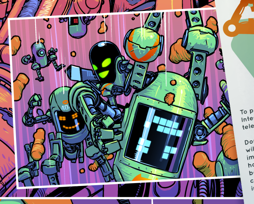
Borag Thungg Earthlets and welcome to the splendour that is the latest cover work on 2000 AD Prog 2276 from the over-worked circuits of the art droid behind Fiends of the Eastern Front: 1963, Tiernen Trevallion!
Right now, Tiernen’s right in the middle of drawing the finale to this latest Fiends of the Eastern Front thriller, 1963, set deep in the heart of cold war Berlin, where the vampire Constanta has already found himself in big, big trouble at the hands (and the sword) of Baba Yaga.
Both Tiernen and writer Ian Edginton have really outdone themselves in their continuing exploration of the blood-red history of the vampire Constanta across the ages, and Fiends of the Eastern Front: 1963 is just the latest series to follow in the blood-drenched footsteps of the character created back in 1980 for 2000 AD Progs 152-161 by Gerry Finley-Day and the legendary Carlos Ezquerra.
However, Tiernen has to send his apologies to all you readers again – after being so overwhelmed with deadlines that he couldn’t get things together for his cold war collection of beauty that was the cover to 2000 AD Prog 2273, he sends even more apologies this time round as he’s currently being whipped into shape by Tharg’s specialist art-droid encouragement squad of trained professional torturers mentors to get the final pages of Fiends: 1963 done and dusted. But he did manage to send across a few pieces of art for your delectation and delight, along with these short explanation…
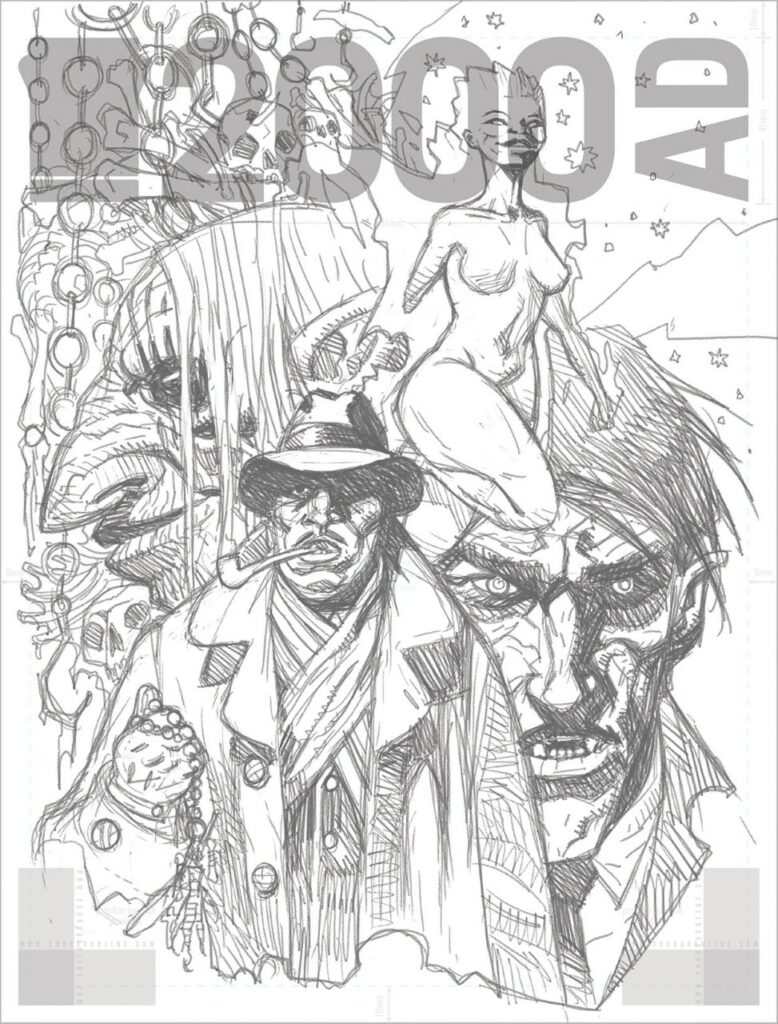
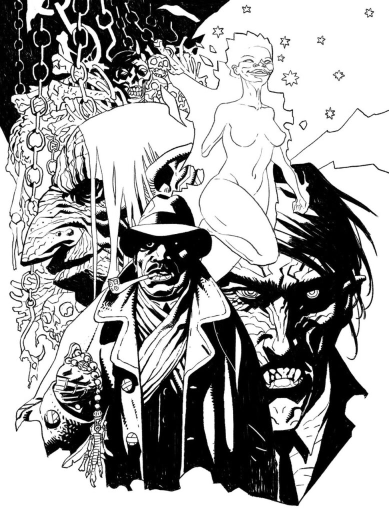
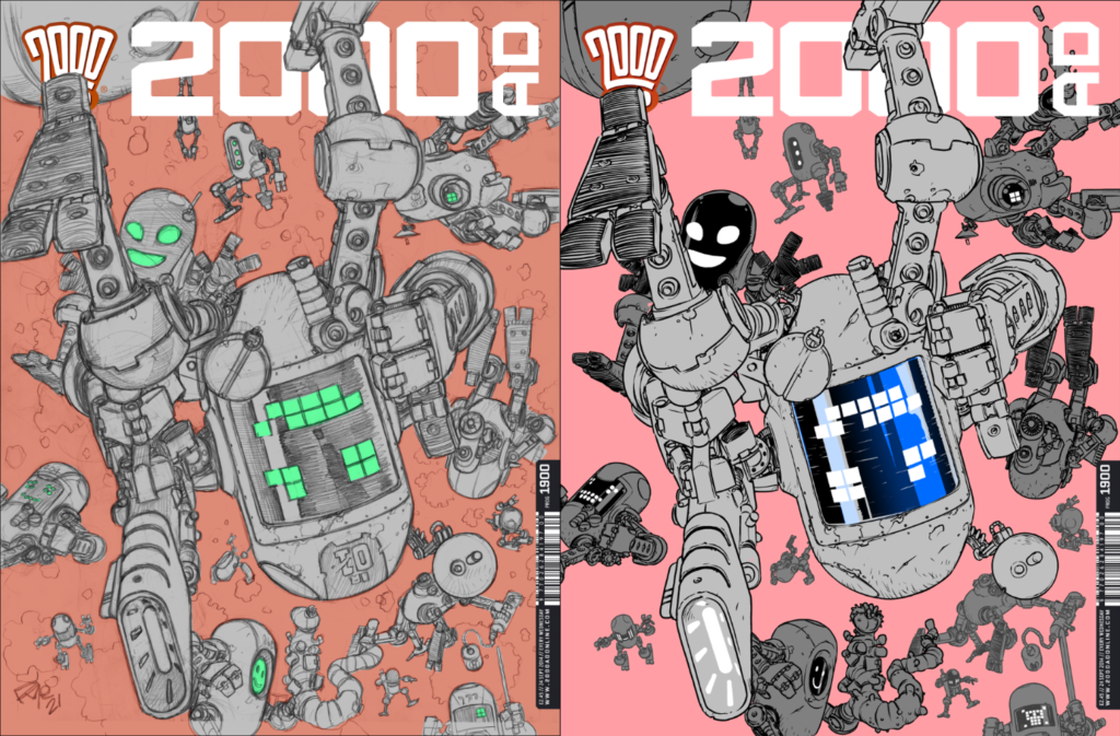
‘I’m afraid I really don’t keep much in the way of WIP’s… but here’s pencils, inks and colour. Put simply, each of the elements are inked on separate layers, then the background and each foreground elements are blocked in separately in colour… I usually very roughly drop in patches of colour to test, then work it up from there, adding shade and light as I go.’
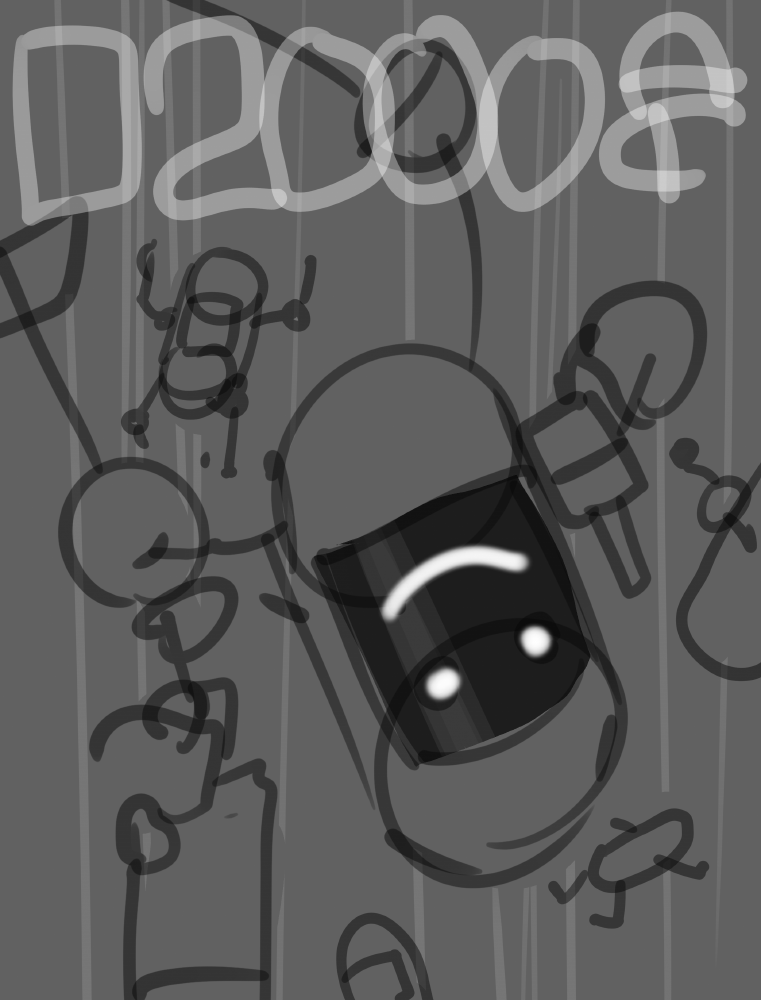
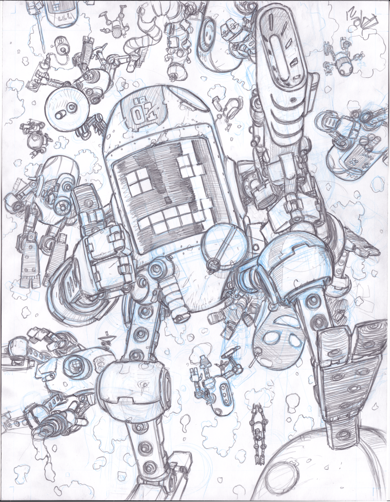
All of which means this… Tiernen goes from pencils…
… to inks…
… to adding colours…
And once that’s all done, you have a damn fine cover showing us all that Constanta’s up against this time round in the snow of Berlin for Fiends of the Eastern Front: 1963.
And with that, the whip cracks again and Tiernen’s back to work!
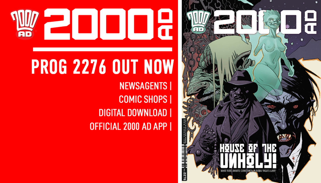
Thanks to Tiernen Trevallion for sending that work through – you can see the finished cover on the front of 2000 AD Prog 2276, out on 6 April and available everywhere the Galaxy’s Greatest is sold, including the 2000 AD web shop.
Every week, 2000 AD brings you the galaxy’s greatest artwork and 2000 AD Covers Uncovered takes you behind-the-scenes with the headline artists responsible for our top cover art – join bloggers Richard Bruton and Pete Wells as they uncover the greatest covers from 2000 AD!
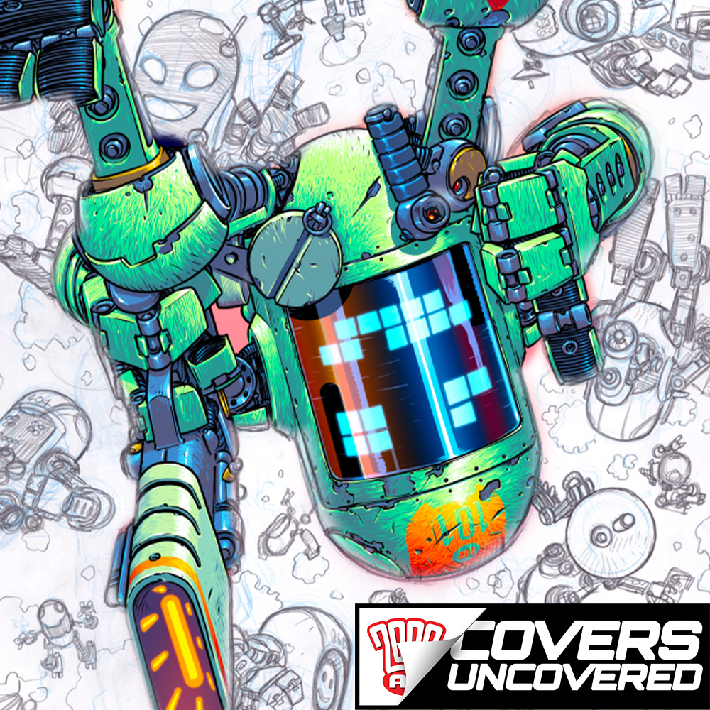
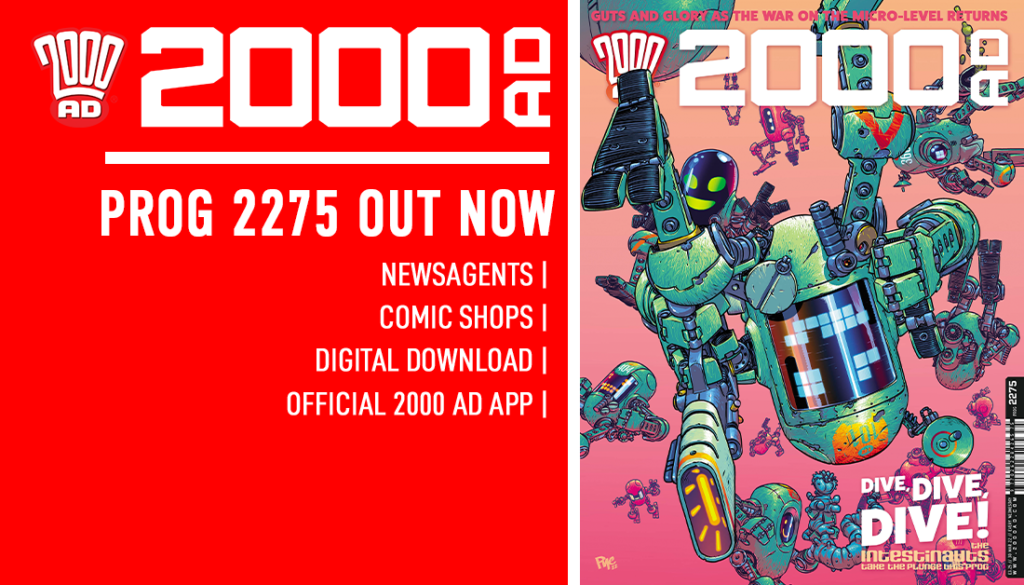
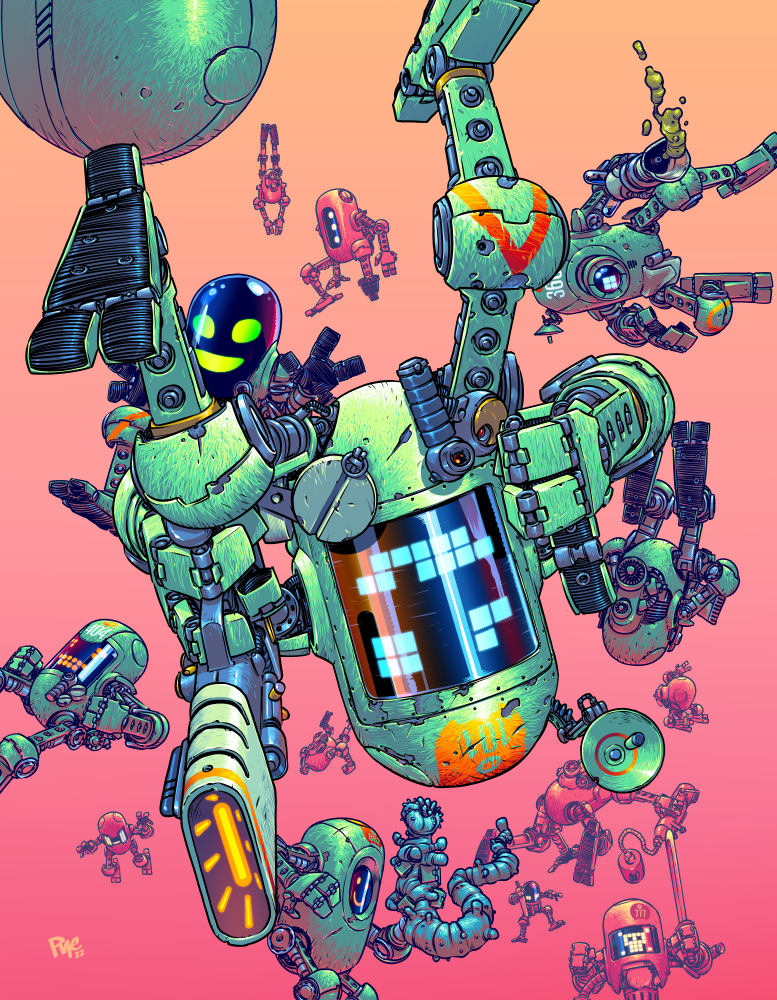
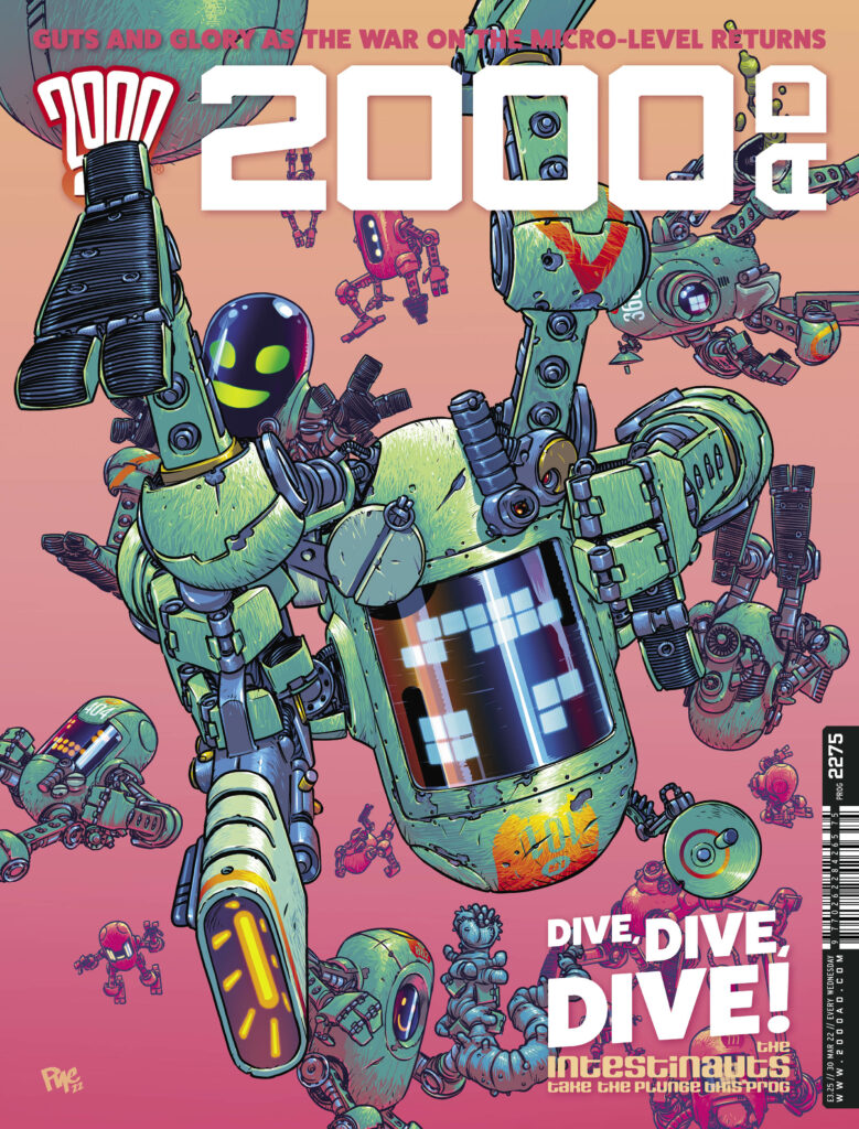
Bowels bothering you? Feeling a little dicky down in the tummy? Well, you’re in luck, because 2000 AD Prog 2275 sees the return of The Intestinauts in The Bowel Impactors by the abdominally afflicted Arthur Wyatt and the positively pustulant Pye Parr.
So, hold onto your lunch, here’s Pye Parr to talk you through the cover to Prog 2275…
PYE PARR: I thought that panel (1a) from page 1 of the story might make a cool cover, and I liked the jarring effect of having something massive and upside down on the cover, so I expanded on it and sent Tharg the thumbnail. I was also keen to do something more simple than normal – less cluttered with background crap and focused on the character silhouettes.
Taking this from episode 1…
… and turning it into this as a proto-cover Or… Smile! – At least you’re not dropping into doo-doo… oh, wait, that’s the whole point of the strip, isn’t it?
I almost always start in pencil, even if I finish digitally. The drawings end up tighter, which helps me with the details, even if they’re not quite as perfectly put together (wonky circles and wobbly straight lines) as they’d be if I did them on the computer.
I also tend to waft over details with a fat brush when sketching digitally, which is lovely and suggestive but doesn’t help when I come to do the proper linework, as there’s not enough information to work with! Plus an actual drawing you can look at and hold is just a satisfying thing to have.
Wonky circles and wobbly straight lines – Pencils all done
Placement test and final linework time now. I scanned the pencils and added some pink in the background to put Tharg’s mind at ease – his one bit of feedback after seeing the art was something like ‘please don’t cover the Prog in hideous brown diarrhea’. Lurid meaty pink it is!
After scanning I dropped the art into a cover template to check the fit and allowed enough room for the other design stuff.
The final linework was done in Clip Studio Paint. When doing covers I always add more bleed than normal to give me some wiggle room when designing the text (plus I have a habit of not giving stuff enough room to breathe, and it means I can zoom out later on when I notice!)
Decisions decisions – the hideous brown diarrhea or the lurid meaty pink?
Next it’s on to colours, again in clip studio paint. I made an Illustrator file with all the Intestinaut name badges/decals etc in, so they’re pasted from that at the end.
The final cover, colours and all – it’s almost tasteful!
And finally… final design time. Apart from adding in the cover lines, the main change I made from the mockup was to lose the second leg over the 2000ad logo – I liked the extra line of text at the top and it made that unreadable. i also zoomed out a tiny bit and moved the art up in the frame to minimise as many awkward interactions between the text and the objects as possible. All done!
Now to get on with finishing the colours on the last two parts before the inevitable Rigelian Hotshot arrives…
Rather than letting Pye face the wrath of Tharg (and that’s some nasty wrath he’s got), we figured it was time to let him get back to the drawing board, pop some more ant-acids to combat the nausea and get right on with filling the pages with the incredible intestinal warriors!
Thank you to Pye for taking the time to chat and you can find Pye Parr’s particularly putrid cover as well as the first episode of The Intestinauts: The Bowel Impactors on the shelves and in the 2000 ADweb shop with 2000 AD Prog 2275 from 30 March!
Every week, 2000 AD brings you the galaxy’s greatest artwork and 2000 AD Covers Uncovered takes you behind-the-scenes with the headline artists responsible for our top cover art – join bloggers Richard Bruton and Pete Wells as they uncover the greatest covers from 2000 AD!
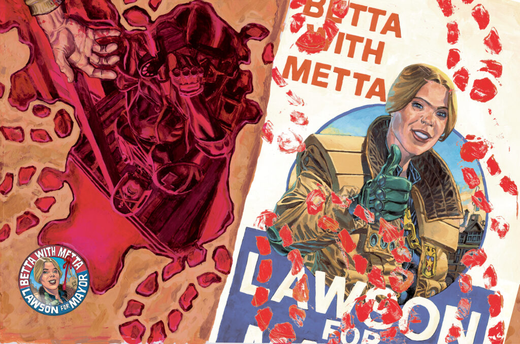
Wow! Check out that blood-soaked masterpiece of a cover for Judge Dredd Megazine 442 – out on the stands and from the 2000 AD web shop right now!
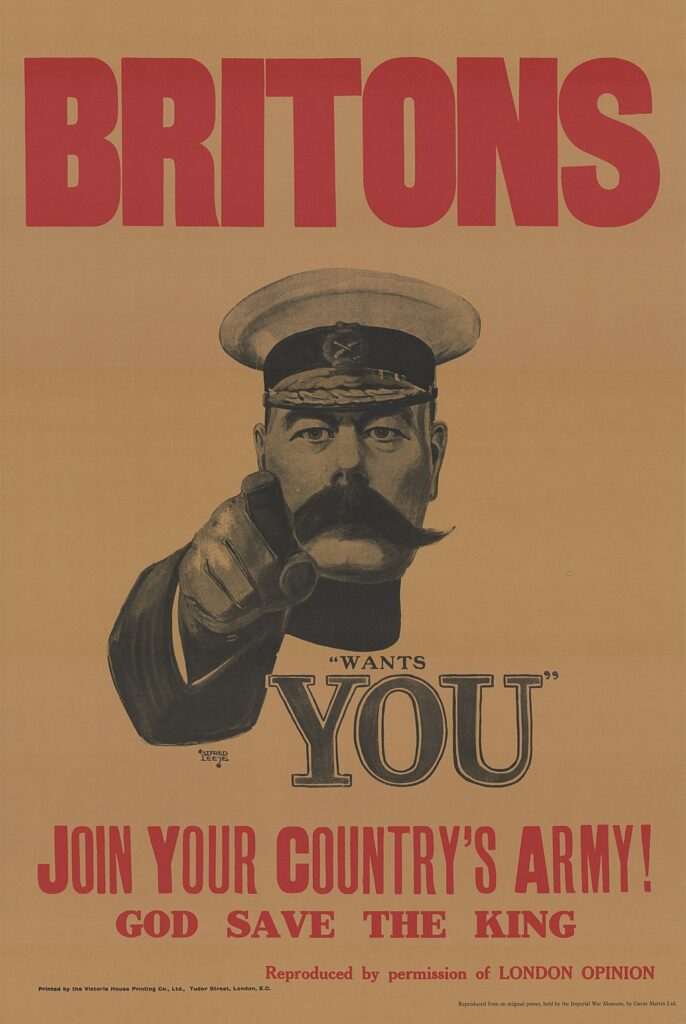
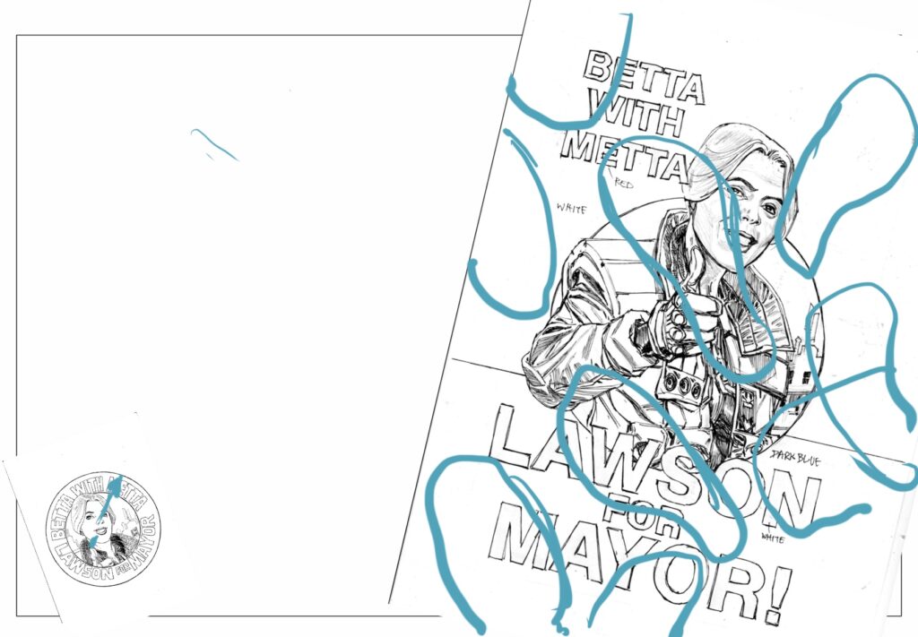
As we speed headlong into Badrock’s forthcoming election in Lawless: Ballots Over Badrock, artist Phil Winslade ramps up the tension with this deceptively optimistic, then devastatingly gory wraparound cover, just what does Phil and Dan have in store for us in Badrock’s first election?
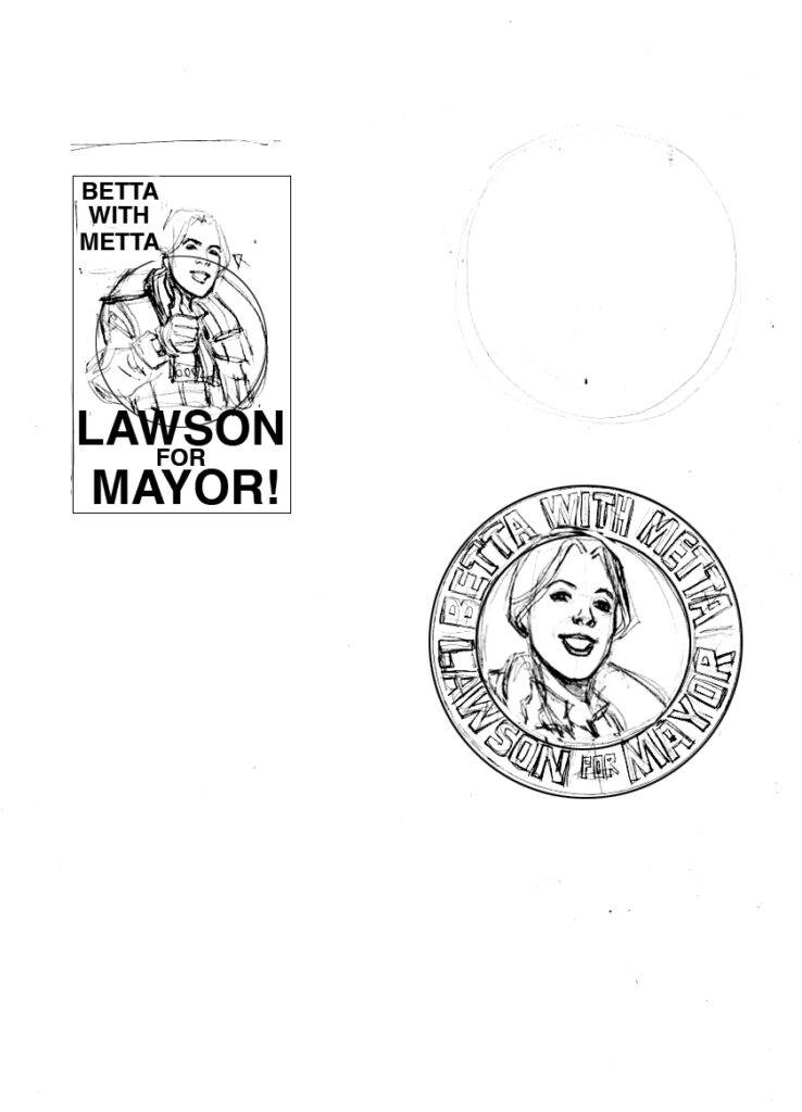
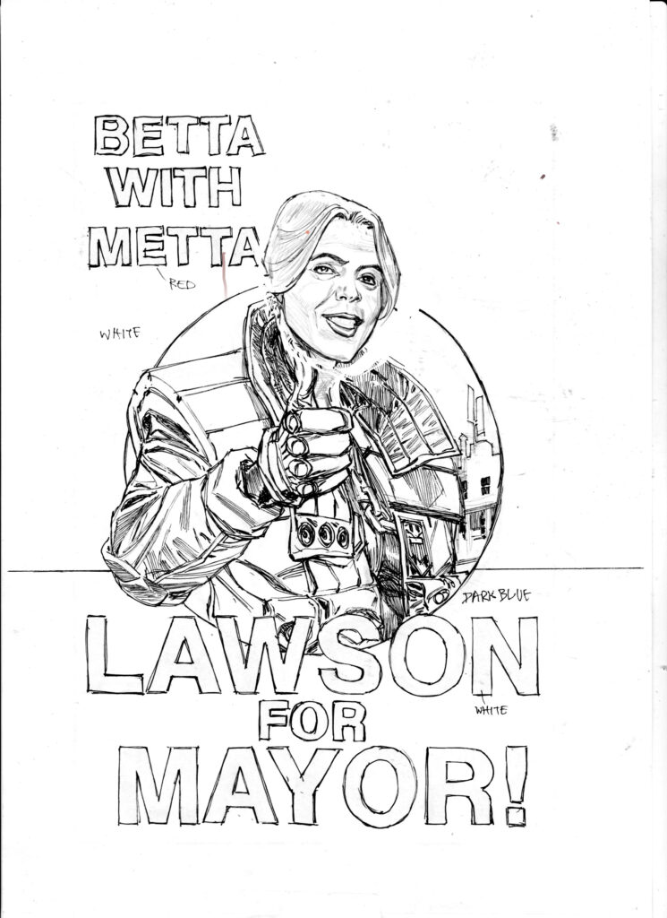
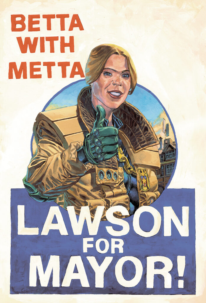
“So I wanted to do a cover with the election poster from the strip being the main focus.” Says artist Phil Winslade, “And I wanted to paint that poster, as I haven’t ever done a version of the Kitchener’s ‘Your Country Needs You!’”
Pull my finger!
Of course, Phil is the master of the wraparound, with seven of his nine Lawless covers offering us dangerously unsafe levels of extra thrillpower, which is highly irresponsible if you ask me!
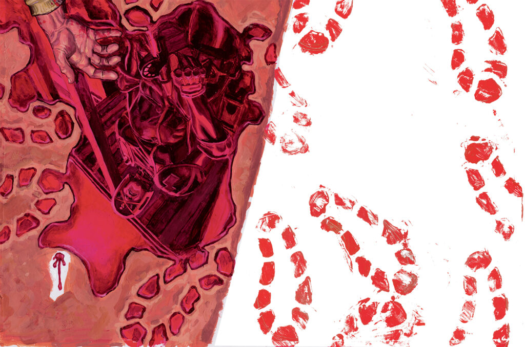
Phil gives us an insight into his process and motivation for his double-page masterpieces, he said “I have been doing wraparounds since the third cover and enjoy how they look and the extra dimension they give. The back cover needs to be less important than the right-hand side, but gives you an extra dimension to the cover when seen as a whole. An extra bit of storytelling context to the main image, if you will. I wanted the poster in the image to look distressed by blood in some way to give it more tension and drama.”
Well, he’s certainly done that! My feeling of dread for the forthcoming election episodes is palpable!
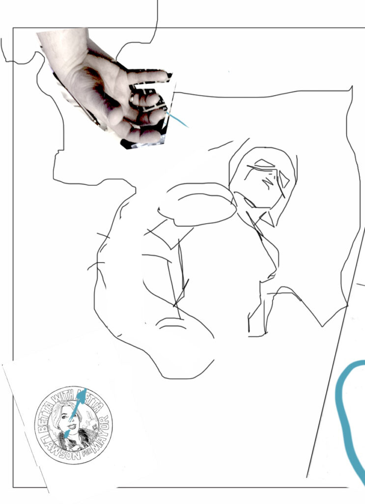
Phil continues “I also wanted to introduce an idea of the chaos of the Badrock elections. This idea had been in my head for a while; either a wall of posters with blood spatters as in the first part of ‘Ballots…’ or a floor shot of the aftermath of some violent event. I chose the latter version because I could add a hand or foot in of a victim, which brings the idea across much better than spattering a load of overlapping posters. This version also gave me the nod to the iconic Dave Gibbons watchmen badge image. Tharg approved my thumbnail image and off I went!”
And one of these days these boots are gonna walk all over you!
“I wanted the poster distressed by footprints to give that feeling of ‘yesterday’s news is today’s chip paper.’ The original drawings of both poster and badge were drawn as pencils for the first part of “Ballots…”
La Placa Rifa
You’ll never put a betta bit of Metta in your life!
Giving us a real glimpse into how this incredibly intricate artist works, Phil continues “This meant that they could be pasted into my pencils numerous times and at different angles, but would give me a consistency for inking on a lightbox. I pencil either on paper or on an iPad, print them out to size and then use a lightbox to see the prints through the board when I ink. This means my inked pages don’t have pencil lines to rub out or blue lines to get rid of during digital editing – blue lines give me a false sense of line weight and ink can be undermined by rubbing out on it.” Truly fascinating.
He continues “The whole cover became a collage assembled on the computer from separate paintings because I wanted to have a clean version of the poster so it could be used as a pin-up or print to go with the sense of the campaign, along with the badges. A kind of created artifact for the readers – a bit of fun. :)”
A BIG tease from Phil next, as he alludes to future events which really don’t sound good at all… “As I was laying it down on the board, I struck on the idea of having SJS Judge McClure reflected in the blood pool, as much to give it a sense of liquidity. It started as a shadow, but I felt that would be a bit difficult to read and thought a silhouette of an SJS judge looming would be significant, especially in light of the events to follow in the story to come.” Ooooooh, scary!
“At some point I thought it would be cooler upside down, to create a kind of compositional vertical symmetry, but more because I thought it looked cool! This image is my first note drawn with touch pad of my laptop in Photoshop. I worked it up on the board…”
Van Gogh cut off his ear, Phil went one step further…
The first element to be completed on the cover was that sumptuous Kitchener-esque poster. Phil said “I did the poster first and slid that under the back cover layer later.”
Make Badrock Great Again!
Next he used erm… extremely technical methods to create the footprints. He explains “The footsteps were created in a ‘Changing Rooms’ fashion by cutting out a stencil from a plastic folder and stippling and smearing the paint into the holes. Originally I wanted to use some shoes but they would have been way too big!”
Move over Llewelyn-Bowen, there’s a new designer in town!
Almost finished, just one more element to add “I pasted the badge on last.”
Of course, we all knew Metta when she was Facebook.
“I hope it’s a good representation of the current storyline and where it’s going. This is an important and game changing period for Metta and co and for Dan and me.
Oh, and if someone wants to make badges and posters, I expect to get one!”
Metta Critics!
Thank you so much to Phil for sending the images and brilliant text. With his excellent panel layouts and mindboggling level of detail on every page, it is amazing that he found time to share his process with us! What lucky squaxx we are!
Judge Dredd Megazine Issue 442 is out right now from anywhere Thrillpower is sold, including the 2000 ADweb shop!
Every week, 2000 AD brings you the galaxy’s greatest artwork and 2000 AD Covers Uncovered takes you behind-the-scenes with the headline artists responsible for our top cover art – join bloggers Richard Bruton and Pete Wells as they uncover the greatest covers from 2000 AD!
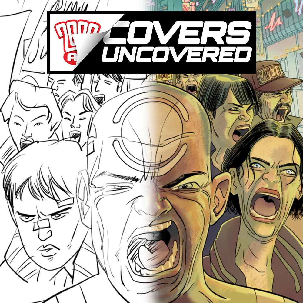
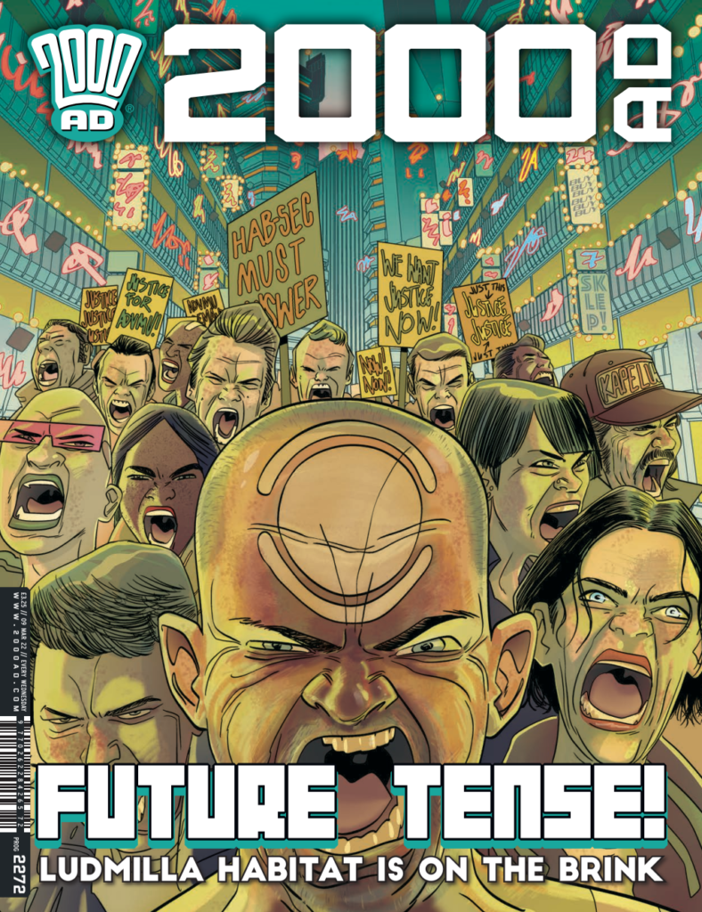
This week we’re headed back in time… to 2000 AD Prog 2272 and the wonderful art of INJ Culbard.
Ian’s work on the latest mind-bending, slow-building, completely thrilling, and frankly downright amazing Brink series; Mercury Retrograde is, as you’d expect, superb. When Prog 2272 came out, he was hard at work at the drawing board doing his thing – but he did promise to send along what process material he had – and here it is!
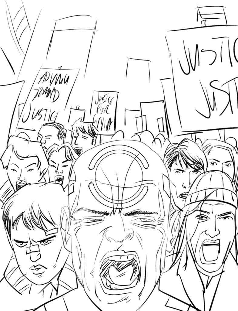
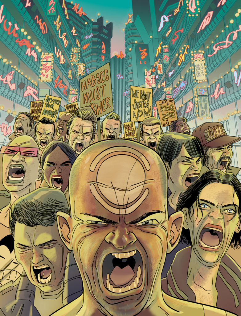
INJ CULBARD: The brief was the protests seen from episode three. I knew I wanted to use the Vovek tattoo on someone’s forehead so I centred that, not to the page but to where the Brink Logo sits above it (in the event any of these covers are used for the collection, because the Brink logo has a circular cut running through it.
Because this already existed as a panel, I just needed to pick a different angle and people it, it was pretty straightforward. So here’s my rough for that.
And here’s the finished piece. Took me ages to get the color on this working right. I went through dozens of iterations (non of which I’ve kept).
Thanks to Ian for taking the time to get this to us. Always such a pleasure to see where the strange thinking behind Brink is going! Brink: Mercury Retrograde is in the Prog right now and it’s a belter!
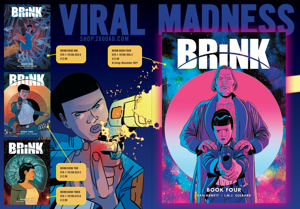
Make sure you catch up with the whole saga of Brink, written by Dan Abnett, art by INJ Culbard in the four books available. It’s one of the greatest modern series to grace the pages of the Prog, a police procedural with a sci-fi twist, a conspiracy theory for the ages, a stunning bit of graphic fiction!
Every week, 2000 AD brings you the galaxy’s greatest artwork and 2000 AD Covers Uncovered takes you behind-the-scenes with the headline artists responsible for our top cover art – join bloggers Richard Bruton and Pete Wells as they uncover the greatest covers from 2000 AD!
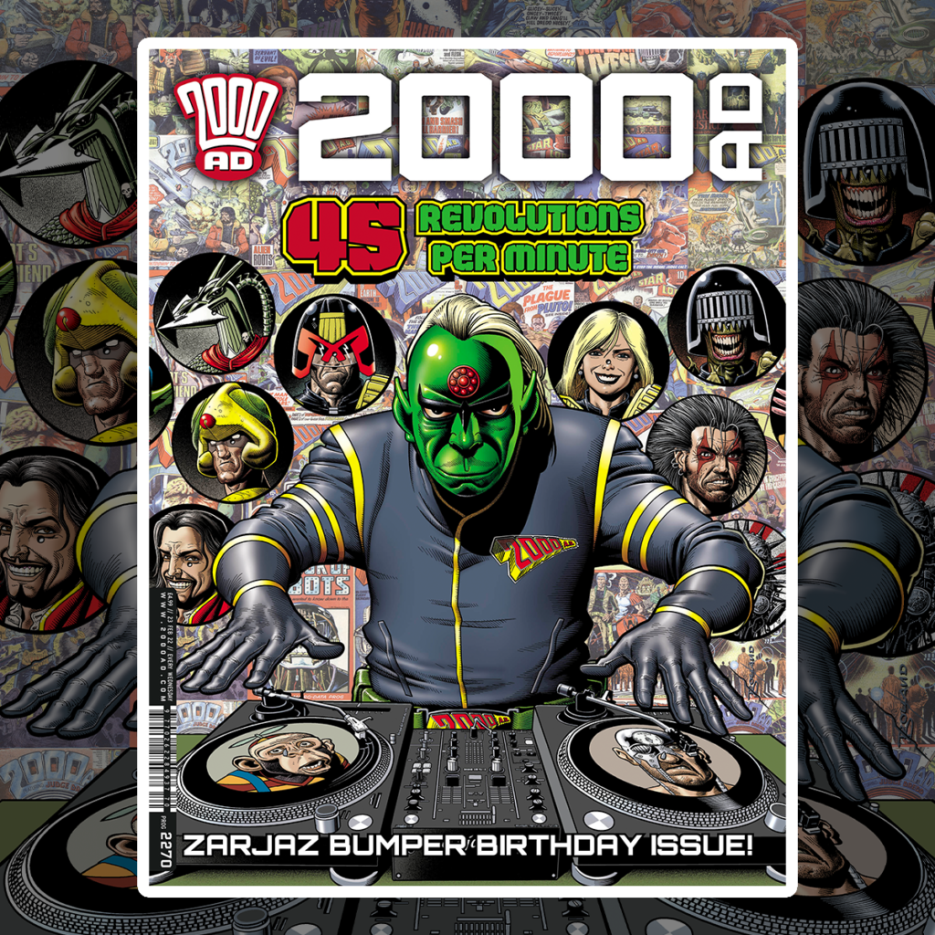
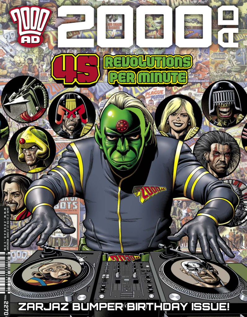
Borag Thungg Earthlets – it’s time to throw on your best glad rags and get ready to celebrate, as the Galaxy’s Greatest celebrates 45 years of delivering the Thrill Power! Tharg’s laying down the tunes, so throw those hands in the air like you just don’t care and enjoy a very special bumper Prog 2270.
Oh yes, did we mention the cover’s by none other than Brian Bolland?
It’s the return of another master for a very special cover for a very special Prog, with The Mighty One throwing down the tunes to get this anniversary party started!
It was an absolute thrill to see Bolland back on the front of the Prog, made even better by getting to see how it’s all put together. Seriously, when it comes to legendary cover stars, Tharg’s really been spoiling us – first we had Mick MacMahon on Prog 2250 and now we get to see Brian Bolland on Prog 2270.
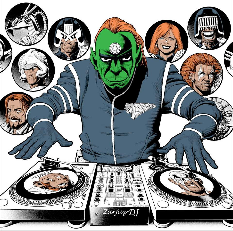
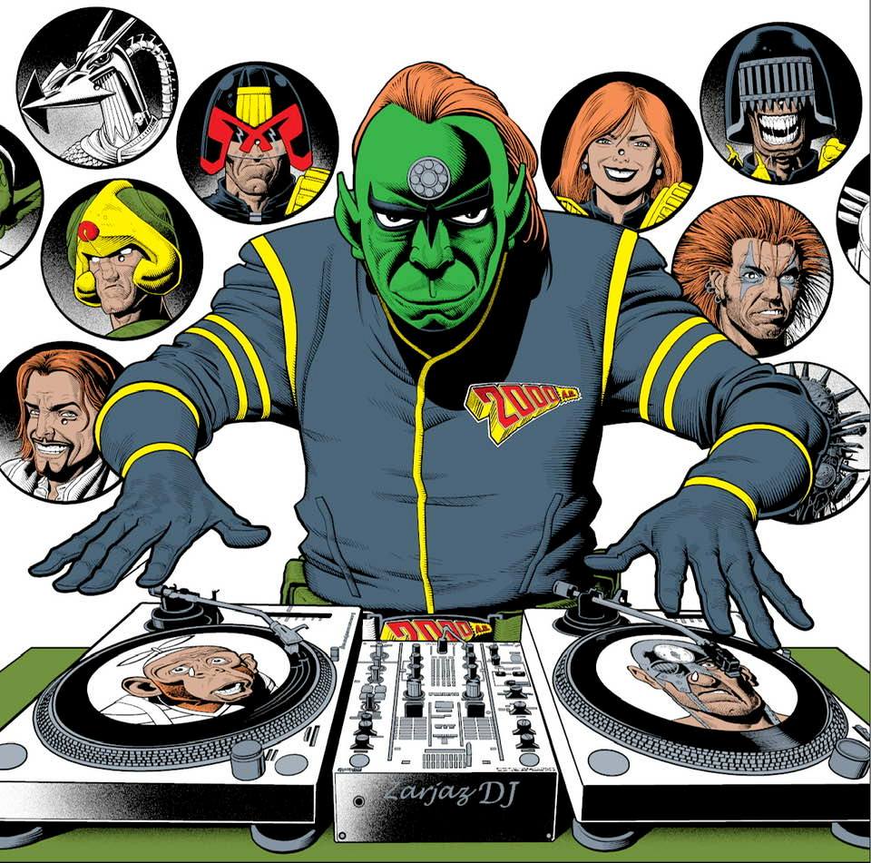
Of course, as Brian works completely digital and has done for a lot longer than most, it’s not the usual breakdown of a cover from initial concepts through pencils, inks, and colours. Instead, it’s more the case of Brian sending along the various elements of the cover, with Tharg playing DJ against a backdrop of the classic characters from the past, present, and future of 2000 AD.
So, ready to drop that needle and bring the beats in… it’s Brian Bolland!
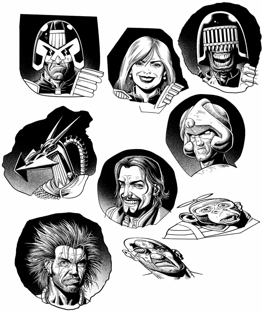
BRIAN BOLLAND: It was all Matt Smith’s idea (so you can blame him). Matt’s been in the job for a mere 20 years so he’ll get the hang of it one day.
He said (and I paraphrase) “It’s 45 years so how about Tharg as a DJ spinning some 45rpm records with 2000AD characters’ faces on them?”
(For our younger subscribers “45rpm records” were pieces of flat vinyl with popular hit tunes etched into each side.)
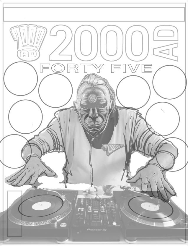
All of that led to the very first concept that Brian sent off to Tharg looking like this – a tribute to TMO’s turntabling skills…
.
Of course, 45s being small things and the labels on them being even smaller – there was a bit of a problem. Over to Brian again…
BRIAN BOLLAND: Yes, immediately a problem arose. The labels on 45s are very small and if a face was on each it would be vanishingly tiny – so I suggested making them “picture discs”.
Okay, that would work, but to make it clear they were vinyl records and not just random circular panels there had to be a hole in the middle of each. Some people have asked why Judge Anderson, for instance, has an unsightly spot in the middle of her nose. The centre hole goes right though Slaine’s eye.
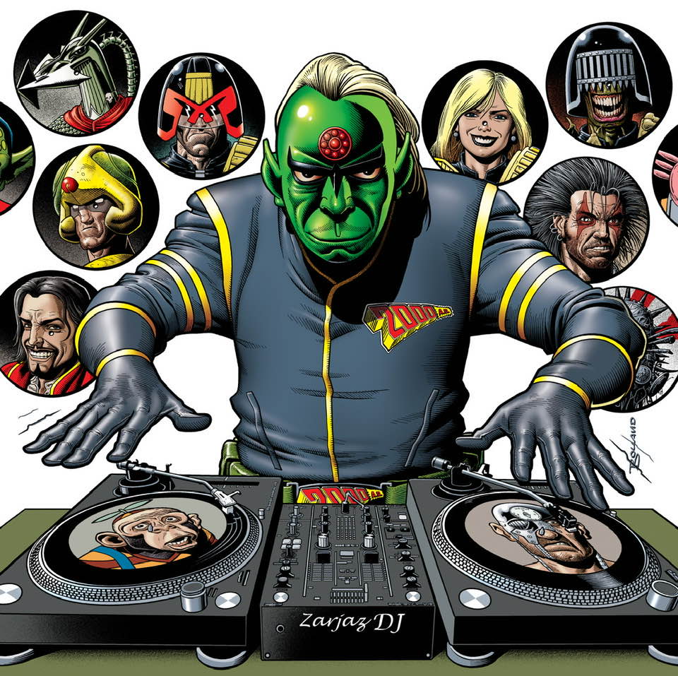
The turntable deck was found online. One comment said that, if Tharg was really spinning those discs, the deck would be the other way round. Well, you can’t please all of the people all of the time! Tharg, himself, hasn’t got back to me.I also inserted the display of covers in the background from my own collection. Mostly mine but there had to be others by Gibbons, MacMahon and other brilliant artists you may have heard of.
And that was that – another Bolland banger in the bag!
Now, those stages of putting the cover together, beginning with his spectacular rogues gallery of the best of 2000 AD, Bolland-style…
.
And then in comes the Galaxy’s Greatest DJ – with Tharg getting ready to let the beat…
…DROP!
.
So, as Tharg’s warming up his digits to start DJ-ing, the Bolland droid gets on with adding his colours to the mix…
.
And after all of that laying down the art, brings us to this, the finished cover for 2000 AD Prog 2270.
.
Thank you so much to Brian for sending over everything over to us and showing us how this one came together.
Every week, 2000 AD brings you the galaxy’s greatest artwork and 2000 AD Covers Uncovered takes you behind-the-scenes with the headline artists responsible for our top cover art – join bloggers Richard Bruton and Pete Wells as they uncover the greatest covers from 2000 AD!
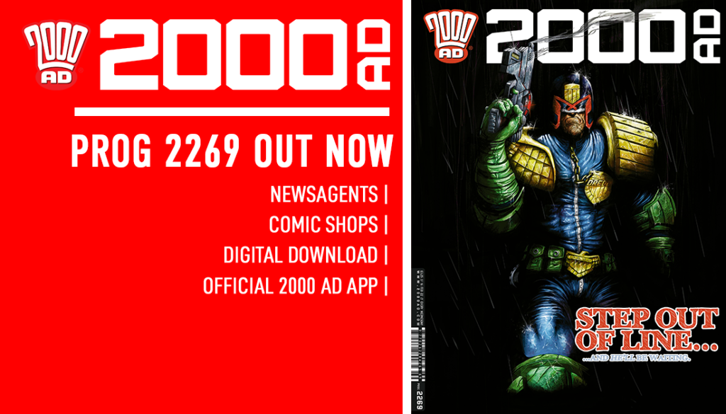
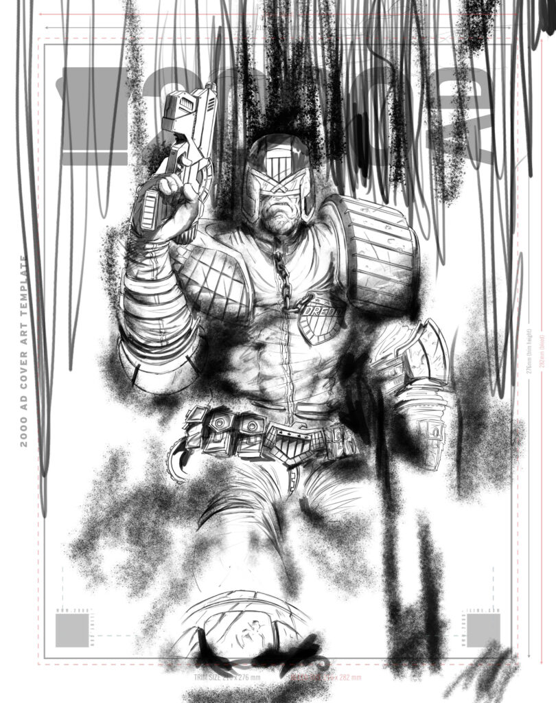
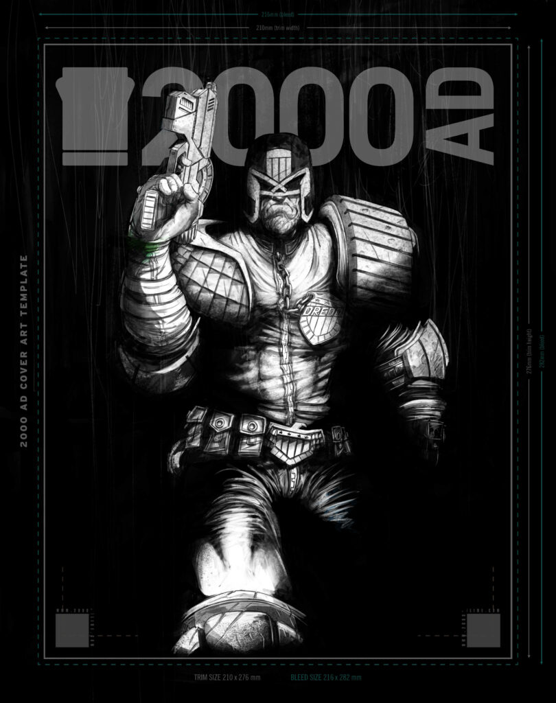
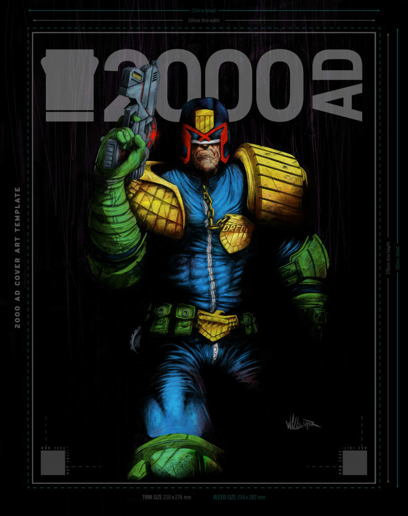
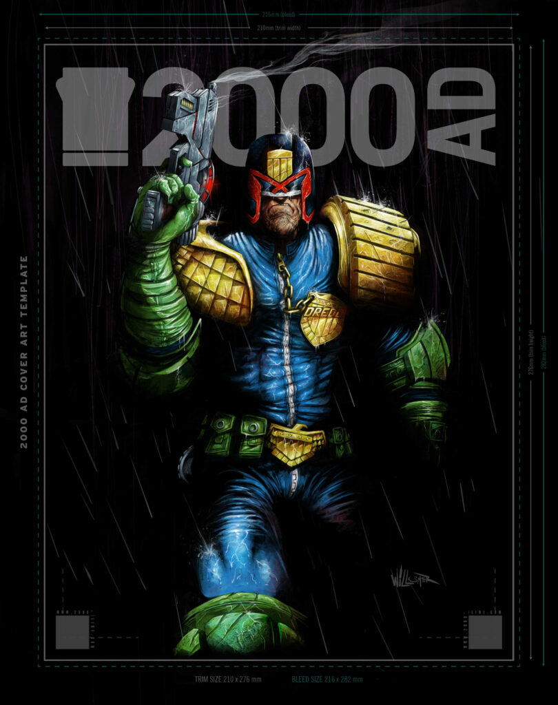
Borag Thungg to you all! This week, it’s the return of one of 2000 AD’s newer art droids, Toby Willsmer for a stunner of a Dredd cover for 2000 AD Prog 2269 – out wherever you get your weekly dose of all things Thrill Powered on 16 February.
.
Okay then, over to Toby to talk Dredd coming out of the shadows…
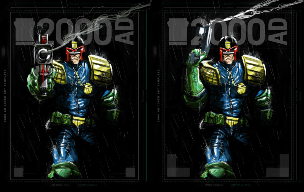
TOBY WILLSMER: I had an idea to do a mostly black piece with good ol’ Dredd, smoking Lawgiver in hand, emerging from the shadows into the rain-drenched light.
For this, I already had a pose in mind, so I came up with a couple of different versions for the smoking Lawgiver and sent them over to Matt to choose from.
Well, you’d be grumpy if you’d forgotten your raincoat as well.
.
Even though the background was going to be mostly black I still wanted to have some shapes in it. These would show through subtly enough to give the viewer some depth against the rain I planned to add later in the foreground. Messy always wins for this type of thing so I drew in some vertical scribbles as a starting point. I also added in some spray textures to parts of Dredd to plot out where the shadows would start to sit and blend into the background.
Today the weather will be cloudy with a case of … squiggles? Dear Weather Control – WTF?
.
I had decided to use a light source above Dredd for direction. I then added all the shadows, textures and blacks. Deciding which parts to leave in the light and which parts to sink back into the shadows.
And then the lights go out. What’s the betting that electrician doesn’t keep Dredd waiting when they get that call-out?
.
From here I added the base colours detailing some areas that will be the focal parts. I did add some ambient lighting defining the torso and outer glove but decided to paint it out as I wanted Dredd to disappear into the shadows rather than have his shape defined with reflective light in the dark areas.
Lights back on. You’d think he’d be happier wouldn’t you?
.
At the final details stage, it’s almost done. With light, highlights, smoke, rain and drips all added to give it some movement and pop. For me, this is the most satisfying part of every painting, when the piece comes alive.
.
And that’s it! Let’s all agree that this one pops! Thanks so much to Toby for sending that one along. He might only have been an art droid for a little while, but the Willsmer droid is proving he’s an exciting talent for the future!
You can find 2000 AD Prog 2269 wherever the Galaxy’s greatest is sold, including the 2000 AD web shop.
Every week, 2000 AD brings you the galaxy’s greatest artwork and 2000 AD Covers Uncovered takes you behind-the-scenes with the headline artists responsible for our top cover art – join bloggers Richard Bruton and Pete Wells as they uncover the greatest covers from 2000 AD!
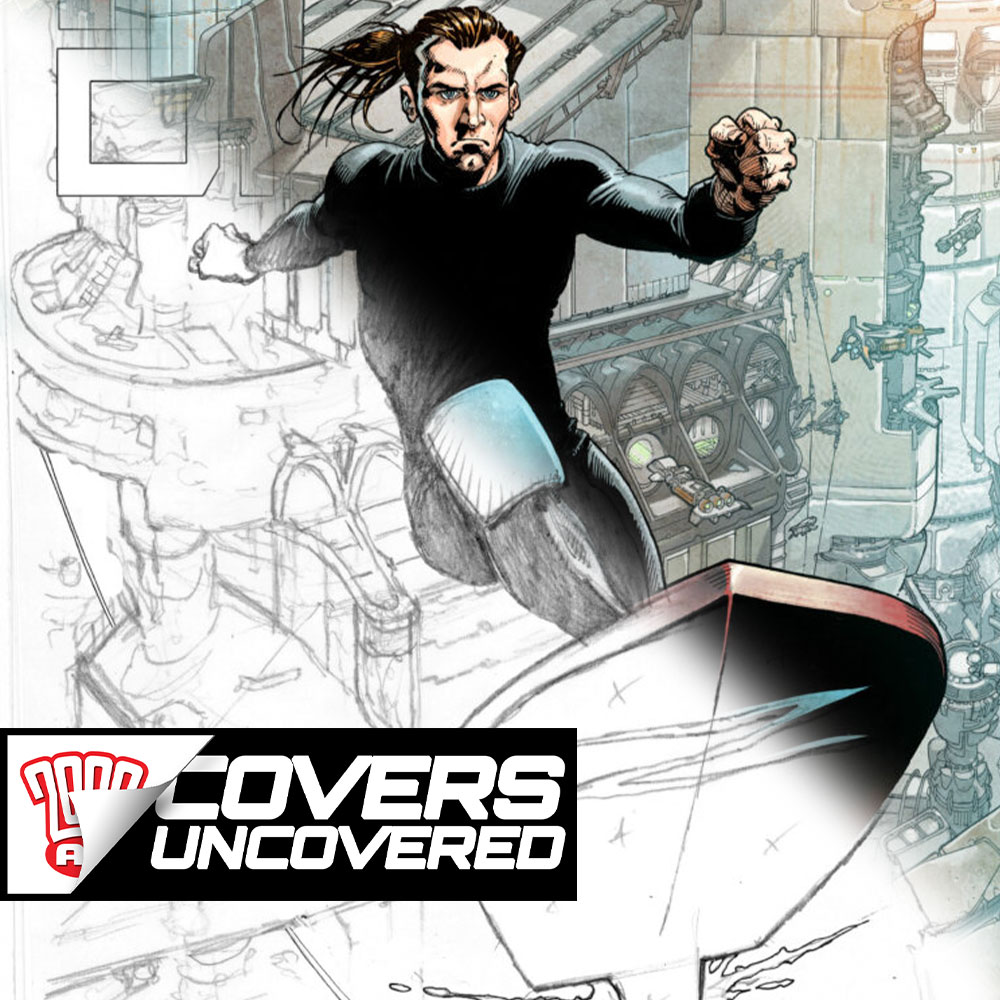
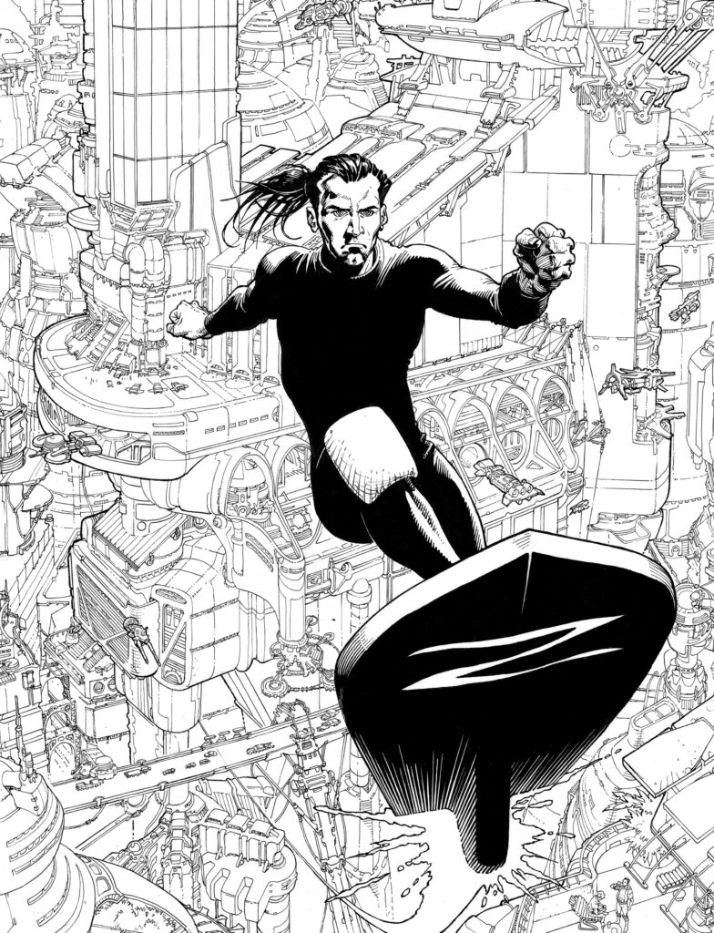
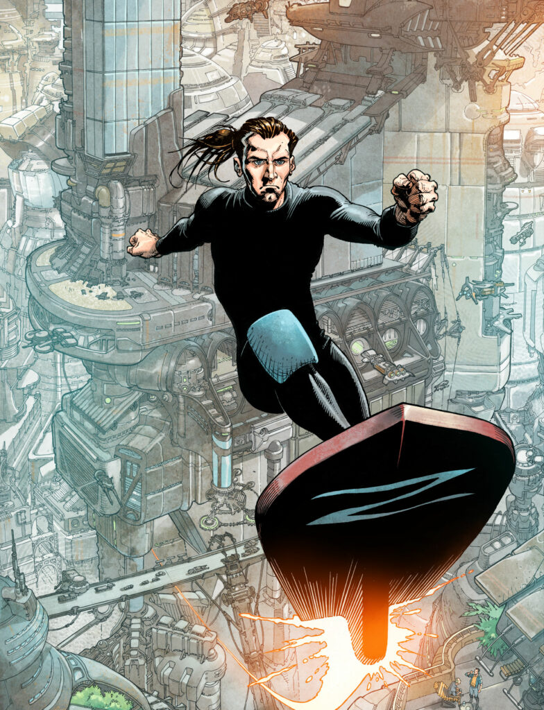
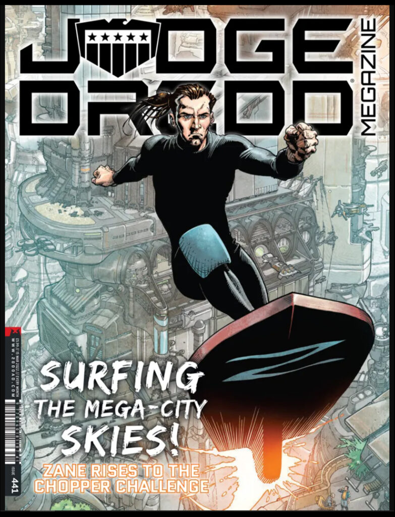
Surfs up for Zane Peeks in Judge Dredd Megazine 441 as the dream team of Cliff Robinson and Dylan Teague wipe us out with this incredible cover! It features star surfer Zane Peeks kissing sky as he prepares for his role of body double for Jako Strutt in the forthcoming Supersurf 7 movie.
As ever, Cliff hasn’t skimped on a single detail as he puts a dazzling amount of time and effort into the MegaCity One architecture, simply incredible!
The cover began with some reference material kindly supplied by the mighty one. Cliff said “Here’s an excellent Colin MacNeil reference page that I received from Tharg…”
Surfing in the fast Zane!
.
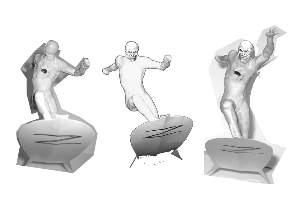
Cliff then searched down the back of his sofa, behind his ear and under park benches to find enough old chewing gum to make this amazing reference figure! Cliff says “Here are some action photos of my handmade poseable model figure, and a truly ZARJAZ surfboard made from a piece card!”
As a result, Cliff is now the subject of a bidding war between Hot Toys and Sideshow Collectables to be chief sculptor.
Morph for Oz!
.
Next, Cliff demonstrates just why he is the best in the business by somehow taking his featureless little sculpture and turning it into an incredible prelim, in three eyeball-meltingly zarjaz steps. Incredible!
He says “These are A4 sized printouts with tracing paper overlays, unfortunately featuring the wrong logo!” Sadly, Tharg did not take too kindly to the use of the incorrect logo and poor Cliff spent an afternoon being ‘schooled’ by Mek-Quake. Thankfully he has managed to retrieve most of his brushes and pens, and given them a good clean…
Zane shoots the “O”!
.
Cliff continues “The prelim led to the finished rough which Tharg okayed…”
“Ha! Rock beats scissors!”
.
Ever the perfectionist, Cliff was not happy with some elements of his image and felt the need to make some adjustments. He said “I had just eyeballed the perspective for all the buildings. I think it shows too…”
This image, and the previous one, will be the first puzzle in Tharg’s forthcoming ‘2000 AD Spot the Difference’ book. Good luck!
.
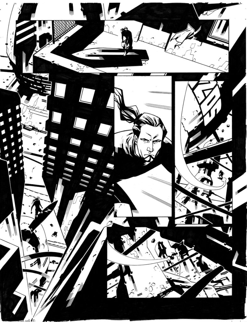
Cliff then converts the rough to blueline, ready for his immaculate inking. He said “Here’s the Blueline printout. I inked Zane and the board first, then gradually pencilled and inked all the buildings using a Hunt 102 crowquill pen and a Rotring Isograph.” Don’t worry dear reader, I’ve checked and he hasn’t just made those things up.
Midnight Blue!
.
And now, let’s just take a few hours to pour over those sublime finished inks which are absolutely incredible! Cliff is unsarcastically coy here, he says “The finished line art! How long did it take? Don’t ask! I did enjoy working on it though.”
I have it on good authority that he enjoyed it for the first 1000 hours…
One can only imagine how Dylan must feel when THIS arrives in his inbox!
.
With Cliff now presumably reduced to a pile of sparking circuitry and burnt-out diodes, it is time for the mighty colouring machine that is Dylan Teague to step up to the plate – and step up he did! Like all of us, Cliff was extremely happy with Dylan’s exquisite work. He said “Dylan Teague’s colouring of this cover is amazing! It’s absolutely beautiful.”
“Everybody’s goin’ surfin’! Surfin Badass Zane!”
And here’s how the cover should look on your newsstand, just before you pick it up and buy it! Absolutely outstanding!
“Stomm! Which Spugwit left that drokking logo there? Coulda took my head off!”
.
A HUGE thank you to Cliff for being kind enough to send his, and Dylan’s, incredible images. The skill, talent and care that have gone into this cover from both formidable artists is palpable!
You can find Megazine 441 everywhere Thrill Power is sold from 16 February, including the 2000 AD web shop!
Every week, 2000 AD brings you the galaxy’s greatest artwork and 2000 AD Covers Uncovered takes you behind-the-scenes with the headline artists responsible for our top cover art – join bloggers Richard Bruton and Pete Wells as they uncover the greatest covers from 2000 AD!
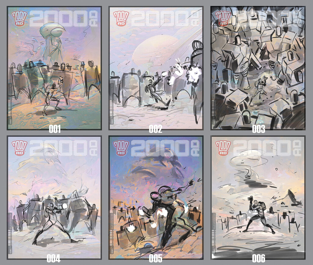
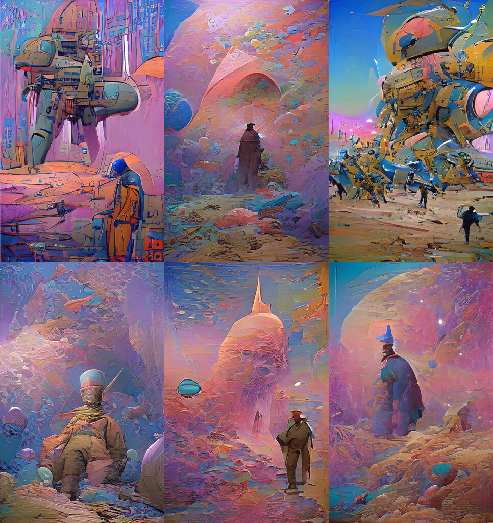
This week, adorning the front of the Galaxy’s Greatest with a pulp-infused, Moebius-influenced Proteus Vex cover… it’s the return of art droid Neil Roberts for 2000 AD Prog 2268 – out wherever you get your Thrill Power on 9 February.
.
Neil’s one of Tharg’s cover specialists responsible for making the Prog pop from the shelves for many years now. And with Prog 2268, he’s turned his hand to the latest series of Proteus Vex: Desire Paths by Mike Carroll and Jake Lynch. It’s outer space action packed with mystery and adventure perfectly captured by Neil right here! And, as Neil’s about to tell you, it all started with Tharg just telling him… ‘Proteus Vex vs Robots.’
NEIL ROBERTS: As always, it starts with a brief from Tharg – basically, “Proteus Vex vs Robots” and a couple of pages of the amazing strip art. From there, I worked up a few initial ideas.
Robots to the left of him, robots to the right, there’s Proteus Vex, stick in the middle…
.
For this piece I really wanted to go for a Moebius/ Giraud feel – so I used AI to give me a few pointers:
Neil ‘Moebius’ Roberts – with a little help from his AI buddy!
.
Being one of Tharg’s many art droids, what’s fun is seeing how a purely AI art-bot thinks. I love using/ messing about with new Earth technologies to try stuff out. “Art is a progression” and all that kinda human stuff.
With the thumbnail chosen, I set about doing the work, sitting and painting until it was finished.
With that – it was sent to Tharg and put on the cover of The Galaxies Greatest Comic!
You get a laser blast, you get a laser blast, you get a laser blast…
.
And that’s it! One stunning Vexatious cover from Neil Roberts there! Thanks so much to Neil for sending that one along.
You can find 2000 AD Prog 2268 wherever you pick up your weekly dose of Ghafflebette comics, including the 2000 AD web shop.
Every week, 2000 AD brings you the galaxy’s greatest artwork and 2000 AD Covers Uncovered takes you behind-the-scenes with the headline artists responsible for our top cover art – join bloggers Richard Bruton and Pete Wells as they uncover the greatest covers from 2000 AD!
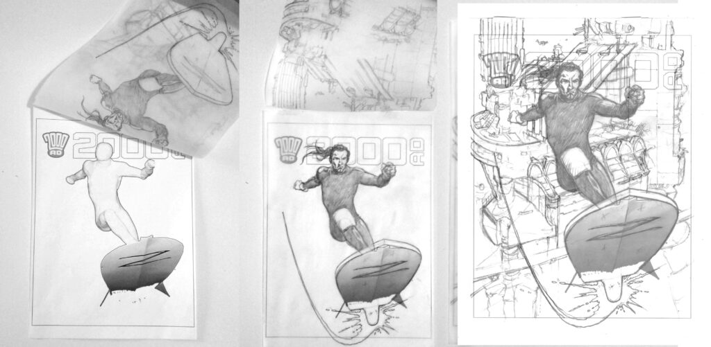
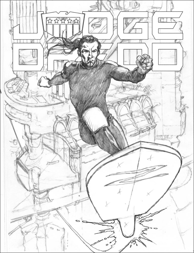
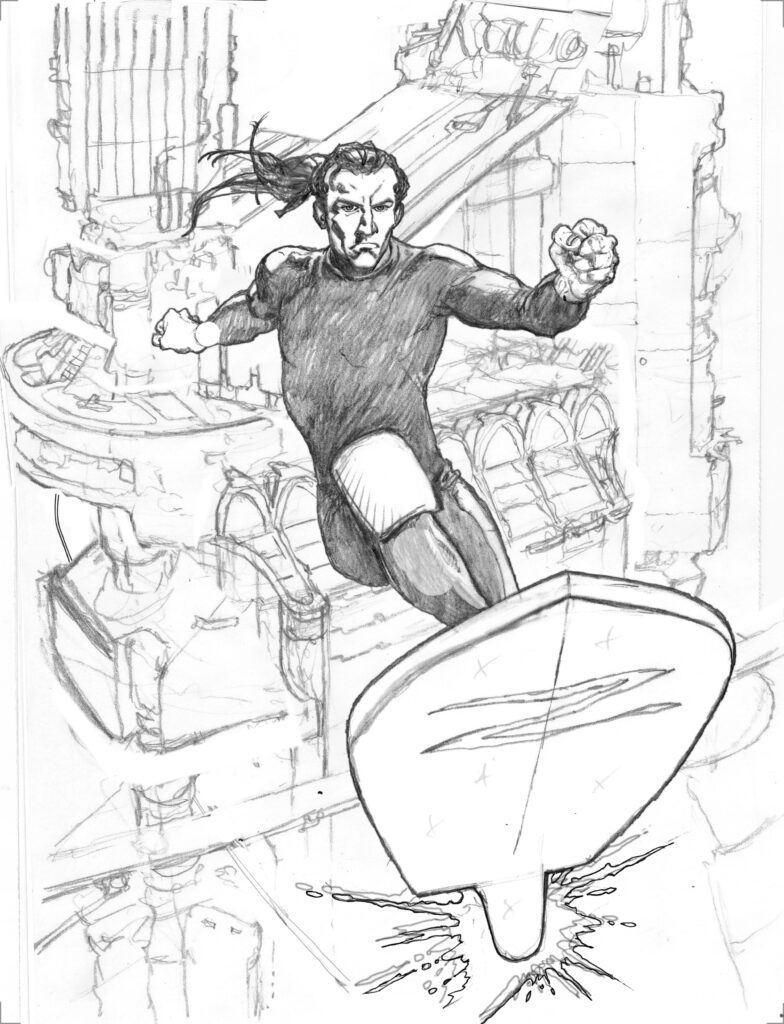
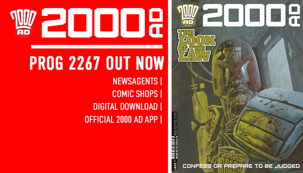
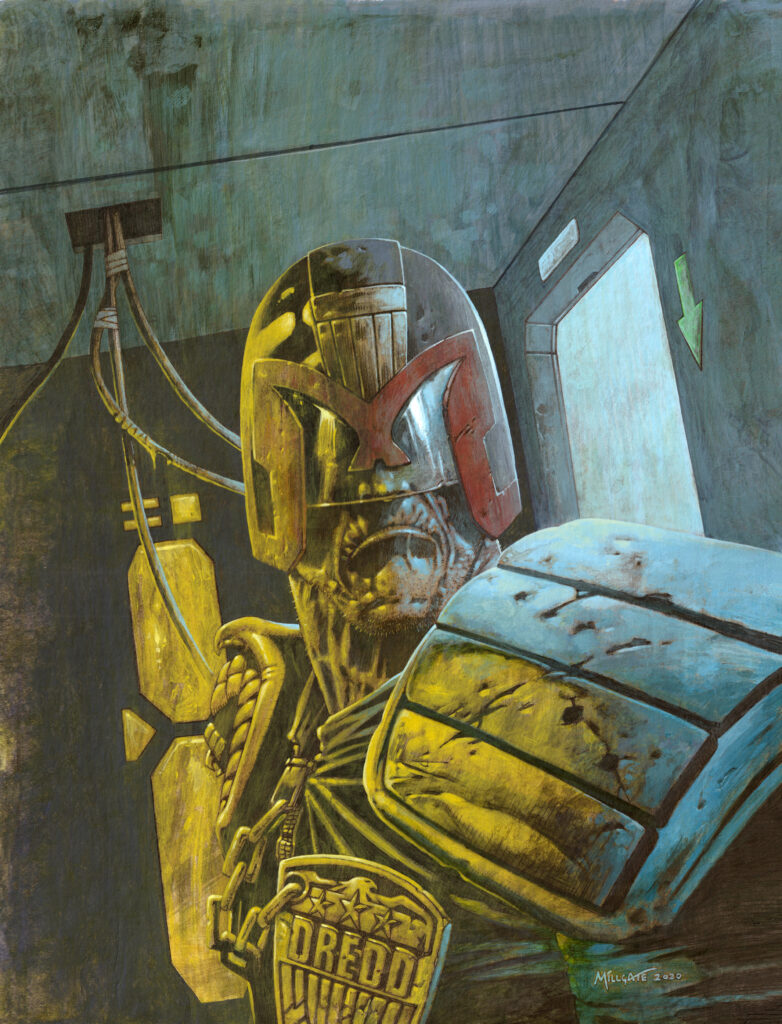
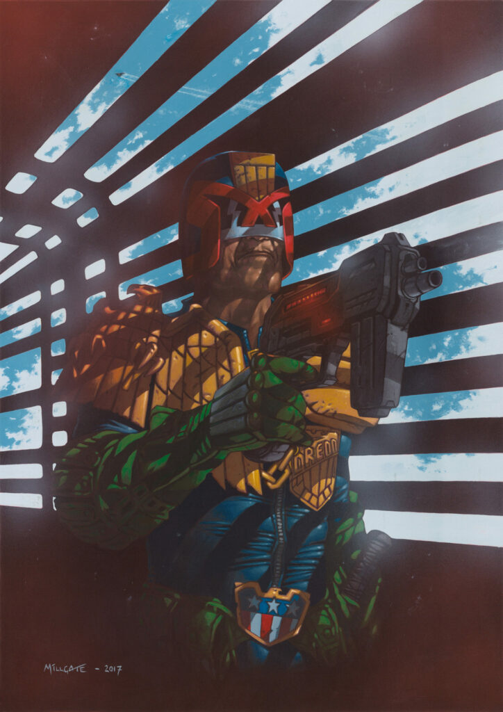
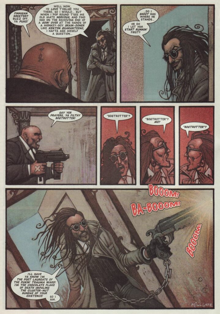
This week, the return of one of the legends of modern 2000 AD, co-creator of Sinister Dexter with Dan Abnett… it’s David Millgate! David’s been working here at the Galaxy’s Greatest since 1995 and he’s back for a classic Judge Dredd here on the cover of Prog 2267… which looks rather like this…
.
DAVID MILLGATE: The first thing to mention is that I did this artwork in late December 2020, so it’s been over a year since I last looked at it. Sometimes I’ll look back at a particular drawing or painting and I don’t remember much about doing it, or what was going through my head at the time. However, luckily this is one piece for which I have total recall!
I wasn’t officially commissioned to do a Dredd cover, but sometimes I’ll set myself a ‘phoney’ brief by inventing a tagline for a potential cover. I like to come up with an initial concept or some vague semblance of a beat that could be from a story. To be honest, anything’s better than looking at a blank sheet of paper, which is often the instant death of any inspiration for me. It just helps get all those creative juices flowing! I’ve done this a few times in the past and the art has ended up on the cover of 2000 AD and luckily that was the case with this one too.
My tagline for this one was ‘If Looks Could Kill’, but in hindsight that was maybe too murderous, even for Dredd. As a character, he’s always hard-as-nails, but he’s still basically a guy who’s upholding The Law. I think the one that the editor Matt Smith came up with, ‘The Look of The Law’, works much better.
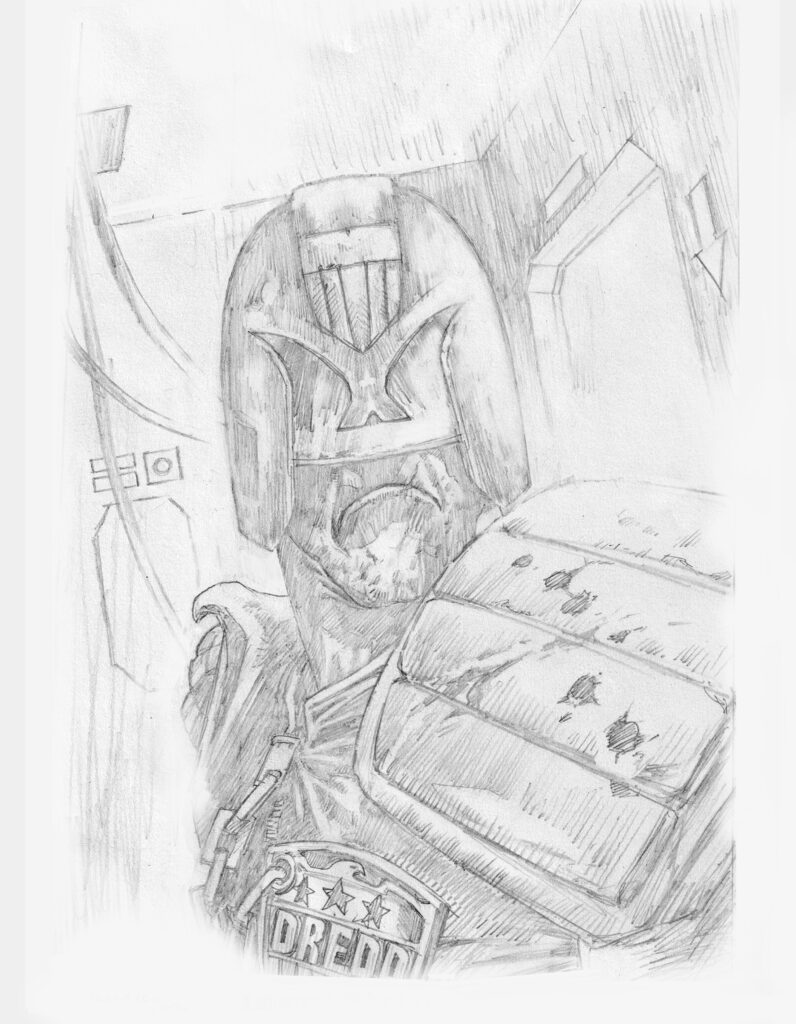
Step 1 – Rough Layouts (Dredd has no nose… how does he smell? Well, you can fill in that gag yourselves)
.
I’ve always thought that Dredd is such a strong visual character, even when he’s not necessarily in an action pose. Some of the most iconic images of him through the many decades have been when he’s been sitting or just standing there with that chin protruding out from beneath his helmet-visor. I wanted the viewer to feel like a perp would when Dredd turns to stare down at them. They know the chase is over…the game’s up…and they’ll be doing a long stretch in an Iso-Cube!
With my potential Dredd cover approach firmly in my mind, this makes doing the actual artwork that much easier, as the image is already 70% rendered in my head, before I’ve even picked up a pencil.
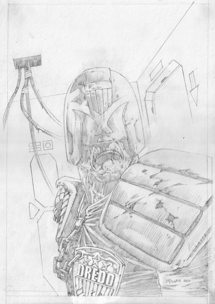
Step 2 – Final Pencils – And a nose!
.
As a result I didn’t bother with thumbnails, but started by doing a quick rough sketch that was pretty much 80% there already and getting near to the image in my mind. However, I wasn’t all that happy with Dredd’s face or the visor section of his helmet. In the past I’ve gotten away with not even drawing his nose. If you’re careful this can sometimes work great with Dredd, but you have to be very careful, as it usually only works from certain angles (*budding artists please take note as the margins between this technique working and looking totally wrong are very small).
The fact that we never get to see or have to worry about what his face looks like is such a cool and mysterious aspect to Dredd’s persona and character (Err…Sly Stallone removing his helmet anybody???)
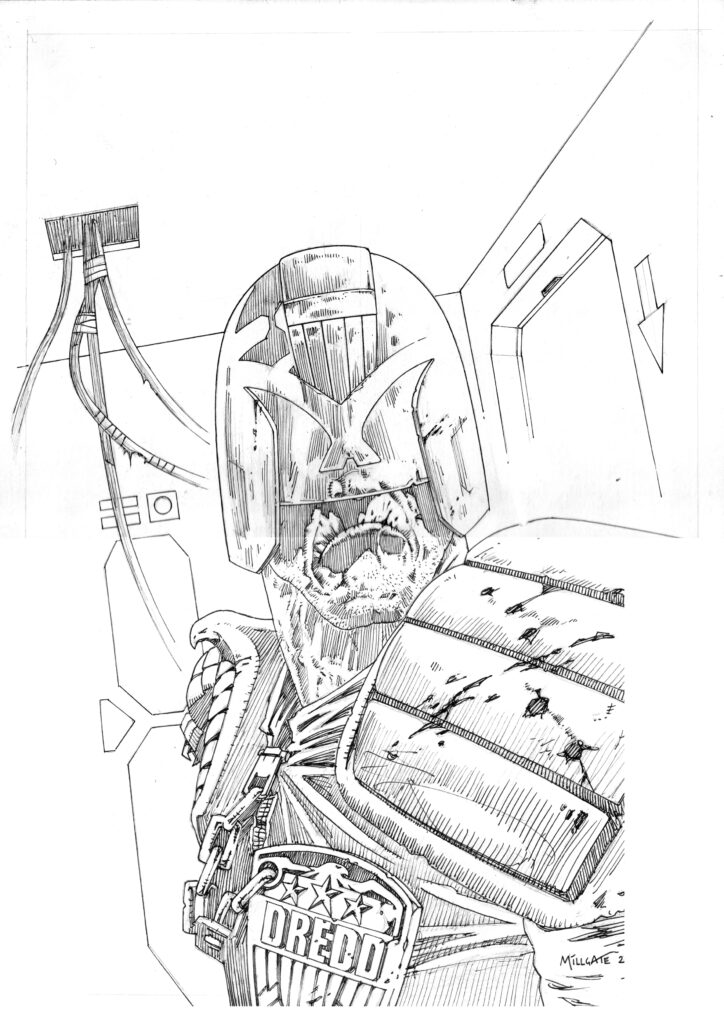
Step 3 – Final Line Art
.
Anyway, I didn’t think completely leaving out his nose was really working here, as it made him look badly drawn at best or at worst oddly deformed. I decided that for this idea to really work I was going to need the visor to look see-through. In so doing this would reveal the end of his nose and make the face/stare less comic-booky and hopefully much more believable.
I also changed the angle of the light-flashes on Dredd’s visor too. I don’t know what anyone else thinks, but it always seemed to me that those lightning-bolt type flashes on his visor were just the classic 2000 AD era line artists way of suggesting light reflecting off of his visor, but in a rather simplified and stylised way. It’s a bit harder to render reflections convincingly with just black and white line art.
Over the years they became ubiquitous and even in the fully painted era – when achieving realistic light effects became more do-able – you’d still often see them rendered as simple, zig-zag flashes. Did all of us ‘lazy’ artist’s not really think it through in a logical way? I felt that this piece required the light-flashes to look much more like interior light being cast into the room, which is then reflected back off a shiny, translucent/transparent surface. At the same time, we can also see Dredd’s nose and a hint of his face through the visor. It sounds like such an obvious thing, but once I’d changed those few details it made a really big difference to the impact of the face and the whole feel of his stare, which as a result really made the cover art come alive!
And BOOM! – Step 4 – Everything Coming Together Beautifully
Oh yes, it’s a cover that really comes alive – another classic cover to adorn the stands. Thanks to David for letting us into his creative process!
2000 AD Prog 2267 is out now – get it from anywhere Thrill-Power is sold, including the 2000 AD web shop.
Now, as a little bonus… David’s cover to 2000 AD Prog 2051 (you can read his Covers Uncovered on that one here)…
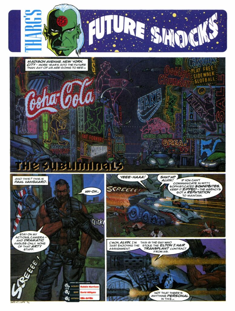
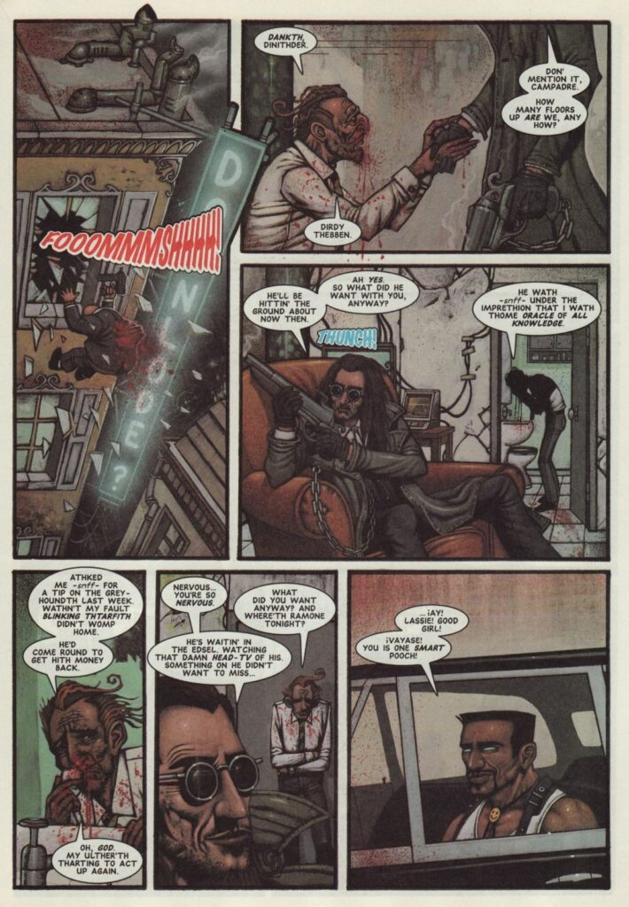
And to end, here’s a little really early David Millgate for you. First, his very first art in 2000 AD, from 1995’s Prog 927 – Future Shocks: The Subliminals.
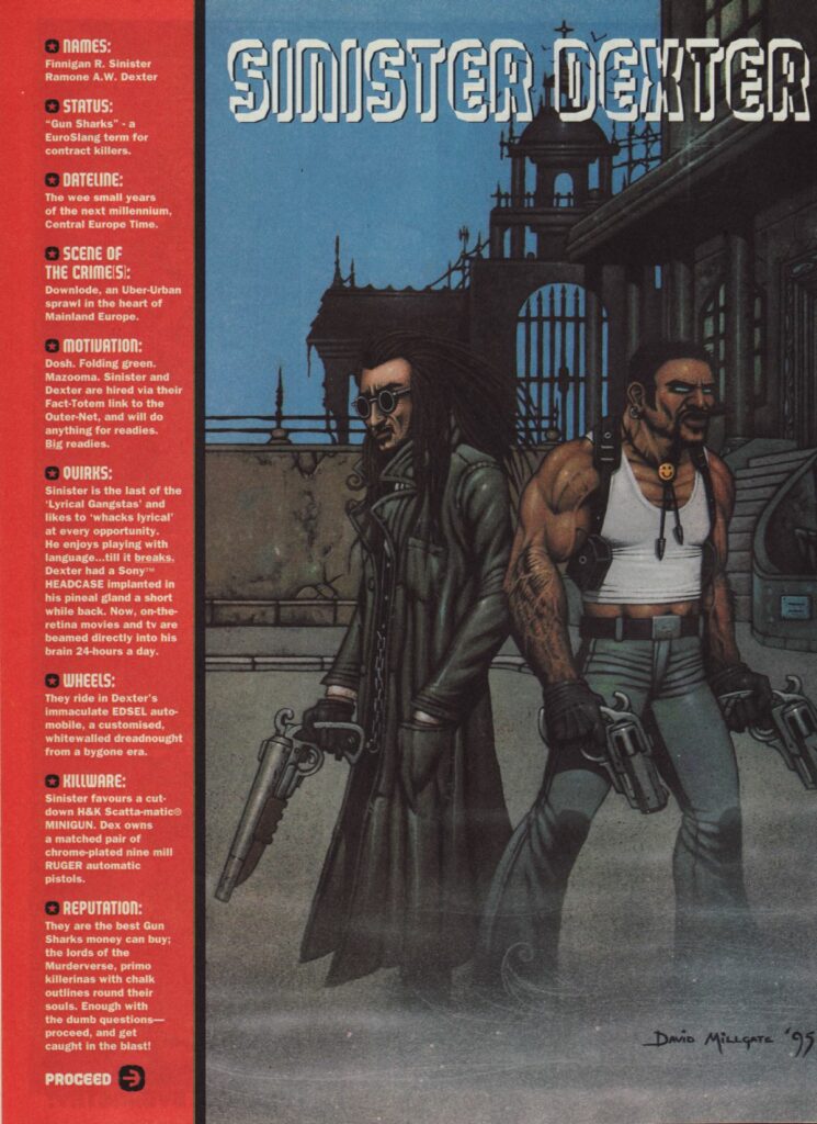
And now, one of those very first Sinister Dexter‘s, co-created by Millgate, from 2000 AD Prog 981.
Every week, 2000 AD brings you the galaxy’s greatest artwork and 2000 AD Covers Uncovered takes you behind-the-scenes with the headline artists responsible for our top cover art – join bloggers Richard Bruton and Pete Wells as they uncover the greatest covers from 2000 AD!
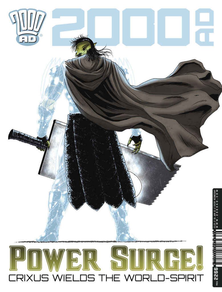
This week, we welcome art droid extraordinaire, Leigh Gallagher for the cover of 2000 AD Prog 2266 – out now!
.
With writer Ian Edginton, Gallagher’s responsible for the new series of Kingmaker, Falls The Shadow, where their series, that began as something along the lines of ‘aliens invade Middle-Earth,’ has gone in a dramatic new direction, with Ichnar the Wraith King returned and the threat against the Nine Kingdoms is now worse than ever. Against him, it’s Crixus the Orc and Princess Yarrow… the odds are not great.
.
For the cover, we get a classic looking Gallagher image, the iconic Crixus shot – Now… over to Leigh for the lowdown on bringing the cover together…
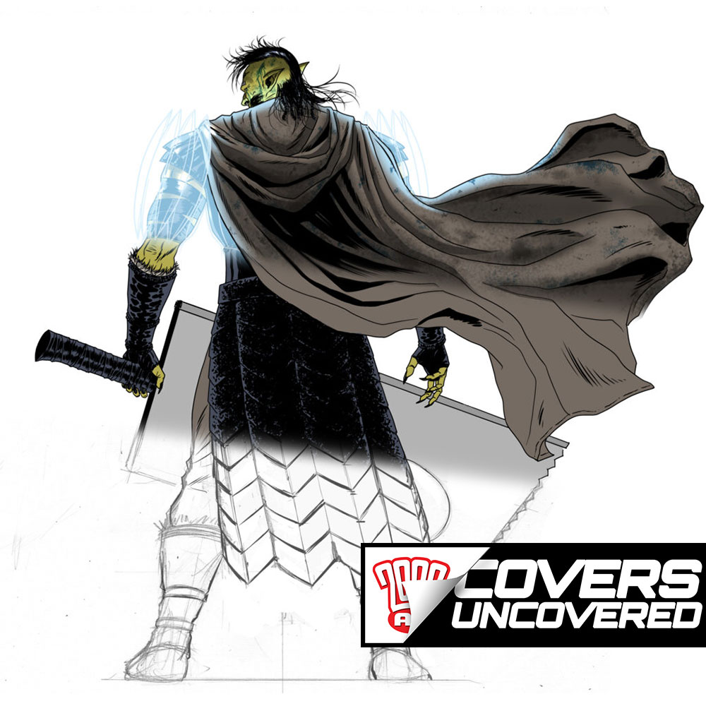
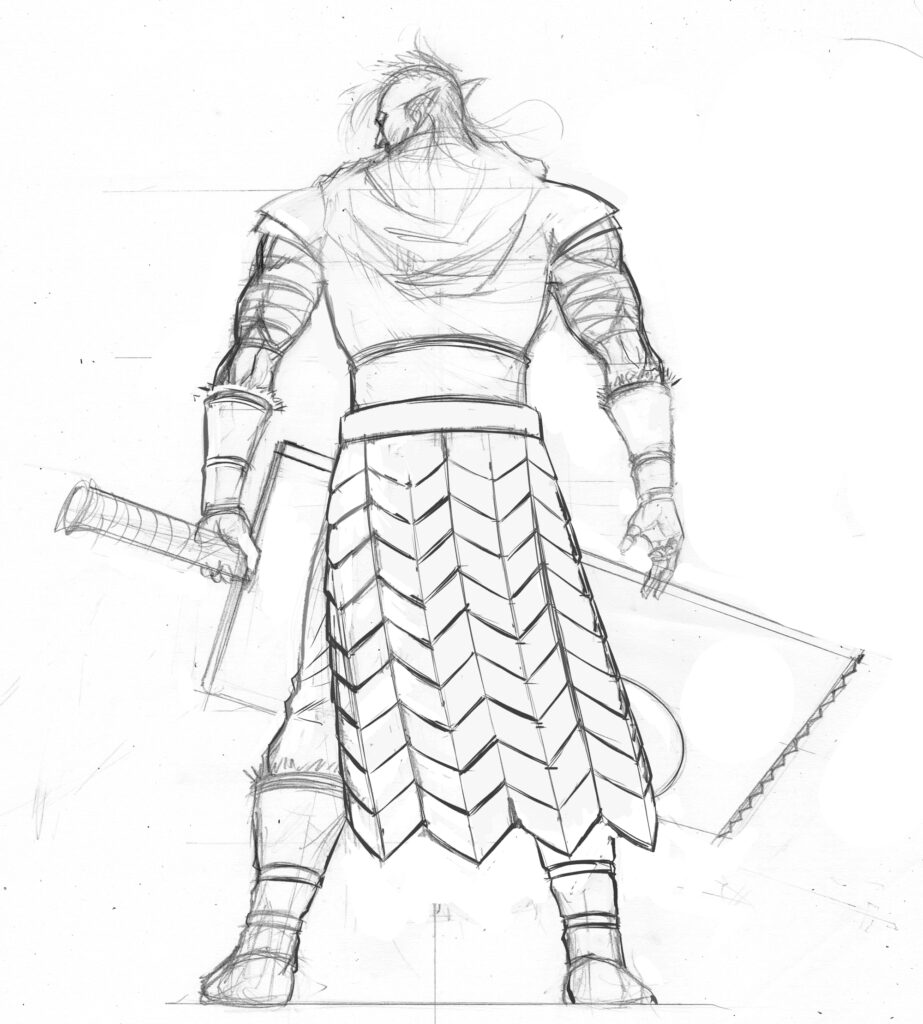
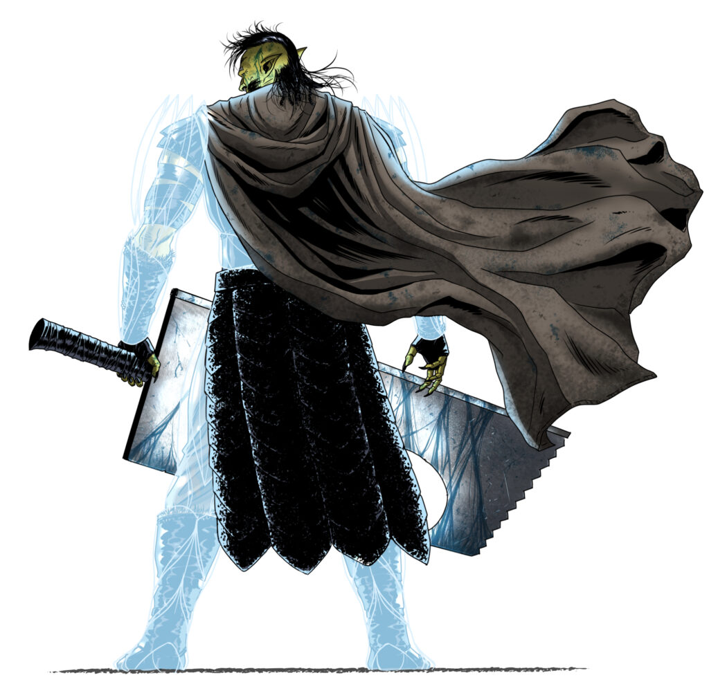
LEIGH GALLAGHER: Ok, so Tharg tasked me with a cover based on this episode 5 page of Crixus alone, facing the alien army. THANKFULLY, just Crixus alone with no background, as right now I still have a bunch of episodes to finish with it out in shops!
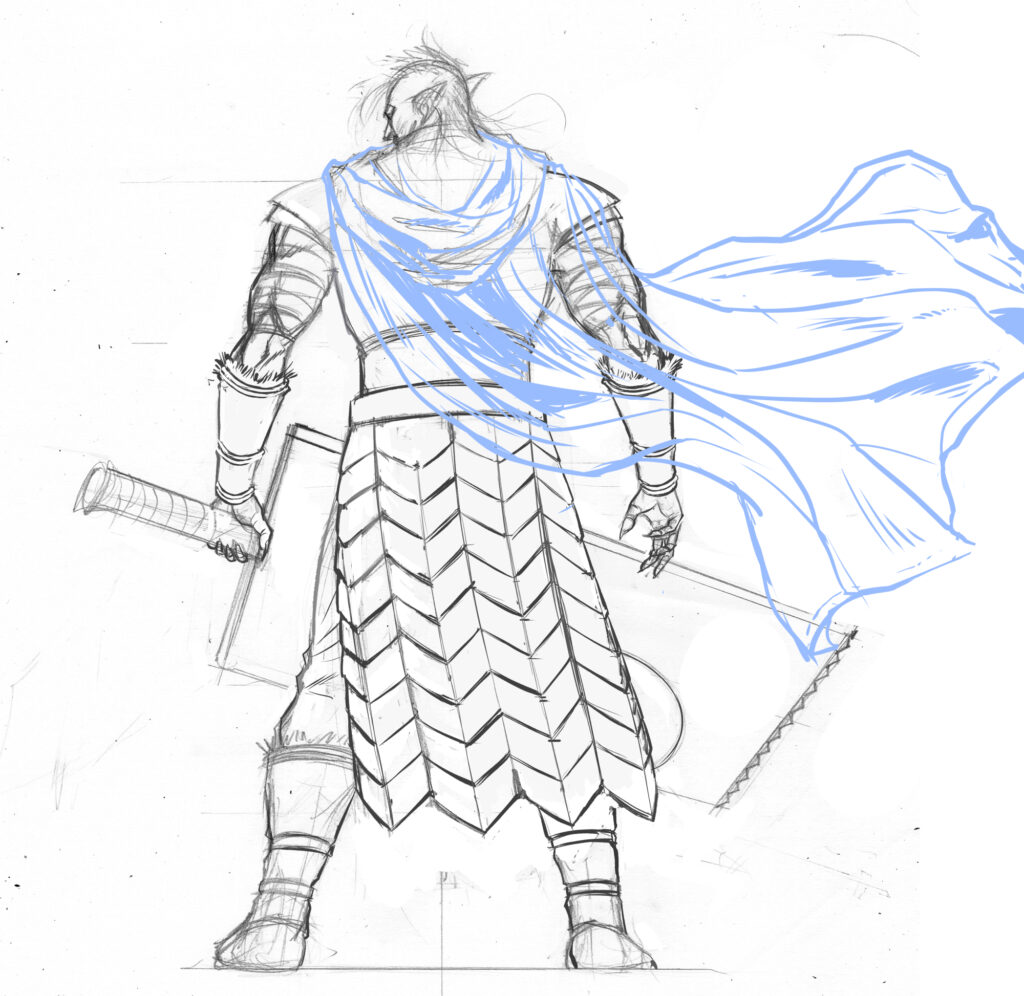
I did a pencil rough and scanned it in to Clip Studio, making it easier to work on another layer to figure out the cloak movement.
Damn, that’s some blade! (Add your own chopper gag)
Leigh Gallgher’s two pencil roughs – with and without cloak
>
With it being a full figure image, I didn’t know how they wanted to crop it, so I just drew the full cloak blowing in the wind to give them more options.
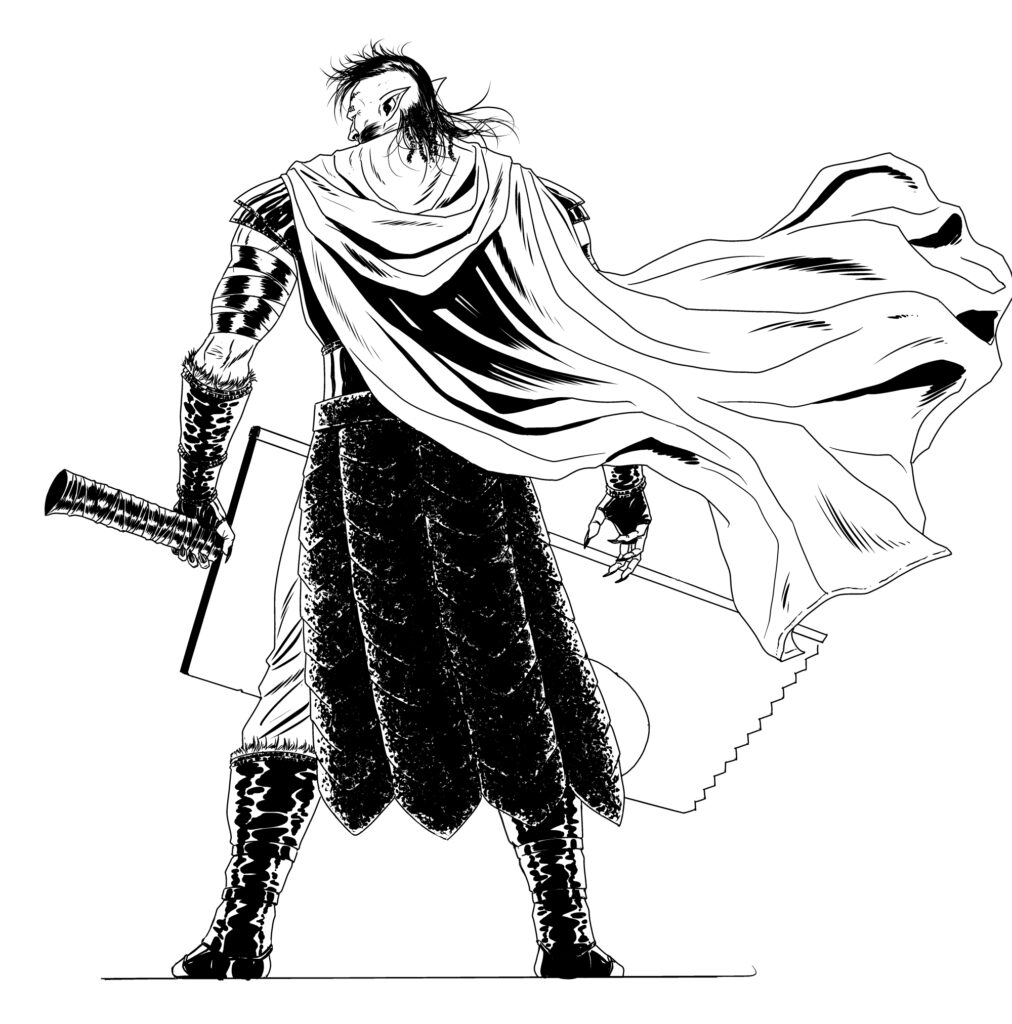
Usually I ink by hand, but with my schedule so crazy I inked on my HUION drawing monitor. As you can see I’ve included all the stages from flats, shading, and adding his mystical glowing armour.
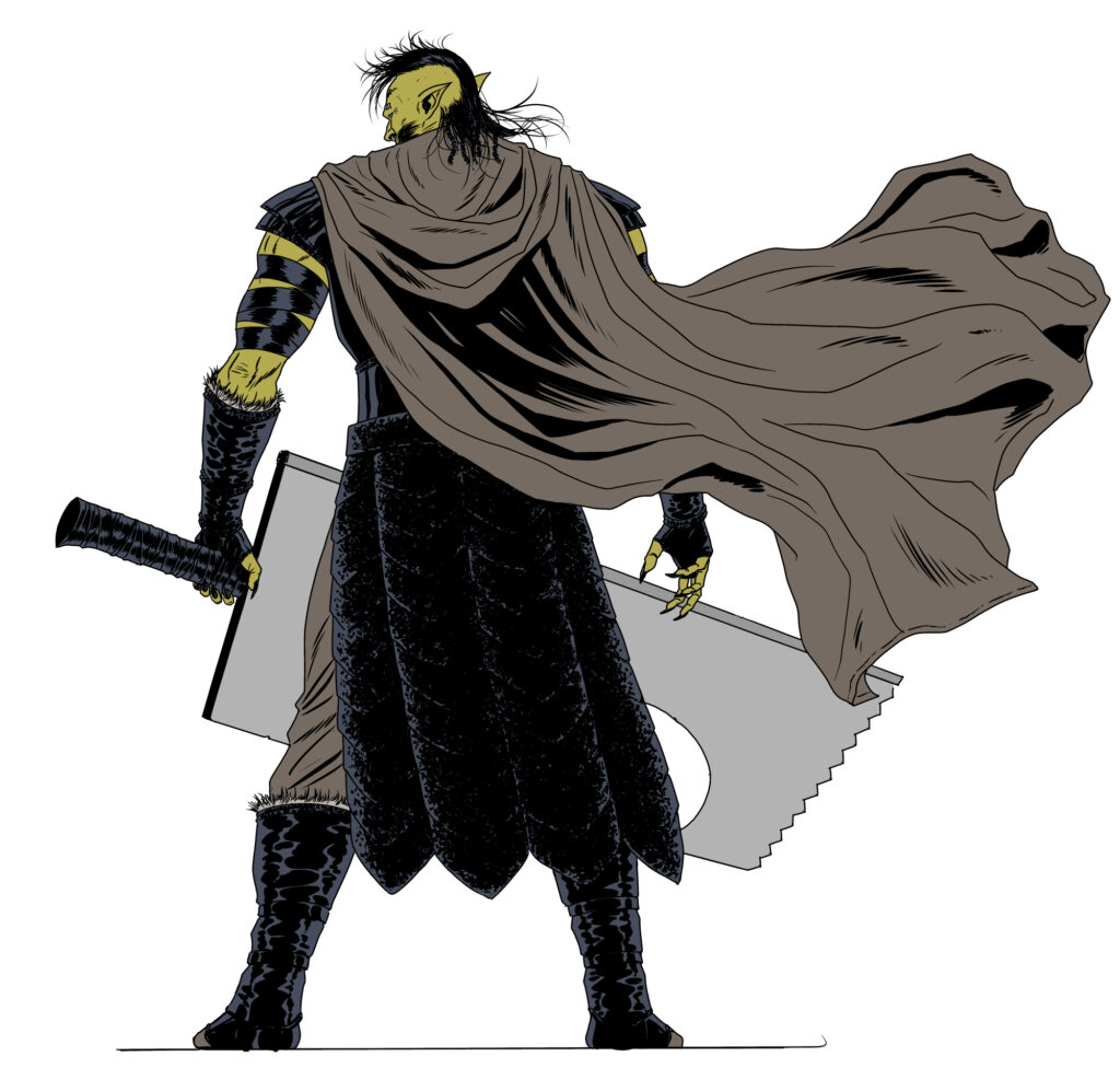
Just in case, I gave Tharg two final versions: one clean and one battle damaged, covered in alien blood.
Right, bugger off now and let me finish this story for you!
Adding the inks – Crixus knows how to style it out
Adding the flats
And the final cover image – adding a certain twinkle to Crixus
And because he can – Gallagher added a little battle damage and loads of alien blood.
A
Okay then, buggering off right now!
As Leigh heads back to the drawing table, we’ll send our thanks to him for taking time out and sending us all those great images for his cover. Kingmaker: Falls The Shadow continues each week in the pages of the Galaxy’s Greatest and Prog 2266 is out on Wednesday 26 January – get it from wherever Thrill-Power is sold, including the 2000 AD web shop.
If you want more from both Leigh Gallagher and Ian Edginton talking Kingmaker, be sure to take a look at our interview with them from 2019.
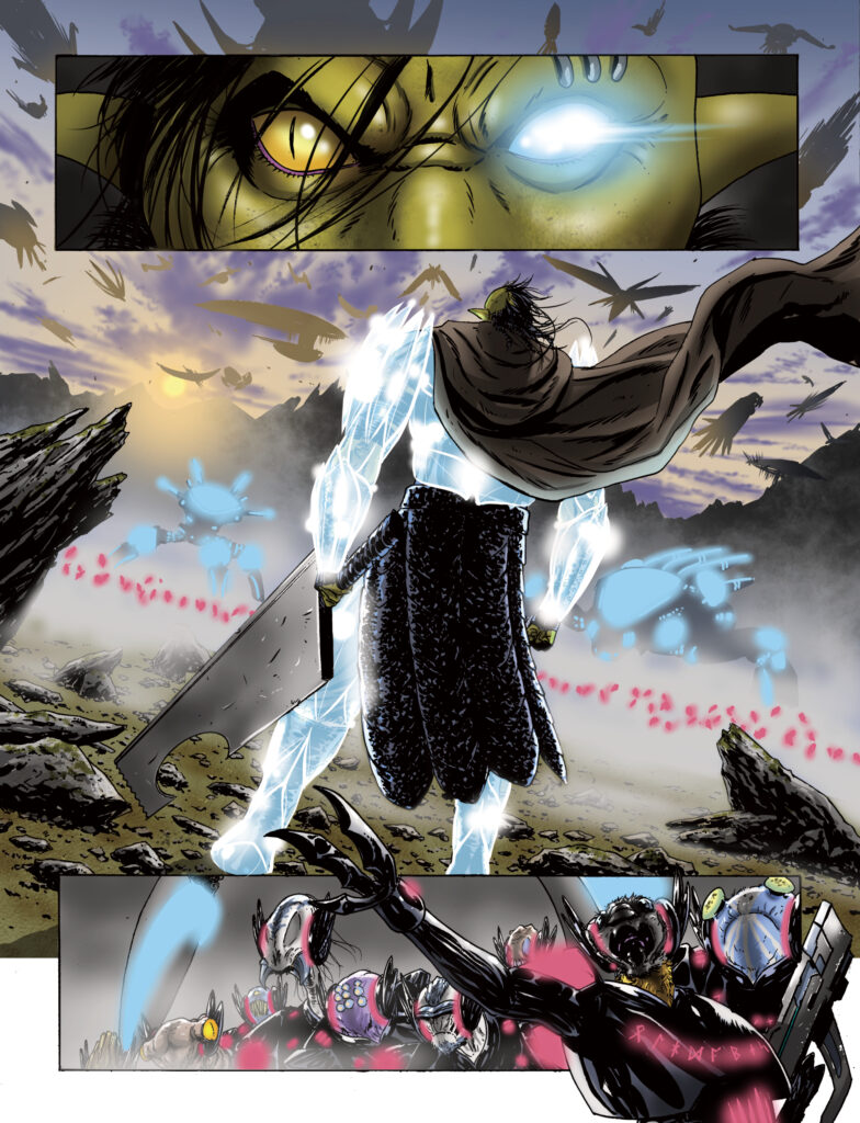
And finally, because Leigh’s a grand bloke, he also sent along a page from the episode from Prog 2266 with Crixus doing his thing… complete with cape flowing, sparkles going, and a damn big blade…