Every week, 2000 AD brings you the galaxy’s greatest artwork and 2000 AD Covers Uncovered takes you behind-the-scenes with the headline artists responsible for our top cover art – join bloggers Richard Bruton and Pete Wells as they uncover the greatest covers from 2000 AD!
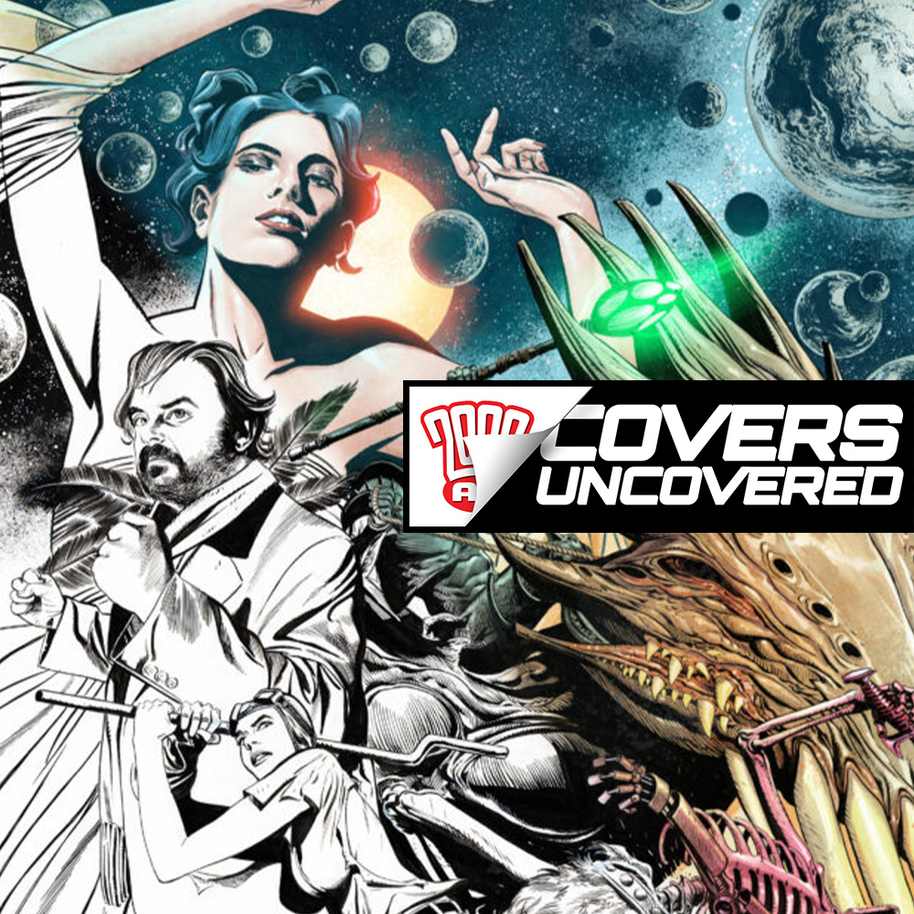
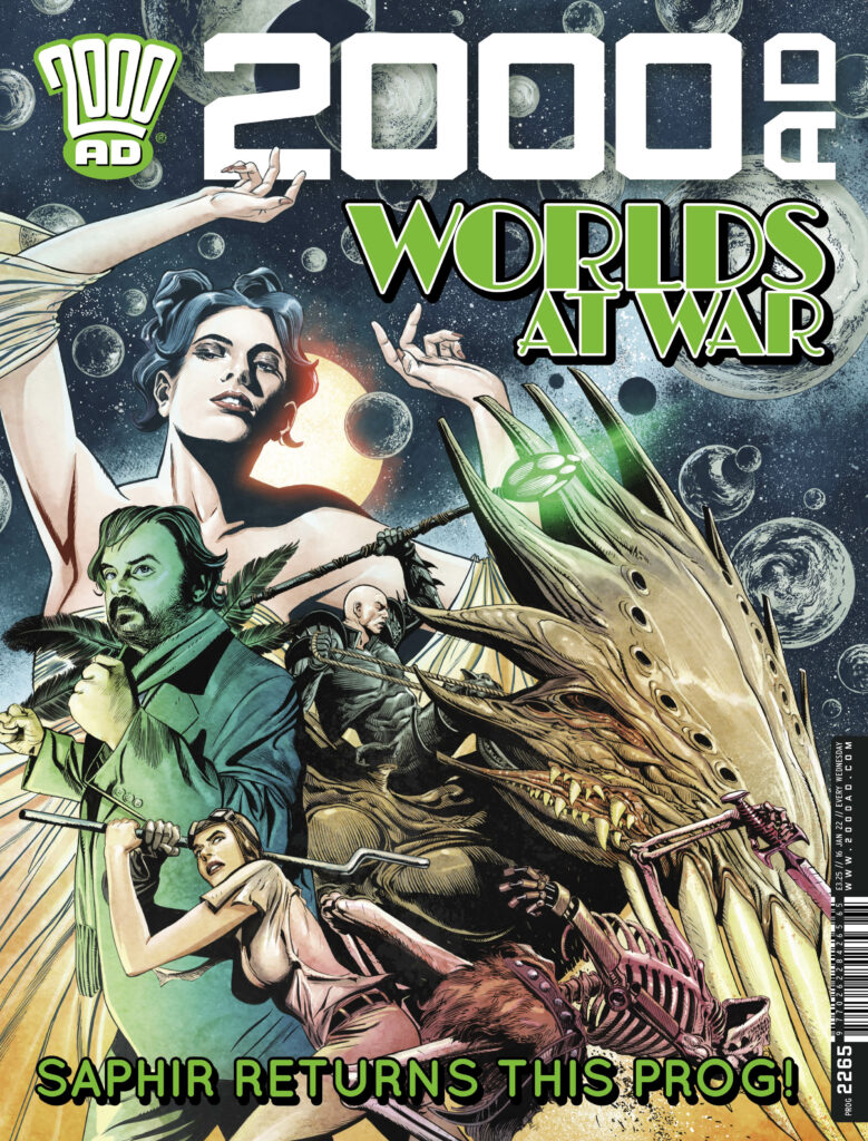
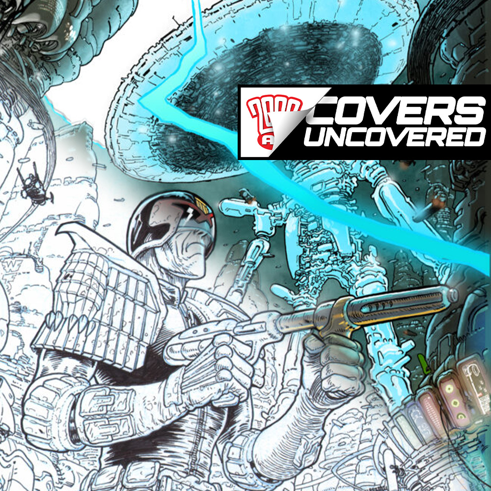
This week, it’s 2000 AD Prog 2265 and the return of the opulence of turn-of-the-century Parisienne sci-fi fantasy thriller, Saphir from Kek-W and artist David Roach. First seen as a Tharg’s 3Riller back in Progs 2197-2199 for the first 3-part Saphir: Un Roman Fantastique, where we were introduced to the strange world of Inspector Alphonse Mucha of the Surete – expect lush looks and plenty of otherworldly weirdness in the new series, the 5-part Saphir: Liaisons Dangereuses!
You’ve thrilled to his work in 2000 AD over the years on Nemesis, Judge Dredd and Judge Anderson over the years, you’ll have been amazed and entertained with the whole history of comics in his Masters Of British Comic Art and now you get to be blown away by his Saphir cover on the latest from the Galaxy’s Greatest – it’s time for Covers Uncovered and the lush lines of David Roach…
So, over to David…
DAVID ROACH: It is one of the vagaries of my comic art career that despite being the regular Dr Who cover artist for Panini, I’ve rarely been asked to draw covers for 2000AD. Admittedly that’s mostly been my own fault because I’ve always been so slow that asking me to draw a cover for my strips would only have made each Anderson , Dredd or Nemesis episode even later than it already was.
So perhaps that’s why each time I am asked (and this is only my fourth- including a pair for classic 2000AD) it feels like an immense honour.
In this case it’s doubly special because Saphir is a special project for Kek W. and myself and being given the cover feels like a big step in trying to establish the series at the Galaxy’s Greatest Comic. Saphir was something we cooked up together and then begged The Mighty One to commission, and amazingly he said yes. Twice!
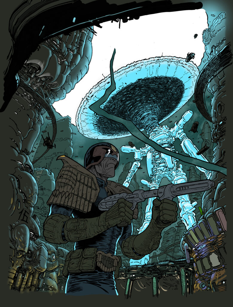
As soon as I’d sent in the last episode of the current storyline Matt asked if I’d like to do a cover, the only stipulation being that it had to be a movie poster style- with various pictorial elements, rather than a particular scene from the first episode.
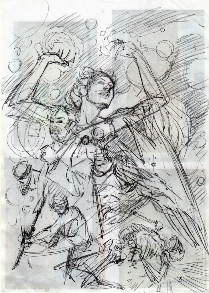
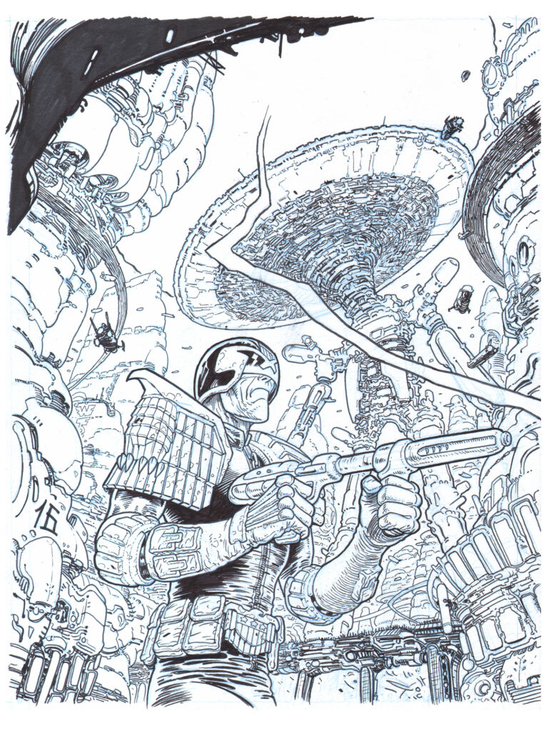
This suited me just fine since it was pretty much the same concept with all my Dr Who covers, and since there wasn’t long to do it, it meant I could shamelessly pick things that were fun to draw without taking a lifetime to finish. It’s odd but true, at least in my case, that putting even the roughest sketch down on paper can feel hard to deviate from, so whenever possible I like to compose each image in my head first, moving around the various parts to create a nicely balanced image. Of course, what constitutes a harmonious but exciting picture is almost impossible to define and much of the time it feels like I’m making it up as I go along and hoping for the best. For this cover I put together an extremely rough sketch (as you can see) and promised Matt it would all come together in the end. Thankfully he gave it the OK so off I went.
.
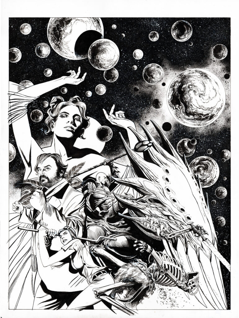
I like to work big and this image actually expanded as I drew it, as more and more of the art overlapped the logo I had to constantly expand the borders to fit everything in. The final picture almost fills an A2 piece of paper, which is the size British artists typically drew at up to the early ‘80s but is quite an anomaly these days. By contrast, Phil Winslade draws at what looks like A4, pretty much print size.
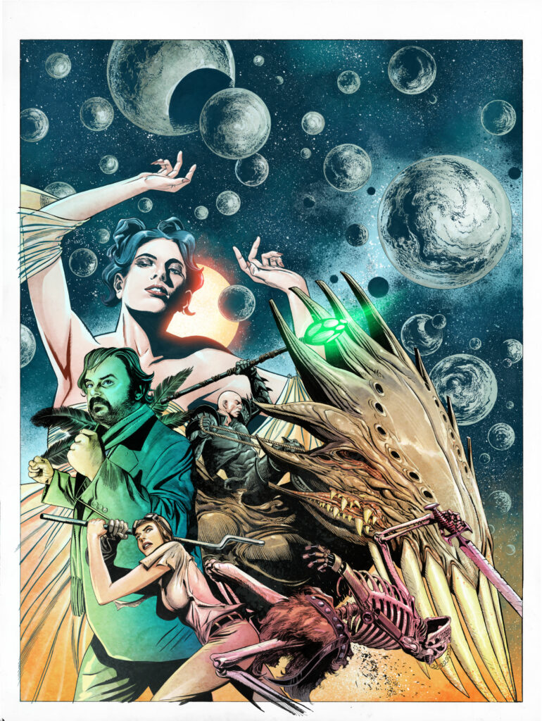
As the star of the strip, I wanted Inspector Mucha to be more or less the central image but he ended up getting squashed to one side a bit by our bald, coral-armoured baddie Viridian on his flying creature. Hey, these things happen. The Inspector himself is modelled on my musician friend Anthony Reynolds who is a life-long 2000AD fan so I felt it only fair to make him look suitably heroic, hence his determined stare and pugilistic posture. Viridian’s pose is largely taken from an interior panel from episode2, just because it turned out so well, and I tweaked some angles so as not to create any jarring vectors with bits of the creature.
It’s a constant frustration that the rough sketch has a lovely dynamism to it that can so easily be lost in the finished drawing, and I ended up redrawing this relatively small figure endlessly to try and get it right. The monster ended up having hands in the strip, but I was never fully happy with them so I obscured them on the cover!
Even in my earliest thoughts about the cover, I wanted to feature a large portrait of Lady Sofia but it took a little while to decide on the background. In episode 1 we have a sequence where Sofia conjures up a whole universe in her sitting room so that seemed like a striking image to include and featuring characters against a black background can really make them pop. Planets are great to draw as well- use a template, compass or small plate, draw around them and bingo- a planet. I just doodle away at them with a brush in the inking stage to create random patterns and depth, add sponge effects for milky ways and white paint for stars and there we are- a suitably cosmic background. That’s the plan anyway.
.
The foreground is a little bit of a cheat since it’s a scene that doesn’t actually happen in episode 1, but I really wanted the statuesque chauffeur/Alien Warrior Jorg to be in the picture. I felt she should be doing something dramatic so I brought forward her battle with the skeletons from episode 2 and hoped that nobody would complain. The poses came through pretty quickly in the sketch so I more or less carried them over to the finished cover with some minor tweaking. There were other characters in the episode who I was initially going to include but I ultimately decide that I wanted to Delay that surprise for inside the comic. Hopefully it’s going to be a real “What the..?” moment.
Putting an image together can be quite an organic process, at least the way I do it, and all through the process I try to be conscious of the tonal contrasts across the picture. That is; aiming to have light areas set against dark backgrounds, or vice versa, and playing different sorts of tones, lines, and textures against each other so the eye is never confused at what it’s looking at. Artists can create depth by putting a white halo around a figure, but that just feels like cheating. For those interested in the minutia of an artist’s tools; the whole thing was drawn with a B propelling pencil, inked with number 1 and 2 Pro-Arte Prolene brushes (Very cheap- in fact, Ian Gibson once told me off for my shoddy art materials!), Joseph Gillott dip pens, Winsor And Newton inks, ropey old bits of sponge and Pitt permanent markers on smooth, 220 g/m A2 Daler Rowney paper.
.
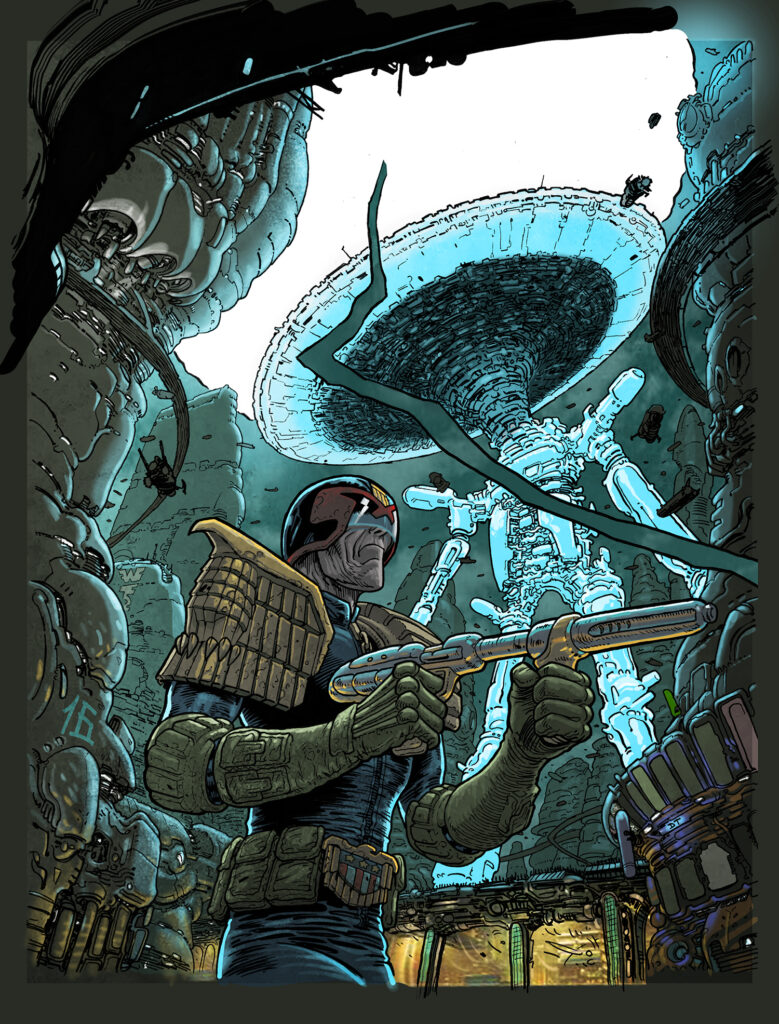
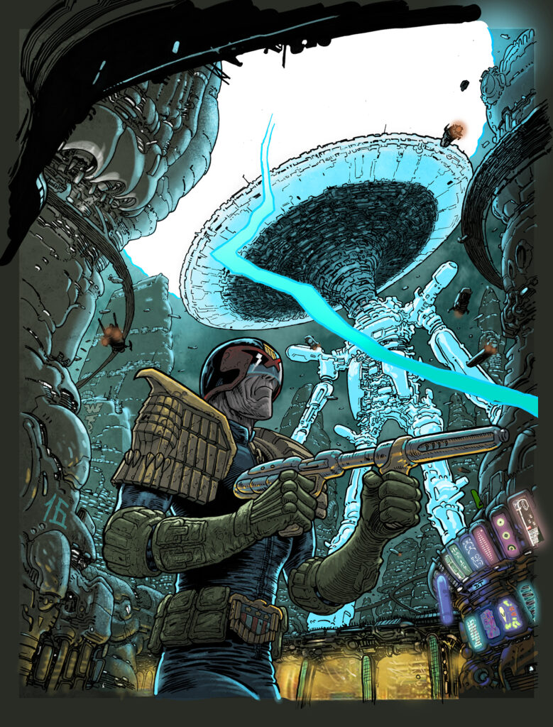
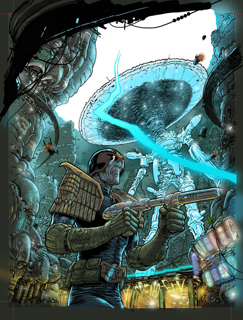
A few days after I sent the cover scan into the Nerve Centre I popped round to give my chum Dylan Teague a Christmas Card and he mentioned that he’d just finished colouring the cover, so you can see the turnaround was extremely fast. I didn’t know Dylan was going to colour it- but I’ll never pass up the chance to work with him, even if I didn’t have any say in it! I always compose in lights and darks and perhaps because I’m colourblind I rarely imagine what colours might work best, simply hoping the colourist knows what he or she is doing, because they’re bound to know more than I do. Dylan is one of the best so I knew I was in good hands
Drawing the 2 series of Saphir has been some of the most enjoyable experiences of my career and getting a cover feels like a real vote of confidence. Kek and I would love to do more but it’s entirely in the hands of the readers so it’s very much a time of crossing fingers and hoping for the best. At the very least I hope everyone enjoys the cover and picks up the latest Prog to see what’s inside….
.
And that’s it – all that work and crossed fingers from David’s side pays off as we all get to see something that looks just stunning on the shelves this week!
Thanks so much to David for sending the work along – you can find that cover as well as the first part of the fantastic and fantastical Saphir: Liaisons Dangereuses in 2000 AD Prog 2265!
Now, a little more of that gorgeous Roach line to make gooey eyes at…
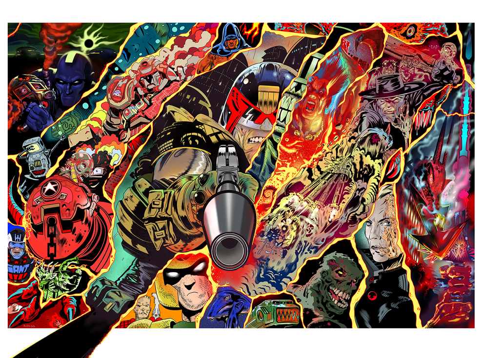
Masters of British Comic Art cover
A recent-ish Anderson for the cover of the Prog
And a recent Anderson & Death cover
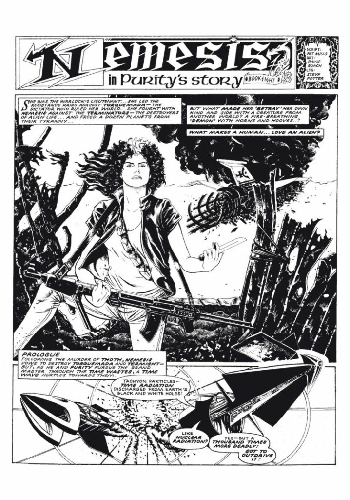
And the opening page from Rach’s time on Nemesis: Purity’s Story
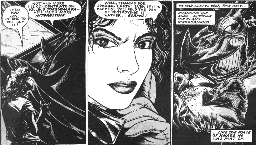
More Nemesis!
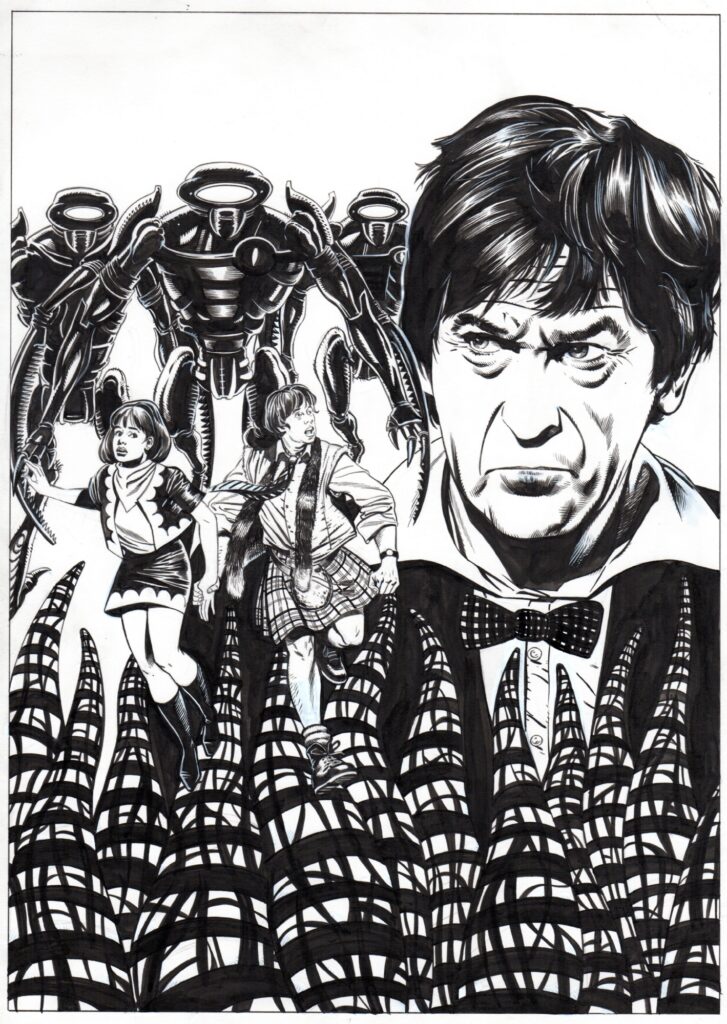
And just because he mentioned them – a particularly fine looking Patrick Troughton Doctor Who cover
Every week, 2000 AD brings you the galaxy’s greatest artwork and 2000 AD Covers Uncovered takes you behind-the-scenes with the headline artists responsible for our top cover art – join bloggers Richard Bruton and Pete Wells as they uncover the greatest covers from 2000 AD!
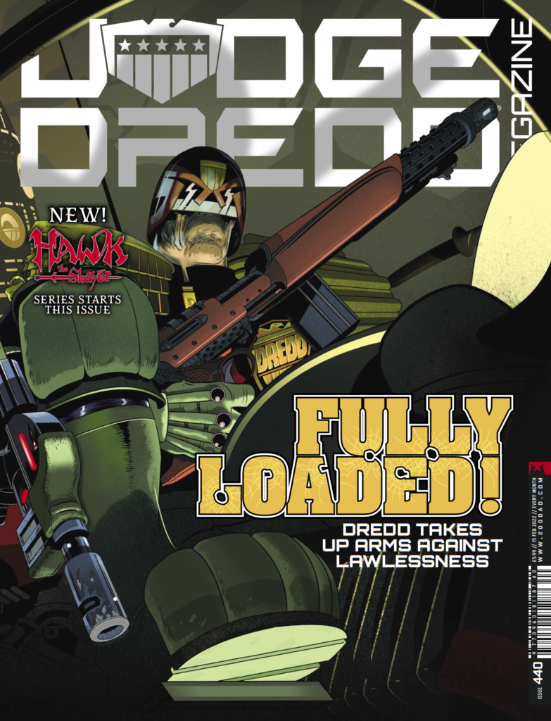
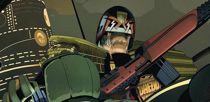
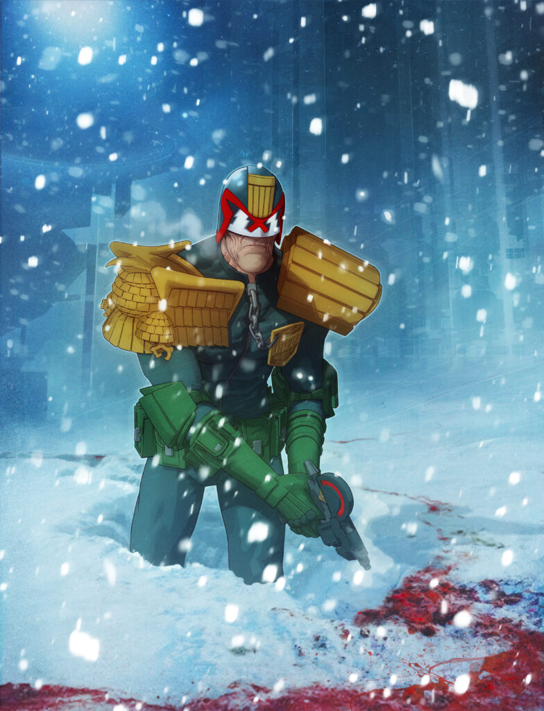
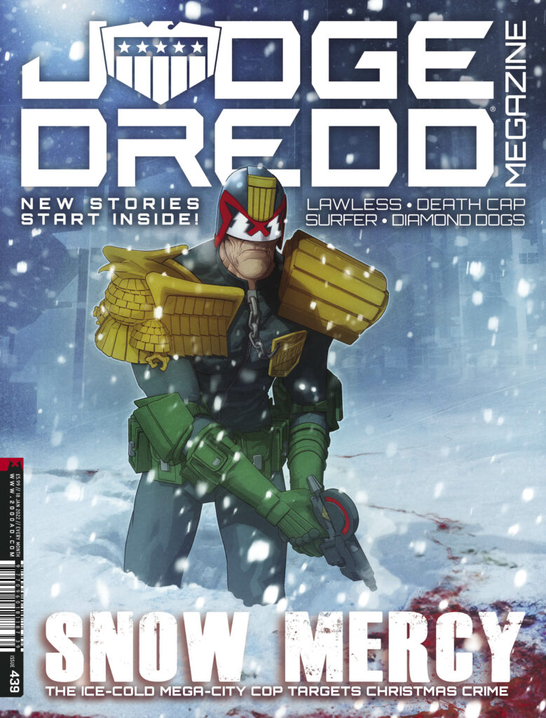
And this week, we’ve a real treat for you, with the return of Stewart Kenneth Moore to the front (and back) cover of the Judge Dredd Megazine issue 440 – out 19 January. Stewart’s write-ups for Covers Uncovered are almost as wonderful as the covers themselves… and he certainly doesn’t disappoint here.
Now, over to the artist for the story of the cover… SK Moore…
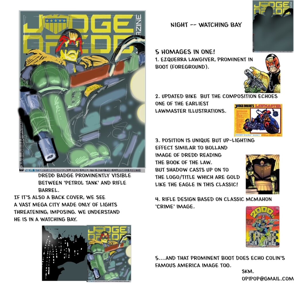
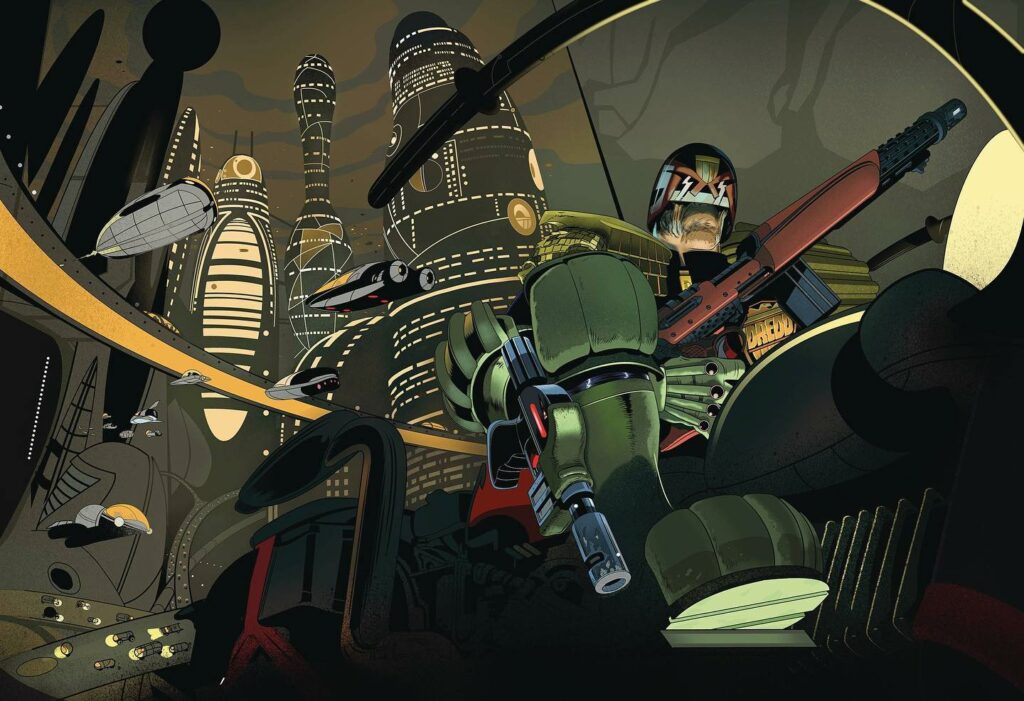
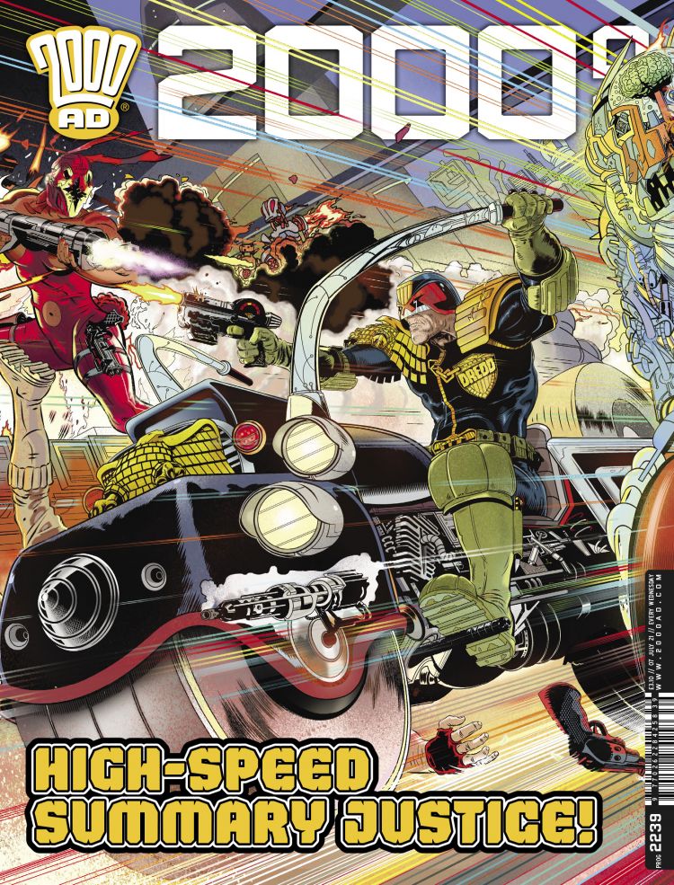
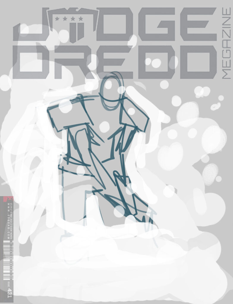
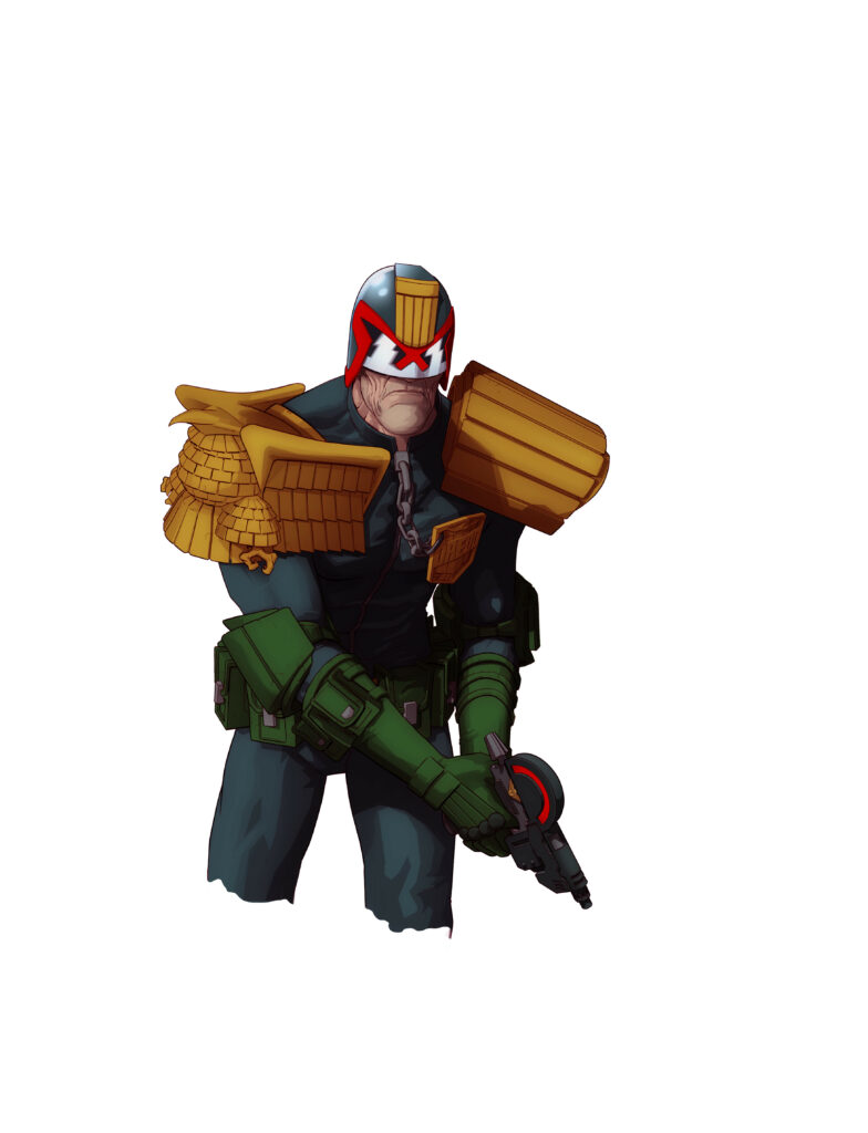
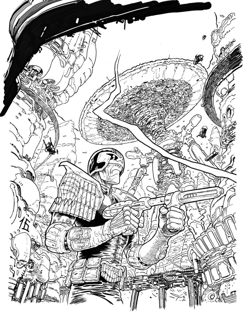
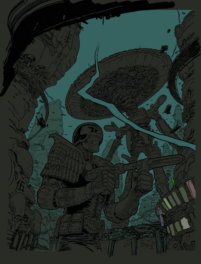
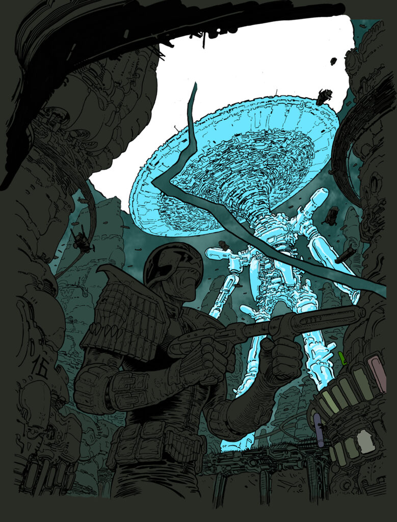
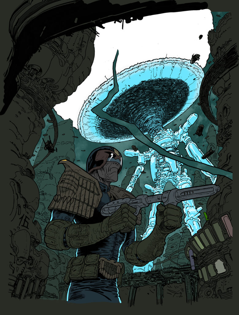
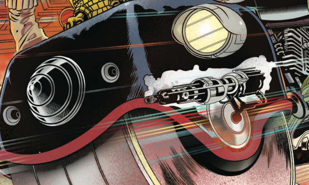
SK MOORE: As a contrast to the high-octane highway shoot-out I previously did for 2000 AD Prog 2239, I pitched this concept of Dredd just idling in a watching bay. This one is several nods in one.
Here’s Stewart’s pitch to Tharg for this one…
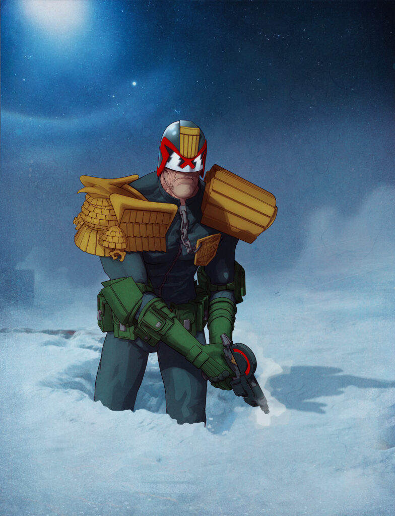
‘A Meg or 2000AD cover pitch homaging several classics. A dramatic uplit image of Dredd in a watching bay, prominent badge ‘ engine parts…but subtle lighting. City lit by lights…carpet of diamonds.’
And the accompanying visual to the pitch...
.
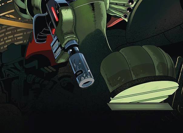
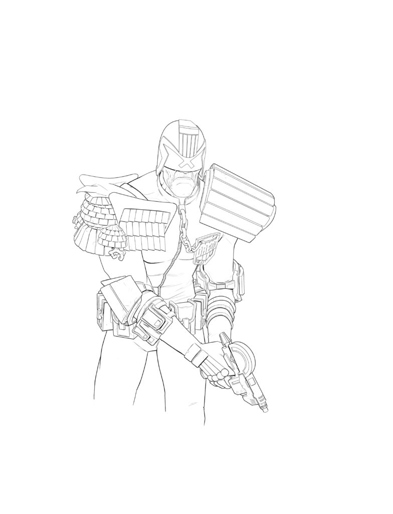
SK MOORE: One nod I didn’t mention is from The Graveyard Shift. The first time I recall seeing a watching bay in close up. Note the impossible angles by Ron Smith – I did a little bit of that here on the back cover.
In this image I’m still trying to find my Dredd, to draw him in the best way and most suitable way for my hand. This version is more stylistic than the Highway shoot-out, which is more of a classic image.
I’d like to come up with a Dredd that is fairly quick to draw, that can work in any story. I could lean more realistic but I think we lose some of the unique and elastic language of comics when it becomes too cinematic or noirish. I feel that today anyway, next week I may feel different.
I’ve moved the zipper toward the eagle, this is how Carlos Ezquerra drew him, zipper off-centre. You can’t just flip a Carlos character, they are asymetric and, for that, far more interesting to look at and more difficult to draw.
With Batman and Spider-Man and many others, if you have a composition issue you can flip the figure to open up various spaces, but you can’t do that with Alpha or Dredd.
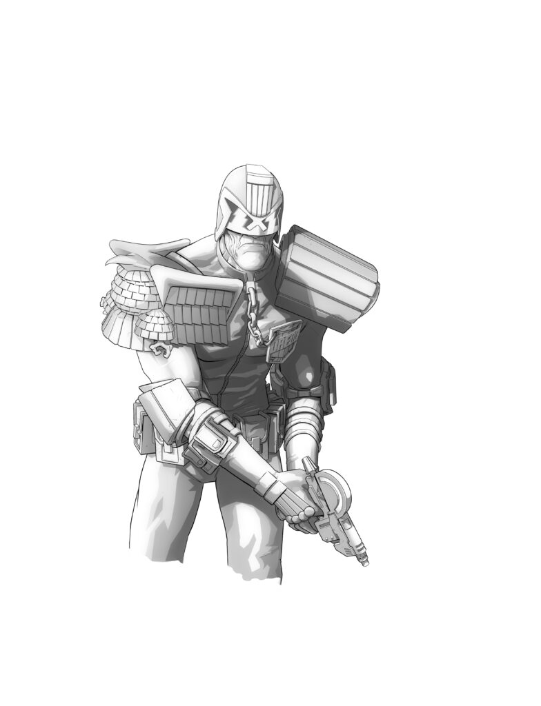
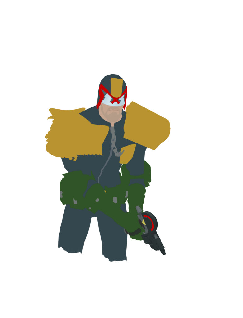
I’ve done the moody palette thing to death. That started 30 years ago. In recent years I’ve looked at classic comics, so my current method used colour to full comic advantage. But here I have subdued things a bit.
.
Oh yes, told you this one was a great one, didn’t I? Stewart just doesn’t ever under-deliver, not in his art, not in his covers, and certainly not in talking about his art either.
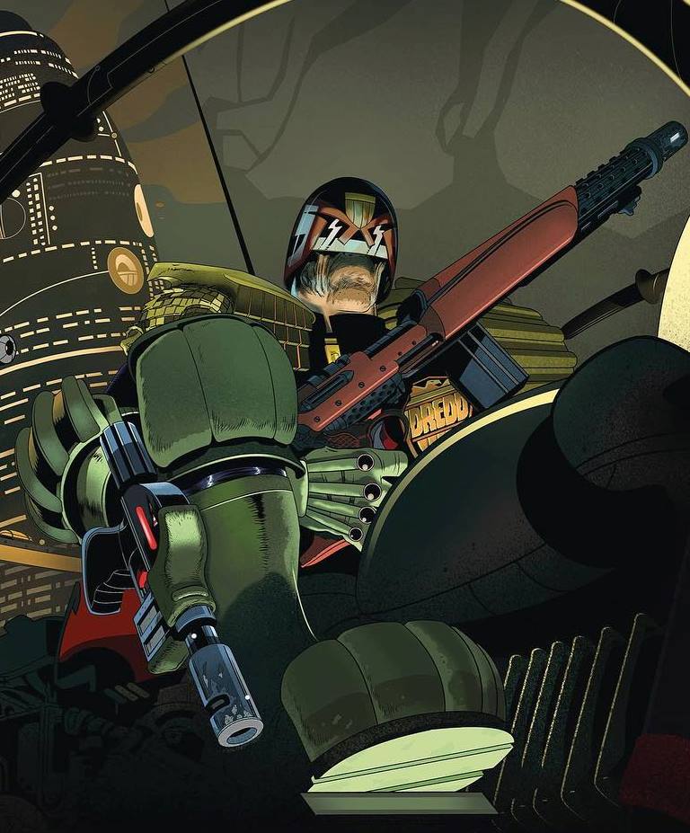
Here’s a few close-up shots from the cover, just to get you salivating a bit more…
.
Thanks so much, as always to Stewart for that one. And you can catch that cover to the Megazine 440 on 19 January – run (do not walk) to the comic shop, the newsagent, or jump online and order it from the 2000 AD web shop right now.
As for the works and looks he’s referencing… well, the Carlos Ezquerra Lawgiver and the whole Ezquerra look you can find across Dredd from the ages – but maybe take a look at The Art of Carlos Ezquerra.
Classic Carlos ref for SK Moore’s cover.
Likewise, if you’re after something to showcase the incredible work of Mick McMahon, look no further than the Mick McMahon Apex Edition.
And Classic McMahon that also finds its way into Stewart’s cover
And as for Judge Dredd: America… well, that’s a stone-cold classic of Dredd by John Wagner and Colin MacNeil.
And the classic pose from MacNeil that SK Moore brought to his cover this time.
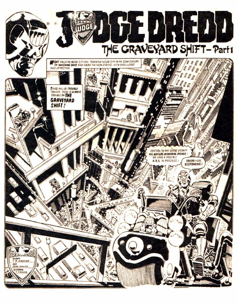
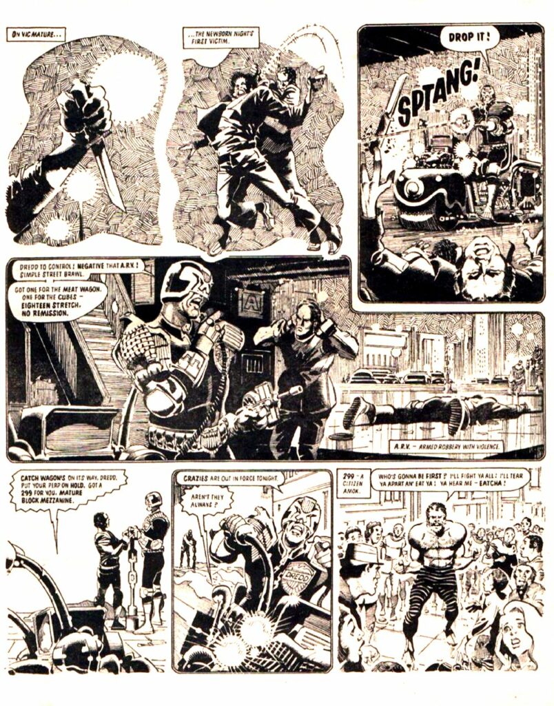
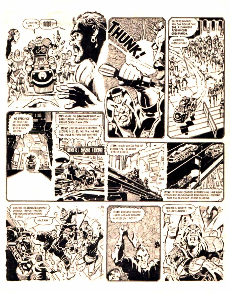
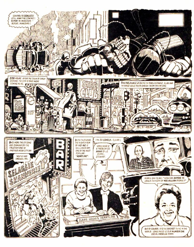
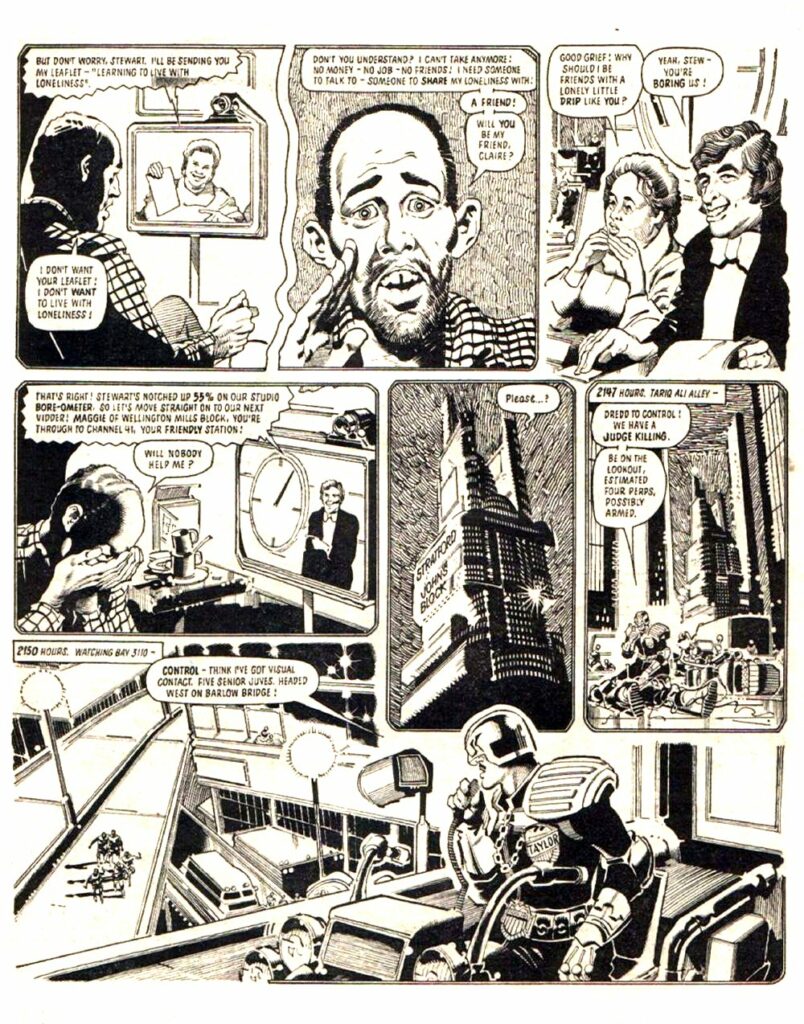
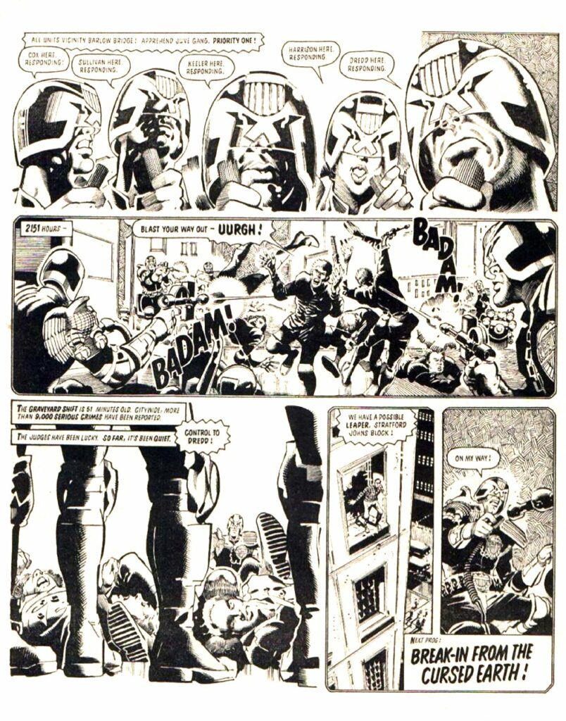
Finally, there’s Judge Dredd:The Graveyard Shift, by John Wagner, Alan Grant, and the incredible Ron Smith, the first time Stewart remembers seeing the classic ‘Watching Bay’ look that this cover’s all about. There’s not (yet – but keep your fingers crossed!) a collection of either this or a bigger Ron Smith collection. However, it’s from 2000 AD Progs 335 – 341 and you can see it in the Judge Dredd Case Files Volume 7.
If you don’t already know it, boy, you’re in for a treat. Wagner, Grant, and Smith at the height of their game, just telling the tale of a Judges team on an eight-hour night shift, an absolute storytelling masterpiece of Dredd.
So, as a special treat – the first episode of Judge Dredd: The Graveyard Shift by John Wagner, Alan Grant, Colin Smith.
Every week, 2000 AD brings you the galaxy’s greatest artwork and 2000 AD Covers Uncovered takes you behind-the-scenes with the headline artists responsible for our top cover art – join bloggers Richard Bruton and Pete Wells as they uncover the greatest covers from 2000 AD!
Borag Thungg and Happy New Year Earthlets, are we all ready to plunge into another year – after all, it’s got to get better some time right? But no matter what the world throws at us for 2022, we’ll be here giving you the very best covers in the Galaxy with 2000 AD Covers Uncovered!
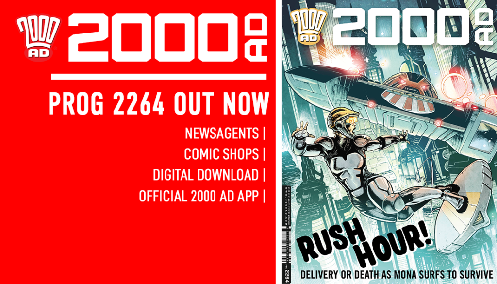
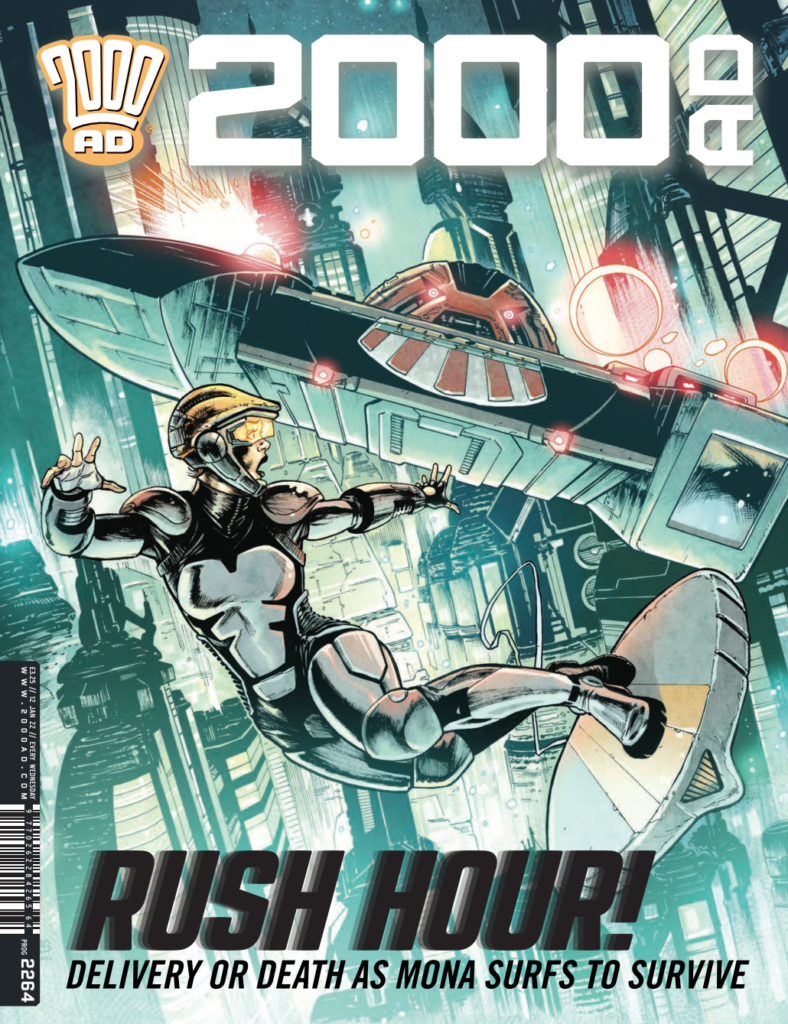
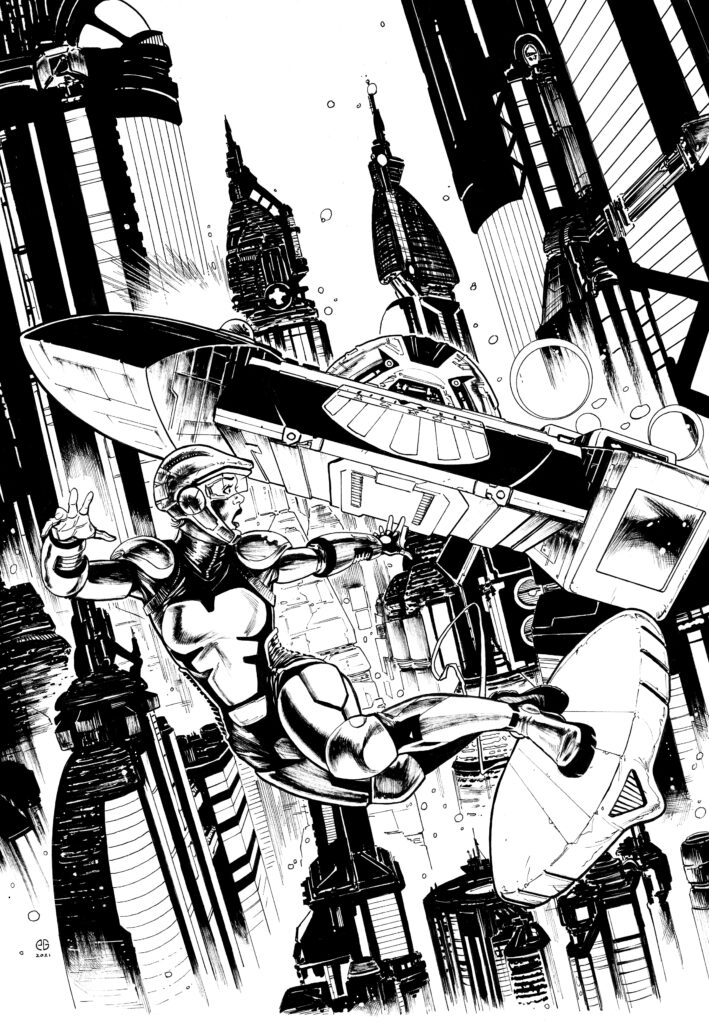
This week, it’s the return of art droid extraordinaire, Patrick Goddard, and colour droid Dylan Teague, whose art graces both the cover and inside 2000 AD Prog 2264 – out everywhere you can get your hands on the Galaxy’s Greatest Comic, including the 2000 AD web shop, from 12 January!
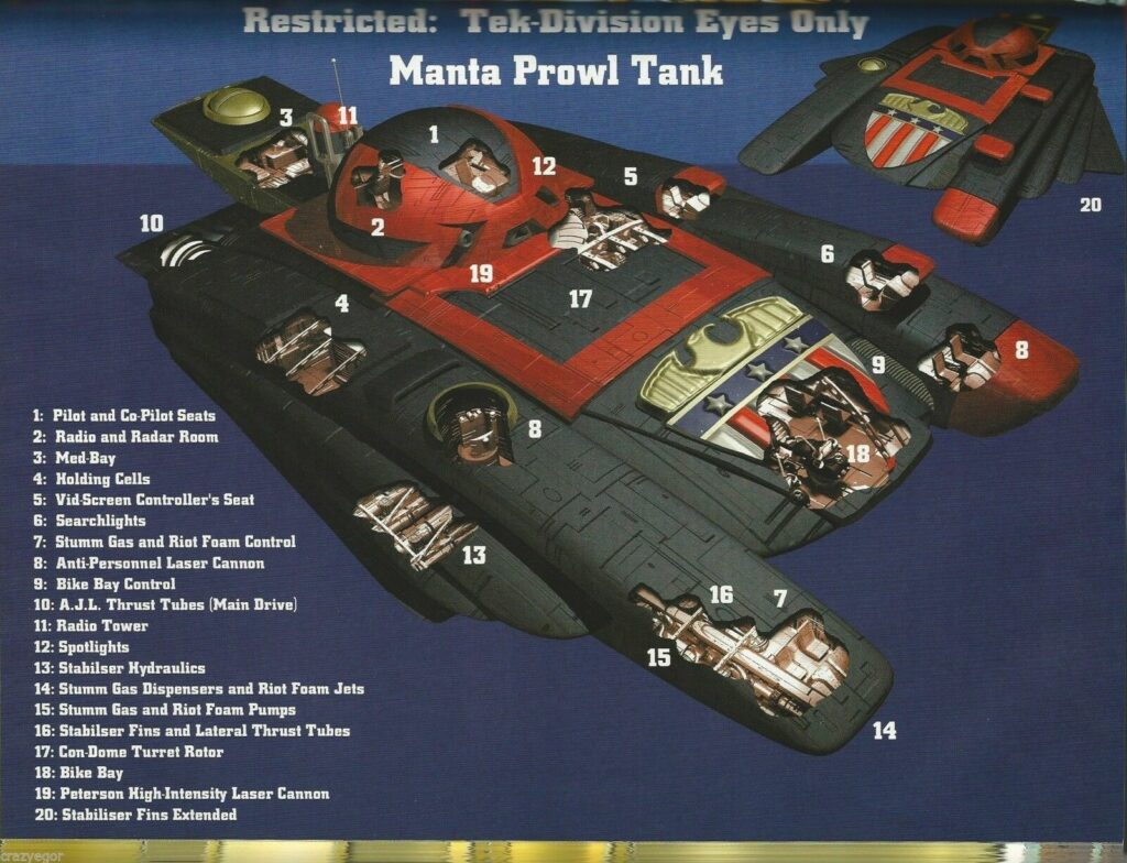
Surprise! Bloody Manta Tanks, always appearing when you least expect them! Art by Patrick Goddard, colours by Dylan Teague
.
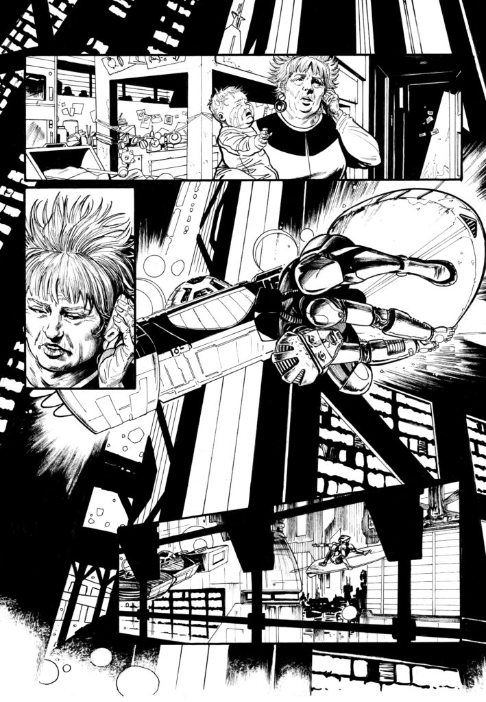
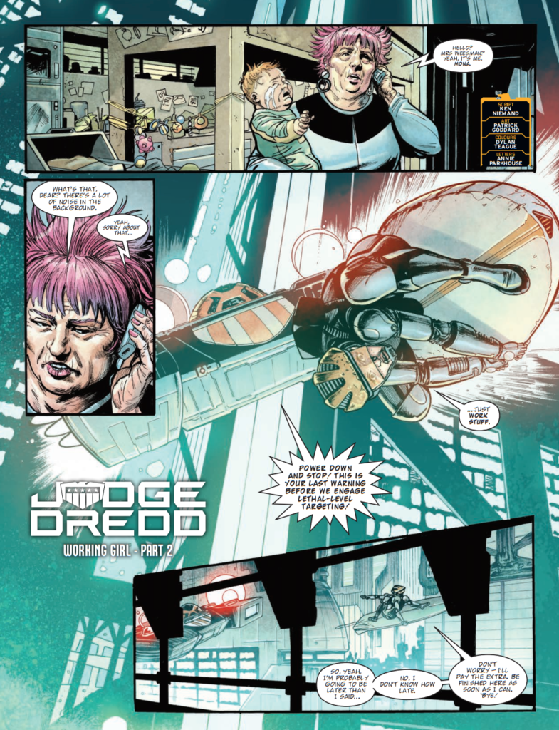
Patrick’s giving us the cover to go along with his Judge Dredd strip, Working Girl, where poor old jobbing skysurfer Mona Plankhurst finds herself on a job that’s put her on the wrong side of the law. It’s full of thrills and skysurfing action, with Patrick delivering epic MC-1 scenes from the skies as Mona does her best to escape the law on her tail. Plus, trouble with babysitters and the classic line from writer Kenneth Niemand – ‘Uh, currently? Lodged tight inside Dave Cameron…’
To find out just what gets lodged inside Dave and why, you’re going to have to pick up the Prog. But right now, it’s over to Patrick for the making of another of his Ghafflebette covers… and it all starts with a quick brief from Tharg and with Patrick grabbing a bit of photo reference for that bloody great Manta Tank on Mona’s tail.
.
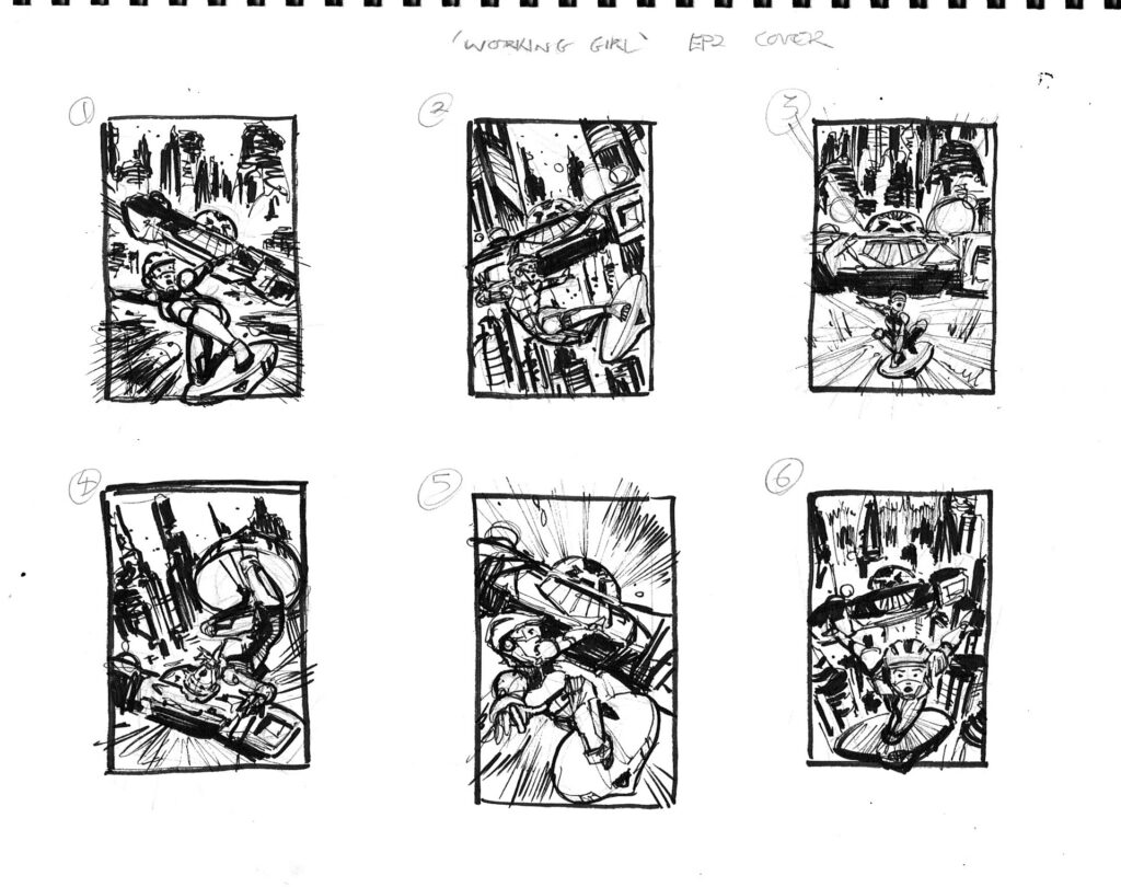
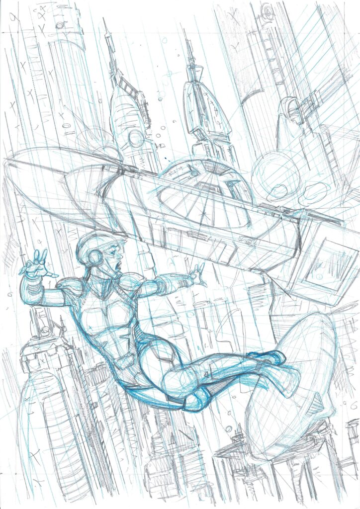
PATRICK GODDARD:As usual, it was all fairly straightforward, the brief was to have Mona being chased through the city by the Manta Tank just like in the episode.
I drew up 6 ideas for Matt and number 2 was picked the winner!
.
I changed the angle of the tank to make it that it wasn’t so in line with the city in the sketch, to try and give it a bit more movement.
I drew a fairly detailed A4 prelim to help with scale and then blew it up on my photocopier to A3 and light boxed it onto the artboard.
From the inks it went onto Dylan to work his colour magic once again and it was all done!
And here’s both the pencils and inks for the cover…
.
So many thanks to Patrick there for sending along the images. He always manages to make it all sound so simple, but we all know there’s a hell of a lot of hard work goes into making a cover look that great.
You can see Patrick’s art on the cover and inside 2000 AD Prog 2264, out on 12 January!
Patrick was also kind enough to send along his finished page one of this second episode of Judge Dredd: Working Girl for our delight…
Every week, 2000 AD brings you the galaxy’s greatest artwork and 2000 AD Covers Uncovered takes you behind-the-scenes with the headline artists responsible for our top cover art – join bloggers Richard Bruton and Pete Wells as they uncover the greatest covers from 2000 AD!
Borag Thungg and Seasons Greetings Earthlets, time to get the stockings up and start thinking about presents! Maybe a subscription to the Galaxy’s Greatest? How about a copy of the Regened or Cor!! Buster collections or a sub to the new Monster Fun for the junior Earthlets?
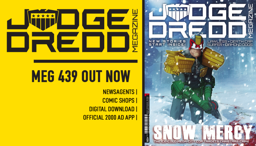
But before the annual Turkey-based (or vegetarian/vegan alternative) activities commence, there’s still the huge matter of the final Judge Dredd Megazine of the year to deal with! Issue 439 is out everywhere Zarjaz comics are sold, as well as the 2000 AD web shop, from 15 December.
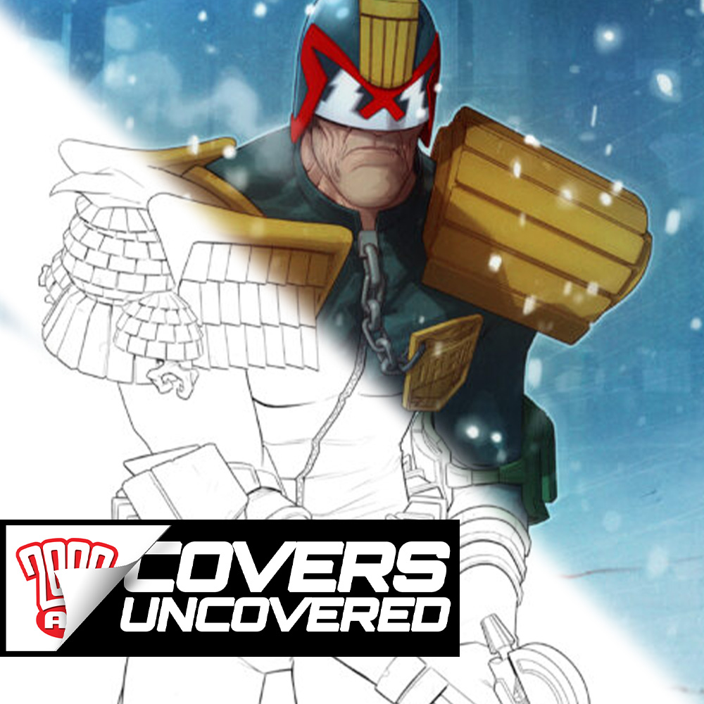
You definitely won’t be able to miss it on the shelves, thanks to the Ghafflebette cover from art droid Lee Carter!
.
LEE CARTER: It was great to be asked to do a cover for the Megazine, especially since it was my first cover! Well, except for the Rogue Trooper Loot Box Special, but that didn’t count as it was a panel from the strip.
And a huge bonus in that it was the Christmas issue. Both the 2000 AD and Judge Dredd Megazine festive covers are much like the Radio Times Christmas issue for me, one of the joys of Christmas…
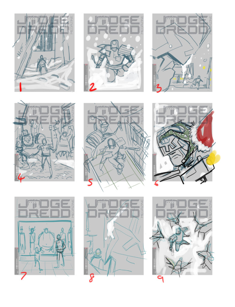
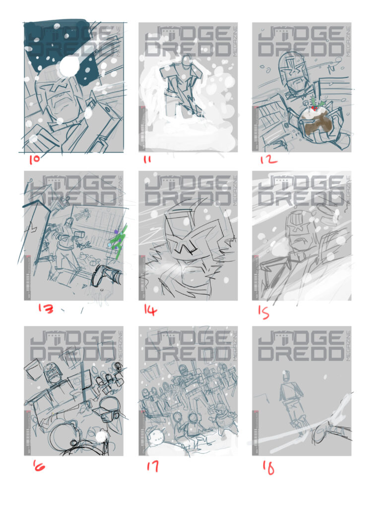
So, I produced two pages of thumbnails, probably a bit overboard but I wanted to give Matt a wide choice, no doubt many ideas have been used before.
18 cover roughs – you can NEVER have too many!
.
I really loved the old Victorian Christmas village scenes that used to be on greeting cards, so I went for a Victorian theme park robots running amok, mutant reindeer maybe, Dredd in a Blizzard, Dredd in a toyshop chase… or a suspect lineup featuring various mutant Christmas archetypes.
Thankfully, Matt went for the simplest one… Dredd knee-deep in the snow…
Drokking thru the snow… sing along kids!
.
I drew the line work digitally, drawing it on Photoshop for me is like penciling and inking at the same time, you just draw it in black but unlike inking you can undo and rub it out.
.
Once I’m happy with the line I do a few layers of grey tones, keeping it all on separate layers means I can reduce the opacity if I want to change .
.
The colour work begins with simple flats which I put under the line and grey tone layers. When it’s all together I can change the tonal layers to colour and add a bit more interesting mix of colours to it all. The background was various photos of snow from my reference folders, composited together and painted over. Then more painting into the background – added some fogged-out buildings and more texture… and of course blood.
Colouring step 1 – a very flat looking Dredd
Colouring step 2 – the Dredd all perps love to see at Christmas…
Colouring step 3 – ah, the crunch of jackboots through the snow – backgrounds added
Colouring step 4 – let it snow, let it snow, let it snow – that’s really going to help his mood.
Colouring step 6 – you know the old saying… It ain’t Christmas without a little bit of blood
And that’s that for the cover! So, as the spirit of the law makes his way to your door through the snow to tell the kiddies to tell them to be good or it’s five years in the iso-cubes, we’ll take our leave.
Thanks to Lee Carter there for a perfect end to what’s been a particularly great year of Megazine covers! You can find Megazine issue 439 on shelves of the finest comic shops and newsagents, as well as the 2000 AD web shop, from 15 December.
Sure, the year itself might have been a bit crappy, what with, well, you know… *Gestures broadly at everything* – but we’re sure the quality of the work in the Galaxy’s Greatest comics has been something to make things that bit better! We’ll be back with more Megazine treats with Covers Uncovered in 2022 – meanwhile, thanks once more to Lee Carter and have a Zarjaz time this Christmas and New Year!
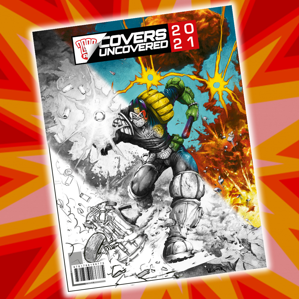
The secrets behind the greatest comic book covers in the galaxy – revealed in a brand new annual!
Every week, 2000 AD Covers Uncovered takes readers of the 2000 AD website behind-the-scenes on the covers of both 2000 AD and the Judge Dredd Megazine. From idea to pencils, from inks to colours, 2000 AD Covers Uncovered reveals the processes behind the jaw-dropping, genre-defining art that graces the covers of the Galaxy’s Greatest Comics!
For the first time, this new annual collects the artwork for every 2000 AD and Megazine cover from a single year in a square-bound bookazine format. Each cover is presented without logos and cover furniture, allowing readers to savour each image in all its glory.
Alongside, step-by-step images such as wireframes, pencils, inks, and inspiration are presented alongside commentary from the artists themselves, providing fascinating detail about the process behind their covers
Written and curated by blogger Richard Bruton, the 2000 AD Covers UncoveredAnnual 2021 is not only an enthralling collection of stellar art but also an indispensable insight into the artistic process.
Every week, 2000 AD brings you the galaxy’s greatest artwork and 2000 AD Covers Uncovered takes you behind-the-scenes with the headline artists responsible for our top cover art – join bloggers Richard Bruton and Pete Wells as they uncover the greatest covers from 2000 AD!
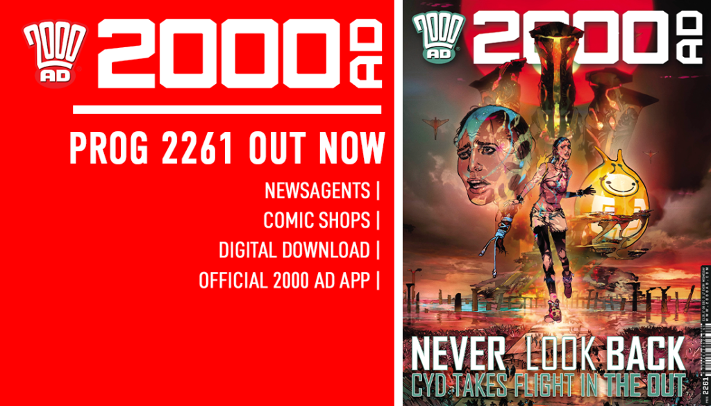
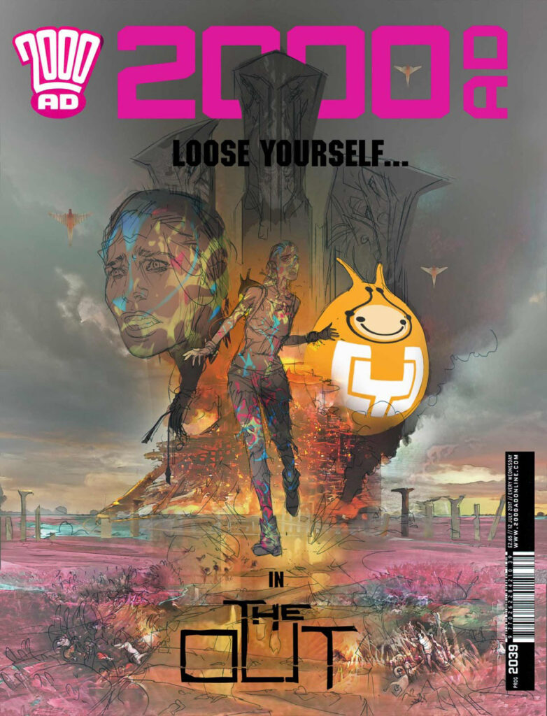
Welcome one and all, to the penultimate 2000 AD Covers Uncovered for 2021… and it’s a return to The OUT with artist Mark Harrison.
This stunning series, by Dan Adnett and Mark Harrison, has taken us further and further into the wonders of the universe with Book 2, with photo-journalist Cyd Finlea (and her sentient flatspace bag) still cataloguing the alien societies she’s been encountering but, as the series has approached the conclusion of Book 2, things are getting… well, without spoilering a fabulous ending, let’s just say they’re taking things to a whole new level here!
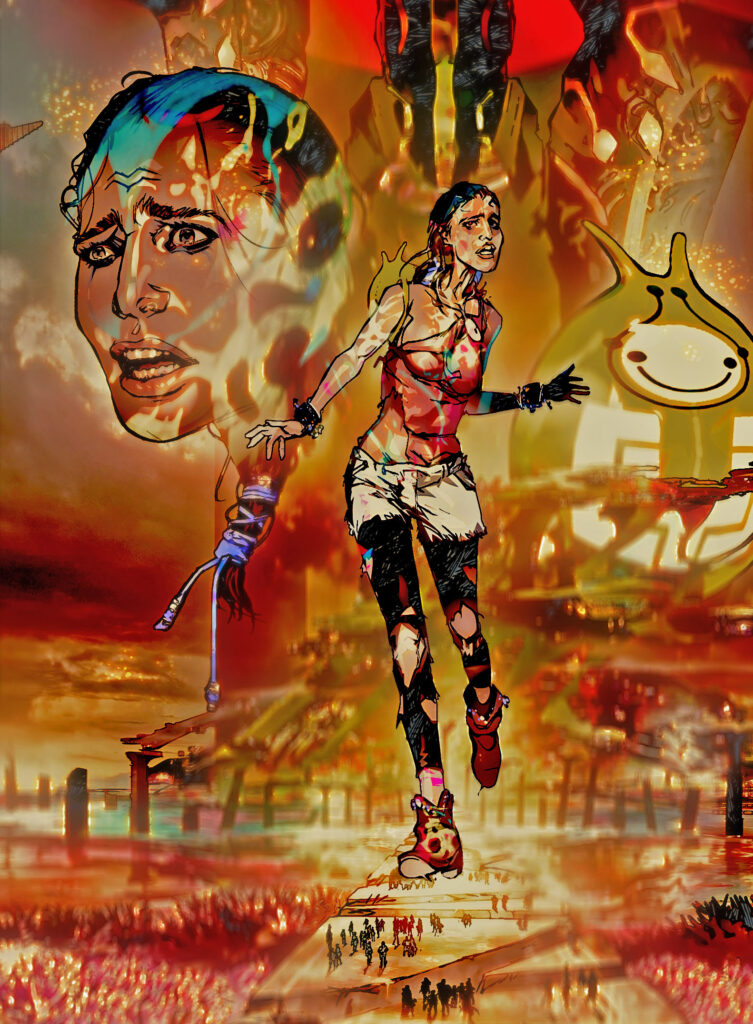
Mark has put a hell of a lot of work into The OUT and he’s reflecting that every time he talks process here at 2000 AD Covers Uncovered. Fittingly, for Mark’s final CU of the year, he’s gone deep, deep, deep into the final stage of putting this cover together… it’s a beauty of a cover and a monster of a CU for you. You can see it on the shelves adorning 2000 AD Prog 2261 on 8 December.
So, without further ado… Mark Harrison presents…
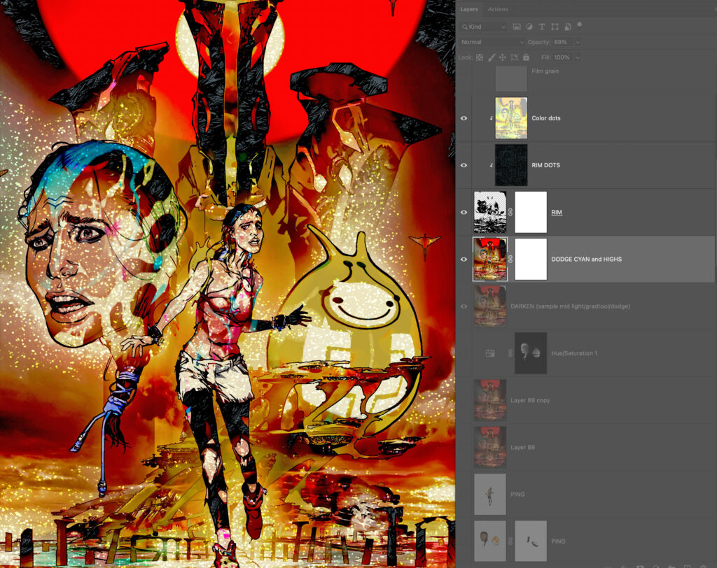
THE BEAUTY PASS – A look at the last stage of finessing of The OUT artwork.
MARK HARRISON: The last stage of my production line art process is to employ various actions, filters and additional art files to give the art a cinematic feel; to add “PING” to all the pages to help the images jump off the page, glow with an inner light, or dazzle with colour. It’s just a comic but in my mind, it’s a movie in static form!
So, first a quick recap on the usual stuff…
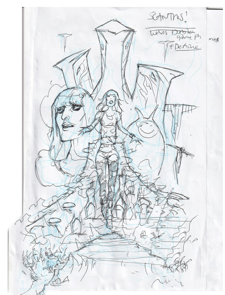
STEP 1 – The ‘scribbled rough’
STEP 1 – The scribbled rough
It all starts with a scribbled rough on the back of Dan’s script (the only bit done outside the computer) to get some ideas done. This is done in blue pencil, quite a fat line so I don’t get hung up on detail. I’m looking to create a sense of composition, balance negative and positive space. Finished off in spidery biro.
I had this idea of a film poster – full figure Cyd running towards us overlaying a biblical scene of destruction, floating heads of Cyd and Bag, a giant tree stump city in flames and the Tankinar silhouettes looking ominous behind. I’ll ‘fess up to the inspiration and references: The pose is pretty much Jessica 7( the gorgeous Jenny Agutter) from the Logan’s Run film poster. For the Tankinar I had in mind AT-AT’s in silhouette in The Empire Strikes Back. The revised headshot of Cyd (will I /won’t I add alien blood) was from my thumbnail sheet of actress Lake Bell from the film “Man Up” who has been the muse for Cyd throughout the story.
Inspirations, references, and muses
STEP 2 – The finished sketch
Elements assembled, I sent a more finished sketch off for final approval.
STEP 2 – The finished sketch
STEP 3 – At this point, I’ve added some pink weed victims
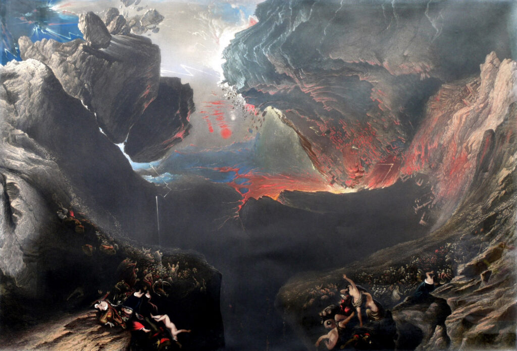
Biblical fuss and bother in the form of John Martin’s ‘The Great Day of His Wrath’. This imagery has also found its way into Glimmer Rats as well as Grey Area. It’s also the basis of the Taffy Landmass manipulation and sculpture of Lustra, but as in that episode, it kind of gets painted over in this cover.
STEP 3 – Biblical fuss and bother in the form of John Martin’s ‘The Great Day of His Wrath’
STEP 4 – Getting into the Layers and Masks
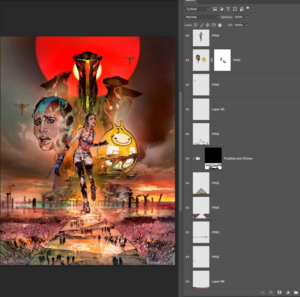
I tend to work in Layers and Layer Masks in PhotoShop, breaking the scene down into foreground, midground, and background, using their layer transparency for additional selection and editing options. (Excuse the Layer names. I get bored of “Layer this/that” and just have the actions sign off on a memorable word.)
STEP 4 – Getting into the Layers and Masks
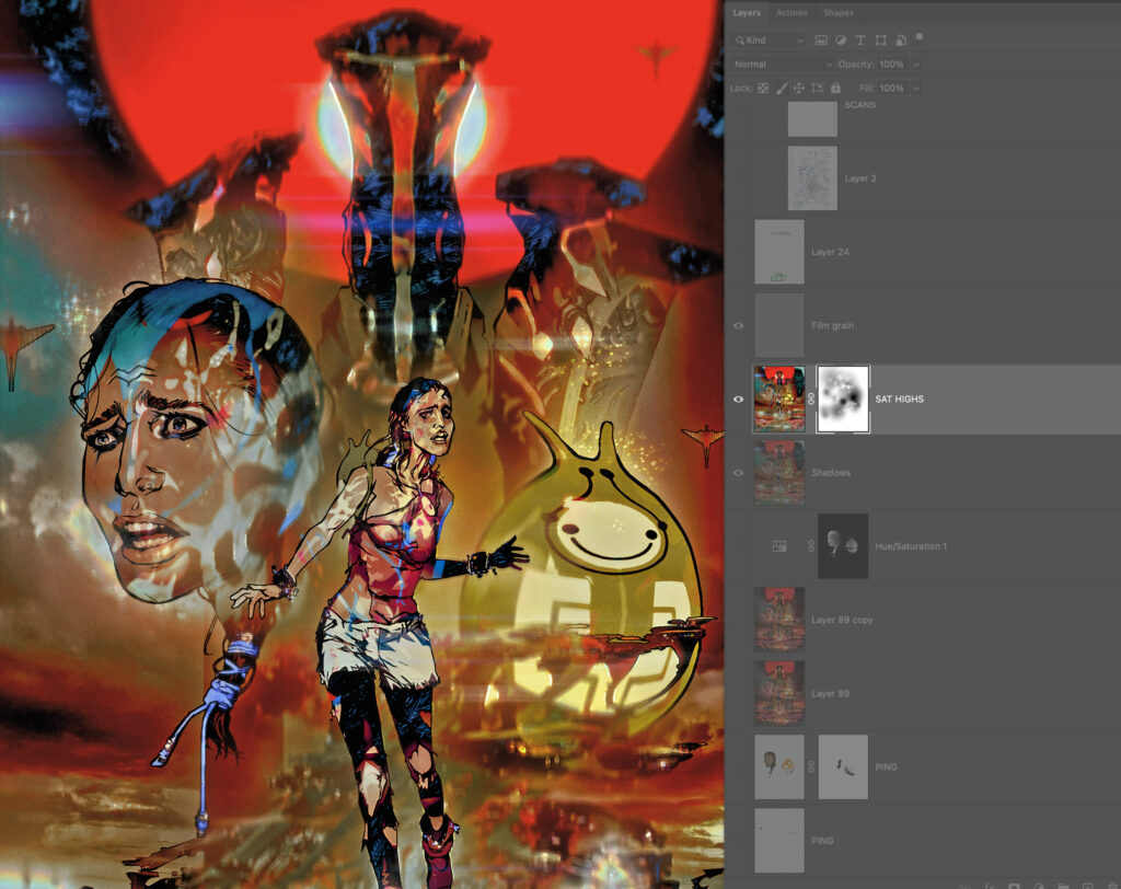
So that shows the artwork merged to a new layer and ready for the Beauty Pass. This will be a series of a dozen or so Actions that will take the art’s tonal and hue values and use them to create effects and enhancements.
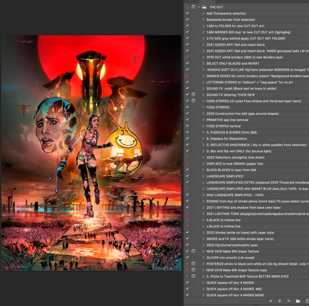
STEP 5 – Actions, Actions, Actions
This shows a snapshot of just some of my Actions. Actions, for those who don’t know, are scripts you can ‘record’ in PhopShop to playback and perform repetitive procedures saving you time and effort – most of the time. I do seem to spend an inordinate amount of time undoing or editing the effects created!
STEP 5 – Actions, Actions, Actions
Some are named after artists that have inspired them. They number in the hundreds and are constantly being refined. Recently I had to move to a new computer, Mac operating system, AND PhotoShop version and found many of these Actions were broken! THAT was a frustrating week of fixes! But, in the long term, Actions are great time savers with predictable results – and it’s why I prefer PhotoShop over other comic art applications.
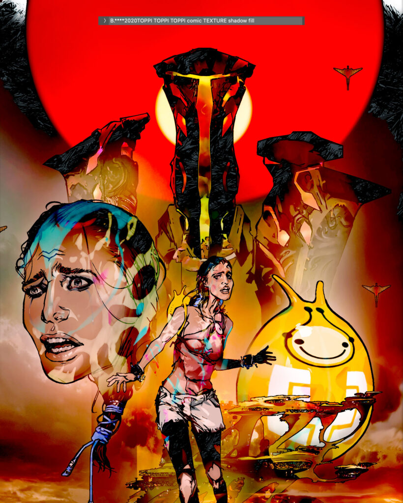
STEP 6 – The Toppi Texture
After a ‘halo’ of brightness around the main character is applied where necessary a ‘TOPPI texture’ fill is applied to the solid black inks from another document to imply a hatched texture I have slavishly worked on. This is a “cheat” just to lessen the intensity of the blacks. It’s a hatched artwork pattern based on the style of Sergio Toppi, a legendary comic artist who influenced the likes of Walt Simonson and Bill Sienkiewicz, (Marvel comic artists with a decidedly European look to their work.)
STEP 6 – The Toppi Texture
The texture is on another Layer and has a Layer Mask to paint into and reduce the effect. All the actions work on duplicate or separate layer and have layer masks as the effects usually globally affect the whole image and have to be dialed back, typically by me painting into the Layer Mask (nondestructively) and ‘hiding’ the areas the effect work. I then invert the mask to only reveal what I want. I do this A LOT.
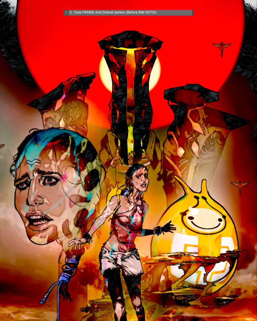
STEP 7 – Tonal Fringe
I next run an Action to create ‘Tonal Fringe’; that is to accentuate the tonal transitions around highlights. Seen here unedited and awaiting me painting into its Layer Mask.
STEP 7 – Tonal Fringe
STEP 8 – Getting Specular
Specular highlights such as sweat, spray, or airborne particles are once again taken from another document of dots. (An old starfield I used to use on Durham Red!) The Action used the arts tonal and hue information to give me a rough approximation of placement.
STEP 8 – Getting Specular
STEP 9 – Anamorphic Lens Blur
Now we’re are into cinematic stylings, something maybe unique to my comic art.
STEP 9 – Anamorphic Lens Blur
This is a much more complex action than it initially seems, blurring a copy of the art to create a depth of field, as if the art was photographed. A duplicate of the art is stretched into 2.35 ratio proportions and a Lens Blur filter applied. Then is compressed back to its original art size to get the elliptical bokeh lens effects seen in anamorphic films. (I’m a sucker for that look and the lens flares it creates. To me it IS movies )
STEP 10 – The Tonal Fringe and Light Patch Action
This is a late addition to the Beauty Pass list. This takes small light areas in the image and creates a halo of yellow-orange. It’s to replicate that diffused light fringing seen in dappled sunlight. I saw its effect used in Japanese Anime background paintings to capture that bloom and flare of exposure. Again, limited use gives the best effect.
STEP 10 – The Tonal Fringe and Light Patch Action
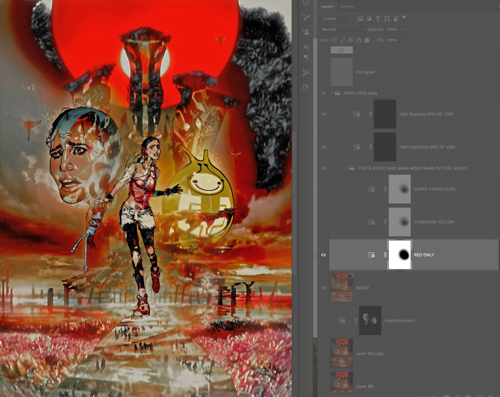
STEP 11 – Colour Grading.
The art can look a bit similar at times with a production line process being applied so this series of Actions adds Layer Adjustment variations by showing bias towards certain colours and desaturating the art. Here the reds are shown at the expense of other colours.
STEP 11 – Colour Grading.
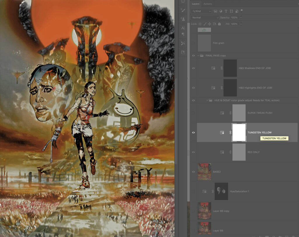
STEP 12 – More Colour Grading
Here we see the yellows are favoured. By using a combination of these Adjustment Layers I can dial back the garishness.
STEP 12 – More Colour Grading
STEP 13 – Adding Teal.
Teal (a complementary/opposite colour to orange) is used in films to help flesh tones be punchier or add colour to areas of low saturation. Greyish areas are targeted and the teal colour itself is modified, pushed more to the blues where the reds are more present.
STEP 13 – Adding Teal.
STEP 14 – Star Wars Flares (no, not the 1970’s trousers fashion.)
Fun fact: For Star Wars A New Hope, cinematographer Gil Taylor stretched nylon stockings over the lens to give the film a diffused fairy tale look, producing these in-camera effects: Cross Flares. The look is unique to A New Hope amongst the Star Wars films, the other films failing to pick up on the effect. I loved this effect; it made the film seem magical.
To replicate these particular flare effects I applied a Shape Blur Filter using a custom-made ‘Maltese Cross’ Shape as the source Shape. The effects targets copied isolated highlights on a separate Layer in Screen mode. Here is the effect full blast. The effect is also colourised to suggest a prism effect. (It took me ages to work this Action out!)
STEP 14 – Star Wars Flares
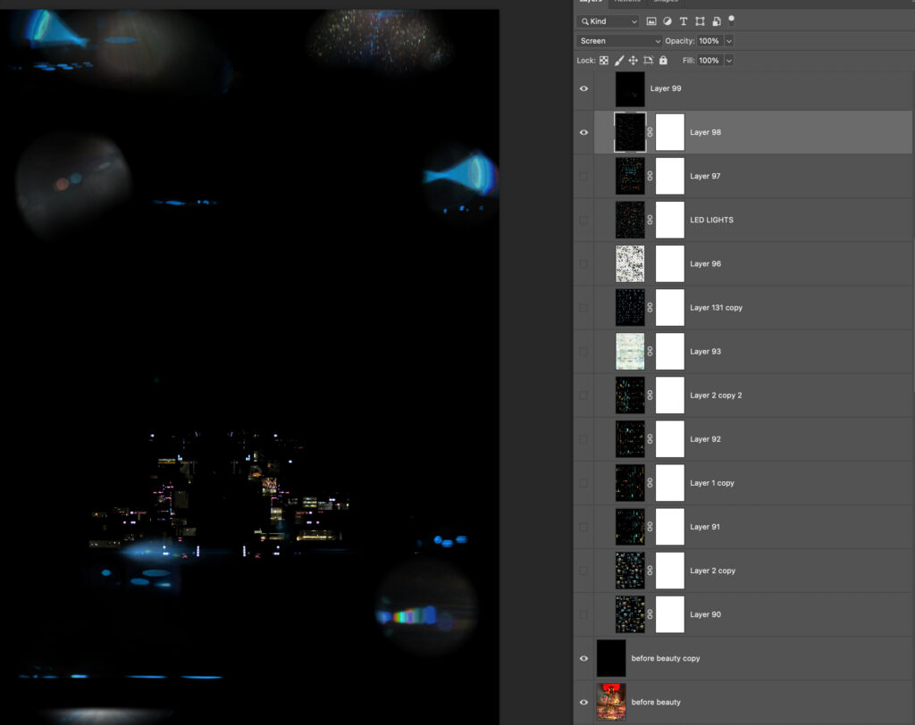
STEP 15 – The Bells and Whistles.
But that’s not it for flares, spill, and general lighting goodness! Sent to a duplicate document this is a Layer breakdown of effects including a light spill I use whenever something dark is against light. It suggests the intensity has bled into the black, emphasising the glow effect. Typically red in colour, there is a grouped blue colour to suggest a cooler light. There are also horizontal flares, again generated from the artworks highlight information.
STEP 15 – The Bells and Whistles.
STEP 16 – Hue & Saturation Layers
Subtle but desirable, there is a series of Hue and Saturation Adjustment Layers that adds a slight variation based on tone; oranges get pushed more to the red hues in the shadows, cyans more to blue.
STEP 16 – Hue & Saturation Layers
STEP 17 – Final Colour Boost
A final action boosts the colour values in highlights that may have been lost.
STEP 17 – Final Colour Boost
STEP 18 – Bringing Light To The Dark
Something I haven’t talked about is added art Layers such as lights and lens flares. These exist in Folders as part of the default art document I start with. They are usually edited early in the art process, in case they can inform lighting choices. Here, lens flares, city lights and some small operational lights are against black in Screen Mode.
STEP 18 – Bringing Light To The Dark
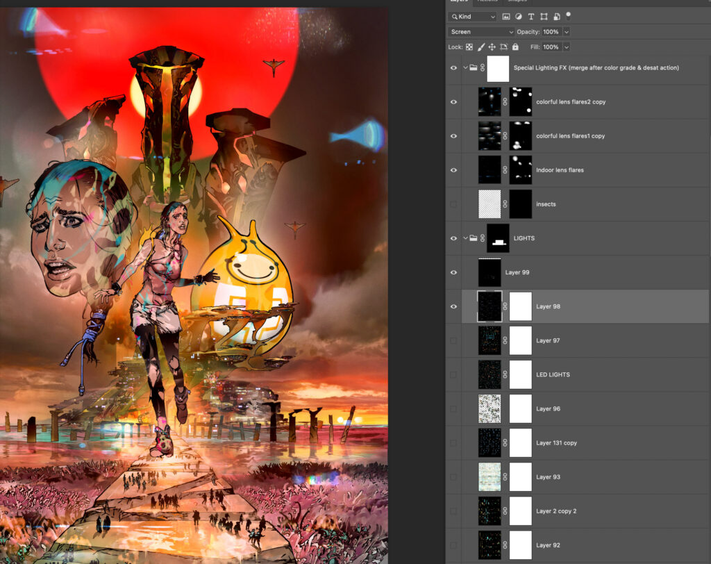
STEP 19 – Lights & flares added to the art.
The trick is to use this sparingly as it is tempting to saturate the image and strip with too many flares.
STEP 19 – Lights & flares added to the art.
STEP 20 – Getting the glow on
There are other actions that I run to generate glowing windows or shapes, reflections (as in water) or light recesses (as seen here) that are derived from the Lights Layer.
STEP 20 – Getting the glow on
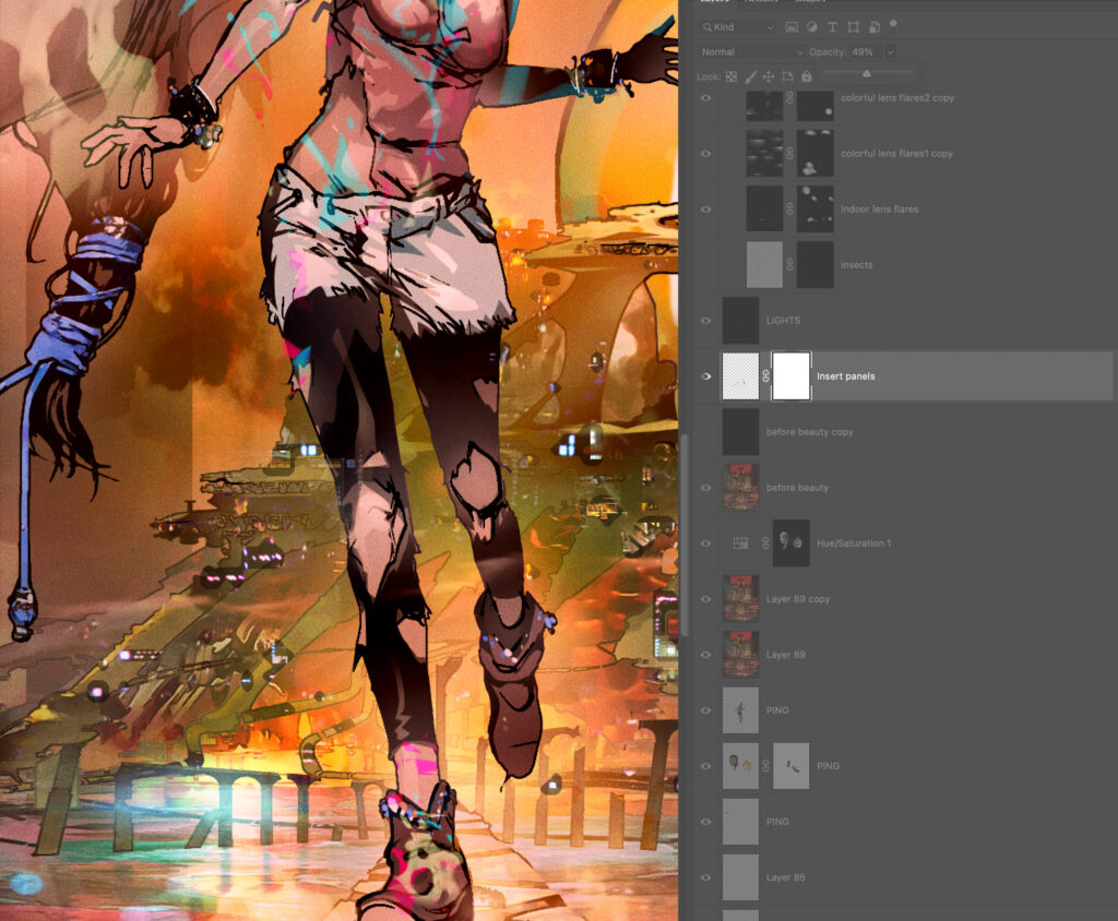
STEP 21 – The perfectionist layer
To cap it all off I add a Film Grain Layer. This is pretty much invisible in the printed comic to the naked eye but helps me in harmonising all the art while working on it.
In the sterile perfect world of the computer, replicating the noise of imperfection is a desirable look for me, so effect perfect computer-drawn lines with a Displacement Filter using a Page texture that adds tiny “wobble” and breakup to the lines, so they match my actual drawn art.
It’s unbelievably subtle and probably completely unnecessary but I’m a perfectionist… of imperfection! ??
And that’s it!
Once again, everybody give Mark Harrison a HUGE round of applause for that one – he really never disappoints with his covers or his Covers Uncovered! We’ll be back next week for the final CU of the year, but be sure to look out for Mark’s stunning cover for 2000 AD Prog 2261 in comic shops, newsagents, and from the 2000 AD web shop from 8 December!
Every week, 2000 AD brings you the galaxy’s greatest artwork and 2000 AD Covers Uncovered takes you behind-the-scenes with the headline artists responsible for our top cover art – join bloggers Richard Bruton and Pete Wells as they uncover the greatest covers from 2000 AD!
You’ll have been having a wonderful time, darlings, with the delights of seeing Sensitive Klegg put on a musical tribute to his hero, Judge Dredd, in the Rob Willams and Chris Weston extravaganza, Judge Dredd: The Musical that started in 2000 AD Prog 2259.
Well, on the cover to Prog 2260 we’ve even more of a treat for you – as Chris Weston takes to the cover to give us the finale to this musical masterpiece…
.
So, over to Chris Weston to tell you all about the madness!
CHRIS WESTON: I was tasked by Tharg to create a new cover for the third part of Dredd: The Musical. He asked to see Sensitive Klegg onstage surrounded by a selection of his fellow performers.
There was a panel in the second episode that I thought would make a good starting point; it featured Sensitive Klegg with an ill-fitting Judge helmet perched on his head. It seemed to perfectly capture the theme and tone of the story: an extremely silly illustration of a fool on his life’s errand!
.
I expanded the panel and added in his fellow performers, all of whom are modeled on past members of Dredd’s ensemble. I made sure they were all giving an enthusiastic demonstration of Zarjaz-hands!
.
Once this was approved by Tharg, I then proceeded to finished inks.
.
But it still wasn’t showbizzy enough! Some online research led me to the publicity poster for the show “Chicago”. I was really taken with the spangly-curtain texture used on the title letters.
.
I thought it might be fun to do a similar effect on the 2000ad logo. I searched fruitlessly to find a high-resolution spangly-curtain texture I could use, so in the end, I was forced to make my own. That’s probably a good thing.
.
I incorporated the 2000 AD logo into the art and set about digitally colouring the page. It took me ages! I have no idea how colourists can afford to make a living! Like Max Normal on this cover, I take my hats off to them, I really do!
.
That pretty much explains the full process behind this page, darlings! Bouquets and ten-minute standing ovations will be gratefully received, Earthlets!
.
Are we all feeling suitably gorgeous now, darlings? Thanks to Chris for sending along the glorious, surely Emmy Award-winning art along – can art win Emmys if it’s art of a musical? No? Well, when it’s this damn good it should be able to!
Judge Dredd: The Musical began in 2000 AD Prog 2259 and concludes in 2261, with Chris’ perfectly over the top cover of 2000 AD Prog 2260 to be found in all the finest retail establishments and from the 2000 AD web shop.
Every week, 2000 AD brings you the galaxy’s greatest artwork and 2000 AD Covers Uncovered takes you behind-the-scenes with the headline artists responsible for our top cover art – join bloggers Richard Bruton and Pete Wells as they uncover the greatest covers from 2000 AD!
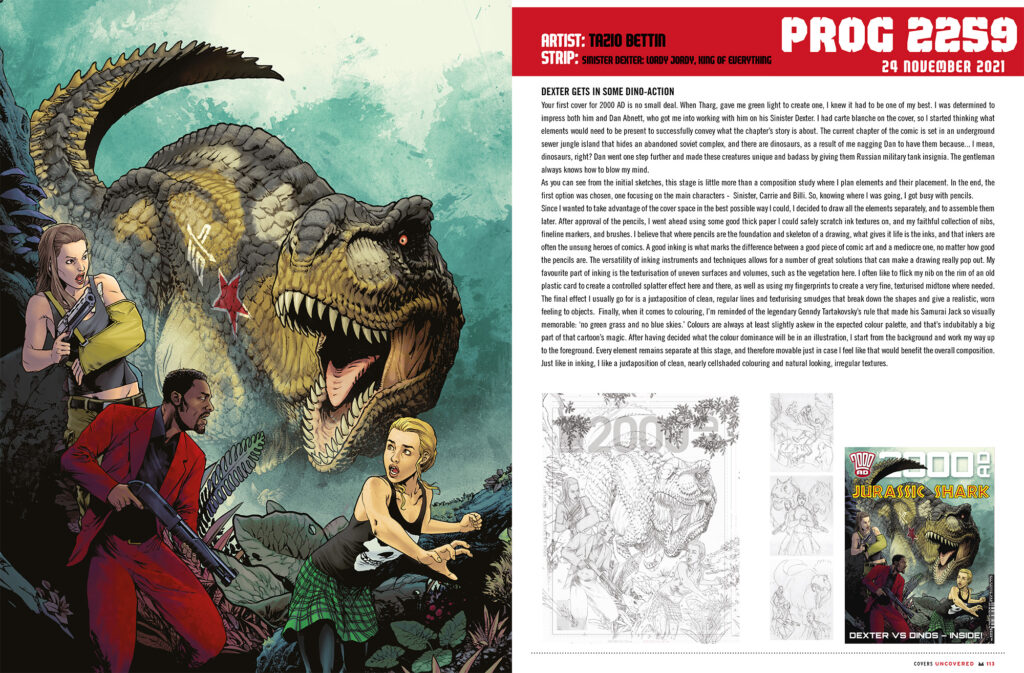
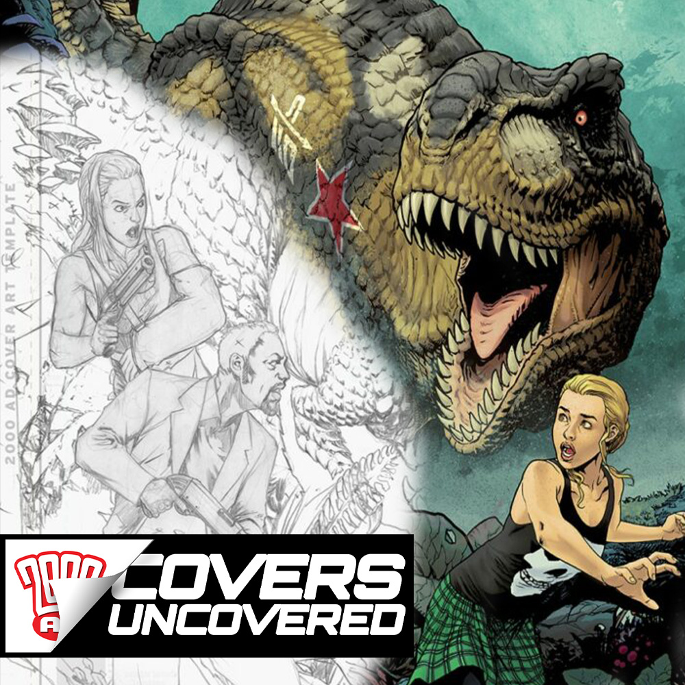
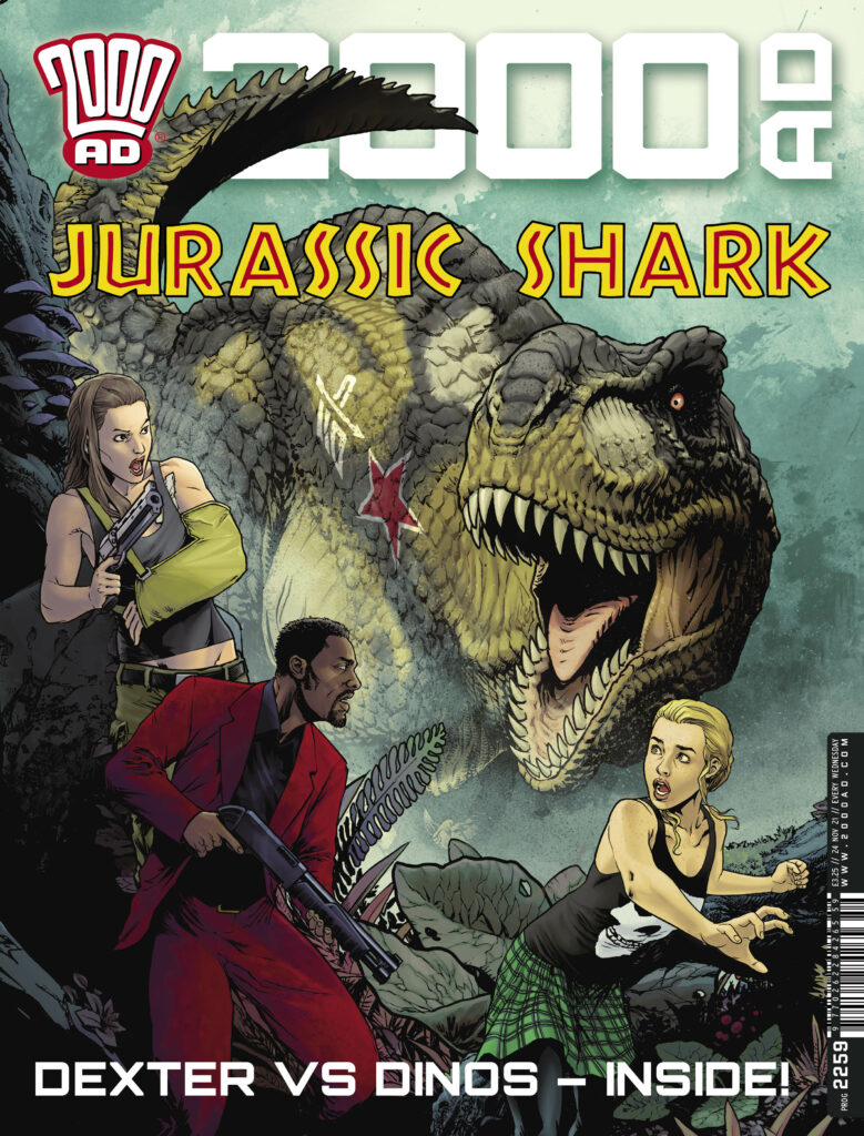
It’s time to check in again with Sinister Dexter… or at least Dexter, in 2000 AD Prog 2259, out on 24 November – as Dan Abnett and Tazio Bettin bring us Dexter in Lordy Jordy: King of Everything. And it’s also a warm welcome for his debut cover to Tazio Bettin!
.
Now, over to Tazio for the making of the cover…
TAZIO BETTIN: Your first cover for 2000 AD is no small deal. When my editor, Matt, gave me green light to create one, I knew it had to be one of my best. I was determined to impress both him and Dan Abnett, who got me into working with him on his Sinister Dexter.
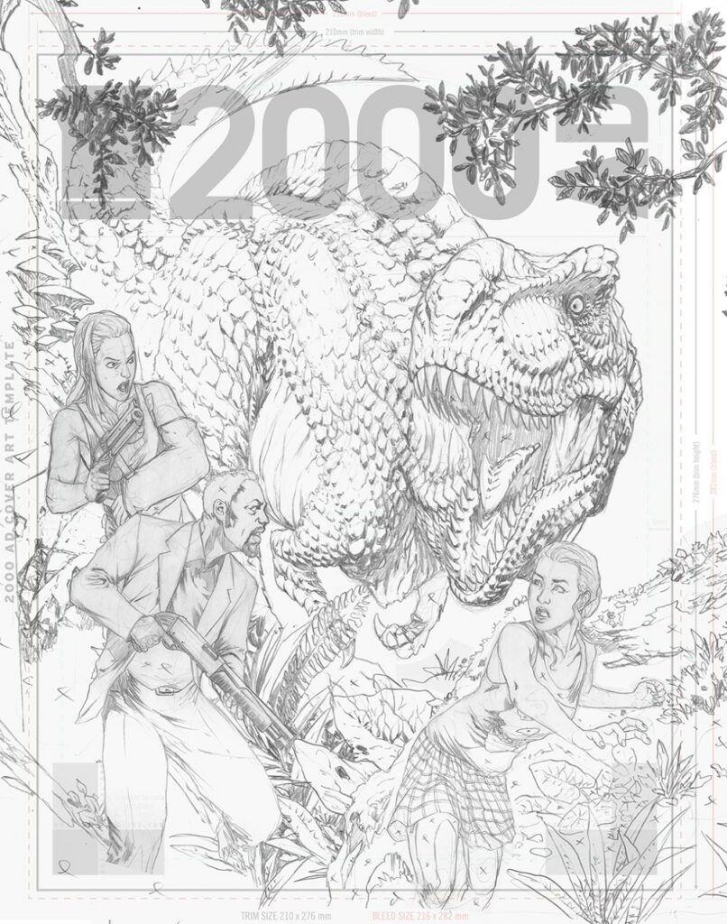
I had carte blanche on the cover, so I started thinking what elements would need to be present to successfully convey what the chapter’s story is about. The current chapter of the comic is set in an underground sewer jungle island that hides an abandoned soviet complex, and there are dinosaurs, as a result of me nagging Dan to have them because… I mean, dinosaurs, right? Dan went one step further and made these creatures unique and badass by giving them Russian military tank insignia. The gentleman always knows how to blow my mind.
Dexter, Carrie and Billi are the focus characters, so they obviously needed to be there. Previously, they had encountered some pretty cool characters, which I had immense fun in designing, such as Kalinka the robot and especially Vegvisir. She was initially meant to be just some lieutenant of the queenpin Bates, capturing our heroes at the beginning of the previous chapter, but when I drew this character as a tough, muscular woman with a cold attitude, Dan decided to give her a name and make her central to the story, which filled me with joy.
.
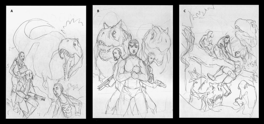
So on I went and prepared some layouts for the cover, two of which included Vegvisir, and the last focusing on the main characters only. I didn’t want the composition to be excessively busy: I think I prefer essential, simple, and iconic compositions over crowded covers with dozens of characters striking an action pose, the likes of which you constantly saw – especially during the nineties when I grew up – and didn’t especially like. I decided that this composition had to have no more than three characters and, of course, dinosaurs.
As you can see from the initial sketches, this stage is little more than a composition study where I plan elements and their placement. In the end, the first option was chosen, one focusing on the main characters – Dexter, Carrie, and Billi. So, knowing where I was going, I got busy with pencils...
.
In drawing dinosaurs for this chapter of Sinister Dexter I actually tried to go with the best scientific knowledge we have of these awesome animals, which ones were likely (or proven) to have feathers and which ones apparently didn’t. To the best of my current knowledge, it seems likely that among Theropods, Tyrannosauridae didn’t have feathers, so my inspiration came from crocodiles. I know it’s a completely different clade, but I took some artistic license inspired by Peter Jackson’s King Kong dinosaurs. Unlike your naked-skin Jurassic park T-Rex, I decided that my Tyrannosauri have scales on their backs and heads and a slightly crocodile-like tail. Oh and let us remember that Tyrannosauridae first appeared in the Late Cretaceous. What’s with this Jurassic nonsense anyways?
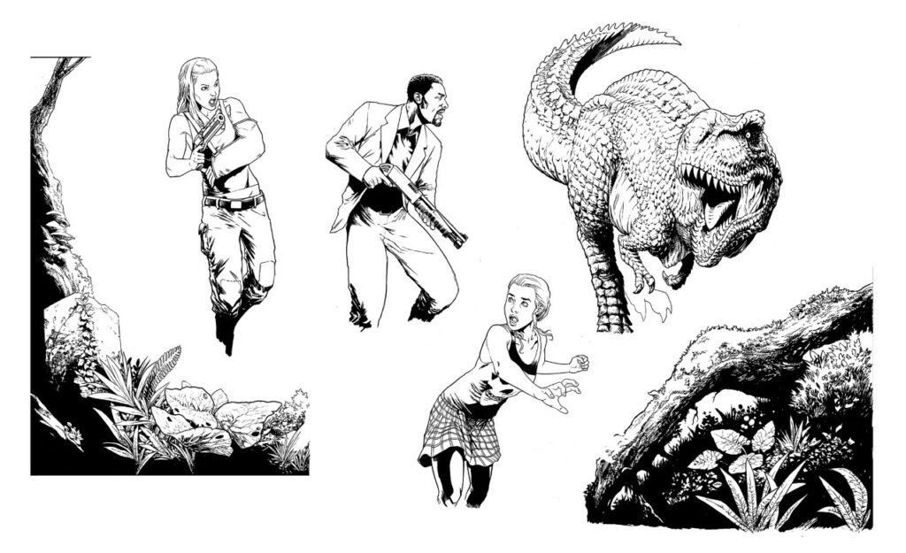
Since I wanted to take advantage of the cover space in the best possible way I could, I decided to draw all the elements separately and to assemble them later…
.
After approval of the pencils, I went ahead using some good thick paper I could safely scratch ink textures on, and my faithful collection of nibs, fineline markers, and brushes. I believe that where pencils are the foundation and skeleton of a drawing, what gives it life is the inks, and that inkers are often the unsung heroes of comics. A good inking is what marks the difference between a good piece of comic art and a mediocre one, no matter how good the pencils are. The versatility of inking instruments and techniques allows for a number of great solutions that can make a drawing really pop out.
My favourite part of inking is the texturisation of uneven surfaces and volumes, such as the vegetation here. I often like to flick my nib on the rim of an old plastic card to create a controlled splatter effect here and there, as well as using my fingerprints to create a very fine, texturised midtone where needed. The final effect I usually go for is a juxtaposition of clean, regular lines and texturising smudges that break down the shapes and give a realistic, worn feeling to objects.
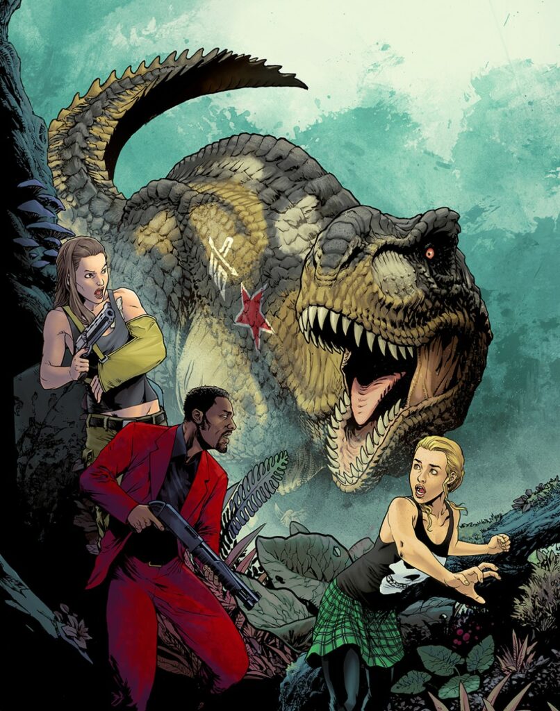
Finally, when it comes to colouring, I’m reminded of the legendary Gennady Tartakovsky’s rule that made his Samurai Jack so visually memorable: ‘no green grass and no blue skies.’ Colours are always at least slightly askew in the expected colour palette, and that’s indubitably a big part of that cartoon’s magic.
After having decided what the colour dominance will be in an illustration, I start from the background and work my way up to the foreground. Every element remains separate at this stage, and therefore movable just in case I feel like that would benefit the overall composition. Just like in inking, I like a juxtaposition of clean colouring and natural looking, irregular textures.
.
For the background, I’ve used some abstract textures I previously created by smudging watercoloured ink on paper, so as to create an illusion of foliage. The Tyrannosaurus’ skin is also painted with textured brushes, whereas the foreground elements, and especially the characters, have clean, regular gradients to them, which makes them stand out in the composition. The wood, rock and foliage were already textured at the inking stage, so I kept clean, untexturised colouring to not overdo the effect, with the result of only making the image difficult to read.
As it is when working on interior pages, the readability of a composition is the main concern, and that remains true during every stage of the process. The value of the chosen colours is probably the key at this point. A good idea is to turn your illustration to black and white, and see if it’s still readable. If the values are too uniform, it will just look like a grey mess. If you can look at a cover at thumbnail size and in black and white, and still read the elements, then you’ve done your first job right.
And hopefully this is just the beginning of a series of covers for 2000 AD, I hope you all like my work!
Oh – we do Tazio, we do!
Thanks so much to Tazio for sending along his cover work – always great to see an art droid get their first ever 2000 AD cover! And you can find Tazio’s cover adorning the front of 2000 AD Prog 2259 – out on sale wherever you get your Thrill-power from, including the 2000 AD web shop, on 24 November
Every week, 2000 AD brings you the galaxy’s greatest artwork and 2000 AD Covers Uncovered takes you behind-the-scenes with the headline artists responsible for our top cover art – join bloggers Richard Bruton and Pete Wells as they uncover the greatest covers from 2000 AD!
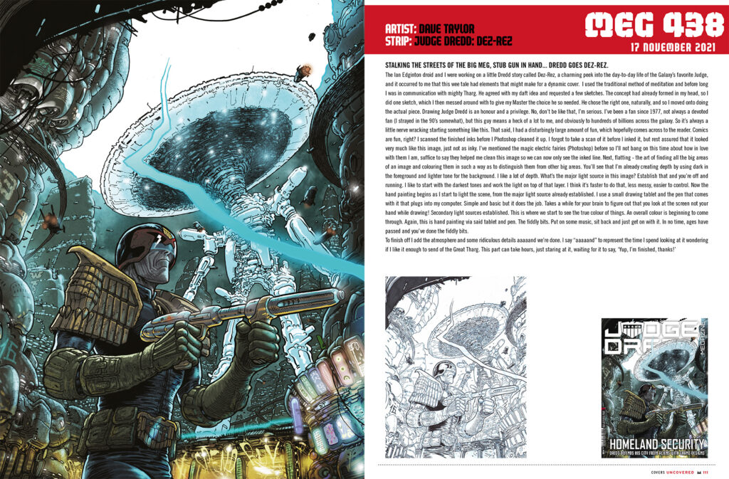
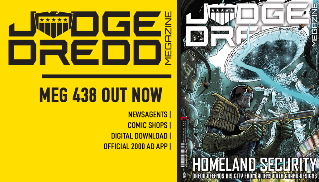
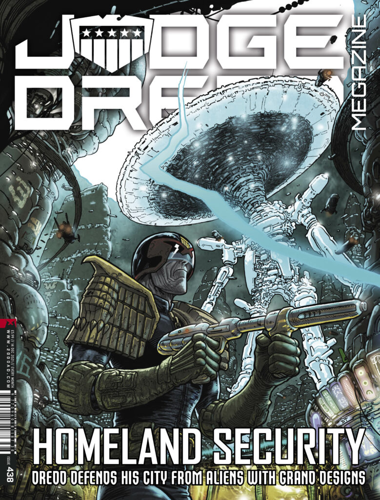
Borag Thungg, Eartlets – the new Judge Dredd Megazine issue 438 is out now , with a thrill-powered collection of strips and a stunner of a Judge Dredd cover with the old man in action (complete with stub gun!) courtesy of art droid Dave Taylor. After giving us the retro-futurist art deco delights of Megatropolis earlier in the year, Taylor’s back in artistic action for Judge Dredd: Dez-Rez in this months’ Megazine, written by Ian Edginton.
Over to Dave Taylor now to give you his rundown on the creation of the cover…
DAVE TAYLOR: The Ian Edginton droid and I were working on a little Dredd story called Dez-Rez, a charming peek into the day-to-day life of the Galaxy’s favorite Judge, and it occurred to me that this wee tale had elements that might make for a dynamic cover.
I used the traditional method of meditation and before long I was in communication with mighty Tharg. He agreed with my daft idea and requested a few sketches. The concept had already formed in my head, so I did one sketch, which I then messed around with to give my Master the choice he so needed.
He chose the right one, naturally, and so I moved onto doing the actual piece.
Drawing Judge Dredd is an honour and a privilege. No, don’t be like that, I’m serious. I’ve been a fan since 1977, not always a devoted fan (I strayed in the ’90s somewhat), but this guy means a heck of a lot to me, and obviously to hundreds of billions across the galaxy. So it’s always a little nerve-wracking starting something like this. That said, I had a disturbingly large amount of fun, which hopefully comes across to the reader. Comics are fun, right?
This is a scan of the finished inks before I photoshop “clean” it up. I forgot to take a scan of it before I inked it, but rest assured that looked very much like this image, just not as inky.
I’ve mentioned the magic electric fairies (photoshop) before so I’ll not bang on this time about how in love with them I am, suffice to say they helped me “clean” this image so we can now only see the inked line.
Next up – “Flatting”. The art of finding all the big areas of an image and coloring them in such a way as to distinguish them from other big areas. You’ll see that I’m already creating depth by using dark in the foreground and lighter tone for the background. I like a lot of depth.
What’s the major light source in this image? Establish that and you’re off and running.
I like to start with the darkest tones and work the light on top of that layer. I think it’s faster to do that, less messy, easier to control.
Now the hand painting begins as I start to light the scene, from the major light source already established. I use a small drawing tablet and the pen that comes with it that plugs into my computer. Simple and basic but it does the job. Takes a while for your brain to figure out that you look at the screen not your hand while drawing!
Secondary light sources established. This is where we start to see the true colour of things. An overall colour is beginning to come through. Again, this is hand painting via said tablet and pen.
The fiddly bits. Put on some music, sit back and just get on with it. In no time, ages have passed and you’ve done the fiddly bits.
To finish off I add the atmosphere and some ridiculous details aaaaand we’re done. I say “aaaaand” to represent the time I spend looking at it wondering if I like it enough to send of the Great Tharg.
This part can take hours, just staring at it, waiting for it to say “yup, I’m finished, thanks!”.
Thank you so much, as always, to Dave Taylor for showing us the ins and outs and all the fiddly bits involved! Great to see the stub gun on a cover!
Judge Dredd Megazine issue 438 hits the stands and the 2000 AD web shop on 17 November – don’t miss out!
Every week, 2000 AD brings you the galaxy’s greatest artwork and 2000 AD Covers Uncovered takes you behind-the-scenes with the headline artists responsible for our top cover art – join bloggers Richard Bruton and Pete Wells as they uncover the greatest covers from 2000 AD!
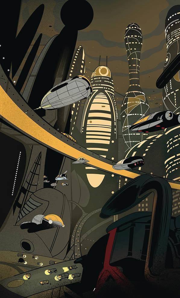
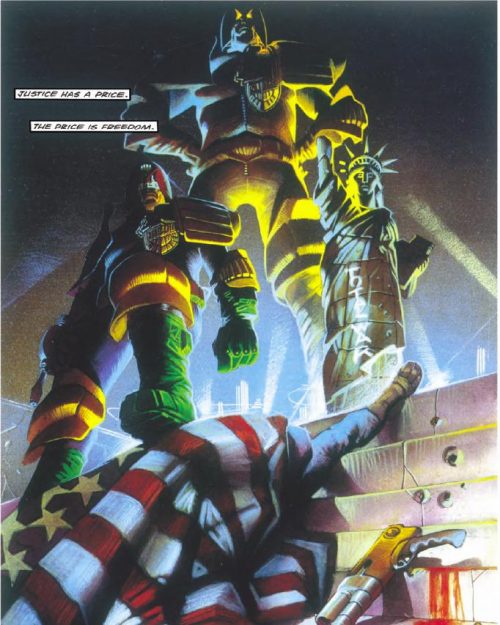
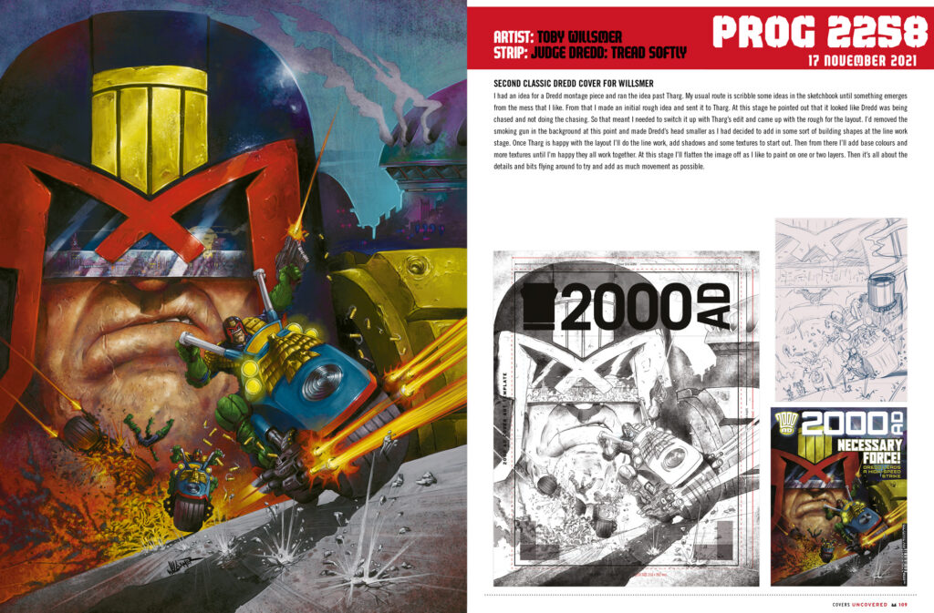
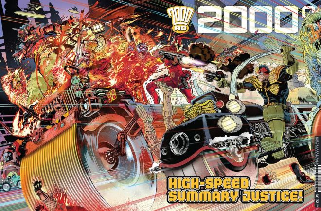
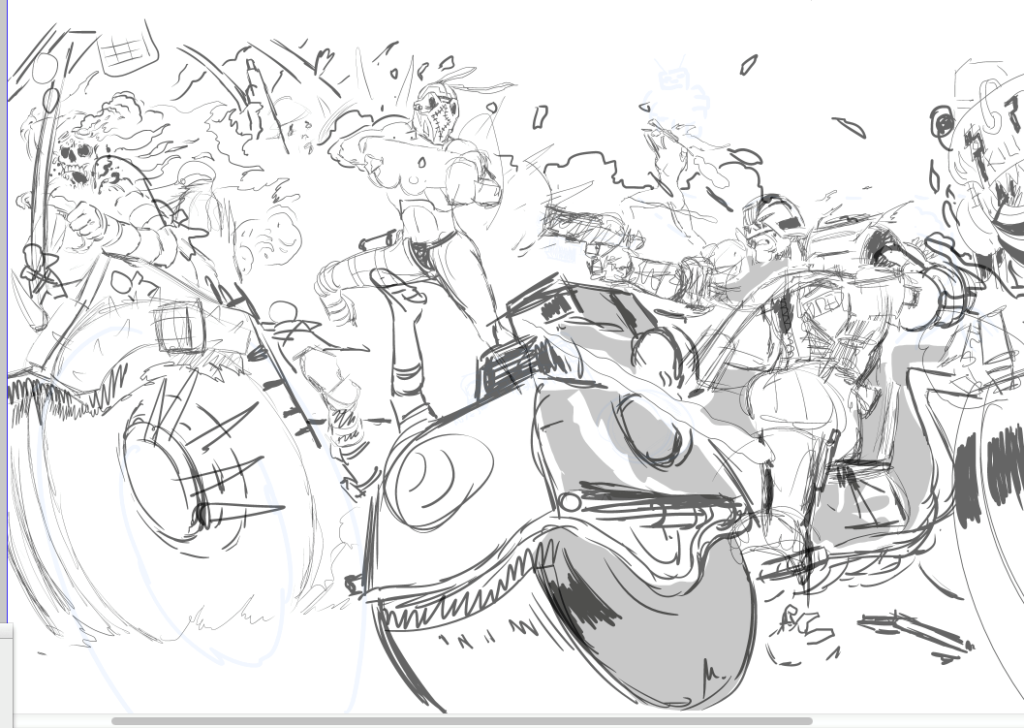
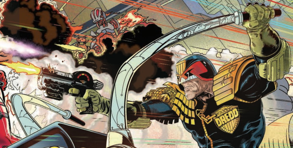
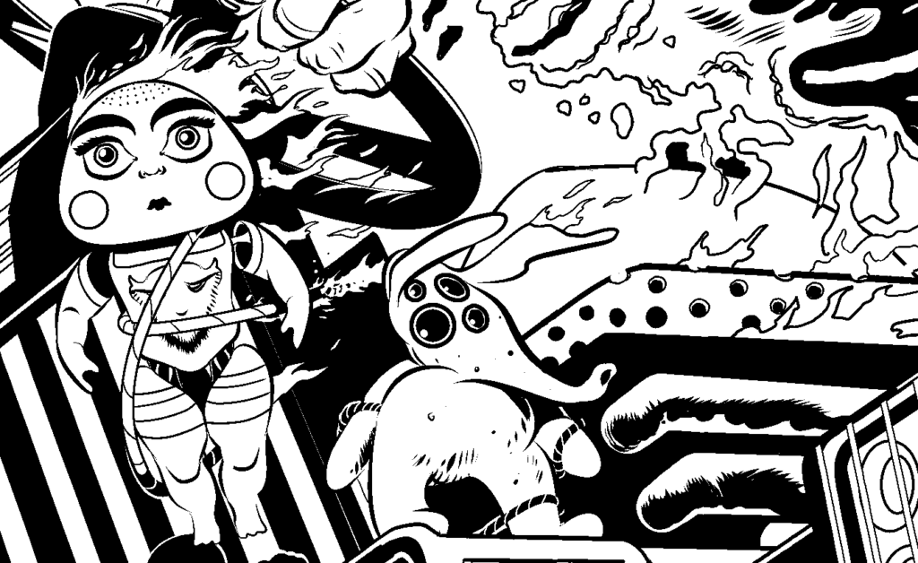
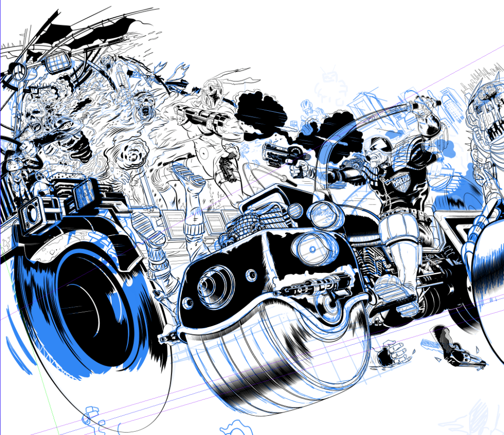
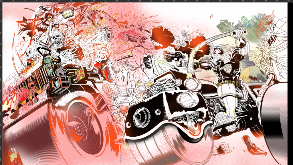
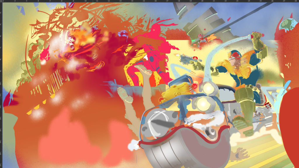
Okay then… settle in Earthlets, we’ve got a long one for you. But a damn good one. It’s the mystery of the missing cover to 2000 AD Prog 2239 by Stewart Kenneth Moore. Way, way, way back in July 2021, SK Moore did one of the covers of the year – a spectacular double-page spread of Dredd looking like this…
.
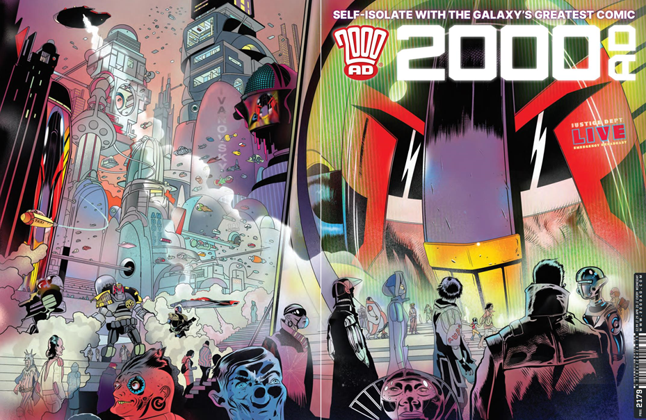
And Stewart was going to do a Covers Uncovered for us, but time and deadlines got the better of him. Oh well, can’t be helped, even though it’s a terrible shame not to see the process and read the process – because if you’ve read any of Stewart’s previous write-ups, you know he really does go the extra mile and goes deep into the creative process for you (have a look at the one for 2000 AD Prog 2179 and the special poster in the 2000 AD Sci-Fi Special 2020 to see what I mean.)
But we were chatting to him recently about the Covers Uncovered Annual 2021 (out November 24!) and he said that even though he’d not sent them over, he’d still got both the image files for Prog 2239 and also the original commentary he’d done somewhere – and would love to get them to us. Except then he went looking for them and couldn’t find the commentary anywhere.
As Stewart puts it… ‘I wrote a new text this morning. But then found my original text that I wrote for you maybe a year ago! So you have the option of modern, sedate, creative narration or ye olde, barking at the moon, ‘he’s driving us off a cliff’ lunacy engine.’
A few hours of editing, 4,000 words later, the images and screenshots Stewart sent over and highlights from the cover to illustrate his points… here we go.
So – strap yourselves in, get ready for the full-on, total immersion, in-your-face creativity blast of SK Moore talking about making the cover to Prog 2239. Okay then.
Get ready for SK Moore in 3… 2… 1…
.
SK MOORE: Going back through my files I see how hard it is to show my process, I was even confused by what I found lurking in my files. It’s a mess!
With ‘Covers Uncovered’ I’m always tempted to share only two pictures. The first, a rudimentary doodle, the second the finished picture. As though those are the only two stages involved!
There’s a meme like this, it’s called ‘How to Draw a Head’ and it never fails to make me laugh. The first picture is a roughly drawn circle with the words ‘First draw a circle’. The second picture is what appears to be an excellent finished 19th century pencil drawing of a human head with the words ‘Now draw the rest of the f*#@ing head.’
I always feel I should do that here but then I remember there are readers out there who really might benefit from the process. People who will one day be doing this job, great artists yet to emerge and they need all the help they can get. I learned that from Jim Baikie (artist on Judge Dredd, Skizz and many more), because that was like his attitude. Help young artists. He even spoke of an idea to start a comics colony in the Orkneys (his home turf). Can you imagine what fun that could have been? I was fortunate enough to do some studio assistance with Jim, he would have been a great influence on any young group. So this is especially for you artists, because we are in this together. Here are the stages…
SK Moore’s doodle sketch that went off to Tharg for approval
.
Stage 1 – Don’t push it, dwell on it.
I decided to let my subconscious do this one. I knew I wanted something spectacular, I’d been dwelling on the idea of something ‘rampant’ for months, just letting it percolate in my mind, a few minutes every day just letting my mind wander on the subject.
I couldn’t see it though, nothing was jumping out at me, not yet. But any time I turned my thoughts to 2000 AD I would try and imagine a scenario with a variety of big shapes moving across its cover.
The only fixed image was a Judge and very possibly a Lawmaster (followed by a dim sense of dread, no pun intended, but any prominent bike is going to be tough to get right, hence the sense of dread.) The other components fltted into my mind – from robots, to mutants, to giants, to aliens and so on – but none of it slammed into place.
Weeks and weeks…nada. But I didn’t sketch it, didn’t ‘work’ on it. I just mulled on it.
Stage 2 – I like my covers to pay off in different ways
They’ve got to be eye-catching, working from a distance and up close, and when a potential reader picks it up it should offer a one-two punch with a surprise back-cover. In this way my covers act like sequences. My covers are sequences!! …and will continue to be that way, Tharg willing. Making an effective cover means first I ask myself how do I make it stand out on the shelves? How do I grab someone from the other end of the shop? How do I fight the tall grass that is the packed shelves of the newsagents? Next time you are in one of these places look at the shelves and ask yourself how you could make something stand out against so many other titles. This is the graphic-design mind at work.
Stage 3 – One morning I woke up and it was right there in my mind.
Maybe after a month I woke up with this image springing toward me, coming right at me! WHAMMO. A triangle, a rainbow, a truck full of bastards, it’s Jean val Jean watching the pre-dawn criminal convoy, only it’s coming at us at 500 miles an hour. Above all it’s an incendiary bullet, fired on the cover and exploding on the back (the one-two punch!)
I have a good feeling about the concept – seems very Dredd, it’s ‘hell on wheels’, where Dredd represents order and the burning truck absolute and total chaos….high-explosive bullets are not the wisest way to deal with traffic violations, so it’s a bit satirical, I guess.
.
Stage 4 – Finally – a sketch!
I did the sketch in 42 nanobause (Scottish unit of time). This is why artists are misunderstood. Anyone seeing a sketch or a finished piece (and especially if it’s swiftly created) can dismiss artists as having it easy. But, as I’ve just explained, it took months to just see it. But you know that because you are an artist too. No, you are! Get over that!! YOU ARE!
So I got sketching in blue pencil, refined the sketch and refined again, only using a ‘Guesspective’ at this stage. I went for the classic Lawmaster look… BREAKING NEWS… I think that’s the last I’ll draw that bike. A more modern design is doing the rounds and I’ll be aiming at that from now on. But I did want to do a good example of the classic in action.
Once happy with the general thrust I set up my perspective rulers and started laying in the machines. Things were going surprisingly well, ratios and scales were adding up. Usually with extreme perspectives issues of scale arise, but there was nothing here that wasn’t working. I felt quite lucky with the Lawmaster, it all worked first time. Perspective is a tool that you need to know when to stop using, it can kill a picture, but somehow I had no issues. Pure luck.
.
.
But a problem did emerge. The handlebars of the bike. Did I do them low so as not to intersect with the badge – and in this case we need to see the badge – but then they’d also be lower than they should be on a MK2 Lawmaster. Or the other option was raising the bars so they arch out at the higher end of what we’ve seen of these bikes over the years.
That’s not a problem in itself, high arches are common in drawings of Lawmasters and my low angle of view further justified this. But Dredd’s gun arm was more ‘badass’ when the handlebars didn’t cut across the view and his posture with the lowered arm on the left meant he was extra ‘badass’ because it gave him a slouch. I liked the attitude a lot.
.
But with the attitude of the higher handlebars I had two big challenges – make the gun-arm work and expose the underarm of Dredd on the left. This would mean careful anatomy. I’m a sucker for a challenge and especially with anatomy. Going this route was harder but it did neat things – it deepened the perspective effect and, by crossing the gun arm with the handlebar, it made the scene more convincing. (Another Jim Baikie tip here: Don’t be afraid to obscure things. When anatomy drawing raises arms across faces, move limbs in ways to obscure other body parts – it lends the image realism, dynamism.)
Above all, without gun or bike, the arms raised make Dredd triumphal, like a silver-back gorilla raising its arms in a sign of confidence. No one apes the law!
Stage 5 – The finished idea isn’t a complex idea, not the idea itself.
One thing that is kinda complicated though is knowing that you’re aiming for a cover that’s new and memorable and unique. The idea can be so strong and immediate that you doubt yourself – even I start thinking that the image came to me ‘way too easy’. ‘Someone has done that before!!!’ And I am militantly against that kind of laziness. So, to spare my blushes at this point I trawl the Progs looking for similar to this Dredd on his Lawmaster.
If this were a film this would be the scene in which a bafflingly handsome young man, undamaged by years of booze and hard labour (art) is shown crouched over thousands of Progs as images of spaghetti monsters, pregnant gangsters, apes aping the law, and alien zealots flit across the screen before he sits back, exhausted, to puff to death a Gauloises stub, behind him the Eiffel tower stands firm over his shoulder – that kind of thing!
Stage 6 – Bite the bullet and hit send!
But I haven’t got all the Progs so I have to hope this doodle is fresh…I then bury my head under a cushion and grope for the keyboard and hit ‘SEND’… I send it to TMO as a jpeg. Some you win, some you lose….but this I win, it’s green lit! (his skin that is!).
One caveat is that this has to be off-the-clock, no deadline, because all my weekday workdays are spent drawing PROJECT MK UlTRA: Sex, Drugs, and the CIA Volume 1. Fortunately, that’s ok with The Mighty One, so we’re off… for weekends and the Christmas holiday at least, much of it assembled in 5 days around Christmas 2020. Assembled, not inked, not painted.
Time can screw everything up and I think the open deadline really helped here but, y’know, too much time can easily kill a picture too, but it worked to the picture’s advantage here.
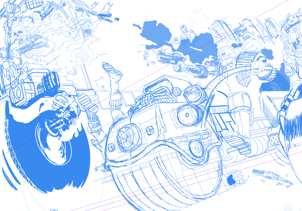
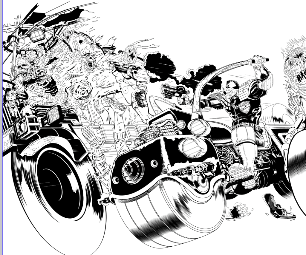
Stage 7 – Now I draw the rest of the f*%#ing cover.
.
Stage 8 – What? You want details?
Okay – just kidding. My digital method is as follows… I blow up the thumbnail and fade it out so I almost can’t see it and draw over it in a new layer with a more refined attention to detail, but still very rough shapes. I do this repeatedly and slowly bring myself close to inking… until I do it finally in ink. I think I see other stuff, more than is actually there, when I fade it out, my imagination engages somehow with the vague lines and I see stuff that I never sketched. I know that’s not a good explanation, just try it, fade right down and refine. You just have to do it to get it. I’m going to repeat for the artists…if you fade that sketch almost to oblivion and begin to work up a new layer, trust me, your imagination will see what is not there yet. Between what is there and what you want to be there stuff will also appear. This is not science, it’s magic – do it, relax and trust your imagination!
Stage 9 – The sketch is energy and information, refining sketches kills the energy….stone dead.
So I have to step very carefully here. The anatomy of Dredd has to be right on, if he looks silly it’s all out the window. And that foreshortening of his leg may kill this image yet. Luckily, somehow, it works ok. But that’s just one of many considerations.
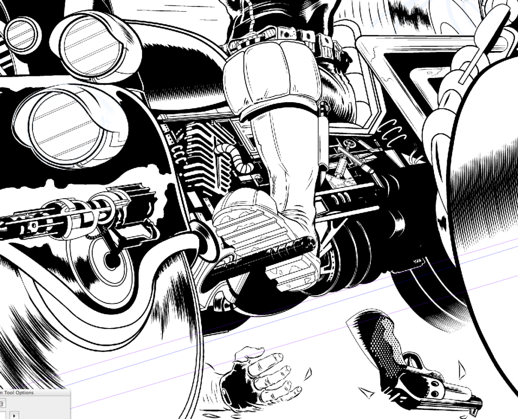
Stage 10 – That damn engine.
The front cover is the priority. I’ve made a conscious decision to do a classic Lawmaster so I look at drawings of it by Carlos Ezquerra, Mick McMahon, Cam Kennedy, Brian Bolland and Ron Smith. But the only place I find a glimpse of a consistent engine design is on a small toy model. So I decide that’s probably cannon…but I don’t know exactly. I then look at real bike engines and use some of those features, I decide to add part of a standard bike radiator (if that’s what it is – I’m an artist not a damn mechanic!)
.
Anyway, somehow the engine and leg and everything else works out ok. Hell knows how I did that. I don’t have a model and had to imagine the whole thing and it had to look functional…and somehow it worked.
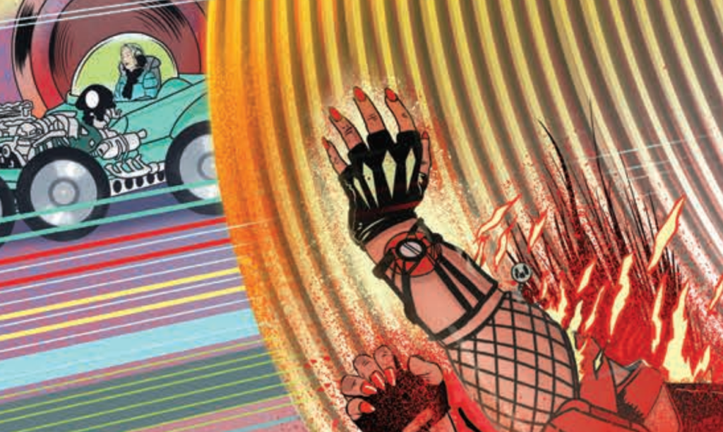
Stage 11 – My son shows me a car by George Barris…
…and I become obsessed with putting my wife in that little green car on the highway at the very edge of the picture on the mega-highway. I then decide that’s a stupid idea, because it is. Then I decide it isn’t…and, later that it is… isn’t, is, isn’t, is…
It’s a George Barris car. He designed it and the Munsters cars and the TV Batmobile and many more. His designs would not look out of place in MC-1. So, for my own amusement I put that in there… but, you’ know, it amused the kids.
.
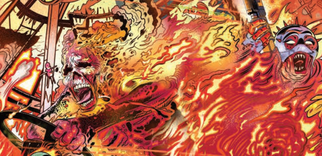
Stage 12 – Fires – the world is horrible.
I look at images of fires and I see some things on the internet that I regret, people on fire, truly horrible. The world is horrible. I remember a journalist telling me, while embedded in Iraq, that he watched people melt in the cab of a truck and I wonder if this memory of this awkward conversation (at a buffet table, no kidding, bon appetite) has been at the back of my mind all along. People are horrible too. Truly horrible.
.
Stage 13 – I draw and I draw and I draw.
I try and remember that fire moves like water as I draw the flames. I decide to make faded airbrushed flames and flat colour flames to mix it up.
I draw a strong female body-builder shooting at Dredd. I had one crazy character with the beginnings of a vicious chastity belt, an idea I obviously abandoned.
Somebody on a 2000 AD podcast or thread mentioned ‘The Green Children’ as I was drawing one of the dolls. So, that’s why that T-shirt ended up there.
.
Stage 14 – When the energy slips away… widen.
I draw and I draw and I draw. I fade out, add a new layer and re-draw. But in most cases things just fall in to place. Somehow.
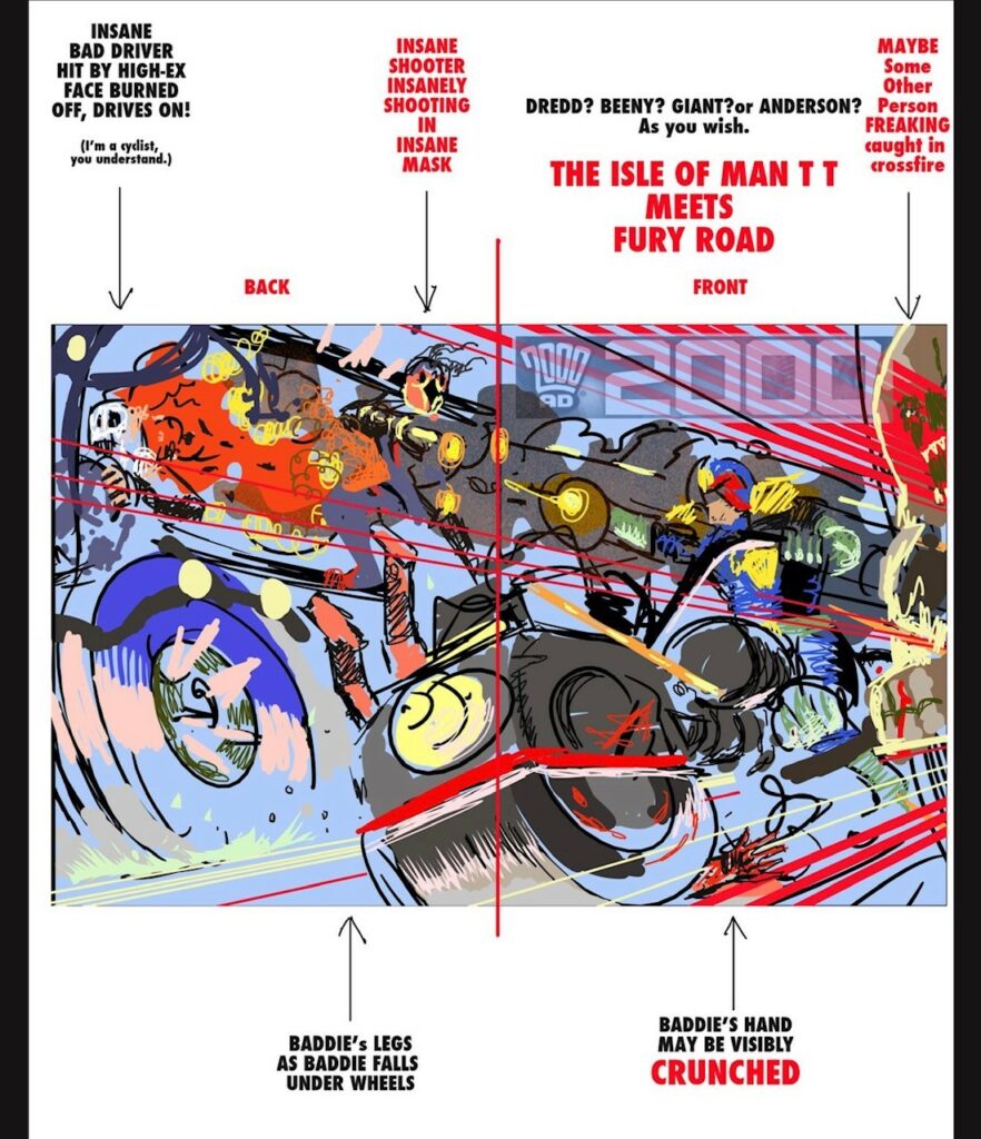
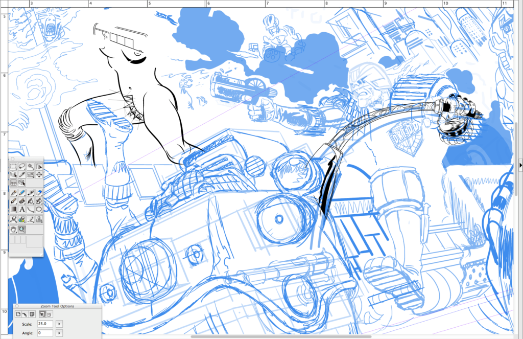
I realise that the energy is slipping away from the finished image and this prompts me to widen the canvas and widen the scene. This is tricky because it shifts the composition of the front cover, the bodybuilder now drifts to the back cover. I can live with that. I open up a whole new field and find I have room for Mega-City One, other drivers, and that Barris car on the highway (dumb idea, no it isn’t, yes it is!)
Suffice to say I clearly didn’t know how to widen my drawing page in Manga Studio when I drew this. I really don’t know much about the software. I’m not alone, I think many of us just learn enough to get on with it. But I ran into the page edges and so, I rotated the whole image to extend the field of play. I kept extending the image, that is I would open up areas and then have to match up the inks so that it looked like it was always that way. I would scale up my page template accordingly, I know, I know – masochist.
I’d export inks from Manga Studio (Clip Studio Paint…or whatever they are calling it this week) into Photoshop where I would stick them together in a definitive page layout. Then (and I know this is nuts) I’d take screen shots and import those to Manga Studio where I would draw in new inky bits where I found openings.
You might note the many layers of perspective rulers. Let me explain that. The ‘back’ button (or whatever it’s called, who cares!) is sadistically close to a button that makes the bloody rulers jump to a different position. So it’s very easy to hit that button and not know you’ve moved the rulers until you are well into a new part of the drawing. This may be digital, but you really are drawing and it can take ages before you realise the lines are off… grrrr.
So, as a precaution, If I’m happy with a ruler I make 2 copies. This way when one I’m using jumps (and it will!) I can dump it and revert to the saved one and not bother trying to match vanishing points up again…..god that aggravates me. Yes, I’m looking at you CLIP STUDIO PAINT.
Stage 15 – A million tweaks later…
I also realise I can enhance the punch by bringing in more ‘BRAIN BIKE’. That’s something I’m a bit obsessed with — brains in jars! Only this jar is all motorbike!! Has anyone done a brain bike? Well I just did!!
I then I cut out and enlarge ‘brain bike’ and paint him again on a new Photoshop layer with the print instruction that he goes over the ‘AD’ in ‘2000 AD’… fingers crossed! I use composition (the triangles!) and I employ some ‘aerial perspective’ (over distance colours fade to blue/ grey) and I use ‘accelerated perspective’ (used in stage design to cheat shapes to enhance the illusion of depth of field).
.
Stage 16 – Colours and the miracle of Photoshop
I’ve said it before but the miracle of Photoshop is how the tools work so well that I can transfer knowledge learned over many years on canvas and Bristol board to digital. It stuns me, quite frankly.
Anyway, colouring is done under the ink layer and it is done on many layers. I tint in the major colour areas. I look over the Progs of yesteryear for Dredd and Lawmaster colours and approximate them.
Expanding the view or reducing the image on the cover so as to add city and road glimpses has proved a good move especially because the black shadowed city blocks now push the burning truck at us enhancing the colours.
.
Stage 17 – Leave it, leave it, leave it.
I leave the file on my HD for about 3 weeks before opening it to see if fresh eyes find problems. Not really. I do this again for another week or so. Nope. There are things I could pick at but nothing I need to change. In most cases there is no time for this but there’s only so much you can work out consciously and having no time limit is a luxury but it allows things to work themselves out.
And that is that – DONE!
The finished image seemed to go down very well, but you must primarily aim to meet or surpass your own expectations first and, if it works for you and the editor, you can only hope some readers will dig it.
Oh, a final note for whipper-snapper artists…
All the figure drawing, all of it, is based on years of learning how to draw figures at any angle, many artists use digital models and photographs and these tools can really help you. I’ve made my own models using the free Sculptris app, very helpful, I’ve used photo references. Anything goes if it helps you get the picture right.
With Defoe I made digital sculptures of the characters faces. I rarely do that now, and I never use digital figure models, I’m not against it, I’ve just never seen any that worked well. As a youngster I started buying a comics ‘how to’ series and it was a demo on drawing shadows and figures in perspective that really opened my eyes to the power of perspective. So, if you want to be a versatile artist, study it.
Nothing liberates you like knowing how to draw a human being at any angle. That will free you up forever, it sounds like a chore and it takes time but it will free you to draw anything and everything possible. Drawing the human form is the language you need to speak fluently. I am also a painter, probably best known for my oil painting work but can use any media. Learn these things and you’ll be free as a bird and you can transfer to any medium.
My digital process is fairly simple. I might doodle on paper, but I do a digital sketch in photoshop that I pitch to 2000AD. I draw and colour with a pen on a wacom tablet. I draw and ink comics using ‘Manga Studio 5’ on an iMac. I sketch in ‘blue pencil’. Once my inking is done I export the pages to Photoshop (again an old version) and I adjust page design, colour and letter (If I letter) with that app.
MS5 is probably the easier app for editing and smoother for a number of reasons but, as far as I’m concerned, you can use the best of gear and turn out pure rubbish. Concentrate on visual quality and you can use any tool – or none. It doesn’t matter what toys you have – it comes down to doing, commitment and study.
Know what you want, go for it, but be aware of what’s happening in the industry, what’s cool and what’s old hat…as best you can. Be open-minded. Look to the very best and strive to be better than you think you can be – because you can improve and you will. You will improve if you work hard or if you work easy, doesn’t matter, just as long as you prioritise drawing you will get better. At some point, it might start getting easy and that’s maybe when you have to make it harder again, look for new improvements. You know better than anyone what’s wrong in your work so zero in on those weaknesses. Focus on them. Be strict.
If you are an artist I hope this helped. And you are! No, YOU ARE.
See – Told you this was a good one! I think you’ve got agree that that was a bit of a special for Covers Uncovered! It may have been late, but damn, that’s a call to arms for artists and a little glimpse into the mind of an artist at work!
Thanks, as always to Stewart for going above and beyond there to (finally) get it over to us! It was well worth the wait!