Posted on

2000 AD Covers Uncovered: A Legend returns – Colin Wilson’s Rogue Trooper for Prog 2338

Every week, 2000 AD brings you the galaxy’s greatest artwork and 2000 AD Covers Uncovered takes you behind-the-scenes with the headline artists responsible for our top cover art – join bloggers Richard Bruton and Pete Wells as they uncover the greatest covers from 2000 AD!

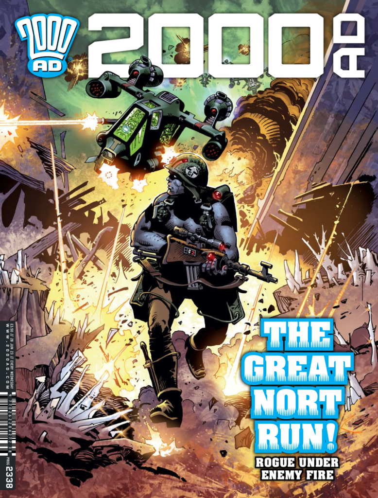
This week sees something very special, as Judge Dredd, Rogue Trooper, Lt. Blueberry, and Nevada artist Colin Wilson returns to cover the penultimate episode of Garth Ennis and Patrick Goddard‘s Rogue Trooper: Blighty Valley. It was an honour to speak to this legendary comics artist, one of the few artists in the world who’ve had incredible success in the UK, Europe, and the USA.
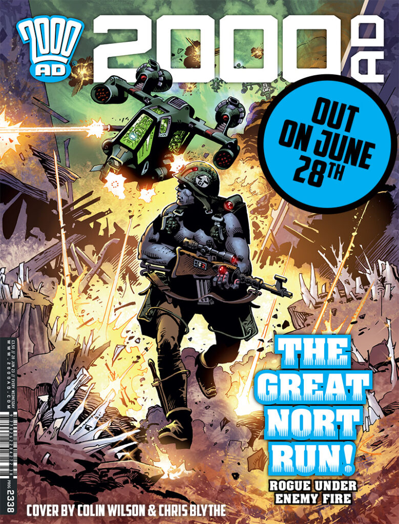
A native New Zealander, Colin Wilson moved to London in 1980 for work at 2000 AD. And although not perhaps technically legal – he’ll fill you in on that himself – his work on Judge Dredd and then Rogue Trooper, the latter alongside the other great Rogue artist of the time, Dave Gibbons, brought his Euro-influence stylings and dystopian techno-futurism to the comic and absolutely cpativated the fans.

He may have only been at 2000 AD in the 80s for a brief time, but his work, from Judge Dredd: The Sweet Taste of Justice in the 2000 AD Sci-Fi Special 1981 to Rogue Trooper: Marauders in Progs 282-289 in 1982 will always be a huge part of 2000 AD history. And, like he proudly (and rightly!) tells you, he’s now been in 2000 AD in every decade from the 80s – very few can say that!

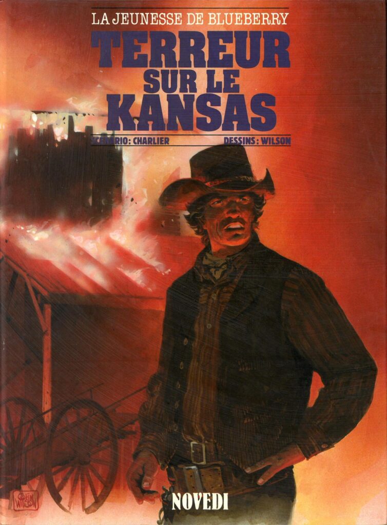
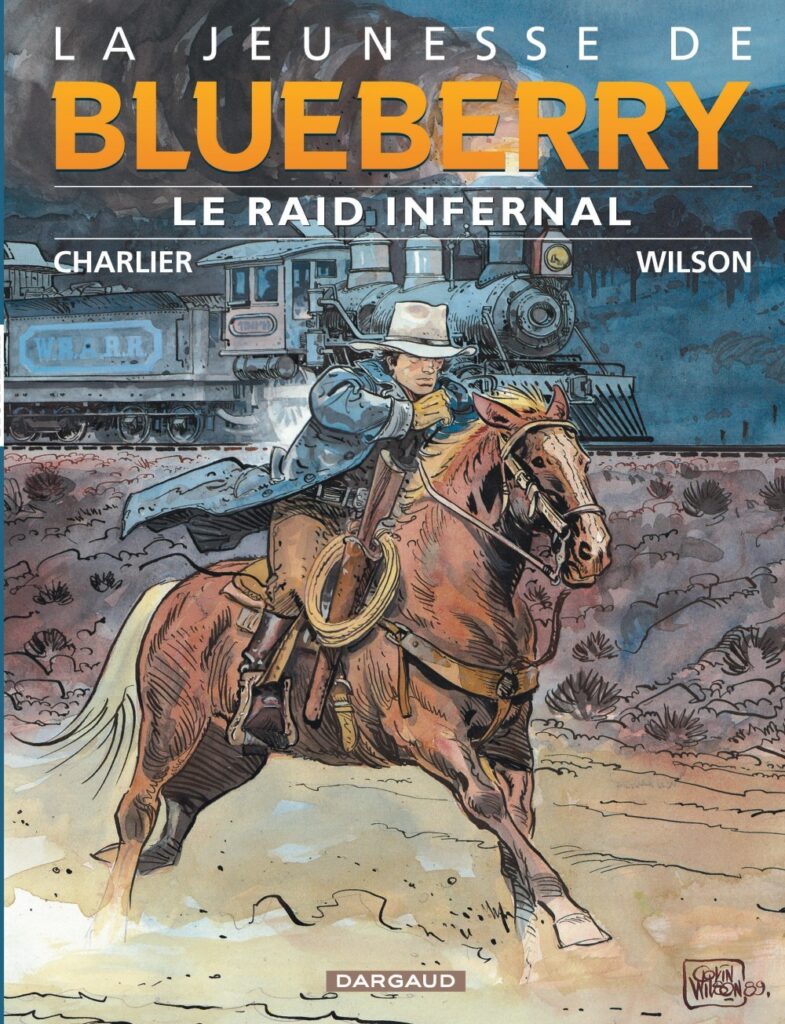
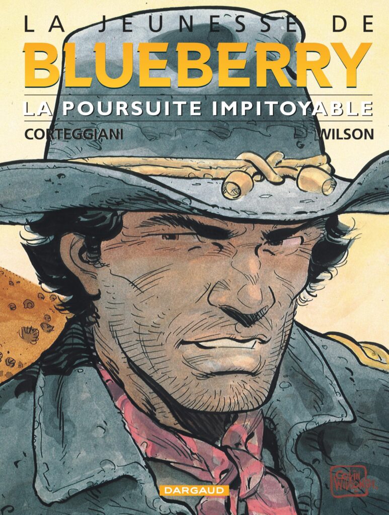
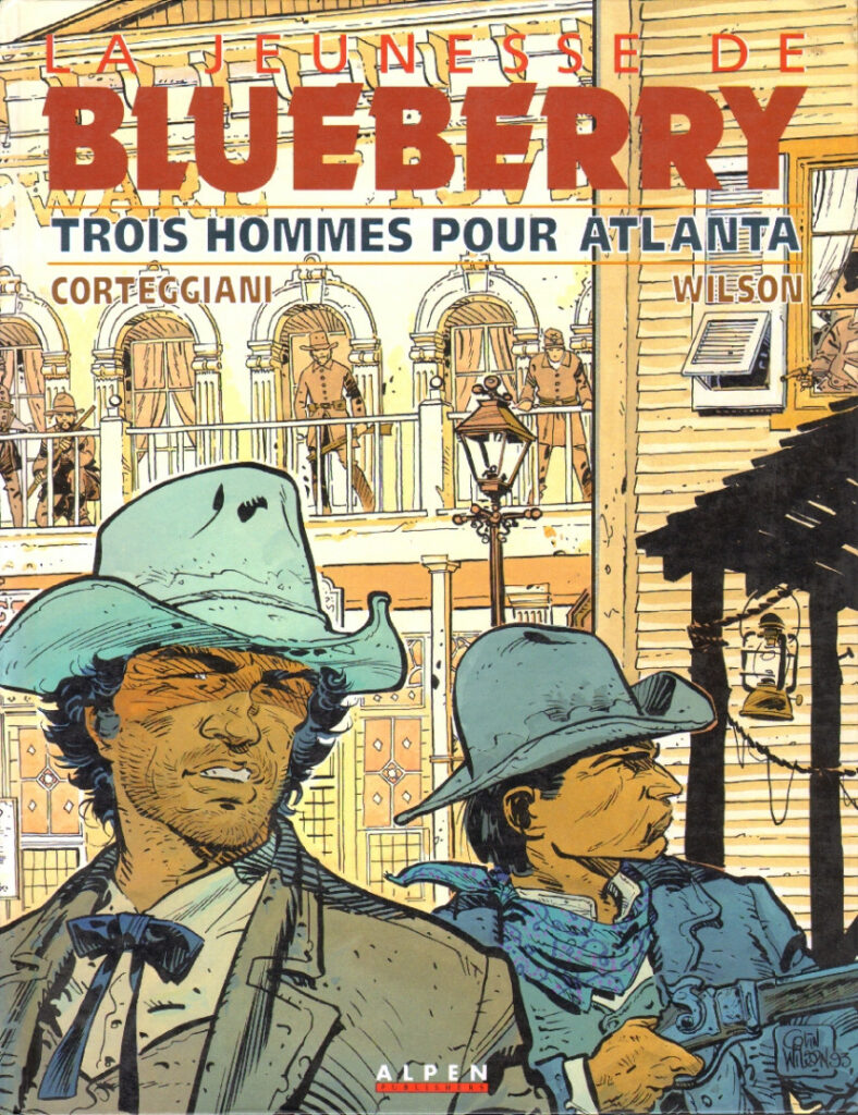
After decamping to Paris, Wilson eventually – again, he’ll tell you all about that in a moment – found his art in demand, with Glénat publishing his sci-fi series Dans L’Ombre Du Soleil. But his real grande entrance on the European bande dessinée scene came when legendary creators Jean-Michel Charlier and Jean (Moebius) Giraud saw his work and anointed him as Girard’s successor on art for their La Jeunesse de Blueberry (Young Blueberry) series. Many, many years of success in Europe followed, as well as work for US publishers, making him that rarest of things, a triple success across three very distinct comics markets – UK, Europe, and USA.
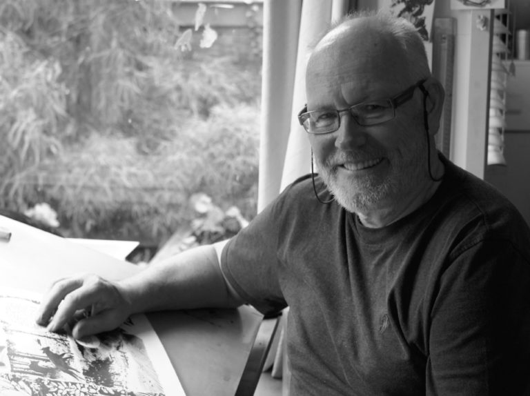
Seeing his artwork back here on the cover of Prog 2338 is an absolute thrill, just as it was to chat with him. So, without further ado, my great pleasure to introduce the wonderful Colin Wilson…

COLIN WILSON: I was thrilled to be asked to draw a Rogue Trooper cover for 2000 AD earlier this year, especially as this would continue my run of having something published in the weekly in every decade since I first started my career there back in 1980.

It was an exciting time in the 80s – I stepped off the plane from New Zealand looking forward to checking out a little of the UK before returning to NZ or Australia, and within a few months I was hunkered down in a cheap but very cold central London squat drawing my first professional comic work for 2000 AD, Initially on Judge Dredd, and then with Rogue Trooper.

I was soon also desperately trying to find a way to avoid being forced to return to New Zealand as (unbeknown to Tharg) I lacked the necessary permit to work in the UK. I never really did succeed in becoming 100% legal there, which was why several of my later RT episodes were completed on tiny tables in a couple of cheap, downmarket Paris Hotels.

Well, he might not have been 100% legal here, but that early Rogue Trooper work was well worth a little bit of bending the visa rules…
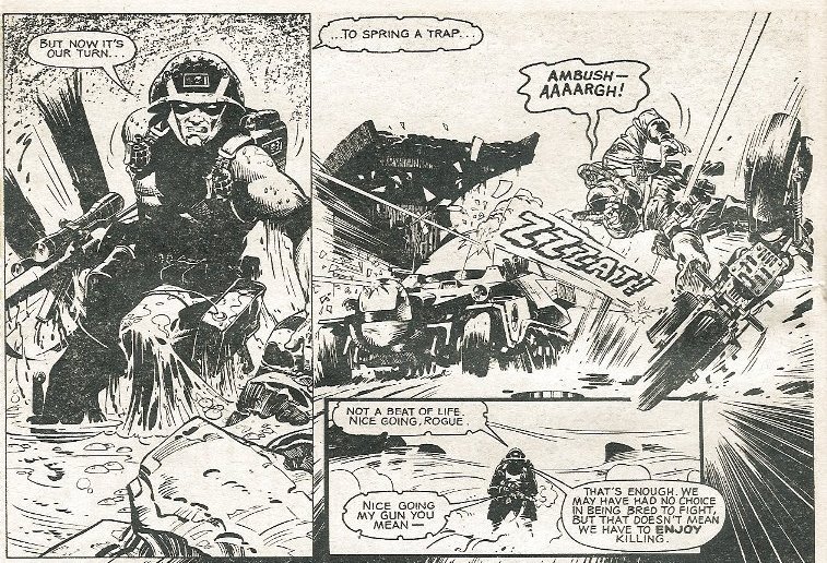
(From Rogue Trooper: Ascent to Buzzard-Three – part 1, Wilson’s first Rogue episode in 2000 AD #236, 1981)

CW: While continuing to work for 2000 AD, my (soon-to-be) wife and I moved to Paris in early 1982, where we also spent the next few months visiting some of the great French comic publishers, using a selection of Rogue Trooper original pages to show them some of my current work. At the time 2000 AD artwork was never returned to the artists after publication, and so yet-to-be mailed (to the 2000 AD office) RT pages were the only samples of my work that I had to work with.

They were almost always completely baffled by what they were looking at, but eventually I got lucky, and signed my first contract to produce a three book science fiction series for Glenat [L’Ombre Du Soleil]. It was 15 years or so before I worked on 2000 AD again…

But RT was such a great character to work with. Dave Gibbons and Gerry Findley-Day had done all the heavy lifting creating the original series, and that 1st year alternating story arcs with Dave in the weekly gave me the boost I needed to think that maybe I could perhaps actually make a living drawing comics (which, in those pre-Internet days, was never going to be possible if I was forced to return to NZ).
.

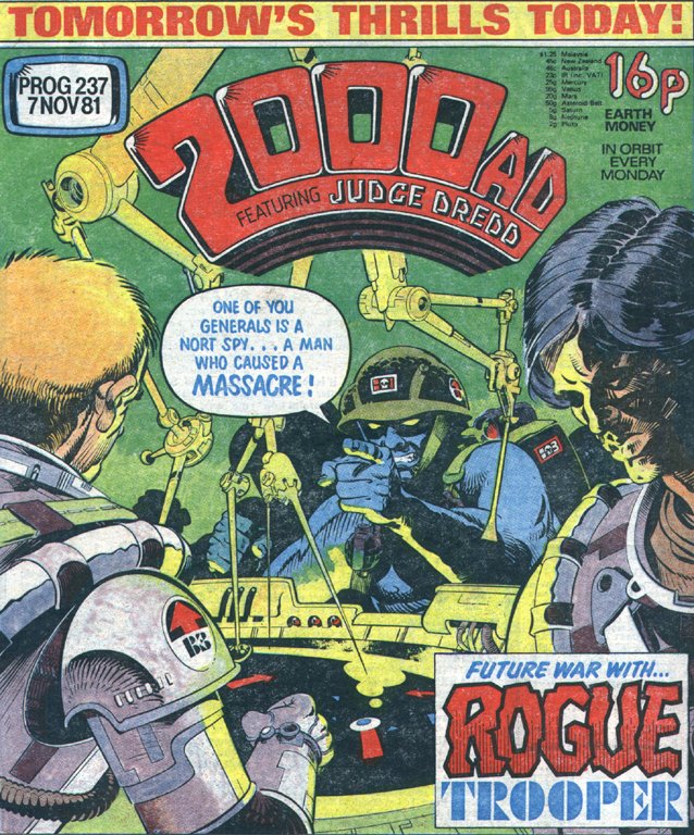
CW: But I was never really all that happy with the (I think) two Rogue Trooper covers that I did produce for the weekly back then. Unlike Dave’s RT covers, there was something stiff and ungainly about my own work that left me feeling unsatisfied.

Oh, artists, artists, artists! Why do you do this to yourselves. You’ve already seen two of Colin’s Rogue Trooper covers – but he was wrong, there’s actually a third, to Prog 269 (thank you Barney!) Now, you look at this and tell me there’s something stiff and ungainly about it???
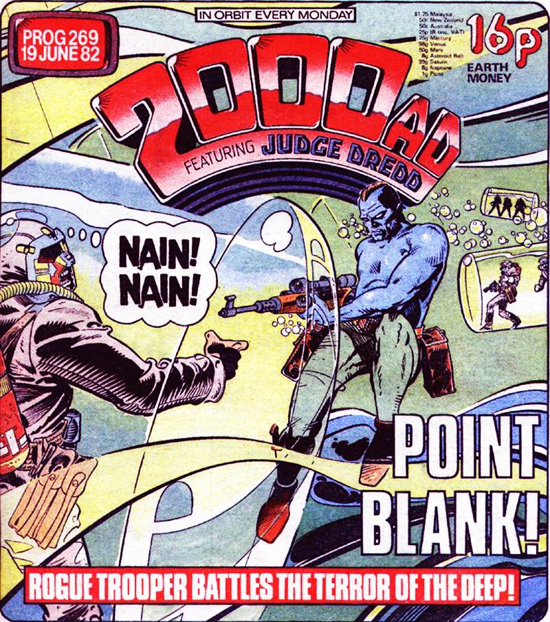
(Rogue Trooper by Colin Wilson for 2000 AD Prog 269 (1982) – according to Colin, ‘stiff and ungainly.’)

CW: Which is why, when Tharg contacted me earlier this year, his request for an “old school, iconic Rogue Trooper illustration” threw down the challenge.

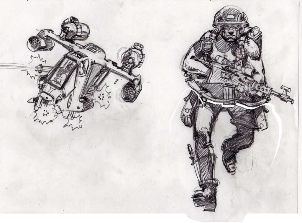
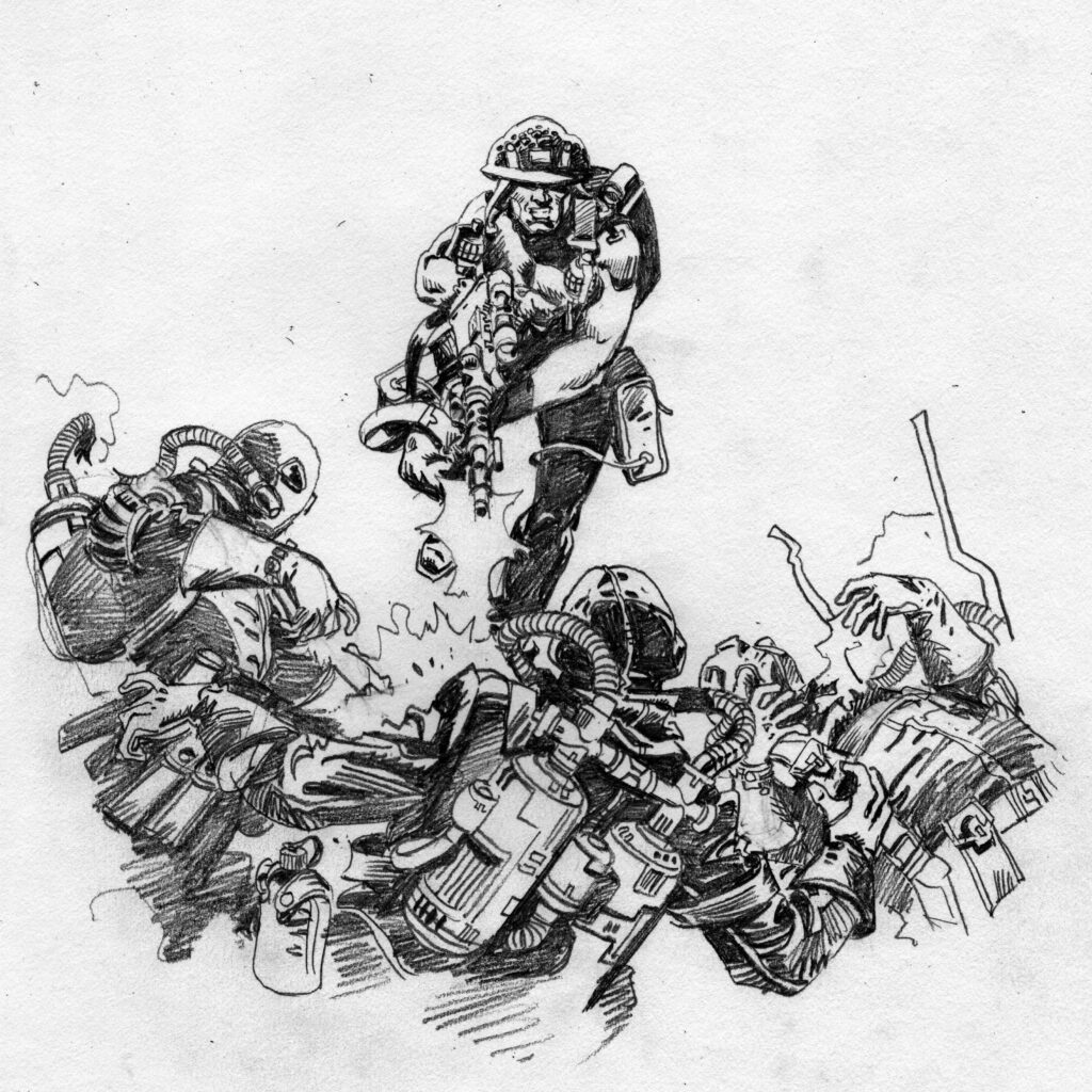
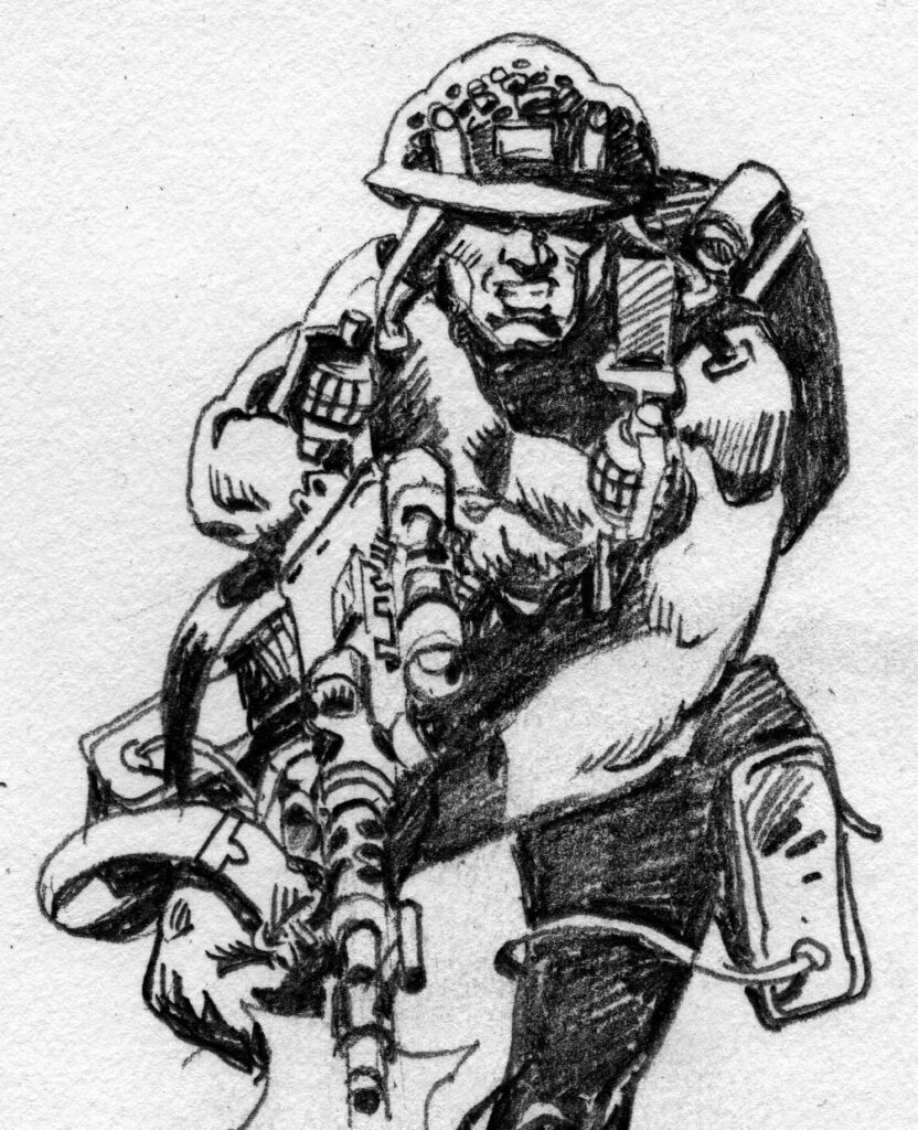
Looking back through a bunch of those early stories all I wanted was a simple, single vanishing point image of RT charging out of the frame, alone, hotly pursued by ‘the enemy’.

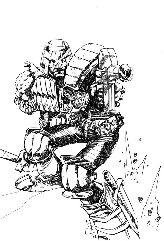
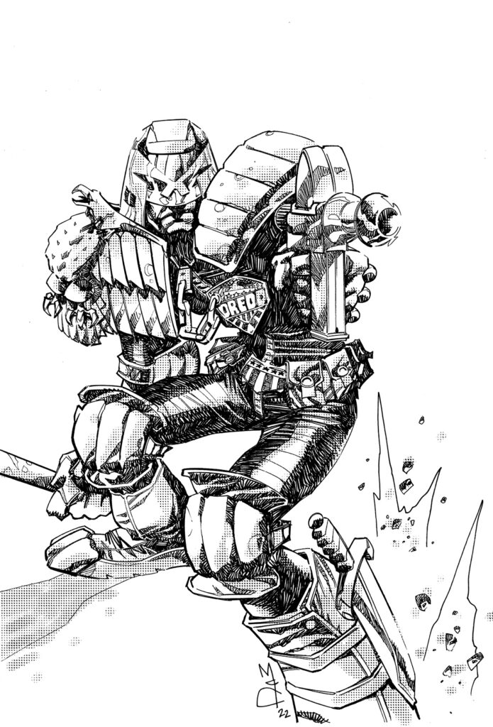
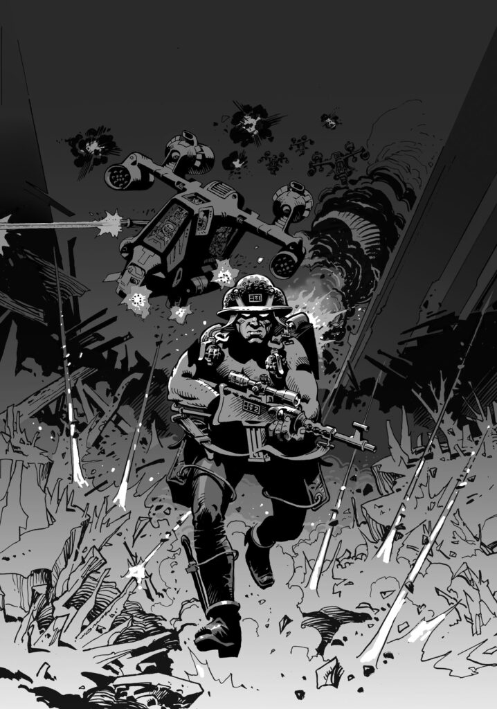
I sketched up a couple of variations on the theme, Tharg chose the final image, and I took a couple of days off from working my current series Nevada (published by Delcourt in France), and inked up the final art. Colour is something that I seldom have to deal with these days, but I also produced a quick B&W treatment of the way I saw the image looking in grey tones, and my job was done…

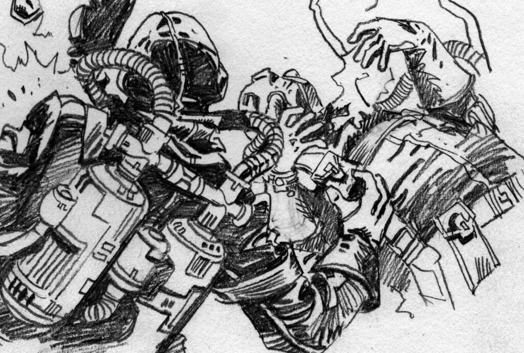
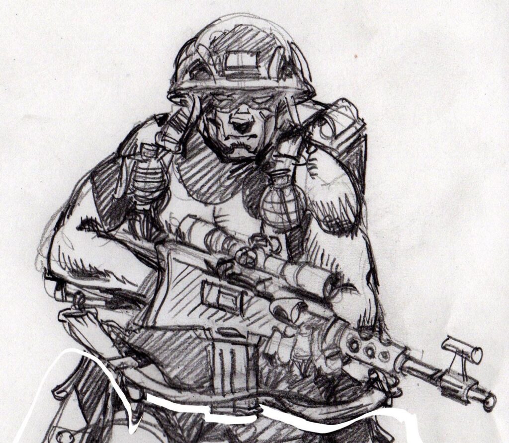
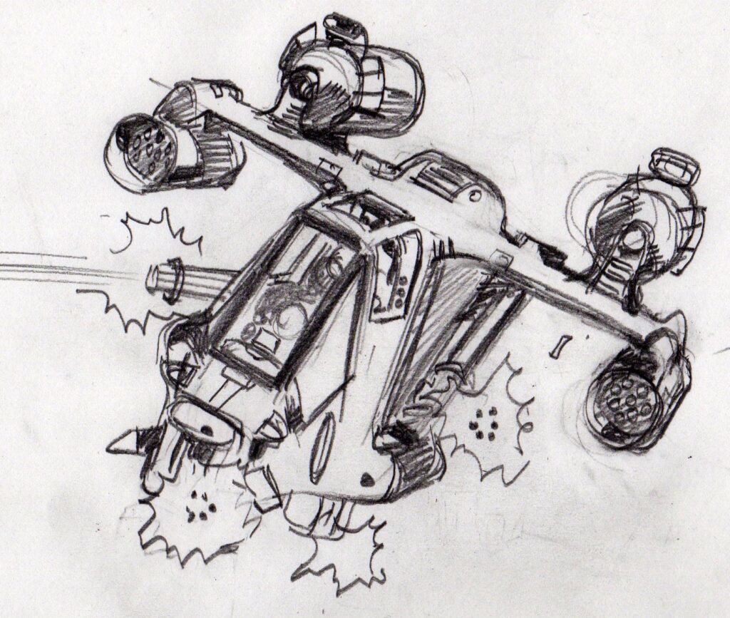
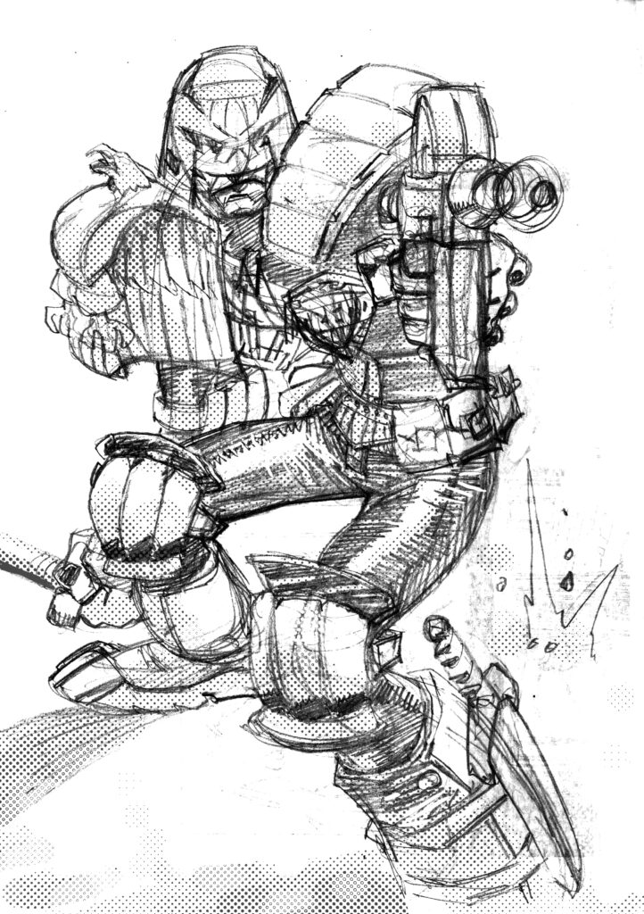
First up then, the couple of concept sketches Colin did, plus a few zoomed-in crops from them for your enjoyment…
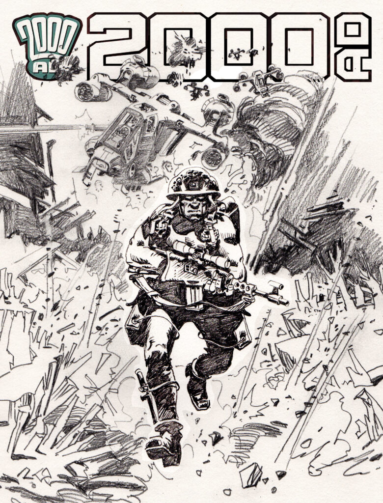
And then the cover pencils for the chosen image…
And then Colin’s B&W treatment of the way he saw it all looking, in grey tones…
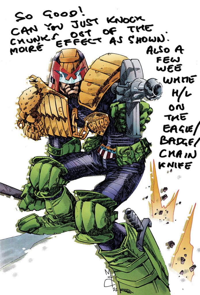
And finally, the finished cover with colours by the always amazing Dylan Teague…
Well, that was, I hope you agree, wonderful. I’ve loved Wilson’s work for so many years, especially when a friend showed me his astonishing Young Blueberry volumes – my sub-O-Level French may not have been good enough to read them, but there was so much excitement and amazement to be had through the artwork. So it was a huge honour and a pleasure to talk to him for this latest of his 2000 AD covers.

You can find Colin’s wonderful artwork on the cover of 2000 AD Prog 2338 from 28 June in shops, newsagents, and the 2000 AD web shop.

Now, extra stuff… because it’s Colin Wilson and I’d be remiss not to show you more, more, more of that amazing artwork.  And, of course, after you’ve read this, you should go and listen to the great man chat all about his life and work at the 2000 AD Thrillcast episode from 2020 here.

YouTube player

So, where to start? Well, let’s go right back to the beginning and showcase all of Colin’s 2000 AD cover art first…
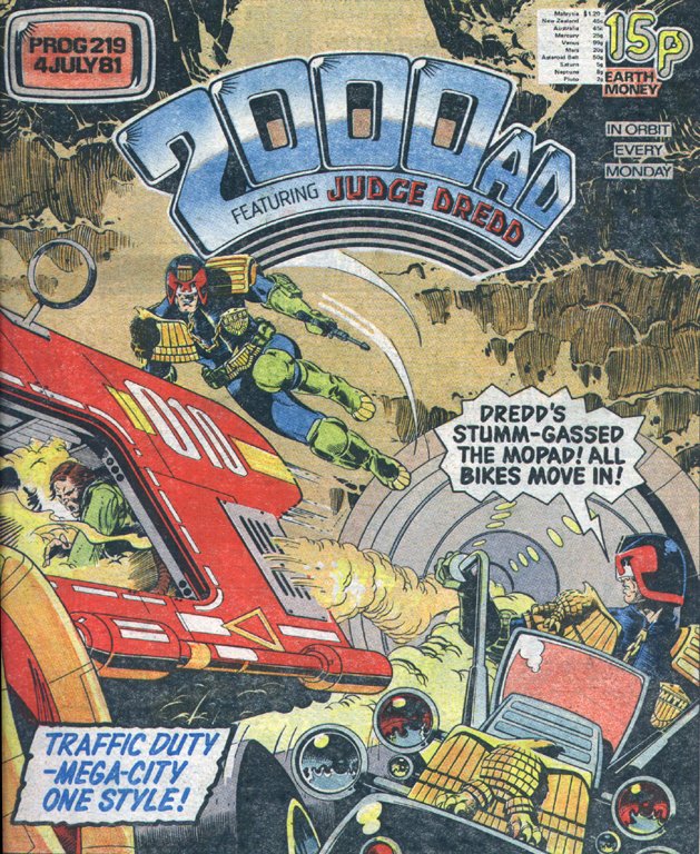
Judge Dredd – Prog 219, 1981
Rogue Trooper – Prog 237, 1981
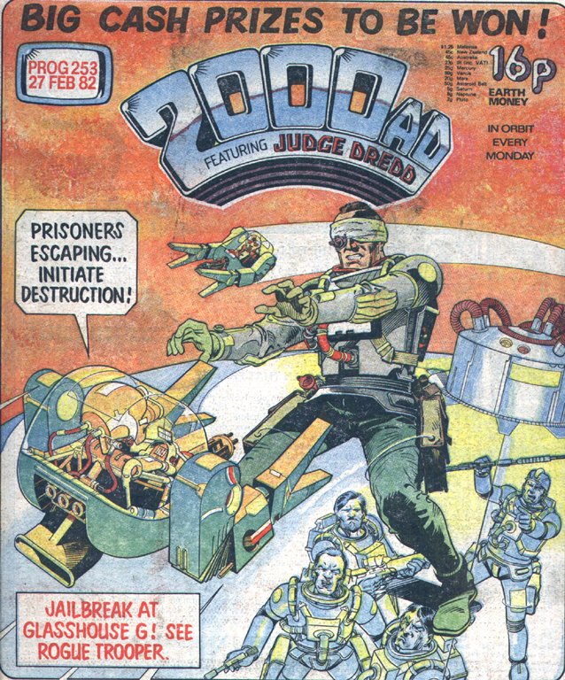
Rogue Trooper – Prog 253, 1982
Rogue Trooper – Prog 269, 1982
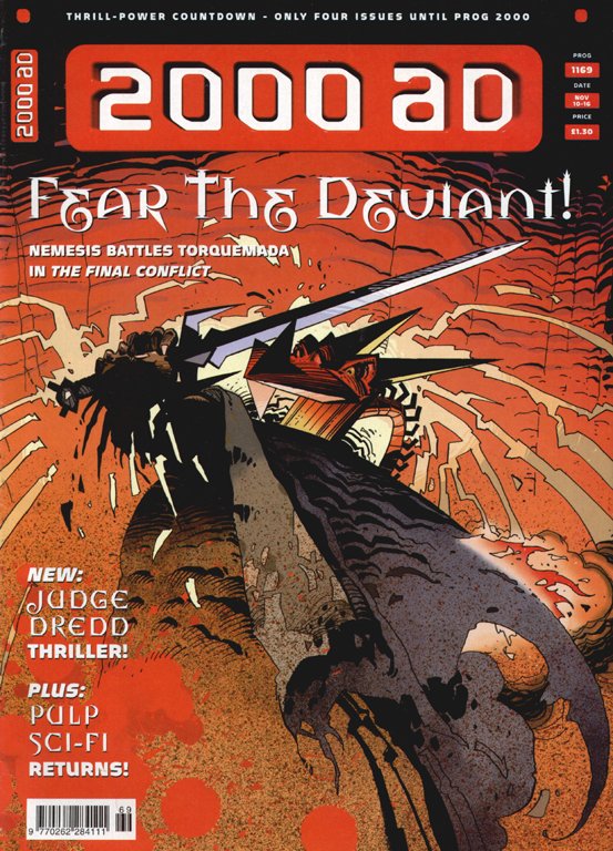
Nemesis the Warlock – Prog 1169, 1999
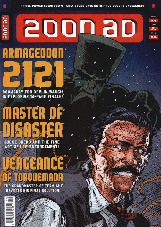
Devlin Waugh – Prog 1173, 1999
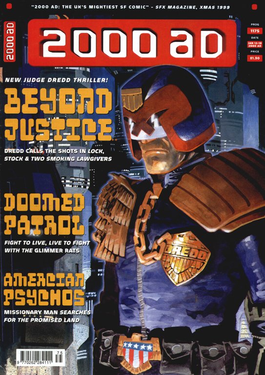
Judge Dredd – Prog 1175, 2000
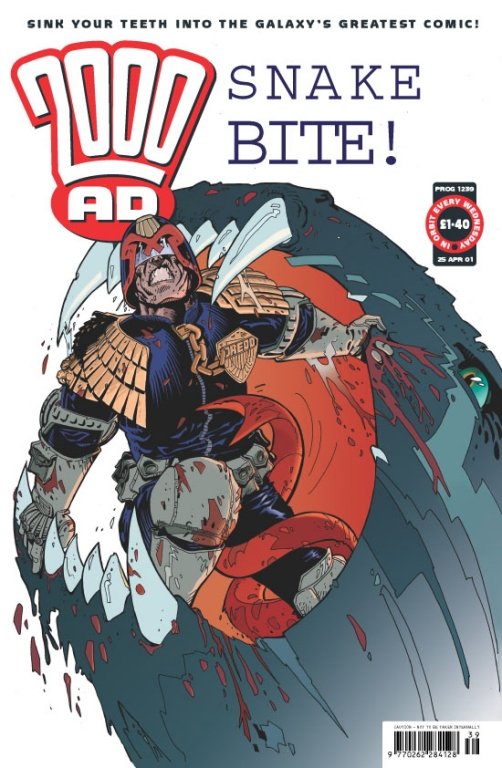
Judge Dredd – Prog 1239 – with Janet Gale, 2001
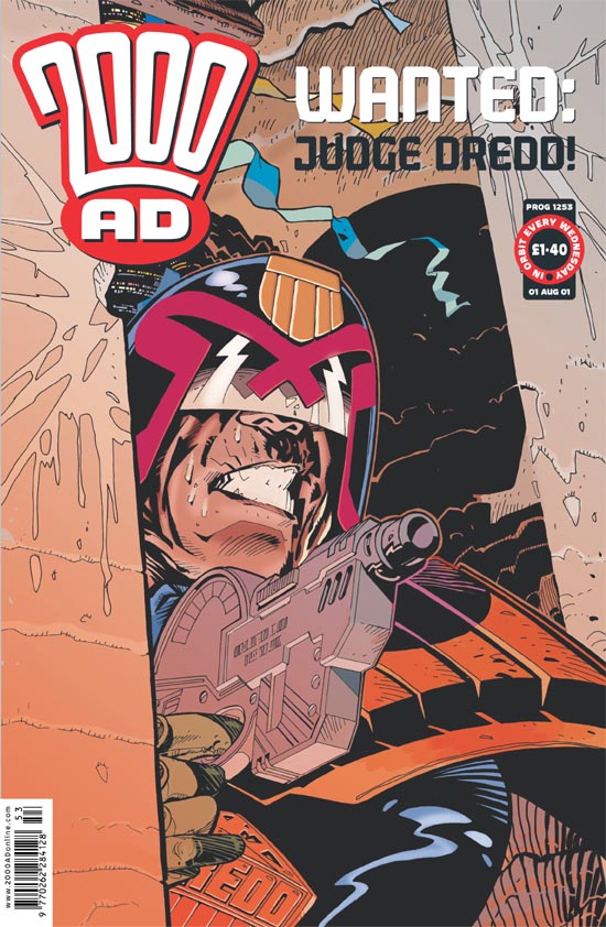
Judge Dredd – Prog 1253 – with Janet Gale, 2001

.

Then maybe a few bits of his Rogue Trooper artwork over the couple of years he was involved…
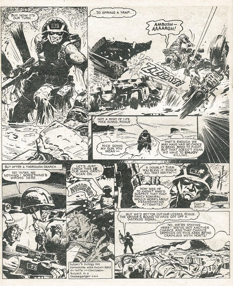
(Full page from Wilson’s first Rogue Trooper tale, Ascent to Buzzard-Three , 2000 AD Prog 236, 1981)
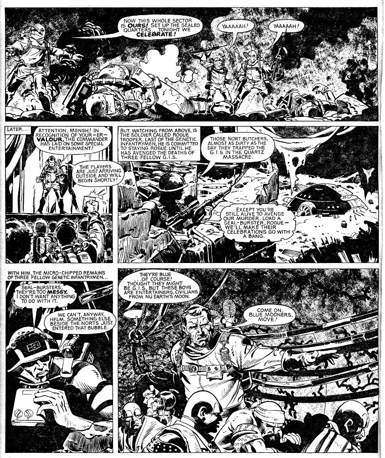
(Rogue Trooper: Blue Moon from 2000 AD Prog 241, 1981)
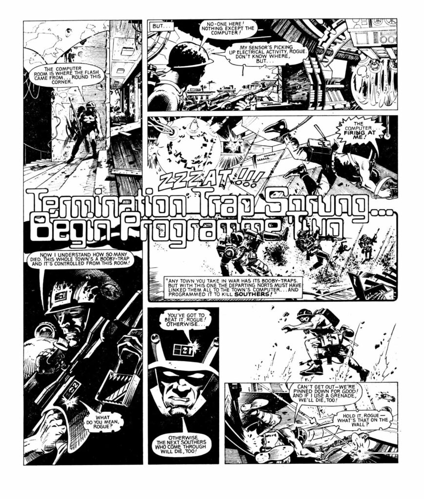
(A stunning two pages of WIlson’s Rogue Trooper – Fear of the Machine – from 2000 AD Prog 246, 1982)

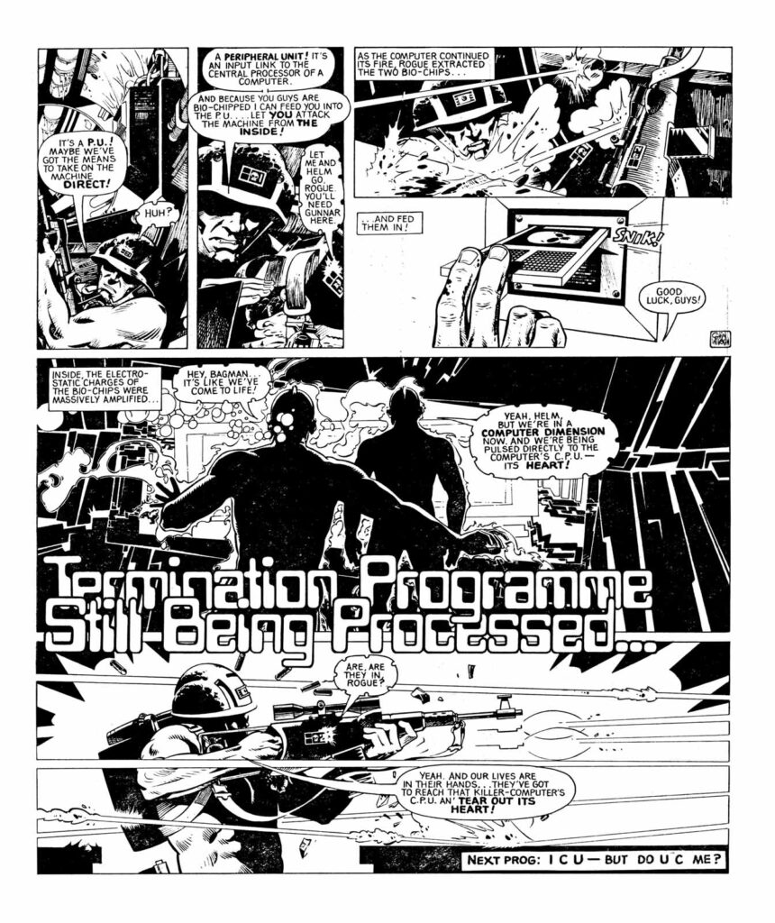
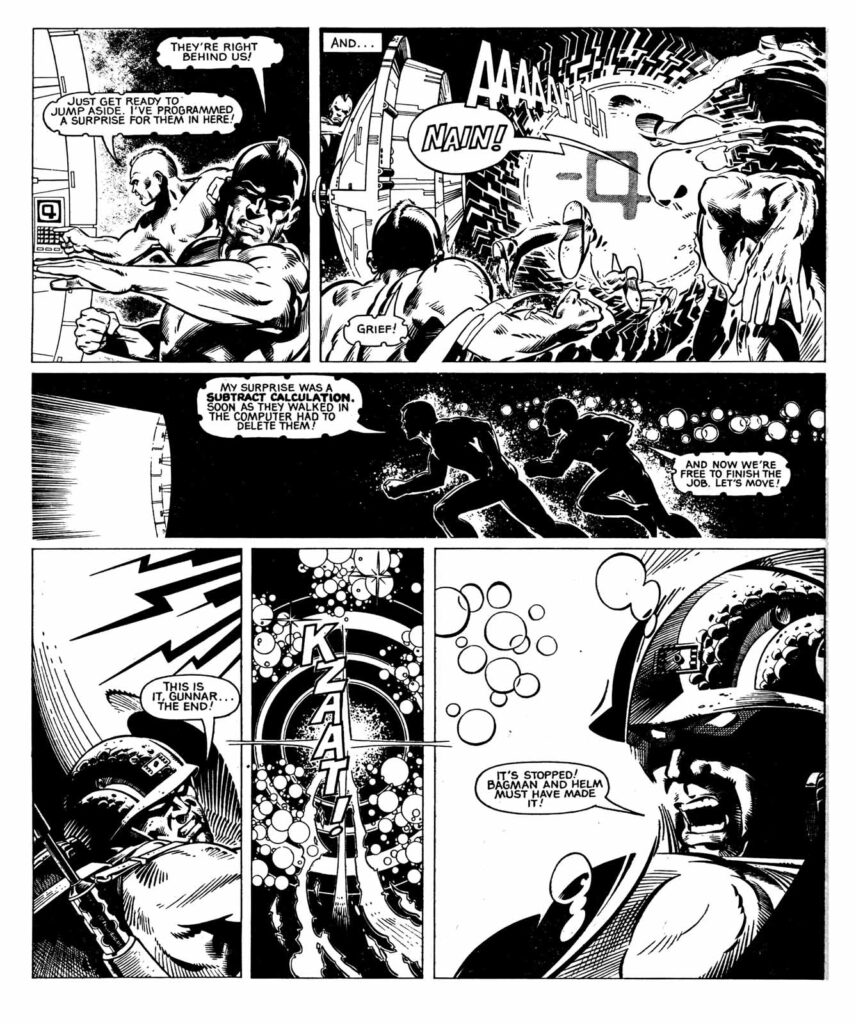
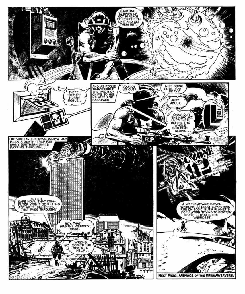
And finally, just as a particular treat, a complete 4-page Wilson-drawn Rogue Trooper episode from Fear of the Machine, this one from 2000 AD Prog 248, 1982…
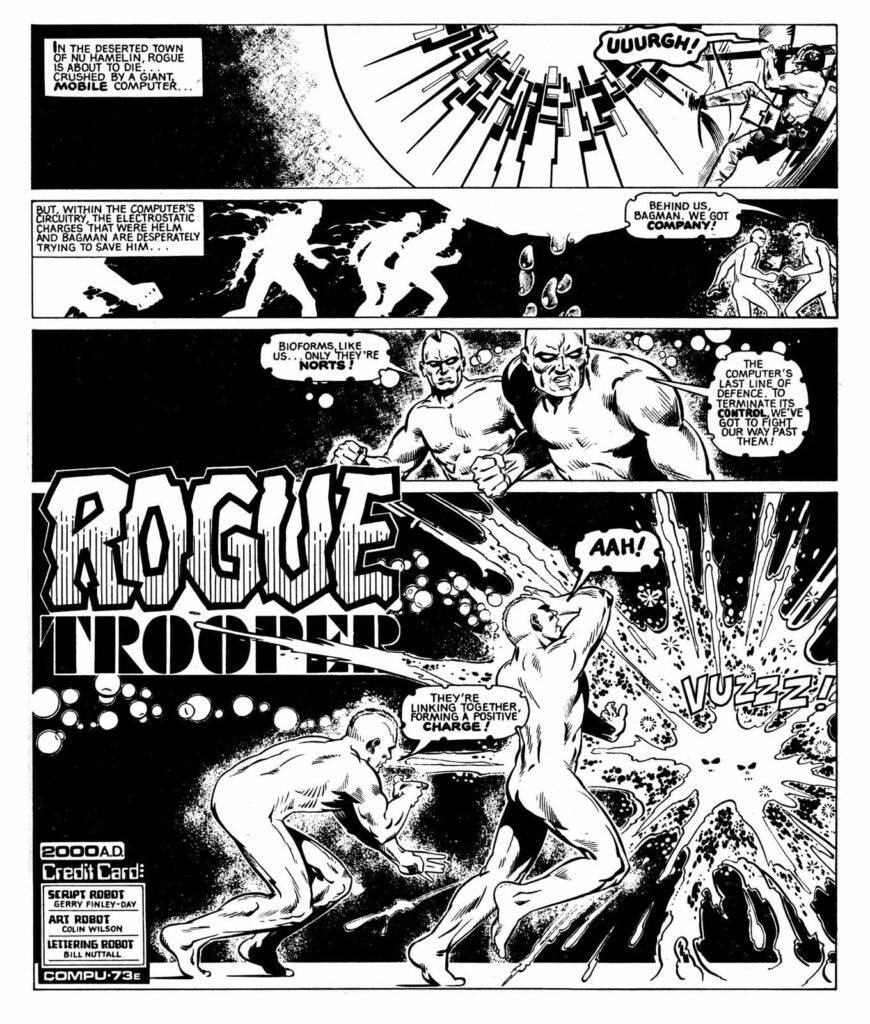
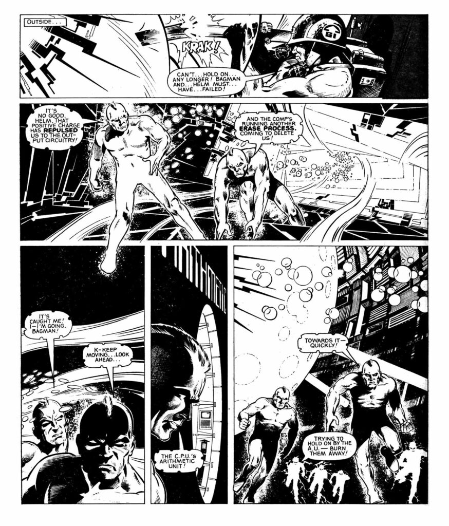
(A complete 4-page Wilson-drawn Rogue Trooper episode from Fear of the Machine, this one from 2000 AD Prog 248, 1982)

.

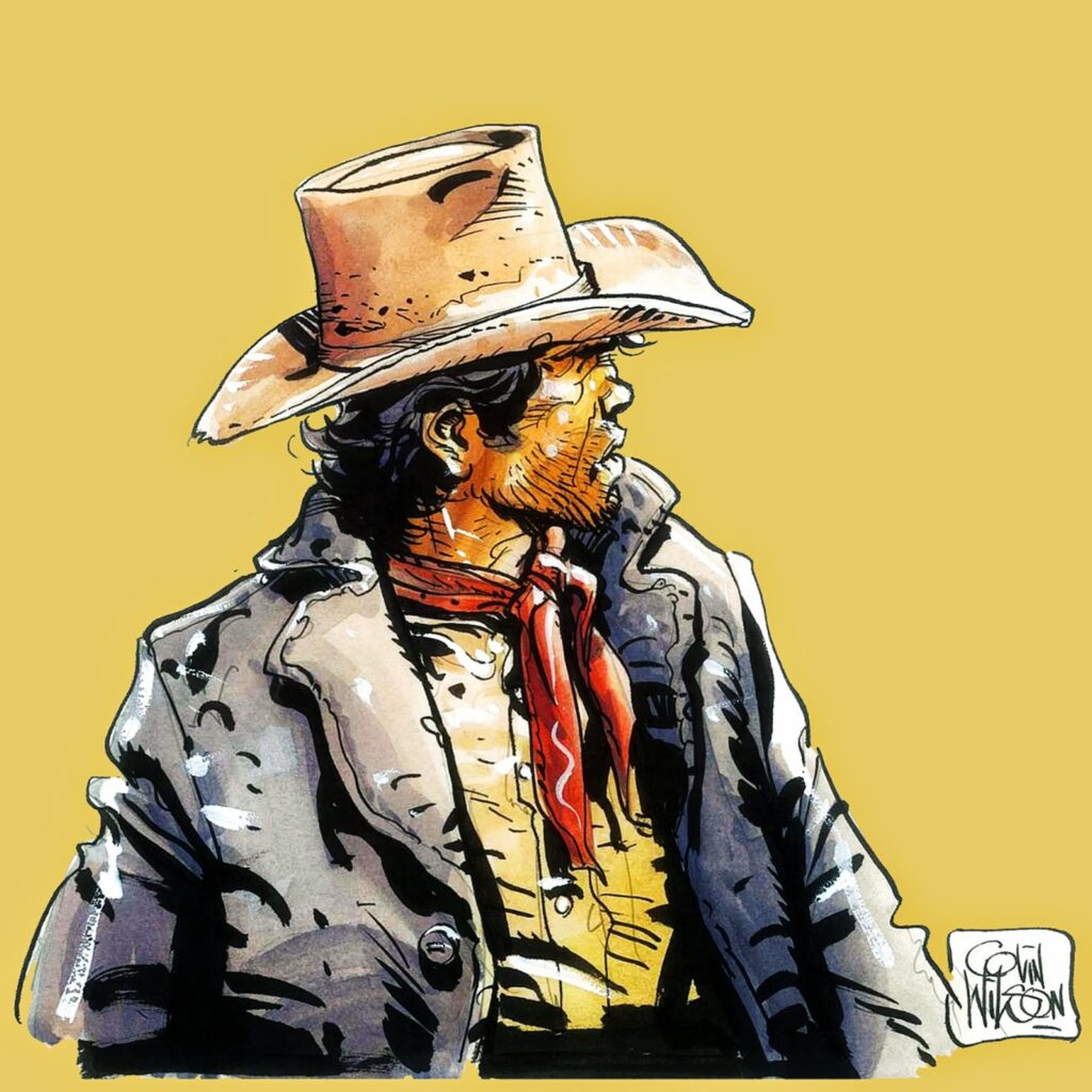
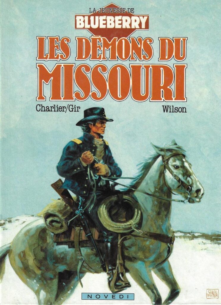
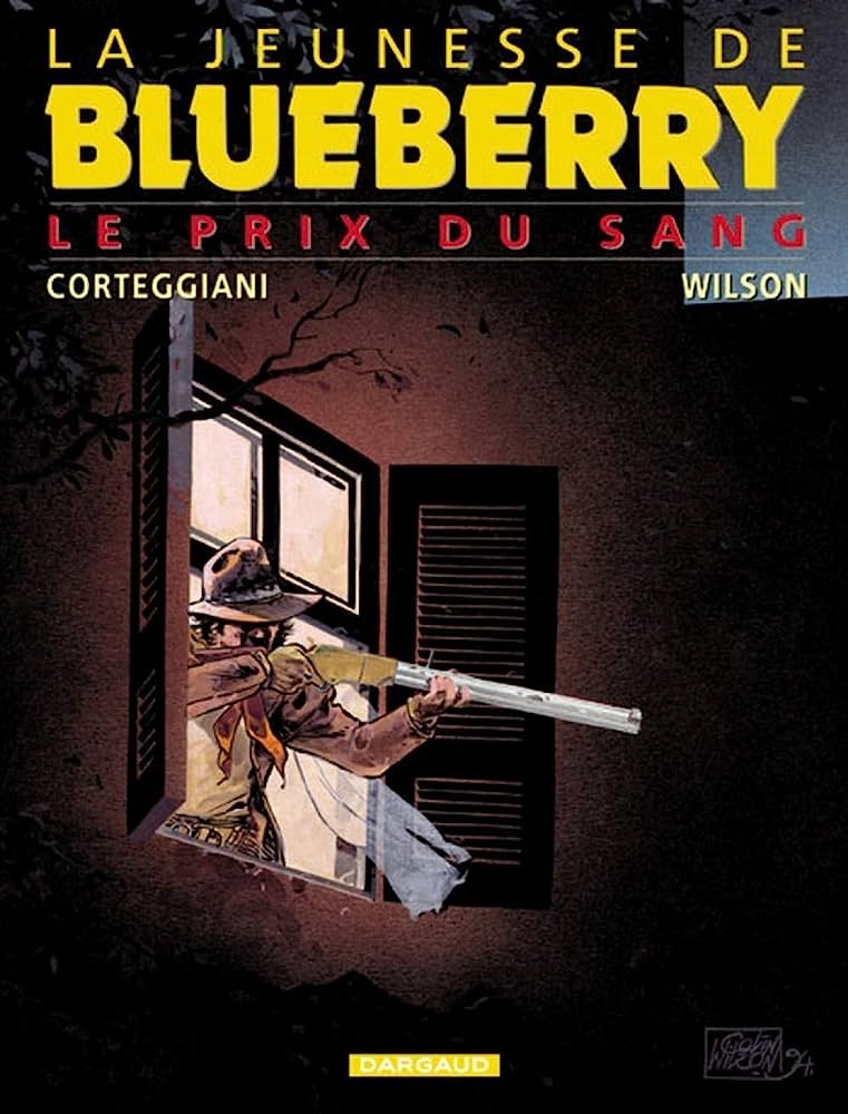
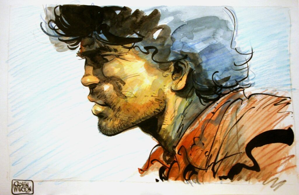
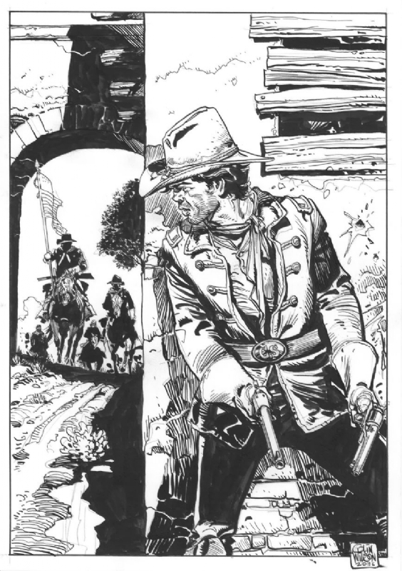
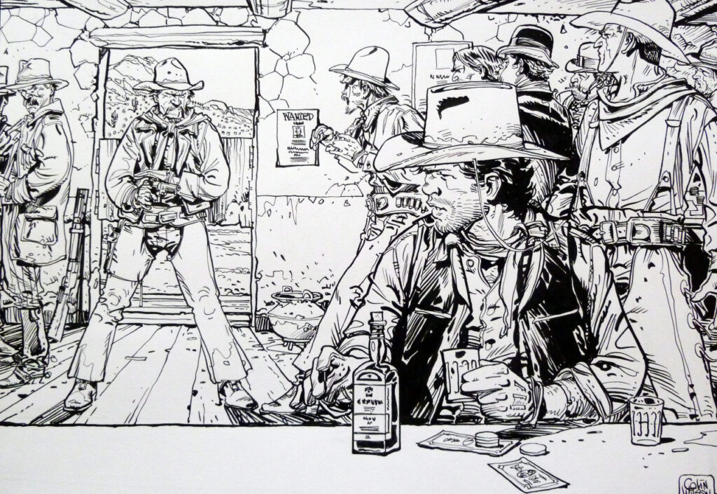
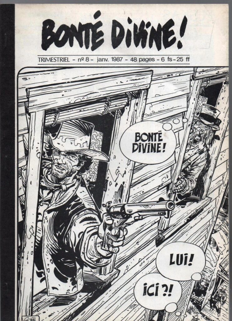
Now, moving on to the simply stunning work he did on Young Blueberry

.

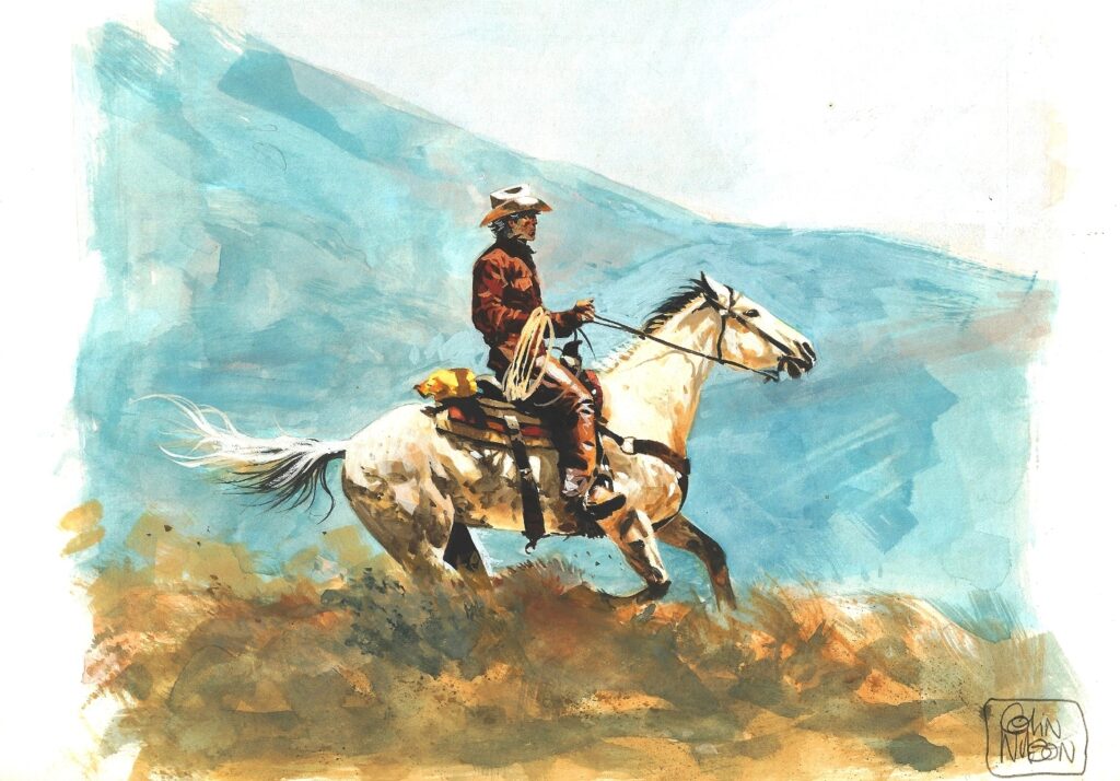
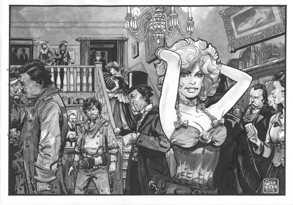
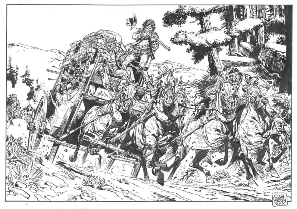
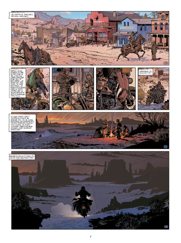
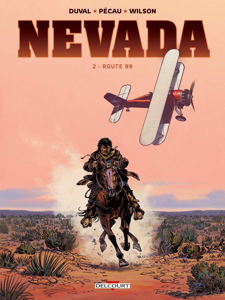
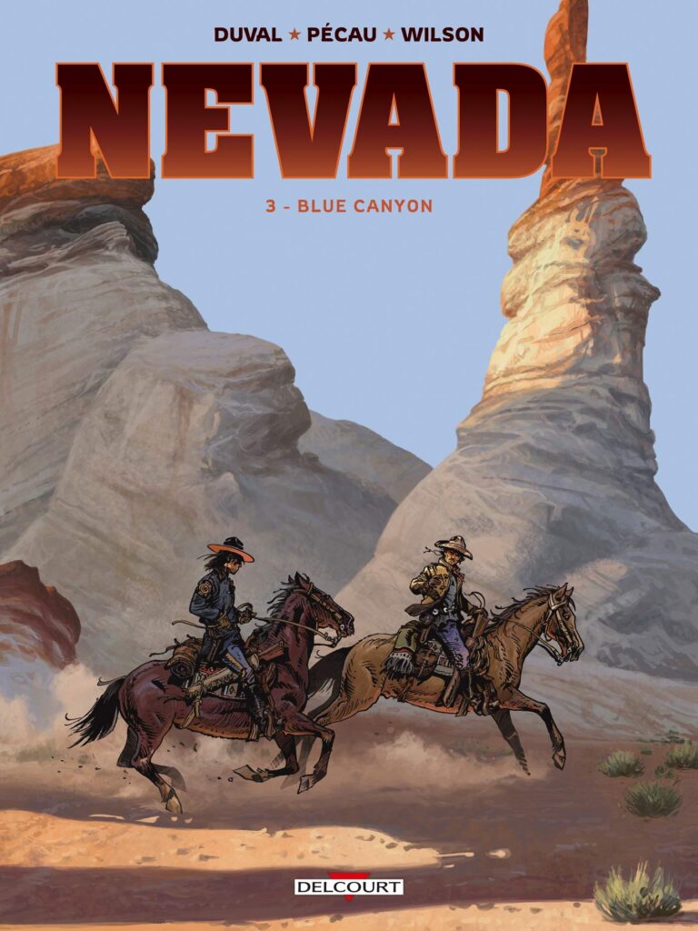
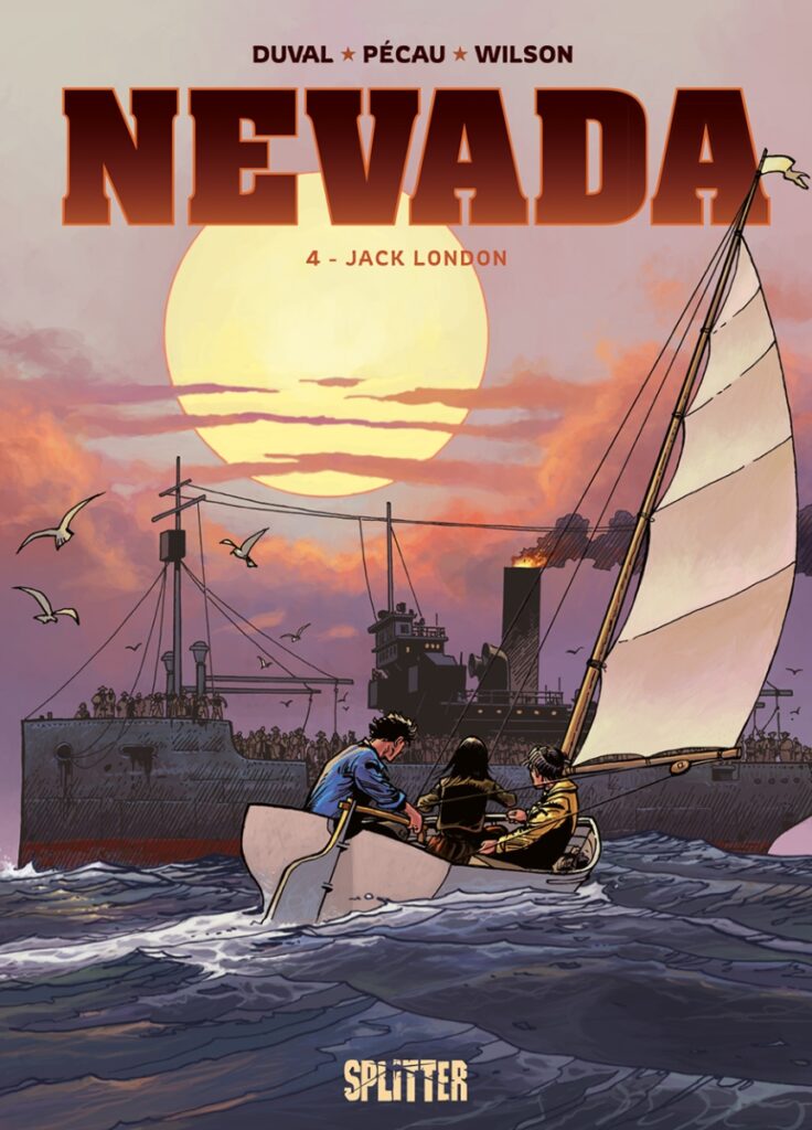
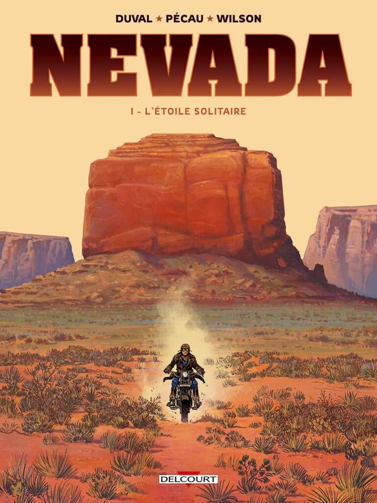
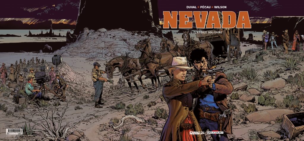
And finally, his most recent series for Dargard, Nevada, written by Fred Duval and Jean-Pierre Pécau. As you’d expect, it looks simply stunning.

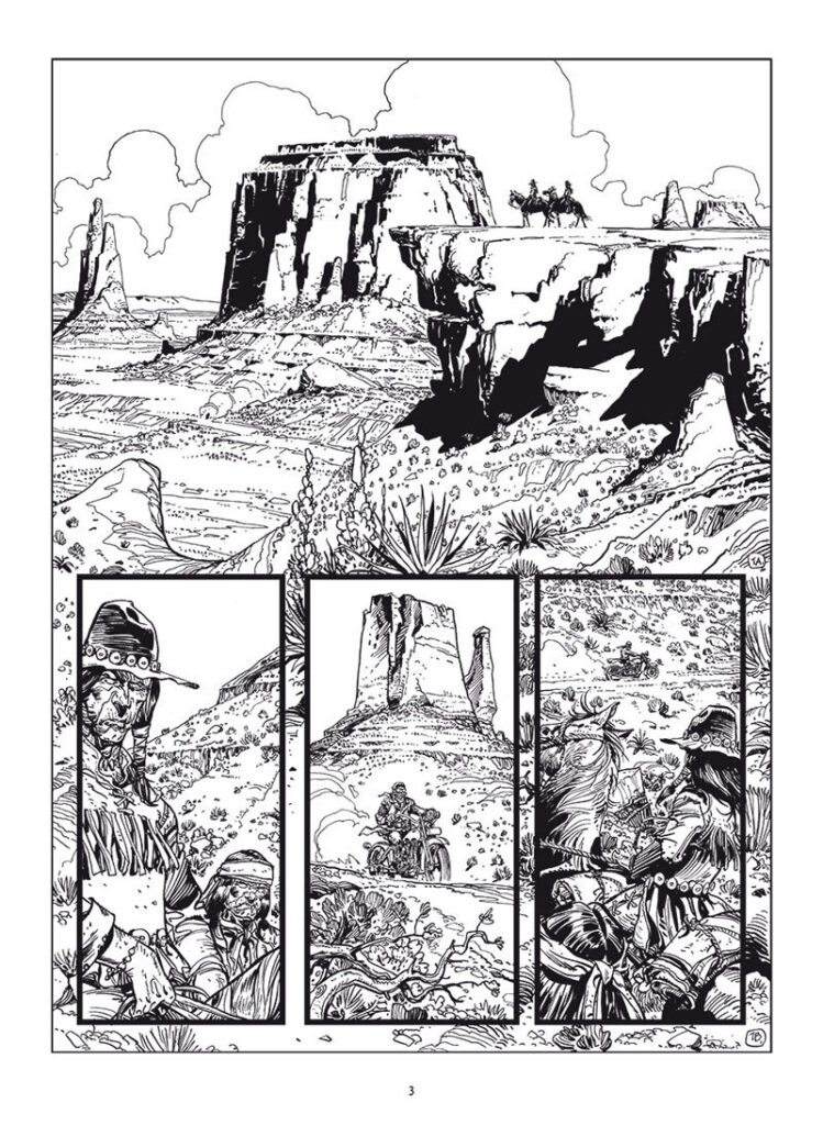
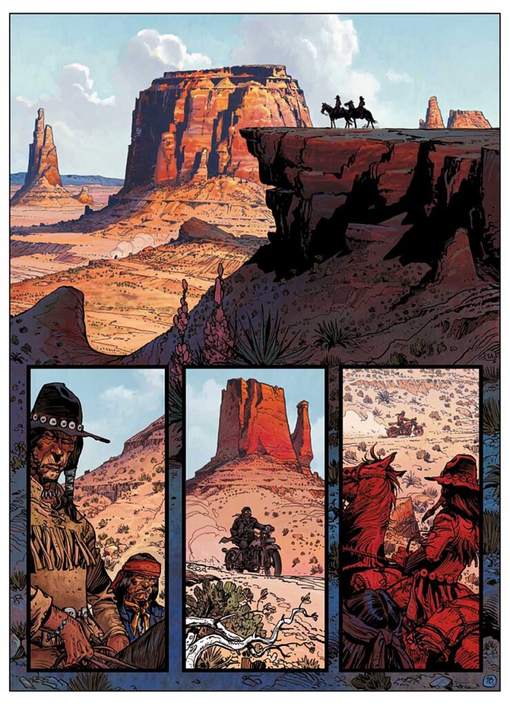
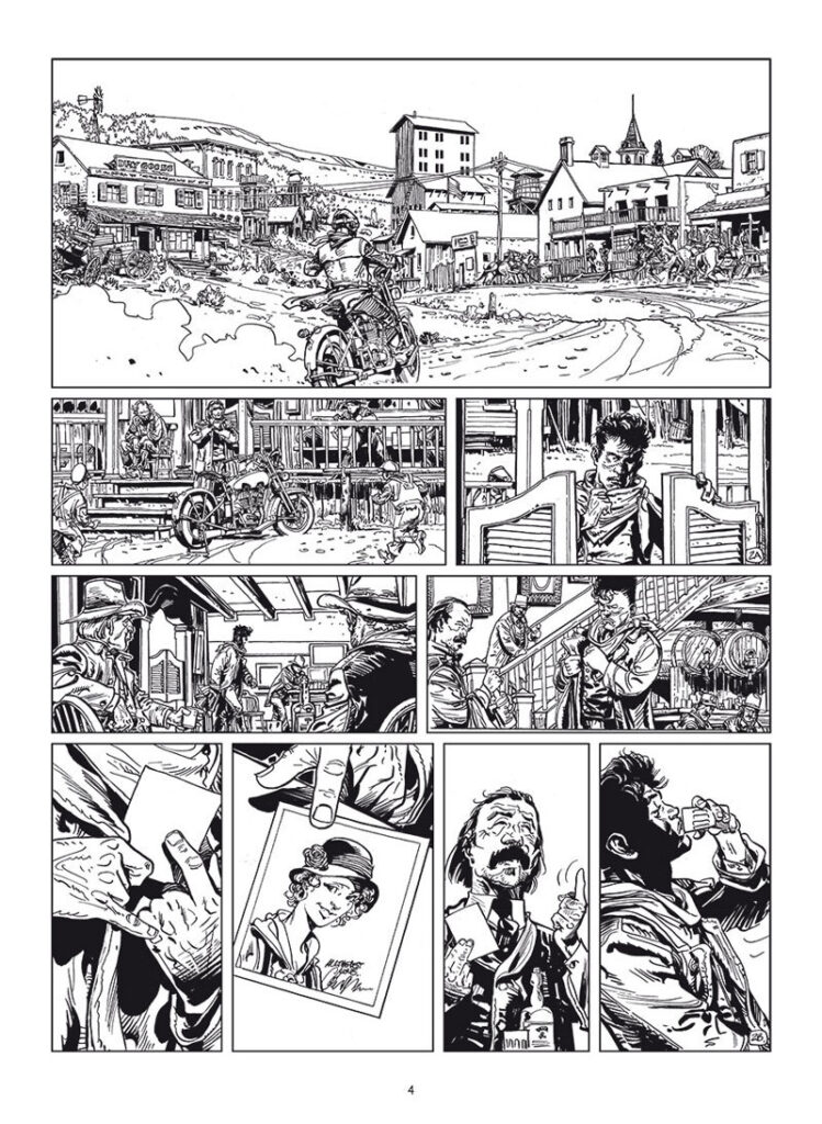
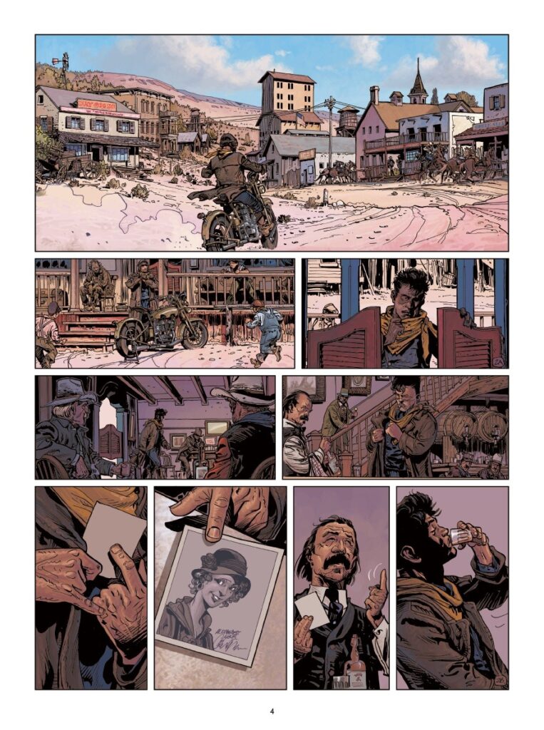
Set in the 1920s when the western United States was changing rapidly, the story centres on Nevada Marquez. Once an adventurer of sorts, he now works in Hollywood for former actress turned producer Louise Hathaway. But although this may be a new age, it doesn’t mean that this west is any less wild, as Nevada’s finding out. It’s Colin Wilson being Colin Wilson on every page, filling the imagination with imagery of the last vestiges of the Wild West, obviously delighting in revisiting the places, themes, and grand vistas that made his Young Blueberry so influential and incredible.
Posted on

2000 AD Covers Uncovered: of Bullitt & Big Guns – McBane & Dredd on Kieran McKeown’s cover for Megazine 457

Every week, 2000 AD brings you the galaxy’s greatest artwork and 2000 AD Covers Uncovered takes you behind-the-scenes with the headline artists responsible for our top cover art – join bloggers Richard Bruton and Pete Wells as they uncover the greatest covers from 2000 AD!

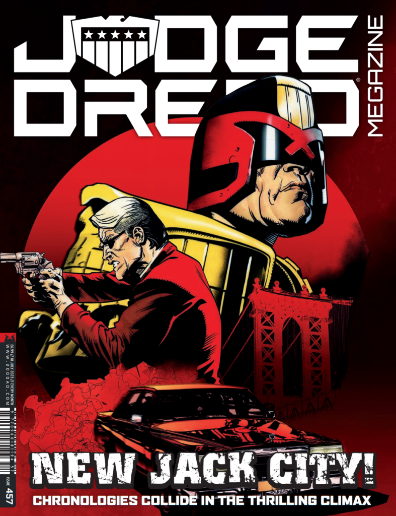
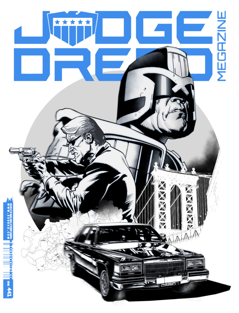
We’re looking at the front cover of Judge Dredd Megazine 457 now – which is out now – with Kieran McKeown giving us the double trouble pairing of Dredd and Jack McBane for the finale of the excellent One-Eyed Jacks storyline.

It’s been a time-travel caper with a difference, as we’ve tracked villainous goings-on in 1970s New York City and 2145 Mega-City One in a thriller of a tale, one which has also shed light onto the Fargo bloodline.

Ken Niemand and Kieran McKeown, with Ian Richardson on art for episode 1, have blown us all away with this one and it’s fitting that Kieran gets the cover for the finale showing that final ‘meeting’ of two of the toughest cops of any time!

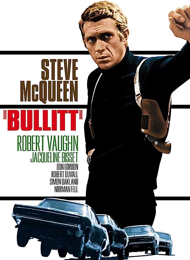
KIERAN MCKEOWN: I had initially wanted to do an homage to late 60s/early 70s cop movies for the cover.  ‘Homage’ is a fancy art word for ‘steal’. 

The one I liked was ‘Bullitt,’ probably my favourite cop movie from that era.  The car chase sequence is just a masterclass in visual storytelling. I probably learned more about visual storytelling from that one sequence alone than any other resource in my library of art books. 

.

KM: Sadly, Matt said that IDW had already done a Dredd Bullitt homage.

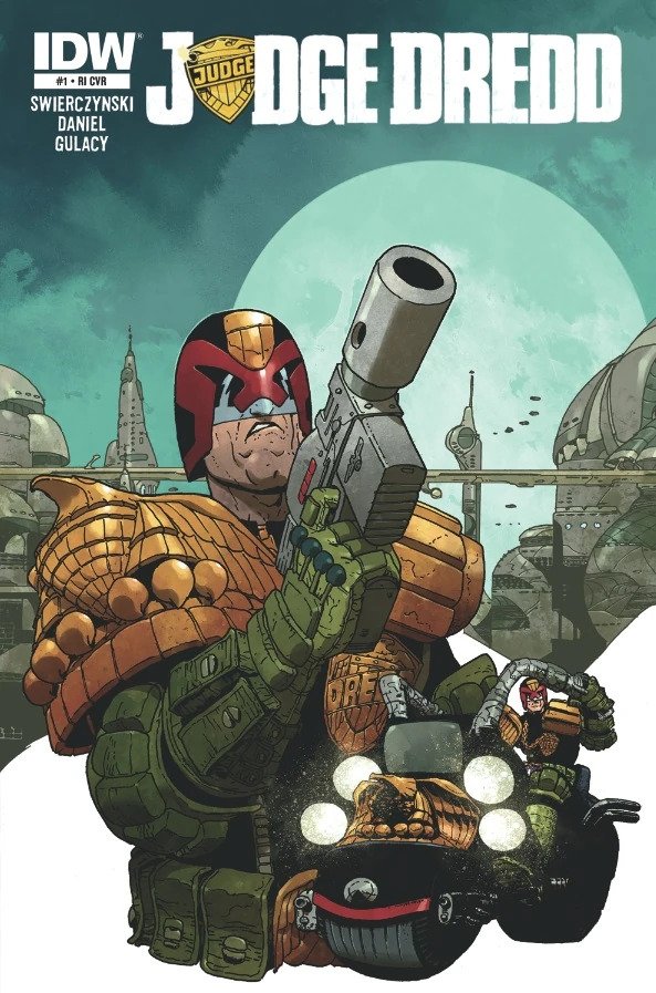
Oh yes they had – and initially I had it in my head that it was the variant cover that the late, great, much missed Carlos Ezquerra did as a variant cover for Judge Dredd #1 from IDW, published November 2012.

Sure, thought I, It’s not quite an exact Bullitt homage, but it’s got the elements of it. So I figured it was most likely this one. Which of course gives me the perfect opportunity to share something by King Carlos with you…

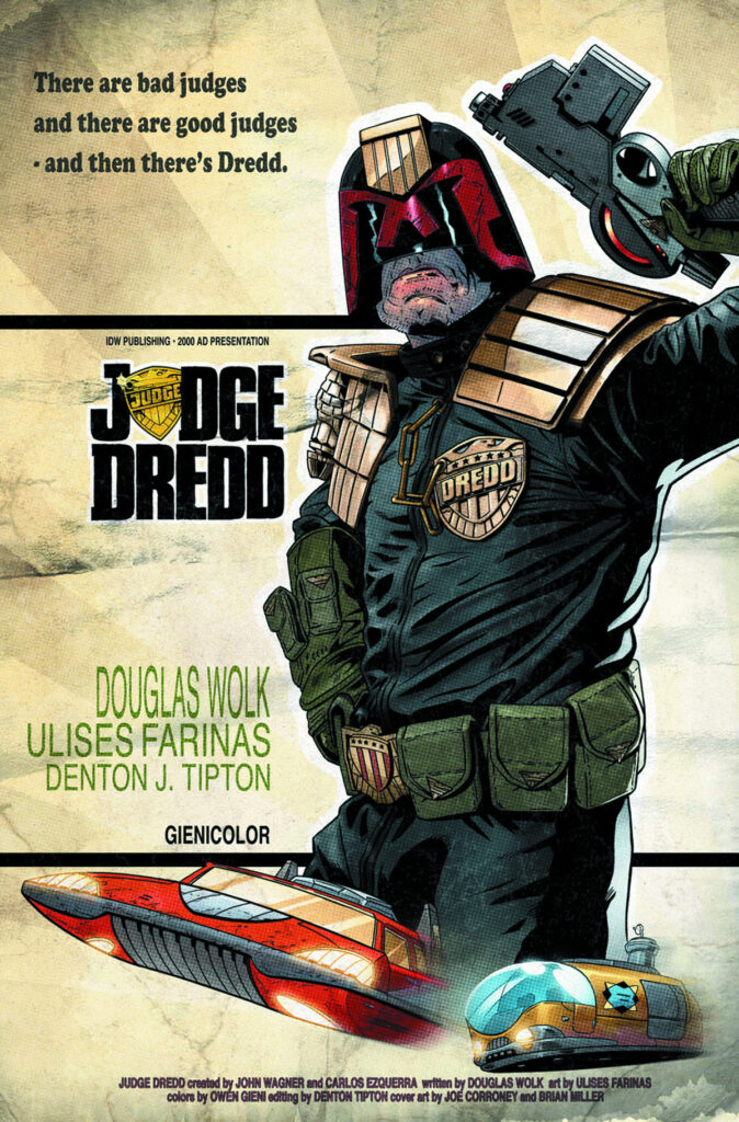
(Carlos Ezquerra’s variant cover for Judge Dredd #1, IDW, 2012)

At which point, a missive from TMO himself, most gracious and majestic and generous Tharg, came through... Idiot web-droid, it’s not the Carlos cover that’s the Bullitt homage but the subscription variant cover by Joe Coroney for 2014’s Judge Dredd Mega-City Two #1. Ooops. Bad me.

Tharg sees all, Tharg hears all, Tharg even knows what we’re typing. Meanwhile, I shall be enjoying quarter oil rations all month. So, THIS is the cover Tharg’s human representative was telling Kieran about…

(Joe Coroney’s cover for Judge Dredd Mega-City Two #1, IDW, 2014)

Okay, back to Kieran, licking his wounds over losing out on the Bullitt image – but at least he’s not in a tiny cubicle smarting from a talking to from TMO!

KM: So I had to think of something else.  Reflecting on it, I felt it important that the cover featured both Dredd and McBane.  The novelty of the Dredd/McBane crossover was that you had these two guys from two very different worlds coming into contact.  So I really wanted to juxtapose Dredd with all this 60s & 70s era imagery.  So I decided to go with this…

My process is not all that different to any other artists. I get my reference, do my layouts and then finish. 

So with the space allowed, I figured the readers might be more interested in some of the finishing touches I employ.

These finishing touches probably don’t make a whole pile of visual difference in the final coloured version. But from experience, they do give a nice layer of polish to your work that editors respond positively to – which is important if you’re trying to get a job.  People that look at your work on Instagram also seem to respond more positively to this type of look in your artwork. I know that can seem trivial but Instagram is very important for building an artist’s profile.

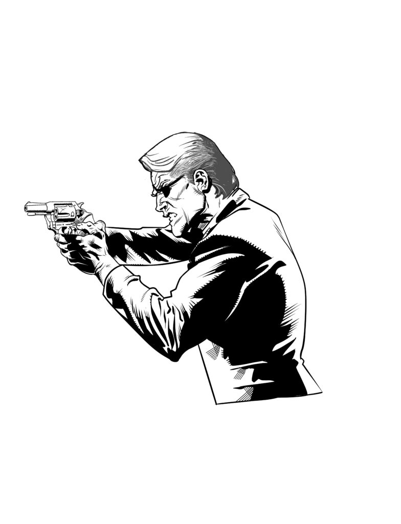
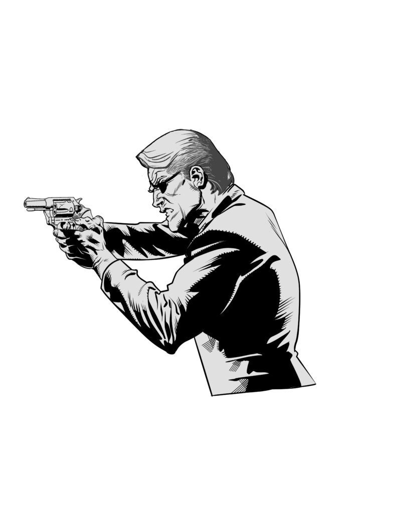
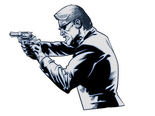
So, when I finish inking a figure digitally, the first thing I do is pop a grey layer underneath…

.

This just helps the figure pop out more from the white of the page. If you’re managing multiple different objects and figures on a page, strategic use of a grey layer is also helpful in emphasising particular elements for which you might want to draw the viewer’s eye. 

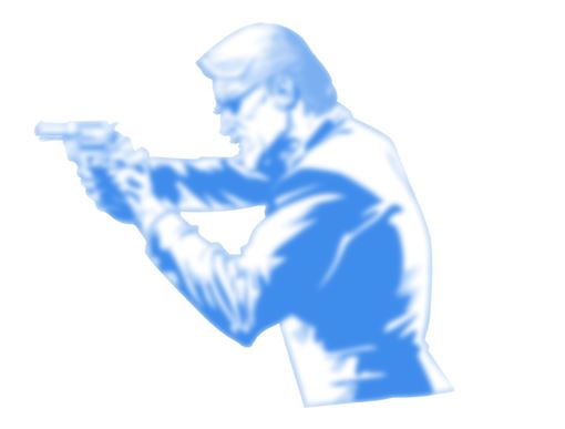
Now you can easily stop at the grey layer stage. But I like to take it one step further. So next, I make a duplicate of the black and white layer and place it between the B&W layer and the grey layer.  I turn the layer blue. You could use some other colour if you prefer.  There’s nothing special about blue. It just reminds me of those non-photocopy blue pencils I used to use in my old analog drawing days.

(McBane getting the blues, the blue layer that is
-just the next stage of Kieran’s process)

Next, Clip Studio and Photoshop have a function that allows you to blur an image. I use the “Gaussian Blur” on Clip Studio for this. I turn the blur up real high. What you’re left with is a very blurred blue image of the B&W layer – as seen below. 

(And the final image, the inks, the greys, plus that blurred blue)

I then turn the opacity of the blue layer right down so you get something like the above when the original B&W layer is overlaid. I learned this trick from Marc Brunet’s YouTube channel. I don’t really know what this step accomplished other than, in my opinion, the image looks cooler. I think it’s intended to be a really quick way of doing “AO” (ambient-occlusion) type shading. That is, softening the transitions between the shadow and light sides of your drawing as well as the midtones within the light side. As I said, they also remind me a bit of the old blue pencil construction lines, comic artist’s often used when drawing analog.

Personally, I just love seeing the artist’s construction peep through underneath a finished drawing. 

Anyway, I hope you found this somewhat interesting!

Nope, not interesting Kieran – fascinating. Sure, I had to look up ambient-occlusion, but that’s what’s always so good about hearing artists go into the nitty-gritty of putting their art together!

So there you go, thanks so much for Kieran to sending that one along – You can find Judge Dredd Megazine 457, released on 21 July, wherever you pick up your monthly Meg, including the 2000 AD web shop.

And if you’re after more McBane, the original John Wagner and John Cooper One-Eyed Jack strip from Valiant comic in 1975 is now available as a collection from the 2000 AD web shop.

But before you go, make sure you go and read Kieran’s interview all about One-Eyed Jacks here! And finally, you can find Kieran online at his Instagram.

Posted on

2000 AD Covers Uncovered: ‘This is where everything begins’ – Tazio Bettin’s first cover to the new series Azimuth for 2000 AD Prog 2337

Every week, 2000 AD brings you the galaxy’s greatest artwork and 2000 AD Covers Uncovered takes you behind-the-scenes with the headline artists responsible for our top cover art – join bloggers Richard Bruton and Pete Wells as they uncover the greatest covers from 2000 AD!

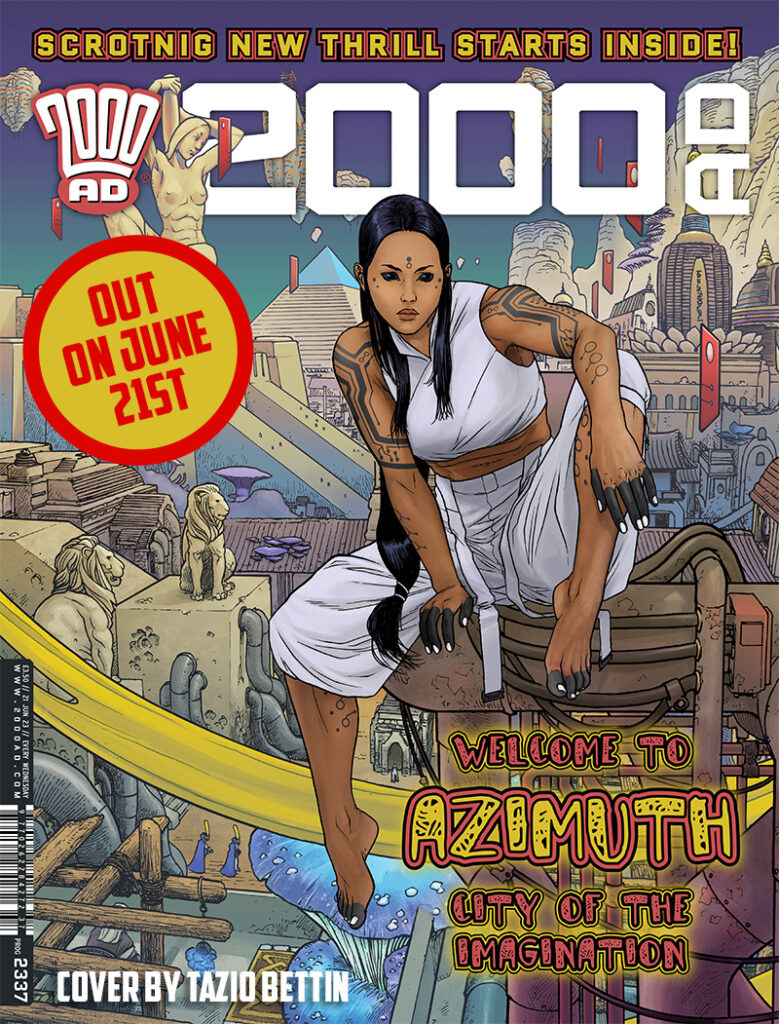
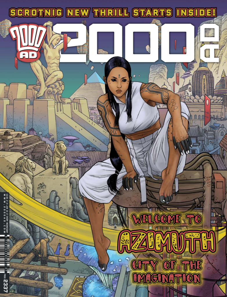
Another week, another stunning new strip in the pages of the Galaxy’s Greatest – with Dan Abnett and Tazio Bettin’s Azimuth beginning in the pages of 2000 AD Prog 2337. Trust us, this one’s a stunner.

Now, over to Tazio to describe putting it all together…

TAZIO BETTIN: This cover was a bit of an experiment, as well as the fundamental reference I created for myself to set the aesthetical tone for the entire series. I drew it before I drew any pages, and I only had a vague idea in my head and Dan’s descriptions of a weird science-fantasy setting to start with and give Azimuth its aesthetics and identity.

Dan is a fantastic writer for many reasons, one of which being his ability to give you just enough information to set a direction, but not too much, so that you can build on top of his suggestions with a lot of freedom. I had a direction but was free to explore it.

Just one of the references from Tazio – Jaroslav Horejc’s ‘Girl With Amphora statue from Prague

So I went with my standard concept art process, which consists of amassing a visual database: I collected photos of Babylonian ziggurats, pyramids, Jaroslav Horejc’s Girl With Amphora statue from Prague (which has some really beautiful proportions, and I was kind of obsessed with), the bazaar of Sana’a in Yemen, Cambodian temples, etc. And mushrooms. Tons of reference photos of the strangest mushrooms in nature.

I knew I was going for a Métal Hurlant vibe, a homage to the aesthetics of Moebius, Druillet, and other French masters of the bande dessinée.

This was also a chance to set the tone for the use of colours as well. I concentrated on the use of chroma, the colour hues, more than value, i.e. its brightness, to define shapes, objects and planes, so as to give everything a surreal patina – also thanks to gradients with unusual colours. Shifting your colours in mid-process and just see what happens is a great way for me to find interesting solutions.

This was also the first time I drew Suzi, the protagonist, outside of some concept sketches.

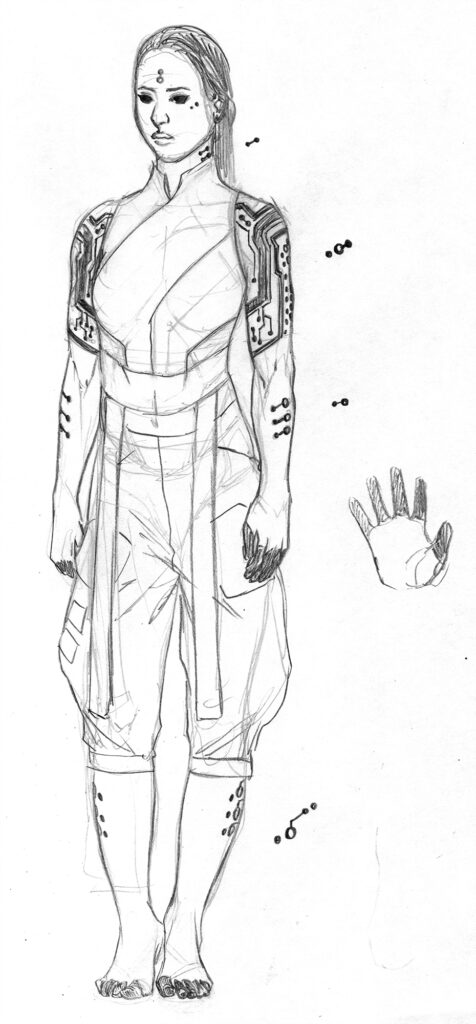
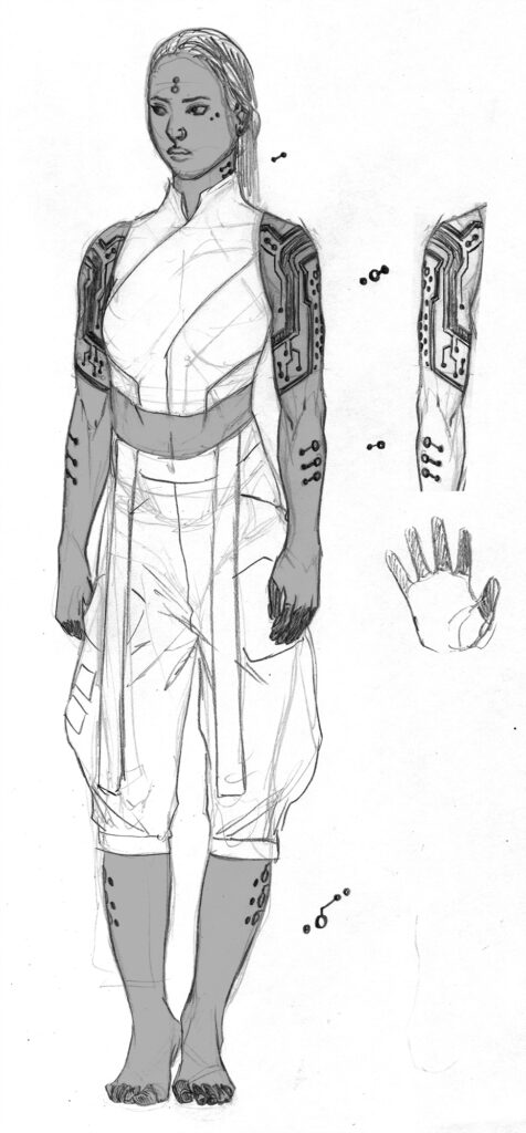
And speaking of those Suzi concept sketches… here’s a couple of stages of Tazio’s very first images of Suzi…

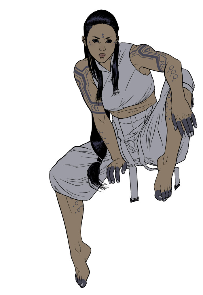
TAZIO BETTIN: Once again, Dan gave me complete freedom to define this character’s looks. Perhaps I was a little inspired by my recent reading of the Mahābhārata, but on the spur of the moment I decided to base her looks on one of the many Indo-Aryan ethnic groups from the Indian continent. You don’t see enough characters, let alone protagonist characters from those origins. Here I wanted to show Suzi in full figure, but close enough to properly show her attire and tattoo details.

Composition-wise, I went with a sort of an opening shot, so as to give the reader a sense of being at the threshold of things to unfold: “this is where everything begins”. It’s a status quo that is about to break, right before the whole story and its action unfolds. Everything gets crazy afterwards. I hope you enjoy!

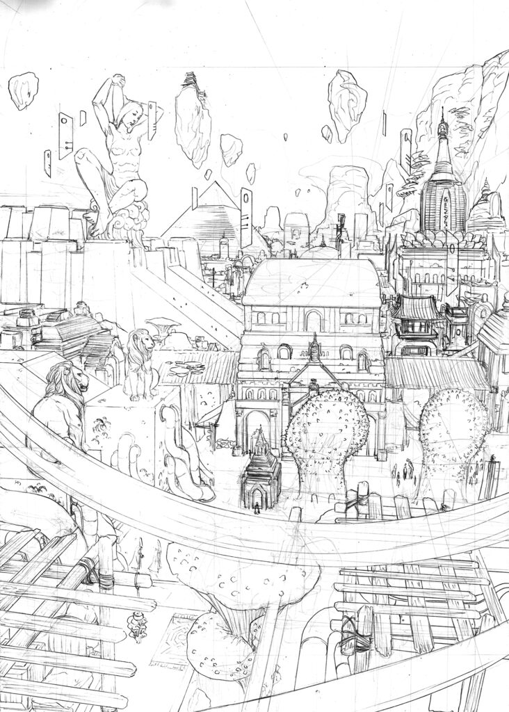
It might be worth noting that I did the main character and the background in two separate drawings and then worked them all together in the final rendition…

And to show you what he meant with the two separate drawings, Tazio also sent along the finished Suzi image from the quite brilliant cover and the pencils for the backgrounds to the cover…

Thank you so much Tazio for sending along those images for the cover – and what a cover! In fact, having read the first episode, what a strip, a stunning new series for the Galaxy’s Greatest.

Azimuth begins in 2000 AD Prog 2337, you can find it everywhere the Prog is sold, including the 2000 AD web shop from 21 June.

And you can see more of Tazio’s excellent covers for Covers Uncovered here – there’s Sinister Dexter covers for Prog 2259, and Prog 2283, and then there was an unusual guest appearance in this Andy Clarke Covers Uncovered for Prog 2290 where we talked all things Austin Allegro! Finally, there’s his cover for Hope… In The Shadows for Prog 2302.

Posted on

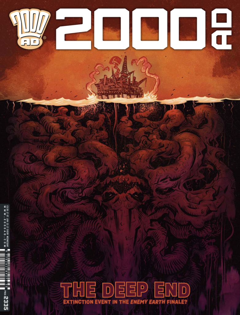
2000 AD Covers Uncovered: Up From The Depths… It’s Luke Horsman For The Finale Of Enemy Earth On Prog 2335

Every week, 2000 AD brings you the galaxy’s greatest artwork and 2000 AD Covers Uncovered takes you behind-the-scenes with the headline artists responsible for our top cover art – join bloggers Richard Bruton and Pete Wells as they uncover the greatest covers from 2000 AD!

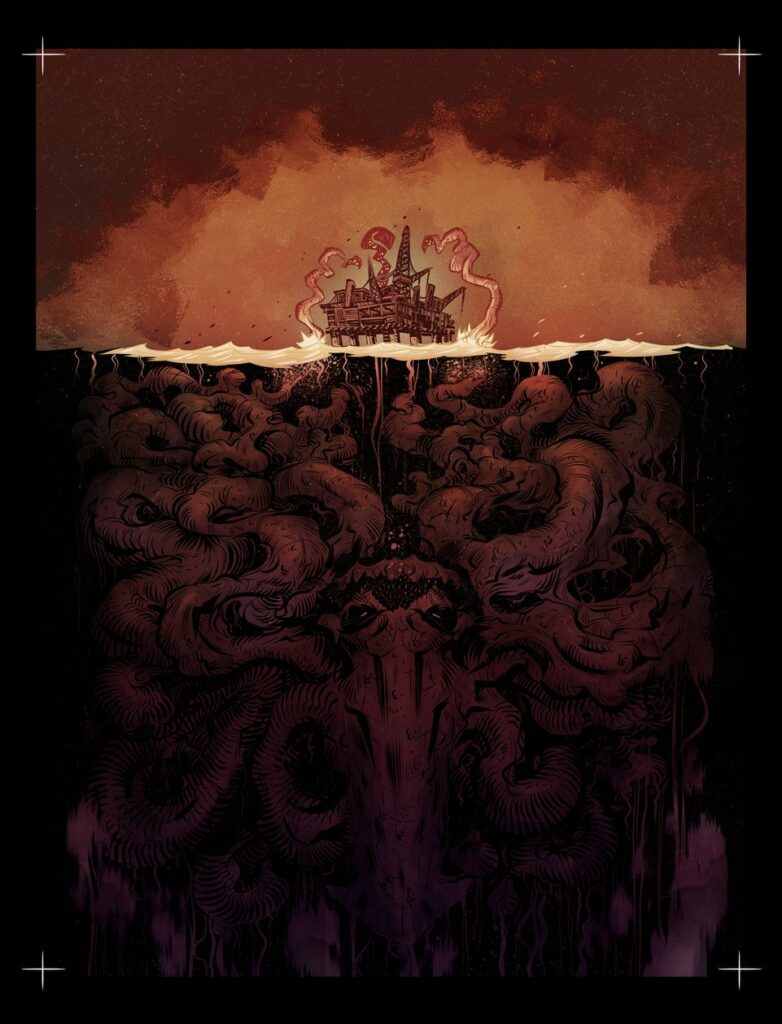
This week, we bid farewell to Book 2 of Enemy Earth by Cavan Scott and Luke Horsman, with Zoe and Jules finding out that even on an oil rig they’re still in a whole heap of trouble from the nasties filling their world. Luke’s delivered a stunning cover that just hints at what terrors lie beneath the surface…

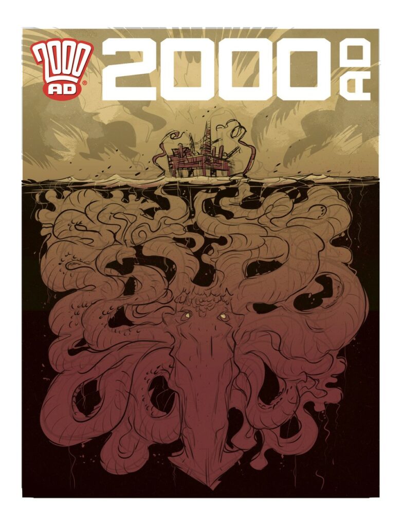
Everything started for this latest Enemy Earth cover with a missive from the Mighty One… here’s Luke… ‘For this cover, Tharg the Mighty requested something akin to the classic Jaws poster.’ Given his orders from on high, Luke set to work with a quick colour rough.

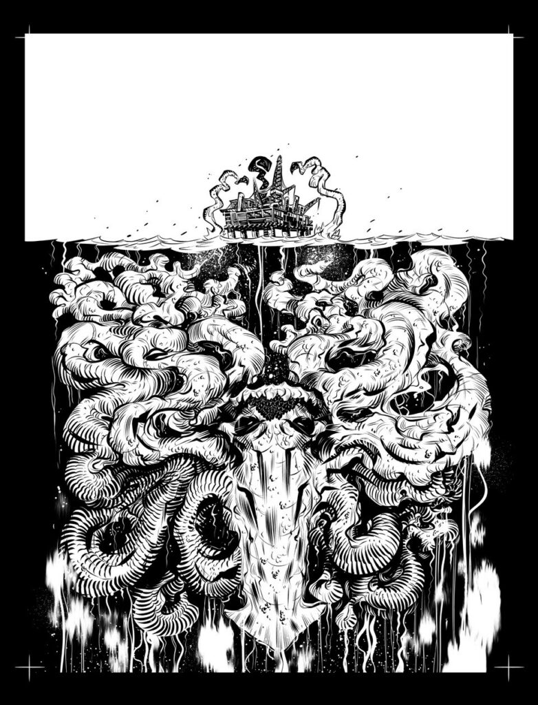
After the customary wait that all art droids have to suffer while Tharg ponders, approval was handed down and Luke set to work, ending up with what he describes as ‘some suitably gloomy looking inks.’

And after the inks, time to add ‘some painterly colours with a nice limited colour scheme.’

And there you have it, another excellent cover there from Luke, and a fitting cover for the finale to Enemy Earth.  

Thank you to Luke for sending that one along – you can look for his cover on the shelves (or the virtual shelves of the 2000 AD web shop) from 7 June.

For more from Luke here at 2000 AD.com, he’s talked Enemy Earth Covers Uncovered with us for Prog 2303Prog 2307, and Prog 2329 and we’ve had the pleasure of chatting to Luke three times now. First with Cavan here about the very first Enemy Earth in 2000 AD Regened Prog 2256, here for another chat with them both for the first series of Enemy Earth that began in Prog 2301, and finally, there’s an interview here with Luke and writer Mike Carroll about another Regened strip, Action Pact, that was in Prog 2220.

Posted on

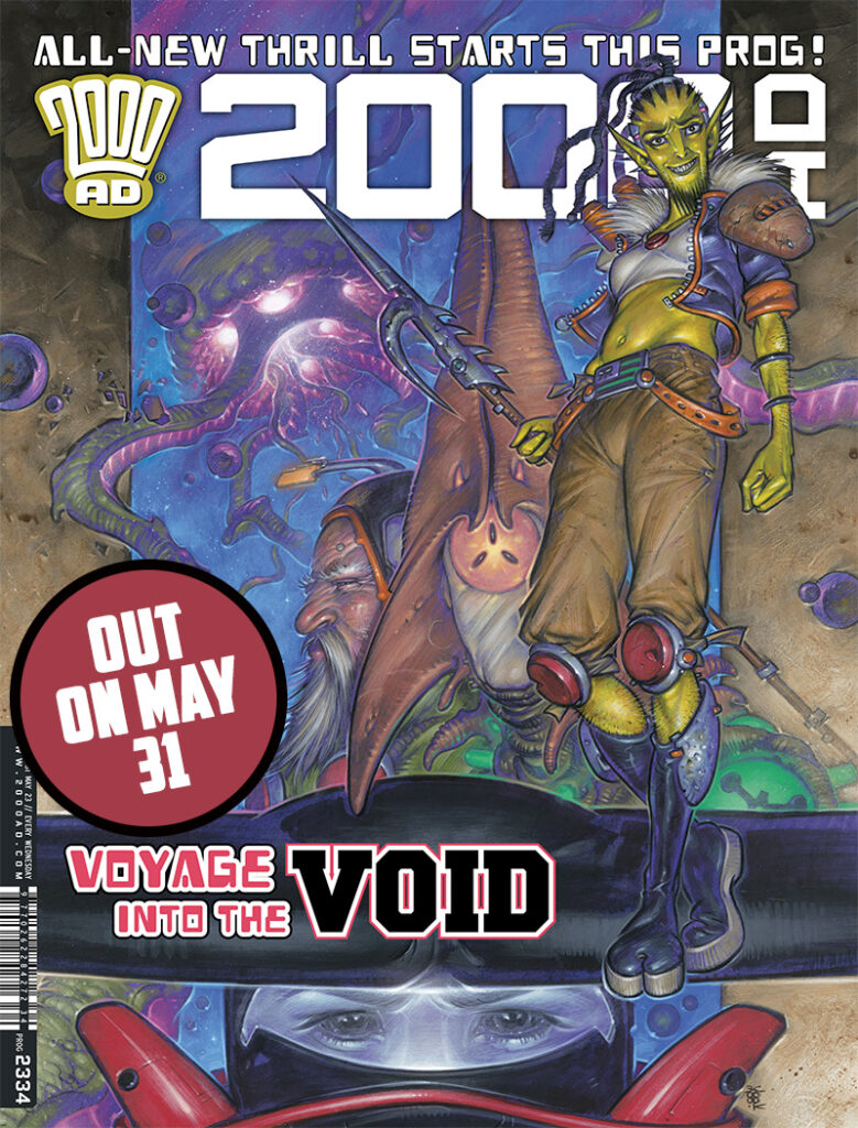
2000 AD Covers Uncovered: Running Into The Void With Boo Cook For Prog 2334 and some ‘psychedelic space jazz’

Every week, 2000 AD brings you the galaxy’s greatest artwork and 2000 AD Covers Uncovered takes you behind-the-scenes with the headline artists responsible for our top cover art – join bloggers Richard Bruton and Pete Wells as they uncover the greatest covers from 2000 AD!

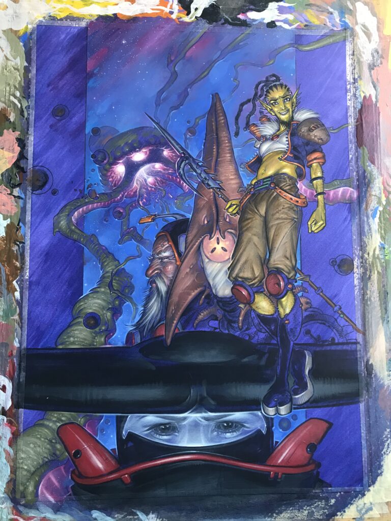
This week, celebrating the new series from David Hine & Boo Cook, the cover is all about Void Runners with Boo giving it the full-on psychedelic sci-fi treatment!

In Void Runners it’s time to discover a substance like no other, a harsh galactic regime reliant on its supply, a captain and her crew given an offer they can’t refuse, and a revolution that can’t be stopped!

It’s an eight-episode psychedelic sci-fi series following Captain Shikari and their crew of alien misfits on the search for Kali’s Dust – the drug that essentially holds the universe together. But if and when they find it, will Shikari fulfil their mission and take it back to the rulers of the Federation or have they got other plans? Well, that’s to be discovered in the pages of this latest out there sci-fi adventure in the pages of 2000 AD. Strap in folks, this is one that Boo describes as ‘a hallucinogenic space manual on how it’s a real pain in the arse to live full of hate.’

Now, over to Boo Cook for the making of a very special cover for the debut of a very special new strip…

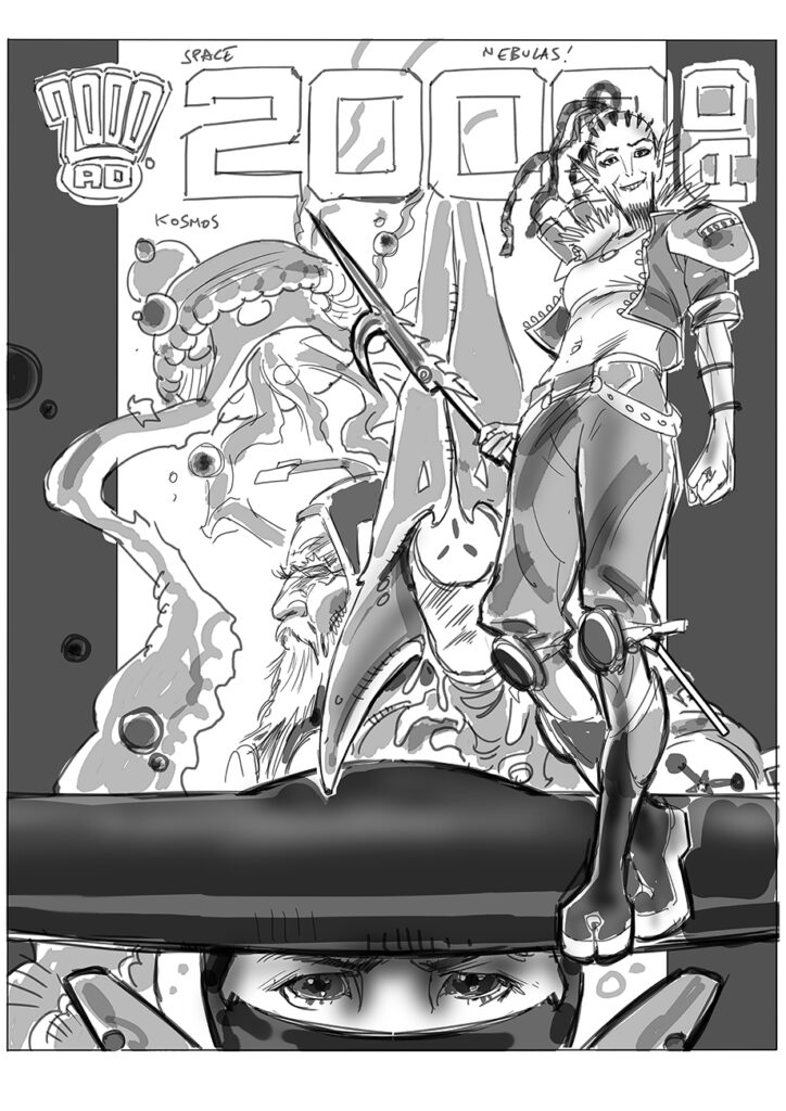
Boo’s greyscale rough sent to Tharg for approval – and Tharg approves very, very much!

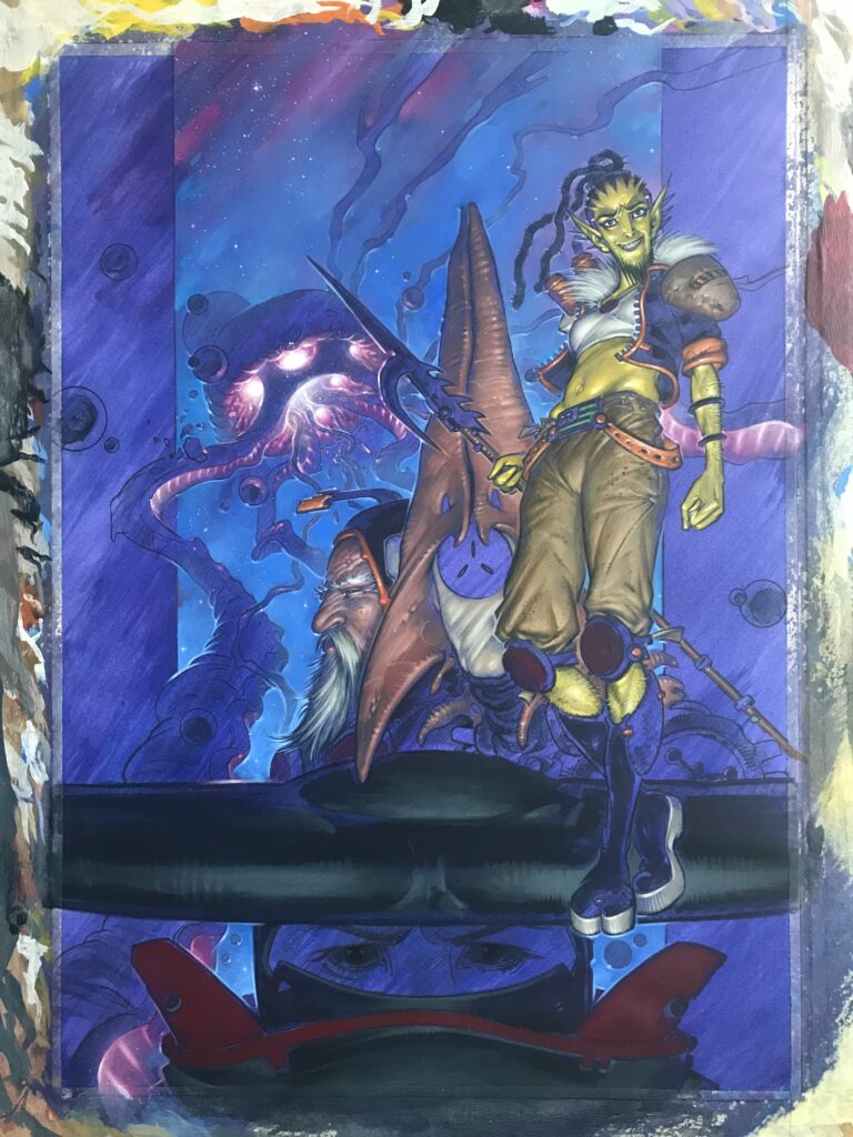
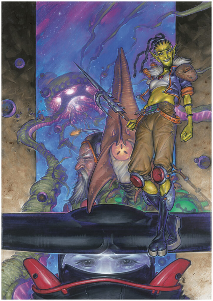
BOO COOK: As this cover was intended for a brand new cosmic sci-fi strip, I wanted to try and give it an epic film poster vibe in the vein of the old Star Wars trilogy paintings and various Drew Struzan posters where you have a montage featuring all the different players in the story.

Scale of characters is to be played with in these ventures so I used the different scalings of the characters to aid the composition. It had to be a cosmic piece but I also wanted to focus it and have the main character projecting forth so I added a couple of sidebars and the flat width of the Subjugator’s hammerhead ninja headpiece worked great for a potential text zone.

Having paid attention to much of the current debate surrounding A.I. generated art I purposely decided that this cover needed to be a fully organic acrylic painting. I’m not strictly against AI as such – it’s something of an inevitability at this point but some incredible artists I know are already losing their jobs in various industries as a result. Also, most of what I’ve seen created by AI, whilst very slick, seems to lack soul and real emotion which tends to leave me feeling somewhat sickly and bewildered. While I’m not exactly railing against it, I figured a good standpoint to take would be to swerve all my creative endeavours towards the organic and visceral – capitalise on my own human element, hope that it’s recognised as such and therefore an un-reproducible commodity in itself…

With all this in mind I foraged out some great figure reference for Captain Shikari and stretched the image so I had a real nice lanky figure to work from. The greyscale rough was banged together in Photoshop so I could shift things about easily, then I sent it off to Tharg for approval.

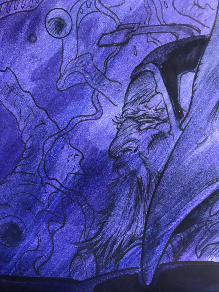
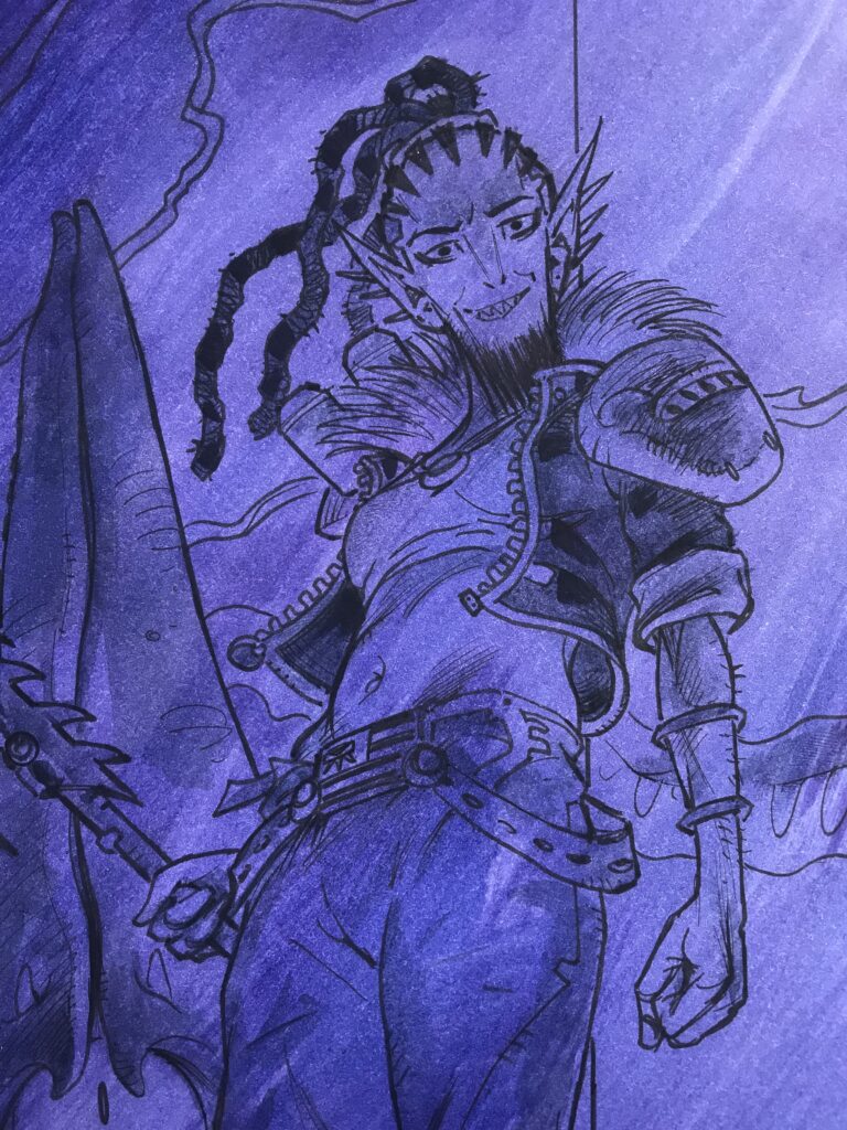
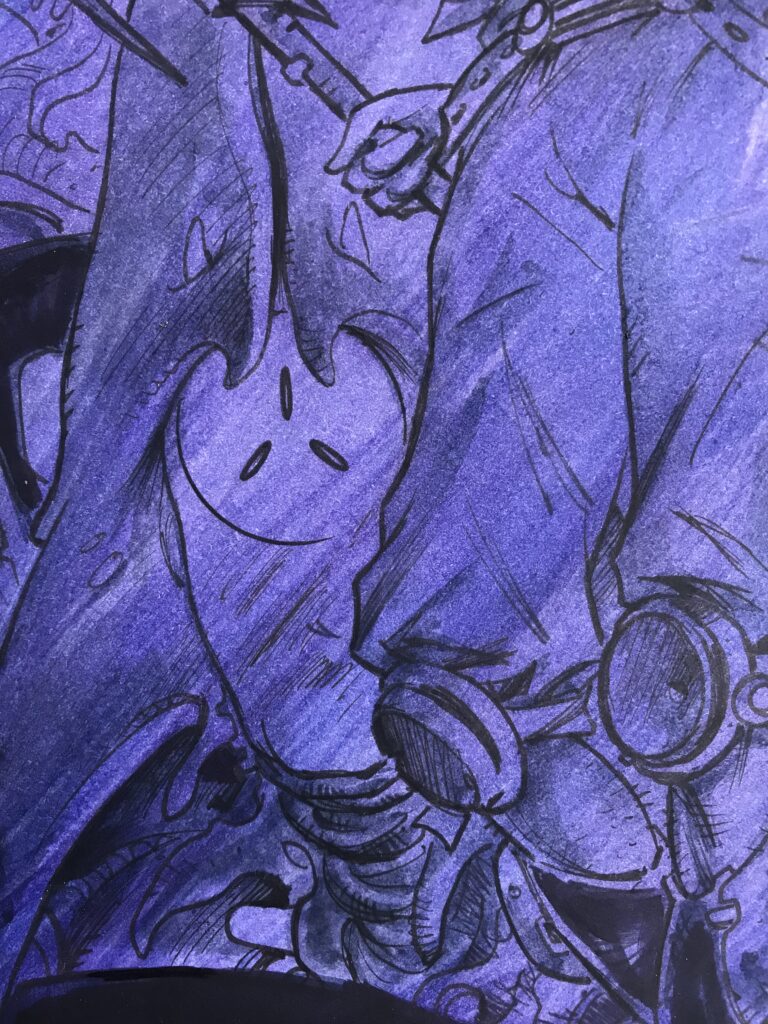
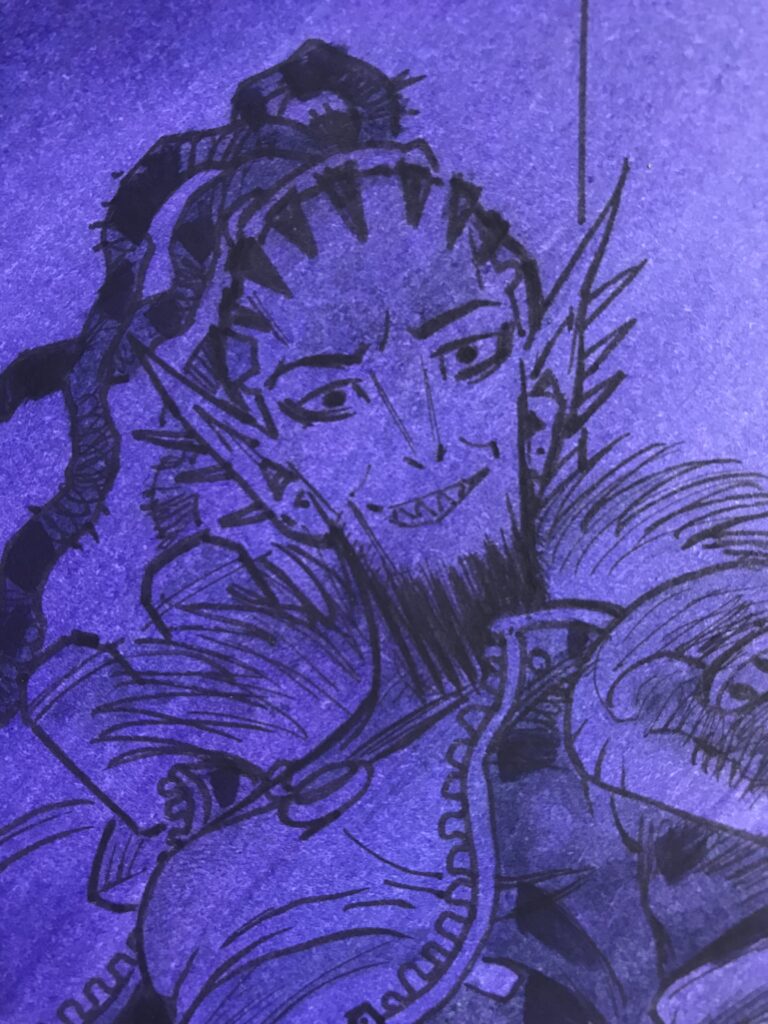
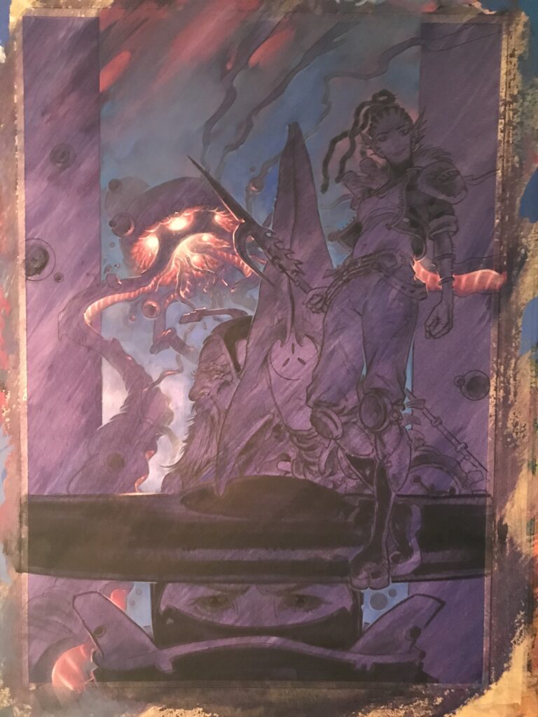
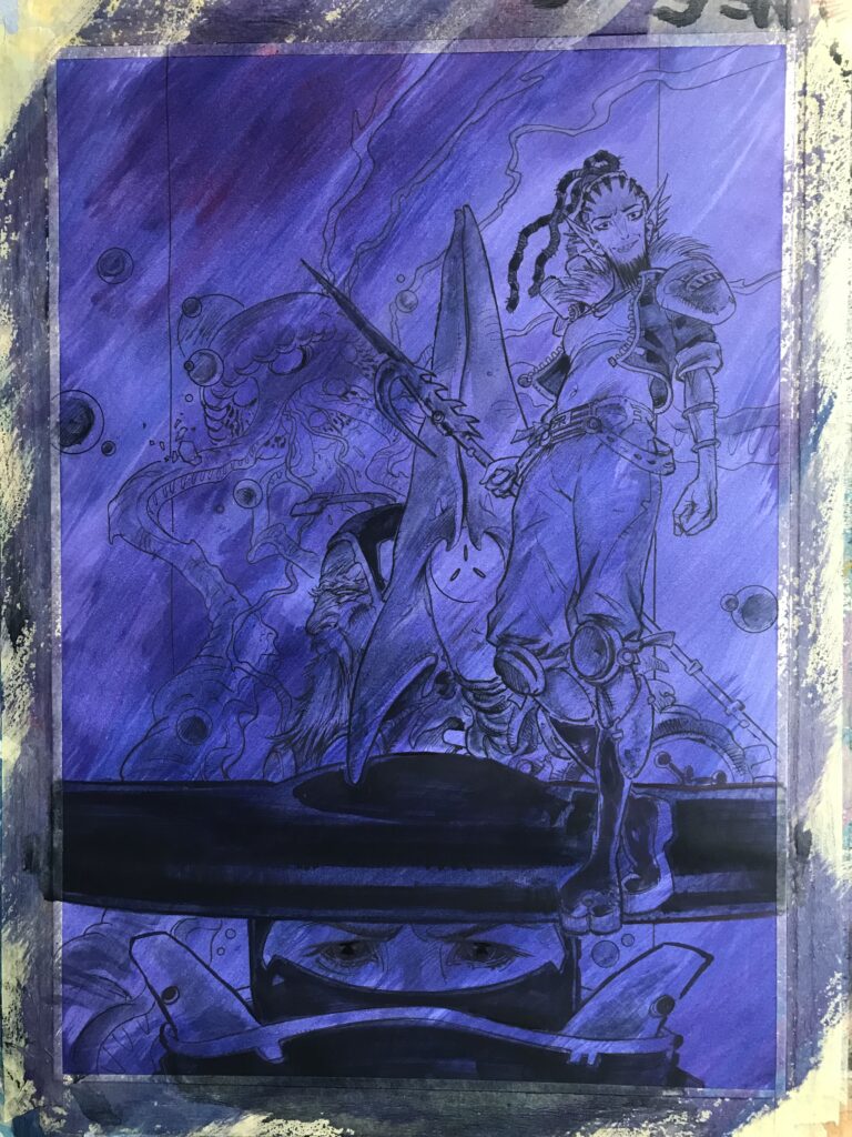
I think he pretty much said ‘go for it’ so I lightboxed my rough onto a piece of A3 Bristol Board using various fine liner pens, embellishing the details as I went for a more finished look and threw in some solid blacks. After that, I taped it to a wood panel and began to add a deep purple wash over the line work.

Boo sent over a load of incredible bits of artwork which we’ve added in as galleries through this Covers Uncovered. But the gallery process cruelly crops some of them, which is why you can find them in all their full-size glory at the end of this piece!

It’s nice to get the initial wash good and dark but without burying the guide inks.

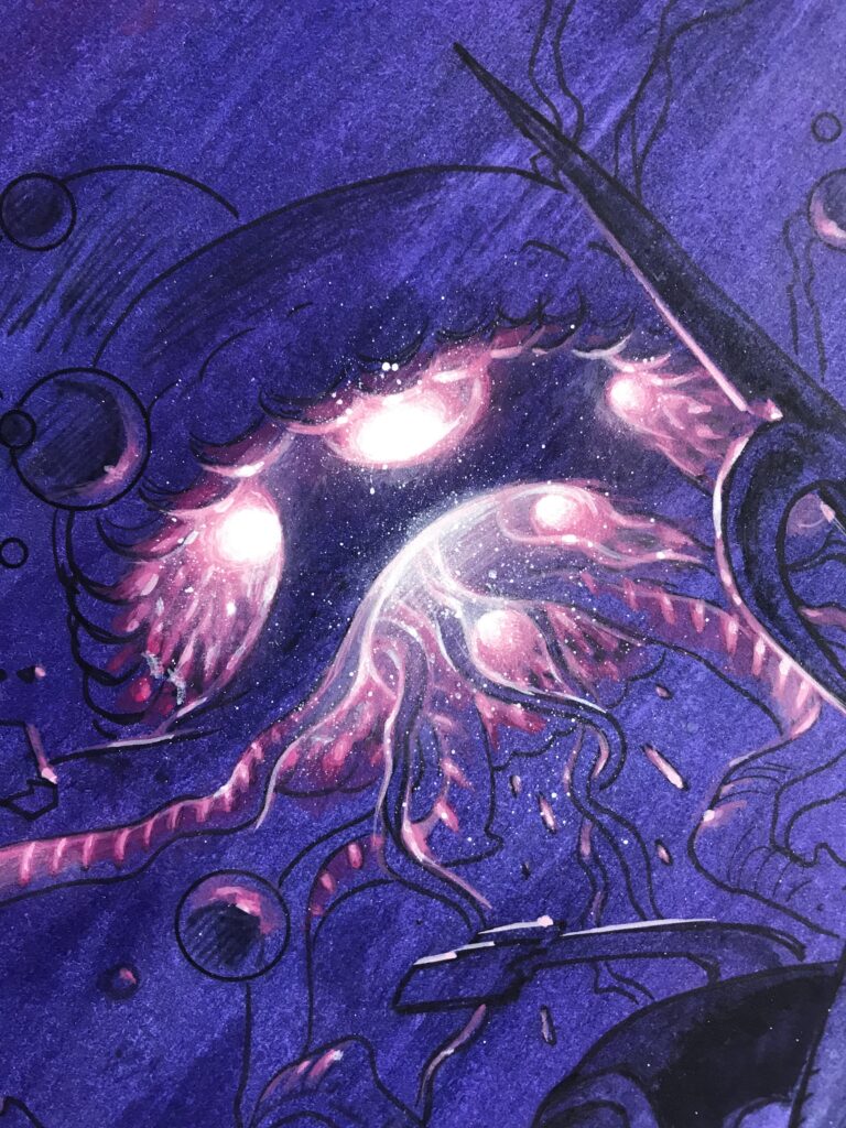
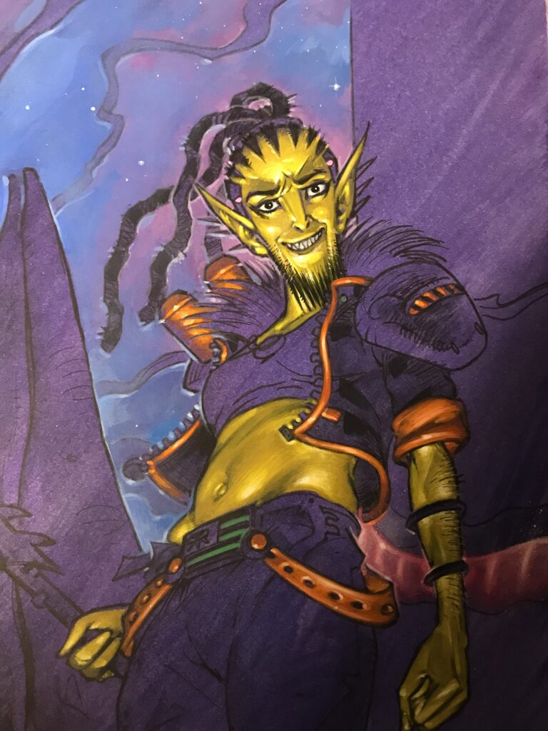
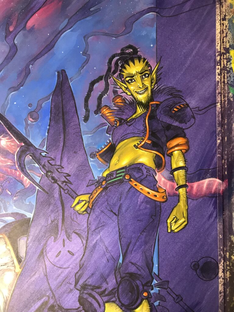
Once that was dry I was quite keen to start introducing some of that psychedelic space jazz, so I started with the Pleroma jellyfish entity and its crazy glowing ‘nubules’ which led into adding the kozmik sky background with a few stars etc.

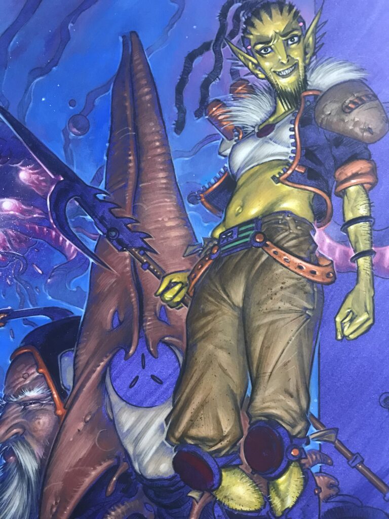
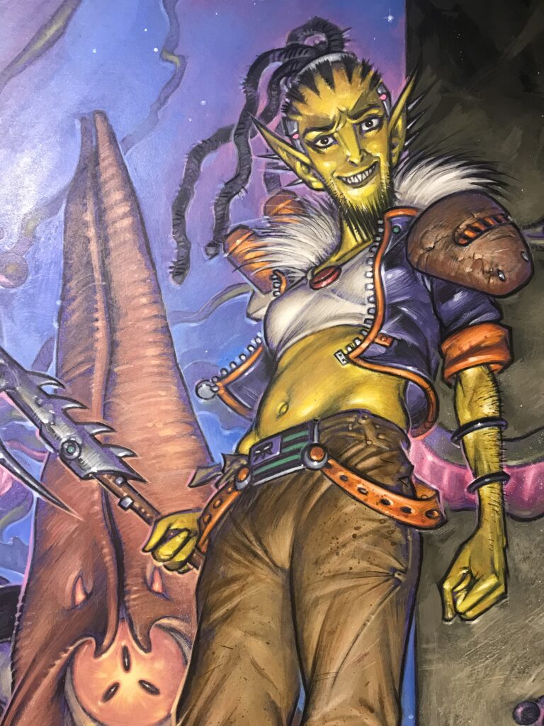
It was starting to take shape but I like to get some of the important key areas in early so I have plenty of time to assess and correct them if needs be during the course of the painting. I think Moondog’s disapproving smirk was first to go in followed by Shikari’s dazzling dayglo yellow skin.

The keen-eyed will twig that in the strip she has constantly morphing skin tones based loosely on the Blue-Ringed Octopus but aside from being insanely time-consuming in real paints I thought there was a chance it might confuse readers.

This would be the first time many people would see the new character and I didn’t want anyone to immediately be presented with a ‘what’s going on with her skin? it’s all blotchy… is that a weird print anomaly?’ confusion so I abbreviated it to straight yellow here. She can morph it at will using sub-dermal chromatophores so it’s fair to say she can go sans pattern where required… FACT!

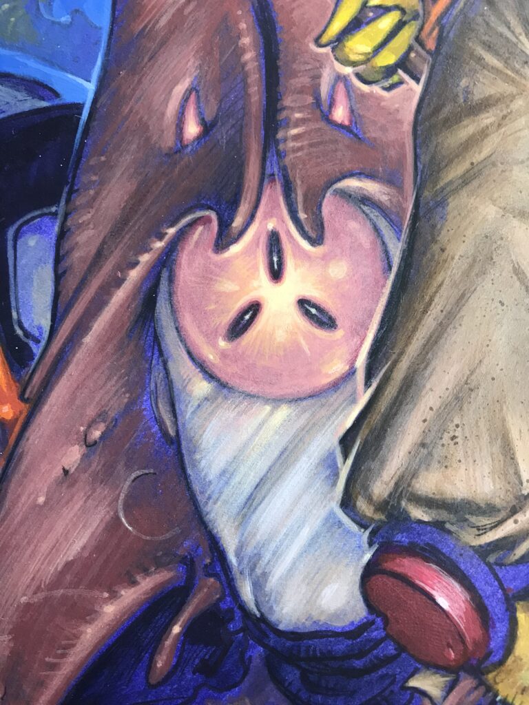
Then it was a case of filling in all the remaining areas – I think the freaky carapace of the Ankorite came next. Weirdly, this was influenced partially by images of Heidi Klum’s horrific human worm fancy dress costume which did the rounds on the Internet recently – I mean hats off to her she knows how to cosplay!

Slowly all the areas went in plus some final tweaks with Prismacolor pencils – I think the entire painting took about 6 days in all which is pretty lengthy but I seriously enjoyed every minute of it.

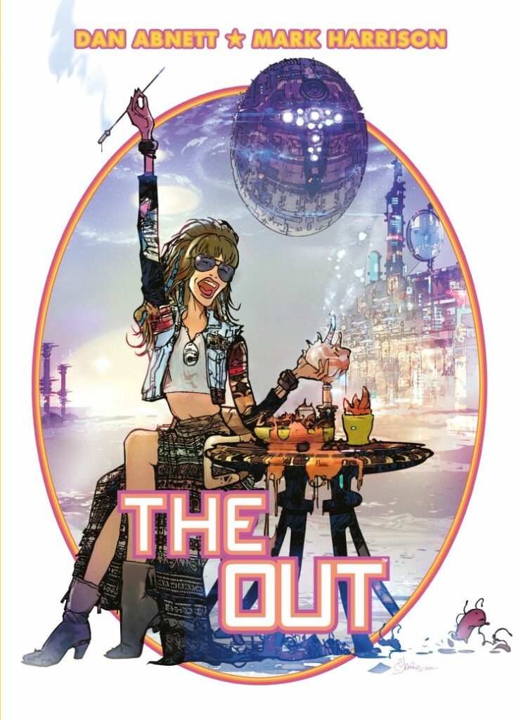
The last element to be added was the stony tones of the sidebars. I was very tempted to leave them purple but was glad I didn’t as a few weeks after I finished the piece a gorgeous Mark Harrison cover for The Out appeared with a shockingly similar composition with purple sidebars no less! Obviously, there was no way he could’ve seen my painting and vice versa, just a crazy coincidence based I guess on the idea of a film poster vibe and a composition to propel the action forwards.

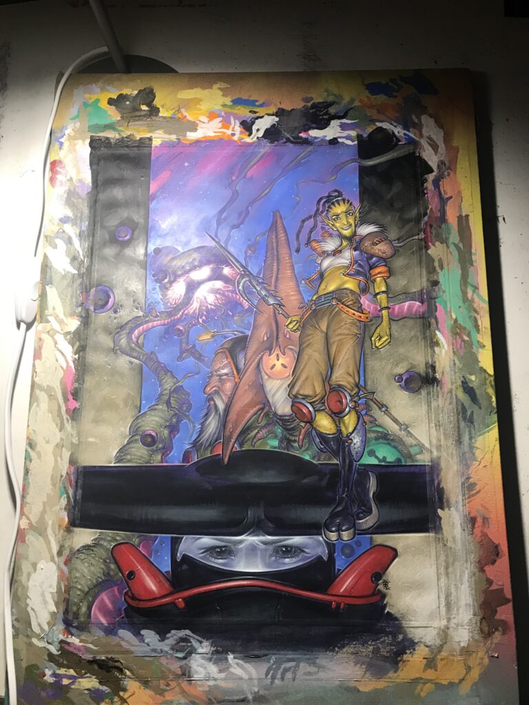
One of the toughest stages of doing a real painting for publication is the scanning. I scanned it at home and the colours were absolutely murdered by my scanner and I started to panic a bit.

Cue the amazing Michael at Prints Regent repro shop in Eastbourne! He scanned it beautifully and I was relieved (to say the least) so massive props to him!

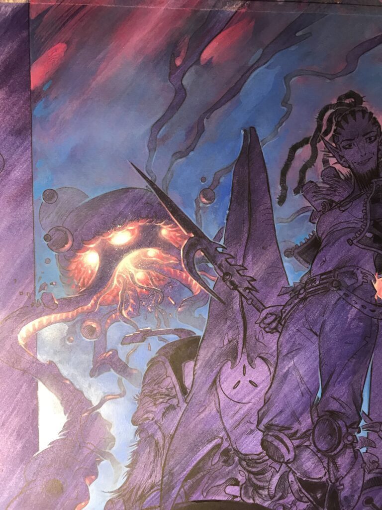
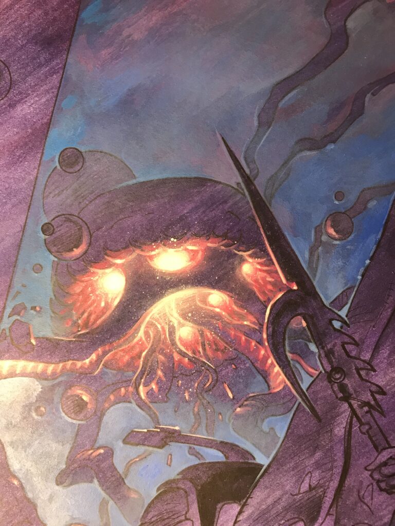
It’s quite easy to see the difference in colours from these phone pics to the final scanned image – there’s always going to be some level of compromise going from analogue to digital but thanks to Michael I was very happy to go to print with it.

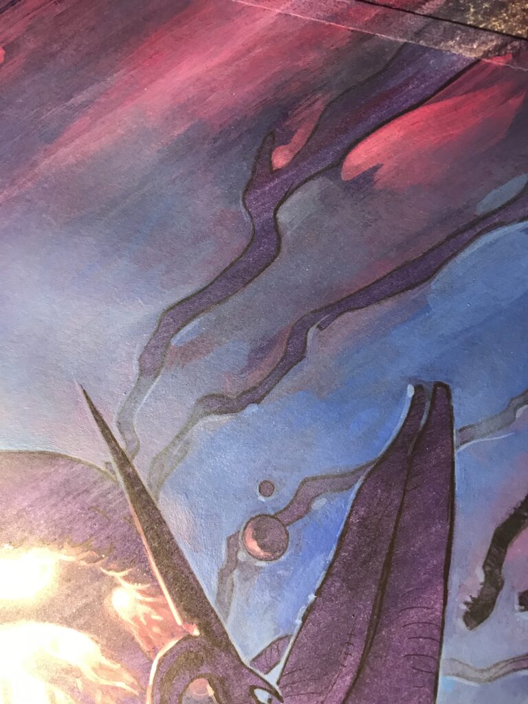
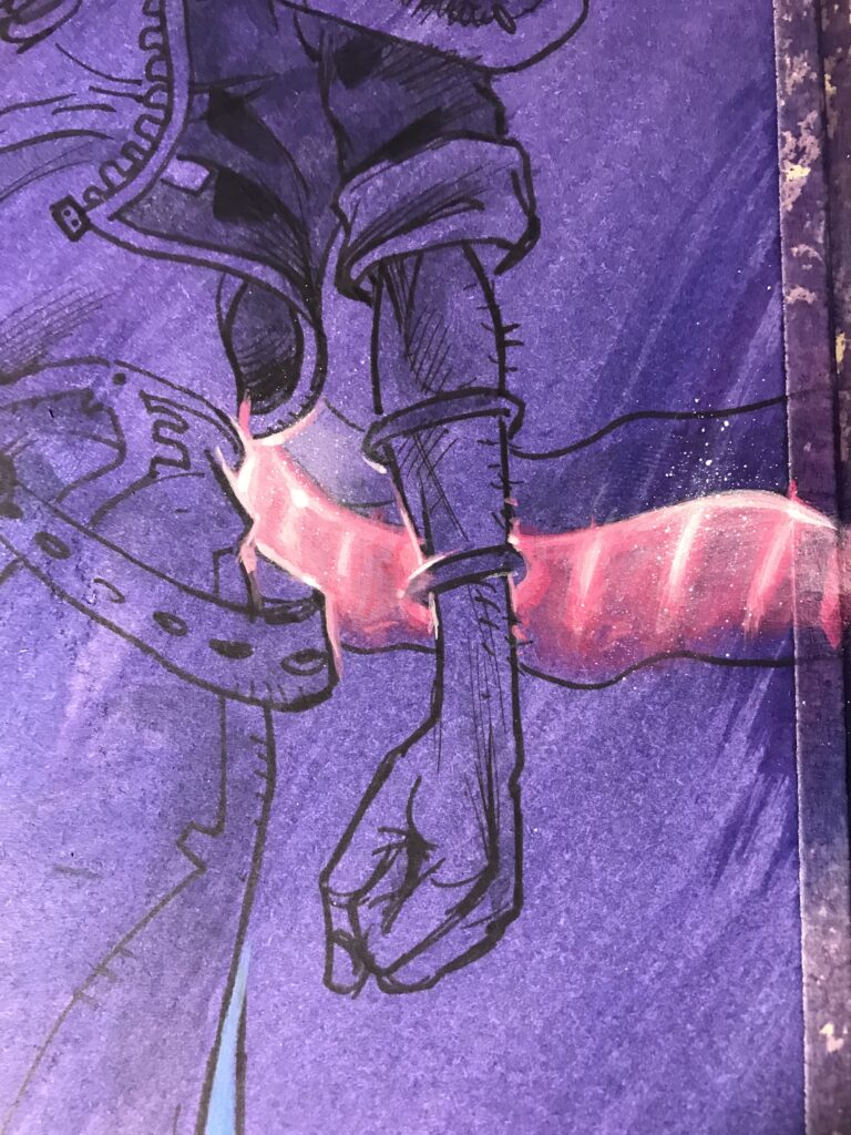
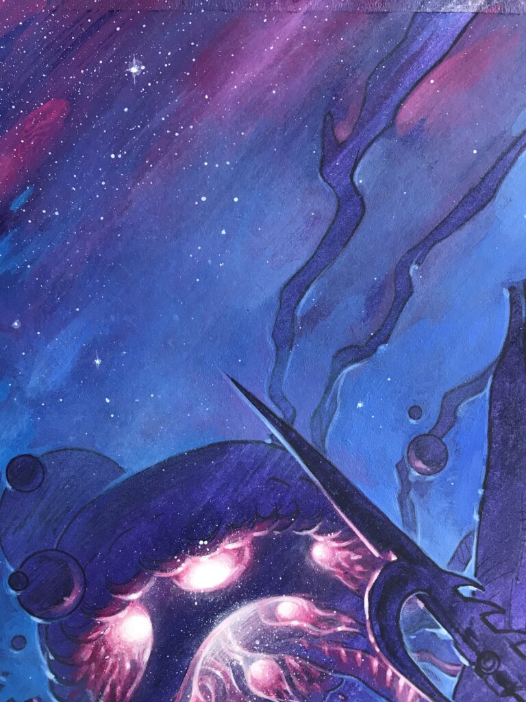
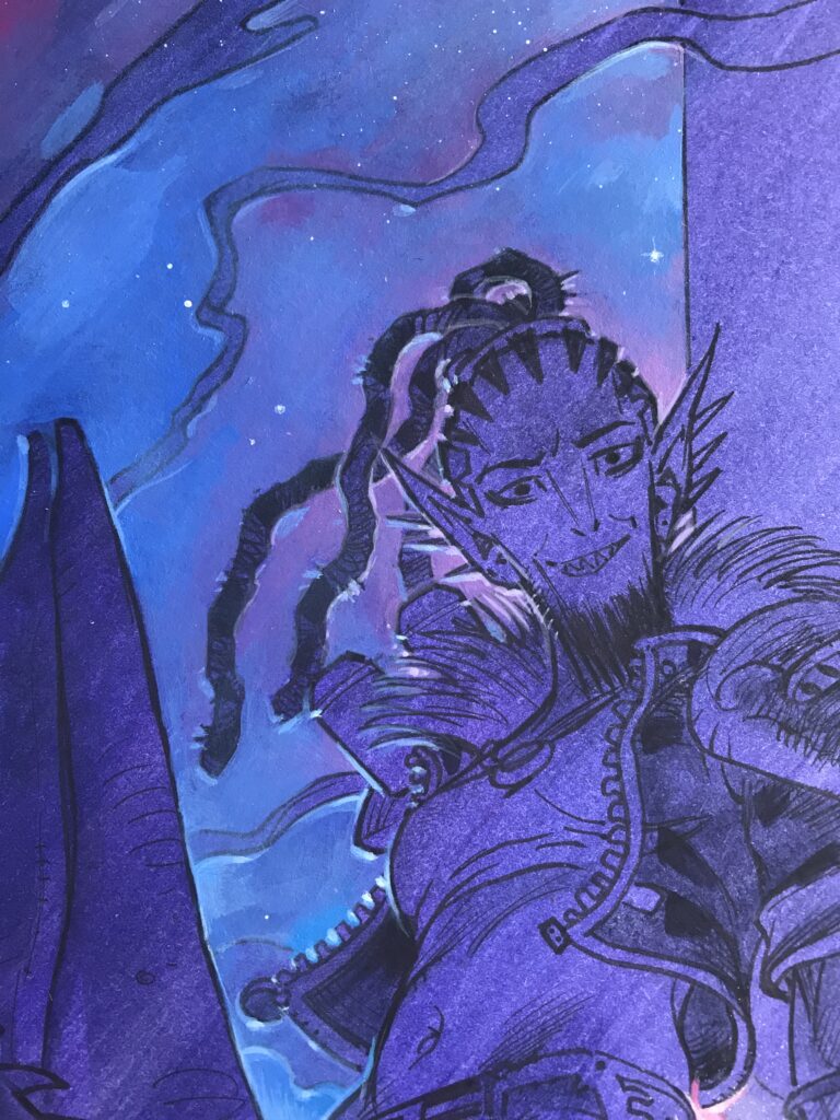
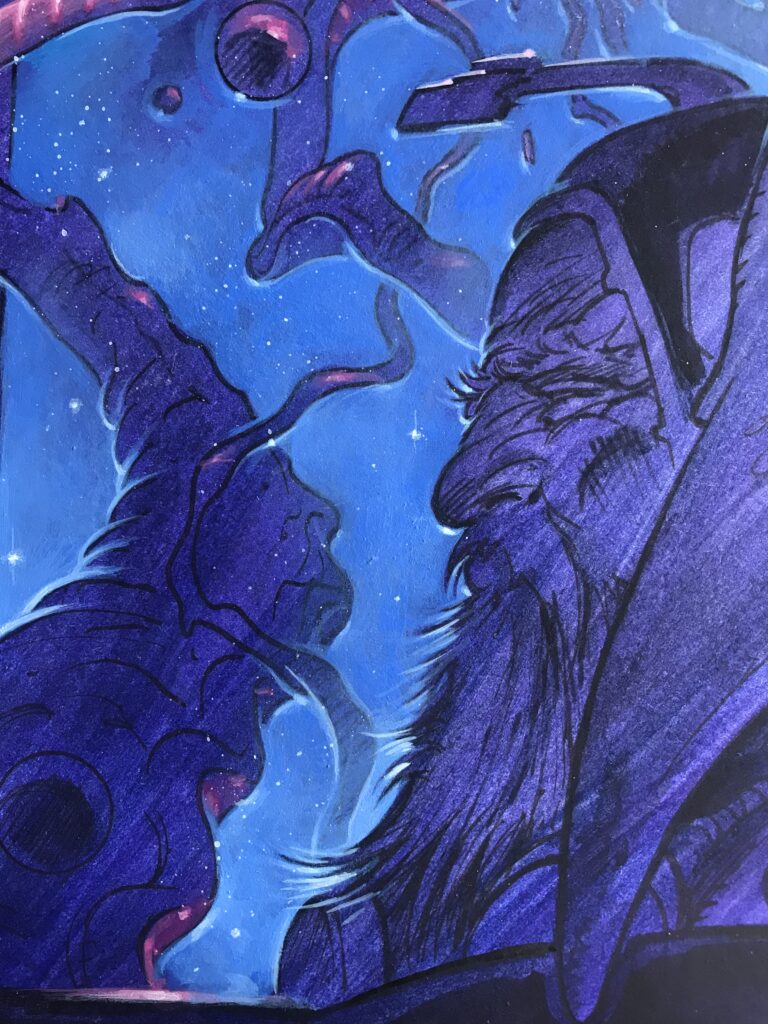
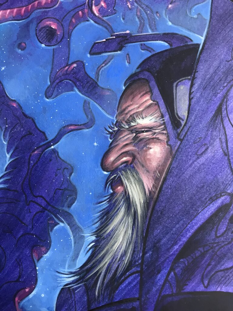
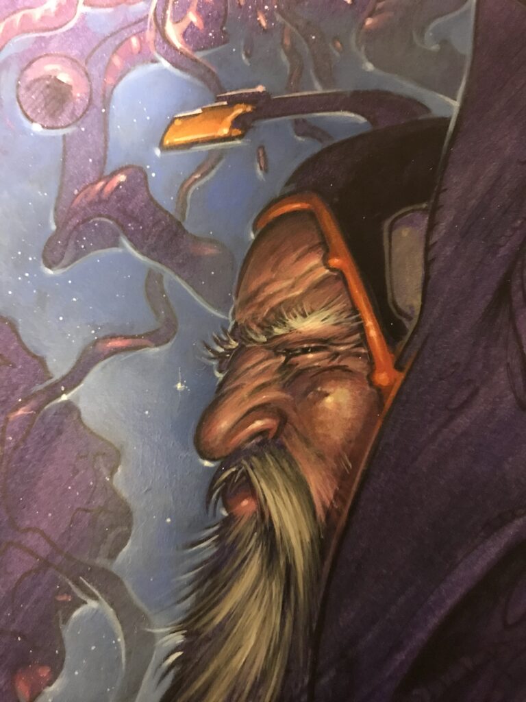
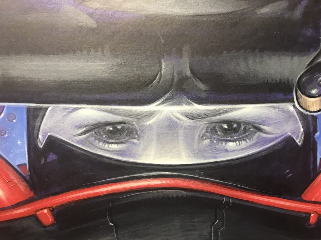
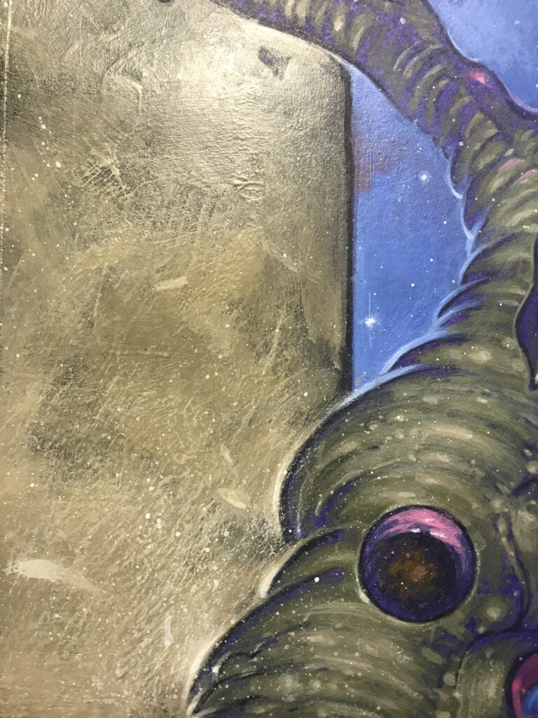
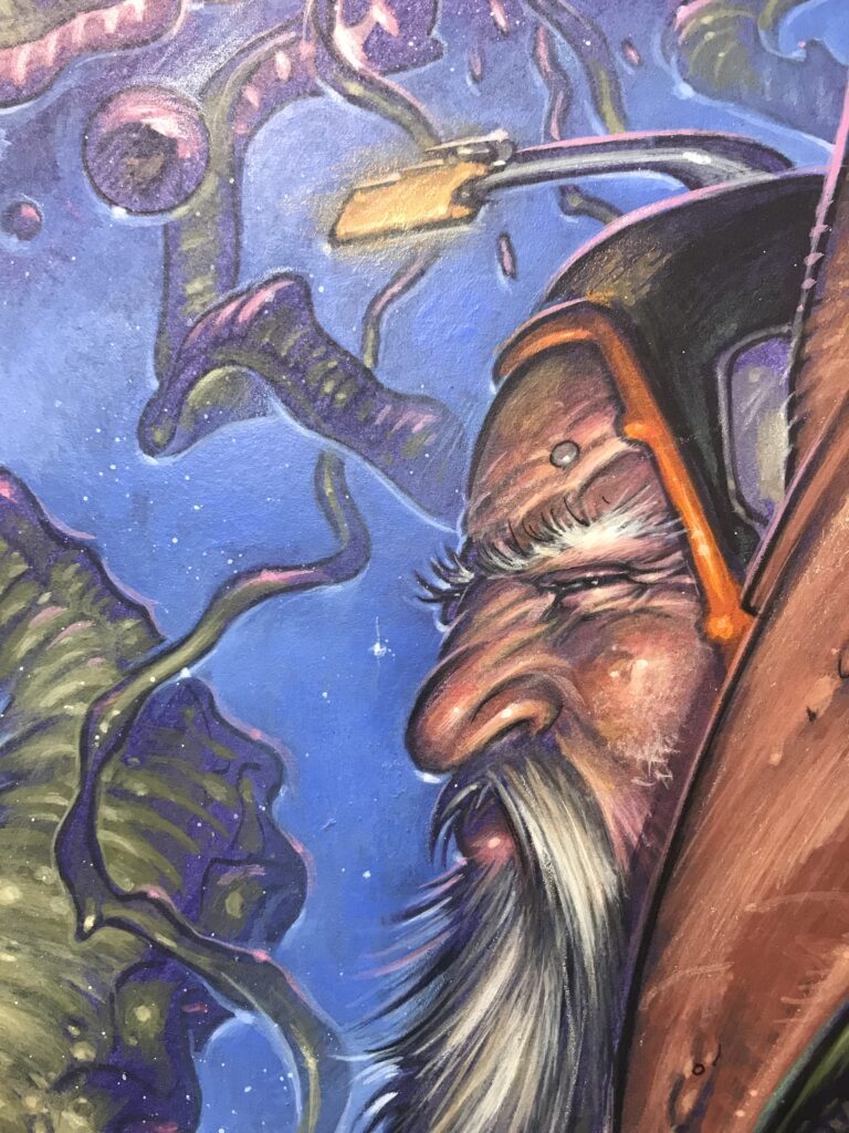
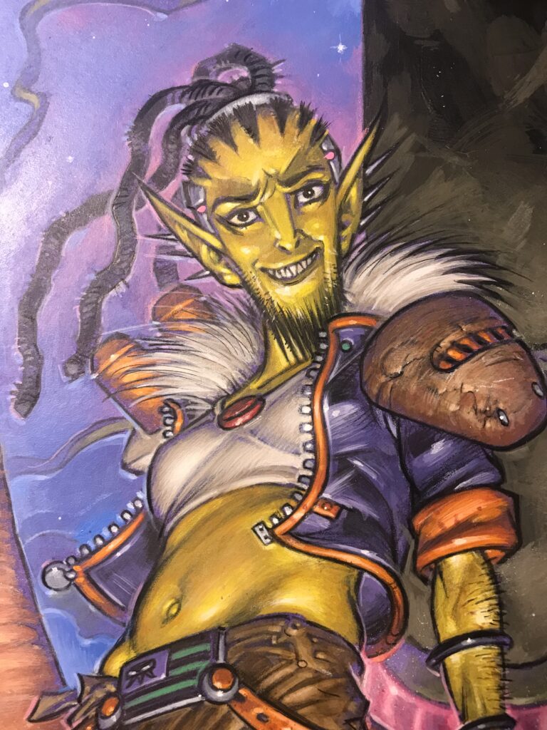
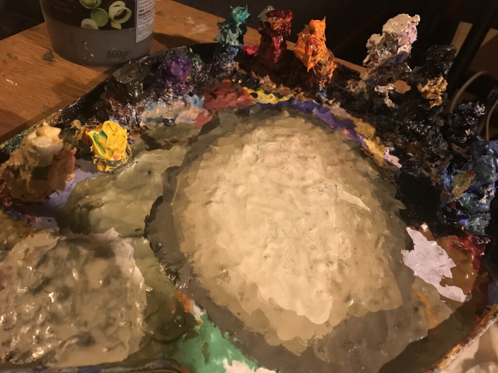
Here’s some close-ups of the finished piece and finally a pic of my paint palette which had become a strange cosmic brown by the end…

If I do any more covers I fully intend to keep it organic.

Eventually, I’d love to do the strip work inside with real paints but at the mo’, time constraints mean I have to keep the colouring process digital. But I do intend to experiment with a short strip to see if I can speed the process up. At least it’s my fallible human brain making the decisions…

Oh, we think Tharg will be wanting more covers from you Boo! He knows great art when he sees it after all!

So there you go, thanks so much to Boo for sending that along, particularly as he was under pressure of deadlines – and you know you don’t want to get on the wrong side of TMO when it comes to deadlines! You can find the first episode of Void Runners right now in 2000 AD Prog 2334 wherever you pick up your weekly dose of the Galaxy’s Greatest, from comic shops, newsagents, and 2000 AD web shop.

For more from Boo, there’s a couple of Covers Uncovered pieces that he’s done for us – Prog 2188 & Prog 2305 and then there’s three interviews – Death Cap and Blunt with TC Eglington, plus one for Judge Dredd: The Pitch (Prog 2302) with Rob Williams and Arthur Wyatt.

You can find him online at www.instagram.com/boocook and his musical outpourings with bands Motherbox, Forktail (with fellow art droid Simon Davis), and his solo work under the name of Owlmask can be found on the Menk Records.  

Now, as promised – all those full-sized, un-cropped Boo Cook images… ENJOY!

Posted on

2000 AD Covers Uncovered: ‘Big headshot, reflective shades. Space background. Simple image. Easy, right? Wrong!’ Mark Harrison talks Prog 2333

Every week, 2000 AD brings you the galaxy’s greatest artwork and 2000 AD Covers Uncovered takes you behind-the-scenes with the headline artists responsible for our top cover art – join bloggers Richard Bruton and Pete Wells as they uncover the greatest covers from 2000 AD!

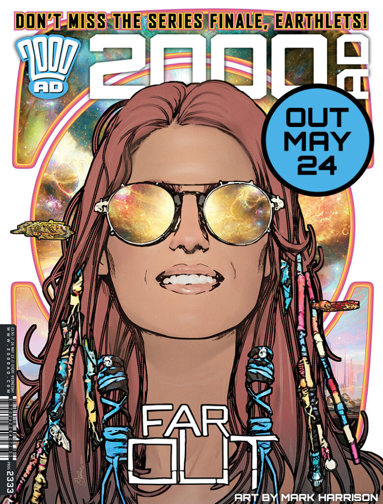
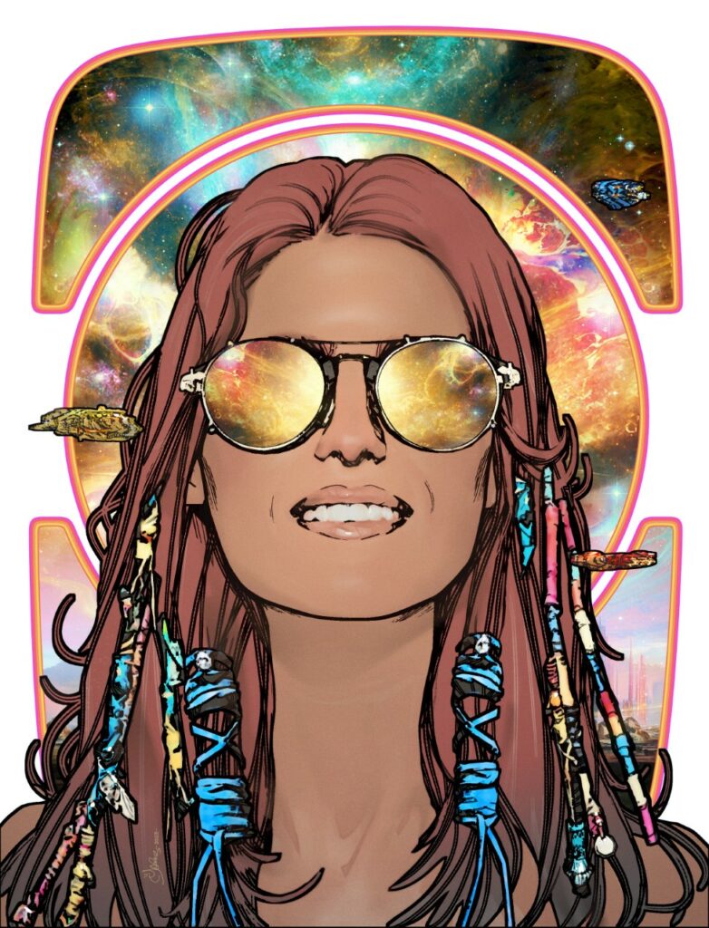
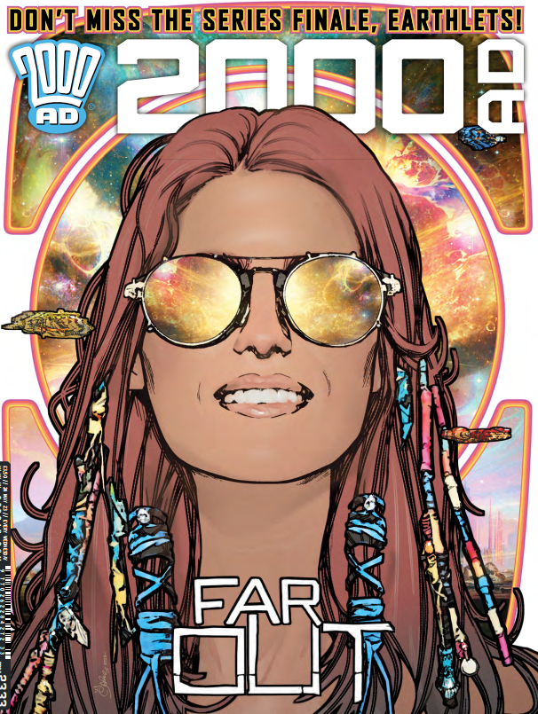
This week, it’s the unmistakable art of Mark Harrison on the cover of 2000 AD Prog 2333 – it’s the finale of Book 3 of The OUT!

/

Over the course of three books of perfect space opera adventures, Dan Abnett and Mark Harrison have shown us the journey of photojournalist Cyd Finlea as she explores what it means to be human so far from Earth, way, way out in space. And now it’s all coming to an end… well, for now at least, as we’ve reached the end of Book 3 with the climactic meeting of Cyd and the proto-Tankinar.

Book 4 is coming soon, but until then, we have one last time to settle back and let The OUT’s Mark Harrison take us through the absolute beauty of a cover that you can see on the front of Prog 2333 from 24 May.

Are you ready? Then we’ll let him begin…

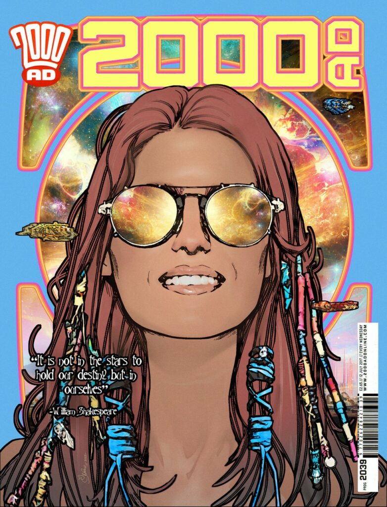
“It is not in the stars to hold our destiny but in ourselves”- William Shakespeare.

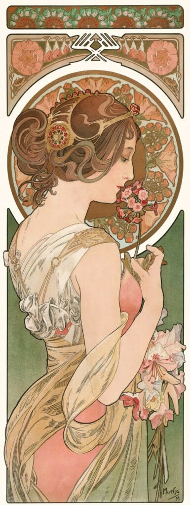
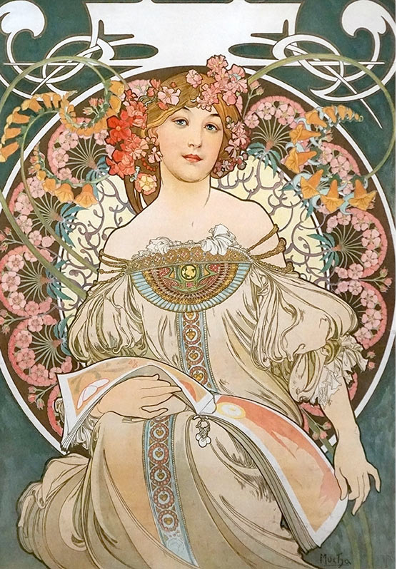
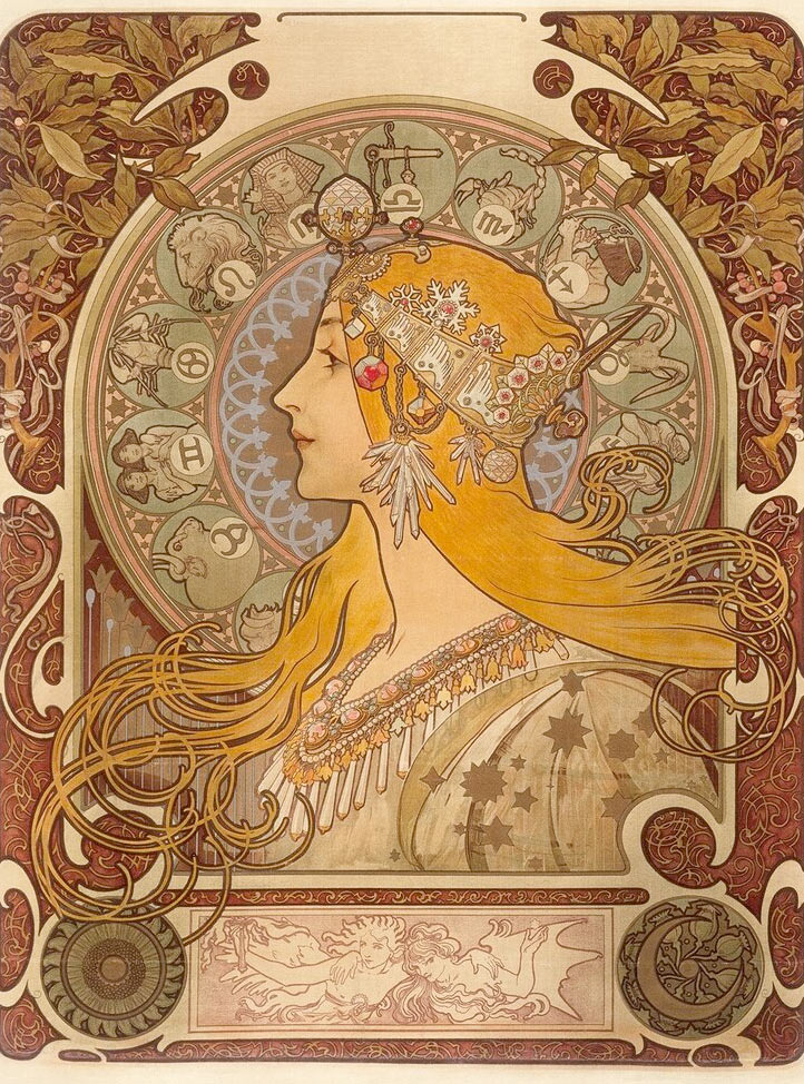
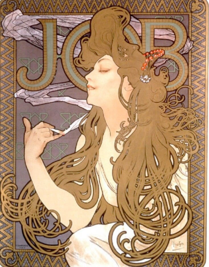
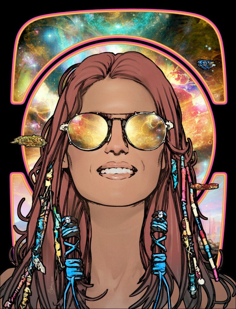
MARK HARRISON: Okay so… How about a bit of Alphonse Mucha? Lovely stuff and why not? If he was embraced by the Hippie culture of the 60s and repurposed for poster art he’s good enough for the galaxy’s greatest comic! 

Also, I had a sheet metal print of his art on my kitchen wall for years. Selling soap I think. I dreamed a version with a girl wearing aviators with the Universe in her head. 

/

Maybe that’s why I’ve had this image in my head since before Dan and I dreamed up The Out. It seems familiar, as if I’ve seen it before… 

It was always there as part of Cyd’s make-up, before Cyd even had a name or strip. It was part of the promo art I pitched.  

That image in the style of Mucha seemed like a good fit so when Tharg surprised me with an unexpected request for a final cover for Book 3 I thought let’s get this image out there.  

It’s supposed to represent that wanderlust ideal of freedom, The Big (Night) Sky of stars in the eyes of the beholder, windows into the soul, you are not just star stuff but the stuff of stars, One with the Universe. 

I wanted to capture in the face of Cyd (our hero) the wonder of the cosmos, the smile of awesome.  

Big headshot, reflective shades. Space background. Simple image. 

Easy, right?

Wrong! 

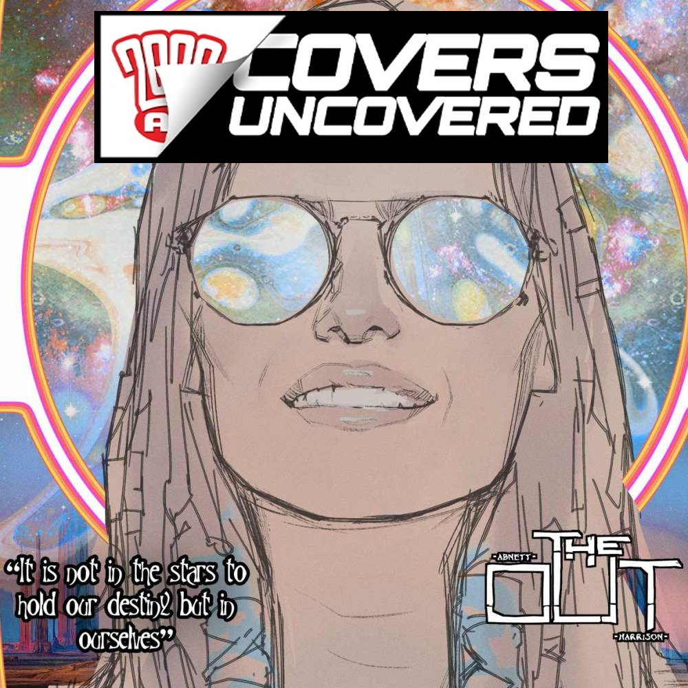
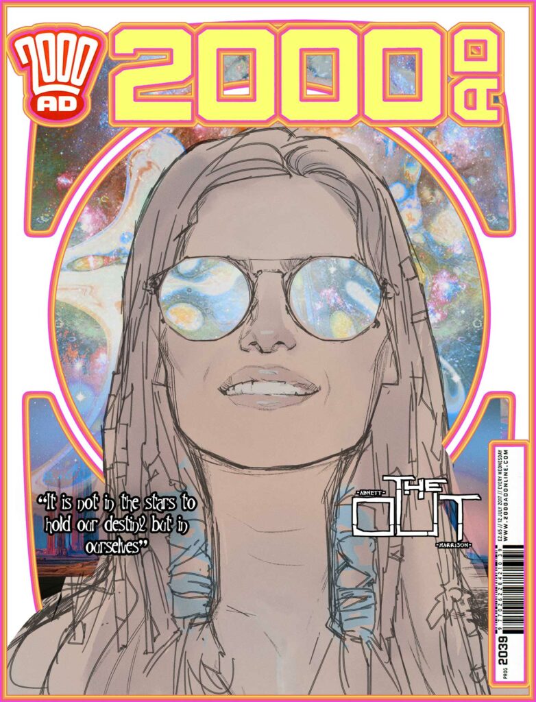
I agonised over a big head or head and shoulders, two versions as you can see here. (I had Matt choose in the end).

Mark’s two early versions of the cover – the head & shoulders version or the big head version?
Tharg will decide!

That was a tie-in with the strip, where Dan and I had transported and transformed Cyd Finela from this insignificant speck of human being out in the backwaters of the galaxy to holding court in the Capital world chambers of a galactic United Worlds, towering over all thanks to a spore generated 3-D modeling representation.  Her significance had also outstripped her diminutive size.  Here she seems to dwarf spaceships.

But she wanted none of this attention, none of the grandeur, she was trying to escape back to The Out, back to being of no consequence again. The book concludes with her facing her demons, cutting ties with the past and forging her own way in the Universe once again.  

The image represents that ideal of freedom, new frontiers, of escape at warp speed with no baggage of the past  (but of course – Bag itself).  

Hopefully, it speaks to all of us who, for whatever reasons, just want to “go out” and free ourselves from terrestrial influences. 

A motivational poster for infinite possibility. 

So the cover design needed to reflect that pure desire, being bright, simple, clean line work, with minimal detail to weigh it down. Barely any tone, a light wash of colour, the contrasting density of the fussy space background acting as a tapestry of interstellar possibility. 

Another late change was giving a sense of motion or “whoosh” reflected in her glasses; a stargate maybe,  forming in front of Cyd, streaking light patterns, ready to whisk her off to new adventures, tripping the light fantastic. (Now THAT I have seen before in the visor of a motorbike helmet) 

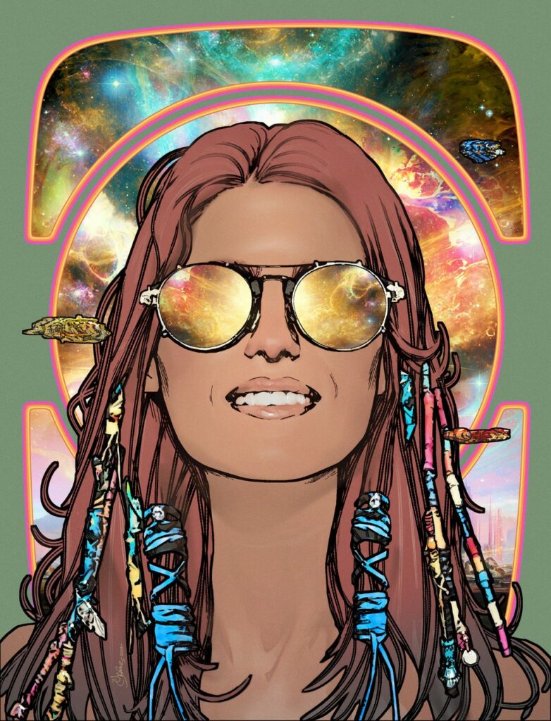
I agonised over background colors again… (Also spaceships or no spaceships?)

But again, I defaulted to simple white.

The white doesn’t mean anything,  it’s just white…

Although no… wait a second…maybe it’s…  

No, it’s just white…   

So, onwards to Book 4…  

Sail on silver girl
Sail on by
Your time has come to shine
All your dreams are on their way
See how they shine

And that was where Mark ended his latest transmission, with the strains of Simon & Garfunkel’s Bridge Over Troubled Water in our ears.

Or at least he thought it was the end – only to suddenly realise he wasn’t quite finished. So, as part of Mark’s continuing exposure of readers to art and artists they may not have been previously aware of… he added this…

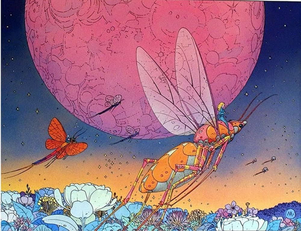
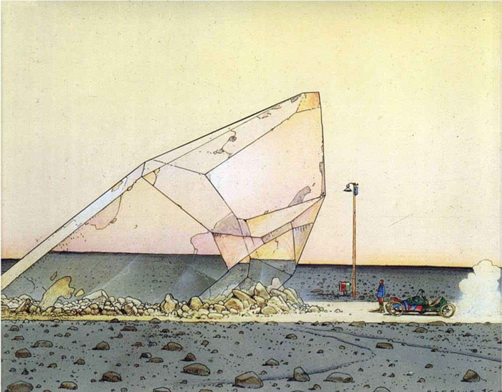
The classic Jean (Moebius) Girard image that influenced this one from Mark.

MARK HARRISON (again): Moebius!

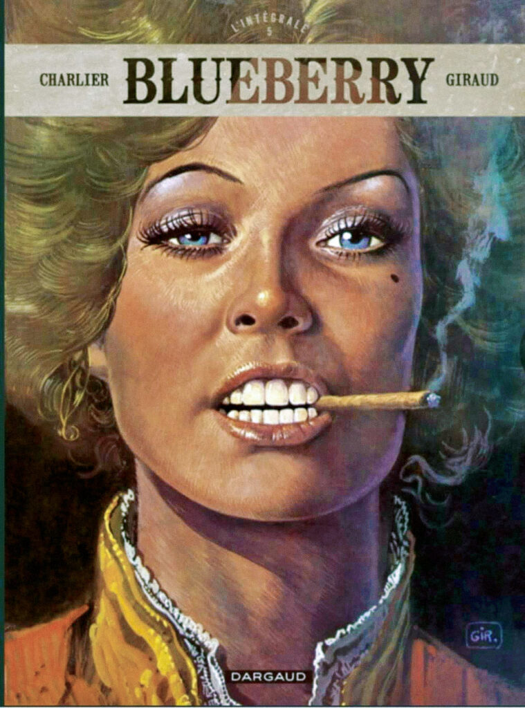
At some point early in the cover’s development, I did consider digitally painting the whole thing like a Lt. Blueberry painting by Jean ‘Moebius’  Giraud (THE undisputed genius of the French fantasy comic scene and a massive influence on science fiction and fantasy comic art and cinema). That seemed like hard work and would have involved re‑learning how to paint digitally in Photoshop which I hadn’t done in a while so it fell by the wayside. But that enigmatic smile remained. 

So, it’s an excuse to give a shout-out to the amazing body of work by the great Moebius (who I brushed past in a crowded room once. True story. Okay, I was too shy to talk to him and I don’t know any French other than: “What’s the time?” – which I didn’t want to go with). 

He was a formative part of my understanding of the possibilities of comic art and my comic-collecting life as a teen.  Such unparalleled flights of fantasy that were the Golden Age of fantasy comics through the 60s up until the 80s. An unfettered, boundless, free flow of expression and imagination that is sadly diminished in today’s comic scene.  

His take on the creative process is similar to mine on The Out, trying to divorce myself from a human-centric viewpoint, removing or expanding beyond that narrow bandwidth of convention and trying to see the universe with an alien eye. Of course that has to be tempered with the practicalities of needing to be printed in a 12+ Western comic, but I always believe your imagination should aim for the stars. And if you fall short through necessity at least you might get the moon. 

Free yourself from today and embrace the worlds of tomorrow…. from yesterday with a bit of Moebius!  (In all real comic fans collections!) 

So there you go, the end of The OUT Book 3 and a perfect cover to go with it. I’ve said it before, I’ll say it again, The OUT is one of the best things to come out of 2000 AD in the last decade. Hell, it’s one of the best things to come out of 2000 AD full stop – and as we all know, the Prog’s had some truly zarjaz things in it over the years! Truly, in years to come, we’ll be talking about The OUT in the same hushed tones reserved for Halo Jones et al – it really is that good. And you should all be reading it.

Thanks once more to Mark for sending along the latest in what are always both wonderful reads and fascinating insights into the mind of the artist. I’m sure I’m not alone in wanting to sit for an evening in a quiet pub with a few drinks and just chat to him about art and what it means to him. That would just be a fabulous night.

You can find all his previous Covers Uncovered work here –  Prog 2187Prog 2193Prog 2251Prog 2254, Prog 2261, and Prog 2314. And be sure to go back and read the interview with Dan Abnett and Mark Harrison all about The OUT right here.

And of course, you need to have the first collection of The OUT adorning your bookshelves. You can pick that up from the 2000 AD web shop.

You can find 2000 AD Prog 2333 wherever you pick up your weekly dose of Ghafflebette comics, including the 2000 AD web shop from right now – today.

Now, your bonus Mark moments…

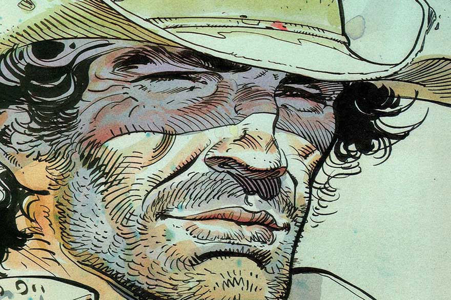
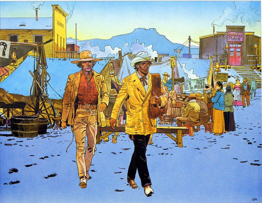
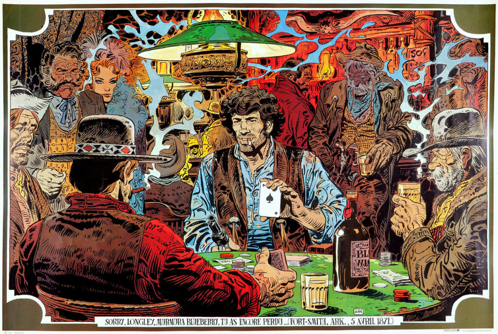
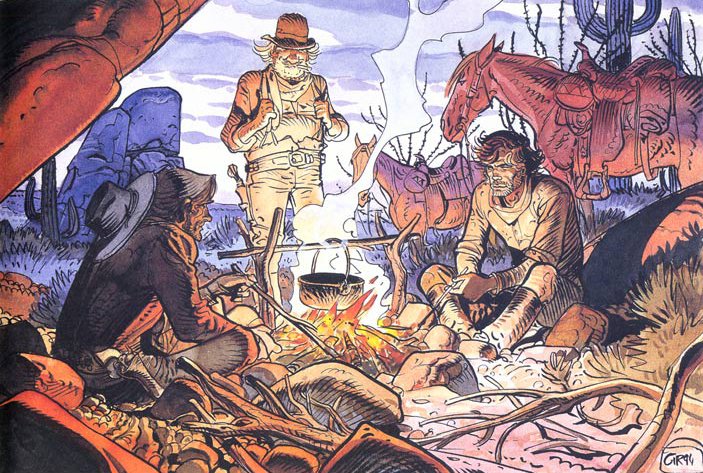
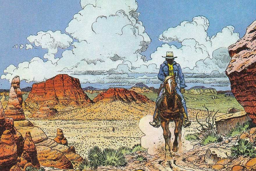
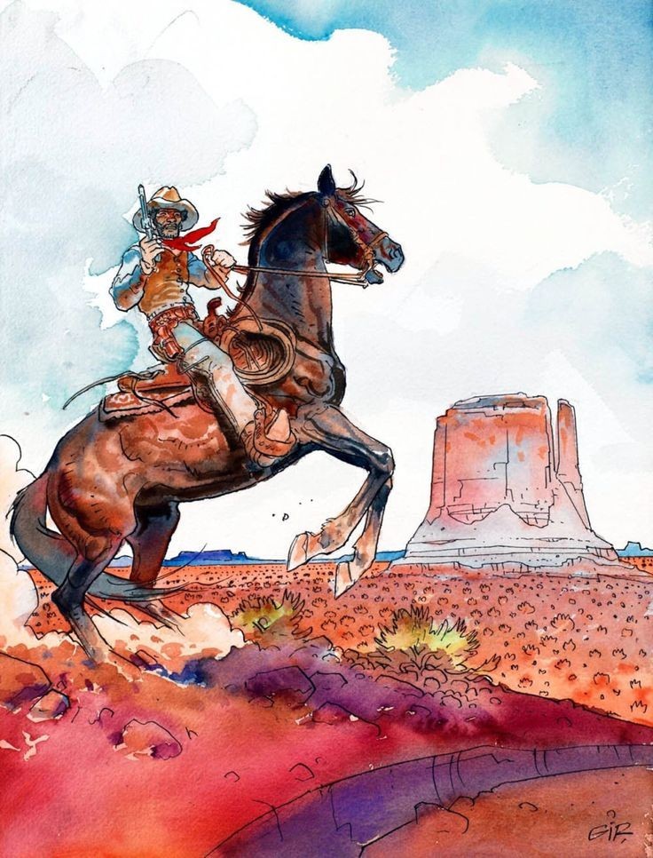
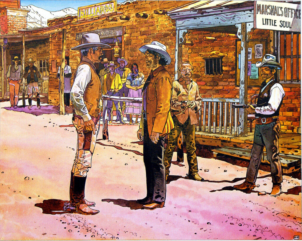
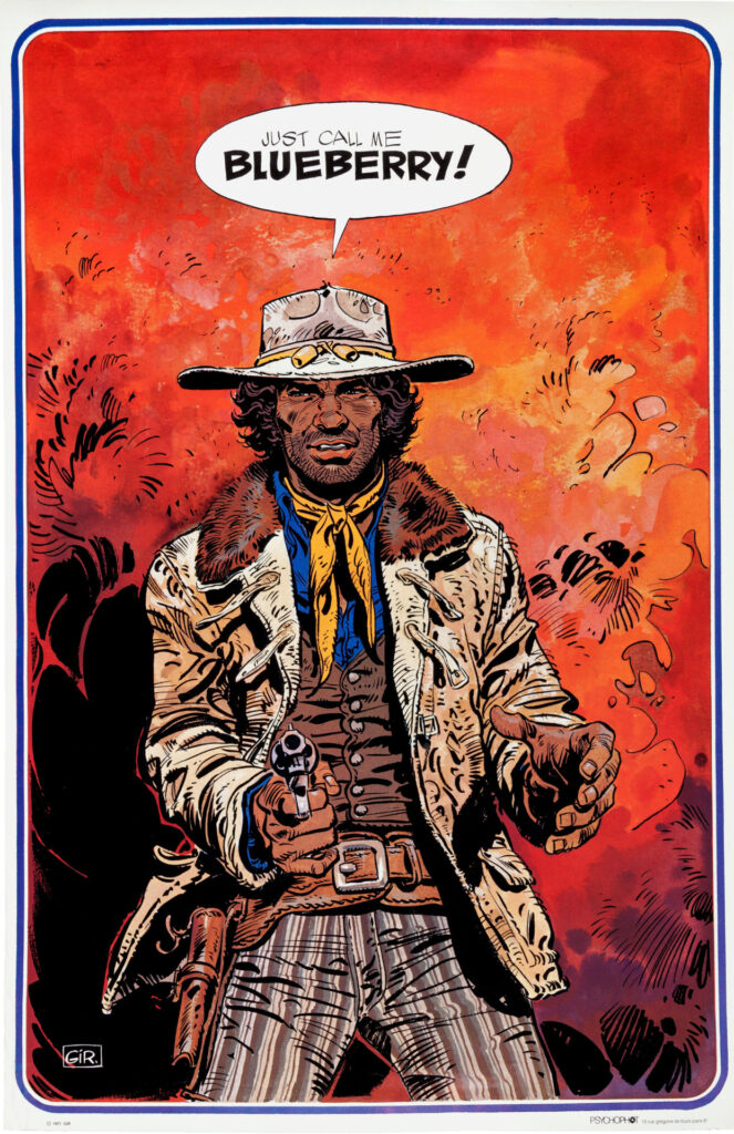
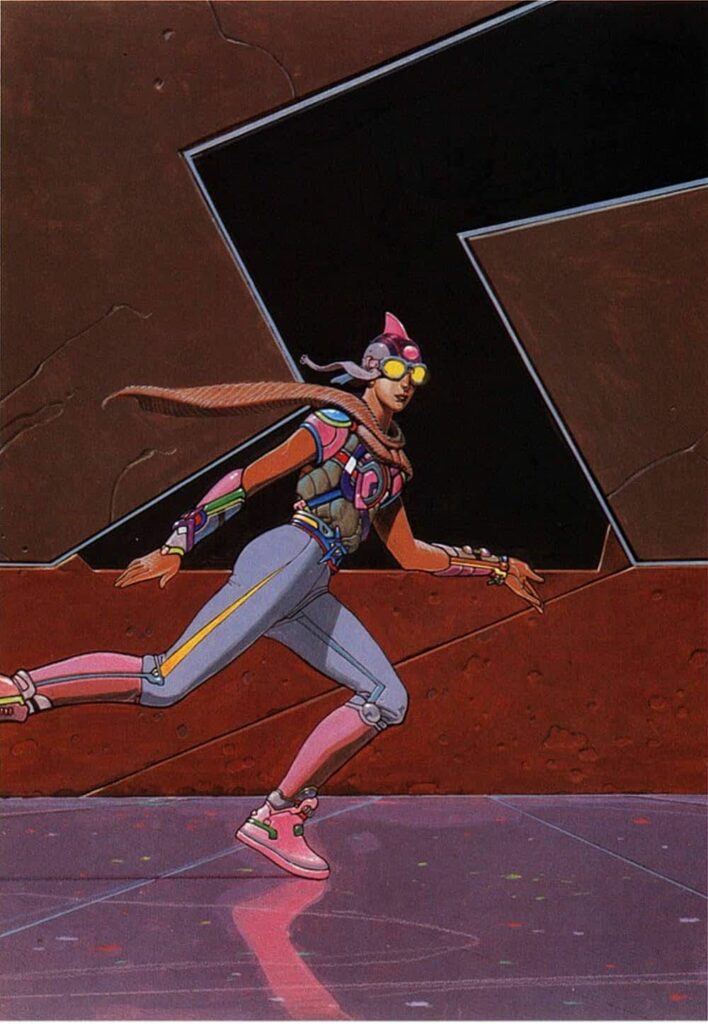
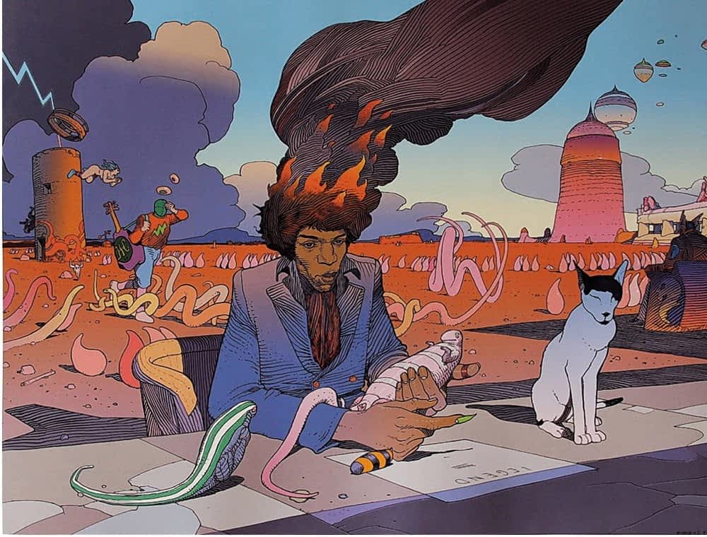
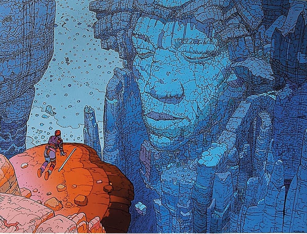
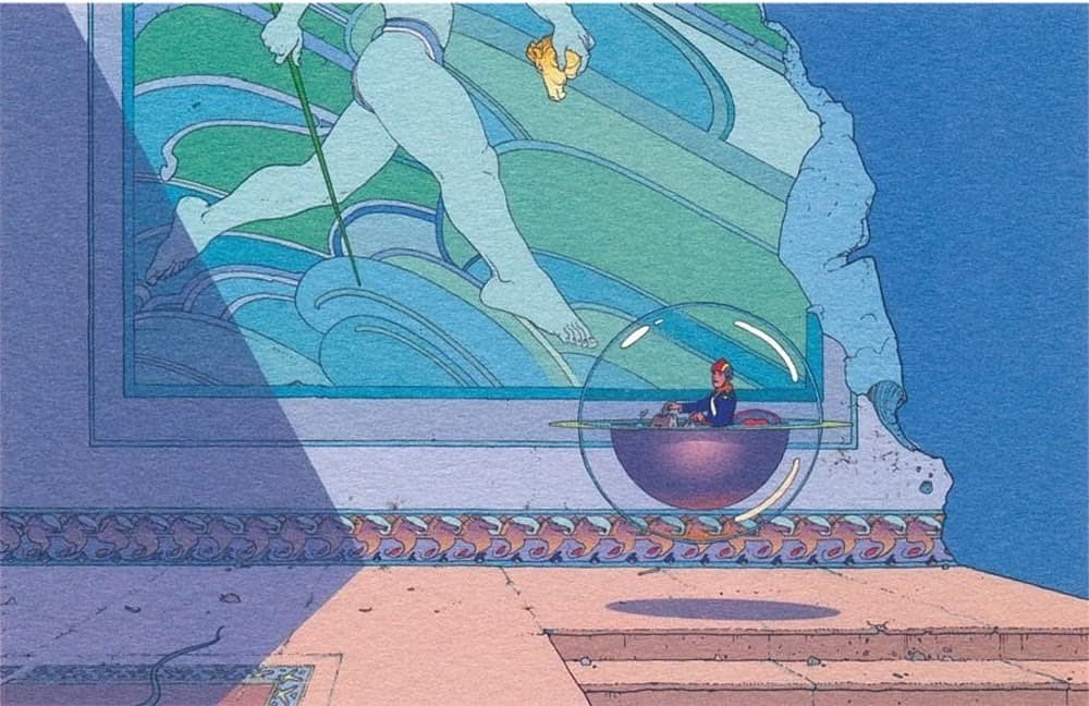
He didn’t just mention the genius that was Jean ‘Moebius’ Girard, but sent along a link to an excellent primer article from Retrozap, Moebius: The Elements of an Artist. So, I’ve added in some of Moebius’ incredible fantasy artwork from that article. But first, seeing as Mark specifically referenced Jean Girard’s early masterpiece, Blueberry, and how he had toyed with the idea of drawing this latest The OUT cover with digital colouring to evoke Girard’s painted colours on that magnificent series, we’ll begin with a few Girard Blueberry pieces…

Posted on

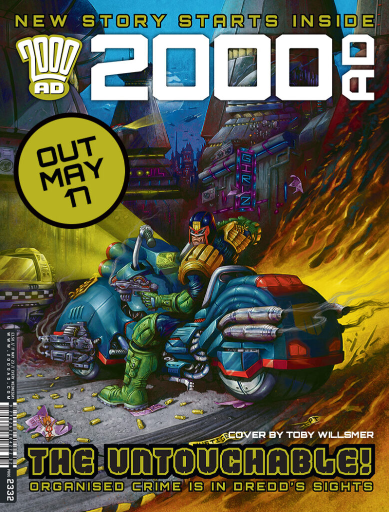
2000 AD Covers Uncovered – Toby Willsmer – Great Flaming Skidmarks, it’s 2000 AD Prog 2332!

Every week, 2000 AD brings you the galaxy’s greatest artwork and 2000 AD Covers Uncovered takes you behind-the-scenes with the headline artists responsible for our top cover art – join bloggers Richard Bruton and Pete Wells as they uncover the greatest covers from 2000 AD!

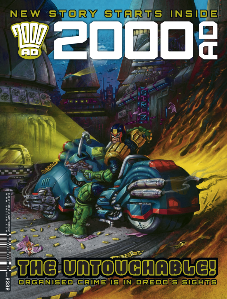
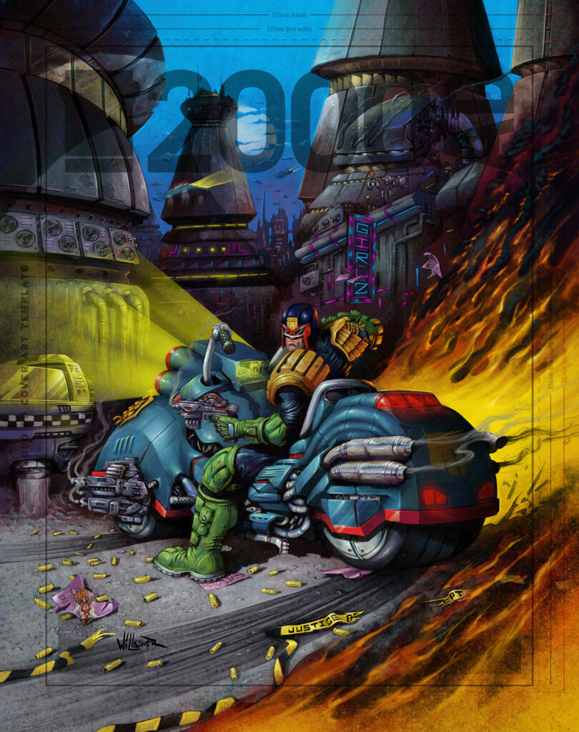
What an incredible first few years in 2000 AD publishing history for the newly constructed Artdroid Toby Willsmer! Not many artists could claim not only winning the Art Stars competition, but then going on to set pulses pounding with covers and stories, including the Robo-Hunter strip in the zombie takeover tale The Darkest Judge and Cadet Dredd in Prog 2325

The Willsmer model is a classic 2000 AD artdroid, with some modern tweaks and upgrades. Built on an refurbished Bisley Mk1 chassis, augmented with some advanced Emond software patches then let loose with a host of bespoke subroutines of his own, he is a formidable addition to Tharg’s roster. He is quickly cementing a reputation for kinetic, literally explosive artwork that is irresistible to terrans and kills all known forms of Thrill Sucker dead. Toby has completed the cover of 2000 AD Prog 2332 (available 17 May) and what a stunner it is!

“Just listen to the gunfire and explosions in the city! Don’t linger on the pedways or ya won’t be lookin’ pretty!”
Petula Clark, Downtown Remix, 2144.

.

Over to Toby to tell you about his overall concept:

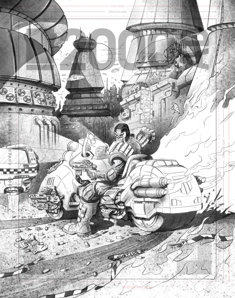
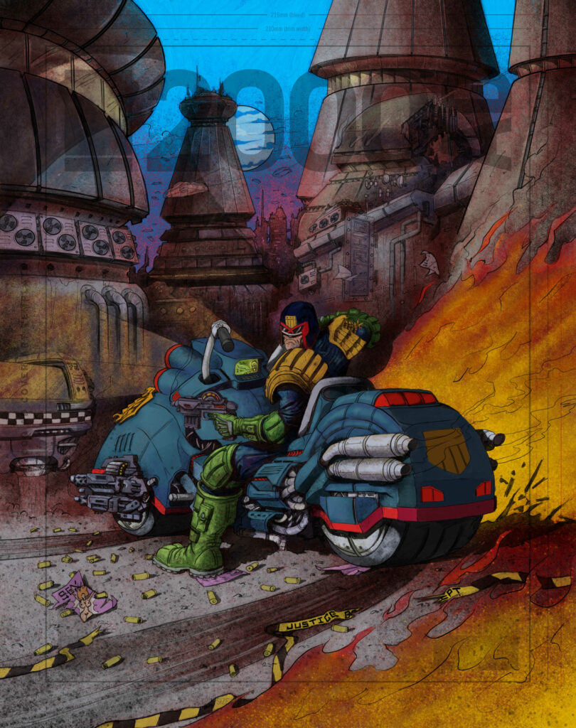
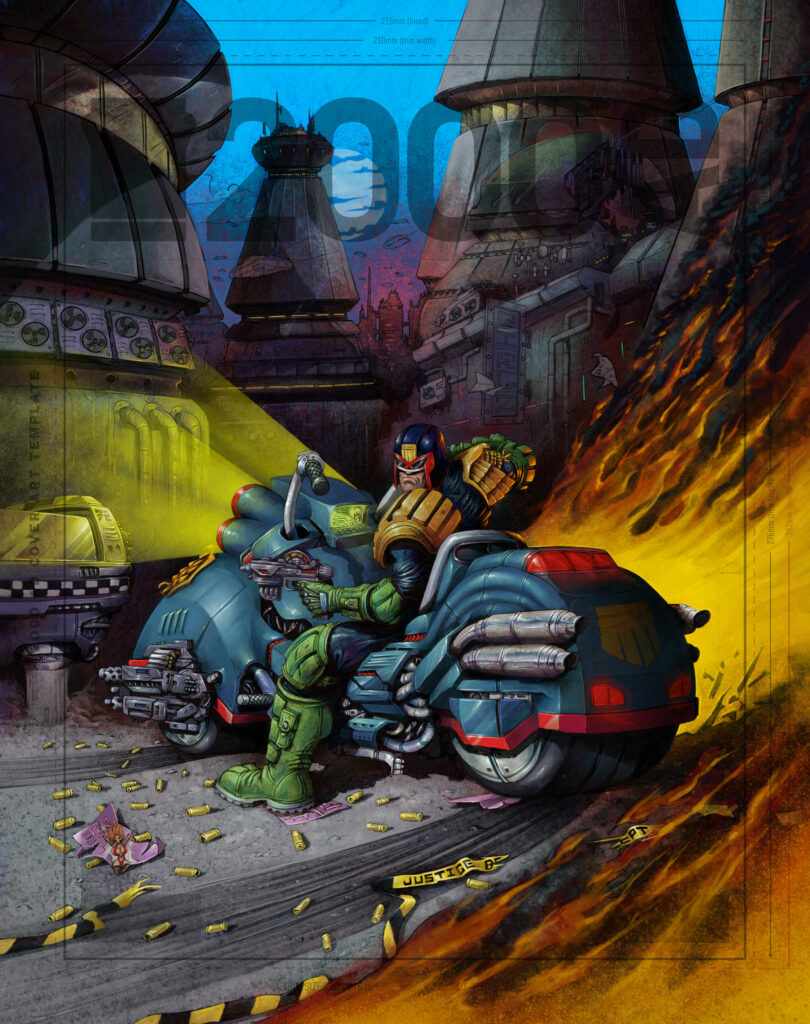
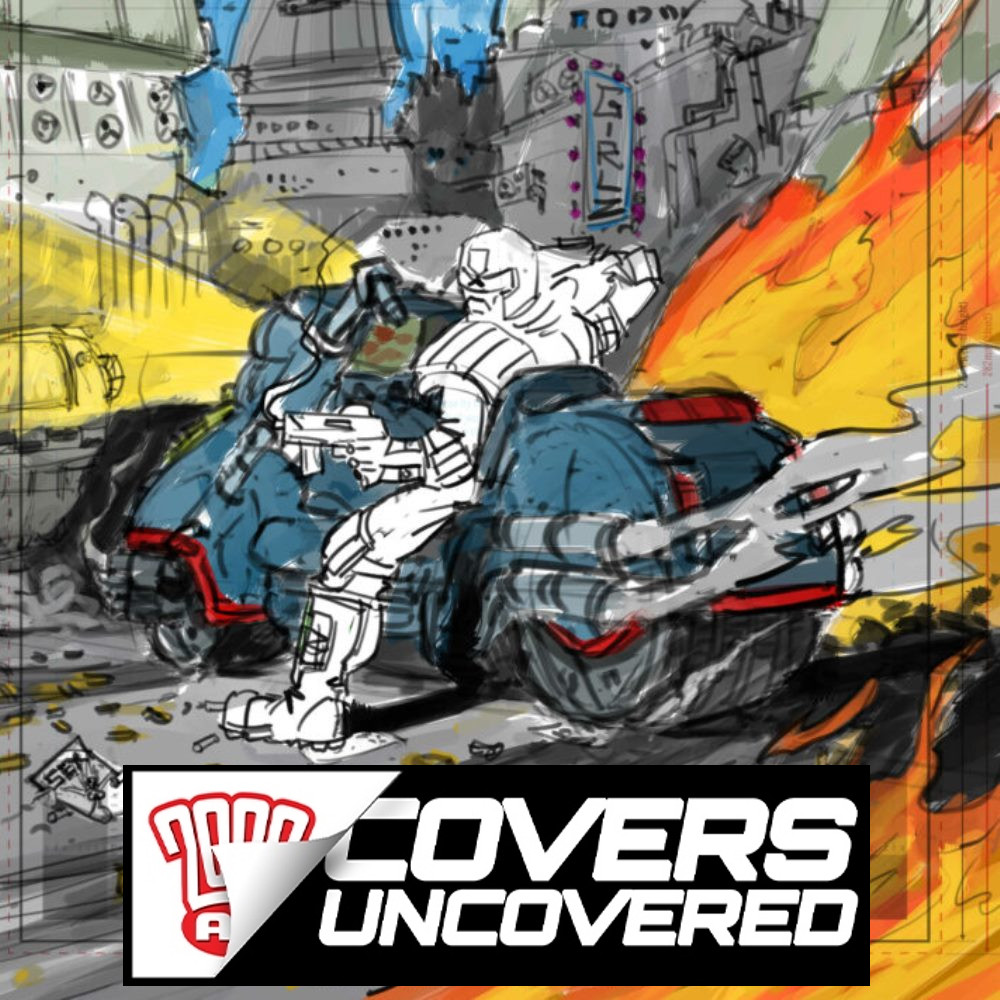
TOBY WILLSMER: I wanted to capture the moment just after Dredd had dealt with his perps and slid to a halt on his Lawmaster. I surrounded him with shootout carnage and burning stuff as a secondary light source and to add movement in there.

After decades of frustrating enforced celibacy, something on the ground had caught Dredd’s eye!

.

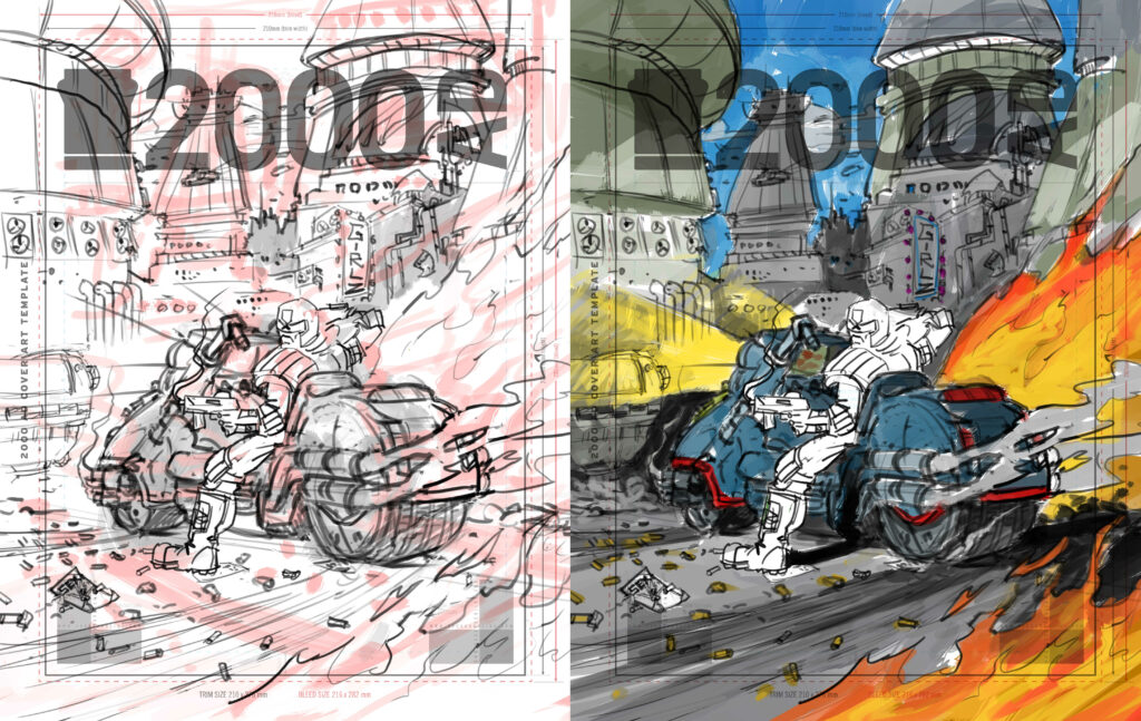
Rough and colour scheme
With the initial concept locked in, Toby got to work. He said “I came up with a fairly detailed rough idea and my initial thoughts on a colour scheme. Then sent them over to Matt to run his eyes over them.”

Once again, Dredd cursed the outdated Justice Department SatNav. There WAS no left turn, Drokk it!

.

Linework and initial lighting and shadows
“Once Matt approved the idea, I went ahead and drew up the detailed linework and added some basic shadows and textures.” And what amazing linework it is, wow!

Looking at Dredd’s Lawmaster screen, I guess he only has to follow the sound of bokking to bag his perp!

.

Initial colours
“From there I’ll head into the base colours, these help me to define where light and shadow will fall for the overall image. I wanted the city to be loose and dirty in the background and Dredd to be much more defined in the image bringing him to the front.”

‘Fan by Headlight’

.

Main part details
The image is really starting to pop now as Toby begins painting in the details. “As I wanted Dredd and his Lawmaster to have contrast lighting, I painted him first. This way I could balance the lighting and detail in the rest of the piece as I worked through it.”

“Six months for the Willsmer creep. Scrawling on the Megway.”

.

Details to the city
The final scrotnig painting. “I didn’t do much more on the city. Only detailing some parts, adding neon lights and some moonlight details on the buildings. At this stage, I’ll add all the small details/highlights to the whole image.”

I’m sure you’ll agree that this cover is a triumph! Thank you very much to Toby for sending the images and explaining his process.

You can get hold of the Willsmer Droid’s latest cover from anywhere the Galaxy’s Greatest is sold from 17 May, including at the 2000 AD web shop!

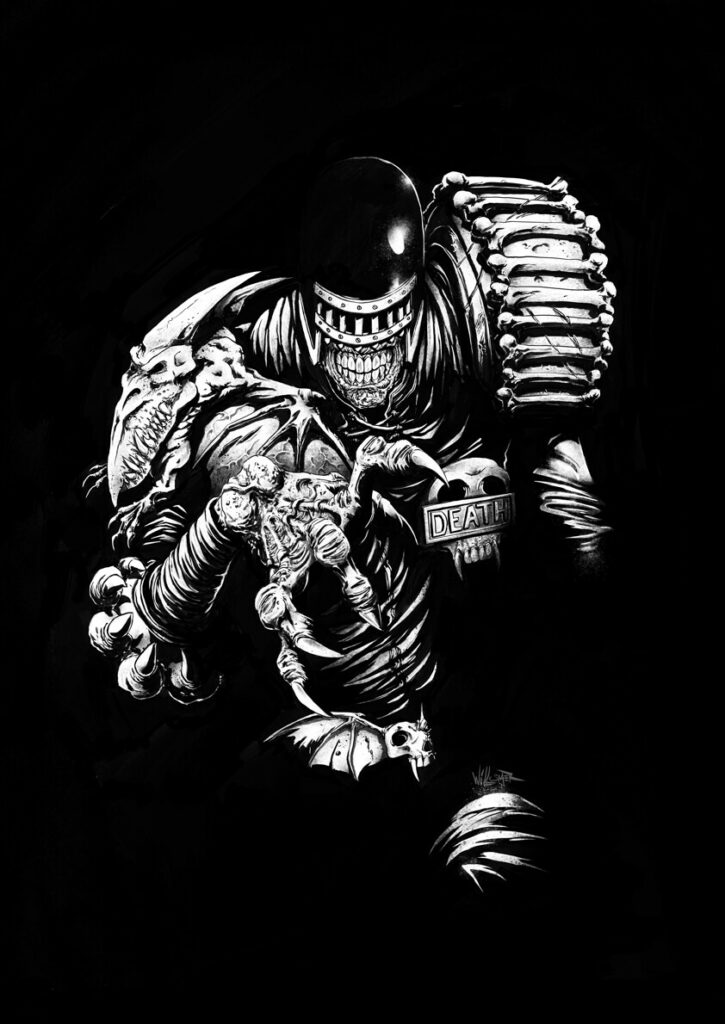
There’s lots more of Toby’s work available to marvel at online, including some outstanding 2000 AD pieces, so be sure to visit his website at willsmer.com. Highlights include this devilishly dark Judge Death bust…

“Curssssessss! Dropped my phone down the toilet AGAIN!!!”

.

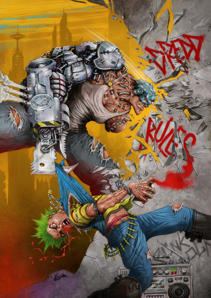
This Mean Machine poster…

And with one Bok! Banksy Jr III’s wall scrawling career came to an abrupt end.

.

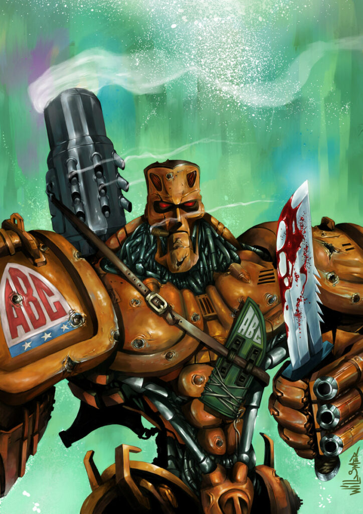
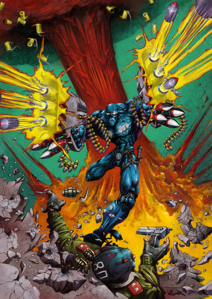
And these glorious ABC Warriors images, truly zarjaz!

Hammerstein just couldn’t get strawberry jam at the ABC Warriors afternoon tea party.
“A1!”


Posted on

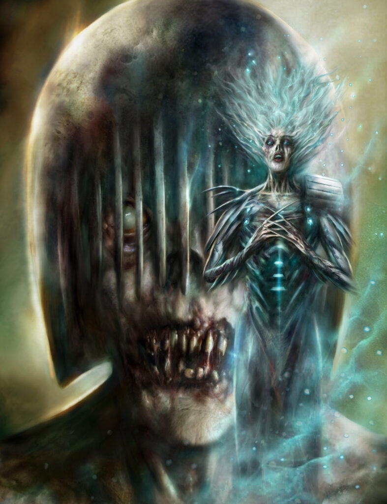
2000 AD Covers Uncovered: The Dark Judgessss Sssstep Into The Light… Nick Percival’s Latest Nightmarish Megazine Cover

Every week, 2000 AD brings you the galaxy’s greatest artwork and 2000 AD Covers Uncovered takes you behind-the-scenes with the headline artists responsible for our top cover art – join bloggers Richard Bruton and Pete Wells as they uncover the greatest covers from 2000 AD!

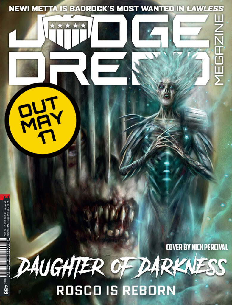
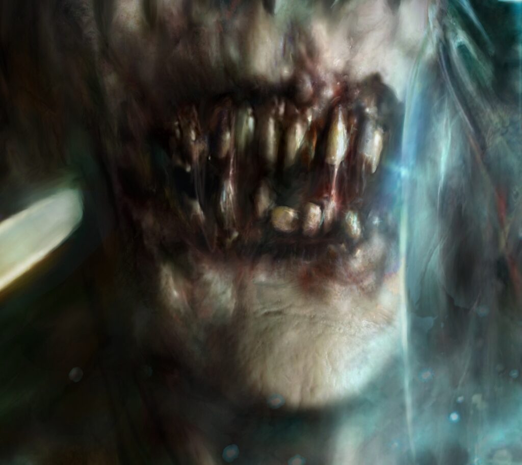
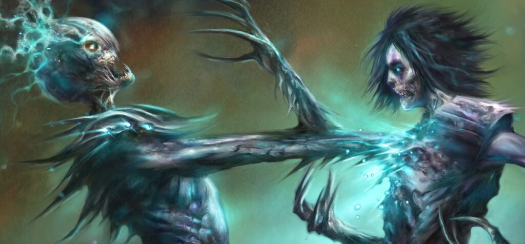
On the cover of the Judge Dredd: Megazine this month, issue 456, it’s the unmistakable grotesquery of Nick Percival and the Dark Judges.

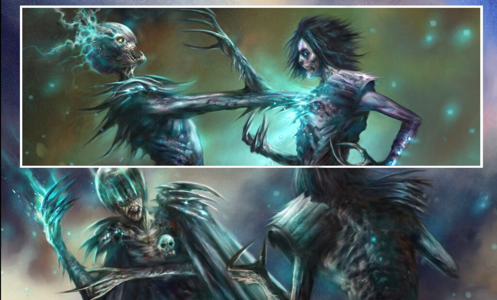
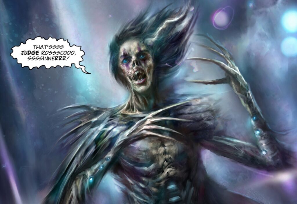
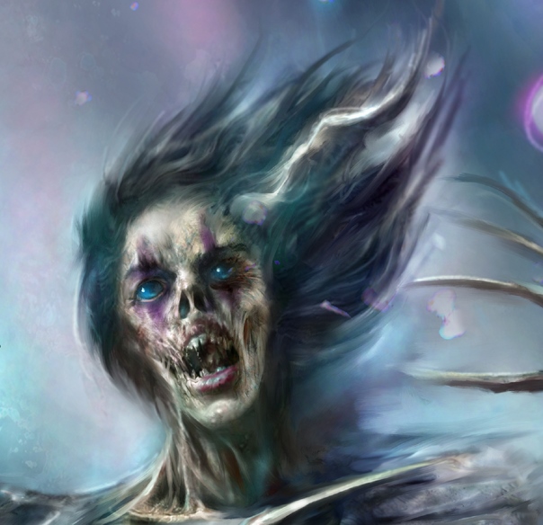
We’re at part 8 of David Hine and Nick Percival’s Dark Judges: Death Metal Planet now, where poor Roscoe’s transformation into a Dark Judge is taking place.

But, as Nick will tell you, that particular transformation isn’t done yet… so, without further ado, over to Nick for the skinny and his cover process of Roscoe and Judge Death…

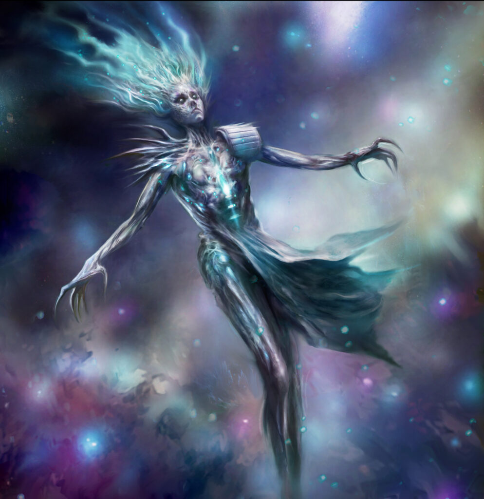
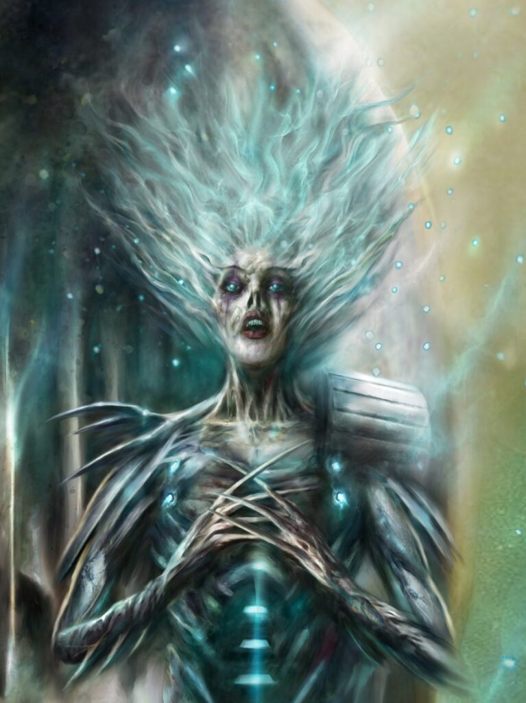
NICK PERCIVAL: Cracking on with Part 8 of Death Metal Planet, the plan for the cover was to have an image that would tease the transformation of Rosco into a ‘Light Judge’ – we last saw her in a zombified Dark Judge form at the end of Part 7 but she only stays that way for a brief amount of time before a new, powerful transformation takes place.

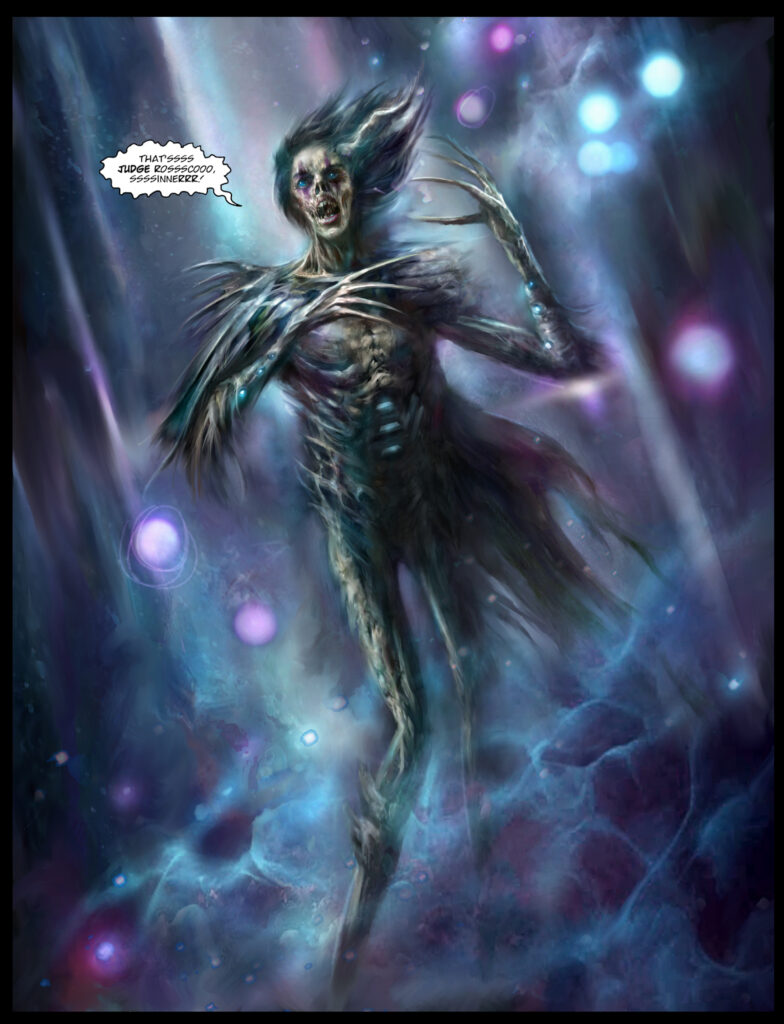
(Roscoe’s zombified Dark Judge form first seen in Megazine 455)

NP: I didn’t want to give away her new look completely on the cover, so on this image, she’s kind of in a state of mid-transformation, if you will. I still wanted a dominating image of Judge Death on there, so it’s kind of basic montage piece.

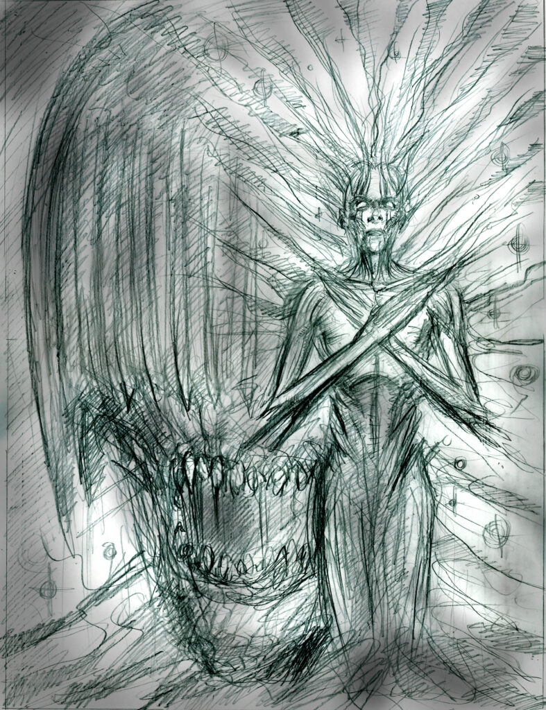
As ever, the pencils are just a very loose rough to get the idea down quickly, whilst it’s still fresh in my head, before going into the detailed final painted image.

(Nick’s loose pencils of Roscoe’s Judge form and Judge Death)

NP: As I was doing the rough, I didn’t really have a clear idea of what she would finally look like and you can see the obvious differences between the two versions from the vague pencils to the final paints.

(And the final paints – Nick’s vision of Roscoe’s transformation from the dark to the light)

NP: When we were discussing the story idea of Rosco becoming a Dark Judge and then a Light Judge, I was hoping for some, dark twisted romance between Death & Rosco.

I was contemplating doing a homage to Gustav Klimt’s ‘The Kiss’ painting, with the two Dark Judges locked in an embrace – It would have been a cool image but wouldn’t have fitted in with the story, so was not to be –  maybe something for the future if Judge Death feels he needs a girlfriend…

(Judge Roscoe, Judge Deah – Not quite the two Dark Judge’s locked in an embrace that Nick was after.)

NP: We’re on the final lap of the story now (I’m currently painting Part 10 as I type this) but there are still a few twists and turns to come before it all concludes in an, intense, epic…well, that would be telling…

(One last final image sent by Nick – Light Judge Roscoe)

And with that, Nick retreated back to the drawing board to craft more nightmarish visions of Mega-City One’s futures. Always a guarantee to send a shiver down your spine, you can see Nick Percival’s Dark Judges cover on the front of Megazine 456, available wherever you pick up the Galaxy’s Greatest, including the 2000 AD web shop.

Finally, because Nick sends along his images at such a huge size, I always like to give you some zooming in – all the better to highlight all that Percival gore and gruesome stuff going on…

Posted on

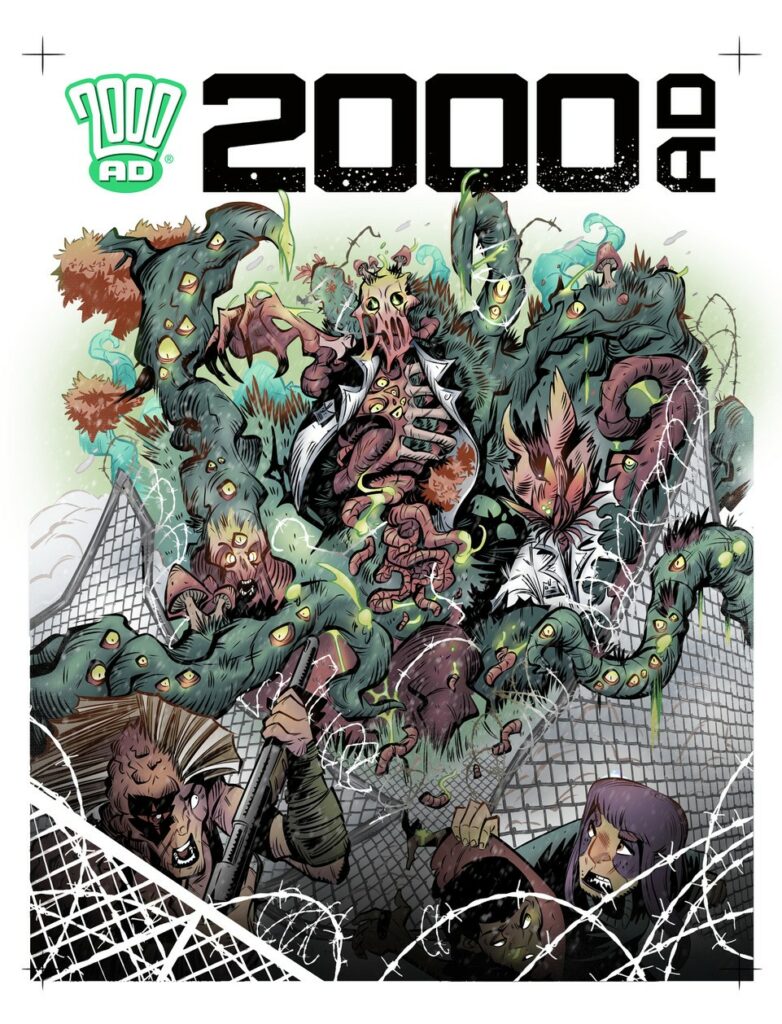
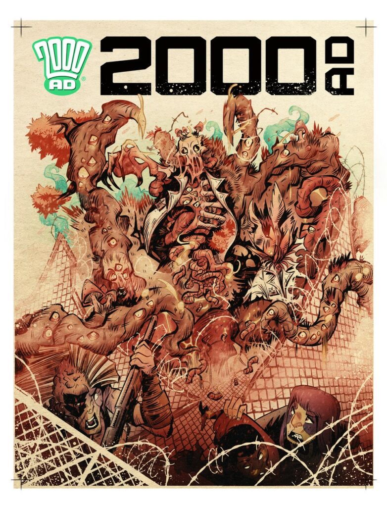
2000 AD Covers Uncovered: Frightful Fauna Attacks In Luke Horsman’s Latest Enemy Earth Cover For Prog 2329

Every week, 2000 AD brings you the galaxy’s greatest artwork and 2000 AD Covers Uncovered takes you behind-the-scenes with the headline artists responsible for our top cover art – join bloggers Richard Bruton and Pete Wells as they uncover the greatest covers from 2000 AD!

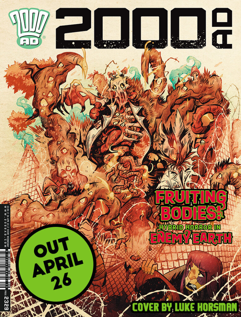
This week, amongst all the other Ghafflebette thrills, we have the latest instalment of Cavan Scott and Luke Horsman’s Enemy Earth: Book 2, with all the fearful fauna and flora out to transform humanity. Against it all, just trying desperately to stay alive, two kids searching for sanctuary in the latest serial to make the jump from the 2000 AD Regened Progs to a full series in the Prog. It’s dark, it’s scary, it’s the entire planet out to get you!

So, let’s see Luke Horsman’s latest cover and what went into putting it all together…

LUKE HORSMAN: For this cover, Tharg the Mighty tasked me with a design involving the mutant horde breaking through a security fence to our unlucky protagonists.

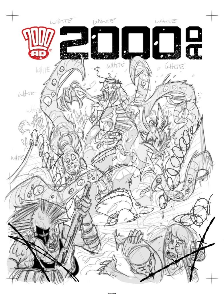
I worked up a loose layout for approval.

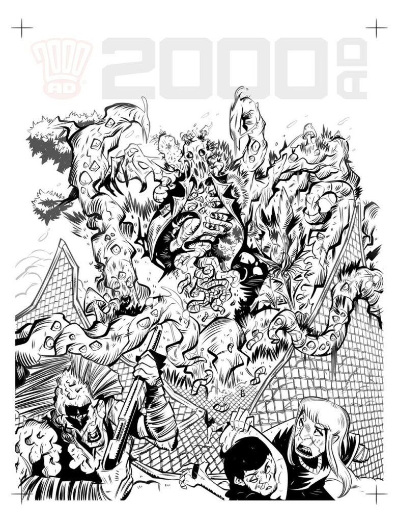
Once approved, I moved on to the usual black inks and grey tone inks so I can plan my colour depths.

I initially started to work the cover up in full technicolour, but decided it wasn’t quite working for me as a piece. 

So for the final piece,  to make it a bit more B-Movie’ish and “designed”, I dropped back the colours to a 2 tone style and added a few paper stock blending layers to bring it all together.

Job done.

Job done indeed. That’s a stunning cover to be sure, full of all the horrors to be found in Enemy Earth.

Our thanks to Luke for sending it all over and letting you see what went into making the cover. You can find 2000 AD Prog 2329 wherever the Galaxy’s Greatest is sold from April 26th, including the 2000 AD web shop.

As for previous Covers Uncovered from Luke, he talks Enemy Earth covers for Prog 2303 and Prog 2307, and we’ve interviewed him three times… here for an interview with Cavan and Luke about the very first Enemy Earth in the 2000 AD Regened Prog 2256 and here for a chat with them both for the first series of Enemy Earth that began in Prog 2301. And finally, there’s an interview here with Luke and writer Mike Carroll about another Regened strip, Action Pact, that was in Prog 2220.

Posted on

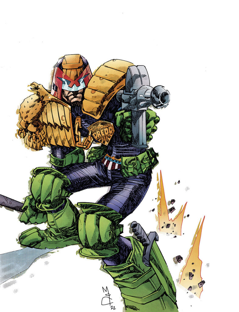
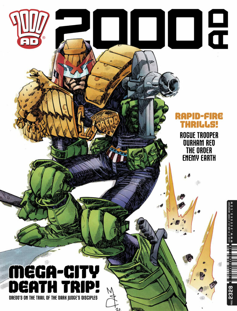
2000 AD Covers Uncovered: A return to ‘everyone’s favourite fascist’ for John McCrea on the cover of Prog 2328!

Every week, 2000 AD brings you the galaxy’s greatest artwork and 2000 AD Covers Uncovered takes you behind-the-scenes with the headline artists responsible for our top cover art – join bloggers Richard Bruton and Pete Wells as they uncover the greatest covers from 2000 AD!

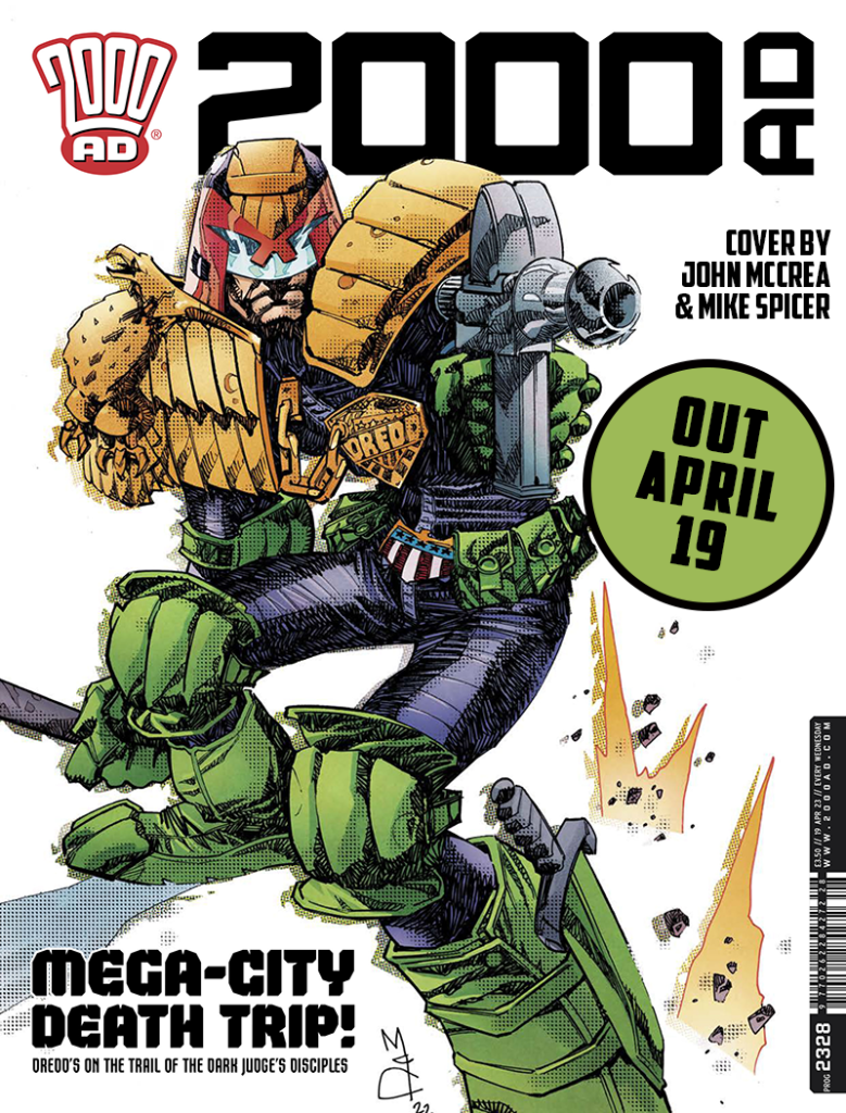
This week, a striking Dredd adorns the cover of Prog 2328 courtesy of John McCrea

Now, just like Jock’s recent cover for Prog 2321, this one started off as work outside the Prog. But whereas Jock’s was a commission, this Dredd from John was just personal, a case of getting back on the horse after a long illness.   

Now, thankfully for us, whereas Jock had no process images to show us (we did ask!) John has plenty. So, here’s John himself to tell us – and show us – all about it…

JOHN MCCREA: This cover was drawn about a year ago. I got long Covid in August ’21 and spent 6 months unable to do anything but sleep. I was literally sleeping 19 hours a day. It was not fun. I had been drawing a  DC comic called Soul Plumber and had completed the first issue when Covid struck. After a couple of weeks, I realised I had to get help. So I asked my old pal and 2000ad regular PJ (Maybe) Holden to step in and draw the book until I was better again- sadly the best I could manage was inking several pages here and there during the remaining 5 issues.

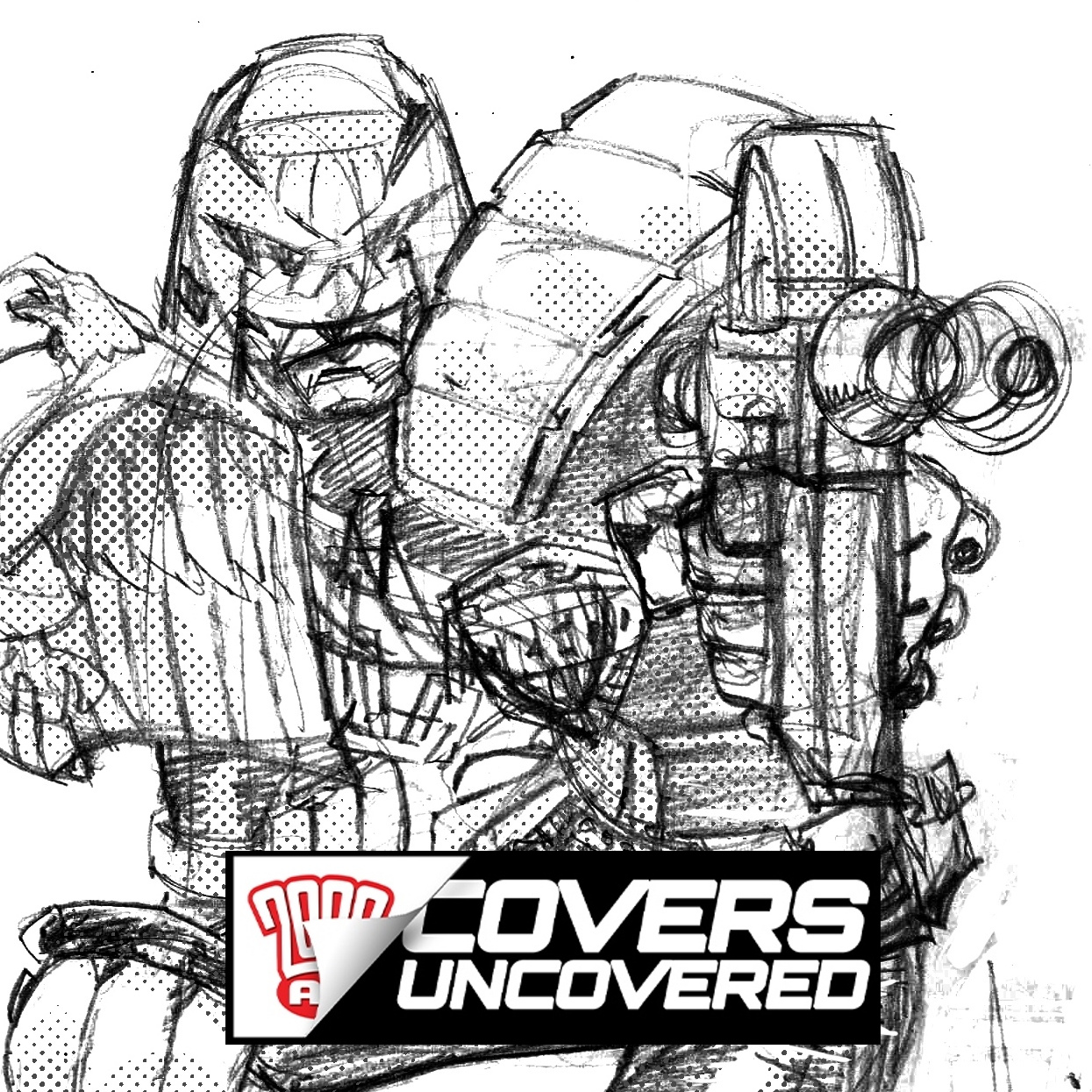
Around March of ’22, I felt well enough to try drawing again. I figured a pic of everyone’s favourite fascist Joe Dredd was what I could manage, and this pencil drawing showed up!

A just getting better Dredd in pencils from the McCrea droid

I dutifully post the sketch on social media and it received a pretty warm welcome, but I was still unsure if it was any good, so I figured I would ink it. I find inking much easier than drawing so this didn’t seem impossible. Bear in mind I was sleeping 13 hours a day by this point and was pretty knackered the rest of the time.
After a sleep, a lot of sleep, John adds the inks.
Once again, social media came to the aid of my mangled ego. No one hated it.

So I chucked a bit of digital tone on it...

More sleep, more art… this time it’s added digital tones

At this point, it was starting to look almost professional.

So I decided to be a bit naughty and send it to Matt Smith, Tharg’s  alter ego, and see if he fancied running it as a cover. Let’s face it folks, after 6 months of bugger-all work, the old bank account was looking pretty dusty so a few galactic groats seemed enticing!

To my surprise, he said yes immediately and paid me in what seemed like minutes. Joy!

Of course, it still needed some colour so I dropped my old colour co-conspirator Mike Spicer a line, and off we went!

Dreadful taskmaster that the McCrea droid is – Time to talk to Mike Spicer about colours!

As usual, I was a dreadful taskmaster and put Mike through the wringer- I had a definite idea of how I wanted the colour, with lots of overlap, etc. (I’m sure there’s an official term for this, but my brain is mush these days).

Mike, being the pro that he is, rose to the challenge.
A year later, here it is. I am still fond of it. If you like it, let ol’ green bonce know, as I love drawing for 2000 and another cover or two would be jolly fun.
And there you go – from illness to artwork!

First of all, we’re all so glad to hear that John’s feeling at least a little better now. Good luck and good continued recovery to you John! We’d also like to thank him for taking the time and sending along the work for the cover for us to oooh and ahhh over. And finally, we can only agree with John that it would be great to see more of McCrea working for Tharg, either on the cover or on the inside!

You can find 2000 AD Prog 2328 wherever you pick up your weekly dose of Ghafflebette comics, including the 2000 AD web shop from 19 April!

And finally, one of those rare McCrea 2000 AD covers which we were fortunate enough to grab him to talk about in this Covers Uncovered!