Posted on

It’s an Annual thing! Celebrating the tradition of the comic book annual

An Annual under the tree was a Christmas tradition for generations of kids. In his regular look at classic British comics and the Treasury archive, David McDonald takes a look at the once booming publishing phenomenon…

Annuals are a publishing phenomenon stretching back well over a century. The term ‘Annual’ in publishing covers a lot of different types of books, – almanacs, yearbook and Annual reports, but the ones this piece is concerned with are those titles that one would associate with comic and story papers, traditionally given at Christmas. 

The seventies and eighties were the golden age of Annuals. They were ubiquitous at Christmas, with an Annual on most kids’ Santa list, and for those that did not ask for one they could be sure a grandparent or relative would bring them as gifts.

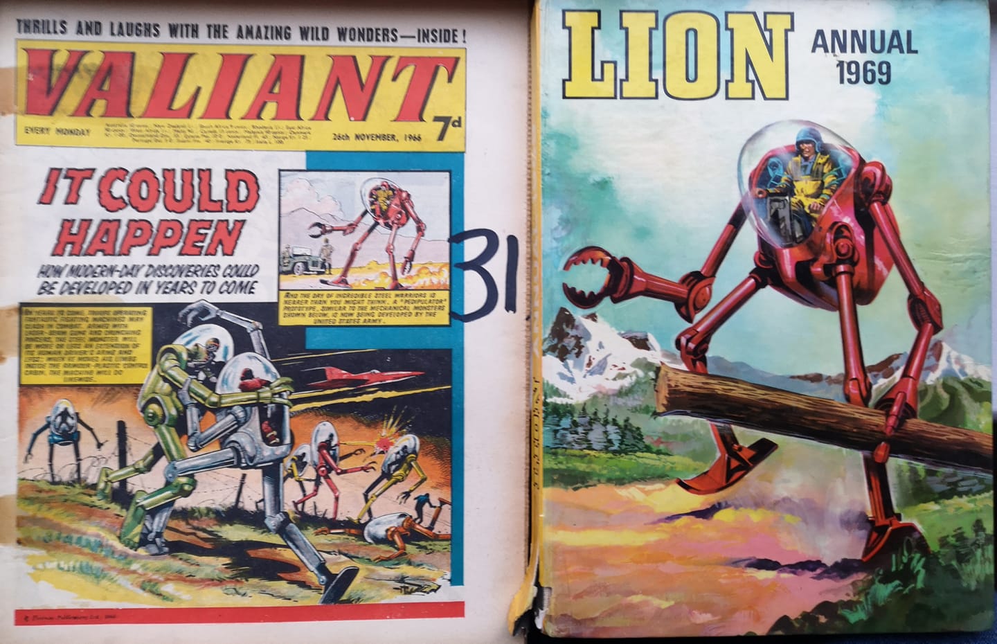
Annuals would go on sale late summer or early autumn, dated the following year, e.g., Lion Annual 1973 would have gone on sale in early autumn 1972. Firmly geared to be a Christmas buy, they were heavily promoted in the weekly comics and in newsagents and toy shops too. Posters and flyers would be sent to proclaim on the shop windows that Annuals were now in stock. Once Christmas was over, whatever Annuals were left in stock were out of date and would be heavily discounted and sold. 

Some Annuals do turn up on occasion with no year printed on the cover. It’s possible that these were published without a date for overseas markets, like South Africa, Australia and New Zealand, giving the titles extra shelf life in case of any shipping delays.

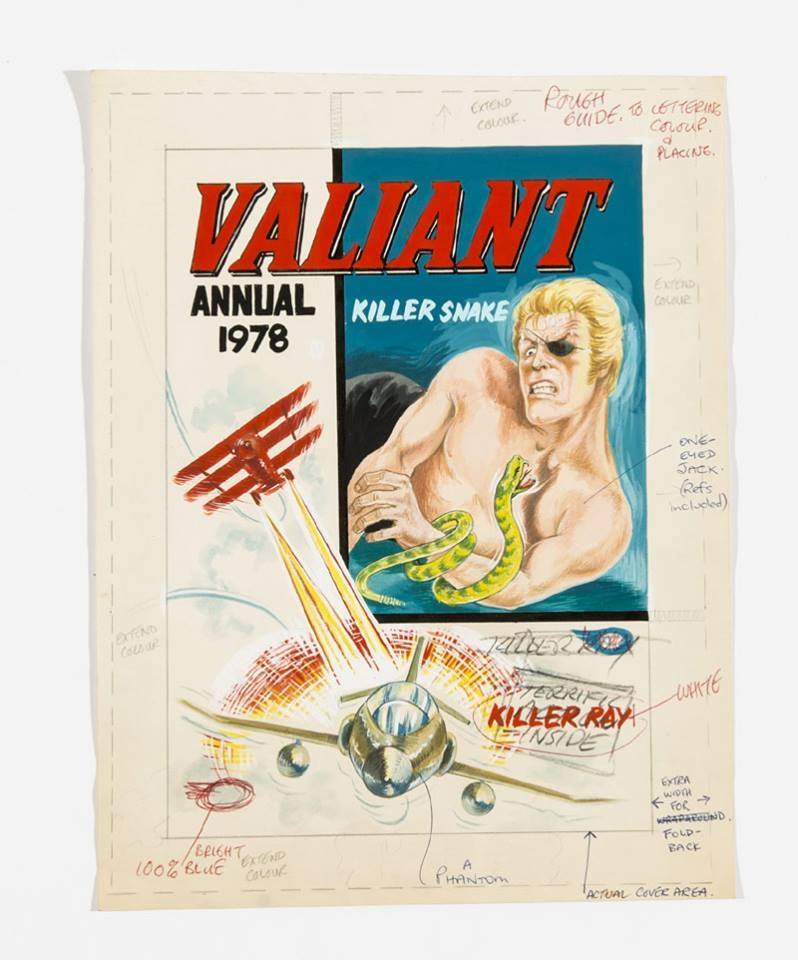
The format of the Annuals was generally uniform, hardback and A4. Colour was sporadic and depended on the publishers, some having a full colour section with the rest all black and white. Some had spot colour throughout of blue or green and some were even full colour. 

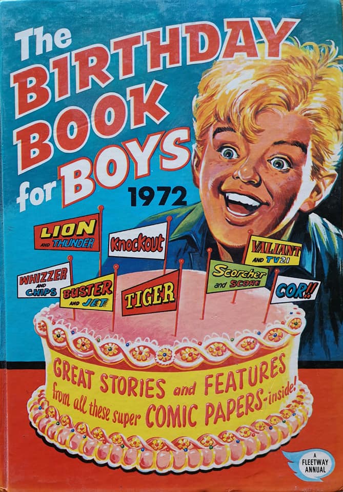
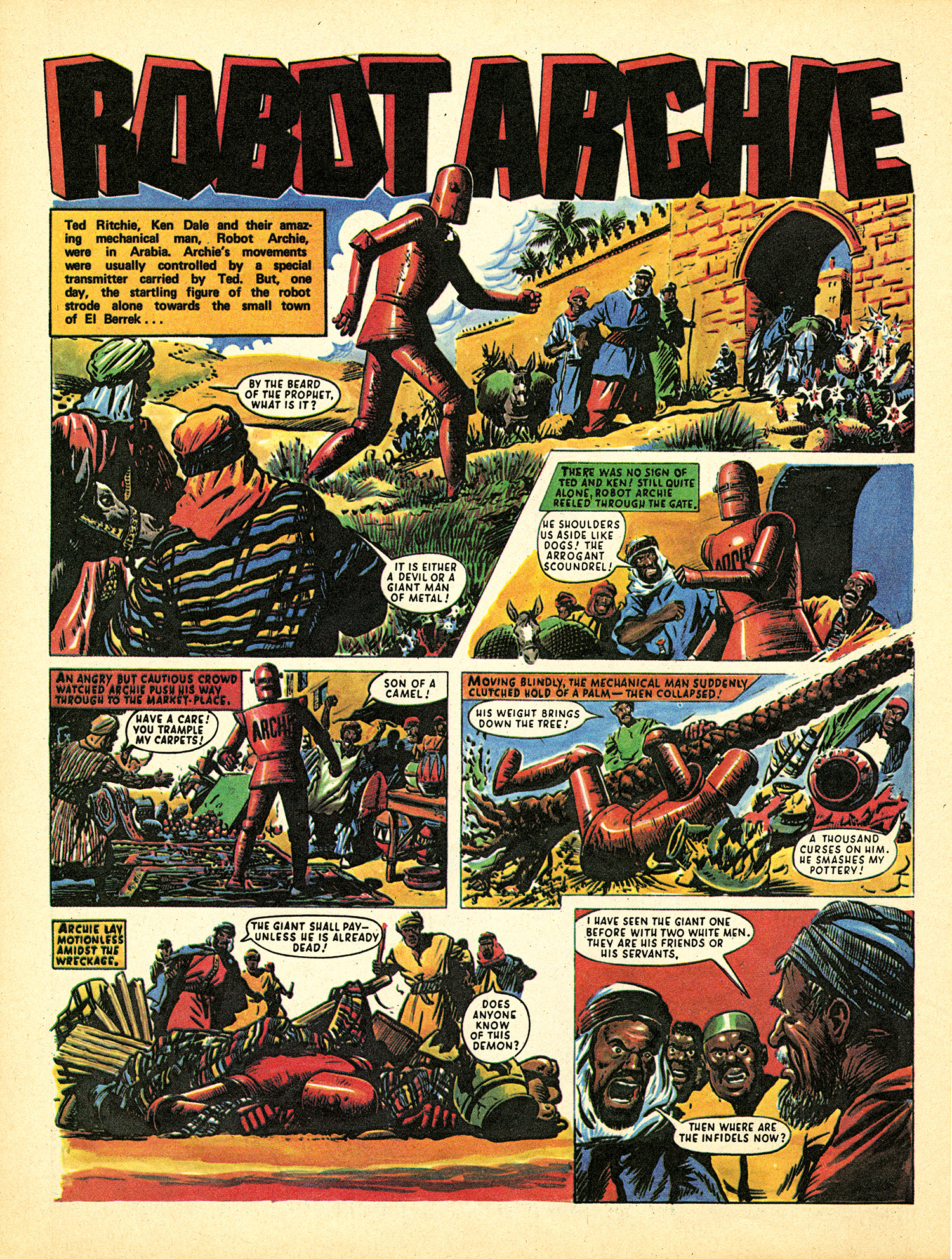
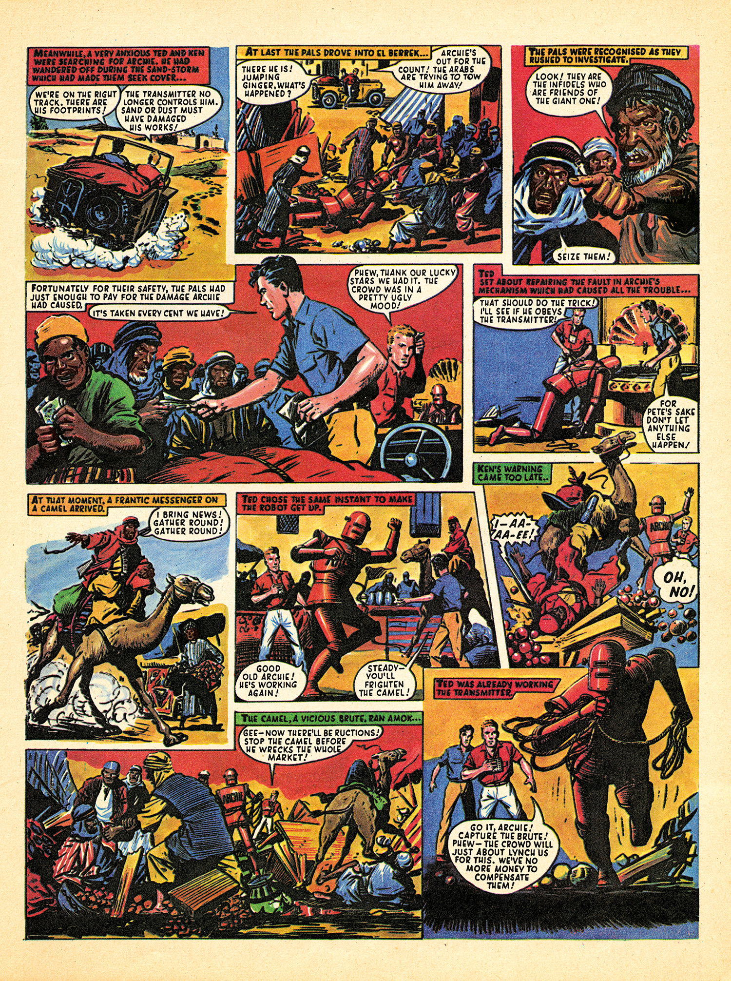
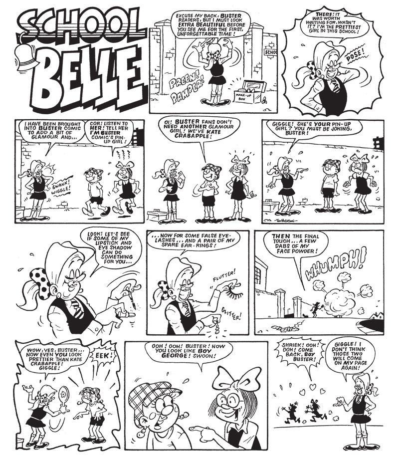
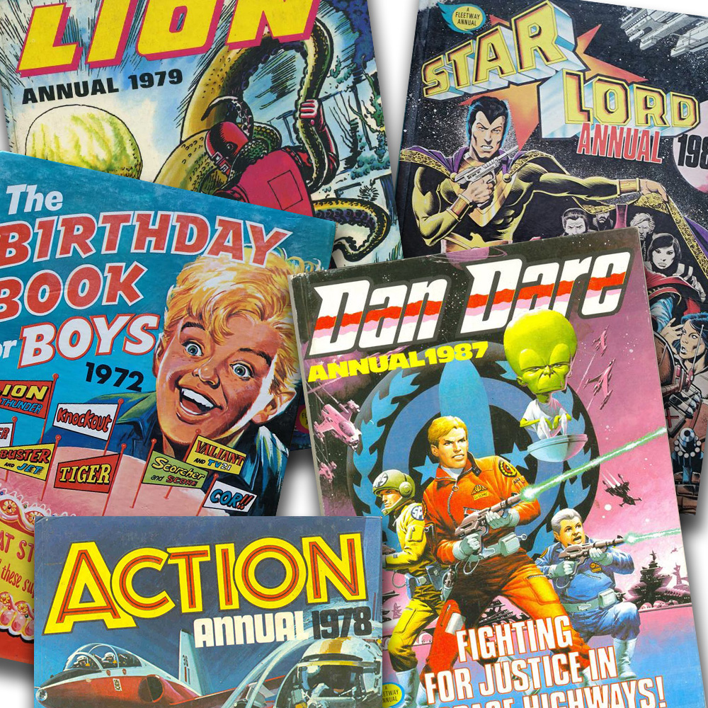
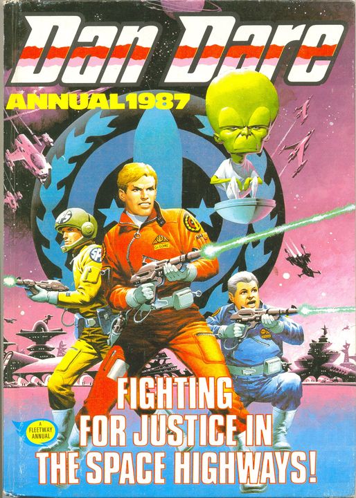
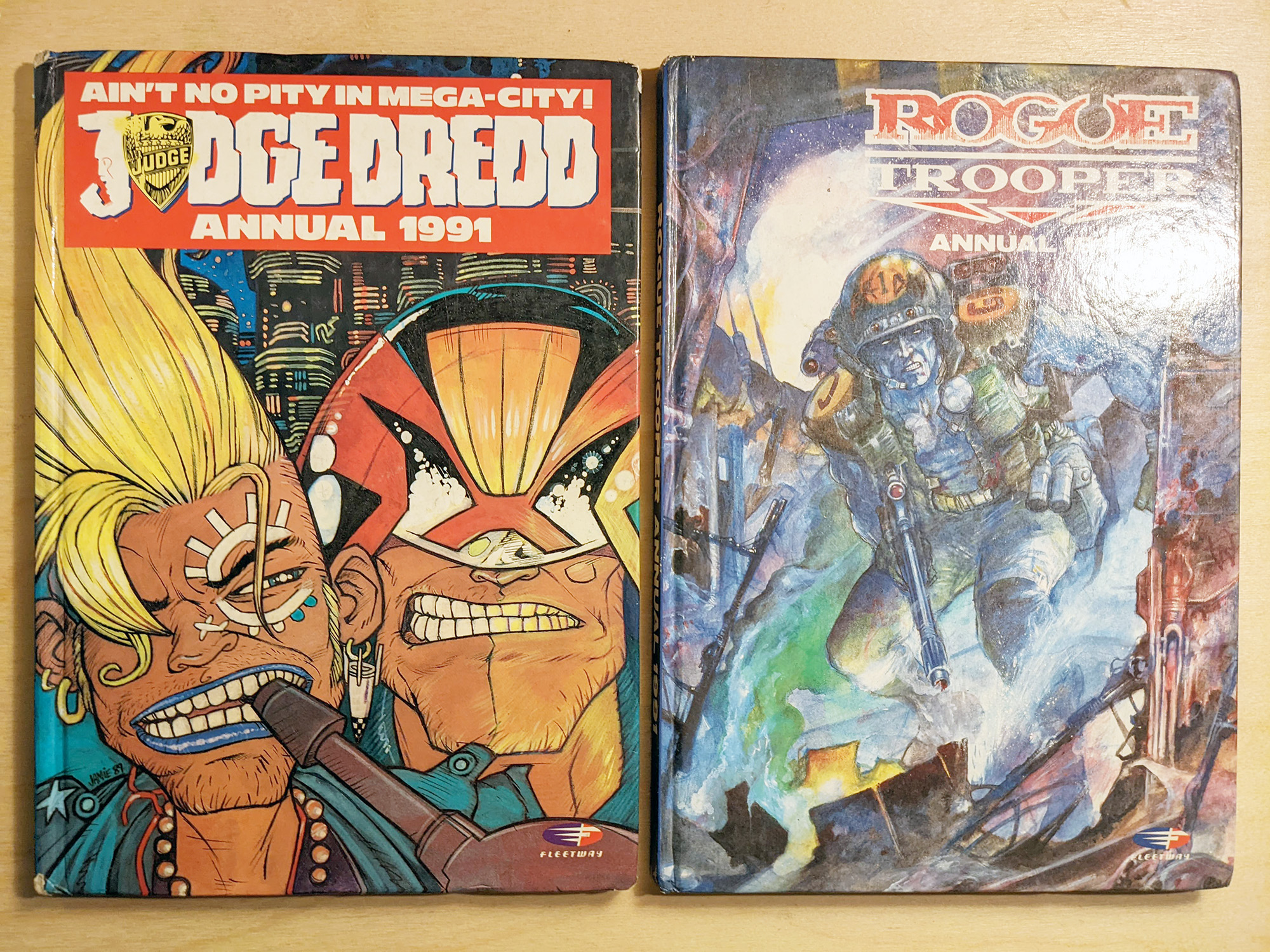
Occasionally different formats were used, like softback or editions like ‘Summer Annuals’ and ‘Birthday Books’. Some titles would have spin-off Annuals from the main title. Buster had several joke book titles – ‘The Buster Book of Gags’, Valiant and Lion had ‘sport’ and ‘war’ titles, Tiger had Roy of the Rovers Annuals and 2000 AD had Dan Dare, Judge Dredd and Rogue Trooper Annuals. 

The range of titles available was staggering. In 1980, (cover dated 1981) for example, there were 10 publishers in the UK producing over 200 titles!  A lot of the titles that were published were licensed spin-offs of television programmes or sports personalities. They had little or no comic content and had no supporting weekly or monthly. Some like Star Trek and Marvel titles did have comic content but in general they were reprints of American material.

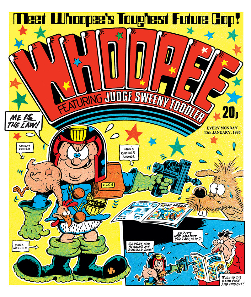
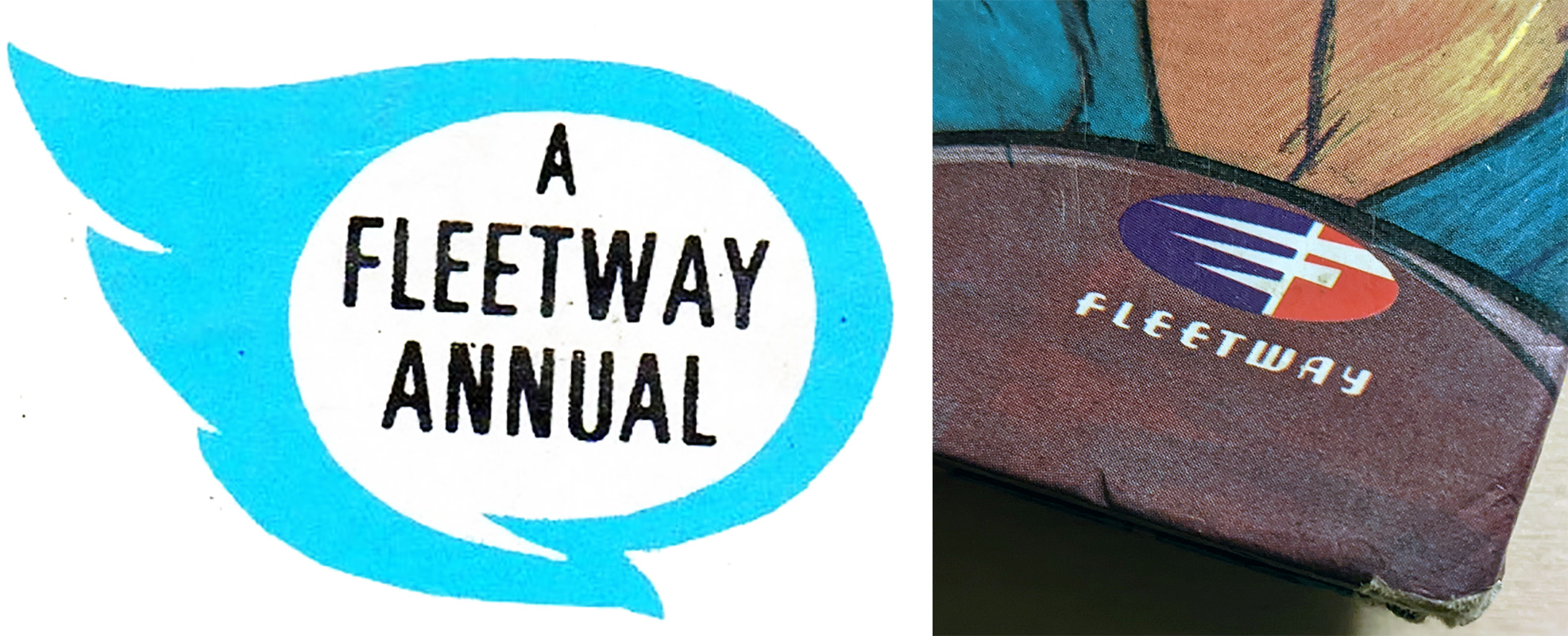
By far the biggest publisher of Annuals in 1980 was IPC magazines. It published a whopping 60 Annuals under the ‘A Fleetway Annual’ brand which was instantly recognisable.  The winged ‘speech bubble’ logo with ‘A Fleetway Annual’ in bold adorned the front cover of every Annual. Introduced in 1973, the design was an adaptation of the old Fleetway Library logo. It was an effort to create a unified and recognisable brand of all the disparate parts that made up IPC’s juvenile department.

Annuals were big business for Fleetway, they sold in large quantities and were cheap to produce. All of IPC’s juvenile department got Annuals. Preschool titles, girls and boy’s comics and the teen photo strip magazines all had Annuals, as did some of IPC’s magazine titles like the Anglers Mail and Shoot

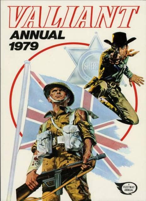
In general, they consisted mainly of reprint with a small budget for a section of newer material. For long running titles like Valiant its editorial team had an extensive back catalogue to use. The Annuals could be stuffed with reprints, put on a new cover with a small amount of newly commissioned pages and you have an attractive package. 

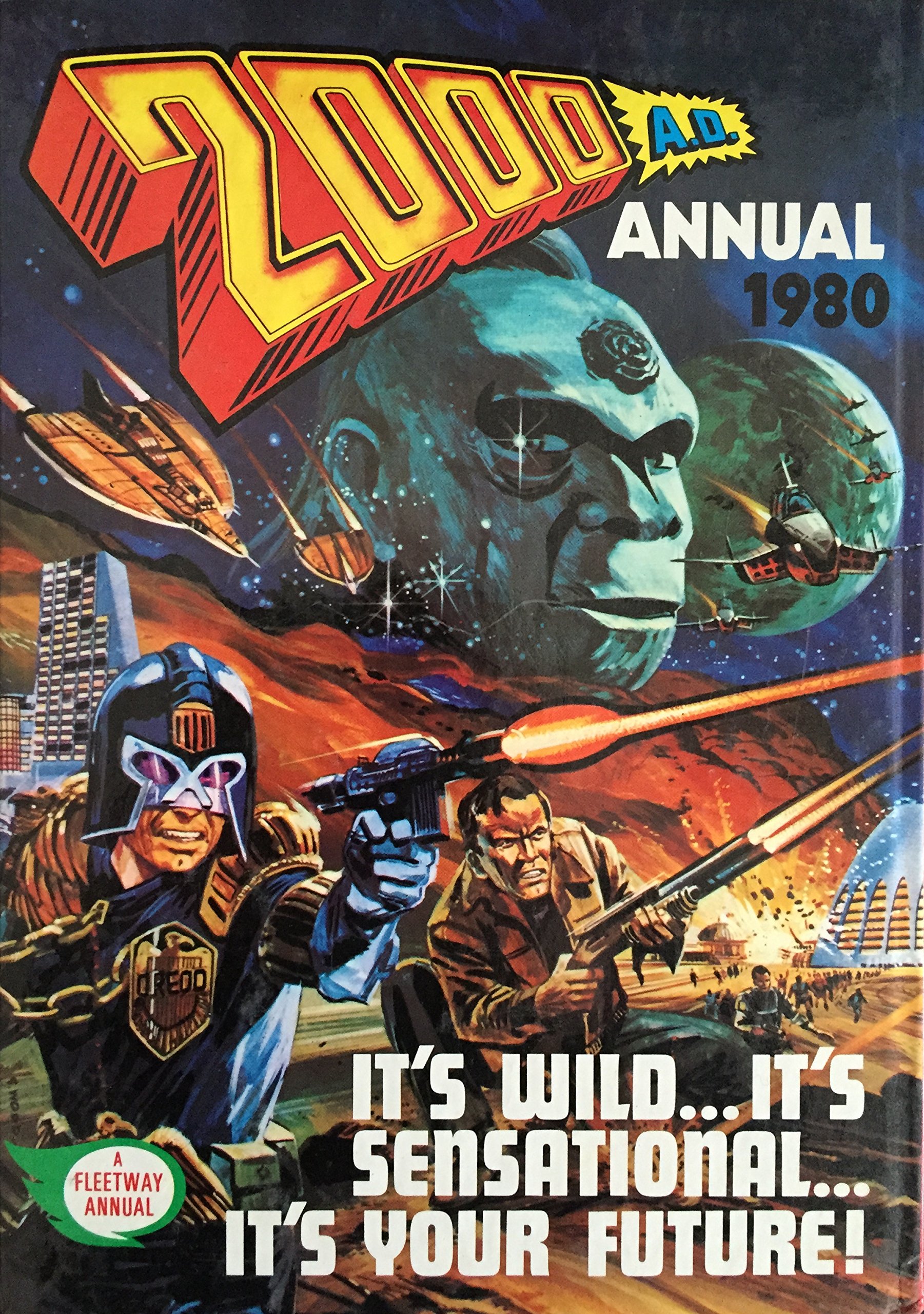
When a new title was launched it didn’t have the back catalogue of reprint to use, so similar material from older titles was used. For example, when the first few 2000 AD Annuals were published, they reprinted The Guinea Pig, UFO Agents and The Phantom Patrol from the Eagle and Swift

A ‘live’ weekly Annual would be produced by the editorial team of that title in a freelance capacity. So, for example, Battle Annual 1979 would have been produced by Battle editor David Hunt and his team. 

Producing an Annual on top of the ongoing rush to get the weekly to the printers was often difficult. Annuals were also an opportunity to blood new creators or use up material that may have been commissioned and not used in weekly titles for whatever reason. 

Design by Jan Shepheard

Annuals of live titles usually had new covers and new stories of the current stars of the comic, some in colour as well as reprint of older material.

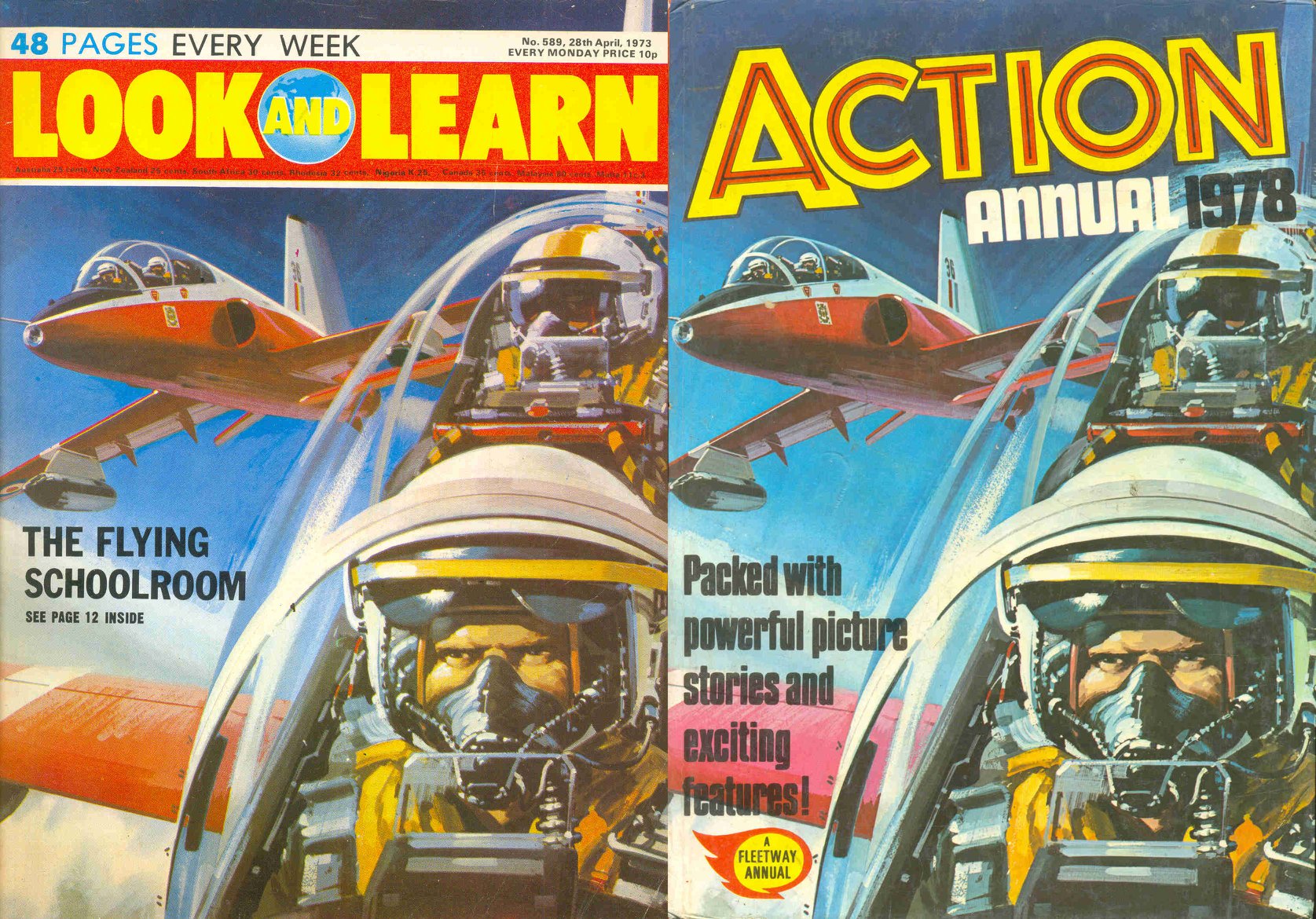
The Annuals of ‘dead’ titles i.e., an Annual of a weekly that had been cancelled, sometime years beforehand, were produced in the IPC offices freelance by whatever editorial staff members were available. Often nearly completely reprint, even the covers would be reprinted from older picture libraries or Look and Learn. Features would be used a lot for content compared to the Annuals of live titles. The format the Annuals used was slightly different to the older comics meaning that reprinted comic artwork would have to be altered. There would not have been the budget or personnel to reformat enough comic pages, so features, often pulled from educational titles like Look and Learn or World of Wonder, were quick and easy fillers.  Annuals of dead titles often ran for years after the weekly titles’ demise. Knockout weekly ended in 1973, but it’s Annuals continued until 1985 (pub. 1984), a full 11 years after the title’s cancellation!

The mid-eighties saw the decline of the Annual’s popularity. Fleetway Annuals dated 1985 could be seen as the last hurrah for a lot of titles as the following year output nearly halved. 

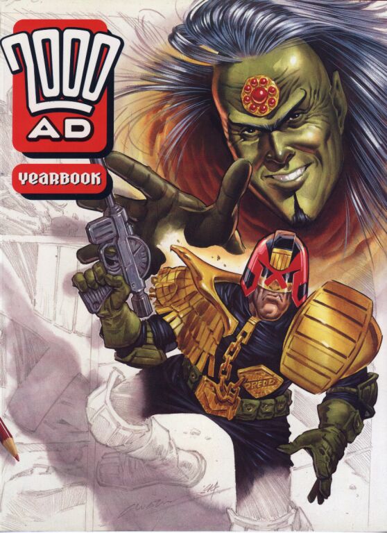
Like the weeklies, they were in less demand, and competition from television and computer games for kids’ attention and pocket money saw the comic market dwindle. By the early nineties Fleetway published only a handful of Annuals, with 2000 AD and Judge Dredd published as softback ‘yearbooks’. The classic ‘A Fleetway Annual’ logo was revamped in 1992, dropped in 1993, and in 1994, the World Distributors logo appeared on the Annuals, a sign of various mergers and acquisitions within comic publishing at the time in the UK.

1994 was the last year of classic hardback Annuals from the Fleetway stable, only Whizzer and Chips, Buster, Roy of the Rovers and Big Comic Book were published. 1994 was also the last of the 2000 AD and Dredd ‘yearbooks’. 

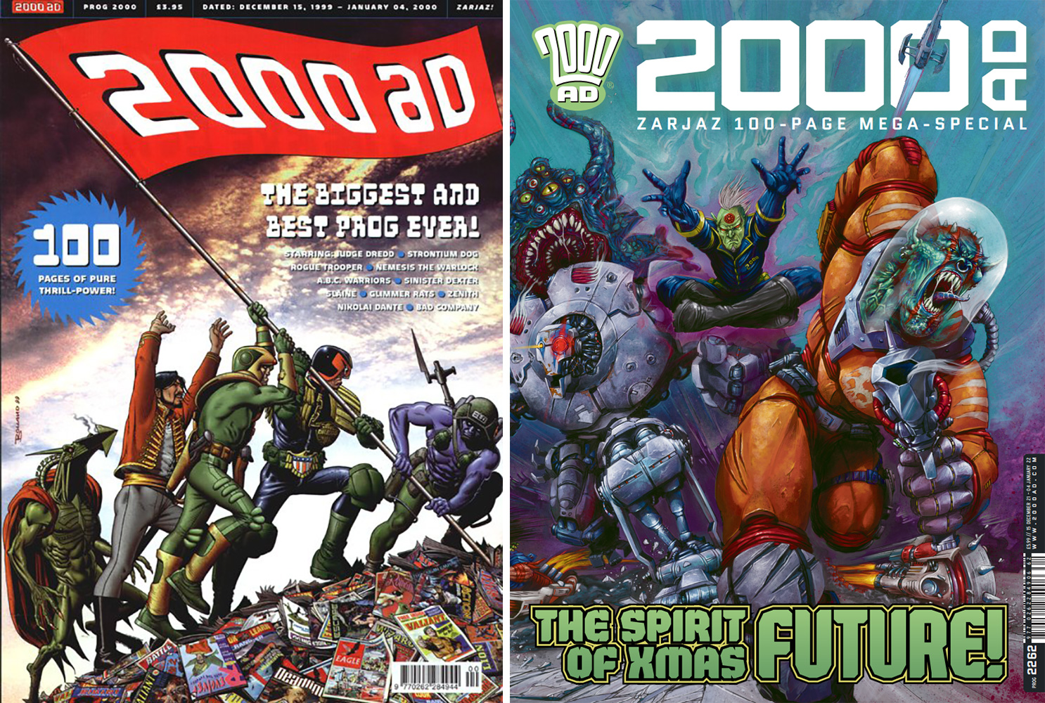
2000 AD did return to the tradition with its ‘Prog 2000’, published in the year 2000. It was a perfect bound softback year end issue of 2000 AD and along with the Judge Dredd Megazine it continues these end of year special issues to this day. This year’s is available now in all good newsagents!

While the golden age of Annuals is long past, they still are a Christmas institution in many homes, with the indomitable Beano Annual still leading the charge as the bestselling title each year.  

What are my favourite Fleetway Annuals? I hear no-one asking but to round up, here they are anyway!

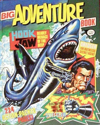
Big Adventure Book 1988

Cover by Sandy James, its 244 pages has a great eclectic range of reprints – The Steel Claw, Hook Jaw, Dredger, The Black Crow and One-Eyed Jack

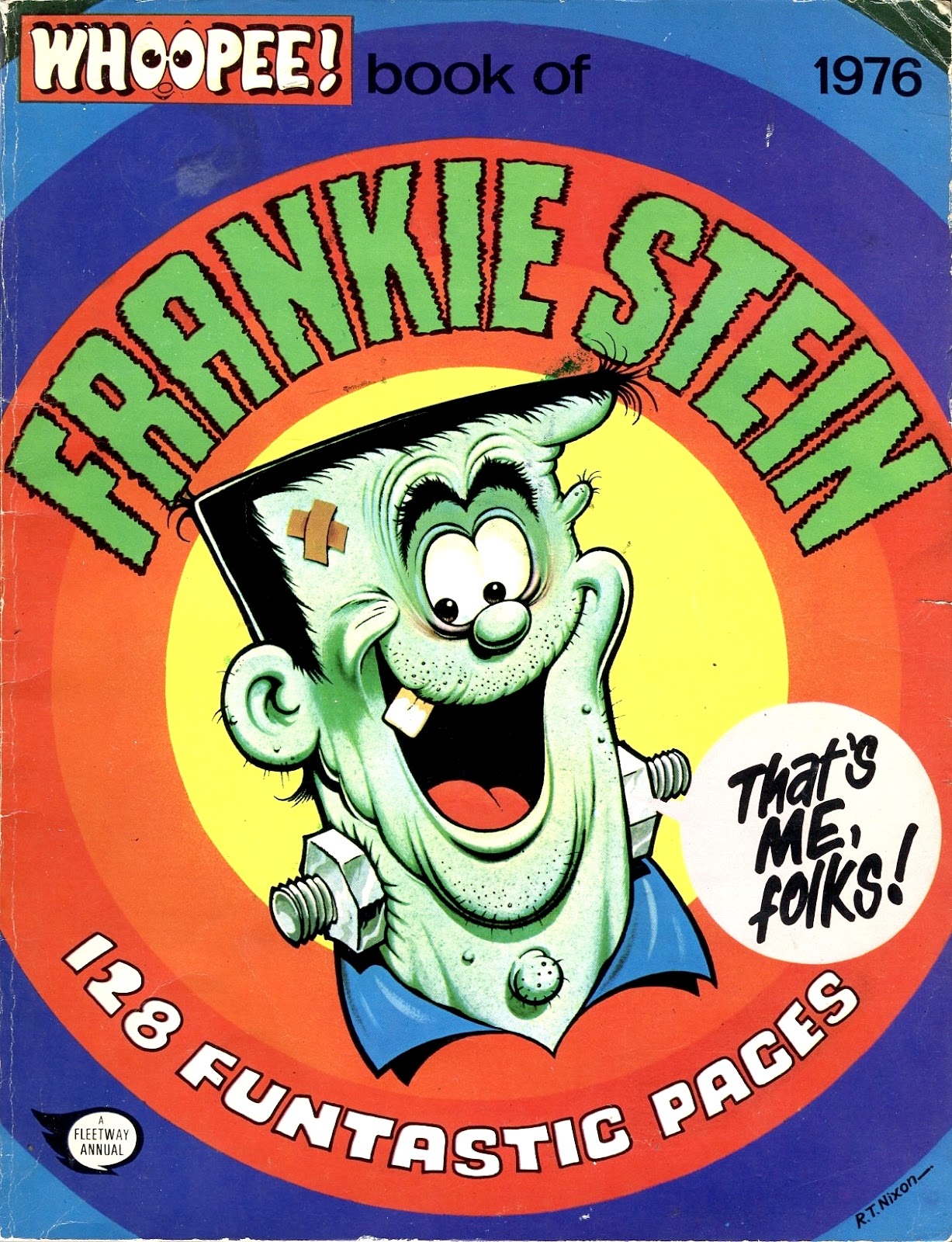
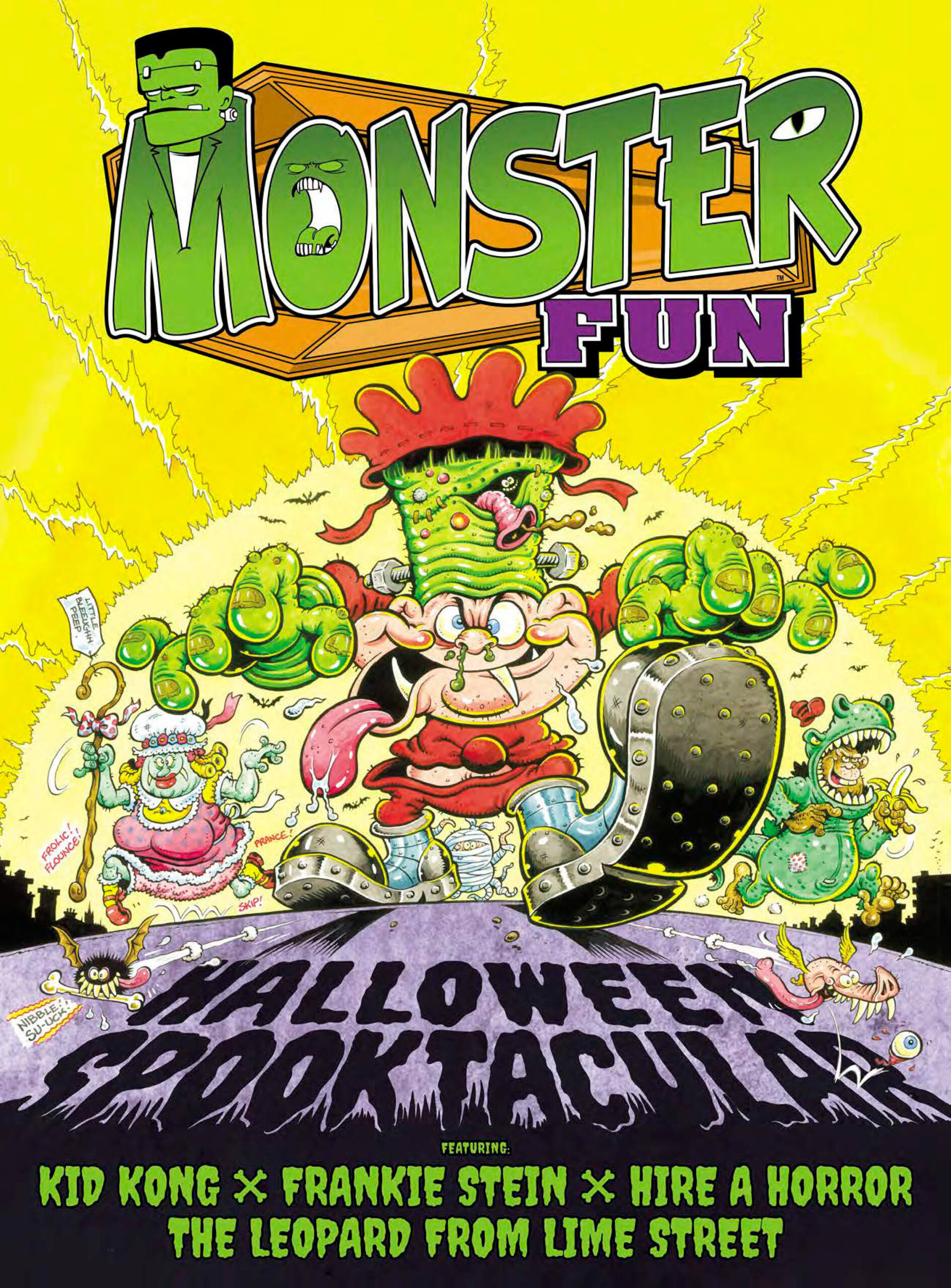
Frankie Stein Annual 1976

With some prime Robert Nixon art, (worth being on this list for the cover alone), mix in some Frank McDiarmuid art with Ken Reid reprints and you have a great book.

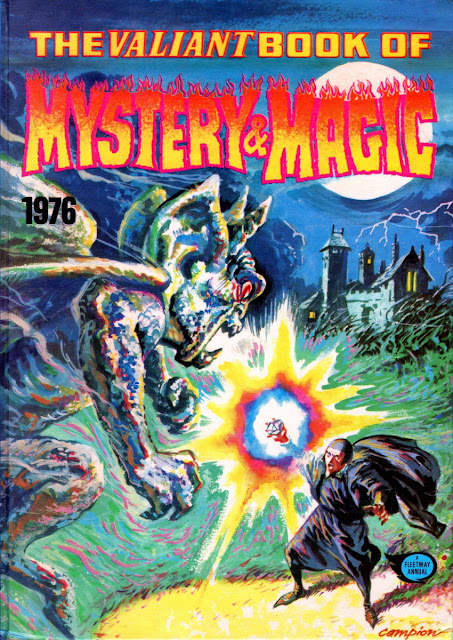
Valiant Book of Mystery and Magic 1976

Edited by Chris Lowder, cover by Geoff Campion. It reprints The Spellbinder from Lion as well as new material by Pat Mills, Eric Bradbury, Angus Allen and Joe Colquhoun (who draws himself in his story). It has the distinction of being the first IPC published title to include creator credits.
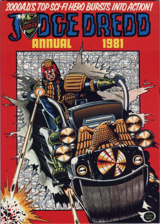
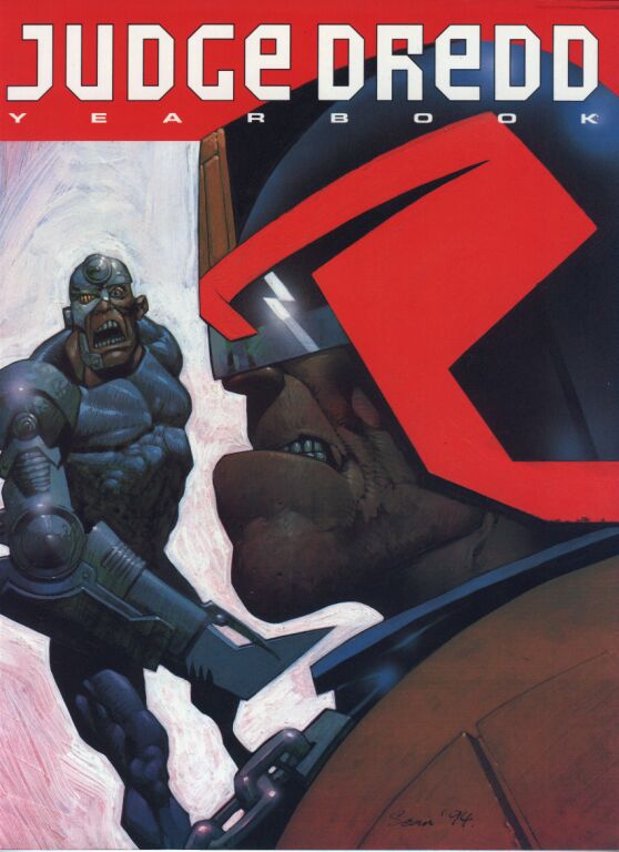
Judge Dredd 1981

Probably the first Fleetway Annual to contain nearly all new material, prime Mick McMahon art mixed with John Wagner scripts, wrapped neatly in a Brian Bolland cover, hard to top!
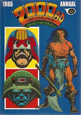
2000 AD Annual 1985

My favourite. Behind an amazing McMahon cover, the art by Belardinelli, Dillon and Higgins, Gibson and Smith make this the best looking Annual ever published. The scripts by Mills, Moore, Wagner and MacManus are not too shabby either!

With thanks to David Hunt, Kevin O’Neill and Mary McDonald.


David McDonald is the publisher of Hibernia Comics and editor of Hibernia’s collections of classic British comics, titles include The Tower KingDoomlordThe Angry Planet and The Indestructible Man. He is also the author of the Comic Archive series exploring British comics through interviews and articles. Hibernia’s titles can be bought here www.comicsy.co.uk/hibernia. Follow him on Twitter @hiberniabooks and Facebook @HiberniaComics


All opinions expressed in this article are the author’s own and do not necessarily represent the opinions of Rebellion, its owners, or its employees.

Posted on

From robot servant to acid house: the fantastical life of Robot Archie

Robot Archie is one of British comics’ most singular and loved characters. In his regular look at classic British comics and the Treasury archive, David McDonald explores the life and exploits of the world’s most powerful mechanical man…

Content advisory: some of the images on this post contain offensive and outdated stereotypes, and are included for the purposes of historical interest.


What character has appeared in Lion, 2000 AD, in original adventures in America’s ‘DC’ Comics and in the Netherlands ‘Sjors’ comic too? 

It’s none other than one of British comics most successful and well remembered characters, Robot Archie! 

 My first introduction to the character was in my older brother’s 1979 Lion annual. The cover with Archie battling a giant Octopus fascinated me, however, the accompanying text story inside disappointed me. I always felt a little short-changed with text stories in annuals, it was supposedly a comic!!

During the early eighties, Archie cropped up in various annuals and specials, including the 1980 Lion special with an amazing Garry Leach cover. That special was edited by Richard Burton- who would later edit 2000 AD. It’s well worth tracking down for the Archie v Spider story, which is probably the last new story featuring the characters for nearly a decade.  It also has some Steve Dillon illustrations on the Captain Condor text story too which was possibly his first work for IPC.… but I digress, back to Archie!  

From reading his adventures in the annuals and specials, I was hooked.  A great character, sometimes in search of an equally great story. That great story landed in a surprising place in 2000 AD prog 627 in 1989. I’m getting ahead of myself a bit though, what of Archie’s origin and his ‘comic life’?

While Archie may have been one of Fleetways more popular characters, it took him a while to evolve into the swaggering and brash character that helped him become so well remembered.  The character appeared in the first issue of Lion back in 1952 as the ‘Jungle Robot’ created by writer Ted Cowan and artist Alan Philpott.  Archie, having been built by Professor CR Richie, was in the possession of the Professor’s nephew Ted Richie and his friend Ken Dale.

Archie was no more than a remote-controlled toy, operated by Ted Richie via a control pad he had in his possession. His first adventure only lasted six months, and it would be another five years before Archie returned to Lion in 1957, this time as Archie – The Robot Explorer.  The new series continued much the same as the first tale, jungle adventures, on the trail of some lost treasure or villainous native. The next evolution in Archie was the addition of artist Ted Kearnon in 1958 who would become the character’s main artist until the end of the series. 

Kearnon was an excellent draughtsman, who could draw literally anything the script threw at him.  His depiction of Archie is the definitive one that we all now associate with the character.

Re-titled ‘Robot Archie’ in 1959, the final stage of Archie’s evolution happened in early 1966 when the Professor fitted him with a ‘mechanical brain’ and a voice box. Why this wasn’t thought of before is a mystery, but it was the final piece in the character, and with a masterstroke.  Over the following year his personality emerged. He was brave, but also impulsive, vain, boastful and full of his own importance, which made for some great stories and interactions with his ‘owners’ Ken and Ted. 

The post 1966 stories are the character’s golden age.  The jungle settings were less frequent, and Archie had lengthy time travel adventures along with battling various monsters, both mechanical and traditional! 

The addition of personality and a voice completely changed the stories from having Ken and Ted being in control of Archie and their adventures, to trailing behind Archie with his newfound bravado and overconfidence.

Archie continued in Lion until the title was cancelled in 1974. The seventies were tough on older comics.  Lion and its stablemate Valiant were cancelled giving way to newer and brasher titles like Action and 2000AD. This wasn’t the end of the character though.  In 1975 IPC in conjunction with Swiss publisher Gevacur published ‘Vulcan’ (titled Kobra in German). Vulcan was smaller than the traditional Fleetway size comic and reprinted some of Fleetway and IPC’s best-known characters. While the format and paper were quite flimsy, the  printing was far superior than the newsprint that was used on most IPC comics.  So stories like The Spider and The Steel Claw looked their best.

Archie appeared in Vulcan in full colour in what could be termed new material.  It had been published previously, but in Dutch in the Netherlands!  Archie was reprinted extensively in the sixties in the Netherlands, and when material from the UK ran out, Dutch artist Bert Bus produced new strips, some of it based on the original British material. It was these strips drawn by Bus that were reprinted in Vulcan, and while Vulcan only lasted 60 issues (the first thirty were only distributed in Scotland as a market test), the German language version Kobra lasted over 160 issues.

From 1976 onward, Archie was limited to his yearly outings in the Lion annuals and specials.  He does make an early appearance in 2000 AD as one of Tharg’s droids in the story Tharg and the Intruder in Prog 24, drawn by Kevin O’Neill. His appearances finally came to an end in Lion Annual 1983, the last Lion annual.

Back to 2000 AD Prog 627 in 1989, Archie crash-landed into one of 2000 AD‘s most popular series, Morrison and Yeowells ZenithZenith was a uniquely 2000 AD take on the superhero genre.  Zenith was a spoilt selfish popstar, and a reluctant superhero. Archie appears in the third series of Zenith, and his transformation is so out there it works brilliantly. He is now a member of a supergroup, Black Flag, an aficionado of ‘Acid House’ music, self-styling himself as ‘Acid Archie’. His character essentially stayed the same as he appeared in the late sixties, and the new characteristics could be seen as an extrapolation of his personality growth in the sixties and seventies.

Archie played a central part in Zenith Phase Three and continued to crop up in later Zenith stories. One of his most memorable scenes is when he appears riding a flower adorned Tyrannosaurus Rex in Zenith! It was inspired by the cover of Lion (3rd December 1966) in the story Robot Archie and the Jungle Menace.  A back cover poster of Archie that appeared in Prog 647 by Steve Yeowell raised my hopes that Archie was getting his own series in the Prog, but alas it never materialised. 

During this time Archie also appeared in a new story in the Classic Action Holiday Special in 1990. This is a new story, but Archie is firmly in his 1960’s character, with some great art by Sandy James. 

Due to the break-up of IPC’s comic assets in the mid-eighties into Fleetway and IPC Media, it turned out that when Archie was appearing in Zenith and the Action Special, Fleetway didn’t actually own the character!  This break up in the mid-eighties meant that IPC Media owned Archie.  Through various mergers and acquisitions, DC Comics in the US and IPC Media were part of the same company. Due to this association, DC published some of IPC Media’s assets in the US in the 00’s under the ‘Wildstorm‘ imprint.  The titles they published were Battler Britton, Thunderbolt Jackson and Albion. 

Albion was written by Alan Moore, Leah Moore and John Reppion, with art by Shane Oakley.  It featured Archie on the front cover of issue one!  Albion told the tale of how all of the various IPC, Fleetway and Odham’s characters had been incarcerated by the government in Cursitors Doom’s Castle and of Penny Dolmann’s efforts, with the help of a reconstructed Robot Archie to release them.

Art by Shane Oakley. © DC Comics

Since Albion, appearances of Archie have been few, although he continues in print in India. It’s also worth pointing out that Archie has inspired other Robots, Android Andy in Captain Britain and Tom Tom in Jack Staff are good examples.  A broken-up Android Andy appeared in the first issue of Albion

Rebellion’s acquisition of the old IPC/Fleetway comic assets now means Archie is back in the House of Tharg.  He has been in comic wilderness now for a while, is it time for a return of Acid Archie

 C’mon Tharg you know it makes sense!


David McDonald is the publisher of Hibernia Comics and editor of Hibernia’s collections of classic British comics, titles include The Tower KingDoomlordThe Angry Planet and The Indestructible Man. He is also the author of the Comic Archive series exploring British comics through interviews and articles. Hibernia’s titles can be bought here www.comicsy.co.uk/hibernia. Follow him on Twitter @hiberniabooks and Facebook @HiberniaComics

All opinions expressed in this article are the author’s own and do not necessarily represent the opinions of Rebellion, its owners, or its employees.

Posted on

From terrifying toddlers to channeling Robert Crumb: the mad, mad world of Tom Paterson

Celebrating one of the finest talents in comics, The Tom Paterson Collection is a gorgeous hardcover bringing together strips from Tom Paterson, artist on titles such as BusterWhizzer and Chips, and many more. 

Continuing our series of short essays commissioned from selected comics critics that explore 2000 AD and the Treasury of British Comics’ latest graphic novel collections, Doris V. Sutherland takes a look at the mad, mad worlds of one of Britain’s best cartoonists…

Generations of children (and not a few adults) have loved the comic strips of Tom Paterson. His bizarre characters and their exploits always did stand out in British comics; and with the range of styles he mastered, many will doubtless be surprised that all of these strips were drawn by one man. Now, with The Tom Paterson Collection, a selection of his best work has at long last been reissued.

Inside, readers will find the likes of Jake’s Seven, an early-eighties Jackpot strip about schoolkids travelling to the future and meeting a Dick Dastardly-esque villain. From 1987 comes Kipper‘s ‘Felix the Pussycat’, a superhero spoof about a boy who fights crime dressed as a cat — not a cat-themed superhero, just a cat. Come the nineties. Paterson was drawing ‘Lucy Lastic’ for Buster: a girl whose lengthy, rubbery limbs prove both blessing and curse.

One of the book’s biggest draws is Paterson’s 1984-7 work on ‘Sweeny Toddler’ in Whoopee and Whizzer and Chips. Here, we see one of Paterson’s most readily-evident gifts: his uncanny ability to emulate Sweeny’s creator, Leo Baxendale. Many cartoonists may be able to cobble together an outward imitation of Baxendale’s style, but to produce anything more than just a soulless copy would require the artist to share Baxendale’s oddball sense of visual humour. The bulk of Paterson’s ‘Sweeny’ strips are practically indistinguishable from Baxendale’s own work.

If there is a significant difference between the Baxendale and Paterson ‘Sweeny Toddler’, it would be the additional layer of rubbery grotesqueness that occasionally appears on Paterson’s work. The strip where Sweeny takes part in a face-pulling contest with Frankenstein, for example, recalls more the inspired cartoon ugliness of Ken Reid.

Paterson perfects this half-Baxendale, half-Reid style with ‘Fiends and Neighbours’ (from the 1976 Cor!! Annual) and its spiritual successor, the early-eighties Whizzer and Chips strip ‘Strange Hill’. These feature lovable grotesques who range from harmless cartoon spooks to genuine oddities. The latter are put on display when the Strange Hill teacher takes his class on a trip to Stonehenge, and encounters a band of hooded, faceless figures: “Nyaargh! Ghostly druids!!”

In Paterson’s world even pretty girls can be pretty odd-looking. Witness the ‘School Belle’, who debuted in 1983 and migrated from School Fun to Buster. Far from being generically attractive (like the Dolly Parton parody who turned up in Jackpot‘s The Park, drawn by Paterson two years earlier) she is a comically lumpy, lanky portrait of adolescence.

Another clear influence on Paterson is Robert Crumb. This shows up in some of Paterson’s later work, particularly Whizzer and Chips’ rap-themed ‘Watford Gapp’ from the late eighties and Buster‘s cool-dude superhero Captain Crucial from the nineties. The rubbery line-shading, Mr. Natural pickle-noses, borderline psychedelic starscapes and exaggerated-perspective “keep on truckin'” gaits found throughout these strips all speak of Crumb.

The Crumb-influenced strips also show a distinct touch of Reid. ‘Sportsfright’, ‘Thingummy-Blob’, ‘Coronation Stream’, ‘Teenage Mutant Turnips’, ‘Goon Moon’ and ‘Cosmo Zocket and his Insterstellar Rocket’ – all Buster strips from 1990 – depict worlds of monsters, aliens and strange animals that exist on a slider-scale with Crumb at one end and Reid at the other. The Buster of 1990 was clearly fertile ground for Peterson, as he also drew the bizarre ‘Monty’s Mutant’ and ‘Stupid Street’.

The book contains a selection of Paterson’s earlier work from the seventies, including such forgotten strips as Buster‘s ‘Crowjak’ (a bald-headed corvid sleuth), Cor‘s ‘Dial “T” for Twitt!’ (about an uncle-and-nephew team of detectives) and Jackpot‘s ‘Scooper’ (about a father-and-son team of reporters). These afford a clear look at how he developed as a cartoonist.

Consider ‘Full o’ Beans’, a 1979-debuting Jackpot strip about a boy who develops super-strength after eating a tin of beans, Popeye-fashion. Although generic in both premise and character design are generic, the strip allowed Paterson some grotesque fun, as when a baby eats the beans and grows into a bloated hulk. Compare this to ‘Guy Gorilla’, a Whizzer & Chips strip from 1983 about a scruffy-headed boy who becomes a huge, jelly-jowled ape after eating peanuts: the idea is essentially the same, but there is far more visual fun.

Another example of Paterson’s development is his work on Shiver & Shake‘s ‘Grimly Feendish’ – like ‘Sweeny Toddler’, a character inherited from Leo Baxendale. Early strips from 1973 show a bulgy-eyed Grimly distinct from Baxendale’s version: the spirit is similar, but the technique is very different. Come 1974, however, Paterson has mastered the faux-Baxendale style that so many know and love.

The book shows how Paterson juggled multiple aesthetics at the same time. Even after establishing his madcap style, he was still drawing relatively sedate fare typified by the unrequited-love comedy of ‘Horace and Doris’, debuting in Whizzer & Chips in 1978; or the boy-and-his-android-double strip ‘Robert’s Robot’, running in the same comic five years later. Tamest of all is the football-themed ‘Team Mates’ from the short-lived Wow!

The book opens with Paterson’s work on the title character of Buster, drawn between 1985 and 1989. Introduced back in 1960, Buster is a rather generic character (his main selling point being that he wears the same hat as Andy Capp) but Paterson does much to enliven the stories, cramming scenes with sight gags. The Baxendale influence is still evident; but this is the earlier, more elaborate Baxendale of the ‘Bash Street Kids’.

A few odds and ends sit alongside the longer-running strips, including some one-off Oink! tales from 1986. Rounding off the volume is six pages of Blerp, an unpublished comic about various  Crumb-esque aliens.

As well as celebrating the cartoonist’s career, The Tom Paterson Collection is offers snapshots of British humour comics as they existed in the seventies, eighties and early nineties. The topics of parody (Kojack, Judge Dredd, He-Man and rap music) are a time capsule themselves. Those who were around at the time will have plenty to gaze at with warm nostalgia — and newcomers to Tom Paterson’s strange world are also in for a treat.


Doris V. Sutherland is the UK-based author behind the independent comic series Midnight Widows and official tie-ins for television series including Doctor Who and The Omega Factor. She has contributed articles to Women Write About ComicsAmazing StoriesKiller Horror CriticBelladonna Magazine and other outlets.


The Tom Paterson Collection is available now from all good book and comic book stores and online retailers, the Treasury of British Comics webshop in exclusive hardcover, paperback, and digital, and in digital from the 2000 AD app.

All opinions expressed in this article are the author’s own and do not necessarily represent the opinions of Rebellion, its owners, or its employees.

Posted on

From Buster to Whizzer and Chips – the ABC of cartoonist Tom Paterson

Out on 25 November, The Tom Paterson Collection is a gorgeous hardcover celebrating one of the finest talents in comics.  In his regular look at classic British comics and the Treasury archive, David McDonald explores the career of the madcap cartoonist…

“The English-speaking world is divided into those who prefer the little squelchy things OR the smelly socks which appear in most of Tom Patterson’s work.” Not sure if I have that quote quite right, but my favourite joke from the work of Tom Paterson is the ‘feed other end’ sticker that usually appears on the posterior of any large animal that appears!

Tom Patterson has been a near constant presence in humour comics since the seventies, his art is instantly recognisable – anarchic, inventive, interactive. irreverent, chaotic, and most importantly, funny. Everything the art in a humour comic should be!

Starting drawing professionally at the age of just sixteen for DC Thomson on the strip ‘Dangerous Dumplings’, Patterson soon moved to working for IPC filling in for Sid Burgeon on ‘Biddys Beastly Bloomer’, which appeared in Shiver and Shake.  When ‘Sweeny Toddler’ transferred from Shiver and Shake to Whoopee, Patterson took over the strip from its creator, Leo Baxendale, and soon made the character his own to the point where it is probably the one he is most associated with. He went on to work on numerous characters right across IPC’s humour line like ‘School Belle’, ‘Roberts Robot’ and taking over from Fleetway veteran Reg Parlett on IPC’s humour comics flagship character ‘Buster’.

On ‘Sweeny Toddler’ he hit his creative height in the mid-eighties on the front covers of Whoopee and Whizzer and Chips, where the character moved in the merger of the two titles.

Patterson’s now (in)famous ‘Sweeny’ covers – including ‘Sweeny Dredd’, ‘Sweeney Dracula’ and ‘Sweeny He-Man’ – are some of the highlights of IPC humour comics! Indeed, it could be argued that Patterson’s output in the eighties and nineties, along with artist John Geering – who drew ‘Bananaman Man’, ‘Smudge’, and ‘Gums’  might give the creative output of Baxendale and Reid in the sixties a run for their money. 

With the decline of the comic market in the late eighties, Patterson returned to DC Thomson, Working on characters like ‘Calamity James’, ‘Minnie The Minx’, and ‘The Banana Bunch’.

The Tom Patterson Collection from The Treasury of British Comics collects a large swathe of his work from comics like Buster, Whizzer and ChipsWhoopee and School Fun. It shows the progress from his early Baxendale-influenced work to later ‘Full-on Patterson’ that graced Whizzer and Chips and Buster. As well as strips like ‘Buster’, ‘Sweeny Toddler’ and ‘Strange Hill’, The Tom Patterson Collection also includes lesser known gems like ‘Guy Gorilla’ from Whizzer and Chips and the brilliant ‘Felix the Pussycat’ from Nipper, and many others. 

Another thing I may have gotten wrong is saying that he hit his creative height in the eighties – looking at his recent work which appeared in the Monster Fun Halloween Spooktacular, it’s clear that he continues to really hit the ball out of the park. If you haven’t seen it yet, track down a copy now – you won’t be disappointed!


David McDonald is the publisher of Hibernia Comics and editor of Hibernia’s collections of classic British comics, titles include The Tower KingDoomlordThe Angry Planet and The Indestructible Man. He is also the author of the Comic Archive series exploring British comics through interviews and articles. Hibernia’s titles can be bought here www.comicsy.co.uk/hibernia. Follow him on Twitter @hiberniabooks and Facebook @HiberniaComics


The Tom Paterson Collection is out on 25 November from all good book and comic book stores and online retailers, the Treasury of British Comics webshop in hardcover, and digital, and in digital from the 2000 AD app.


All opinions expressed in this article are the author’s own and do not necessarily represent the opinions of Rebellion, its owners, or its employees.

Posted on

Third World War: The Future’s Arrived

With Pat Mills and Carlos Ezquerra’s Third World War being reprinted in its entirety for the first time, the Treasury of British comics has commissioned short essays from selected comics critics that examine different aspects of this seminal political series from the pages of Crisis.

Tom Shapira’s first essay in the series can be read here. In the second essay, Kayleigh Hearn discusses how the series predicted, from the 1980s, how the rapacious nature of corporate America would use mascots, slogans, and branding to dehumanise and exploit…

THIRD WORLD WAR cover

“Forget science fiction, man. The future’s arrived: the greenhouse floods…identity cards…electronic tagging…police video cameras…you never know what the techno-pervs are going to dream up next.”

So says a member of Freeaid’s so-called peace force—a group of troubled, forcibly conscripted teenagers operating in South America—in Pat Mills and Carlos Ezquerra’s Third World War. Science fiction told us that in 2020 we’d have time travel and giant robots, so it’s a shock encountering a comic like this, originally serialized over thirty years ago, that isn’t just prescient, but exactly right. With its images of “forever wars” benefitting global corporations and sub-tropical forests burning to provide land for future Happy Meals, Third World War was a scalding prediction of late-stage capitalism. The future’s arrived.

Published between 1988 and 1991 in Crisis magazine, a spin-off of 2000 AD, Third World War is set in the then-future of, a-ha, 2000 AD. Among its accuracies is its depiction of young people at the dawn of the new century; its main character, Eve, wasn’t called a Millennial then, but she is one now. A politically conscious, black teenage girl growing up in the shadow of white, western paternalism, Eve is deemed “unemployable” by the country’s youth selection board and forced to join Freeaid. (As an example of the thin vein of dark humor that runs through the book, Eve knows she’s doomed when she tells the board that she’s studying art, English, and sociology.) “I’d always thought things would get better by 2000 A.D.” Eve confesses.  “I hadn’t realized they’re getting worse. That it was so late…later than you think…”

Eve and the rest of her Freeaid team—consisting of a punk, an eco-pagan, an evangelical, and worst of all, a volunteer—are sent to win over the hearts and minds of the South Americans who are being forcibly displaced and culturally annihilated for the sake of western corporations. One such corporation is Multifoods, a fast-food empire represented by its impish, ghoulish mascot, Mickey the Multifoods Dragon. A glance at the cover of this new Treasury of British Comics release of Third World War shows us a blood-red Eve ripping apart a Mickey plush toy, her Multifoods Global Village t-shirt fixed with a slash of a pen—Multifoods Global Pillage. Like the rest of her generation, Eve distrusts soulless mascots, empty slogans, and the back-breaking, environment-destroying corporations behind them. The headline writes itself: “Are Millennials Killing the Mickey the Multifoods Dragon Industry?”

Self-expression is one of the few weapons Eve has in a world that wants to bulldoze free-thinkers like her and replace them with pasty white faces in army fatigues. Like the P that transforms “village” into “pillage,” words of protest are scrawled all over the book, on every available surface: walls, planes, bodies. This is a distinct part of Third World War’s visual identity; Mills and Ezquerra (along with artists Angela Kinkaid and D’Israeli) synthesize the art and text—incorporating everything from Chumbawamba song lyrics to Lorraine Schneider posters into the pages. The unique reading experience that results is apparent from the very first page. Our eyes are first drawn to Eve and her internal monologue. But then we notice her “Meat is Murder” button and the “WHAT TO DO IF YOU’RE SELECTED” Freeaid poster completed by red graffiti: “PANIC.” Third World War is a book that demands to be read. It’s a manifesto, a polemic, and a protest sign, with layers of dense storytelling in a compact volume of two-hundred pages. Like a chicken bone caught in your throat, it’s impossible to ignore.

Third World War is an eye-opening book, as it shows death squads, mass graves, and other atrocities that are the bitter, pesticide-poisoned fruit of western imperialism, and dares the reader to look away. It’s an immensely heavy read, but its strength is that it never feels like a lecture; Mills and Ezquerra say what they need to through their characters instead of to them. Eve is a fallible, human lead, but she possesses a durable integrity and keeps a diary that is a document to everything that happens to her—the truth, not propaganda spewed from the mouth of a cartoon dragon. She isn’t in a platoon of strawmen, either; a lesser creative team would have reduced them to predictable stereotypes (Ivan the punk, Trisha the evangelical, etc.), but they’re shockingly believable in what they do and how they relate to each other. Think of them not as The Breakfast Club, but The Breakfast Sandwich Club, perhaps. Unfortunately, like so many other young people conscripted into meaningless wars, they’re grist for the Multifoods mill.

And, once again, we’re in the shadow of the dragon. Mickey the Multifoods Dragon is inescapable in Third World War, appearing on every tv screen (even the pirate channels!), peering at us over a folded page flap, or splitting a globe apart like juicy orange slices. It’s not a small detail that the Multifoods mascot is a beast known for its greed and rapacious appetite, or that he shares a name with the real world’s most monopolizing mascot. (And how fitting is it that the opponent of a fast-food dragon is named after the woman who first ate fruit from the Tree of Knowledge?) Ezquerra is a visual master, turning Mickey from cute to sinister with a flick of his pen.

If there’s one thing Third World War is missing—simply because Mills and Ezquerra aren’t oracles—it’s the internet; only Twitter could make that universe worse. But Mickey is a recognizable enemy in our current social media age where mascots and trademarks seem more alive than ever. Cartoony brands pretending to be just like you when they’re the smiling façades for corporations where the junk food they produce is the least of their sins? Mickey would love ‘em. Multifoods dehumanizes everyone it comes in contact with, from the vile lieutenant that seems to transform into Mickey while arguing with Eve, to Mrs. Garcia, a woman resettled by Freeaid who then commits suicide via immolation as protest, and becomes known only as “the hamburger lady.” In Third World War, meat is the message.

I hope I haven’t made Third World War sound too hopeless or cynical. That would be a disservice to its wit and depth, or its striking visuals (green-haired Ivan skateboarding in front of an inferno, firing his gun in the air, is just one image that sticks with me). It throbs with the kind of anger that’s usually accompanied by gamma radiation, but it’s a call to action rather than despair. With its depiction of endless war, blood-sucking corporate mascots, and a trapped generation of young people, Third World War creates a world recognizable as our own. The future’s arrived—time to do something about it.


Kayleigh Hearn is the Reviews Editor for Women Write About Comics, and has written for PanelxPanel, Shelfdust, and The MNT.


Third World War is available now in paperback from all good book and comic book stores, online retailers, and the Treasury of British Comics webshop in paperback and limited hardcover editions.

All opinions expressed in this article are the author’s own and do not necessarily represent the opinions of Rebellion, its owners, or its employees.


Posted on

Still Angry After All These Years: Third World War in the 21st century

With Pat Mills and Carlos Ezquerra’s Third World War being reprinted in its entirety for the first time, the Treasury of British comics has commissioned short essays from selected comics critics that examine different aspects of this seminal political series from the pages of Crisis.

Tom Shapira discusses the strip’s sense of deep-seated anger and asks whether this makes it even more relevant today…

In 1992 Francis Fukuyama published The End of History and the Last Man, a book which arrogantly predicted the final triumph of Western-style liberal democracy, and the capitalist ideology which guides it. There would be no more large wars, no clash of ideologies. It was the book for the 1990s, a decade in which cynicism and irony ruled with an iron fist – a world with seemingly nothing left to fight for. 

Taken in that context it is little wonder that Third World War, published between 1988 and 1991,didn’t become the hit its creators hoped it would be: it was too political, too talky, too angry. Like its writer, Pat Mills, it was too much of everything for the 1990s. Third World War did not want to hear that all conflicts were over, it was a book that came out looking for a fight. Which means it’s probably just about right for now.

The series was part of Crisis, a spin-off magazine from 2000 AD meant to appeal to a more mature audience. While Crisis didn’t last long, its competition, in the form of Deadline, made it all the way to 1995. Deadline was young and hip, the herald of the 1990s. Strips like Tank Girl, Johnny Nemo and A-Men were violent and funny and took a boot to The Man with great style an air of ironic detachment.  

This was ‘the problem’ of Third World War – it was not cool or detached. It didn’t want to make you laugh, it wanted you to stand up straight and protest and even riot. It was probably the wrong thing to ask of Generation X. Pat Mills, already part of the old guard of British comics by the time the story started, was always a passionate writer. His greatest strength was that no matter how disposable the strip was in theory, he seemed to take 100 per cent seriously as piece of art and social commentary. Hook Jaw, commissioned as a Jaws cash-in, was used as vehicle to condemn rich industrialists and their mistreatment of the environment; while the comedic Ro-Busters constantly had class issues on its mind.

Third World War is Mills unleashed and unbound. Without the limitations of a young audience it gives us a story of the capitalistic oppression of a ‘third world’ country in the onset of the 21st century. Presenting the struggle in all its gory details, from death squads to forced resettlements, illustrated with an unusual baroque flair by 2000 AD mainstay Carlos Ezquerra (with occasional chapters by Angela Kincaid and D’Israeli). Yet the single fights on the page were not the limits of the book’s scope. Its main interest was in a wider discussion: what does it means when the first world ‘intervenes’ with the third; Cui Bono? Ask Mills and Ezquerra throughout the story. Answer – never the ‘peasants’, in whose name the fighting is done.

The plot of the story, revealed through the diary written by fresh recruit Eve as her unit is sent to “capture hearts and minds” an in unnamed South American country, allows Mills’ script a rare laser-focus. For a writer whose tendency has always been to attack the reader with an endless barrage of characters and concepts this is a work of singular vision: it knows the story it wants to tell, it knows the information it wants to explain and it knows how it wants its readers to feel at the end. Is it subtle? Of course not! Nor was it ever trying to be. This the type of comics George Orwell could appreciate.

The downside for all of this is that the script rarely allows the reader a moment of rest. Quite possibly this is the result of reading in a singular sitting what was meant for serialization, but even taking that into account there’s a certain lack of modulation throughout the story: it’s just a barrage of pain coming your way. Charley’s War, an earlier work written by Mills, also came with a similar bleak emotional tone overall, but changed its presentation between chapters – allowing the readers a moment of inspiration and elation before plugging them back into the horrors of the trenches.  Nothing like that here. Ezquerra, of course, as the co-creator and one of the leading artists of Judge Dredd knows a thing or two about tuning the horrific into the entertaining.

It is Ezquerra who provides some of the most interesting bits of the story. Used as he is to high melodrama and big action moments, the script calls for many scenes of talking and emotional downtime. When you do get a rare action moment it’s unpleasant and ugly: you’re not meant to enjoy the baddie being blown away, or to snigger at a particular nasty brutalization. Still, even going against the grain Ezquerra remains a superb artist. If there exist a mythic ‘bad Ezquerra page’ I’ve never seen it.

There’s some standout pieces here that really seem to take Ezquerra to a new direction: one page in particular breaks into three sections with the middle one showing a single figure approaching our protagonist in the most threatening manner while they freak out as he comes closer and closer. Another bit, close to the ending of Book I, takes a moment that should be ridiculously on-the-nose and charges it with exceedingly creepy energy. The series manages to preserve Ezquerra’s typical professionalism, which made him such a peerless storyteller, while adding more complicated layouts and imagery.  

There’s sadness to these characters, and the world they inhabit, that is expressed purely through the visual: like the way Trish is keeping a façade of cheerfulness, fooling herself enough to believe all is well as she performs one act of horror after another; or the look in Garry’s eyes the moment he first kills a man. Even the character of Paul, that the script over lionizes in a manner more fitting for typical heroic adventure series, is given some sinister edge in his movement and expression.

Stylistically it’s still recognisable as the Ezquerra we know and love, but there’s some added emotional burden here. The artist suppresses his tendencies for big and bold in favour of more downbeat presentation. This is Ezquerra drawing with the weight of the years upon him. This is as it should be. This is a story meant to make you feel that weight.

Thirty years after it ended Third World War now sees the light of day again. The faults are still there, but in the harsh light of the third decade of this century it seems everything that made the comics work, including the bloody single-mindedness, shines ever brighter. As we enter the 2020s it’s only appropriate for a new generation to find this old book – and get angry all over again.

Tom Shapira is a critic who has written for Sequart, Shelfdust, The Comics Journal and others. His book, The Lawman, a long-form appreciation of the first Judge Dredd story, is set to be published by PanelXPanel Magazine.

Third World War is available now in paperback from all good book and comic book stores, online retailers, and the Treasury of British Comics webshop in paperback and limited hardcover editions.

All opinions expressed in this article are the author’s own and do not necessarily represent the opinions of Rebellion, its owners, or its employees.