Posted on

2000AD Covers Uncovered – Pinterest!

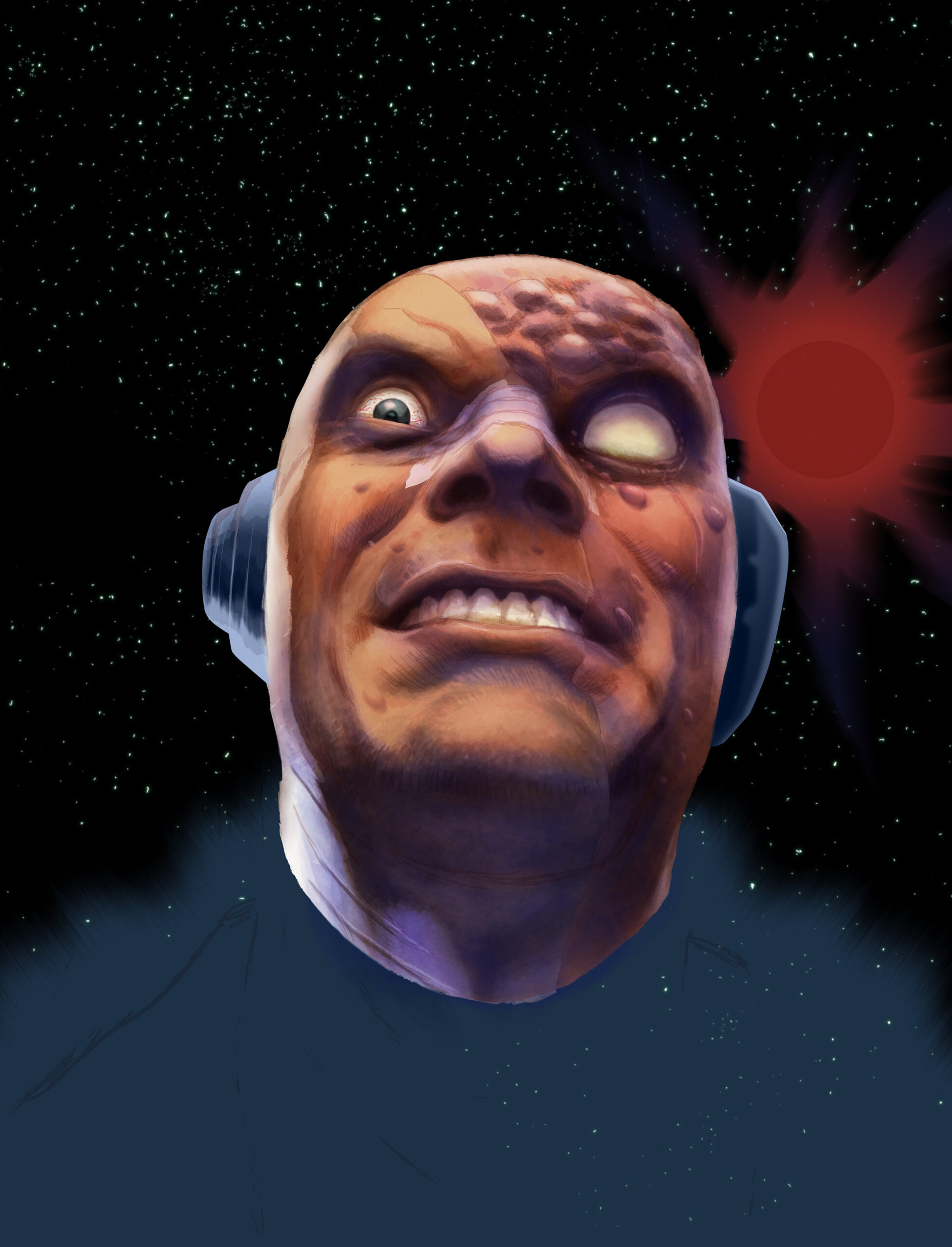
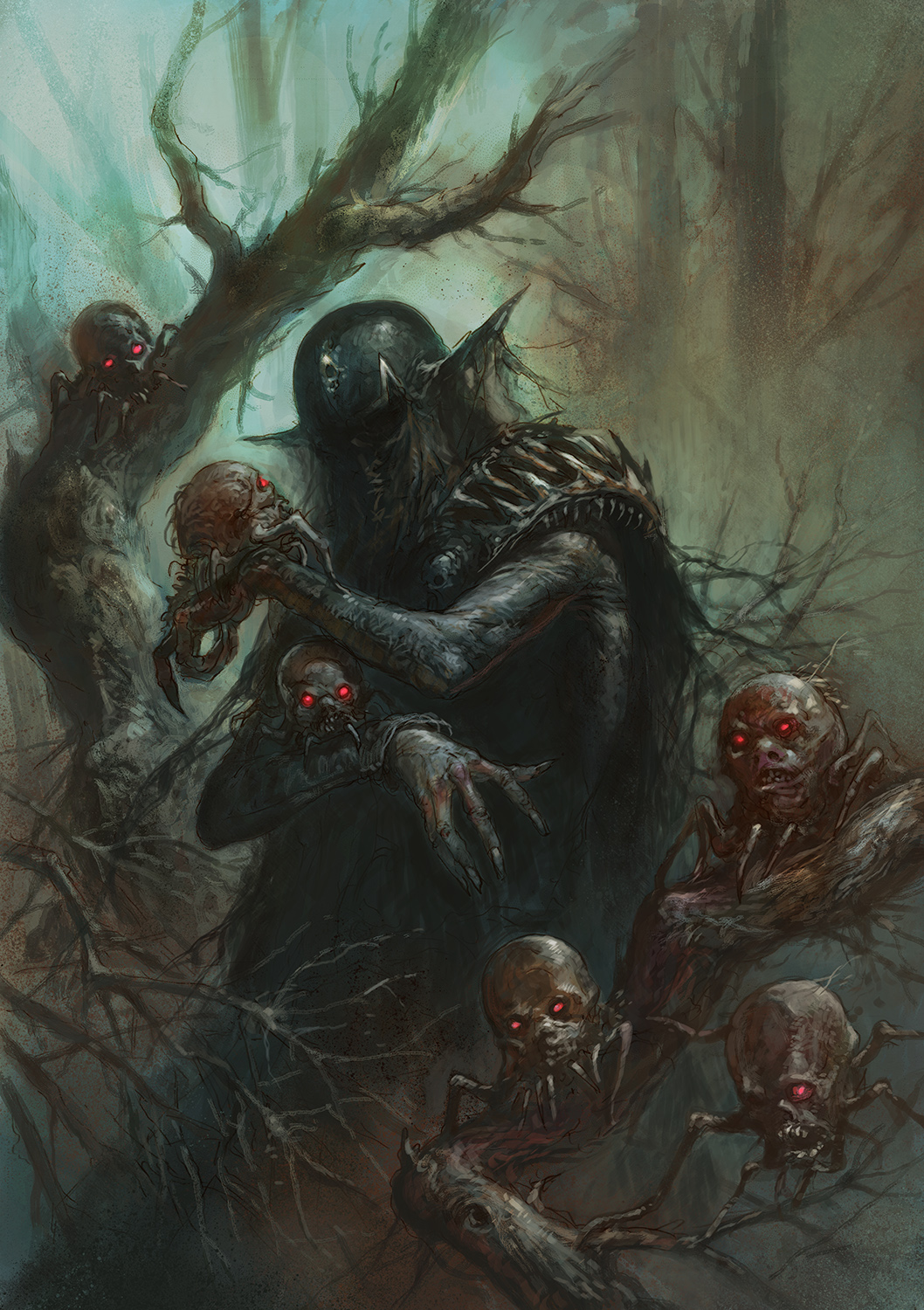
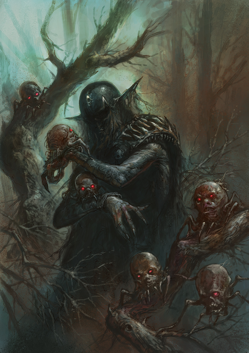
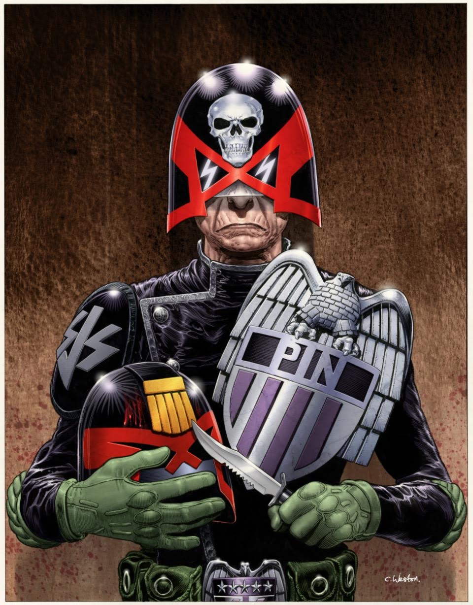
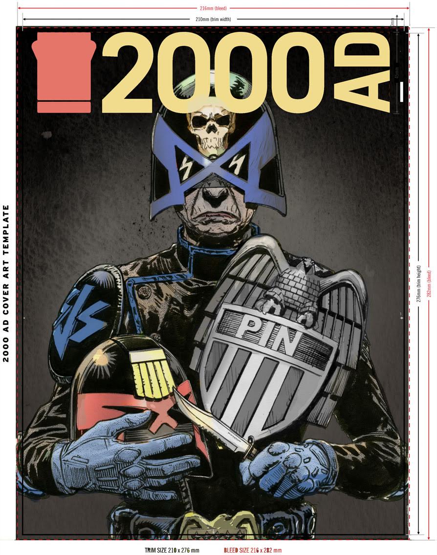
Who judges the judges that judge the judges, eh? I don’t know but they ruddy well need to have a look at Judge Pin! This highly strung SJS judge is currently performing her role with just a little too much zeal, murderously judging those she feels don’t live up to the badge! Will pin be a thorn in Dredd’s side?

This fantastic new character has been brought to us by Rob Williams and phenomenal series artist, Chris Weston in the new Dredd thriller, The Fields.

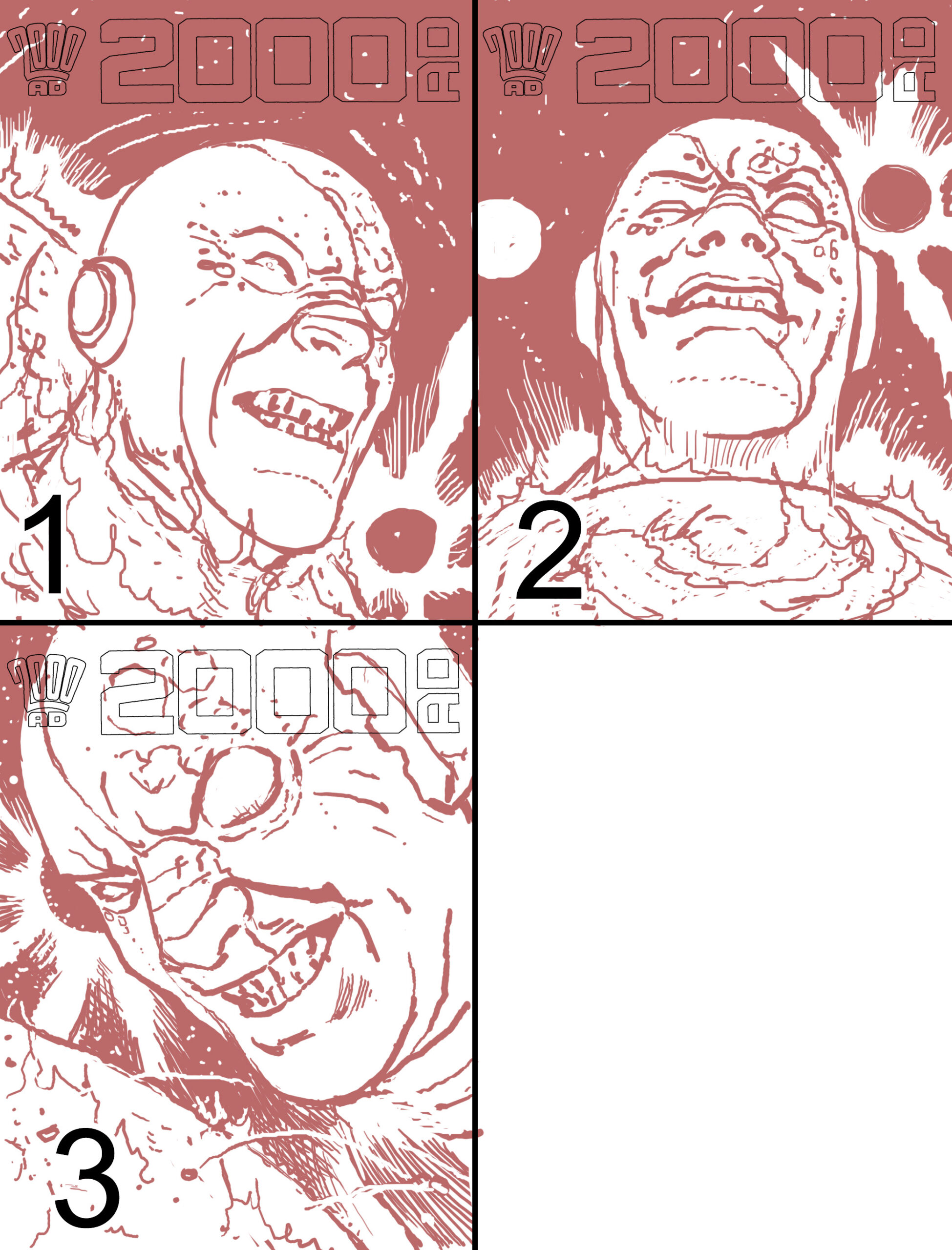
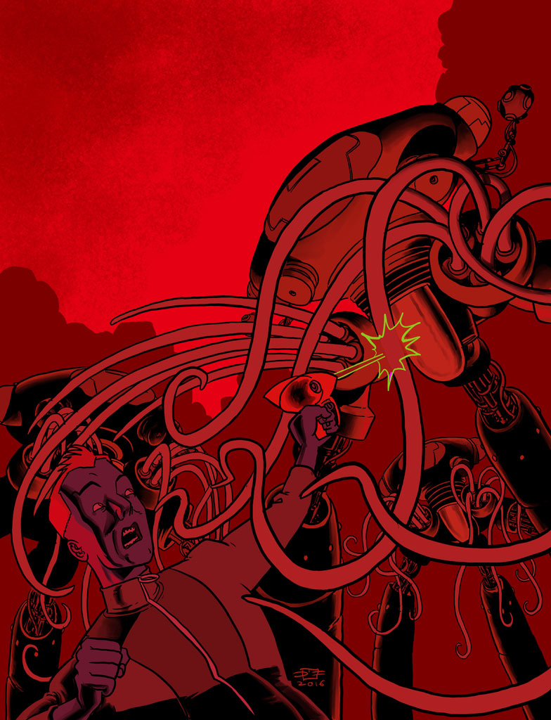
I asked Chris to talk us through the creation of this terrifying cover, he said “Tharg provided the artistic brief: “Something quite sparse – a creepy, spot lit image of Pin holding a bloody knife in one hand, and a Judge’s helmet in the other. “

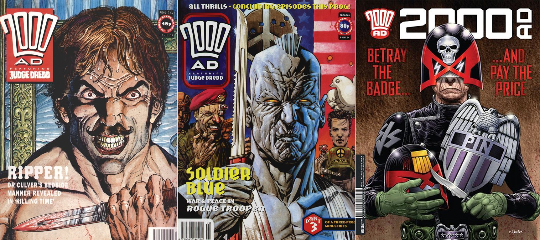
(Incidentally this marks my third 2000ad cover to feature a large figure-shot of a character with a knife: see also my Indigo Prime Ripper cover and Rogue Trooper cover from over twenty years ago. The trilogy is complete!)”

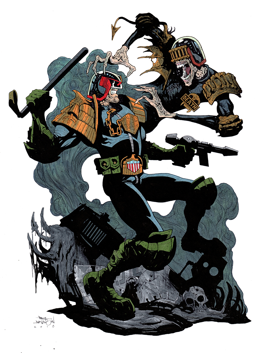
I’ve put together the blade trillogy below, it’s a nice representation of Chris’ artistic development. Those other two covers are 26 and 23 years old!

Knife to see you, to see you, knife!

Chris continues “The first thing to do was get my reference material, which meant my wife once again reluctantly posing for a photograph. But I think it’s great that Karen is gracing the cover of the Galaxy’s Greatest Comic on the week of our 20th wedding anniversary! It seems appropriate!”

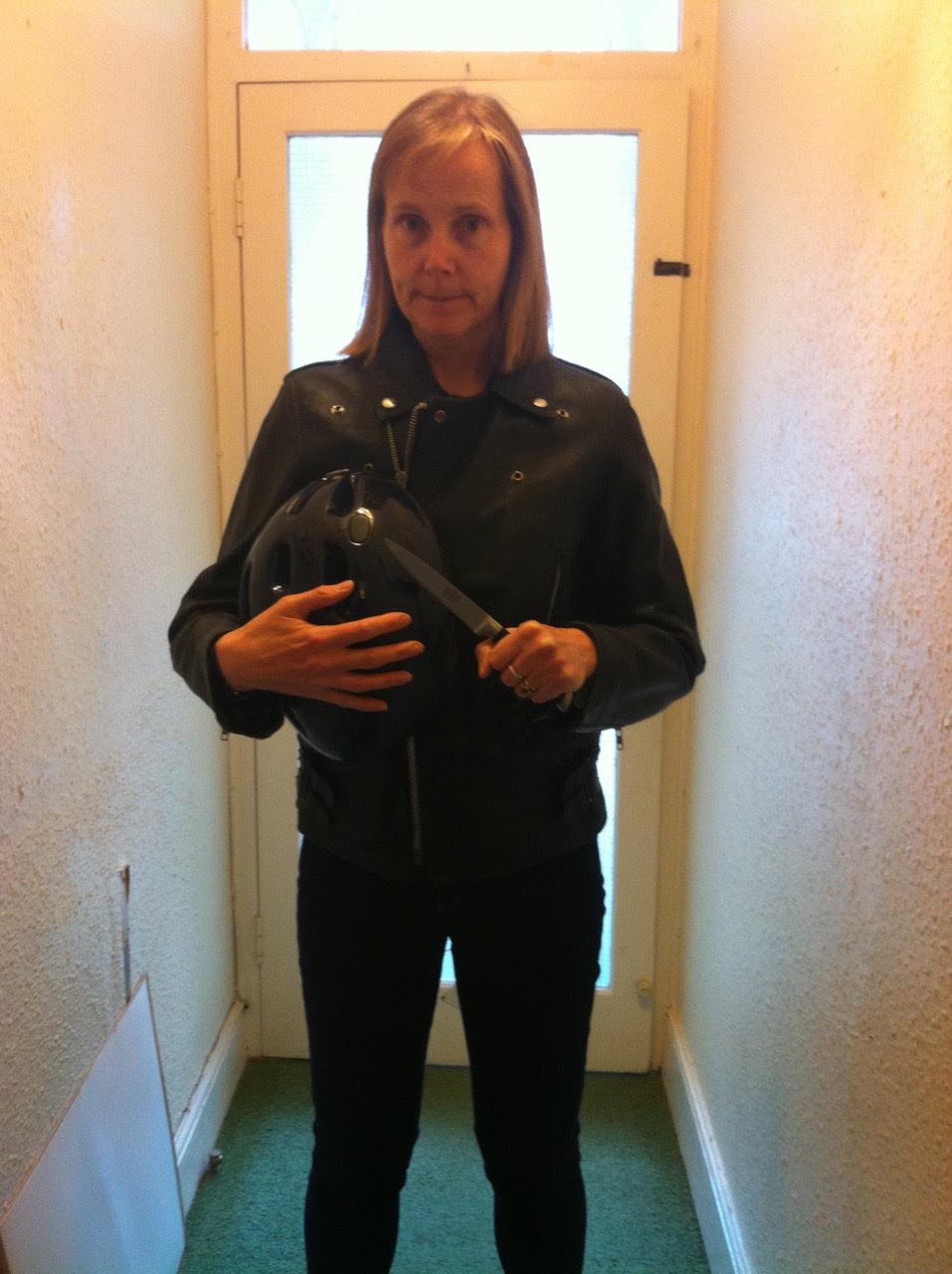
That time when Chris forgot his wedding anniversary…

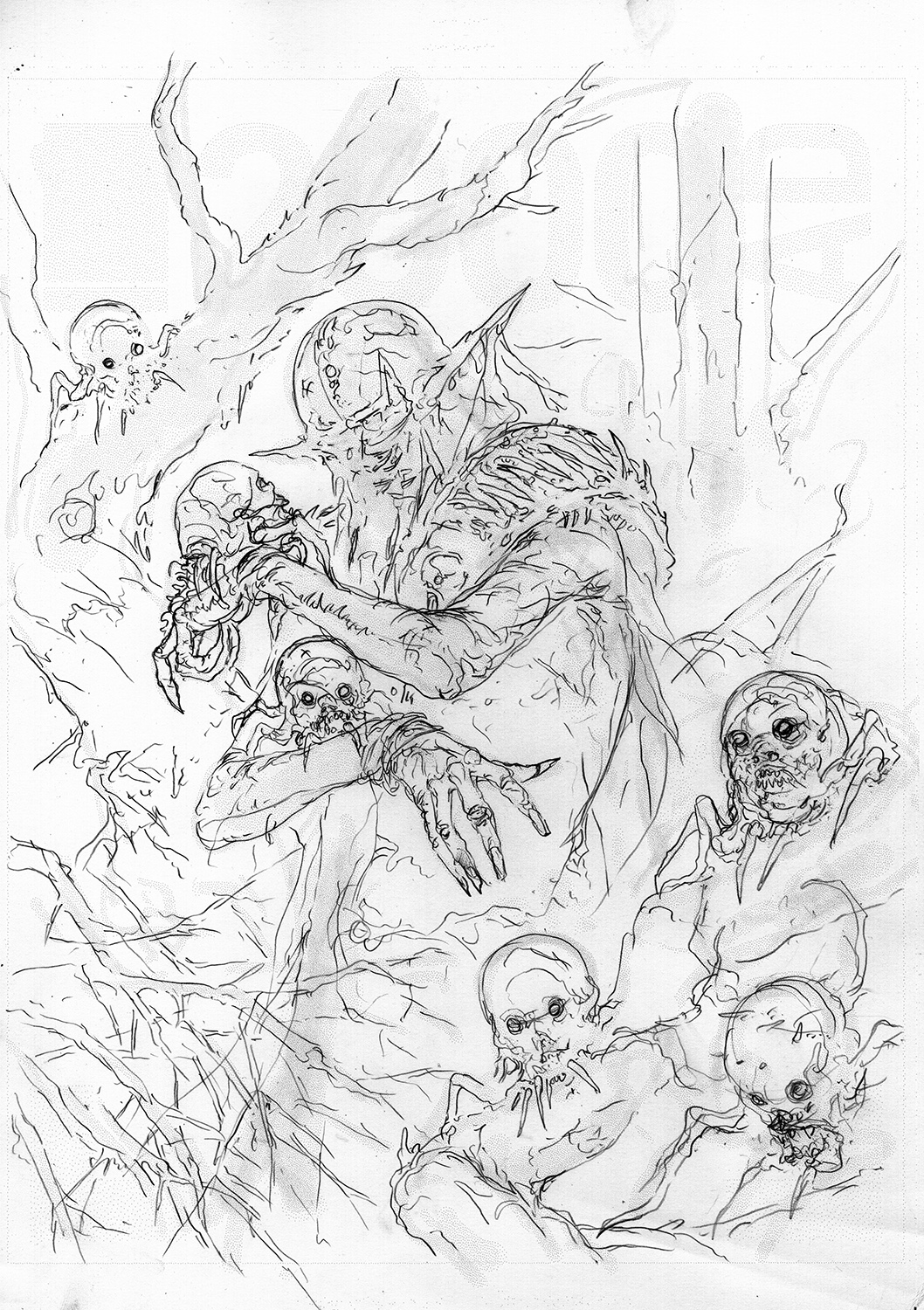
Chris lets us know a little about the ‘inspiration’ for this nasty little character “With my reference in hand, I then produced a prelim of Judge Pin in all her murderous glory. I “May” have looked at some photos of a prominent politician for more inspiration…
Possibly one known for making dramatic “cuts” to the police force, who can say? We all know S.J.S stands for Strong, Just and Stable, right?” I don’t know what he’s talking about…  

Highly Strung and Unstable?

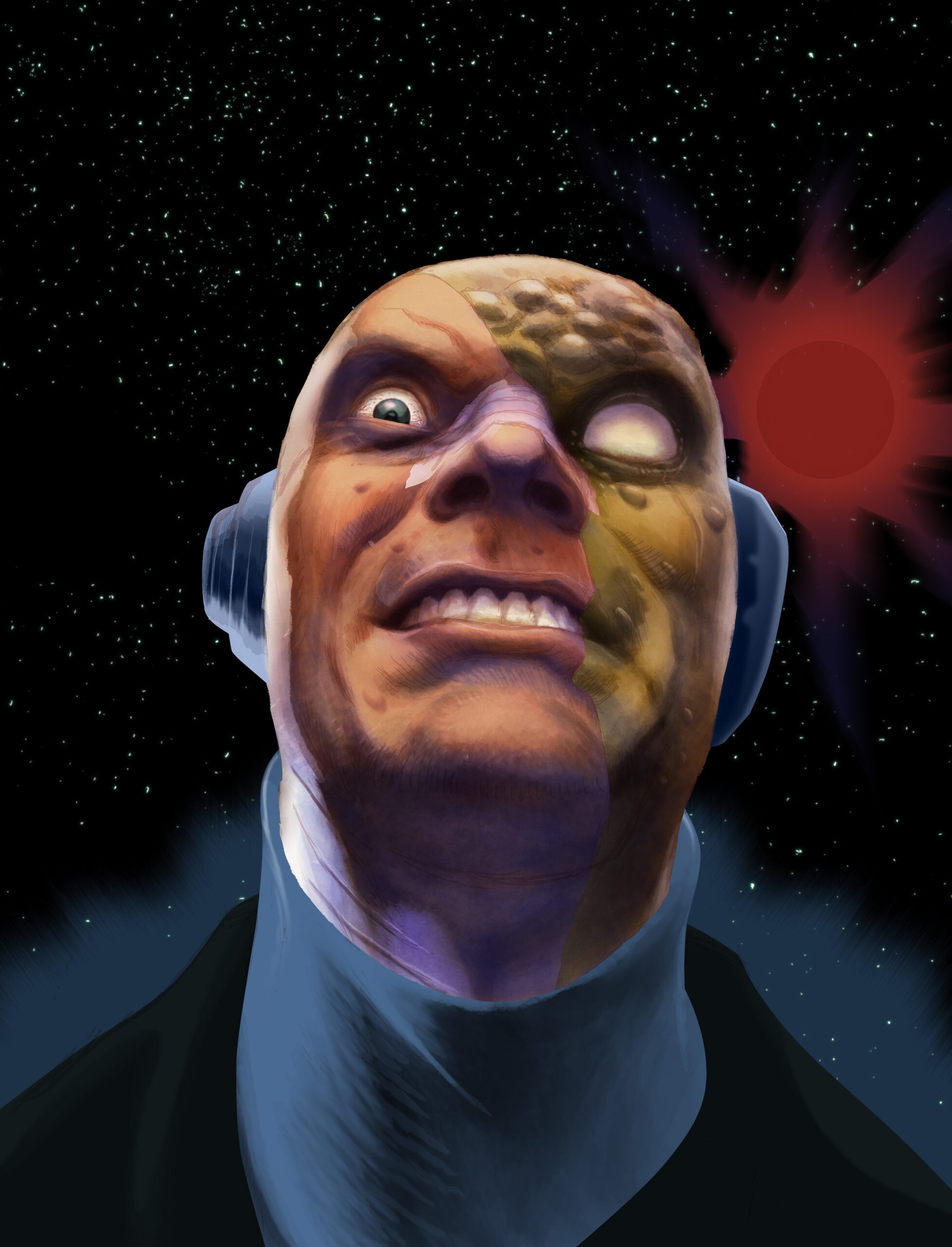
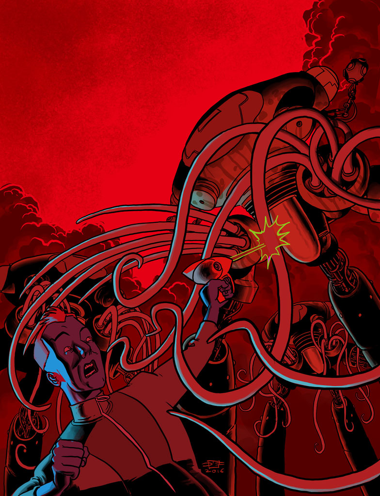
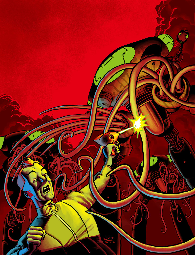
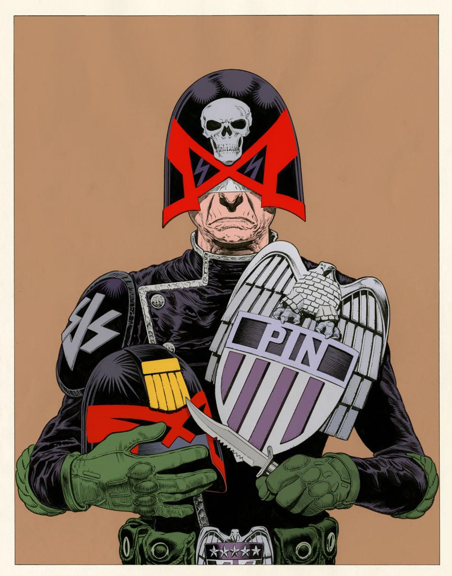
Next Chris looked at colour choices for the uniform; “I wasn’t entirely sure what colours the SJS ere sporting these days, so I provided Tharg with a couple off choices to pick from. I really liked the blue trim on the helmet, but that was too much of a departure from previous continuity. Soon after this, Dylan Teague, THE colourist had turned in his finished work, and I felt it was better to stick to the colours he chose. They were a combination of the two roughs I supplied anyway, so it was no hardship.”

I’m loving the blue, that’d look great in Brit-Cit…

The thin blue swine?

“You’ve got red on you…”

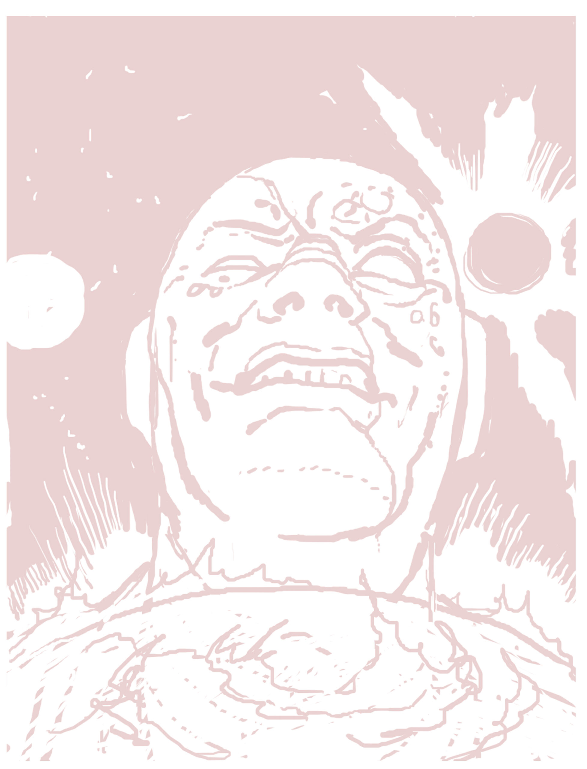
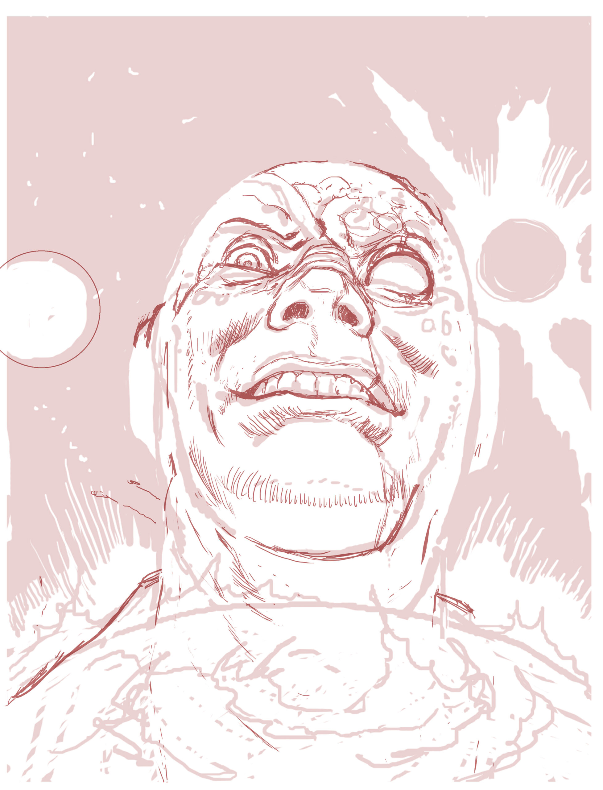
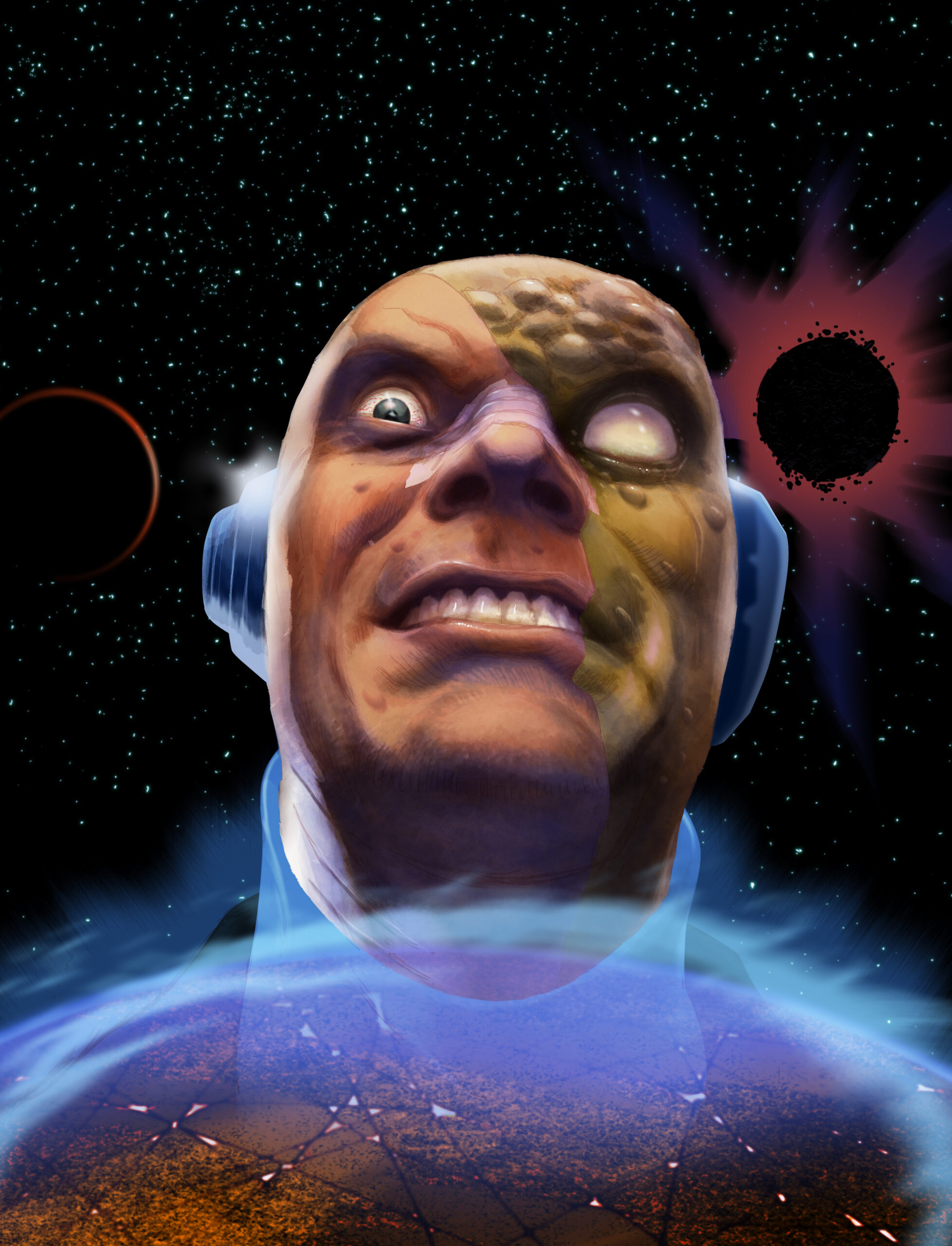
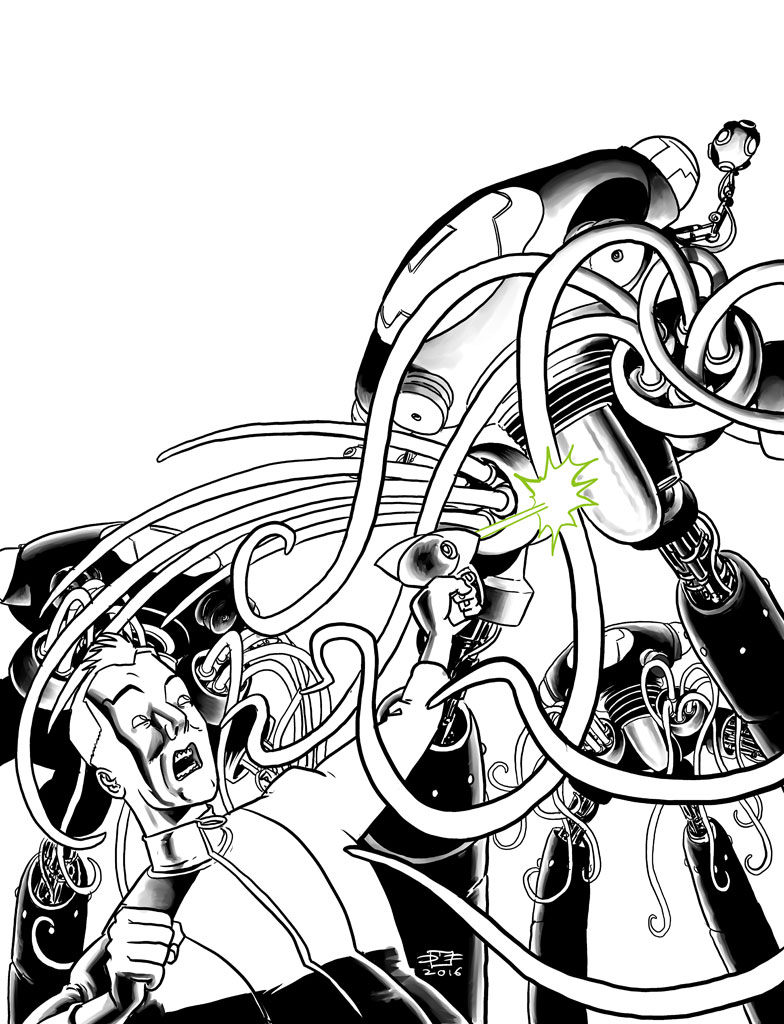
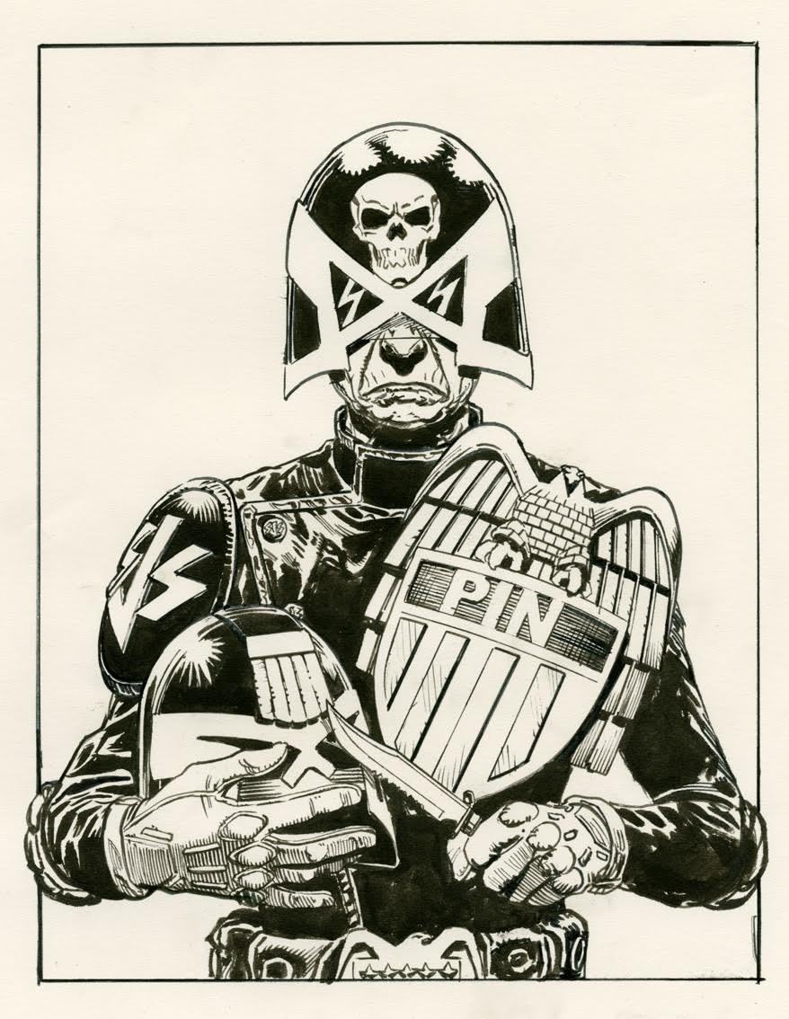
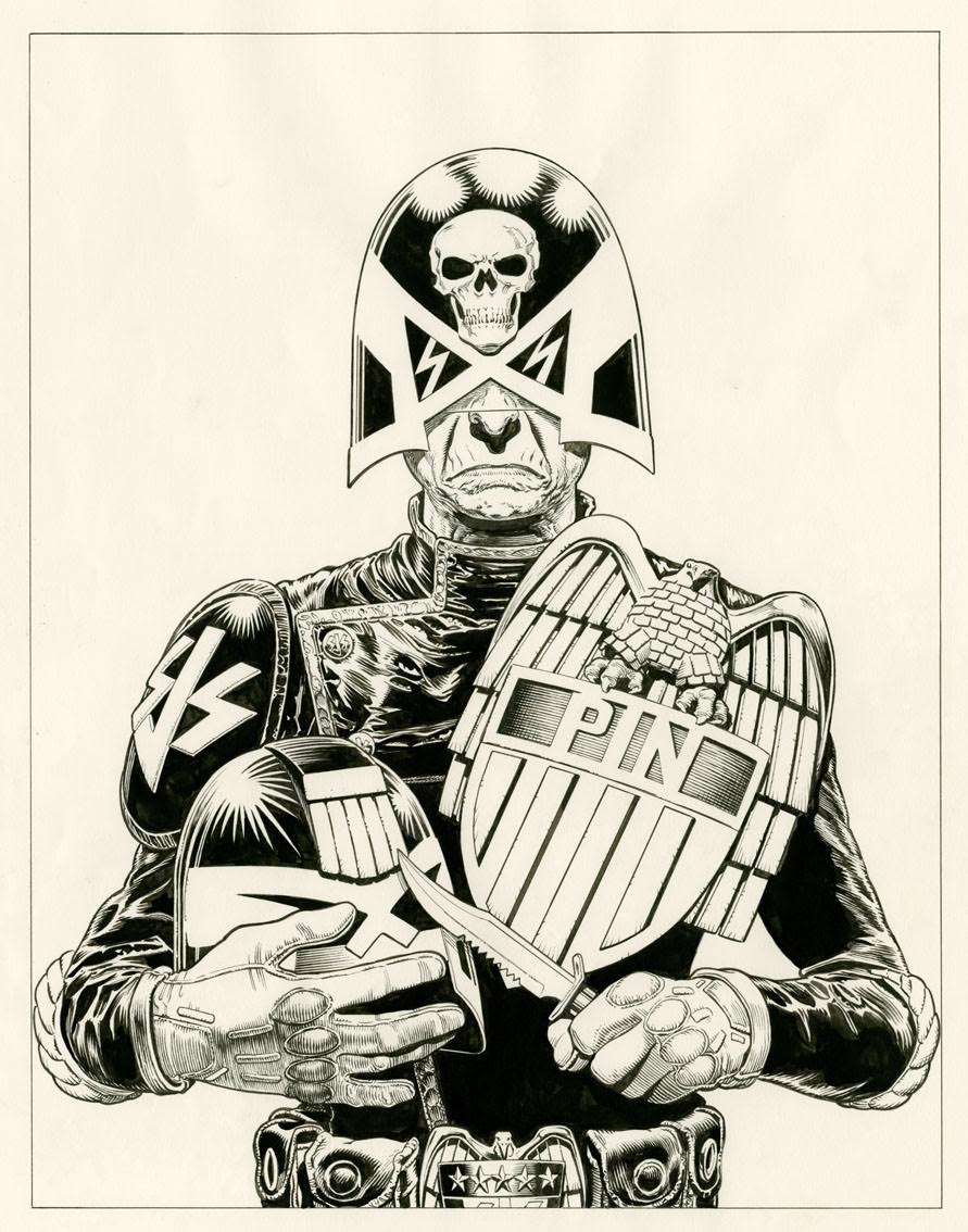
“With the rough approved by Tharg, I then proceeded to ink up a tighter version of the figure. These days I scan the art in full colour and don’t bother to bitmap or threshold the image because I like the paper textures and the brush-strokes to be visible on the printed page. It gives it a more organic hand-produced quality.”

“Pin pin!”

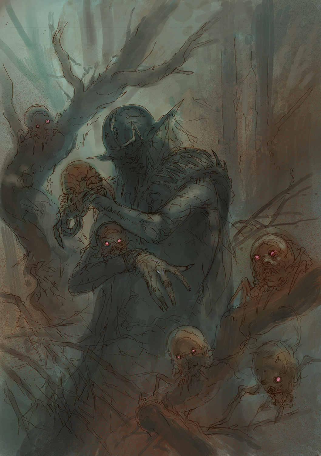
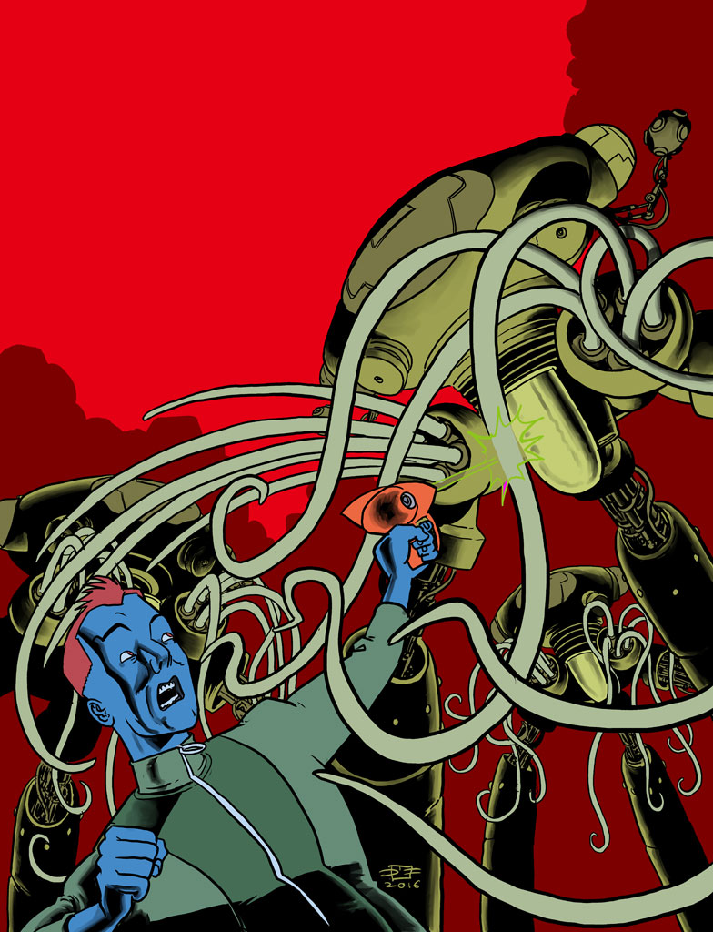
Next Chris begins to digitally colour the image “I then produced a layer made up of flat colours, which I use as way of selecting the desired areas I wish to colour. I actually quite like the look of this flat, coloured art. It looks like something out of a European comic book. One day I may just do a strip in this style.” Yes! Yes! Yes!

Chris is very talented in the art of flatulence

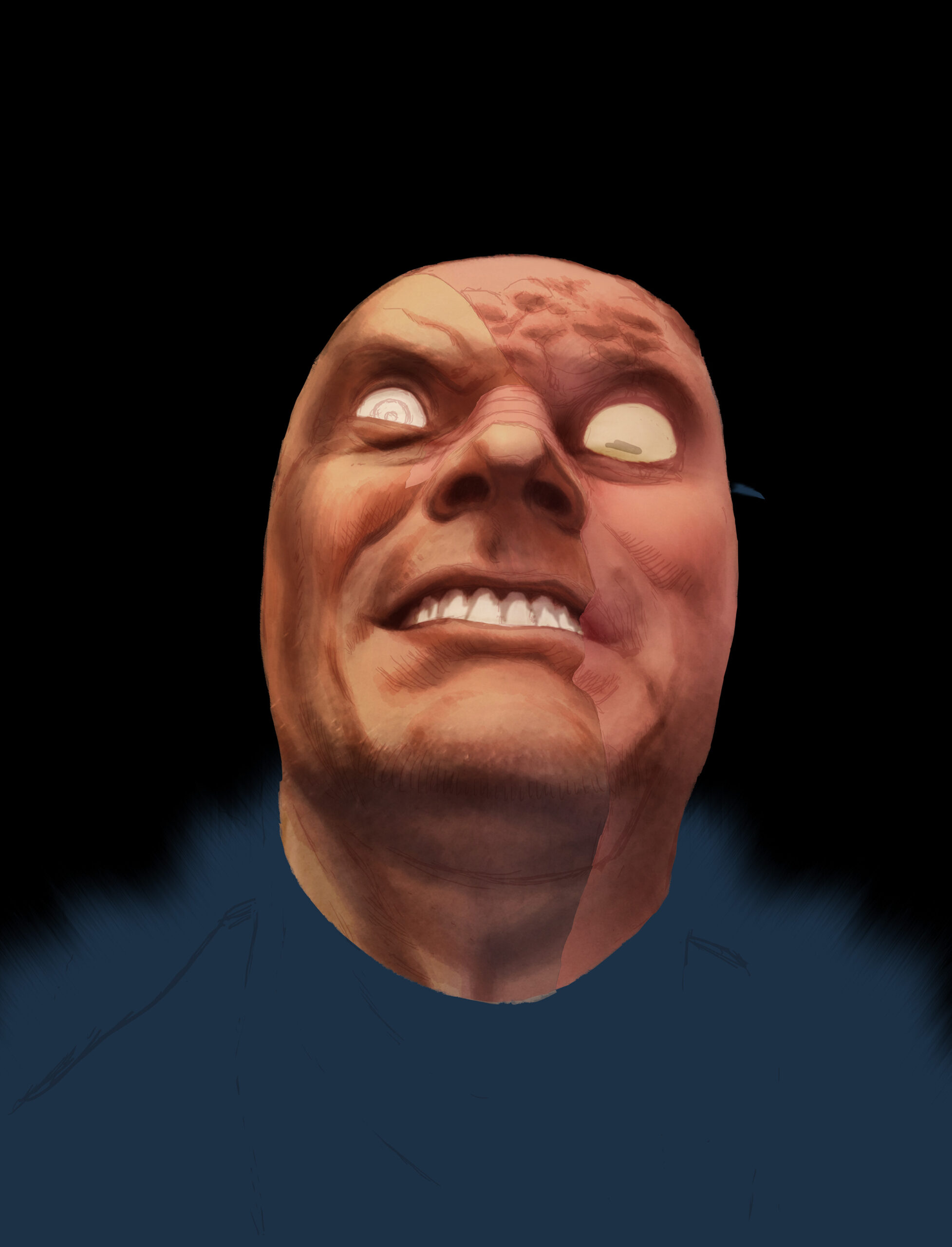
“Now I just began the process of modelling the figure in Photoshop; building up the colours to produce shade or subtracting them to make highlights.”

Pin prick?

Until finally the image is complete “Eventually, I look up at my clock and realise I’ve spent far too long on the job, and for the sake of my own bank balance, I should knock it on the head and move on to the next assignment!”

She has such pleasures to show you.

Phew! There we have it, one of the most sinister covers to feature on the Prog for a long time! Huge, huge thanks to Chris (and poor Karen!) for the images and excellent commentary, both social and artistic! 

Chris is truly one of the 2000AD greats and it’s always an event when he appears in and on the Prog. I’m very excited (and a little bit scared) to find out more about Judge Pin, how will she feature in Dredd’s future?

Posted on

2000AD Covers Uncovered – General Knowledge!

Behold, the most hated individual on Nu-Earth and beyond, brought to us by the brilliant Richard Elson. This zarjaz cover of Prog 2034, which contains part two of the current Hunted arc, Furies, shows the Machiavellian monster desperately plotting and scheming to keep one step ahead his ever increasing number of enemies. Insert your own timely politician joke here Earthlets!   

While no less scrotnig, the digitally painted cover is quite a departure for the Elson droid, whose work normally features bolder, cleaner linework. I asked Rich about this, he said “Yeah, it is different; I’ve had a few attempts at digital painting now and I keep coming up against the same problems. I think I need a different approach. I used a ridiculous 54 layers and 10 channels on this one!” Well I for one say it’s worth it, when the results are this striking!  

I asked Rich to take us through the creation of the cover and he very kindly sent a tonne of images. He said “Series artist PJ Holden kindly gave me some background information and provided extra refs of his work on the strip – that was a big help in working out what has been going on with the TG’s face since we last saw him!” Yes, the poor bloke wouldn’t win many beauty contests would he?

Rich continues “Below are three roughs based on Tharg’s idea of the TG looming above Nu-Earth…”

TG spent hours choosing his Tinder profile picture. 

“And here a scaled up version of the chosen rough.”

The Traitor General prepares to tuck into a giant meatball.

Rich continues “Next I start tightening up a few details on the rough before starting to paint…”

TG was never a very good teacher, he only had one pupil!

“Next I mask off the two distinct areas of the TGs face so I can work on them separately…”

TG was a big fan of The Phantom of the Opera.

“In the next two images you can see me working up the skin tones. First the left side…”

TG loved pampering the right side of his face with a nice mud pack.

“Then the right.”

TG has had his Ready Brek!

“With the skin tones done, I begin adding a few details and lighting…”

Try the Milli-Com Nazeaway – Gets rid of unsightly nasal and ear hair fast!

“Now I begin adding in the background.”

During his brief, ill-conceived foray into stand up comedy, it was the rotten tomato that finally made the Traitor General storm off stage.

Rich continues “Then I go back to more skin tone work.”

Erm… remember folks, it’s what’s on the inside that counts!?! 

“Next I take on his clothes and recolour the unreconstructed half of his face.”

It was cold in space so TG’s mam made sure he wore his turtle neck sweater.

Finally, an alternative version of the image used on your Prog. Rich explains “The last stage was adding in the planets and black hole. I just realised, I actually didn’t submit this one in the end. I went for a less transparent Nu-Earth as I thought there would probably be a caption over that area and it might be difficult to read if the planet wasn’t so clear. Now that I look at it again, all I can see is the things I didn’t do that I should have done, so I’d better file that one away for a bit before it really starts pissing me off!”

I’m sure you’ll agree that Rich shouldn’t worry and the cover looks amazing on the Prog!

Otto Sump’s better looking brother.

Many, many thanks to Rich for sending the images and run down for the cover. It’s a fantastic painting that really encapsulates this awesomely disgusting character! 

Posted on

2000ad Covers Uncovered – Hot Digidelic Rod!

“Now that’s Hoverod racing!”

Praise be, as the mighty Brendan McCarthy returned to Prog 2032 for the high octane Dredd tale, Hoverods! The maestro of mutie motor mania, who many will know was the co-writer and designer of 2015’s excellent Mad Max: Fury Road movie, brings us an explosive vision of carmageddon on the cover of Prog 2033! 

The Hoverods strip focuses on a group of wayward juves who are taking part in an illegal drag race in the Cursed Earth against the immoral pertol head, Sick Pete. What could possibly go wrong?

As ever, Brendan blows our circuits with his unique ‘Digidelic’ style, which, of course, fits perfectly with the crazy, unpredictability of the Cursed Earth and its villainous denizens!

Below we see Brendan’s sketch for the cover – I love the energy that bursts from the image and the cool suggestions for taglines – ‘Go Dredd Go’ indeed!

Dredd grimaces as his Hoveroids give him gip again…

Brendan says the cover was ‘Based on the early poster for Death Race 2000, the Carradine one‘ which Squaxx will know was part of the inspiration for the look of Judge Dredd himself.

Frankenstein took a shortcut through the doughnut shop.

I asked Brendan about his co-colourist for the strip, having spotted Dom Regan in the credits box in the Prog. It seemed odd to me that a colourist would be used on such a distinctive artists’ work, let alone be expected to get onto the head of someone with such a strong sense of style! Brendan said “Dom coloured episode 2 of Hoverods. I then went over it and tweaked stuff and turned it more ‘digidelic’!” 

Below is a finished version of the cover – Eagle-eyed readers will notice that this is an alternative version of the published cover, can you spot the difference?  

Roadhog!

And there we have it, an inspired choice of artist for an excellent Dredd tale! As Brendan himself says “After Mad Max, I guess I’ll be the go to ‘Hoverods’ artist!” Well, there’s no argument from us on that score! 

Huge thanks to Brendan for sending the images, be sure to visit his site here: http://artbrendan.com/ 

Posted on

2000AD Covers Uncovered – Freak out! Le Reek, c’est Chic!

Prog 2033 sports this action packed cover by the brilliant Paul Davidson! The image shows young Daniel Foe taking on the terrible Diehard Reeks with only his unshakable faith as a weapon. Can Titus Defoe save the boy in time or will he end up as worm food like his poor mother and brother before him?

I asked Paul to take us through his process. Very much the traditionalist, Paul approaches his work using good old fashioned pencils, inks and felt tips. Over to Paul… 

“Tharg had something very specific in mind, so I pretty much nailed it on one sketch!” which is lucky for Paul; the mighty one isn’t known for his patience and it would have meant a ‘ten minute work out’ with Mek-Quake if he had not… 

On this early pencilled image, you can see the stench coming from young Daniel’s pants where he has soiled himself…

Paul continues “Then it was out with the inks…”

“Hello Mr Christian. Can I eat you please?” Ooops, wring strip…

“A couple of hours later…”

“A little help please, Mr Defoe!?!”

“On with the colour…”

“Show him your cross!” “Cross!?! I’m bloody livid!”

Paul continues “More colouring in with the felt tips…” Ah yes, what could be more relaxing than spending an afternoon depicting the impending, grisly death of a minor by a horde of evil, undead ghouls… 

“Excuse me? I wonder if you have five minutes to chat about the Lord?”

And finally, the image is done, wow!

What does a vegetarian zombie eat? Graaaains! (Sorry!)

And here is the final image for your enjoyment, I suggest you don’t look at it while eating your tea…

Die Hard 1671: A Good Day to Reek Hard!

So there we have it. I love this cover, which set my usually trustworthy artist detecting circuits haywire. With that composition, the colour choices, the hair of young Daniel, I instantly thought it was the work of the Ezquerra droid, all that was missing were the little dashes around the characters! I can’t think of a higher compliment than that!

For me, Paul is certainly one of the most exciting artists around at the moment and I’d urge everyone to check out his website (and awesome blog) here: http://www.pauldavidsonart.com/ He has a dazzling range of styles which are simply glorious! Check out this brilliant Dredd vs Death image…

“Stay still and take your drokking beating!”

Once again, Dredd wished there was a ‘Breath mint’ setting on his lawgiver…

Huge, huge thanks to Paul for once again stepping up for 2000AD Covers Uncovered. Here’s hoping we see more covers from this exciting art droid soon!

Posted on

2000AD Covers Uncovered – Venus Fly Scrap!

Earth strikes back! The forces of Earth, with the help of Ahron, Ikarus and Sohna, have stuck a major blow against the occupying Alien forces on Venus. Series artist D’Israeli brings us yet another stunning cover, beautifully highlighting the forces of Earth’s hit and hope ‘Scorched Venus’ policy.

As ever, D’Israeli was kind enough to send a wealth of images and information about the cover, he said “As usual we started with a brief from Tharg-In-Residence Matt Smith; the idea was to show a formation of Earth fighters firing missiles over a Venusian city as a hug explosion goes off in the background. Unless otherwise stated, all work was done in Manga Studio/Clip Studio Paint MX 5.”

“The previous episodes had contained quite a few shots similar to the brief, and I’d already built 3D models of the fighters so I could draw them consistently. They were loosely inspired by the “Sky One” fighter aircraft from the 1969 Gerry Anderson TV series UFO…”

Believe in Better

“Since I’d done a lot of work like this already, I took the unusual step of starting by playing about with 3D models – I had a pretty clear idea of the composition I wanted to achieve, and it was as easy to get it by moving models around as it was to draw roughs and then move models around.”

We can only hope that D’Israeli makes ‘Neeeeoooooowwwww! Pew! Pew! Pew!’ noises while he plays with these models…

“Below is the cover rough sent to Matt Smith. I often do two or three, but in this case the design was very clear and I was also in the middle of the last episode with the deadline roaring up on me like a Jurassic Park tyrannosaur seen through the wing mirror of an electric jeep. The colour scheme had been established in the story already, so I just went with that as it was nice and dramatic.”

Is it still called a Dutch Angle when it’s on Venus?

“Here are the pencils. Once the rough was approved, I stripped out the outlines from the roughs, faded them down a but and used them, superimposed over the same model rendering, as the “pencils’ for the finished piece.”

Apocalypse Now!

“On a new layer I inked the aircraft and on yet another the red flames from the rocket launches. It’s always best to keep everything separated out as much as possible to allow for corrections or changes, so I routinely end up with dozens of layers. The background explosions and city buildings were to be done as “colour holds” (coloured outlines), so I took a slightly different approach with them…”

“Stay on target! Stay on target!”

“Flat colour next! By dropping in simple flat colour I could better judge what colours the background outlines needed to be. Using coloured outlines for the background helps to “pop” the planes forward and smart a sense of distance.”

“I inked the explosion in red first, filled it (on another layer – the Paint Bucket Tool in both Manga Studio and Photoshop can use outlines on one layer to constrain a fill on a different layer) with orange and then “greebled” in the details of the city buildings behind the explosion. Having the dark green to work against let me see more easily what colour to pick for the building outlines. I use the term “greebling” for noodling in fine detail like buildings or mechanisms as a nod to the use of the word “greeblies” by the special effects house ILM to describe fine detail pieces used to give a sense of scale to models. The greebling here was quite tough as the foreground greeblies were identifiable things like doors, windows, roofs and even tiny figures, but the stuff near the horizon was basically just scribble designed to hint at lots of buildings below the resolution of the eye. Deciding at what point to go from recognisable detail to texture is a bit tricky, and you’re always tempted to switch a bit too early when your hand starts getting tired!”

“In this cover, as with the matching scenes in the strip, you’ll notice I use columns of smoke to eat up as much landscape as I decently can to reduce the amount of greebling necessary.”

D’Israeli’s Greeble wobbles, but he doesn’t fall down!

“The flat colours on the background and explosion are either midtones or shadows, so I just needed to add highlights to make them look 3D. For some reason I find it easiest to start with a mid-tone and add highlights and shadows; as a result I’m more comfortable with acrylics or gouache than watercolour when I work with real media. I also added a shadow tone to the planes to make them really stand out from the background explosions.”

“Smoke me a kipper, I’ll be home for breakfast!”

“Finally I add highlights to the planes. They’re already standing out well from the background, so I add the minimum of highlights to keep them separated while also giving the impression they’re 3D objects lit by the blast from below and the flashes from the missiles.”

To experience the cover in its full glory, you must join in with the Dambusters March. All together now “Dah! Dah! Dah! Dah! Dada dah, daaaah! Dah! Dah! Dah! Dah! Dah! Dada da daaaah!”

And it’s finished! “At this point we’re done and I export the file from Manga Studio to Photoshop for file preparation and upload to the 2000AD FTP server. Manga Studio only works in the RGB colour space so I convert the file to a CMYK TIFF for printing. Photoshop has particularly good controls for this, and in fact it’s about the last thing I still use it for.”

Huge thanks as ever to the wonderful Mr Matt Brooker, AKA D’Israeli for once again sending such wonderful images and info. Greebling eh? I’d never heard of that before! I love this cover, it really does give off a Star Wars/Dambusters vibe and I love the way the fighters have penetrated the smoke trails, it really adds a kinetic energy and atmosphere to this already brilliant piece! All hail D’Israeli!

Posted on

2000AD Covers Uncovered – FCBD: Thrills of Future Past!

Saturday 6th May is Free Comic Book Day and once again, Tharg the Mighty has ordered his droids to put together a free prog that is absolutely throbbing with Thrillpower! The Prog contains a brand new Judge Dredd tale by Matt Smith and Phil Winslade, a treacherous Blackblood romp by Pat Mills and Kei Zama and Dan Abnett and DaNi bring us a berand new Judge Anderson Strip featuring a classic MegaCity villain! Add Kek-W and Dave Kendall’s Deadworld to the mix and a dash of Guy Adams and Jimmy Broxton’s Hope and you’ve got a series risk of Thrillpower Overload!

There are few artist’s with the chops to do justice such a Scrotnig package. Enter, the legend who is Mike Perkins! Mike first appeared in the Galaxy’s Greatest twenty four years ago and has since worked on fan favourites such as Carver Hale, Tharg’s Future Shocks and Vector 13. 

Mike was kind enough to send us his cover process for the issue. Over to Mike…

“My brief for this cover was “Something along the lines of X-Men : Days of Future Past – perhaps with progs in the background” I opted to put some of the characters featured in the Free Comic Book Day prog in the background (it gave me the excuse to draw Tapper Hag – C’MON!!) accompanied by some of my favourites!”

Below is Mike’s glorious rough…

Mike risks a Rigellion Hotshot by putting Tharg on the wall of shame!

Mike continues “Once the pencil rough was approved I moved straight on to the black and white inks – following on with the colours…”

Rot that pesky Invisible Man!

Jaegir? Bombed! Blackblood? Scrapped! Hag? Trapped! Death? Dead! Slaine? Slain! Mortis? Bleached! Nun in a Gasmask? Wait? What!?!

“Initially we decided to put various progs in the background to emphasize the history of the comic and I provided 3 versions – a faded background, a full colour background and, my preference, the black and white background…”

The PWLS droid suffers thrillpower overload at the sight of so many covers!

Dredd and Anderson in desperate need of some comic storage boxes.

Exed Men

“I also provided the artwork without the background there at all as I felt it was becoming a little too busy – especially when adding the text. Tharg – in his divine beneficence – decide to opt for this one and added the solid yellow behind in order for it to “pop” off the shelves…”

That bit in the bottom right is giving Anderson flashbacks to her Boing(R) coffin…

And pop it does! Mike has provided a fantastic cover for an excellent prog! In closing, an ecstatic Mike said “After all these years – my first 2000ad cover! May there be many more!!!” With a cover of this quality, I completely agree!

A huge, huge thanks to Mike for sending the images, they’re brilliant! Be sure to check out more of his work on his official site at http://www.mikeperkinsart.com/ 

Be sure to pick up your free Comic Book Day Prog this Saturday Earthlets!

Posted on

2000 AD Covers Uncovered – If You Go Down To The Woods Today…

Dear me! The TeenyMeks haven’t aged well have they?

Welcome to 2000 AD Covers Uncovered which this week explores the making of Cursed: Fall of Deadworld‘s artist Dave Kendall’s terrifying cover of Prog 2029. The cover shows Senior Judge Fear and his chilling agents of intrusion on a jolly jaunt in the forest…

Dave sent copious notes and process images for this cover, so let’s begin by thanking him very much! He said “This is the first time one of the major four dark judges have directly intervened in the Deadworld plotline. They’ve lurked around the outskirts up to now pulling strings behind the scenes while the lesser Grey Judges carry the load.”

“I really wanted to do the cover for this issue. So although trying to crack the deadlines on the strip I managed to fit the time in to this. In this issue we have a new use for Fear’s shrunken heads. Under the influence of dead fluids they become spidery things with the power to infiltrate and worse. I probably came up with the idea after watching Despicable Me, when robotic cookies break into a vault. I’m not sure Fear does home baking so I plumped for his heads. I have to mention Kek-W, my partner in crime. He is a most generous writer. I’ll come out of research and development with these strange ideas and he jumps on them with relish. I loved the use he found for these heads. I hope they are as creepy to read as they were to illustrate.”

“In the story Siren is waiting in a blasted copse of trees observing the Wall where Jess and Fairfax are holed up. Fear makes a rather ghostly appearance among the trees. So that was the simple premise for the cover. First up was a quick digital rough…”

“Tuck into the bisssssscuits of Fear!”

Dave continues “Tharg was happy with this direction. I’d sussed out many of the compositional elements at rough stage so it was a case of tweaking and refining the drawing.”

Dunkin’ Heads?

“As this was going to be digitally painted, like the strip, I didn’t go over the top with rendering all the shadows in this line version.”

“Next stage was a quick underpainting to establish mood and atmosphere. I really like the mistiness of this but the cover needed to Pop a little more.”

Dave’s underpants, disgusting! What? Oh… sorry, underPAINTS.

“The next stage was rendering this up to a finished state…”

Scary, Scary, very contrary! How do your shrunken heads grow?

“Tharg was happy with this, but felt the background needed to be lightened, to increase the POP.”

Fear shall have no Minions!

And there we have it, surely the making of one of the scariest covers in 2000AD’s rich history. A huge, huge thank you to Dave for sending such detailed and interesting notes, this one has been a blast!

So, next time you’re alone and you hear faint noises… perhaps one of Fear’s evil little critters is watching you…

Posted on

2000 AD Covers Uncovered – Venus Bluegenes

War! Those pesky ‘Martians’ are constructing a contraption to block the sun’s rays, wiping out the entire solar system! This devious plot has finally prompted the nations of Earth to come together as one to launch a final offensive against the occupying alien menace on Venus! Meanwhile, on the surface of the planet, Ahron and Ikarus frantically search for a way to wipe out the alien threat. Oh-laaaa indeed!

I asked King of Covers, D’israeli to tell us how he crafted this latest masterpiece. He said “This was a weird one – I’d just finished Scarlet Traces: Cold War series 1, Tharg very kindly gave me a cover for series 2. However, Ian Edginton’s series outline wasn’t in yet; we’d no idea what it would be about, beyond the fact that Ahron and Ikarus would be in it. So Matt came up with a generic “Ahron fending off tripods” concept, and we took it from there. This also explains why I didn’t do my usual three roughs for this one – I submitted only the one you see, and that went through.”

“I started by arranging the tripod models I’d made for the first series in an appropriate composition to make up the background of the image. The original HG Wells tripods were graceful and organic, like animals, so I just used to draw them by hand, but the new Venusian ones are meant to be a cross between deep-sea diving gear and military tanks, so I made them more clunky and complex, and at that point building a model was the easiest way to go.”

This also works as a basis for Groucho Marx in a chef’s hat.

“The video below gives you an all-round view of the tripod model. I didn’t bother building the legs, as those can easily be drawn by hand; the checker pattern on the finished render helps me to draw in addition details like lines of rivets or oil stains more easily. Missing from this version of the model is a stick that extends from the base of the model to ground level, making sure the tripod is always the same height…”

 D’Israeli continues “The model was imported into Manga Studio, and I traced over it, adding the figure and the tentacles. This is the rough layout approved by Tharg. Since I was kicking my heels at the time, I put a bit more work into this one than usual.”

“Oola! Keep still while I’m drying your hair!”

“Once my rough was approved, I copied the “inks’ from the rough drawing onto a new layer and filled them with pale blue to use as the rough basis for the finished drawing. I also made sure the reference model shot was visible, as I’d be tracing from that when I inked the tripods.”

“Mind the Checkerboard, Ahron!”

“The “pencil” drawing (in red) firmed up the figure of Ahron and fixed the position of the tentacles.”

“Aw, my own little Venusian. I will love him, and hug him, and call him George!”

“Time for the inks. The “ink” outlines to the figure, tentacles and tripods, added using Manga Studio’s Pen Tools…”

“Y-you have a snot hanging out of your nose…”

“I added the “painted” shading to the inks using the Lasso Fill tool to add spot blacks, then the Brush Tool to soften up edges where necessary. The end result should look hand-painted, avoiding the “too-perfect” airbrushed look of much digital colouring.”

“One down, twenty nine to go!”

“The Paint Bucket Tool in Manga Studio has the nifty ability to draw blacks, so it’s much better than Photoshop for putting flat colour under drawings . The Lasso Fill Tool – which automatically fills any shape your draw with your chosen colour, also helps make Manga Studio a fantastic tool for colourists.”

It takes over an hour for the aliens to do the Hokey Cokey.

“Colour-Shading – I added a red tint to the piece; this will be the underlying shadow colour out of which all the other colours “pop.”

A water pistol!?!

Next D’Israeli adds a Colour rim light, he says “This is a blue “rim light” – a light that just picks out the edges of Ahron and the tentacles, pulling them forward from the background tripods…”

While Ahron was busy fighting, Ikarus fired up the sunbed.

“The final step was to put in the bright yellow highlights from the muzzle flash of Ahron’s raygun. These pull the figure away from the background and direct the eye to the main character. At this point I can export the file from Manga Studio to Photoshop for the final file processing and upload!”

The aliens weren’t happy with the Oh La La Land Oscar Mix Up.

Huge, huge thanks to Matt “D’Israeli” Brooker for sending his usual meticulous process notes and images. Watching his artwork take shape is a real pleasure and this series of Scarlet Traces looks incredible.

Will mankind be able to stop the aliens in time? Will Ahron escape his home planet? What will happen to the offspring of Ikarus and Irya? There’s only one place to find out Earthlets!  

Posted on

2000 AD Covers Uncovered – Kroom Harvee!

Who judges the judges? Prog 2027 sees Judge Dredd give his final assessment of Harvey, one of the fearsome, more advanced Mark 8 Mechanismo Units. These new and improved versions of the Justice Department lawbots are no less deadly, yet more empathic versions of the Mechanismo droids we’ve seen before. Has Tek Division got it right this time?

Tharg asked exceptional artist Matt Ferguson to provide one of his trademark ubercool covers for the series and, of course, Matt didn’t disappoint!

Below we see Matt’s rough sketches for the image. In a nod to his sold out Vice Press Block War print and his seminal Prog 1984 cover (a few prints of these are still available over at Vice Press,) we see the law machine against a glorious, ad-free moon! 

Below are Matt’s initial sketches…

Drokking Hedgehogs!

Harvey’s back seat driver didn’t last very long.

The chosen idea is refined for maximum coolness…

“No tailgating Creep!”

With the composition sorted, work begins on Harvey…

Bike-cop-on-it Exploder (sorry.)

Harvey REALLY starts taking shape – terrifying!

Ugh! He’s got oil patches under his armpits!

Next the background elements are added. Squaxx will recognise at least one of those names, that of the magnificent Mr Chris Weston who gave Matt some feedback on the buildings and general thoughts on composition. Matt modestly said “It’s always good to get feedback from people, they always spot stuff I can do better!” 

The other block name is that of fellow artist Mark Englert, whose exceptional Taco Belvedere blog is well worth a few hours of your time! 

Will Dredd keep death off the roads?

 And with that, this astounding cover is finished. Huge, huge thanks to Matt for sending the impossibly cool images. Please check out his awesome website at http://www.cakesandcomics.com/ 

Posted on

2000AD Covers Uncovered – Keep Death Off The Roads!

Hold on to your helmets as Clint Langley brings us the making of his zarjaz cover Deadworld cover of Prog 2025, and Good Grud, what a cover it is!

The cover shows Fairfax and Jess desperately trying to escape the omnipresent clutches of Judge Death and his twisted brethren in what must be one of the darkest strips in 2000AD’s rich history. Clint was kind enough to send his images of his mind boggling process which simply MUST come with the following health warning – set Thrill Buffers at Maximum Earthlets! 

Done that? Good, because here are what can only be described as Clint’s eye meltingly terrifying inks…

Good Grud, the cycling proficiency tests on Deadworld are harsh!

Those inks are drawn A2 sized and I bet are an absolute wonder to behold.

With the inks complete, tones are digitally added to make it look even darker and creepier!

Hiiiiiiiighway to Hell!

 So finally, Clint digitally colours the image proving once again that he is probably the best in the business!

 “Look once! Look Twice! Keep an eye out for Motorcycles (and giant genocidal maniacs!)”

Thank you so much to Clint for sending the images. This cover is an astounding testament to his talent – stunning composition and digital effects mere squaxx cannot comprehend. For more of CLint’s work, those who are on Facebook should check out The Art of Clint Langley, it’s wonderful!