Posted on

Mark Harrison – Mr Boombastic!

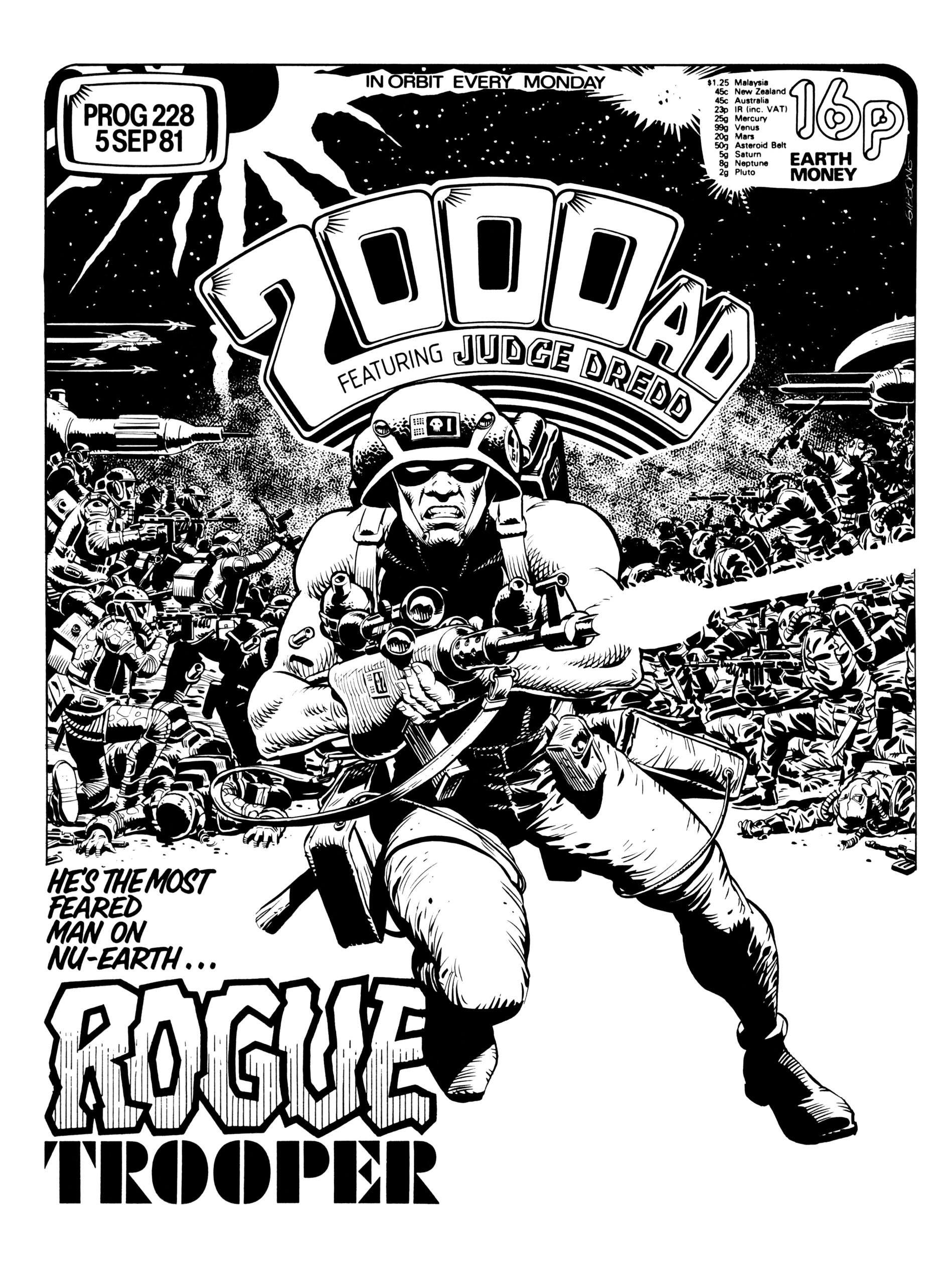
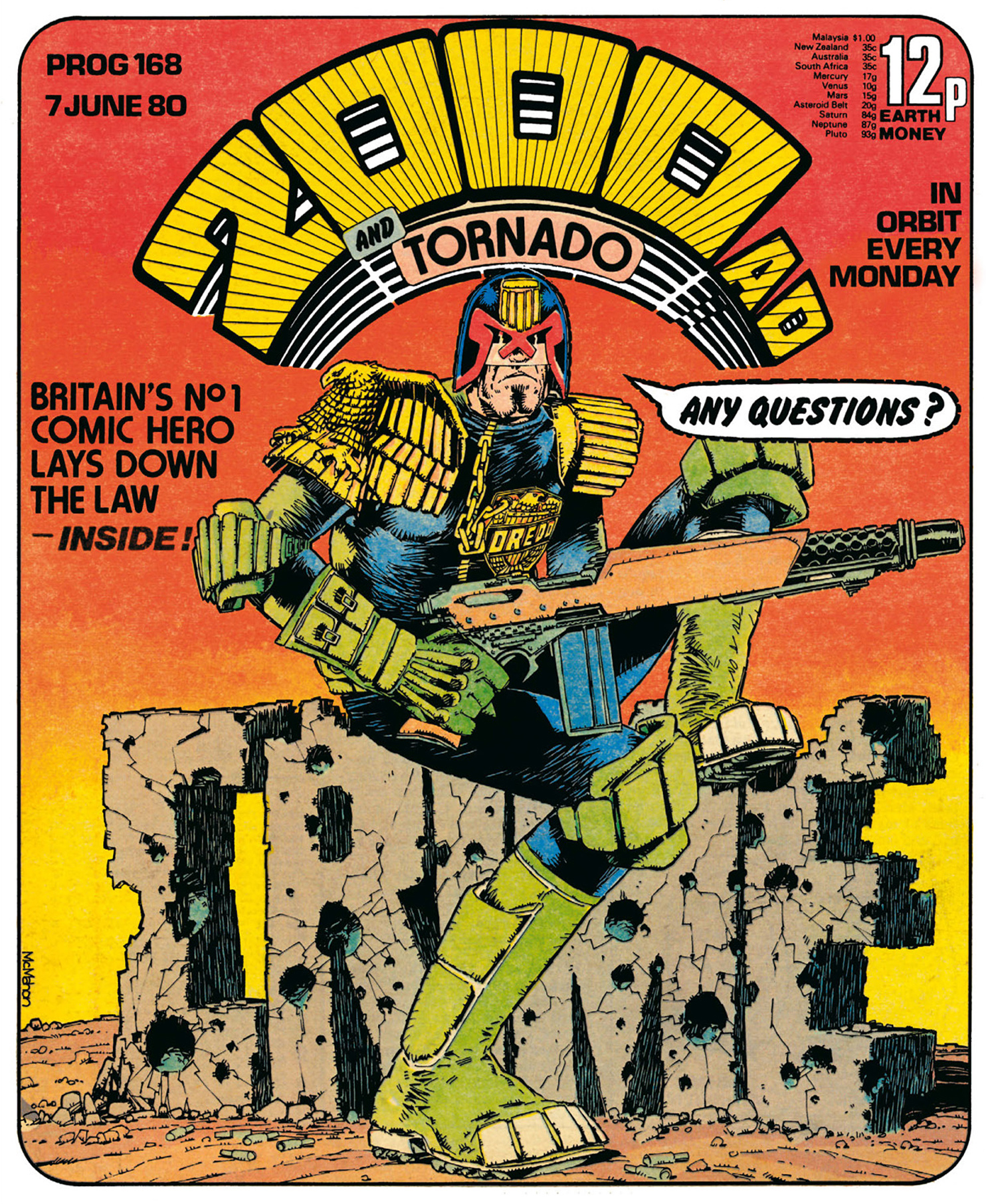
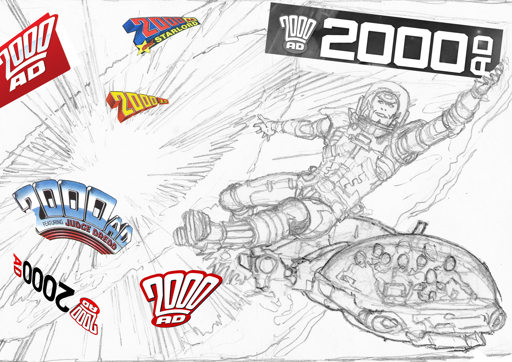
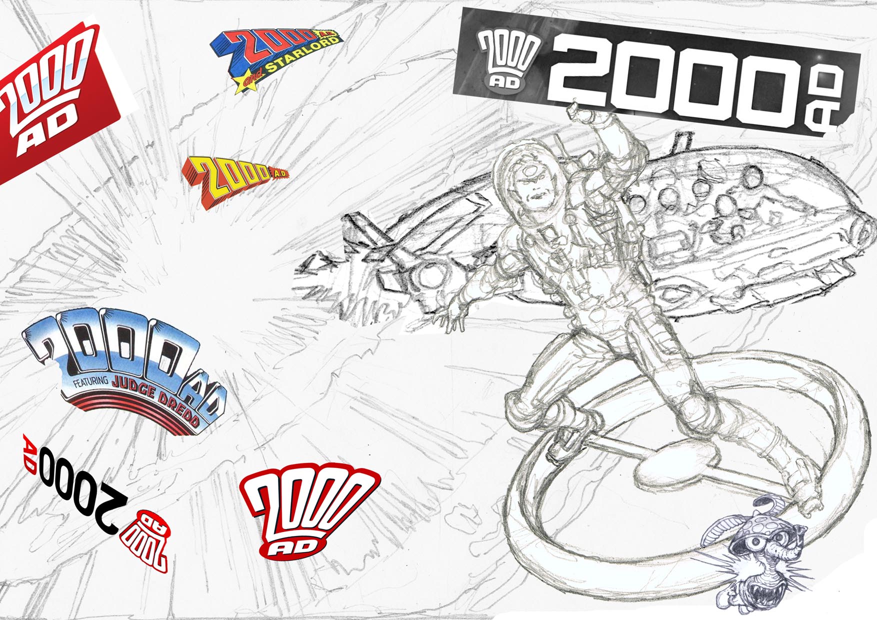
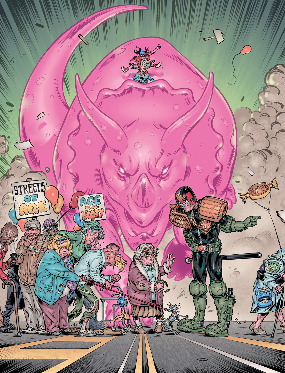
Okay then! This edition of 2000AD Covers Uncovered is coming in two halves; the first, is our usual look at how this weeks’ artist, the BRILLIANT Mark Harrison has put the cover together. The second half will see Mark talk about his obsession for explosions! I’m sure he can expect the MI5 to come knocking soon!

I adore doing a write up for Marks covers for a variety of reasons; A) Because the covers themselves are ALWAYS stunning; B) He is so, so passionate about digital media as an artform and C) I always learn something. This is certainly the case here.

So go and grab a cup of sythicaf and enjoy this weeks’ wonderful 2000AD Covers Uncovered brought to you by the amazing Mark Harrison…

“Be warned, i’m going to name drop like a SOB in this sort of tutorial on real world faked in digital cover breakdown!”

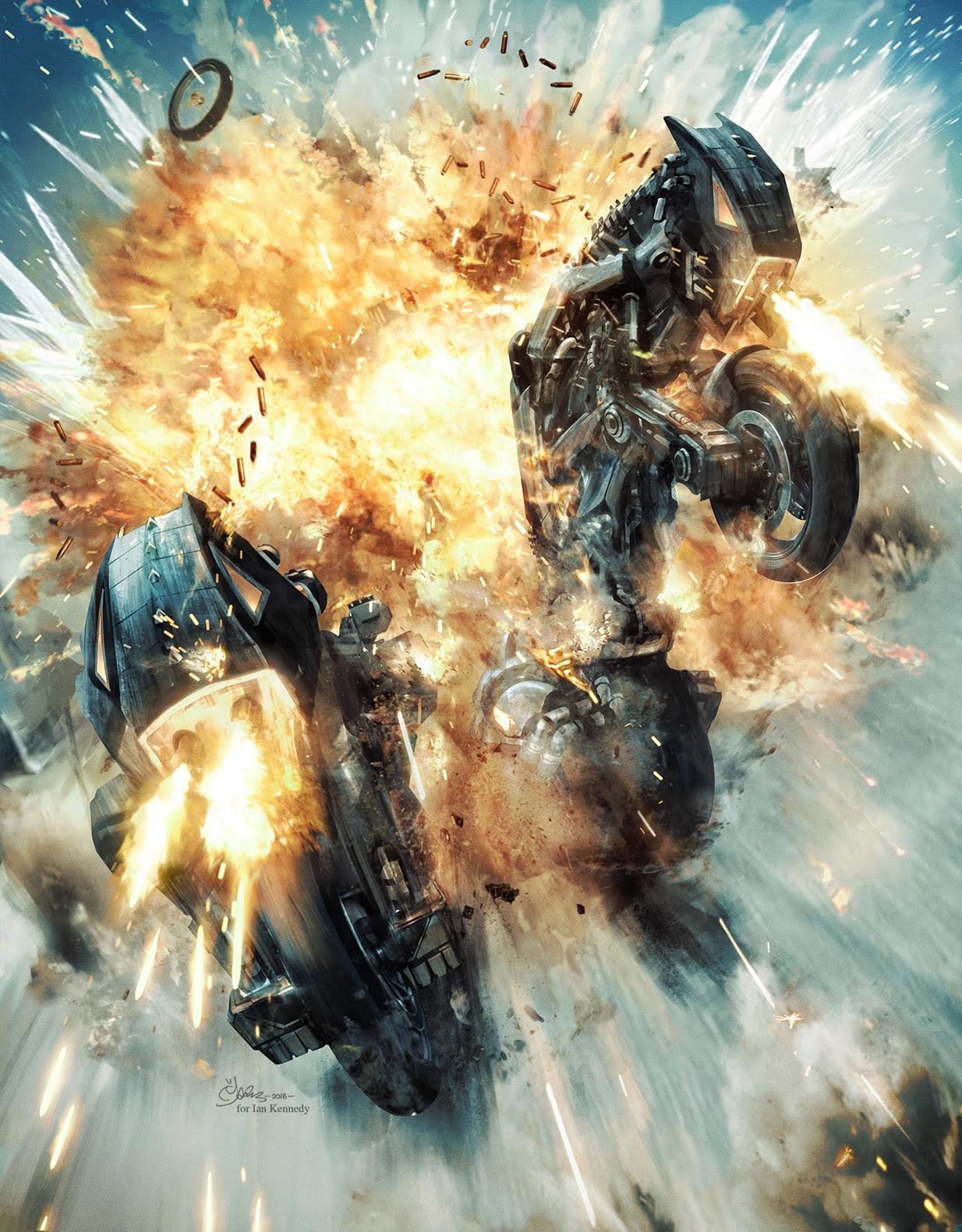
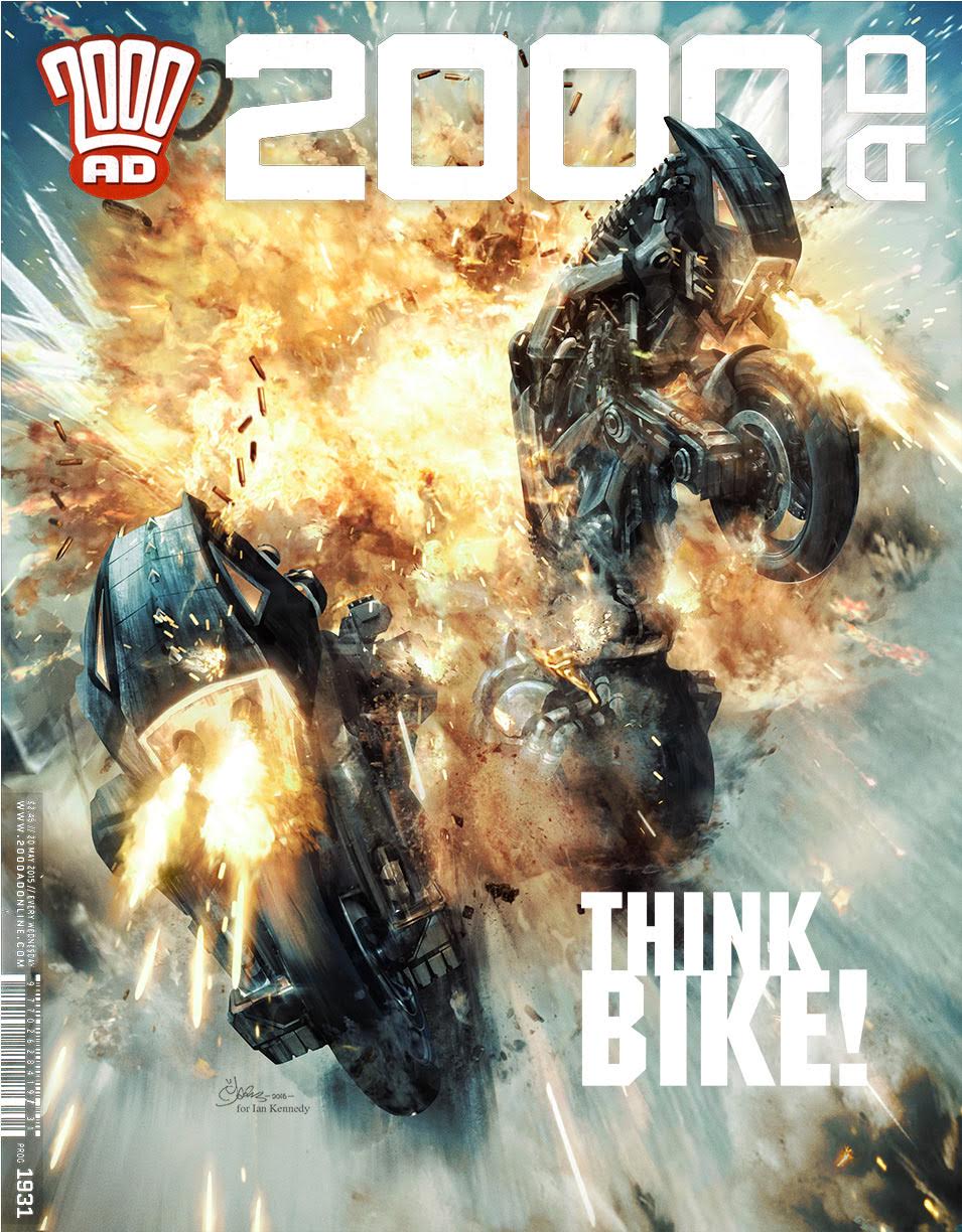
“When Tharg tasked me with providing a cover for the (Bill) Savage strip depicting transformer-styled bikes, I was both excited and deflated. Excited because I’d get to try out my new “explosion brushes” (see KABOOM – EXPLOSIONS UNCOVERED at the end of this cover breakdown); deflated because how could I really improve on the composition of Patrick Goddard‘s stunning comic art. So why reinvent the wheel?”

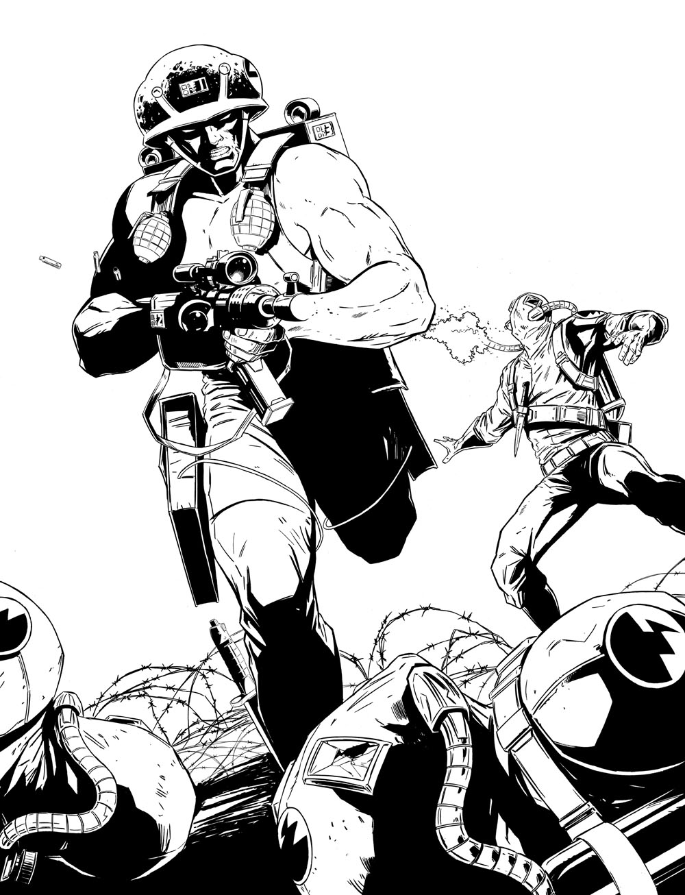
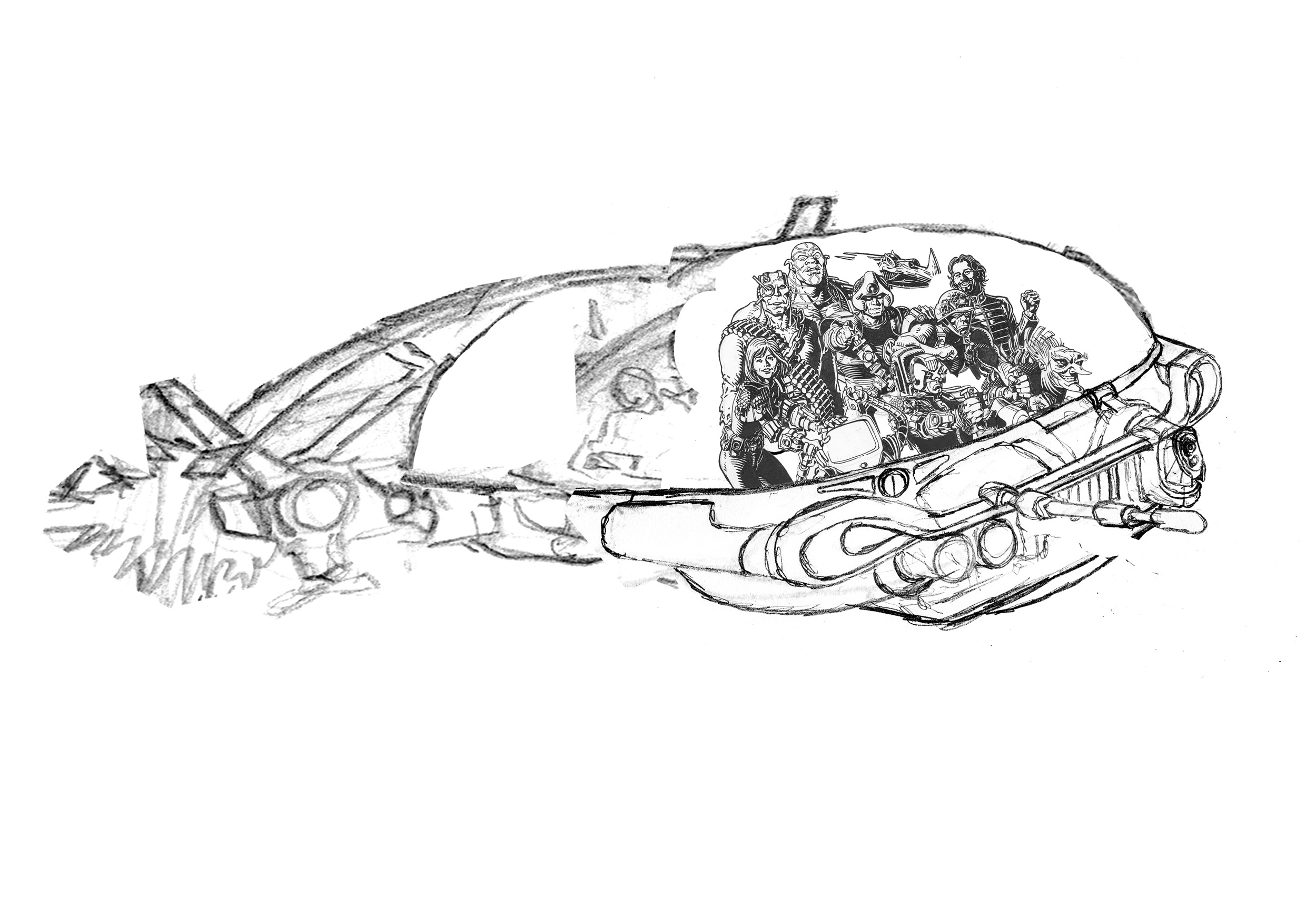
Here we see Patrick’s perfect composition!
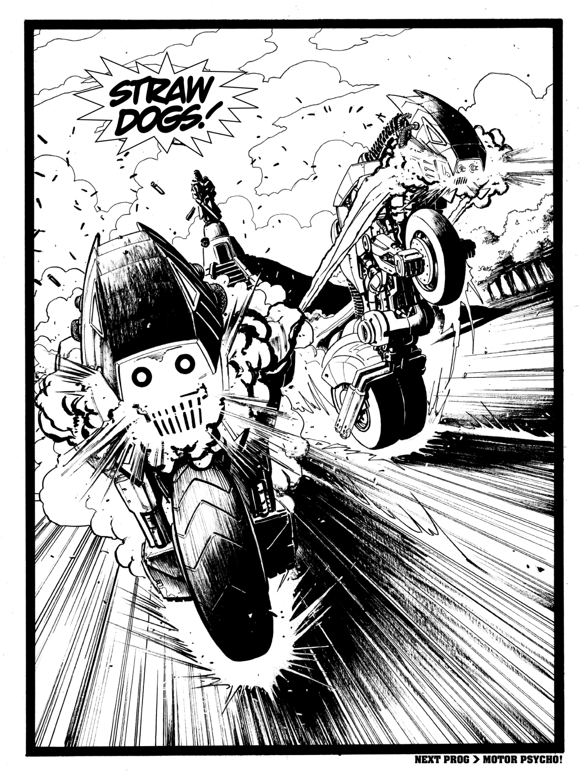
Robots in disguise?

“I planned to do very little to it compositionally, just tweak the poses a little and allow the render to carry the difference. To that end I started with silhouettes within silhouettes, working over a couple of google grabbed images of motorbikes.

“It’s an approach I use for concept art, defining the outline then working within that on areas of note- catching the light, etc. I was effectively treating this as a money shot- production art for the Bill Savage movie!”

“The silhouettes, drawn with PhotoShop’s lasso tool to create a black and white foundation image to work over, plus masks to “keep within the lines”. Using texture brushes I created I could quickly block out a dirty looking bike image over the exiting bike images and silhouette art.”

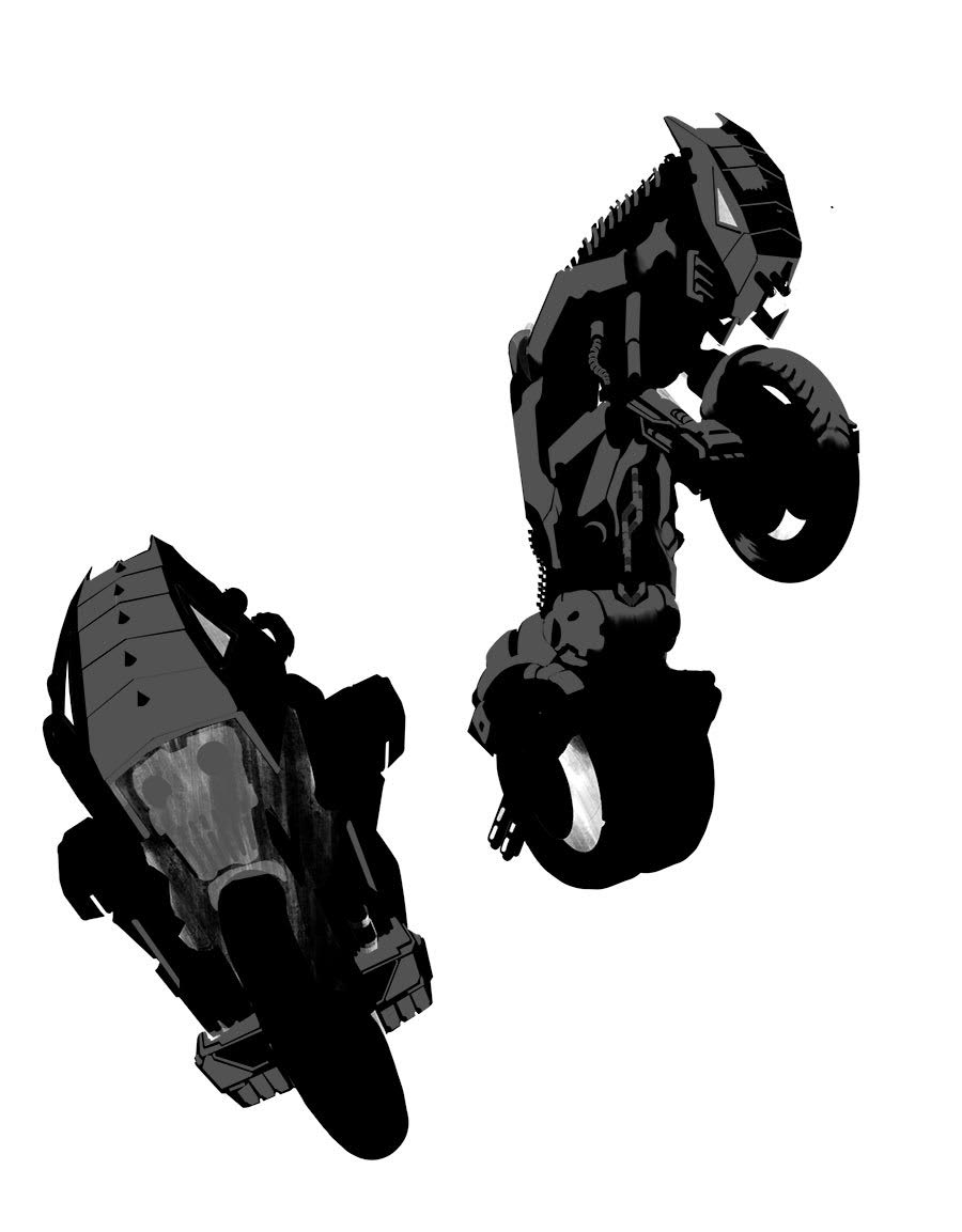
Two Straw Dogs, just casually drawn with Photoshop’s Lasso tool. Bloody show Harrison!

“Ultimately, despite the digital approach, I still wanted this to look painty. The best artists that work in the computer in my opinion still retain their real world styles in their digital art. You’d probably think how could it be any other way but artists can be swamped by the possibilities; the expanded tool kit.”

“Sometimes you need to pull back from that- keep it loose. I reworked the art closer, not too defined.”

“Keeping it real can be an obsession. After demoing my hybrid art technique on the strip Glimmer Rats at a comic con years ago Dave Gibbons told me how Brian Bolland had phoned him excited to show him some new line art. Dave was bemused to see what the fuss was about – it looked like typically well executed line art by Brian.”

“But Bolland exclaimed that this had been drawn entirely in PhotoShop (and back in the days before customisable brushes ) and he was rightly pleased with the achievement because it looked like he had painstakingly painted it in the real world. But he hadn’t. He had even more painstakingly painted it in the digital world!”

“Get any artist alone to talk technique and we’ll be only to happy to share. Ian Kennedy uses acrylics like watercolours. Michael Golden uses a paintbrush for EVERYTHING and I still don’t believe him because it makes me want to cry!”

“I myself create PhotoShop brushes based on real world “footprints”, paint dabs or ink marks, scanned them into PhotoShop and then attributed dynamics to them to best mimic real world tools.”

“I’ve even written PhotoShop Actions to turn the digitally crisp silhouette selections of the computer into line art that has been subtly displaced by a paper grain texture, to replicate the imperfections and bleed from paper! (Colin Wilson told me that although he used a rule to draw straight lines, he would sometimes give it a little nudge or waiver to make it look hand drawn. I do the computer equivalent!)”

“It’s all about the Art of Freehand; the Noise of Imperfection. The results will probably not even register in print, but along with a film grain overlay it harmonises the art and any disparate elements. Makes it more pleasing to the eye.”

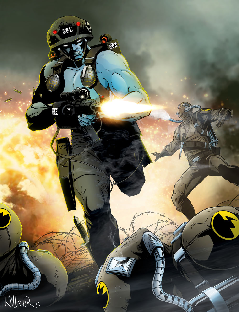
“I also wanted this cover to have a sense of speed about it in the foreground; a frozen moment but the road motion blurred by speed. A kinetic shot with lots of overlaid tracer fire and debris being kicked up; a companion bike had been blown up and these two were emerging thru the flames with a vengeance.”

“To get that speed look I looked back on an old favorite artist of mine growing up and one of the earliest artists to contribute to 2000 AD (on MACH 1); Ian Kennedy.”

“Ian was the first comic book artist I ever collected. (I didn’t collect comic books- I collected artists!) By which I mean I would cut out his pages and keep them, and bin the rest of the comic!” 

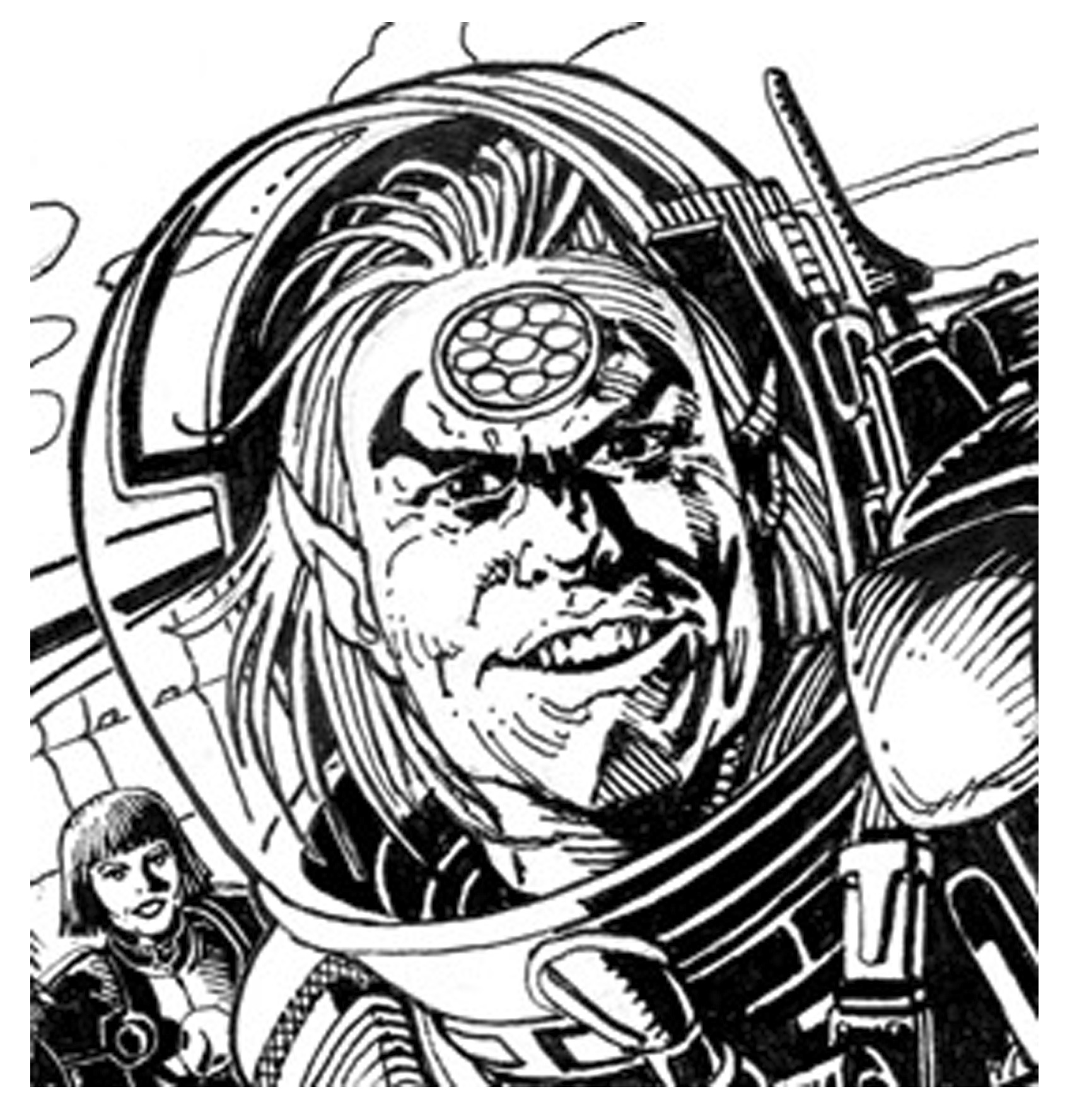
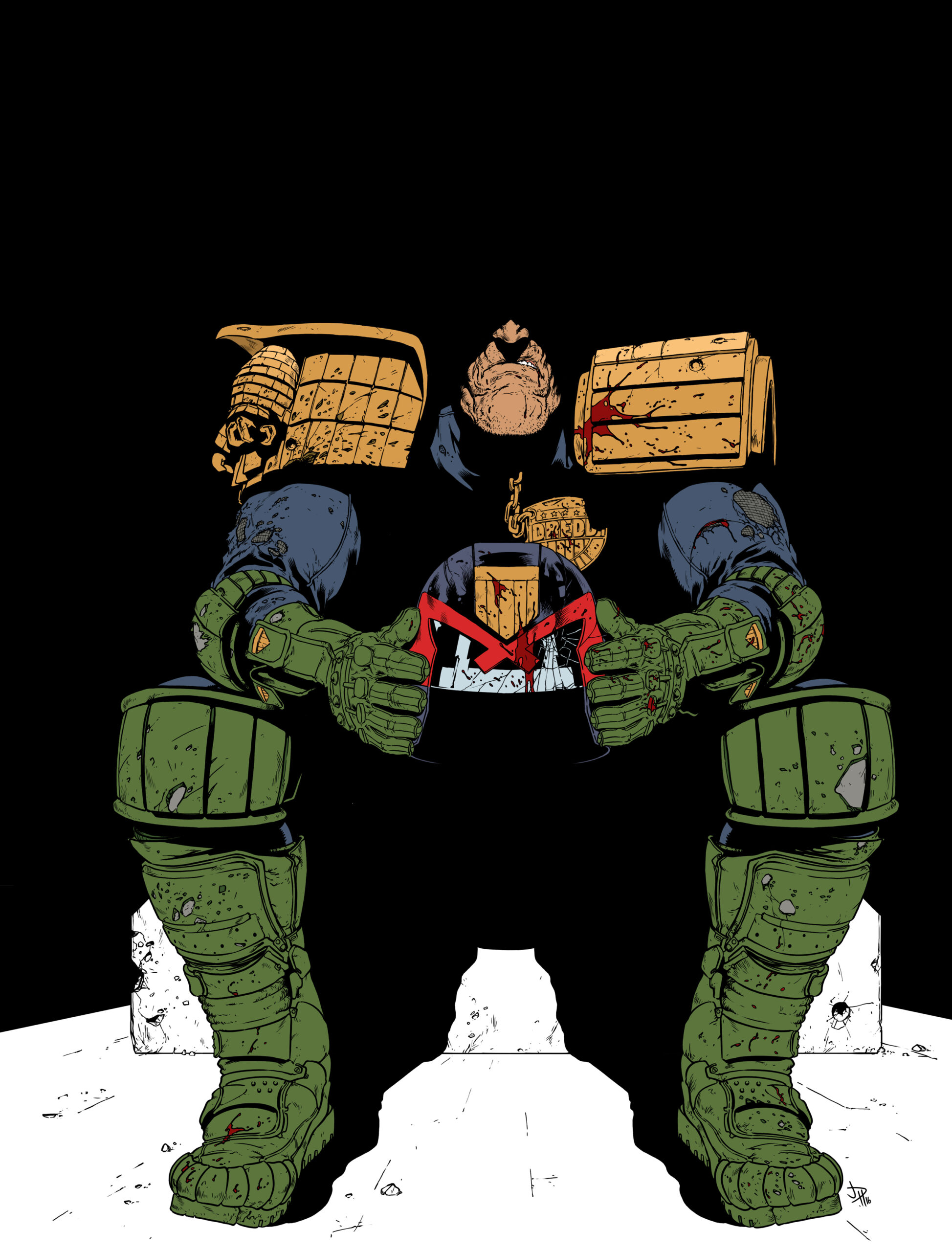
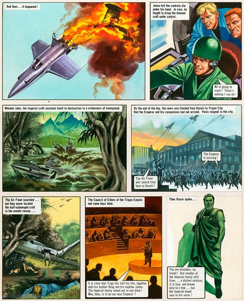
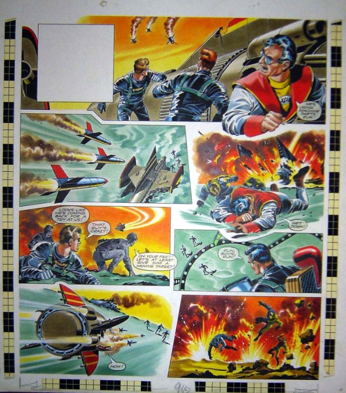
To illustrate his point, Mark sent this page of Ian’s work on RoBusters. He says “Why Ian never got to work on anything Gerry Anderson baffles me- he would have been the perfect fit! Collect and reprint the Pat Mills Dan Dare of the revamped Eagle!” 
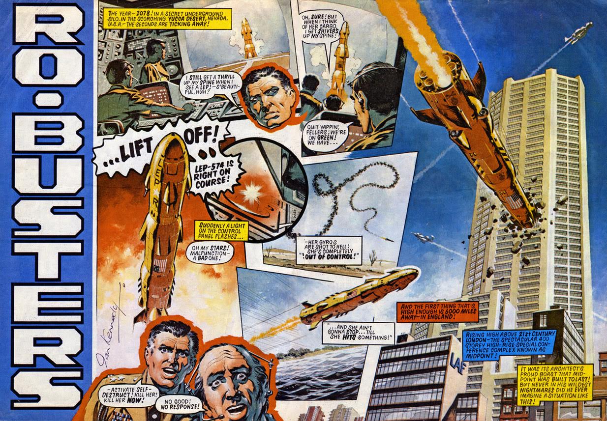
“Oh my STARS!”

“He did fabulous painted explosions with the characteristic “wheel flying out of them”, be it a Spitfire or racing car, something Frank Bellamy did and also years later in 2000AD Colin Wilson of Rogue Trooper fame.”

Here’s a wonderful Ian Kennedy with flying wheel page which also illustrates the point perfectly…

Fireball? Check! Burning debris? Check! Flying wheel? Check!

“I was lucky enough to meet Ian for the first time earlier this year and the cover is respectfully dedicated to him, a childhood comic artist hero.”

“Ian managed to capture wonderfully with pen and brush the speed of wheels, the tarmac rushing by, the spray being kicked up in rain, and I referenced (copied) that for this cover. I just had to have a wheel flying out of the explosion as an homage! (the placement of which was the hardest part of the cover!)”

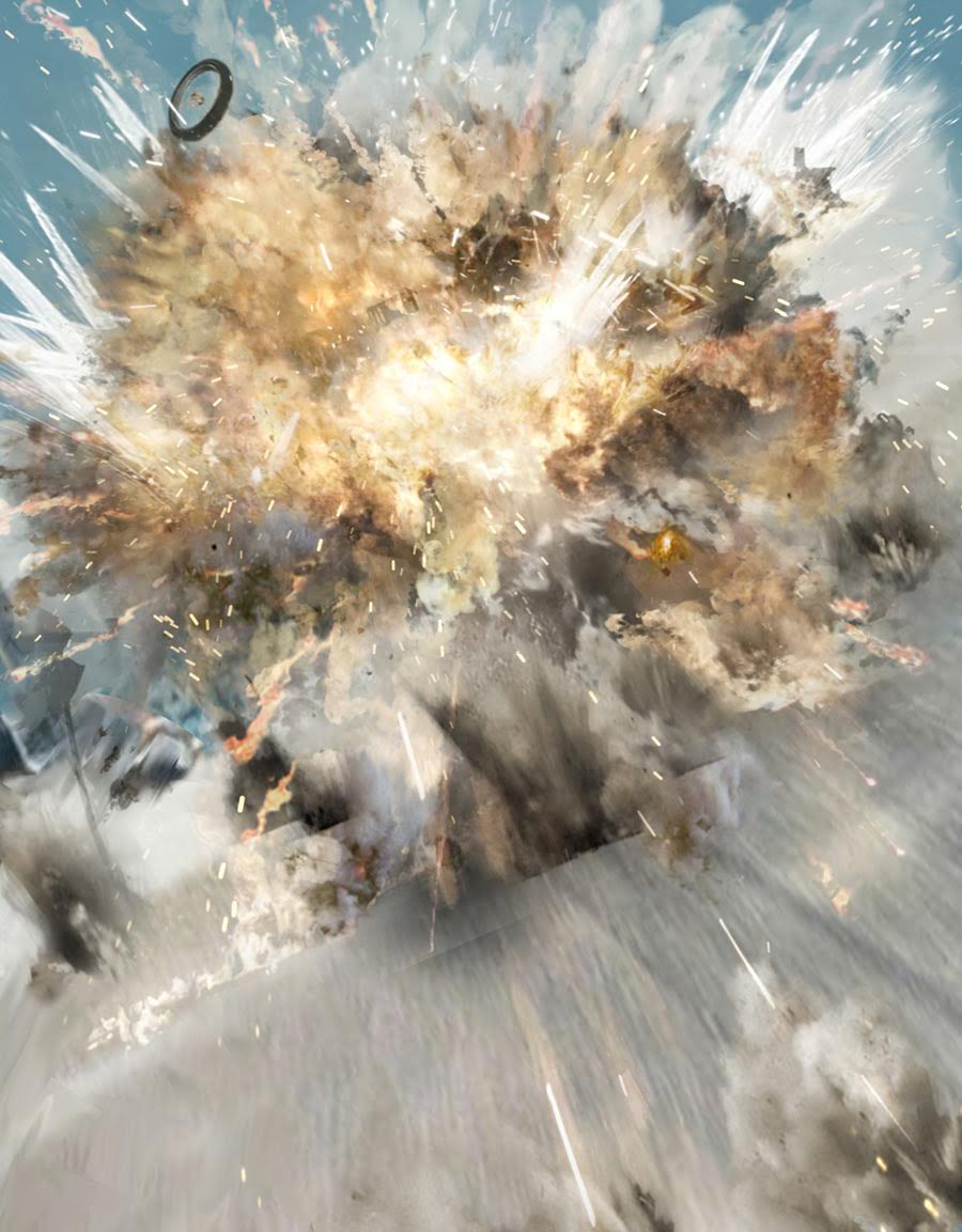
Let’s look at how Mark created his dazzling explosion. Below are some of the elements he uses to create mayhem. He says “Showing the various PhotoShop brushes used to create an explosion and their controlling shape dynamics…”
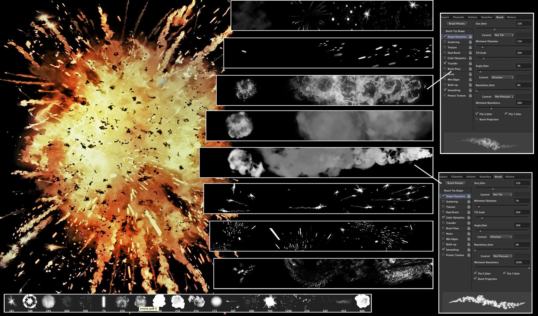
Kablooee!

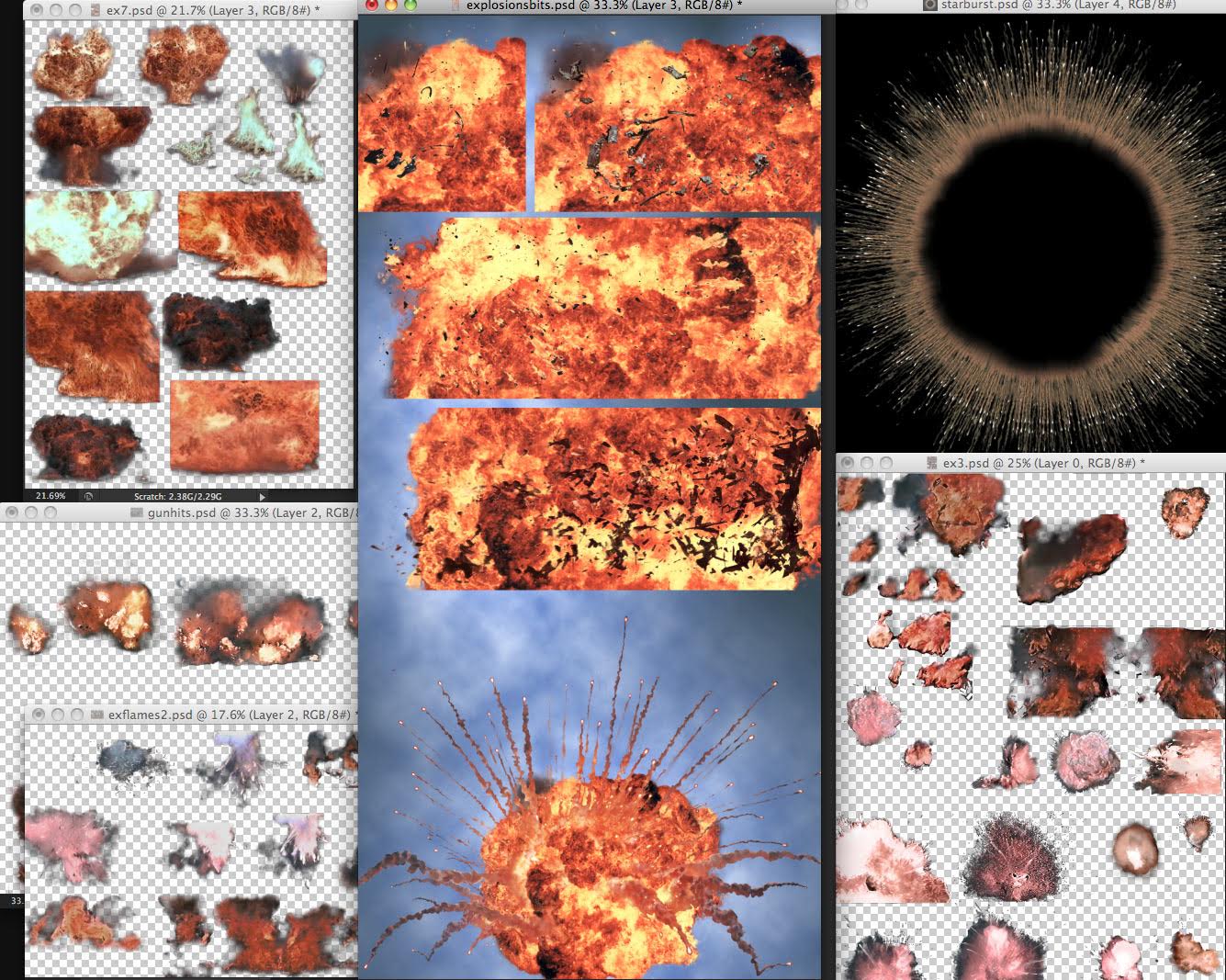
“These are grabbed and tweaked explosion files that served on 3 books of Durham Red and Glimmer Rats. From great explosion films like Independence Day, Star Wars, Goldeneye and Tomorrow Never Dies.”

“Give me the power, of man’s red flower, so I can be like you!”

Mark continues “Building an explosion from an existing grabbed explosion using custom brushes in the layer mask to reveal the explosion and tailor it to the scene. See how the sparks add to the energy. Also dropping on some Baysplosions!”
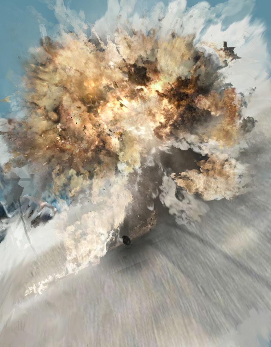
Badooooooom!

The all important wheel and debris!

Mark continues “As Ian says- “Copy from the best and your own style will emerge.” I’m still copying, Ian… 😉 “

“Additional art and effects such as muzzle flash and debris being kicked up was dropped on from preexisting art files. This is a technique I was thrilled to see Carlos Ezquerra also used , one of the very first artists to adopt the Mac computer and PhotoShop for comic book art back in the 90’s.”

“Carlos, along with American underground artist Richard Corben were the only two artists using PhotoShop in comics the way I intended to use it on Durham Red. Using real worlds assets, drawings, paintings and then digitally enhancing them later in the computer.”

“If you do the same thing enough times, you can build up a library of art you’ve saved that you can drop on new art again and again, like decals.”

“Carlos had files of bullet impacts on walls and bits of broken concrete that he just copied and pasted on his art. It was an exciting time of discovery and innovation and sharing of techniques. To this day it’s the technique- the process of comic book art I love. I’ll talk an artist to death to know how he does something!”

“The final finesse was a knowing nod to the Michael Bay films and a particular colour palette or “film grade” he applies to his Transformers films, pushing blues and green colours into machinery to be a complimentary contrast with the overly saturated oranges of flesh tones and explosions. This cover had to be Baysplosive!”

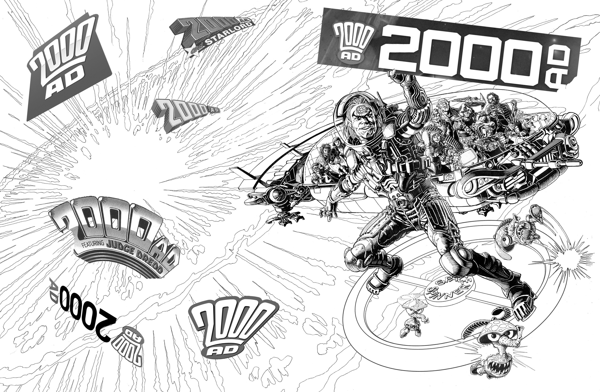
And Baysplosive it is! Bring on Savage the Movie!

Mr Embleton will be proud!

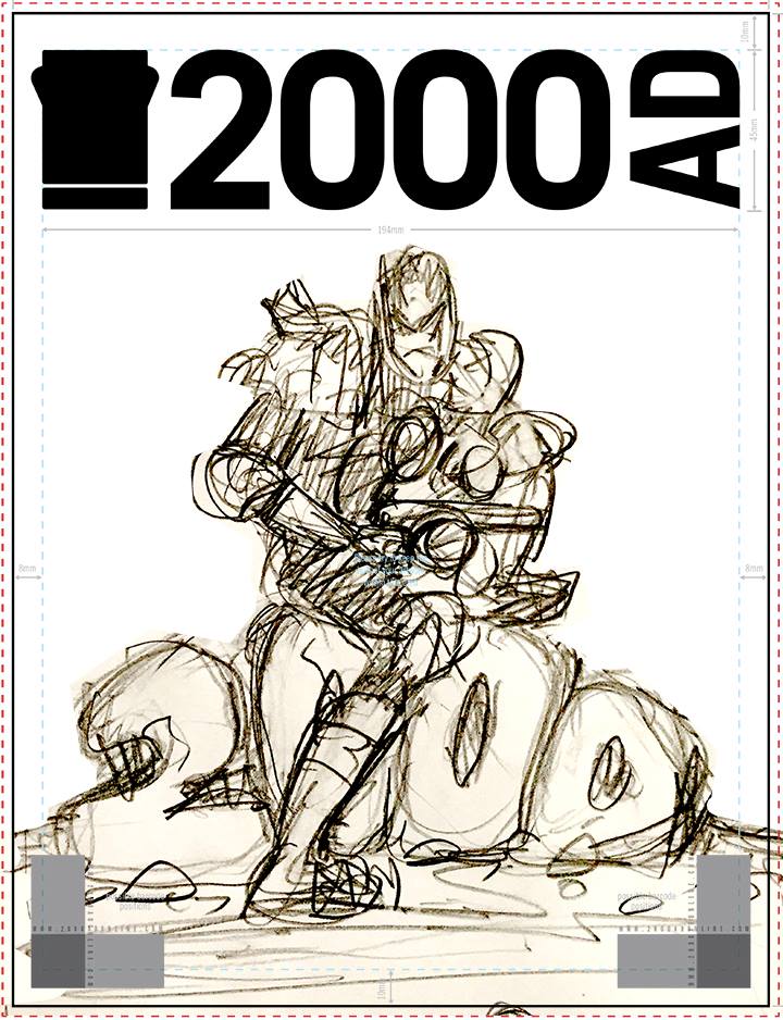
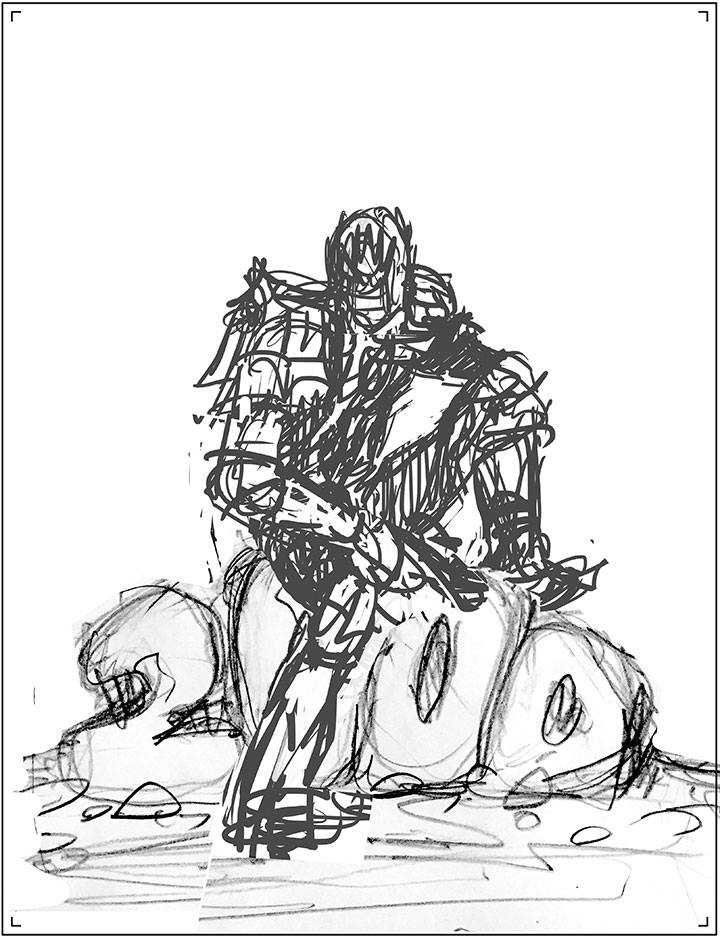
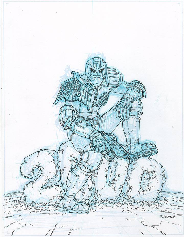
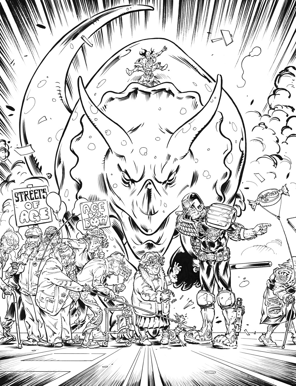
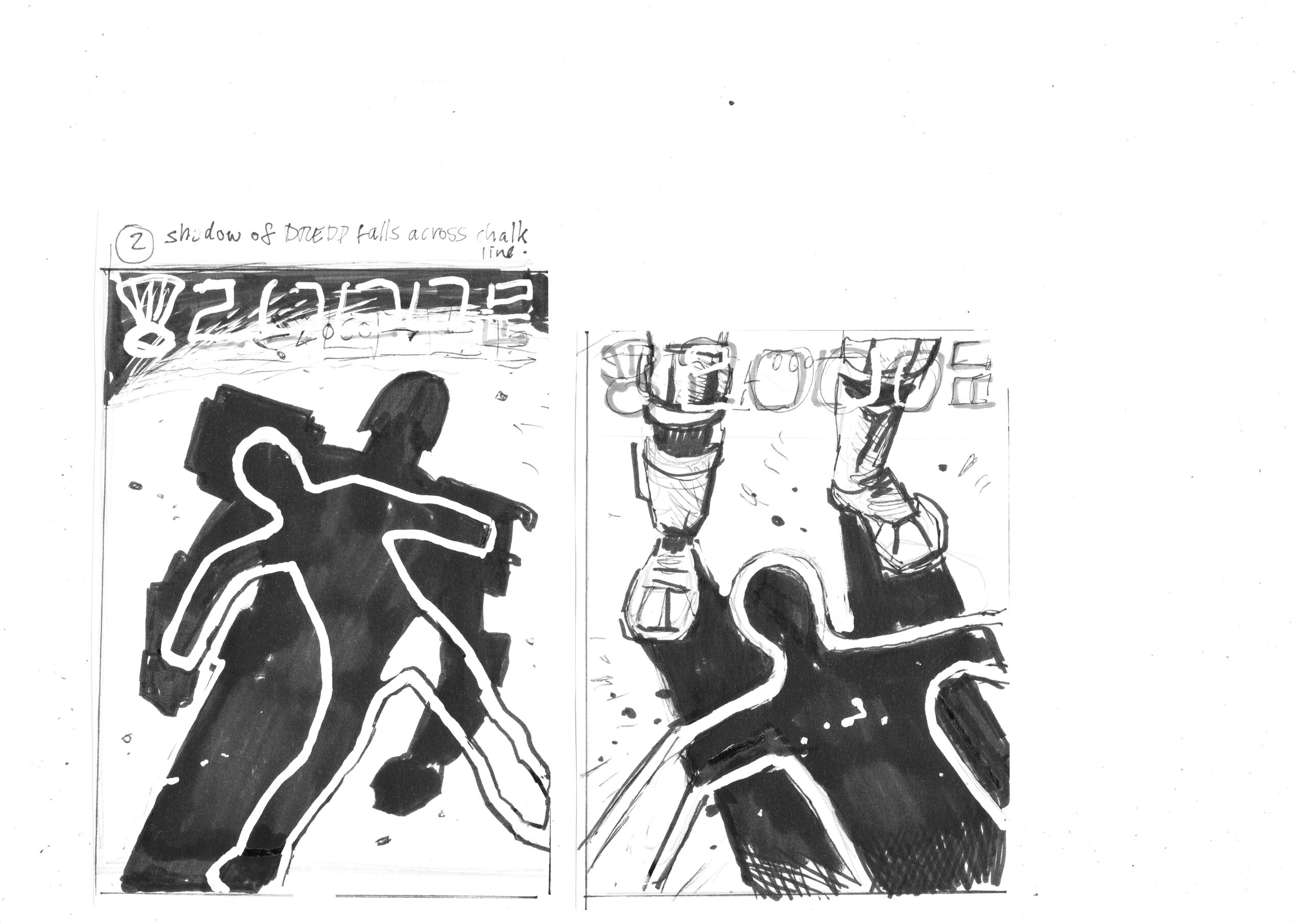
As ever, Mark has mocked up his own version of the cover, complete with puntastic strapline…

“That completes this cover! I’m grateful to Tharg, Wiggz and Ian Kennedy for sparing the time to talk to me and inspire me from childhood to now. Thanks guys! Should I grow up and put explosions in their toy box… Nahhh! Every boy loves a good explosion!”

Which brings us to…

KABOOM!!! Explosions Uncovered!!!

So now, Mark talks us through his love affair with all things loud and firey, it’s fascinaitng! He says “I grew up on explosions. Not literally, but loving them in film, TV, comics. What young boy didn’t? Whether it was the opening titles of Thunderbirds (the original- not the explosion-free remake) or the villain’s base blowing up at the end of a Bond movie. I was primed from a young age to appreciate a good bit of pyro!”

“I rated comic artists on how good they did an explosion. Did it have energy, wow-factor? Try and get away with a balloon pop and smoke puff and you weren’t on my radar. Luckily I grew up in a time of great painted art, or line and painted, and that allowed artists like Frank Bellemy, Ron Embleton and Mike Noble to dazzle with stunning layouts and colourful TV action explosions!”

Bellamy BOOMS!

Embleton EXPLODES!

Nobel, erm… NOBLES!

“Amongst that handful of great British comic talent was Ian Kennedy handling the war effort side of comics and becoming my favorite artist of that period.”

“I myself spent far too long trying to perfect my own take on an explosion, especially after seeing Star Wars. In traditional media, acrylic, oil pastel, pencil and airbrushed coloured inks. I cut stencils from cardboard to get a fireball shape.”

“I mean I don’t want to sound too obsessive (too late) but I even started checking out the special effects guys who did the explosions at the end of film credits. I knew if Joe Viskocil was involved I was going to get some nice chunky bitty explosions like in True Lies or Independence Day. (He had his own formula for achieving that effect…)”

“I had a Cinefex on Terminator 2 and I’d stare at the explosions of a couple of Terminator tanks for hours, trying to replicate that look in paint for my strip work in what would be my first (and unpublished comic) Loose Cannons.”

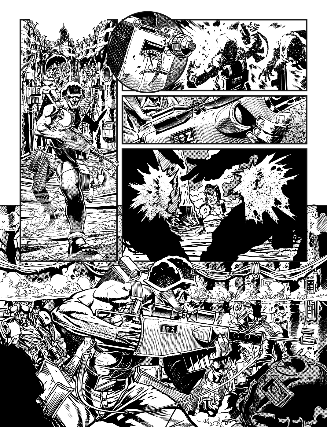
Here is a suitable explosive page of Loose Cannons which can be read here. Mark says “Painted explosions in the unpublished Loose Cannons using acrylics, white pencil and airbrushed coloured inks.”

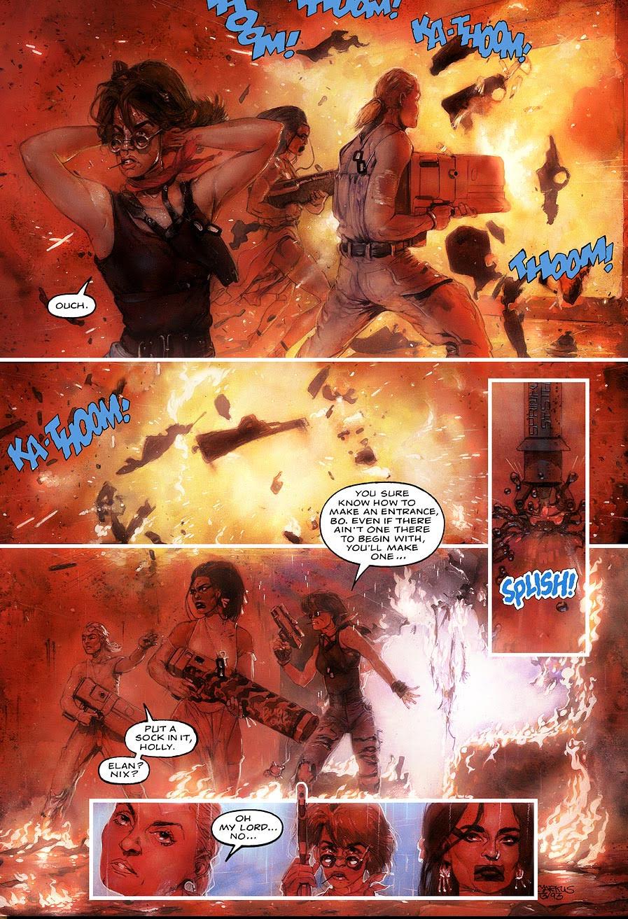
Loose Women took a turn for the worst (or possibly better.)

“When I went digital, I grabbed explosions from films like Star Wars or Goldeneye (Gun hits: You can’t go wrong with a Derek Meddings explosion). These were actually photographed off the TV if I recall- using a film camera! (God knows what the one hour processing shop thought of my holiday snaps!)”

I had to eliminate the noticeable pixel lines from the TV, adapt them into “explosions files” that served me well through 3 Durham Red books and Glimmer Rats.

But as I transitioned into digital line art from digitally painted art I found the line art for explosions didn’t look right to me, to my cinematic stylings. And a dropped in explosion would stick out like a photo. I was wanting the line art clarity but keeping the light gaseous look of an explosion intact.

Once again I looked to those artists of old and saw they drew in line the “hard bodies”, fragments of the exploded vehicle but let paint describe the billowing plasma.

That was the way to go and so I built PhotoShop brushes that would allow me to tackle the individual elements of the explosion; the sparks, the trailing phosphorus bits, the oily flames and embers.

Here are some of Mark’s brushes below, he says “These are some of my brush footprints; (copy these and you can make your own brushes!) I name all my brushes after the artists that inspire them. i have line brushes named after Olivier Vatine, Eduardo Russo, Walt Simonson, Sergio Toppi, Frank Bellamy (stipple), Mort Drucker and in this case “Basil”. (named after horror Famous Monsters cover artist Basil Gogos!)”

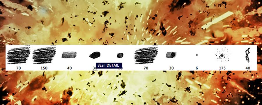
I wrote a custom PhotoShop Action to render the black and white tone art to colour flame that would complete the effect.

The same brushes could create smoke and dust clouds. I had perfected my digitally painted explosion! Now to blow up the World! Artistically of course.

(This artist in no way condones real explosions that hurt people. Just ones that blow up models or sets)

Brilliant stuff! Thank you so much to Mark for sending the hugely entertaining write ups and the glorious images. This is a truly fantastic cover from a brilliant artist. Be sure to check out more of his work here. 

Posted on

2000AD Covers Uncovered – Rogue One!

Stak! Ben Willsher blasts through the chem clouds with this absolute monster of a cover! As a long term fan of Rogue, it was a dream come true for Ben and you can see the love on the page, it’s brilliant!

Ben was kind enough to send his thoughts behind the cover and tell us the story behind its conception. He said “This Rogue cover came about when Tharg asked if I’d be interested… Well, I nearly bit his green hand off! I’ve only ever drawn Rogue once before (well, unless you count all those doodles in the back of my Maths prep book (which my teachers never did!)) That illustration was for a poster for an end of year prog – over to P-WLS for some visual reference and Prog number.”

Yes! That’d be Prog 2011, and here is that scrotnig poster…

“You put your firearm in, your firearm out! In! Out! In! Out! And shake it all about!”

 Ben continues “Tharg had a strong idea of what he wanted- That being shot of him racing towards us leaving dead Norts in his wake. I was provided with this lovely black and white Page care of PJ… Holden, not Maybe!”

Just another day at the office for Rogue and the guys.

Ben wanted to fill some pretty big boots and who can blame him? He’s doing a stakking Rogie Trooper cover! “As soon as he suggested this concept, I knew exactly what I wanted to do – I wanted to try and create something that had that same raw energy that Dave Gibbons captured in his classic 1981 cover for Prog 228. Not that I am comparing myself in anyway, you understand, but I really wanted to try and tap into that action Dave so beautifully delivered.”

You’re shooting the wrong way Rogue!

“Where as normally I would do very rough thumbnail sketches and then produce a better quality rough for Tharg to give me either the Quaxxann thumbs up, or a kick in the Galactic groats and told to come back with something new. This time the image being so clear in my head I went straight to this more detailed rough stage. Loosely pencilling first on A4 paper, then going over those outlines with a biro and Marker, with a blue pencil line rough logo to set the layout.”

“Tharg liked it and gave me the go ahead.”

He’s a very Norty Boy!

“I drew the piece on an A3 piece of heavyweight card with black drawing ink.” Good Grud, I’d LOVE to see this in the flesh!

“You can’t catch me, I’m the Genetic Infantryman!”

“Afterwards, I coloured it, and painted in the explosion smoke FX.” 

I’m a huge fan of Ben’s work and his colouring is always amazing. This is his second Toxic Gas cover (see the making of Prog 1768 here: Prog 1768 ) which I think says a lot about him…

Ben continues “As you can see from the Black and white image I discarded the line drawn smoke coming from the Nort’s broken pipe in favour of a more natural looking smoke effect. I also added better Biochips.”

Stak! Rogue’s back! On the Attack! I’m gonna cack!

Huge, huge thanks to Ben for sending the files and write up. I love him to Nu-Earth and back!

P-WLS, October 2016

Posted on

2000AD Covers Uncovered – Prog 2001 Gorehead Revisited!

Flesh returns to Prog 2001 as we discover wat became of Gorehead, Carver and the gang at the Trans-Time Corporation. Clint Langley breaks out his amazing digital toolbox to bring us some seriously eyepopping visuals in the story, including the glorious cover above.

Clint’s previous cover was for Prog 1980, a chilling vision of Death and his world for the excellent Deadworld series Tainted. Clint was kind enough to send the inks for the fearsome foursome. This massive peice was done at A2 and must be an awesome sight to behold!

(It’s on a peice of wire on his belt.)

And here’s Clint’s digital painting. The man is a true visionary when it comes to working digitally…

The Harlem Heroes have let themselves go…

Massive thanks to Clint for sending the amazing images, I can’t wait to see what he, Pat and Gorehead have in store for us!

Posted on

2000AD Covers Uncovered – Tonight we’re gonna party like it’s 2000!

Paaaaaaaarty! A (very) rare moment of joviality in the Nerve Centre as Tharg allows his characters a break from destruction and mayhem to celebrate the momentous Prog 2000!

This Previews Exclusive cover was brought to you by the cover-miester himself, Mr Glenn Fabry and coloured by the brilliant Ryan Brown. Below we see Glenn’s rough sketch, eagle eyed readers will spot a cameo from Rhubarb, of Rhubarb and Custard fame…

“SURPRISE! Ooops, sorry Death!”

With the layout approved, Glenn gets to work on his trademark, meticulous pencils. Not Glenn’s notes around the border for the more obscure characters…

Tharg: The Kissogram Years…

With the beautiful pencils finished, it was over to art supremo Ryan Brown to colour. He said “It was really was fun to work on, though its hard working on other peoples pencil work as you need understand where all the light sources are coming from.” Below is a work in progress with many of the flats done…

Death takes a sssssssselfie!

Ryan continues “I really enjoyed coming up with all the textures, it’s just a pity I didn’t have more time to work on it!” Modest as ever with a truly Zarjaz cover worthy of such a momentous prog.

Poor Gronk never got over the shock…

Huuuuge thanks to Ryan for the images (check his website at http://ryanbrown-art.com/) and a hearty Congratulations to Tharg and the gang for 2000 Progs of Pure Thrillpower. Here’s to 2000 more!

Posted on

2000AD Covers Uncovered – Officer Sitting Down.

Prog 2000 is here with, count ’em, THREE scrotnig covers by some of the best artists in the galaxy! Tharg has commissioned some of the greatest artdroids ever assembled to celebrate this magnanimous event in zarjaz style!

The second of our thrillpowered covers comes from Superstar artist Chris Burnham, the artist behind such high profile comics as Nameless, Batman Inc. and, of course, the brilliant Officer Downe.

The cover is based on a (no pun intended) stone cold classic, Prog 168 by Mick McMahon. Here’s the lineart for that iconic cover…

No sir! But if you keep sitting there you’ll get terrible piles.

And the coloured version, which I assume was by the late, great Tom Frame…

Yes, how do you wash your hair if you never take your helmet off?

Chris was kind enough to send his roughs and linework for the image, below we have his thumbnail sketch…

Even from this rougher than rough thumbnail, you can make out Dredd’s scowl…

With Tharg’s approval, Chris begins to work on the image.  

Crikey, Dredd is looking rough…

The rough begins to get tightened up as Dredd goes to his ‘Dead Man’ phase…

Come on Joe, make an effort! This is Prog 2000!

Those pencils are converted to blue line and inked…

The thin blue line!

And here are those finished inks, brilliant…

Sitting on the Prog of the Day.

With the inks laid down(e), they were sent to Nathan Fairbairn (Walking Dead, Justice League and Lake of Fire) for colouring. Pretty damned perfect if you ask me… 

Red sky at night, Dredd has a fight!

And here’s how the prog looks on your shelf…

Old Stony Base

Huge thanks to Chris for sending the images! On Wednesday, Glenn Fabry and Ryan Brown bring us a 2000AD party! 

Posted on

2000AD Covers Uncovered – Prog 2000: Digety-Don’t!

Prog 2000 is here with, count ’em, THREE scrotnig covers by some of the best artists in the galaxy! Tharg has commissioned some of the greatest artdroids ever assembled to celebrate this magnanimous event in zarjaz style! Obviously, if we’re talking about top quality cover artists, then we have to be talking about the wonderful Mr Cliff Robinson. As if producing a cover for the illustrious Prog 2000 wasn’t exciting enough, this is actually Cliff’s 100th Prog cover, making him the first artist to reach triple figures! Congratulations Cliff, here’s to 100 more!

Cliff told us how he created his centennial masterpiece, he said “Originally I had Tharg just holding onto the current Logo as it and everything else in the picture is being sucked into a black hole. Tharg suggested a star going ‘super nova’ instead of a black hole would be better and he also had the great idea of Tharg surfing on the ‘Space Spinner’.”

Below we see Cliff’s roughs…

Tharg doing his best Peter Shilton impression

Lo-going, going, gone!

With the composition decided, Cliff powers on. He continues “Tharg, the spaceship and the characters were all drawn separately and cobbled together on the computer.”

I love, love, love seeing Cliff take on other characters and he didn’t certainly disappoint below…

“Drokking back seat drivers!”

If Savage was here, would he have called Shotgun?

Duck! Here’s that supernova, yikes!

This is actually what a Rigellion Hotshot looks like.

Everybody’s goin’ surfin’, Surfin Betelgeuse.

“Oh, we’re all going on a, Summer Holiday! No more working for a, week or two!”

With all the elements prepared, it’s time for Cliff to assemble the ingredients into a tasty thrill powered cake. However, Cliff noticed a bit of a snag… “As Tharg was going to be holding the main 2000ad logo, I only drew his left hand thumb, figuring it was a waste of time drawing his other fingers when they’d be covered up once the Logo was added. So I was a bit surprised to see the cover appear on the 2000ad website minus all the Logo’s. I guess a small meteorite could have taken off Tharg’s fingers, but if so, would he be smiling so broadly? Of course that could be a symptom of hypoxia due to his space suit being compromised. If anyone should come across Tharg’s fingers, please return them to the Quaxxann lost & found office.”

“‘Tis but a fleshwound!”

And here’s the line art with those poor doomed logos…

“Out of my way, sucker!”

Tharg didn’t even get past the interview for Ted Rodgers’ old job…

Once the line art is complete, it’s over to Cliff’s partner in crime, the Brilliant Dylan Teague for colouring. As usual, he did a stunning job!

Supersurf 2000 is go!

Huuuuuge thank you to Cliff for sending the images and brilliant commentary and congratulations again of his 100th glorious cover!!!

Next up – Chris Burnham and Nathan Fairbairn…

Posted on

2000ad Covers Uncovered – Old Pink Eye!

Who better to see us out of the 1000s-era of the Prog than the brilliant Boo Cook. And, what more appropriate way to see us out than with a rampaging, gelatinous dinosaur and to splat a bunch of eldsters? Erm… quite!

Good old Boo was quick to tell me about the making of the Prog cover in his usual enthusatic style. Over to Boo: “It’s always an immense pleasure to get an email from Tharg requesting a Dredd cover – I’m sure art droids would agree it’s best if you can get to just do Dredd’s massive face or a big full body action pic, but this one was a bit different as it required a full on narrative approach full of batshit crazy stuff – who doesn’t like a massive pink triceratops made of jelly!?!”

“I was sent Ron Smith’s classic fatties cover from Prog 273 as something to vibe off but having the giant dino in there meant I had to shrink the foreground folks to fit the scene…”

Just another day in the pasty emporium…

“Tharg also wanted a host of crazy eldsters in there so I figured it would be a great opportunity to get some bonkers Norman Rockwell-esque characters on the go and to think of some terrible ageist puns.”

Below, we see Boo’s gloriously chaotic roughs, note the balloon on the right, tsk…

Tut! Have some respect Boo, they fought in the atomic war for you…

And from that, the beautiful pencils…

The Conga Line at the Jackie Stallone Home for the Terminally Bewildered had gotten hopelessly lost…

Readers may have noticed the rather handsome chappie at the left of the picture, Boo explains “At some point along the way I had the idea to put my dear old Gramps in the mix – a fitting tribute to a real lovely fella, himself a recipient of the Kril Tro Thargo in the 80’s for his services to thrill power. Basically, he used to send me and my brother a comic each week without fail from Stevenage down to Devon since I was 4 years old. I started with Toby comic, then The Beano, Look-In was next and was closely followed by Starlord where my man crush on Johnny Alpha began. Pretty soon I was onto 2000AD and he sent me that faithfully from the age of ten onwards and naturally I still get the weekly prog to this day. Alas the sweet guy passed on in ’92 so he never got to see me follow my dream of working for Tharg but to say that my life would be completely unrecognisable without the input of this humble and generous dude is something of an understatement. It’s with great pleasure that I pay tribute to him on the front of the Galaxy’s Greatest!”

And here he is…

We all have a lot to thank this fine man for…

Next, Boo’s fantastic inks come rampaging into the fore…

If Dredd has anything to do with it, the boys controlling the creature will soon have a Megasaurarse…

And with the inks down, Boo takes out his digital crayons to colour the picture in…

Drokk me! Barney hasn’t aged well…

A massive, rampaging dinosaur sized thank you to Boo for sending the images and touching tribute to his lovely Grandpa. Please, rush to Boo’s blog at http://boocook.blogspot.co.uk/ so see some stunning images like this…

“A righteous infliction of retribution manifested by an appropriate agent.”

And this!

I’m sure he’s smiling on the inside…

Next week – A Prog 2000 triple bill!

Posted on

2000AD Covers Uncovered – A Death in the Family?

Prog 1998 spells certain doom for a major Dredd character, but for whom does the bell toll? Dredd has finally pushed serial, serial killer PJ Maybe over the edge and he has promised to murder someone close to the lawman. Who will it be? Dredd’s niece Vienna? Lovely Old Mrs Gunderson? Bob, the sector 13 hottie stall vendor? Please, please let it be wubbish old Walter!

Below we see a couple of Paul’s initial, very imaginative ideas. Firstly a wonderfully ominous chalk outline in Dredd’s shadow and secondly, a shot of those tight boots as Dredd surveys the scene of the murder, chilling…

Ooooooh, Vienna!?!

The third idea is the one that tickled Tharg’s Belegusian thrill bone, as our favourite lawman looks sullen at the grisly scene…

Chief suspect in the murder was Keith Haring…

With the final sketch approved, it was time for Paul to break out the brushes to ink the final image…

White liiiiiines… blown away!

With the tense scene rendered, it was beamed to colour droid supremo Chris Blthye to work his magic on…

Tsk! Bloody grafitti is getting worse…

Huge thanks to Paul for sending the scrotnig images. This is an excellent cover that has me desperate to find out who lives and who dies!

Posted on

2000AD Covers Uncovered – Jaegir Bomb!

Prog 1996 features the return of Kapitan-Inspector Atalia Jaegir, of the Nordland State Security Police. Atalia, who is infected with the fearsome Strigoi curse which can mutate it’s victims into fearsome monsters, is part of the Nordland Security Forces who deal with war criminals. The brutal war between the Norts and the Southers has seen its fair share of atrocities, many by members of the Jaegar family. When the time comes, will she be able to bring them to account?

The stiking cover is by Dredd: Uprising and Aquila artist Paul Davidson and is an absolute cracker! I reached out to Paul and he was kind enough to send some fantastic work in progress images and notes about his creative process. He said “Tharg knew what he wanted, so we bypassed the stage of various rough design proposals. From his description, i went straight to a well finished rough…” 

A tagline from the Ronseal School of Taglines…

“Once that was given the green light, I proceeded to inks…”

As usual, the troops were quite literally behind Jaegir!

“I then blocked in the background colour as I visualised this with a strong warm colour background, with a cool foreground for maximum punch…”

Red sky at night, Nordland’s do fight! Red Sky in the morning, Nordland’s warring!

“I then added the cool tones to the main deal using Copic markers bought from my local corner shop!”

Here’s pen in your eye!

“And then more of the same to completion…”

Embarrasingly, Jaegir had a piece of lavvy roll handing out of the back of her trousers…

Paul was thrilled with the work done by Tharg’s design team, he said “Picking up on the white light on her face, picked up very nicely in the typography……all tied in nicely………it’s great when that happens!”

Atalia gets ready for a scrap in the scrap.

It’s great for us too, as this is a fine cover for a great character! Thanks to Paul for sending the images and insights, please go visit his website at http://www.pauldavidsonart.com/ 

Posted on

2000AD Covers Uncovered – Dark Justice

Back in Prog 1981 we were in the middle of Mike Carroll’s summer epic, ‘Every Empire Falls’, which saw an attempted hostile takeover of Megacity-One by treacherous dissenters in Texas City and Brit-Cit. Of course, Dredd wasn’t going to take this lying down, so a plot was hatched fake his death before taking him prisoner in Brit Cit. As we know, Dredd is a very hard man to kill and it wasn’t long before the battered and beaten lawman led the fight back for his beloved home, but at what cost?

Premier artdroid, Jon Davis-Hunt produced this glorious cover, which for me, is easily a contender for cover of the year. Jon is currently providing beautiful artwork for the disturbingly grisly ‘Clean Room’ for Vertigo comics, but took time out of his hectic schedule to work on a piece which had been rattling around his curcuits for a while.

He said “I originally had the idea for this cover about a year ago, but had been too busy with stuff to get any time to work on it. My idea was, to have Dredd, seated after a hard fight, with his helmet off, held between his legs. He would be sitting in a strong shadow, the angle of which, as it fell across his face, would not only obscure his eyes (as the helmet normally does) but actually mirror the angle of the helmets nose section.”

“I was heading to Thought Bubble at the end of November and I realised that John Burdis would be there. As he is such a thoroughly nice chap, I figured he would be up for posing for a reference photo. I wanted to do a really detailed version of Dredd’s suit and I figured, as Johns real-life, Planet Replicas version was so ace, it’d be the perfect opportunity. I pitched the idea to Tharg who liked it, then headed off to Leeds to find John. As you can see, he was a total gent and agreed to pose for this photo. Cheers John! :)” 

This isn’t the first time that Cellar of Dredd owner John has modelled for 2000AD droids. He has also posed for greats such as Greg Staples and Laurence Campbell, though obviously those images were heavily edited to make Dredd more manly, slender and chiselled…

A thoroughly nice chap, apparently… 🙂

Of course, the above picture in no way resembles this classic Cliff Robinson cover of Prog 1194…

“I’d give that ten years if I were you…”

Jon continues “With a nice photo to help with ref, I then sketched out the pose. I exaggerated Dredd’s size and also tried to get him to hunch over a little more, to emphasise the idea that he’d just been in a bloody and hard fought battle…”

Oor Joey…

“Next came the inks. I went straight from my rough sketch to the inks, as I felt the proportions of the sketch were mostly there. As I worked on each element, I then began to ad in all the scarring, battle-marks and blood. I figured that the Judge uniform would be layered, with armoured weave and multiple layers under the surface for insulation, protection etc and tried to show this on various points. I also tried to imagine specific instances that had occurred – you’ll notice that on Dredd’s right side, his eagle and arm is peppered with shrapnel marks where I imagined he had turned at the last minute to avoid a grenade etc.”

Suprisingly, Dredd’s Megadate profile picture didn’t lead to many dates…

“With the inks done, it was time to flat out the colours. I did toy with the idea of darkening the costume and making it more gritty, maybe even adopting the darker uniform of the film (the good one, not the bad Stallone one). But in the end, decided to go with the original colours.”

He’s been shot and blown up, of course he’s flat!

“With flats done, I then move onto modelling. I tend to keep that fairly simple now, just using a few layers for highlights and a few for shadows.”

Dredd HATED those fiddly little ketchup sachets…

“Finally, lighting. I tried to emphasise the materials here, especially the gold of the armour. I also added in the suggestion of the light source (although I used a large degree of artistic license for this). 🙂 “

He just needs to pop it in a boil wash with new, improved Megsil Powder and those stains will be gone, gone, gone!

“And there you have it!” 

You certainly do! Huge thanks to Jon for the images and text. Be sure to check out his site at http://www.jondavis-hunt.com/ for some truly breath taing images! Look out for the making of Jon’s beautiful Anderson cover of Prog 1995 soon!