The Art of Revenge: what Simon Fraser brings to Judge Hershey’s quest for vengeance
20th August 2021
The collection of Hershey: Disease is out now, with critically acclaimed creative team Rob Williams (Suicide Squad) and Simon Fraser (Doctor Who) telling a globe-spanning, gritty story of retribution featuring fan favourite Dredd-world character, Judge Barbara Hershey.
In the next of a series of short essays commissioned from selected comics critics that explore 2000 AD and the Treasury of British Comics’ latest graphic novel collections, Graeme McMillan looks at how artist Simon Fraser’s stylistic choices and portrayal of the veteran Judge are an intrinsic part of its impact.
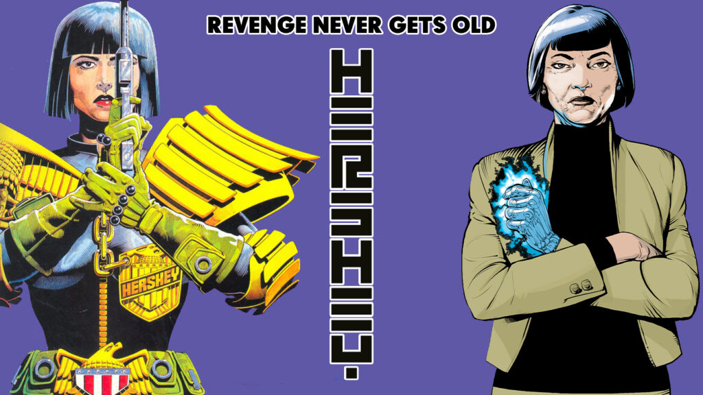
As it happens, the true star of Hershey is not former Chief Judge Barbara Hershey, a longstanding character finally given her due in a series that fully embraces her contradictions and, thrillingly, her internal anger after almost four decades. Instead, I’d argue, the true star of Hershey is Simon Fraser, whose visuals are undoubtedly the best in a career that’s already included co-creating fan-favorite 2000 AD serial Nikolai Dante.
That’s not intended as a slight for the writing from Rob Williams at all. Few have more regard for what Williams has been doing in recent years than I do, whether it’s his Dredd work, rebooting Roy of the Rovers into something surprisingly compelling even to a non-football fan like me, or his work for U.S. publishers like AWA or DC. There’s an argument to be made that Williams is one of the finest writers in the British comic book industry today, and Hershey is a fine demonstration as to why that might be true. Just in terms of writing, it’s a bold, exciting read that stands alongside the best of crime comics, no matter the country or era of origin.
And yet, Simon Fraser is still the star of the show.
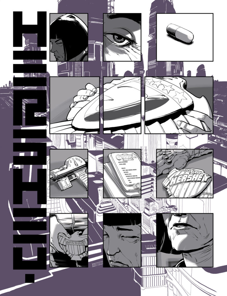
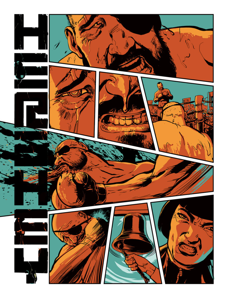
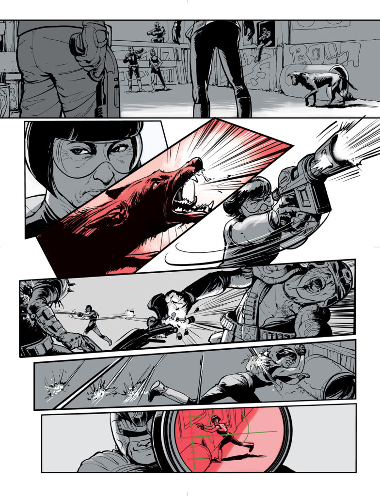
If all Fraser had done for Hershey was the line work, it would still be an amazing looking book; there’s a sharpness to his line here that makes the art look breathtakingly fresh and kinetic at times, moody and atmospheric at others. Fraser can make scenes with minimal lighting work in a way few others can, and he gets the opportunity to demonstrate that skill more than once here. There are action sequences in the first collection that put paid to the notion that “cinematic” should be the ambition for contemporary comics, offering scenes that move in a way that most movies couldn’t even imagine, placing the reader in the centre of events in such a way that the blows are almost physically palpable. Check out the very first page of “Brutal” for proof of that; you can almost hear, feel, the punches.
His work is also particularly successful in evoking specific physical spaces, which proves to be useful in a serial that moves from the future mushroom-shaped megatropolis of Mega-City One to the slums of what used to be Columbia and beyond, each world with a feel and look all its own. One gets the feeling that he’s spent an impressive, likely unreasonable, amount of time working out the ways in which the experiences of the upper and lower classes in Ciudad Barranquilla differ, merely based on their surroundings alone, and that work on the page — behind the page — makes the experience all the richer for the reader as they venture through the strip.
Attention should be paid, too, to the way Fraser draws people. It’s not just that he’s a gifted character actor, with Rijkaard, Juninho and De Andrade wonderfully human and singular every time they appear on the page, with Fraser offering physical cues to their personalities and dynamics with other characters even before they’ve had a chance to define themselves through dialogue or action; it’s that Fraser manages to suggest that these are characters with histories, with Hershey looking her age — or something close to it; Mega-City One science and comic book aging have played their part to some degree, after all — for perhaps the first time since the 1980s. There’s something brutally effective about seeing Hershey displaying the physical toll her career has taken on her, whether it’s the permanent scowl lines etched into her face or the wrinkles suggesting the emotional weight she’s been carrying for years by the point the story begins.
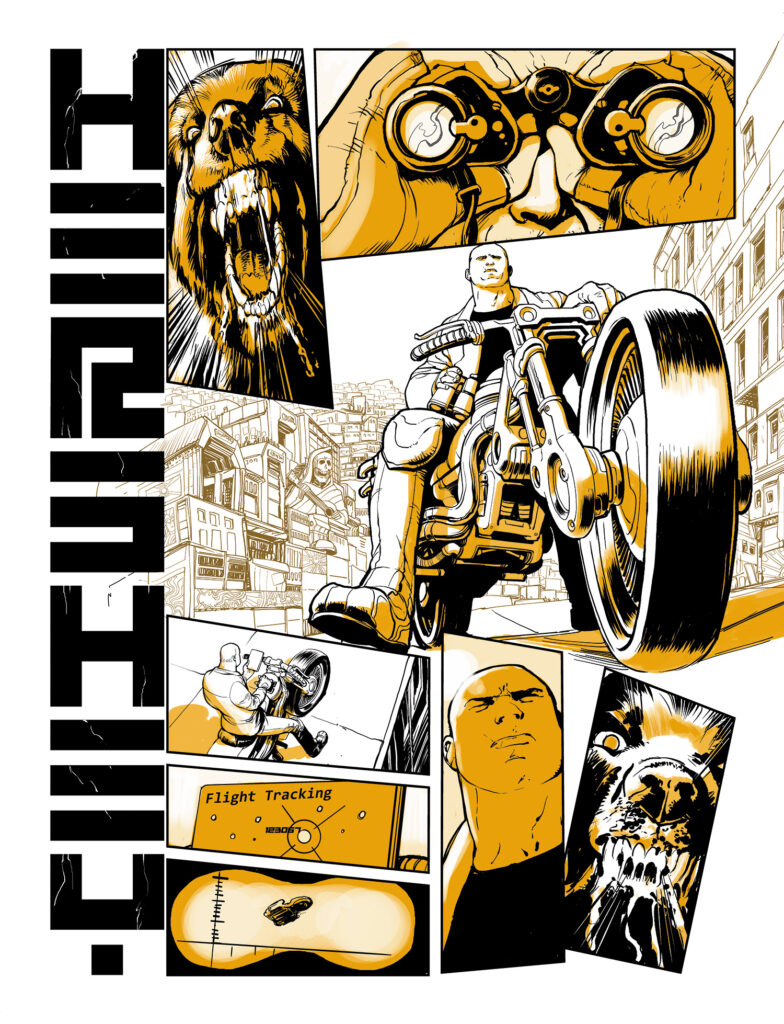
However, Fraser has done more than just the line work in Hershey, and the choices made when it comes to color in the series are almost as important and effective as his lines. Hershey uses minimal color, with — for the most part — just one color on each page, in addition to black and white. It’s a move at once reminiscent of the first couple of years of 2000 AD annuals, where limited color kept print costs low, but used far more intentionally and intelligently, with the colors leading the reader’s eye across the page but also feeding into the emotional reading of any given scene.
In the rare occasions where multiple colors are employed, it feels almost jarring, the dissonance between them — especially in the closing pages of “Disease,” the first story arc in the series — an indicator that something important is happening. It’s a subtle, but thoroughly successful, creative decision that makes Hershey stand out, and differentiate itself from the traditional Dredd world as fans know it, whether things are either black and white or full color. Things are quite so straightforward for Hershey, and Fraser manages to key everyone looking at the pages into that in a smart, almost underhanded, manner.
Letterer Simon Bowland deserves no small amount of praise, as well, when it comes to setting the aesthetic for the series. In addition to delivering narrative captions and dialogue in ways that seem almost invisible, always a sign of successful comic book lettering, he also plays games with the series logo across the individual episodes of the first storyline, seemingly echoing Hershey’s emotional state as the story progresses. The vertical lettering of the logo — and the announcement of the shift of setting in the first episode, for that part — is something else that makes the strip stand out amongst its peers.
Hershey is a strip that plays fair by its complicated, difficult eponymous lead character, and the situations in which she’s found herself; one that doesn’t reveal everything up front, but instead offers discoveries and opportunities for growth as things progress. With Simon Fraser installed as the artist responsible, Hershey manages to deliver on every single one of those promises, and then go even further in convincing the reader of what’s happening in front of them.
Graeme McMillan is a freelance comics and culture writer based in Portland, Oregon, whose work has appeared in The Hollywood Reporter, Wired, Polygon, Playboy, and countless other outlets. He has more opinions about the output of Tharg the Mighty and associated entities than is probably reasonable.
All opinions expressed in this article are the author’s own and do not necessarily represent the opinions of Rebellion, its owners, or its employees.
