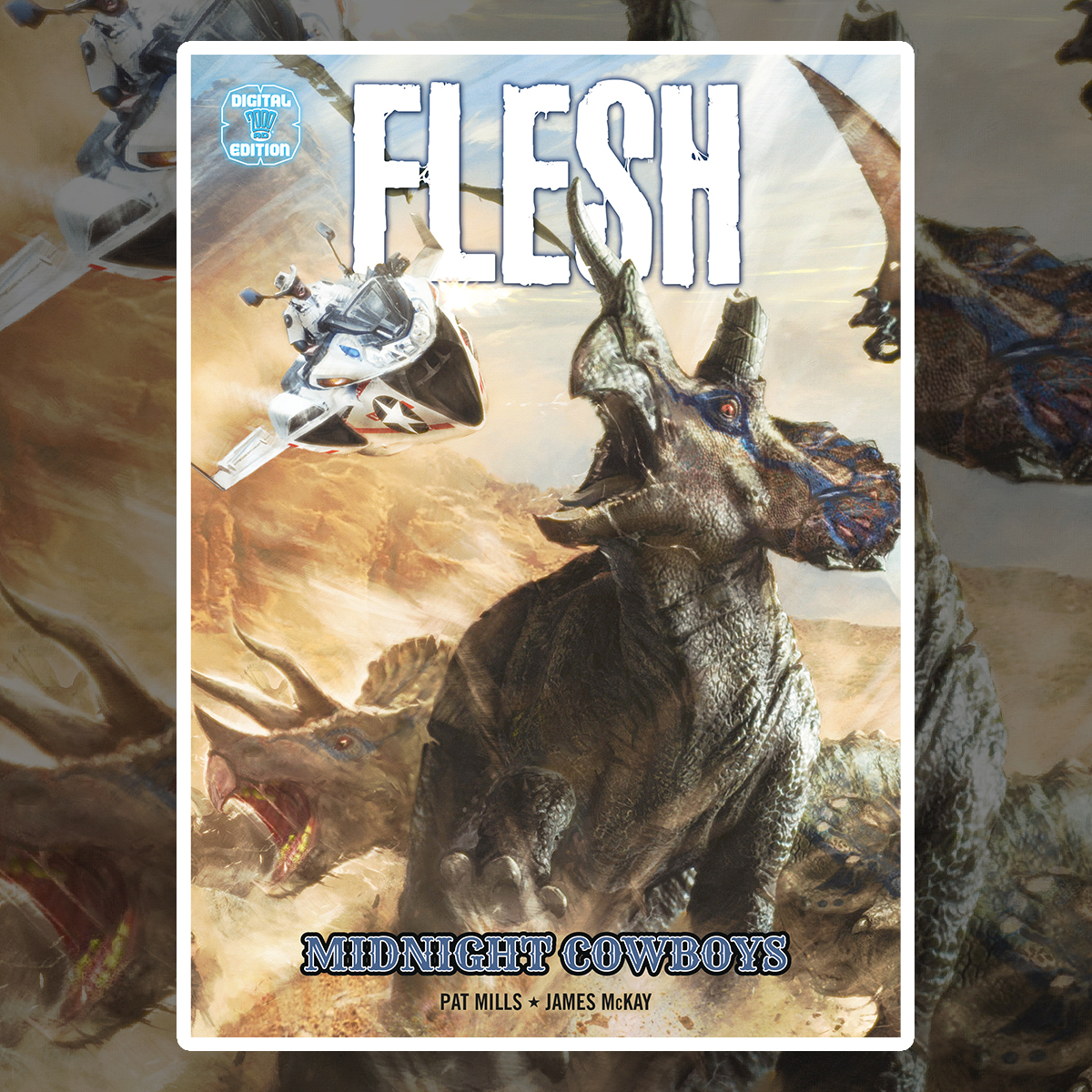
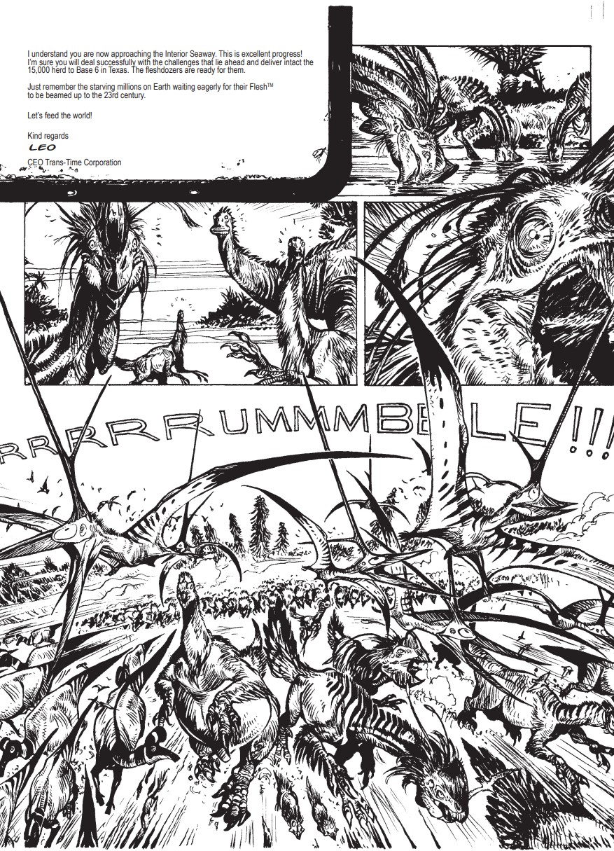
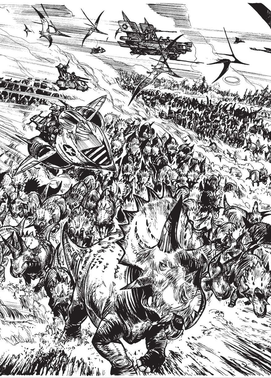
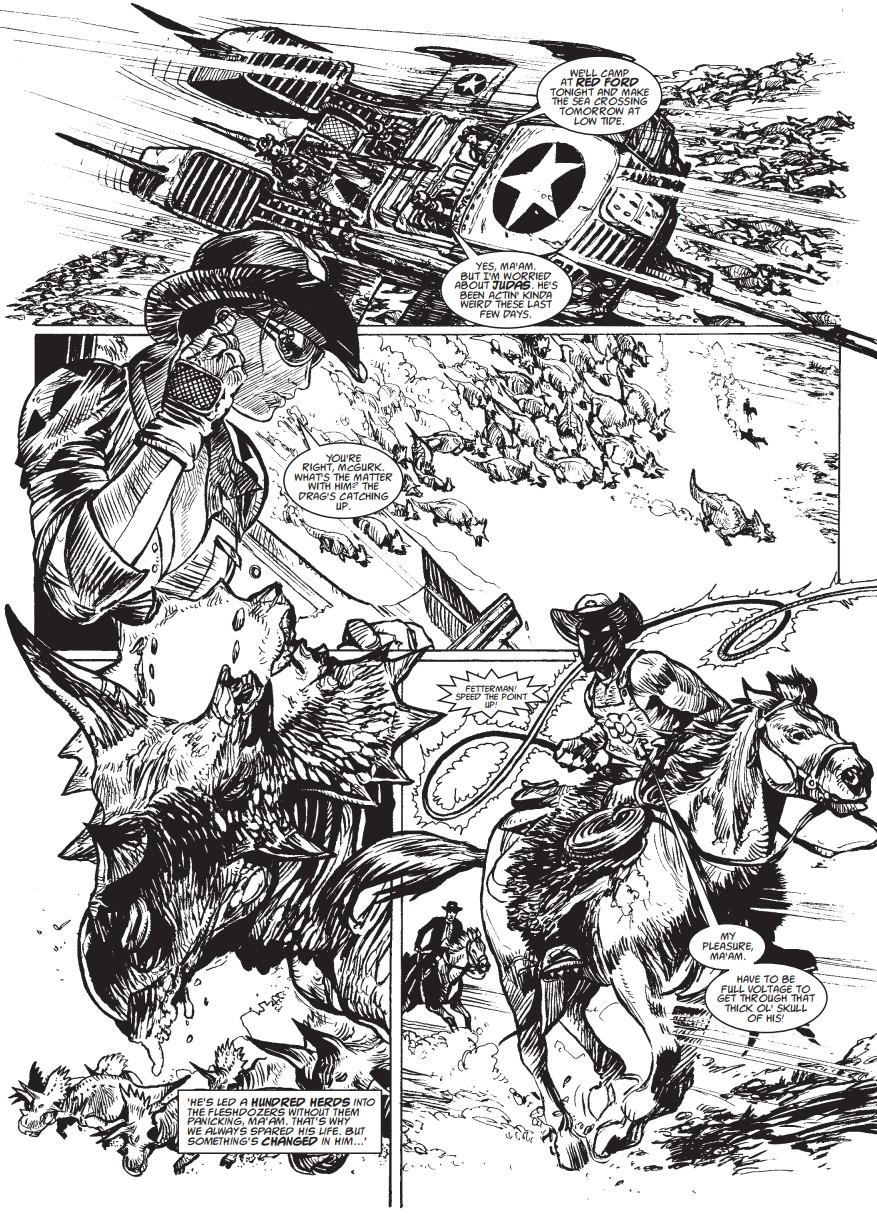
The 23rd century, mankind is surviving on synthetic food, but the Trans-Time corporation has a solution: sending its employees back in time to the age of the dinosaurs and butcher them for their meat… but these humungous beasts aren’t afraid to bite back!
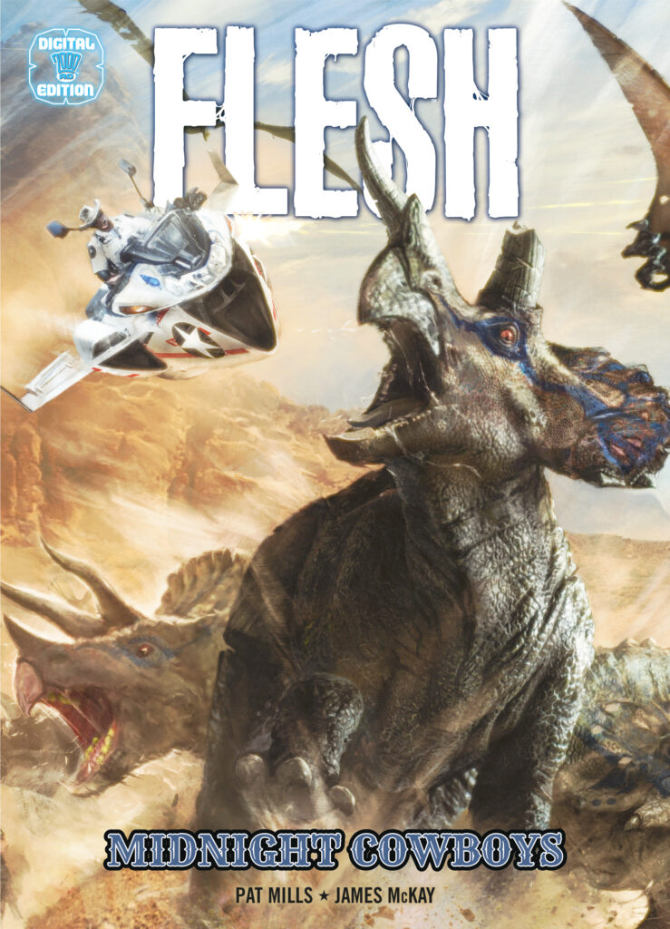
This futuristic Western story by Pat Mills and James McKay, and with cover art by Mark Harrison, is now available in an exclusive digital-only graphic novel for the first time!
Created by Pat Mills, Fleshwas one of the original stories featured all the way back in Prog 1, and quickly became a fan-favourite for bloodthirsty readers. Originally running from 1977 until 1979, there was a smattering of stories in the 1990s, but in 2007 the dinosaurs were brought back to life and Flesh was fully revived, and has been a staple of the Prog ever since.
In the original strip, and this – the modern continuation with art by James McKay – time travelling corporations send humans back to the ancient past to farm dinosaurs for meat to feed a hungry future, but the employees of Trans Time discover pretty quickly that their dinner likes to fight back!
The new digital releases will be available from the 2000 AD app for Apple, Android, and Windows 10 devices, as DRM-free PDF/CBZ downloads from the 2000 AD webshop, and on Amazon Kindle devices.
We have more brilliant digital releases coming in this series of collections, the full list includes:
5 May – Time Flies – Garth Ennis (w) Philip Bond, John Beeston, Roger Langridge (a)
2 June – Slaughter Bowl – John Smith (w) Paul Peart (a)
7 July – Aquila Volume II: The Burning Fields – Gordon Rennie (w) Paul Davidson, Patrick Goddard (a)
4 August – Bad City Blue – Alan Grant (w) Robin Smith (a)
1 September – Firekind – John Smith (w) Paul Marshall (a)
6 October – Dark Justice: Torture Garden – David Hine (w) Nick Percival (a)
3 November – Tales from the Black Museum: Volume One – including John Wagner, Al Ewing, Dan Abnett, Simon Spurrier, John Smith, Alan Grant (w) Shaun Thomas, John Ridgway, Dylan Teague, Rufus Dayglo, Dean Ormston (a)
1 December Durham Red: Born Bad – Alec Worley (w) Ben Willsher, Lee Carter (a)
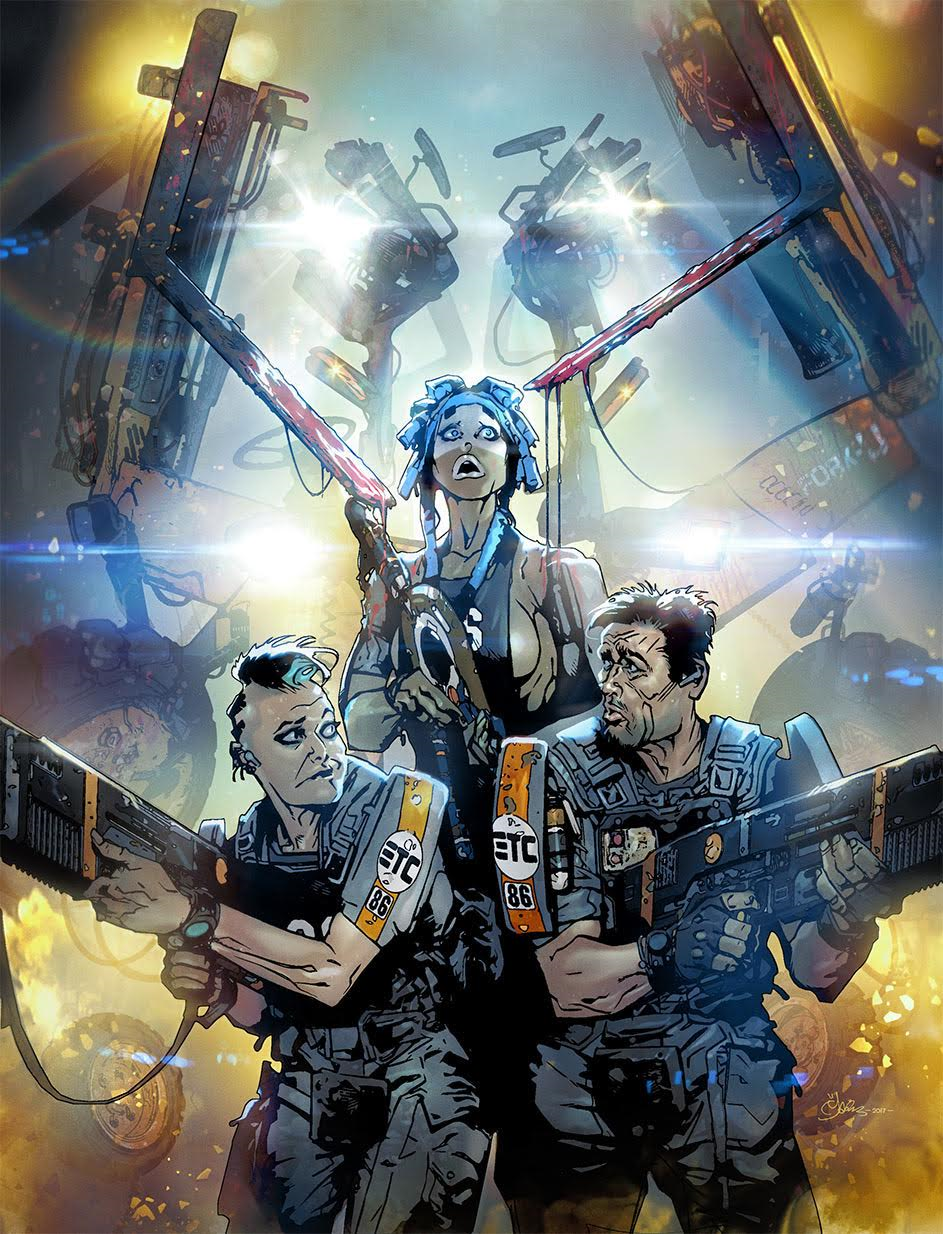
Uh oh! The intrepid agents of Exo Transfer Control are back and they’ve got trouble! Something is tearing apart cargo handlers in the Grey Area and it’s up to officers Feo, Resting Bitch Face and Bulliet to stop it. In a facility full of oddballs, how do you tell the spooks from the kooks!?!
Series artist Mark Harrison is back to pack the panels with all manner of cinematic effects and crazy background jokes. I urge you all to pour over each and every page as the Easter Egg count is off the scale!
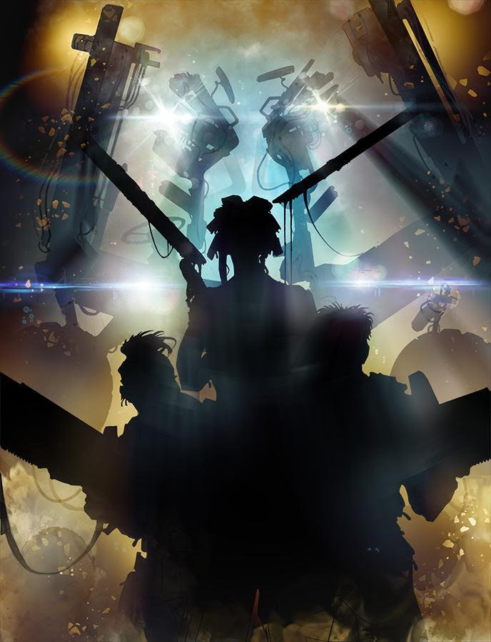
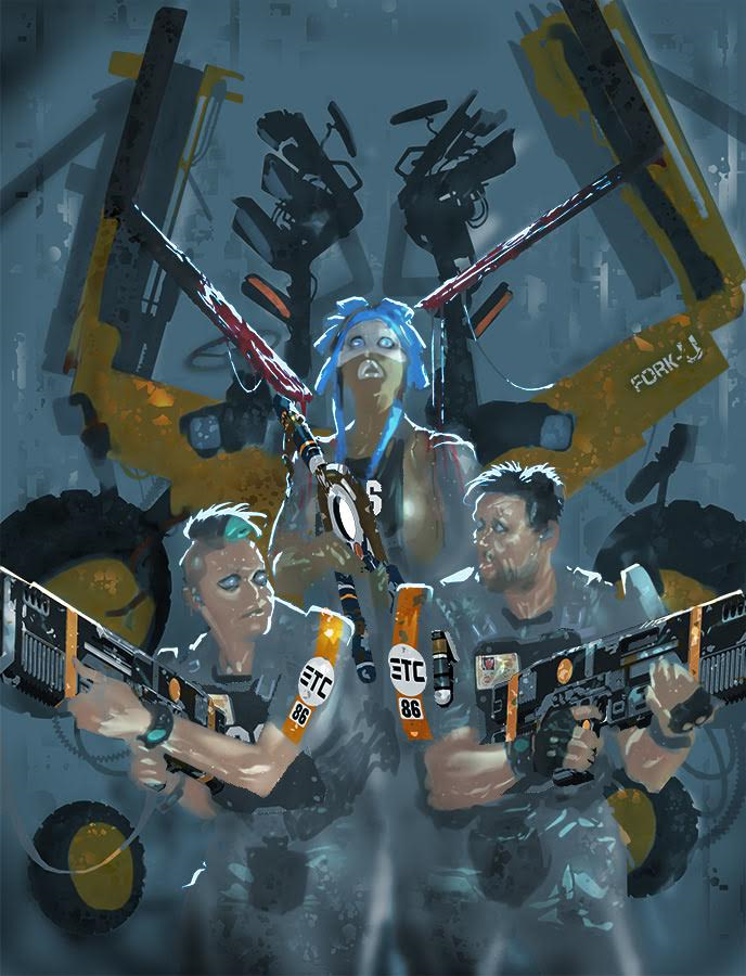
Over to Mark to tell us how the cover was created “After an initial suggestion from Tharg-who-must-be-obeyed of a “Transformers” type alien looming up behind our unwary heroes, I came up with this finished sketch in PhotoShop that also suggested some mood lighting, being lit by amber emergency lights.”
“It’s behind you!”
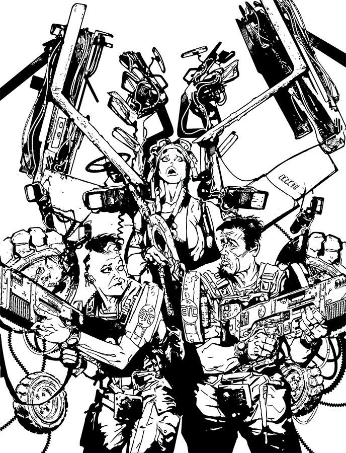
“I knew I wanted a sort of “Was that the wind?” cliché moment you get in a horror film, where the beast drips saliva onto the heroine or in this case blood (Having not seen the final cover I don’t know if this will be censored along with the “Fork U”- Tharg and his minions can move in mysterious ways!)” Rest assured, both details survived! – PWLS.
“The transformer alien was in the guise of a Fork lift truck so I grabbed some images off the internet, cut them up and created a sort of collage of machine parts as an indistinct “presence”.
“The creature would be more silhouette and shadow and light than anything too complex. (Although you can see from the “inks” I did work into it quite a bit before dialing back the detail.)”
“The inks however tend to be towards the end of the process these days as my particular approach towards a cinematic styling paying attention to lighting and shadow no means I usually after initial sketching go straight to a silhouette of the foreground figures and around, on top of and behind that I place special effects.”
“Big Jobs!” Ooops, wrong strip!
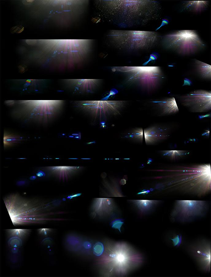
Of course, Mark is well known for his cinematic approach to his artwork, with a range of atmospheric volumetric light effects, smoke, lens flares and sound effects. Mark gives us a little insight into his infatuation here: “I’d become quite obsessive with in-camera lighting effects and artefacts, loving the added colour and layering they create.”
“Ironically I’m not a fan of them excessively used in films, but sparingly, anamorphic, is there nothing that screams wonderful widescreen film more than the short life of a lens flare on screen? I love ’em! (When they are real!)”
“I like the effect in comics so much I’ve created my own over the years. Even as pencil and paint pre-computers, and then created my own based on freeze frames from films (the helicopters approach in Close Encounters; Kane descends into the Egg silo in Alien.) However, recently I realised I could generate my own better than I could make them digitally using my camera and an anamorphic lens (that gives you that classic panavision look!)”
“I lay on my back in the garden on a sunny day and pointed my digital camera at the sun (not a good idea kids) with a black portfolio on my lap to catch the flaring effects. You can see the results in what I call “JJ Abrams Wet Dream”. :)”
“God knows what the neighbours must have thought!”
“Beyond honour, there is duty! Beyond duty, obsession! And beyond obsession, madness! Beyond that, is a man lying on his back in the garden, taking photos of the sun!”
Mark continues “Will I actually use them remains to be seen. I generate a lot of art files than sometimes don’t get used. Making comics into movie comics is pretty complex!)”
Below are the lens flares used on this particular cover…
Mark does the Rorschach Test.
“I established the effects and atmosphere of the piece using silhouettes…”
“Who turned out the lights?”
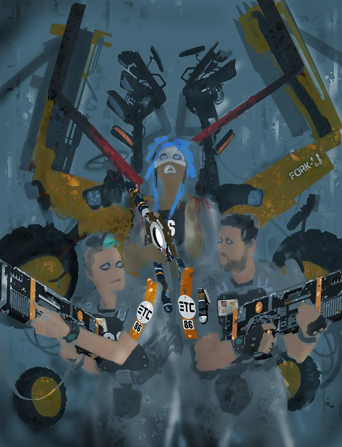
“Now its time to give the foreground some detail. I add additional art such as the guns and ETC logos a separate layer and block out large areas of black using the PhotoShop lasso tool and fill…”
“Then comes the heavier line brush work to define depth. Finally the finer line detail. Pretty much the classic inking approach.”
Not so resting, surprised face!
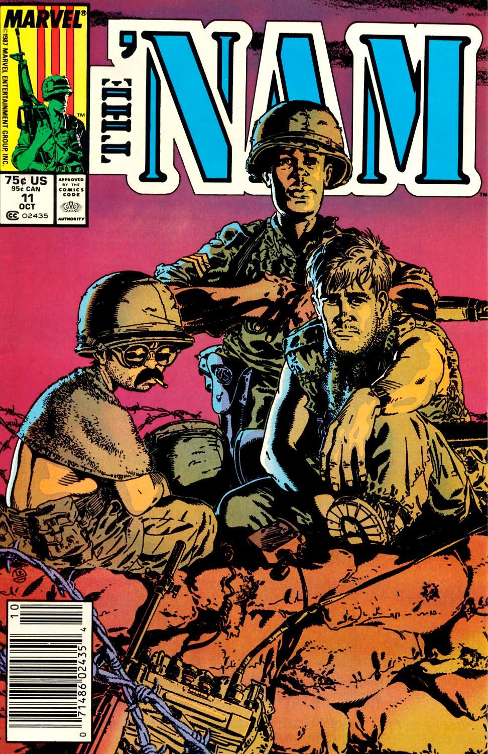
“I’m inspired by artists like artist Michael Golden. His work on Marvel’s “The ‘Nam” and his more caricature portrayal of heroes is something I’d definitely want to explore in future episodes of Grey Area.”
“It’s something I feel more comfortable with. A mix of realistic cinematic styling with almost a toon like content.”
Hey what’s this!?! Nam Covers Uncovered?
The Golden Boys.
“Flat colours follow which are sampled colours from a reference sheet that I apply to the scene at a reduced opacity initially. This gives the scene a colour mix. Tone and rim lighting are defined once again by lasso took and brush.”
“The flattened image is then selectively dodged and burned and a few custom actions are run that enhance the over effects and colours.”
He slimed me!
“Finally I tweak the overall contrast and gamma and lighten for final delivery and printing to compensate for the darkening that takes place in the printed comic (which doesn’t always work.)”
Resting Bitch Face had gone a little too far with her Ripley in Exosuit cosplay costume.
Huge thanks to Mark for sending us the images and fascinating process, I always enjoy his commentary when explaining his cover process, passion and innovation in equal measure!
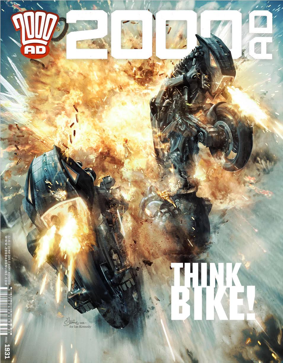
Okay then! This edition of 2000AD Covers Uncovered is coming in two halves; the first, is our usual look at how this weeks’ artist, the BRILLIANT Mark Harrison has put the cover together. The second half will see Mark talk about his obsession for explosions! I’m sure he can expect the MI5 to come knocking soon!
I adore doing a write up for Marks covers for a variety of reasons; A) Because the covers themselves are ALWAYS stunning; B) He is so, so passionate about digital media as an artform and C) I always learn something. This is certainly the case here.
So go and grab a cup of sythicaf and enjoy this weeks’ wonderful 2000AD Covers Uncovered brought to you by the amazing Mark Harrison…
“Be warned, i’m going to name drop like a SOB in this sort of tutorial on real world faked in digital cover breakdown!”
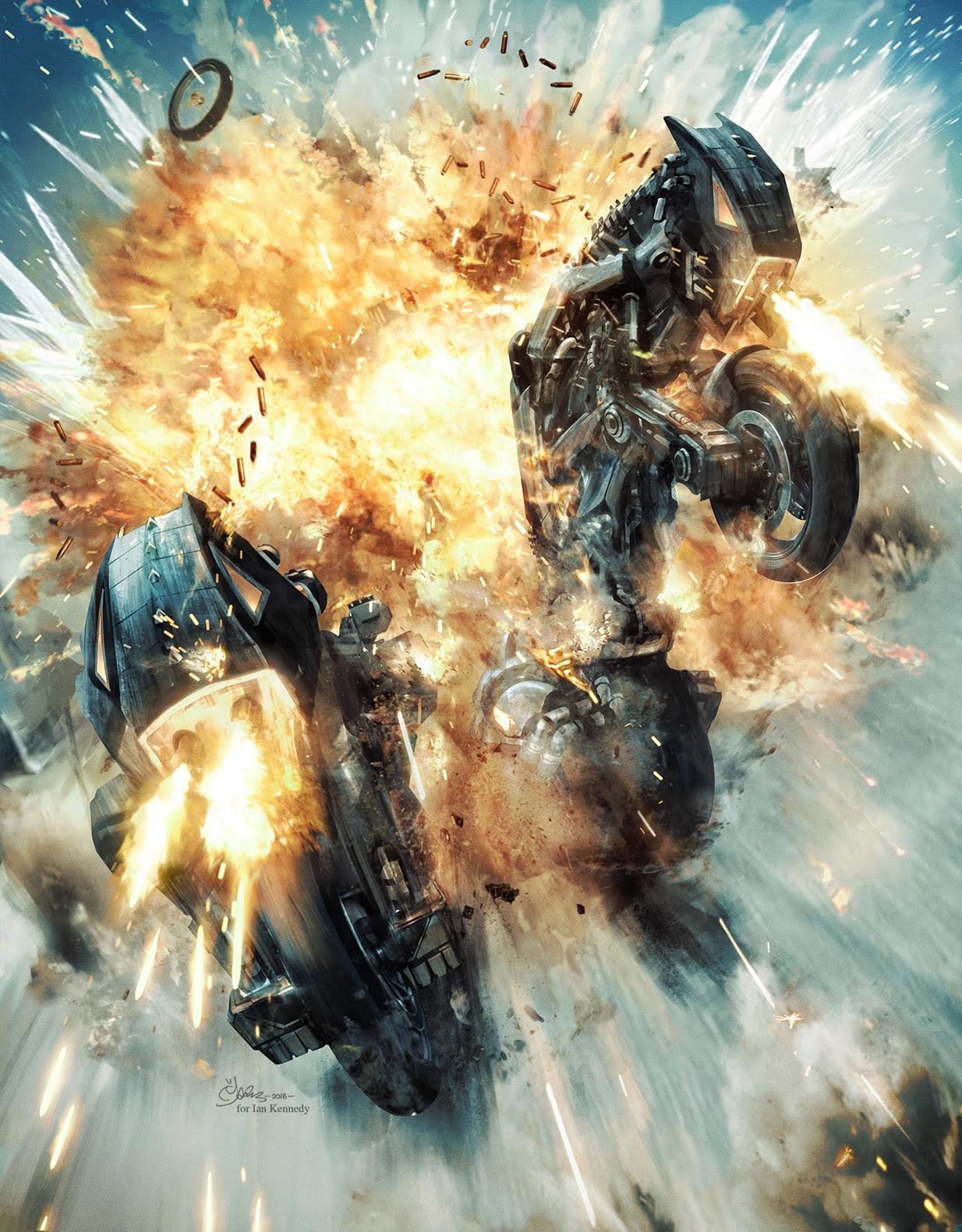
“When Tharg tasked me with providing a cover for the (Bill) Savage strip depicting transformer-styled bikes, I was both excited and deflated. Excited because I’d get to try out my new “explosion brushes” (see KABOOM – EXPLOSIONS UNCOVERED at the end of this cover breakdown); deflated because how could I really improve on the composition of Patrick Goddard‘s stunning comic art. So why reinvent the wheel?”
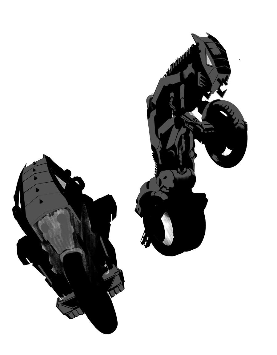
Here we see Patrick’s perfect composition!
Robots in disguise?
“I planned to do very little to it compositionally, just tweak the poses a little and allow the render to carry the difference. To that end I started with silhouettes within silhouettes, working over a couple of google grabbed images of motorbikes.
“It’s an approach I use for concept art, defining the outline then working within that on areas of note- catching the light, etc. I was effectively treating this as a money shot- production art for the Bill Savage movie!”
“The silhouettes, drawn with PhotoShop’s lasso tool to create a black and white foundation image to work over, plus masks to “keep within the lines”. Using texture brushes I created I could quickly block out a dirty looking bike image over the exiting bike images and silhouette art.”
Two Straw Dogs, just casually drawn with Photoshop’s Lasso tool. Bloody show Harrison!
“Ultimately, despite the digital approach, I still wanted this to look painty. The best artists that work in the computer in my opinion still retain their real world styles in their digital art. You’d probably think how could it be any other way but artists can be swamped by the possibilities; the expanded tool kit.”
“Sometimes you need to pull back from that- keep it loose. I reworked the art closer, not too defined.”
“Keeping it real can be an obsession. After demoing my hybrid art technique on the strip Glimmer Rats at a comic con years ago Dave Gibbons told me how Brian Bolland had phoned him excited to show him some new line art. Dave was bemused to see what the fuss was about – it looked like typically well executed line art by Brian.”
“But Bolland exclaimed that this had been drawn entirely in PhotoShop (and back in the days before customisable brushes ) and he was rightly pleased with the achievement because it looked like he had painstakingly painted it in the real world. But he hadn’t. He had even more painstakingly painted it in the digital world!”
“Get any artist alone to talk technique and we’ll be only to happy to share. Ian Kennedy uses acrylics like watercolours. Michael Golden uses a paintbrush for EVERYTHING and I still don’t believe him because it makes me want to cry!”
“I myself create PhotoShop brushes based on real world “footprints”, paint dabs or ink marks, scanned them into PhotoShop and then attributed dynamics to them to best mimic real world tools.”
“I’ve even written PhotoShop Actions to turn the digitally crisp silhouette selections of the computer into line art that has been subtly displaced by a paper grain texture, to replicate the imperfections and bleed from paper! (Colin Wilson told me that although he used a rule to draw straight lines, he would sometimes give it a little nudge or waiver to make it look hand drawn. I do the computer equivalent!)”
“It’s all about the Art of Freehand; the Noise of Imperfection. The results will probably not even register in print, but along with a film grain overlay it harmonises the art and any disparate elements. Makes it more pleasing to the eye.”
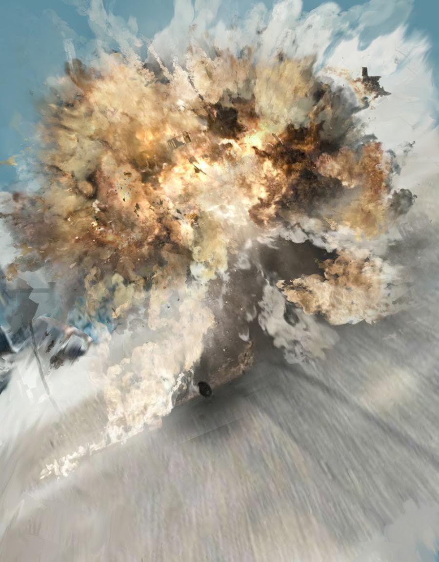
“I also wanted this cover to have a sense of speed about it in the foreground; a frozen moment but the road motion blurred by speed. A kinetic shot with lots of overlaid tracer fire and debris being kicked up; a companion bike had been blown up and these two were emerging thru the flames with a vengeance.”
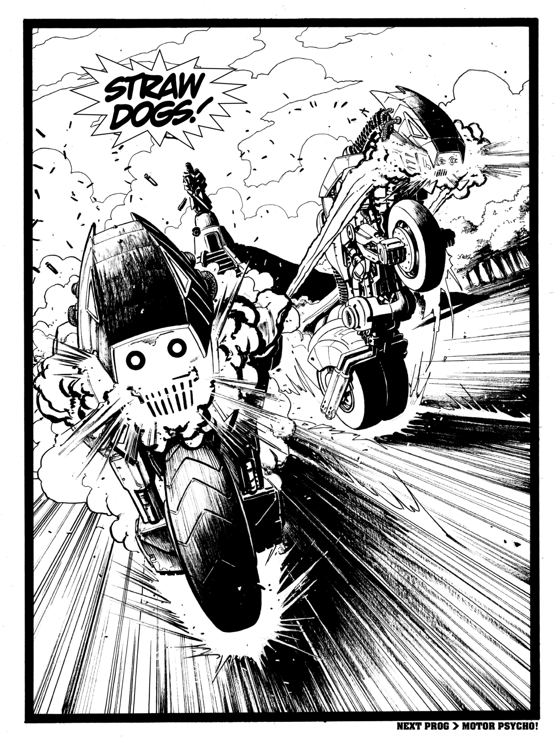
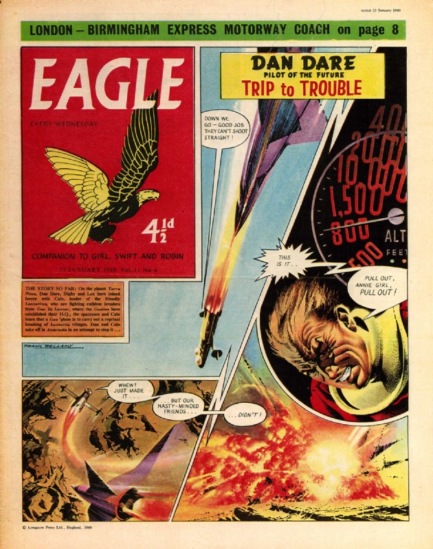
“To get that speed look I looked back on an old favorite artist of mine growing up and one of the earliest artists to contribute to 2000 AD (on MACH 1); Ian Kennedy.”
“Ian was the first comic book artist I ever collected. (I didn’t collect comic books- I collected artists!) By which I mean I would cut out his pages and keep them, and bin the rest of the comic!”
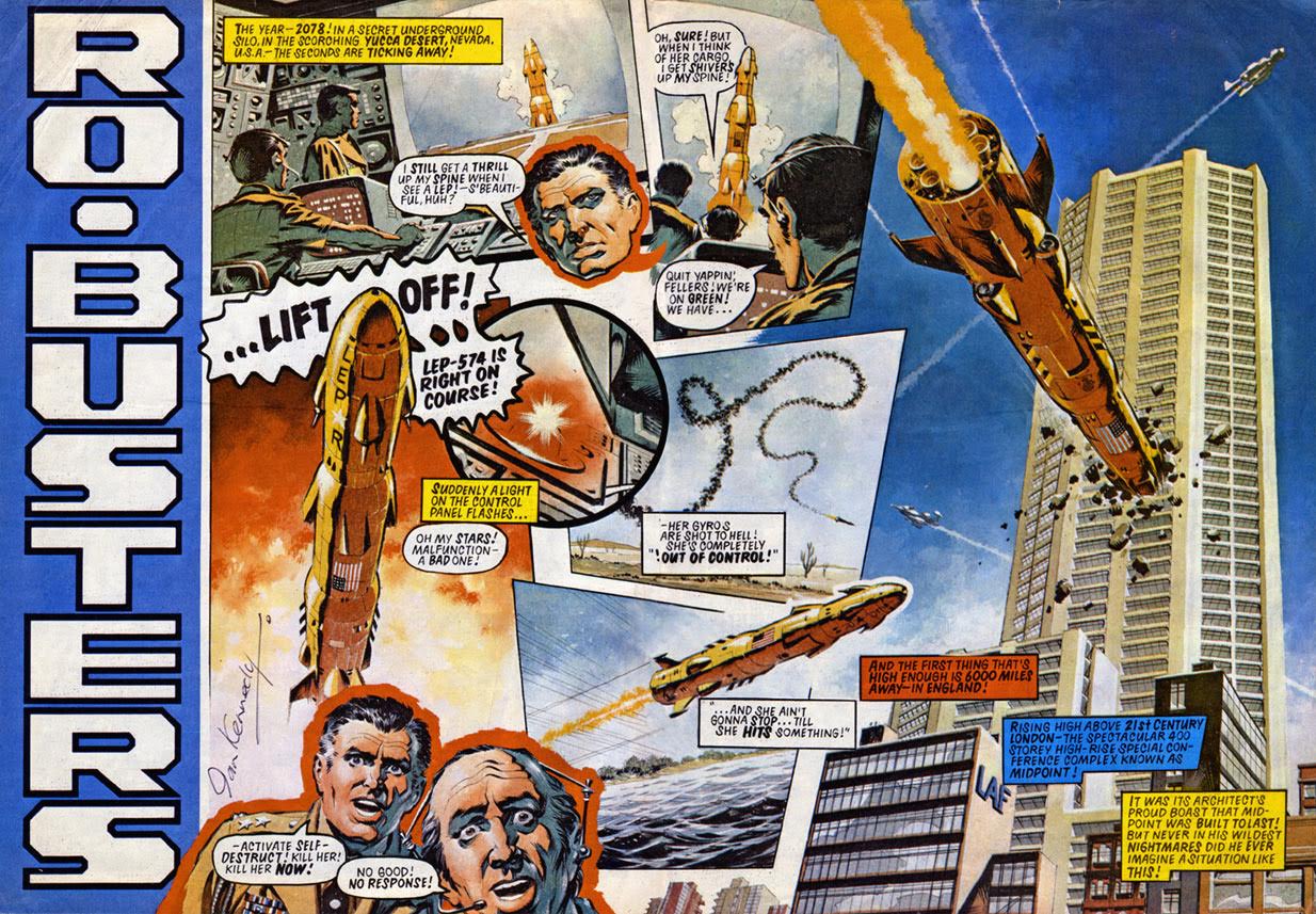
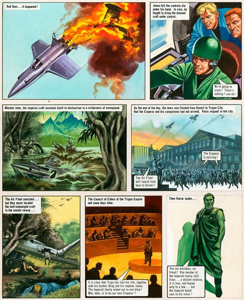
To illustrate his point, Mark sent this page of Ian’s work on RoBusters. He says “Why Ian never got to work on anything Gerry Anderson baffles me- he would have been the perfect fit! Collect and reprint the Pat Mills Dan Dare of the revamped Eagle!”
“Oh my STARS!”
“He did fabulous painted explosions with the characteristic “wheel flying out of them”, be it a Spitfire or racing car, something Frank Bellamy did and also years later in 2000AD Colin Wilson of Rogue Trooper fame.”
Here’s a wonderful Ian Kennedy with flying wheel page which also illustrates the point perfectly…
“I was lucky enough to meet Ian for the first time earlier this year and the cover is respectfully dedicated to him, a childhood comic artist hero.”
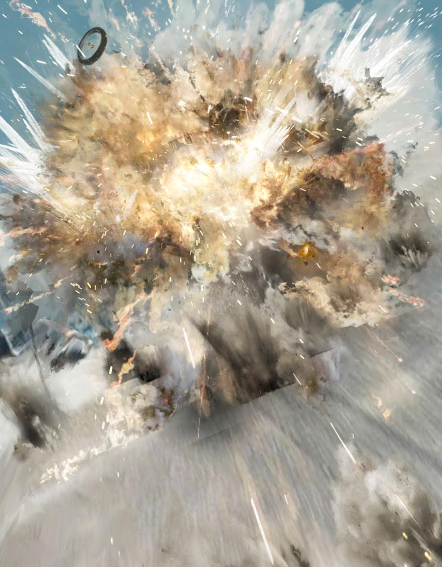
“Ian managed to capture wonderfully with pen and brush the speed of wheels, the tarmac rushing by, the spray being kicked up in rain, and I referenced (copied) that for this cover. I just had to have a wheel flying out of the explosion as an homage! (the placement of which was the hardest part of the cover!)”
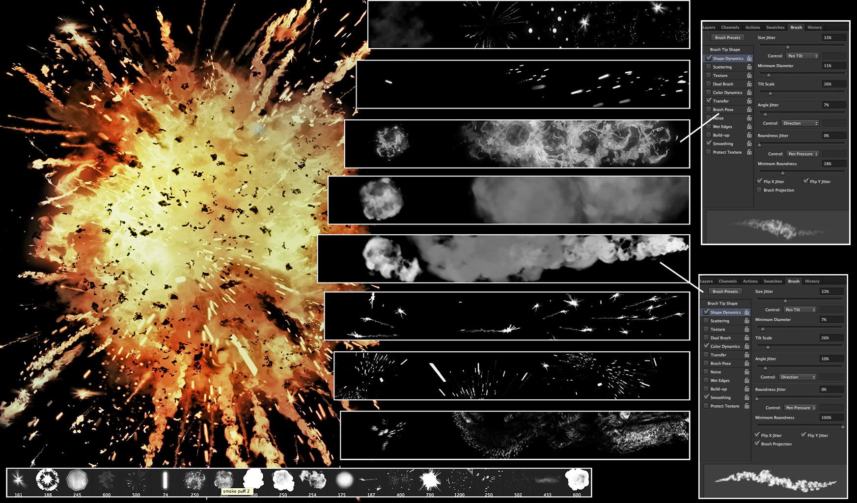
Let’s look at how Mark created his dazzling explosion. Below are some of the elements he uses to create mayhem. He says “Showing the various PhotoShop brushes used to create an explosion and their controlling shape dynamics…”
Kablooee!
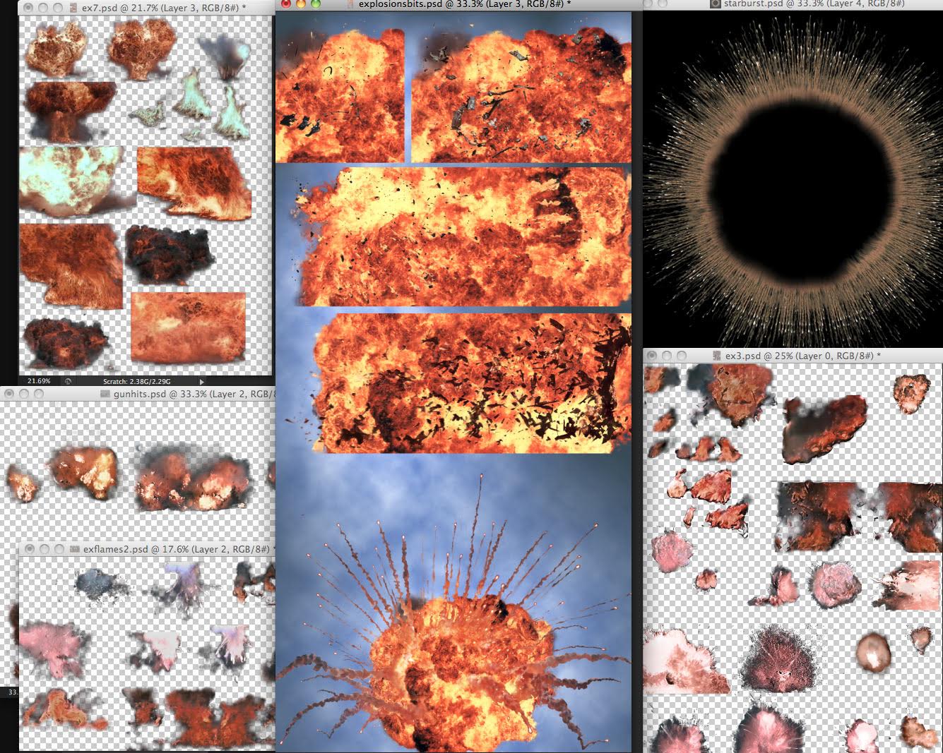
“These are grabbed and tweaked explosion files that served on 3 books of Durham Red and Glimmer Rats. From great explosion films like Independence Day, Star Wars, Goldeneye and Tomorrow Never Dies.”
“Give me the power, of man’s red flower, so I can be like you!”
Mark continues “Building an explosion from an existing grabbed explosion using custom brushes in the layer mask to reveal the explosion and tailor it to the scene. See how the sparks add to the energy. Also dropping on some Baysplosions!”
Badooooooom!
The all important wheel and debris!
Mark continues “As Ian says- “Copy from the best and your own style will emerge.” I’m still copying, Ian… 😉 “
“Additional art and effects such as muzzle flash and debris being kicked up was dropped on from preexisting art files. This is a technique I was thrilled to see Carlos Ezquerra also used , one of the very first artists to adopt the Mac computer and PhotoShop for comic book art back in the 90’s.”
“Carlos, along with American underground artist Richard Corben were the only two artists using PhotoShop in comics the way I intended to use it on Durham Red. Using real worlds assets, drawings, paintings and then digitally enhancing them later in the computer.”
“If you do the same thing enough times, you can build up a library of art you’ve saved that you can drop on new art again and again, like decals.”
“Carlos had files of bullet impacts on walls and bits of broken concrete that he just copied and pasted on his art. It was an exciting time of discovery and innovation and sharing of techniques. To this day it’s the technique- the process of comic book art I love. I’ll talk an artist to death to know how he does something!”
“The final finesse was a knowing nod to the Michael Bay films and a particular colour palette or “film grade” he applies to his Transformers films, pushing blues and green colours into machinery to be a complimentary contrast with the overly saturated oranges of flesh tones and explosions. This cover had to be Baysplosive!”
And Baysplosive it is! Bring on Savage the Movie!
Mr Embleton will be proud!
As ever, Mark has mocked up his own version of the cover, complete with puntastic strapline…
“That completes this cover! I’m grateful to Tharg, Wiggz and Ian Kennedy for sparing the time to talk to me and inspire me from childhood to now. Thanks guys! Should I grow up and put explosions in their toy box… Nahhh! Every boy loves a good explosion!”
Which brings us to…
KABOOM!!! Explosions Uncovered!!!
So now, Mark talks us through his love affair with all things loud and firey, it’s fascinaitng! He says “I grew up on explosions. Not literally, but loving them in film, TV, comics. What young boy didn’t? Whether it was the opening titles of Thunderbirds (the original- not the explosion-free remake) or the villain’s base blowing up at the end of a Bond movie. I was primed from a young age to appreciate a good bit of pyro!”
“I rated comic artists on how good they did an explosion. Did it have energy, wow-factor? Try and get away with a balloon pop and smoke puff and you weren’t on my radar. Luckily I grew up in a time of great painted art, or line and painted, and that allowed artists like Frank Bellemy, Ron Embleton and Mike Noble to dazzle with stunning layouts and colourful TV action explosions!”
Bellamy BOOMS!
Embleton EXPLODES!
Nobel, erm… NOBLES!
“Amongst that handful of great British comic talent was Ian Kennedy handling the war effort side of comics and becoming my favorite artist of that period.”
“I myself spent far too long trying to perfect my own take on an explosion, especially after seeing Star Wars. In traditional media, acrylic, oil pastel, pencil and airbrushed coloured inks. I cut stencils from cardboard to get a fireball shape.”
“I mean I don’t want to sound too obsessive (too late) but I even started checking out the special effects guys who did the explosions at the end of film credits. I knew if Joe Viskocil was involved I was going to get some nice chunky bitty explosions like in True Lies or Independence Day. (He had his own formula for achieving that effect…)”
“I had a Cinefex on Terminator 2 and I’d stare at the explosions of a couple of Terminator tanks for hours, trying to replicate that look in paint for my strip work in what would be my first (and unpublished comic) Loose Cannons.”
Here is a suitable explosive page of Loose Cannons which can be read here. Mark says “Painted explosions in the unpublished Loose Cannons using acrylics, white pencil and airbrushed coloured inks.”
Loose Women took a turn for the worst (or possibly better.)
“When I went digital, I grabbed explosions from films like Star Wars or Goldeneye (Gun hits: You can’t go wrong with a Derek Meddings explosion). These were actually photographed off the TV if I recall- using a film camera! (God knows what the one hour processing shop thought of my holiday snaps!)”
I had to eliminate the noticeable pixel lines from the TV, adapt them into “explosions files” that served me well through 3 Durham Red books and Glimmer Rats.
But as I transitioned into digital line art from digitally painted art I found the line art for explosions didn’t look right to me, to my cinematic stylings. And a dropped in explosion would stick out like a photo. I was wanting the line art clarity but keeping the light gaseous look of an explosion intact.
Once again I looked to those artists of old and saw they drew in line the “hard bodies”, fragments of the exploded vehicle but let paint describe the billowing plasma.
That was the way to go and so I built PhotoShop brushes that would allow me to tackle the individual elements of the explosion; the sparks, the trailing phosphorus bits, the oily flames and embers.
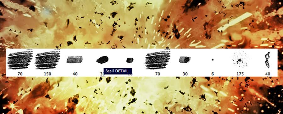
Here are some of Mark’s brushes below, he says “These are some of my brush footprints; (copy these and you can make your own brushes!) I name all my brushes after the artists that inspire them. i have line brushes named after Olivier Vatine, Eduardo Russo, Walt Simonson, Sergio Toppi, Frank Bellamy (stipple), Mort Drucker and in this case “Basil”. (named after horror Famous Monsters cover artist Basil Gogos!)”
I wrote a custom PhotoShop Action to render the black and white tone art to colour flame that would complete the effect.
The same brushes could create smoke and dust clouds. I had perfected my digitally painted explosion! Now to blow up the World! Artistically of course.
(This artist in no way condones real explosions that hurt people. Just ones that blow up models or sets)
Brilliant stuff! Thank you so much to Mark for sending the hugely entertaining write ups and the glorious images. This is a truly fantastic cover from a brilliant artist. Be sure to check out more of his work here.