2000 AD Covers Uncovered: Bringing the Bellerophon… D’Israeli returns to cover Prog 2359
23rd November 2023
Every week, 2000 AD brings you the galaxy’s greatest artwork and 2000 AD Covers Uncovered takes you behind-the-scenes with the headline artists responsible for our top cover art – join bloggers Richard Bruton and Pete Wells as they uncover the greatest covers from 2000 AD!
Helium: Scorched Earth by Ian Edginton and D’Israeli is absolutely blasting through the pages of the Prog right now, giving us the thrills of a beautifully strange world. 2000 AD Prog 2359 finds the forces of Ris in the skies above our heroes – as you’ll see from the latest fabulous cover by D’Israeli…
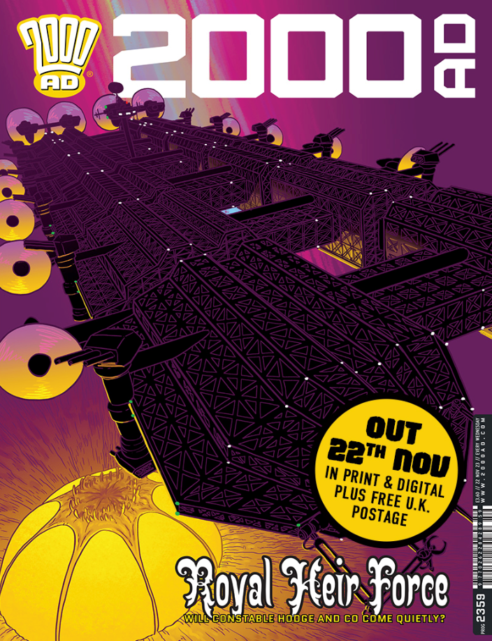
When Helium debuted for a first series in 2015, it told a fabulous tale of adventure in a sumptuously realised world where war has devastated the environment, leading the survivors to seek refuge above the toxic cloud of biological and chemical weapon smog that blankets the world below.
But as we’ve seen in the second series, Scorched Earth, there’s a lot of life both below and in the Fugue Cloud. Our heroes Constable Hodge, her deputy Sol, and the strange Professor Bloom, who claims he can transform the world, are now on the run from the forces of Ris, the city under the Fugue.
All of which has led them to the small township inside the Fugue, a township under a very weird organic shell. But any peace has been shattered as the Ris battle carrier Bellerophon looms overhead. And that’s exactly where we are on this latest cover from D’Israeli.
So, over to D’Israeli to tell you all about it…
MATT BROOKER: This image was produced using a Wacom drawing tablet and Clip Studio Paint software. The same effects can be produced in other graphics programs.
This was an unusual one for a couple of reasons – the first was the choice of cover design itself. For my whole time at 2000AD, Tharg-in-Residence Matt Smith has given me a clear brief for each cover. I’ll usually produce 1-2 interpretations of that brief, plus one complete outlier idea of my own. Matt will usually choose one of the variants on the brief and off we go.
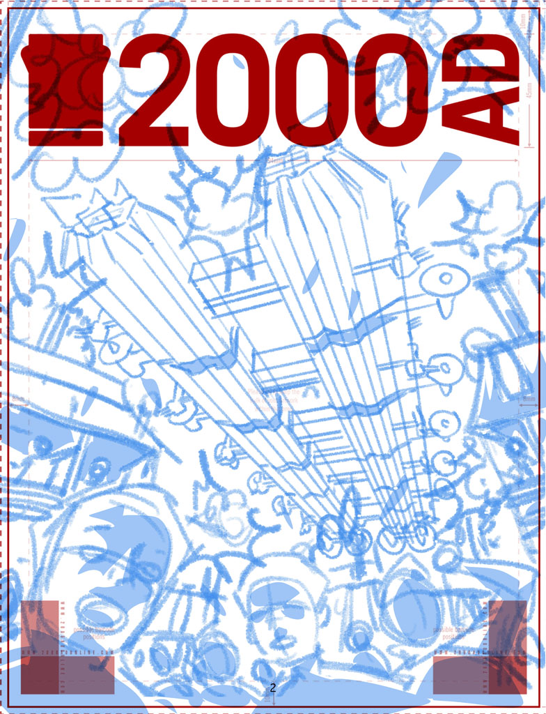
This time, though, Matt’s brief was to show the carrier Bellerophon bombarding the marketplace of the domed town (Rough number 1), and I also produced a variant with the Bellerophon bombarding the dome as seen from the outside (Rough number 2).
We went with the brief of rough number 1, but once I started penciling the image I remembered that the clothing of the inhabitants of the dome was Middle-Eastern in style, and we were showing them being bombarded with artillery. Given current sensitivities over the Israel-Gaza crisis, I thought it best to check back with Matt, and after some thought we went with the second idea, removing the explosions from that version so we just see the huge ship menacing the dome.
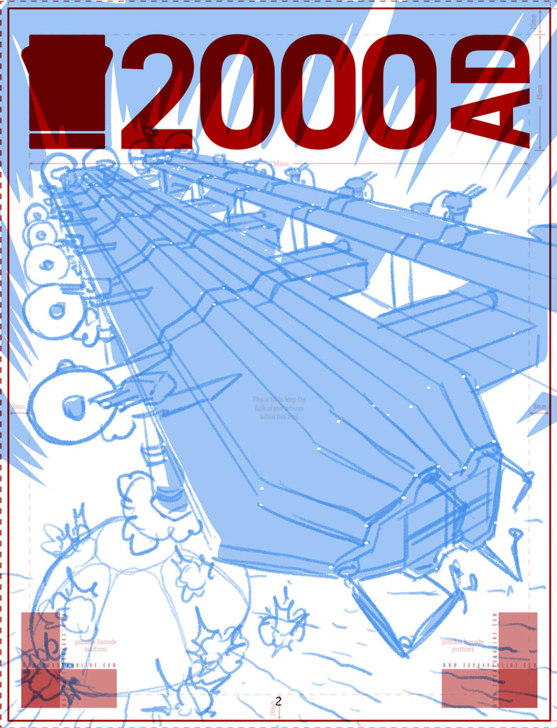
That actually made the job quite a bit simpler – I’d already used 3D models to get the Bellerophon looking right in the roughs, so most of the job would be inking over the render. This cover was the first one I’ve ever done without needing to do pencils!
Or inks, technically – I was only using coloured outlines for this image, which in the old days would have been classified as “colour holds,” not inks.
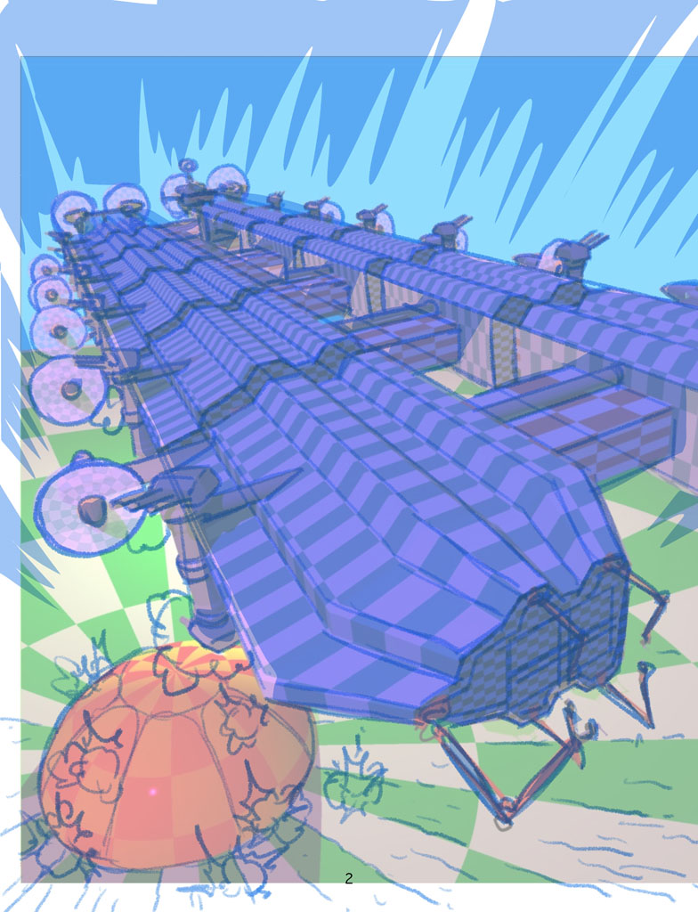
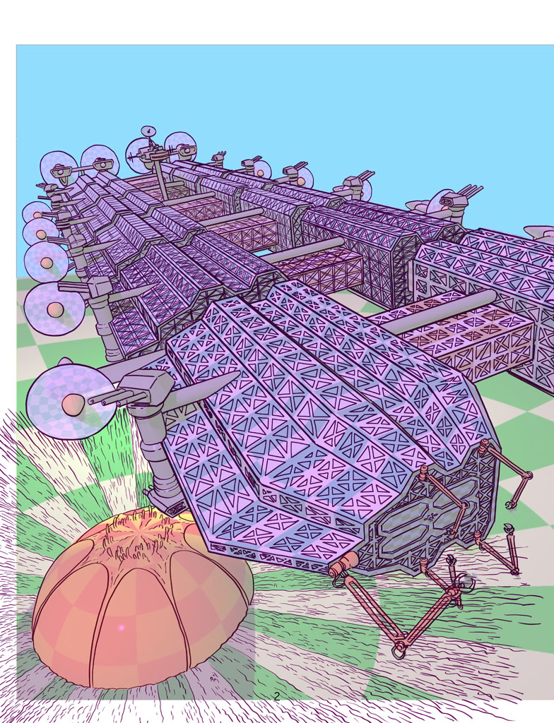
Having the model to work from saved me a lot of effort in terms of setting up with structure of the drawing, but I still had to add all the gridwork on the outside of the ship.
I’d covered the model in a chequerboard pattern to act as guides for the gridwork, but it’s still a slog drawing it all in. The most difficult bit is working out how to start tailing off the amount of detail into the distance, so the density of the drawing looks consistent. If you try and draw every last girder, the drawing will look like a mess, but tail off too soon and it looks sparse and lazy…
The next step was to add blacks under the girderwork – for printing purposes, black needs to be on its own layer above the colours, so I traced off the shape of the Bellerophon in black on a layer above the linework, then selected the contents of the linework layer (CMD/CTRL + click on the thumbnail for the layer in Clip Studio) and used that to make a Layer Mask that cut out the linework from the black.
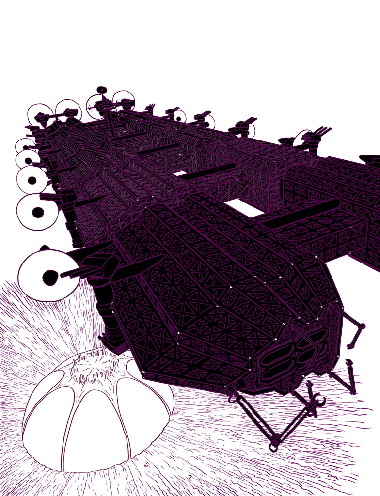
Following that, time to add flat colour and a basic grad to make it look as if the dome is glowing, all on layers beneath the black and the linework…
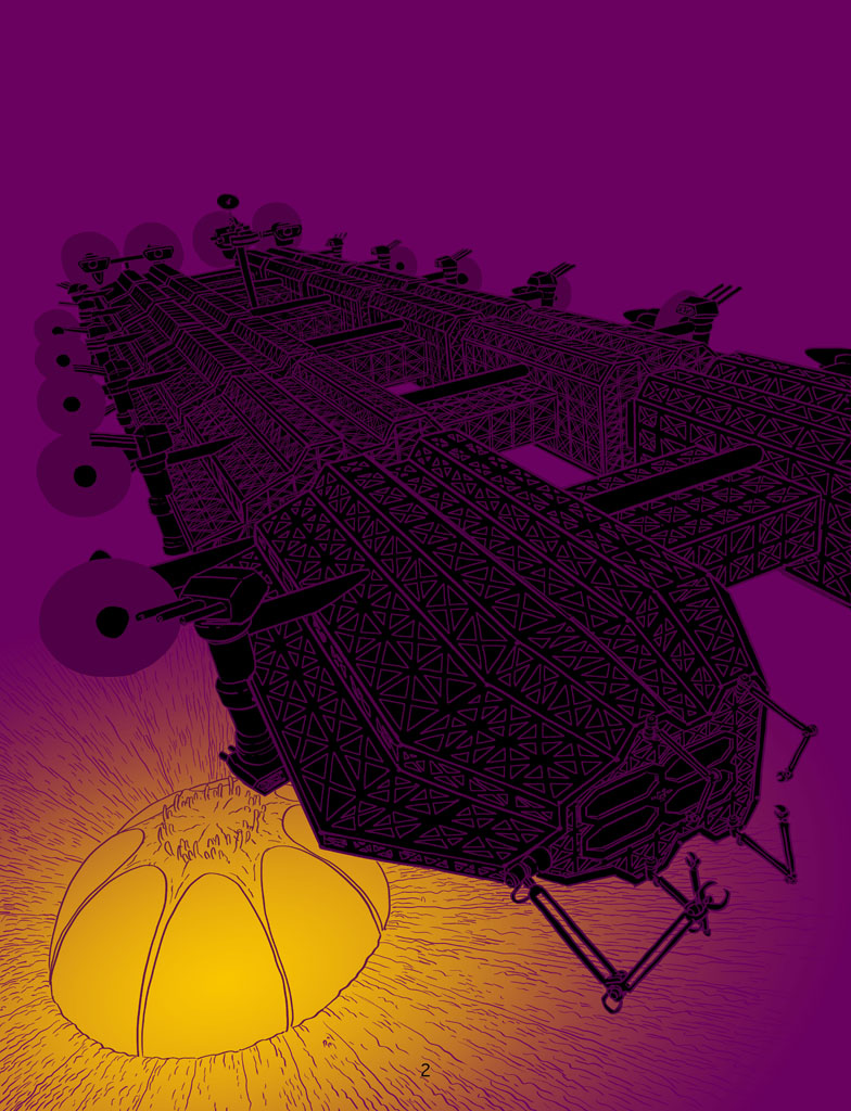
Next, I added modelling to the background grad, grads and highlights to the Bellerophon’s propellors (to suggest movement) and also to add yellow highlights to some of the linework on the Bellerophon to help it “pop.”
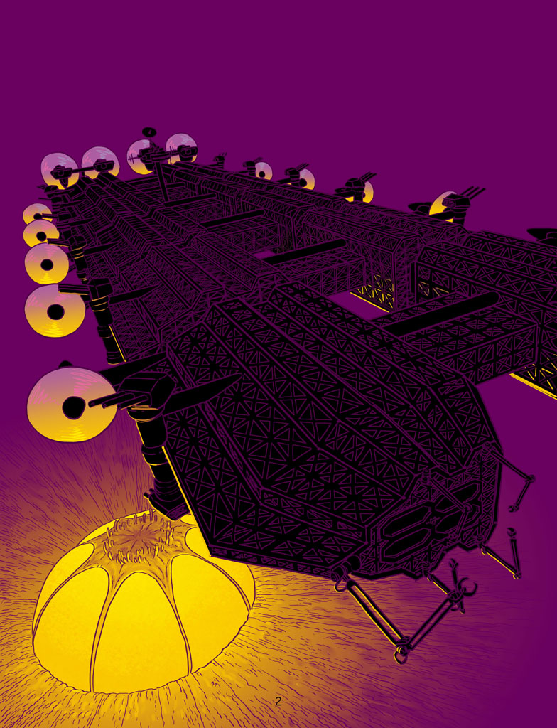
After that, the final touches – I put in a subtle grad on the blacks so the giant carrier would look as if it were fading into the mist with distance, and I added some detail to the sky – a magenta grad and blue-green streaks which help break up the background a bit. I’m not sure what this effect is meant to represent, but I’ve been putting it in since early in series 1, so there you go.
The final step (not shown) is to export the file to Photoshop, and carefully collapse the layers to give me a CMYK TIFF file suitable for printing.
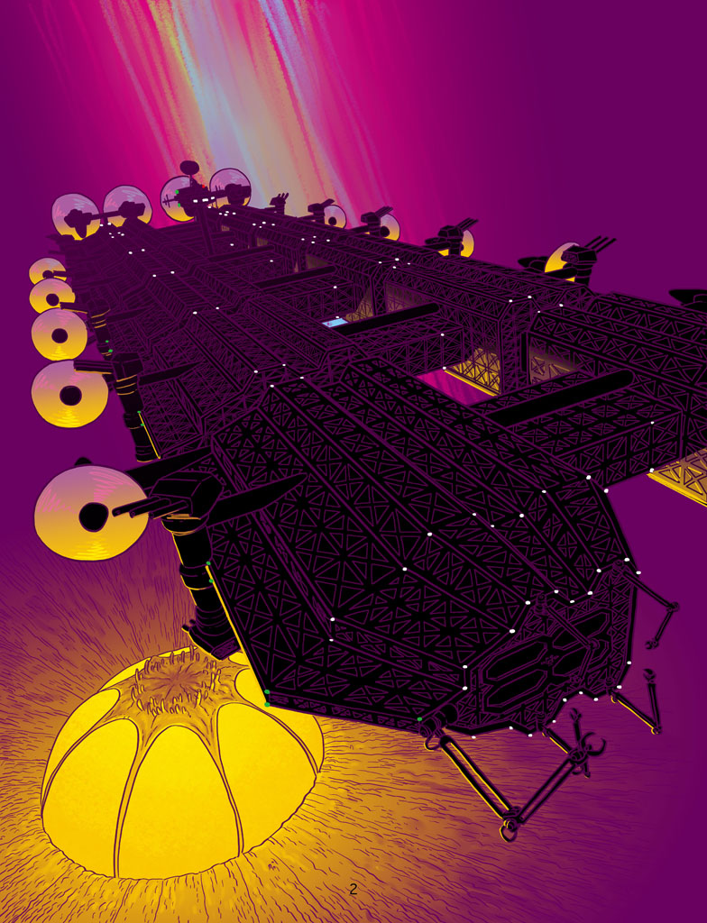
Thank you so much to D’Israeli/Matt for sending that lot across. It’s a really striking bit of cover art that you’ll be seeing on the shelves of your local emporium stocking Tharg’s finest right now. And of course it’s available from the 2000 AD webshop as well.
If you’re after more Helium, we interviewed writer Ian Edginton about Scorched Earth here and we talked of the art of Scorched Earth with D’Israeli here. And as for more from both gents… do be sure to dive into the interview archives… Fiends of the Eastern Front: 1812, interview with Ian and Dave Taylor, Fiends of the Eastern Front: 1963, interview with Ian, Judge Dredd: Babel, interview with Ian and Matt, and Scarlet Traces: Storm Front, interview with Ian and Matt. Plus, don’t miss both Ian and Matt talking on The Lockdown Tapes.
