Interview: Talking D’Art of Helium with D’Israeli.
12th October 2023
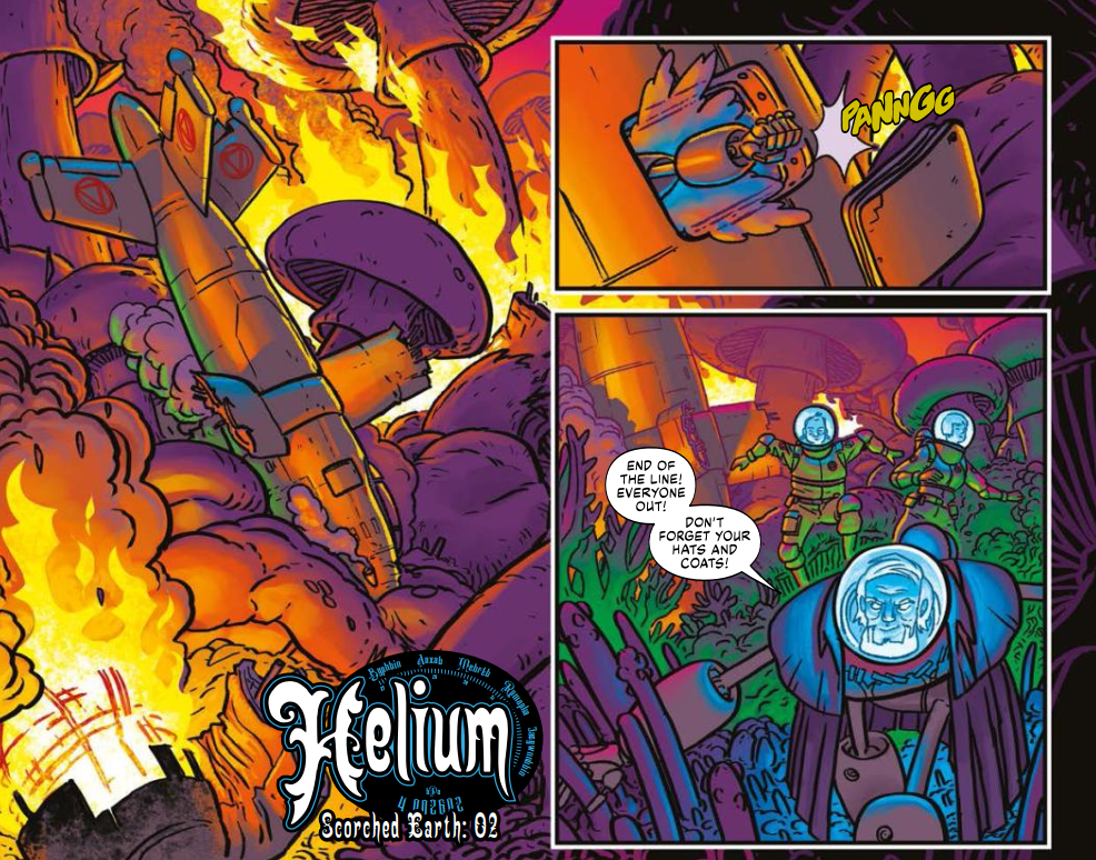
Scorched Earth, The second series of Ian Edginton and D’Israeli’s magnificent retro sci-fi thriller Helium is up to episode 3 in the new 2000 AD Prog 2353, out this week – so time to have a chat to the D’emon Draftsman himself… D’israeli…
and a whole new set of stunning colours from D’Israeli!
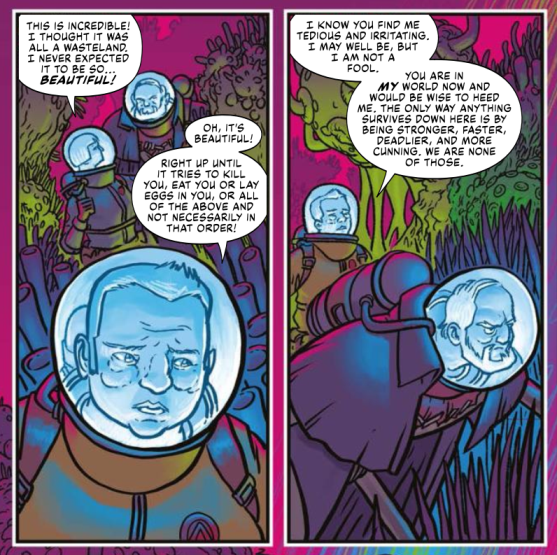
From Helium: Scorched Earth Part 2, Prog 2352
Back in 2015, Edginton and D’Israeli introduced us to the incredible world of Helium in Progs 1934-1945. A tale of a world split in two after the Great War, with the toxic biological and chemical weapon fog known as the Poison Belt forcing those above to live on high ground and travel by air and those below it to live in huge terrariums to prevent a terrible and agonising death from the fog.
But, as we find out from episode 2 of Scorched Earth, Constable Hodge, her loyal deputy Sol, and the mysterious Professor Bloom are in that deadly, flesh-eating Poison Belt, having been shot from the skies at the end of the first series. We’ve already had huge revelations about Hodge and Sol and who they actually are and we’ve no doubt there will be many more as Scorched Earth continues!
We’ve already talked to writer Ian Edginton about Scorched Earth (you can find that interview here), but in the same way that you can’t have jelly without ice cream or gin without tonic, having Edginton without D’Israeli just wouldn’t be right.
So, without further ado… D’Israeli, aka Matt Brooker…
From Helium: Scorched Earth Part 2, Prog 2352
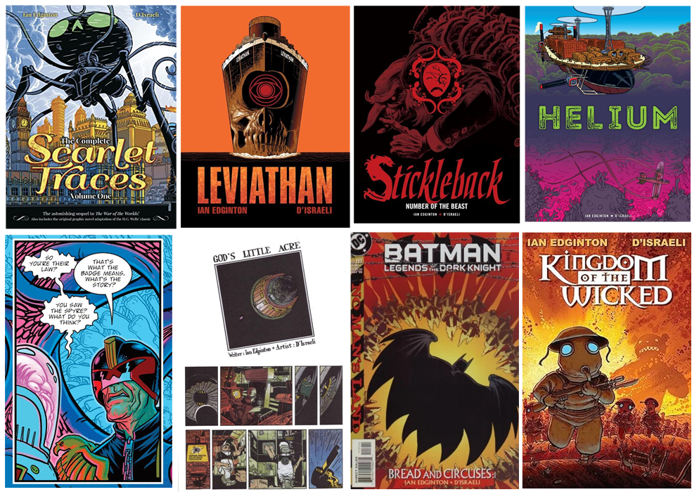
Matt, you and Ian go way, way back, first collaborating together at the start of both of your comics career with God’s Little Acre in 1990’s Revolver issue 2. Since then, there have been various Judge Dredd tales, the whole Scarlet Traces saga, Leviathan, Stickleback, and Helium here in 2000 AD, plus Kingdom of the Wicked, Batman: Bread and Circuses, Murder in the Rue Morgue, and Torchwood.
So, what is it that’s made the Edginton/D’Israeli partnership both successful and longstanding?
MB: It’s funny, we pretty much clicked from the start – even back as far as God’s Little Acre, I remember checking with Ian if I could add a couple of little tweaks to background details and he trusted me to get on with it. Kingdom of the Wicked cemented the relationship, but then we went about five years until we worked together on Batman: Bread and Circuses. At that point we’d really kind of melded – that two-issue Batman story was produced under phenomenal time pressure, so we basically scheduled things between us and bullied our DC editor, Jordan Gorfinkel, to approve the pages! He actually said to us, ‘You guys are a pain in the ass, but don’t stop what you’re doing, it’ll never get done otherwise.’
These days we’re pretty much like an old married couple – we’ll talk on the phone every couple of weeks and it’ll be five minutes of business followed by an hour shooting the breeze about old Doctor Who episodes, weird movies and Star Trek toys.
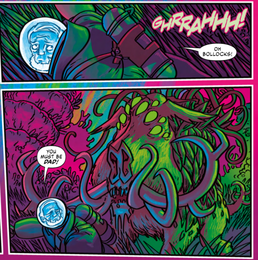
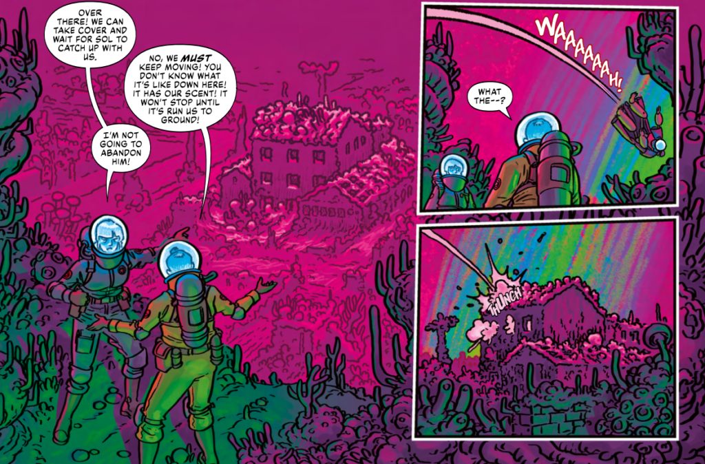
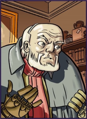
From Helium: Scorched Earth Part 3, Prog 2353
Matt, when we’ve talked before, you’ve talked about the ‘oh shit’ page that Ian usually throws at you in the scripts. The big, complex, hell to draw page. Have you had one of those in Helium: Scorched Earth?
MB: There’s a couple: a big market scene at the end of episode 4 that required both an expansive view and an intimate perspective; working out the viewpoint for that was a bit of a nightmare and then there was a ton of story-relevant detail to generate.
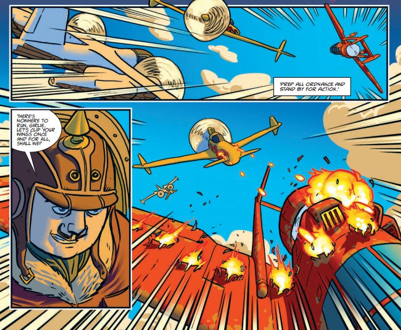
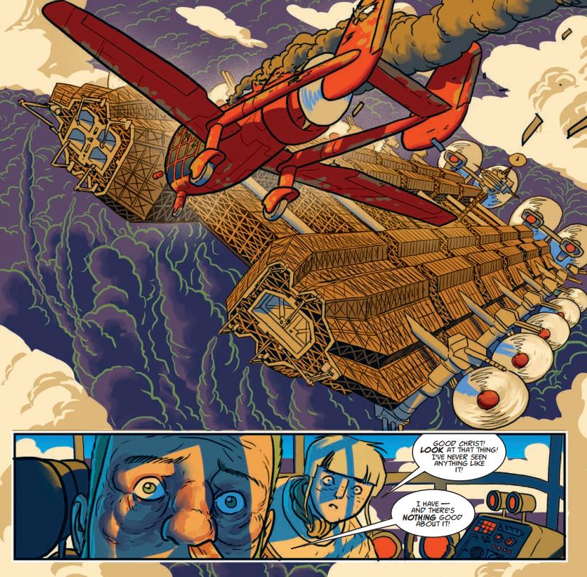
There’s also a big double-page spread that presented the opposite problem – it features the flying aircraft carrier Bellerophon menacing a small settlement under the fugue. Because of the foggy environment I couldn’t hide behind lots of detail like usual, and instead had to rely on shapes and a use of colour and tone to suggest size, mass and menace. I’m still a bit nervous about that one.
Ah, you’ll be fine, don’t worry!

David Attenborough, he’s not.
From Helium: Scorched Earth Part 3, Prog 2353
Matt, with all of your art you have a look that permeates, something that’s absolutely unique to you. It’s always backed with a simplicity of the linework that builds to give life to wonderful ideas and results in spectacular scenes of invention – your fantasy is always fantastical, your sci-fi always stunning, and your horrific moments always enough to make the reader wince. And of course, there’s something of a sense of the absurd in your work, capturing the madness of what you’re putting on the page.
As far as the art on Helium is concerned, it’s a series that really did look like nothing else in the Prog when it first appeared. There was this tremendous lightness to it, perfect to show us the bright, beautiful skies above the Belt.
MB: Glad to hear you say that, I really wanted to get a sense of cold, wintry, high-altitude light in the early episodes of series one.
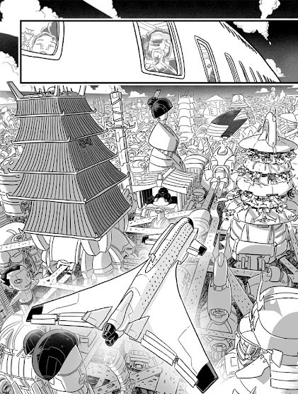
From Helium series 1
Helium the first time round was full of all this. The visuals are suitably spectacular and alien, full of a retro-chic tech thing, all of those wonderful designs for the aircraft adding a really strong visual sense to it all.
When you and Ian sit down to talk about things, is it a case of you then going away and coming up with the designs?
MB: We’ll often talk in general terms about stuff it would be cool to do or have in a new project, but generally speaking I get the design cues from Ian’s scripts. He’s a real maven for old and obscure aircraft – I think every airplane that appears in Helium really existed, at least as a prototype. That means I’m usually working from photos, or for stuff that appears enough times, I’ll buy or make 3D models to work from.
For the more fantastical stuff, like the carrier Bellerophon, Ian will usually give me a design cue that mixes two existing things; if I remember rightly, the description for the Bellerophon was something like ‘imagine the dreadnaught from Laputa made out of the same struts and scaffolding as the starship Cygnus from The Black Hole.’
From Helium series 1, art by D’Israeli
So, what was the thinking with this very different look to Helium?
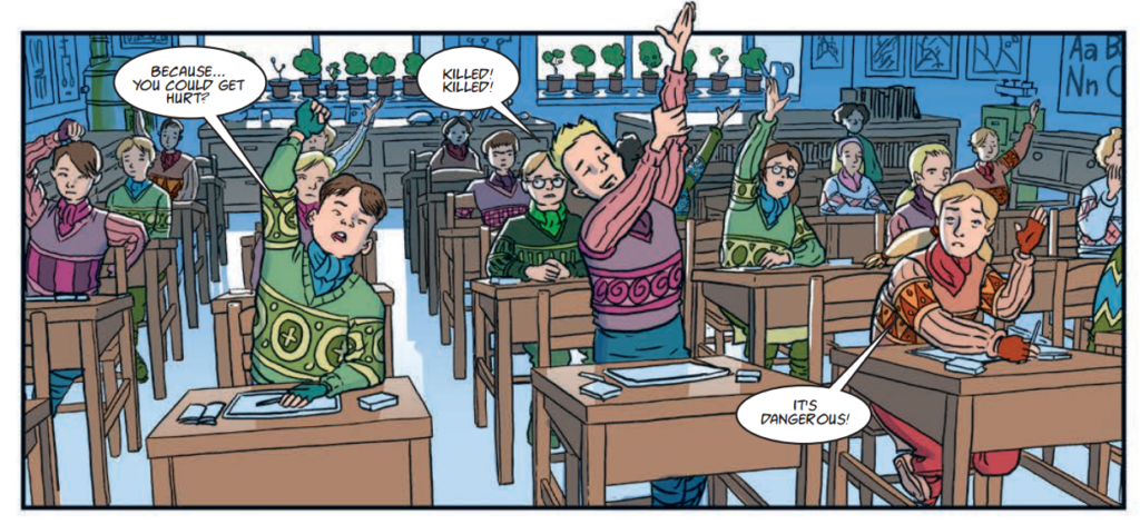
MB: We’re generally going with a ‘30s/40s retro vibe, with added elements derived from the demands of the environments. So I added quite a few elements from fishing villages in the North of England and Scotland to the New Castle sequences – thick stone walls, lots of heavy knitwear since they’re living at altitude. They all have jumpers with a family pattern on them so the bodies can be identified if they fall into the fugue – if you look carefully at the classroom scene in Series 1, Part 1, you’ll see that similar-looking kids (siblings) all wear the same pattern.
And of course, I went back, and yes, it’s there… all those little artistic touches that escape you the first time round…
One thing that always comes out when I look at Helium is the colours you’ve used. It’s something that’s recognisable through all your colour work in 2000 AD, almost giving us a completely new palette to view, but Helium really seems to have turned it up a notch – filling the skys with all that vivid blue and both the Belt and the depths below with choking, toxic greens and purples.
Was this something you’d thought about when considering how to do Helium or something that came out in the making of each page?
MB: I think again it flows from the environments within the story – Ian had described the oily, poisonous clouds of the fugue and the luminous, coral-like jungles under the fugue, but I turned it up to 11.
In series 2, between the noodly detail of the corals and the elaborate colouring, I really made a rod for my own back!
From Helium: Scorched Earth Part 3, 2000 AD 2353
Matt, time to talk process with Helium. And it strikes me there’s plenty to talk about given the long gap between series and how your work has changed in the interim.
MB: Working in colour is a particular problem – I think black & white offers more opportunities to go wild stylistically, so I do worry about just repeating myself.
By the end of Scarlet Traces I was getting a bit burned out – I’d done Home Front and Storm Front in a pseudo-John M. Burns/Gerry Haylock style with big areas of flat colour in the shadows, which matched the ’60s setting but started to feel a bit limiting by the end of the second series. The epilogue, set in the 1980’s, was done in a Bilal-inspired style that I’m not sure I pulled off, I think it ended up looking over-faffy.
I was feeling a bit disgruntled with my work (voicing that on Instagram sounded worse than it was and caused a bit of a panic on Instagram – sorry to everyone who was concerned, your support was appreciated), so I looked over the old pages of Helium for a bit of inspiration and realised I much preferred the simpler, straightforward approach I’d taken back then.
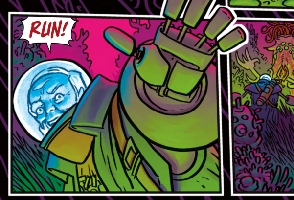
especially when you see what dangers await at the end of episode 3!
From Helium: Scorched Earth Part 3, Prog 2353
Can you take us through the thought processes of creating the art for Helium versus creating the art for Helium: Scorched Earth?
MB: Basically, I was using the old Helium pages as a template for the new material, so actually the idea was to try and recapture the relative simplicity of the 2015 material.
The main difference has been what’s available technically. I work digitally and the Cintiq pad I use today is considerably more responsive than the one I used eight years ago (though I still do use that 2011 Cintiq display that I drew series 1 on my office machine, I find myself drawing with more recent 13” stand-alone pad most of the time). The other big difference is I’ve invested heavily in organic-looking brushes for Clip Studio over the last couple of years, and with some tweaking of settings I’m much closer to capturing the look of my favourite brush pens and dip pens from the analogue days.
On the process side, I’ve developed a new colouring system where I flat-colour everything, then produce multiple copies of the colouring on different layers, with different tints and shades applied to create highlight and shadow tones. I can then use a feature called a layer mask to hide all but one layer, and then paint back in parts of the other layers to create highlights and shadows. This lets me think purely about light and shade, while still producing a full-colour image.
Right then, and as we’re talking process, Matt sent through a panel from a future episode to talk us through just how the magic is done…
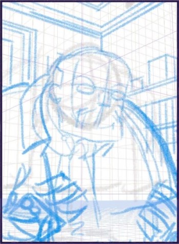
MB: The first step is to get a script from Tharg-in-residence Matt Smith – that’s emailed, so I print it out and mark it up with the number of panels per page, underlining any key points I’ll need to pay attention to. I’ll re-read the script a couple of times, drawing in little diagrams for possible arrangements of panels on each page.
1) Roughs
I used to do preliminary thumbnails in a little sketchbook, but for years now I’ve worked entirely digitally. I open up a page file in Clip Studio Paint – I have my own set up with the right page size and a vast stack of layers. For each part of the process outlined below, there’ll be at least three layers to allow me to treat foreground, midground and background separately. I rough in stick figures and rough indications of backgrounds using a very broad brush to prevent me adding any detail – this is about setting up the broad strokes of composition only.
I also add temporary lettering so that I can be sure there’ll be room for all the dialogue and captions – this way I know there’s definitely one possible way to letter the page. (Dialogue blurred out to avoid spoilers)
2) Rough Pencils
Here I use a finer pencil to block in the shapes of the figure and background. I’m establishing correct anatomy and proportions at this stage. I use a perspective grid to guide the drawing and help it look 3D. Clip Studio lets you constrain your lines to the perspective axes, which is great for quickly blocking out the corner of the room, picture frame and bookshelf in the background.
3) Pencils
I follow the animator’s convention of rough pencilling in blue and final pencilling in red. At this stage I’m adding detail to the framework I built in the last stage, and locking down the expression on the face. Note that I don’t pencil the background – unless there’s something really finicky in the background, I usually just ink from the rough pencils.
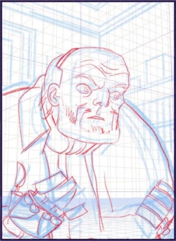
4) Inks
I use a heavier brush to establish the outlines of the foreground character and a finer tip to add fine detail and draw in the background. These are pressure-sensitive brushes which give a fatter line if more pressure is applied to the stylus. They’re harder to control, but give a livelier line. Leaving a little gap around the figure helps to separate the background from the foreground.
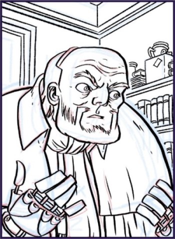
5) Flat Colour
Added using the Paint Bucket tool on layers below the inking. I always rather like this simple, Tintin-style look, but an adventure strip requires something a bit more atmospheric. One day I’ll have the nerve to do finished work this minimalist.
6) Tints and shades
I collect the colouring layers into one and duplicate them multiple times, adding tints and shades for each level of highlight and shadow I’ll want to use. This grid shows the different variations. Some of them look very similar, but when they’re overlaid the differences become more apparent.
I use Layer Masks to hide each of these layers – I can then use any painting or drawing tool to selectively paint back in the different layers, creating highlights and shadows on a base layer.
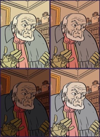
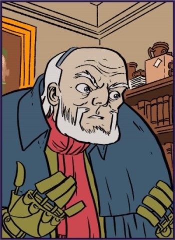
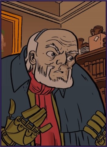
7) Shading
Starting with a lightly-shaded base layer, I add a few darker shadows (face, scarf, back wall and right hand)
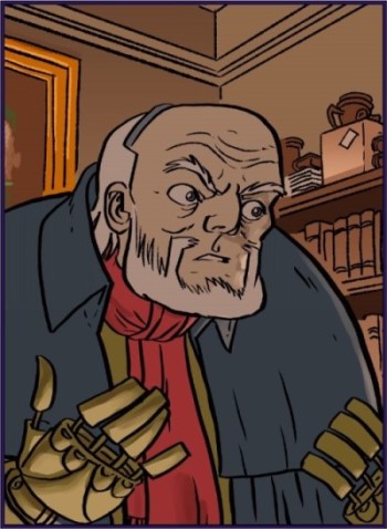
8) Uplighting
Mainly noticeable on the face and hand.
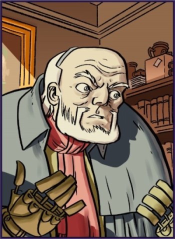
9) Sunlight
A shaft of bright sunlight pops the figure into 3D. The shading on the face is mostly the base colour showing through the bright highlights.
10) Highlight/Finished
A couple of bright highlights in white using a chalk brush help the figure to “pop.” Panel complete.
How has your art developed over the years? Have there been noticeable ‘periods’ that are recognisable to you in your artwork?
MB: Definitely. I try to distinguish each series I do in some small way. If you just keep repeating yourself, you end up with diminishing returns. I’m sometimes unsure if the differences are that noticeable to the reader, but they help me to stay fresh.
Left – Leviathan, Right – Stickleback
>
The obvious ones would be Leviathan and Stickleback, each of which had their own distinct looks. Stickleback used a collage-based approach inspired by Argentinian artist Alberto Breccia to capture the grime and squalor of the Victorian slums. Lowlife went through a couple of phases, getting very chiaroscuro with lots of black and minimal outlines, then getting cleaner for a Manga-influenced look in the Hondo-Cit story.
‘getting very chiaroscuro with lots of black and minimal outlines,
then getting cleaner for a Manga-influenced look in the Hondo-Cit story’
>
The Vort needed to have a fever-dream feel to it, so I left the pencils and rough pencils in the art to give the backgrounds a slightly ragged, defocussed feel. I was inspired by Nicola De Crecy and Ralph Steadman on that one.
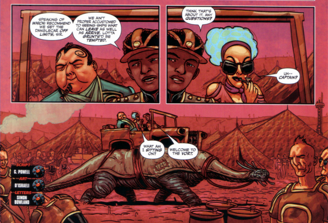
The Vort’s fever-dream feel
With Scarlet Traces, I’ve tried to reflect the era each story’s set in – The Great Game is Frank Hampson/Dan Dare, Cold War is Don Lawrence/Trigan Empire, and as I mentioned before, Home Front/Storm Front reflects John M Burns’ and Gerry Haylock’s work for Countdown.
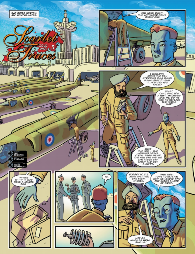
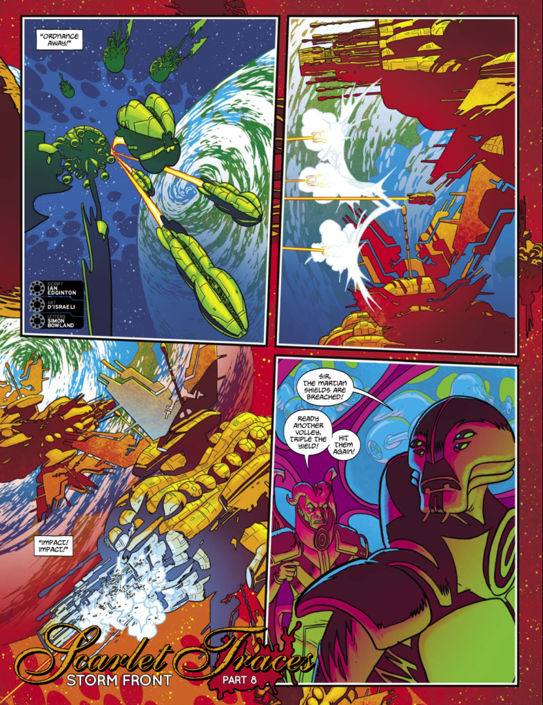
Top left – The Great Game, top right – Cold War, bottom – Storm Front
In each case I start with a strong inspiration from another artist, but very quickly the work takes on a life of its own and starts to go its own way.
Earlier in my career I’d have been worried about becoming too derivative, but after I passed the 15 year mark my habits were so well established that whatever I draw and however I draw it, it always looks like my work in the end.
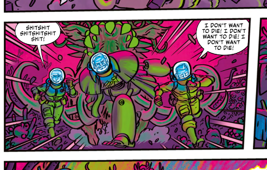
swears, running, loads of D’Israeli colours!
From Helium: Scorched Earth Part 3, Prog 2353
Thanks to Matt/D’Israeli for answering our questions and in particular for taking us deep into the process of making Helium: Scorched Earth.
The series began in 2000 AD Prog 2351. It is absolutely, definitely, totally worth your while. Pick up copies wherever you can find Thrill Power, including the 2000 AD web shop.
And as for all the other zarjaz volumes of Edginton/D’Israeli greatness, can we suggest you pick up The Best of 2000 AD Volume 2 which contains the complete Leviathan, their epic tale of the awful curse that haunts a mile-long ocean liner trapped in limbo.
For more epic storytelling, there’s the Scarlet Traces saga, adapting and expanding hugely on HG Wells’ War of the Worlds. And after that, how about a little Victorian steampunk crime thriller whose lead character is hiding a huge secret? If the answer’s yes, then Stickleback is a must.
Finally, for more chat from Ian and Matt, please be so kind as to peruse these interviews: Judge Dredd: Babel, interview with Ian and Matt, and Scarlet Traces: Storm Front, interview with Ian and Matt, and of course be sure to read Ian’s interview about this new series of Helium here as well! Plus, don’t miss both Ian and Matt talking on The Lockdown Tapes, And for more art talk from Matt, be sure to look up his Stickleback Covers Uncovered pieces for Prog 2204 and Prog 2208,
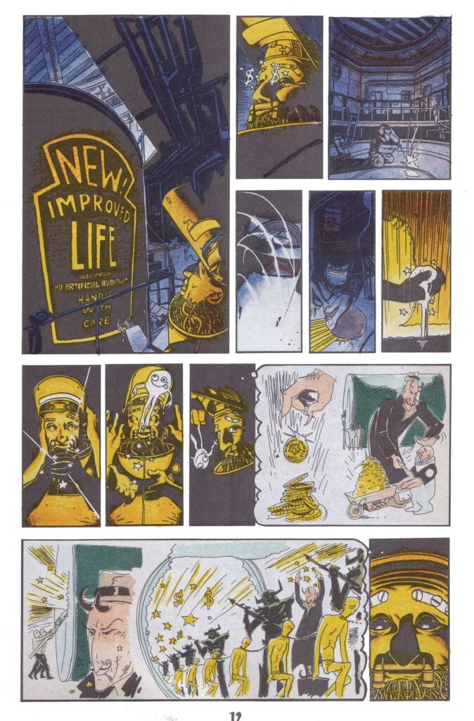
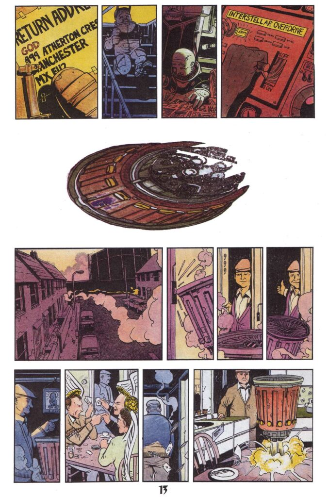
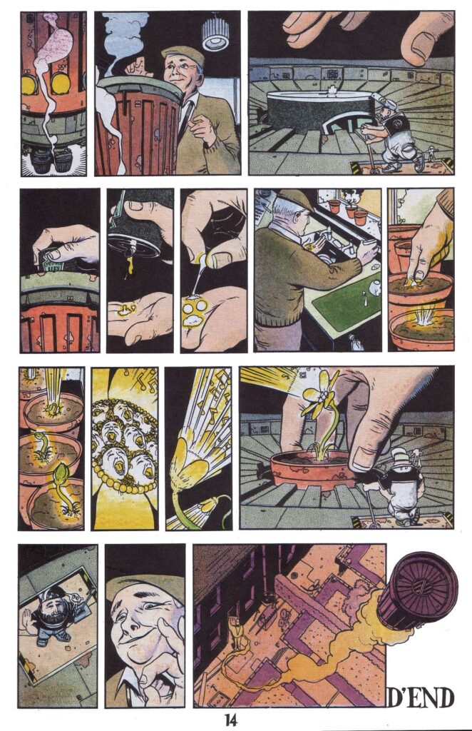
Now, a little treat for you before d’end… I uncovered my copies of Revolver and scanned in that very first Edginton and D’Israeli story from issue #2… God’s Little Acre from 1990…