2000 AD Covers Uncovered – On Yer Bike Joe – Paul Williams’ Classic Lawmaster Cover
16th September 2021
Every week, 2000 AD brings you the galaxy’s greatest artwork and 2000 AD Covers Uncovered takes you behind-the-scenes with the headline artists responsible for our top cover art – join bloggers Richard Bruton and Pete Wells as they uncover the greatest covers from 2000 AD!
This week, we chat to art droid Paul Williams about his latest cover – Judge Dredd Megazine #436.

Since winning the 2000 AD art search competition at Thought Bubble 2017, this is the fourth time Paul’s art has graced the covers of both the Prog and the Judge Dredd Megazine, as well as providing art for Prog 2072’s Future Shock: Sunday Scientist. and the DeMarco, P.I. 3-parter, An Eye, in Megazine issue 410-413, both scripted by Laura Bailey.
This latest from Paul gives us a twist on the classic image of Dredd astride his Lawmaster, looking just like this…
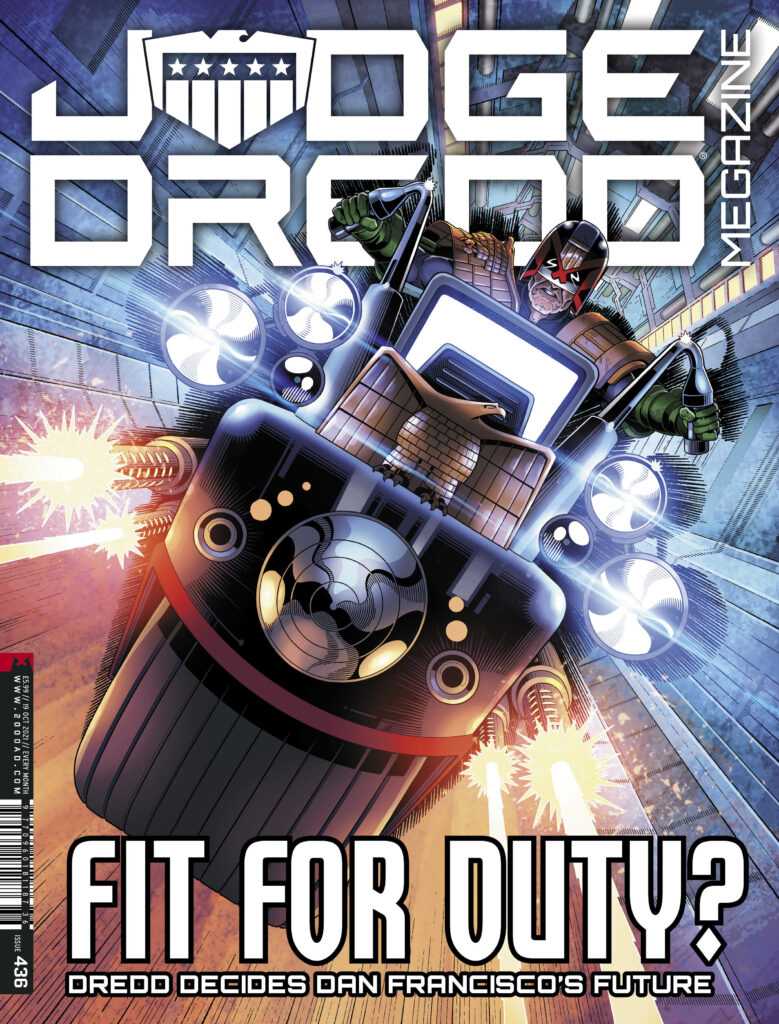
PAUL WILLIAMS: This cover came about after I’d been kicking the kernel of an idea around my head for several months before Christmas, not quite finding the version of it that was unique enough to retain my interest for quite some time.
There are plenty of ‘Dredd on a Lawmaster’ covers in 2000 AD’s history, most of which were drawn by some of the all-time greats and so I didn’t want to go down that route unless there was something in the design that would make it different or memorable, even as a more generic ‘pin-up’ style image. Eventually, I hit upon the idea of Dredd being framed by his shadow, cast from the Lawmaster’s bike cannons and that piqued my interest enough for it to stick.
My style has naturally evolved towards a focus on heavy contrast in the past year (as evident below in an unsuccessful cover pitch from 2020) and I knew that this concept would give me the perfect opportunity to play with that some more.

Like all artists who have depicted Dredd (albeit only on covers, in my case), you want to put a bit of your own touch on how the equipment and uniform are designed and the above gives a good idea of where I was at with that going into this pitch, even though most of it will be hidden out of view. The shoulder eagle is pretty consistent now with how most artists draw it but all of the other pads have a raised border surrounding the central panels.
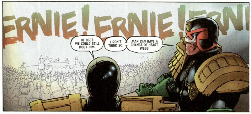
For some reason, I’ve always struggled to find a way to draw the more traditional left shoulder pad with the bars over the top in a way that looks good and so one day I decided to try it Kev Walker style from the Judge Dredd story “Fast Food” (see below) and found that worked well.
Uniform aside, obviously the more important design when you’re showcasing the Lawmaster is the bike itself. I have my own 3D model that I built for drawing reference which is largely ‘classic’ in appearance and I had intended that this would be my basis for the image.
If I may go on a tangent for a second, one side of illustration that I do like to employ is the use of 3D modelling software. Almost everything I use for reference is something I have created myself (unless I need reference for a specific item or vehicle, such as when I had to draw a military MRAP from multiple angles for a project and it was just a matter of saving time by downloading an existing model rather than needlessly making my own) and the reason I do this rather than drawing everything from scratch is because, honestly, I get bored only ever working in one medium all the time. Switching between 2D and 3D goes a long way to keeping me creatively stimulated, which is important when you’re working on bigger projects that potentially have you in it for the long haul.
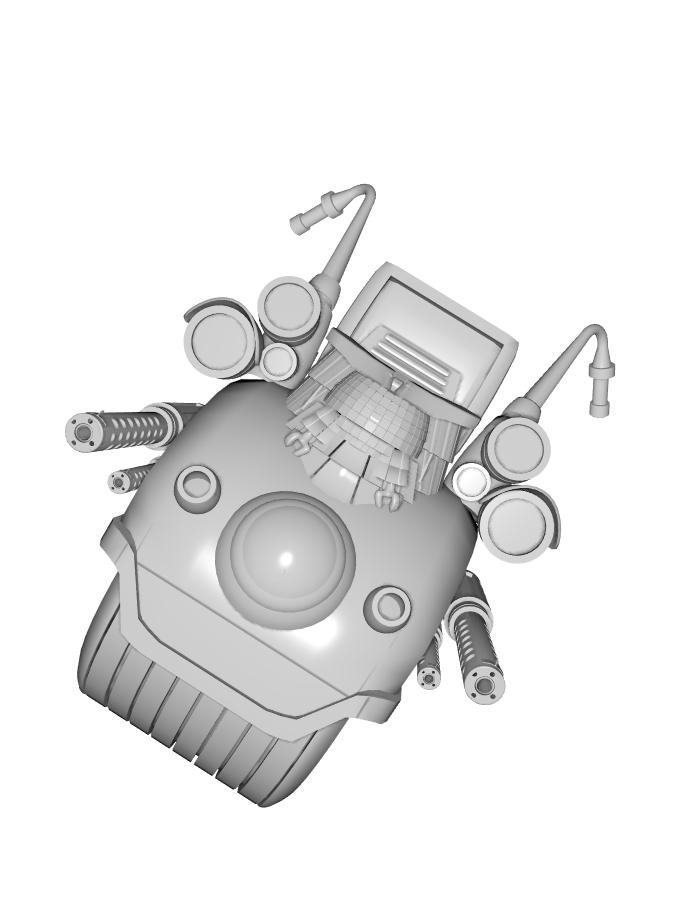
When I started work on this cover, however, I discovered that this design (shown above) wasn’t really suiting the composition I had imagined, which should be more angular and a distinct set of geometric shapes. I normally prefer the more rounded front on the bike but I felt it would definitely take away from the impact I wanted this image to have so I decided to scrap the reference and draw the Lawmaster from scratch.
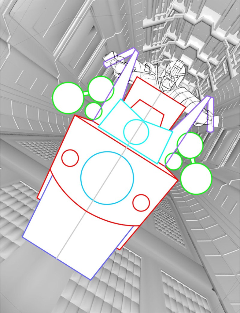
After coming up with a front view that I was happy with, I combined a few existing 3D design elements to create the background reference that would also provide me with the perspective lines (and sense of motion) for later on. I’ve also made the decision to switch out the U-shaped (when viewed from above) Eagle that I typically use on the front of the Lawmaster for the flat one which I feel will ‘read’ more easily in this composition.
The final touch was, of course, adding Dredd behind it all, nice and comfy in his bike seat…. what’s he looking so miffed about?
Next step was to pencil up a rough that I felt confident was good enough to send to Tharg’s delegate on earth, Matt Smith (see below). I threw a simple line-art filter over that background reference to give a general gist of how that would look, knowing I could save myself some wasted time if Matt didn’t deem it worthy enough to adorn the cover of 2000AD or the Judge Dredd Megazine but luckily that was not the case and I was well on my way towards creating my 4th cover for the Galaxy’s Greatest Comic!
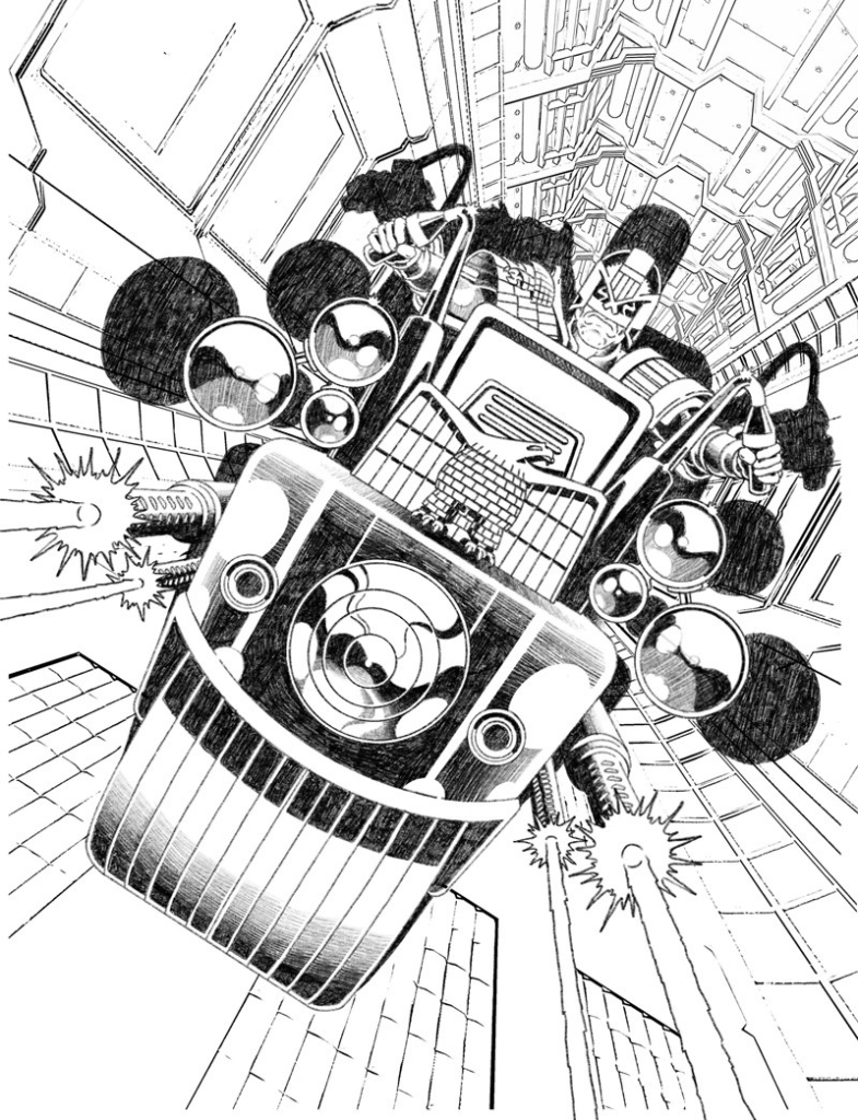
I took the rough into Procreate on my iPad Pro and commenced the inking, making small changes along with the way such as improving Dredd’s expression and fine-tuning the shading on the bike’s front.
As you can see, I initially envisioned the shadow to be much more prominent a part of the design. But at this stage, I was finding it less impactful (partly because I changed the positioning slightly) and, if anything, was taking away from the sense of movement I had hoped this illustration would have.
That’s one of the ways I’m still learning as an artist; I can ink a lot of precise detail into a piece but that’s often to the detriment of any sense of action, when looser brush strokes and mark-making would better suit but I do struggle to let go of that need for tight control of the pen line.
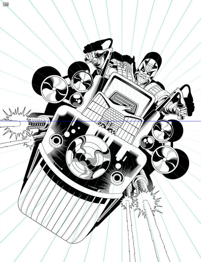
That’s when I had the idea not to draw the shadow as a full, blocked-out shape but to ink it as speed lines protruding out all around Dredd, which I hoped would help make it feel like the Lawmaster is leaping right off the page at you. So I set up Procreate’s useful perspective tool (see above) and started to carve out those lines.
Next up was the background and the bit that I had been privately dreading, because to be honest, I didn’t really have a clue how I was going to ink it. I knew that I wanted the lineart to have an element of motion blur but – with the limitations of my style that I previously mentioned in mind – I wasn’t entirely sure of the best method. I was also wary of making the background too difficult for the colourist to interpret so I didn’t want to lose too much of the forms within it, whilst also attempting to do exactly that.
Eventually, I settled upon a technique that I was happy with and which I felt conveyed the motion in the way I had hoped and, once that was locked in, it was just a case of filling out the rest.
I really enjoyed the entire day I spent meticulously inking in all those dots and blur lines, as followers of my instagram account (@sketchymagpie) will tell you…

But as with all things we achieve, the hard work along the way is part of what makes it so satisfying to eventually finish!
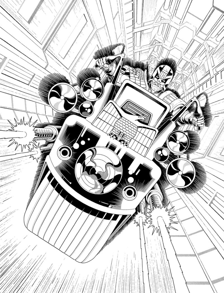
Thank you once more to Paul Williams and congratulations to him for getting Tharg to say yes to that fourth cover. And honestly, he might be regretting his decision to painstakingly ink all the dots and blurs, but we think it’s come out beautifully! So stop complaining Williams Droid, otherwise, Tharg will just make you do more details!
You can see Paul’s cover adorning Megazine Issue 436, available at the 2000 AD web shop from 15 September.

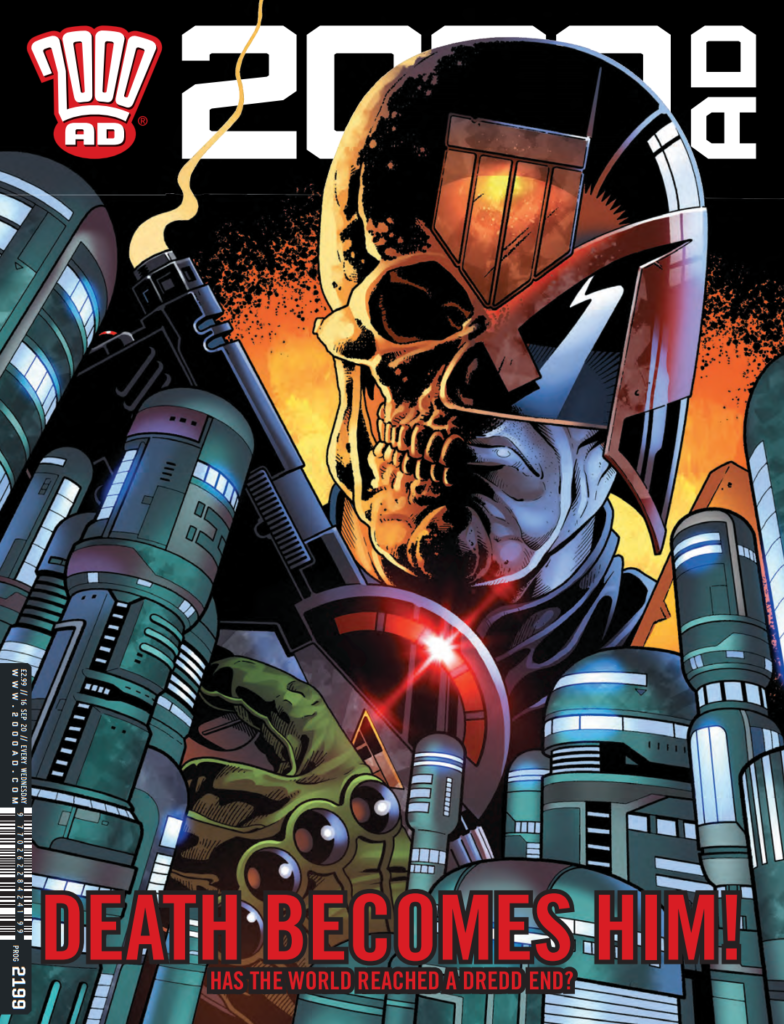
There’s more Covers Uncovered from Paul for Prog 2199 (the rather iconic cover that marked the end of End of Days) and Megazine 422. Plus, you can read an interview with Paul and fellow Thought Bubble winner, script-droid Laura Bailey, here and both Paul and Laura talk about their DeMarco strip on the Thrill-Cast here. And catch up with the latest from Paul over at his Twitter, Instagram, and his website.
