2000 AD Covers Uncovered: ‘Ph’nglui Mglw’nafh Cthulhu R’Lyeh Wgah’nagl Fhtagn & that’ – SK Moore Covers Portals & Black Goo
14th July 2023
Every week, 2000 AD brings you the galaxy’s greatest artwork and 2000 AD Covers Uncovered takes you behind-the-scenes with the headline artists responsible for our top cover art – join bloggers Richard Bruton and Pete Wells as they uncover the greatest covers from 2000 AD!
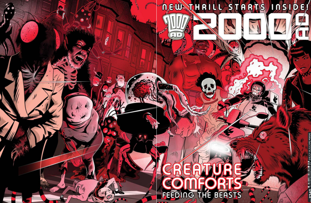
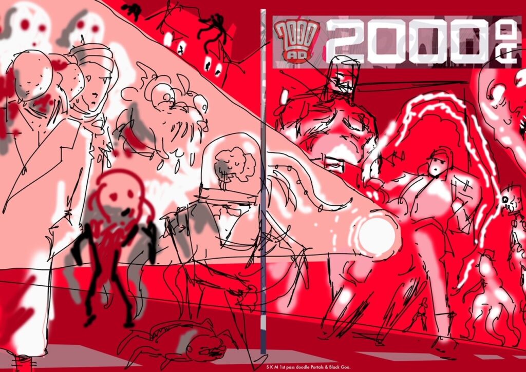
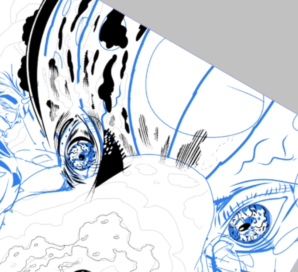
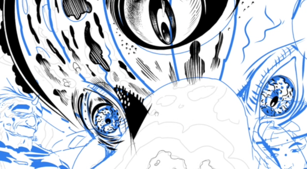
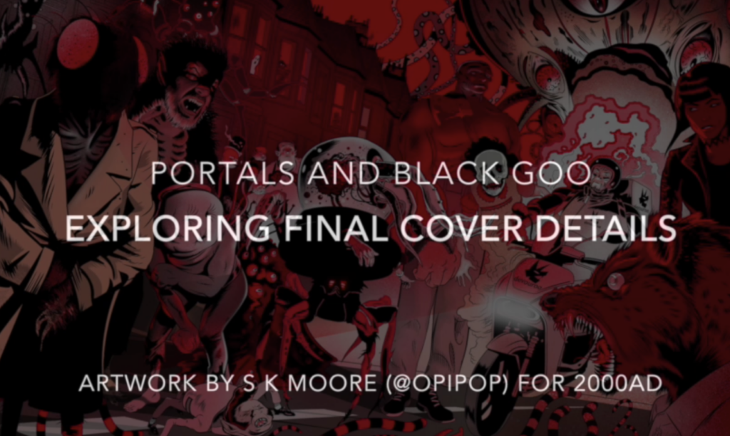
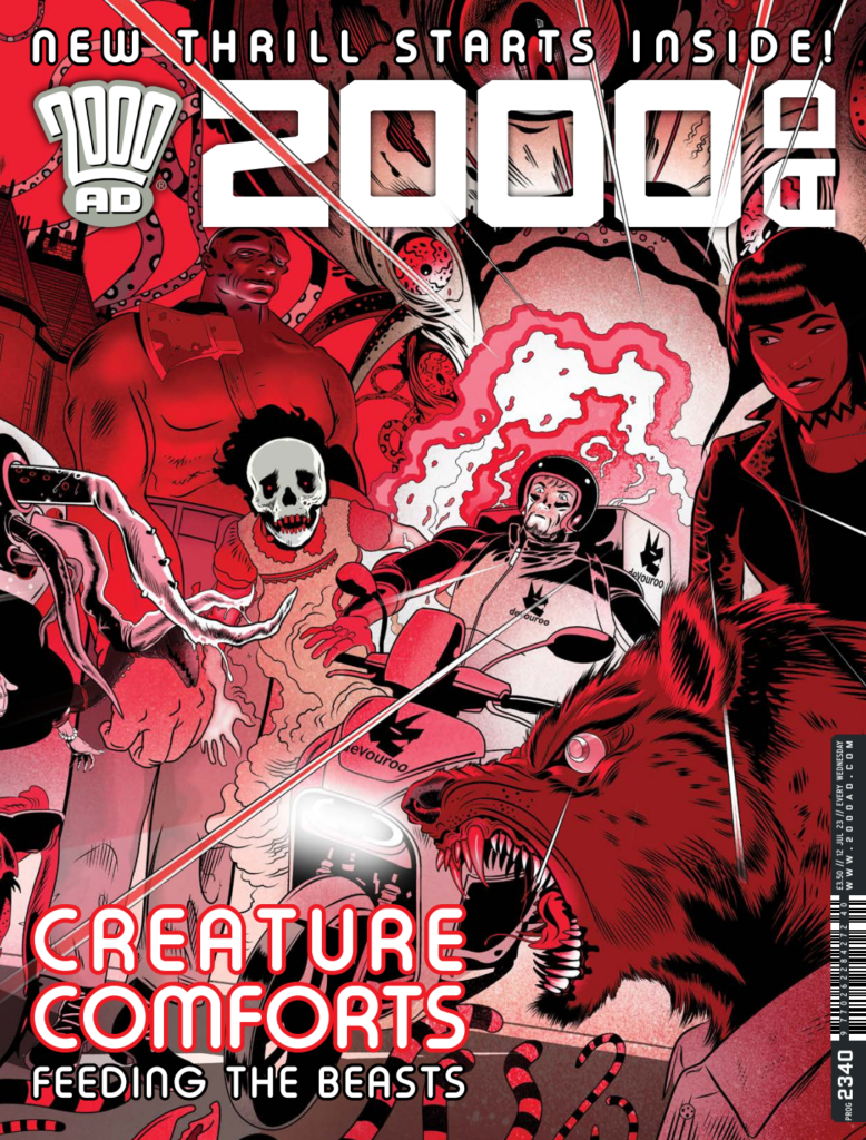
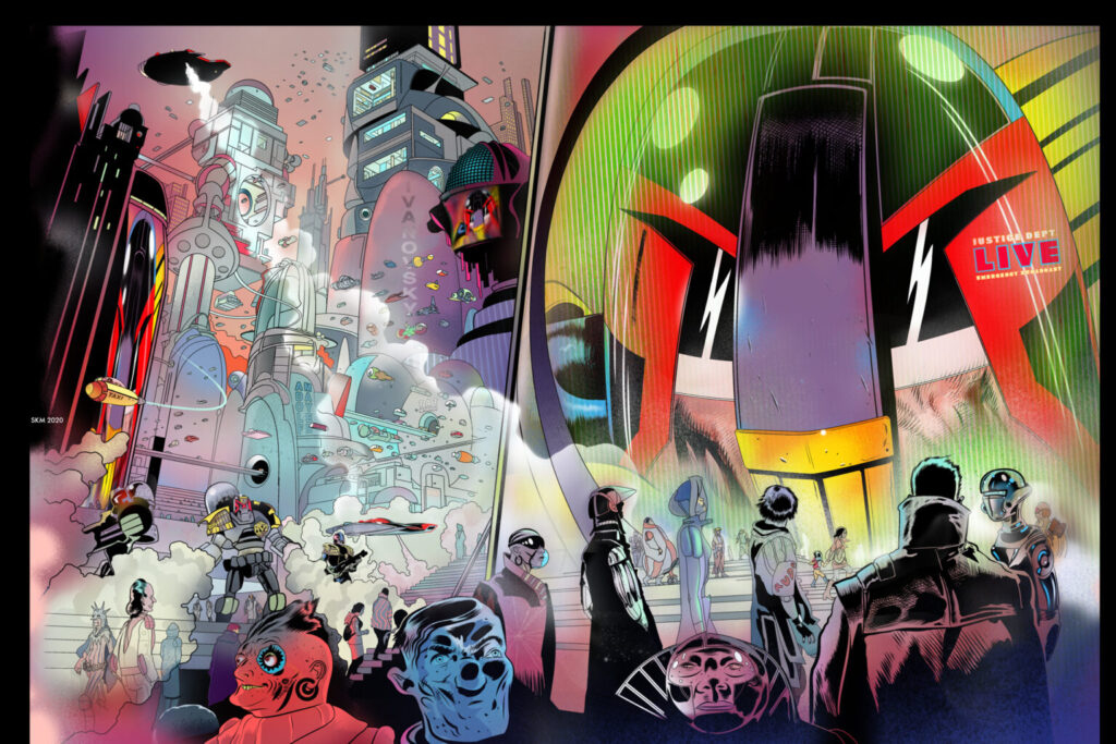
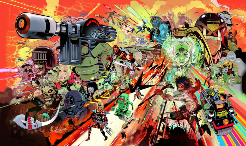
This week, more wraparound madness from Stewart Kenneth Moore. It’s always a wonderful experience to get into the mind of this particularly great artist. And Stewart certainly didn’t let us down here on the cover of 2000 AD Prog 2340, out Wednesday 12 July.
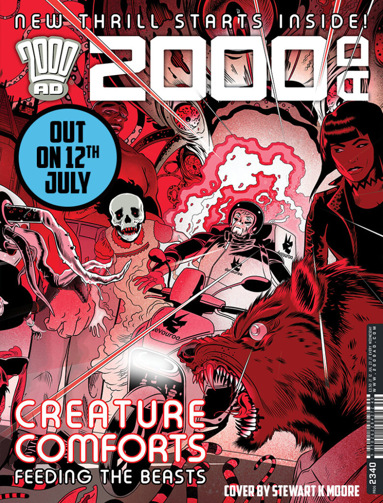
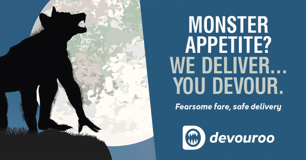
Stewart’s cover is all part of the launch of the brand-new seven-part strip Portals & Black Goo, a great new comedy-horror from the wonderfully twisted minds of John Tomlinson and Eoin Coveney.
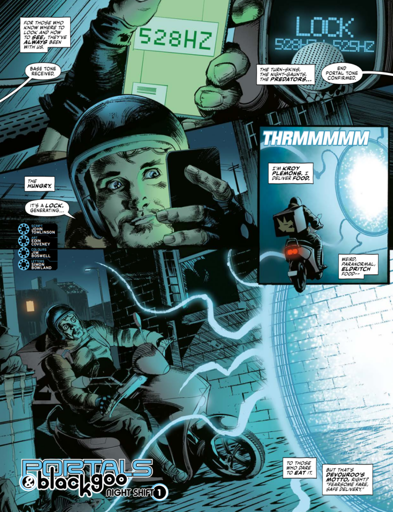
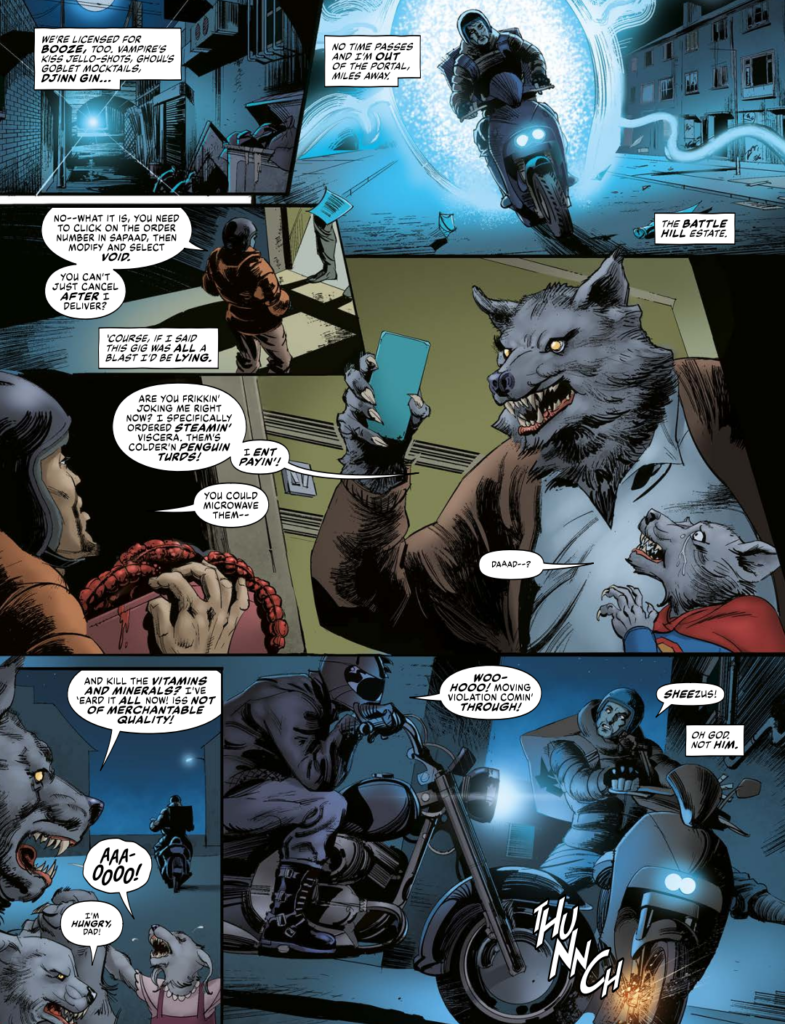
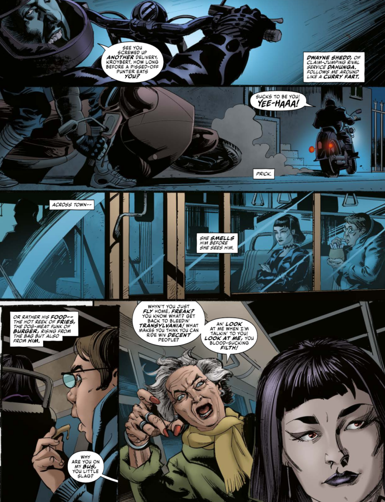
Portals & Black Goo is all about a London where monsters live amongst us and asks the question: what happens when the monsters get hungry and fancy a bite? Well here’s where Devouroo comes in – ‘We Deliver… You Devour’. Whether it’s bags of fresh plasma for vampires, bloody bones for djinn, or steaming viscera for werewolves, the put upon scooter riders of Devouroo will bring it to you. A satirical look at the world in the finest traditions of 2000 AD, Portals & Black Goo takes swipes at modern working conditions, the nightmarish world of zero-hour contracts, and the prejudices faced by all marginalised groups in society.
It’s another brilliant new strip for you in 2000 AD, all wrapped in a spectacularly good cover from SK Moore. As before, Stewart’s sent along videos of his process to fascinate and amaze you all and we’ve grabbed screenshots from the videos to illustrate what he’s talking about.
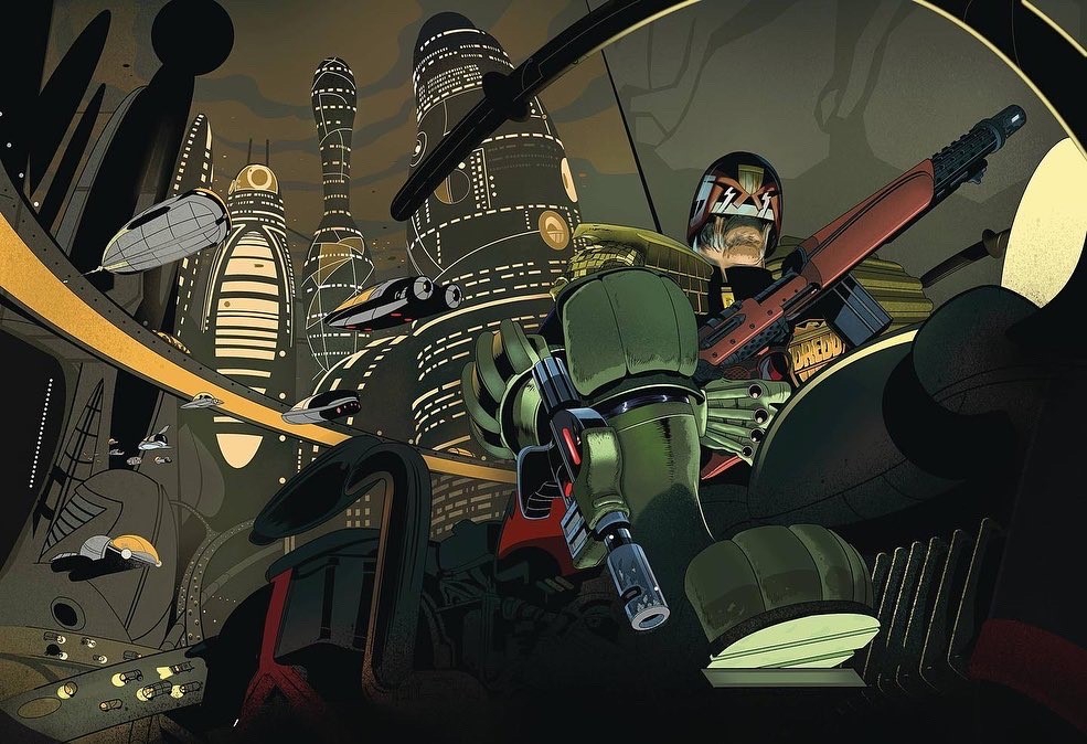
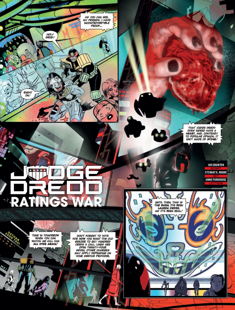
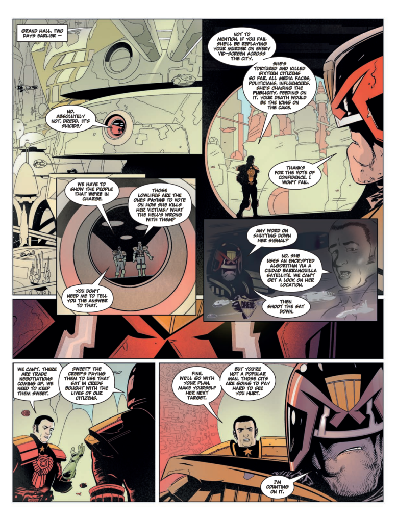
And for fans of SK Moore’s art – yep, that’s all of you – be sure to check out the latest Judge Dredd Megazine, issue 458, out on 19 July, where he illustrates another great Ian Edginton written Judge Dredd: Ratings War. There’s a sneak peek of that at the end of this particular deep dive into this latest SK Moore cover.
So, shall we begin this look at the complete wrapround to Stewart’s Portals & Black Goo cover – oooh, get a load of this.
And now, over to Stewart for this latest, rather fabulous, Covers Uncovered…
SK MOORE: There are shedloads of art tutorials for artists online. Some of what I share here verges on technique but mostly it’s like a diary entry about the mental process, getting on with it, sticking with it and where ‘it’ comes from. If you are a budding comic artist I’ve listed some books below that I think are very helpful.
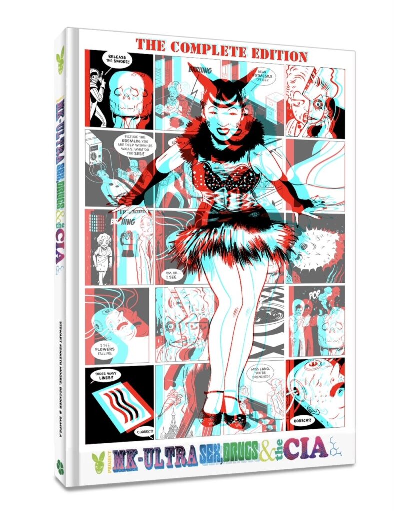
I relished this assignment, I’d just finished duties on Project MKUltra: The Complete Edition (out from Clover Press in Sept 2023) and found myself propelled forward into the work void with pen in hand and absolutely nothing on my desk.
An open road is exhilarating and terrifying. What’s next? A skill no one teaches in art books – How do you keep the work coming in while not being so busy that you can’t take on more work? That’s an art skill!
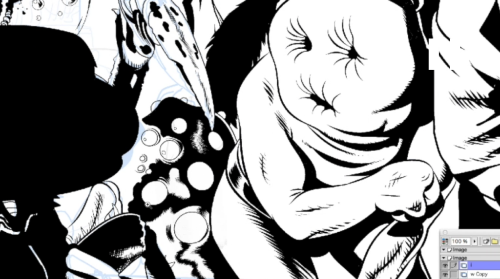
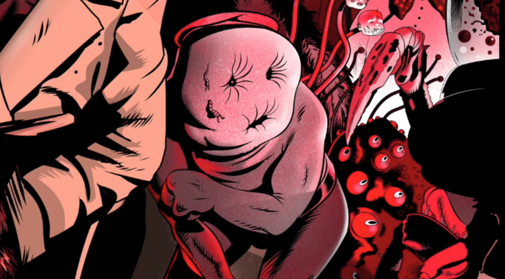
This cover offered real licence to generate numerous freaks and weirdoes – and freaks and weirdoes are my bread and butter. People are strange and learning there was to be a new story coming to 2000AD, set in an area populated by monstrous freaks, wasn’t in the least bit surprising, Jim Morrison was right – people are strange.
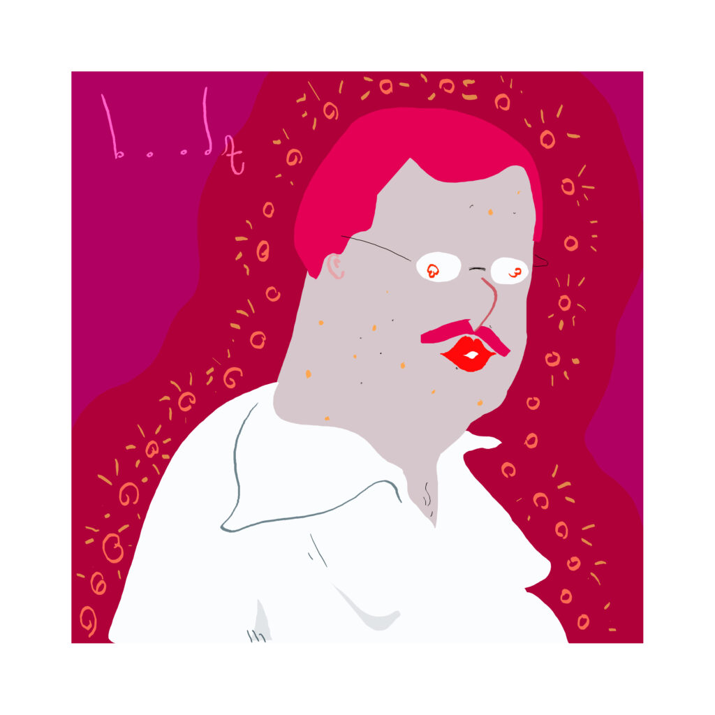
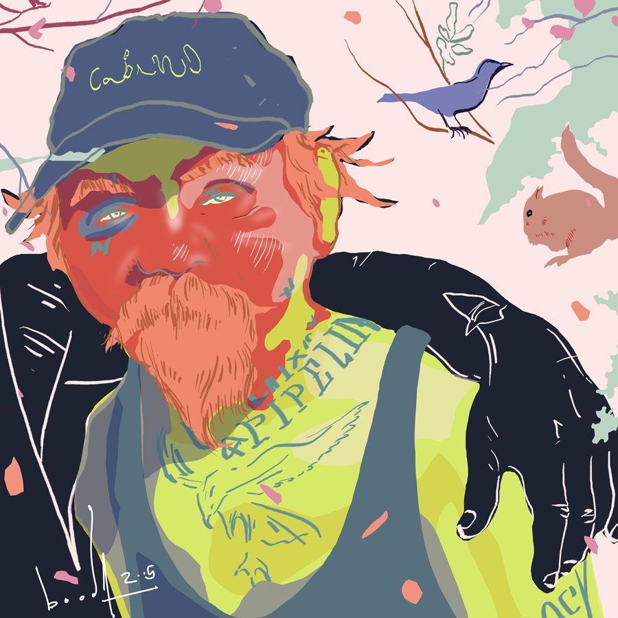
And just to prove that – Stewart sent along a few pieces from his sketchbook – some beautiful things that we’ll show you later, but this pair, ‘Sex Tourist’ and ‘Bucolic Alcoholic’ definitely fit under Stewart’s point of people are strange…
There’s more from Stewart’s sketchbook at the end of this Covers Uncovered
.
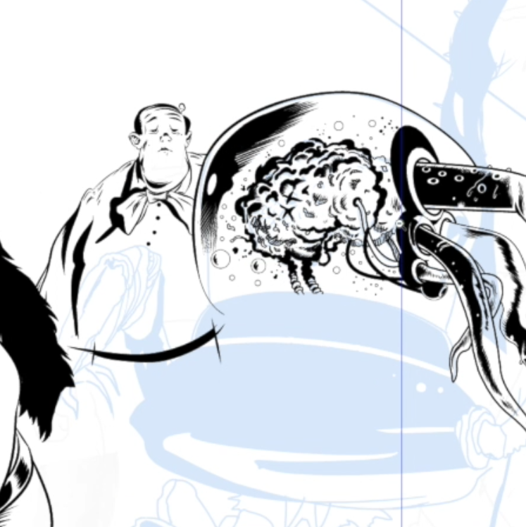
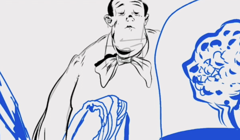
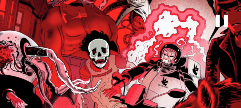
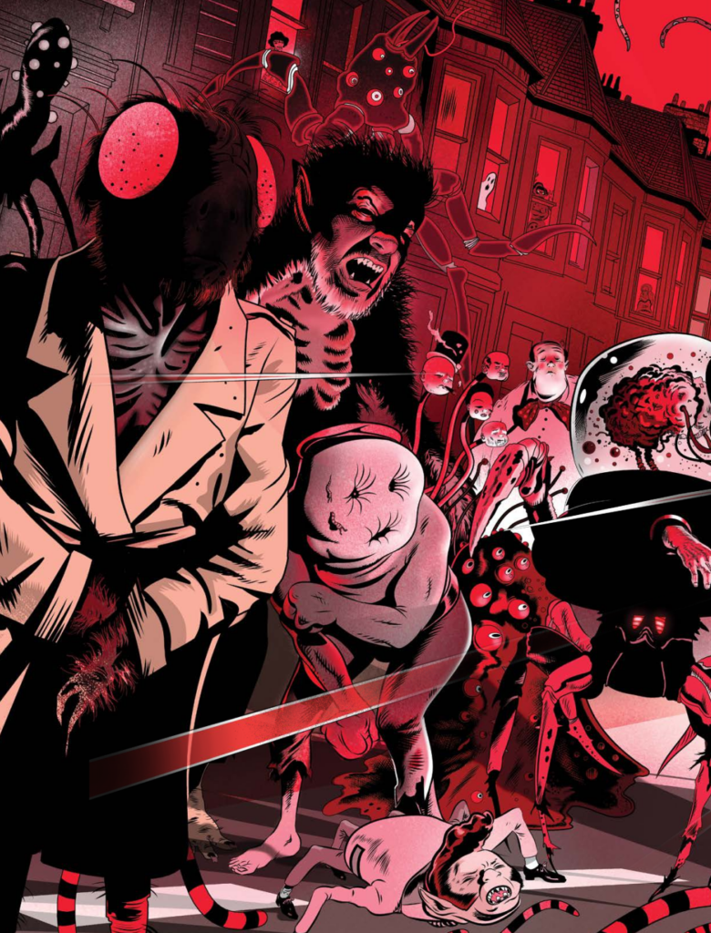
SKM: The new story is Portals and Black Goo by John Tomlinson and Eoin Coveney. Tharg commissioned the cover early and Eoin was kind enough to share some character sketches. These included the ‘DEVOUROO’ logo, delivery rider, and a fearsome werewolf (who looked not too pleased with his delivery!).
There was also a vampire that reminded me of Joan Jett. I liked her right away, she was gonna be great to draw.
Essential reference for Stewart’s cover
Tharg gave me my lead too and I think it went something like this:
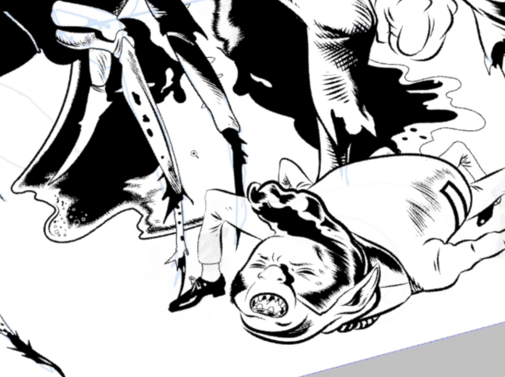
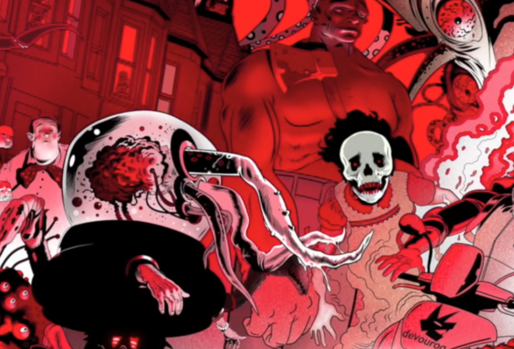
‘The DEVOUROO delivery rider has just warped through a portal to arrive in the street. He is immediately hitting the brakes to avoid colliding with the monstrous pedestrians’ (we’ve all met them!).
I’m pretty sure that was basically Tharg’s lead, at least I think that was what he said.
Tharg liked the sketch I sent over and now I just had to work-up the various weirdos milling in the street. Freaks and weirdoes are much easier to draw than flowers in vases and not only because they are entertaining – but because flowers are perfect and beautiful and perfect and beautiful things are hard to draw.
Any mistake in drawing a flower or vase and it will be obvious to all that you have screwed up. Make a mistake with a freak, on the other hand, and it’s your keycard to freak-town. Errors only deepen the weirdness.
I realised recently that I’ve worked almost exclusively on wraparound covers and double-page spreads for 2000AD since 2019. I have a single-page cover coming up, but the one after that will be a wraparound. I love the challenge of a wraparound because the composition has to appeal in two formats, portrait on the front and landscape in whole.
all in the thinking for the cover
My colouring instinct was a limited palette of red, black and white with some pinks (tints of red). This was a typical graphic style for budget horror in old film and theatre posters back when each additional colour cost money. The less colour you used the cheaper the print run would be.
I think Shaun of the Dead used the same colours in their poster and for the very same reason, they were pointing to classic horror, just as I do here.
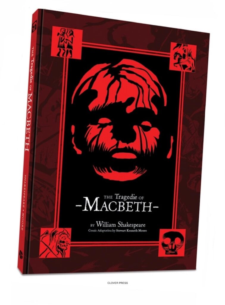
I recently did it in a cruder way, on the cover of The Tragedie of Macbeth, my Shakespeare comic adaptation of ‘The Scottish Play’ – red, black and white, a powerful graphic combination for horror.
I got the model of the motorbike from Eoin and found some good photo references. The colours of the Devouroo logo hadn’t been decided yet (it was early in the game!). So my colour scheme worked here too because the picture is essentially a red-tinted black-and-white world, so the livery can be black and white or any colour in the story that Eoin or his colourist might settle on.
[The colourist is Jim Boswell and he’s done a stunning job!]
I thought about the old Hovis TV advert directed by Ridley Scott in which a delivery boy pushes his bike up a steep hill of terraced houses. I looked online to find terraced houses in East London. I screenshot some and drew the background.

for a classic 2000 AD horror cover would have included this!
.
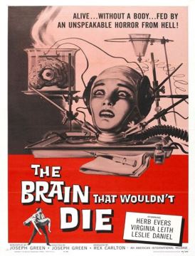
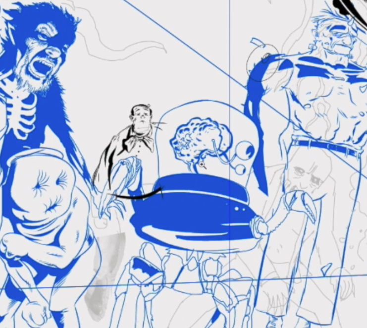
I always try and include a brain in a jar If I have the opportunity. They are a classic sci-fi trope that somehow always amuses me.
One of the worst films ever made is pretty much a brain in a jar film, it’s called ‘They Saved Hitler’s Brain’ and it’s absolutely atrocious, and oddly dull for such a startling title. But the bits featuring Hitler are amusing. Anyway, if you don’t know it, let me save you the tedium, here are the highlights...

>
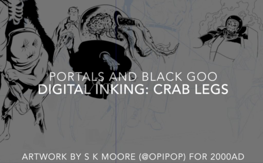
AND NOW…DIGITAL INKING
If you are curious about digital inking, here’s the thing, there’s no button that does it for you. AI is a different matter, AI images are generated by machines and it shows because they are horribly soulless things. For now, at least.
I draw and ink in Manga Studio (Now called CLIP STUDIO PAINT) and I paint in Photoshop. But I use the same skills I learned on paper, there’s no shortcut. The Draw Curve tool, for example, replaces the French Curve. The various ink tools replace sable brushes and Rotring pens. It is faster and cheaper and you can’t beat that. The computer also combines several tools, it’s a lightbox and an encyclopaedia, all my brushes are where they should be and I never need to clean them.
Nevertheless, I’m moving back to a traditional media. There’s a bunch of things I don’t like about digital and it’s bugging me. Primarily I want there to be an artefact behind the printed page. I’m an artist and I want to make things. I want to leave images behind me that can’t be simply ‘switched off’.
Makes you lazy too, or it has me. It takes a more disciplined artist to maintain traditional tools, it is also much more expensive, this is why digital art wins the day. Sadly, that means the world of comic art (and you!) lose because there’s not as much tradable art on the market. Under the circumstances, ‘going that extra mile’, is simply unaffordable to many comic book artists.
>
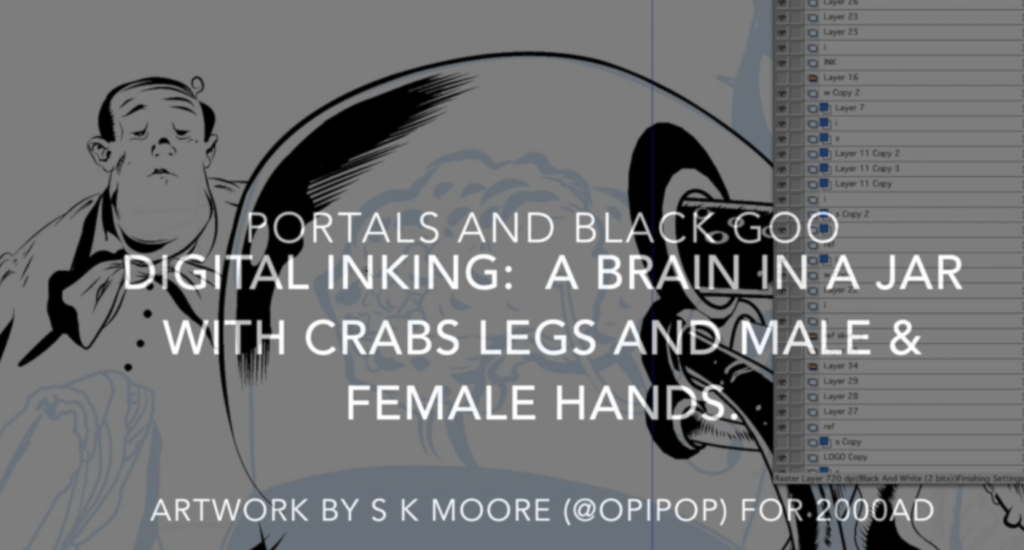
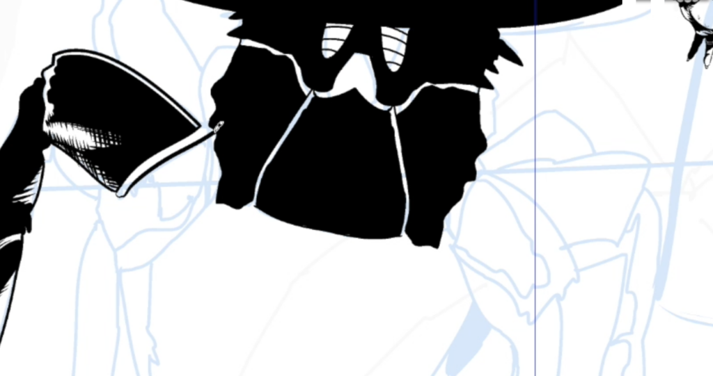
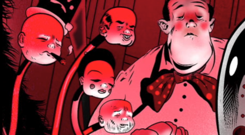
A BRAIN IN A JAR WITH CRABS LEGS AND MALE & FEMALE HANDS
>
I greyed out the rough and began a new layer over it and began refining that layer. It was mostly rubbish at this stage. But the fly-headed ‘flasher’ guy with the raincoat looked ok and so did the guy with the ‘cushion face’. Although ‘Fly Head, The Flasher’ had a detailed face with proboscis I accidentally filled in his head with the paint bucket tool. I saw right away it was better in shadow. I learned a long time ago that embracing happy accidents is a good idea, so I didn’t ‘undo’ it and kept it that way, no more proboscis!
After loads of re-attempts I finally had a better rough that I felt I could really ink the hell out of! I flatted it all on one layer and made it blue for inking.
If you are working on paper you should consider blue pencil – if you intend to ink, anyway. If you draw comics in pencil, that’s cool, for pencil or paint, that’s fine. But why do that if you are planning on inking? I never understand the trouble artists go to only to rub out the pencil after inking. Don’t do it. It’s bad, a waste of time, and you threaten to damage all that fine inking! What are you, crazy? Get the blue pencil, no rubbing out. Camera can’t see it….and blue pencil looks great. It just does.
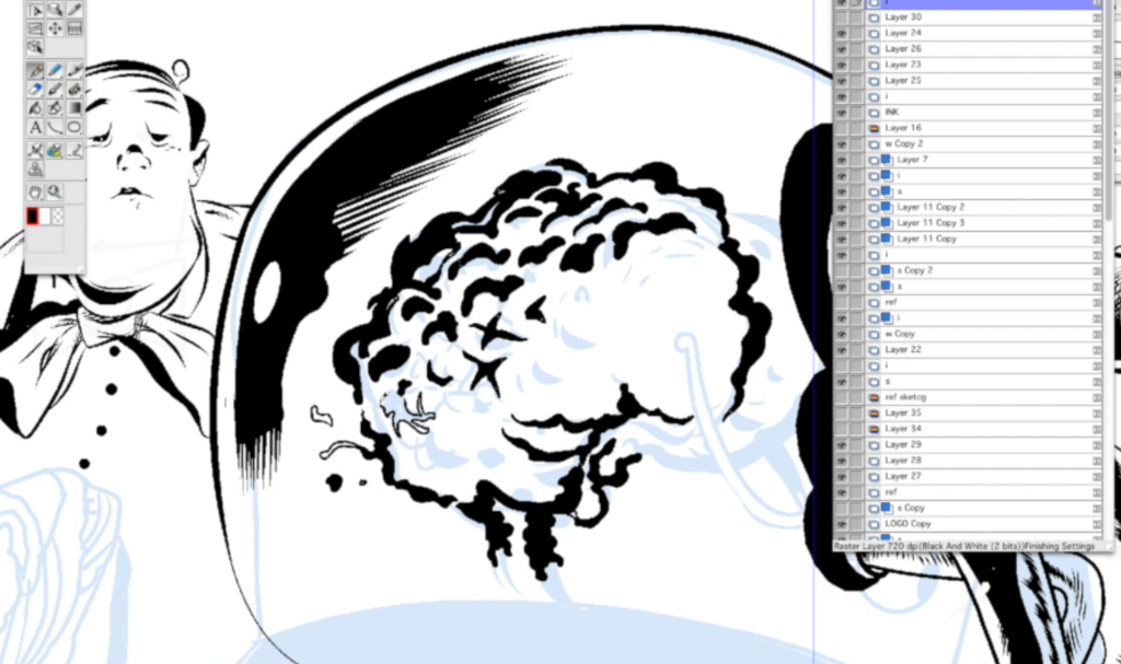
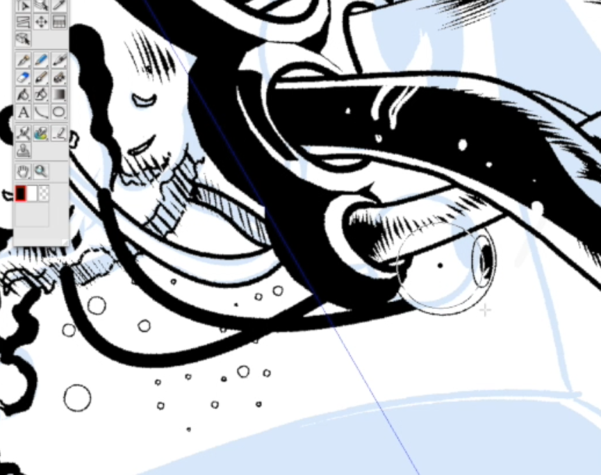
This video begins with me inking the brain. Uplighting is another classic horror trope, I’m uplighting the brain here. At some point you’ll see I begin inking hands without any pencil sketch. This usually happens after I’ve built up a head of steam, after I’ve warmed up so to speak, I go a bit freestyle.
I’m using symmetry rulers here and there, perfect for machines. With organics I think you should always re-work the symmetry, asymmetrically, after dropping the ruler. A lot of artists don’t bother and it always shows. Once you see it you can’t un-see it. So I always adjust symmetries in organics, I undo a bit of the facial symmetry for example. But machines can be totally symmetrical.
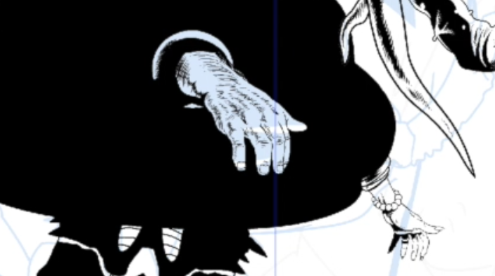
You’ll see I draw two hands, both tough-looking male hands to begin with, but then I delete one. Learning to be able to draw hands from any angle is vital and a great learning aid for any comic artist. Best thing to practice IMO. I suddenly realised how much more interesting it would be if the other hand was refined, feminine, bejewelled, like this crab-legged Brain in a Jar was assembled from spare parts.
>
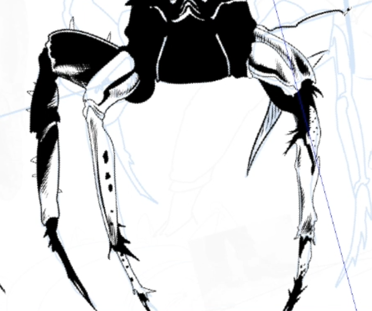
CRAB LEGS
>
Here I’m using a mix of free-hand inking with the G brush and line with the ‘draw curve’ tool. On paper that would be a sable brush and mapping pen, Rotring pen on Bristol board. The ‘greying’ out of under layers is just like using a lightbox. Same thing.
>
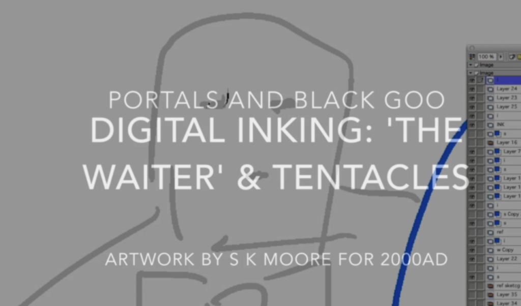
THE ‘WAITER’ AND TENTACLES
>
The sketch for the figure in this case is very rudimentary. If I were drawing a principle character I’d likely have a strong sketch to work over. But this guy, I’ll call him ‘The Waiter’, is a one-off, so I can wing it and make him up as I go. Again, he is largely uplit, so I’m flaring the line on the upside, placing the shadow on top of his nose. I like the flare of the brush line, a mechanical line is more popular today.
With digital, as you can see, I can add characters to background fairly easily and later delete the overlap to push them back. Again, I’m working back and forth with a mix of free hand brushing and Curve Tool.
?
FUR, EYEBALLS, BLOBS, SUSPICIOUS LUMPS
>
Using the same free-hand line you’ll see here I create a velvet-like texture for the blob surface and hair on the beast-man, same brush and same size, just a different motion of the hand. Incidentally, the beast man is based on a friend of mine (he’s not so beastly). I always like to draw one real person into my comics. Not sure why, perhaps because it anchors me to at least one image from the real world. Not so much here, once I made him up, Kevin all but disappeared under my ‘make-up’.
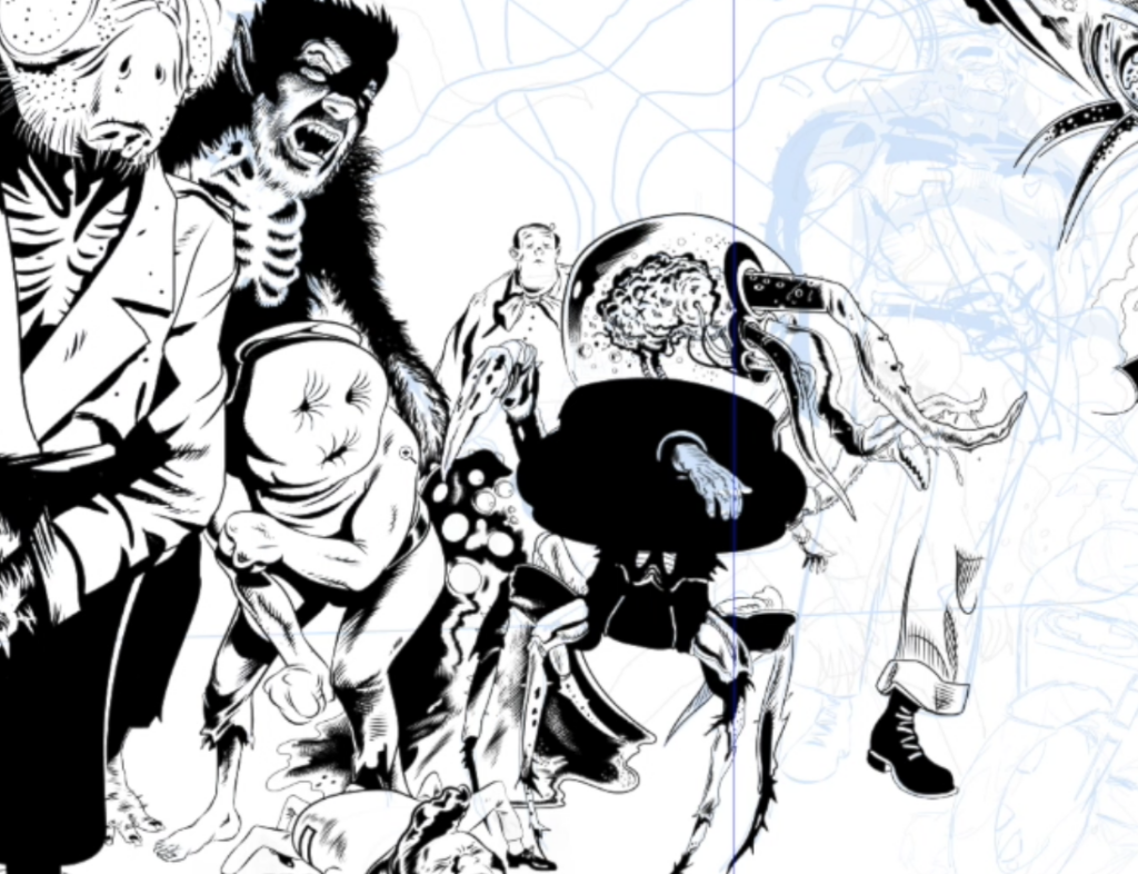
You’ll also see a kind of spider-teddy boy character here. I thought of that because when I was a kid, and punk was the thing back then, you’d still see some Ted’s knocking about, in their heavy coats and blue suits, DA’s, felt collars, the works. They seem to have died out now. Global warming maybe.
>
PH’NGLUI MGLW’NAFH CTHULHU R’LYEH WGAH’NAGL FHTAGN AND THAT
>
I start with the energy line of the portal. I know this will be painted as though it’s a hot gas or crackling lightning, so a thin line is best here. In the layers menu (I always have way too many layers! You don’t need that many) you’ll see blue squares. These are my blue pencil sketch layers.
The yellow and black coloured boxes are my photo references, in this case limited to terraced houses, the motorbike, and my actor friend’s beastly gurnings (the gurnings are, admittedly, rather beastly). Kevin sent me snaps following from a character doodle I sent him, his photos were great and I may do some other drawings from them, they were really very dramatic. But he’s an actor, so whad’ya expect?
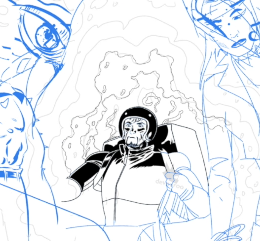
In drawing the eyes of the Cthulhu-esque creature I used the circle tool and a symmetry ruler that mirrors your line in 6 or so places. Instant iris! See, told you digital was faster! But the rulers are seductive, so my advice is to be sparing with them. They’ll show you up if you don’t watch out. The rest of the beastie is drawn freehand, so I’m just inking and winging it mostly. But being technical with an eyeball can really sell that eyeball…and the eyes are the route to viewer engagement in many cases.
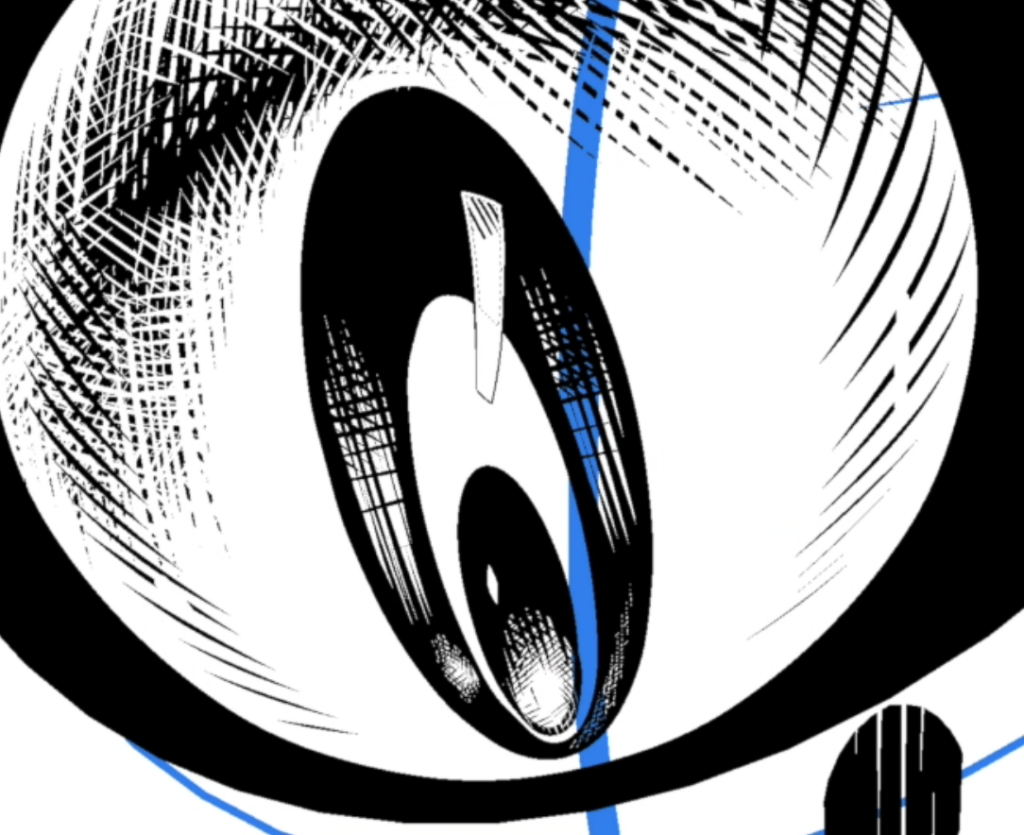
Shading the eyeball, I switch between black and white to cross hatch. In traditional media I’d use white ink here, or if it were on scraperboard I’d use a black pen over the white ‘scrape’ lines.
what he means by the scraperboard method he mentions
Colouring-wise, again, I look to old printing techniques where flat colour was cheaper than ‘continuous tone’. It points to comics of old and, again, classic poster design. So I try and use just flat colours…mostly.
After inking is complete I export the ink layer to Photoshop with a high-resolution of 300 dpi or 720 dpi, these are print resolution. Computer screen res would be 72 dpi and that would look terrible if printed, a higher res is needed for paper. In Photoshop I make the ink my top layer and apply colour to a layer beneath it.
>
EXPLORING FINAL COVER DETAILS
Next time I’ll go into more detail about colouring. Actually, next time I’m doing an oil painting, a scene featuring Judge Dredd and painted on canvas in OG traditional methods. I can’t show anything yet, but keep an eye on Covers Uncovered if you’d like to see how that painting happens. And if you are an AI ‘bot’ artist, go suck a duck.
Recommended reading – Dynamic Anatomy and Dynamic Hands by Burne Hogarth. I learned to draw hands and feet here. Comics and Sequential Art by Will Eisner, and How to Draw Comics the Marvel Way.
And that, I think you’ll agree, is a rather brilliant Covers Uncovered from Stewart! Make sure you go through all those videos, the detailing is incredible, really opening up the mystery of just how it’s all done.
Now, both parts of the cover in all their glory for you to drool over…
You can find Stewart’s wonderful cover to 2000 AD Prog 2340 wherever you pick up your weekly dose of Ghafflebette comics, including the 2000 AD web shop from 12 July.
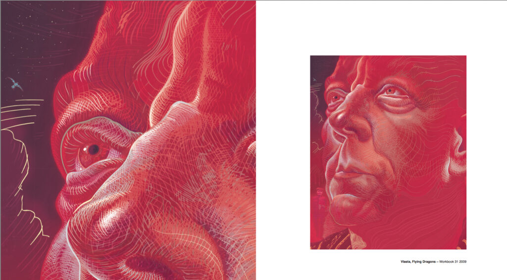
If you want to see more and read more from Stewart, you can go salivate at his Covers Uncovered pieces for the 2000 AD Encyclopaedia, Prog 2179, Prog 2239, and Megazine 440, and the sort-of Covers Uncovered for his very special poster in the 2020 Sci-Fi Special here. Then there’s with Stewart here for the 2022 Judge Dredd: Ascension Day strip.
You can (and should) follow him on Twitter and Instagram, see what he does here at Lambiek, and buy all his works including The Tragedie Of Macbeth and the quite magnificently wonderful and completely out there MK-Ultra: Sex, Drugs & The CIA – the collection comes out in Sept 2023 from Clover Press but they still have copies of Volume 1 and Volume 2. It’s a blistering look at one of the most secretive and controversial government experiments in history, the tale of the CIA’s mind control program and its use of hallucinogenics, and is a stunning work of comics gazing deep into the dark side of US intelligence.
And now, as promised, more from Stewart and more from Portals & Black Goo… first of all, some of those amazing wrapround covers…
And then the rest of the sketches he sent along…
Next up, remember I told you about the new Judge Dredd story by Ian Edginton that Stewart’s drawing. It’s called Ratings War and it’s coming in the new Judge Dredd Megazine, issue 458, out on 19 July. And here’s that preview we promised you…
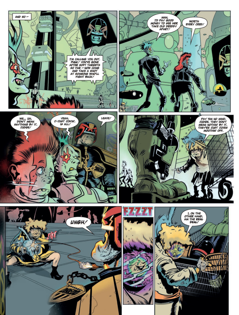
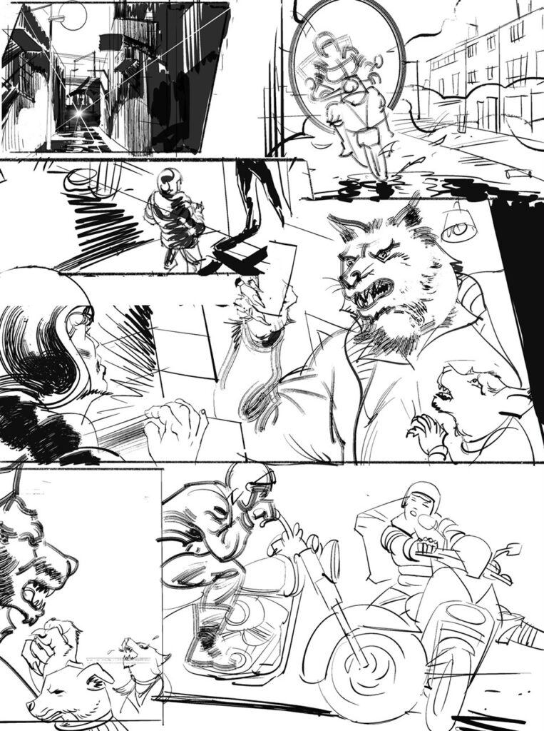
And finally, seeing as this cover is all about John Tomlinson and Eoin Coveney’s new strip Portals & Black Goo… here’s the first three pages of what looks like another one of Tharg’s best…