2000 AD Covers Uncovered – Shooting The Reader with Mark Harrison
22nd August 2021
Every week, 2000 AD brings you the galaxy’s greatest artwork and 2000 AD Covers Uncovered takes you behind-the-scenes with the headline artists responsible for our top cover art – join bloggers Richard Bruton and Pete Wells as they uncover the greatest covers from 2000 AD!
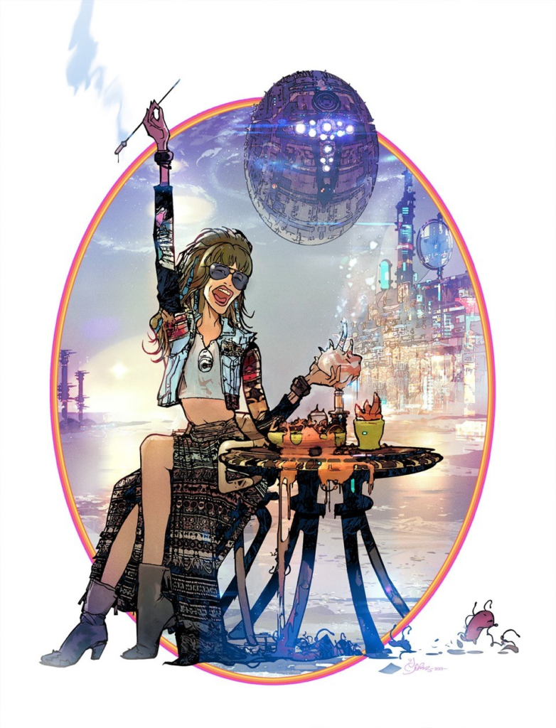
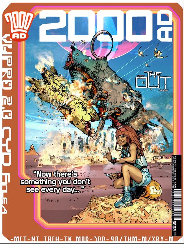
This week, it’s the triumphant return to the pages of the Galaxy’s Greatest to art-droid Mark Harrison, usually found beavering away on The Out, his incredible outer space adventure with Dan Abnett, their ‘love letter to the SF book-jacket art’, which returns soon for its second series!
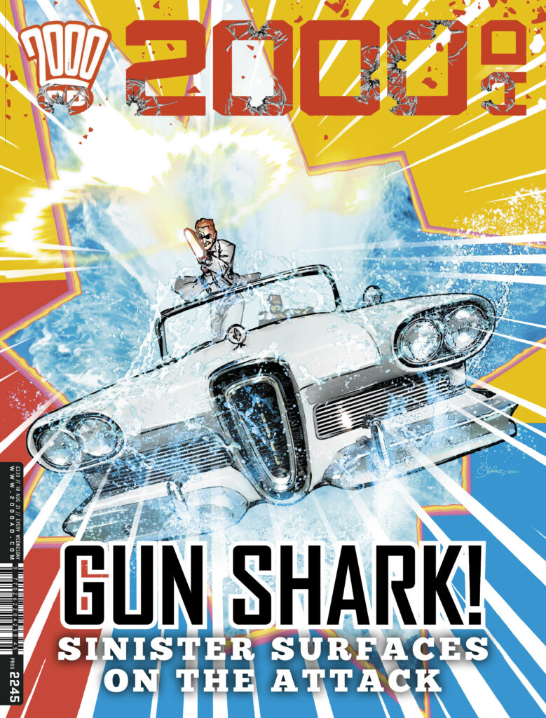
But on the cover of 2000 AD Prog 2245, Mark’s turning his artistic talents to one Finnigan Sinister, freshly back from the dead and out for the blood of Dexter in the Sinister Dexter saga, Bulletopia Chapter Six, Somewhere Beyond The Sea, the series written by Dan Abnett with art from Tazio Bettin.
We chatted to Mark about all things Sinister and why shooting the reader is always a great thing!
PROG 2245 out now
Buy now
.
MARK HARRISON: The brief from Tharg/Matt was to go with one of Tazio Bettin’s images from the strip; a shot of the Edsel Car in amphibious mode skimming across the sea, Sinister firing a BFG.
(Love the way Tazio did the gun flash; an expanding plasma shockwave and an energy blast exiting along one plane. Nice energy. Sorry, artist appreciating something another artist has done and inevitably stealing it… which I did! 😉
And that would be this image of Tazio’s…
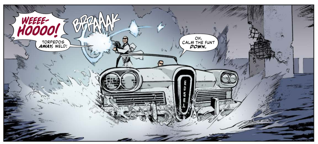
MARK HARRISON: The car was kind of skimming across the surface of the water like a hydroplane boat and I originally had it in that orientation, with Evil Sinister blasting to the side.
I thought I could do more with the cover. Sinister Dexter is latin for left and right and was used to denote sides of a shield in heraldry. I was also thinking of a graphic or shield/badge to do with a car, an emblem like Ferrari, so I also overlaid an insert image of Sinister and Dexter, to flip sides of a face, a contrast.
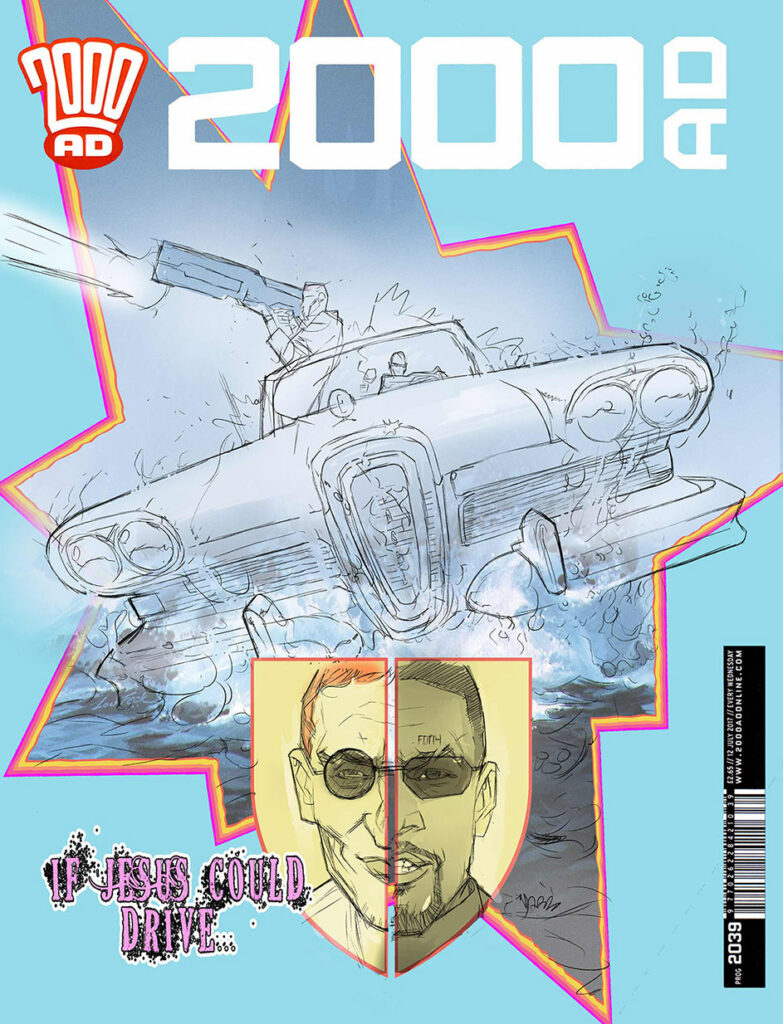
Sinister in the strip had been taken over, was a bad guy, dressed in white. I had noted that for it to work, Sinister should have been on the right of the cover, but before I could make that change Tharg/Matt suggested dropping all that for a less fussy approach and with Sinister “shooting the reader”.
Shooting AT the reader is good.
There are rules in comics and particularly in regard to eye-catching covers; a psychology. I’ve been told by editors/marketing over the years: “Have the character make eye contact with the reader”. “Shoot AT the reader.”’ Explode the frame”. I’m assuming that the confrontational aspect of the image arrests the reader or casual comic buyer. It “connects”. It’s not a passive image.
Some editors have interesting preferences. One time 2000 AD editor Dave Bishop had a penchant for headshots; (not literally shooting someone in the head… although I don’t know) and Paul Neary at Marvel UK would ask me to have the combatants look out at the reader… which was kinda odd if they were punching someone page left or right: “Look at me, I’m punching his face!”
I don’t always agree with their choices but I can see their point of view.
Of course, this cover became an exercise in revisiting some of those techniques that were used back in the day when layout artists and comic artists had to maximise the limited resources (colours and fidelity) of comics at the time and be contrary to their surrounding, safer imagery.
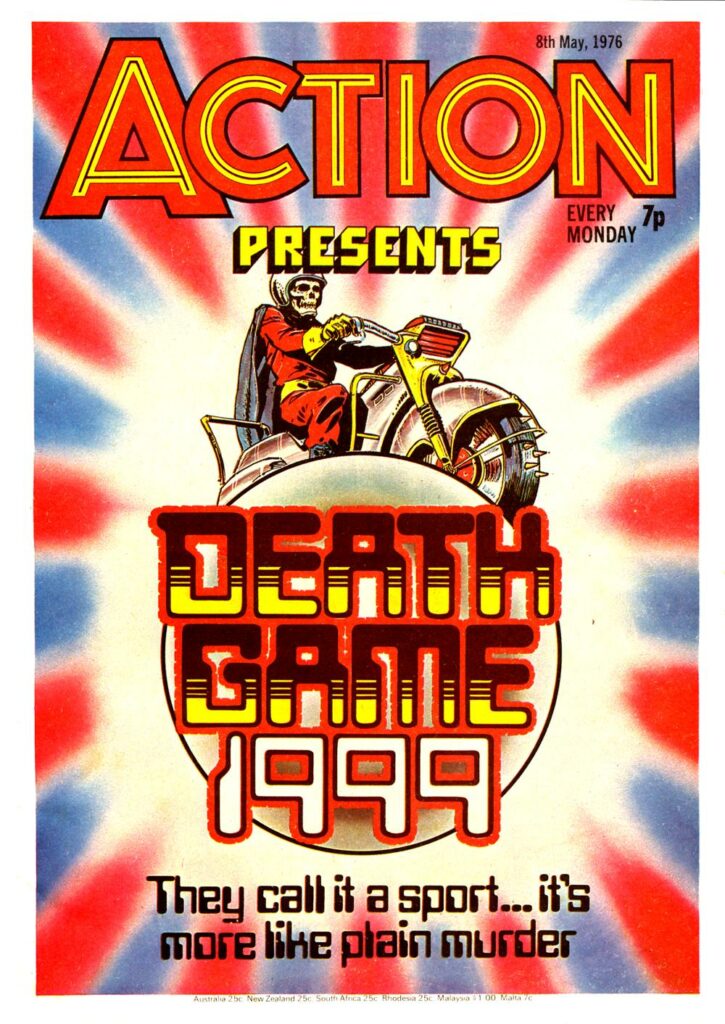
Comic shelves in WH Smiths were a crowded place back in the ’70s as children had little in the way of alternative distraction. So your comic had to leap off the shelf, kick the reader to the ground, lose some teeth before pumping a few caps into his wide, disbelieving eyes. Figuratively speaking. The go-to comic for this “Boot in the face” subtlety was of course 1970’s boy’s comic ACTION.
Doug Church (I think) was the ACTION layout artist to deliver the goods, covers that EXPLODED in you face like an IED, images that broke the frame, three primary colours to disrupt the synapses, whoosh lines and jagged caption boxes that SCREAMED at you. It all had to say… well “ACTION”. Along with “Blood” and “Death” and “Disembowelled”. (Different times).
Yes, Doug Church was a legendary contributor to Brit comics – Action, Battle, and 2000 AD, to name but three, all benefitted so much from his design work. And this is a perfect cover to show you what Mark’s talking about – ‘Covers that EXPLODED in you face like an IED, images that broke the frame, three primary colours to disrupt the synapses…’ Oh yes, just like this…
MARK HARRISON: Oh, I could wax lyrical about British comic art page layout which I consider to be the best in the world.
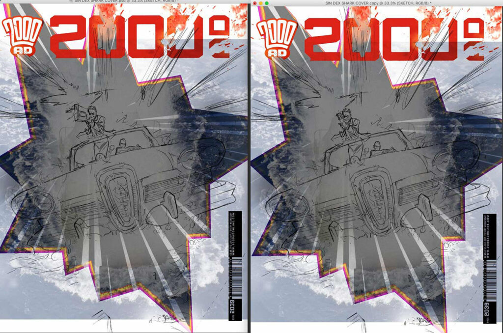
With that legacy in mind and remembering how it grabbed me as kid, I redesigned the cover to be more punchy.
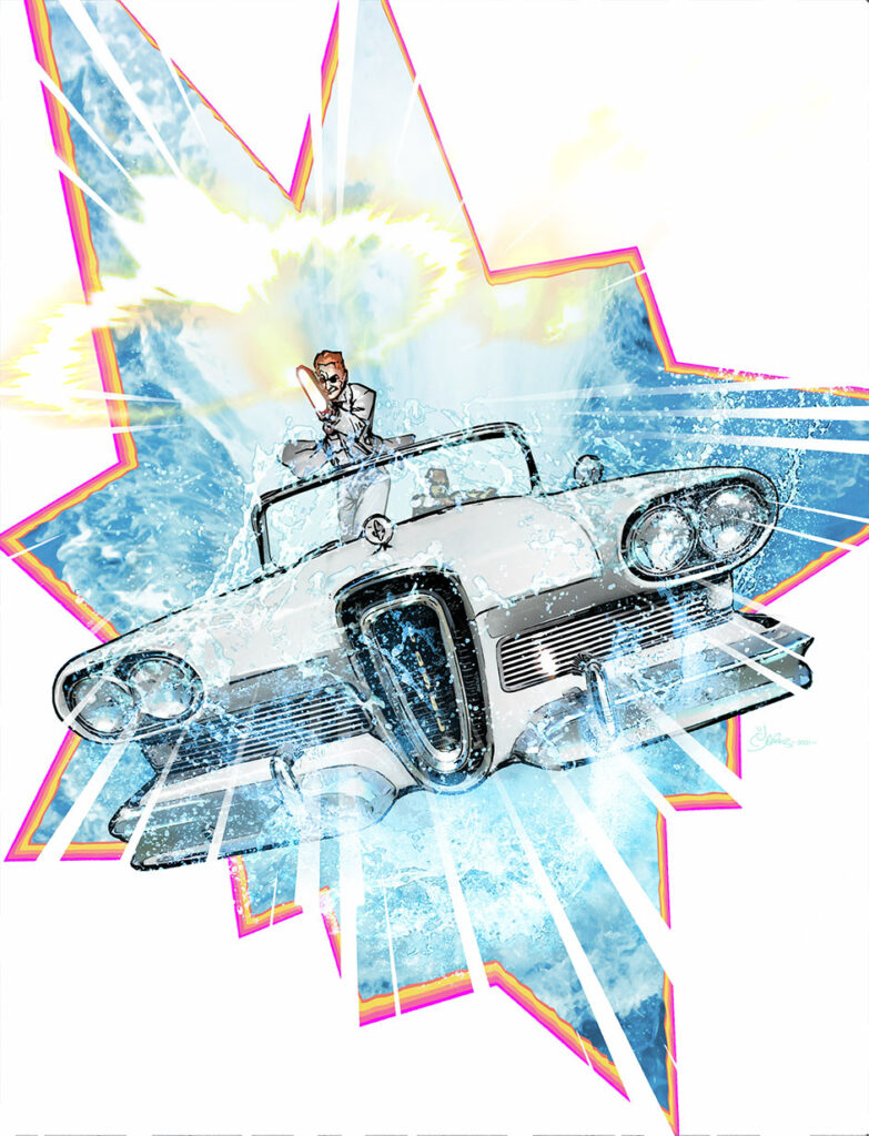
Gone was the hydroplane angle on the car (which had been inspired by the JAWS 2 movie poster) This was more an aerial shot looking down, the car launching from the water towards us like Stingray from the Gerry Anderson show of the same name.
The car I partially sourced from an image online and exaggerated the perspective on the final image, to suggest a distorted stretched wide-angle, again, to create more dynamism.
The car’s top had collapsed back into morphing tech and Sinister had seemingly hauled himself into a firing position over the windshield defeating both gravity and acceleration (it’s comics) to blow away the reader.
Not just us, but the 2000 AD logo too! What a bastard.
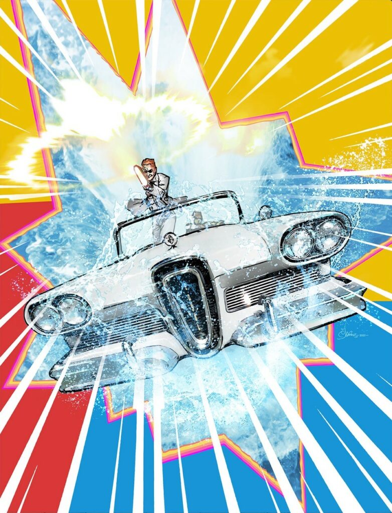
The background of the cover would be rent apart in a stylised “Kapow!” framing, as if he had blasted through the cover, overlaying the frame with the car to create that illusion of depth. Whoosh lines emphasised the speed and energy. (It’s why you have particulate matter streaking past the USS Enterprise in Star Trek; otherwise it would look like it was hardly moving. By the way: Particulate matter in space to suggest motion: Good. Shaking a camera with the so called “wake” caused by the ship in the vacuum of space: bad.)
The seafoam (actually the second most difficult thing to get right on the cover and to look suitably translucent) helped suggest a snapped freeze frame, or a moment where the car hangs before dropping back.
The most difficult thing was nailing the angle of the car. I went through several versions of just rotating the image. Even upside down How much is too much? But ultimately (and a good rule of thumb) the simplest way is the best way. So a slight tilt. Don’t overthink it. “Thinking slows you down, Logan.”
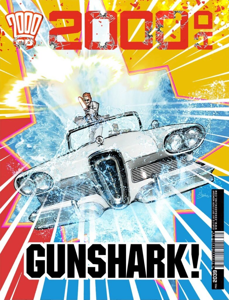
The car and Sinister shooting was the main impetus. What remained was how to finesse the image with graphical choices so I provided a couple of iterations. I think Tharg/Matt chose my fave version; the three colour background; a nod back to the classic covers of ACTION which works better with the white car. But I also like the starkness of the just white background.
There were other ideas. To overlay a texture of grainy Grindhouse film (flecks of dust, a trapped hair, film stripes) but that’s mixing the metaphors as it were, or styles. This was old school comic book, not old school film. Maybe for another cover!

And there we go – (one Finiggan + one Edsel + one BFG) x one Mark Harrison = one funting incredible cover.
You can find 2000 AD Prog 2245 on the shelves of comic shops and newsagents as well as the virtual shelves of the 2000 AD web shop from 18 August!
Thanks to Mark for sending the details along, always so good to read his thinking about putting his covers together. For more from Mark, try these… Covers Uncovered Prog 2187, Covers Uncovered Prog 2193, plus an interview with Harrison and Dan Abnet about The Out.
