2000 AD Covers Uncovered – Surfs Up With Tom Foster For Megazine 454
15th March 2023
Every week, 2000 AD brings you the galaxy’s greatest artwork and 2000 AD Covers Uncovered takes you behind-the-scenes with the headline artists responsible for our top cover art – join bloggers Richard Bruton and Pete Wells as they uncover the greatest covers from 2000 AD!
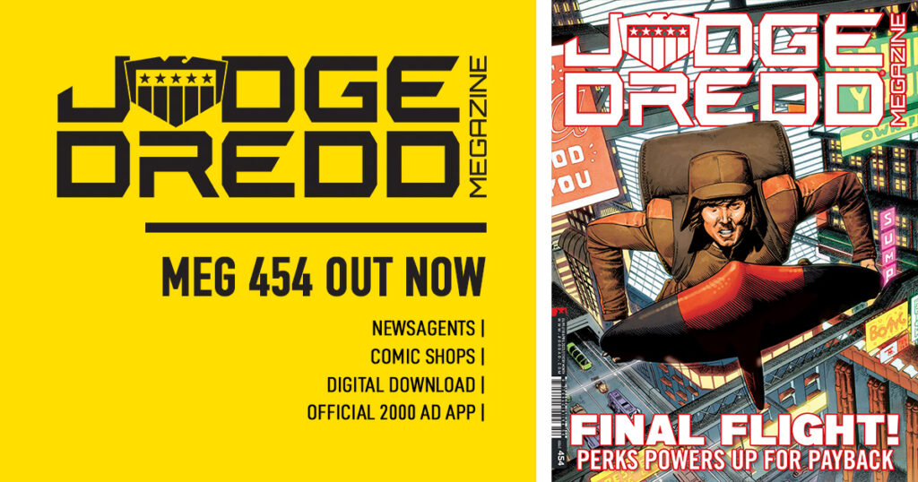
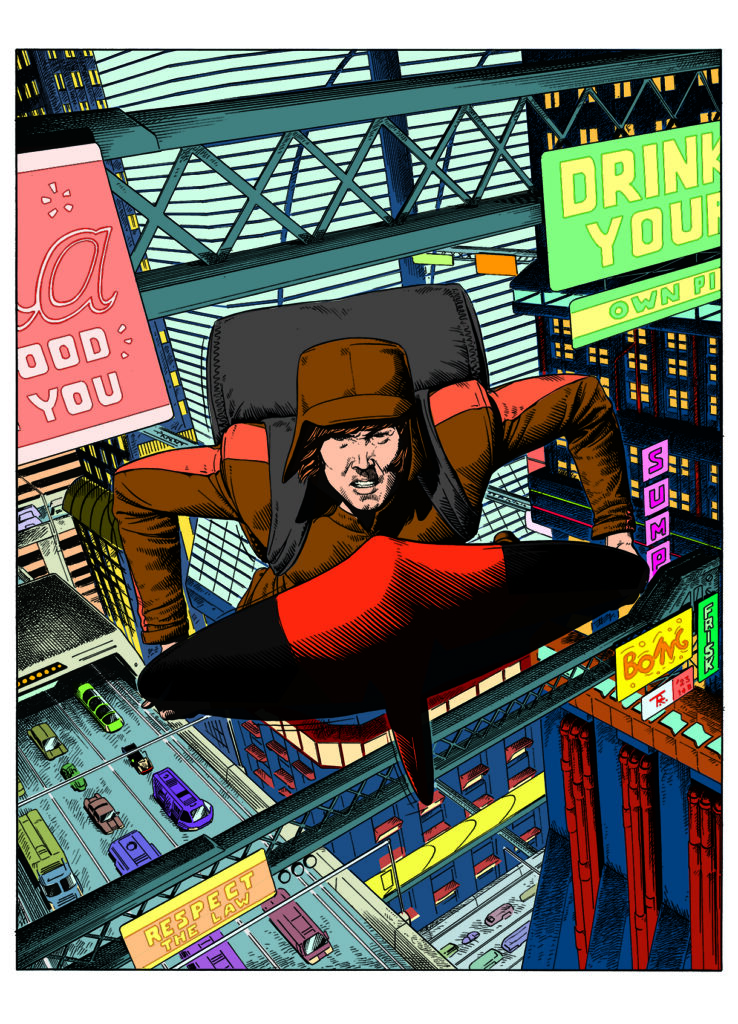
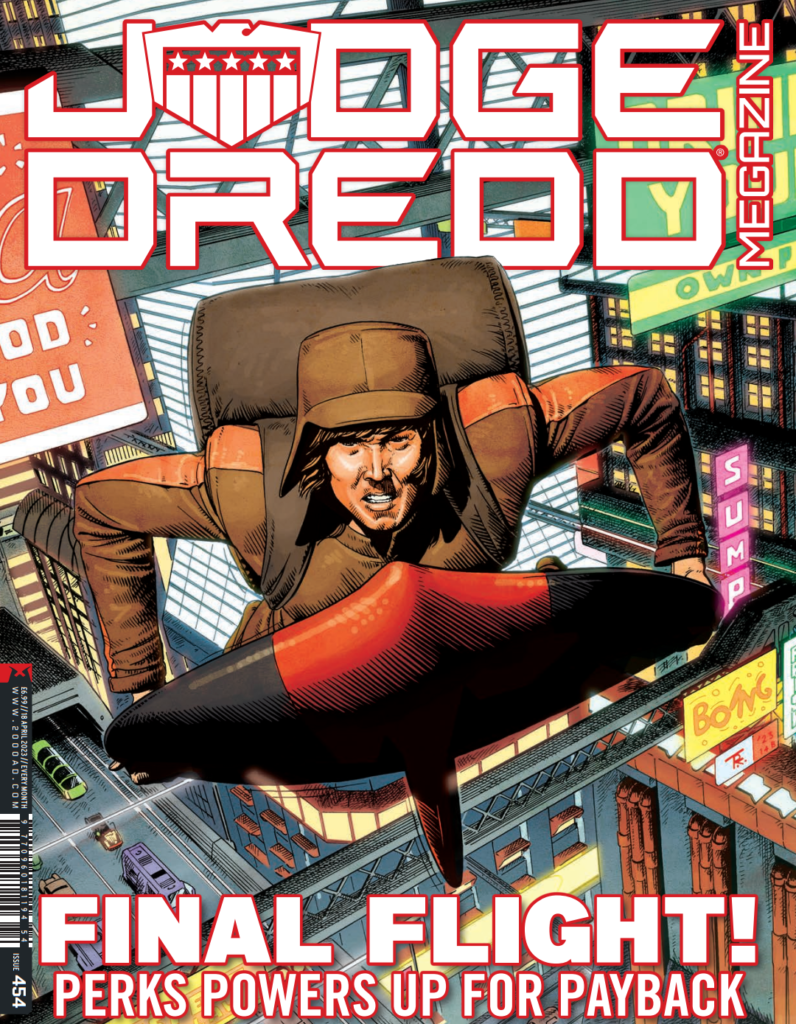
This week, it’s back to the cover of the Judge Dredd Megazine for art droid Tom Foster. And it’s a great cover from the ghafflebette Surfer by John Wagner and Colin MacNeil, a thriller of a tale of surfing and crime in MC-1.
After winning the 2013 2000 AD Art Portfolio Competition at Thought Bubble, Foster’s distinctive style has been a sure-fire hit with you Earthlets, most notably on Storm Warning, the series he co-created with John Reppion and Leah Moore, and his recent Dredd work with Ken Niemand – A Penitent Man and An Honest Man, with the third and final instalment, A Fallen Man, coming later in 2023.
But that’s for later in the year, we’re here to talk with Tom about that great Megazine cover… or at least we thought we were talking to Tom…
TOM FOSTER: Hello, I’m an AI and I would like to introduce you to my process for making this exciting, dynamic, and trending on ArtStation, cover for The Judge Dredd Magazine.
Not really of course, I’m Tom Foster – and, while it would certainly be very funny and not tiresome of me to write the whole walkthrough from the point of view of a fictional AI, I can absolutely guarantee you that I can’t be bothered. So let’s begin where all non-James-Corden humans start their artistic journey – with an idea…
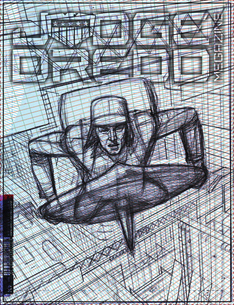
(1) The Mighty Tharg himself was good enough to furnish me with a pitch for this cover, which is often the easiest way. With the rough idea of what I’d be drawing already decided, I could busy myself with figuring out how to stage it.
A diagonal composition can be very useful for suggesting movement, drama and emotional turmoil, but this one was particularly tricky as all three principal vanishing points were outside of the image area. As with most dramatic compositions though, it made sense to have the focal point be relatively simple – so the time I lost to plotting out my perspective grids, I gained in not having to draw lots of complex figural detail.
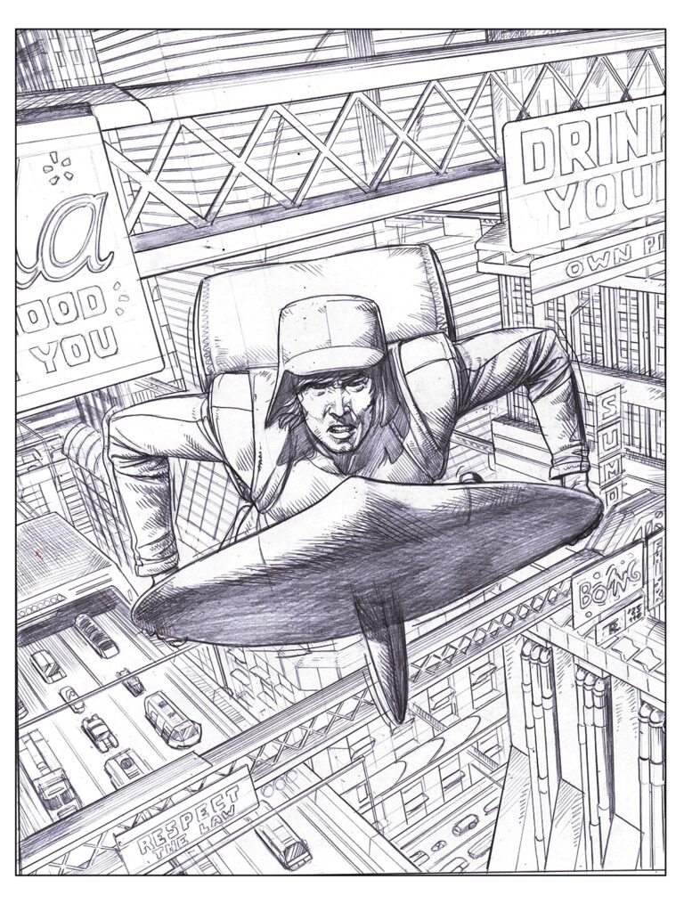
(2) With a rough layout sketched out and approved, I moved onto the pencils. In this case the bulk of the work was in populating the background city.
I was quite pleased with how detailed it looked.
Then Cliff Robinson’s ‘Taking Liberties’ cover for Prog 2316 came out and I just about had an aneurysm.
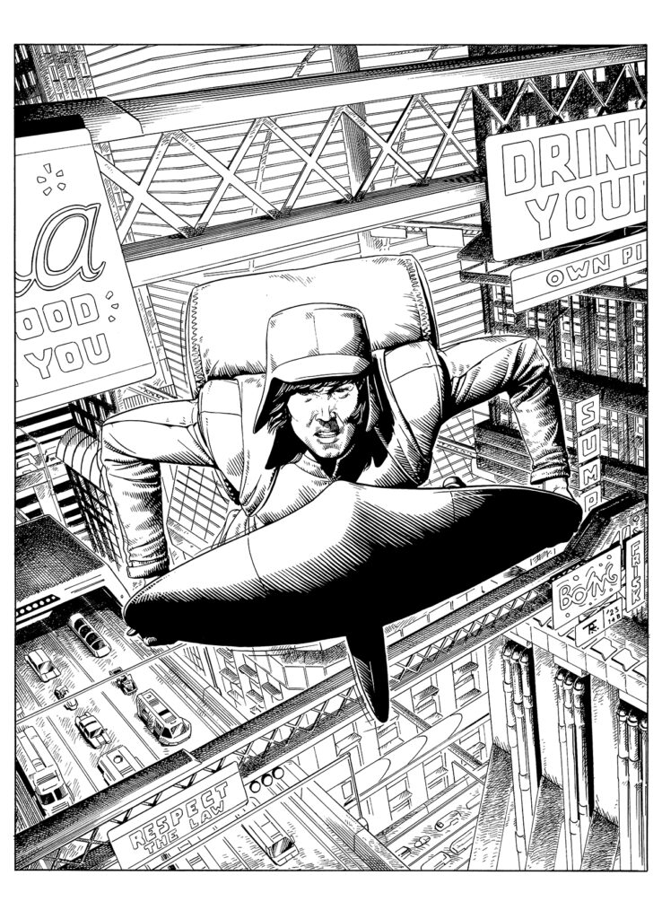
(3) With the inks I realised that subtle shading effects were not going to be too much use here. With so many forms in the image, it was far more effective to try and create a good balance of black and white and let the colouring deal with the bulk of texture and tonal variety.
(4) People who read a lot of these step-by-steps will be very familiar with the flatting part of the process. I certainly am. Took an eternity to separate out, this did.
I know, I know ‘call the U.N.’…
(5) With the human rights atrocity of flatting out of the way, I was free to do the fun bit – making it look pretty. As so many people do when they’ve run out of options, I turned to the world of anime for help. Anime background artists are often very good at making cityscapes, which could so easily be dull and grey, richly colourful without seeming gaudy and ridiculous. I have a big book of anime architecture, which was a tremendous help. I also watched Akira all the way through for (gasp) the first time.
(6) After rendering the forms as much as seemed advisable with a composition that might tend towards being cluttered, I added a few finishing touches. I’m not a big fan of using effects that seem overtly digital, as I find they often clash with the more traditional linework, but I really wanted some ambient light in the city – particularly with all those billboard screens and windows all over the place.
My compromise was to try and go no further with my digital trickery than might be possible with a double exposure effect in traditional cel animation. The process was different (mostly using a series of Hard Mix layers), but the effect, I think, is similar. This is by no means a new approach, but it’s one that I’ve resisted using in the past. Here, it seemed like the right choice.
So that’s all. If you’re still imagining how much better it would have been if I’d committed to the idea of writing this whole thing as a satire on AI-generated content, then by all means try it yourself and see how long you can milk references to image scraping and big-titted manga girls before you realise you’re essentially writing an on-the-nose whimsy piece for The Daily Mash and give yourself over to screaming.
And that’s it – say no to AI kids, the last thing Tharg needs is the Droids getting ideas above their stations!
Thanks so much to Tom for sending his breakdown of his cover. You can find Judge Dredd Megazine Issue 454 everywhere the Galaxy’s Greatest is sold, including the 2000 AD web shop from 15 March.
For more from Tom here at 2000AD.com, check out his Covers Uncovered features for 2000 AD Progs 1986, 2225, 2281, and 2310, and his great Storm Warning cover for Megazine issue 450. We’ve also interviewed him a couple of times – he talks about his 2013 Thought Bubble talent search win here and the Judge Dredd: A Penitent Man strip here. Finally, if you want to see and hear him, there’s his 2000 AD Thrill-Cast Lockdown Tapes appearance here and his far too funny From The Drawing Board video can be found here.