Not Quite Covers Uncovered – SK Moore Talks A Stunning Sci-Fi Special Extra…
20th July 2020
Something a little different now. In the 2000 AD Sci-Fi Special this year, Tharg commissioned SK Moore (Defoe) to deliver a double-page spread celebrating all that is best in the 20 years of the Rebellion that took hold at 2000 AD in 2000 AD.
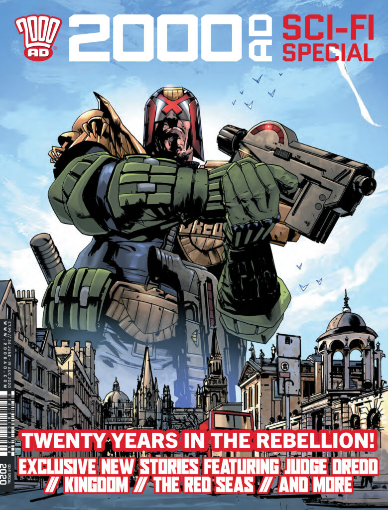
And having seen it in the pages of the Sci-Fi Special, I was absolutely blown away by it. It’s EXACTLY the sort of thing that teen me would have plastered up on his walls.
If you haven’t picked up your copy of the Sci-Fi Special (and why the hell not? – Get it from the 2000 AD shop NOW!), then this is what I’m talking about… this glorious double-page spread by SK Moore…
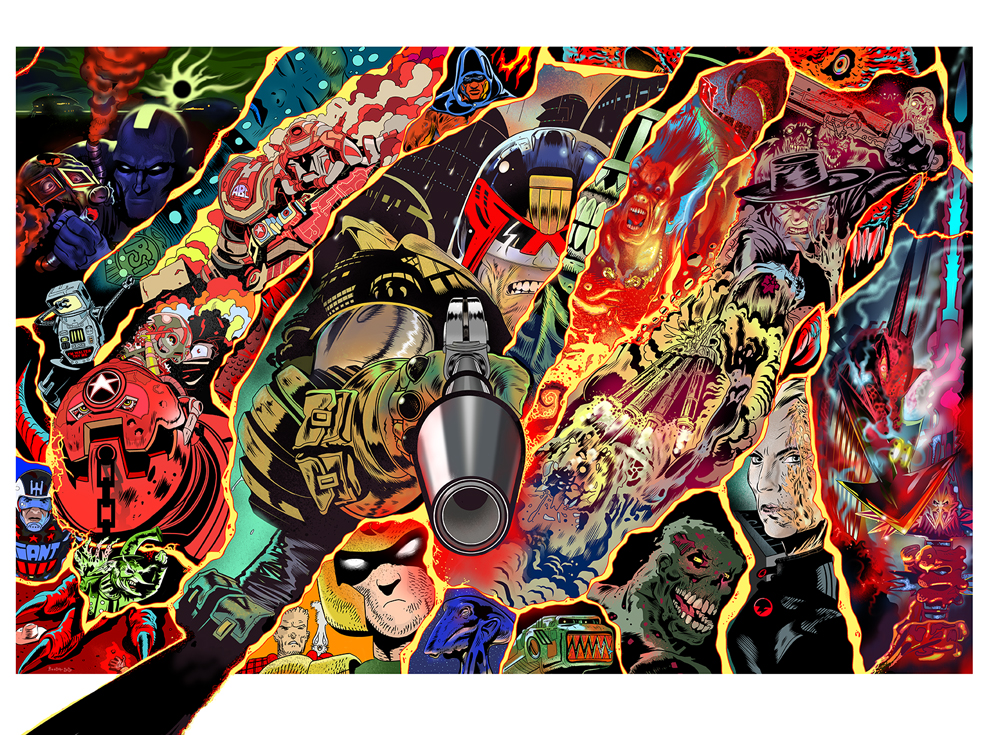
So, having seen it, I thought it would be great if Stewart could share with us the process of putting together the double-page spread pretty much in the same way we do the regular Covers Uncovered feature here.
So… ‘Hey Stewart’, says I, ‘love the pin-up double pager in the Sci-Fi Special. Do you fancy doing a little behind the scenes into how you put it together? Nothing too time-consuming, but would be great to see how something that good came together.’
‘Sure thing’, says Stewart. And then goes off and writes a bleeding essay about the making of the pin-up that covers the very spirit of creation itself and goes deep, deep into so many things. Bless him, it’s fabulous reading.
Matt Smith asked me to create a poster pin-up that celebrated a mix of 2000 AD characters for the 2020 Sci-Fi Special. Examples included Dredd, Rogue, Strontium Dog, Slaine, ABC Warriors, Nemesis, Old One Eye – but in addition some of the more recent characters like Defoe, Stickleback, Aquila, Zombo, etc.
It was quite a short deadline for me, I work weekdays on my graphic novel (Project MKUltra: Sex, Drugs & the CIA) and taking on a pin-up would be difficult since I can only work weekends on other projects and the deadline only allowed 2 weekends, it was tight!
I produced two roughs. The first was a grouping of the characters fighting back-to-back against various enemies, the second a series of vignettes separated by some kind of energy, I’d firm up what that energy was later, but at the time I thought ‘laser fire’. Matt asked me to focus on the vignettes idea now and work up the second composition at a later date.
(So BREAKING NEWS… I’ll be creating a 2nd painting based on the other sketch once I finish my book!)
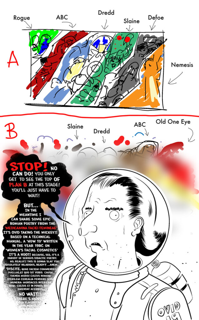
I was a bit relieved, to be honest, by Matt’s choice because the vignettes design would be quicker for me to complete than a full-on perspective-heavy, character-filled, battle scene.
The following description goes into my thought process and doesn’t deal too much with how it was drawn. There are simply hundreds of tutorials on comic art, figure drawing, perspective, oil painting and digital methods, any kind of painting, you name it, it’s all on Youtube. That’s all a matter of practice and learning ‘how to draw’ and paint. What follows here is a little bit about the thought that went into this image.
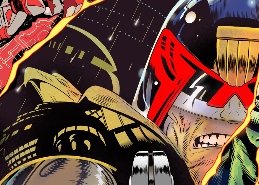
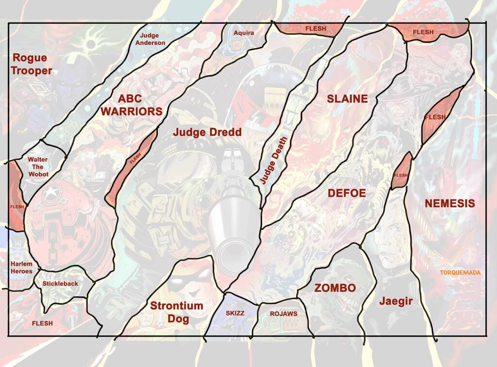
First I blew up the sketch to fit across two pages. I decided Dredd had to be completed first since he was the focal point. If he shaped up right then everything else should fall into place around him.
Each of the vignettes is a glimpse into each character’s world. If I ran out of time I could widen the dimensions of the vignettes if necessary, in Dredd’s case that would mean more city blocks behind him. But, to my surprise, I made good time with the drawing.
It’s easy at this stage to redraw a bigger version of the sketch and lose all its dynamism, don’t ask me why, it just happens. So I was VERY careful to copy the proportions precisely but much larger and in more detail.
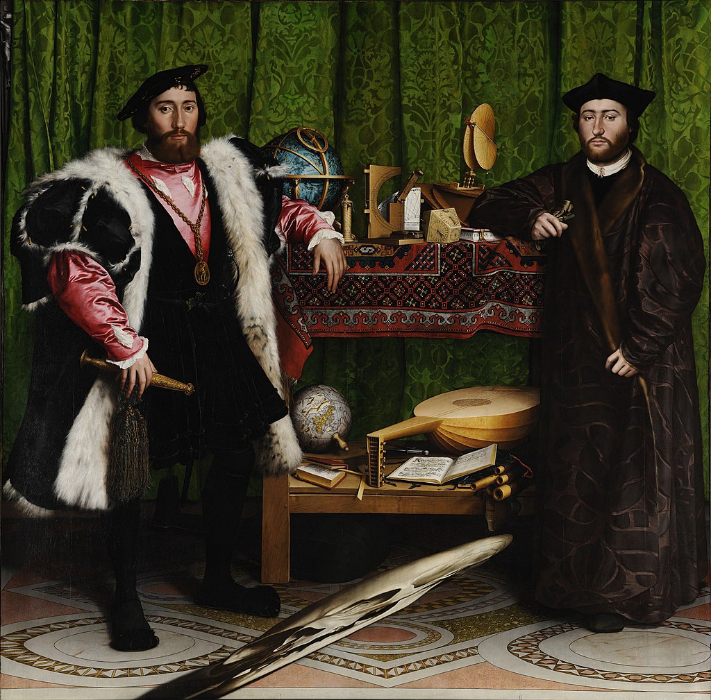
I’ve always been intrigued by optical illusions and use them in my work sometimes. For example, if you hold Prog 2151 (my wraparound Defoe cover) at an oblique angle the condensation trails of the spacecraft compress into skulls.

(Okay… we’ll wait for you to go and try that – I know I did. Cool, huh?)
Those skulls are based on one of the most famous illusions in the history of painting. A picture painted by Hans Holbien the Younger known as The Ambassadors. If you are in London it’s well worth a visit to see this astonishing masterpiece at The National Gallery.
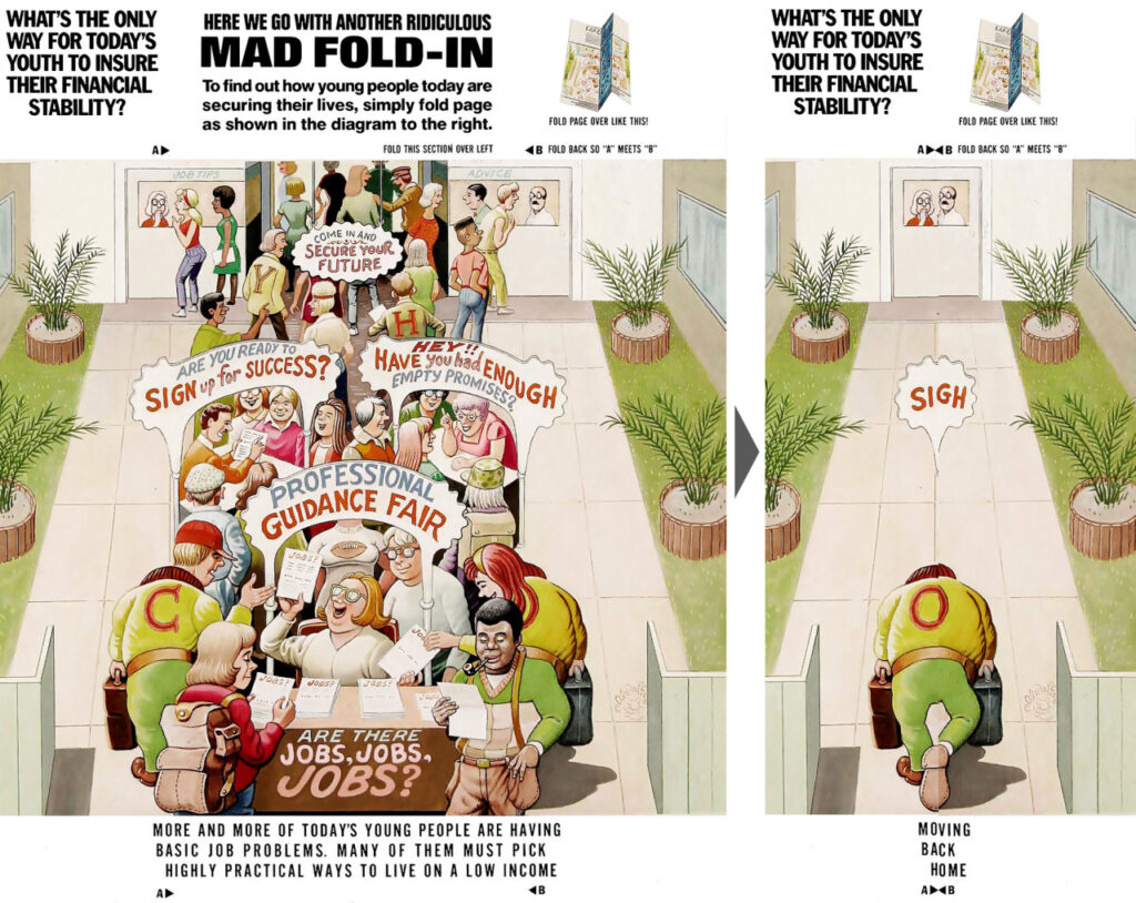
Al Jaffee’s illusions in Mad Magazine were always a treat and I initially came up with something along similar lines to his work, but it was way beyond the brief, so that idea (which I can’t share right now) has been shelved for the time being. Incidentally, Jaffee is 99 years old and retired from comics last week! (June 2020, as I am writing this.)
I started thinking about something that I feel I’ve noticed when drawing my own comics. Although letterers put bubbles on the art, the human mind seems to account for that and ‘see’ the obscured areas.
Somehow, even though the bubbles are dropped over the art, I feel I don’t notice the missing areas, somehow my mind still seems to see and understand the composition even though areas are missing. Do you know what I mean?
Artists generally leave space for bubbles but bubbles will very often still land on elements of the artwork, in my case because I’ve not given the letterer enough room. Yet most of the time bubbles don’t actually disrupt the image at all, the mind’s eye sees what’s under the bubble, somehow, anyway. Somehow your mind completes the broken picture line. This is just one of the odd things I feel I’ve noticed while drawing comics and as an artist I’ve wondered about it many times.
So I looked into it and was delighted to find it is a known phenomenon called ‘reification’ and it emerged from studies into what is called ‘Gestalt Psychology’ in the 19th century.
‘Reification is the constructive or generative aspect of perception, by which the experienced percept contains more explicit spatial information than the sensory stimulus on which it is based.’ – Wikipedia.
In other words you see things in the picture that are not there because the mind completes the broken picture based on what is there!

I started drawing just a sliver of Judge Death, and a few others, to slip between the main characters, so he might not be obvious and hopefully a treat to discover in the cracks.
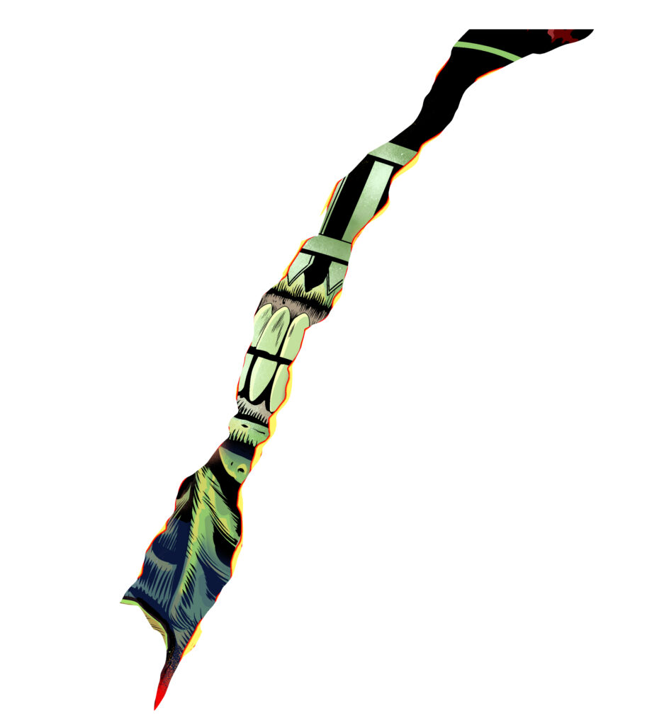
The most challenging attempt at reification was Old One Eye. Her foot is evident at bottom left, the cowboy hat is a clue. Only Flesh has cowboys and dinosaurs! But if you look across the picture there are scales coming through here and there, one empty eye-socket, some teeth and claws.
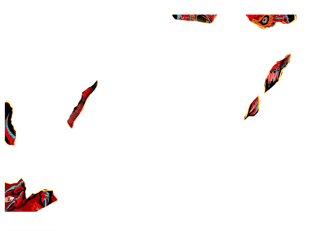
Character designs should always be recognisable in silhouette. 2000 AD characters are immediately recognizable in this way. But Death is so well designed I think you could put him through a shredder, pick any strand from the waste-paper basket, and still recognise him from just that sliver.
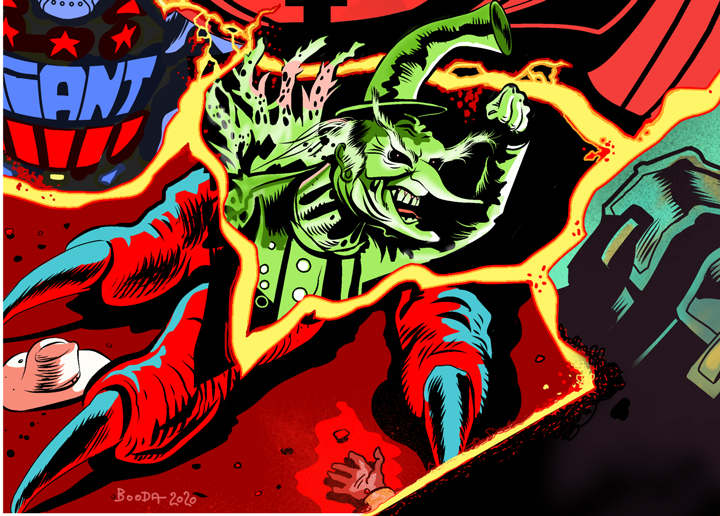
I can only draw Dredd and Defoe off the top of my head. For all the others in the pin-up, I had to study the characters and in the case of Strontium Dog, I even abandoned any attempt to draw him my way. I kind of aped the way that Carlos Ezquerra drew him, is there any other way?
Similarly, I know there are new ABC Warrior stylings, but I am not familiar with them. Instead, I looked at some classic ABC’s by Mike McMahon. I remember, for a while as a young reader, feeling the McMahon run on the ABC’s was the finest thing in the Prog for me, so I looked there for starting points.

I lost a lot of time just looking for material and periods on which to base my drawings.
Once the pencils were near done, I did a second refining layer, then I inked Dredd and then inked Nemesis.
Normally I would only colour after all the inking is done but panic began to set in as I watched the clock hands spin faster and faster. I realised none of this might work – I needed to know it was working.
So I began to complete each vignette, in full, as I moved across the picture. This was advantageous, it spurred me and I was thrilled by the idea that I had no idea how colourful it would end up being.
I could imagine the composition, and each section’s colours, but the overall effect was going to be a surprise even to me.

I worked on the characters that excited me at that moment, and seized them. If you struggle with motivation this is a great creative method to follow. Pick the panel (or areas) that trigger your excitement, you’ll feel it as you look over the pencils, one panel will strike you as exciting, and if you do it well the positivity seems to pass to the next bit of heavy-lifting and before you know it – it’s all done!
This can help you down the creative road faster than plodding through panels you don’t want to draw in numerical order. There’s usually a subconscious reason why I don’t want to draw certain things and that’s usually because something bores me about them. Get stuck into the exciting stuff and it builds your excitement and gives you time to think about how to make those bothersome panels better. This method is also good because when you start you are maybe not firing on all cylinders and by jumping around you warm up in a way that isn’t too obvious to the reader’s eye.
I realised the vignettes could be more like tectonic plates and that ‘energy’ I mentioned earlier could be like lava, between them. So, not thinking too hard about the energy at the beginning helped after all, it gave me time to find the right methodology. Time to think.

Wow. You see what I mean about Stewart throwing himself into it and coming out with an essay on creation?
Stewart’s graphic novel ‘Project MKUltra:Sex, Drugs & the CIA‘ will be published by Clover Press, San Diego later this year. To find out more about the man, go here, and for more on Project MKUltra (& to sign up for the Clover Press newsletter – click here. And here’s a stunning looking page from Stewart’s new book…

Other things SK Moore related – you can read his (extended) thoughts on making a 2000 AD cover in this Covers Uncovered piece about putting together this beauty for Prog 2179…

