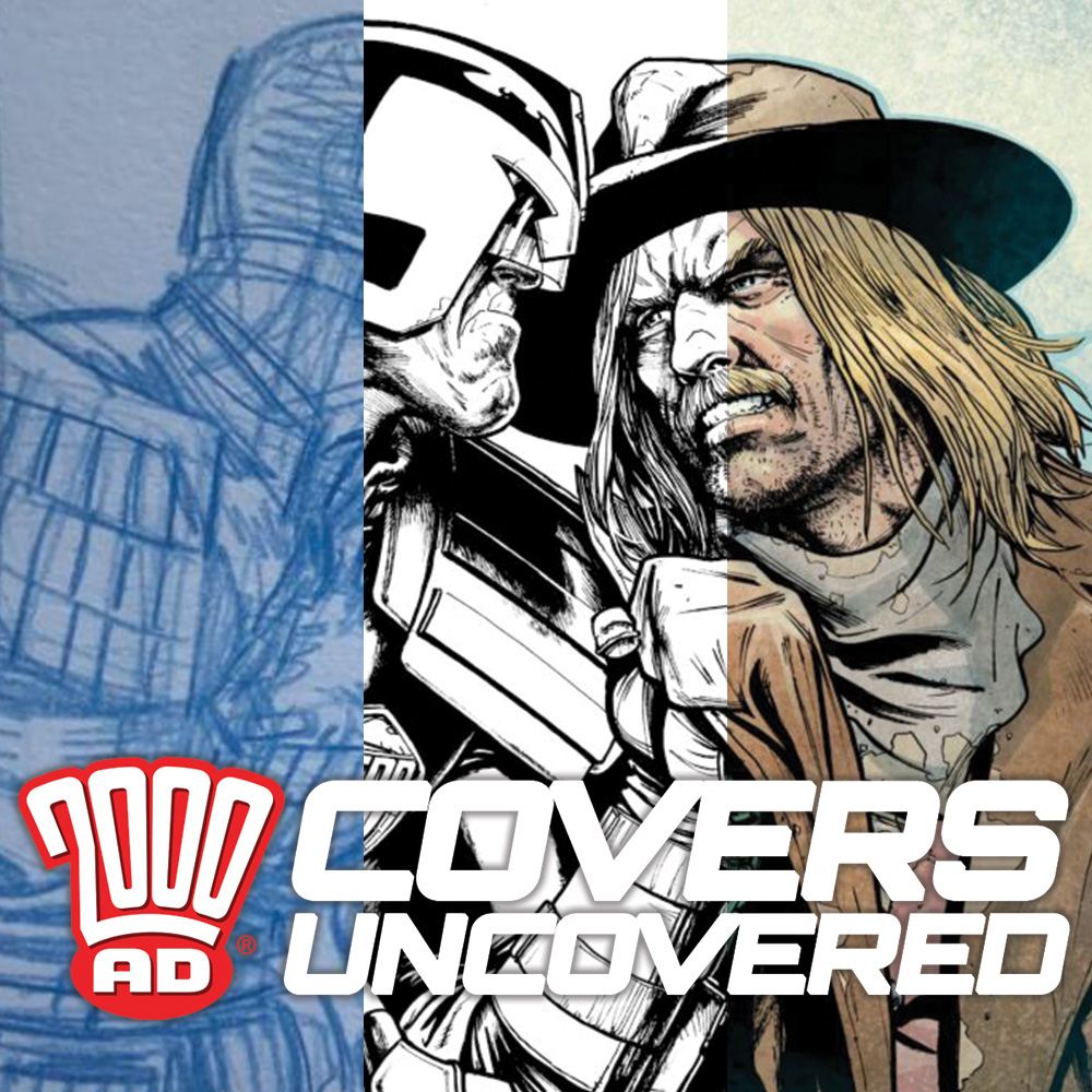
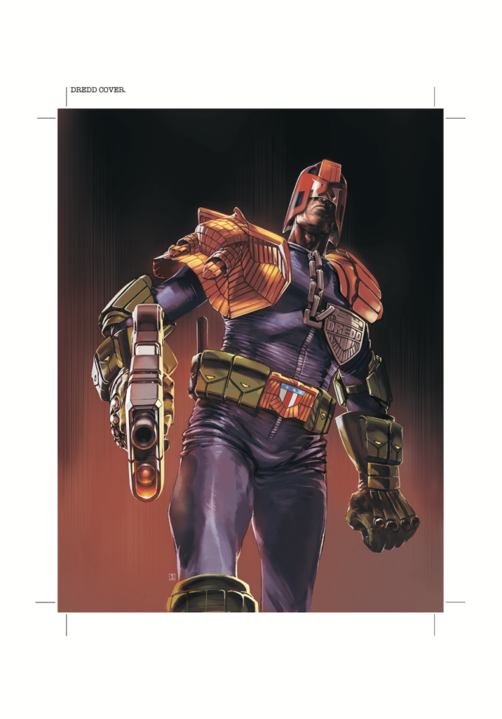
Every week, 2000 AD brings you the galaxy’s greatest artwork and 2000 AD Covers Uncovered takes you behind-the-scenes with the headline artists responsible for our top cover art – join bloggers Richard Bruton and Pete Wells as they uncover the greatest covers from 2000 AD!
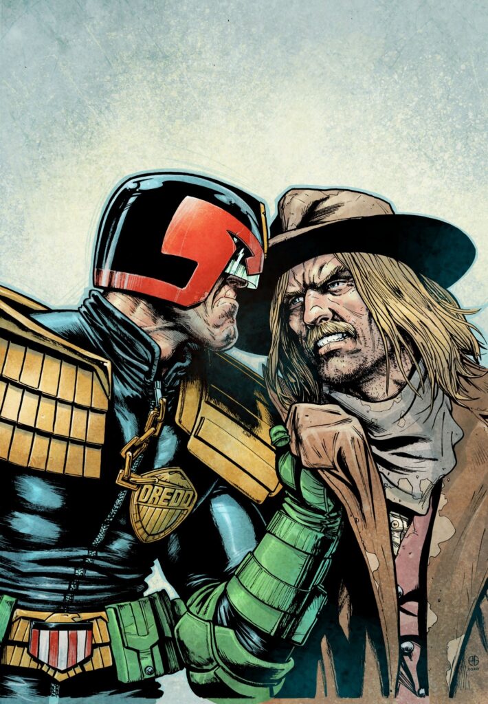
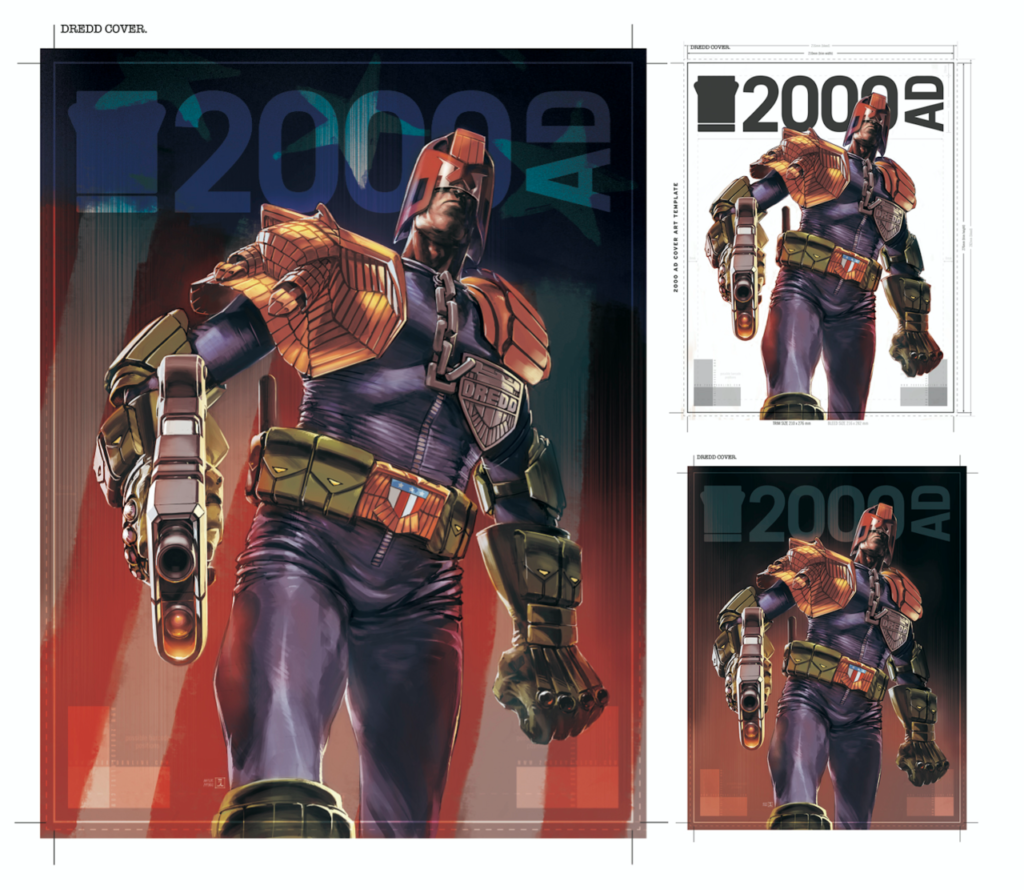
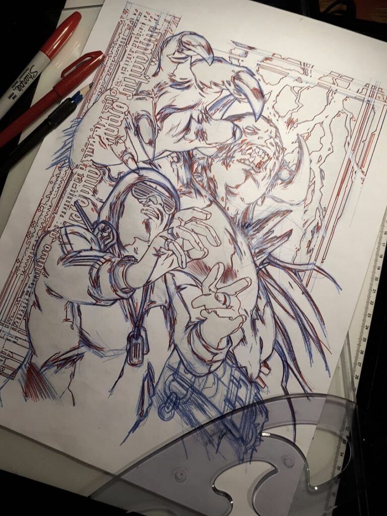
This week’s cover comes from the team of Patrick Goddard and colourist Dylan Teague. With Prog 2185, Patrick’s given us a look into the showdown between Dredd and that mystery cowboy (shhh… spoilers if you haven’t caught up yet!) currently featuring in the End Of Days epic unfolding from Rob Williams and Colin MacNeil. You can find Prog 2185 in the 2000 ADweb shop and comic shops from 10 June.
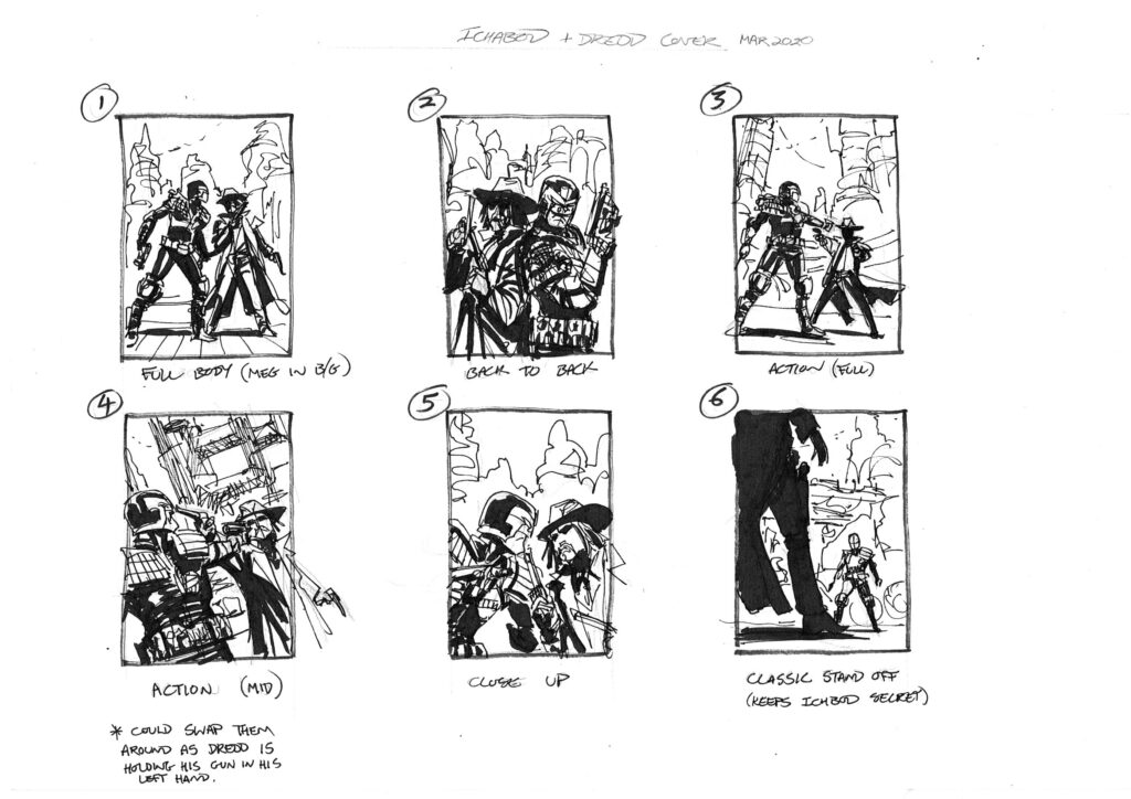
Over to Patrick to tell us about putting together the cover… first the ideas after a commission from Tharg…
I had just finished Aquila and Matt offered me a cover to tide me over until my next scripts so it was great to draw Dredd again!
Initially, I thought there was going to be Mega-City 1 in the background but it wasn’t needed in the end so went with the simple face-off, and with a profile like Dredd’s, how can you not want to draw that?!!
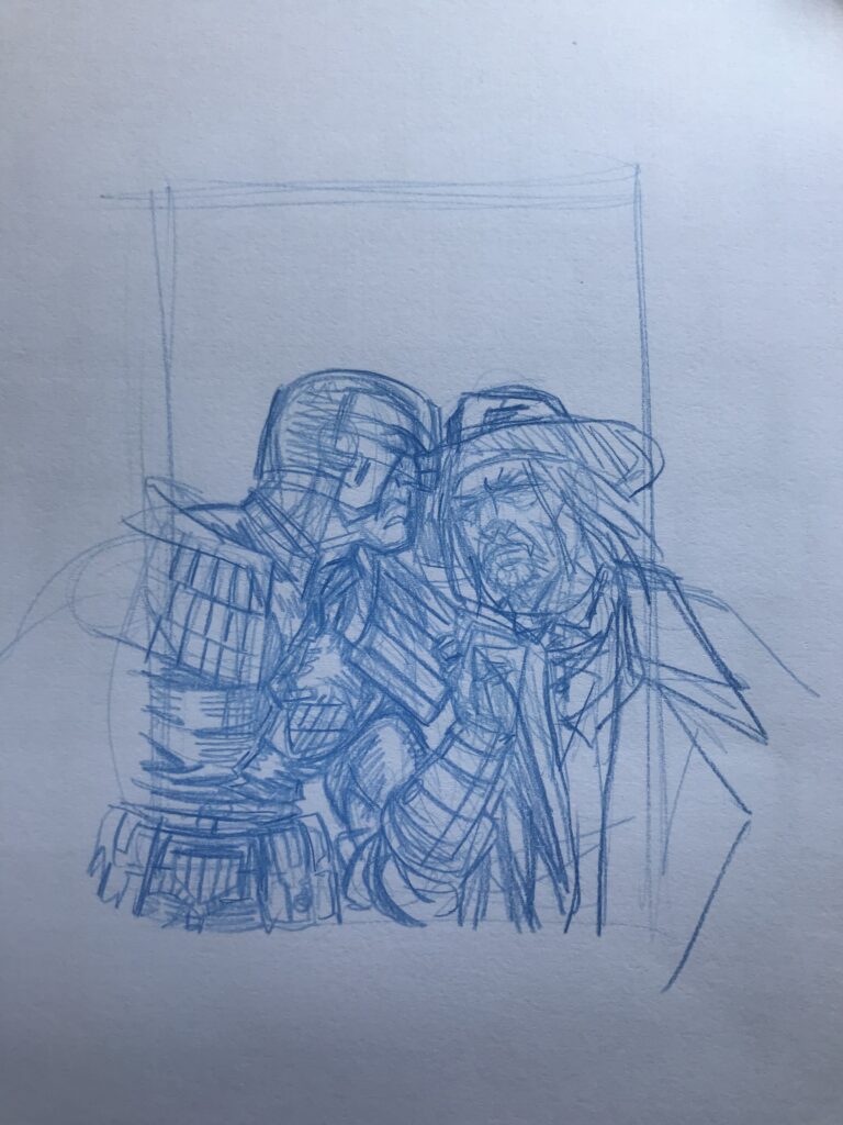
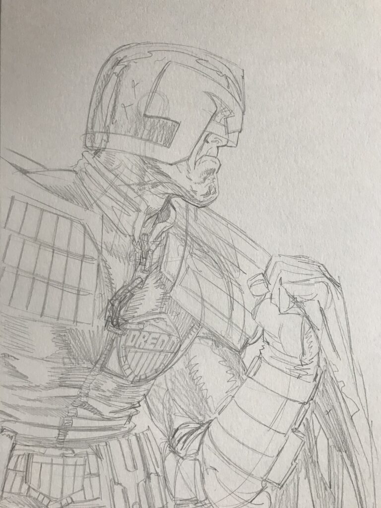
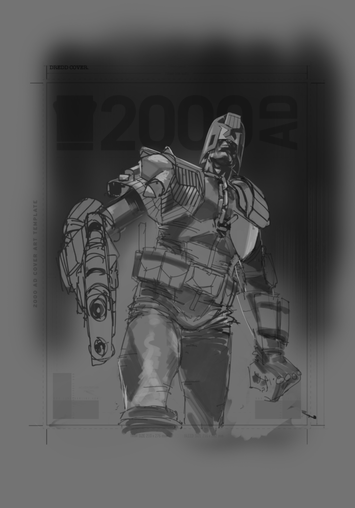
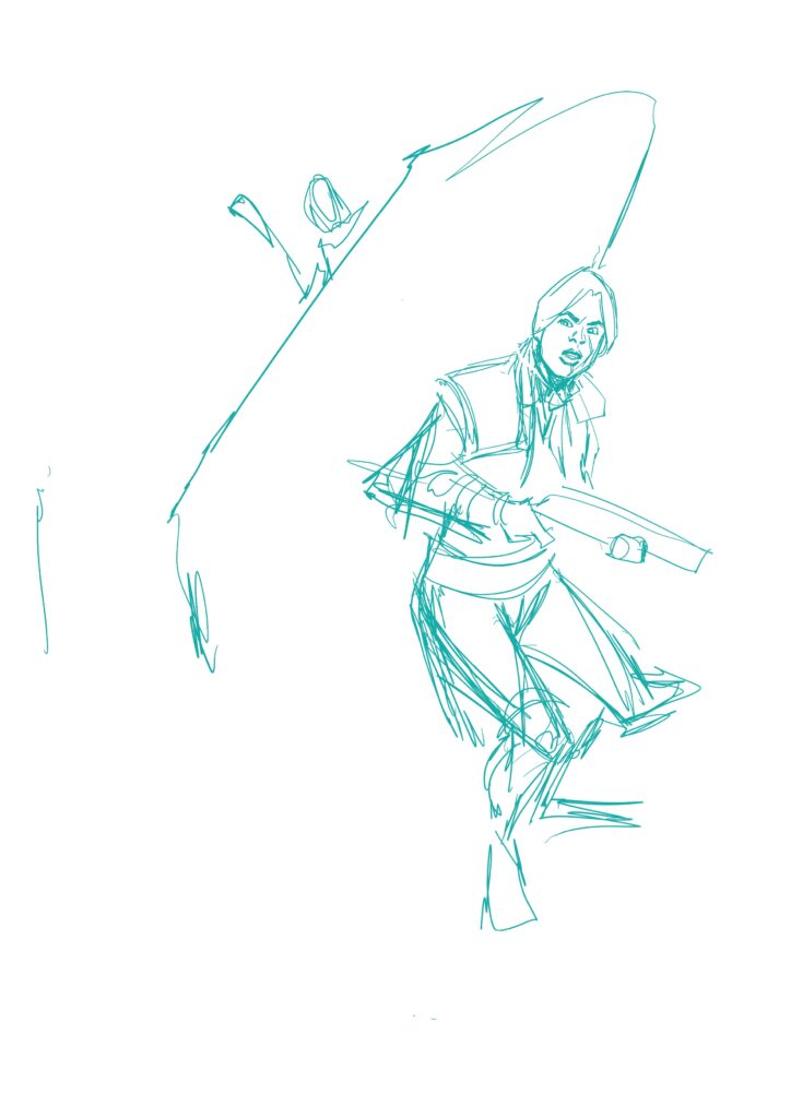
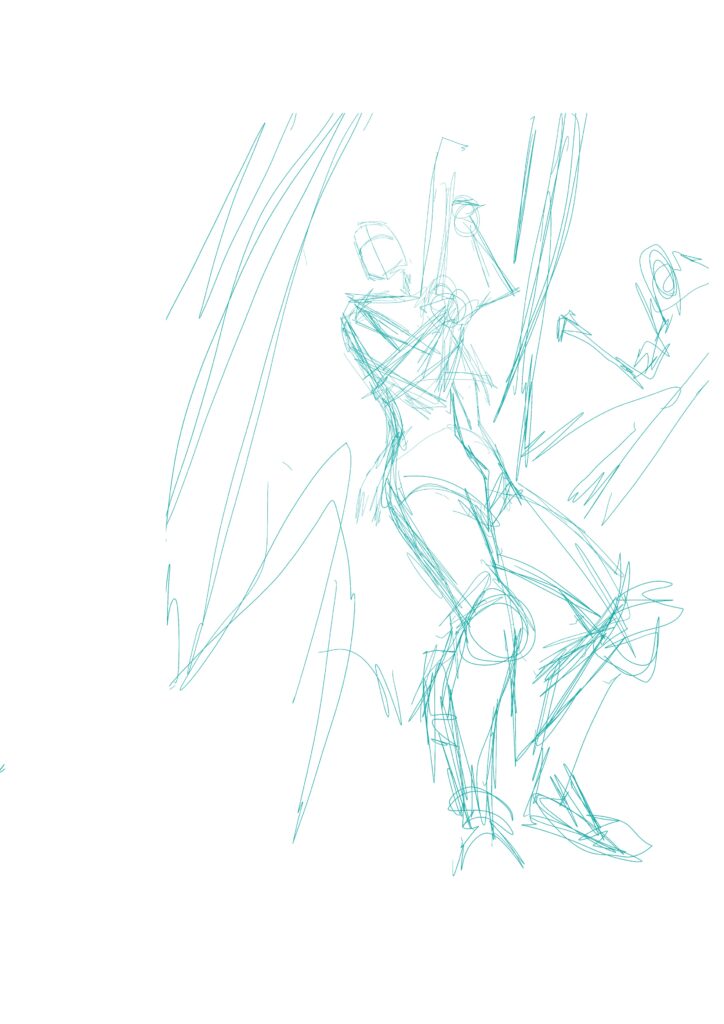
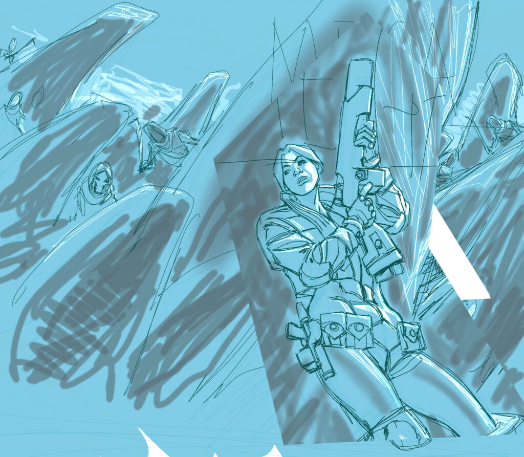
First things first, cover design in blue roughs…
Are you dancing? Are you asking?
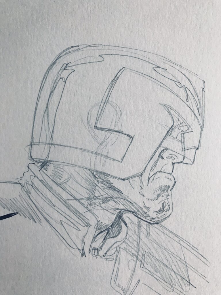
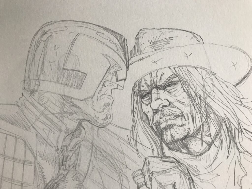
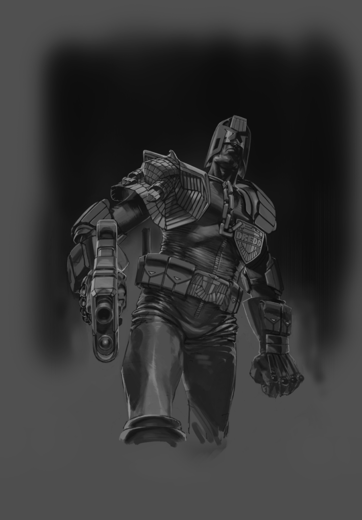
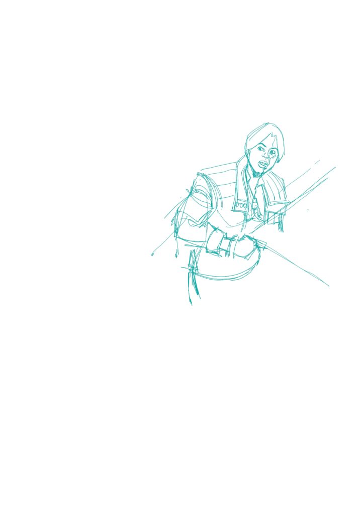
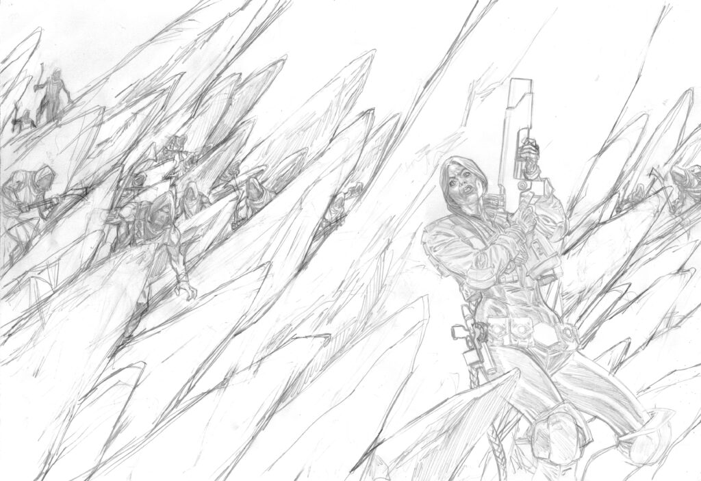
Next up, those wonderfully tight Goddard pencils…
With any large figure work I do, I tend to draw small and then enlarge it on my scanner, it helps me, for the most part, get the scale right.
It was a very quick cover to do, nothing too tricky to draw and probably had it all done in a day.
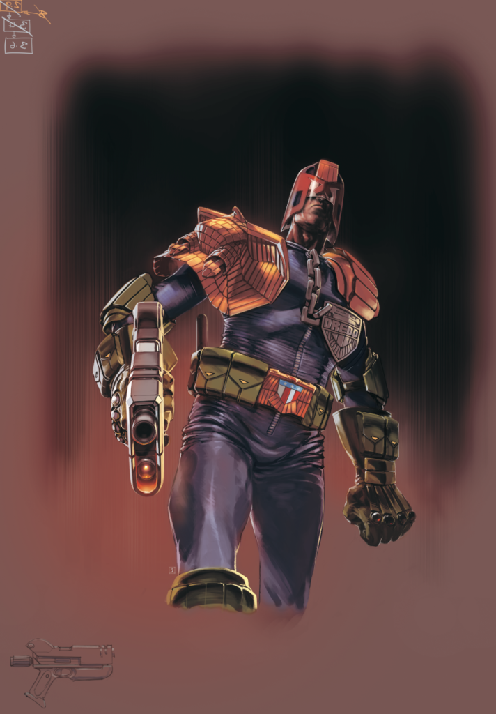
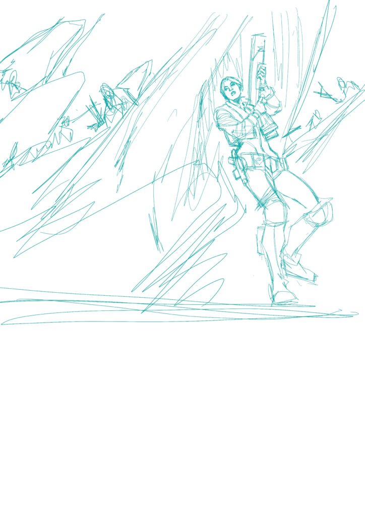
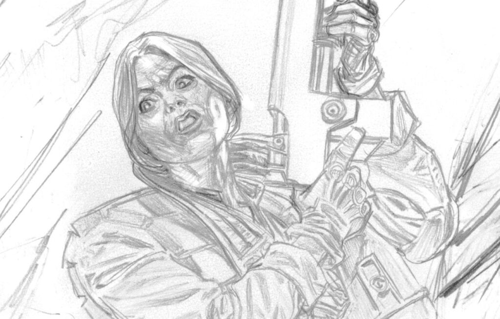
When the Law meets the Outlaw, we all know who’s going to come out the winner.This town ‘aint big enough for the both of us!
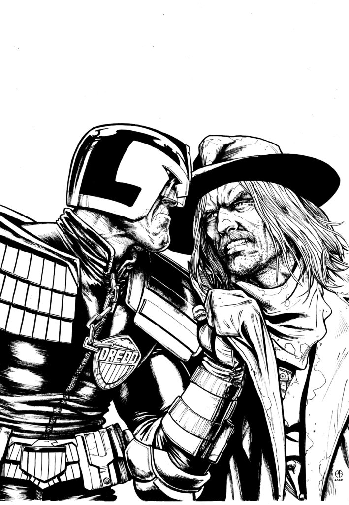
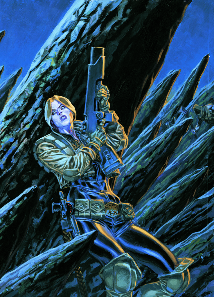
Then I just hand it over to the colour maestro that is Dylan Teague and he works his magic, all done!
And here’s the magic added by Dylan Teague!
Thanks to Patrick for letting us inside the making of his latest 2000 AD cover. Follow him on Twitter and pick up Prog 2185 from the shelves or in the 2000 AD web store!
Every week, 2000 AD brings you the galaxy’s greatest artwork and 2000 AD Covers Uncovered takes you behind-the-scenes with the headline artists responsible for our top cover art – join bloggers Richard Bruton and Pete Wells as they uncover the greatest covers from 2000 AD and the Judge Dredd Megazine!
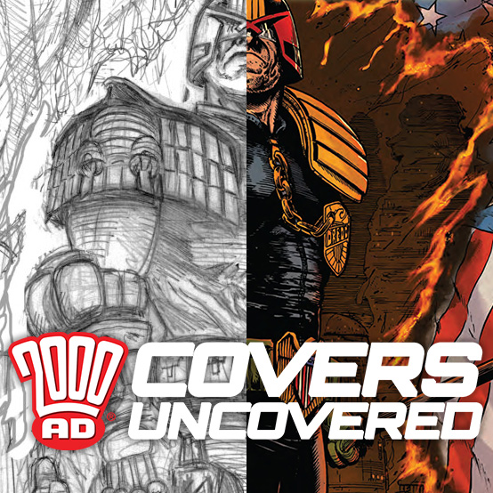
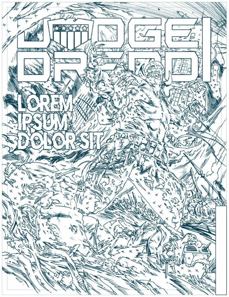
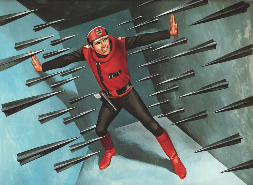
2000 AD Prog 2184 is out on 3 June, featuring a cover from Steven Austin. He first worked for 2000 AD with Prog 1982, providing the art for a Tharg’s Time Twister – The Timeless Assassin, as written by Rory McConville. Since then, he’s done a couple of Tharg 3Rillers, The House Of Gilded Peak, written by Eddie Robson, and Keeper of Secrets, written by Robert Wilson, and a Black Museum Tale from David Baillie.
Here’s the tale of how this iconic Dredd cover for the Prog came about…
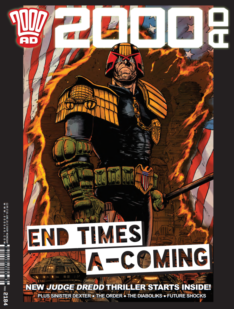
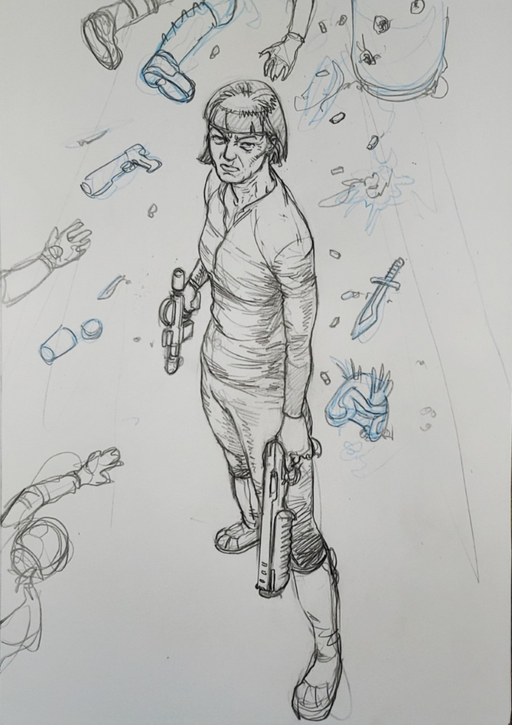
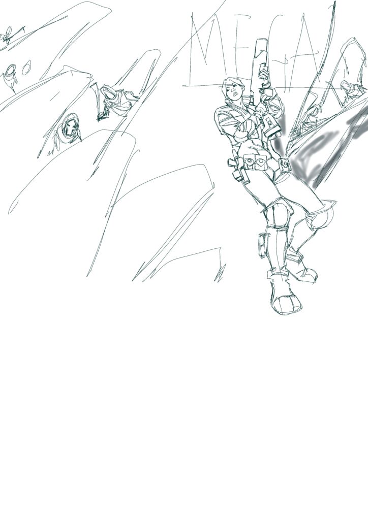
So this cover was a pitch to Tharg. Inspiration comes from the most random of places and the inspiration for this came from a link to a band sent to me by a friend, the band is named Burning Flag, I think I’d probably just been watching some news article on YouTube about the US and Donald Trump and somewhere in that mix the idea for this cover image came to fruition.
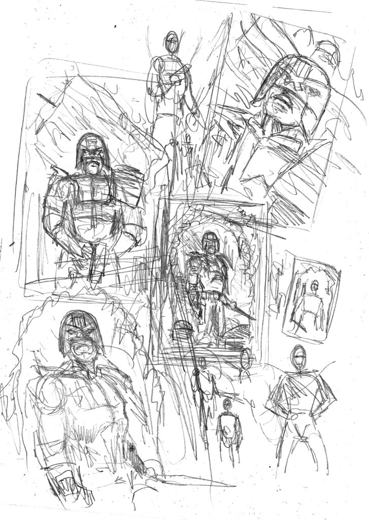
(Prelim sketch by Austin – doodles don’t get much looser)
I began as always with some very loose doodles, I had an idea that I wanted Dredd in front of a burning US flag but wasn’t sure of composition etc. so went about doodling some options, initially, I envisaged a flag behind Dredd, waving in an apocalyptic wind whilst burning, however, as I went along I started to draw the flag framing Dredd and this stuck.
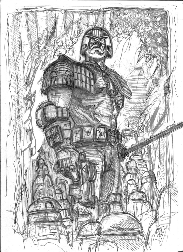
Once I’d decided upon the design I was going with I went my usual route and drew an A5 rough which I then scanned into PS.
(A5 rough – Judge versus flag – flag always gonna lose)
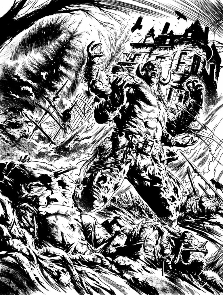
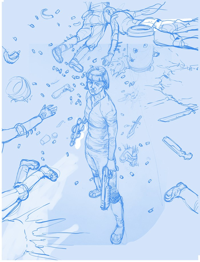
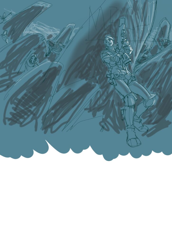
I then blew this up to A3, printed it off and light boxed the rough onto A3 bristol board. Next, it was a case of tightening everything up and making any small changes I decide upon.
(Final pencils – Just once, just the once, you’d love to see him smile)
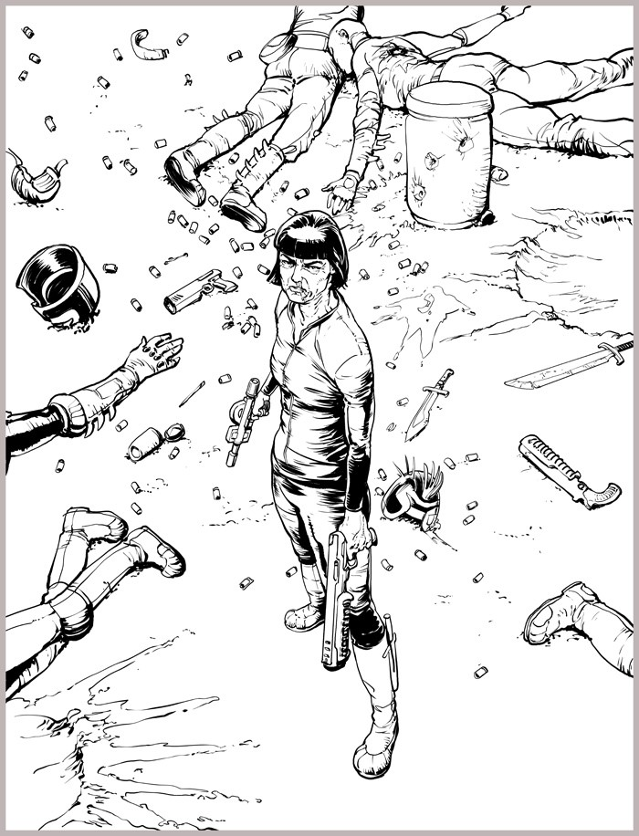
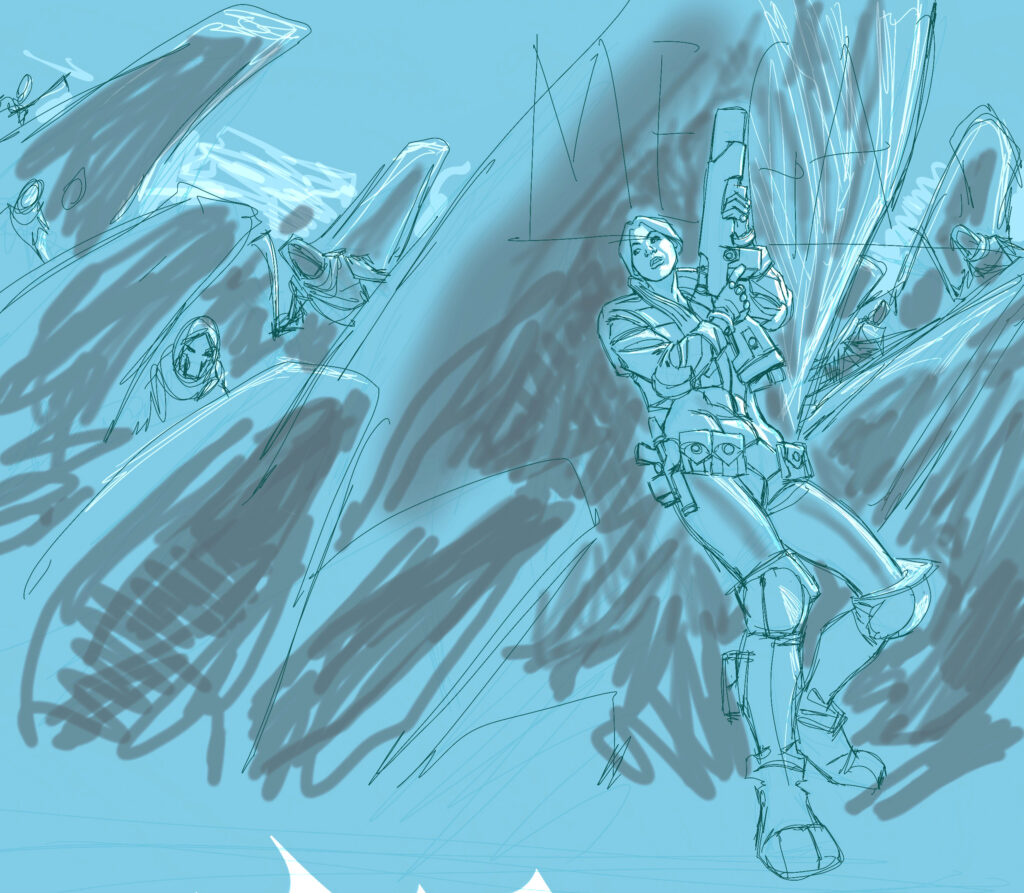
Once happy with the final pencils, I begin inking using sizes 2 and 3 series 7 sable brushes with some scribbling at the end with various pens, just to give it a little more edge.
(Final inks – Dredd’s idea of a Superbowl anthem was never going to go down well )
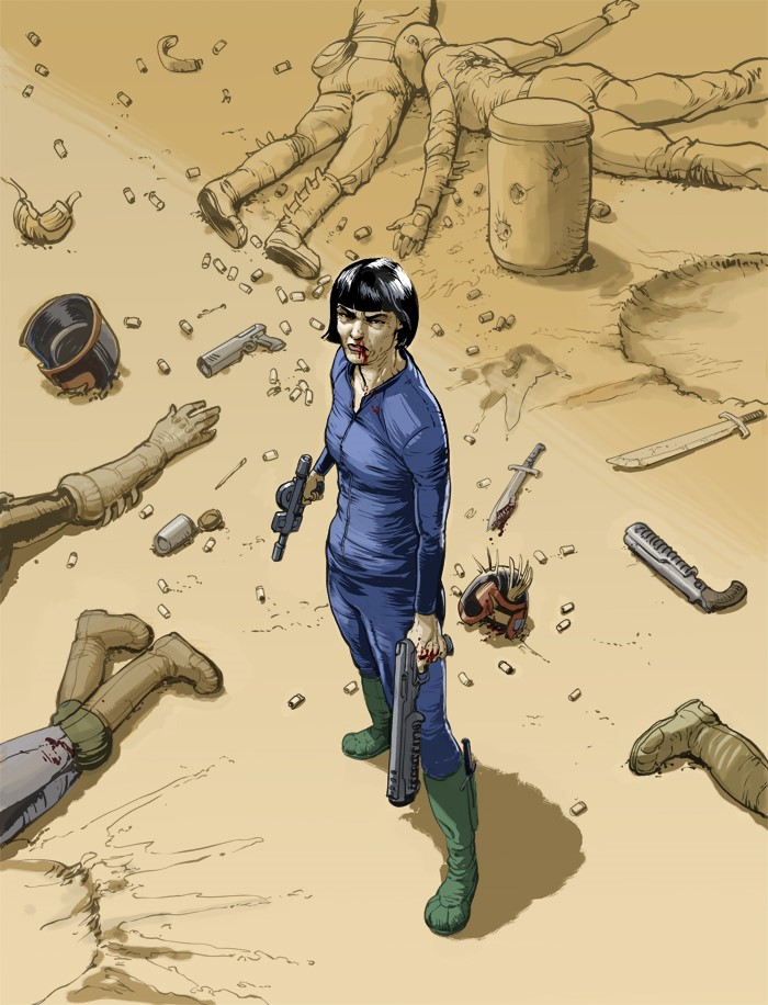
On completing the inks I became concerned that perhaps the colourist wouldn’t realise that the flag should be burning so decided to produce a coloured rough, I printed out the inks, painted over them very quickly in Acrylic and then rescanned it in placing the original inks over the top in Photoshop.
(Colour rough – seriously, if Trump gets annoyed at NFL players kneeling – he’d lose his mind over Dredd’s flag attitude. )
Next, I then decided to go a step further and play around with some digital colours before sending it off to Tharg.
(Colour Rough 2 – The flag never stood a chance. Dredd’s law wins every time)
I think the final colours are a very happy medium as to the image and mood I originally envisaged and Quinton Winters’ own excellent interpretation.
As always, thanks to Steven for sharing the making of the cover! Grab 2000 AD Prog 2184 at a newsagent or comic shop near you or from the 2000 ADweb store from 3 June.
Every week, 2000 AD brings you the galaxy’s greatest artwork and 2000 AD Covers Uncovered takes you behind-the-scenes with the headline artists responsible for our top cover art – join bloggers Richard Bruton and Pete Wells as they uncover the greatest covers from 2000 AD!
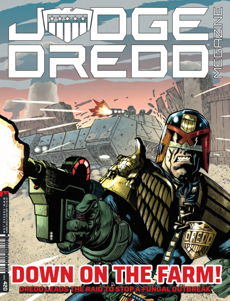
PJ Holden grabs his second cover of the year with Megazine 420, following the beautiful cover for 2000 AD Prog 2178 (see the Covers Uncovered for that one here).
You can get hold of the latest Megazine, issue 420, from the 2000 ADweb shop and comic shops from 20 May.
The cover feature comes from the third and final part of the PJ Holden drawn Dredd tale, Bad Sector, written by Arthur Wyatt. And the Holden Droid was good enough to send over his process images for that Meg cover, along with his usual bizarre conversations with Tharg The Mighty… Over to PJ for the details…
I’ve decided I’d like to do more 2000 covers this year. Never sure the right way to approach Tharg about this, but I figure if I’m doing a strip I should at least ask if I can do a cover. So I did –
“Can I do a cover please???” “OK! BUT ONLY FOR THE FINAL PART. I THARG HAVE SPOKEN” (he always talks in the third person. Weirdo)
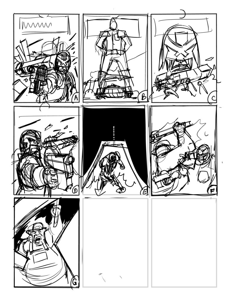
So I knew what was happening in the strip, and, technically, this cover is a bit of a cheat – Dredd doesn’t quite arrive with the tank – but the cover is doing a different job – it’s supposed to convey an emotion and sell you on the strip. So I sent Tharg some cover ideas: As you can see I think I was going for Dredd super imposed over some action.
The eight doodles of the Holden droid
Tharg responded: “I THARG, IN MY INFINITE THARGY WISOM, DECREE ‘A’ TO BE THE GREATEST ART IN THE ENTIRE WESTERN HEMISPHERE. FINISH IT! FINISH IT! I HAVE SPOKEN”
Again, he’s kind of weird, but when Tharg says jump you don’t say anything, you sort of hide under the table and hope he didn’t notice you in case he makes you jump then sets MekQuake on you for not jumping high enough.
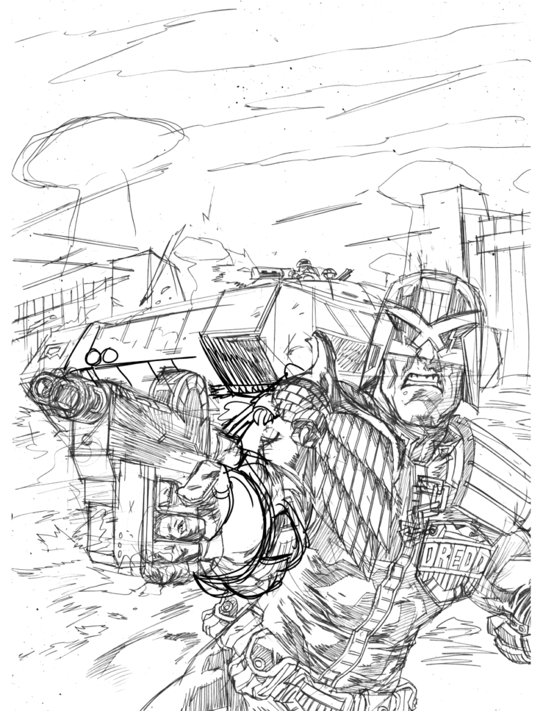
Pencils were fairly quick. I love drawing Dredd he flows out of my pencil as naturally as a phone doodle. Though I will admit, I’ve been wrestling with that arm pose since I pencilled it.
They bring a gun – Dredd brings a tank.
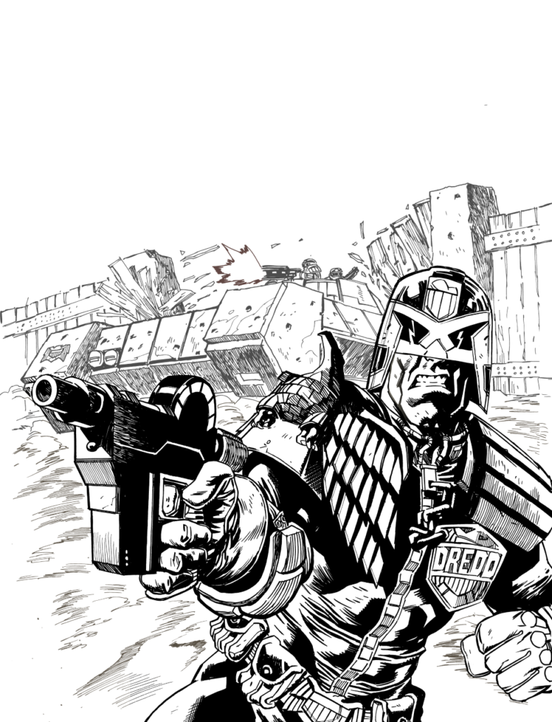
Inks next!Again pretty quick.
Dredd breaks up another lockdown party… the hard way.
And finally, flats and colours – the flats help me select areas of the image to apply proper colour too, so they’re only here out of interest…
Stay home citizens, state authorised exercise only – or Dredd will come knocking.
And with final colours, that’s it!
No Creeps, a cheeky BBQ in the park is not ok. Stay home, exercise once a day, essential trips only – or Dredd will come knocking.
Hope you like it! (BTW if you’re keeping count, I drew this cover BEFORE the Chimpsky cover, but I did both in the space of a month, I think… and they’re covers number 7 & 8 for me… hopefully I’ll be asked to do more!) – PJ.
Thanks, as always, to the Holden droid for letting us inside the process of putting together his latest. Hopefully, if he keeps bowing correctly before Tharg, we’ll see him on many more covers to come!
You can get hold of Judge Dredd: Megazine issue 420 in print and digital from the 2000 ADweb shop, and from whatever newsagents and comic shops are open in this trying times. If you can, make sure you get in touch with your local comic shop and support them however you can – they really need your help right now. See if they do mail order or kerbside pick-up for all your comic needs – now really is the time to pick up all those 2000 AD books you’ve been meaning to get your hands on!
Every week, 2000 AD brings you the galaxy’s greatest artwork and 2000 AD Covers Uncovered takes you behind-the-scenes with the headline artists responsible for our top cover art – join bloggers Richard Bruton and Pete Wells as they uncover the greatest covers from 2000 AD and the Judge Dredd Megazine!
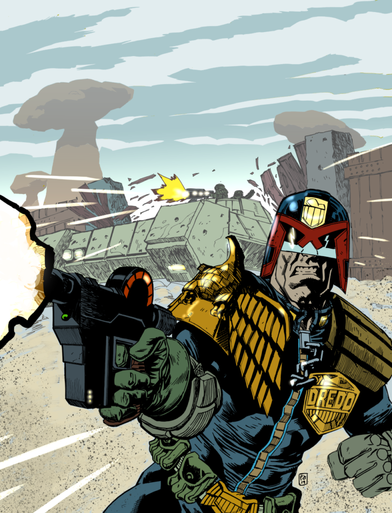
2000 AD Prog 2181 is out on 13 May and marks the return of artist Jake Lynch with another stand-out iconic cover featuring Judge Dredd … standing. But, as always, Lynch makes standing such a thing!
Lynch has done a fair few of these Covers Uncovered pieces, but looking back, the Lynch-droid always manages to fall foul of TMO somehow. And this time turns out to be no different. But before then, everything started out, as Lynch tells us with a doodle…
The cover came about as a doodle I submitted to Tharg.
(Dredd’s always been terrible at posing for the Justice Department annual photoshoot)
After the usual anger and Rigellian Hotshot (I had emailed during His Mightinesses cup break) it was agreed and I refined the pic and tone a little more.
(Hey Joe – feel free to crack a smile for the camera?)
That done, it was time to shift it into colour. I wish it was as simple as just ‘washing’ colour over the toned artwork (though that is the starting point) – it’s a little more long-winded and often feels like reworking the whole pic over again, hardening it out. It’s also the point where I decide on any new elements such as the rim-light colours and their strength.
(Yep, gotta love those rim-light colours – add your own Pete-Wells-ian gag here kids)
That sorted I start wondering if there’s any more interest I can add and submit an idea to Tharg (he’s angry ALL the time you know)
(Lynch Droid sends in more ideas – Lynch Droid should know better by now)
I am reminded to know my place and stick to the original idea (all hail Tharg). So I set it up for print and access the comics’ server to upload it where I accidentally delete 2000AD – sorry…
(The finished product – smile for the Lawgiver)
Thanks to Jake and leave him screaming deep down in the bowels of the Thrill-Centre begging forgiveness for the accidental deletion of the Thrill Power archives!
Remember kids, always take back-ups, just like Tharg does!
2000 AD Prog 2181 is out in digital and print on 13 May.
Every week, 2000 AD brings you the galaxy’s greatest artwork and 2000 AD Covers Uncovered takes you behind-the-scenes with the headline artists responsible for our top cover art – join bloggers Richard Bruton and Pete Wells as they uncover the greatest covers from 2000 AD!
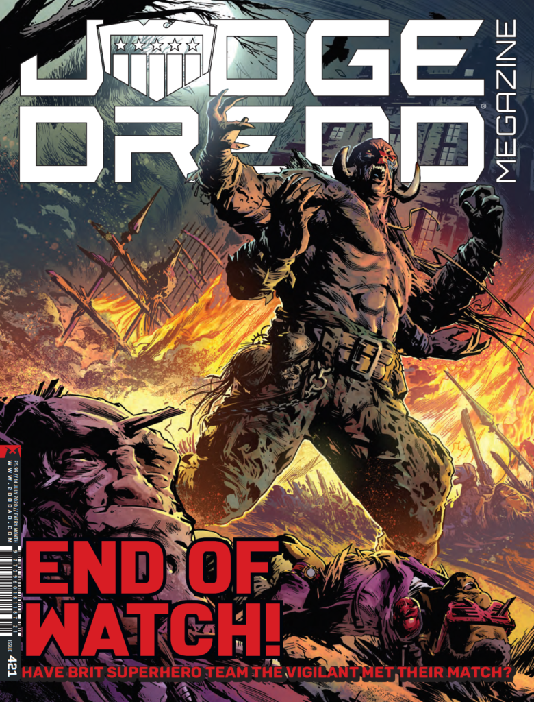
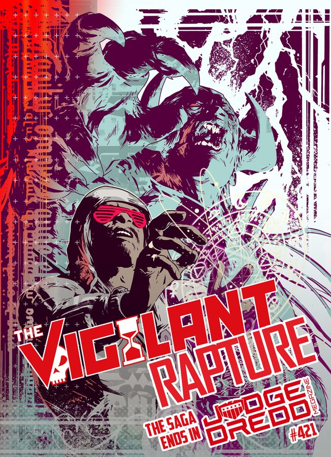
Available to buy now from the 2000 ADweb shop and whichever stores are open, Simon Coleby brings us the third part of The Vigilant saga on the cover and inside the pages of Judge Dredd Megazine 421…
Yes, the stunning saga of Rebellion’s super-team of classic British comic book characters, The Vigilant, comes to a reality-shattering conclusion in the pages of the Judge Dredd Megazine #421 with a special 22-page finale. And of course, it’s all under a suitably stunning cover to really mark the end of a stunning series.
Simon was good enough to send over his process images that went to make up that cover. We’re incredibly grateful to Simon for getting this over to us as he’s had what could best be described as a rather busy couple of months, both before and in lockdown. It’s a tale of computer breakdowns, beating a new computer until it did what he wanted, and then a surprise lockdown house move – it’s definitely been a busy, busy time for him! Thankfully, all has settled down a little now and we look forward to seeing whatever is next from one of 2000 AD’s finest artists!
Now, here’s the making of that great Vigilant cover… over to Simon…
And so; the cover for the final chapter in The Vigilant’s tale.
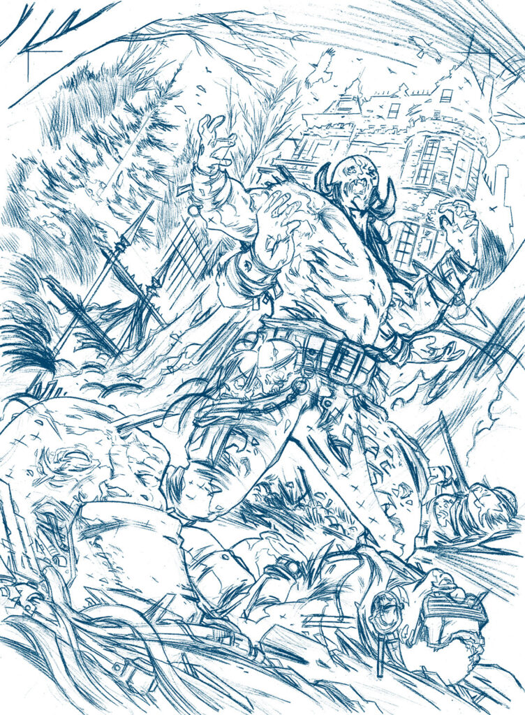
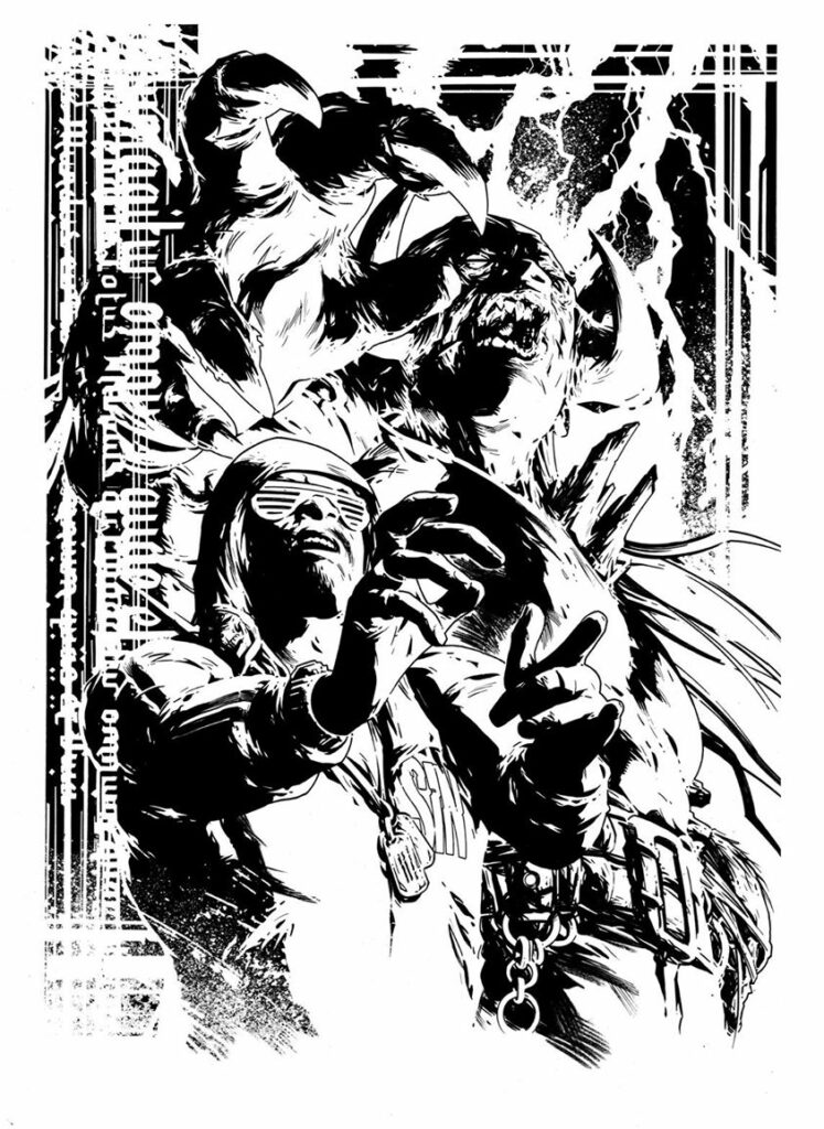
The previous two covers showed the team in heroic, dominant poses. This one had to suggest a moment of peril. Perhaps of defeat. It needed to suggest the questions appropriate to a cliffhanger ending. Will they survive? Will they return? Will the Leopard from Lime Street go back to wearing that leopard-print onesie?
The design of the piece was fairly straightforward – a three-tier composition with the mauled team in the foreground, the looming figure of the demon Mazoul in the midground, dominating the image, and the haunted manor house in the background to provide depth and a sense of scale. And also because who doesn’t love drawing gothic, dark, spooky architecture?
To add to the sense of disorder, I decided to go for a tilted angle – in cinema, known as ‘Dutching’. It’s a technique I find very useful to add interest to my panel compositions. The practise originated in German expressionist film-making, largely being used to convey alienation, madness, disorder and all that kind of fun stuff. For some reason, it seems to work well in my art. Make of that what you will.
Terry Gilliam and Tim Burton both use it to great effect in their movies. You can also see it overused to hilariously awful effect in the Scientology disasterpiece ‘Battlefield Earth.
The idea for the drawing was fairly strong and straightforward from the outset, so I didn’t need to do a huge amount of preliminary work. I did a few rough sketchbook thumbnails, just to sort out the balance of the elements, then I put together a marker rough on A4 paper, which I submitted to Keith in the Nerve Centre for approval.
As usual, I drew the pencils for the finished page on A3 typing paper, starting with a rough blue-pencil drawing, and then refining it with fine-liner marker pens.
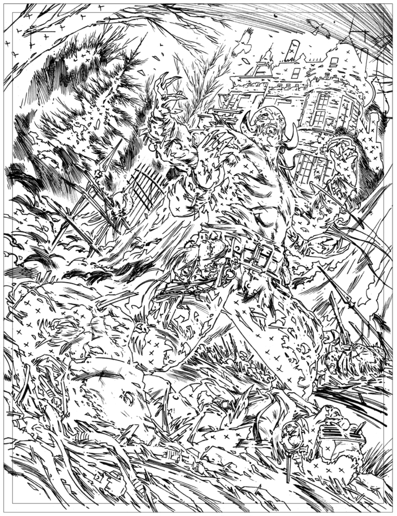
I scanned the finished pencil work, then printed it in cyan on A3 Bristol board for inking.
The piece was inked using Rotring Art-Pens, Japanese calligraphy markers, Chinagraph pencils and splatters of ink applied from an old bit of kitchen sponge and flicked from a toothbrush.
After all the mucky stuff with ink, I scanned the image back into Photoshop for a final bit of digital polish.
Len’s colours are superb, as always – a restrained yet strong palette. Warm colours emphasise the foreground, with cooler colours around the haunted manor. The flame colours add drama and impact and also help to ‘pop’ the figure of the demon.
So, that’s that one. We bid farewell to this heroic team. I can only hope that the trivial matter of a global pandemic won’t stop this story finding its way into readers’ hands.
Thank you so much to Simon Coleby for sending the art along.
Now, as a bonus to all you lovely readers – another great bit of Coleby Vigilant artwork – something he put up first on his Facebook… – it’s also a little insight into just what a damn trooper Simon was in getting The Vigilant finished and for taking the time to get the images over to us – he’s had a busy, busy time in lockdown!
A couple of days ago I finished the third ‘Vigilant’ story. That was an ‘interesting’ one — a challenging script, then a dead computer. A new computer which turned out not to be up to scratch, so then another machine and all the fun of sorting out compatible software. Then just for extra chuckles, here comes a global pandemic — having to pack up my studio and unexpectedly move house, mid-job. Never a dull moment, eh? Anyway, with my brilliant collaborators, the job was put to bed with a week to spare — all good and everyone’s happy.
So, for a change and just to chill out I thought I’d do some drawing today. A spec thing I’ve been playing with. Not sure if it’ll get used or how, but I’ve been enjoying bunging it together.
I do love calligraphy when I get a chance to incorporate it in my stuff, so this one has some of John Dee’s occult Latin text, rendered in a lovely Arabic style font. Because why not? Anyway, just a thing that I’ve been playing with, not for any particular reason.
I’ve been doing proper work today, but also pretty-much finished mucking about with this spec thing. Just going to bung some colours at it, then call it done.
Every week, 2000 AD brings you the galaxy’s greatest artwork and 2000 AD Covers Uncovered takes you behind-the-scenes with the headline artists responsible for our top cover art – join bloggers Richard Bruton and Pete Wells as they uncover the greatest covers from 2000 AD!
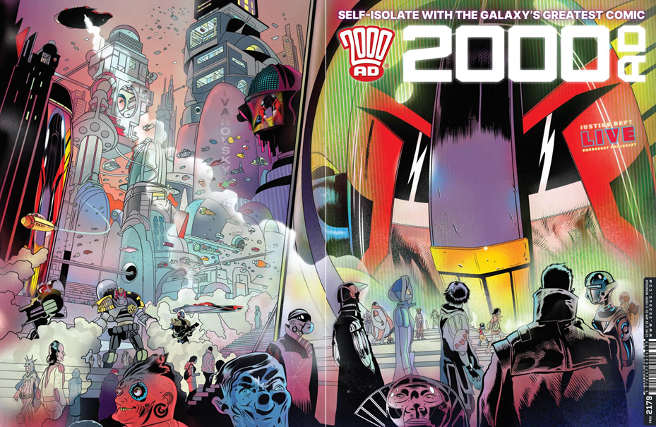
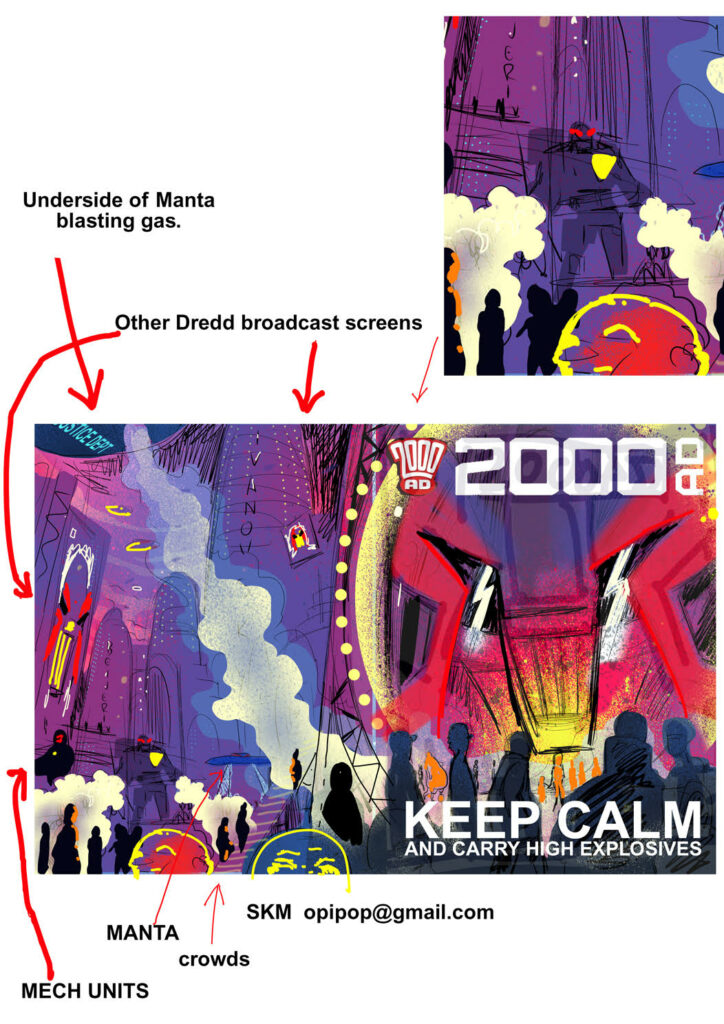
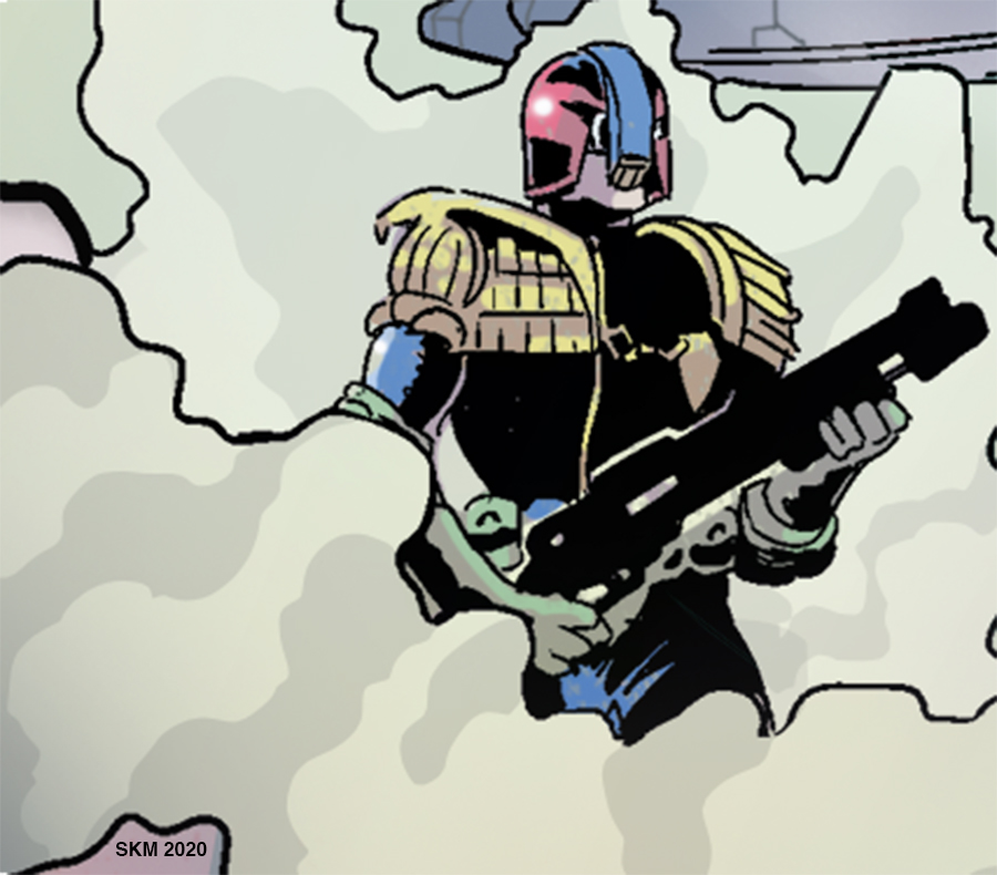
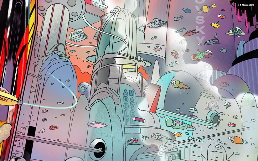
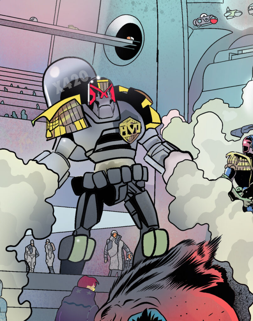
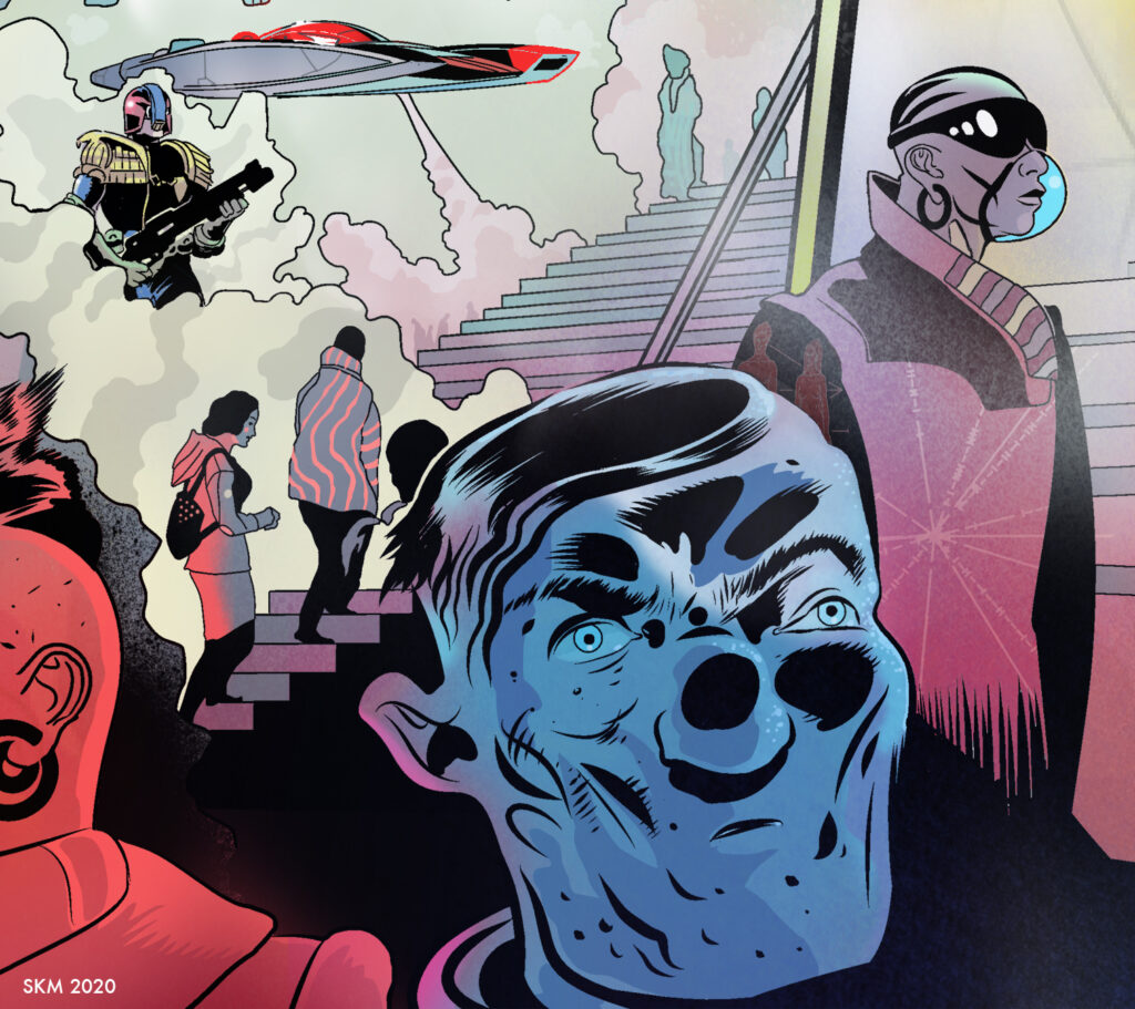
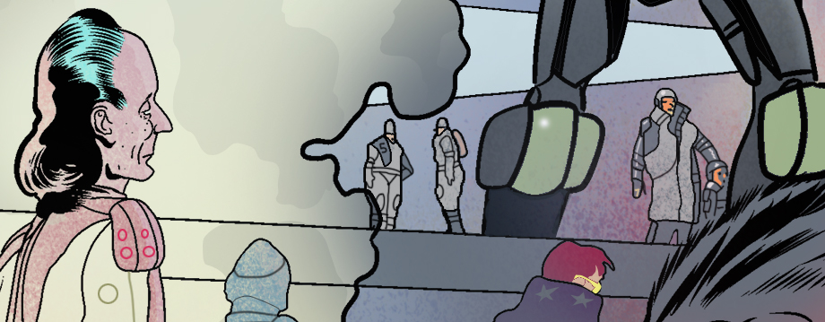
Heading to the 2000 ADwebstore and whatever stores are still open, you’re not going to be able to miss 2000 AD Prog 2179 with a stunning cover by SK Moore…
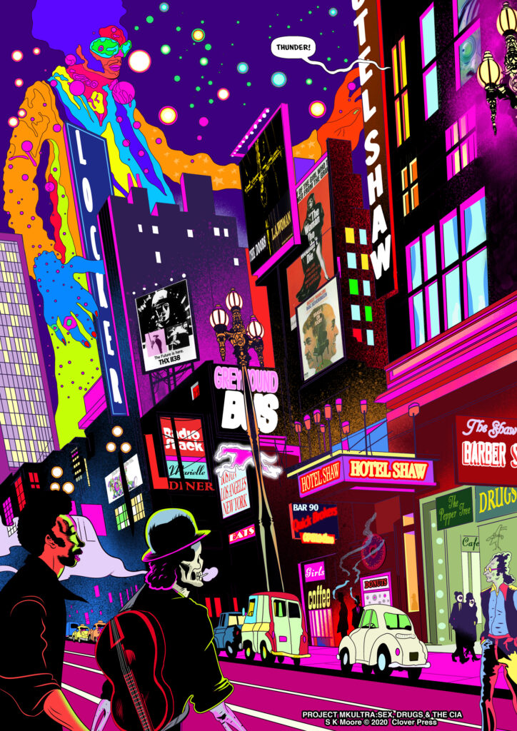
Stewart Kenneth Moore first entered the pages of the Galaxy’s Greatest when he took over the art duties on the last series of Pat Mills’ Defoe: Divisor that began in 2000 AD Prog 2150. His style is full of detail and style and you can find an interview with him talking about his artwork on Defoe: Divisorhere. Currently working on his graphic novel, MK-Ultra: Sex, Drugs and the CIA, he took some time to give us this week’s wraparound Dredd cover.
Stewart joins us now to break-down just how the cover was put together, a tale of respirators, masks and a city under a watchful authoritarian glare…
How to Have Ideas Without Getting Any Ideas. I didn’t have one. I wasn’t looking for one either. But despite a huge effort on the part of my frontal lobes to keep my mind trained on the psychedelic world of 1970’s San Francisco (the setting of my current project) images of Hazmat-suited soldiers emerging from disinfectant clouds repeatedly turned my thoughts to the stories of Judge Dredd. 2020 Wuhan China seemed very Mega-City One.
Respirators and masks were on my mind long before they became mandatory in Prague, where I live. Passing the occasional nightmarish figure in 17th century ‘Plague Doctor’ uniform or glimpsing hooded figures in state-of-the-art military gas helmets in the metro system here was an increasingly common sight. Gallows humour. Everyone’s a social satirist these days.
Within a few days, we were all in lockdown here and running errands without a mask was illegal. But there was no problem, no panic-buying, the citizens just got on with it like they’d seen it all before. They hadn’t, of course, no they’d seen far worse. Compared to Soviet and Nazi invasions this was nothing.
The image of Dredd with his respirator down while addressing a population that had seen ‘far worse’ flashed through my mind, probably while I did something awful like clean the cat litter tray, who knows, but I laughed. It might have been partially triggered by something a 2000 AD fan said to me on Twitter (How’s that for reverb!). I don’t really know why I laughed but it occurred to me the idea might amuse others too and that it could be a very good thing right now. I realised it might cheer people up, especially fans, to see that in Mega-City 1 it’s business as usual. Beyond that, it reinforces the lockdown message. Hmmm…
Ideas don’t always appear fully formed and when they do I get a bit suspicious of them and doubtful of how I came to have them, ‘where did that come from?’ I wonder. I tend to think I’ve seen it somewhere. So I quickly searched the back issues on the 2000AD website, I found nothing that looked anything like what I imagined. I couldn’t be sure but decided to risk embarrassment by pitching anyway. Pitch and be damned!
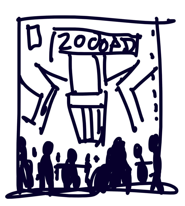
The Pitch I emailed the idea to Tharg accompanied by a simple rudimentary scribble (see simple rudimentary scribble provided) that I offered to ‘work up’ into a doodle.
I included a drawing of Dredd that I made for the ill-fated 2nd Judge Dredd Gamebook. The scribble was very simplistic so I felt I should show the level of finish I would be aiming for. Tharg’s very own emissary on Earth, Matt Smith, told me to doodle on and, so, doodle on I did.
Yep, that’s a scribble!And the detail of Dredd by Moore from the 2nd Judge Dredd Gamebook
The Doodle I knocked out this doodle with the poor-taste text ‘KEEP CALM AND CARRY HIGH-EXPLOSIVE’ . These words being, of course, a cruel update of the famous WW2 era British motivational posters. I thought it was very funny. So funny in fact that I fell out of my chair and on to the floor. I lay there for some time, doubled over laughing.
At some point, I regained my composure and climbed up into my chair to ‘carry on’. This was of course just place holder text, the words that will actually go on the cover have nothing to do with me. That’s decided in The Nerve Centre. But I do need to show where I would hope any text would be placed. It so happens the art was published without any text and that was the best choice of all.
I submitted the doodle and that evening I noted a mysterious green glow at my window. At the time I thought it a kind of sign from The Mighty One’s ‘Rosette of Sirius’ or something. Come to think of it, this part of what I’m telling you may be rubbish, so take it with a pinch of salt. No one drives these days. The traffic lights outside my window are permanently green, maybe that was it. Hell knows. The point is I thought I had the green-light, that’s what I’m saying. I thought I could take this doodle and go ‘NEXT LEVEL’. It’s the thought that counts, right?
The Design Now cheering you up is an objective, sure, but I need to grab you to do that. Anyone who has stood back and looked at the shelves of WH Smith knows what a piranha-like feeding frenzy that is. Prog 2179 has to crack Woman’s Own right in the staples, head-butt its way through an army of Clarksons, turf Good Housekeeping backwards out an open window and boot Country Living right square in the GQ’s! But how?
If you can see Dredd’s visor at 200 feet, well, chances are Ideal Home will bottle it, Vanity Fair will fold, Heritage Railway will step up or step off. Aye, thought so Heritage Railway. Everybody knows that visor and what it represents, back off!
Now, if I succeeded and you grabbed 2000AD, that’s good, but my job isn’t done yet, it needs to grab you! With it in your mitts I want you to feel you are at the back of the crowd watching the screen. I want Dredd looking in at you, not the other way around! Yes, It is ‘objectively true’ to say that you are holding the prog, but at some subconscious level you have now also entered Mega-City One and are standing at the very back of the crowd. And just about when your eye begins to study the distant fatty with his wee belly-wheel, I think, it’s fair to say, you’ll have been grabbed!
Now, you might open the issue, or turn it over. If you do the latter, I’m taking your eye deeper and deeper into a vast Mega-City in a desperate effort to hold it there long enough to prompt the store clerk to break the spell and ask ‘You gonna buy that comic ur whit?’ (Translation: ‘Are you considering purchasing this particular publication?’).
The combination of confusion followed by a flush of embarrassment should render you psychologically weakened enough to be highly suggestible to the word ‘buy’ at this point and my work is done here. You don’t work this long on the subject of MKUltra without picking up a few mind-control tricks!
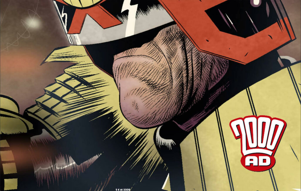
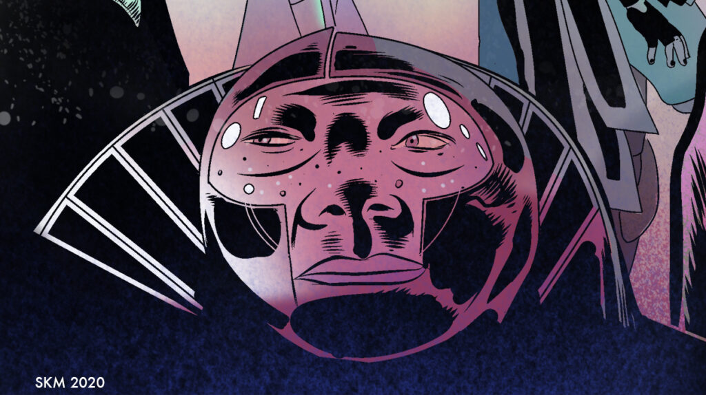
Cover detail – Moore masking the city
Shut Up and Tell Us How You Did It. I took the 2000AD cover template and over-laid my doodle. I then lightened those layers and started to rough out the particulars on a new top layer. That means making a strong Dredd first! I only have his visor to go on, no chin, so nailing the visor ‘intent’ was very important. Although Dredd is depicted on a massive screen the dramatic trick here is to treat it like a goldfish bowl and we are the goldfish and he is looking in and down at us like a giant. Later I had to push Dredd back because the dominance of the black in the helmet threatened to make him appear to be an actual giant and that could be confusing. Am I…repeating myself? Age, jings.
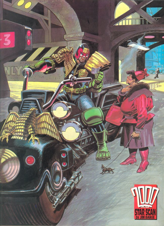
With Dredd inked I got on with the citizens. I wanted to build everyone around the wee belly-wheeled ‘Fatty’. Making a large man very small was another way to maximise Dredd. That may have been a lesson learned from Jim Baikie.
Making the small Fatty the big focus on the cover.
Long ago I asked Jim about a tiny dog in one of his Dredd pages. ‘It’s that minimalist thing’ he said. I believe he meant that emphasising something so small can serve to maximise other things, in this case, Dredd. One way or another it amuses the eye.
Stewart sent along this Star Scan – ‘This is the picture I refer to by Jim Baikie. Thanks to Wullie Russell for sourcing it.’
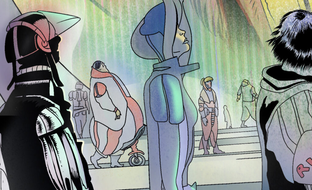
During the day I work on my graphic novel. I start early, around 6am most days. But some days I start at 5am. I worked on this cover in the evenings. I had a long lead time on it so I could potter around at night and take my time. I started work on the city on the back of the cover at the same time as I worked on another cityscape during the day for my book.
One of Moore’s San Francisco cityscapes from Project MKUltra
San Francisco 1971 and the futuristic MC1 are quite different, but they affected one and other. I think my GN page was improved by this back and forth method, as though one image was a testing ground for the other.
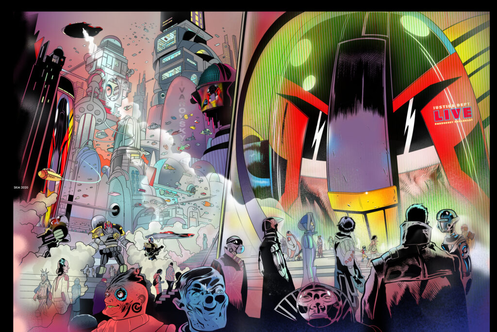
The glorious vista of a Moore MC-1 cityscape
I then scoped out the cavernous interiors of the mega-blocks to heighten the sense of vastness. Finally, I created a final inked drawing of the entire wrap-around scene. My goal with this design is to jump off the shop-shelf at you…oh, I did you say that already…ha ha, you whipper-snappers!
But for those with digital subscriptions, I take it even further. My hope is that digital resolution will be good enough to allow readers to pinch and expand the scene to reveal many more areas. You have to remember that your comic may be A3 on paper but in the digital medium, it is a vast wall-sized fresco, potentially anyway. I have been trying to exploit this side of digital comics for the benefit of readers for years now in Aces Weekly. But I must admit, it is exhausting and I’m not feeling the love. This is an area to be explored, but it may be beyond me to continue in this way much longer…..where was I?
Oh right, now I set up my rulers. I draw with a tablet and work in Manga Studio (now inexplicably known as ‘Clip, Studio Something’…well, not in my day!). The digital rulers allow you to work faster than you might on paper. But they are a pain in the neck. As much as I love the speed I find them to be maddening and would rather use actual rulers on Bristol board. I like technical drawing. Digital is vital for speed, though, and not having to worry about how or where to buy art materials with all the shops shut nowadays (due to the pandemic) is yet one more unseen advantage of digital art. In the Covid age I never run out of ink!
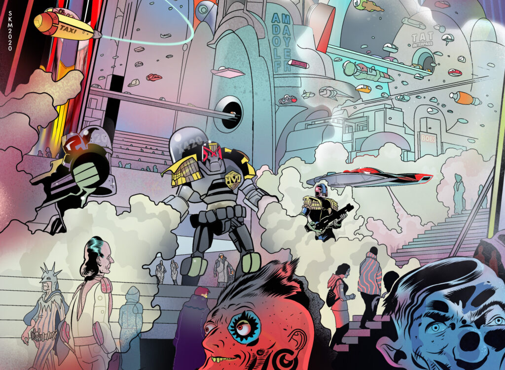
Detail from the cover – mugshot
The doodle perspective was all by eye. I always find it a bit uncanny when I over-lay the rulers and they all work right away. Doing perspective by eye, without rulers has it’s stylistic advantages. Some artists never use rulers and the organic quality, it seems, keeps the image alive in a way that rulers can kill a picture. The straight line can stiffen art to death.
‘The straight line leads to the downfall of humanity’ – Friedensreich Hundertwasser.
Well, I wouldn’t go that far. So I draw everything…refine, delete, clean up. It’s a balancing act and I try and keep the image a ‘comic’ image and not too ‘real’. This leads to areas looking real and some more like comic characters, I like that mix right now, I think it keeps things alive somehow, unpredictable, amusing. Here and there I might use some photo references, but they also can stiffen the art and I’m often disappointed with the outcomes. So I tend not to. I have found that if I fog out my sketches, make them really really light, almost vanishing, my imagination suggests things in them that are not there and I follow that very often. Strange, I know, but true. Try it. Anyway, I export my inks and open them in Photoshop.
Background details to zoom in on in digital – Peeps of MC-1
To quickly govern colour I pull in my doodle and ‘gaussian blur’ the doodle into a cloud of colours. That creates a ‘colour atmosphere’ that I then place under the inks and workover. The colours I choose are reactions to the colours beneath. I have always painted this way in oils with very colourful under-paintings. It’s a way of doing things. The psychedelic MK page definitely affected this part of my Mega-City.
More Moore detailed figure work
I paint the details and push and pull and fight and temper things for a long while. I like flat colour in comics but mix things up a bit with some shading and airbrushing here and there. Eventually, I look at the whole image and temper a few final things. In this case, pushing Dredd back a bit so he will sit better under the 2000AD logo. It’s always a good idea to keep checking against the logo that the whole image works to serve the title.
At the very end, I made some blunders, with so many details I accidentally lost a few things. There was some graffiti and a few other details that I painted over accidentally. There was more gas and darkness on the front cover art. Somehow I mixed things up and lost those layers in the final version and didn’t realise. It realised it didn’t really matter, not a big deal.
I use Dropbox (or other FTP system) to upload final art to Tharg. I then wait in fearful silence. You never know, the work might not pass muster and I might be demolished by Tharg’s Rigelian Hotshots. They move at near light speeds, I understand.
So if Tharg is in Oxford it should only be a matter of seconds for them to strike me down, so, once the moment passes and I’m still quite conscious (and not horribly burned) I feel it’s reasonable to assume the work has most likely been approved for publication. However, if Tharg is in lockdown at his second home on Betelgeuse it could take considerably longer for me to be rent asunder. I’m not sure how many light years away his star system is or how long it would take for Rigelian Hotshots to get to me.
But The Mighty One must be happy with my work because I am still here typing this missive with my faculties intact!
Now THAT was a Covers Uncovered! Thanks to Stewart for going deep onto something that will, no doubt, be up there in the top Prog covers of the year!
2000 AD Prog 2179 is out now – available from stores that are open and from the 2000 ADweb store.
You can follow Stewart on Twitter and Instagram for more art, more updates, and more greatness!
Every week, 2000 AD brings you the galaxy’s greatest artwork and 2000 AD Covers Uncovered takes you behind-the-scenes with the headline artists responsible for our top cover art – join bloggers Richard Bruton and Pete Wells as they uncover the greatest covers from 2000 AD!
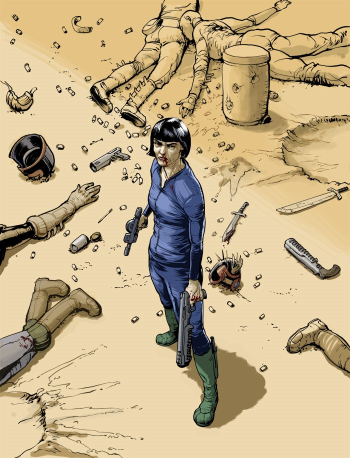
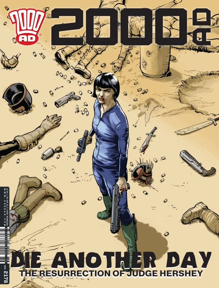
This week, we have the stunning cover for Prog 2176. Stunning in a couple of ways. First, it marks the return of Simon Fraser to the cover of the Galaxy’s Greatest. And second, because it’s the surprise return of Chief Judge Hershey!
Yes, in a surprise kept from everyone until the very day of publication of 2000 AD Prog 2175 on 1 April, it was revealed that Chief Judge Hershey didn’t perish from the microbial infection ravaging her body back in the pages of Prog 2150, but instead put in place a plan to right the wrongs she’d inflicted on the world with Judge Smiley.
Hershey getting a load off her mind in deadly fashion on the final cover to Prog 2176
HERSHEY: DISEASE, featuring the surprise return former Chief Judge Hershey, is written by Rob Williams with art by Simon Fraser. It all kicked off in 2000 AD Prog 2175 and continues with the cover feature on Prog 2176 by Simon Fraser.
Death is the longest walk – but for Judge Barbara Hershey, it’s only the first step!
So, here’s the magnificent Simon Fraser to tell us all about the making of a cover in particularly difficult circumstances, in the middle of chaos from the Covid-19 virus and a house move… and as it so often does, it all began with a missive from Tharg’s minion on Earth, editor Matt Smith…
“I was thinking of having a moody shot of Hershey on the cover for episode 2 (I don’t want to do it for episode 1 as that’ll give the game away). Would you be able to fit that in? I could do with having it for early next month.” Sez Matt.
The problem is that I’m in the middle of moving house, from the Bronx across the Hudson River to New Jersey. I’m already fighting to keep on track with the schedule, so adding a cover is going to be ….tricky.
Nevertheless, it’s late at night, I’m surrounded by mountains of cardboard and a very clear idea comes to me. My Scanner is packed so I draw what I think into an old sketchbook and shoot it with my cellphone.
What you staring at punk? I just died, you think I’m in the mood for this?
“I’m in the middle of my move right now. My scanner is packed and most of my computer. This is an idea I just had for a Hershey cover. Just her, looking intense, a bleeding nose, at the centre of the carnage. Kind of Frank Quietly-esque , but with extra grit.” :I sez to Matt.
The pose is an old standby of mine, the 3/4 elevation shot. I used it on one of my Dante covers. It’s pared-down, she’s centred in the frame underscoring her isolation and vulnerability. Her face is a mask of rage and resolution though. This story is Hershey’s story, her journey, it’s important that we see her face and be aware of her emotional state.
From the start of this thing, it’s been important to me that I draw Hershey as a woman in her late 50s, her actual age. I know that Mega-City One has de-ageing tech that can keep someone like Dredd functional well into his 80s, but I feel that there has to be a cost to that. Hershey is physically very strong, still capable, but the years and the responsibility have left a mark. Hershey is an intensely practical person and she’s been in the public eye for a large part of her life as Chief Judge. This story isn’t about that. She’s done with pleasing other people and she’s in quite a bit of pain. This is all written on her face and how she holds herself. The character is now very alive in my head so the drawing comes with very little effort.
I tidy up my photo/scan, pull back a bit from the figure and add in more background carnage, then shift it to blue line…
Blue? Of course I’m bloody blue. You try being me right now creep.
The linework is done in Clip Studio using a ‘Real G-Pen’ nib for the figures and a lighter, less gritty pen for the background detail...
I’m not telling you again. Stop with the staring or you’re next for Hershey’s law.
Now for the first pass at the colour in Photoshop. I could do this in Clip Studio too, but I’m under time pressure and I’m much more familiar with using Photoshop CS5 for colouring…
Colour adds nothing to Hershey’s mood
I’d dropped in a fade to push the background back and pop the figure forwards, but it was at the cost of the chaotic destruction being diminished.
I don’t want it to get too polite and polished, we need the chaos, so I nix the fade...
Fraser, ditch the fade. I want them to know just what taking a bite of Hershey looks like.
There are some problems with scaling on the plane with the various bits of debris, that’s a problem I find with working digitally. It’s easy to lose sight of the whole image as you zoom in too close and obsess about one detail. It’s all too easy to obsessively polish a cover. Turning into some kind of perfect soulless thing.
I don’t want this to look like I’ve inked it with a needle. So the imperfections stay.
The Removal Men are literally at the door and I need to pack up the computer.
Upload to Server. Done!
And that’s that, another stunning Simon Fraser cover, a fabulous image of Hershey for what’s looking like it’s going to be her finest hour.
Thank you to Simon for taking the time to get the cover done and for talking to us. You’ll be happy to hear he’s out of New York and in the relatively quieter and safer environs of New Jersey. We wish him all the best there as he keeps safe and healthy.
2000 AD Prog 2176, featuring that stunning cover and containing part two of Hershey: Disease by Rob Williams and Simon Fraser, is out on 8 April.
We’re still publishing, we’re still getting the Prog out to newsagents and stores where possible. It’s also available from the 2000 AD web shop for those of you across the world who can’t get to a print copy.
And for everyone else, no matter where you are, New York, New Jersey, the USA or here in the UK, keep yourselves safe and well, we know it’s bad right now, but we’ll see it all through. This too shall pass, just keep doing the right thing, keep your social distance, be kind, be good, and wash your hands. We’ll see you again on the other side of this thing.
Every week, 2000 AD brings you the galaxy’s greatest artwork and 2000 AD Covers Uncovered takes you behind-the-scenes with the headline artists responsible for our top cover art – join bloggers Richard Bruton and Pete Wells as they uncover the greatest covers from 2000 AD!
This week we have the welcome return of Phil Winslade to the cover of Judge Dredd Megazine Issue 418, with magnificent Marshal Metta Lawson from Lawless adorning the cover…
The current series of Lawless, Boom Town, is running right now in the Meg, with Lawson having to deal with Badrock’s new status as a free town, a group of annoying overseeing SJS Judges, the return of the even more annoying Brotherly, a Zhind trading party and an awful lot more. For a woman who basically just wanted a quiet life out in the middle of nowhere, Lawson sure attracts trouble!
Megazine 318 is out now in print and digital – just look for Phil Winslade’s beautiful wrap-round cover. Now, over to Phil to take us through the making of the thing, which started, as these things often do, with TMO’s Earthly representative, Matt Smith, getting in touch…
‘Would you be up for doing another Lawless cover? I was thinking of one for part 4, with a grim-looking Lawson trekking through the Badlands. Best, M.’
So I got this email from Matt in December and sort of asked if I could postpone it until the new year as I was halfway through an episode of Lawless and had Christmas coming up and all that sort of thing but my mind would not let me postpone and started working on it overnight. Next morning, I just jotted down some ideas.
Cover Rough part 1 – squiggles aplenty!
Which I fiddled around with on the iPad quickly...
Cover Rough 2 – It’s Metta!
…and refined it a bit…
Cover Rough 3 – Marshal, you’re not gonna do much with that big stick.
…but wasn’t too convinced.
I wanted to produce something more akin to a horror cover as the whole tone of the story has a sort of creeping menace ( cue twanging banjos). At this point, I realised I wanted to set this at night too, I felt that I’d moved from ‘grimly trekking’ to a sort of nervous tension that was dramatic but not in an action but more psychological way. Lawson is surrounded by the unknown, ready to make her last stand- the tension BEFORE the action. I didn’t exactly think this through in this kind of logical way really, it was just a natural flow that started here and moved to here.
I needed to up the drama.
I remembered Ron Embleton’s glorious paintings for the end credits of Captain Scarlet – the way they started with his face straining in anticipation, glaring at the predicament which was revealed by the pull-out. The moment before his inevitable death. I wanted to inject that sort of drama.
Cover Rough 4 – Consider the drama upped!
So I changed the angle so we were looking up at her, she’s braced against the rock, gun primed, ready to spin round and start blasting, her face a mask of tense determination, wide-eyed and desperate. The rocks echoing the diagonal spikes on that spiky wall in the cap scarlet painting, shadowy, menacing figures stalking between them, Lawson braced against the flow of the ragged slabs.
Cover Rough 5 – The Marshal does her best Captain Scarlet impression! The Ron Embleton Captain Scarlet painting that Phil’s referring to – all that diagonal spikiness!
I refined it a little but I knew that lighting would be a factor if I was going to sell this to Matt. So I crudely blocked it in using halo or rim-lighting- a blue light and a stronger but more angle light that silhouettes the figure and defines details, heightening that gothic horror feel.
Cover Rough 6 – It’s beginning to look a lot like a cover! Cover Rough 7 – Metta feeling some kind of blue
So I ended up with this…
But then I thought I would blow it up a bit and crop Lawson as an option- just playing really – as I have a predilection for putting the whole figure into a picture which isn’t always the right way to go and it felt a bit more dramatic to focus on Lawson and importantly her face.
I sent both options to Matt, he rightly chose the cropped version. This was all done in a day or so- then I got on with what I was working on and Christmas.
Before Painting, I blew the approved sketch up and put it on a lightbox and really refined the image in pencil on a board (usually I’d do a finished drawing in ink but I was really concerned with the lighting especially on Lawson’s face so went for a more tonal medium to paint over.
And just so you can see what Phil’s talking about – here’s a tight crop of Lawson’s face…
I probably overworked her face but I was going to paint over it anyway. Then I got out the acrylics, girded my loins and took a deep breath.
One of the things, I’ve been trying to do with the Lawless covers is get that sort of pulp ’60s paperback western feel, to get that energy and atmosphere, that sense of light. I’m not sure how successful I’ve been but that is my approach.
I don’t find painting easy. I really enjoy it (well, mostly) and every time I do it, I learn so much, but I find it quite nerve-racking.
I go in with all these great intentions and ideas but, at some point, it all falls apart and I’m left desperately trying to rescue this awful mess and create something at least presentable. I’ve come to expect it and actually sometimes it takes you places you wouldn’t necessarily have wanted to go but get a sense of gratification for going there and getting something unexpected.
It ’s always unpredictable and frustrating, rewarding and humbling- sometimes traumatic, my memory tends to blank out most of the experience.
I kept the palette fairly limited as I wanted the rim lighting to ‘pop’ and spent a lot of time trying to get Lawson’s face how I wanted it. I was very conscious that nightscenes print quite dark and can print muddy too so tried to keep the contrasts and the rim light crisp.
After painting it in sunlight, I scanned it and watched the colour values change in unexpected directions and so had to do some editing in photoshop by tweaking the colour levels. I sent it off to Matt, who said he was happy with it.
As is always the way with these things, after spending so much time with it in the painting and the intensity of all the good and bad decisions I made, I can’t really look at what I do with any objectivity for a good long time afterwards. It tends to get better with a little distance. I can see nothing but the faults so hope that I got some of what I was trying to do across to some of the readers.
I think we can all agree – what faults? Nope, we see no faults with that one, none at all!
Out huge thanks to Phil Winslade for that exhaustive look at how the cover was put together – you can find the cover adorning the front (and back) of Judge Dredd Megazine Issue 418, which is out now from all good newsagents and comic book stores, as well as through the 2000 AD webshop and apps!
Every week, 2000 AD brings you the galaxy’s greatest artwork and 2000 AD Covers Uncovered takes you behind-the-scenes with the headline artists responsible for our top cover art – join bloggers Richard Bruton and Pete Wells as they uncover the greatest covers from 2000 AD!
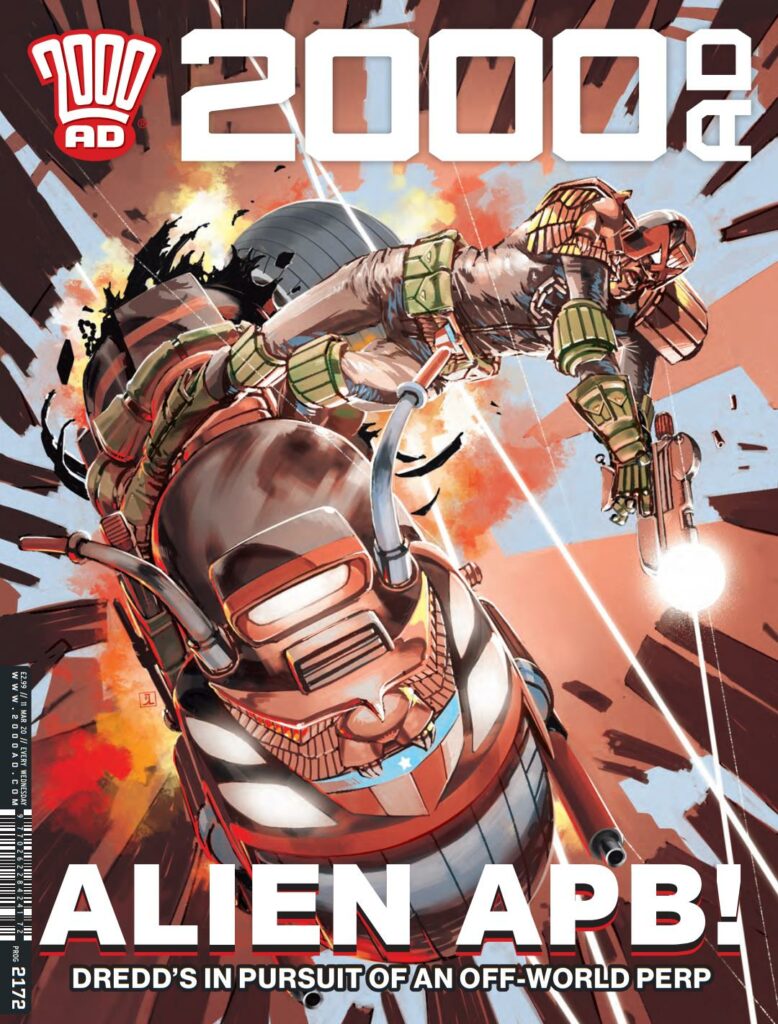
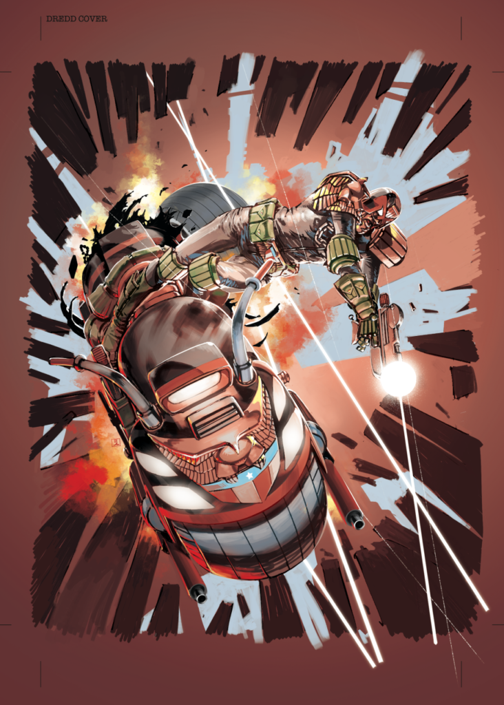
This week, with the cover to 2000 AD Prog 2172, it’s a welcome return to Jake Lynch, who gives us a cracking bit of Dredd in action – under fire and in trouble – on 11 March.
Dredd shows us his loathing of the good old exclamation point!
It’s all part of the current Judge Dredd serial, The Relic, with Dredd on the hunt for an off-world perp who’s just in MC-1 to retrieve his ancestral remains.
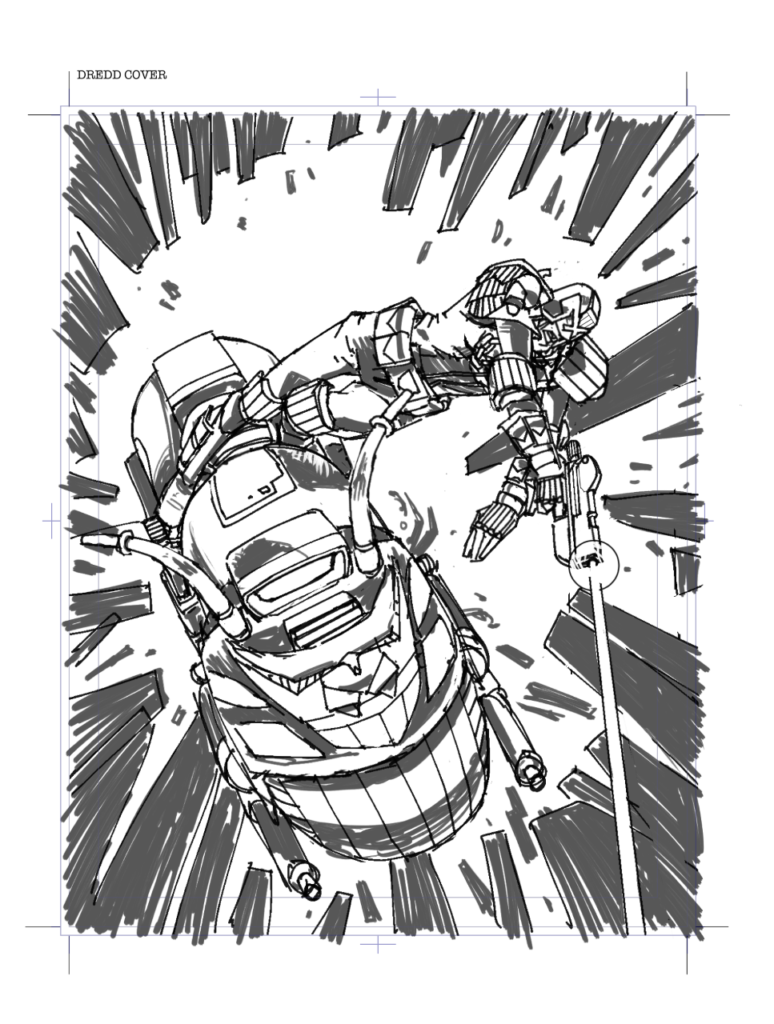
The first step, as it so often is, involved The Lynch-droid prostrating himself before TMO and begging for the chance to get back on cover duties. Sufficiently satisfied, Tharg passed the quivering Lynch-droid to his Earthly representative Matt Smith, who took a little look-see over the initial rough.
Now, over to Jake Lynch…
So that initial rough was just an idea for Dredd that I submitted to Matt, who liked the concept but suggested some return fire for Dredd to be diving into.
Dredd still has to pass that cycling proficiency test.
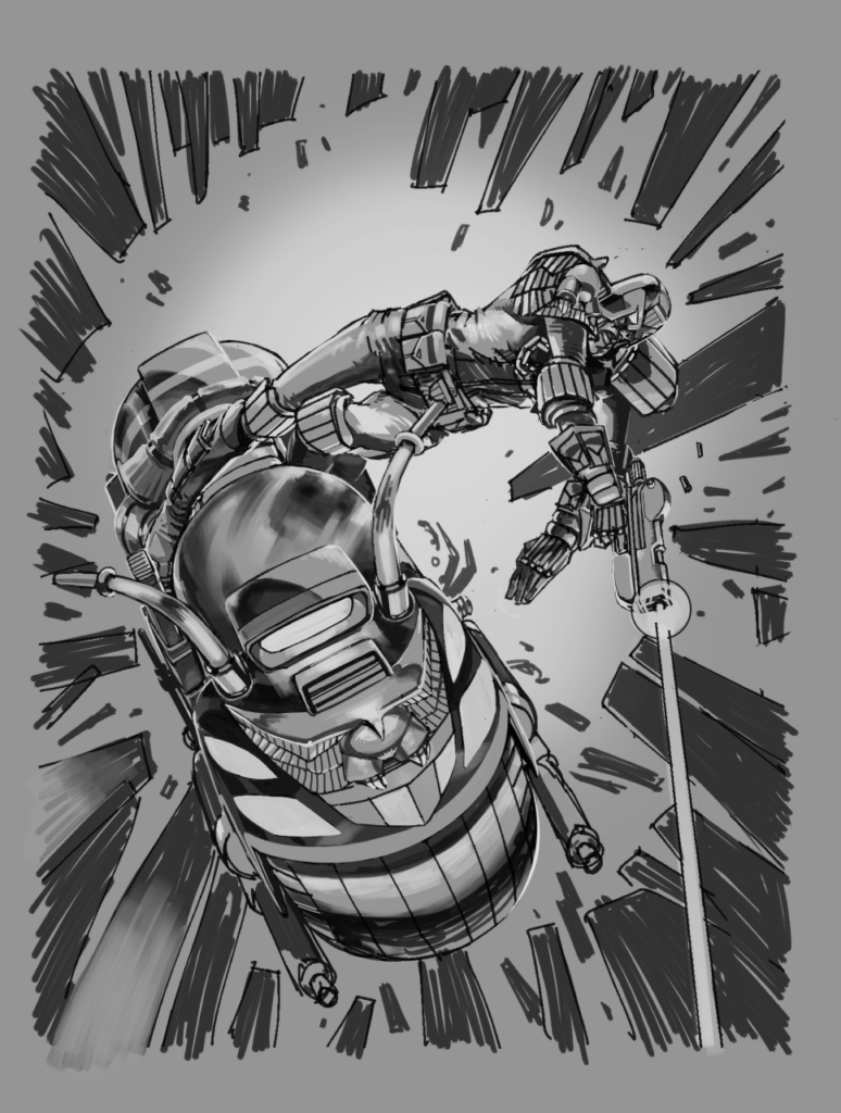
That taken on board I first tone up the rough…
Another Lawmaster trashed – oh, you know there’s going to be forms need filling in for that.
…and then tidy and colour, adding the suggestions and re-editing the figure and damage to bike for a little more impact.
And that’s that! A short but sweet look into just how Jake Lynch put that cover together. A big thanks to him for that, and you’ll be able to see the cover out there in the wild on 11 March.
Every week, 2000 AD brings
you the galaxy’s greatest artwork and 2000 AD Covers Uncovered takes
you behind-the-scenes with the headline artists responsible for our top cover
art – join bloggers Richard Bruton and Pete Wells as they uncover the greatest
covers from 2000 AD!
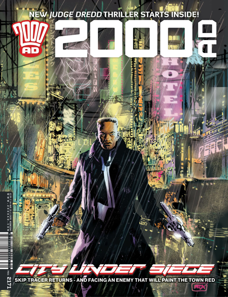
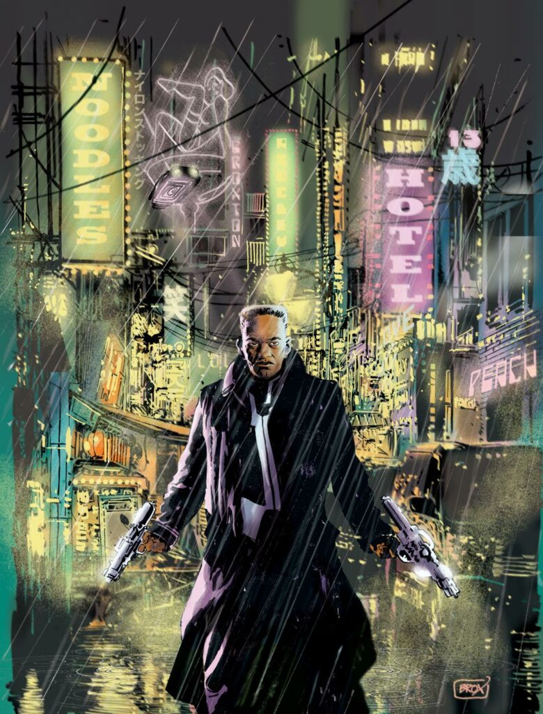
This week, it’s time to look at the fabulous
cover for 2000 AD Prog 2171, out right
now, and featuring the return of Skip Tracer. And we’ve got cover artist Jimmy
Broxton giving us a wonderfully in-depth tale of putting the cover together…
So, without any further ado, over to Jimmy
Broxton…
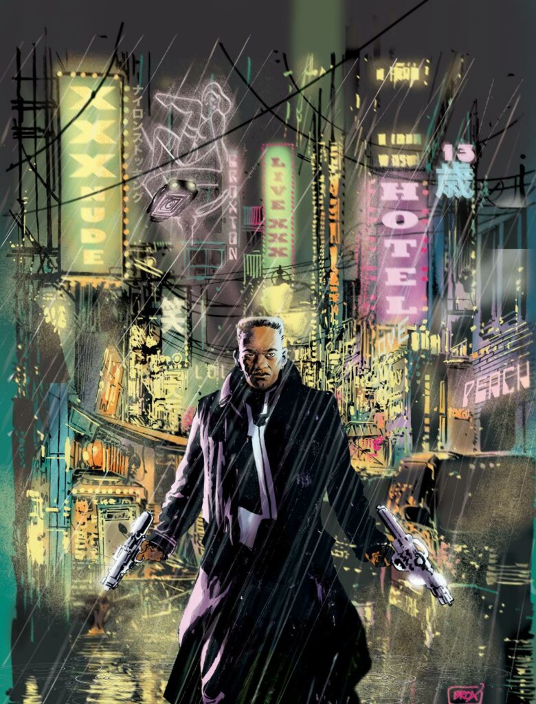
I rarely do covers, and I approach them slightly differently to my interior storytelling pages. I’ll experiment with different styles and media, I sometimes have a prose book cover, or movie poster aesthetic in mind, not just a pin-up style piece of comic art with a logo slapped on it (not that there’s anything wrong with those sorts of covers, they can work a treat). This piece was no exception, fortunately, 2000 AD likes to do things differently as well, so when Matt asked me to do a cover for the prog featuring Skip Tracer, I jumped at the chance.
Matt’s brief was simple, ‘I thought maybe you could do the cover as a pulp neo-noir pastiche. Bit Blade Runner in tone.’
SOLD! Say no more, that was all I needed to hear, I’m already there, as that is so far up my neon-lit, rain-drenched alley that I can taste the raindrops, and the cover now exists fully formed in my mind, all that’s required is that I do justice to the vision in my head (almost never happens, but hey, we have to keep trying). And more importantly, the request from Matt, doing a cover is a big deal for me, so I want to get it right.
My typical working relationship with the mighty Tharg is an unusual one I think. Basically I’m sent a script, and I send back finished art, I rarely do roughs or layouts for myself, preferring instead to go straight to final art. So, no prelims, roughs, pencils or layouts usually exist, unless I’m running close to deadline, in which case I’ll provide (if requested) very basic roughs in order to allow the lettering to be done. This straight to art process usually works fine, with only very occasional requests for alterations or changes, it’s never to do with the interpretation of the script, more likely a question of content, and going a little ‘too far’, even for 2000 AD! More on that later.
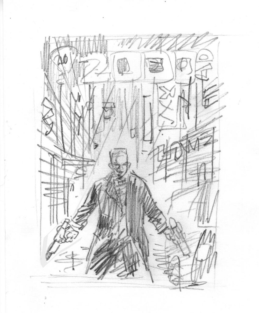
(Initial pencil sketch)
Covers are different and need to be planned and balanced with other Progs, so I go through the proper approval process for a change! I produced a small pencil sketch (for my eyes only, well, until now), not much more than a stick figure doodle, but that was enough to satisfy me that it would work compositionally.
It wouldn’t, however, be enough to satisfy Tharg, he would need to see something a little more polished, something befitting a mighty editor’s inbox, rather than the inside of a school desk, where my woeful scribble belongs.
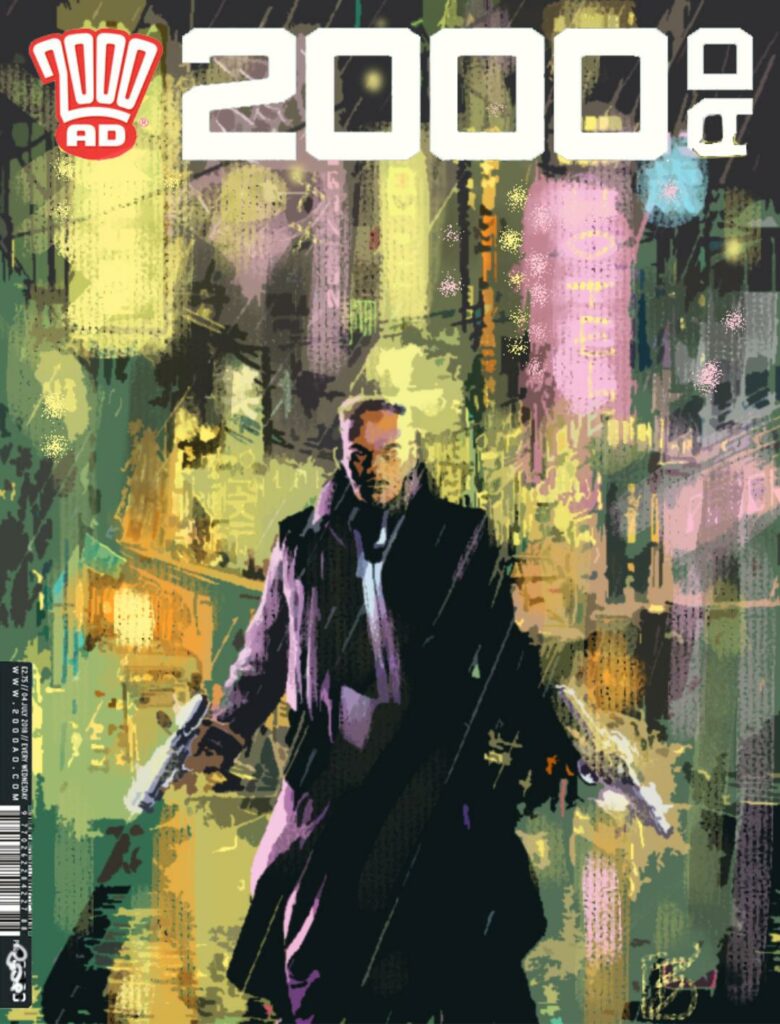
To that end, I digitally painted a rough of the cover, and dropped it into a cover template, with logo and publishing/pricing info. Very crude, but hopefully enough to sell the idea, it was more to suggest the colour values and the atmosphere I was trying to achieve, with no specific details on display. I brazenly submitted only one such rough, and Tharg the benevolent (it would seem) as well as mighty, approved it.
(Colour cover rough)
Now I had to draw it properly!
It’s worth noting at this point that, although that colour rough was created 100% digitally, I do in fact create all of my art the old fashioned way, with pens, pencils, brushes etc, on actual paper! Some digital compositing takes place, and the colours and special effects are done on screen, but the line art is real. I’ve yet to find a digital application that effectively replaces or improves upon actual wet ink on paper, with all of the multitude of variances and organic/analogue ‘accidents” that can contribute to a finished piece. Just call me ‘partially old fashioned.’
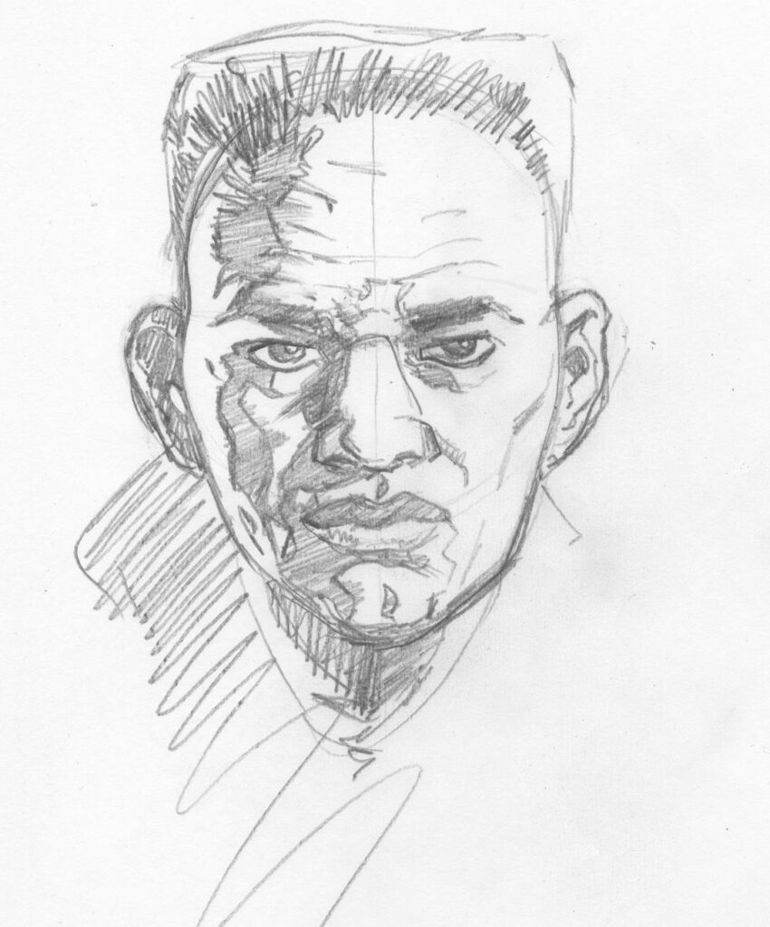
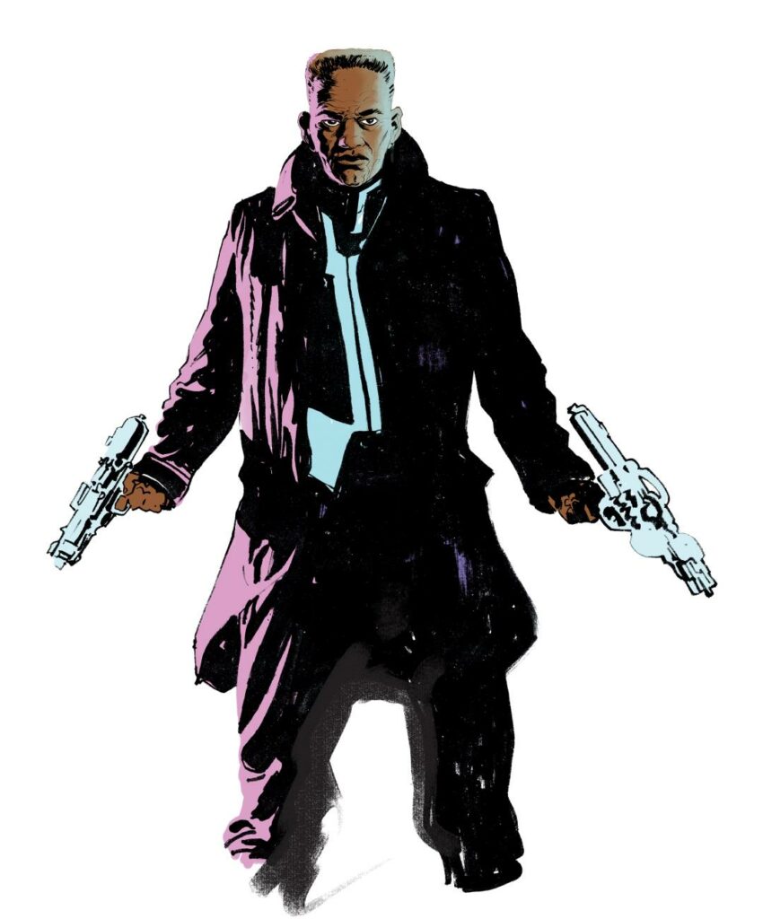
With a single point perspective composition like this, and with the figure front and centre, that figure, and especially the face and expression is key, so I drew the head separately, much larger than the body…
(Skip Tracer up close and personal)
This allowed me to focus on his expression and work out the lighting patterns – as I was planning multiple light sources the shadow work had to be very solid.
Once confident the sketch was working, I proceeded to final inks for the head…
(Final inks for Skip Tracer’s head-shot)
The body was then created as a second stand-alone piece of artwork, all to be ‘comped’ together later on screen.
With the figure complete, I could then tackle the background without worrying about figure placement too much. I created the entire street scene, with no hole or gap for Skip Tracer, I could add him anywhere at my digital leisure later (friendly advice, watch out for digital leisure, spend too much time with that and you’ll get no work done!)
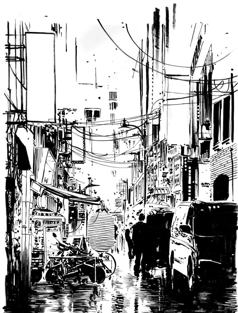
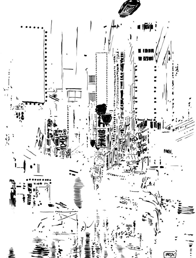
I drew the scene, in ‘positive’ mode, which is to say, all the black and ‘shadowy’ bits.
(A truly beautiful b&w scene – you can feel the rain on your face as you look at it)
I also produced a second drawing, where I inked all of the negative or ‘shining’ bits (technical term), lights, reflections, signs etc, this way I could create those effects with an analogue organic /vibe, to hopefully achieve a hand-painted, ‘none CGI’ final result…
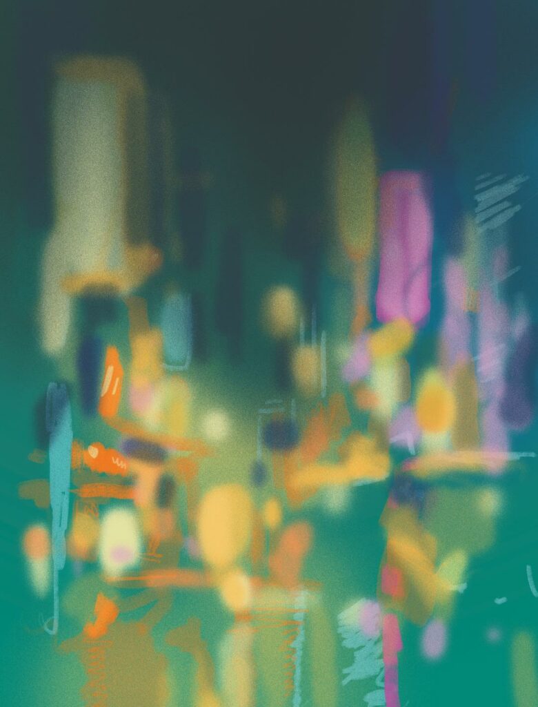
(And the second part of the street scene, something perfectly near-abstract looking at it this way)
With all the linework done, everything was scanned at hi-res (600dpi, thanks for asking), I then ‘comped’ the figure together by combining the head and body, and added the basic colours. At this stage, the scanned line art of the ‘negative’ elements were kept aside.
(Putting a Skip Tracer together, head and body joined at last!)
Referring to my original colour rough, I very roughly digitally ‘hand-painted’ the background in various layers over the black and white line art…
The colour render, minus inks, shows just how free-flowing and impressionistic the colours are…
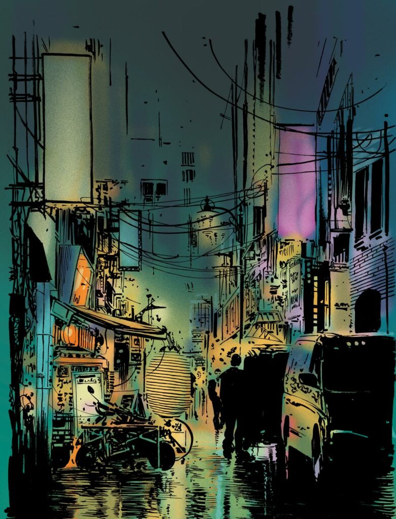
The pre-coloured figure was pasted into position to complete the scene. I also added a flying car, as nothing screams ‘this is the bloody future’ like a flying car. The final image, will hopefully be greater than the sum of its parts, no single element stands alone, and the composition does not really succeed until all the separate elements are pasted into position, not unlike traditional 2D animation cells from years ago (hey, I said I was old fashioned.)
(Skip Tracer, meet your background!)
Finishing touches were then added, glowing lights, smoke, steam, extra lighting effects (including my inked ‘negative’ elements, now layered as highlights), typographic elements and signs (more on those presently) and finally a few extra layers of weather, rain, puddles and reflections.
At this stage, just for the fun of it, I created a ‘back cover’ version, the same image, just completed minus the figure…
(The back cover version, as Skip Tracer steps out of shot)
The completed, flattened and print prepped file was set to Tharg for approval. Job done, well almost…
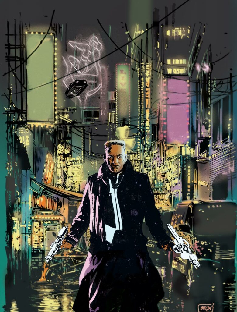
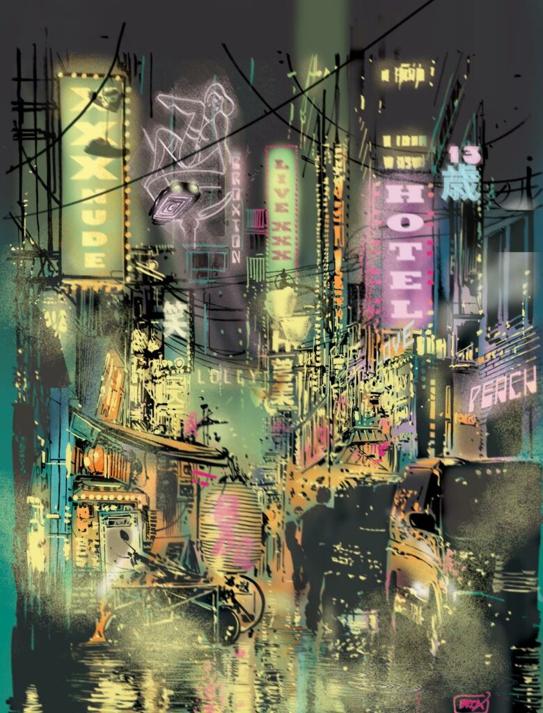
(The X rated final cover version – Skip Tracer walking through neo-Soho)
In my eagerness to give the image an authentic neo-noir, neon-drenched feel, I had strayed perhaps too far into the red light district of Skip Tracer’s world. ‘Live XXX’ and ‘XXX Nude’, in bold signage, might give the wrong impression of the contents of a magazine to be displayed prominently on a WH Smith shelf. Something ‘less saucy’ was requested and I thought it best not to suggest we simply go with it as is and poly-bag the Prog as a give-away with ‘Big and Bouncy’ magazine. I very wisely complied with Tharg’s request to tone down the sleaze (well, there had to be a first time!) The signs were changed, the ‘XXX ALL NUDE’ delights previously offered replaced by noodles (hey, even a pervert’s got to eat!) and that version is the final approved cover of the prog that will hit the stands any day now.
(The final version – exactly the ‘pulp neo-noir pastiche’ that Tharg was after)
A huge thank you to Jimmy Broxton for an incredible breakdown of just what goes into making a cover. And what a cover it is. Go look for 2000 AD Prog 2171 on the racks of your local newsagent or comic shop right now!