2000 AD Covers Uncovered: ‘A whopping great fudging was now lumbering inexorably in my direction’ – Tom Foster talks Dredd for Prog 2341
19th July 2023
Every week, 2000 AD brings you the galaxy’s greatest artwork and 2000 AD Covers Uncovered takes you behind-the-scenes with the headline artists responsible for our top cover art – join bloggers Richard Bruton and Pete Wells as they uncover the greatest covers from 2000 AD!
This week sees the return of Ken Niemand and Tom Foster for Judge Dredd: A Fallen Man, the third part of their trilogy following former Judge Kyle Asher, freshly returned from his 20 years on Titan for beating a citizen to death and now working as an auxiliary. It follows A Penitent Man (Progs 2225-2230) and An Honest Man (Progs 2281-2286) and something tells us it’s just not going to end too well for poor Kyle. Not if Dredd’s got anything to do with it.
To mark the start of the third and final part of the trilogy, we get to welcome back Tom Foster to the cover of Prog 2341 with a fabulous Dredd image – although, as you’ll discover, he’s got issues with it…
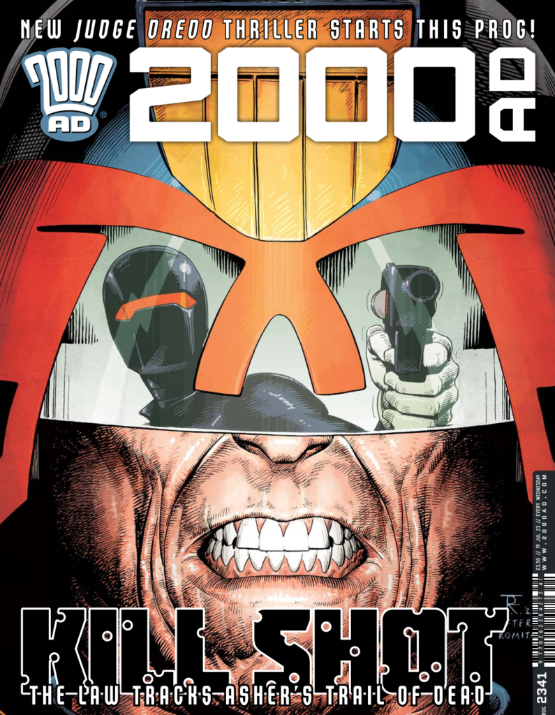
TOM FOSTER: Alright, I’ll level with you. At the time of writing, I’m just over halfway through the third-to-last chapter of this story. By the time you read this I should be (if all goes according to plan) a few days into drawing the penultimate part – and part one will already be on newsagents’ shelves and in the hands of whichever subscribers are fortunate enough to live in a district with a prompt postal service.
So, if this ‘Covers Uncovered’ has an air of desperation about it, it’s because this droid is currently gears-deep in the process of trying to get it all finished in time for the solemn and immutable deadline, the spectre that haunts a comic book artist’s dreams like a sleep paralysis demon.
Those familiar with my working methods, or even just my general essence, may have good cause to suspect that this frenzied dash to the finish is the result of poor time-management and fecklessness. For once though, I’m happy to say this is not the case. But, whatever the root cause, the implications are the same: I am racing face-to-face with my own doom and we are about to smash into each other in a cataclysm of blood and zygomatic arches.
But sure, let’s use up a chunk of my remaining time to go over the process for the cover of Prog 2341.
First of all, let’s be clear on one point – this cover has problems. Some of those problems are the result of logical sacrifices in service of the concept and some are the result of my own surfeit of limitations and ignorance, but problems they remain – and the biggest, by some measure, is wideness.
Judge Dredd is too wide. His face is too wide. His helmet is too wide. His whole vibe is too wide.
To understand this overabundance of width it is necessary to journey back to the beginning, when I was just a fledgling Prog 2341 cover artist, starting out on my journey to make the cover for Prog 2341, with nothing but hope in my heart and a bagful of dreams.
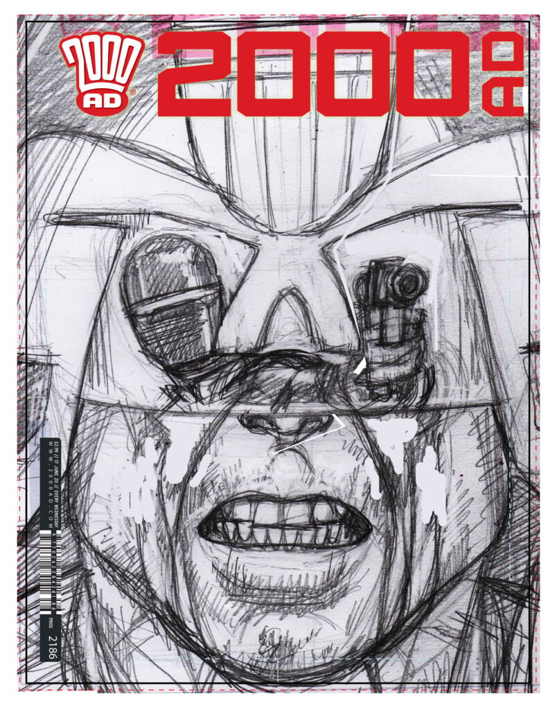
As is the custom, I started with a layout sketch. Here, I was presented with my first problem. This is a Dredd story – Dredd being on the cover is generally a plus here – but Tharg also likes covers to reflect the actual chapter of the story that they are to accompany. So, what does Dredd do in this chapter? He stands and looks at a screen.
‘Hang on though’, I thought to myself ‘if I show the action on-screen reflected in Dredd’s visor, it’ll create the suggestion of Dredd’s involvement and foreshadow any confrontation to come later in the story’. It seemed like an excellent idea.
Then I realised just how narrow those bits of Dredd’s visor that he looks out of are. ‘No problem,’ I thought ‘I’ll just fudge the proportions a bit.’
Little did I suspect that that fudging would come back to fudge me in turn. Fudge me something rotten.
I rushed through the layout, a hanging offence, with the rationale that I’d drawn Dredd’s head a million times, so there was really no need to over-prepare. Idiot.
I based the whole composition around using Dredd’s helmet as a design element that didn’t really have to correspond to functional reality. But then, of course, I still wanted it to look convincing and to have Dredd’s whole chin in shot, so a certain amount of proportional shenanigans was necessary to have the visor take up the requisite amount of active space to have a nice clear shot of our stealth gunman reflected therein.
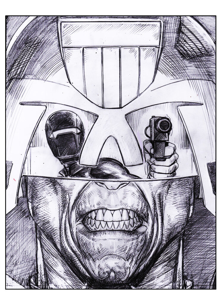
With the penciling stage, I started to notice some irregularities. The neck seemed wrong, springing up out of his body like one of He-Man’s buddies. The whole head seemed alien-like and unconvincing. ‘No problem’, I continued to think, ‘I’ll fix it in Photoshop before I ink it.’
A whopping great fudging was now lumbering inexorably in my direction.
I did my best to mitigate the damage and then printed out the pencils for inking. This stage went not too bad. I used a smaller brush for the figure in the visor and a bigger one for Dredd, just to give some sense of scale (a Winsor & Newton 7 Series size 0 for the figure and size 2 for Dredd, for all you brush-heads out there).
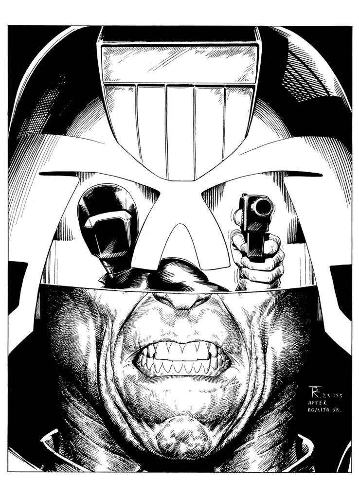
Then, again, I tried to compensate for the flatness in the image engendered by poor proportion, by really highlighting the middle of Dredd’s face and darkening out the outer edges of it.
While this worked in part, there’s only so much dimension you can add this way. I only really fully realised my folly the day after I’d finished the colours.
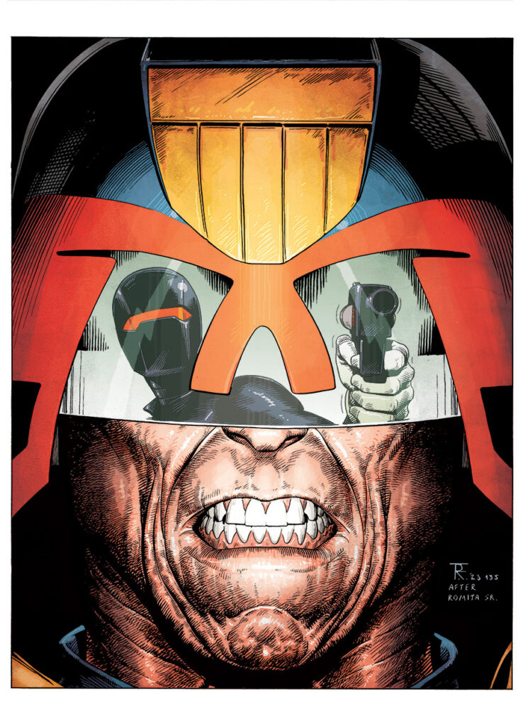
Seeing a thumbnail-sized preview of the image on my desktop, I was suddenly struck by how wrong it looked, how much like a mid-late 90’s abomination of horrible superhero anatomy and colour gradients.
You can simulate this process now yourself by standing up the cover on a shelf in front of you and slowly stepping backwards away from it. You’ll see all the nuance disappear – all the seemingly-aligned elements of facial anatomy giving way to a snarling, two-dimensional monstrosity that even Rob Liefeld would have humanely euthanised on the spot.
Like all intelligent people, I keep a skull around the house – for contemplative and instructional purposes. As any good skull should, it provided a chilling portent of the error of my ways. I noticed that, when viewed from the front, the jaw is really only about two ‘mouths’ wide. One in the middle (obviously) and roughly one half on either side. No doubt this was covered in one of my many anatomy books, but my youthful abandon conditioned me to ignore it.
Even with someone like Dredd, whose mandible often suggests a state of medical emergency, there’s only so much you can stretch these proportions before things start to look prohibitively unrealistic, particularly if you show his full array of pearly whites (as I had), betraying the underlying anatomy to the viewer.
So it was that I realised that, not only had I made this mistake here, but in a hundred other drawings, some contained within this very issue.
Fortunately, this process was an instructional one that has now informed the way I think about all faces and my work has improved as a result, but it came at a cost.
The thumbnail of this cover still haunts me and I can offer no better advice to budding artists than to consult this verse I’ve composed on the subject:
“If plagued by troubled doubt you be,
when drawing head anatomy,
consult the skull upon your shelf,
’tis wiser counsel than yourself.”

And we will leave poor art droid Foster there – the art droids really do beat themselves up over things when they think something’s wrong. Thanks to Tom for opening up to us – it’s almost a form of therapy sometimes!
You can find 2000 AD Prog 2341 wherever you pick up the Galaxy’s Greatest Comic, including the 2000 AD web shop from 19 July.
For more from Tom here at 2000AD.com, check out his Covers Uncovered features for 2000 AD Progs 1986, 2225, 2281, and 2310, his great Storm Warning cover for Megazine issue 450 and his just as great Surfer cover for Megazine issue 454. We’ve also interviewed him a couple of times – he talks about his 2013 Thought Bubble talent search win here and the Judge Dredd: A Penitent Man strip here. Finally, if you want to see and hear him, there’s his 2000 AD Thrill-Cast Lockdown Tapes appearance here and his far too funny From The Drawing Board video can be found here.
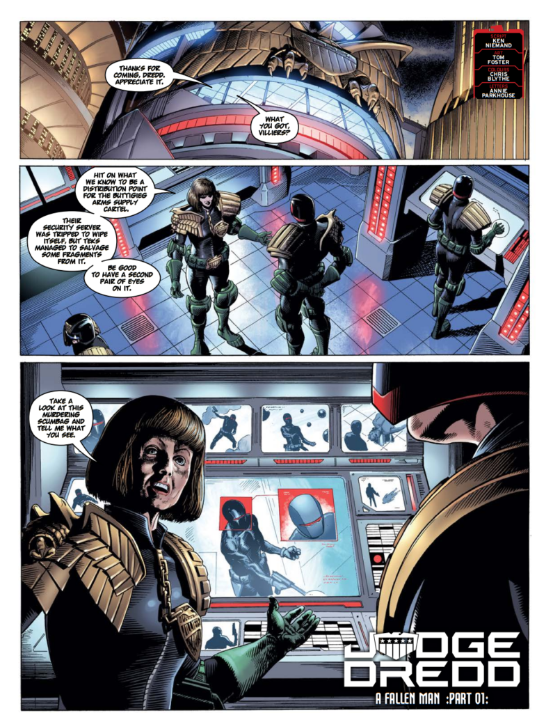
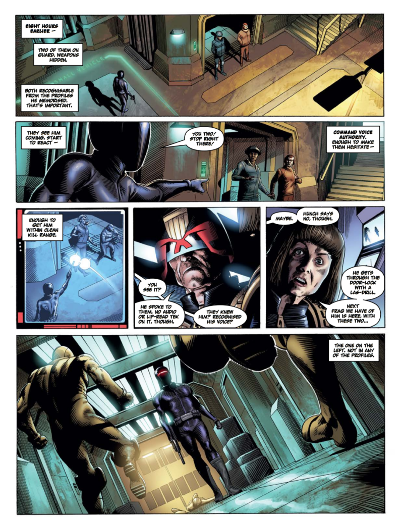
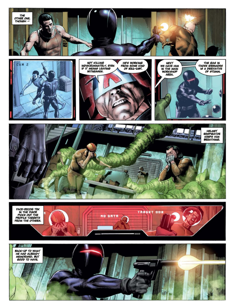
And as a special bonus for you, here’s the first three pages of Tom’s great artwork on the first episode of A Fallen Man… starting in Prog 2341…
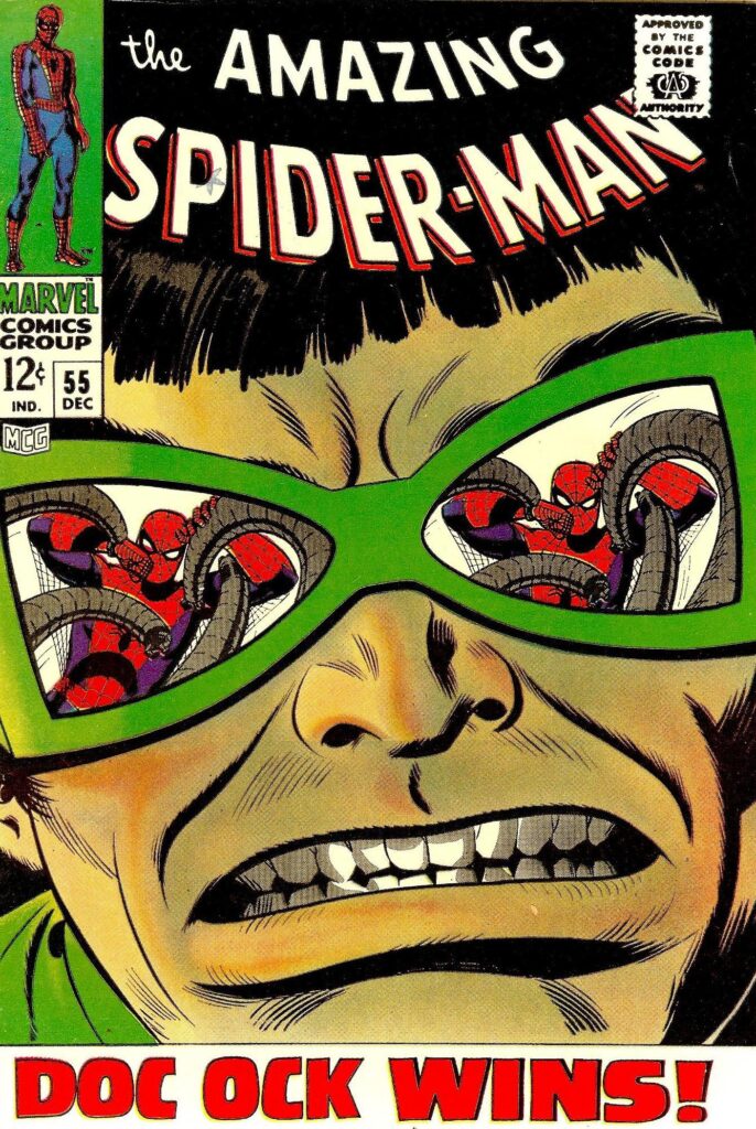
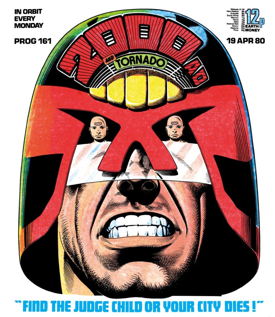
Oh, and if you’re wondering why Tom’s labeled the cover ‘After Romita Sr’, well that would be because he’s homaging the classic John Romita Sr cover to Amazing Spider-Man #55 (Marvel Comics, 1967)… although, as he said to me when I enquired, ‘I know the composition’s a little different (it could just as easily be seen as an homage to Bolland’s cover for prog 161), but that Doc Ock over was definitely the more prominent in my mind while I was working on this one, so it just seemed appropriate to acknowledge it.’
