2000 AD Covers Uncovered: Stewart K. Moore on Surfer and the artistic long game
22nd August 2023
Every week, 2000 AD brings you the galaxy’s greatest artwork and 2000 AD Covers Uncovered takes you behind-the-scenes with the headline artists responsible for our top cover art – join bloggers Richard Bruton and Pete Wells as they uncover the greatest covers from 2000 AD!
This week it’s not a 2000 AD Prog or a Megazine cover we’re talking about but the cover to the new collection of John Wagner and Colin Macneil’s epic Surfer. The cover’s a wrapround stunner from Stewart K. Moore and, if you’ve been following these Covers Uncovered for a while, you know Stewart’s Covers Uncovered pieces are always epic!
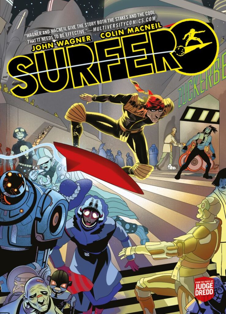
Stewart’s entitled this particular Covers Uncovered…
On Surfer and the artistic long game, pitch fails and successes,
and the pitching process for 2000AD.
But in fact, because this particular Covers Uncovered is so epic, so huge, and so long, we’re going to split it in two. Today, you get the ‘Surfer and the artistic long game’ bit. Tomorrow, Stewart will take you through more of ‘the artistic long game,’ and we’ll get into the fascinating aspect of ‘pitch fails and successes and the pitching process for 2000 AD.’
So, today we’re all about Surfer, the John Wagner and Colin MacNeil collection of the two storylines that ran in the Judge Dredd Megazine. Surfer sees Wagner and MacNeill return to Dreddworld and also return (in a way) to Chopper and Supersurf 7.
It’s all about young surfer Zane Perks, whose troubles really begin when he lands himself the role of playing Chopper in a new film of Supersurf 7. What should have been a dream job swiftly turns into an absolute nightmare, with the (unbeknownst to Zane) illegal filming and surfing landing him in the iso-cubes. After that, on release, he’s then tied up with the mob, being forced to first escape MC-1 to pick up drugs from Canadia and then to do the even more dangerous thing of smuggling said drugs back into the city. It’s an absolute masterpiece and a start to finish zarjaz thriller that mixes the excitement of surfing – brought to life by stunning work from MacNeill – and a tense drama of crime and redemption.
Surfer is out right now, and should be there on the shelves on your local comic shop when you next go in. And of course, you can always pick up a copy from the 2000 AD web shop.
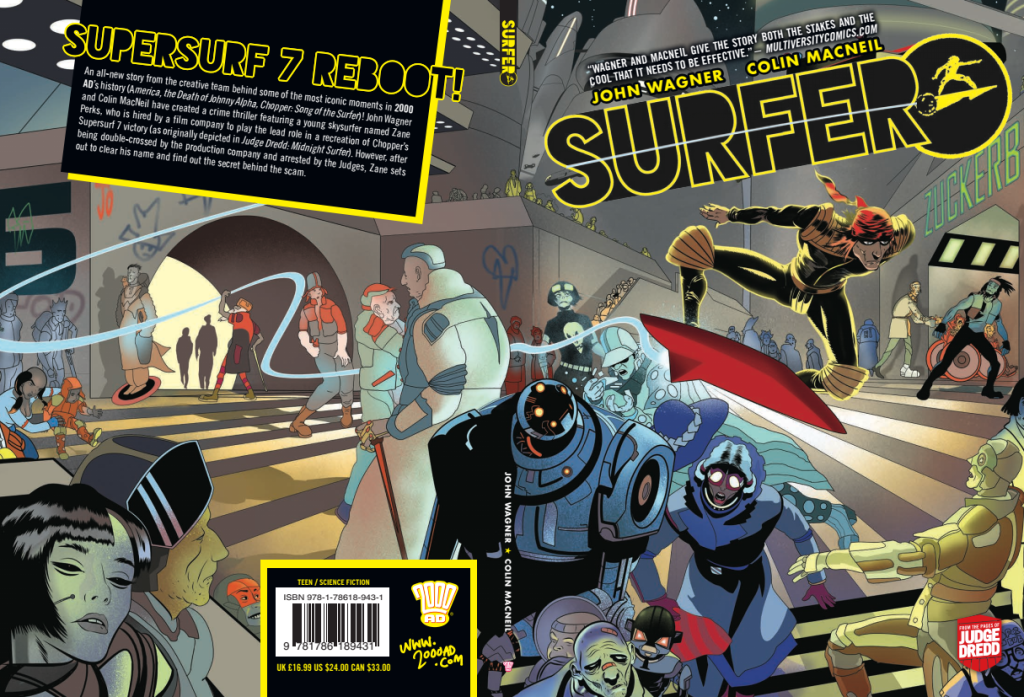
But now, let’s go deep into the creation of another stunning Stewart K. Moore cover.
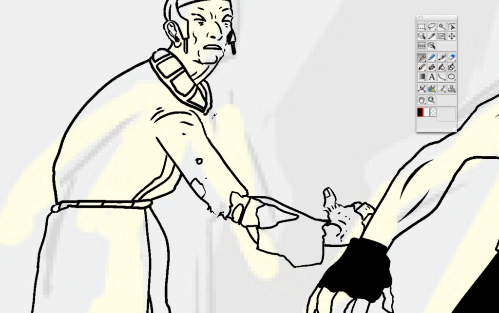
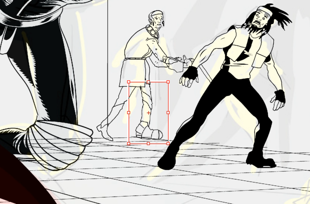
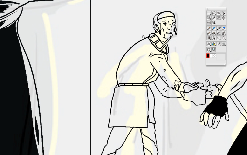
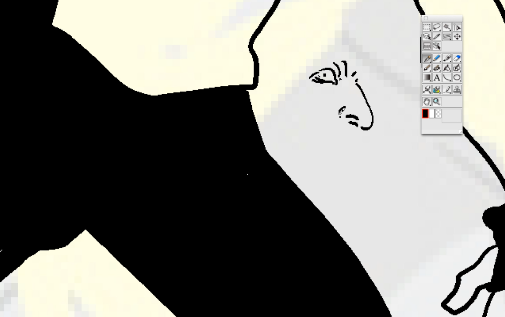
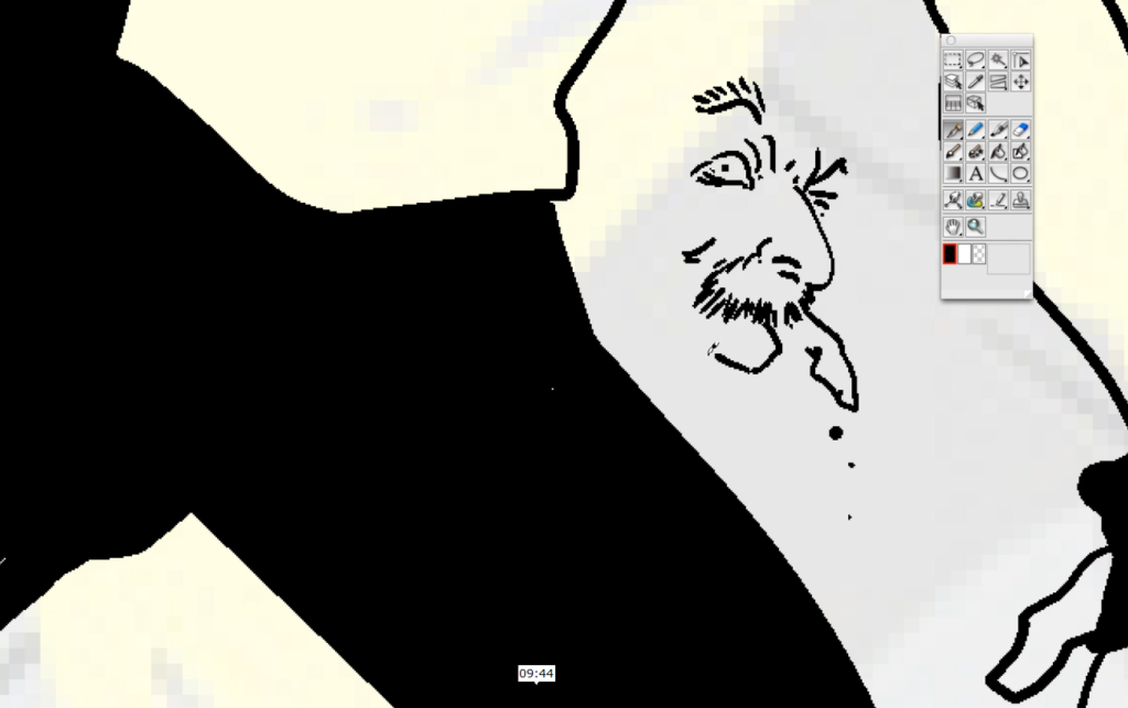
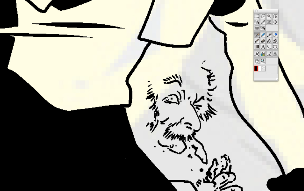
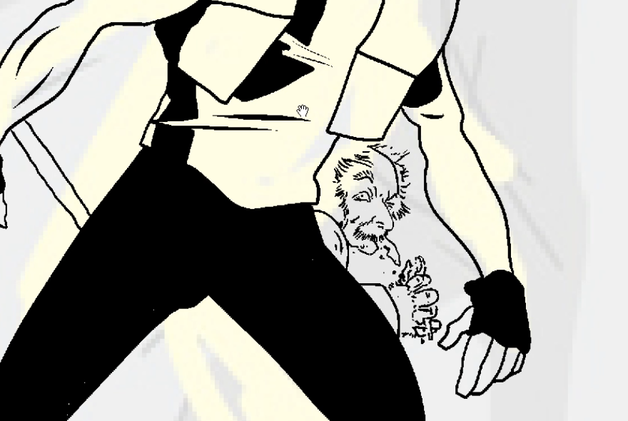
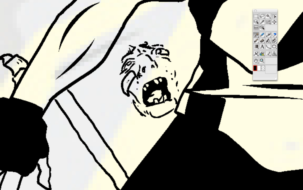
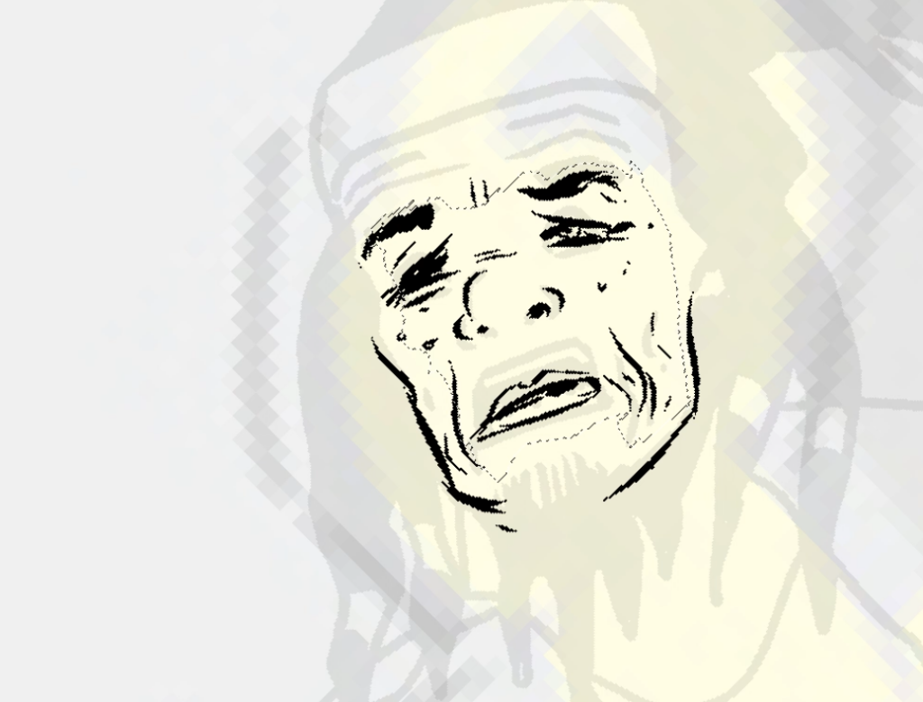
As Stewart’s been doing for the last few Covers Uncovered, he sent along his rough and then a video of the process. It’s well worth watching the vids as they really do get so deep into the way that he works and allow you to see the minute detail that he puts into everything that he does – almost a ridiculous amount of detail, way, way more detail than a lot of us would notice.
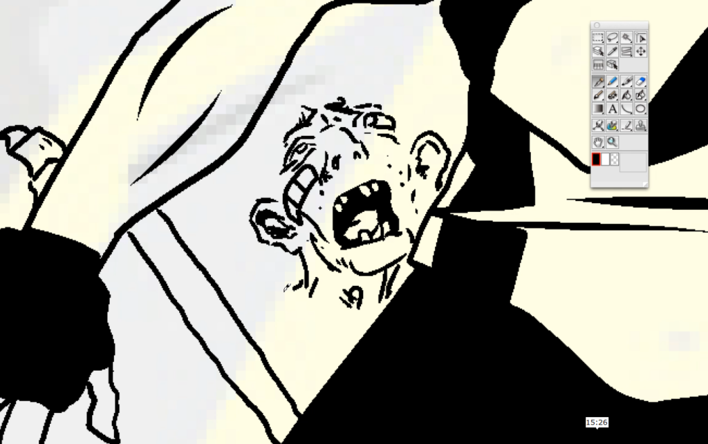
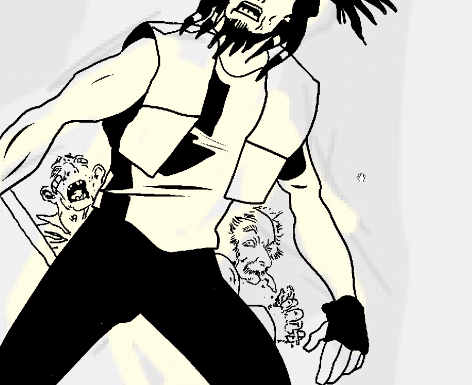
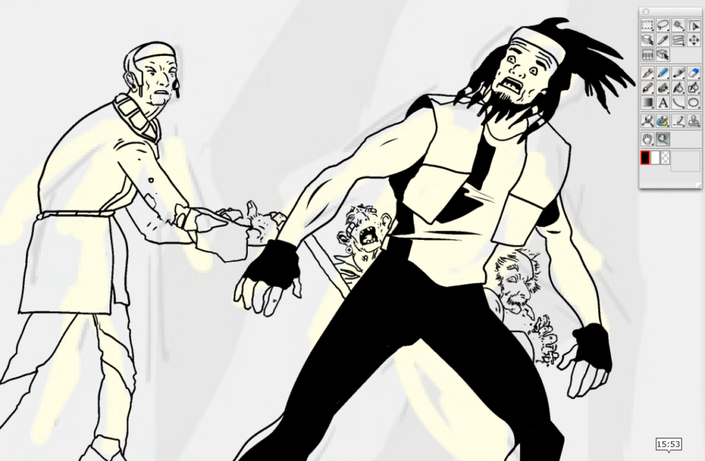
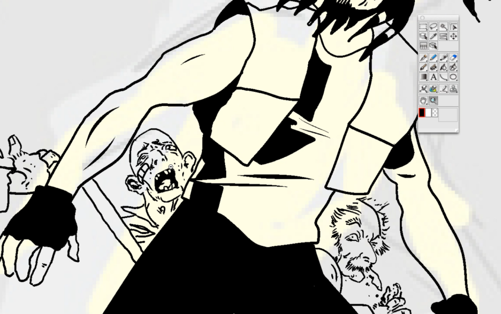
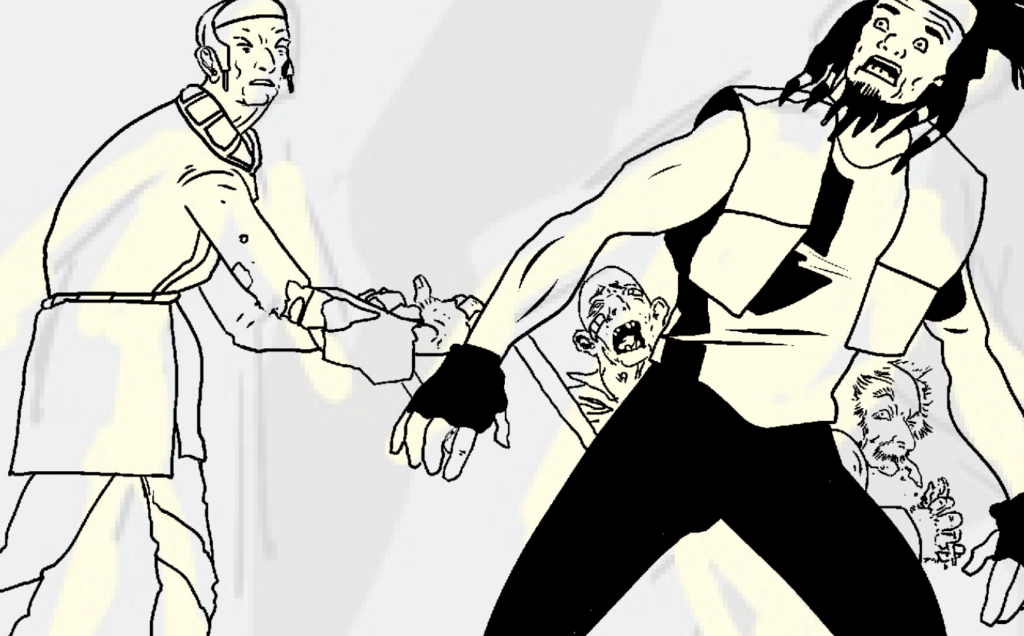
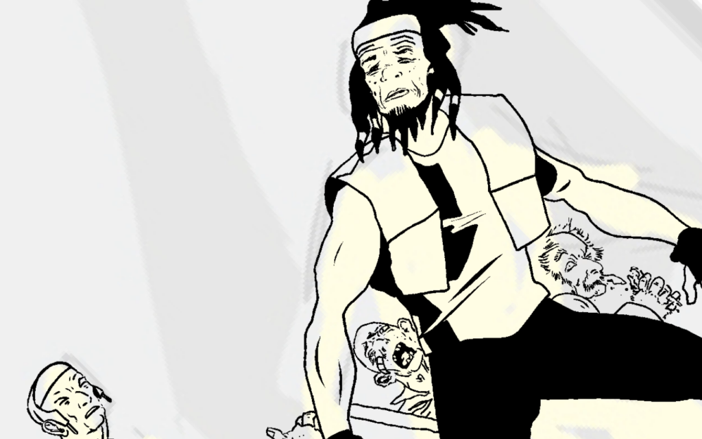
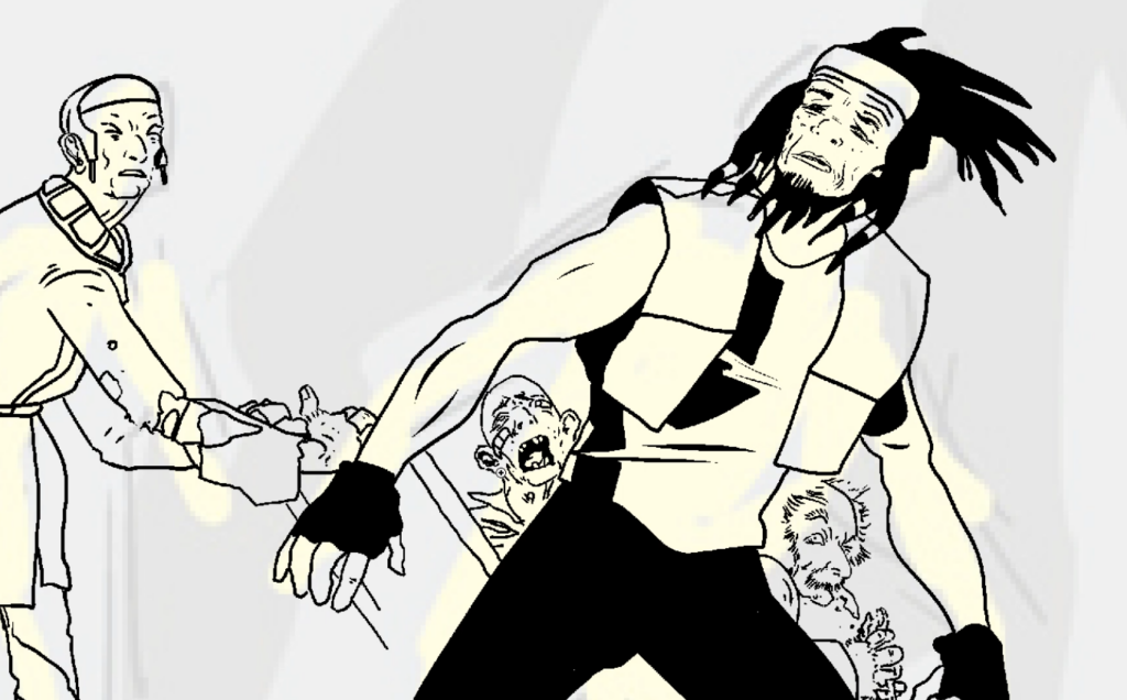
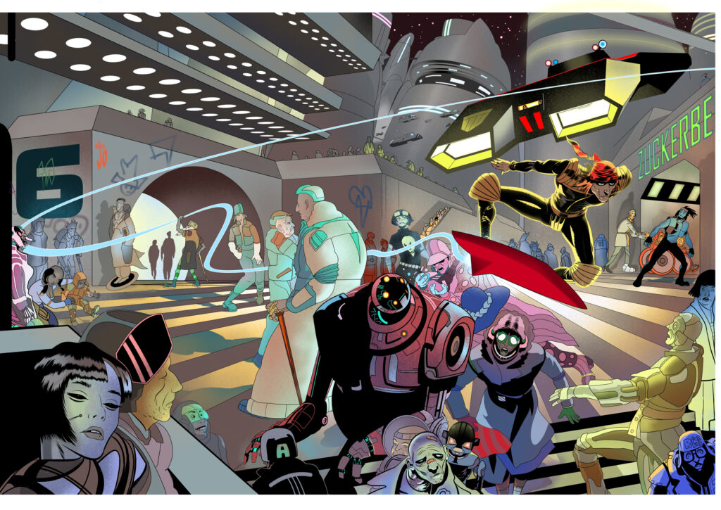
This set of videos is a little different from what Stewart’s usually showing us though. He’s not showing you Zane, he’s not showing you characters in the foreground. No, he’s concentrating on the little group of characters in the background. The ones you maybe won’t even notice on the cover.
This lot, the one’s just in the entrance to Zuckerberg block…
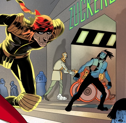
So, here you go, the videos of Stewart’s process, enjoy!
>
STEWART K. MOORE: I had two cover projects for Rebellion, back to back, in the summer of 2022. So the day I sent in the first I started the second. One of the problems of freelancing is bridging the project gaps, I’m always busy but somehow there are always gaps. Anyway, it was nice, that. Doubly nice because I was able to pull a stylistic 180-degree turn.
The first was Karl the Viking. The subject matter – a classic sword and sorcery story. It immediately suggested a painting in oils on canvas. So I did an oil painting – it felt right and I really enjoyed working on a Don Lawrence project, he was a master artist.
I enjoyed revisiting what felt like my artistic origins too. Dabbling with paint, listening to rock and punk and Ska while trying to understand the works of Frazetta and Vallejo and Bernie Wrightson and many more in the late ’80s.
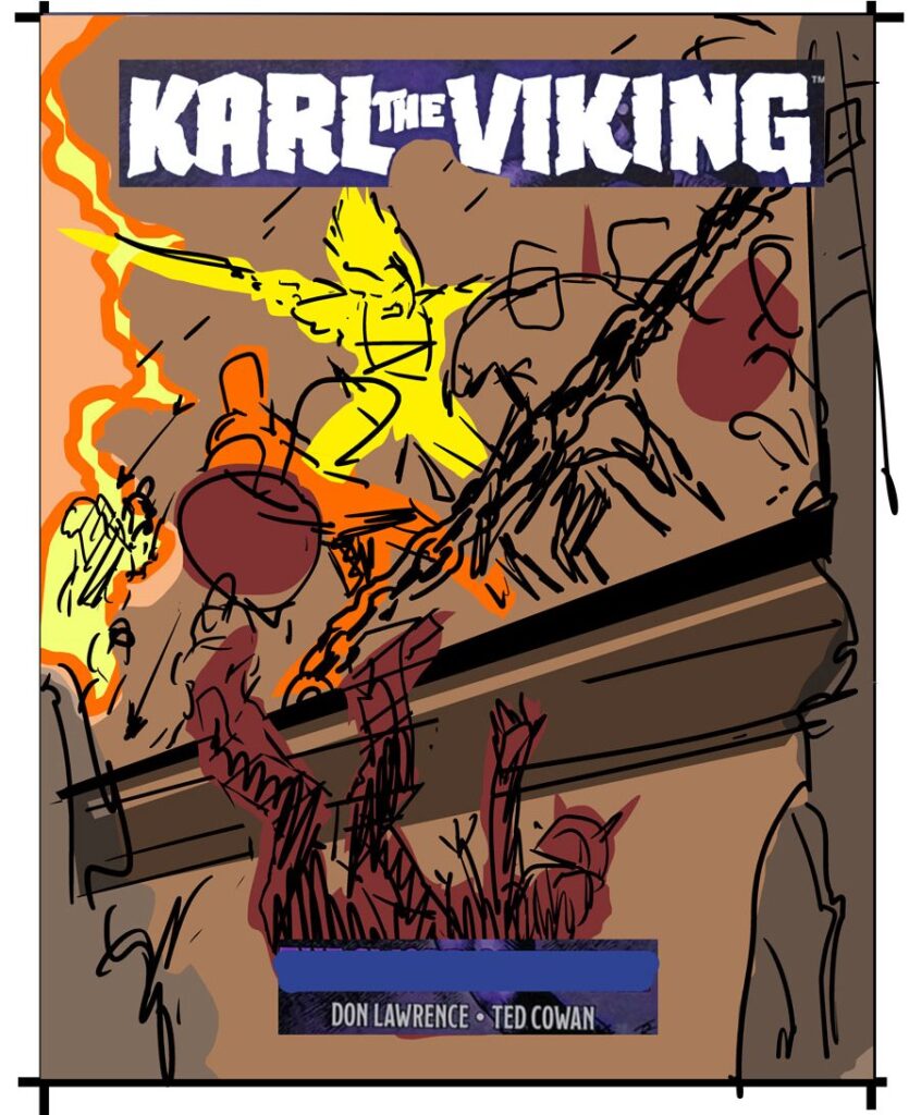
Stewart added these notes to that Karl The Viking cover sketch…
SKM: ‘The fight on the drawbridge, Karl has dropped ‘from space’ into the centre of the fight. Light hits his hair, face, muscular arm and swinging sword, whilst the battle is shadowed by smoke from the fires.’
And, after a lot of work in oils (a LOT of work), we get this as the finished cover for the second and concluding reprint volume of Karl The Viking, a web shop exclusive hardcover that you can get here.
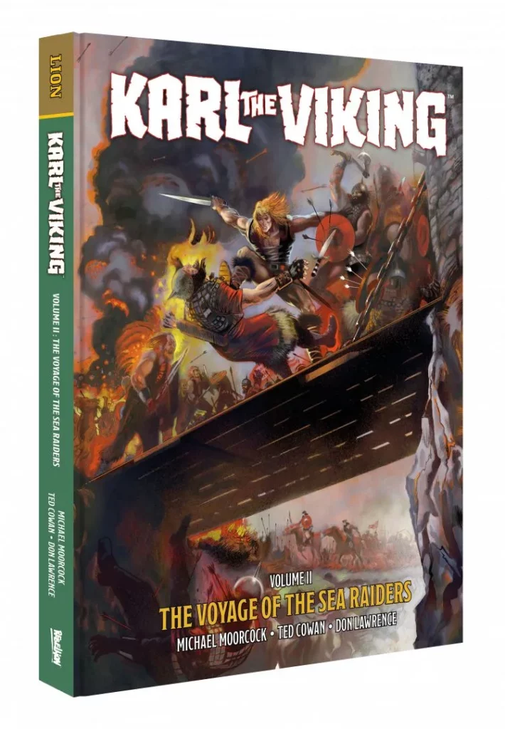
Written by Ted Cowan and Michael Moorcock, with art, incredible, beautiful, stunning art from Don Lawrence, along with Edmund Drury, Robert Forrest, and Ruggero Giovannini, Karl the Viking is the series which made Don Lawrence’s reputation, and it was on this basis that he was hired to revolutionise painted comic art with The Trigan Empire.
But as beautiful as Stewart’s work is on that Karl The Viking cover, we’re here to show you the cover to Surfer, so let’s get back to that…
SKM: But Surfer is Mega City One and so I did that in a digital style.
I wanted the oil to be classic and muted and natural in feel and the digital to push the envelope into something plastic, a little cartoonish, colourful, and utterly artificial.
I didn’t quite make it, but I closed in and it has been well received.
I feel we’ve got to strive toward the unusual and not readily accept the default image that comes to mind, lest that default be the fall-back. So I took some compositional risks here. I also wanted it to be a scene something like a game or animation cut-scene.
We all know how to make pictures and what ‘to do’, what makes a pretty picture; if we don’t there will be a book showing the way. Simples.
But with a comic like 2000 AD there have been millions of images by an array of maddeningly brilliant artists. How do you do something that fits with that merry band but also brings something new? That’s what keeps me awake at night.
Anyway, for Surfer I did a series of sketches. I can’t share them, I have plans for them. Oliver Pickles, my editor at Rebellion, chose a dynamic one. A fun visual grabber...
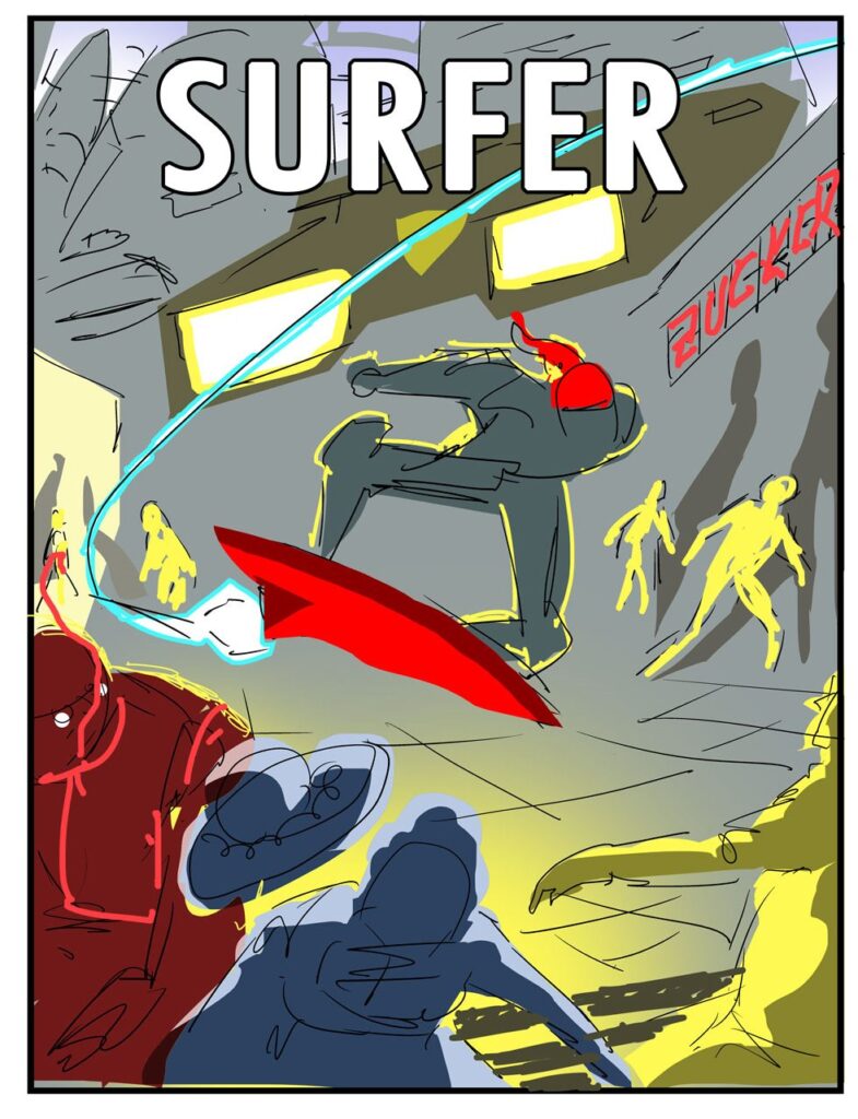
Part ways in and I realised it could be a wraparound, the jet trail leaves the page, there was fun to be had on that back page! I got the go-ahead for that extension.
Then the heatwave of 2022 came. It was so bad, so unbearable to work in, that I wrote to Oliver to apologise for the delay, let’s just say he’s not from Betelgeuse so I feared no Rigelion hotshots! The heat was enough of a punishment…awful, debilitating. Terrible. I have no air-con in the studio and usually, the heat doesn’t bother me. But this time it really did.
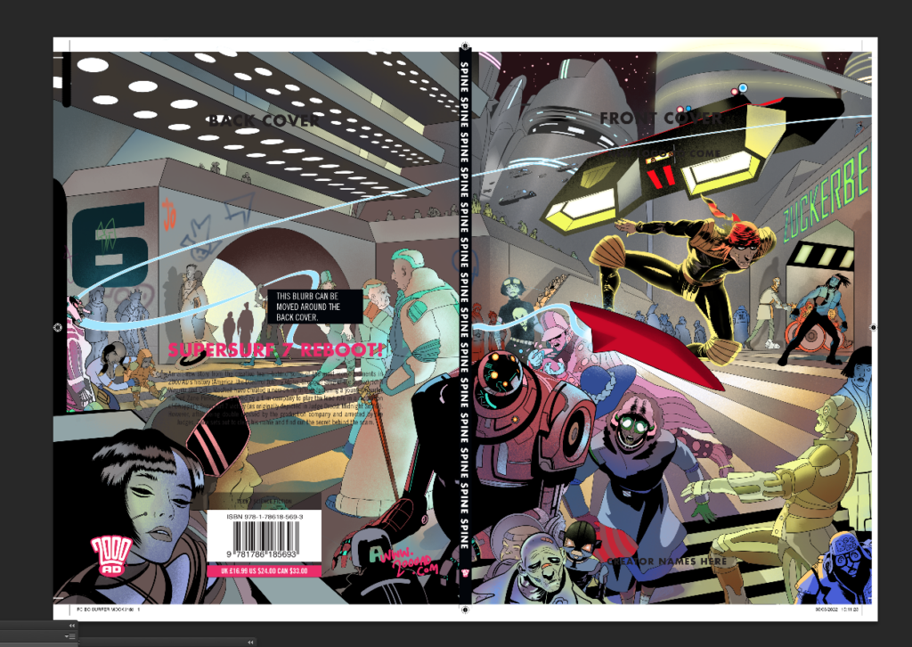
The picture was finished during this period, I put in some incredible hours, but I didn’t get what I wanted. So it’s a bit of a heartbreaker this one.
It’s not like anything else. I think that’s a success of sorts.
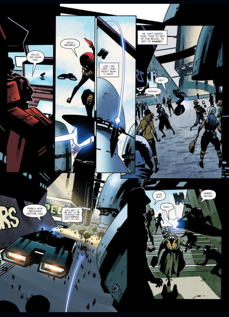
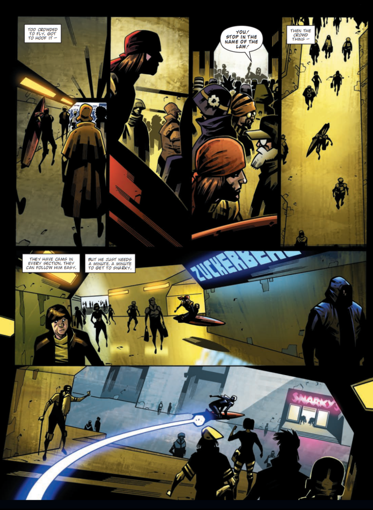
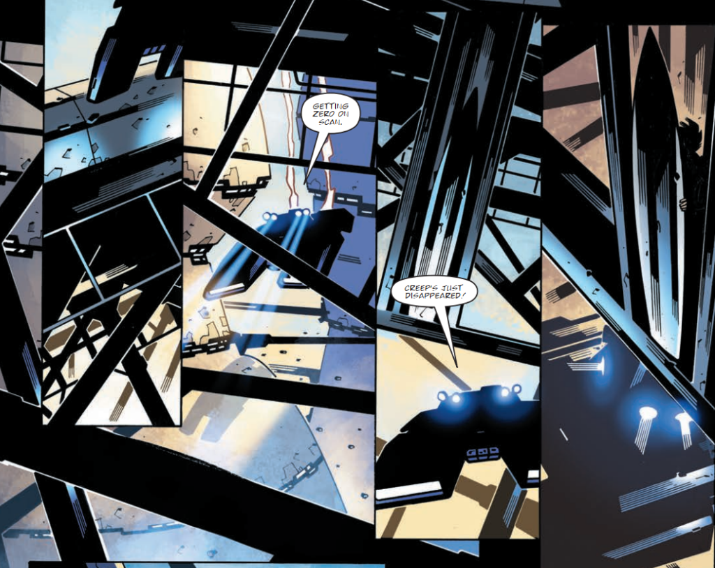
The design features a moment in the story where the lead character evades the judges by slipping into an underpass of some kind.
That would be these pages of gorgeous Colin MacNeil artwork…
>
I studied the panels and tried to draw the same pedestrians I saw in the comic art panels, loosely based anyway.
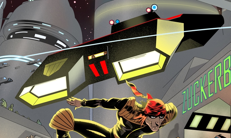
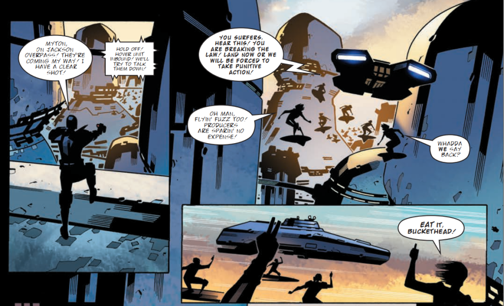
I tried to draw Mr McNeil’s unique H Wagon / Manta too. I didn’t feel it would be right to draw a Manta the way I would (there are many designs, many artists have their unique take). His version is great, like a floating concrete tank, but I struggled to draw it. That’s the truth of it.
Of course, the H-Wagon that Stewart drew on the cover is obscured by the logo… but here’s what’s underneath…
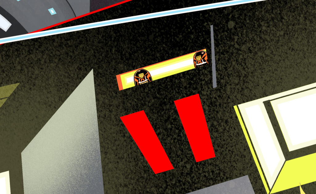
And a close-up of the Judges inside the H-Wagon… this is what I mean by the amazing detail that Stewart will pack his art with…
And here’s a few panels showing you Colin MacNeil’s H-Wagons from Surfer for comparison – sorry Stewart, don’t feel too bad…
Okay, back to Stewart…
SKM: The physical stance of the Surfer has that unique, ungainly, monkey-like crouch quality we often see in 2000 AD characters. I got that right. If you look at the history of 2000 AD characters they don’t tend to be elegant like Marvel’s bounding pimped Nureyevs, no, they are oftentimes inelegant in 2000 AD. So I guess I managed that.
But ultimately it didn’t go where I sensed it could, it only got so far.
The trouble with art is we artists can see and feel it right away, but showing others takes many hours of work. Those who can’t imagine what we see can then see it in an instant and can imagine it in an instant, although they had no idea just a moment before. I can still see it and feel it and I’m sorry I can’t show you it, this is as close I could get in that blistering heat.
Maybe next time.
Oh, Stewart, Stewart, Stewart, we know that readers of this and those fans picking up Surfer from the shelves will be thinking you absolutely nailed the cover. The insecurities of those art droids really are something!
Thank you once more to Stewart for another enthralling Covers Uncovered for Surfer. You can (and should) pick up Surfer from all great comic shops and the 2000 AD web shop right now.
But of course, that’s just the first part of this mammoth Covers Uncovered feature. We’ve done Surfer now, but there’s a load more to come, all about making art, pitching for work, and so much more. You can see that tomorrow. And believe me, you’re going to want to see it.
As for more from Stewart, be sure to go look at previous Covers Uncovered pieces – 2000 AD Encyclopaedia, Prog 2179, Prog 2239, Prog 2340, Megazine 440, the poster in the 2020 Sci-Fi Special here, and then there’s a look behind the scenes here for the 2022 Judge Dredd: Ascension Day strip and an interview about Defoe: The Divisor here.
You can follow him on Twitter and Instagram, read his bio here at Lambiek, and buy all his works including The Tragedie Of Macbeth and the quite magnificently wonderful and completely out there MK-Ultra: Sex, Drugs & The CIA, a deep look into the darker aspects of US intelligence and one of its most secretive and controversial experiments involving the CIA’s mind control program and its use of hallucinogenics. The collection comes out in October 2023 from Clover Press.
Stewart will also be appearing at Gosh Comics in London on Saturday 30th September at 1-2pm for a signing for The Tragedie Of Macbeth. Bring your stuff for him to sign – and be sure to get yourself a copy of Macbeth as well – it’s another style completely from Stewart, he describes it as ‘very raw and hard and sheer.’ We’d describe it as gorgeous.
Stewart’s Macbeth is based on his drawings of Prague Shakespeare Company’s adaptation of Shakespeare’s masterpiece. Published by Clover press, Stewart documents the stage performance in Prague and illustrates it against the ‘starkest memories, places and myths of his own homeland.’ It’s a really stunning adaptation of the play, with Stewart’s use of the comics page and storytelling pacing making this a perfect adaptation of the play.
And now, to finish, plenty of screenshots from Stewart’s videos, showing you all that incredible detail in his artwork and the amount of work these art droids put into things…
