Posted on

2000 AD Covers Uncovered: Simon Fraser, Prog 2309 – ‘I want the whole thing to pop as hard as it can’

Every week, 2000 AD brings you the galaxy’s greatest artwork and 2000 AD Covers Uncovered takes you behind-the-scenes with the headline artists responsible for our top cover art – join bloggers Richard Bruton and Pete Wells as they uncover the greatest covers from 2000 AD!

This week, it’s the return of Simon Fraser for a second cover for this first part of Hershey: The Cold In The Bones, which reaches its thrilling conclusion here in 2000 AD Prog 2309.
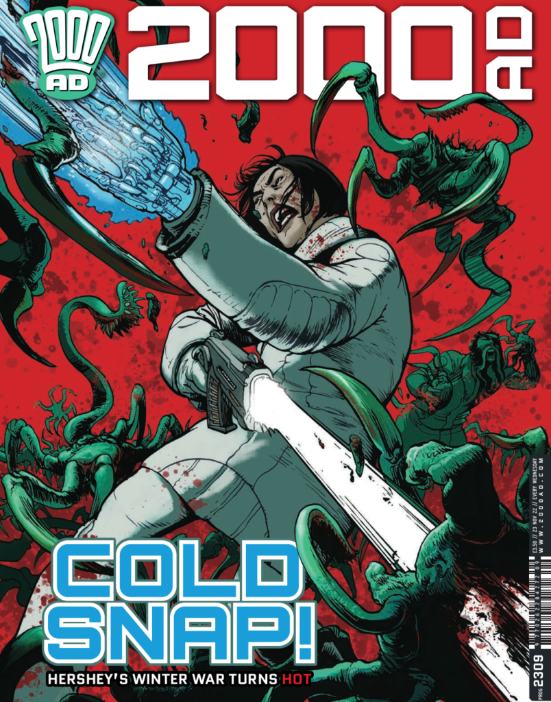
The first part of Hershey: The Cold in the Bones ends in this Prog, and Rob Williams and Simon Fraser have delivered eight episodes of chilling thrills down in Antarctic City, all culminating last Prog when Hershey and Frank discovered what the connection to Smiley and Enceladus was down here in the cold.

Yes, things are coming full circle for Hershey in her final mission to right the wrongs of Judge Smiley that were committed on her watch. But the microbial virus coursing through her body means that time is not on her side…
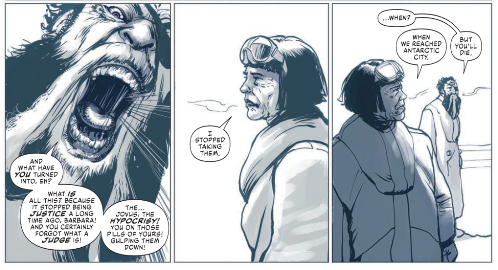
‘We’re ALL going to die, Frank.’
Hershey’s prepares for the worst in The Cold in the Bones episode 5, 2000 AD Prog 2308

Now, over to Simon to tell you all about putting together the cover to 2000 AD Prog 2309…

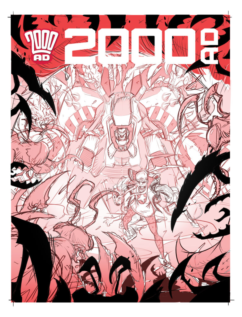
SIMON FRASER: So it’s unusual for me to get to do 2 covers on a story, so I wanted them to look very different. The first Hershey: The Cold In The Bones cover was very moody and quite still. I want this one to be as intense and action-packed as possible.

The scene where Frank & Hershey are attacked by the Enceladus Spider/Plants/Triffids seemed the obvious scene to choose.

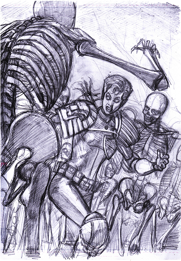
The thumbnail is very loose, drawn on the back of a script page…
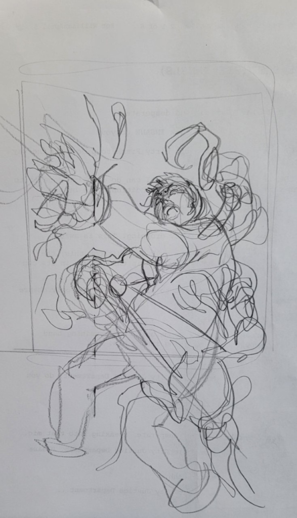
Thumbnail stage – ‘very loose’

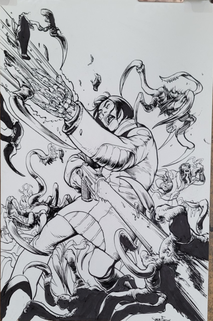
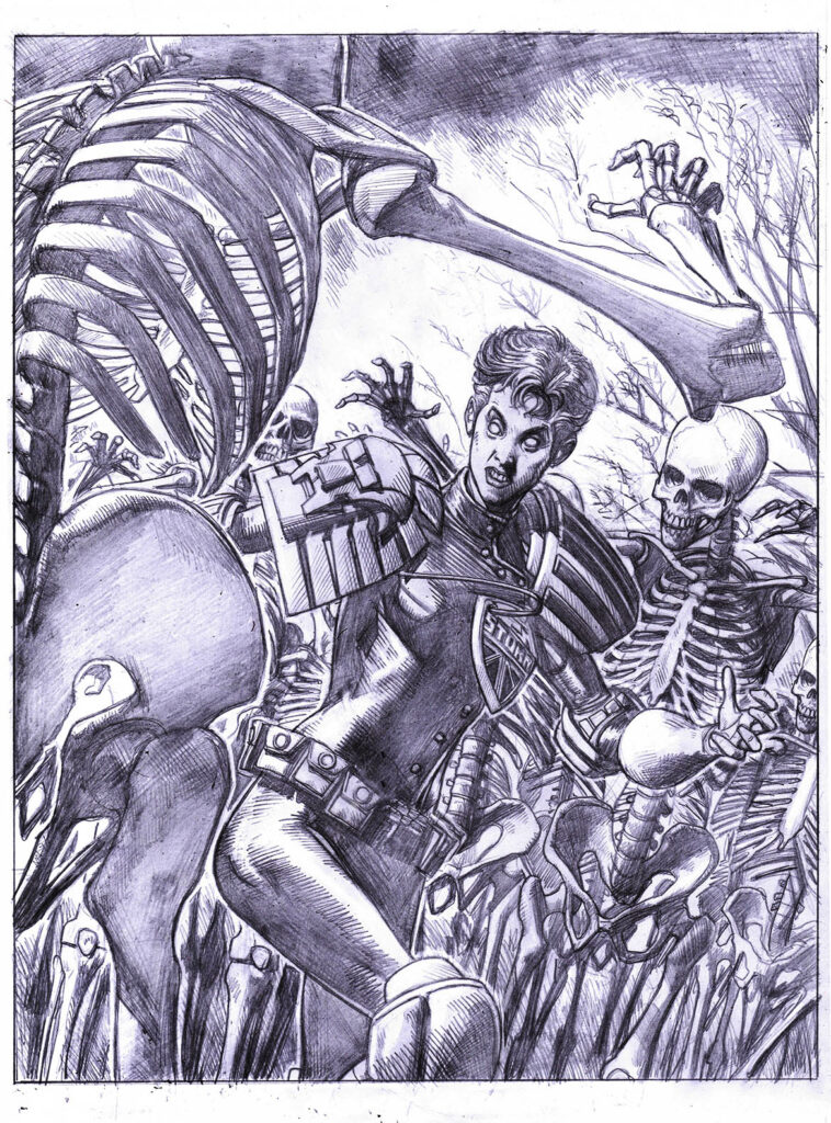
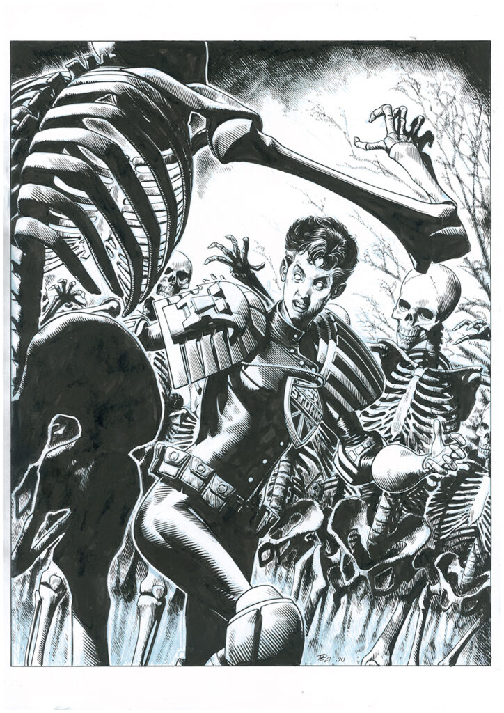
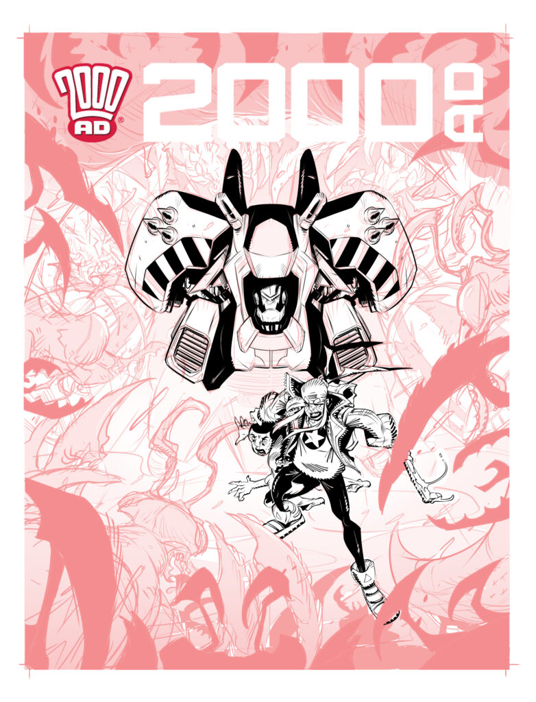
Then I worked it up into a pencil drawing on a sheet of Strathmore 300 series. Then, because I like to make my life more difficult, I thought it would be fun to actually ink this page, not digitally, but with actual ink and a G nib.

It’s been a while since I did this so I was rusty as hell. All the more reason to do it. I got so excited by this process that I forgot to send the pencil to Matt for approval before I started inking it.
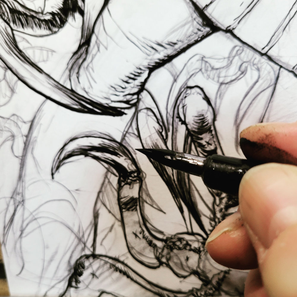
Inky fingers time…
‘Then, because I like to make my life more difficult, I thought it would be fun to actually ink this page,
not digitally, but with actual ink and a G nib.’
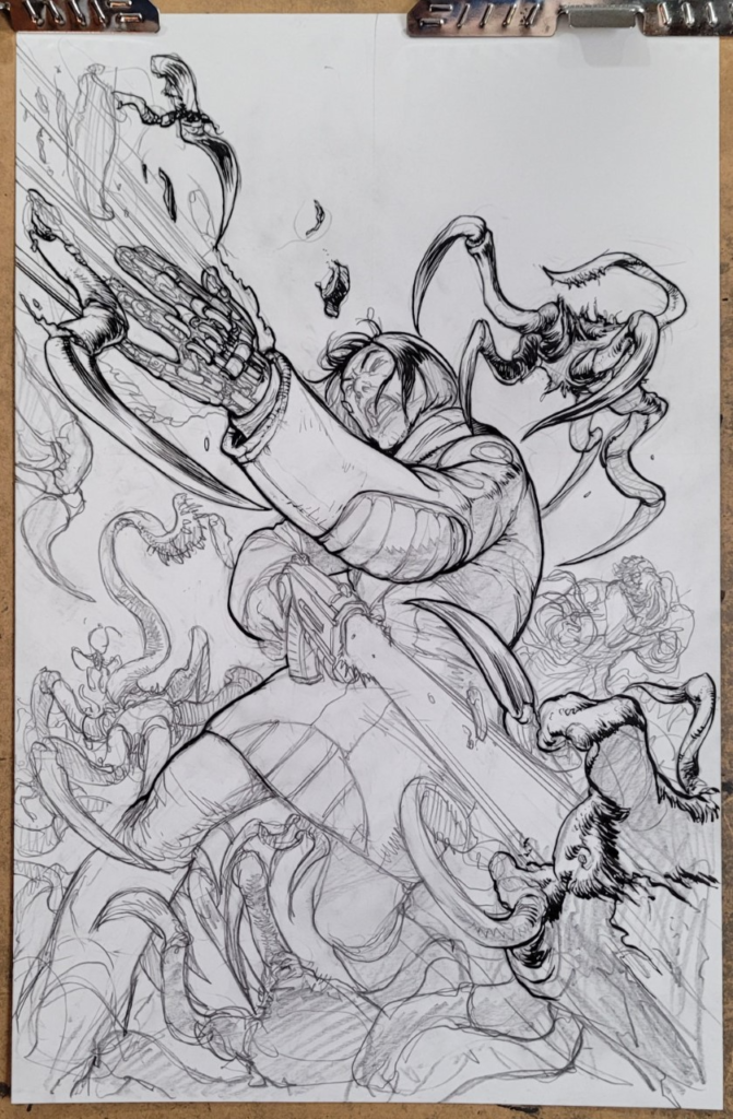
Inks over pencils – no inky fingers in shot this time
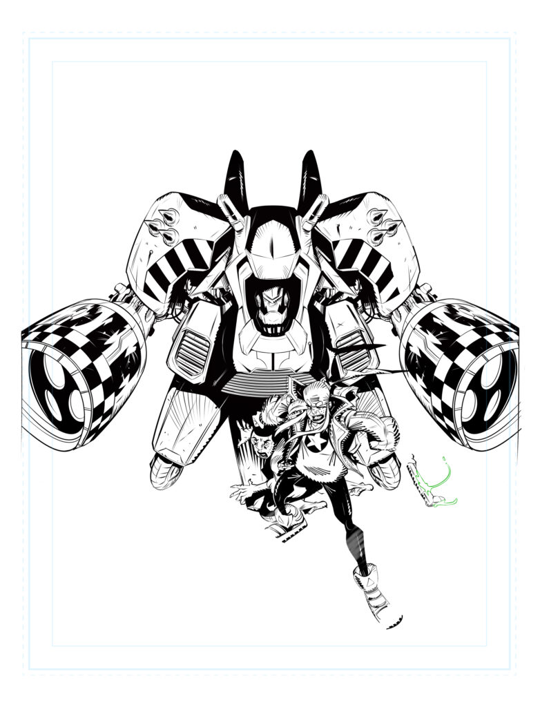
Final inks, all ready to be scanned – Now, where’s Simon’s scanner?

Now comes the problem. I have an A3 scanner, but I haven’t used it for 2 years. It’s in a stack of stuff and I don’t think I can be bothered to dig it out and then set it up and then chase random technical bugs all afternoon. So I took a picture of the page with my phone. Now I do this with my pencils normally, but never for a page of inks. The resolution and fidelity requirements are much higher for black & white linework. I won’t be inking over these lines in Clip Studio, these are the lines that will be printed.

For the record, my phone is a Galaxy Note20 5G and it did a spectacular job using just the daylight through my window. After a fairly minimal amount of level adjustment in Affinity Photo, the linework was scanned and looking pretty good.

(If anyone wants to buy a used A3 scanner, DM me )
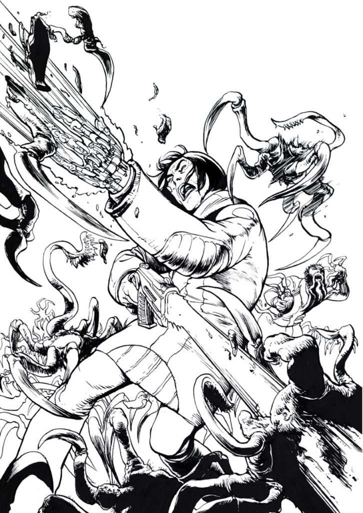
Scanned linework – isn’t it amazing what a phone can do these days?

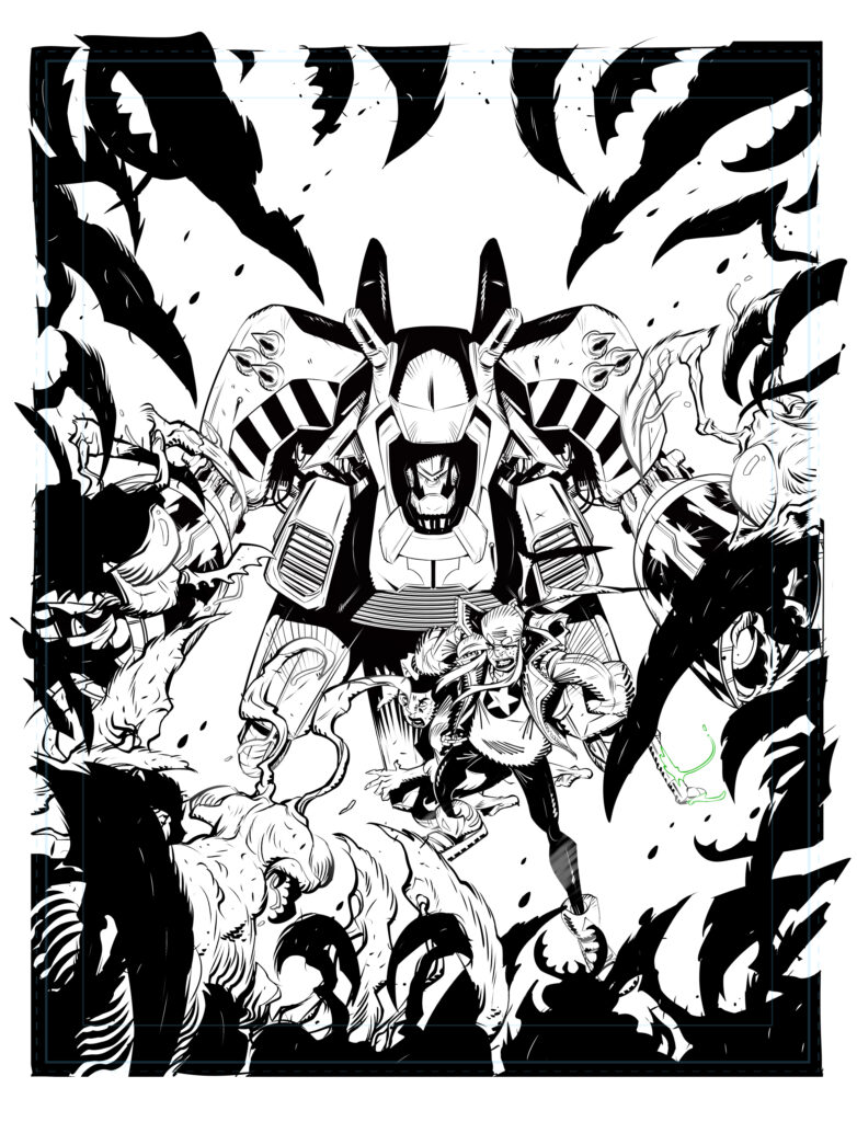
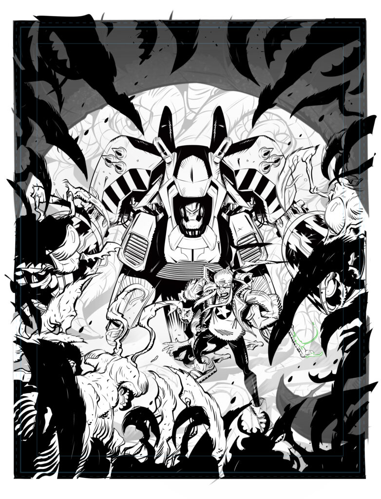
Now comes the tedious part, masking out all the major colour blocks. With some illustrations, I can have 20 different Alpha Channels masking out all the important areas. That lets me adjust colour and tonal relationships right up to the end. It’s very easy to get overworked and dull when you’ve been layering textures for hours, so being able to pop up the saturation or push it back is really useful.

In this case, I didn’t need many masks at all, but the major one was a very complex shape. The advantage of inking digitally is that all the black lines are clean and it’s easy to make clean and well-finished lines that respond well to the Magic Wand tool. This is a hand-inked page though, so there is a ton of random crap and ragged lines to deal with.

Masking takes a while.
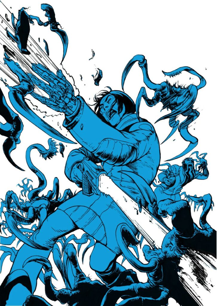
Adding colour masks to the scanned inks – complete with ‘a ton of random crap and ragged lines to deal with’

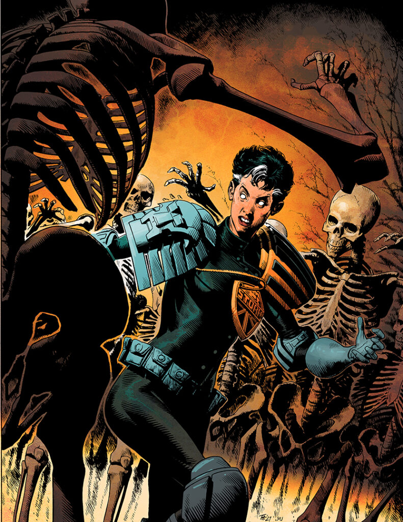
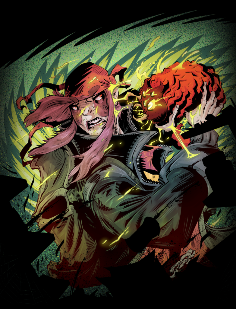
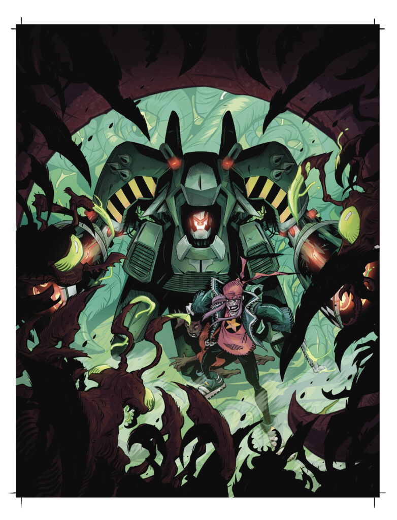
Because this is essentially one big shape, the depth of field is fairly short and I want the whole thing to pop as hard as it can, I’m choosing one of my very favourite colour relationships, Red & Green.

I want this cover to SCREAM, so I’m keeping it very simple. It’s also quite Christmassy, which is season appropriate.

I want the creatures to have a specific texture. I’ve got a set of texture brushes which I like to use for this. I also get very liberal with the splatter brushes because there are many fluids spraying around and all those particles and squirts add to the visceral energy of the piece.

(Yes, because nothing says Christmassy and seasonal like fluids spraying around and all those particles and squirts!)
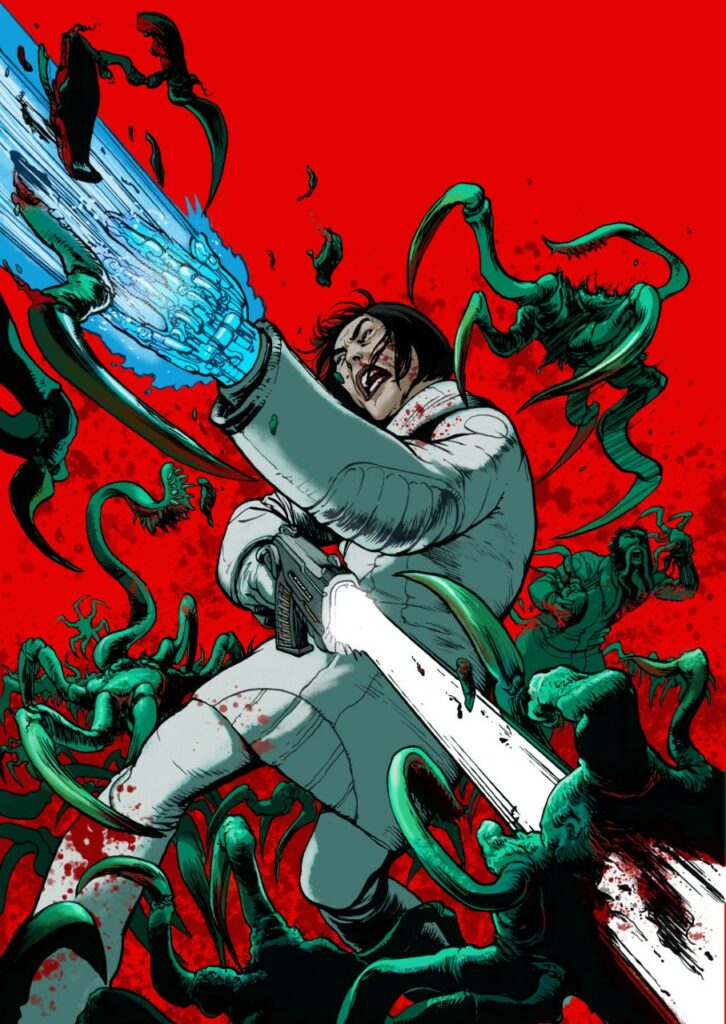
Yes Barbara, according to Simon… It’sssss Christmasssss!!!!!

So there you go, thanks so much for Simon to sending that one along – You can find 2000 AD Prog 2309 wherever you pick up your weekly dose of Ghafflebette comics, including the 2000 AD web shop. It’s out on 23 November.

And if you do fancy getting your hands on a nice A3 Scanner (providing Simon can dig it out from wherever it is), you can find get in touch with him through his website and Twitter.

For more Hershey, you can pick up the first in Hershey’s quest to make things right in the Disease collection. As for more of Rob and Simon talking about what they’re doing on Hershey, check out this interview with them, listen in to them on the 2000 AD Thrill-Cast and read Simon’s thoughts on creating his Hershey covers with 2000 AD Covers Uncovered – Prog 2176, Prog 2218 and Prog 2304.

Finally, be sure to subscribe to The Great Dante Readthrough podcast that Simon and his wife, Edie Nugent, are doing. It’s an excellent behind-the-scenes glimpse at one of 2000 AD’s greatest sagas – you can find that everywhere you get podcasts (AppleSpotifyPodbay, and others, including from Simon’s website.)

Posted on

2000 AD Covers Uncovered: PJ Holden, Chimpsky, John Woo… It’s All On Prog 2308’s Cover

Every week, 2000 AD brings you the galaxy’s greatest artwork and 2000 AD Covers Uncovered takes you behind-the-scenes with the headline artists responsible for our top cover art – join bloggers Richard Bruton and Pete Wells as they uncover the greatest covers from 2000 AD!

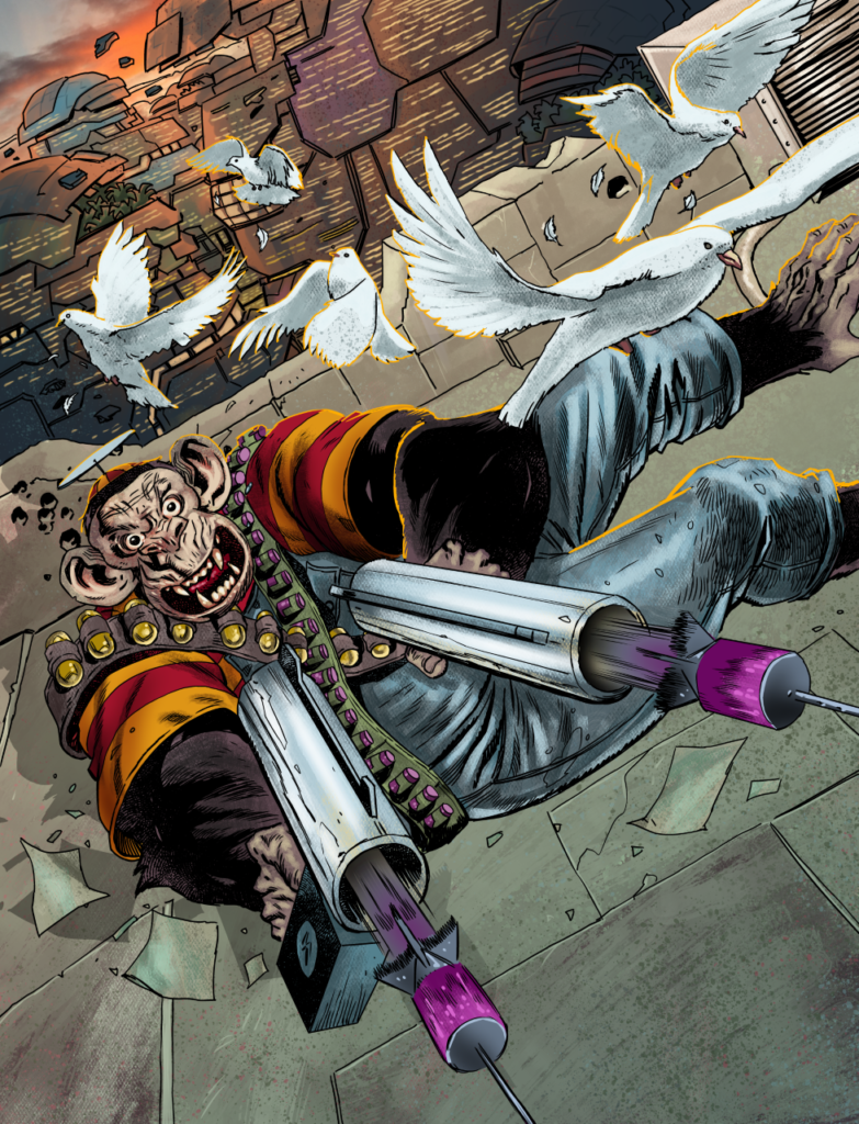
This week, it’s the return of that super simian, protector of Ludi Wittengenstein Block, the one and only Noam Chimpsky coming out fighting for the cover of 2000 AD Prog 2308 by PJ Holden.

Inside, it’s the penultimate episode of the latest Chimpsky’s Law: A Terrifically Disturbing Adventure by Ken Niemand and PJ Holden and on the cover it’s PJ getting his John Woo on and letting those doves pigeons fly!

So it’s over to PJ to tell you all about it…

PJ HOLDEN: OK, some behind-the-scenes scuttlebutt – I hadn’t got the script for this episode, so I knew as much as the readers knew – Chimpsky and Mr Grofaz are locked and loaded ready for BATTLE!

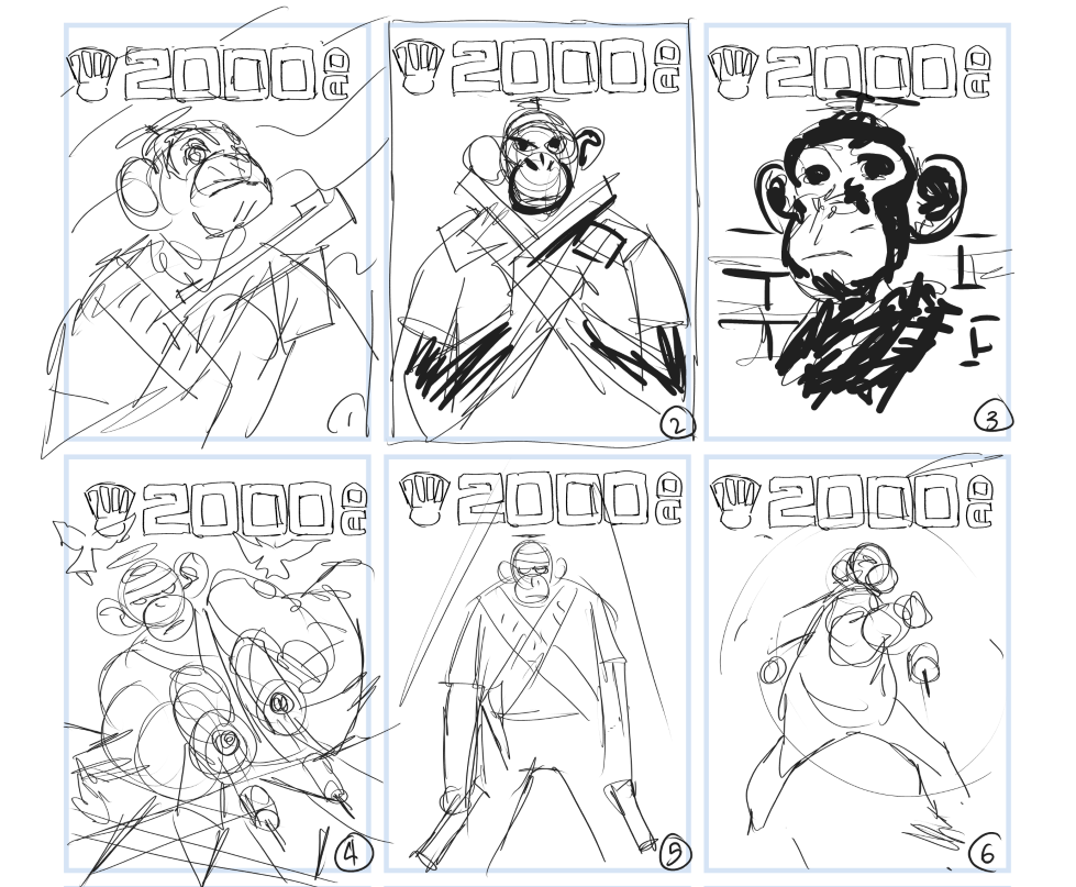
Matt asked for something with just Chimspky on it, all armed up, and I sat and panic-drew a few sketches – along with a note.

The 6 Chimpskys… PJ Holden’s panic-drawn concepts!

1) Chimpsky will save us all (maybe American flag behind him?)
2) Chimpsky – with guns or without (as a wanted poster? or just close-up of Chimpsky about to get into it…)
3) Chimspky spray-painted a la Banksy or Che Guevera pic – on the wall somewhere.
4) John Woo-impsky
5) Hard spotlight on the lean, mean, ape-machine
6) Turning and firing his dart gun (sort of bond like? a spotlight lighting a circle around him)
I favour one, but happy for any of them or if there’s nothing here you like I’ll have another pass!


As it turned out, Matt favoured number 4 (the obviously most action-packed one) – and so I set to work.

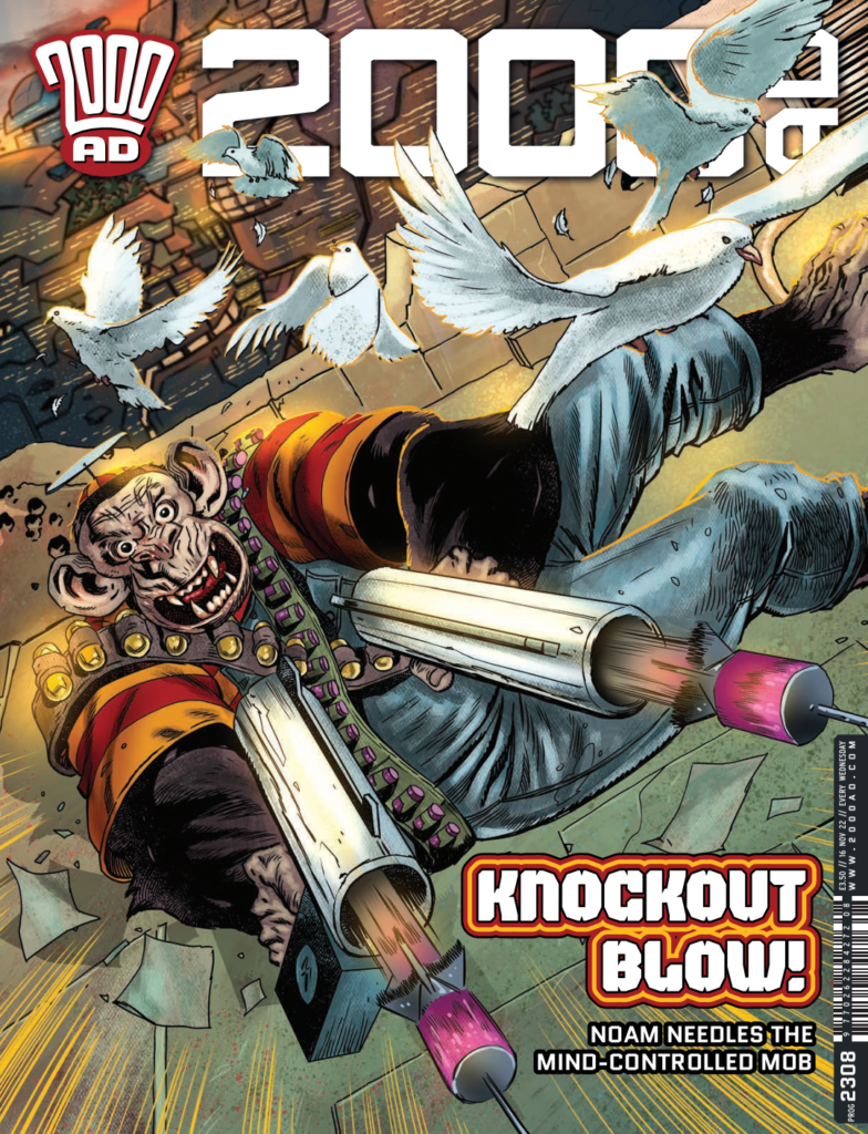
The idea of number 4 did make me laugh, pigeons flying off, Chimpsky – two guns in hand – firing darts as he dives through the air (with the clunkiest looking dart gun that ever existed – in my head this thing takes small cartridges of some kind that contains dart in very compressed form, and when it fires the explosive force of it – pumped by the battery sitting where a magazine would sit – forces the container out of the side (which like an idiot I forgot to draw here) and then the dart flies out.)
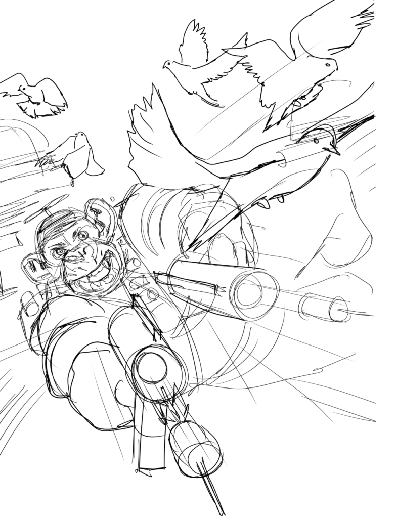
Getting that thumbnail roughed out

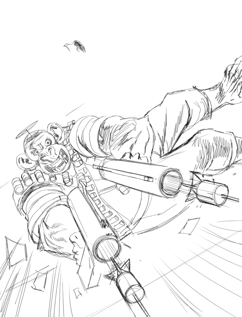
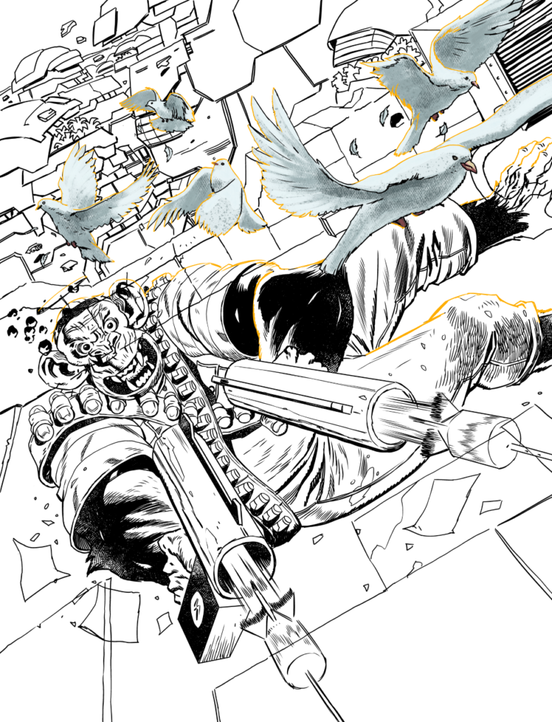
My process is boringly uncomplicated, this was all done in Clip Studio Pro EX (from thumbs to finished colours) – I blow up the thumbnail to full size, then do a quick pencil sketch of it enlarged, maybe move things around then pencil it much tighter and then ink.
Tight pencils stage to bring out the snarl in our hero
Brilliant idea PJ – work on it all in layers… here it’s those John Woo doves getting the treatment
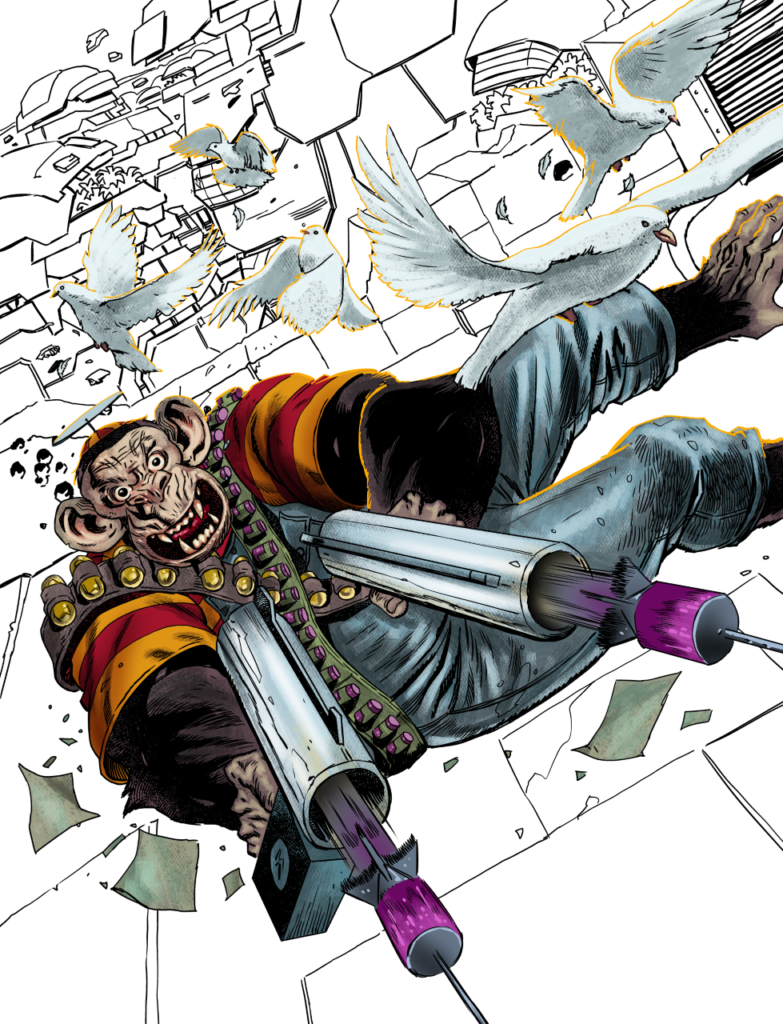
More layers, more Chimpsky, more colours…

Like a fool I decided since there were so few elements to this, it might be useful for production if I did everything in layers, so we could drop Chimpsky into his own or put text behind him, so I spent ages isolating each element and then … forgot to send the layers – they got the flat file.

So well done, me. No extra oil rations for you PJ.

When I got the script for the next issue, luckily, I could shoehorn the doves in to the scene, so it at least feels part and parcel! Anyway, that’s it!

And the final cover you’ll see on the stands – full-on Chimpsky action with a dash of Woo!

So there you go, thanks so much PJ for sending that one along – You can find 2000 AD Prog 2308 wherever you pick up your weekly dose of Ghafflebette comics, including the 2000 AD web shop from 16 November.

For more from the Holden Droid – take a look at his previous Covers Uncovered work, complete with the previous exploits of Chimpsky – Prog 2178, Prog 2234, and Prog 2301. Or there’s his Dredd covers – the homage to King Carlos Ezquerra with Prog 2221 and the cover of Judge Dredd Megazine 420. And if you want to hear what PJ has to say, first there’s a great interview with him about this latest Chimpsky adventure here, and then there’s a couple of interviews about his Department K series here and here.

Posted on

2000 AD Covers Uncovered – Tom Foster’s Storm Warning, Dead & Gone For Megazine 450

Every week, 2000 AD brings you the galaxy’s greatest artwork and 2000 AD Covers Uncovered takes you behind-the-scenes with the headline artists responsible for our top cover art – join bloggers Richard Bruton and Pete Wells as they uncover the greatest covers from 2000 AD!

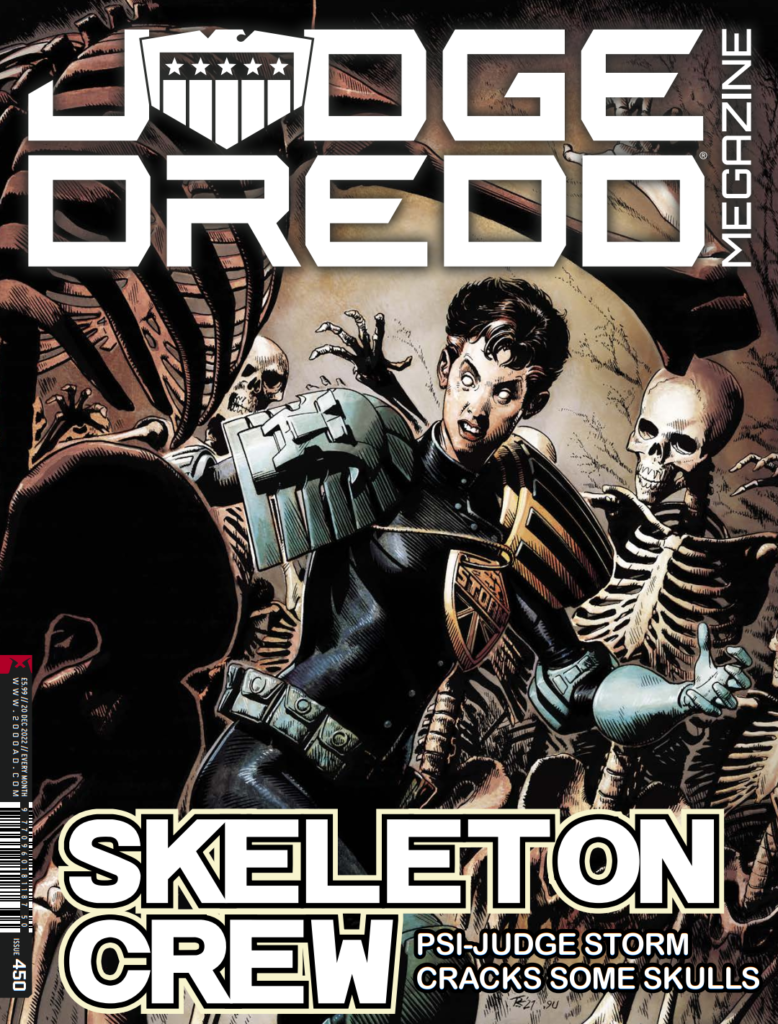
It’s Judge Dredd Megazine time, with the scrotnig issue 450 out on 16 November. It’s packed with all the thrill power of course, all wrapped up in a stunning Storm Warning cover from Tom Foster.

The new Storm Warning storyline, Dead & Gone, began in Megazine issue 449, with new series artist Clint Langley joining co-creator John Reppion for this one. Tom’s not providing the art this time round for the strip he co-created with Leah Moore and John Reppion, but it’s great to have him back for the cover!

Tom started at 2000 AD with his 2000 AD Art Portfolio Competition at Thought Bubble 2013. From his first strip, Prog 1886’s Tharg’s Terror Tale: Done Deal (with Alec Worley), through to the Judge Dredd stories A Penitent Man and An Honest Man (with Ken Niemand) his distinctive, classical style has been a huge hit with everyone.

Now, without further ado, for your reading pleasure… Tom Foster

TOM FOSTER: Well, I asked to do the cover so that I could retain a connection to the series but the reason I didn’t do the interior art this time is that, when the prospect first came up of doing this one, I had already agreed with Kenneth Niemand to do the Dredd arc ‘An Honest Man’ and didn’t want to get started on a multi-part series in case in case they ended up conflicting. Also, I still sort of associate Storm Warning with the panic of working on that first series of it. There was so much at stake at that point – I was constantly pulling my hair out to try and turn in high quality work, with very little experience. It was VERY stressful, and I was ill for months after I finished it. 

Then the second series was when I abandoned the 3-D models as the basis for my drawings. Halfway through the run, I decided they were too restricting, too time-consuming, way less fun, producing mediocre results and that my drawing ability was stagnating. So, I started drawing everything from scratch. This, again, was a source of a lot of stress as I was trying to produce work that had the same level of accuracy and dimension, but without the solid foundation I’d been using for years. Thankfully, Tharg was very encouraging – and I think the best work I did on that series was in the later chapters.

I still have a lot of affection for Storm Warning though – I don’t feel like I’ve moved away from it permanently. After all, this isn’t the first time someone else has taken over art duties on it. It’s been nice, though, to work on other things and to see different artists interpret the character. Hopefully, I can come back to it at some point with fresh eyes and a better-developed set of skills and not have it feel quite so much like a water buffalo sitting on my windpipe.

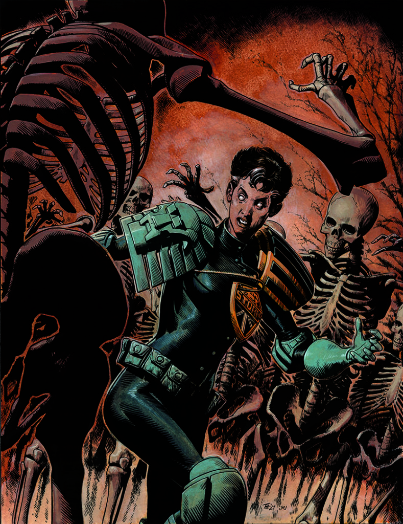
Anyway, this cover is an unusual one for a couple of reasons. Firstly, because it’s probably the longest gap I’ve had between finishing something and it coming out in print (I did this one in summer of 2021), but also because I used a process for the colours that I had never used before.

Join me, won’t you? And we can explore that process together.

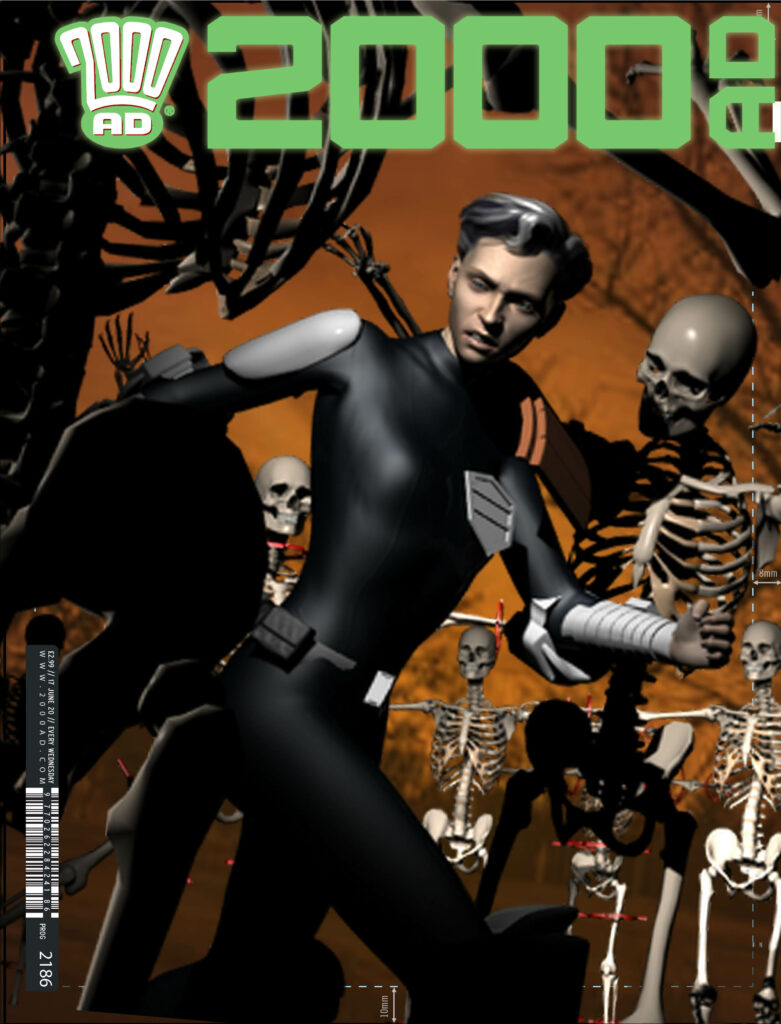
Step 1 for Tom – the 3-D render he uses as his rough

Step 1: Covers allow me that bit longer to focus on a single image, so I tend to use a lot more reference for them than on my pages. Since I know I’ll likely be making a 3-D render anyway, for reference purposes, I usually use that as my pitch. It’s relatively quick to do and it gives a pretty comprehensive idea of what I’m going for with the finished art.

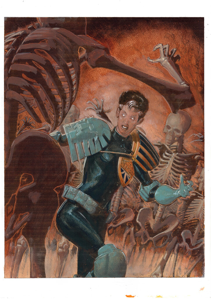
I already had a Judge Storm model from the days when I was starting everything in Daz Studio, and I had a skeleton model downloaded too, so this was a very straightforward process. The background trees and colour were added in Photoshop.

As this was my first Megazine cover, I didn’t have a template for the cover dress handy at this stage, so had to use the Prog one. But Tharg is infinitely benign and sent me a Meg template, which I used for all the subsequent stages.

Step 2, the sketch – back to physical media after the computer render

Step 2: With the cover design approved, I then proceeded to my initial sketch. I’m not used to drawing detailed skeletons, so the reference was invaluable here and at the pencil stage.

For those wondering why I would bother to start drawing from scratch when I’ve already got a detailed prelim in the 3-D render, the answer might seem a bit flimsy, but is actually pretty important: 2-D images are designed differently to 3-D captures and photography.

When you actually draw an image from scratch, you make design decisions (often very small ones) with every line you draw that are unique to that one composition. Whereas, when you capture something from a 3-D source, you are always getting a sort of imperfect realisation of a two-dimensional idea. There are artists, like Mike Deodato Jr., who are very good at compensating for this with excellent composition and complementary hand-drawn details, but I find I have the most freedom of choice when I build a drawing from the ground up.

Step 3 – pencils

Step 3: From here it’s on to finished pencils. This was a fairly straightforward transition, as I had so many of the details available in the reference and a lot of the heavy lifting was done in the composition, so it was more-or-less just a case of cleaning things up.

Step 4 – adding the inks

Step 4: Inks next and, thanks to a fairly clean pencil drawing, this was one of my less fraught inking sessions.

Step 5 – on with the colours – this is the colour rough Tom did to get an idea of palettes

Step 5: Here’s where it starts to get a bit odd. I knew I wanted an earthy, textured look to the colours and I had been experimenting with painting during my run of covers for Commando, so wanted to try doing my colours with traditional materials.

However, I didn’t want to start slathering paint all over my original inks, in case I messed it up (also it’s nice to have original inks to sell on later). Neither did I want to swamp my nice crisp line drawing with semi-transparent materials and get less sharp results.

So, I decided to get my inks printed onto acetate and heavy paper stock and paint over the latter, while using the former as an overlay to make sure everything stayed nice and inside-the-lines. Then I’d composite a bitmap of the inks over the painted colours in Photoshop and get nice clean lines with lovely textured colours underneath. That was the theory anyway.

Before I started painting though, I wanted to get some idea of my palette, so I did a rough colour job in Photoshop – knowing that I could then use the colour flats later to aid with any retouching that might need done after the painting stage.

Step 6 – painted colour layer

Step 6: Then I got my acetate printed at a print shop and printed out my line art at home on thick, toothy paper. Using a combination of watercolours and gouache, I painted my colours over the paper printout. This turned out a little better than I expected and I began to think I could have just committed to doing a full painting – but, with the line art already done and the clock ticking, it seemed more sensible to see this process through and confine this stage to colour and texture information, rather than trying to work in any delineating details. (This is the painted colour without the acetate overlay.)

Step 7 – scanned colours compositied with the line art

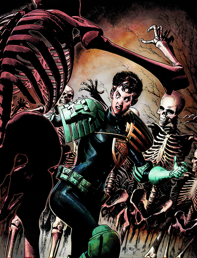
Step 7: I then scanned the colours and composited them with the line art in Photoshop. They looked a little dull, but the groundwork was there.

And the final step, step 8, fine-tuning it all!

Step 8: Finally, I set about fine-tuning the colours to create a greater sense of depth and boost the contrast a bit.

On the whole, I think it worked quite nicely – but, after a second attempt at the same process on my Karl the Viking cover (which required far more rescuing in Photoshop) and a comparison with my all-digital colours on my cover for Prog 2281, I’m not sure the palaver with the acetate really merits a reprise. Still, I now have one more physical piece to sell than I otherwise would – and it did give me a bit more confidence in my painting – so I guess it was worth it. Unless you hate my painting – in which case you’re in for a horrible surprise with Prog 2310.

And that’s yer lot! Thanks as always to Tom for taking the time. You can find his excellent Lillian Storm cover to Megazine issue 450 wherever you pick up your weekly dose of Ghafflebette comics, including the 2000 AD web shop from 16 November.

For more from Tom here at 2000AD.com, check out his Covers Uncovered features for 2000 AD Progs 1986, 2225, and 2281. He talks about winning the 2013 Thought Bubble talent search here and the Judge Dredd: A Penitent Man strip here.

You can hear him talk on the 2000 AD Thrill-Cast Lockdown Tapes here. And finally, there’s his ridiculously funny From The Drawing Board video here – the one that basically meant the other art droids stopped doing them as none of them could match Tom’s delivery!

Posted on

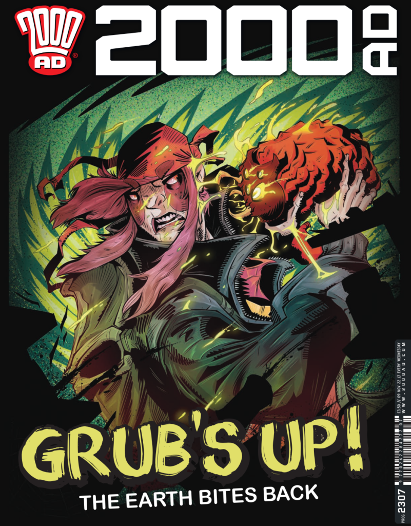
2000 AD Covers Uncovered – Luke Horsman on Prog 2307 & the mutated monstrosities of Enemy Earth…

Every week, 2000 AD brings you the galaxy’s greatest artwork and 2000 AD Covers Uncovered takes you behind-the-scenes with the headline artists responsible for our top cover art – join bloggers Richard Bruton and Pete Wells as they uncover the greatest covers from 2000 AD!

This week, we have the second Prog cover from art droid Luke Horsman, another visit to the post-apocalyptic world of Enemy Earth, where the hideously mutated flora and fauna of the world have risen up against humanity, and the few people who remain are left to try to survive as everything, animal and plant, attempts to kill them.

Being the incredibly busy art Droid that he is, Luke’s currently hard at work for Tharg –and you know what Tharg’s like, no work, no vital sustenance – so he only had chance to send across the process artwork for his Enemy Earth cover.

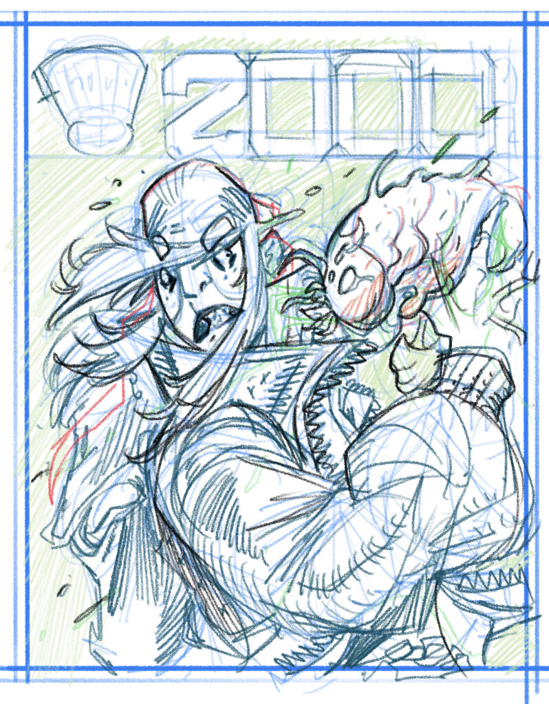
Everything starts with a rough thumbnail based on Tharg’s particular instructions, this time all coming from a moment in the episode from this Prog’s Enemy Earth, where our hero Zoe finds herself fighting off a mutated gruesome grub or carnivorous caterpillar thingy…

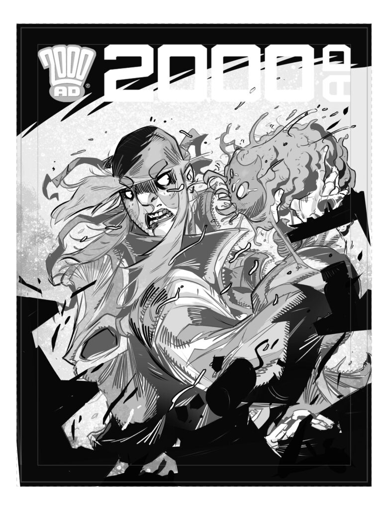
After that, it’s over to the computer and working digitally, recreating the roughs on the cover template to make sure everything fits nicely…

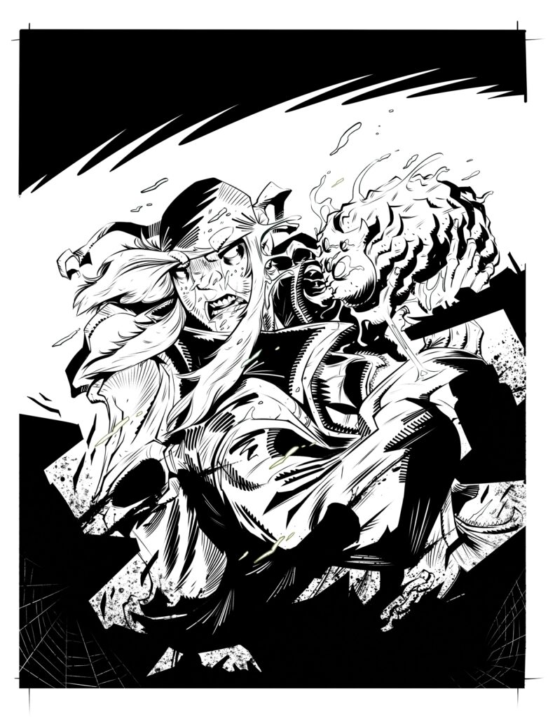
After that, it’s on to the inks for the cover image…

And finally, time to finish it all off by adding the colours…

And there you have it, Luke Horsman’s cover from roughs to the finished piece that you’ll be looking for on the shelves of wherever you get your weekly dose of Thrill Power, including the 2000 AD web shop. You can find 2000 AD Prog 2307 from 9 November. And thanks so much to Luke for taking the time to sentenced over his process images. Hopefully Tharg wasn’t too annoyed at him slacking off for a couple of minutes. The last thing the newer art droids want is to get on his bad side!

Enemy Earth, written by Cavan Scott and drawn by Luke, began in 2000 AD Regened Prog 2256 and continued with this first full series starting in Prog 2301. You can read all about it from Cavan and Luke in two interviews, here and here. And you can see more of Luke’s cover process work with his Covers Uncovered piece for Prog 2303 here.

Posted on

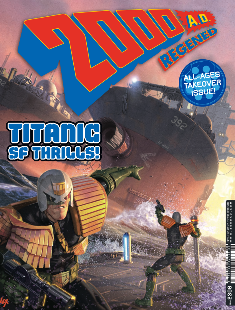
2000 AD Covers Uncovered – Cadet Dredd’s Black Atlantic Beauty by Alex Ronald for Regened Prog 2306

Every week, 2000 AD brings you the galaxy’s greatest artwork and 2000 AD Covers Uncovered takes you behind-the-scenes with the headline artists responsible for our top cover art – join bloggers Richard Bruton and Pete Wells as they uncover the greatest covers from 2000 AD!

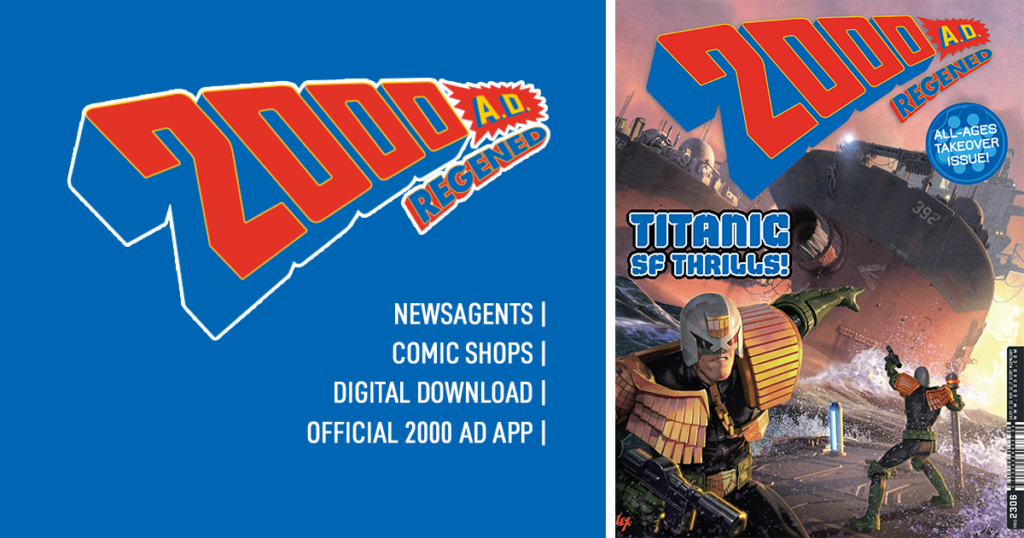
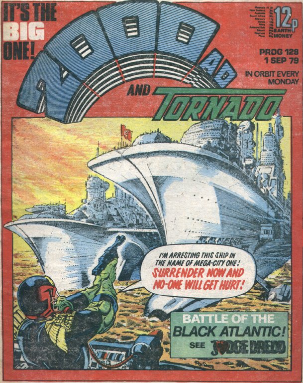
This week it’s the return of 2000 AD Regened, where art droid Alex Ronald harks back to the days of Ron Smith’s classic Black Atlantic cover from 1979 for the new Regened Prog 2306 – out on 2 November from wherever you get your Thrill Power hit for the week!

Inside this week’s Regened Prog this time round, there’s a titanic Cadet Dredd, the latest catch-up with both Future Shocks and our young Marlon Shakespeare in Chopper. Plus there’s our very first look at the maniac-for-hire Ulysses Sweet in Psychobaby, and the pilot episode of a brand-new sports sci-fi drama thriller in Bladers. Oh yes, Tharg’ nephew does it again, bringing all-ages thrills to everyone!

And on front of it all, showing us the goings-on down at the MC-1 docks in the Cadet Dredd: Undertow tale by Paul Starkey, Silvia Califano, and Gary Welsh, we have Alex Ronald‘s cover… it’s a bit good!

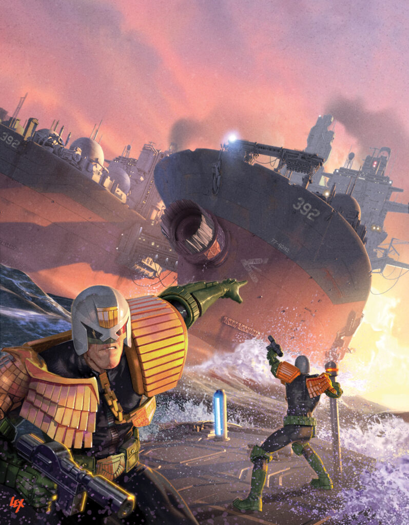
ALEX RONALD: Matt had asked for a Regened cover which would be in keeping with the classic Ron Smith Black Atlantic cover from 1979.

Oh yes, that would be this classic Ron Smith cover from 2000 AD Prog 128, 43 years old and still looking incredible…

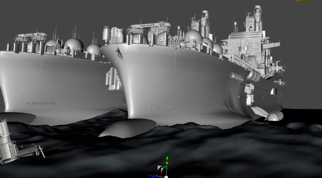
ALEX RONALD: In this scenario the catamaran ship would be a more industrialised tanker rather than ocean-going liner depicted in the original.

To create the ship I kit-bashed and custom-built the parts necessary to create this massive tanker. As you can see from the 3D scene, the scale difference in relation to the two 6ft human figures was absolutely massive.

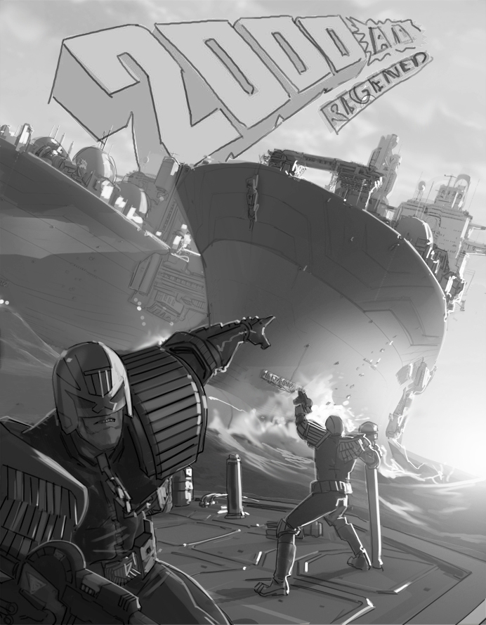
Once the main characters were in place, I positioned the ship and set up the camera for the best possible angle allowing for the large retro 2000ad logo at the top.

A rough sketch over of the composition was approved then it was onto painting the scene with a fiery sunset sky. I hope you like it.

I did make the schoolboy error of using the modern gun…

A quick mail from Matt reminded me it should be classic era Lawgiver. No problem, a great chance to do the Carlos style gun.

It was a treat to reimagine one of Ron Smith’s stand out covers from the early Progs. I might be wrong but this was possibly our first exposure to the Sov Judges. What a part they were to play in the years to come.

And that’s it! Another cracking cover from the Ronald droid right there. Thanks so much to Alex for sending that one along. You can find 2000 AD Regened Prog 2306 wherever you pick up your weekly dose of Ghafflebette comics, including the 2000 AD web shop from right now – today.

Posted on

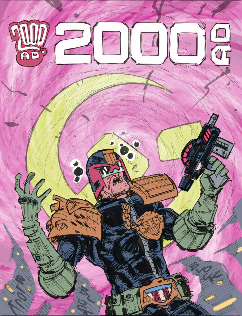
2000 AD Covers Uncovered – Boo Cook’s Sov Psi-Storm for Prog 2305

Every week, 2000 AD brings you the galaxy’s greatest artwork and 2000 AD Covers Uncovered takes you behind-the-scenes with the headline artists responsible for our top cover art – join bloggers Richard Bruton and Pete Wells as they uncover the greatest covers from 2000 AD!

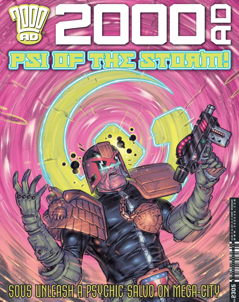
This week, Dredd’s in a right psi-storm thanks to art droid Boo Cook covering 2000 AD Prog 2305 – out wherever you get your Thrill Power on 26 October.

Boo’s cover is for the current Dredd storyline by Rob Williams and Henry Flint Buratino Must Die, 6-episodes of Dredd and Mega-City One facing down the Sov Psi-Division who’ve come looking for Sov Psi-Div Judges Buratino and Isaaks after the issues of End Of Days.

BOO COOK: Well, not a massive amount to say about this one as it was pretty straightforward…

First up, getting asked to do a Dredd cover is always an occasion to do my special dance and I suspect it always will be. Sometimes the cover may require Dredd not being too upfront or obscured by some weird thingy but as an artist it’s always lovely to have a cover brief where Dredd is upfront and in your face.

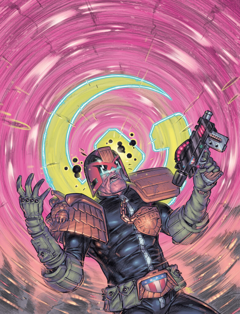
I think Tharg’s brief was very simple for this one, something like “Dredd reacting to a massive PSI blast in the sky behind him” – music to my ears! I think the only addition to that was when I asked if there was anything specific that needed to be in the blast and he suggested the Sov’s hammer and sickle emblem.

I was provided with some gorgeous refs from the story by the eternally incredible Henry Flint where the psi-blast seemed to be largely some kind of pink cyclone so I just went with that, adding a few ghostly tortured faces into the swirl… I noticed Dredd’s nose was bleeding and I loved how Henry’s city blocks were also warping into the blast so I factored all that in as well.

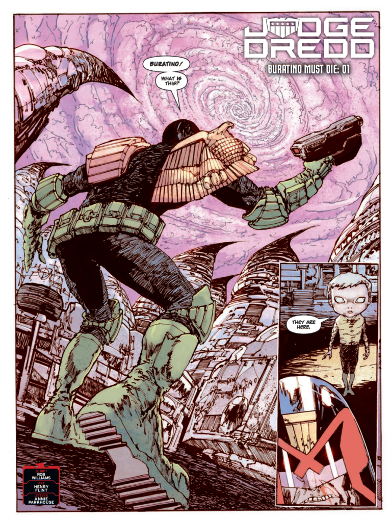
This would be the visual referfence Boo’s refering to – Henry Flint’s opening page for Judge Dredd: Buratino Must Die –

Henry Flint art from Burantino Must Die pt 1 – 2000 AD Prog 2303

.

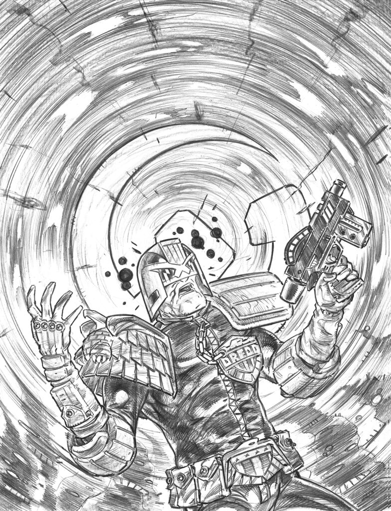
BC: In my mind there was only really one angle I wanted to go with on this so I just provided Tharg with an ink rough which I coloured in Photoshop to give myself an idea of the colour balances I’d be dealing with, he approved it (thankfully) and then it was off to graphite land for some heavy penciling…

Boo Cook’s coloured ink rough for Tharg’s approval
… and then for some of Boo’s heavy pencilling

>

BC: I seem to be mostly enjoying the pencil/photoshop approach these days so I went with that. The only changes I made from the rough were a few tweaks to the anatomy plus making the hammer and sickle a little smaller so that less of it was obscured by the Chinster himself and easily recognisable as the Sov emblem.

Then all that was required was to enter a psychedelic pink mind vortex for a few days until the colouring was done. 

The pressure is always gonna be on a bit with a Dredd cover but I really enjoyed this one, it really felt great to be back!

And Boo’s final worked-up cover, Dredd right in the middle of that Sov psi-storm

>

And that’s it! Thanks so much to Boo Cook for sending that one along.

You can find Boo’s brilliant Dredd cover on 2000 AD Prog 2305 wherever you pick up your weekly dose of Ghafflebette comics, including the 2000 AD web shop – it’s out on 26 October.

Posted on

Covers Uncovered: Simon Fraser feels the Cold in the Bones for Prog 2304…

Every week, 2000 AD brings you the galaxy’s greatest artwork and 2000 AD Covers Uncovered takes you behind-the-scenes with the headline artists responsible for our top cover art – join bloggers Richard Bruton and Pete Wells as they uncover the greatest covers from 2000 AD!

This week, we have Simon Fraser, artist on Hershey: The Cold In The Bones, currently running in the Prog, as written by Rob Williams and featuring ex-Chief Judge Barbara Hershey as she tracks down all of the fallout from Judge Smiley’s clandestine operations that have poisoned her reign. She’s dying from a microbial virus, she’s faked her own death, yet she’s still fighting to get Justice down in Antarctic City…

Now, over to Simon to give you the skinny…

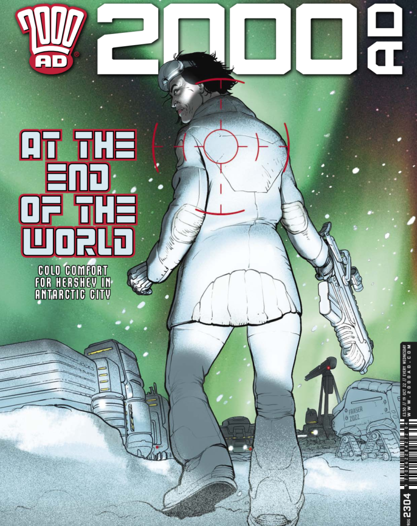
SIMON FRASER: Okay, so Matt (Tharg) wanted a cover. He was typically terse… something with Hershey in the snow.

I wanted to do something with her looking impressive and heroic, because she isn’t getting many heroic moments in this story.

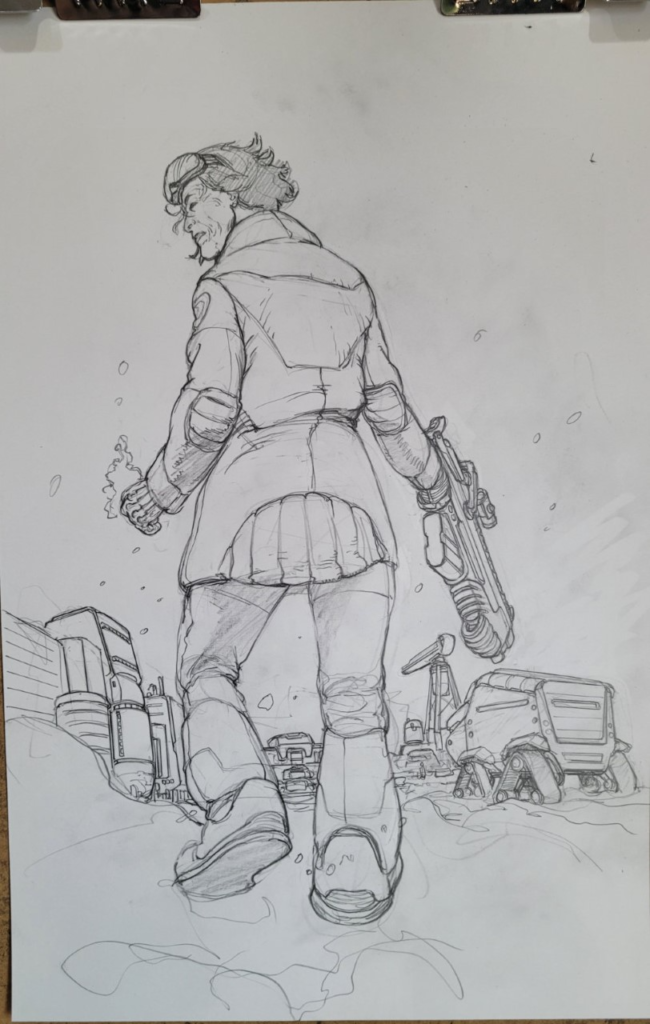
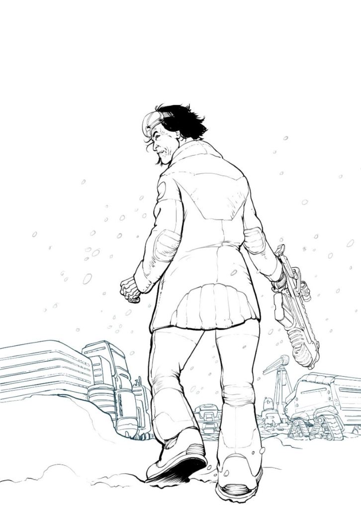
I tried out a classic low angle from the back shot of her walking through the snow. She’s bulky because of the winterwear and I wanted to get the solid physicality of her, confident and powerful looking.

It came out nicely  and I added a gun to help with all the implied danger. I photographed the drawing with my phone

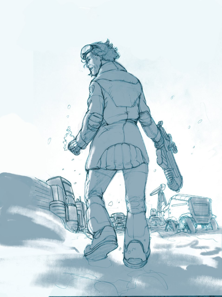
SF: Next, some basic toning…

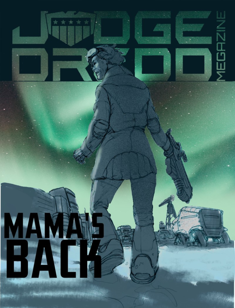
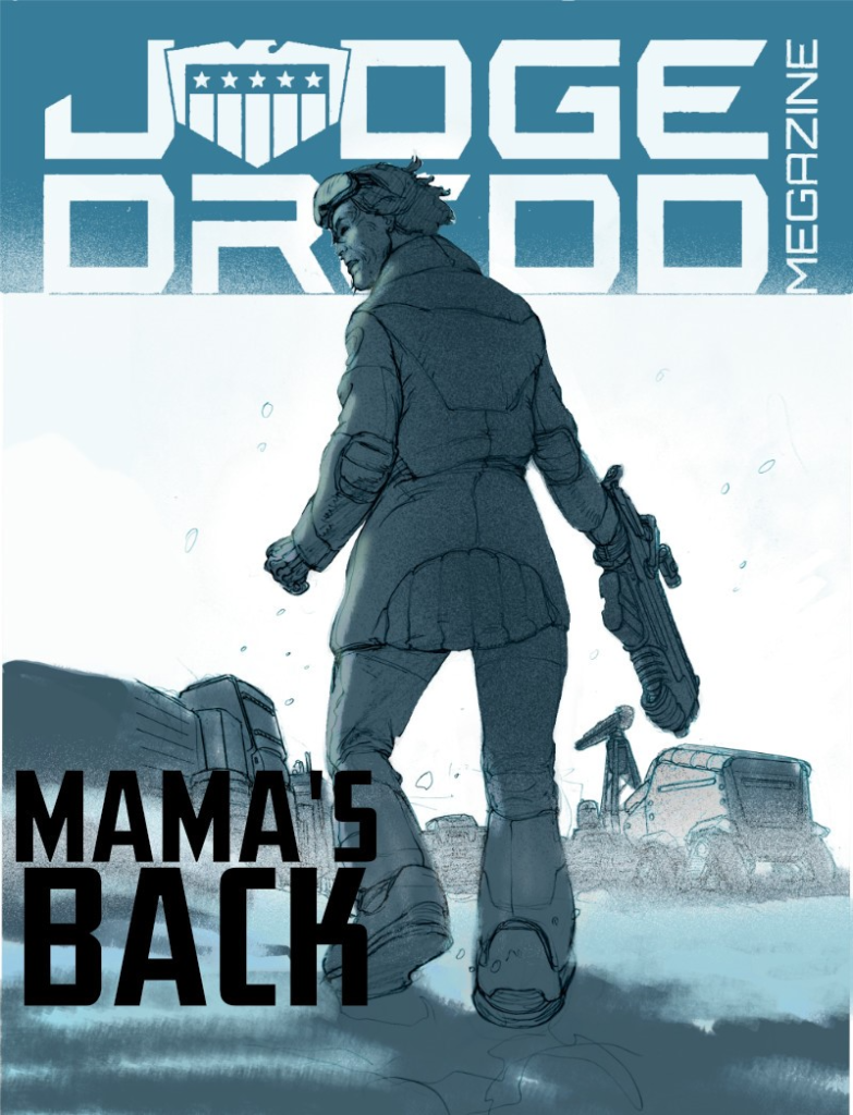
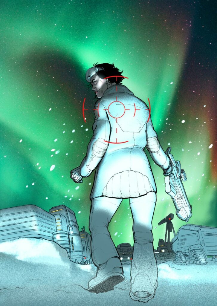
SF: Then I worked up 2 different treatments, one light with her contrasted against the snow, the other dark with the Aurora Australis.

The white cover has a clear graphic punch, but the aurora one has more colour.

Don’t ask me why I used the Megazine logo, that was a total brainfart.

SF: I sent the 2 versions to Matt and he went for the colourful and dark one.

I then started working in earnest. I inked up the linework in ClipStudio…

SF: And then did a version of the dark cover (colouring in Affinity Photo), but it wasn’t working. It was coming out too dark and the focus of the page (her face) was too high. I should really have realised this earlier, but often you get quite far down the line before you notice any obvious problems. It helps to get a second set of eyes on this, so I showed my wife and she agreed.

I then had the idea of shining headlights at her, as if she’s standing in front of a car. That popped her nicely and gave me a very intense, low lightsource. That makes everything more dramatic because I can cast shadows over her face. The page focus is still off though.

Then I do a cheap trick and put a gun-sight on her back right at the focal point of the page...

Bingo, it all works now! 

This is now one of those covers that shows a scene that doesn’t happen in the story. Those used to annoy me, but I understand how they happen now.

Covers have their own needs.

Yep, covers have their own needs – but hey, the artist tells their truth and the artist makes it work. And in this case, Simon’s made it work so well

So there you go, thanks so much for Simon to sending that one along – You can find 2000 AD Prog 2304 wherever you pick up your weekly dose of Ghafflebette comics, including the 2000 AD web shop from right now – today. Run, don’t walk, to wherever you get your Thrill Power and grab the Galaxy’s Greatest right now!

Posted on

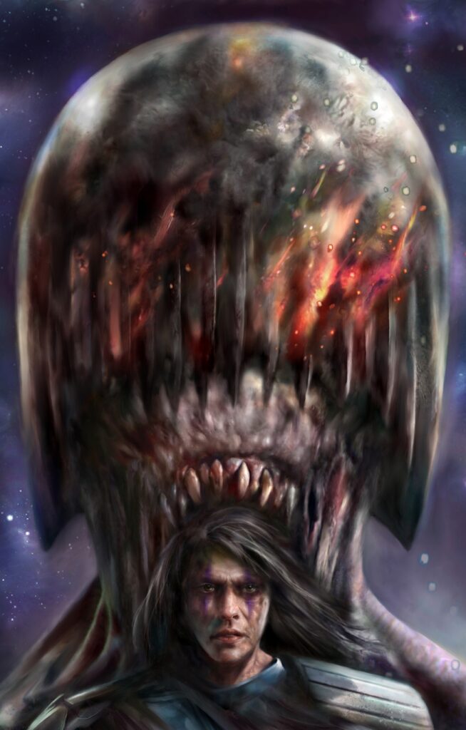
2000 AD Covers Uncovered: Nick Percival Visits The Death Metal Planet…

Every week, 2000 AD brings you the galaxy’s greatest artwork and 2000 AD Covers Uncovered takes you behind-the-scenes with the headline artists responsible for our top cover art – join bloggers Richard Bruton and Pete Wells as they uncover the greatest covers from 2000 AD!

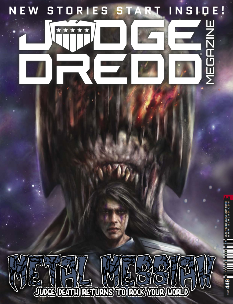
This month, celebrating back-to-back covers on the Judge Dredd Megazine, it’s that most fiendish of art droids – Nick Percival!

Not content with giving us Zombie Dredd last month with Megazine 448, he’sssss back on Megazine 449 to show us the beginning of the latest sssssaga for those Dark Judges as we see what Percival and writer David Hine have in store for us with Death Metal Planet – beginning right here in Megazine 449 – out on 19 October!

So, without further ado… here’sssss Nick…

NICK PERCIVAL: I’m baaaaack. Yep, after last month’s Zombie Dredd cover it’s time to unleash the full wraparound cover artwork for the new Dark Judges ten-part epic, Death Metal Planet.

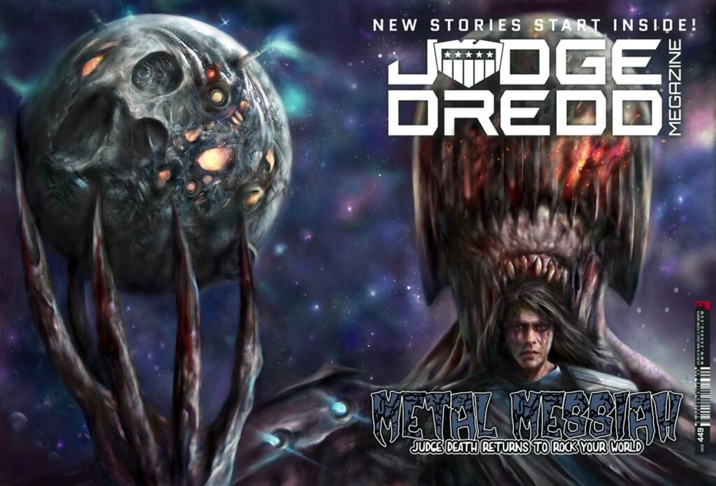
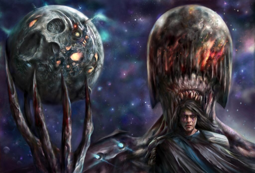
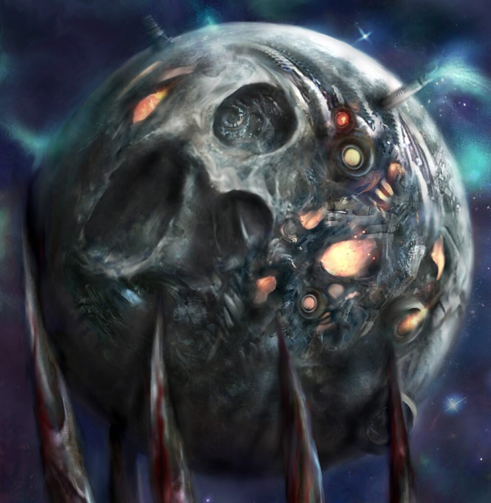
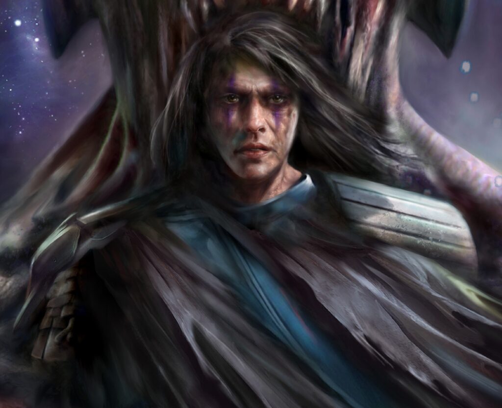
Since this cover is for part 1, it has to be a teaser-type image but does show some important elements from the new series. The story is set 25 years after Deliverance ended, so we now have an older Rosco as the main female lead (on the cover) and a hint of what is the mysterious Death Metal Planet, that Judge Death has his spiky paws around in the rest of the cover image.

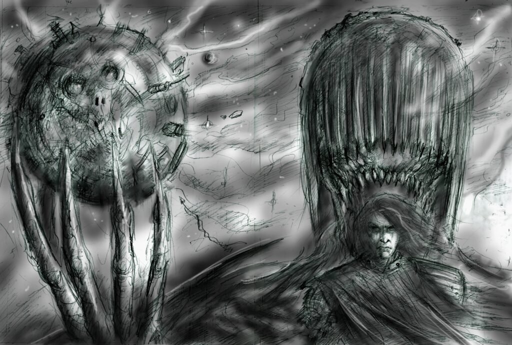
As always, the cover starts with a loose rough sketch for Tharg, so The Mighty One knows how I’m thinking and is really just to get the main design elements sorted before getting in there with more detail and of course, the painting.

He’s got the whole world in his handssss… sing-a-long with Judge Death
Nick Percival’s idea of a rough sketch for the Death Metal Planet cover

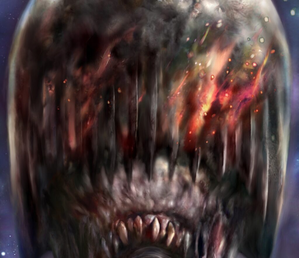
NP: I wanted a cool, blue/purple colour palette in keeping with cosmic, deep space setting but with a hint of the danger lurking ahead with the burning energy flowing from Death’s face. Hopefully we get a sense of some of the ominous tone and foreboding of what is to come.

And the music to sing along with – Death Metal of course!
Nick Percival’s finished wrapround cover for Megazine 449 and the future of the Dark Judges

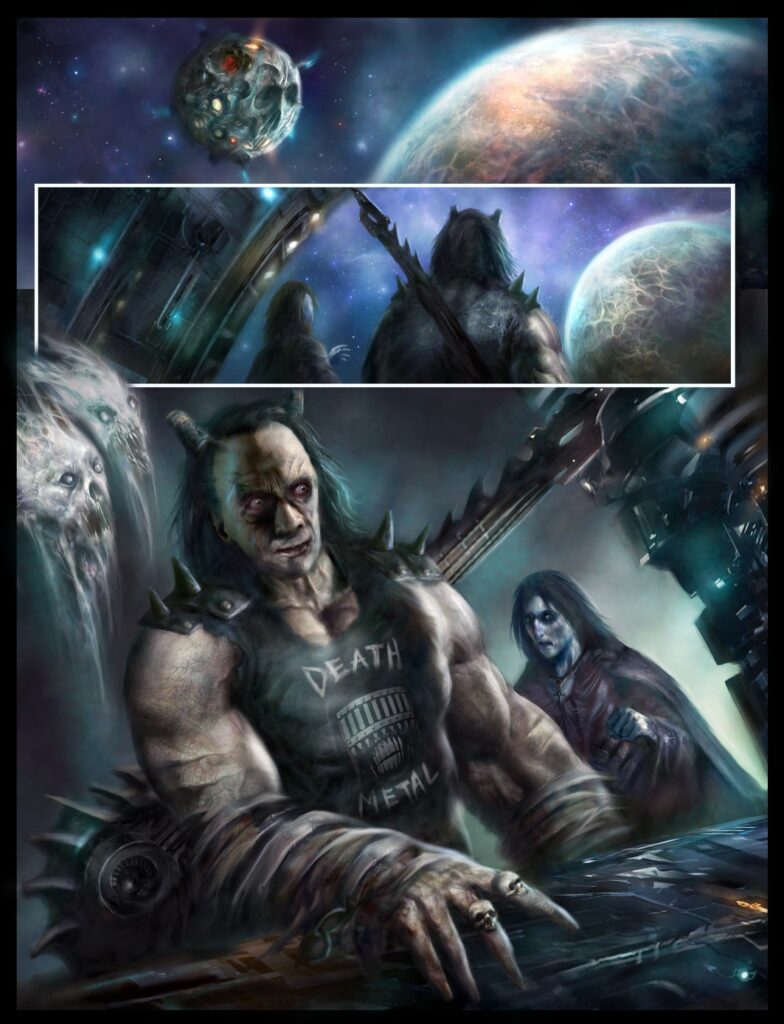
And that’s the cover all done and dusted. But Nick wasn’t finished there, wanting to share with you all a little of what to expect from the new Dark Judges storyline, Death Metal Planet

NP: I’ve also included a sneak peek at one the new main villains of the series, who has some bizarre sinister plans of his own for Judge Death and since this is set in the future from the current Mega City timeline, we also get to see what some of the street Judges look like 25 years down the line, one of whom plays a large part in the story.

A sneak peek at one of the new villains coming in Death Metal Planet

I hope everyone enjoys the new epic – it has strange and crazy scenes for sure as well as the usual high body count we expect from J Death and the gang (and we even have a throwback to the classic, Judgement On Gotham – If I say any more, I will be sealed in a block of Boing ™ for the rest of my days….)

Now that’s just a tease and a half right there! We’re just going to have to see what he means in the course of Death Metal Planet.

The law of the future? Nick Percival’s design for a street Judge, 25 years hence.

There you go – another ssssstunning wrapround cover and details for the new Death Metal Planet there from Nick Percival. Thanks for sssssending that one along Nick.

You can all see both the cover and the beginning of Death Metal Planet on the shelves – and in the 2000 AD web shop – when Judge Dredd Megazine issue 449 comes out on 19 October.

For more from Nick, there’s his stunning Covers Uncovered work – Megazine 425, Megazine 427, Megazine 430, Megazine 433, Megazine 448, and 2000 AD 2247. And back in 2020, we talked to both David Hine and Nick about Dark Judges: Deliverance here.

Now, another bonus for you – first a little preview of Judge Death and another of his victims…

And now, because Nick always sends along HUGE files of his art, some details, in all their fiendissssh glory from the art…

Posted on

2000 AD Covers Uncovered – Luke Horsman returns to Enemy Earth for Prog 2303

Every week, 2000 AD brings you the galaxy’s greatest artwork and 2000 AD Covers Uncovered takes you behind-the-scenes with the headline artists responsible for our top cover art – join bloggers Richard Bruton and Pete Wells as they uncover the greatest covers from 2000 AD!

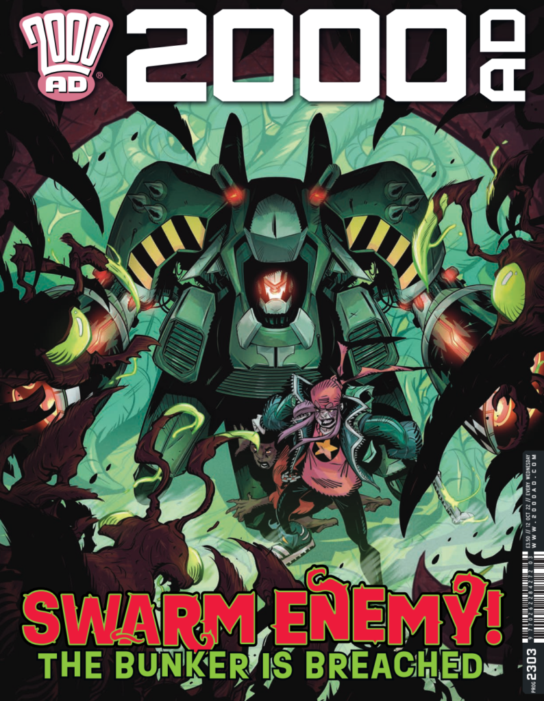
This week, as Cavan Scott & Luke Horsman’s post-apocalyptic Enemy Earth reaches episode 3, we welcome art droid Luke Horsman to talk about putting together the cover for 2000 AD Prog 2303 – out wherever you get your Thrill Power on 12 October.

In Enemy Earth Cavan and Luke return to the world they created back in 2000 AD Regeened Prog 2256, a world where Mother Nature has turned against humanity and the mutated flora and fauna is proving deadly. Can young survivors Zoe and Jules, together with Jules’ defence droid Nanni, survive as their bunker is overrun? Well, that’s what you see on the cover and what you’ll find out in episode 3 (of 10) of Enemy Earth!

So, over to Luke…

LUKE HORSMAN: I start with the usual rough layout. I like to keep things loose in this stage and spend more time in the inking phase. 

I start inking in the main focus of the image first. I like to work in layers for ease of masking colours later, so with most of my work this is usually in the midground layer. I keep in a placeholder Prog logo so I’m aware of not drawing any detail that will be covered up, leaving plenty of space.

Midground inks finished...

I next bring in the foreground elements for framing and visual depth. Here I’m using plenty of blacks to draw the eye to the centre. 

Lastly for the line work I bring in the background elements, with a little more framing. 

Finally on to colours and finished off.

And that’s a wrap – another scrotnig cover completed! Thanks so much to Luke Horsman for sending that one along.

You can find 2000 AD Prog 2303 wherever you pick up the Galaxy’s Greatest, including the 2000 AD web shop from 12 October.

And if you want to know more about Enemy Earth, both Luke and Cavan talked about it right here.

Posted on

2000 AD Covers Uncovered – Tazio Bettin gives us ‘foreboding, gloomy atmospheres’ for Prog 2302

Every week, 2000 AD brings you the galaxy’s greatest artwork and 2000 AD Covers Uncovered takes you behind-the-scenes with the headline artists responsible for our top cover art – join bloggers Richard Bruton and Pete Wells as they uncover the greatest covers from 2000 AD!

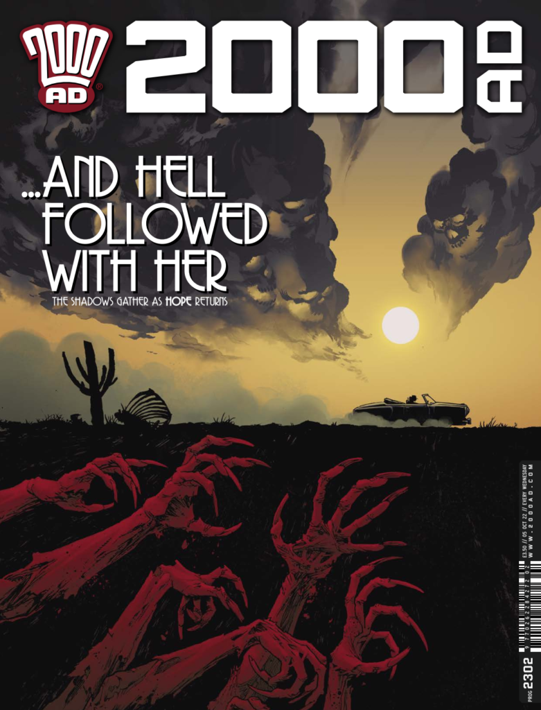
This week sees the start of Guy Adams & Jimmy Broxton’s nightmarish Hope… In The Shadows Reel Two inside the Prog and to set things off suitably atmospheric and moody we have Tazio Bettin on cover duties – as the shadows gather – and hell follows with her…

So, without further ado… over to Tazio to tell you all about it…

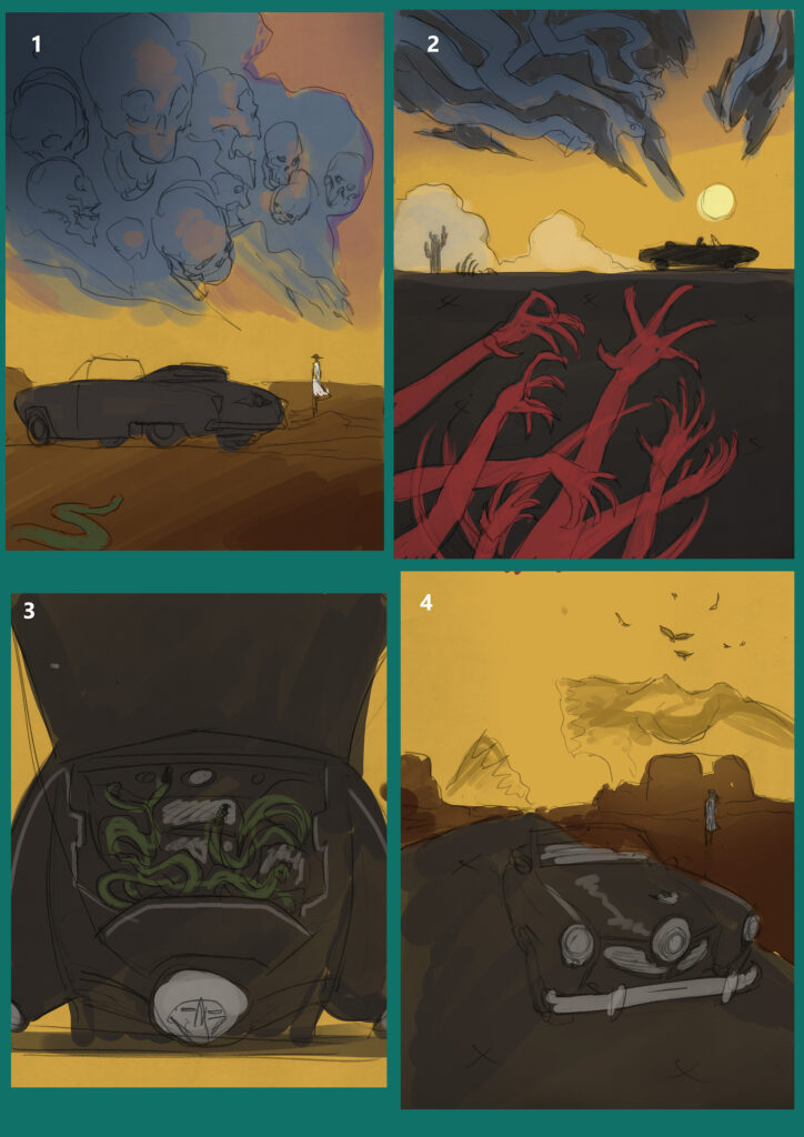
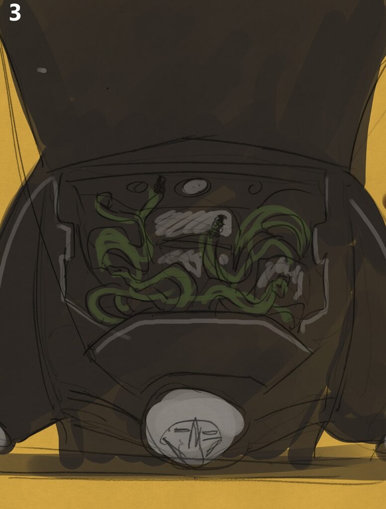
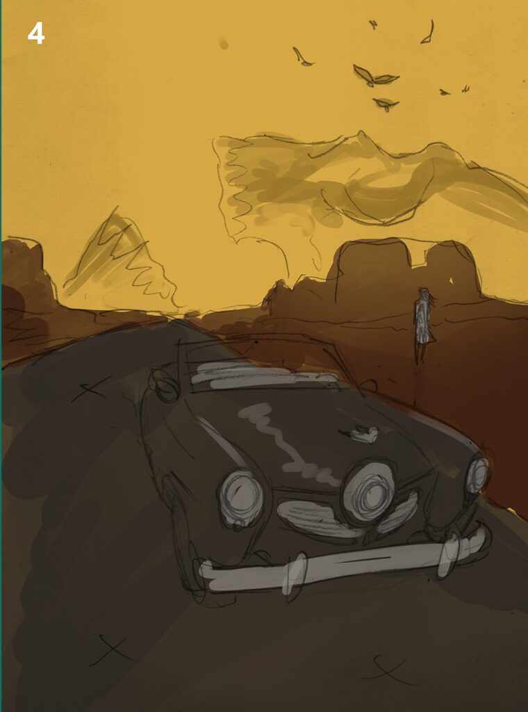
TAZIO BETTIN: I’ve sent along some colour sketches I did for this job – but perhaps the finished cover speaks for itself better.

Well, I don’t know – seeing the four colour sketches does give us a look inside the creative process and just how things get put together… the four different cover ideas all look damn fine…

.

When you work on a cover where the keywords you set for yourself are “foreboding, gloomy atmospheres” it’s advisable to listen to a good doom metal record. I recommend Four Phantoms by Bell Witch.

It’s the first time in my collaboration with 2000 AD that I’ve drawn a cover that isn’t from a project I’m part of, and it’s quite exciting!

.

I received a very short description dealing with the atmosphere and theme of Hope… In The Shadows that this cover is for, and a page of the strip to have an idea of the mood – and I was captured by the wonderful inks right away. I had just the perfect amount of information needed – enough boundaries to know what to work with, and enough freedom to explore ideas.

I felt inspired and let imagination fly, and several ideas immediately came to me. Horror is a genre I very much love, and I wanted this illustration to give off a feeling of foreshadowing, rather than immediate danger. In other words, I wanted it to be subtle and creepy. I also wanted it to include some symbolism. It must be all the books I’m recently reading about medieval literature and its focus on allegories… also the aforementioned record helped with picturing things in my mind.

.

So I drew several sketches, selected some, and submitted them to Tharg.

In the end, as it often happens, the first idea I’d had was the one that worked best.

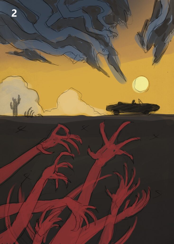
Unusually for me, colours came first in picturing this cover. I wanted a juxtaposition of warm, soothing colours and oppressive, dark, and cold ones – all creating a geometrical composition designed to give a sense of oppression and the promise of violence through the use of an almost solid red.

.

All elements point towards the car, and the clouds closing on it are about to choke the light of the sun. Cloudy desert landscapes can be very evocative and melancholic, and I wanted that feeling going hand to hand with the sense of something sinister stirring.

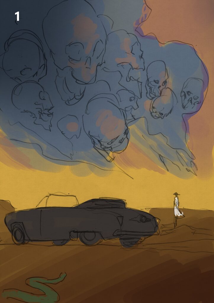
So I pictured an ominous sky where you can see shapes in clouds, and dead hands slowly stirring under the ground to deny escape to the figure of the protagonist, slowly closing in despite the illusory feeling of freedom a car speeding in a desert highway would naturally communicate.

The initial sketch had snakes slithering through the clouds instead of skulls, but that felt too much like immediate threat rather than foreboding gloom. So leering skulls it is, an image of inescapable doom. The lower half of the composition is also an unabashed homage to Mike Mignola’s amazing covers compositions.

.

Well, I don’t think anyone’s going to argue that Tazio hasn’t delivered just what he was aiming for – foreboding gloom never looked so great!

2000 AD Prog 2302, with that gorgeously dark cover heralding the first episode of Hope… In The Shadows Reel Two, is out everywhere Thrill Power is on sale, including the 2000 AD web shop, from 5 October.

You can find more of Tazio’s Covers Uncovered work right here at the site – whether it’s Prog 2259’s Jurassic Shark or Prog 2283’s Scare In The Community –  two of his great Sinister Dexter covers.