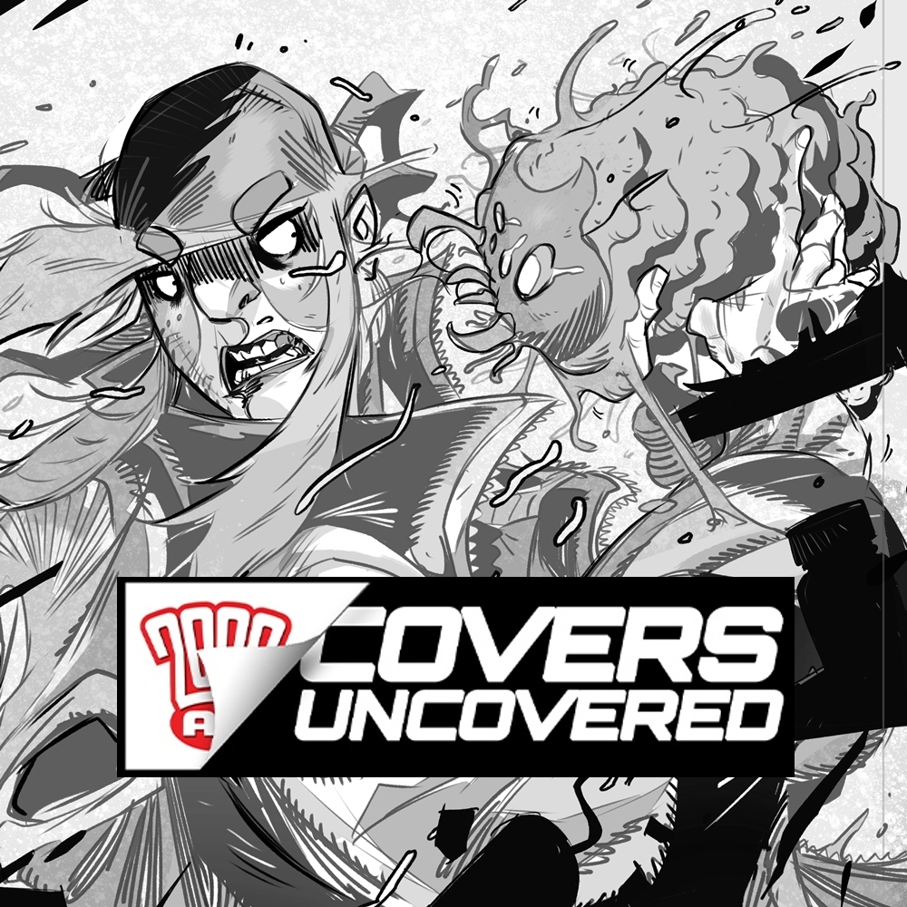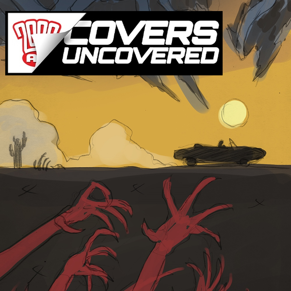
Every week, 2000 AD brings you the galaxy’s greatest artwork and 2000 AD Covers Uncovered takes you behind-the-scenes with the headline artists responsible for our top cover art – join bloggers Richard Bruton and Pete Wells as they uncover the greatest covers from 2000 AD!
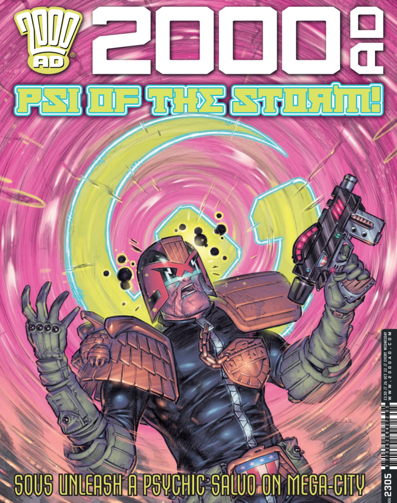
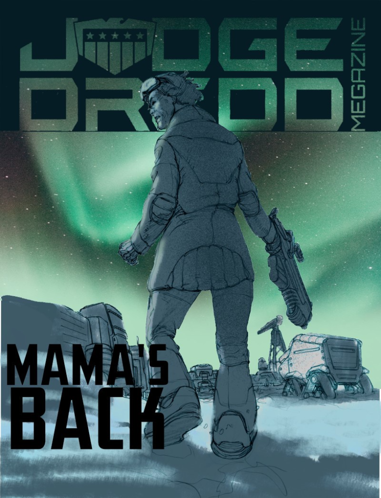
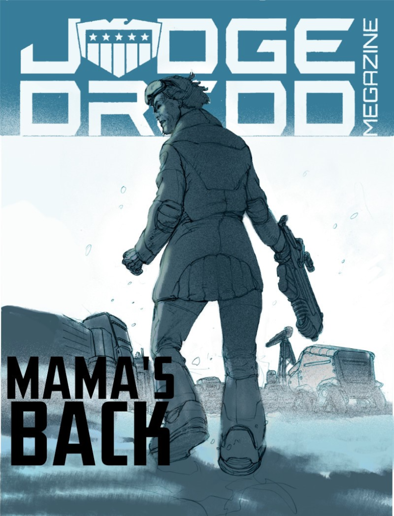
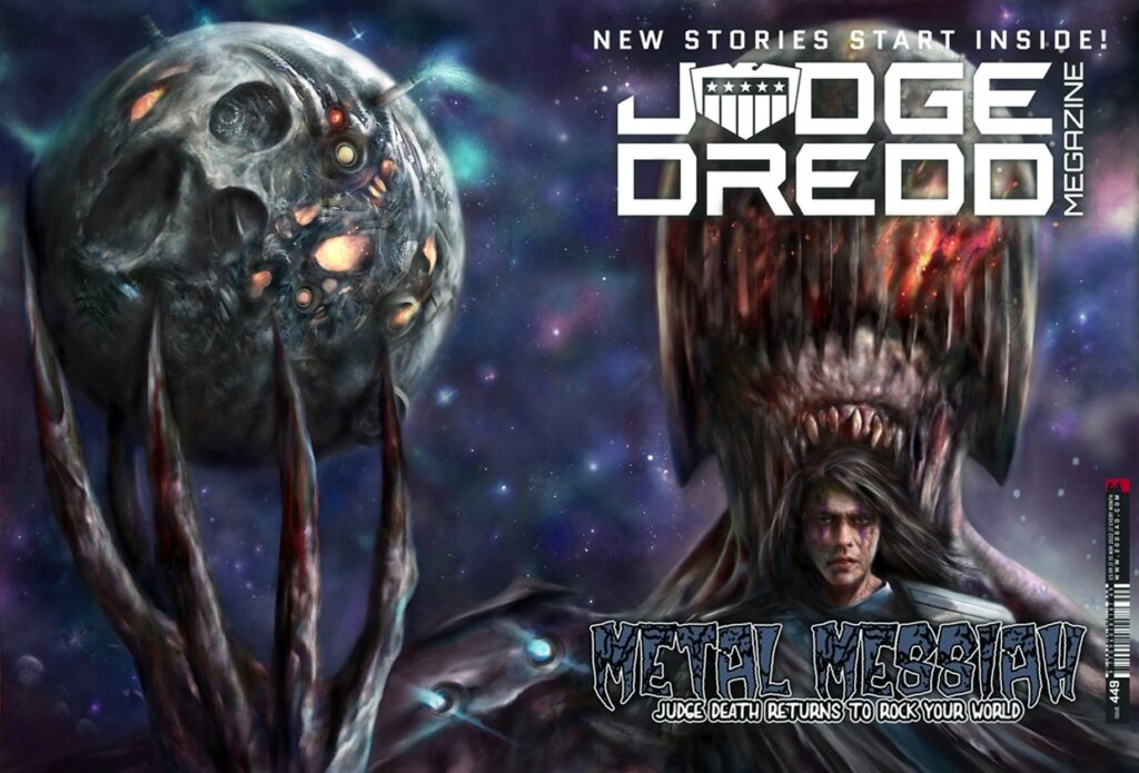
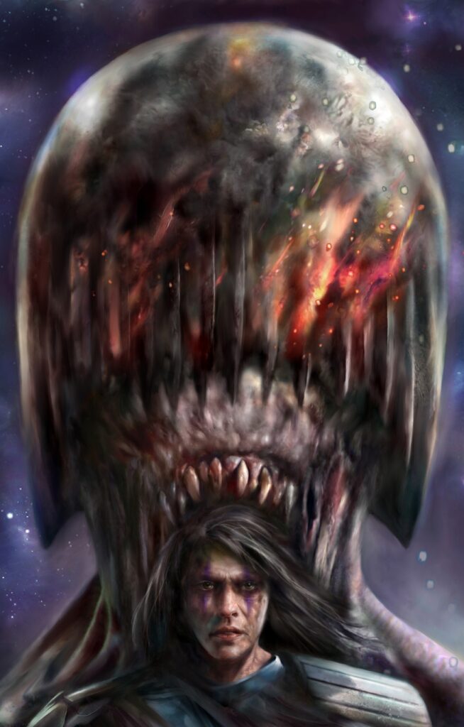
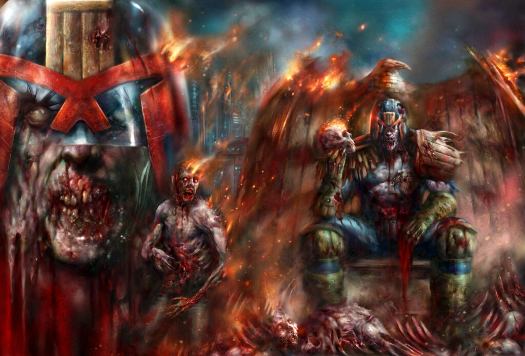
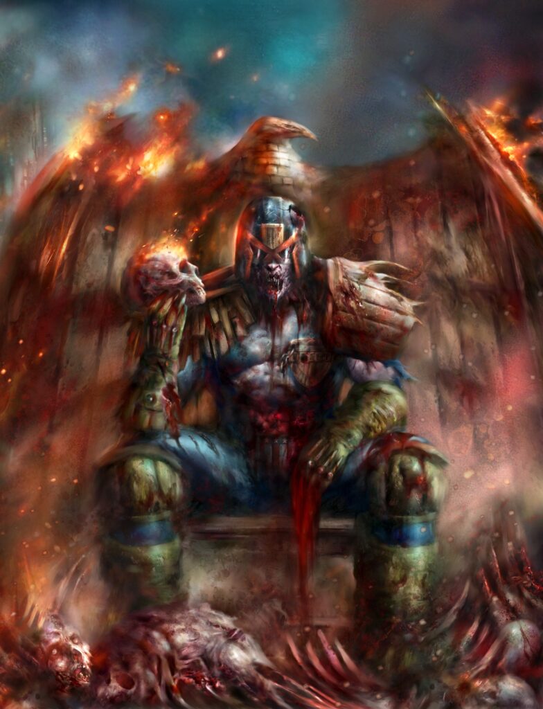
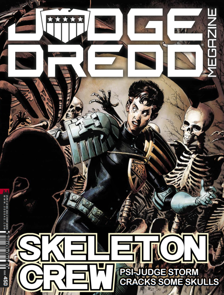
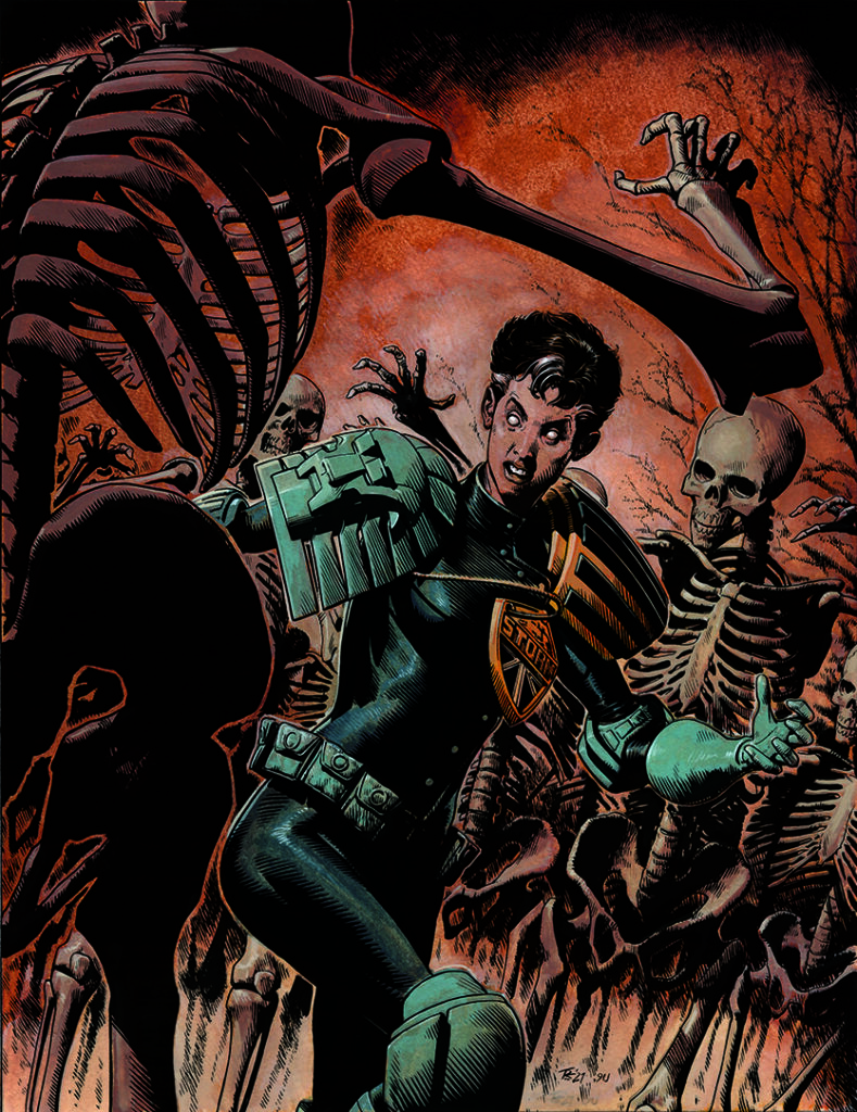
It’s Judge Dredd Megazine time, with the scrotnig issue 450 out on 16 November. It’s packed with all the thrill power of course, all wrapped up in a stunning Storm Warning cover from Tom Foster.
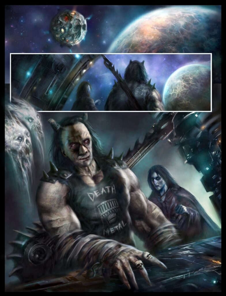
The new Storm Warning storyline, Dead & Gone, began in Megazine issue 449, with new series artist Clint Langley joining co-creator John Reppion for this one. Tom’s not providing the art this time round for the strip he co-created with Leah Moore and John Reppion, but it’s great to have him back for the cover!
Tom started at 2000 AD with his 2000 AD Art Portfolio Competition at Thought Bubble 2013. From his first strip, Prog 1886’s Tharg’s Terror Tale: Done Deal (with Alec Worley), through to the Judge Dredd stories A Penitent Man and An Honest Man (with Ken Niemand) his distinctive, classical style has been a huge hit with everyone.
Now, without further ado, for your reading pleasure… Tom Foster…
TOM FOSTER: Well, I asked to do the cover so that I could retain a connection to the series but the reason I didn’t do the interior art this time is that, when the prospect first came up of doing this one, I had already agreed with Kenneth Niemand to do the Dredd arc ‘An Honest Man’ and didn’t want to get started on a multi-part series in case in case they ended up conflicting. Also, I still sort of associate Storm Warning with the panic of working on that first series of it. There was so much at stake at that point – I was constantly pulling my hair out to try and turn in high quality work, with very little experience. It was VERY stressful, and I was ill for months after I finished it.
Then the second series was when I abandoned the 3-D models as the basis for my drawings. Halfway through the run, I decided they were too restricting, too time-consuming, way less fun, producing mediocre results and that my drawing ability was stagnating. So, I started drawing everything from scratch. This, again, was a source of a lot of stress as I was trying to produce work that had the same level of accuracy and dimension, but without the solid foundation I’d been using for years. Thankfully, Tharg was very encouraging – and I think the best work I did on that series was in the later chapters.
I still have a lot of affection for Storm Warning though – I don’t feel like I’ve moved away from it permanently. After all, this isn’t the first time someone else has taken over art duties on it. It’s been nice, though, to work on other things and to see different artists interpret the character. Hopefully, I can come back to it at some point with fresh eyes and a better-developed set of skills and not have it feel quite so much like a water buffalo sitting on my windpipe.
Anyway, this cover is an unusual one for a couple of reasons. Firstly, because it’s probably the longest gap I’ve had between finishing something and it coming out in print (I did this one in summer of 2021), but also because I used a process for the colours that I had never used before.
Join me, won’t you? And we can explore that process together.
Step 1: Covers allow me that bit longer to focus on a single image, so I tend to use a lot more reference for them than on my pages. Since I know I’ll likely be making a 3-D render anyway, for reference purposes, I usually use that as my pitch. It’s relatively quick to do and it gives a pretty comprehensive idea of what I’m going for with the finished art.
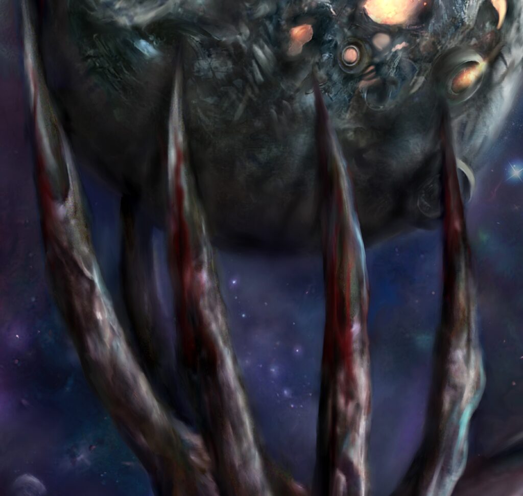
I already had a Judge Storm model from the days when I was starting everything in Daz Studio, and I had a skeleton model downloaded too, so this was a very straightforward process. The background trees and colour were added in Photoshop.
As this was my first Megazine cover, I didn’t have a template for the cover dress handy at this stage, so had to use the Prog one. But Tharg is infinitely benign and sent me a Meg template, which I used for all the subsequent stages.
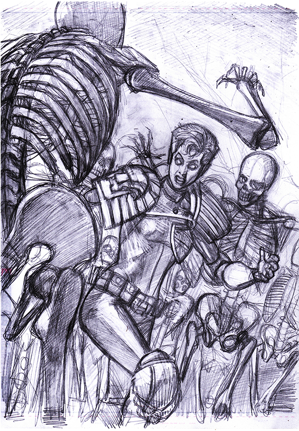
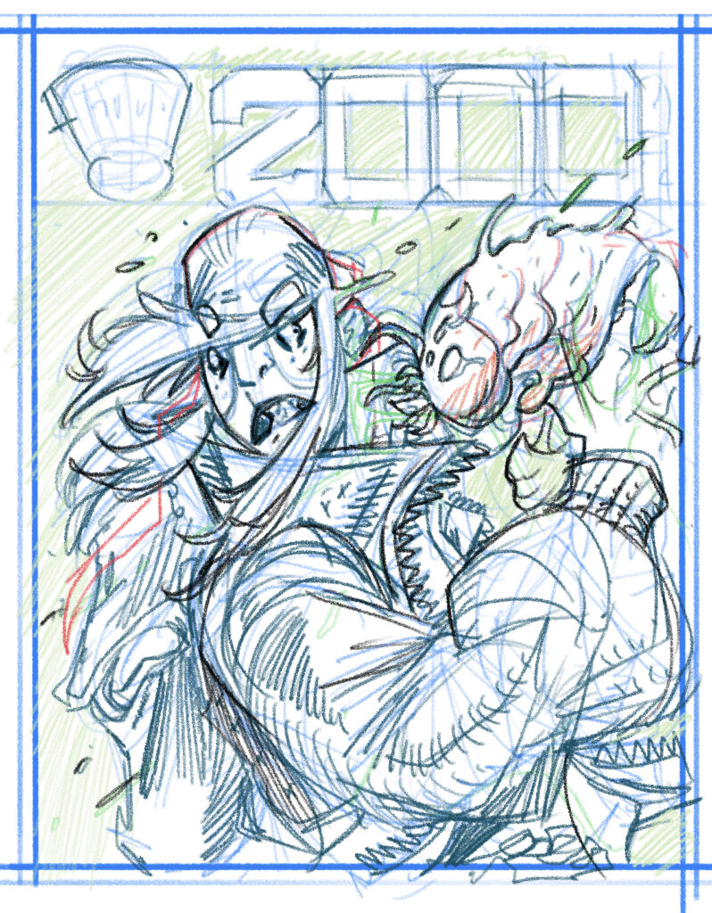
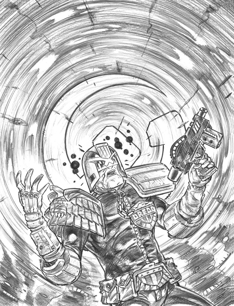
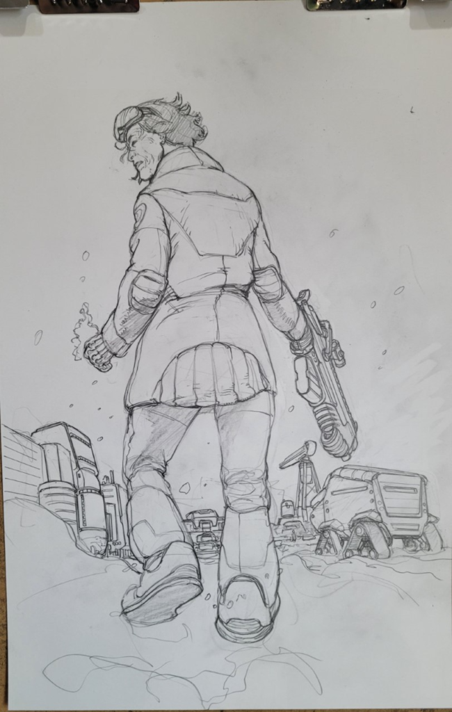
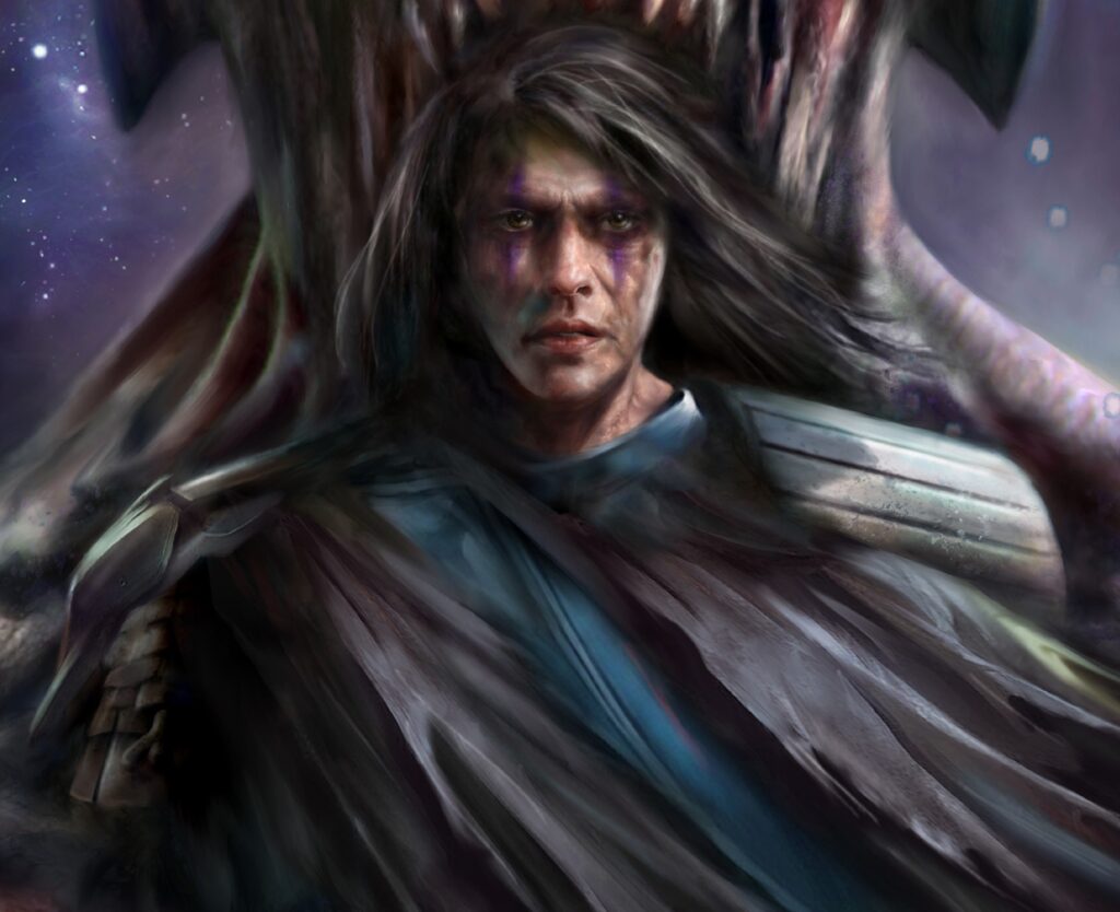
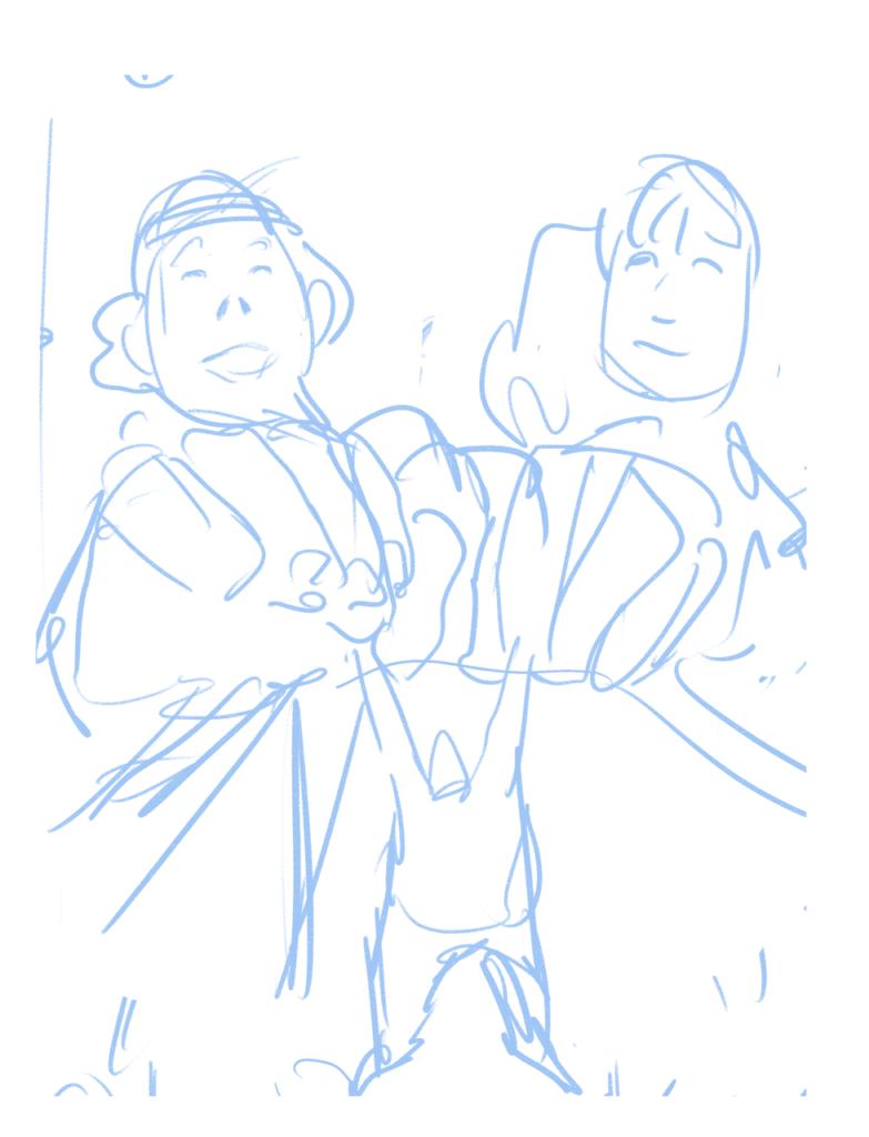
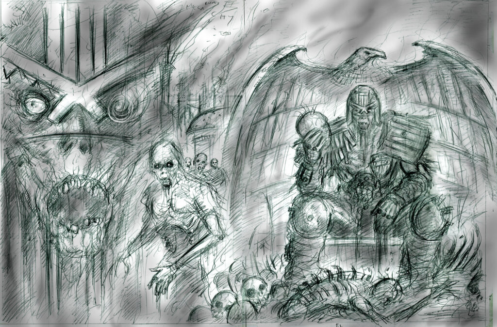
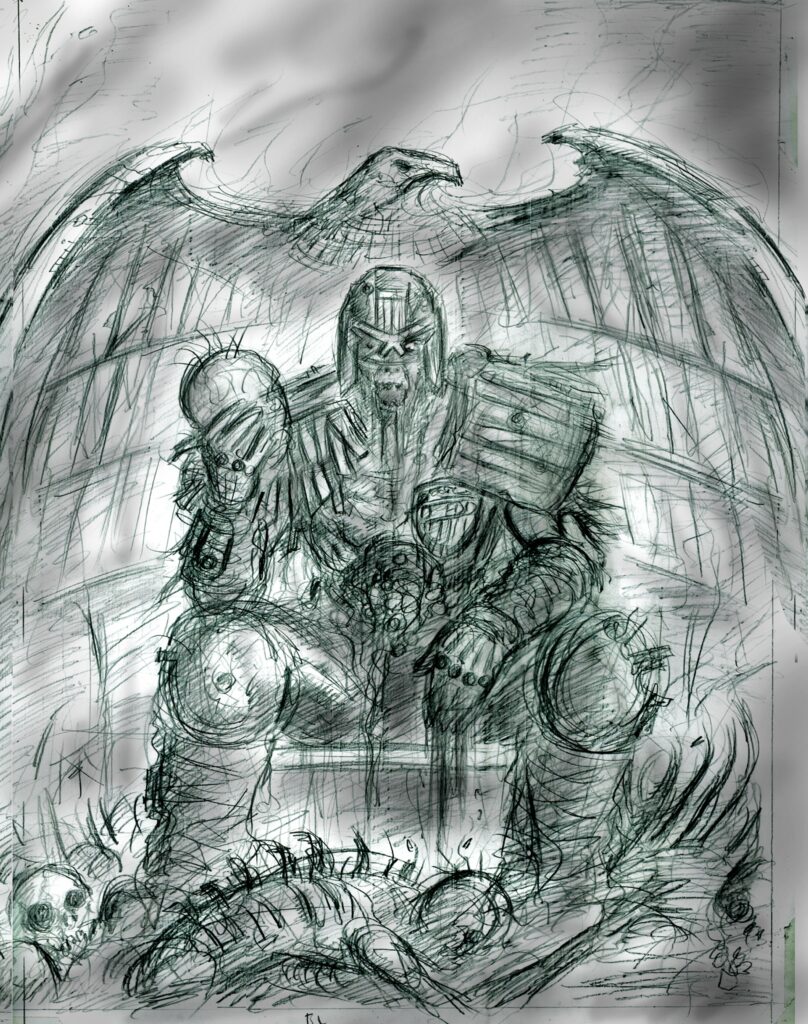
Step 2: With the cover design approved, I then proceeded to my initial sketch. I’m not used to drawing detailed skeletons, so the reference was invaluable here and at the pencil stage.
For those wondering why I would bother to start drawing from scratch when I’ve already got a detailed prelim in the 3-D render, the answer might seem a bit flimsy, but is actually pretty important: 2-D images are designed differently to 3-D captures and photography.
When you actually draw an image from scratch, you make design decisions (often very small ones) with every line you draw that are unique to that one composition. Whereas, when you capture something from a 3-D source, you are always getting a sort of imperfect realisation of a two-dimensional idea. There are artists, like Mike Deodato Jr., who are very good at compensating for this with excellent composition and complementary hand-drawn details, but I find I have the most freedom of choice when I build a drawing from the ground up.
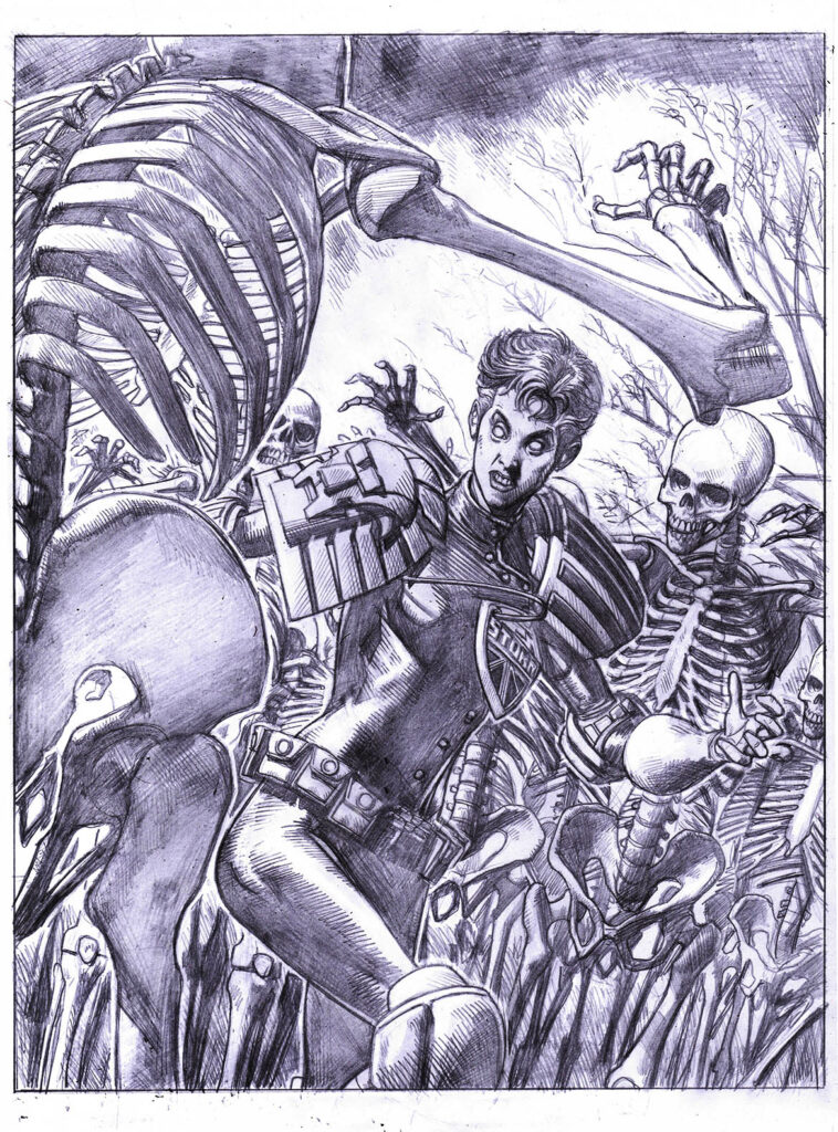
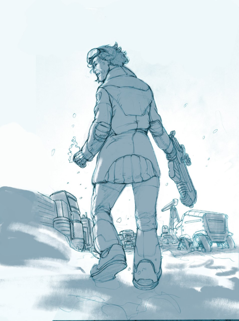
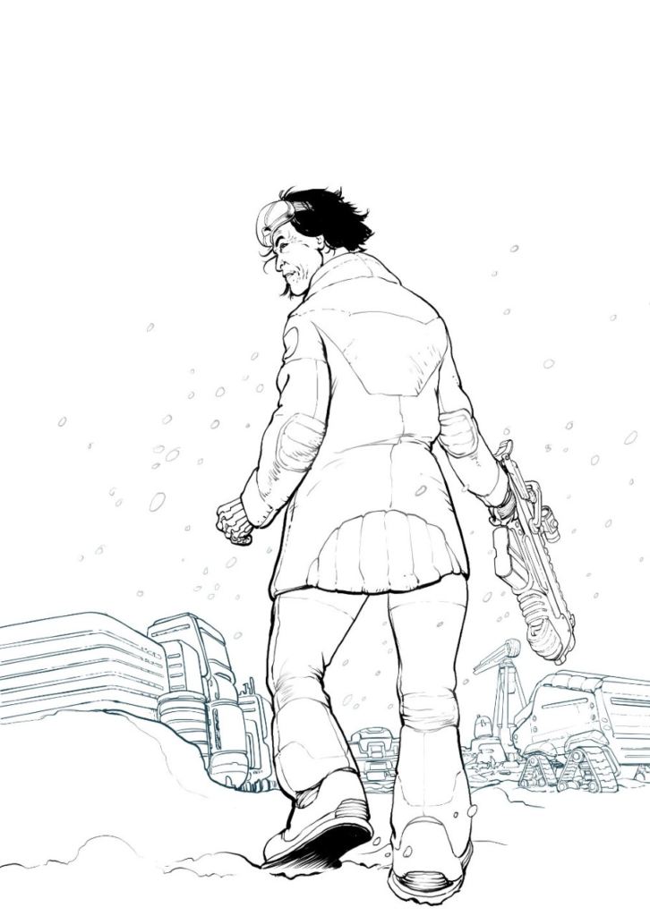
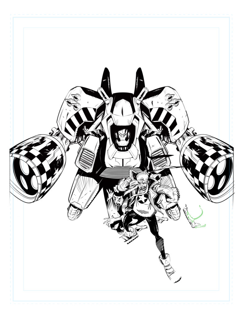
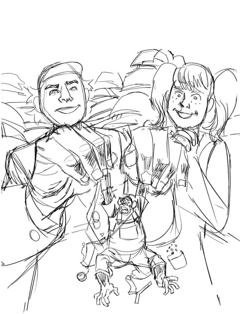
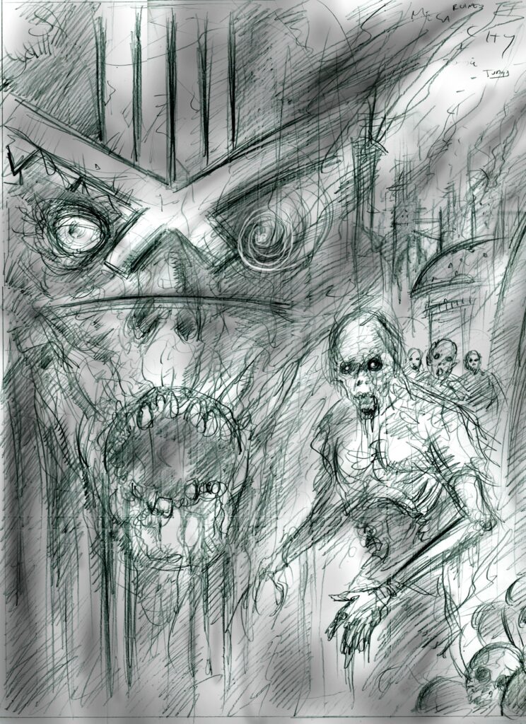
Step 3: From here it’s on to finished pencils. This was a fairly straightforward transition, as I had so many of the details available in the reference and a lot of the heavy lifting was done in the composition, so it was more-or-less just a case of cleaning things up.
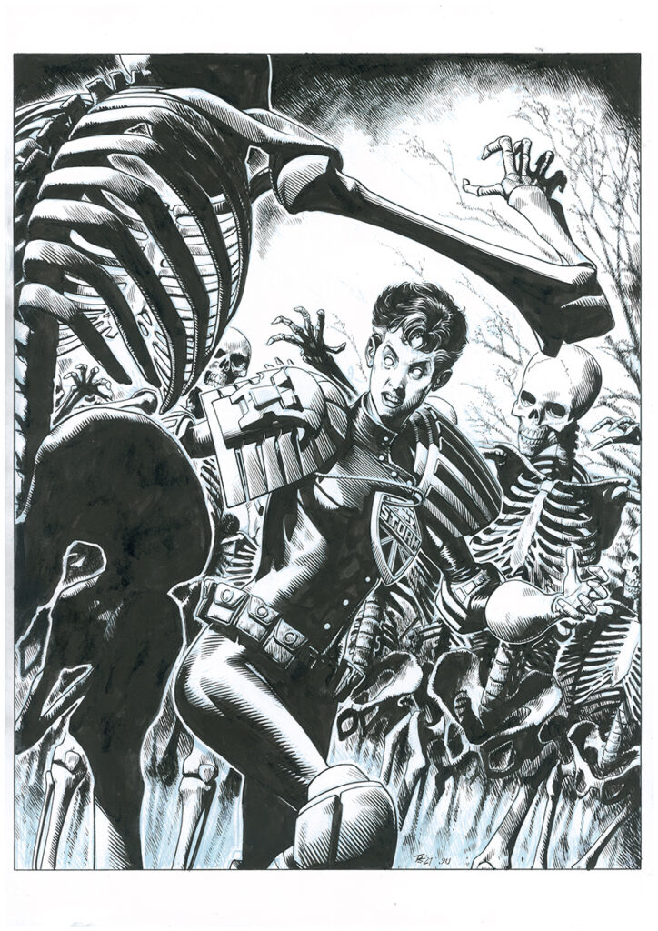
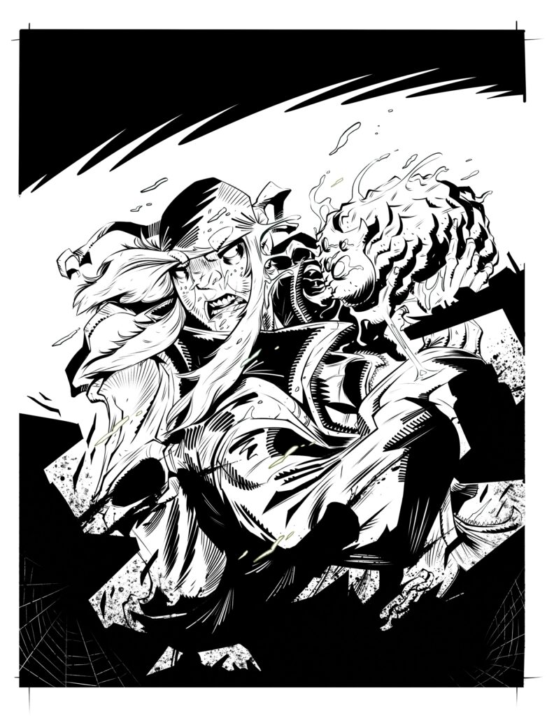
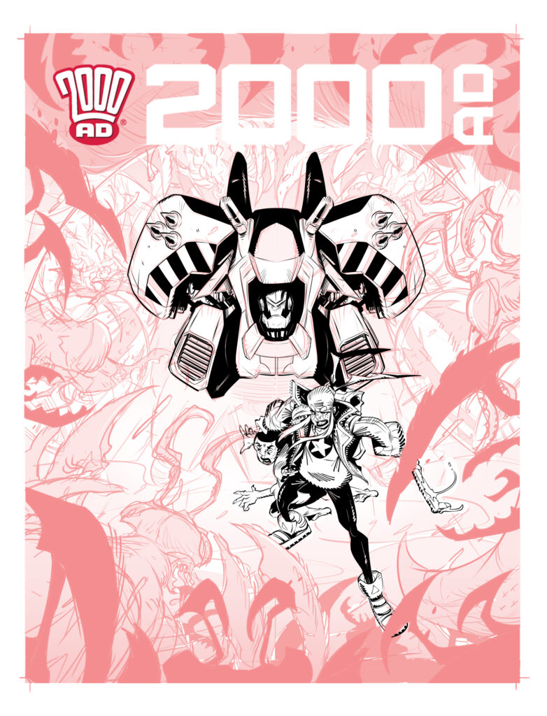
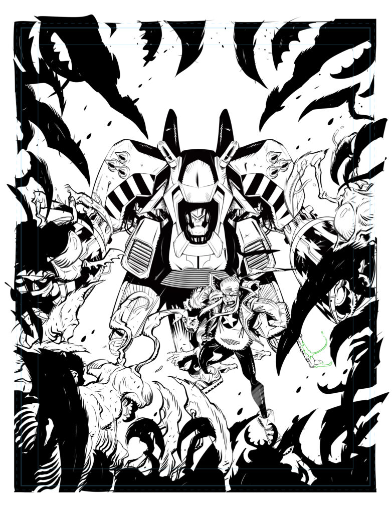
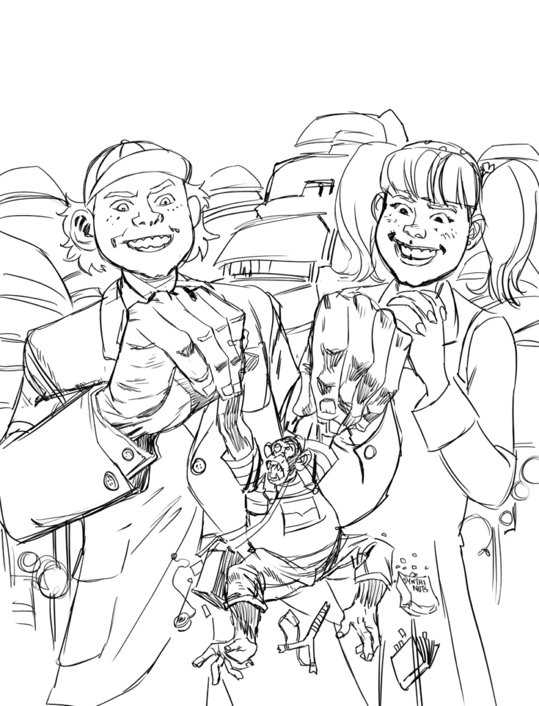
Step 4: Inks next and, thanks to a fairly clean pencil drawing, this was one of my less fraught inking sessions.
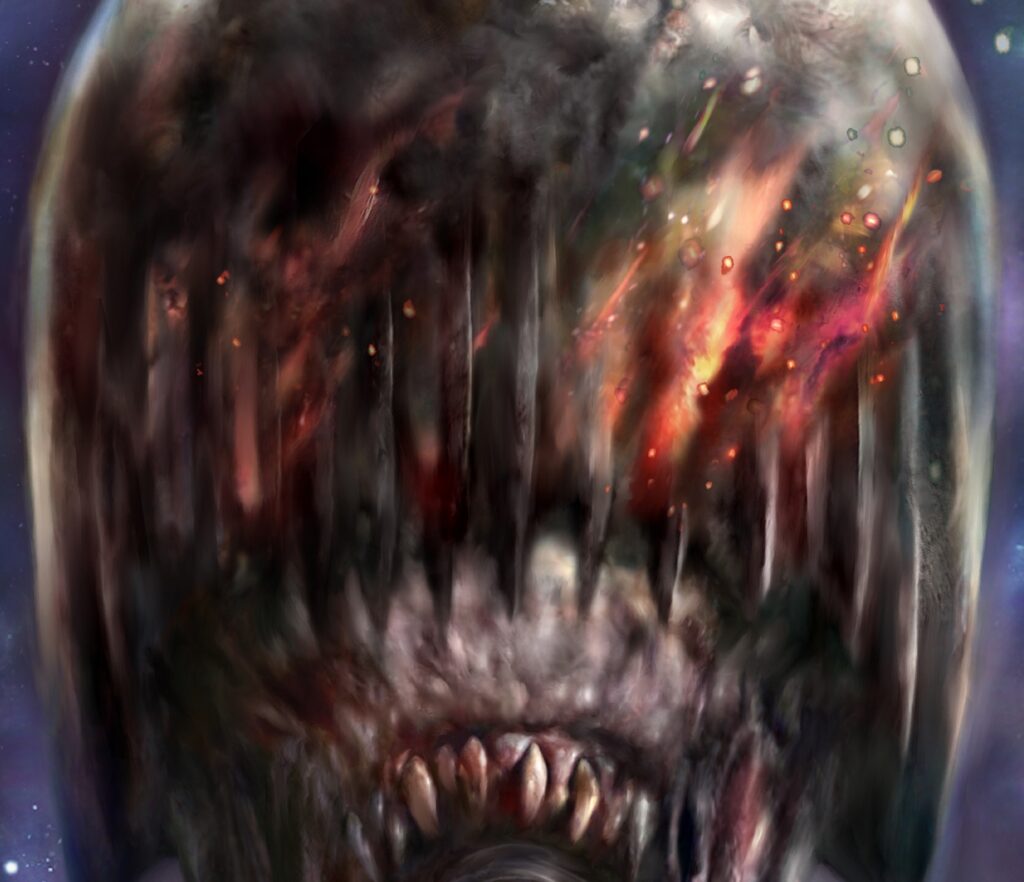
Step 5: Here’s where it starts to get a bit odd. I knew I wanted an earthy, textured look to the colours and I had been experimenting with painting during my run of covers for Commando, so wanted to try doing my colours with traditional materials.
However, I didn’t want to start slathering paint all over my original inks, in case I messed it up (also it’s nice to have original inks to sell on later). Neither did I want to swamp my nice crisp line drawing with semi-transparent materials and get less sharp results.
So, I decided to get my inks printed onto acetate and heavy paper stock and paint over the latter, while using the former as an overlay to make sure everything stayed nice and inside-the-lines. Then I’d composite a bitmap of the inks over the painted colours in Photoshop and get nice clean lines with lovely textured colours underneath. That was the theory anyway.
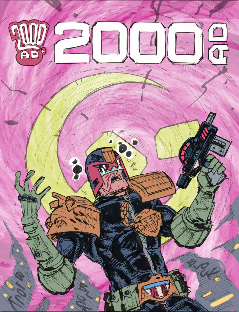
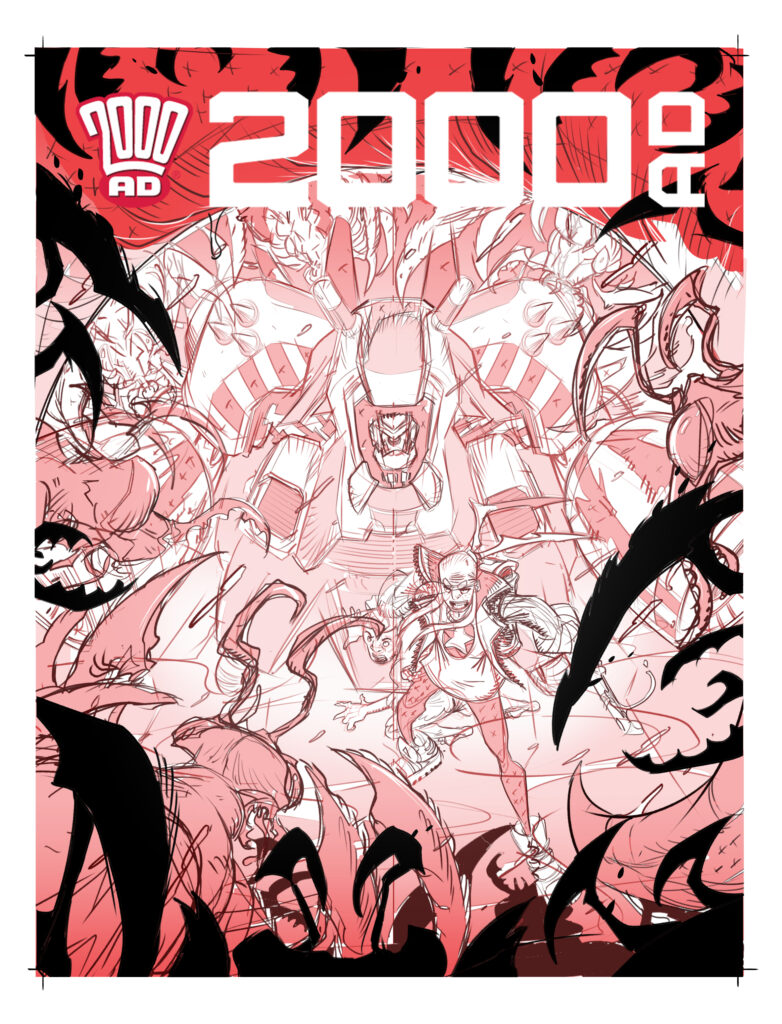
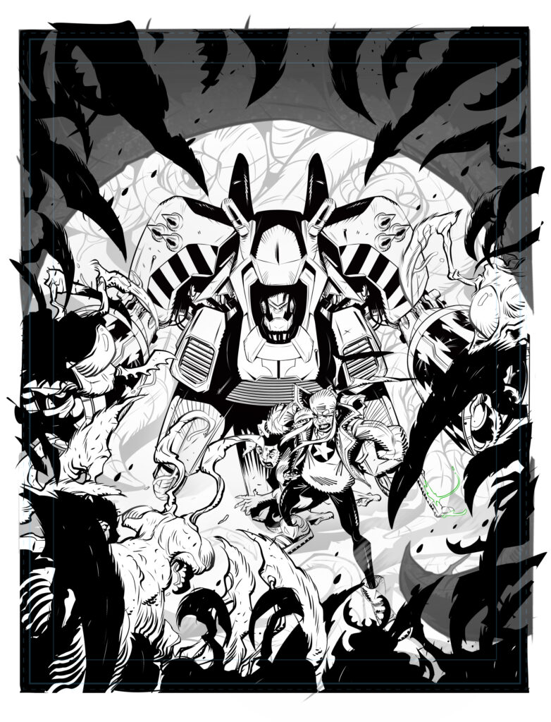
Before I started painting though, I wanted to get some idea of my palette, so I did a rough colour job in Photoshop – knowing that I could then use the colour flats later to aid with any retouching that might need done after the painting stage.
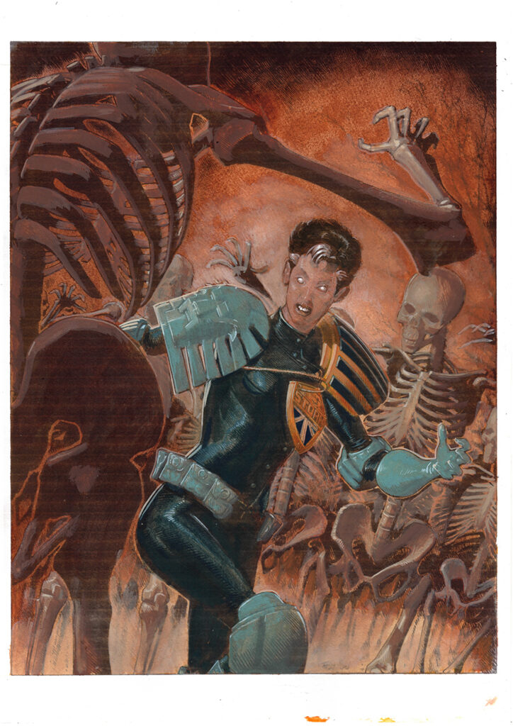
Step 6: Then I got my acetate printed at a print shop and printed out my line art at home on thick, toothy paper. Using a combination of watercolours and gouache, I painted my colours over the paper printout. This turned out a little better than I expected and I began to think I could have just committed to doing a full painting – but, with the line art already done and the clock ticking, it seemed more sensible to see this process through and confine this stage to colour and texture information, rather than trying to work in any delineating details. (This is the painted colour without the acetate overlay.)
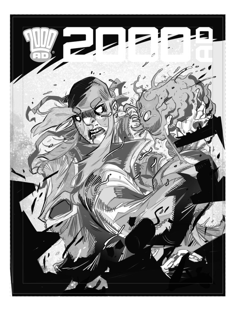
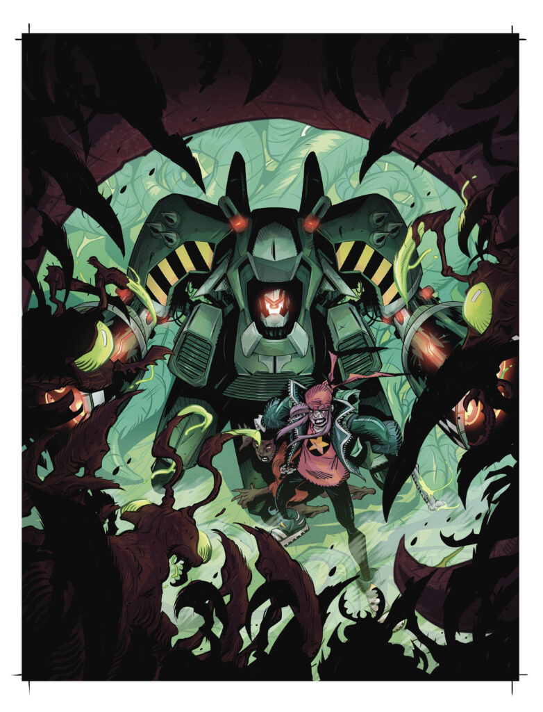
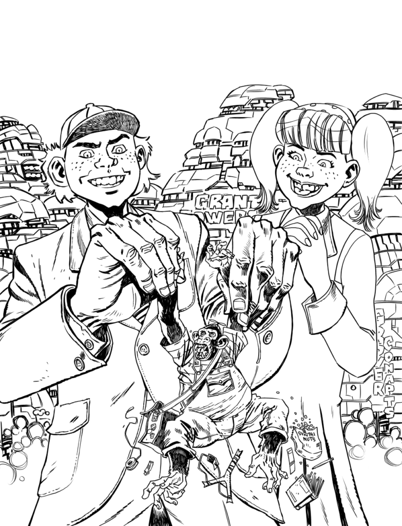
Step 7: I then scanned the colours and composited them with the line art in Photoshop. They looked a little dull, but the groundwork was there.
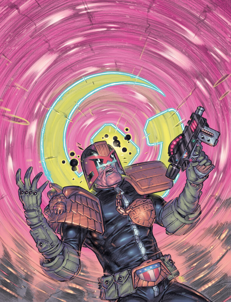
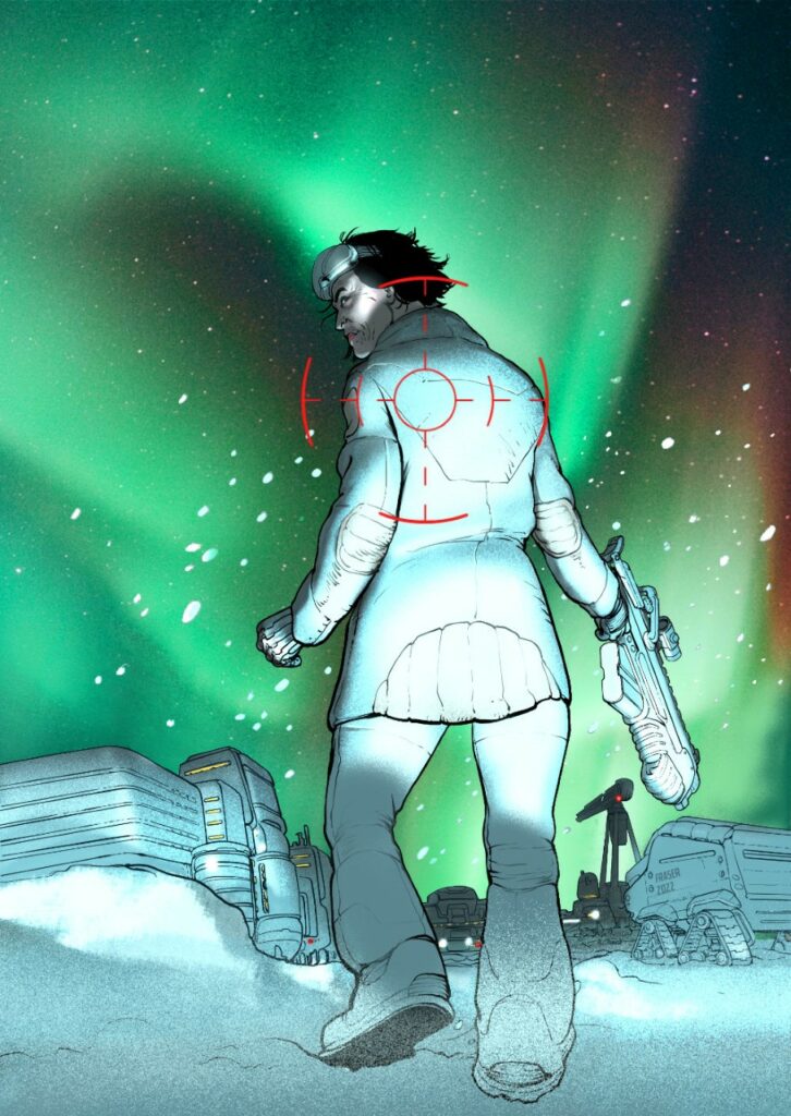
Step 8: Finally, I set about fine-tuning the colours to create a greater sense of depth and boost the contrast a bit.
On the whole, I think it worked quite nicely – but, after a second attempt at the same process on my Karl the Viking cover (which required far more rescuing in Photoshop) and a comparison with my all-digital colours on my cover for Prog 2281, I’m not sure the palaver with the acetate really merits a reprise. Still, I now have one more physical piece to sell than I otherwise would – and it did give me a bit more confidence in my painting – so I guess it was worth it. Unless you hate my painting – in which case you’re in for a horrible surprise with Prog 2310.
And that’s yer lot! Thanks as always to Tom for taking the time. You can find his excellent Lillian Storm cover to Megazine issue 450 wherever you pick up your weekly dose of Ghafflebette comics, including the 2000 AD web shop from 16 November.
For more from Tom here at 2000AD.com, check out his Covers Uncovered features for 2000 AD Progs 1986, 2225, and 2281. He talks about winning the 2013 Thought Bubble talent search here and the Judge Dredd: A Penitent Man strip here.
You can hear him talk on the 2000 AD Thrill-Cast Lockdown Tapes here. And finally, there’s his ridiculously funny From The Drawing Board video here – the one that basically meant the other art droids stopped doing them as none of them could match Tom’s delivery!