Every week, 2000 AD brings you the galaxy’s greatest artwork and 2000 AD Covers Uncovered takes you behind-the-scenes with the headline artists responsible for our top cover art – join bloggers Richard Bruton and Pete Wells as they uncover the greatest covers from 2000 AD!
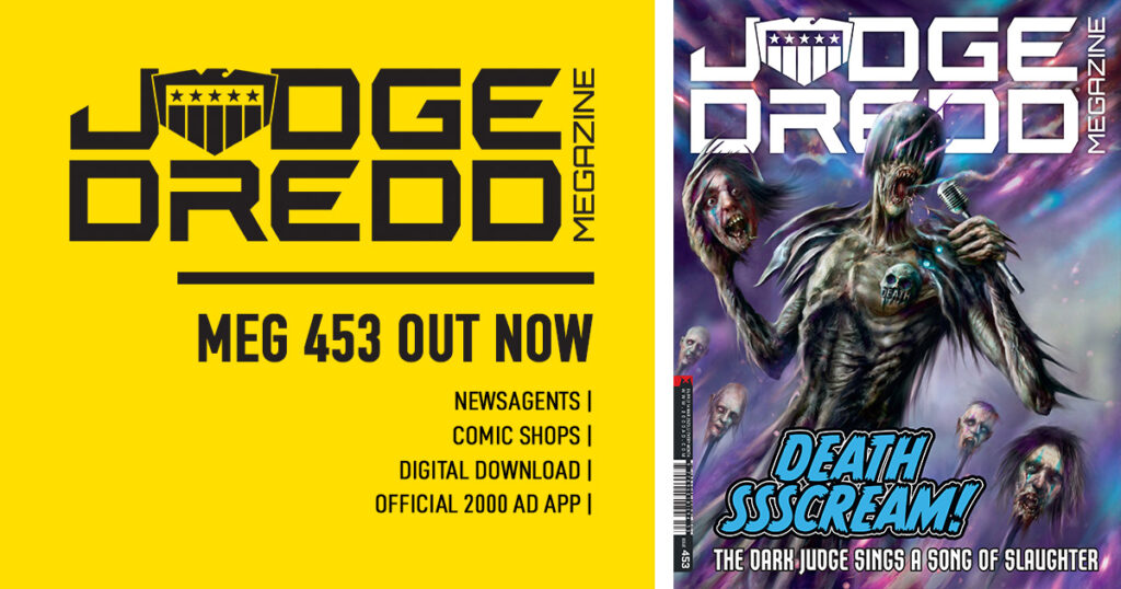
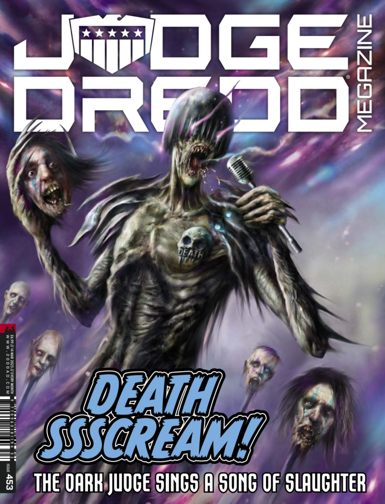
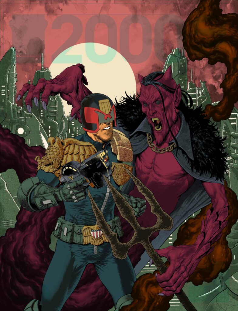
It’s time for another fiendisssshly fabuloussss cover right now from Nick Percival for Judge Dredd Megazine issue 453 – out for your delight and delectation on 15 February wherever you get hold of the monthly magnificence!
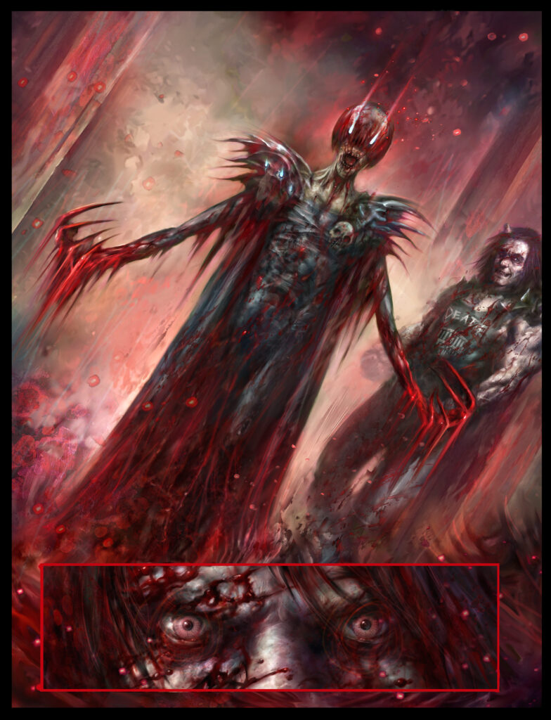
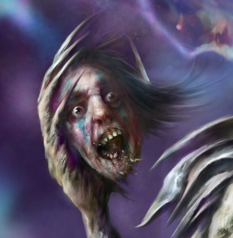
It’s the latest cover to go along with the new Dark Judges storyline, Death Metal Planet, where some misguided (and that’s putting it mildly) death metallers have freed Judge Death just so he can take part in their Deathfest. Yep, it’s not going to end well, is it?
So, without further ado, here’s Nick to take us backstage at the deadliest festival you’ll ever experience, now with added father/daughter cameos…
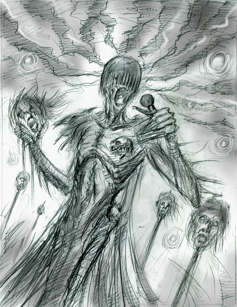
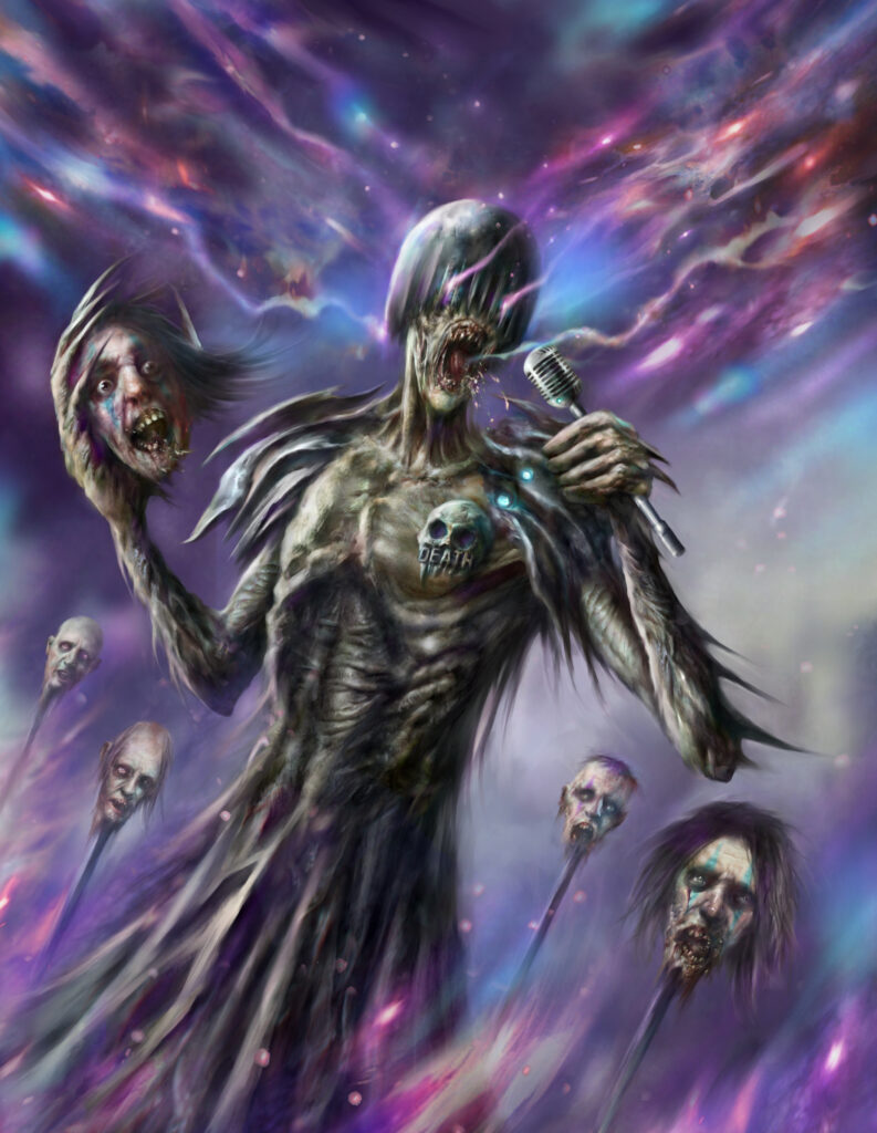
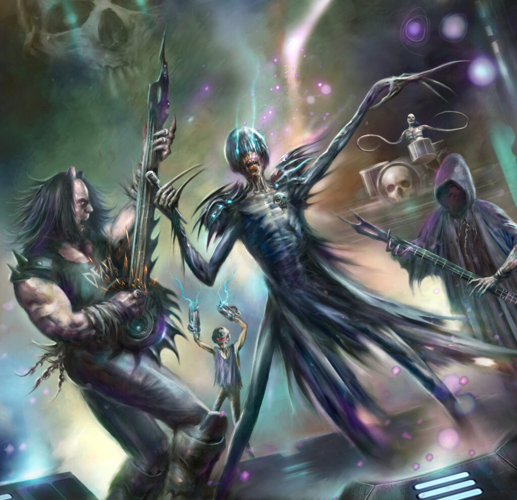
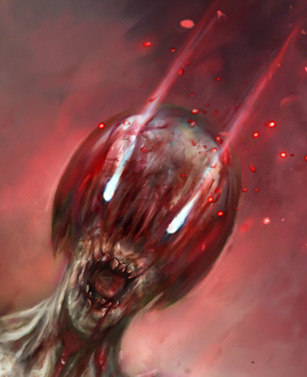
NICK PERCIVAL: Since we’re now at the halfway point in Death Metal Planet, it was a good time to feature a cover with Judge Death on the mic, doing his thing.
We’ve been playing up the dark humour in this series a fair bit, so I wanted to reflect some of that with an image of Death really going for it and blasting out, what I’m sure is a lovely little tune.
The sketch is pretty bang on with this cover and I didn’t need to really tweak anything too much for the final painted version.
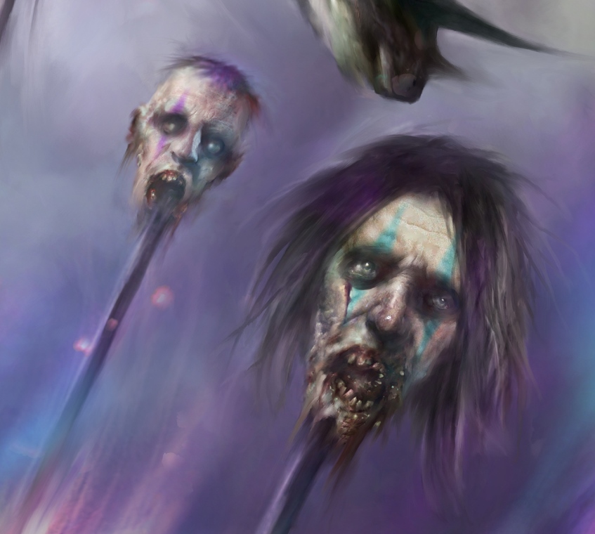
I thought it’d be cool to have the severed heads as his ‘backing singers’ – it is still a horror story after all!
I’ve stuck with the funky colour palette (ramped up blues and purples) that’s been so dominant in the series so far, to keep some continuity going.
It was good fun to do but I should warn (little tease) that things do take a much darker and somber tone at the end of Part 6 to bring us back into true Dark Judges territory as we continue. There will be many surprises and of course, blood…
[We’d expect nothing less Nick!]
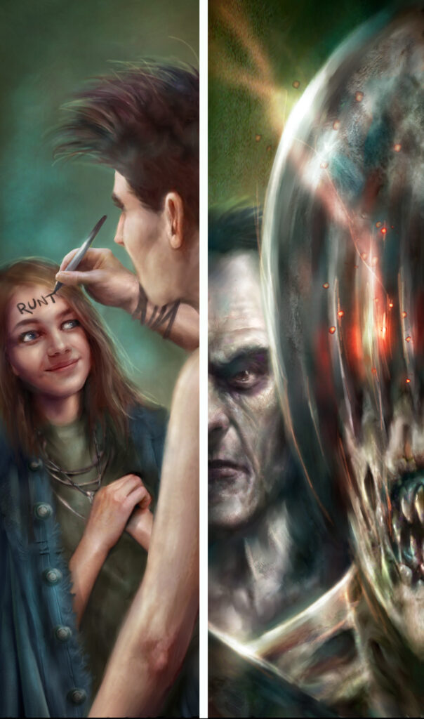
Oh, and a side note -this episode features a little cameo in the crowd of yours truly…
… and also one of my daughters (hey Maddie!) as a fan of the support band ‘Runt’...
She suffers a particularity grisly fate, though. My daughter thought it was cool but my wife has been giving me hard stares ever since! (Comics, eh? – What a laugh!)
Well, I mean, what’s the world coming to, eh? If you can’t feature your own kids in your comic art and have them brutally killed by Judge Death – what’s the point of fatherhood for a comic artist?
Our thanks once more to Nick for sharing all the magnificently gruesome Dark Judges artwork there – you can find Judge Death screaming at you on the mic on the cover of the new Magazine, issue 453, on the stands and in the 2000 AD web shop from 15 February.
Every week, 2000 AD brings you the galaxy’s greatest artwork and 2000 AD Covers Uncovered takes you behind-the-scenes with the headline artists responsible for our top cover art – join bloggers Richard Bruton and Pete Wells as they uncover the greatest covers from 2000 AD!
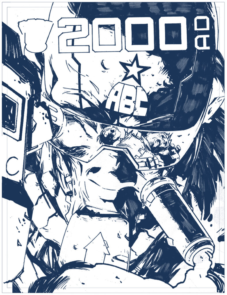
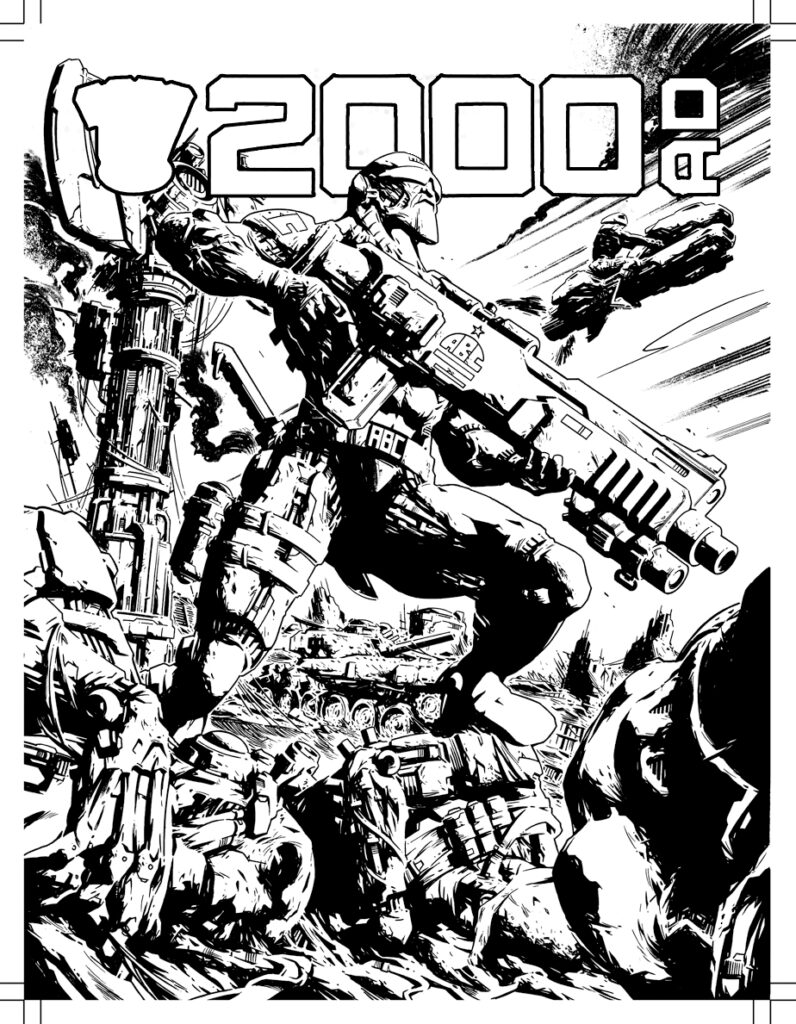
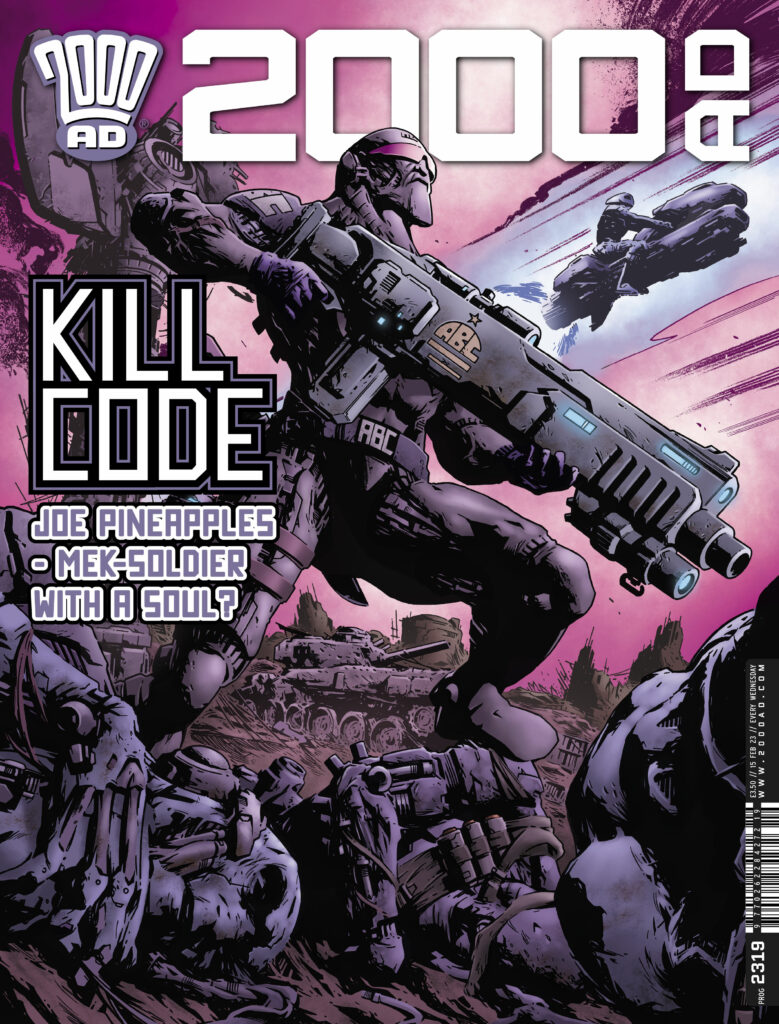
Another incredible cover this week from Simon Coleby, whose work we usually see gracing the cover and the insides of the Prog for his tale of Number-Earth nightmares, Jaegir. However, this week Tharg has assigned him the task of showing us Joe Pineapples in all his glory for 2000 AD Prog 2319, out right now!
Inside the Prog, we have more from Joe Pineapples in the Tin Man series by Pat Mills and Clint Langley, but it’s always such a pleasure to see Simon’s work – whether it’s on the cover or in the Prog!
Simon sends his apologies for this one – as it’s a short and sweet one! As Tharg demands, Simon’s been beavering away with other work and had to send this Covers Uncovered last minute. But he did send us along some great process art to show you!
Okay then, here’s what he had to say about it…
SIMON COLEBY: Anyway — here’s all I have for the Joe Pineapples cover. It was the most straightforward brief ever – Tharg simply asked me for ‘a Joe Pineapples cover.’ That was it — no demands of context, setting or whatever. I did four roughs. Tharg chose the one he preferred. I drew it. Everyone was happy — time for a pint.
And that was it! Sometimes these things take a long time, sometimes a cover just comes together like that. This one starts off with the four roughs that Simon sent off to Tharg…
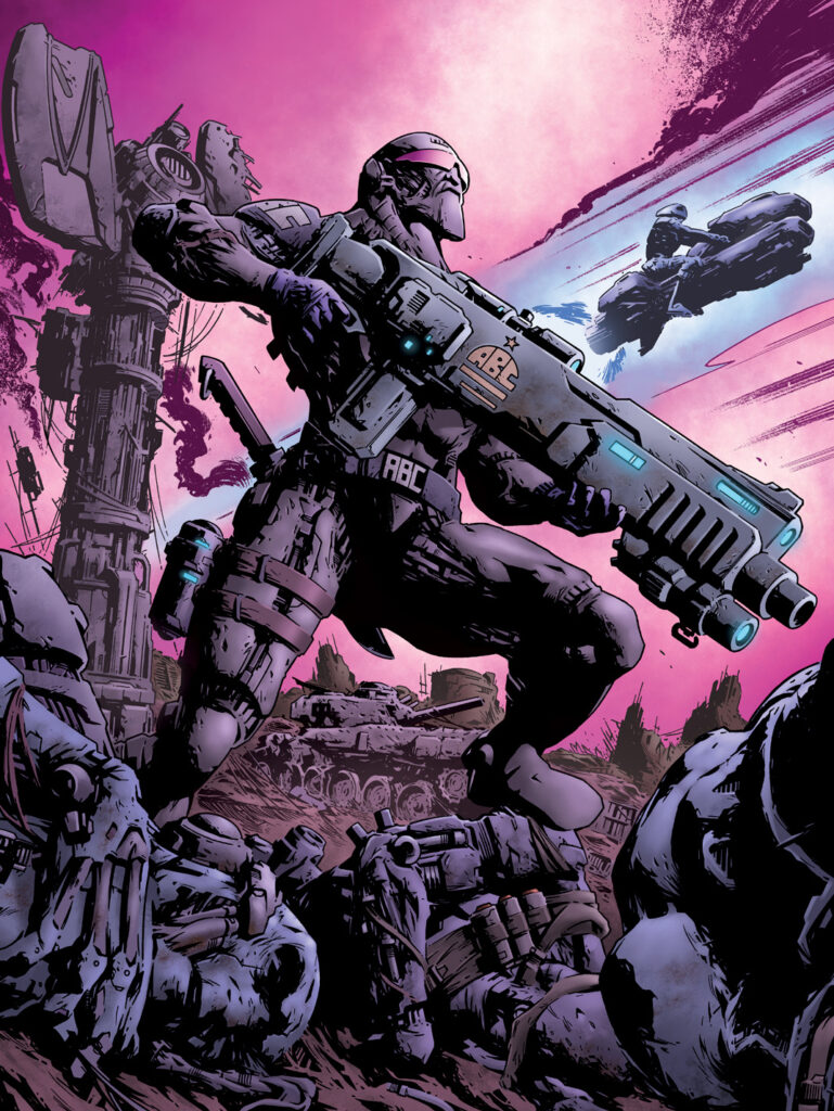
After Tharg picked the one he preferred, Simon got to work, first pencils, then inks, and finally sent off to Tharg to get colourist extraordinaire Jim Boswell to add his magic for the finished cover!
So first it’s pencils of the big man striking heroic pose…
Next, inks and inks over the trade dress for composition…
And once Simon’s finished with it and happy, it’s sent over to colourist Jim Boswell to make the whole thing pop… just like this!
So there you go, thanks so much for Simon to sending that one along – we never mind it being short and sweet, a droids gotta get Tharg’s work done. You can find 2000 AD Prog 2319 out right now – get it at all the best comic shops and newsagents across the land, or from the 2000 AD web shop.
Every week, 2000 AD brings you the galaxy’s greatest artwork and 2000 AD Covers Uncovered takes you behind-the-scenes with the headline artists responsible for our top cover art – join bloggers Richard Bruton and Pete Wells as they uncover the greatest covers from 2000 AD!
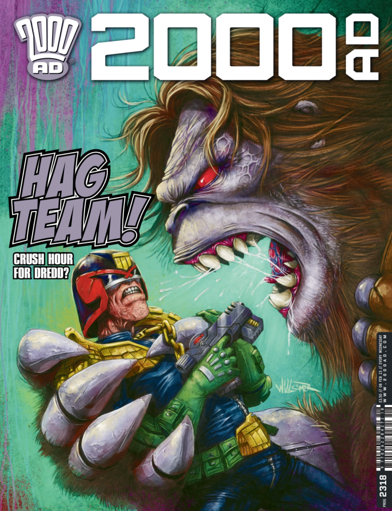
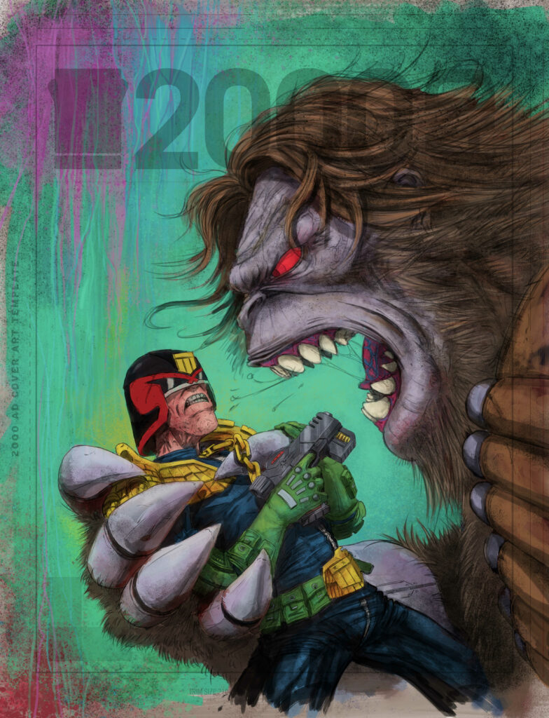
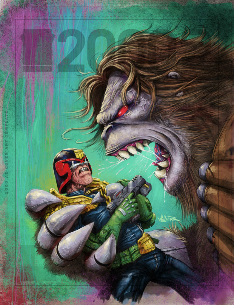
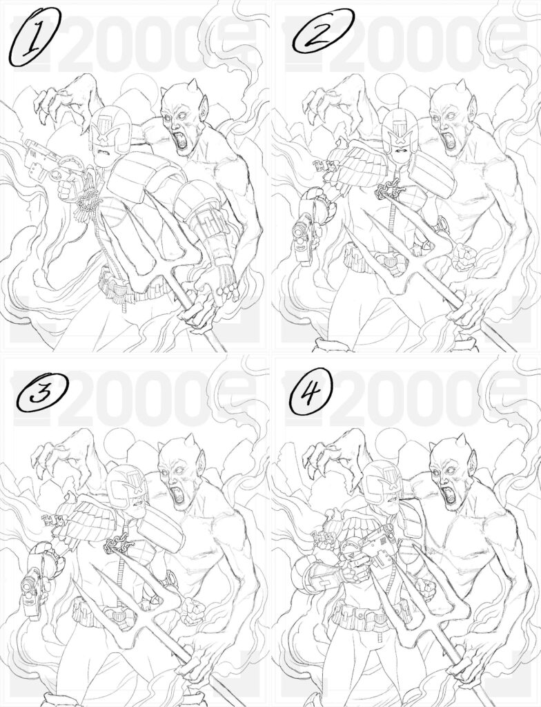
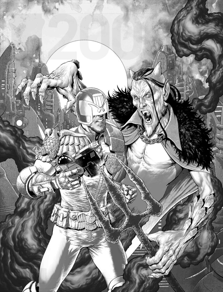
On the cover of Prog 2318, we have Toby Willsmer, giving us a touching little moment between Keeper Hag and Judge Dredd – out on 8 February wherever you get your weekly dose of Thrill Power!
Based in New Zealand but born and raised in ‘70s Britain, Toby first got his work published in the Prog after winning the January 2021 2000 AD Art Stars contest, with a great-looking Sam Slade Robo-Hunter, and since then has been a regular cover artist on the Galaxy’s Greatest, with his distinctive visuals have been jumping out at you regularly on the cover of several Progs, including this one.
Featuring Keeper Hag getting a little too up close and personal with Dredd, Toby’s cover takes inspiration from the current Dredd strip, The Hagger They Fall by Arthur Wyatt, Rob Williams, and Paul Marshall, with Dredd following up the events of the Atlantis attacks by The Red Queen (soon to be collected in Judge Dredd: Requiem) and on the trail of Keeper Hag. And you know what? I reckon they’ve found each other…
Now, over to Toby to tell you all about it…
TOBY WILLSMER: Matt/Tharg asked if I could come up with a cover with a close-up of Dredd straining in the Keeper Hag’s grip. In my head I had an idea I thought might work.
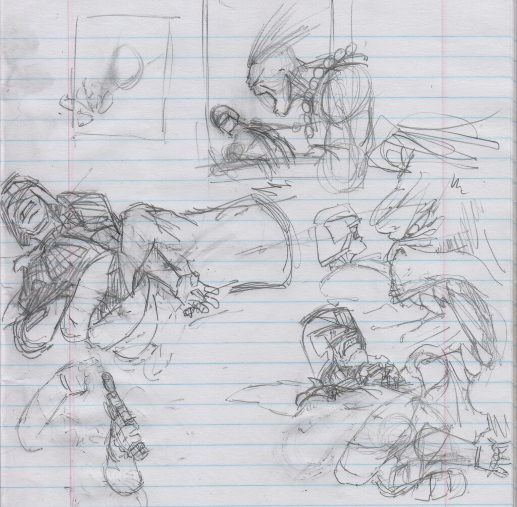
1 – Sketch – My usual place to start is with a good ol’ 2b in the sketchbook. Quickly getting down the ideas and seeing what works and what doesn’t.
2 – Roughs sheet – I put the ideas I had into the template and drew over them until I had something that I liked to show Matt.
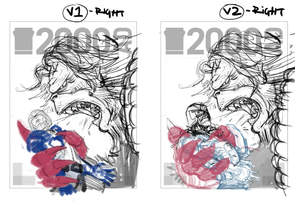
3 – Rough colours – As there was no need to have a specific background for this cover. I went ahead and came up with a couple of colour schemes that I thought would complement the two figures.
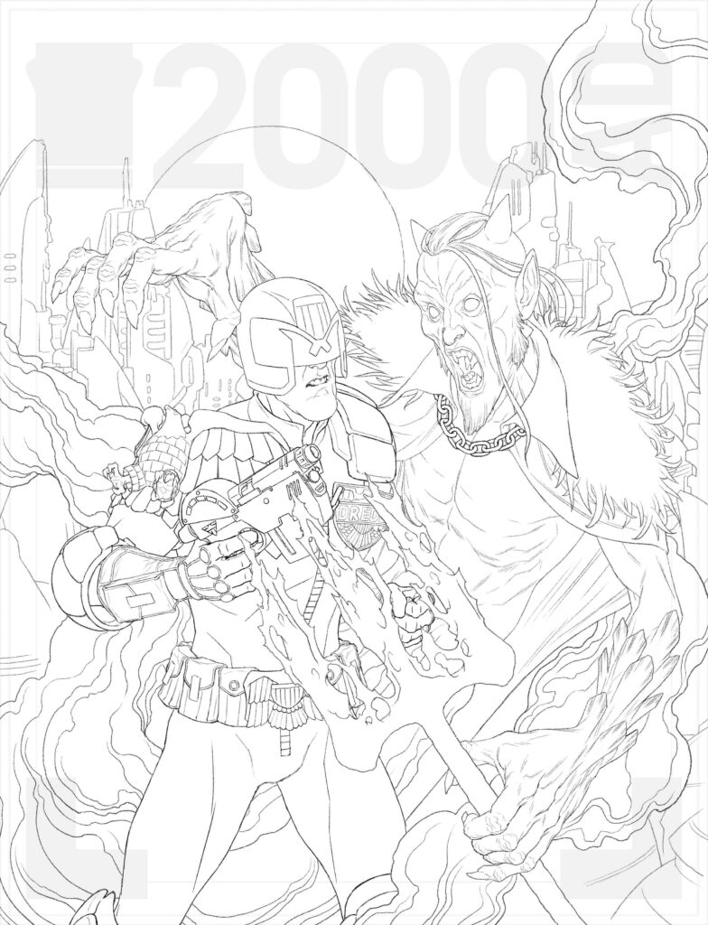
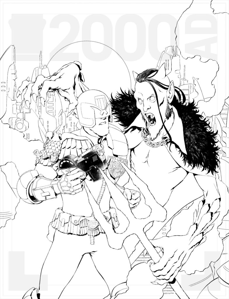
4 – Cover lines – Once Matt was happy with his chosen rough and colour scheme I went ahead and drew up the linework. It was during this stage that I added Dredd holding his trusty Lawgiver to see what it might look like. So drew up a couple of quick options and fired them off to Matt to see if he preferred that… He did.
5 – Cover shades – With the outline all done and updated, it’s the usual route to finish the piece. Adding the shades and shadows first.
6 – Colour stage 1 – Then the base colours get added.
7 – Colour stage 2 – Adding the background splurge colour fest until I’m happy with the result.
8 – Colour stage 3 – And lastly adding all the details and lighting to give the piece some life.
There you go, another cover completed! But hold on, that’s not all, as Toby also sent along a video of the entire cover process, from blank page to finished cover. It’s always so good to see the magic unfold before your eyes…
And thanks so much to Toby for sending all of that along to us to put before your eyes! You can find 2000 AD Prog 2317 wherever you pick up your weekly dose of Ghafflebette comics, including the 2000 AD web shop from 8 February.
And for more of Toby’s incredible covers, do have a look at what he’s done previously – Prog 2240, Prog 2262, Prog 2269, Prog 2299, all of them stunning pieces!
Every week, 2000 AD brings you the galaxy’s greatest artwork and 2000 AD Covers Uncovered takes you behind-the-scenes with the headline artists responsible for our top cover art – join bloggers Richard Bruton and Pete Wells as they uncover the greatest covers from 2000 AD!
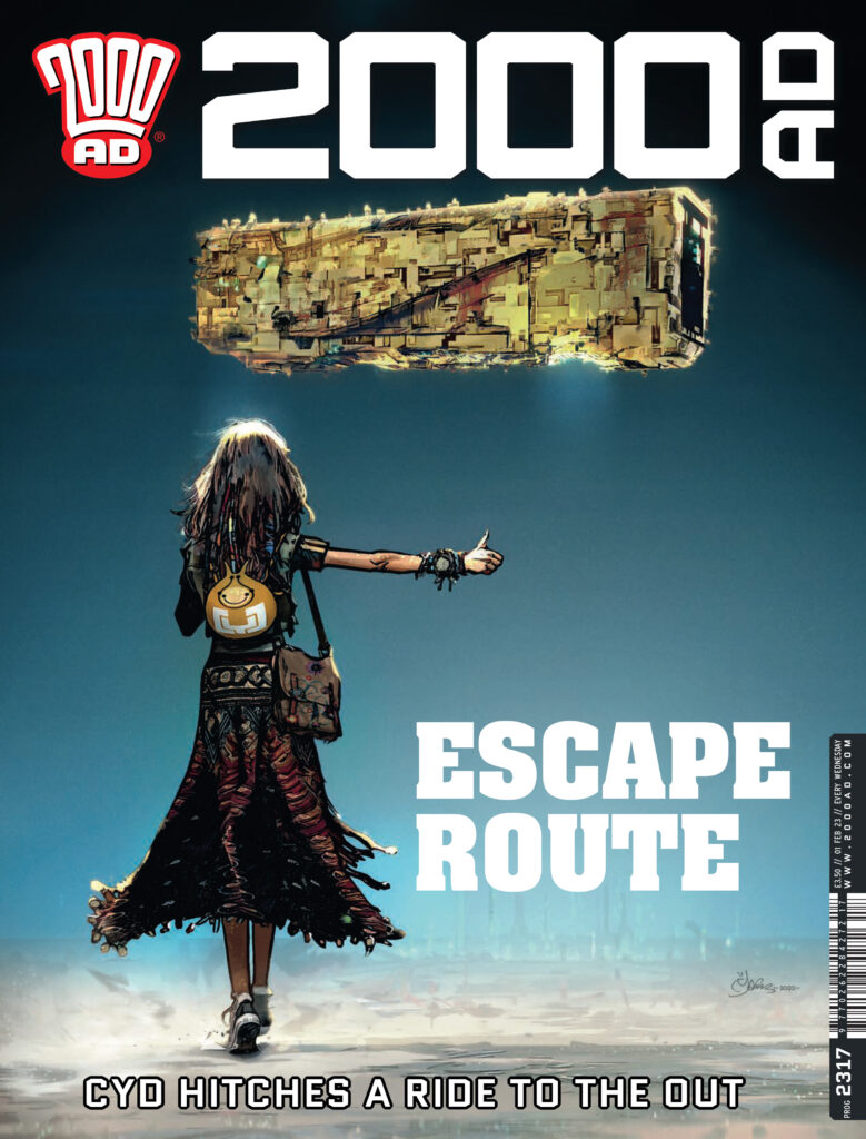
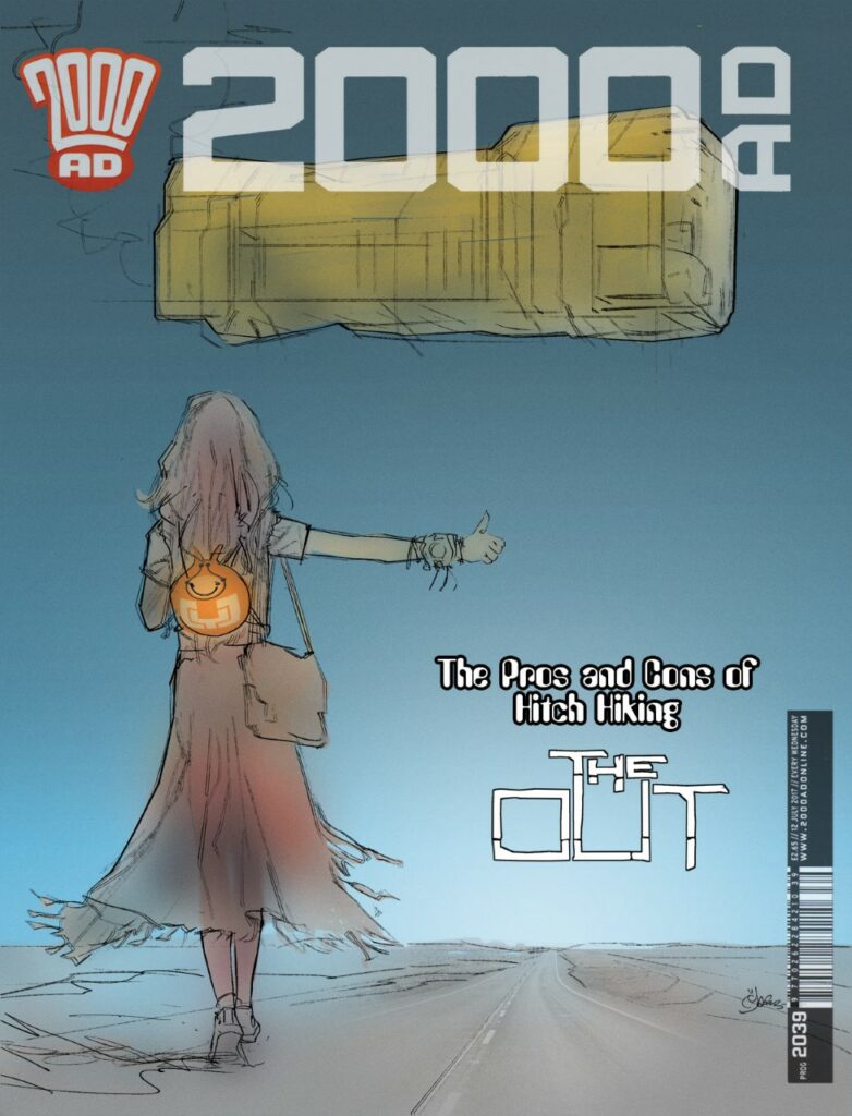
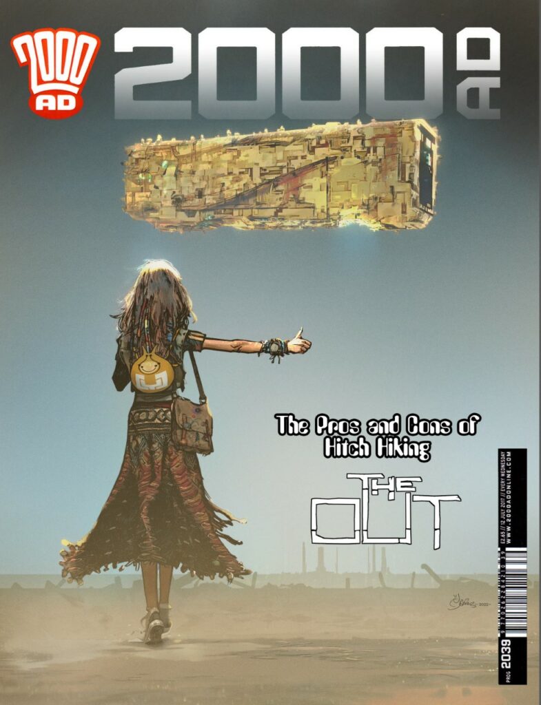
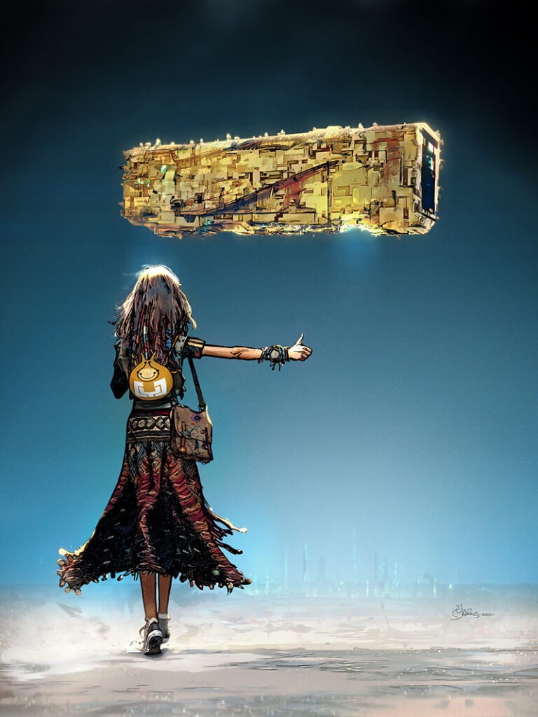
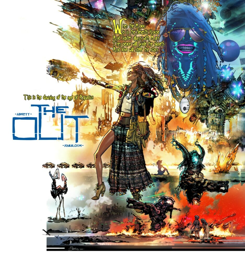
This week, it’s 2000 AD Prog 2317 and on the cover we have the unmistakable artwork of Mark Harrison with yet another incredible cover for The Out!
Inside the Prog, we have more spectacular sci-fi adventuring in The OUT Book Three by Dan Abnett and Mark Harrison.
After her Tankinar troubles, Cyd was looking at a lifetime of house arrest on the Unanima capital world – and then she found out that someone had left the back door open. How did it happen? More importantly, why did it happen and is it part of some plan on the part of the Unanima? Well, that’s something we’re going to discover as this amazing series unfolds. For the moment though, Cyd’s getting out of there and back into the Out as quick as possible…
Right then, over to Mark Harrison for the breakdown of the cover. As usual from Mark, it’s a fascinating deep dive into the artist’s mind and shows you just how much goes into making the cover look THIS good…
MARK HARRISON: Not much to say on this one I’m afraid as it was it was another case of knowing exactly what I wanted to do and just pitching it to Tharg.
[Well, he says there’s not much to say, but… well, you’ll see what I mean]
The idea had been kicking around in my head for some time. A simple image of a traveller walking in an open desert thumbing a lift from a city-sized spaceship hanging in a cloudless sky.
But oh boy, how simplicity has a tendency to be a trial of complexity when computers add numerous iterations and choice to the mix.
(Mark’s preliminary cover)
Cyd was always walking away but I moved her around, centred her, resized, her, and wondered what worked best. This happened with all the elements, squinting to see what “felt” right.
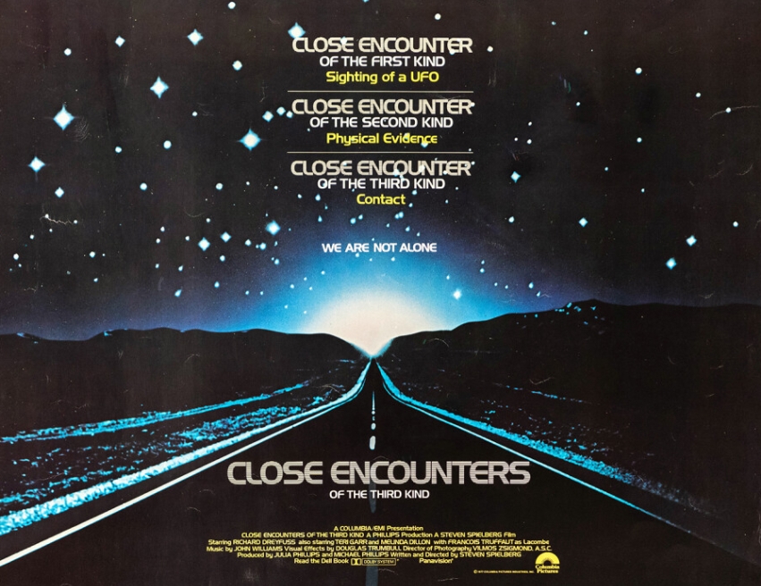
The background was to be a highway, like the poster for Steven Spielberg’s Close Encounters of the Third Kind (which I had already parodied in the Luwot Holiday in Grey Area).
[For more on Grey Area – keep reading to the end where we’ve got a load of Mark Harrison bonus features for you!]
(And here’s that famous Close Encounters poster– and Mark’s homage from Grey Area)
>
Maybe an Alien city in the background? But it was all too fussy and detracted from the clean simplicity.
I added Saturn rings, cloud effects… trying to make it otherworldly… No.
It had to be stripped down to the basics. Which I found to be very hard to do. But it helps if you follow those who have gone before.
(One of those ‘evocative sci-fi book covers with an endless horizon’ that Mark’s talking about – by the great Chris Foss)
I wanted to evoke those evocative sci-fi book covers with an endless horizon. That sterile bleakness that they conveyed. (To do it justice it should have flowed onto the back cover.)
I spent more time removing stuff I’d added, reducing and reducing until in some versions it was just silhouettes or lights – an impression of something over the horizon.
It was all about mood – this was supposed to be a moment of stillness.
Maybe some library sound effect of desert wind catching Cyd’s dress in the midday sun? (A direct downlight – I played with lighting but I wanted this hot dry stillness) Foley work of Converse on a glassy path? The ominous low-frequency electrical hum of something very massive hanging in space? Maybe a tinny sound of music playing from Bag or the chirping of alien desert cicadas?
If the ship had come to land it would have been hissing steam and dripping fluids like a steam train or David Lynch spaceship. I love “organic” detailing applied to machines.
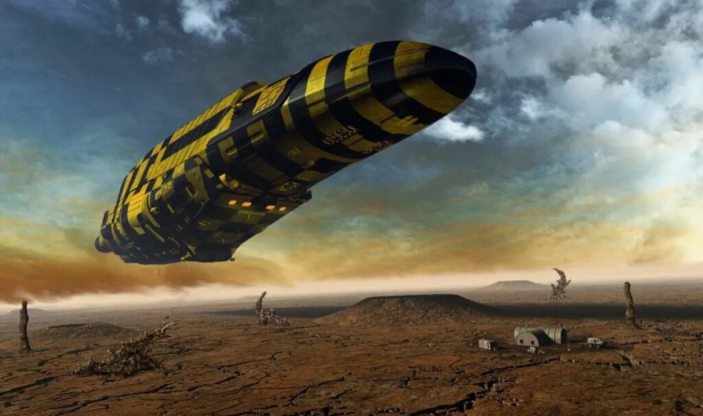
The ship itself went through many changes. I started off with an organic look, curved shapes, lots of lights, lots of fuss. Then I went with simple shapes – spheres, pyramids… bricks?
BRICKS.
Of course! It was there from the off. No prizes for guessing the reference here. Yeah you got me, but I painted the target large and loud in luminous paint.
“The ships hung in the sky in much the same way that bricks don’t.” Douglas Adams, The Hitchhiker’s Guide to The Galaxy.
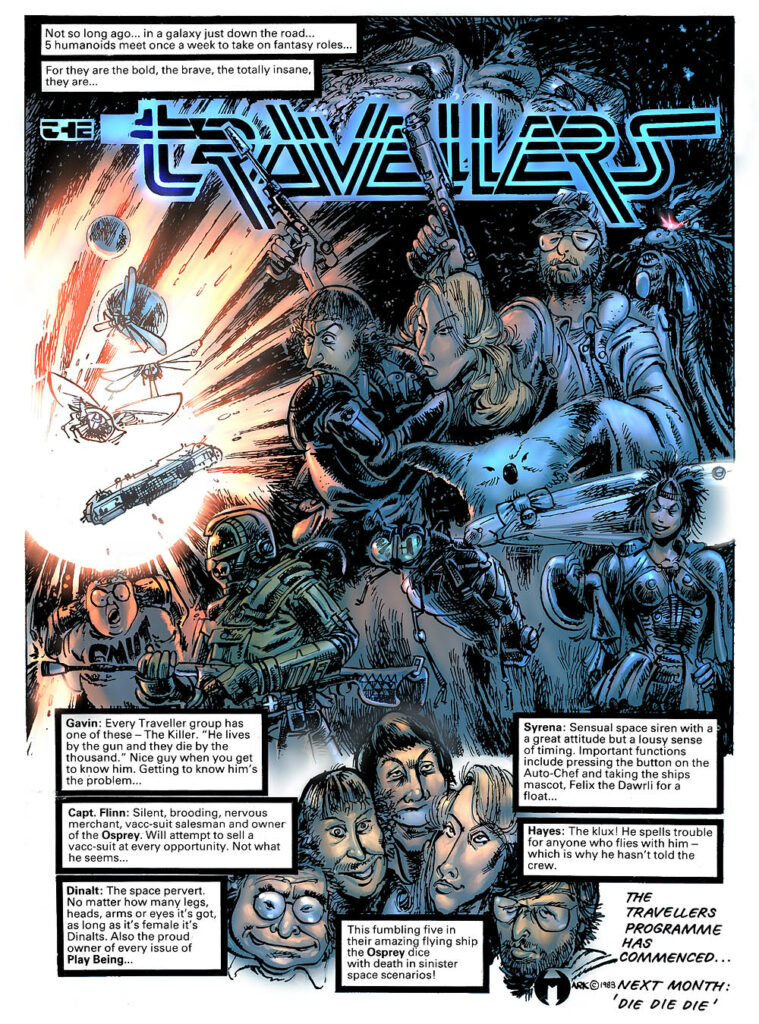
Everyone should know The Hitchhikers Guide. A massive influence on me and my teenage years (and onwards) and on my very first strip the Travellers which had irreverent (but adoring) humour poking fun at the sci-fi clichés of the genre. (There’s still a bit of that in The Out.) I had to acknowledge that beloved book in some way.
[Again, for more on The Travellers, keep going to the end and the bonus features!]
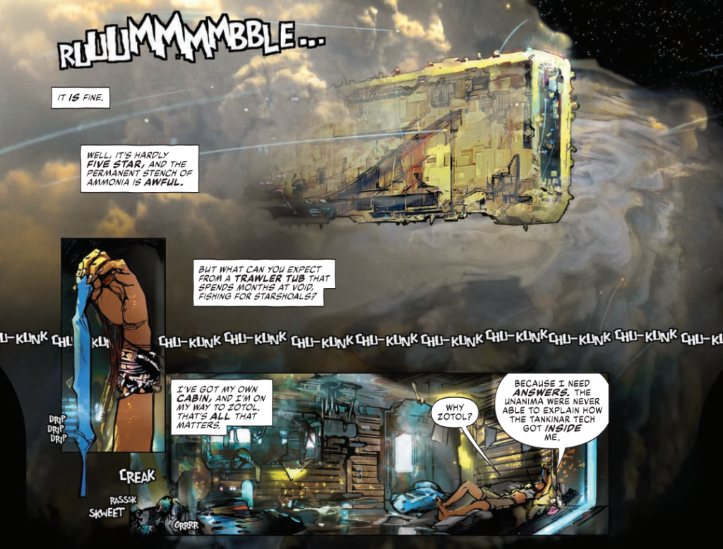
So the ship became a rectangle, a yellow brick, and that also informed the fishing ship in the strip which Cyd hitches a lift with.
Again, I messed with detail, Foss (as in Chris Foss) stripes, and ‘greebles’ – the little model kit parts sci-fi model makes would put on starships for detail.
(Two more reference pieces Mark wanted you to see.On the left, the Vogon Constructor Fleet come to demolish the Earth from Hitchhiker’s Guide. On the right, some of those greebles, here on a Star Wars Star Destroyer – and for more on greebles, have a look at this great Den Of Geek article on them.)
>
But it was getting too fussy again.
It’s a really fine line because I do subscribe to the John Harris school of mass; that something looks bigger the less detail it has on it on it. Harris is an artist that can capture mass very simply with a loose style that coveys atmospheric depth and scale.
(More of Marks’s recommended reading – John Harris’ work)
So I tried it but my brain screamed ‘needs detail’ so I compromised.
I mixed in an overlay of a fishing trawler (since this wasn’t supposed to be a JCB in space) to give me some ideas and a texture to sell a Lego feel.
The interior of the ship suggest cargo containers so I wanted that grunge and panelling on the outside.
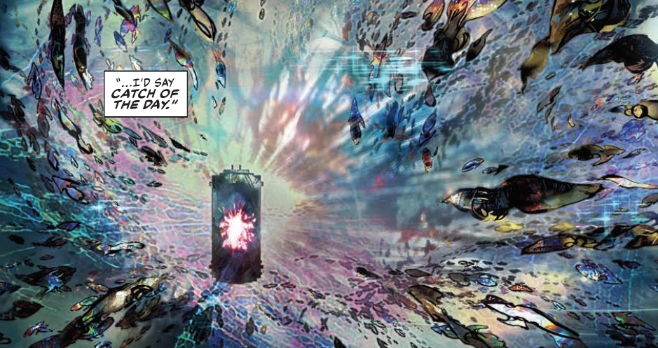
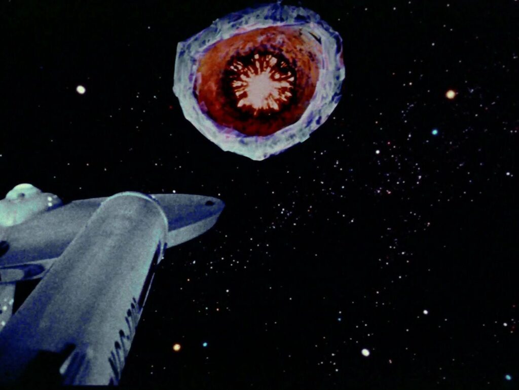
There was an open maw at the front for when the ship deploys a magnetic field; a “tractor net” to capture space-borne squid-like creatures. As an Easter egg, the maw’s light effect is copied from the planet killer in ‘The Doomsday Machine’, one of my favourite Star Trek TOS episodes.[Again, check out the bonus features!]
I submitted two versions of the cover so I’ll be interested to see which one they go with.
Well, by now we’ve all seen the final cover. But here’s the alternative one…
And here’s the clean version of the cover that was used…
It was a cover I fought with. To make it look simple. Fighting the desire to add beyond what was necessary.
Knowing what to leave out in comic art (and still make it readable) is just as important as the line work itself and can be considered a sign of maturity and excellence.
Thankfully I still have a way to go and have fun along the way. I’m still learning and that’s the great thing about this job.
Never give in! Never surrender! (your style!)
And there we have it, yet another quite magnificent look inside the head of the artist. Mark actually apologised when he sent this one over as he was unimaginably busy for various reasons and was concerned this one was a bit short and light! You know, these art droids that make your weekly Prog so thrill powered really are the most wonderful things!
Anyway, thanks so very much to Mark for sending it along – it’s yet another classic image to grace the cover, a cover you can find wherever you get the Galaxy’s Greatest on the front of 2000 AD Prog 2317, including the 2000 AD web shop, right this minute!
Now, be sure to check out Mark’s previous Covers Uncovered entries (all as wonderful as this one) for the covers of Prog 2187, Prog 2193, Prog 2251, Prog 2254, Prog 2261, and Prog 2314, and be sure to go back and read the interview with Dan Abnett and Mark Harrison all about The Out right here.
And of course, no shelf, physical or digital, should be without the first volume of a series that’s going to go down in history as one of the greats of 2000 AD… The OUT.
Now, a few bonus features for you, because frankly Mark always sends along so much, fills his Covers Uncovered pieces with so many references, that there isn’t always space to fit them all in!
So, you all need to check out the work of Chris Foss, John Harris, you should certainly all go and immerse yourselves in the Hitchhiker’s Guide to The Galaxy (start with the radio show or the books, then move onto the BBC TV show), and of course Close Encounters is a sci-fi classic you should all have watched!
As for one of those Easter eggs Mark mentioned, the ‘open maw at the front for when the ship deploys a magnetic field; a “tractor net” to capture space-borne squid-like creatures…’ that he copied from the Star Trek Original Series episode The Doomsday Machine. Well here’s the panel from this week’s episode of the Out and a still from ST:TOS…
And here are the panels from this week’s episode where we first see how Mark’s ideas took shape, where, in his words, ‘the ship became a rectangle, a yellow brick and that also informed the fishing ship in the strip which Cyd hitches a lift with’ …
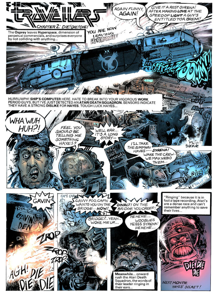
Next, Mark mentioned his first-ever published strip, The Travellers. Well, this was a new one on me, so I asked him about it. According to Mark, it was his ‘humorous take on the role-playing game Traveller. It was published in White Dwarf Magazine back in the 80’s. It was a one-page strip that was my first commissioned work that I wrote and illustrated.’
Well, if you haven’t ever seen it before, there’s great news, as the whole thing has been archived over at 2000 AD.org (Barney, the monumental 2000 AD resource site) at this sub-site – http://www.2000ad.org/markus/travellers/.
So, here’s a little look at what you can find there…
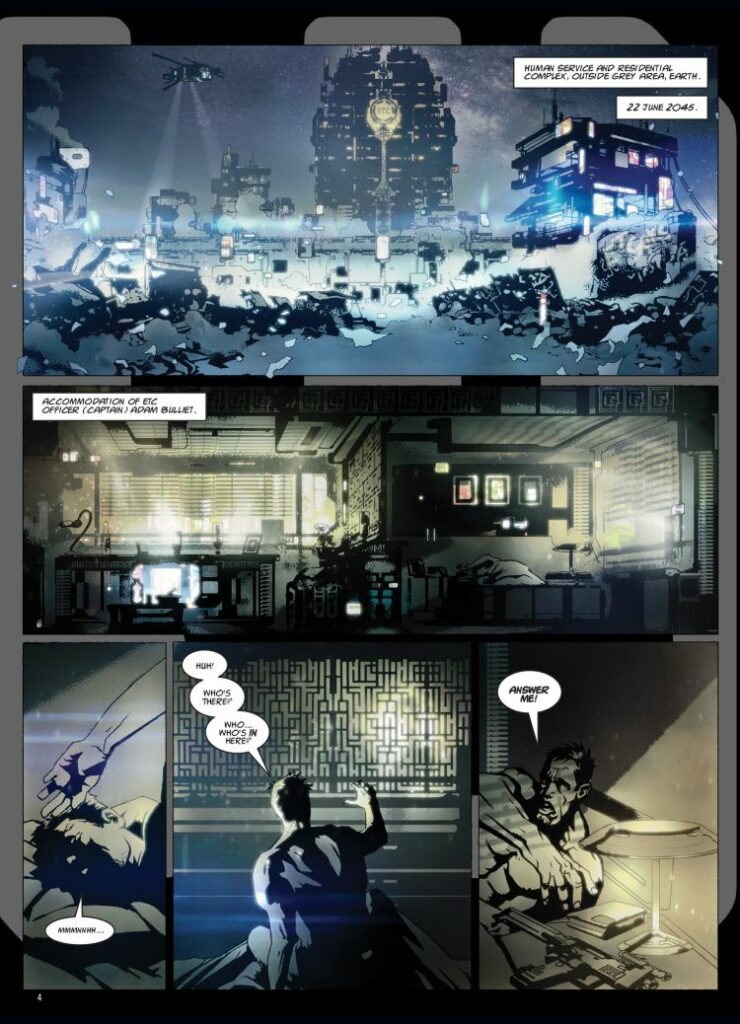
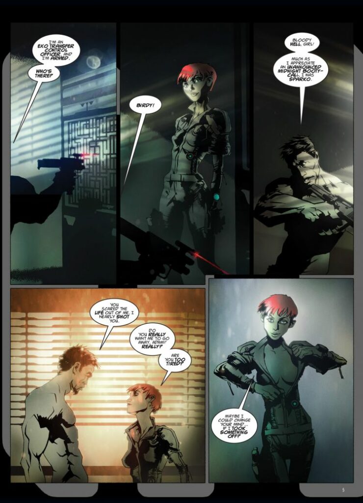
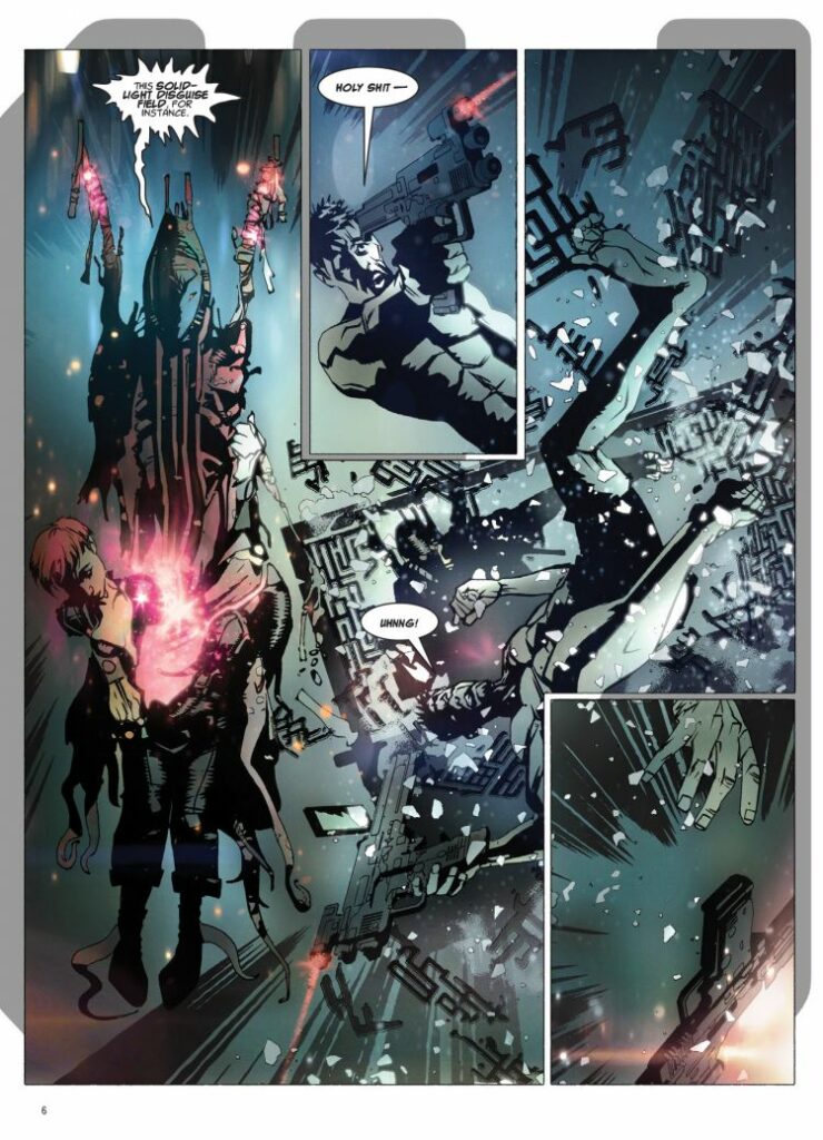
And finally, Mark also mentioned that he’d already referenced Close Encounters in his previous 2000 AD work with Dan Abnett, when they collaborated on the second book of the excellent Grey Area, which was the strip that introduced me to Mark’s artwork and one I absolutely love.
Here’s what it was all about…
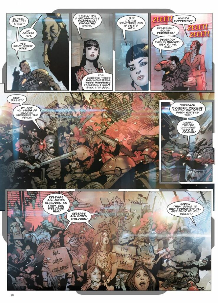
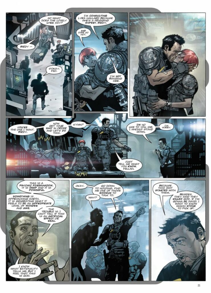
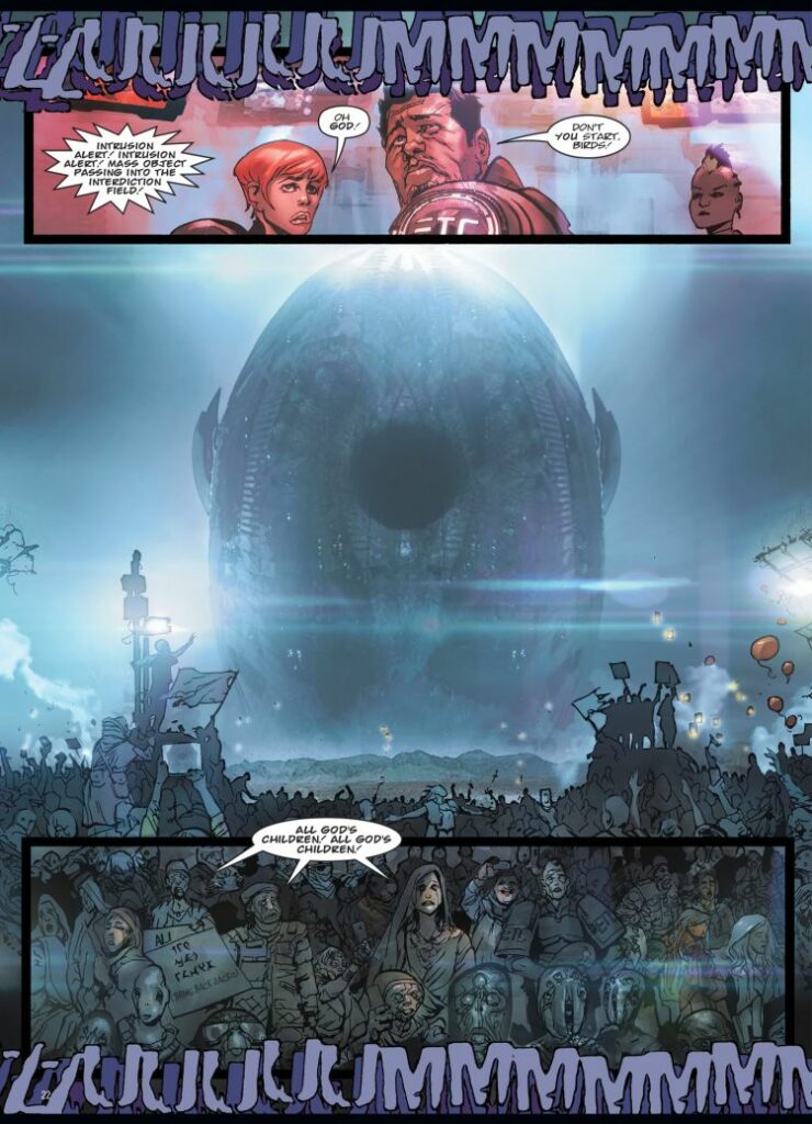
North America, 2045. The Global Exo Segregation Zone (aka the ‘Grey Area’) is a huge holding area in Arizona housing aliens hoping to visit earth: a melting pot for disputes, crime and inter-species misunderstandings!
The only thing standing in the way of chaos is the Exo Transfer Control squads: heavily-armed immigration cops that keep the peace and make sure everyone has their papers in order… E.T.C. Captain Adam Bulliet has a lot on his plate; The Arakshu want revenge on humanity for their dead ambassador, increasing numbers of aliens are having rapturous visions, and his fraternisation with Officer Birdy isn’t nearly as discrete as he thought. Not to mention a dizzyingly colossal god star is descending on Earth, and Bulliet’s team are the ones suiting up to meet ‘n’ greet the second coming. But they might end up going further than they expect…
So, it’s obviously a perfect opportunity to give you a little of that to gawk at as well, isn’t it?
Every week, 2000 AD brings you the galaxy’s greatest artwork and 2000 AD Covers Uncovered takes you behind-the-scenes with the headline artists responsible for our top cover art – join bloggers Richard Bruton and Pete Wells as they uncover the greatest covers from 2000 AD!
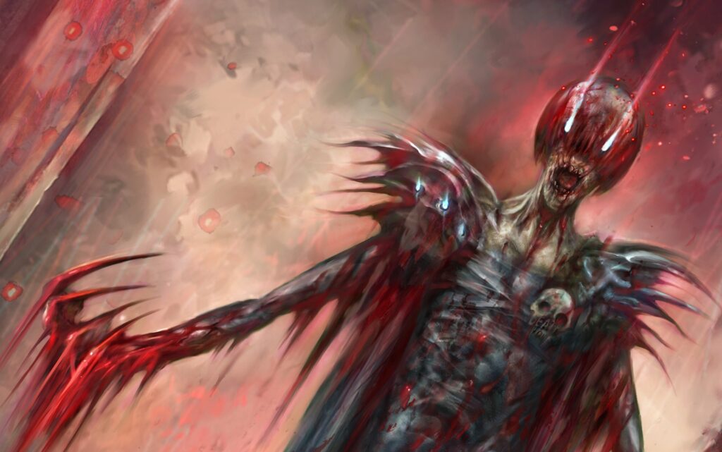
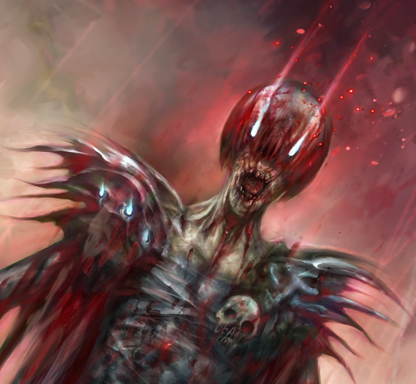
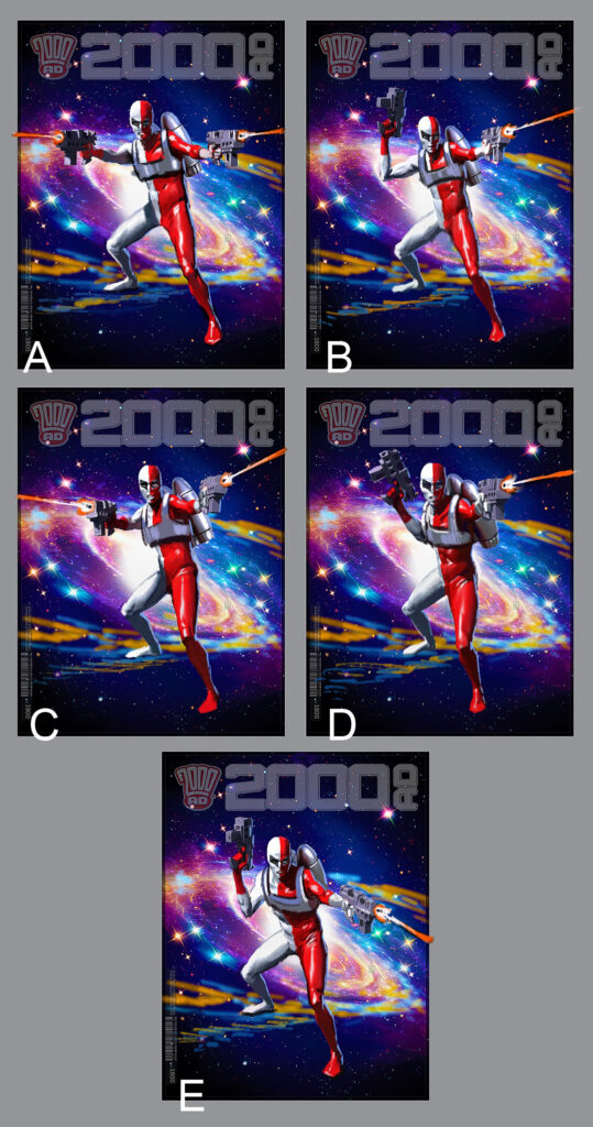
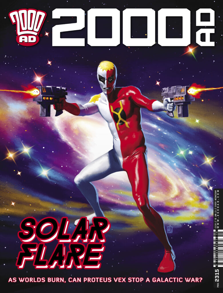
This week, we have another stunning cover featuring Proteus Vex by artist Neil Roberts for Prog 2315…
Inside the Prog, Proteus Vex continues its stunning latest adventure Crawl Space by Michael Carroll and Jake Lynch, where Proteus Vex is back in action and making dramatic moves in the Scorcher war.
Now, over to Neil…
NEIL ROBERTS: It all started off with a brief from Tharg, something along the lines of: “Proteus Vex character shot. Blasting away towards us. Based on the classic Ron Smith ‘Dredd cover”. I quickly delved into my reference folder for some other inspirational images:
From there, I worked up a few thumbnails, based on the references and character design:
One note was to lose the rocket pack on the back. Which was easily done at this stage.
And, basically, all I then do is sit down and paint. There’s no secret to the process – I paint for a day or two until the image is finished. I must add the debt I owe to Mike, Henry, Jake, Jim and Simon for creating the incredible world I briefly get to play in!
Short and sweet there from Neil! Thanks as always for him for sending along the images for another great looking cover! You can find 2000 AD Prog 2315 out right now, on the 2000 AD web shop and from wherever you get hold of the Galaxy’s Greatest!
Every week, 2000 AD brings you the galaxy’s greatest artwork and 2000 AD Covers Uncovered takes you behind-the-scenes with the headline artists responsible for our top cover art – join bloggers Richard Bruton and Pete Wells as they uncover the greatest covers from 2000 AD!
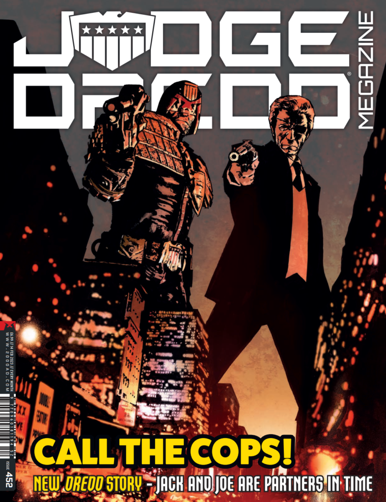
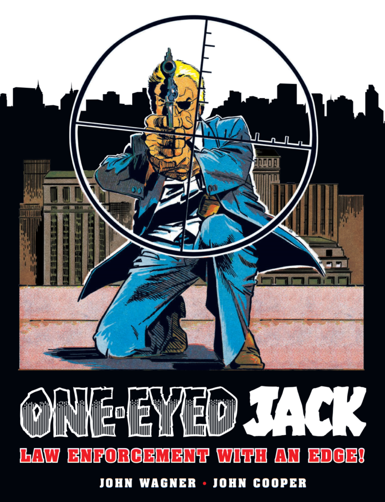
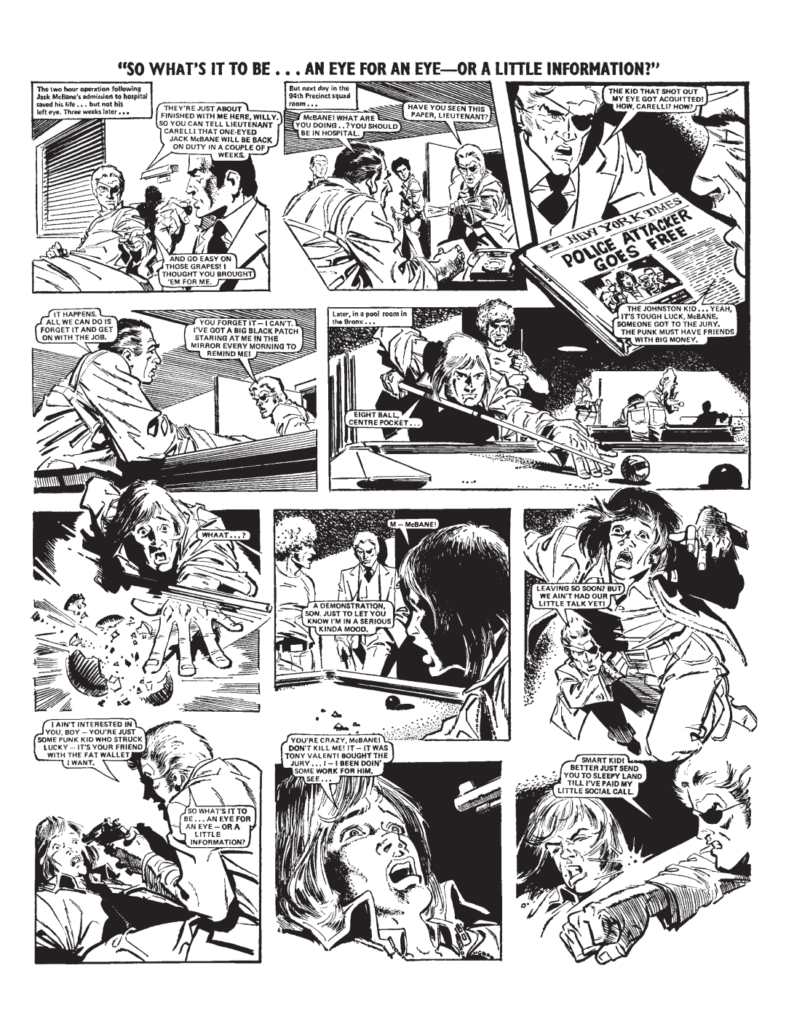
This week, it’s time for a new Judge Dredd Megazine with the surprise return of a classic character from the pages of 1970s Valiant… One-Eyed Jack.
But how on Earth have writer Kenneth Niemand and artist Ian Richardson managed to bring together Jack McBane, scourge of villains in 70s New York, with the toughest Judge of Mega-City One? Well, we’re not saying – you’ll need to read the new Judge Dredd series, One-Eyed Jacks in this months Megazine!
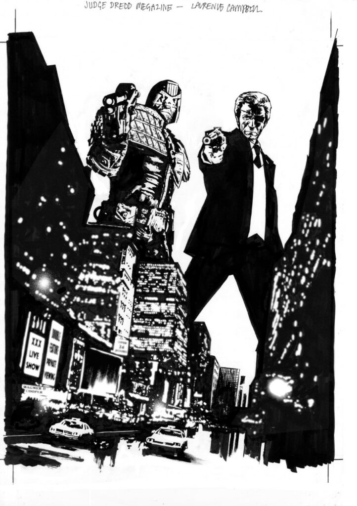
And it’s all underneath a fabulous cover from artist Laurence Campbell…
This first Megazine of 2023 is also the first regular sized squarebound format for the Meg after last months super-sized festive blowout, meaning you get all the usual five thrill-packed Megazine strips (Storm Warning, Dark Judges, Devlin Waugh, and Surfer, in addition to the One-Eyed Jacks Judge Dredd tale) plus reprints of Judge Dredd: Year One and Mega-City Two, alongside a Treasury Classic, reprinting an extract from the 1975 debut of One-Eyed Jack from Valiant, as written by John Wagner and drawn by John Cooper.
But back to Covers Uncovered and the return of Laurence Campbell to the cover of the new Megazine… and he’s here to tell us all about it right now…
LAURENCE CAMPBELL: If I remember correctly Matt got in touch asking if I was free to draw a cover for Judge Dredd Megazine. I replied yes as I love working for 2000 AD when I can.
He then sent over the cover concept of Judge Dredd and One-Eyed Jack together with 1970’s/early 80’s New York in the background.
How could I not resist this? My 11 year old self would have gone nuts for this. I remember One-Eyed Jack from the odd issue of Valiant I picked up or from reprints in 2000 AD Annuals or it might have been Summer Specials, Either way I knew the character.
My starting point was very rough sketches in a sketchbook, this is something I’ve always done since art college. Anything and everything gets put down as it’s brain storming at this point. Matt’s original suggestion was Jack and Joe standing back to back with old New York skyline in the background.
Once initial very loose marks are put down in the sketchbook I then draw up ideas, these are thumbnails and normally drawn four to an A4 page, sometimes one to an A4 page. The idea here is for the ideas to take some sort of form.
These would also have been sent to Matt when ready. Shapes, points of focus and clarity are what I’m looking for here, it’s a good point to solve problems you might have.
I’ve put my thumbnails in order of the development of my idea. Matt’s initial idea was the starting point. This to me was your Hollywood film poster, buddy cop/romcom look – that’s in examples 1-4 of my thumbnails...
This would have worked fine with me but I felt there was something more which could be done.
I was worried that your eyes were attracted direct to the centre of the image and that was it – I felt there was something more dynamic to be done… which brings me to 5 and 6…
The upward looking shot of 5 and putting the city in the foreground had something interesting for me. At this point I then moved away from the back to back and played with other ideas. I liked the connection to two full figures standing within the city and the connection with the twin towers. The twin towers obviously sadly dating the city.
Ideas 5- 6 then got me to my final idea of number 9. I like the shape of the buildings in number 9 and how it pulls in into the picture and to the bottom right of the cover. Ready to get the viewer to turn the page.
I then sent all the thumbnails off to Matt with my suggestion of number 9 working for me. Matt agreed which was cool.
The next step is to enlarge the thumbnail in Photoshop, get references ready, and then start inking…
Inked on A3 paper with a selection of brush pens, fine line pens, markers, inks and correction fluid.
Once happy I then scan, clean up and add Photoshop touches here and there. The image is then sent to Matt.
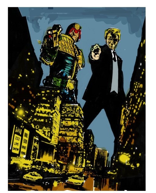
Matt told me Quinton Winter was colouring the cover, so I worked up some very quick colours ideas just to give Quinton an idea of what I was thinking.
I’d worked with Quinton on Sword of Hyperborea, a Hellboy and BPRD spin off book along with writer Rob Williams a 2000 AD regular who I’ve worked with a number of times.
I’m very happy with what Quinton has done with the colours on the final cover.
The whole process was fun and enjoyable, would be cool to draw more Dredd in the future some point.
So there you go, thanks so much for Laurence for sending that one along – and we can ALL agree that it would be more than cool to see Laurence’s artwork on Dredd in the future!
You can find the Dredd/One‑Eyed Jack cover, and the start of the series, on Judge Dredd Megazine issue 452, out wherever you get hold of your Thrill Power from 18 January, including the 2000 AD web shop!
And just as a little bonus, here’s the first few pages of the One-Eyed Jack strip that’s reprinted in this issue of the Megazine – you can get hold of the full reprint from the 2000 AD web shop!
Every week, 2000 AD brings you the galaxy’s greatest artwork and 2000 AD Covers Uncovered takes you behind-the-scenes with the headline artists responsible for our top cover art – join bloggers Richard Bruton and Pete Wells as they uncover the greatest covers from 2000 AD!
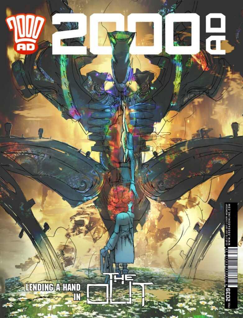
This week, it’s only the second Prog of the year and we already have a stunning cover from Mark Harrison for The Out on the cover of 2000 AD 2214.
Since beginning back in Prog 2187, The Out has been taking you Earthlets out to the far reaches of the Universe to be amazed and awed by the fabulous adventures of photojournalist Cyd Finlea (and her sentient flatspace bag). We’re now following Cyd’s journey in Book 3 of The Out, which began in the 2022 Xmas Prog, 2312. It is a spectacular space odyssey of epic proportions that will be spoken of in decades to come as the finest of 2000 AD.
It’s always a pleasure to get a Mark Harrison cover. Not just because they’re always such amazing pieces of art but because it means we can then look forward to reading Mark’s thoughts on putting the cover together. It’s always eye‑opening stuff, full of all the insane little details that you’re going to be reading about in just a moment as we hand you over to the incredibly talented Mark Harrison…
MARK HARRISON: Okay… Back from a biblical journey to Cornwall for Christmas down under the sea it seems (Flood, End of Days stuff). Mind lost a few brain cells over Christmas so I will try and remember best I can.
I was going to give you some background on the Tankinar beastie that is the main focus of the cover but then realised that strayed into spoiler territory so I’ll just talk cover and the design of the Tankinar. As always hopefully it will point readers in directions and have a nice reminisce about things.
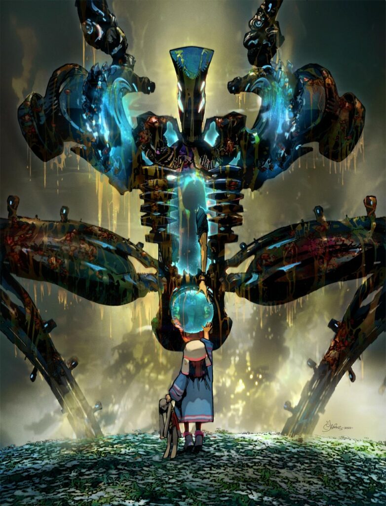
Mark Harrison’s initial rough for Prog 2314 Lending A Hand – a cybernetic horror, a child reaching out. And daisies, plenty of daisies.
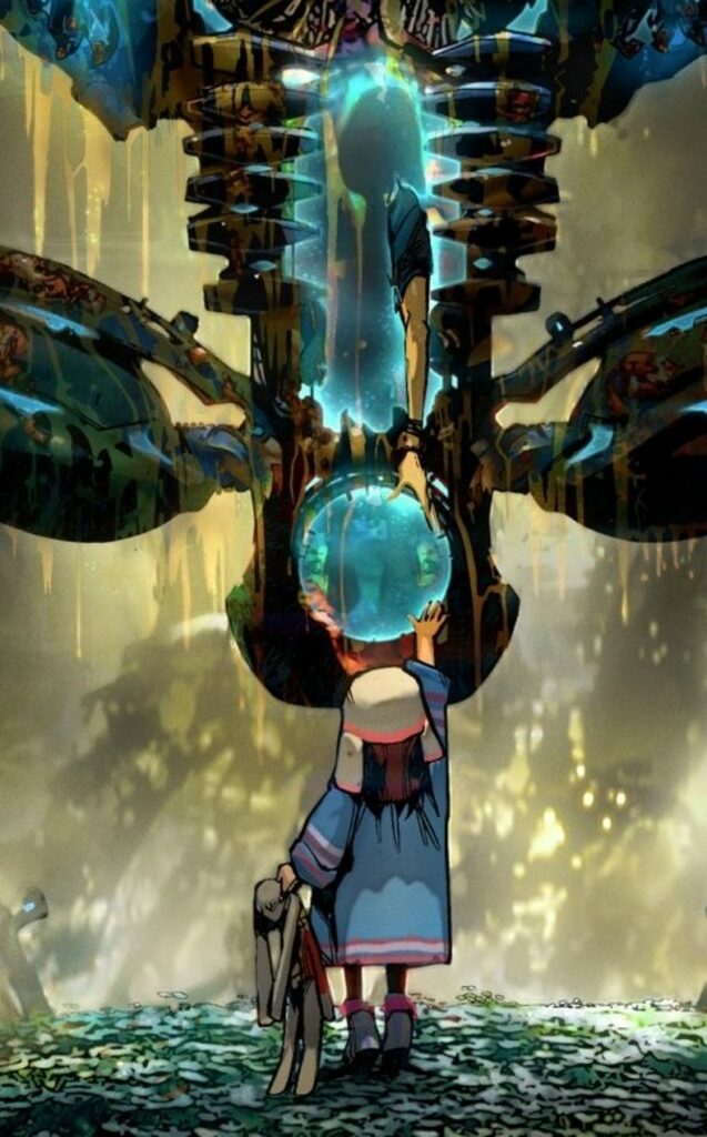
The cover: ‘Lending a Hand’ came together very quickly. I knew straight away I wanted a scene of overwhelming destructive force; a Tankinar, facing a seemingly innocent and inquisitive child reaching out, an unwitting baby putting its hand into the mouth of a lion. That juxtaposition of brutality vs soft passiveness.
The threat had to be HUGE, filling the frame/cover, the child teetering to reach up and touch it, seemingly oblivious to the danger it was in. There had to be daisies. Lots of daisies.
Only in this instance, the child would be Joey, a manifestation of Cyd’s daughter freeing her mother from a glassy prison of fused diamond (giving birth to her mother as it were!).
I went straight to roughs and Tharg approved of it and it was turned around pretty quickly. I think the biggest issue I had was the pose of the Tankinar.
I was going with this aggressive, open-legged squat, like giving birth. (Birthing, either images or film of, I tend to find pretty intense. Aged ten we were shown a video in science class of a 1970’s woman giving birth… no horror film I have watched since has come close to that gory horror show. God knows what the girls thought!)
The pose brought the Tankinar down to Joey’s level, who is standing in an idyllic field of sunlit daisies whilst cities burned in the background, Joey reaching out, Rupert the Rabbit in hand.
As a final late addition, I took out the background colour and had the Tankinar encrusted and dripping with the blood and mince of the inhabitants it has ploughed through to get here, backlit to look pretty.
And Mark’s final cover image – ‘The Tankinar encrusted and dripping with the blood and mince of the inhabitants it has ploughed through to get here, backlit to look pretty.’
I had previously referenced Michelangelo’s iconic image of the Hand of God giving life to Adam when Cyd first meets Joey (Spirituality and religious/art references abound in this strip as Easter eggs/drinking game. Read safe, kids!)
This time Cyd is reaching down to Joey to be given her (3rd?) life. (This all happened ‘off comic’ I should add. The cover kind of shows what happened and how Cyd escaped that which cannot be escaped from. Dan and I like to leave some mystery and have the reader speculate. There is ambiguity, deliberately so. I could say more but…
A blow-up from Mark’s final cover image ‘Cyd is reaching down to Joey to be given her (3rd?) life ‘
That said… Let me pad this Covers Uncovered with a deep dive into the design of the Tankinar. Like most of this personal journey into The Out, it involves my childhood, my love of science fiction film, TV and books and art. My life of stealing; magpie that I am!
The Tankinar was born out of a combination of three elements that made up the original illustration I knocked up while working on Grey Area to accompany the very rough synopsis Dan and I were pitching of The Out to Tharg. Seen here, Cyd the then Space Hippie thumbing a lift and in the montage around her are speculative adventures, foes, events.
Mark’s original illustration to go along with the series pitch
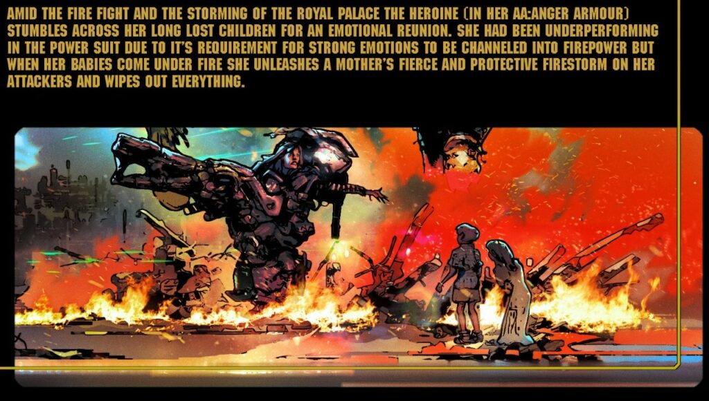
Minor tweaks to the character were made; making her a reporter, and the warring foe she would encounter had no longer abducted her children. The Tankinar then were a race called the Krakken and rode around in Crushtakken tanks (I know… sorry.) The idea was already there that this was a small ‘Little Napoleon race’ that had symbiotically merged with another to ‘Get Big’ and redress some colonial injustice. They sat in the head of ‘AA-Anger armour’; Power suits the Krakken used that were powered/focused by strong emotions, typically fear or anger. Cyd would don one of these conveniently applicable suits in the finale and it would be a mother’s love and protective streak that would free her children from the child catcher Little Napoleons.
More from that original pitch for The Out with a early version of Cyd reaching out of her cybernetic shell
In the process of a back and forth with Dan, things got lost, merged, swapped around. The Tankinar turned out to be a tool. It was the race inside that gave the tool/weapon it’s motivation. And before someone says ‘Dalek,’ these are totally different. These have legs.
(Funny, I never thought of a Dalek until late in the process. As much as you try to come up with something original you’ll find someone has got there before you. So you tweak around the edges.)
The real origin of the Tankinar being the actual weapon came from a science fiction novel I had read in my teens (I can’t remember the name of it unfortunately.) A robot coming to Earth and being impervious to man’s weapons/tools etc. immobile and unmovable. Until it decided to move. And it did so without acceleration or deceleration. From rest to hundreds of miles an hour in an instant and vapourising anyone it’s path. Then stop.
I found that to be a powerful image, something moving faster than thought, being the weapon. To that end it had to be brutal. An iconic silhouette. It also had to tie in with a disturbed child’s scribblings on a daisy chain cut out of the Tankinar that had already been done. I wonder how many readers guessed that Joey would help turn (blue) the Tankinar from that ‘Spoiler’ cover to Prog 2251?
Detail from the cover to Prog 2251 – Mark’s covers always have teases and Easter eggs in the details
An early idea was eventually dismissed but was briefly glimpsed in Book One of The Out – killing Cyd as we needed to see something. I had until Book Two to come up with a more finalised image. In the 40 years that Cyd had been on ice the Tankinar were defeated in that incarnation, (so everyone thought) but had in fact it had only retired to reorder itself. But into what?
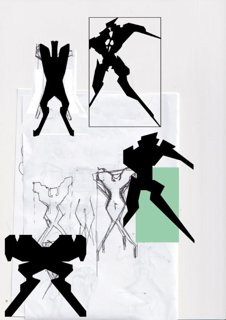
Right from the off I knew this to be biomechanical. Cyborg. A weapon that needed organic input. It had to be brutal looking. I thought of stuff that would be intimidating, that everyone could relate to. An axe/iron for the head. Crossed claw hammers for the American footballer styled shoulders and inside those terrifying buzzsaws that rev up prior to an attack (actually based on road milling drums. They’re awesome- look them up. Imagine a Bond henchman falling under one of those!) Bolts projecting from scythe-like legs.
Mark’s early Tankinar silo shell ideas – ‘An axe/iron for the head. Crossed claw hammers for the American footballer styled shoulders and inside those terrifying buzzsaws that rev up prior to an attack’
I tried it with arms but it looks heavier. Less agile. I then settled on an Olympic speed racer silhouette and that powerful, graceful slicing forward motion you see in them, the throwing back of the arms, thrusting out the head and chest. A legion of those coming at you in perfect synchronisation.
A more streamlined influence for the Tankinar
.
(As an interesting aside: When working on the Aliens vs Predator game for Rebellion I was tasked with creating storyboards of the Aliens motion and stalk/running cycles. I quickly realised running at you with arms outstretched looked less scary (almost comical) than running at you jaws first. This creature was so assured it didn’t need to lead with its claws!)
I played with textures; some Hindu carvings (that survived to be framing elements to the first page of Book Two) an Aztec pattern, runes on some indestructible rock body, and a plated look.
Bits of it worked but… then a blast from the past, from my childhood intervened.
My brother and I had loved the Denys Fisher toys: ‘Cyborg and Muton’ growing up in the 1970’s. (Dan told me he had Android). Great box comic art too that fired up the imagination.
They were rebranded Japanese toys (Henshin Cyborg and King Walder respectively) that were the precursors to the Micronauts and Transformers. Their selling point was interchangeable weaponry and the fact they were transparent. Brains and organs visible or Golden bionics encased in fused diamond.
1970s Childhood memories for Mark, his brother, and Dan Abnett
The cybernetic horrors of the 70s with Cyborg and King Walder – oh, the 70s were great!
I’ve no idea on the artist for the box art for Cyborg – although I did ask one famous artist I thought it might be – Walt Simonson! It wasn’t him but he was glad it inspired me to become a comic artist. Putting on my comic book detective hat it’s not a known Spanish comic artist that the British comics would sometimes employ.
Knowing how these things work and the time period it was probably a British-based ad agency artist, a no-name that simply fulfilled a brief. It fits very much with the 60’s/70’s ad agency line illustration of the period. They have a loose, sketchy style about them and some giveaways/markers to their art like how they do hatching, explosions, dynamic layouts (very British/European and an influence on me – Americans, by and large, were still grid system) and line art (a rapiodograph or felt tip typical of ad agencies) There is similar styled graphic line art for architecture, newspaper ads etc.
I’d love to know the artist myself but sadly the internet draws a blank (no pun intended). It’s not very good at obscure British retro stuff.
[Nope, we can’t place it either Mark – anyone have a clue? We’ll put the full sized art at the end of this Covers Uncovered to give you eagle-eyed readers a better chance at identifying the artist!]
MARK HARRISON: Kid’s toys in the 70’s were so cool. I remember my mom being disgusted by them!
I’ve just been reading ‘Scarred for Life: The 1970’s (got the 80’s for Christmas) Of course it talks about Action! and 2000 AD but the real revelations are the toys and girls comics of the age.
Back to the Tankinar – add internal lighting (mainly to distinguish the Joey blue Tankinar from the rest) and it was ready for the final ingredient. A host, in this case a human inside it, in a sort of foetal position. (That also decided the Tankinar’s size.)
The torso also owes a nod to Epstein’s rock drill sculpture that I used to marvel at in Birmingham’s Art gallery and Museum. (A futuristic design from the early 1900’s that George Lucas also thought was pretty cool for the STAP droids.) The sculpture appears to have a figure inside it to my mind.
Epstein’s Rock Drill Sculpture – another influence on Mark’s designs for the Tankinar
>
That was a delicious idea for the Tankinar- to see the hapless being trapped inside. For them to see out. For all eternity. As if in a specimen jar, the organic element slowly dissolving over time so only a brain (with eyes) and nervous system remains.
The organic parts; redundant limbs and organs collecting as a soup in the base of the Tankinar. Sloshing around… for all eternity.
Tankinar soup – a delightful idea
It’s a gun that seduces and reduces the user, makes them part of it as you lose yourself to it. Fortunately Cyd avoids that fate but mind links with those that have.
‘Make it stop’ comes to mind.
I first thought of Cyd frozen in a perpetual scream entombed in the Tankinar, drowned in liquid diamonds. Like a wasp in amber. That gave way to a cavity to allow for Bag and the pollen to have a possible effect on Cyd, break the psychic link to a hive mind of the Tankinar. Edvard Munch’s famous ‘The Scream’ was something I referenced with Cyd’s head locked fast in a cyborg vice replacing the hands of the painting, microfilaments holding open her eyes, ears, and nostrils to experience the full sensory horror ride she was on, unable to turn away. (A memory of Alex’s conditioning in A Clockwork Orange?)
Cyd, Edvard, and Alex… three screams
>
The Tankinar feed off organic impulses and stimuli. They require the intent, the impetus that comes from the primeval fear all life is descended from. They may a tool but a hammer in the wrong hands is a weapon. And it has weapons beyond the stumps it has for arms. Utilising the same plugs on the toys, weapons are ‘morphed’ into place from flatspace in the same way Bag can deliver items. So the Tankinar has a whole arsenal to draw upon when simply ramming objects is not enough. Molecular whips, rockets, blast waves. I hoped for a two-issue battle to end book two showing all this off as she decimated the Tankinar horde but we ran out of space. (Dan found a way to make it a dramatic intro to Book Three.)
It’s a balance to make Cyd not too heroic or empowered but grounded and believable. We try to keep in mind the real world. A real world lost and terrified tourist picking up an AK-47 and letting loose. Only this gun doesn’t stop firing and you can’t let go.
What unlocks the fear, the cycle of violence is love. If fear drives you then you are fodder for the Tankinar. But love will set you free.
But why are they doing this? What is the Tankinar’s purpose? Look to the stars for answers… and 2000 AD, the Galaxy’s Greatest Comic!
As always with Mark, an absolute pleasure to read the inner workings of the artist’s mind in the creation of this stunning cover! You can get it wherever you obtain the Galaxy’s greatest from, including the 2000 AD web shop, from 11 January. It’s 2000 AD Prog 2214, packed with more than enough thrill power to get you over that post-Christmas slump!
Now, be sure to check out Mark’s previous Covers Uncovered entries (all as wonderful as this one) for the covers of Prog 2187, Prog 2193, Prog 2251, Prog 2254, and Prog 2261, and be sure to go back and read the interview with Dan Abnett and Mark Harrison all about The Out right here.
And finally, here’s the Cyborg box art in full for you – anyone out there got an idea which artist it was that so inspired Mark?
Every week, 2000 AD brings you the galaxy’s greatest artwork and 2000 AD Covers Uncovered takes you behind-the-scenes with the headline artists responsible for our top cover art – join bloggers Richard Bruton and Pete Wells as they uncover the greatest covers from 2000 AD!
This week, it’ssssssss Christmassssssss (which strangely, works whether it’s Noddy Holder or Judge Death announcing it.) And Christmas means the HUGE 2000 AD festive blow out, complete with a cover from the ever-wonderful Andy Clarke!
Yes, it’s full on Christmas in Hell for the big Xmas Prog this year, with Andy Clarke’s cover leading into a massive end of year celebration and the beginnings of some of the greatest Thrill Power you’ll find anywhere!
We have two lots of Judge Dredd, the beginnings of three ghafflebette tales–Proteus Vex: Crawlspace by Mike Carroll & Jake Lynch, The Out Book Three by Dan Abnett & Mark Harrison, and the highly anticipated Joe Pineapples: Tin Man by Pat Mills, Simon Bisley & Clint Langley, as well as the continuation of the dark horrors in Hope: In the Shadows Reel Two by Guy Adams & Jimmy Broxton. Plus, Rogue Trooper encounters Nort genetic experiments in Brothers by Kek-W & Warwick Fraser-Coombe, and there’s the unexpected (and bittersweet) return of the anarchic alien, Bonjo From Beyond The Stars, by Garth Ennis and the late Kevin O’Neill, plus a special Judge Dredd tribute to the much-missed Alan Grant. Seriously, this is one you need to be stuffing that stocking with!
But now, we’ll get the skinny from Andy Clarke on putting together the cover that you’ll see on the shelves for Christmasssss…
Ohhhhh, it’s PANTO season – ‘He’s behind you!’
ANDY CLARKE: The brief from Tharg was pretty exciting – the chance to come up with a cover for the Christmas Prog with the added bonus of some flippin’ brilliant Lee Carter work to reference. It was a good opportunity to revisit the original Carlos Ezquerra strip too – fantastic stuff.
[Andy’s talking about Judge Dredd: The Last Temptation of Joe by Ken Niemand & Lee Carter in the Xmas Prog, a sequel riffing off the classic Beat the Devil, by John Wagner and Carlos Ezquerra, originally published in Judge Dredd Annual 1984 – the one set in Iso-Block 666 and ending up with Satan in cuffs.]
Once Tharg approved the sketch, I tweaked anythingthat needed it or needed tightening up. I was going to do most of it greytone, so only inked up the outlines and the odd detail here and there.
Fire and brimstone and the usual bondage gear for Dredd’s Christmas party then? Pencils and partial inks done by Andy, all awaiting the greytones
I got the background underway first so I could see as I went along how it was sitting in relation to Dredd and the devil. I dropped in some texture instead of going in and drawing any more detail and then erased into it to get an idea where the light was going to fall on the buildings.
To give the sky a bit more to do, I wetted some paper and made a few splodges with old ink that’s more grey-brown than black, scanned it in and dropped it in behind the city. I did a few of these a few years back to use for outer-space backgrounds – the hope was they’d look a bit more interesting than just a black area with ink-spray for stars. They seem to work for other stuff too, adding dirt to things that are a bit too nice and clean – flicking ink over everything works pretty good too.
If you even think about it, Beelze-perp, I’m going to stick that trident, flaming or not, where the sun don’t shine!
The greytone stuff needed a little more care this time – my usual parallel pen method wasn’t going to work all that well on the devil’s skin – it’s a bit hard and flat – so something with a softer edge seemed a better option for these areas. Same approach for the devil’s fiery “tail” thingy.
The devil rides into MC-1 trailing a brown toxic cloud of choking gas… A lesson learned, always avoid overdoing the sprouts.
Once all the flats were in place, I changed some of the greys to colour for a bit more flexibility, then darkened up some areas and lightened up others. Wasn’t really sure how to approach the fire on the devil’s fork, so made some fiery shapes, duplicated them, blurred and blended, poked and prodded until it all started to come together. A lot of mucking about and hoping, in other words.
To finish off – as it’s that time of year – I peppered in some falling snow and capped the city blocks. I’m glad Tharg went for the subtler snowy option, far better than the other thought I had about Dredd being tangled up in xmas tree lights and the devil wearing a santa hat. Lame.
Silent Night, unholy night – choir practice always gets canceled because of something in MC-1
And that’s it – it’s beginning to look a lot like Christmas… all thanks to Andy Clarke! You can find 2000 AD Prog 2312, the final Prog of 2022, wherever you pick up your weekly dose of the Galaxy’s Greatest, including the 2000 AD web shop from right now – today.
If you want to read more of Andy Clarke talking covers (and of course you do) – how about Prog 2287 with its trash droid for Dredd? Who can forget the Sinisterless Dexter cover with the world’s worst category for Prog 2290. And finally there’s his swimsuit special Dredd for Judge Dredd Megazine 444.
Every week, 2000 AD brings you the galaxy’s greatest artwork and 2000 AD Covers Uncovered takes you behind-the-scenes with the headline artists responsible for our top cover art – join bloggers Richard Bruton and Pete Wells as they uncover the greatest covers from 2000 AD!
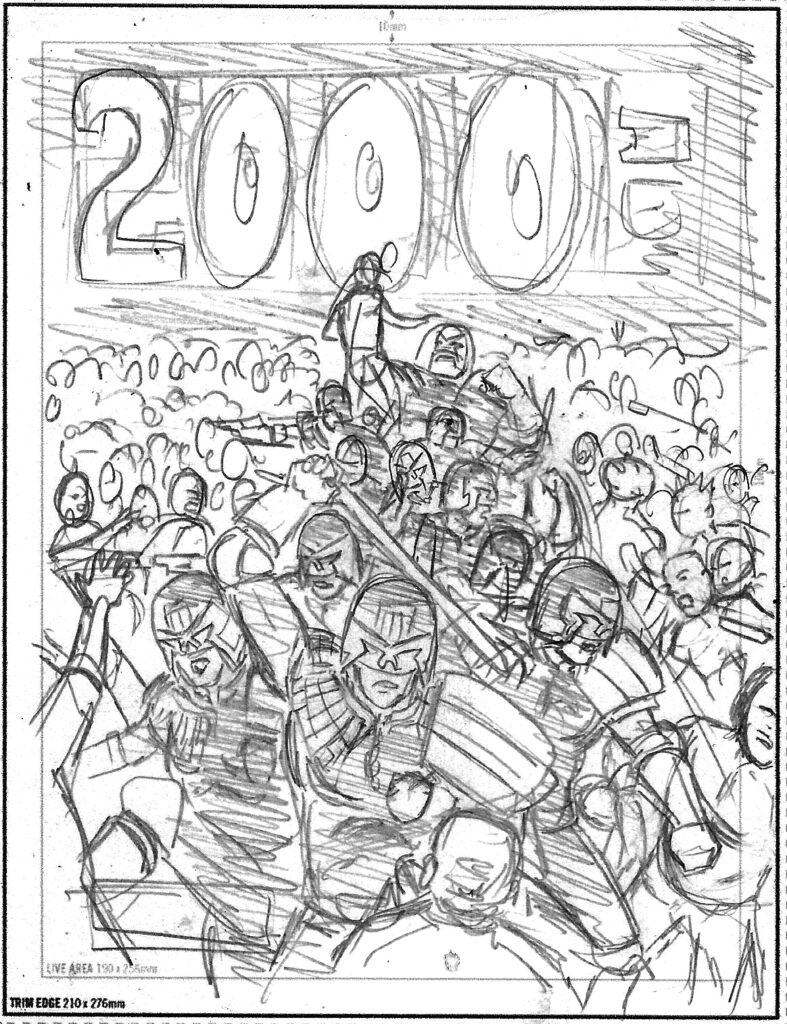
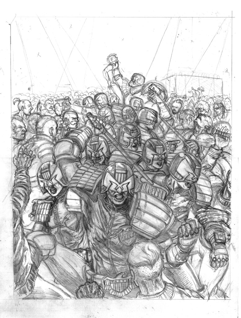
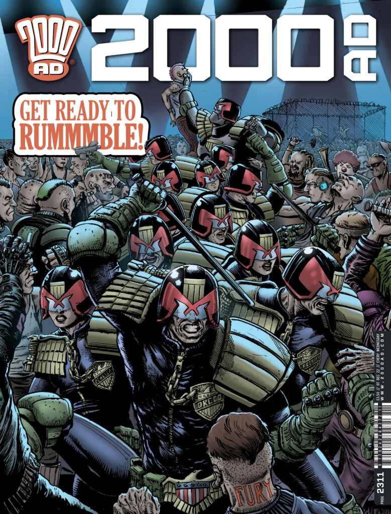
This week, Steven Austin brings you the cover for the final regular Prog of the year, featuring Dredd and his pals doing a little bit of community policing as they politely shut down the illegal fight between the champs of Tyson Fury Block and Caitlyn Jenner Block – as featured in the conclusion of the Judge Dredd tale inside, The Re-Match.
STEVEN AUSTIN: Matt contacted me and asked if I could produce a cover similar to the panel from The Rematch part 2 – where Dredd and the his Judicial cohorts are cracking skulls after raiding the venue as the fight is in full swing.
Matt requested Dredd front and centre with the other judges behind going off into the distance. For this to work, I had to take a slightly higher vantage point than in the opening panel and wanted to compose it in such a way that the judges almost make an arrow pointing toward the logo.
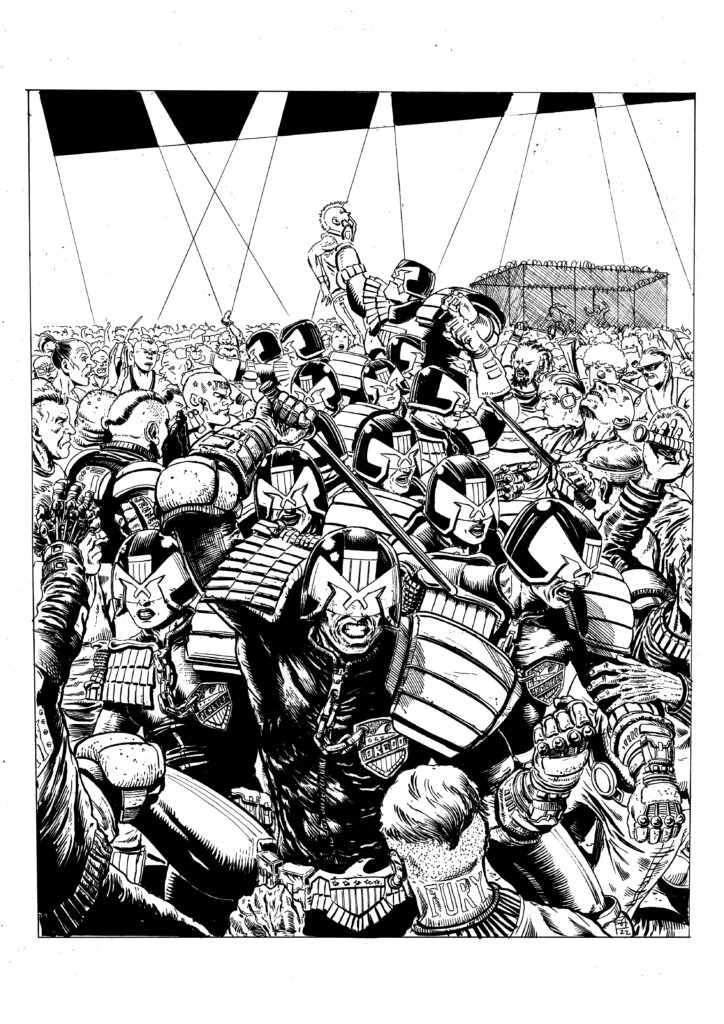
The colourist Jim Boswell, who has coloured all of my recent strips and covers recognised the opportunity to play with the reds on the helmets and has used muted hues throughout the rest of the composition so that the judges really pop.
As per usual I began with a pencil rough, which Matt liked but requested that I increase the size of Dredd slightly, which I did. This rough then went onto the lightbox where I worked up final pencils.
On completion of these I inked the piece with a combination of a Tombow Fudenosuke brush pen and a Pentel brush pen, I find the Tombow great for outlining and the Pentel for filling.
Following this the piece made its way to Jimbo for him to work his magic with the crayolas.
And work his magic he did… that Boswell art droid knows how to make a cover pop – something very much like this…
So there you go, thank you so much to Steven for sending that one along – you can find 2000 AD Prog 2311 wherever you pick up your weekly dose of Ghafflebette comics, including the 2000 AD web shop, right now.
Every week, 2000 AD brings you the galaxy’s greatest artwork and 2000 AD Covers Uncovered takes you behind-the-scenes with the headline artists responsible for our top cover art – join bloggers Richard Bruton and Pete Wells as they uncover the greatest covers from 2000 AD!
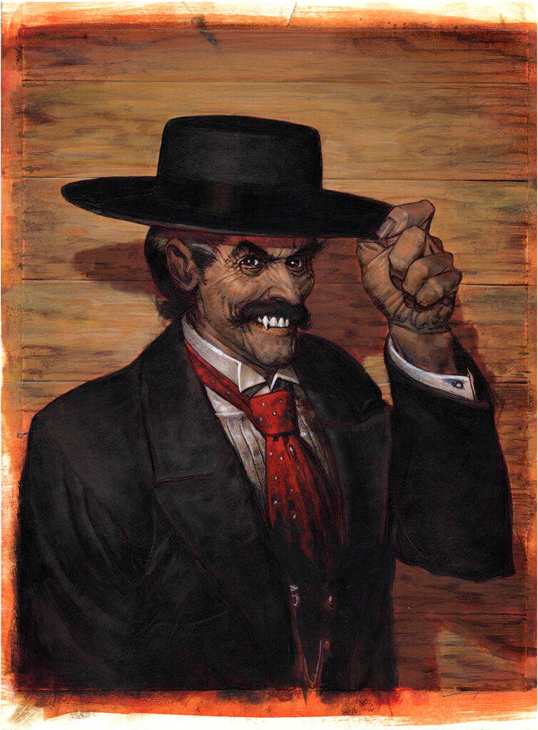
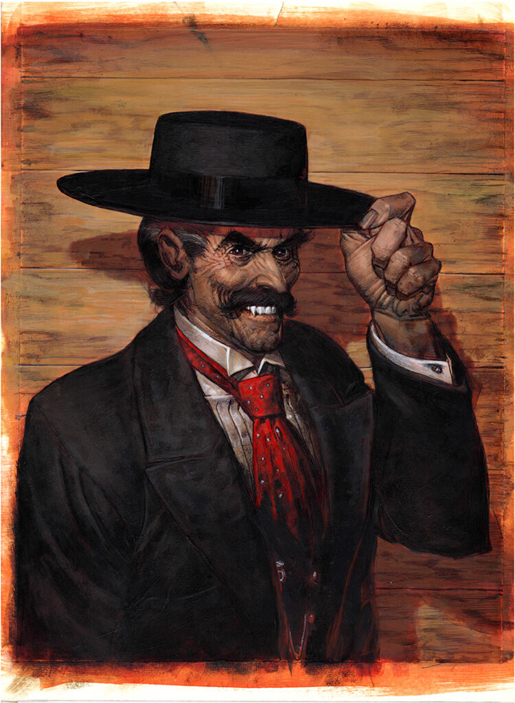
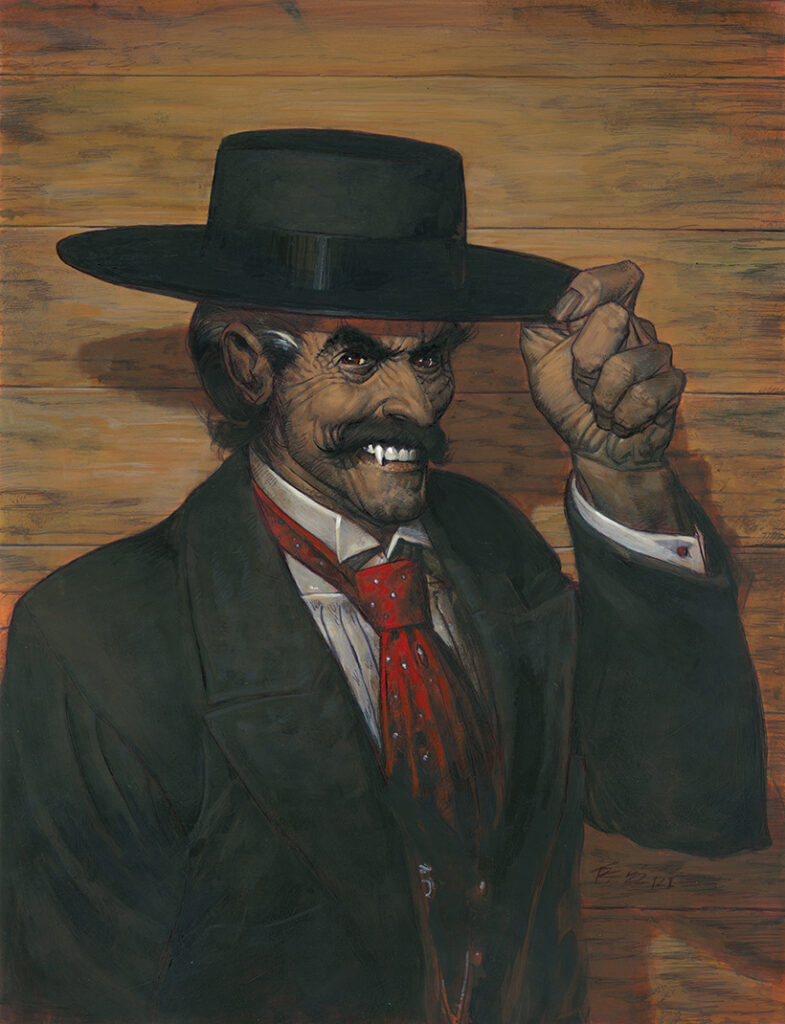
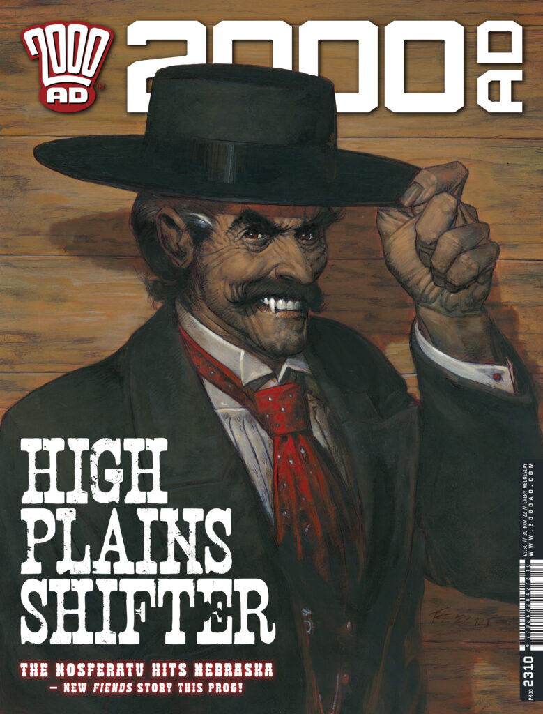
This week, art droid Tom Foster gives us a Western with a bite – as we welcome back the Vampire Constanta in Fiends of the Western Front: Wilde West, a prologue episode introducing the series that begins in 2023.
Fiends of the Western Front has seen Constanta in many different times and many different places. But this new series, Wilde West, takes him way out west, to Nebraska in 1882, where a certain Mr Oscar Wilde is having problems with a wraith. Wilde West sees Ian Edginton returning to chronicle the life and times of the vamp created by Gerry Finley-Day and Carlos Ezquerra back in 1980. He’s joined for this particular western vampire tale by Warren Pleece.
But it’s Tom Foster introducing the strip to us, on a pulp-infused cover to catch your on the stands from 30 November…
TOM FOSTER: Well, this is a first for me. November’s Judge Dredd Megazine represents my first Meg cover and, for a brief window, I’m on both the Prog and Meg covers at the same time.
As such, I’ve purposely designed these two covers so that, if you place them next to each other and unfocus your eyes, you get a secret subliminal message that will allow me to access your subconscious remotely at a time of my choosing. I can’t really reveal any more than that, but suffice it to say that a certain Estonian ambassador to Equatorial Guinea might not want to make any long-term plans.
Anyway, forget all of that immediately and let’s focus instead on the process for creating the cover for Prog 2310.
You may notice that this is my first fully-painted work for 2000AD. I’ve painted a few Commando covers over the years (with mixed results), but it wasn’t until I tried soft-body acrylics that I really felt I could get my painted work up to a standard that might match my usual inks-and-colours approach.
This assignment seemed perfect for a painting, with its pulpy themes of vampires and the wild west, so I decided to risk it and crack out the paints.
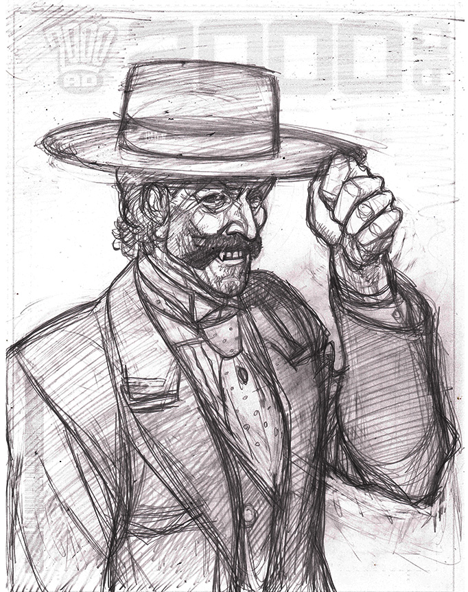
As usual, I had to submit a rough to Tharg and, since the composition was so straightforward (and had been suggested by The Mighty One himself), I went straight to a pencil sketch without doing a full 3-D render…
Tom Foster’s initial pencil sketch – Constanta says howdy
I may have compiled some of my reference at this stage, I can’t quite remember, but I figured getting some indication of Constanta’s expression was more important than establishing lighting and colours. This one is all about character, and poseable 3-D models usually don’t communicate that as well as a pencil sketch.
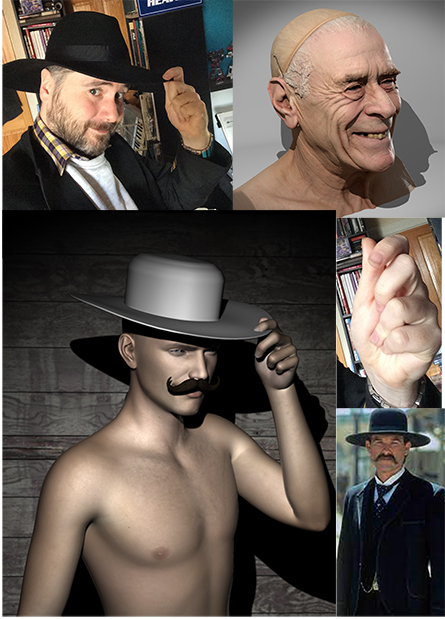
Since there are so few elements depicted in this one, I could really afford to compile a fair bit of reference for the central character. I did a quick Daz render for lighting and pose composition; used a 3-D head model in Anatomy 360 for some nice grizzled facial details; took a couple of photos of myself; and looked at as many images of Kurt Russell as Wyatt Earp in Tombstone as I could find…
Step 2 sees Tom get rendering and get into character – every artist needs a cowboy hat
With my reference squadron assembled, I set about doing a detailed pencil drawing. Knowing that I was planning on painting this piece, rather than inking it, I approached the pencils a little differently from usual.
Rather than worrying too much about line quality, I tried to make this more of a value study, establishing the different tones that would make up the final image in pencil, so that I could refer to them during the painting process.
With my pencils complete I then did a few Photoshop fixes, added a bit of digital colour and mocked it up with the 2000AD trade dress to try and get an idea of my palette and how the finished article might look.
From here, I printed out my pencils, transferred the most important outlines onto claybord with tracedown paper, and went over them with Sharpie and biro so that I had a solid line-drawing to paint over.
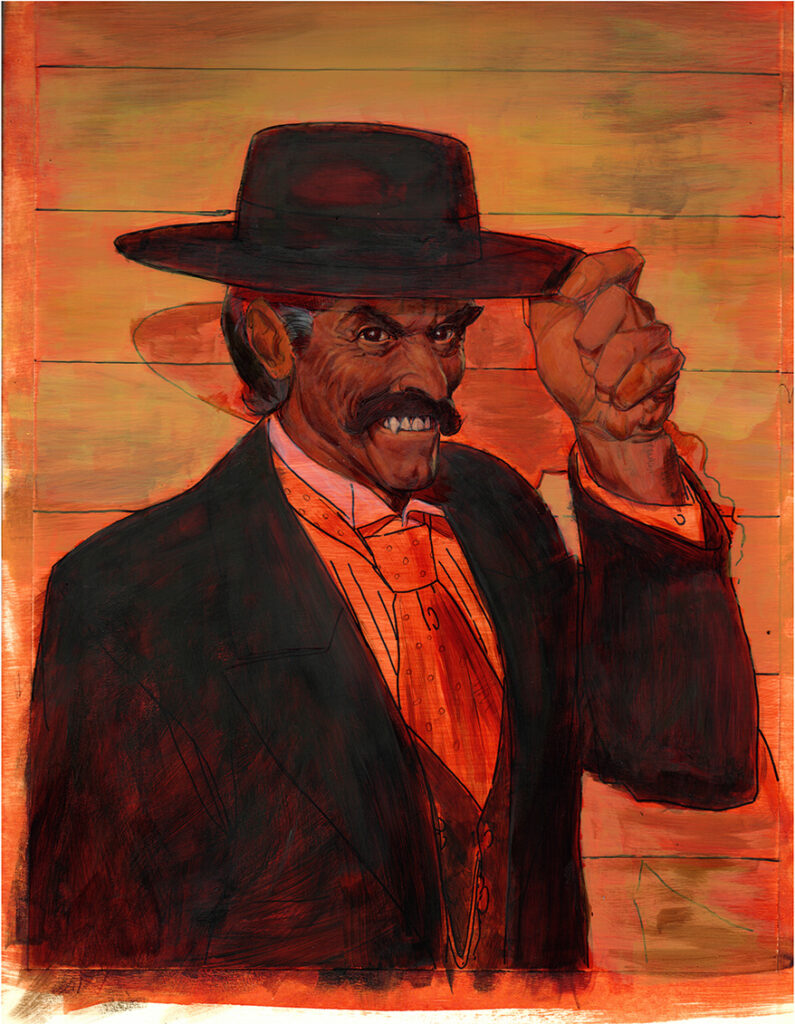
I started out my paints with a midtone wash of burnt sienna, then worked in some details in the face and hands and blocked in some of the larger areas of colour. You can still see my first wash and line drawing here on Costanta’s shirt and tie.
Then came hours of rendering – doing my best to add as much dimension and contrast as possible. It was at this stage that my inexperience as a painter was brought into sharp relief. I over-rendered everything and my colours got way too dark.
The lights in my studio aren’t all that great, so what looked okay in artificial light, often looked muddy and rubbish in the cold light of day. On top of that, my painting surface was getting uneven and lumpy from all the applications of paint. I panicked and considered restarting the painting.
I was relieved to find that a fine-grain sandpaper, liberally applied over the whole painting, had a remarkable restorative effect, not only to the smoothness of the painting surface, but also the lightness of the colour. This served also to soften my over-rendering and I got a second chance to try and salvage the painting.
I touched up a few areas and found myself with an over-all effect that seemed to work. The details however, were still a bit rough.
So, once again, I set about rendering the surfaces and adding detail. But, once again, I was too heavy-handed. Taking these process shots proved invaluable for remedying mistakes, as I was able to refer to earlier stages which seemed to work better.
Finally, I managed to get something that, while not perfect, did not immediately present me with obvious flaws. I got a better-quality scan done and sent it off to Tharg for approval.
I was very nervous about this one, knowing that my inexperience with the medium might be blinding me to a lot of problems that a more practiced eye would notice right away. Thankfully, The Mighty One’s benevolence shone down on me and I was not cast into the Nerve Centre’s Rotary Pulper of the Damned. In the end, I think it does the job, but I definitely need more painting practice to get the results I’m after.
Thanks so much to Tom for talking to us and for yet another great cover. You can find 2000 AD Prog 2310 wherever you pick up your weekly dose of the Galaxy’s Greatest, including the 2000 AD web shop.
For more from Tom here at 2000AD.com, check out his Covers Uncovered features for 2000 AD Progs 1986, 2225, and 2281. And this month, he’s also provided the cover to Megazine issue 450 – you can see the Covers Uncovered for that here. He talks about winning the 2013 Thought Bubble talent search here and the Judge Dredd: A Penitent Man strip here.
You can hear him talk on the 2000 ADThrill-Cast Lockdown Tapeshere. And finally, there’s his ridiculously funny From The Drawing Board video here – the one that basically meant the other art droids stopped doing them as none of them could match Tom’s delivery!