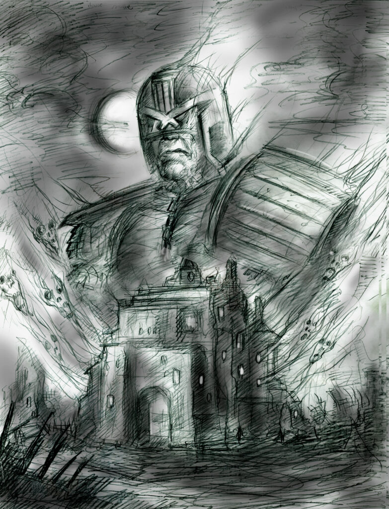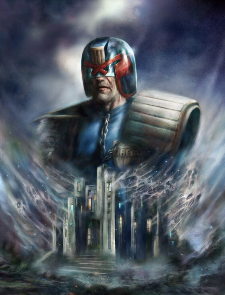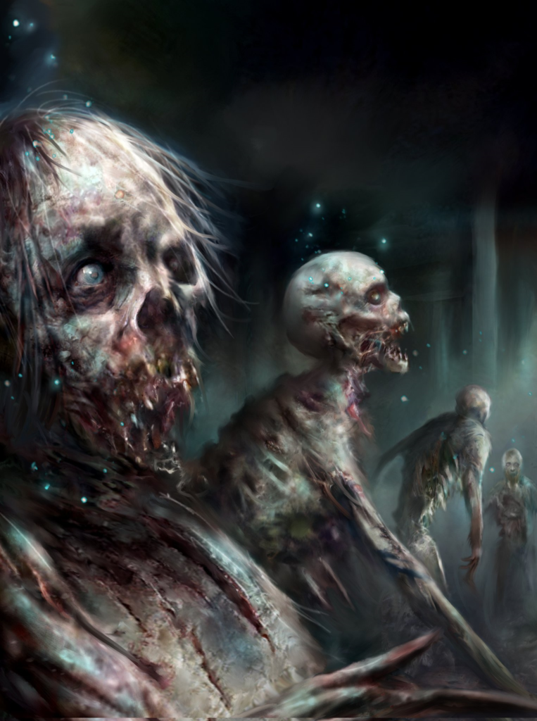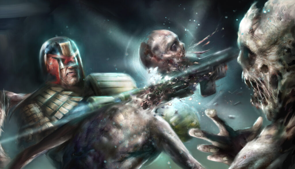
Every week, 2000 AD brings you the galaxy’s greatest artwork and 2000 AD Covers Uncovered takes you behind-the-scenes with the headline artists responsible for our top cover art – join bloggers Richard Bruton and Pete Wells as they uncover the greatest covers from 2000 AD!
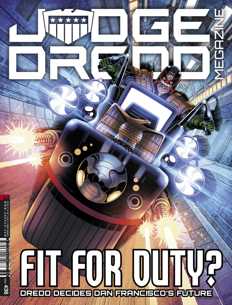
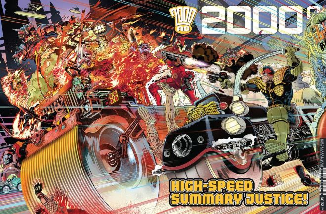
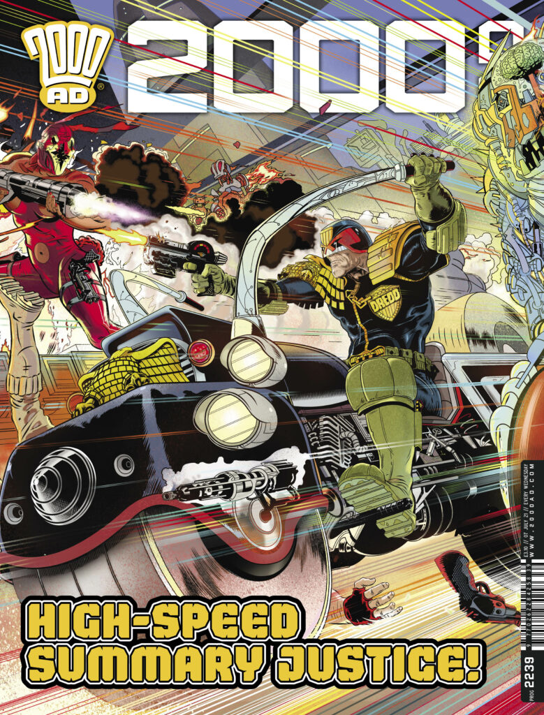
Okay then… settle in Earthlets, we’ve got a long one for you. But a damn good one. It’s the mystery of the missing cover to 2000 AD Prog 2239 by Stewart Kenneth Moore. Way, way, way back in July 2021, SK Moore did one of the covers of the year – a spectacular double-page spread of Dredd looking like this…
.
And Stewart was going to do a Covers Uncovered for us, but time and deadlines got the better of him. Oh well, can’t be helped, even though it’s a terrible shame not to see the process and read the process – because if you’ve read any of Stewart’s previous write-ups, you know he really does go the extra mile and goes deep into the creative process for you (have a look at the one for 2000 AD Prog 2179 and the special poster in the 2000 AD Sci-Fi Special 2020 to see what I mean.)
But we were chatting to him recently about the Covers Uncovered Annual 2021 (out November 24!) and he said that even though he’d not sent them over, he’d still got both the image files for Prog 2239 and also the original commentary he’d done somewhere – and would love to get them to us. Except then he went looking for them and couldn’t find the commentary anywhere.
As Stewart puts it… ‘I wrote a new text this morning. But then found my original text that I wrote for you maybe a year ago! So you have the option of modern, sedate, creative narration or ye olde, barking at the moon, ‘he’s driving us off a cliff’ lunacy engine.’
A few hours of editing, 4,000 words later, the images and screenshots Stewart sent over and highlights from the cover to illustrate his points… here we go.
So – strap yourselves in, get ready for the full-on, total immersion, in-your-face creativity blast of SK Moore talking about making the cover to Prog 2239. Okay then.
Get ready for SK Moore in 3… 2… 1…
.
SK MOORE: Going back through my files I see how hard it is to show my process, I was even confused by what I found lurking in my files. It’s a mess!
With ‘Covers Uncovered’ I’m always tempted to share only two pictures. The first, a rudimentary doodle, the second the finished picture. As though those are the only two stages involved!
There’s a meme like this, it’s called ‘How to Draw a Head’ and it never fails to make me laugh. The first picture is a roughly drawn circle with the words ‘First draw a circle’. The second picture is what appears to be an excellent finished 19th century pencil drawing of a human head with the words ‘Now draw the rest of the f*#@ing head.’
I always feel I should do that here but then I remember there are readers out there who really might benefit from the process. People who will one day be doing this job, great artists yet to emerge and they need all the help they can get. I learned that from Jim Baikie (artist on Judge Dredd, Skizz and many more), because that was like his attitude. Help young artists. He even spoke of an idea to start a comics colony in the Orkneys (his home turf). Can you imagine what fun that could have been? I was fortunate enough to do some studio assistance with Jim, he would have been a great influence on any young group. So this is especially for you artists, because we are in this together. Here are the stages…
.
Stage 1 – Don’t push it, dwell on it.
I decided to let my subconscious do this one. I knew I wanted something spectacular, I’d been dwelling on the idea of something ‘rampant’ for months, just letting it percolate in my mind, a few minutes every day just letting my mind wander on the subject.
I couldn’t see it though, nothing was jumping out at me, not yet. But any time I turned my thoughts to 2000 AD I would try and imagine a scenario with a variety of big shapes moving across its cover.
The only fixed image was a Judge and very possibly a Lawmaster (followed by a dim sense of dread, no pun intended, but any prominent bike is going to be tough to get right, hence the sense of dread.) The other components fltted into my mind – from robots, to mutants, to giants, to aliens and so on – but none of it slammed into place.
Weeks and weeks…nada. But I didn’t sketch it, didn’t ‘work’ on it. I just mulled on it.
Stage 2 – I like my covers to pay off in different ways
They’ve got to be eye-catching, working from a distance and up close, and when a potential reader picks it up it should offer a one-two punch with a surprise back-cover. In this way my covers act like sequences. My covers are sequences!! …and will continue to be that way, Tharg willing. Making an effective cover means first I ask myself how do I make it stand out on the shelves? How do I grab someone from the other end of the shop? How do I fight the tall grass that is the packed shelves of the newsagents? Next time you are in one of these places look at the shelves and ask yourself how you could make something stand out against so many other titles. This is the graphic-design mind at work.
Stage 3 – One morning I woke up and it was right there in my mind.
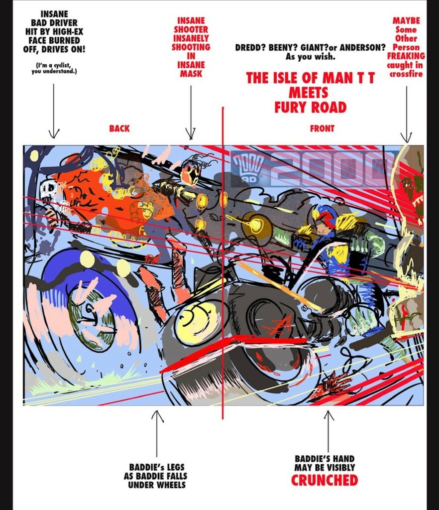
Maybe after a month I woke up with this image springing toward me, coming right at me! WHAMMO. A triangle, a rainbow, a truck full of bastards, it’s Jean val Jean watching the pre-dawn criminal convoy, only it’s coming at us at 500 miles an hour. Above all it’s an incendiary bullet, fired on the cover and exploding on the back (the one-two punch!)
I have a good feeling about the concept – seems very Dredd, it’s ‘hell on wheels’, where Dredd represents order and the burning truck absolute and total chaos….high-explosive bullets are not the wisest way to deal with traffic violations, so it’s a bit satirical, I guess.
.
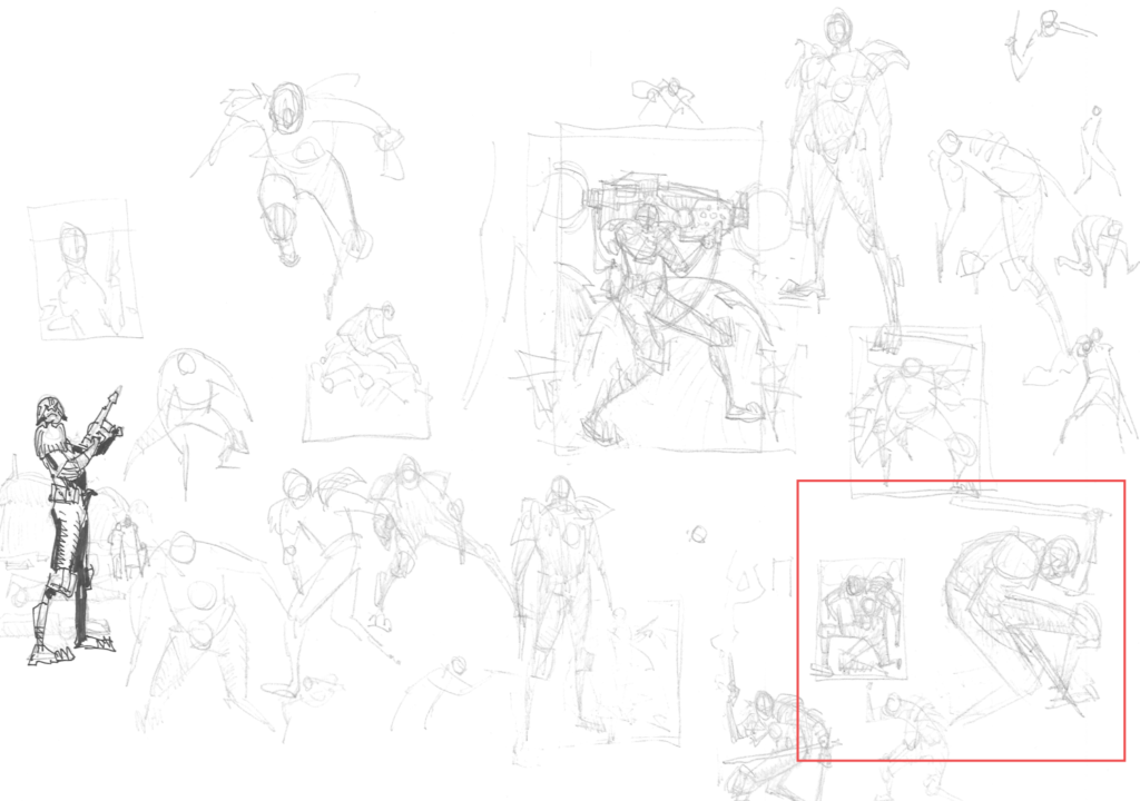
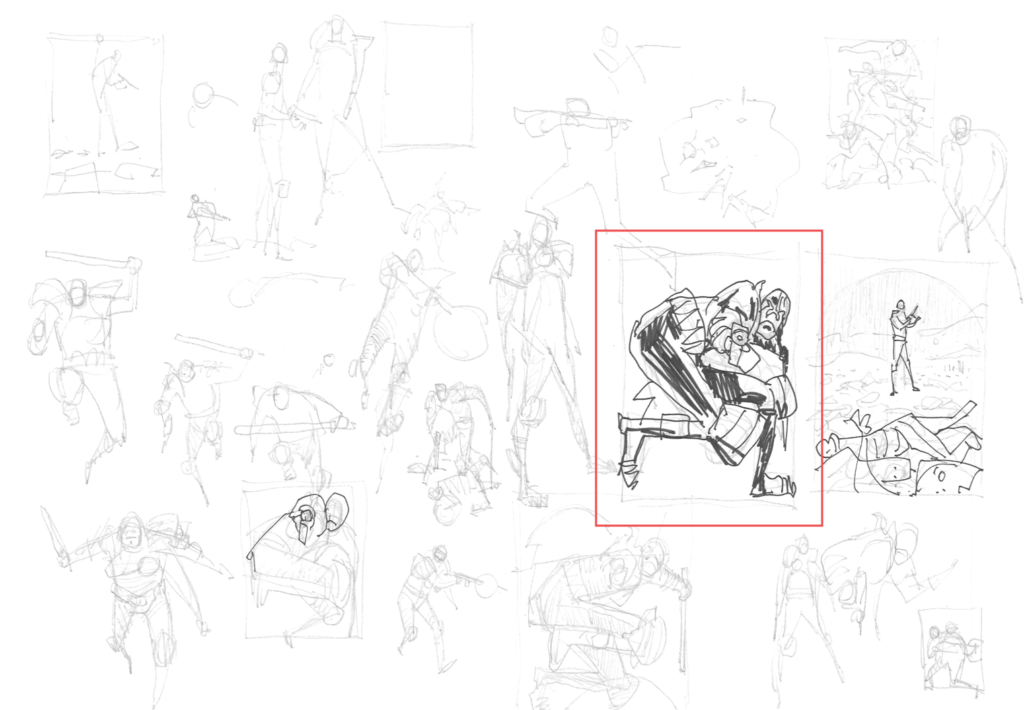
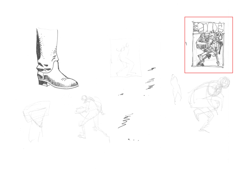
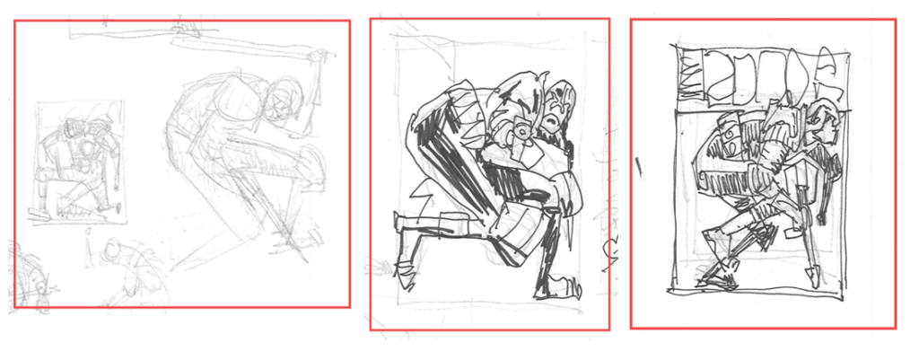
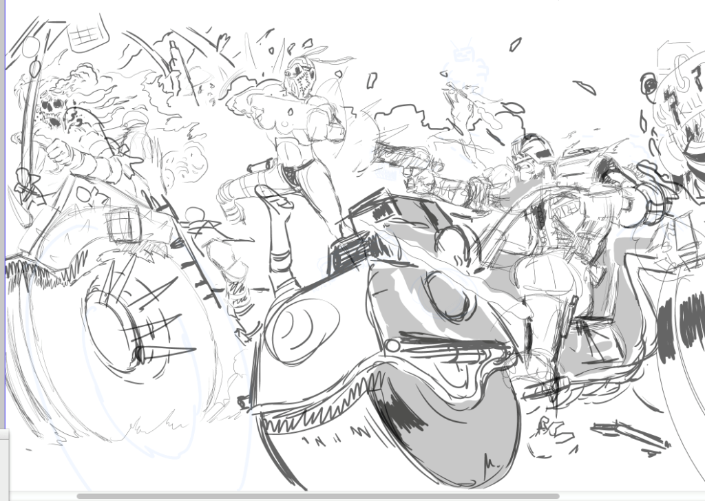
Stage 4 – Finally – a sketch!
I did the sketch in 42 nanobause (Scottish unit of time). This is why artists are misunderstood. Anyone seeing a sketch or a finished piece (and especially if it’s swiftly created) can dismiss artists as having it easy. But, as I’ve just explained, it took months to just see it. But you know that because you are an artist too. No, you are! Get over that!! YOU ARE!
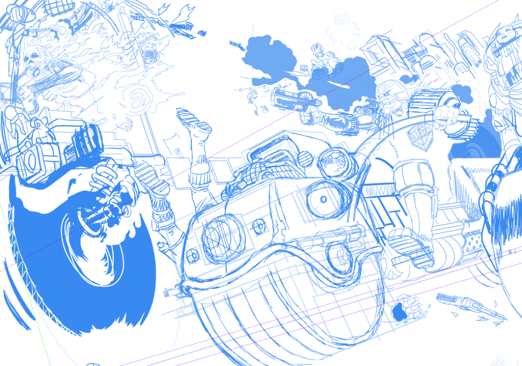
So I got sketching in blue pencil, refined the sketch and refined again, only using a ‘Guesspective’ at this stage. I went for the classic Lawmaster look… BREAKING NEWS… I think that’s the last I’ll draw that bike. A more modern design is doing the rounds and I’ll be aiming at that from now on. But I did want to do a good example of the classic in action.
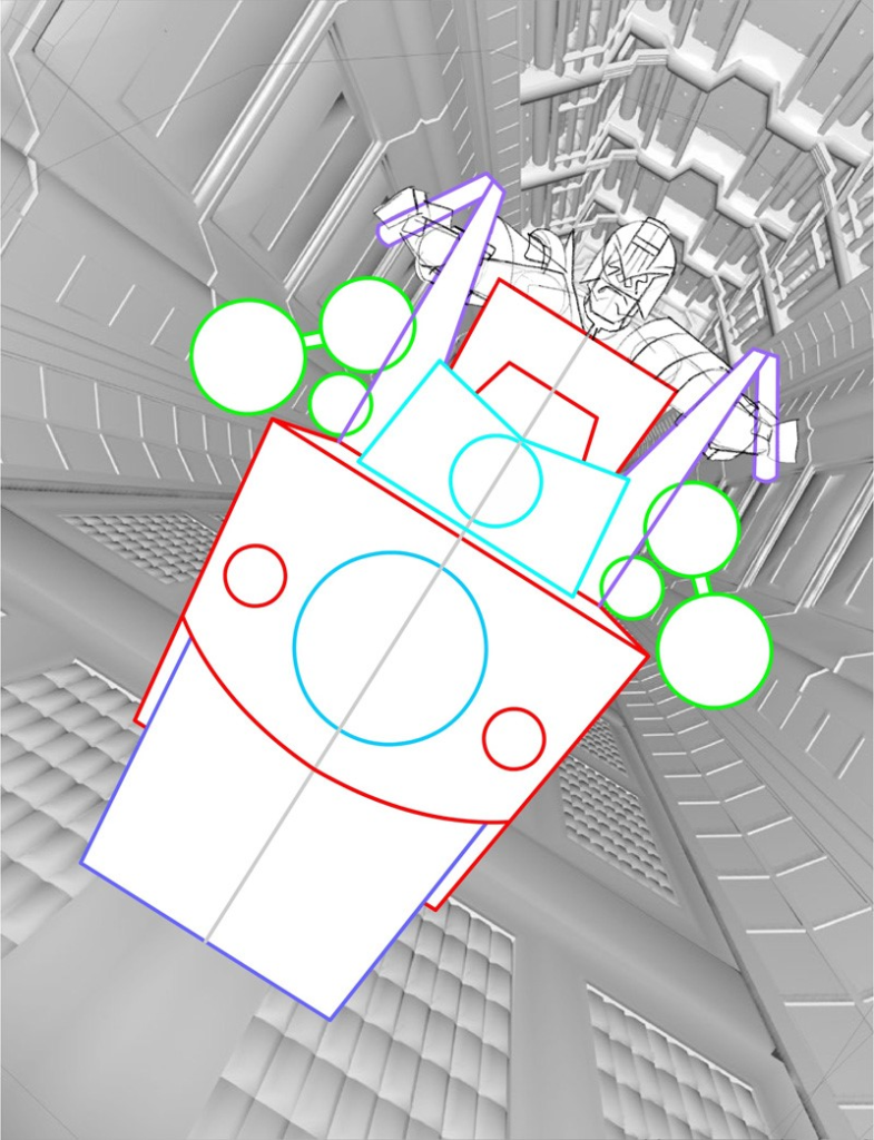
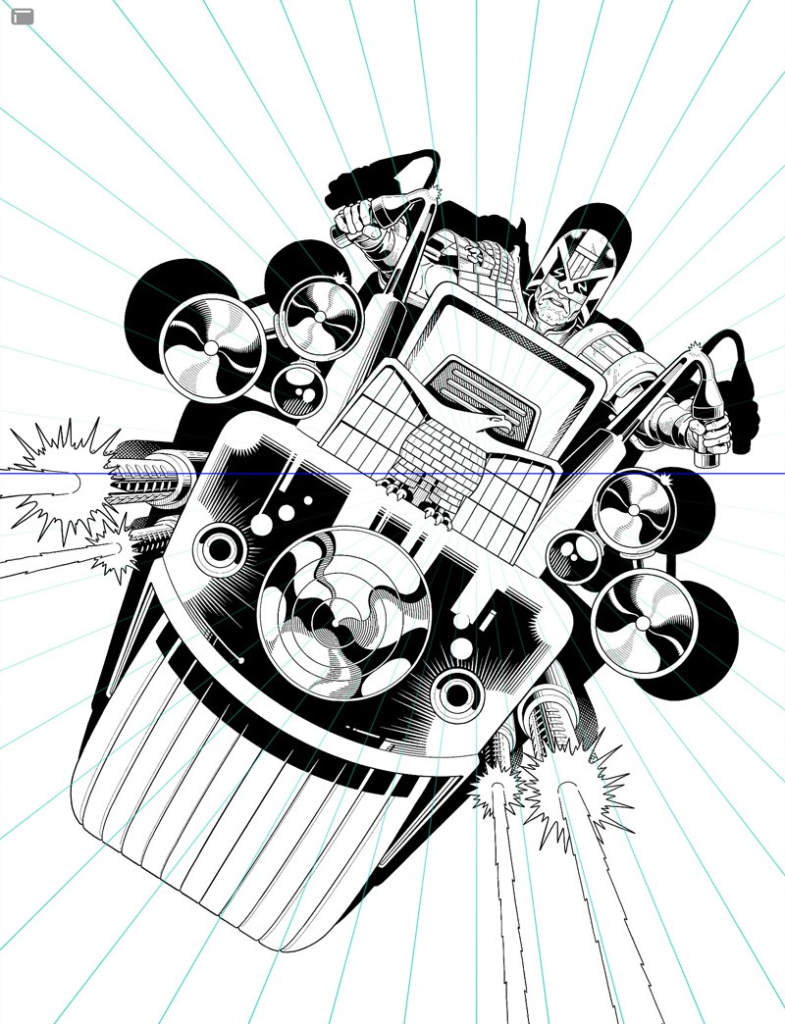
Once happy with the general thrust I set up my perspective rulers and started laying in the machines. Things were going surprisingly well, ratios and scales were adding up. Usually with extreme perspectives issues of scale arise, but there was nothing here that wasn’t working. I felt quite lucky with the Lawmaster, it all worked first time. Perspective is a tool that you need to know when to stop using, it can kill a picture, but somehow I had no issues. Pure luck.
.
.
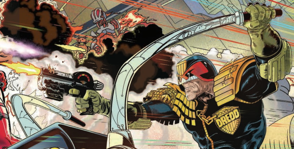
But a problem did emerge. The handlebars of the bike. Did I do them low so as not to intersect with the badge – and in this case we need to see the badge – but then they’d also be lower than they should be on a MK2 Lawmaster. Or the other option was raising the bars so they arch out at the higher end of what we’ve seen of these bikes over the years.
That’s not a problem in itself, high arches are common in drawings of Lawmasters and my low angle of view further justified this. But Dredd’s gun arm was more ‘badass’ when the handlebars didn’t cut across the view and his posture with the lowered arm on the left meant he was extra ‘badass’ because it gave him a slouch. I liked the attitude a lot.
.
But with the attitude of the higher handlebars I had two big challenges – make the gun-arm work and expose the underarm of Dredd on the left. This would mean careful anatomy. I’m a sucker for a challenge and especially with anatomy. Going this route was harder but it did neat things – it deepened the perspective effect and, by crossing the gun arm with the handlebar, it made the scene more convincing. (Another Jim Baikie tip here: Don’t be afraid to obscure things. When anatomy drawing raises arms across faces, move limbs in ways to obscure other body parts – it lends the image realism, dynamism.)
Above all, without gun or bike, the arms raised make Dredd triumphal, like a silver-back gorilla raising its arms in a sign of confidence. No one apes the law!
Stage 5 – The finished idea isn’t a complex idea, not the idea itself.
One thing that is kinda complicated though is knowing that you’re aiming for a cover that’s new and memorable and unique. The idea can be so strong and immediate that you doubt yourself – even I start thinking that the image came to me ‘way too easy’. ‘Someone has done that before!!!’ And I am militantly against that kind of laziness. So, to spare my blushes at this point I trawl the Progs looking for similar to this Dredd on his Lawmaster.
If this were a film this would be the scene in which a bafflingly handsome young man, undamaged by years of booze and hard labour (art) is shown crouched over thousands of Progs as images of spaghetti monsters, pregnant gangsters, apes aping the law, and alien zealots flit across the screen before he sits back, exhausted, to puff to death a Gauloises stub, behind him the Eiffel tower stands firm over his shoulder – that kind of thing!
Stage 6 – Bite the bullet and hit send!
But I haven’t got all the Progs so I have to hope this doodle is fresh…I then bury my head under a cushion and grope for the keyboard and hit ‘SEND’… I send it to TMO as a jpeg. Some you win, some you lose….but this I win, it’s green lit! (his skin that is!).
One caveat is that this has to be off-the-clock, no deadline, because all my weekday workdays are spent drawing PROJECT MK UlTRA: Sex, Drugs, and the CIA Volume 1. Fortunately, that’s ok with The Mighty One, so we’re off… for weekends and the Christmas holiday at least, much of it assembled in 5 days around Christmas 2020. Assembled, not inked, not painted.
Time can screw everything up and I think the open deadline really helped here but, y’know, too much time can easily kill a picture too, but it worked to the picture’s advantage here.
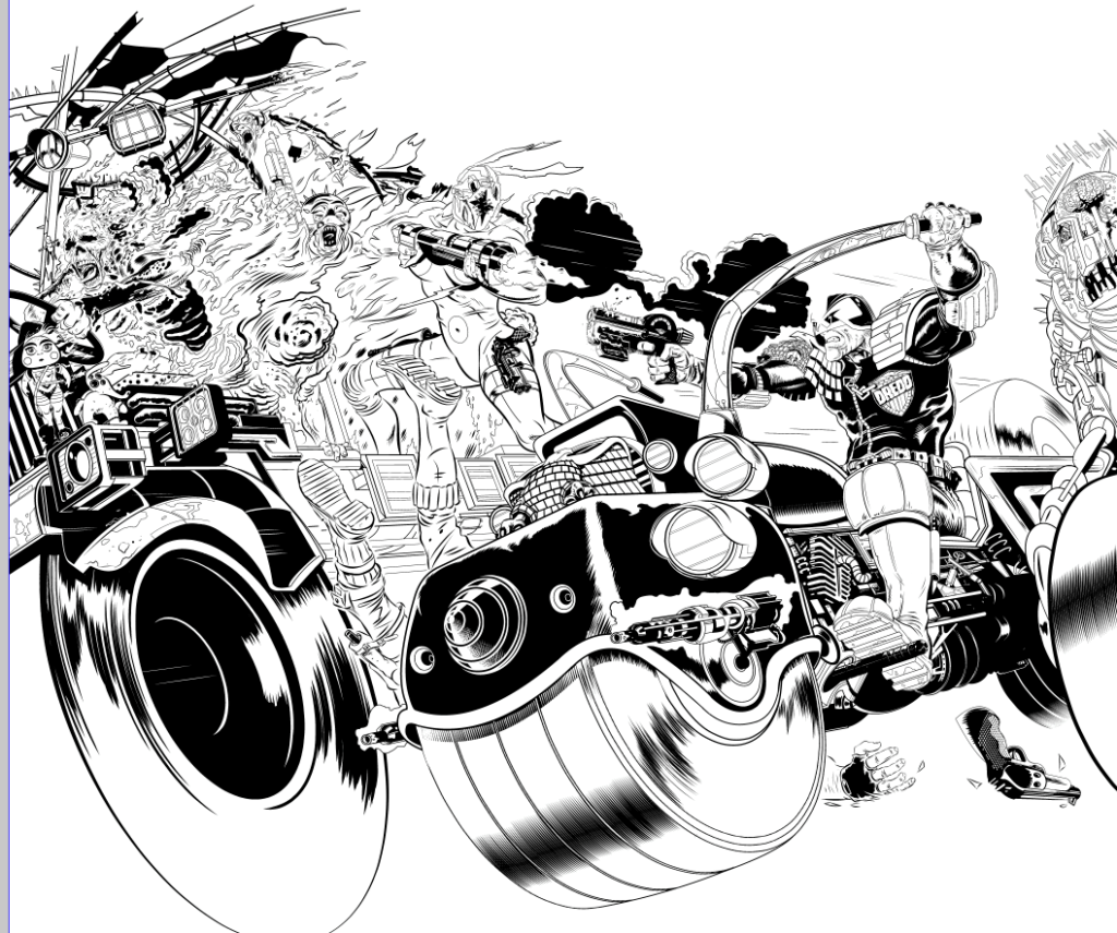
Stage 7 – Now I draw the rest of the f*%#ing cover.
.
Stage 8 – What? You want details?
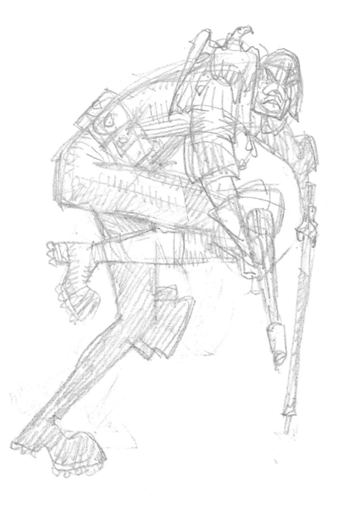
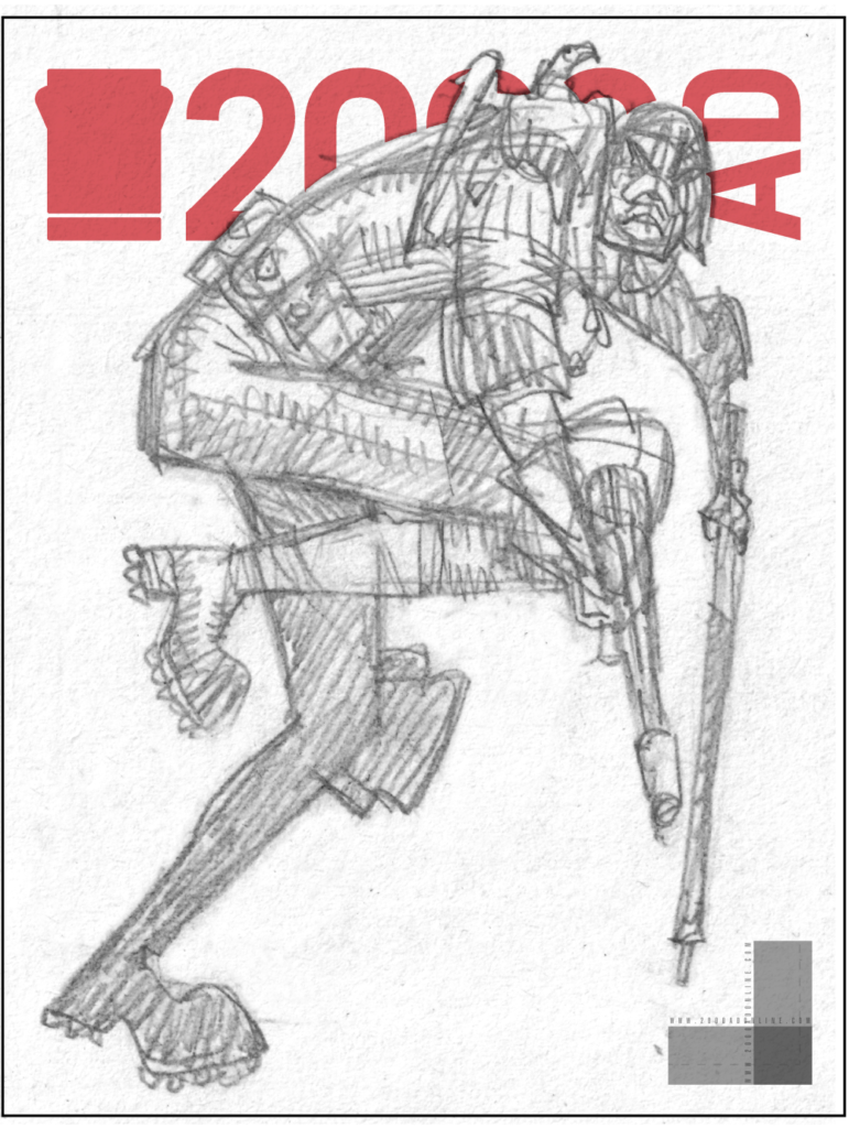
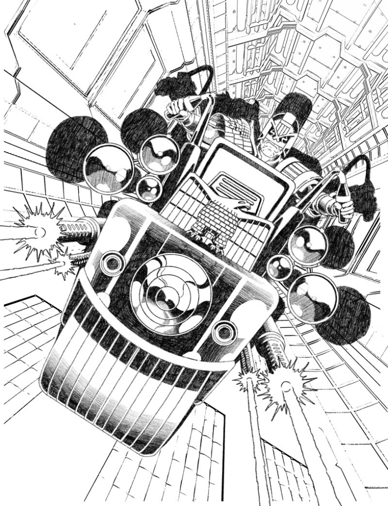
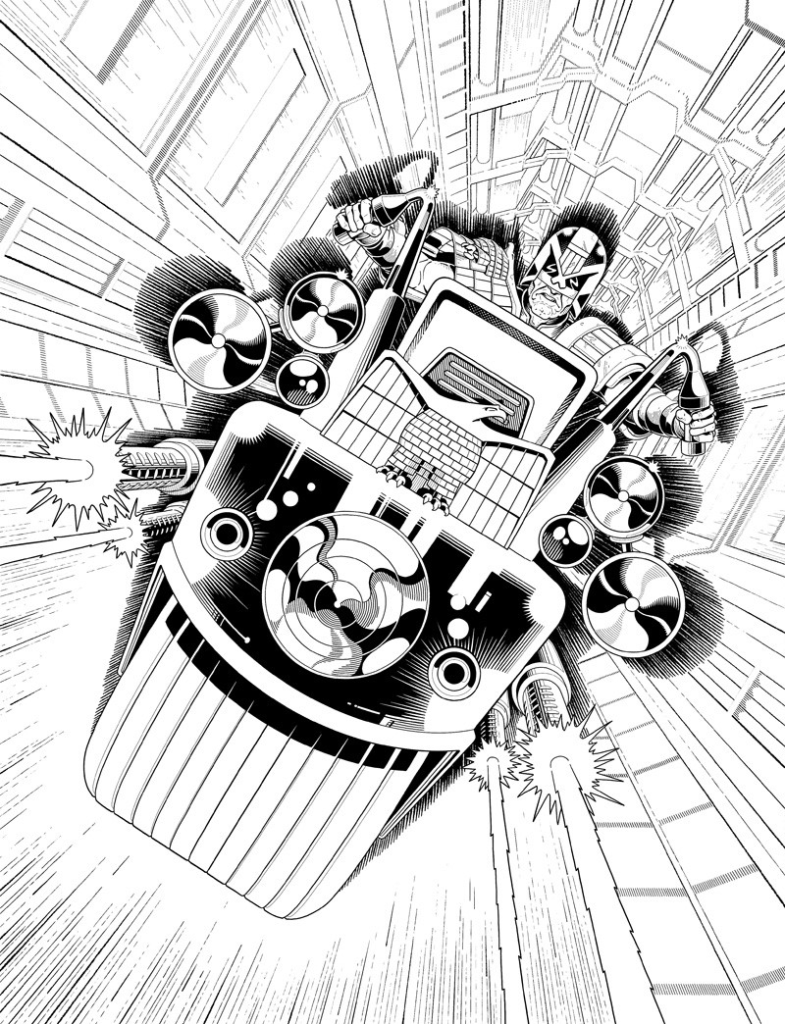
Okay – just kidding. My digital method is as follows… I blow up the thumbnail and fade it out so I almost can’t see it and draw over it in a new layer with a more refined attention to detail, but still very rough shapes. I do this repeatedly and slowly bring myself close to inking… until I do it finally in ink. I think I see other stuff, more than is actually there, when I fade it out, my imagination engages somehow with the vague lines and I see stuff that I never sketched. I know that’s not a good explanation, just try it, fade right down and refine. You just have to do it to get it. I’m going to repeat for the artists…if you fade that sketch almost to oblivion and begin to work up a new layer, trust me, your imagination will see what is not there yet. Between what is there and what you want to be there stuff will also appear. This is not science, it’s magic – do it, relax and trust your imagination!
Stage 9 – The sketch is energy and information, refining sketches kills the energy….stone dead.
So I have to step very carefully here. The anatomy of Dredd has to be right on, if he looks silly it’s all out the window. And that foreshortening of his leg may kill this image yet. Luckily, somehow, it works ok. But that’s just one of many considerations.
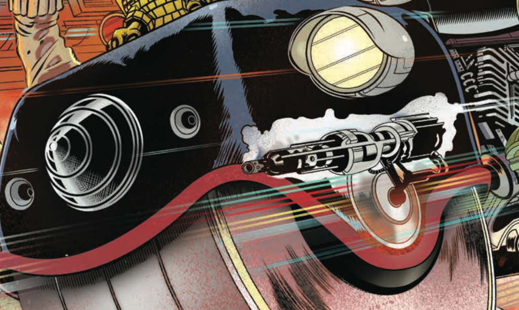
Stage 10 – That damn engine.
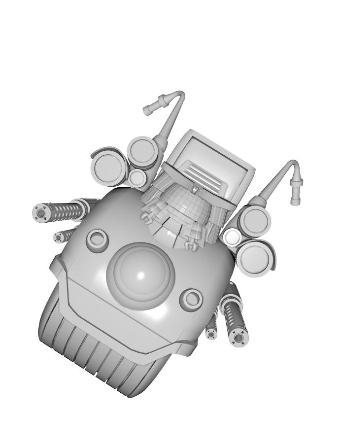
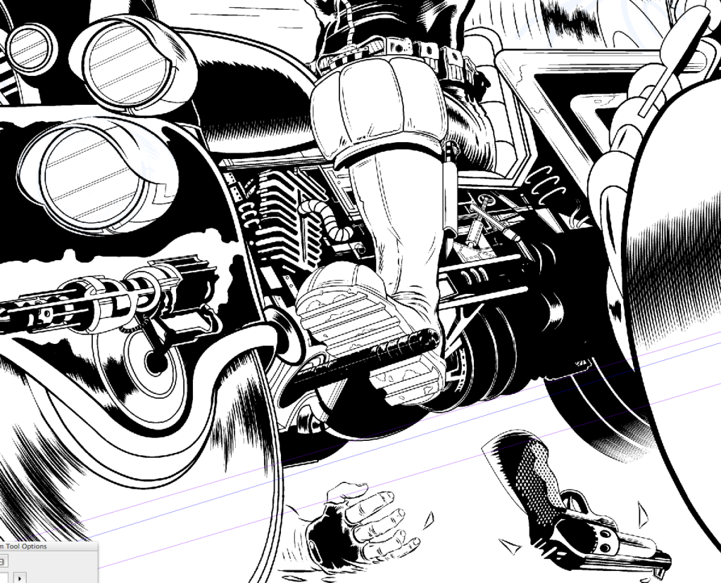
The front cover is the priority. I’ve made a conscious decision to do a classic Lawmaster so I look at drawings of it by Carlos Ezquerra, Mick McMahon, Cam Kennedy, Brian Bolland and Ron Smith. But the only place I find a glimpse of a consistent engine design is on a small toy model. So I decide that’s probably cannon…but I don’t know exactly. I then look at real bike engines and use some of those features, I decide to add part of a standard bike radiator (if that’s what it is – I’m an artist not a damn mechanic!)
.
Anyway, somehow the engine and leg and everything else works out ok. Hell knows how I did that. I don’t have a model and had to imagine the whole thing and it had to look functional…and somehow it worked.
Stage 11 – My son shows me a car by George Barris…
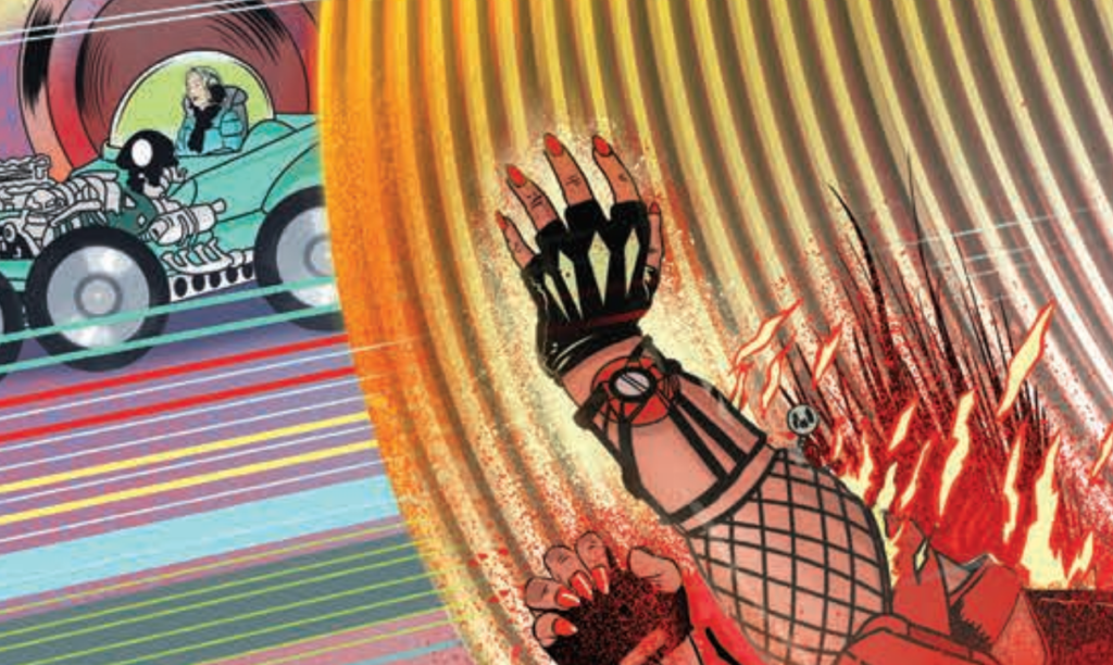
…and I become obsessed with putting my wife in that little green car on the highway at the very edge of the picture on the mega-highway. I then decide that’s a stupid idea, because it is. Then I decide it isn’t…and, later that it is… isn’t, is, isn’t, is…
It’s a George Barris car. He designed it and the Munsters cars and the TV Batmobile and many more. His designs would not look out of place in MC-1. So, for my own amusement I put that in there… but, you’ know, it amused the kids.
.
Stage 12 – Fires – the world is horrible.
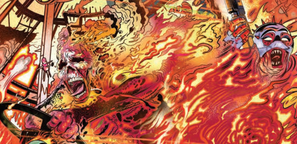
I look at images of fires and I see some things on the internet that I regret, people on fire, truly horrible. The world is horrible. I remember a journalist telling me, while embedded in Iraq, that he watched people melt in the cab of a truck and I wonder if this memory of this awkward conversation (at a buffet table, no kidding, bon appetite) has been at the back of my mind all along. People are horrible too. Truly horrible.
.
Stage 13 – I draw and I draw and I draw.
I try and remember that fire moves like water as I draw the flames. I decide to make faded airbrushed flames and flat colour flames to mix it up.
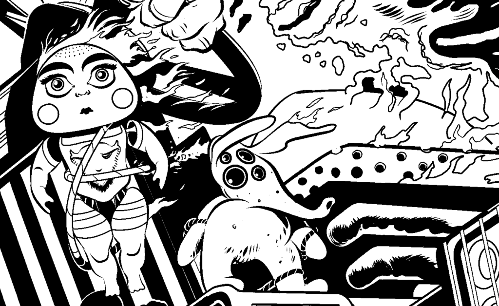
I draw a strong female body-builder shooting at Dredd. I had one crazy character with the beginnings of a vicious chastity belt, an idea I obviously abandoned.
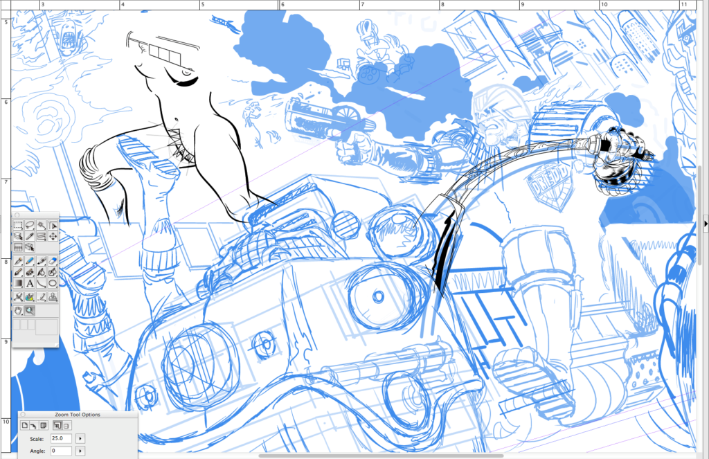
Somebody on a 2000 AD podcast or thread mentioned ‘The Green Children’ as I was drawing one of the dolls. So, that’s why that T-shirt ended up there.
.
Stage 14 – When the energy slips away… widen.
I draw and I draw and I draw. I fade out, add a new layer and re-draw. But in most cases things just fall in to place. Somehow.
I realise that the energy is slipping away from the finished image and this prompts me to widen the canvas and widen the scene. This is tricky because it shifts the composition of the front cover, the bodybuilder now drifts to the back cover. I can live with that. I open up a whole new field and find I have room for Mega-City One, other drivers, and that Barris car on the highway (dumb idea, no it isn’t, yes it is!)
Suffice to say I clearly didn’t know how to widen my drawing page in Manga Studio when I drew this. I really don’t know much about the software. I’m not alone, I think many of us just learn enough to get on with it. But I ran into the page edges and so, I rotated the whole image to extend the field of play. I kept extending the image, that is I would open up areas and then have to match up the inks so that it looked like it was always that way. I would scale up my page template accordingly, I know, I know – masochist.
I’d export inks from Manga Studio (Clip Studio Paint…or whatever they are calling it this week) into Photoshop where I would stick them together in a definitive page layout. Then (and I know this is nuts) I’d take screen shots and import those to Manga Studio where I would draw in new inky bits where I found openings.
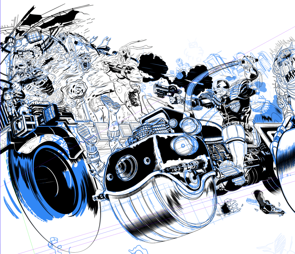
You might note the many layers of perspective rulers. Let me explain that. The ‘back’ button (or whatever it’s called, who cares!) is sadistically close to a button that makes the bloody rulers jump to a different position. So it’s very easy to hit that button and not know you’ve moved the rulers until you are well into a new part of the drawing. This may be digital, but you really are drawing and it can take ages before you realise the lines are off… grrrr.
So, as a precaution, If I’m happy with a ruler I make 2 copies. This way when one I’m using jumps (and it will!) I can dump it and revert to the saved one and not bother trying to match vanishing points up again…..god that aggravates me. Yes, I’m looking at you CLIP STUDIO PAINT.
Stage 15 – A million tweaks later…
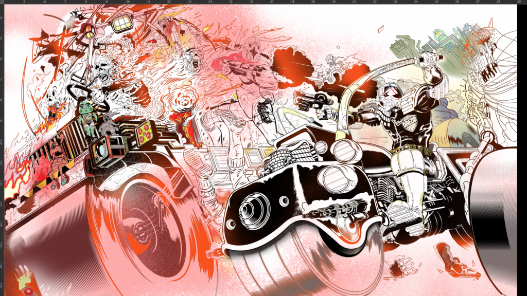
I also realise I can enhance the punch by bringing in more ‘BRAIN BIKE’. That’s something I’m a bit obsessed with — brains in jars! Only this jar is all motorbike!! Has anyone done a brain bike? Well I just did!!
I then I cut out and enlarge ‘brain bike’ and paint him again on a new Photoshop layer with the print instruction that he goes over the ‘AD’ in ‘2000 AD’… fingers crossed! I use composition (the triangles!) and I employ some ‘aerial perspective’ (over distance colours fade to blue/ grey) and I use ‘accelerated perspective’ (used in stage design to cheat shapes to enhance the illusion of depth of field).
.
Stage 16 – Colours and the miracle of Photoshop
I’ve said it before but the miracle of Photoshop is how the tools work so well that I can transfer knowledge learned over many years on canvas and Bristol board to digital. It stuns me, quite frankly.
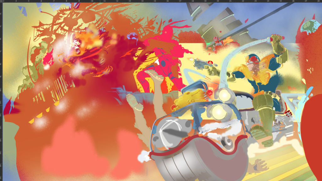
Anyway, colouring is done under the ink layer and it is done on many layers. I tint in the major colour areas. I look over the Progs of yesteryear for Dredd and Lawmaster colours and approximate them.
Expanding the view or reducing the image on the cover so as to add city and road glimpses has proved a good move especially because the black shadowed city blocks now push the burning truck at us enhancing the colours.
.
Stage 17 – Leave it, leave it, leave it.
I leave the file on my HD for about 3 weeks before opening it to see if fresh eyes find problems. Not really. I do this again for another week or so. Nope. There are things I could pick at but nothing I need to change. In most cases there is no time for this but there’s only so much you can work out consciously and having no time limit is a luxury but it allows things to work themselves out.
And that is that – DONE!
The finished image seemed to go down very well, but you must primarily aim to meet or surpass your own expectations first and, if it works for you and the editor, you can only hope some readers will dig it.
Oh, a final note for whipper-snapper artists…
All the figure drawing, all of it, is based on years of learning how to draw figures at any angle, many artists use digital models and photographs and these tools can really help you. I’ve made my own models using the free Sculptris app, very helpful, I’ve used photo references. Anything goes if it helps you get the picture right.
With Defoe I made digital sculptures of the characters faces. I rarely do that now, and I never use digital figure models, I’m not against it, I’ve just never seen any that worked well. As a youngster I started buying a comics ‘how to’ series and it was a demo on drawing shadows and figures in perspective that really opened my eyes to the power of perspective. So, if you want to be a versatile artist, study it.
Nothing liberates you like knowing how to draw a human being at any angle. That will free you up forever, it sounds like a chore and it takes time but it will free you to draw anything and everything possible. Drawing the human form is the language you need to speak fluently. I am also a painter, probably best known for my oil painting work but can use any media. Learn these things and you’ll be free as a bird and you can transfer to any medium.
My digital process is fairly simple. I might doodle on paper, but I do a digital sketch in photoshop that I pitch to 2000AD. I draw and colour with a pen on a wacom tablet. I draw and ink comics using ‘Manga Studio 5’ on an iMac. I sketch in ‘blue pencil’. Once my inking is done I export the pages to Photoshop (again an old version) and I adjust page design, colour and letter (If I letter) with that app.
MS5 is probably the easier app for editing and smoother for a number of reasons but, as far as I’m concerned, you can use the best of gear and turn out pure rubbish. Concentrate on visual quality and you can use any tool – or none. It doesn’t matter what toys you have – it comes down to doing, commitment and study.
Know what you want, go for it, but be aware of what’s happening in the industry, what’s cool and what’s old hat…as best you can. Be open-minded. Look to the very best and strive to be better than you think you can be – because you can improve and you will. You will improve if you work hard or if you work easy, doesn’t matter, just as long as you prioritise drawing you will get better. At some point, it might start getting easy and that’s maybe when you have to make it harder again, look for new improvements. You know better than anyone what’s wrong in your work so zero in on those weaknesses. Focus on them. Be strict.
If you are an artist I hope this helped. And you are! No, YOU ARE.
See – Told you this was a good one! I think you’ve got agree that that was a bit of a special for Covers Uncovered! It may have been late, but damn, that’s a call to arms for artists and a little glimpse into the mind of an artist at work!
Thanks, as always to Stewart for going above and beyond there to (finally) get it over to us! It was well worth the wait!

