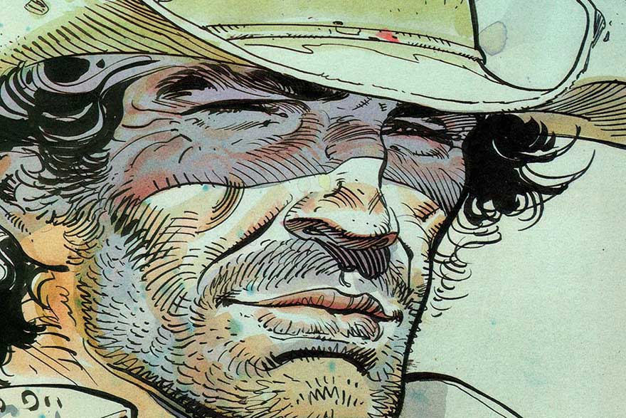
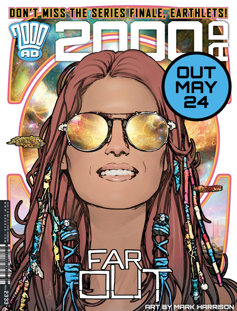
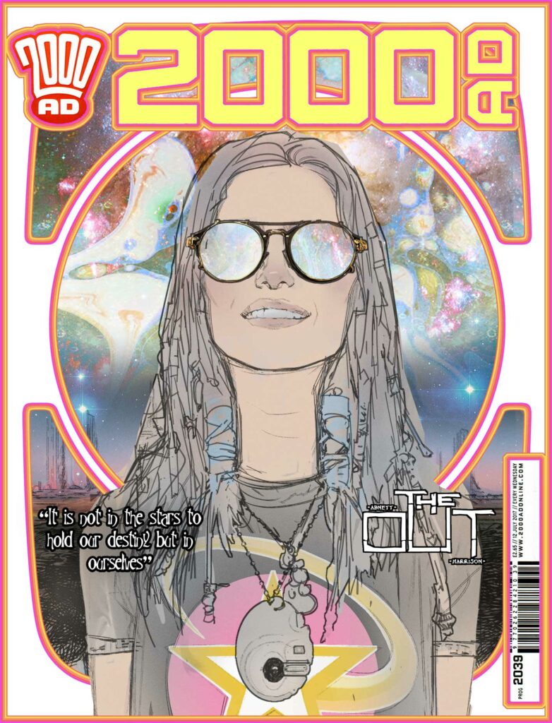
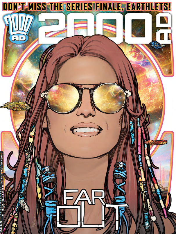
2000 AD Covers Uncovered: ‘Big headshot, reflective shades. Space background. Simple image. Easy, right? Wrong!’ Mark Harrison talks Prog 2333
24th May 2023
Every week, 2000 AD brings you the galaxy’s greatest artwork and 2000 AD Covers Uncovered takes you behind-the-scenes with the headline artists responsible for our top cover art – join bloggers Richard Bruton and Pete Wells as they uncover the greatest covers from 2000 AD!
This week, it’s the unmistakable art of Mark Harrison on the cover of 2000 AD Prog 2333 – it’s the finale of Book 3 of The OUT!
/
Over the course of three books of perfect space opera adventures, Dan Abnett and Mark Harrison have shown us the journey of photojournalist Cyd Finlea as she explores what it means to be human so far from Earth, way, way out in space. And now it’s all coming to an end… well, for now at least, as we’ve reached the end of Book 3 with the climactic meeting of Cyd and the proto-Tankinar.
Book 4 is coming soon, but until then, we have one last time to settle back and let The OUT’s Mark Harrison take us through the absolute beauty of a cover that you can see on the front of Prog 2333 from 24 May.
Are you ready? Then we’ll let him begin…
“It is not in the stars to hold our destiny but in ourselves”- William Shakespeare.
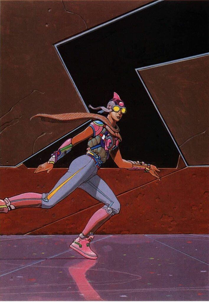
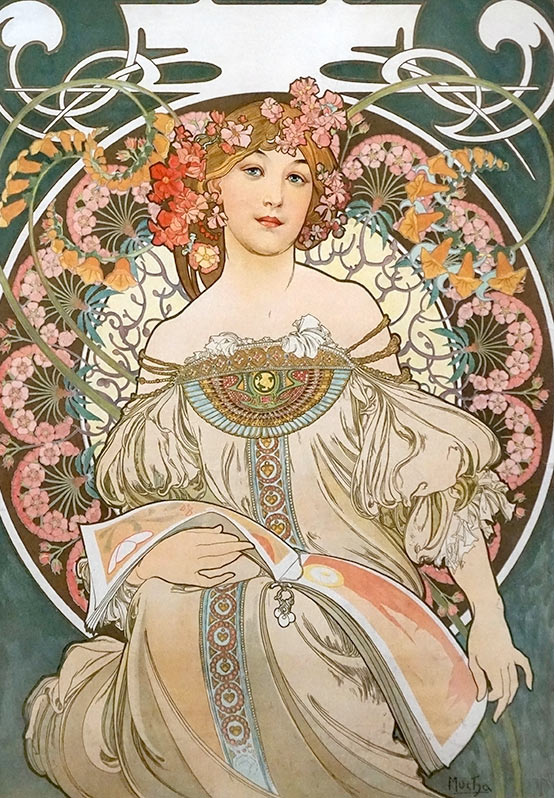
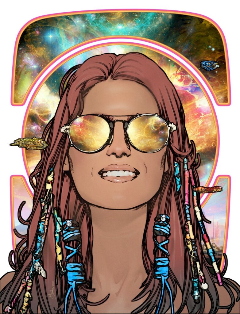
MARK HARRISON: Okay so… How about a bit of Alphonse Mucha? Lovely stuff and why not? If he was embraced by the Hippie culture of the 60s and repurposed for poster art he’s good enough for the galaxy’s greatest comic!
Also, I had a sheet metal print of his art on my kitchen wall for years. Selling soap I think. I dreamed a version with a girl wearing aviators with the Universe in her head.
/
Maybe that’s why I’ve had this image in my head since before Dan and I dreamed up The Out. It seems familiar, as if I’ve seen it before…
It was always there as part of Cyd’s make-up, before Cyd even had a name or strip. It was part of the promo art I pitched.
That image in the style of Mucha seemed like a good fit so when Tharg surprised me with an unexpected request for a final cover for Book 3 I thought let’s get this image out there.
It’s supposed to represent that wanderlust ideal of freedom, The Big (Night) Sky of stars in the eyes of the beholder, windows into the soul, you are not just star stuff but the stuff of stars, One with the Universe.
I wanted to capture in the face of Cyd (our hero) the wonder of the cosmos, the smile of awesome.
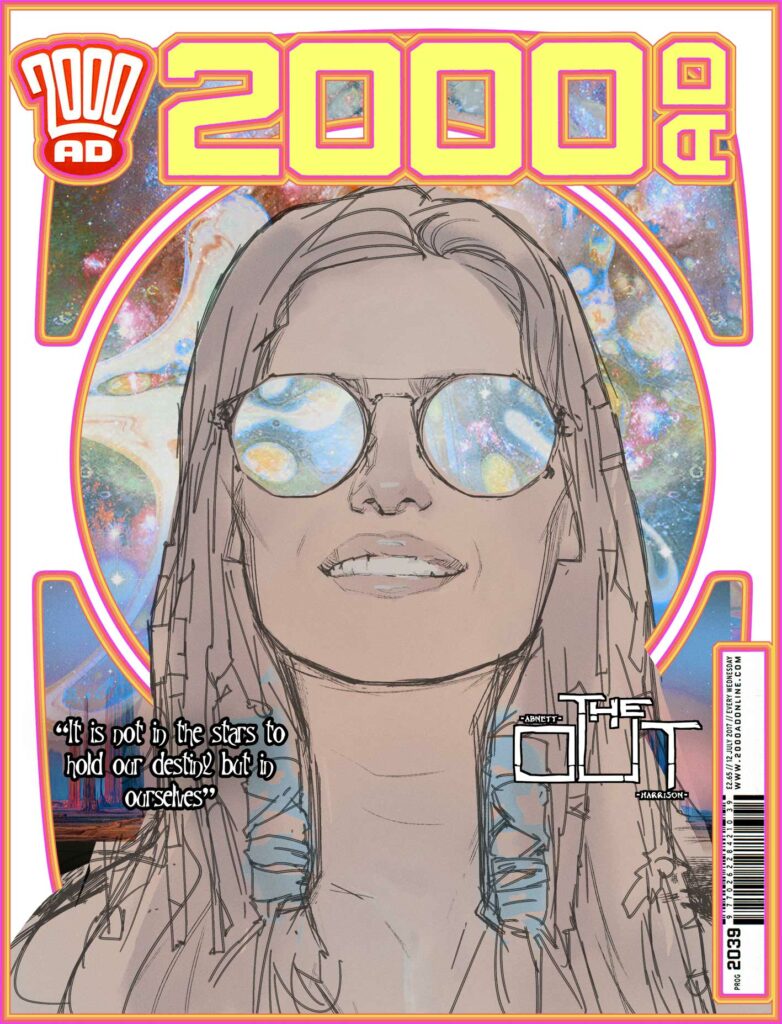
Big headshot, reflective shades. Space background. Simple image.
Easy, right?
Wrong!
I agonised over a big head or head and shoulders, two versions as you can see here. (I had Matt choose in the end).
Tharg will decide!
That was a tie-in with the strip, where Dan and I had transported and transformed Cyd Finela from this insignificant speck of human being out in the backwaters of the galaxy to holding court in the Capital world chambers of a galactic United Worlds, towering over all thanks to a spore generated 3-D modeling representation. Her significance had also outstripped her diminutive size. Here she seems to dwarf spaceships.
But she wanted none of this attention, none of the grandeur, she was trying to escape back to The Out, back to being of no consequence again. The book concludes with her facing her demons, cutting ties with the past and forging her own way in the Universe once again.
The image represents that ideal of freedom, new frontiers, of escape at warp speed with no baggage of the past (but of course – Bag itself).
Hopefully, it speaks to all of us who, for whatever reasons, just want to “go out” and free ourselves from terrestrial influences.
A motivational poster for infinite possibility.
So the cover design needed to reflect that pure desire, being bright, simple, clean line work, with minimal detail to weigh it down. Barely any tone, a light wash of colour, the contrasting density of the fussy space background acting as a tapestry of interstellar possibility.
Another late change was giving a sense of motion or “whoosh” reflected in her glasses; a stargate maybe, forming in front of Cyd, streaking light patterns, ready to whisk her off to new adventures, tripping the light fantastic. (Now THAT I have seen before in the visor of a motorbike helmet)
I agonised over background colors again… (Also spaceships or no spaceships?)
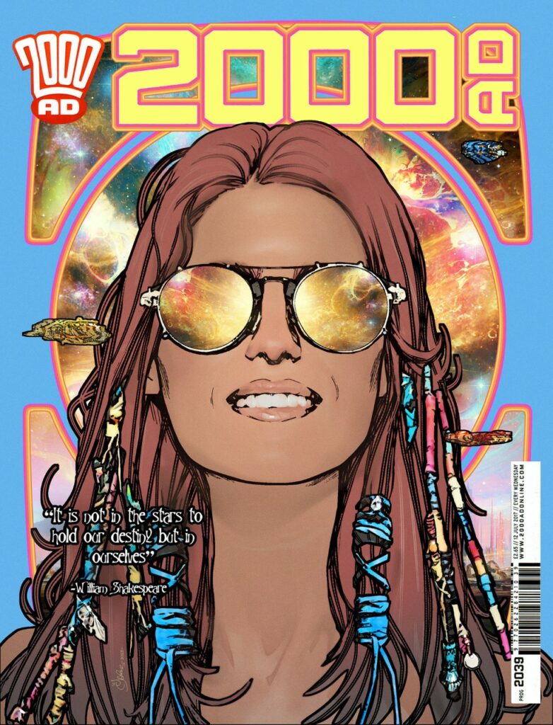
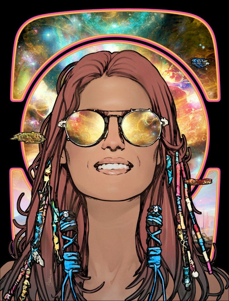
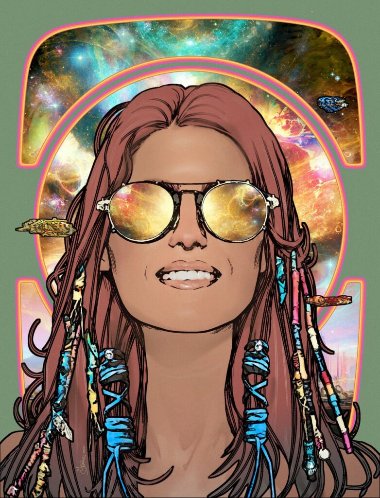
But again, I defaulted to simple white.
The white doesn’t mean anything, it’s just white…
Although no… wait a second…maybe it’s…
No, it’s just white…
So, onwards to Book 4…
Sail on silver girl
Sail on by
Your time has come to shine
All your dreams are on their way
See how they shine
And that was where Mark ended his latest transmission, with the strains of Simon & Garfunkel’s Bridge Over Troubled Water in our ears.
Or at least he thought it was the end – only to suddenly realise he wasn’t quite finished. So, as part of Mark’s continuing exposure of readers to art and artists they may not have been previously aware of… he added this…
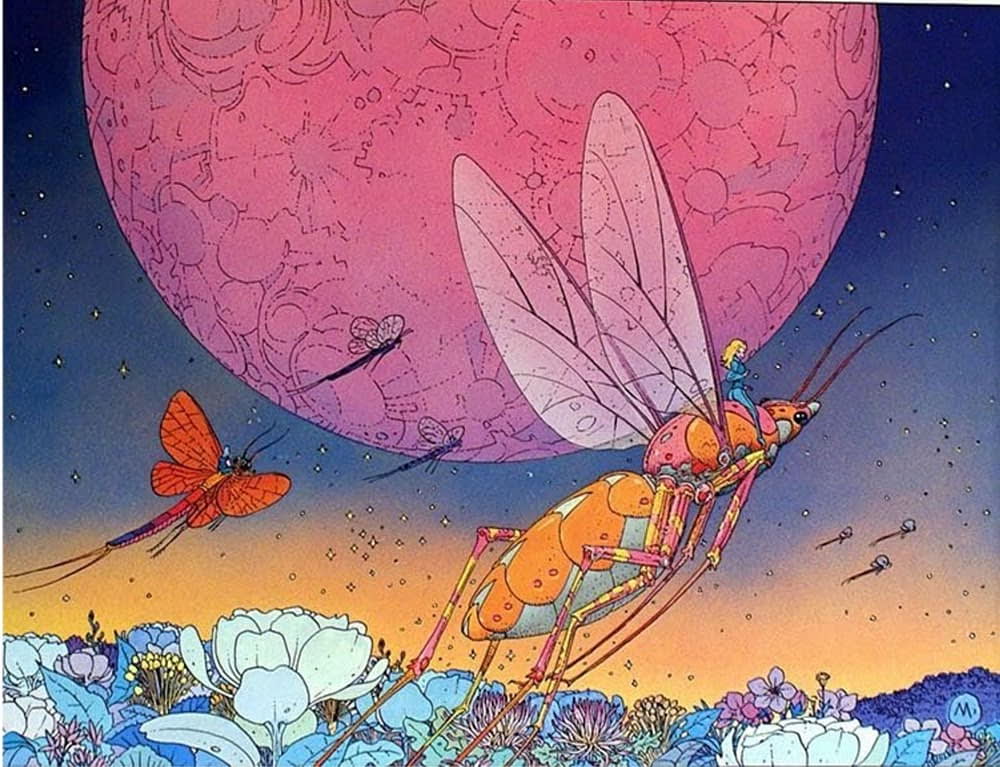
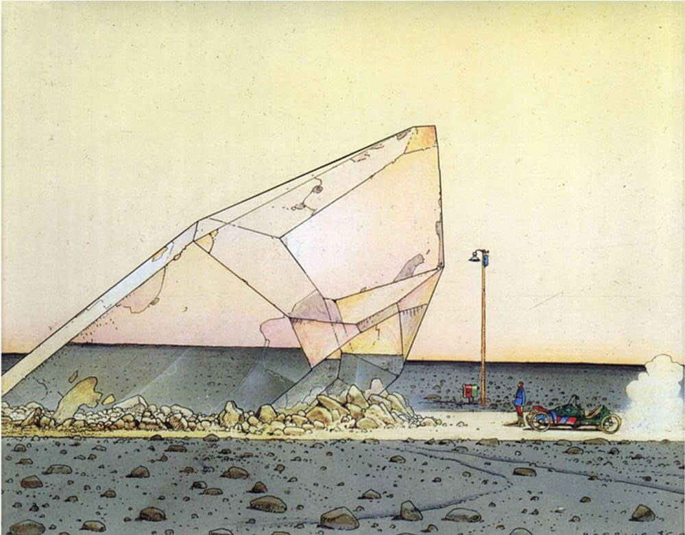
MARK HARRISON (again): Moebius!
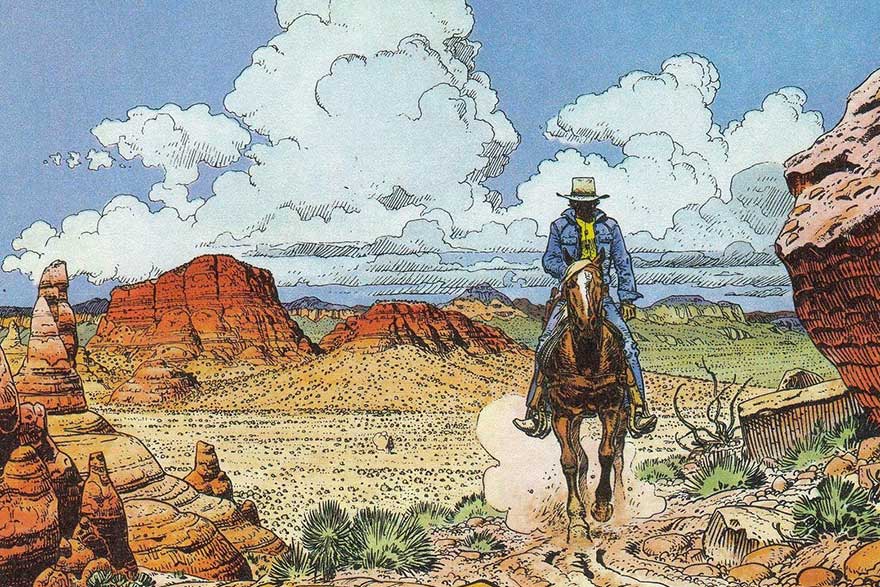
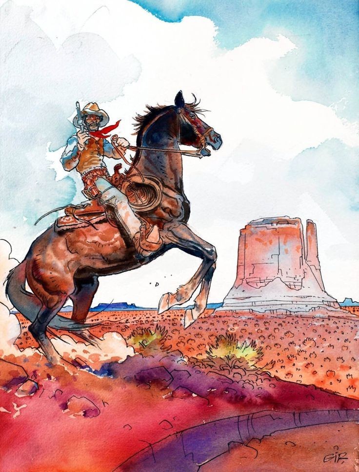
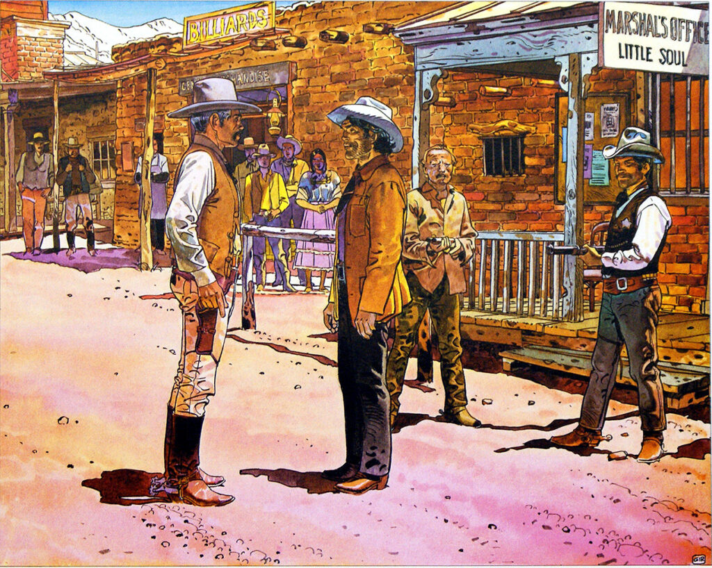
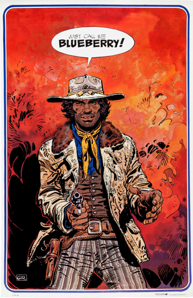
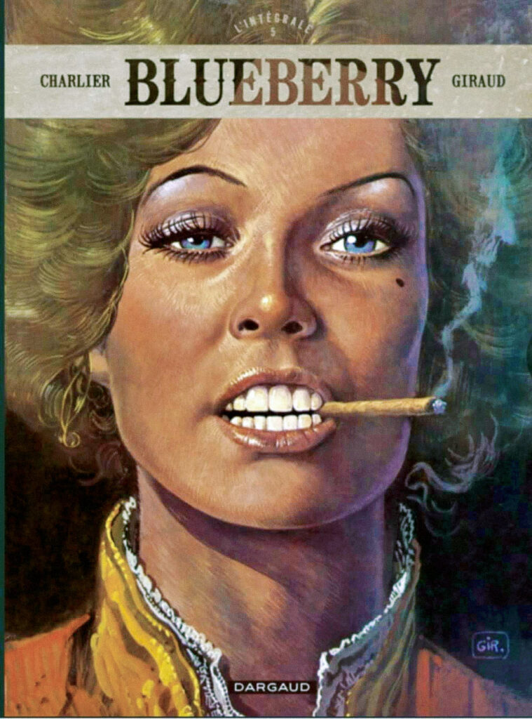
At some point early in the cover’s development, I did consider digitally painting the whole thing like a Lt. Blueberry painting by Jean ‘Moebius’ Giraud (THE undisputed genius of the French fantasy comic scene and a massive influence on science fiction and fantasy comic art and cinema). That seemed like hard work and would have involved re‑learning how to paint digitally in Photoshop which I hadn’t done in a while so it fell by the wayside. But that enigmatic smile remained.
So, it’s an excuse to give a shout-out to the amazing body of work by the great Moebius (who I brushed past in a crowded room once. True story. Okay, I was too shy to talk to him and I don’t know any French other than: “What’s the time?” – which I didn’t want to go with).
He was a formative part of my understanding of the possibilities of comic art and my comic-collecting life as a teen. Such unparalleled flights of fantasy that were the Golden Age of fantasy comics through the 60s up until the 80s. An unfettered, boundless, free flow of expression and imagination that is sadly diminished in today’s comic scene.
His take on the creative process is similar to mine on The Out, trying to divorce myself from a human-centric viewpoint, removing or expanding beyond that narrow bandwidth of convention and trying to see the universe with an alien eye. Of course that has to be tempered with the practicalities of needing to be printed in a 12+ Western comic, but I always believe your imagination should aim for the stars. And if you fall short through necessity at least you might get the moon.
Free yourself from today and embrace the worlds of tomorrow…. from yesterday with a bit of Moebius! (In all real comic fans collections!)
So there you go, the end of The OUT Book 3 and a perfect cover to go with it. I’ve said it before, I’ll say it again, The OUT is one of the best things to come out of 2000 AD in the last decade. Hell, it’s one of the best things to come out of 2000 AD full stop – and as we all know, the Prog’s had some truly zarjaz things in it over the years! Truly, in years to come, we’ll be talking about The OUT in the same hushed tones reserved for Halo Jones et al – it really is that good. And you should all be reading it.
Thanks once more to Mark for sending along the latest in what are always both wonderful reads and fascinating insights into the mind of the artist. I’m sure I’m not alone in wanting to sit for an evening in a quiet pub with a few drinks and just chat to him about art and what it means to him. That would just be a fabulous night.
You can find all his previous Covers Uncovered work here – Prog 2187, Prog 2193, Prog 2251, Prog 2254, Prog 2261, and Prog 2314. And be sure to go back and read the interview with Dan Abnett and Mark Harrison all about The OUT right here.
And of course, you need to have the first collection of The OUT adorning your bookshelves. You can pick that up from the 2000 AD web shop.
You can find 2000 AD Prog 2333 wherever you pick up your weekly dose of Ghafflebette comics, including the 2000 AD web shop from right now – today.
Now, your bonus Mark moments…
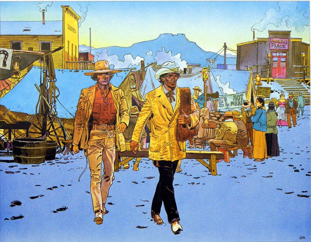
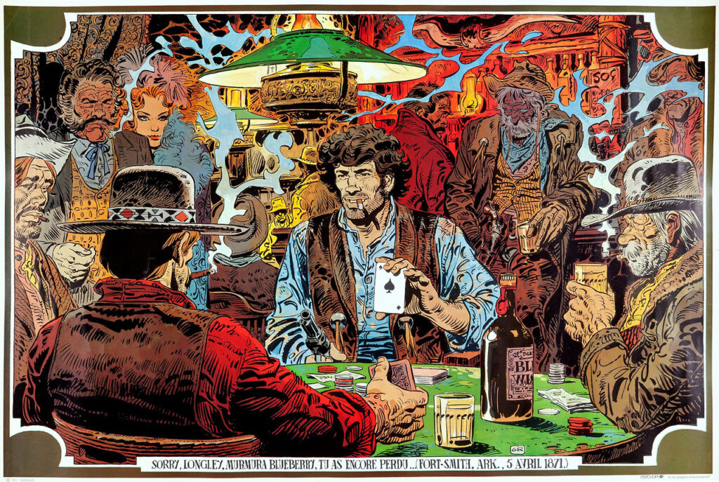
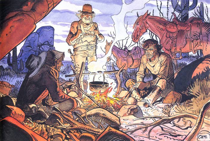
He didn’t just mention the genius that was Jean ‘Moebius’ Girard, but sent along a link to an excellent primer article from Retrozap, Moebius: The Elements of an Artist. So, I’ve added in some of Moebius’ incredible fantasy artwork from that article. But first, seeing as Mark specifically referenced Jean Girard’s early masterpiece, Blueberry, and how he had toyed with the idea of drawing this latest The OUT cover with digital colouring to evoke Girard’s painted colours on that magnificent series, we’ll begin with a few Girard Blueberry pieces…