2000 AD Covers Uncovered: ‘Fighting the desire to add beyond what was necessary’ – Mark Harrison takes us OUT once more for Prog 2317
2nd February 2023
Every week, 2000 AD brings you the galaxy’s greatest artwork and 2000 AD Covers Uncovered takes you behind-the-scenes with the headline artists responsible for our top cover art – join bloggers Richard Bruton and Pete Wells as they uncover the greatest covers from 2000 AD!
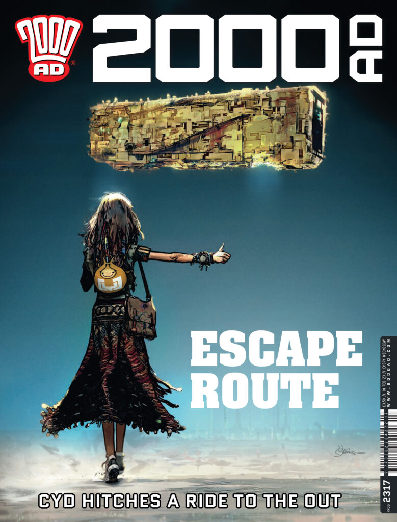
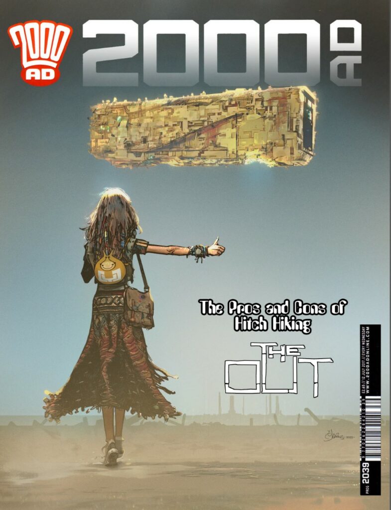
This week, it’s 2000 AD Prog 2317 and on the cover we have the unmistakable artwork of Mark Harrison with yet another incredible cover for The Out!
Inside the Prog, we have more spectacular sci-fi adventuring in The OUT Book Three by Dan Abnett and Mark Harrison.
After her Tankinar troubles, Cyd was looking at a lifetime of house arrest on the Unanima capital world – and then she found out that someone had left the back door open. How did it happen? More importantly, why did it happen and is it part of some plan on the part of the Unanima? Well, that’s something we’re going to discover as this amazing series unfolds. For the moment though, Cyd’s getting out of there and back into the Out as quick as possible…
Right then, over to Mark Harrison for the breakdown of the cover. As usual from Mark, it’s a fascinating deep dive into the artist’s mind and shows you just how much goes into making the cover look THIS good…
MARK HARRISON: Not much to say on this one I’m afraid as it was it was another case of knowing exactly what I wanted to do and just pitching it to Tharg.
[Well, he says there’s not much to say, but… well, you’ll see what I mean]
The idea had been kicking around in my head for some time. A simple image of a traveller walking in an open desert thumbing a lift from a city-sized spaceship hanging in a cloudless sky.
But oh boy, how simplicity has a tendency to be a trial of complexity when computers add numerous iterations and choice to the mix.
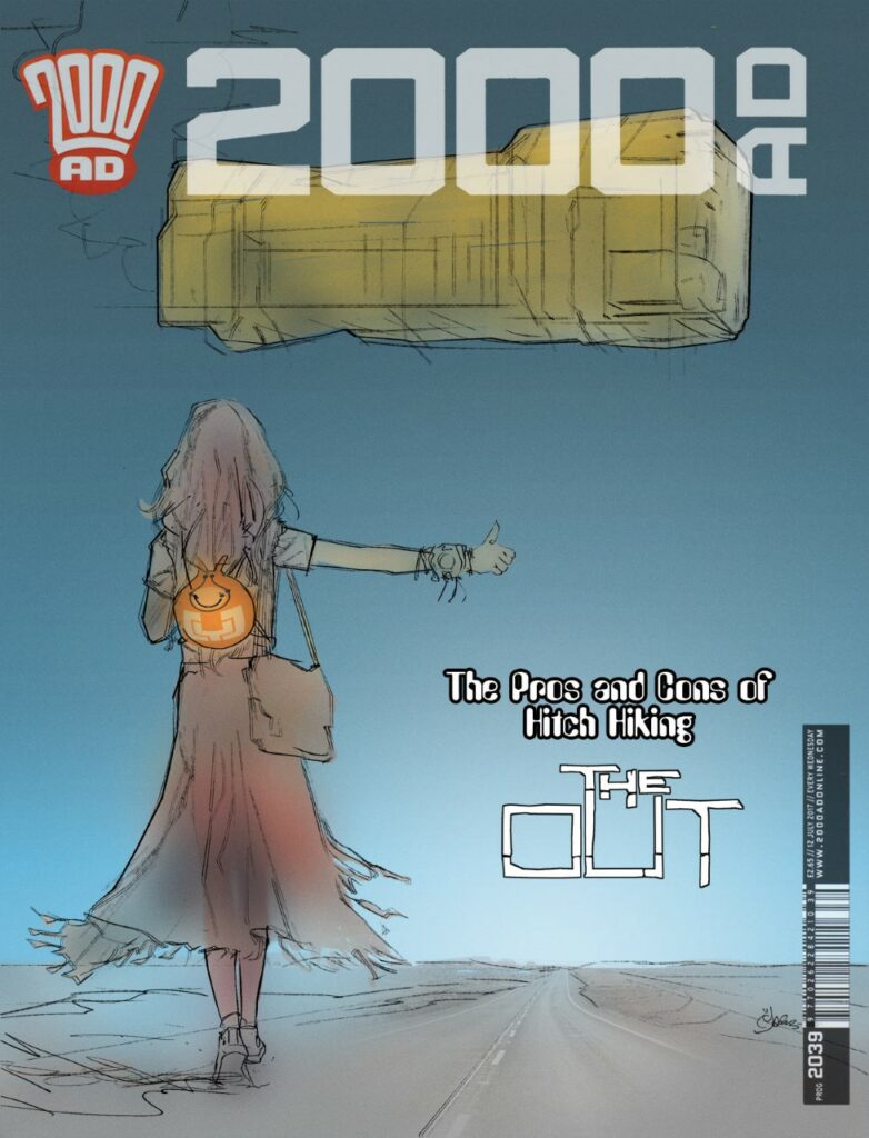
Cyd was always walking away but I moved her around, centred her, resized, her, and wondered what worked best. This happened with all the elements, squinting to see what “felt” right.
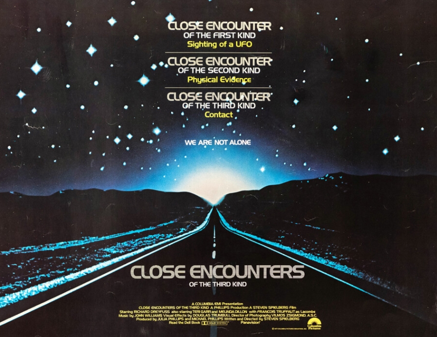
The background was to be a highway, like the poster for Steven Spielberg’s Close Encounters of the Third Kind (which I had already parodied in the Luwot Holiday in Grey Area).
[For more on Grey Area – keep reading to the end where we’ve got a load of Mark Harrison bonus features for you!]
>
Maybe an Alien city in the background? But it was all too fussy and detracted from the clean simplicity.
I added Saturn rings, cloud effects… trying to make it otherworldly… No.
It had to be stripped down to the basics. Which I found to be very hard to do. But it helps if you follow those who have gone before.
I wanted to evoke those evocative sci-fi book covers with an endless horizon. That sterile bleakness that they conveyed. (To do it justice it should have flowed onto the back cover.)
I spent more time removing stuff I’d added, reducing and reducing until in some versions it was just silhouettes or lights – an impression of something over the horizon.
It was all about mood – this was supposed to be a moment of stillness.
Maybe some library sound effect of desert wind catching Cyd’s dress in the midday sun? (A direct downlight – I played with lighting but I wanted this hot dry stillness) Foley work of Converse on a glassy path? The ominous low-frequency electrical hum of something very massive hanging in space? Maybe a tinny sound of music playing from Bag or the chirping of alien desert cicadas?
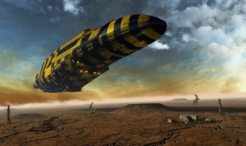
If the ship had come to land it would have been hissing steam and dripping fluids like a steam train or David Lynch spaceship. I love “organic” detailing applied to machines.
The ship itself went through many changes. I started off with an organic look, curved shapes, lots of lights, lots of fuss. Then I went with simple shapes – spheres, pyramids… bricks?
BRICKS.
Of course! It was there from the off. No prizes for guessing the reference here. Yeah you got me, but I painted the target large and loud in luminous paint.
“The ships hung in the sky in much the same way that bricks don’t.”
Douglas Adams, The Hitchhiker’s Guide to The Galaxy.
Everyone should know The Hitchhikers Guide. A massive influence on me and my teenage years (and onwards) and on my very first strip the Travellers which had irreverent (but adoring) humour poking fun at the sci-fi clichés of the genre. (There’s still a bit of that in The Out.) I had to acknowledge that beloved book in some way.
[Again, for more on The Travellers, keep going to the end and the bonus features!]
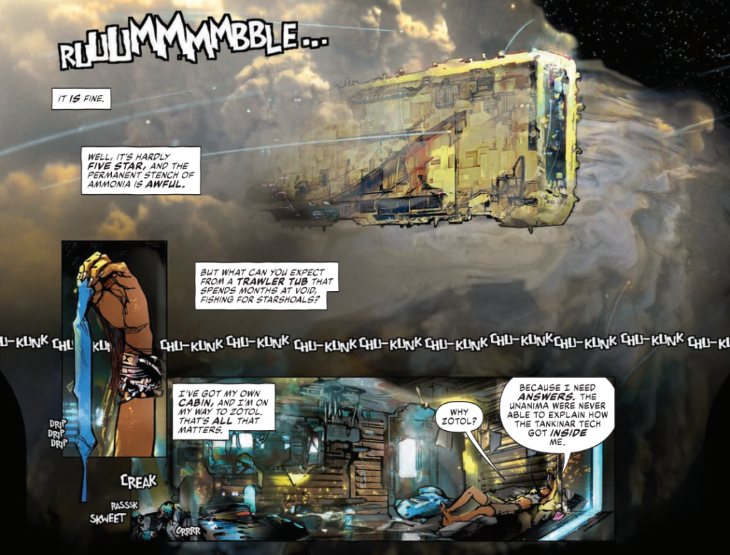
So the ship became a rectangle, a yellow brick, and that also informed the fishing ship in the strip which Cyd hitches a lift with.
Again, I messed with detail, Foss (as in Chris Foss) stripes, and ‘greebles’ – the little model kit parts sci-fi model makes would put on starships for detail.
>
But it was getting too fussy again.
It’s a really fine line because I do subscribe to the John Harris school of mass; that something looks bigger the less detail it has on it on it. Harris is an artist that can capture mass very simply with a loose style that coveys atmospheric depth and scale.

So I tried it but my brain screamed ‘needs detail’ so I compromised.
I mixed in an overlay of a fishing trawler (since this wasn’t supposed to be a JCB in space) to give me some ideas and a texture to sell a Lego feel.
The interior of the ship suggest cargo containers so I wanted that grunge and panelling on the outside.
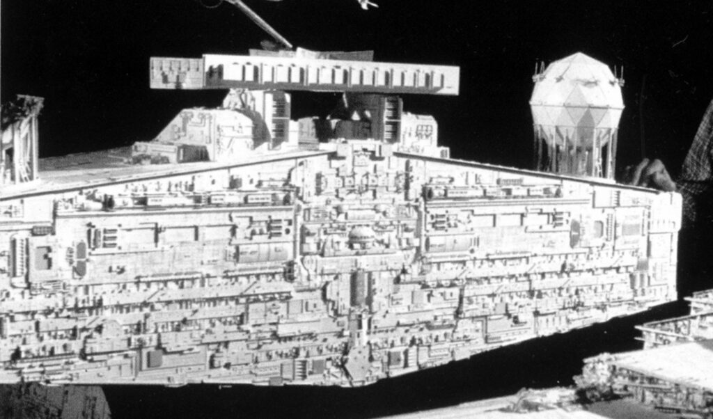
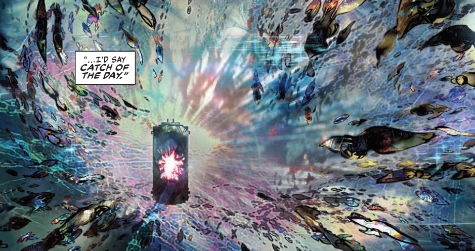
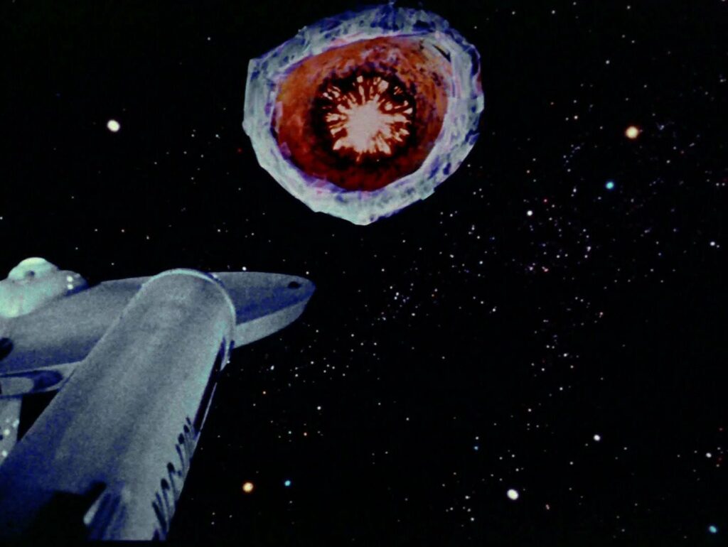
There was an open maw at the front for when the ship deploys a magnetic field; a “tractor net” to capture space-borne squid-like creatures. As an Easter egg, the maw’s light effect is copied from the planet killer in ‘The Doomsday Machine’, one of my favourite Star Trek TOS episodes. [Again, check out the bonus features!]
I submitted two versions of the cover so I’ll be interested to see which one they go with.
Well, by now we’ve all seen the final cover. But here’s the alternative one…
And here’s the clean version of the cover that was used…
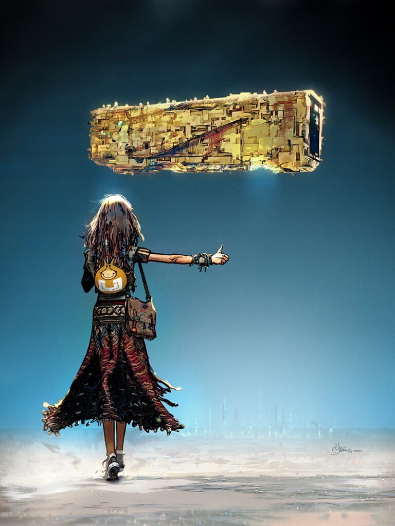
It was a cover I fought with. To make it look simple. Fighting the desire to add beyond what was necessary.
Knowing what to leave out in comic art (and still make it readable) is just as important as the line work itself and can be considered a sign of maturity and excellence.
Thankfully I still have a way to go and have fun along the way. I’m still learning and that’s the great thing about this job.
Never give in! Never surrender! (your style!)
And there we have it, yet another quite magnificent look inside the head of the artist. Mark actually apologised when he sent this one over as he was unimaginably busy for various reasons and was concerned this one was a bit short and light! You know, these art droids that make your weekly Prog so thrill powered really are the most wonderful things!
Anyway, thanks so very much to Mark for sending it along – it’s yet another classic image to grace the cover, a cover you can find wherever you get the Galaxy’s Greatest on the front of 2000 AD Prog 2317, including the 2000 AD web shop, right this minute!
Now, be sure to check out Mark’s previous Covers Uncovered entries (all as wonderful as this one) for the covers of Prog 2187, Prog 2193, Prog 2251, Prog 2254, Prog 2261, and Prog 2314, and be sure to go back and read the interview with Dan Abnett and Mark Harrison all about The Out right here.
And of course, no shelf, physical or digital, should be without the first volume of a series that’s going to go down in history as one of the greats of 2000 AD… The OUT.
Now, a few bonus features for you, because frankly Mark always sends along so much, fills his Covers Uncovered pieces with so many references, that there isn’t always space to fit them all in!
So, you all need to check out the work of Chris Foss, John Harris, you should certainly all go and immerse yourselves in the Hitchhiker’s Guide to The Galaxy (start with the radio show or the books, then move onto the BBC TV show), and of course Close Encounters is a sci-fi classic you should all have watched!
As for one of those Easter eggs Mark mentioned, the ‘open maw at the front for when the ship deploys a magnetic field; a “tractor net” to capture space-borne squid-like creatures…’ that he copied from the Star Trek Original Series episode The Doomsday Machine. Well here’s the panel from this week’s episode of the Out and a still from ST:TOS…
And here are the panels from this week’s episode where we first see how Mark’s ideas took shape, where, in his words, ‘the ship became a rectangle, a yellow brick and that also informed the fishing ship in the strip which Cyd hitches a lift with’ …
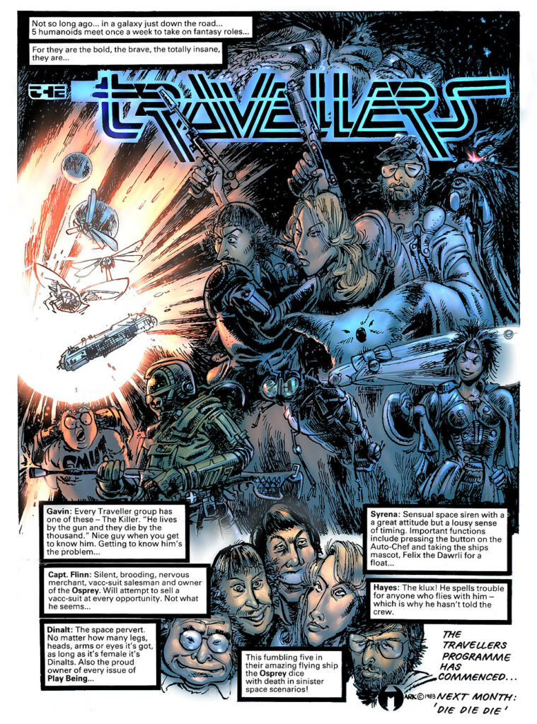
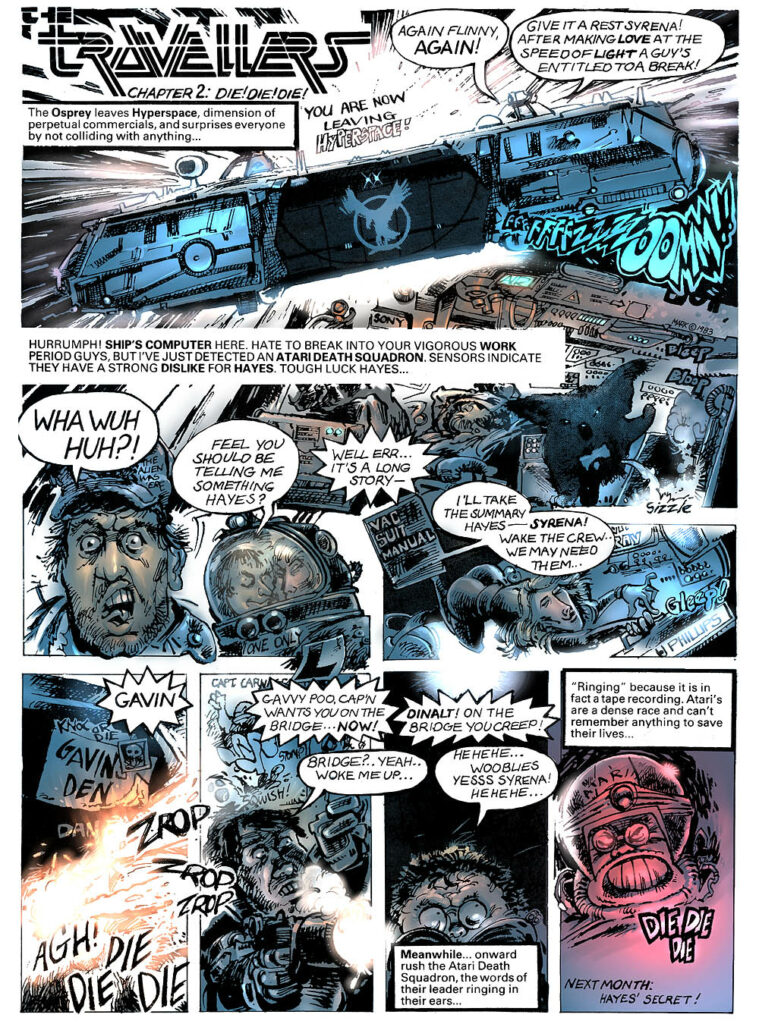
Next, Mark mentioned his first-ever published strip, The Travellers. Well, this was a new one on me, so I asked him about it. According to Mark, it was his ‘humorous take on the role-playing game Traveller. It was published in White Dwarf Magazine back in the 80’s. It was a one-page strip that was my first commissioned work that I wrote and illustrated.’
Well, if you haven’t ever seen it before, there’s great news, as the whole thing has been archived over at 2000 AD.org (Barney, the monumental 2000 AD resource site) at this sub-site – http://www.2000ad.org/markus/travellers/.
So, here’s a little look at what you can find there…
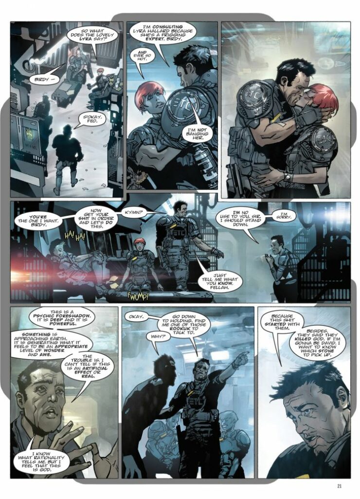
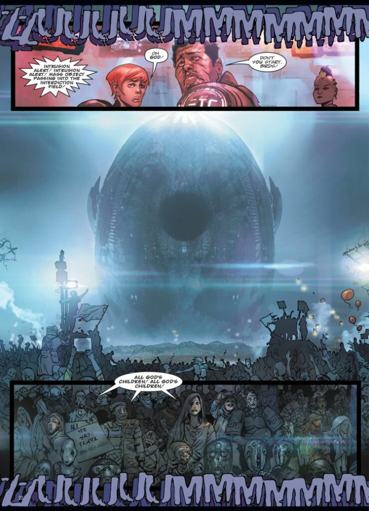
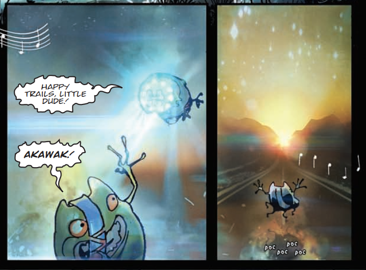
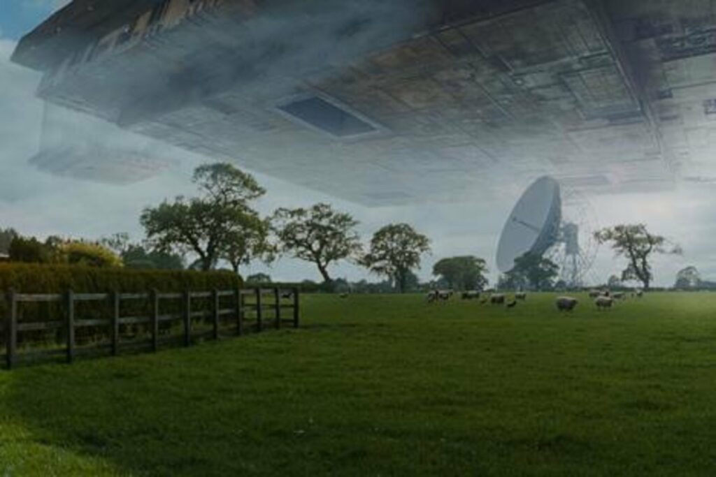
And finally, Mark also mentioned that he’d already referenced Close Encounters in his previous 2000 AD work with Dan Abnett, when they collaborated on the second book of the excellent Grey Area, which was the strip that introduced me to Mark’s artwork and one I absolutely love.
Here’s what it was all about…
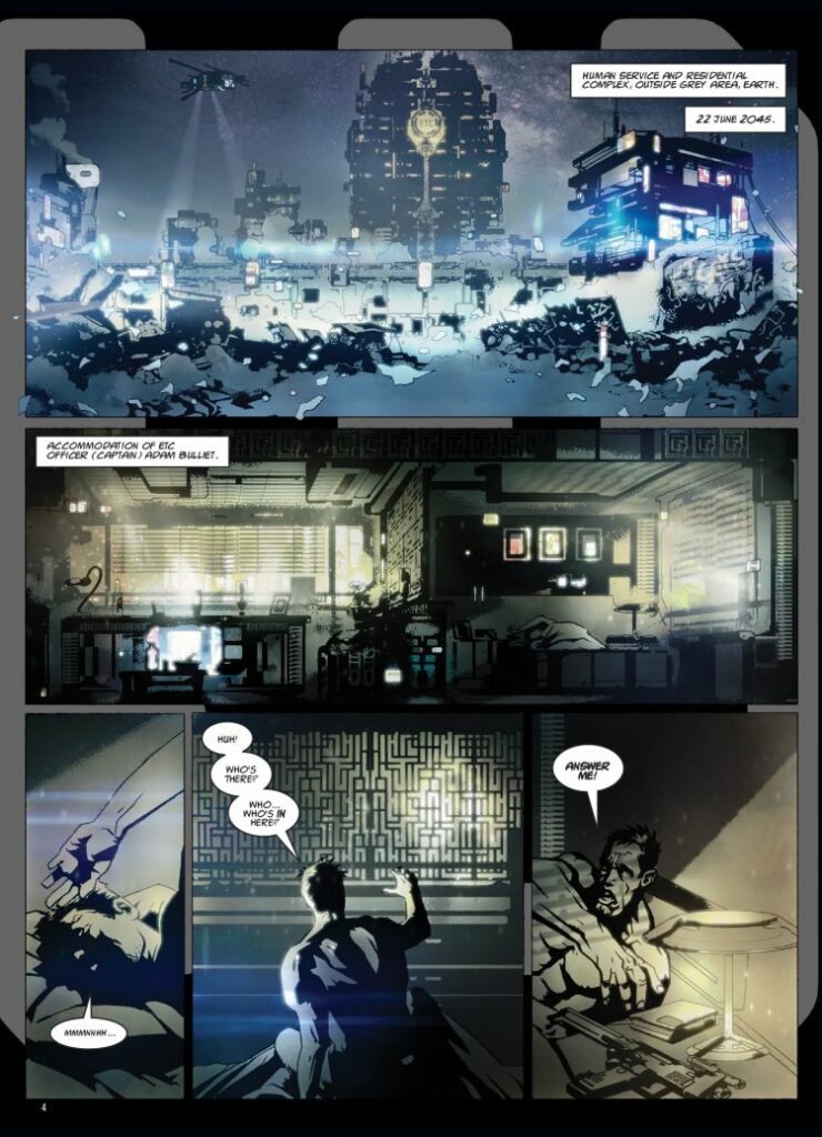
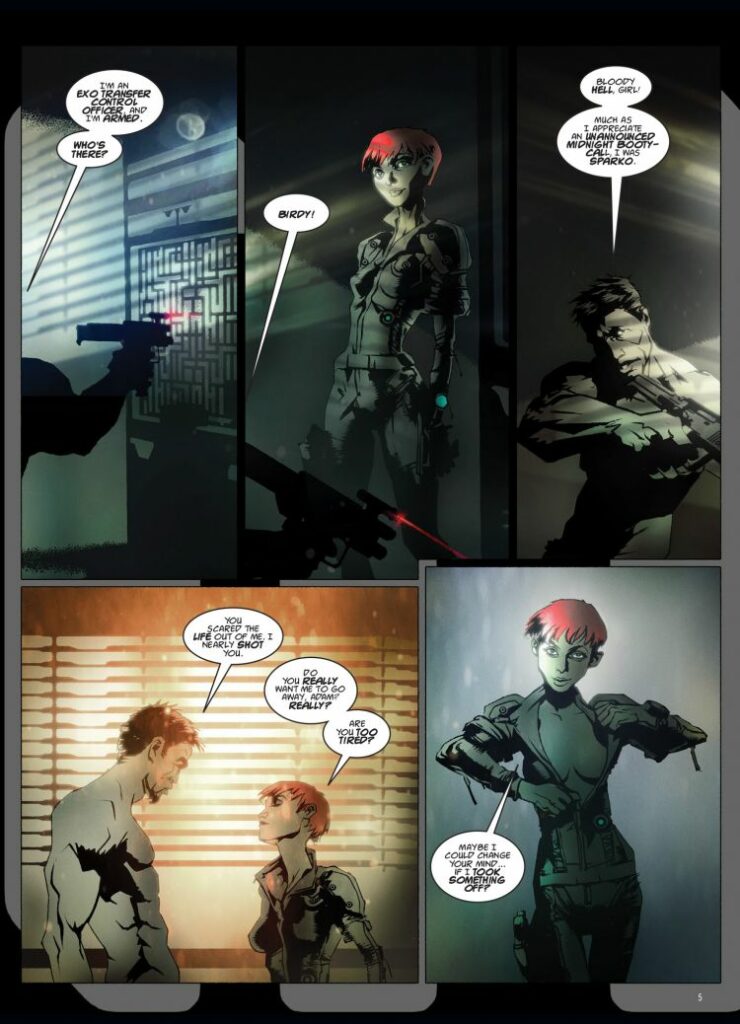
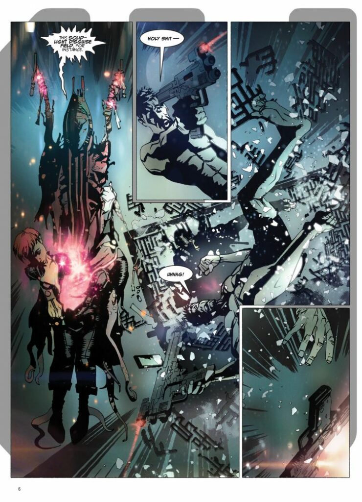
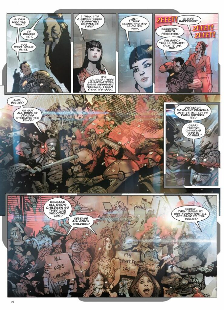
North America, 2045. The Global Exo Segregation Zone (aka the ‘Grey Area’) is a huge holding area in Arizona housing aliens hoping to visit earth: a melting pot for disputes, crime and inter-species misunderstandings!
The only thing standing in the way of chaos is the Exo Transfer Control squads: heavily-armed immigration cops that keep the peace and make sure everyone has their papers in order… E.T.C. Captain Adam Bulliet has a lot on his plate; The Arakshu want revenge on humanity for their dead ambassador, increasing numbers of aliens are having rapturous visions, and his fraternisation with Officer Birdy isn’t nearly as discrete as he thought. Not to mention a dizzyingly colossal god star is descending on Earth, and Bulliet’s team are the ones suiting up to meet ‘n’ greet the second coming. But they might end up going further than they expect…
So, it’s obviously a perfect opportunity to give you a little of that to gawk at as well, isn’t it?