2000 AD Covers Uncovered: ‘Lending A Hand’ – Mark Harrison takes us deep into The Out for Prog 2314
11th January 2023
Every week, 2000 AD brings you the galaxy’s greatest artwork and 2000 AD Covers Uncovered takes you behind-the-scenes with the headline artists responsible for our top cover art – join bloggers Richard Bruton and Pete Wells as they uncover the greatest covers from 2000 AD!
This week, it’s only the second Prog of the year and we already have a stunning cover from Mark Harrison for The Out on the cover of 2000 AD 2214.

Since beginning back in Prog 2187, The Out has been taking you Earthlets out to the far reaches of the Universe to be amazed and awed by the fabulous adventures of photojournalist Cyd Finlea (and her sentient flatspace bag). We’re now following Cyd’s journey in Book 3 of The Out, which began in the 2022 Xmas Prog, 2312. It is a spectacular space odyssey of epic proportions that will be spoken of in decades to come as the finest of 2000 AD.
It’s always a pleasure to get a Mark Harrison cover. Not just because they’re always such amazing pieces of art but because it means we can then look forward to reading Mark’s thoughts on putting the cover together. It’s always eye‑opening stuff, full of all the insane little details that you’re going to be reading about in just a moment as we hand you over to the incredibly talented Mark Harrison…
MARK HARRISON: Okay… Back from a biblical journey to Cornwall for Christmas down under the sea it seems (Flood, End of Days stuff). Mind lost a few brain cells over Christmas so I will try and remember best I can.
I was going to give you some background on the Tankinar beastie that is the main focus of the cover but then realised that strayed into spoiler territory so I’ll just talk cover and the design of the Tankinar. As always hopefully it will point readers in directions and have a nice reminisce about things.
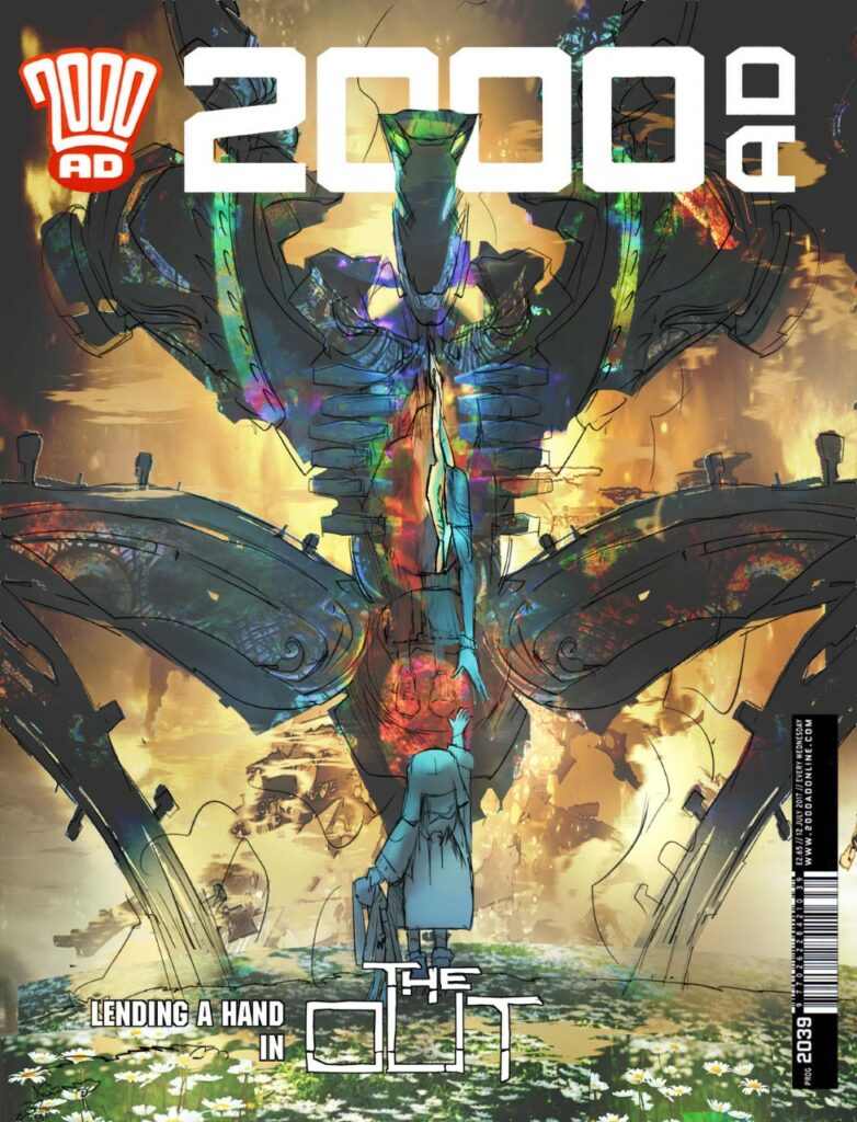
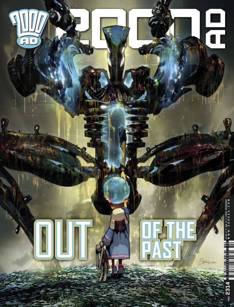
Lending A Hand – a cybernetic horror, a child reaching out. And daisies, plenty of daisies.
The cover: ‘Lending a Hand’ came together very quickly. I knew straight away I wanted a scene of overwhelming destructive force; a Tankinar, facing a seemingly innocent and inquisitive child reaching out, an unwitting baby putting its hand into the mouth of a lion. That juxtaposition of brutality vs soft passiveness.
The threat had to be HUGE, filling the frame/cover, the child teetering to reach up and touch it, seemingly oblivious to the danger it was in. There had to be daisies. Lots of daisies.
Only in this instance, the child would be Joey, a manifestation of Cyd’s daughter freeing her mother from a glassy prison of fused diamond (giving birth to her mother as it were!).
I went straight to roughs and Tharg approved of it and it was turned around pretty quickly. I think the biggest issue I had was the pose of the Tankinar.
I was going with this aggressive, open-legged squat, like giving birth. (Birthing, either images or film of, I tend to find pretty intense. Aged ten we were shown a video in science class of a 1970’s woman giving birth… no horror film I have watched since has come close to that gory horror show. God knows what the girls thought!)
The pose brought the Tankinar down to Joey’s level, who is standing in an idyllic field of sunlit daisies whilst cities burned in the background, Joey reaching out, Rupert the Rabbit in hand.
As a final late addition, I took out the background colour and had the Tankinar encrusted and dripping with the blood and mince of the inhabitants it has ploughed through to get here, backlit to look pretty.
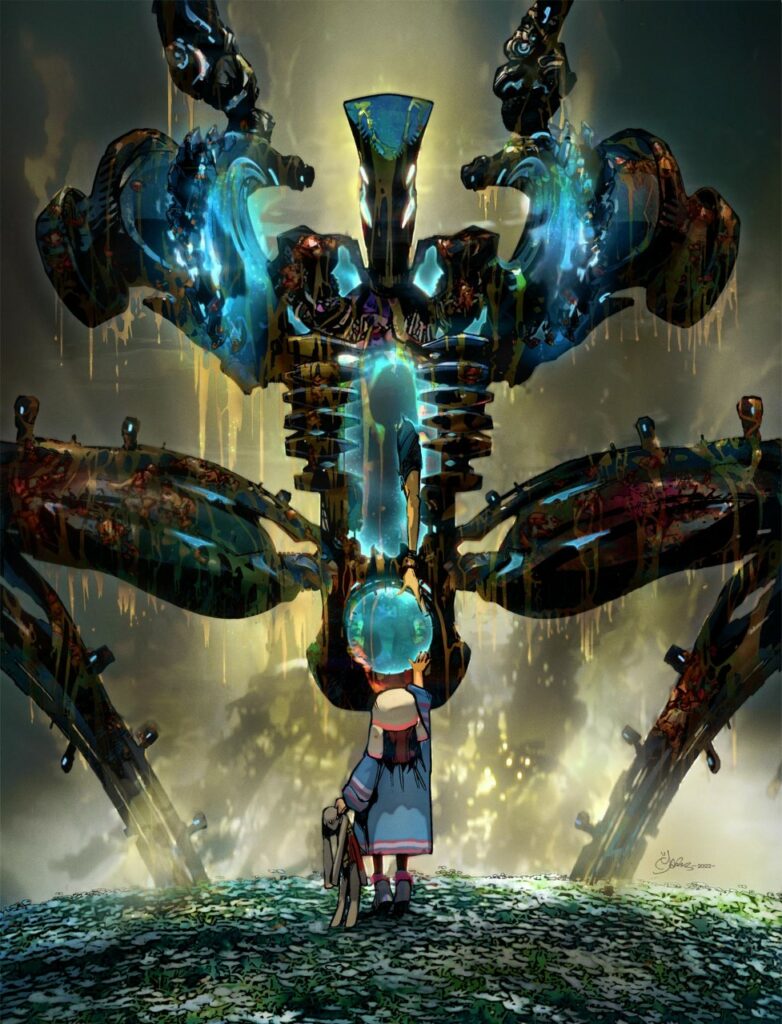
I had previously referenced Michelangelo’s iconic image of the Hand of God giving life to Adam when Cyd first meets Joey (Spirituality and religious/art references abound in this strip as Easter eggs/drinking game. Read safe, kids!)
This time Cyd is reaching down to Joey to be given her (3rd?) life. (This all happened ‘off comic’ I should add. The cover kind of shows what happened and how Cyd escaped that which cannot be escaped from. Dan and I like to leave some mystery and have the reader speculate. There is ambiguity, deliberately so. I could say more but…
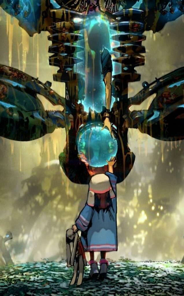
‘Cyd is reaching down to Joey to be given her (3rd?) life ‘
That said… Let me pad this Covers Uncovered with a deep dive into the design of the Tankinar. Like most of this personal journey into The Out, it involves my childhood, my love of science fiction film, TV and books and art. My life of stealing; magpie that I am!
The Tankinar was born out of a combination of three elements that made up the original illustration I knocked up while working on Grey Area to accompany the very rough synopsis Dan and I were pitching of The Out to Tharg. Seen here, Cyd the then Space Hippie thumbing a lift and in the montage around her are speculative adventures, foes, events.
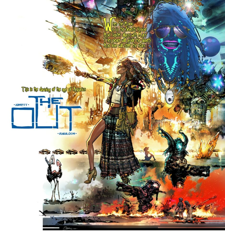
Minor tweaks to the character were made; making her a reporter, and the warring foe she would encounter had no longer abducted her children. The Tankinar then were a race called the Krakken and rode around in Crushtakken tanks (I know… sorry.) The idea was already there that this was a small ‘Little Napoleon race’ that had symbiotically merged with another to ‘Get Big’ and redress some colonial injustice. They sat in the head of ‘AA-Anger armour’; Power suits the Krakken used that were powered/focused by strong emotions, typically fear or anger. Cyd would don one of these conveniently applicable suits in the finale and it would be a mother’s love and protective streak that would free her children from the child catcher Little Napoleons.
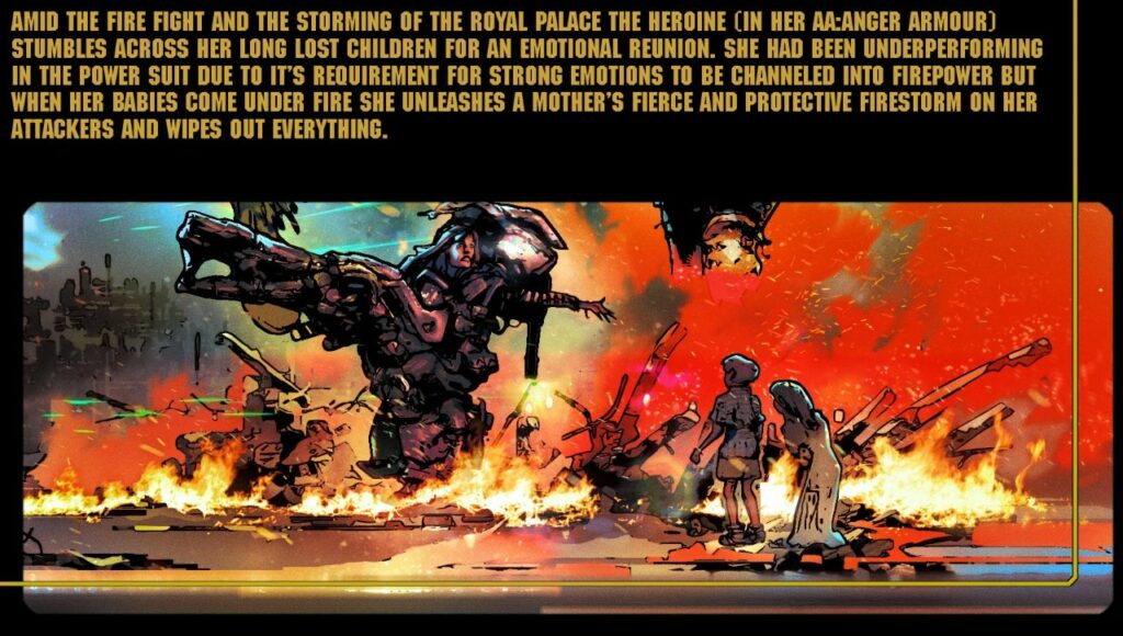
In the process of a back and forth with Dan, things got lost, merged, swapped around. The Tankinar turned out to be a tool. It was the race inside that gave the tool/weapon it’s motivation. And before someone says ‘Dalek,’ these are totally different. These have legs.
(Funny, I never thought of a Dalek until late in the process. As much as you try to come up with something original you’ll find someone has got there before you. So you tweak around the edges.)
The real origin of the Tankinar being the actual weapon came from a science fiction novel I had read in my teens (I can’t remember the name of it unfortunately.) A robot coming to Earth and being impervious to man’s weapons/tools etc. immobile and unmovable. Until it decided to move. And it did so without acceleration or deceleration. From rest to hundreds of miles an hour in an instant and vapourising anyone it’s path. Then stop.
I found that to be a powerful image, something moving faster than thought, being the weapon. To that end it had to be brutal. An iconic silhouette. It also had to tie in with a disturbed child’s scribblings on a daisy chain cut out of the Tankinar that had already been done. I wonder how many readers guessed that Joey would help turn (blue) the Tankinar from that ‘Spoiler’ cover to Prog 2251?

An early idea was eventually dismissed but was briefly glimpsed in Book One of The Out – killing Cyd as we needed to see something. I had until Book Two to come up with a more finalised image. In the 40 years that Cyd had been on ice the Tankinar were defeated in that incarnation, (so everyone thought) but had in fact it had only retired to reorder itself. But into what?
Right from the off I knew this to be biomechanical. Cyborg. A weapon that needed organic input. It had to be brutal looking. I thought of stuff that would be intimidating, that everyone could relate to. An axe/iron for the head. Crossed claw hammers for the American footballer styled shoulders and inside those terrifying buzzsaws that rev up prior to an attack (actually based on road milling drums. They’re awesome- look them up. Imagine a Bond henchman falling under one of those!) Bolts projecting from scythe-like legs.
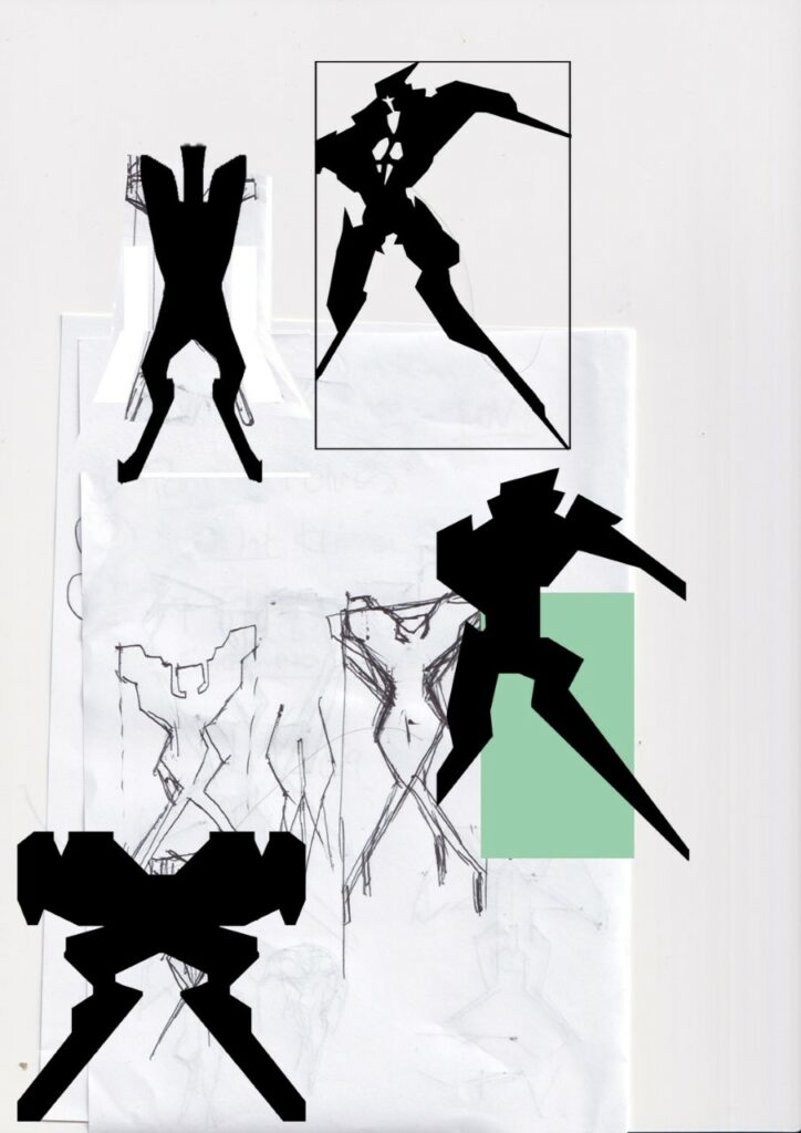
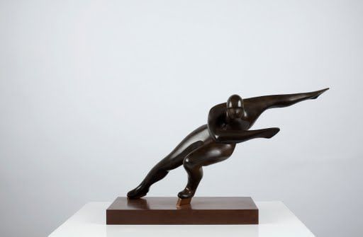
I tried it with arms but it looks heavier. Less agile. I then settled on an Olympic speed racer silhouette and that powerful, graceful slicing forward motion you see in them, the throwing back of the arms, thrusting out the head and chest. A legion of those coming at you in perfect synchronisation.
.
(As an interesting aside: When working on the Aliens vs Predator game for Rebellion I was tasked with creating storyboards of the Aliens motion and stalk/running cycles. I quickly realised running at you with arms outstretched looked less scary (almost comical) than running at you jaws first. This creature was so assured it didn’t need to lead with its claws!)
I played with textures; some Hindu carvings (that survived to be framing elements to the first page of Book Two) an Aztec pattern, runes on some indestructible rock body, and a plated look.
Bits of it worked but… then a blast from the past, from my childhood intervened.
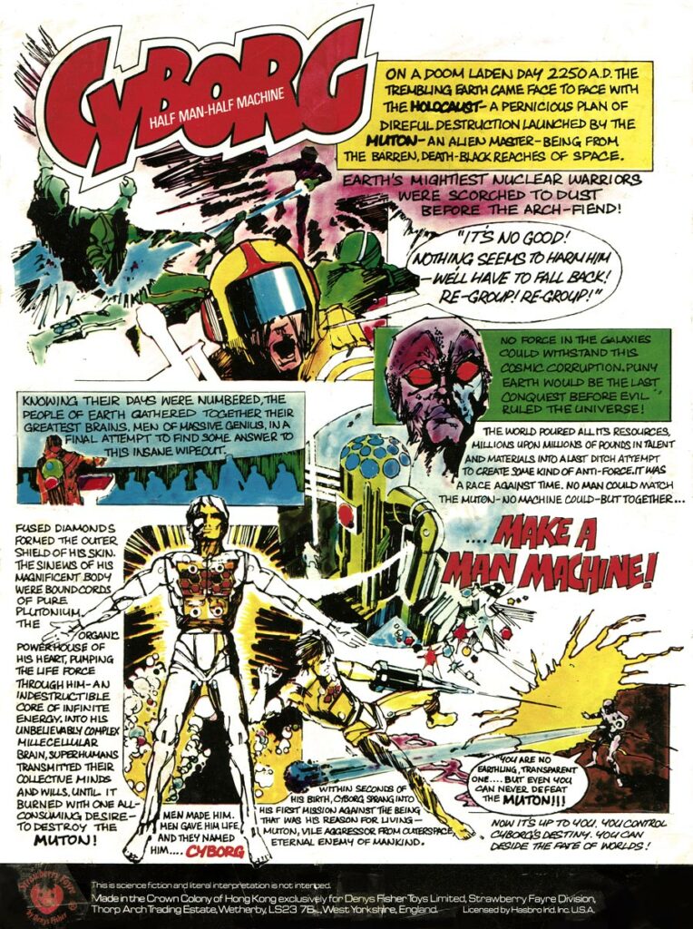
My brother and I had loved the Denys Fisher toys: ‘Cyborg and Muton’ growing up in the 1970’s. (Dan told me he had Android). Great box comic art too that fired up the imagination.
They were rebranded Japanese toys (Henshin Cyborg and King Walder respectively) that were the precursors to the Micronauts and Transformers. Their selling point was interchangeable weaponry and the fact they were transparent. Brains and organs visible or Golden bionics encased in fused diamond.
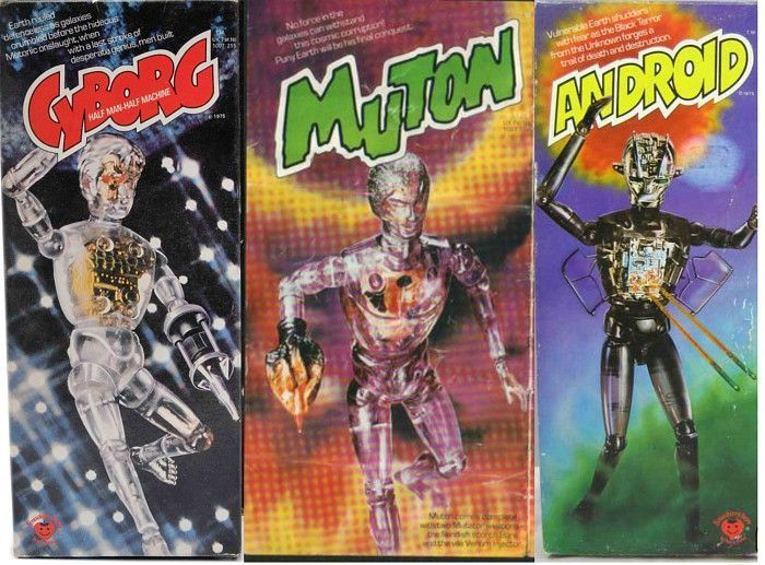
I’ve no idea on the artist for the box art for Cyborg – although I did ask one famous artist I thought it might be – Walt Simonson! It wasn’t him but he was glad it inspired me to become a comic artist. Putting on my comic book detective hat it’s not a known Spanish comic artist that the British comics would sometimes employ.
Knowing how these things work and the time period it was probably a British-based ad agency artist, a no-name that simply fulfilled a brief. It fits very much with the 60’s/70’s ad agency line illustration of the period. They have a loose, sketchy style about them and some giveaways/markers to their art like how they do hatching, explosions, dynamic layouts (very British/European and an influence on me – Americans, by and large, were still grid system) and line art (a rapiodograph or felt tip typical of ad agencies) There is similar styled graphic line art for architecture, newspaper ads etc.
I’d love to know the artist myself but sadly the internet draws a blank (no pun intended). It’s not very good at obscure British retro stuff.
[Nope, we can’t place it either Mark – anyone have a clue? We’ll put the full sized art at the end of this Covers Uncovered to give you eagle-eyed readers a better chance at identifying the artist!]
MARK HARRISON: Kid’s toys in the 70’s were so cool. I remember my mom being disgusted by them!
I’ve just been reading ‘Scarred for Life: The 1970’s (got the 80’s for Christmas) Of course it talks about Action! and 2000 AD but the real revelations are the toys and girls comics of the age.
Back to the Tankinar – add internal lighting (mainly to distinguish the Joey blue Tankinar from the rest) and it was ready for the final ingredient. A host, in this case a human inside it, in a sort of foetal position. (That also decided the Tankinar’s size.)
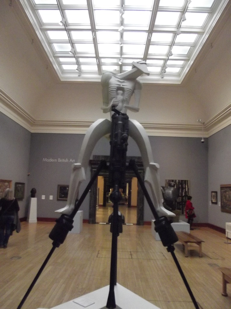
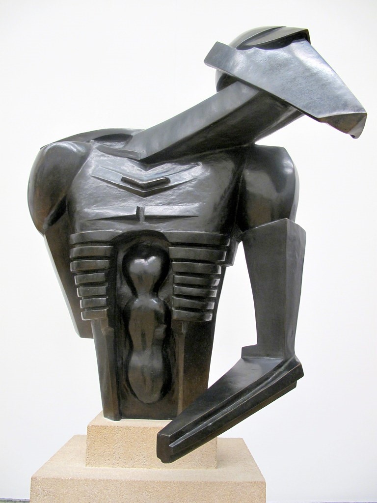
The torso also owes a nod to Epstein’s rock drill sculpture that I used to marvel at in Birmingham’s Art gallery and Museum. (A futuristic design from the early 1900’s that George Lucas also thought was pretty cool for the STAP droids.) The sculpture appears to have a figure inside it to my mind.
>
That was a delicious idea for the Tankinar- to see the hapless being trapped inside. For them to see out. For all eternity. As if in a specimen jar, the organic element slowly dissolving over time so only a brain (with eyes) and nervous system remains.
The organic parts; redundant limbs and organs collecting as a soup in the base of the Tankinar. Sloshing around… for all eternity.

It’s a gun that seduces and reduces the user, makes them part of it as you lose yourself to it. Fortunately Cyd avoids that fate but mind links with those that have.
‘Make it stop’ comes to mind.
I first thought of Cyd frozen in a perpetual scream entombed in the Tankinar, drowned in liquid diamonds. Like a wasp in amber. That gave way to a cavity to allow for Bag and the pollen to have a possible effect on Cyd, break the psychic link to a hive mind of the Tankinar. Edvard Munch’s famous ‘The Scream’ was something I referenced with Cyd’s head locked fast in a cyborg vice replacing the hands of the painting, microfilaments holding open her eyes, ears, and nostrils to experience the full sensory horror ride she was on, unable to turn away. (A memory of Alex’s conditioning in A Clockwork Orange?)

>
The Tankinar feed off organic impulses and stimuli. They require the intent, the impetus that comes from the primeval fear all life is descended from. They may a tool but a hammer in the wrong hands is a weapon. And it has weapons beyond the stumps it has for arms. Utilising the same plugs on the toys, weapons are ‘morphed’ into place from flatspace in the same way Bag can deliver items. So the Tankinar has a whole arsenal to draw upon when simply ramming objects is not enough. Molecular whips, rockets, blast waves. I hoped for a two-issue battle to end book two showing all this off as she decimated the Tankinar horde but we ran out of space. (Dan found a way to make it a dramatic intro to Book Three.)
It’s a balance to make Cyd not too heroic or empowered but grounded and believable. We try to keep in mind the real world. A real world lost and terrified tourist picking up an AK-47 and letting loose. Only this gun doesn’t stop firing and you can’t let go.
What unlocks the fear, the cycle of violence is love. If fear drives you then you are fodder for the Tankinar. But love will set you free.
But why are they doing this? What is the Tankinar’s purpose? Look to the stars for answers… and 2000 AD, the Galaxy’s Greatest Comic!
As always with Mark, an absolute pleasure to read the inner workings of the artist’s mind in the creation of this stunning cover! You can get it wherever you obtain the Galaxy’s greatest from, including the 2000 AD web shop, from 11 January. It’s 2000 AD Prog 2214, packed with more than enough thrill power to get you over that post-Christmas slump!
Now, be sure to check out Mark’s previous Covers Uncovered entries (all as wonderful as this one) for the covers of Prog 2187, Prog 2193, Prog 2251, Prog 2254, and Prog 2261, and be sure to go back and read the interview with Dan Abnett and Mark Harrison all about The Out right here.
And finally, here’s the Cyborg box art in full for you – anyone out there got an idea which artist it was that so inspired Mark?
